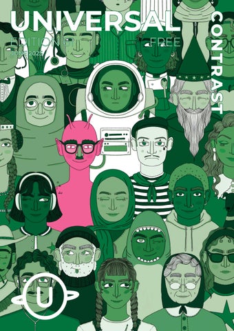
Contrast is a tricky one. When we first pitched
this edition, we had in mind a strict and
minimal colour palette to showcase what can
be done with so little. The end result looks
amazing of course, however the journey was a
bit more involved than with other editions.
From choosing the colours, to coming up with
concepts, the umming and ahhing of what to
write for this one came in spades. Contrast can
mean so many things!
Despite that, it’s safe to say the committee has
delivered yet another bumper edition. With a
selection of beautiful short stories highlighting
the convergence of contrasting characters,
articles about food combinations from around
the world, beautiful comics and illustrations,
and some thoughtful pieces about art, the
world, and the places we’ve come from, this
edition is a testament to the people who
make Universal possible.
Thank you for joining us in reading this edition
online, and we hope you enjoy what’s inside.