The Anne Boleyn Effect. My Rouge, Your Rouge.


‘Your Pink Heart’. Georgia’s Rose Revolution. Rouge, красный, Rot. Dystopian Rouge. Ferrari is Red. Seeing ‘Red’.
Don’t Say Cheese. Red, Bold and Timeless.
R O
G E! Pi Magazine Editorial Issue 737 Spring 2024 ROUGE Pi Issue 737
U
2 Pi Magazine Issue 737 ROUGE CON TE NT S rouge This is WelcomeRouge. to a bold new world of colour and chaos. 4 THE ANNE BOLEYN EFFECT Lust, Desire and the Vilification of Women by Emma Routledge __________________________________ 6 MY ROUGE, YOUR ROUGE by Ewan Alderman
Instagram @uclpimedia | Website uclpimedia.com
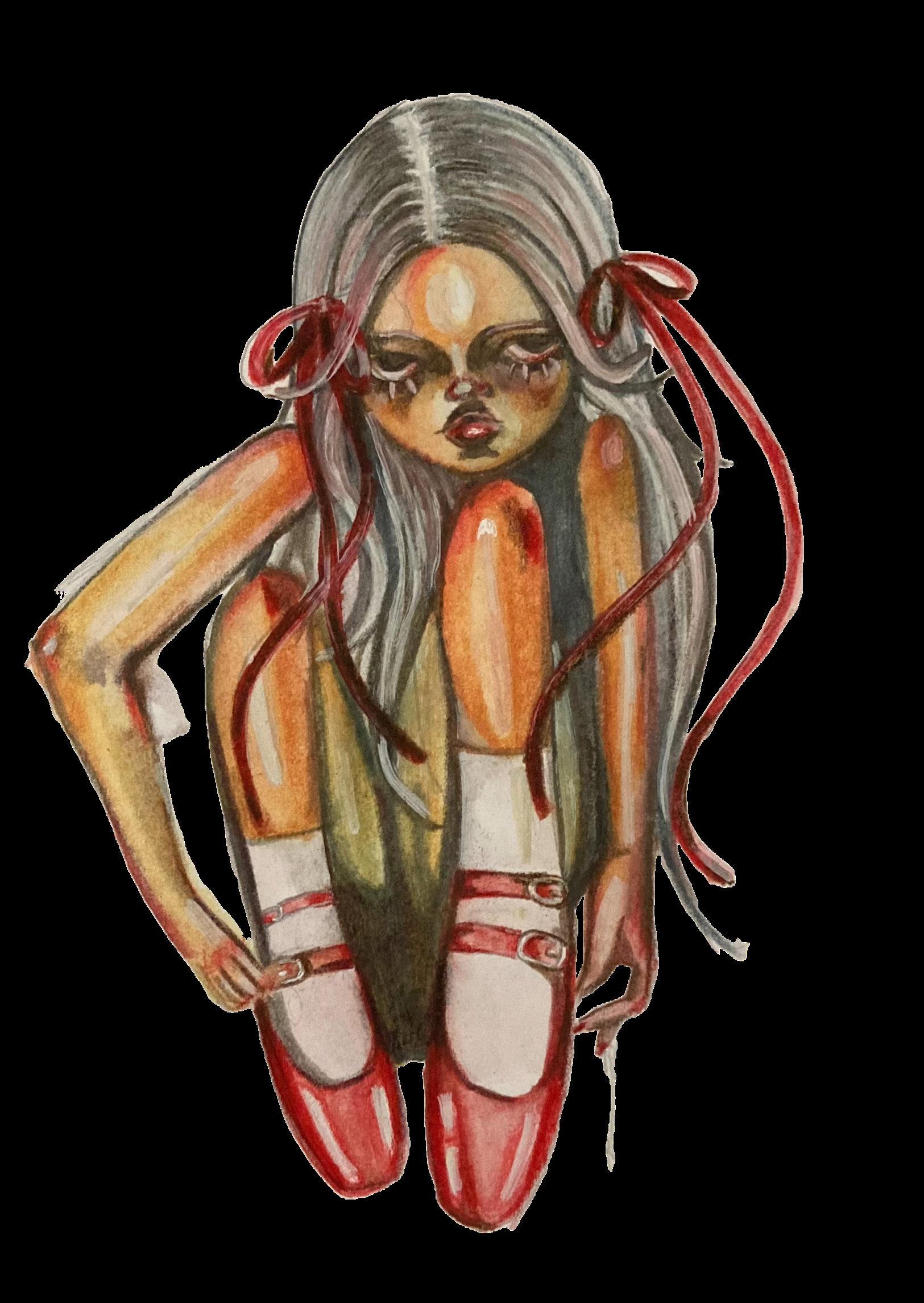
Illustration by Beca Summers
8 ‘YOUR PINK HEART’ the Satirists Working against the Chinese Autocracy One Gag at a Time by Keziah Cho
10 PLACING MODERN DISSENT THROUGH A LOOK AT GEORGIA’S ROSE REVOLUTION by Irine Teneishvili
12 FERRARI IS RED Lewis Hamilton and What this Means for the Legacy of Formula 1 by Ayra Farzana
14 SEEING ‘RED’ in Football and Beyond by Mayra Nassef
16 ROUGE, КРАСНЫЙ, ROT the Complexity of Red in European Political History by Madaleine John __________________________________
17DYSTOPIAN ROUGE
Exploring the Symbolism of the Colour Red in the Handmaid’s Tale by Lauren Welch
20 DON’T SAY CHEESE
What Susan Sontag Can Teach Us About the Bloody Aesthetics of War by Ishita Chauhan
24 RED, BOLD AND TIMELESS
A Brief History of Lipstick by Margot Chambaud
3 Pi Magazine Issue 737 ROUGE
__________________________________
__________________________________
__________________________________
__________________________________
__________________________________
a note from our editors... EDITOR’S FOREWORD
Dear Readers,
In a world filled with endless hues, Rouge holds an evocative and vibrant power that other colours just cannot rival. Its symbolism transcends the mere spectrum of colour, extending into all spheres of human existence: lust, passion, anger, love, power, even revolution. It encapsulates the tender joy of a blooming rose; the crimson hue of parted lips; the sorrow of war and bloodshed.
Throughout history, and across cultures, Rouge commands a special place. From the regal red of monarchs to the scarlet of revolution, from the of glamour to the pulse of political power. It beckons with the promise of passion and the intoxicating thrill of the unknown. Amidst its vibrant allure, rouge also carries a cautionary note, serving as a beacon for danger and warning. In this Rouge, you will find stories, art, and perspectives that celebrate Rouge in all its glory. We invite you to immerse yourself in its rich tapestry, to explore its nuances and its profound impact on our lives.
Without our section editors, Amber, Juliette, Sophie, Anders, Elliott, Meriel, Tomás, Anna, Alicia and Maria, Rouge would not be here today. Nor would it look so fabulous without our design team of Emma, Raaneem, Lucy and Shaun. A special thank you to our fantastic writers and their creativity. This entire society, let alone the publication, is forever indebted to Conor, our President, and his constant support in navigating the stormy seas of ‘colour journalism’! Finally, to our rock, our muse, our artistic administrator, to Beca, our gorgeous Design Officer, whose vision has taken this magazine from chaotic scribbles to a work of art, we love you!
Antara and Coco, Editors-in-Chief

4 Pi Magazine Issue 737 ROUGE
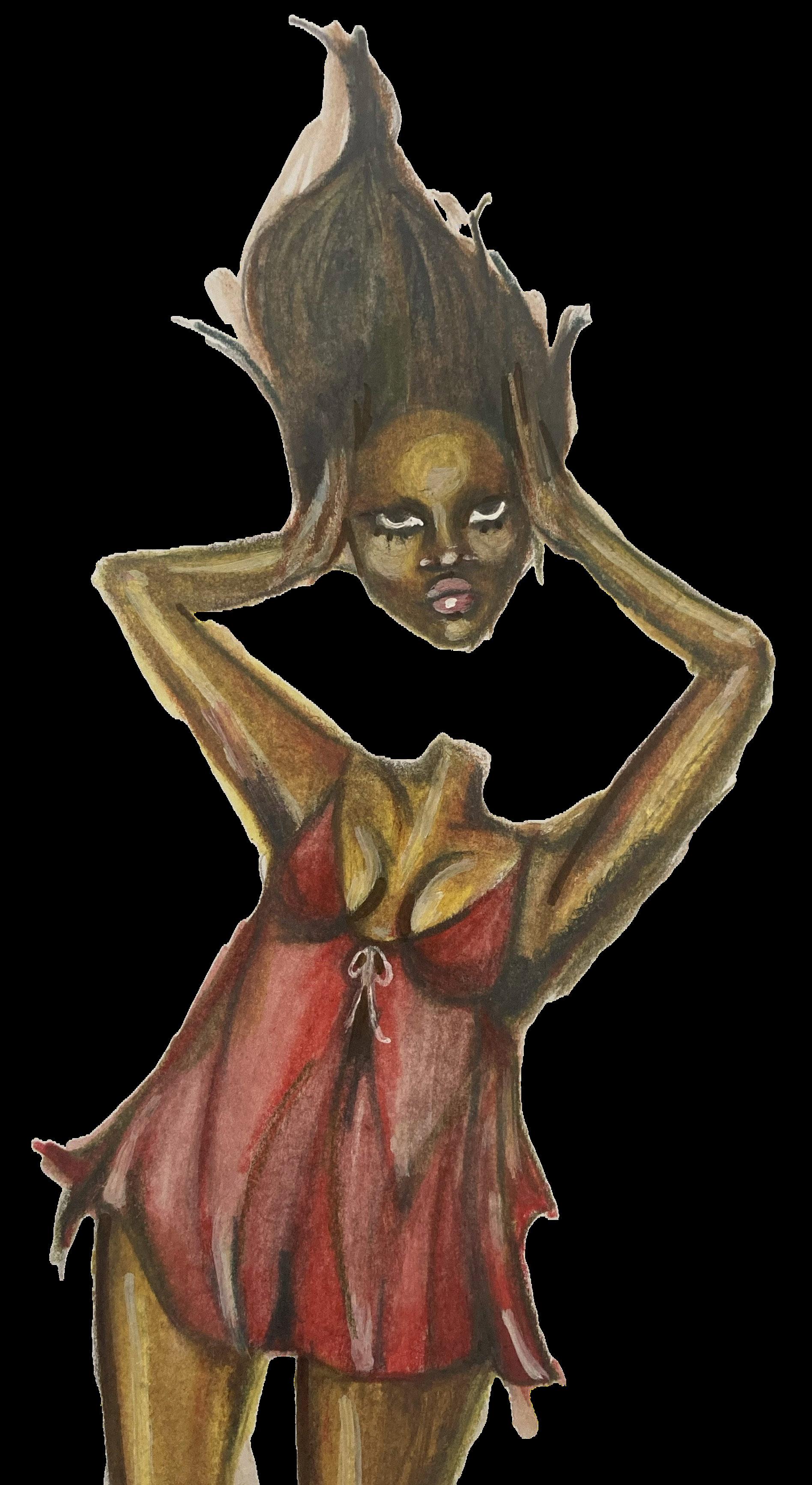
Illustration by
Shaun Phillip Murphy
“Then I turned round and saw the sky. It was red and all my life was in it.”
Jean Rhys, Wide Sargasso Sea
5 Pi Magazine Issue 737 ROUGE
issue 737 WELCOME to R ROUGE
WELCOME to Rogue 737 WELCOME to Rogue, 737 WELCOME TO ROGUE,
Pi Magazine Issue 737 ROUGE 5
Illustration by Beca Summers
6 Pi Magazine Issue 737 ROUGE
7 Pi Magazine Issue 737 ROUGE
MyRouge, YourRouge
by Ewan Alderman
Have you ever shared a beautiful moment with someone? A sunset with a lover, art with a friend, fireworks with the family? All these beautiful moments may not be as universal as once thought. Imagine the world as you know it, yet with green skies, red grass, and a lilac ocean. Quite the different experience, isn’t it? Well, this very well may be the case. You see, colour is not a fact of reality; it is not an external creation; rather, colour is entirely an invention by the self. With this creation of colour comes the complete and utter subjectivity of the world.
So, how exactly does this phenomenon manifest? Well, the human retina contains cone cells which are sensitive to the brightness of visible light and its wavelength. There are three types of cone cells, catering to their sensitivity and receptive capabilities for specific wavelengths. These cone cells are “blue”, “green”, and “red” (B, G, R), each 440, 550, and 570 nanometres in length respectively. Cone activity yields two independent processes, the electrical impulses from R cone cells contrasted with those from G, then with B against the sum of R and G electrical impulses. If both contests are tied, no colour is seen, (only white, black, or grey). If a winner emerges, voilà, colour is perceived, with differing wavelengths determining what exactly is seen. Between the 450nm of violet to the 760nm of red lies the sum of human colour experience. Beyond these, there exists ultraviolet, infrared, and a plethora of wavelengths unobservable to the human eye.
If we understand the processes of colour creation, it begs the question: where does the subjectivity of colour originate? Well, that would be our innate inability to empirically explain what we see. I cannot record the colour that you have created inside your mind.
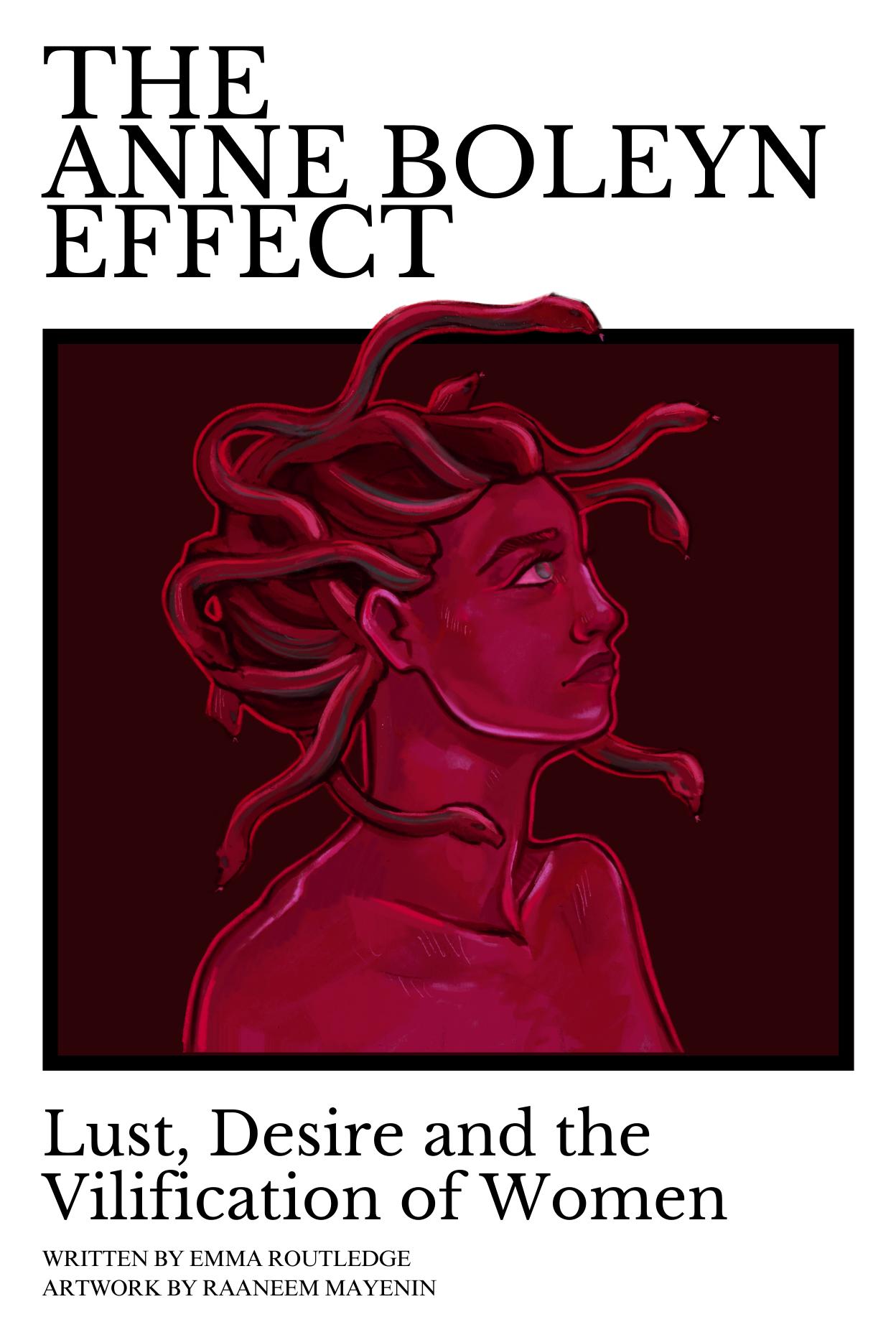
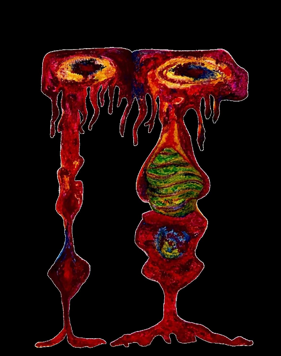
The colour of this drawing, for example, I’m certain we could agree to call it rouge. Yet your rouge could easily be my green; since we have always been conditioned to call these colours by certain names, we could communicate what we see and still never truly know each other’s individual experiences. This separation of experiences is not to be confused with colour blindness, as this prohibits the perception of certain colours, something we can quantify and record. Yet it is entirely possible that some observe the full range of colours that most of the population can also observe, but simply label colours differently, unaffecting their performance on any conceived test. This inability to record personal experience is better known as qualia. Beyond this explanatory gap, we already have scientific evidence of differing colour perceptions between people.
For instance, our cone cells are linked to our photoreceptors, which relay the cone-cell electrical impulses towards the brain, informing us of what colour we are seeing. However, the amount of cone cells and photoreceptors varies between individuals, some possess around 100 million, some possess fewer. Simply put, the fewer the cone cells, the fewer the colours. There also exists harsh gender differences in perception: many women possess the ability to more finely discriminate colours in the long-wavelength regions (reds and oranges) due to X-chromosome variations. It’s believed up to 40% of women have tetrachromatic vision, the ability to see a broader spectrum of colours. Furthermore, our inability to conform to colour perception is only further muddled by linguistic differences in colour categorisation. Within English, colours receive around 11 basic colour categories, within Tsimane, there exists 3 basic colour categories: light, dark, and red.
8 Pi Magazine Issue 737 ROUGE
Colour subjectivity and Qualia have also had an interesting history within philosophy. Renowned thinkers like Aristotle concluded that no such thing existed, believing that the relationship between an object and an individual’s perception was nonarbitrary and that our senses rarely faulted. Speaking on perception, he claims, “what is straight and white is the same for all things.”
Sextus’ empirics of the 2nd century edges towards an understanding of colour subjectivity. When investigating Jaundice, he declares, “we do not, in fact, receive identical impressions, owing to the different constructions of our senses”. However, Sextus attributes this to a physical “obstruction of the senses”, not yet recognising the subjectivity of one’s own mind. Leaping to the 17th century, the infamous John Locke encountered a similar thought: “a violet produced in one man’s mind, were the same that a marigold produces in another, and vice versa…this could never be known”.
He later admits this is unlikely, but if it were to occur, it would be the effect of a physical organ. It wouldn’t be until the 19th century that a question similar to our initial query arose; with a popular science article in the New York Times, posing the question: “Do colour-blind persons see when they speak of red, green, violet, and other colours? The question would seem quite unanswerable. How are we to tell what people see who have no common standard of comparison?”. It would seem that it was this posting that helped push colour subjectivity into the realm of popularity within contemporary philosophy and science.
“a violet produced in one man’s mind, were the same that a producesmarigold in another, and vice versa…this could never be known”.
So where does that leave us now? Philosopher Daniel Dennet believes qualia is not ineffable. Through a hypothetical string of descriptions, one may effectively convey personal experience to another, in such an accurate manner that it would be akin to observing another’s personal experience. This, of course, has yet to occur. So that is where we stand: amidst subjective externality and the crafted worlds of everybody else.
The question of colour has evolved with human curiosity, and our understanding of perception has altered radically over time. We can share a moment, you can tell me it was beautiful, and I may even agree, except we never really will, for we will never see the world through each other’s eyes. We may never truly understand each other. But maybe that is our blessing, perhaps this is our reason to keep talking, to investigate the science and philosophy of how we see the world, and to always stay curious. So, keep qualia in mind dear reader, and keep talking about those beautiful moments. We may just understand each other.
9 Pi Magazine Issue 737 ROUGE
Illustration by Shaun Phillip Murphy
P I N K Y O U R
‘Any


The satirists working against the Chinese autocracy one gag at a time
by Keziah Cho
HEART
objections?’
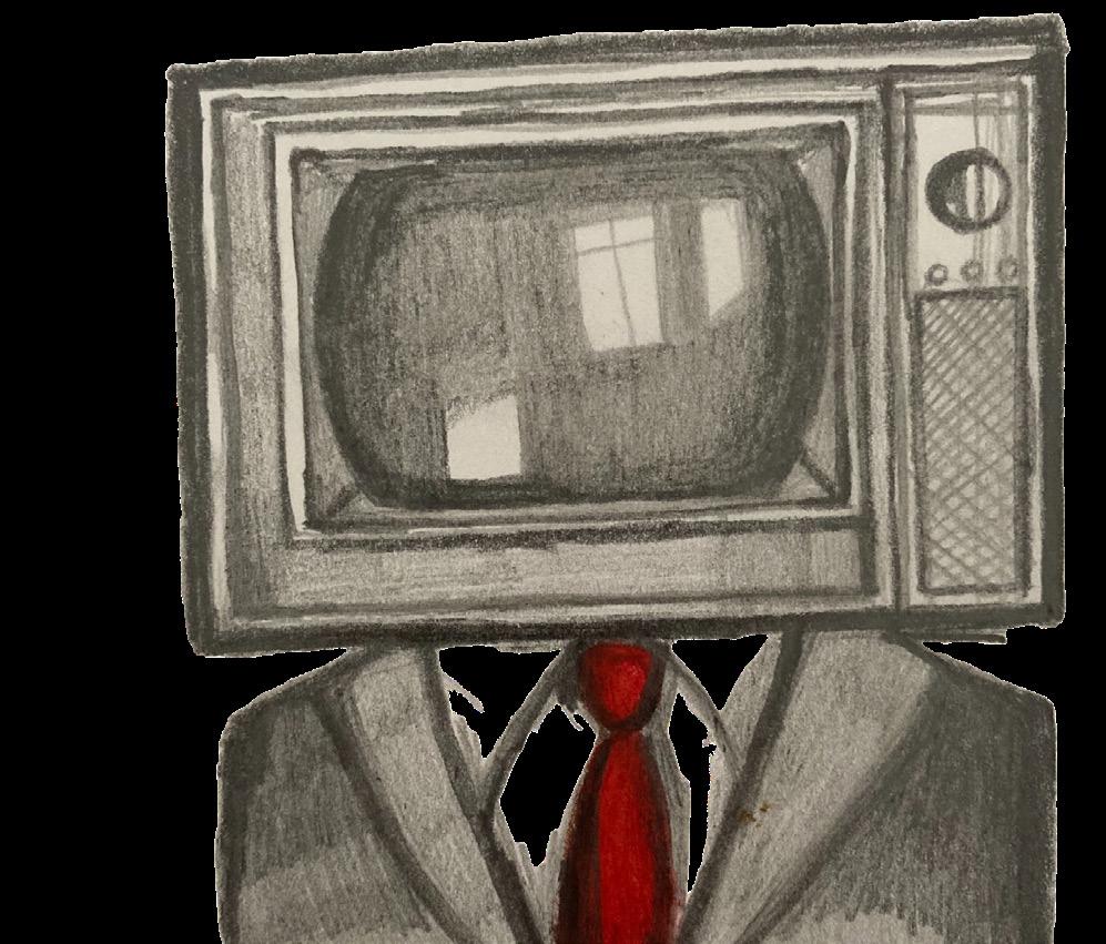
It’s a trick question, of course. The vote will be unanimously in favour of the new policy. Cries of ‘no objection, sir,’ reverberate across the hall, drawled out in that characteristic Beijing accent. The leader looks approvingly at the crowd before him. He cuts an imposing figure, clad in yellow silk robes fit for a nineteenth-century emperor—his face completely masked by a giant pixelated image of Winnie the Pooh.
Such is the scene depicted in the trailer to Chinese Malaysian satirist Namewee’s new music video, ‘People of the Dragon’. The song, which made it onto the Top 10 Trending Music Videos on YouTube in late January this year, consists almost entirely of barbed references to everything wrong with the Chinese autocracy and its supporters. By the thirty-second mark, Namewee has poked fun at mainland internet slang, the Chinese netizens’ hostility towards ‘foreign forces’, and Xi Jinping’s uncanny resemblance to Winnie the Pooh.


As the clip progresses, China’s handling of the COVID pandemic, its repeated threats towards Taiwan, and the Tiananmen Square Massacre are all referenced—all while the fluttering tune of the Chinese flute mingles with a trap beat in the background. There are more than a few references to Xi’s genitalia.
This is not the first time Namewee, born Wee Meng Chee, has created content targeting the Chinese government. The 40-year-old singer is well-versed in the political absurdities both of his home country Malaysia and of the global superpower looming directly above it. His 2021 music video ‘Fragile’ is a dig at the overly nationalistic behaviour of Chinese netizens (referred to as ‘little pinks’ for their blind endorsement of the ‘red’ Communist Party) and their tendency to take offence at the slightest things. ‘You’ve got that pure, pink heart,’ he croons, donning a pink beanie and heart-shaped sunglasses. ‘I’m so sorry I’ve made you mad again.’
10 Pi Magazine Issue 737 ROUGE
10 Pi Magazine Issue 737 ROUGE

Unsurprisingly, ‘Fragile’ has been banned in China— but that hasn’t stopped it from reaching 71 million views. Namewee has his mainlander fans, and with the aid of VPNs, some of them are able to bypass the firewall and have a good laugh at his music. And that’s not counting his staunch supporters from Hong Kong and Taiwan, many of whom can easily relate to his lyrics.
Namewee is part of a wider phenomenon when it comes to ridiculing China. From 2015 to early 2023, Taiwanese YouTube channel EyeCTV posted parodies of mainland broadcasting platforms, poking fun at their handling of Sino-Taiwan relations. There’s also American comedian Alex (LeLe) Farley, who speaks better Mandarin than I do and whose experience as an international student in China has now led him to ‘fight for a free China’. On the more literary side, there are journalists such as Hong Kong-born Chip Tsao and Mainland-born novelist Yan Lianke. The latter has won international awards for his novels ridiculing the CCP, with jingoistic titles such as Serve the People! and Lenin’s Kisses—all sporting crimson cover art in ironic homage to Mao.
In a way, satire is one of the few ways in which frustrations towards the Chinese government can be aired. In the country, direct criticism is quickly quashed. According to Human Rights Watch, for example, the White Paper Revolution in 2022 resulted in dozens of protesters being detained, and their whereabouts remained undisclosed by the authorities for months on end. Social media posts supporting the revolution were censored, while those praising the state’s handling of the pandemic were allowed to circulate widely. Political activism is suppressed even if it does not directly target state power. Last September, MeToo activist Huang Xueqin went on trial for ‘subversion of state power’ after writing about her experiences with workplace sexual harassment and empowering other women to do the same.
Satire, then, is a way of partly circumventing the censorship imposed on individuals by the state. Unlike direct criticism, it has the advantage of ambiguity.
It is, after all, hard to tell what Namewee means when in his music video he tenderly embraces the Winnieemperor figure from behind, à la Titanic. An outright ‘I hope you crash and sink’, though probably carrying the same meaning, is much more explicit—and would probably have led to his channel being shut down altogether.
That doesn’t mean humour is free from the watchful eye of the Chinese government. In April 2023, LeLe Farley was banned from China after infiltrating a pro-China rally in the US to ‘troll’ Chinese nationalists in the wake of Nancy Pelosi’s visit to Taiwan. In the same year, satirical YouTube channels GFWfrog and Voice of Chonglang were both sanctioned on the grounds of ‘bullying and harassment’. Yan Lianke’s novels, too, are banned from the mainland. Being funny may obfuscate your criticism for a while, but it does not detract from its weight.
So does being funny help at all? Not particularly, in terms of radical change. Decentralised as it is, satire alone has very little chance of initiating any massive political upheaval, especially in an authoritarian society. But they do a very good job of informing the public about current events in a digestible, more lighthearted way—and with information comes power. There’s also a sense of glee that comes from slapping a Winnie the Pooh mask on a dictator whose greatest wish is to be revered. It reduces the terrifying down to the absurd; it demonstrates that these untouchable leaders can be flattened into objects of ridicule whether they like it or not. Satire refuses to take autocrats seriously, and therein lies its greatest power.
Or maybe it was never about taking down the government in the first place. It might be more helpful to interpret humour less as a political tool and more as a reflection of public sentiment. Perhaps the fact that Namewee’s ‘People of the Dragon’ made it to a top ten trending list on YouTube says something about the deeper, darker storm clouds brewing within China’s firewall. Above all else, satire is cathartic. Suppressed anger manages to find an outlet, one way or another. If it’s forbidden to cry out in pain, the next best thing is to laugh it out.
11 Pi Magazine Issue 737 ROUGE
11 Pi Magazine Issue 737 ROUGE
llustrations by Beca Summers
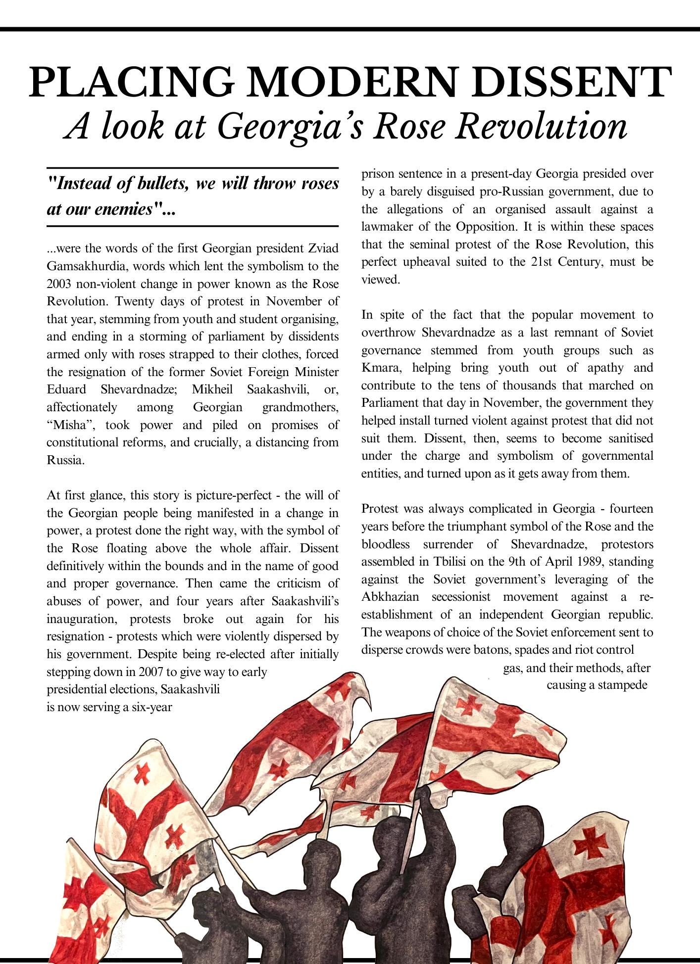
12 Pi Magazine Issue 737 ROUGE
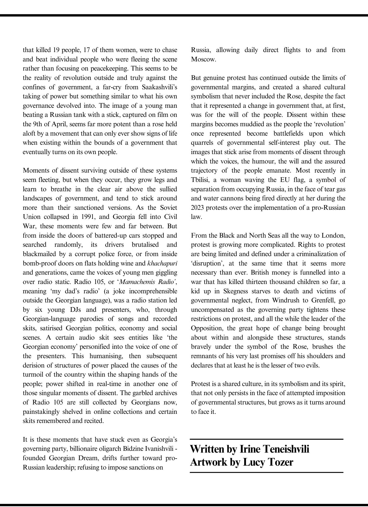
13 Pi Magazine Issue 737 ROUGE
Lewis Hamilton and What this Means for the Legacy Formulaof1.
FERRARIis red
by Ayra Farzana
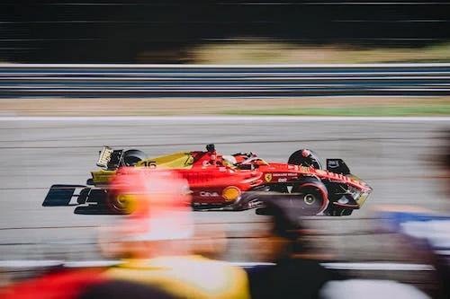
In recent news which has taken the motorsport world by storm, Sir Lewis Hamilton, seven-time Formula 1 world champion, has been announced to join Scuderia Ferrari for the next 2025 season after an astonishing 11 years with Mercedes. What does this mean for Hamilton, and what does this mean for Ferrari?
Scuderia Ferrari, the Maranello team infamous for its red livery, is widely considered to be the pinnacle of Formula 1 racing. Boasting the likes of Schumacher, Raikkonen, Lauda, Vettel, Alonso, amongst many more, Ferrari currently holds the spot as the ‘dream team’ for today’s aspiring drivers. And yet, for many, Hamilton’s announcement into the rouge team has been nothing short of unexpected.
Lewis Hamilton began racing for Formula 1 in 2008, and has since won a staggering seven world championships: the first with McLaren and the six others (2014, 2015, 2017, 2018, 2019, and 2020) alongside his long-standing team Mercedes. This incredible loyalty has thus proven to fans an inherently deep relationship between driver and team, demonstrated especially by the team principal Toto Wolff. In turn, Hamilton’s recurrent wins boosted the reputation of the team, who correspondingly won eight constructor championships during their collaboration.
14 Pi Magazine Issue 737 ROUGE
However, in a startling turn of events during the Abu Dhabi Grand Prix of 2021, Hamilton found himself defeated by Dutch driver Max Verstappen, ending his four year long winning streak. Since then, Max Verstappen has continued to take Formula 1 by storm, winning consecutive world championships in 2021, 2022, and 2023 with team Red Bull. This surely would have afflicted Hamilton and his confidence - who at the present moment still holds the highest number of F1 world championships tied with legend Michael Schumacher - as he strives to beat the world record.
Given the current rise of Dutch driver Verstappen, and Hamilton’s race to reach his eighth win before retirement, Lewis Hamilton has nothing to lose and needs every chance and advantage he can get to win the race.
This year, F1’s ‘silly season’, a term that describes the sport’s off season, was once again a turbulent time for contract renewals and cascading rumours for lost and taken seats. On 1st of February, news of Lewis Hamilton joining Ferrari for the 2025 season was announced by Sky Sports, and later confirmed by both teams, allegedly after the British driver informed team principal Toto Wolff. Despite rumours of joining Ferrari repeatedly mentioned by the press in past years, Hamilton had always reaffirmed his contracts with Mercedes and dismissed the rumours. In fact, his contract had been confirmed with Mercedes for another year ahead of 2025, making the sudden announcement very shocking news for fans and news agencies.
Many fans have found humour at imagining Hamilton adorned in the bright red colours of the Italian team, whilst others have turned to comparing Hamilton’s joining hands with Ferrari with that of American-musical ‘Hamilton’ through a series of fan made edits. More importantly, Hamilton’s transition into Ferrari in the late stage of his career could provide him the opportunity to move up the ranks to beat Verstappen. A collaboration between Formula 1’s current most experienced driver, and the renowned ‘dream team’ deserves the title of one of the most interesting and unpredictable forces of any racing career.
Whilst many questions remain unanswered as to why Lewis Hamilton - known for his strategy and privacy - announced his leave earlier than usual contract announcements, many believe that Lewis Hamilton may be investing in better machinery.
Not only is Ferrari the emblem of Formula 1 and cars entirely, but the early stages of the 2023 season proved the team to still be capable of winning a world championship. With its current racers Charles Leclerc and Carlos Sainz, Ferrari reinforced itself as a reputable competitor with Red Bull, chasing behind Max Verstappen.
As the stakes are unexpectedly high for the driver and team, all eyes are drawn to their performance as the 2024 racing season commences in Bahrain this 29th of February. Rumours of contract changes are guaranteed to spark throughout the season, as other drivers will be impacted by the seat changes. Namely Charles Leclerc, who will race alongside Hamilton after a multi-year contract with Ferrari, and Carlos Sainz, who is being replaced by Hamilton at the end of this season and whose current future remains unknown, and George Russell, Hamilton’s current partner at Mercedes.
“Ask a child to draw a car, and they’ll color it red. I think that’s what you need to know about Ferrari”
Enzo Ferrari
Formula 1 continues to grow in popularity, and a larger audience will likely tune into the sport since the shocking news about Hamilton transcended the racing community. Lewis Hamilton has not only proven to be an exceptional driver, but now shoulders the most pressure as to changing the terms of Formula 1 history altogether - will he win that eighth championship and become the world’s greatest driver? Will Red Bull and Verstappen’s longstanding streak of winning a Grand Prix be broken? Or, will Hamilton be forced to face a disappointing retirement like many who came before him?
Tune in this weekend to find out. As always, Forza Ferrari Sempre.
15 Pi Magazine Issue 737 ROUGE
SEEING ‘RED’ IN FOOTBALL AND BEYOND
 by Mayra Nassef
F ootball incites passion globally. It is a uniquely famous sport that unites as well as divides supporters. After living in Rotterdam for three years, home of one of the most notorious football clubs (FC) in the world - Feyenoord - it became clear to me that there is much more to this sport than just blind passion.
As a city and FC known for “hooliganism” with police cars stationed in most public places on match days, I would always opt to stay home every time there was a match in fear of the potential violence that would break out before and/or after the match. Whilst this type of violence has become increasingly regulated, in the past year, an increase in football-related violence has been observed in Europe. Instead of writing this off as the actions of crazed hooligans (amongst other heavily loaded terms to describe offenders that veer on classism), it is perhaps more useful to understand why this is happening and where it’s coming from.
Collins dictionary describes the “football hooligan” as a noisy violent supporter, but football hooliganism is a catch-all term for generally obnoxious football fan behaviour - particularly violent behaviour. Hooliganism can range from verbal abuse, attacking other people, to throwing things on the field. It’s not an easily definable concept. It is a loaded word that has been over-used in the media to over-sensationalise, spread moral panic about, and generally exacerbate the issue. However, as the Euro 2024 looms, concerns have arisen due to recent rises in fan violence, especially in the UK. Whilst laws are being introduced to counter this surge, their efficacy is yet to be seen. Younger people in the UK seem to be exhibiting this behaviour especially after the lockdown seasons, marked with an increased correlation with the use of Class-A drugs.This does not come out of nowhere.
16 Pi Magazine Issue 737 ROUGE ___________
Illustration by Shaun Phillip Murphy
Pi Magazine Issue 737 ROUGE 16
Many blame the English for football-related violence, using the term “English disease” to describe the increase in violence amongst football fans after the internationalisation of English clubs. Particularly after the spread of the imitation of firm behaviour in European ultras after several bans of English FCs in the 70s, namely heeded by Leeds United and Manchester United. This came to a head with the Heysel tragedy of 1985 in Brussels, when Liverpool fans surged into Juventus fans, causing a wall to fall down and crush 39 supporters.
This finger-pointing as to who caused the rise in football violence misses the mark on the wider structural issues that are to blame, and is based in a disproportionate focus on English resources compared to limited coverage on other European countries. Despite all of this resentment, many measures were put in place to decrease football violence, including raising ticket prices, creating designated sitting areas, sending more police officers, and installing fences. Whilst successful in preventing trouble during the actual matches, it did not deter people from engaging in violence outside the stadium.
This is not just about football
.
For this reason, we shall shift our attention to Rotterdam, a previous home, and a place where I witnessed this violence firsthand.
19 November 2021. I had just come out of the cinema, and saw many police cars coming towards me. I didn’t think much of it. This often happens in Rotterdam. I turn a corner, and see it - large swathes of people setting fire to police cars. While I thankfully got home safely, it was an unexpected riot responding to COVID-19 restrictions. Clearly, the police had not anticipated it either, and were having trouble controlling the chaos; many were injured that night after the police opened fire. It was no surprise to me then that much of the violence was said to have been linked to and spurred by “football hooligans”. On the following day, violence broke out across other Dutch cities due to the inaccessibility of football matches. One year later, in late November 2022, riots broke out again after the Moroccan world cup win.
The Netherlands has followed a post-war trajectory similar to the UK when it comes to violent fan behaviour. Rotterdam is one of the poorest cities in the Netherlands, with one of the poorest neighbourhoods in the country (Crooswijk). Despite this, the city’s sports policy aims to help the unemployed and minorities. For example, the Sport Steward Program (SSP) works to divert disadvantaged young people away from violence and crime. Whilst these efforts are commendable, Rotterdam is neglecting its working class through gentrification strategies, and its new brand as a city for entrepreneurs. This exclusion is bound to come out in dissent through what is deemed to be “football hooliganism”.
Football-related violence is a political and sociocultural tool of working class upheaval and anger. In fact, the majority of football match attenders tend to be working class - especially in the UK - and this matters. In a post-COVID climate, the economy has been hit hard; we have been plunged into a near worldwide recession that has increased inflation to practically unlivable levels. Inequality is pervasive, and class issues are at the forefront of that. The rise in populism parallels this, as well as an allegiance between many “hooligans” and farright groups. Football has become intrinsically political, and these angry, dissenting supporters are being targeted - and recruited - by the far-right. Violence in matches has been linked to socioeconomic duress, and whilst it is inexcusable, it should be understood as a symptom of a larger issue at play.
On the other hand, football fans - similarly to other fan groups - can foster community in an increasingly fragmented society where subcultures have been commodified and have all but disappeared.
Instead of pointing at “football hooliganism” as many media outlets do, using it as a scapegoat for crime and unrest, it is integral to see the larger systemic issues that are actually causing this to occur. It’s not just football, it’s a representation of socioeconomic conditions. Football mania is here to stay, but perhaps now more than ever, an FC supporter’s role is diminishing as the sport becomes more commodified and fan behaviour becomes more digitalised. How this will translate as a tool for social commentary is yet to be fully seen.
17 Pi Magazine Issue 737 ROUGE
Pi Magazine Issue 737 ROUGE 17
КРАСНЫЙ,ROUGE, ROT:
by Madaleine John

Red is a colour with many meanings. It has classic connotations of lust and passion, anger and blood, wealth and dominance. Yet, red also resides in the world of politics.
To this day, the political left provides red with some of its most powerful images, evoking ideas of extremism and, perhaps, terror. Here, its archetypal implications of dominance, anger and blood serve as pervasive characteristics of the legacy of red in Europe’s political landscape.
Red is a multi-faceted colour, and its various meanings are further complicated and developed by the throng of interpretations immortalised in art, literature and film that reinforce each one of them. Modern media certainly amplifies this, exacerbating the tangled political connotations of this visually striking and diverse colour.
The story of red’s leftist political prominence starts with “rouge” in France, where bonnets rouge, worn by revolutionaries, became an iconic image of the French Revolution. Featuring heavily in art of the period –including Antoine-Jean Gros’ Figure allégorique de la République (circa 1793) and Eugéne Delacroix’s La Liberté guidant le people (1830) – they served as a formidable form of propaganda. Eventually, the colour bled into flags brandished by the Jacobins, providing the beginning of a particularly extreme political connection.
_______
The Complexity of Red in European Political History
As well as in art, red as a colour representative of the French Revolution appears in other modes of expression. Maybe the foremost retelling of the event in pop culture comes from Les Misérables, originally a novel by Victor Hugo which has seen an array of adaptations, both on stage and screen. The popular film stars some of Hollywood’s biggest names, including Anne Hathaway, who received an Academy Award for her role in 2013. While the well-known movie also plays with red as a sexual colour, especially in association with the character Fantine, its political connotations in all forms of the story are undeniable. Bonnets rouge make an appearance - but, more obviously, the red flag flies high, furthering its status as an irrefutable symbol of the revolution.
Since its initial importance in the 19th century, the red flag has been developed by numerous political groups, providing a backdrop to many movements and eventually becoming a symbol intrinsically linked with socialism. More recent centuries have seen this flag, and, consequently, its colour, contort into an ominous emblem of repression, savagery and dread.
Over the past 107 years, Russian political history has come to be defined by several things: tyranny, oppression, and the colour red. Only beginning with the flag, red kept a near-constant presence in countless aesthetic aspects of the Russian government throughout the 20th century, including in uniform, military symbols and propaganda. But the relationship between the colour and the Soviet Union runs far deeper than a mere image of the regime.
18 Pi Magazine Issue 737 ROUGE
_______________
Emma Mouiliere
Photography
courtesty of
Instead, red became the regime.
During the existence of the USSR, “red” and “Soviet” became largely synonymous - “Red” Terror, “Red” army, “Red” scare - and in many countries today, the residue of this colour is still palpable.
There is no shortage of media exploiting this obvious link between politics and colour, with many filmmakers drenching their Bolshevik-centred work in a deep red. Armando Iannucci, however, in the 2017 film The Death of Stalin - dealing with Joseph Stalin’s death and a questionably handled power vacuum in the Politburoutilises a more subtle aesthetic approach.
Unlike other works, red possesses a looming presence throughout the film. It grips the arms of Stalin’s government, lines the floors of buildings, and is used as accents in bouquets, encapsulating the menacing omnipresence of the regime: red is everywhere, red is oppressive, and red is suffocating. Every aspect of life is controlled by the Communist authorities, even to the point of causing serious angst to those in charge themselves.
While the strongest political association of this colour arguably lies in the USSR, their close enemies and contemporary far-right regimes have also come to be remembered in a similar colourway.
The name “National Socialism” holds little resemblance to socialism in the way most people would recognise, but what many can distinguish is their infamous symbol: the swastika. Posed against a sinister red background, a great deal of the symbolism of red within the context of the Nazi occupation relates to the idea of blood. Nazi ideology centred largely around concepts of “racial purity” and eugenics, so a dark fixation on this fluid feels uncomfortably apt. The red flag supposedly elicits such ideas, with phrases like “Blut und Boden” (“Blood and Soil”) constituting the early rhetoric of the group before it consolidated power.
Although the Nazis utilised the powerful connotations of red as blood, many filmmakers choose to defy this idea, refusing to engage with it in the same way. Steven Spielberg’s Schindler’s List features barely any colour at all (save for a young girl in a red coat - more representative of innocence and the needlessness of war), and Roman Polanski’s The Pianist gradually drains the colour from its frames as the narrative progresses.
Other adaptations appear to lean into Nazi imagery, immersing themselves in red. Quentin Tarantino’s Inglourious Basterds is a prime example of this, culminating at the pivotal point of the movie, where leading Nazis (including Adolf Hitler himself) gather at a screening of a propaganda film in Paris. Here, Tarantino juxtaposes red with itself: Shosanna Dreyfus, the heroine of the story, wears red to represent ‘Jewish vengeance’ as she burns down a cinema, laden with Nazi memorabilia in its signature colour - yet another menacing red.

Tarantino’s film seems to encapsulate the general complexity of red and its many meanings, each one contrasting and conflicting. On one side, red represents the most famous instance of European revolutionary freedom, but on the other, it illustrates the very nature of oppressive yet directly antagonistic regimes that killed millions. While the connotations of this colour appear multi-faceted and intricately confusing, one thing does not: red certainly holds an important legacy in the political landscape of Europe.
Illustration by Shaun Phillip Murphy
19 Pi Magazine Issue 737 ROUGE
Dystopian Rouge
Exploring the symbolism of the colour red in The Handmaid’s Tale
by Lauren Welch
‘The colour red can mean love, blood, life, royalty, good luck- or sin’...
In Gilead, Handmaids are forced to wear long, modest red dresses to illustrate their function in society: bearing children for the Commander and his wife, the elites of this dystopia. Offred, the protagonist of the novel, describes herself as having been ‘dipped in blood’ due to the overpowering presence of red in her attire. The association of the prescribed red dress with blood symbolises the danger each Handmaid faces: if they cannot conceive a child, they will be sent to ‘The Colonies’, a place contaminated by radioactive waste after nuclear disaster, where they will suffer a horrific death. Therefore, Offred’s red dress is a continual reminder of the looming threat that awaits her should she fail to fulfil their role in the regime.
...states Margaret Atwood in an interview with the Guardian detailing her visit to Afghanistan and the cultural significance of clothing and colour in regards to the chador - a traditional garment worn by some Muslim women. The obscurity as to the ‘true’ meaning of the colour red, if a definition even exists, exposes a whole new dilemma concerning Atwood’s masterpiece The Handmaid’s Tale. Red is used repeatedly to describe the dystopian world, and often gives insight into the machination of the totalitarian regime and the plight of those who are oppressed by it. It is evident that the colour red is used symbolically, but what does it actually represent?
The blood connotation is also a reference to the menstrual cycle, and emphasises how Handmaids are dehumanised by their role. They are valued purely for their fertility, reduced to ‘two-legged wombs’, according to Offred. They have been stripped of individual agency and identity, used purely for their biological functions. The arrival of menstruation typically denotes a failure to conceive, and so in Gilead menstrual blood is shameful, as it means the handmaids have failed in their duty. Moreover, in this theocratic regime, the Old Testament is used to justify their oppressive doctrines: in Leviticus, menstruation is described as ‘unclean’, therefore magnifying the shame surrounding this natural process. By representing menstrual blood, the red dress symbolises the ignominy a Handmaid will face if they do not become pregnant, thus embodying their persecution.
20 Pi Magazine Issue 737 ROUGE
The Handmaids are shamed not only by the connection between the colour red and blood, but also because their red dresses unmistakably resemble sexual sinners such as Mary Magdalene, the biblical prostitute. Despite the lack of any control the Handmaids possess over their lives, they are still seen by many others as promiscuous, dishonourable women, instead of powerless victims who are raped monthly and will be executed if they dissent against their role. The use of religious iconography relating to Mary Magdalene to encourage shame towards the Handmaids sustains the oppressive regime, turning women against each other. The wives of the Commanders often speak derogatively about the Handmaids’ supposed ‘sexual sins.’ Dividing women enables the misogynistic, totalitarian state to continue repressing human rights.
The Handmaid’s Tale draws many parallels to Nathaniel Hawthorne’s The Scarlet Letter. The red dress the Handmaids wear is intentionally evocative of the scarlet ‘A’ Hester Prynne is forced to wear on her chest due to her sinful adultery. As a physical manifestation of her sexual sin, it is comparable to the Handmaids’ red dress symbolising their sexual role in Gilead.
Both Hester and the Handmaids are characterised solely by their sexual sins, and both have limited freedom to defend themselves in their intolerant, religious societies, risking severe punishment if they dissent against the doctrines of their respective communities.
The Handmaids’ red dresses are also reminiscent of what prisoners of war in Canada wore during World War II, illustrating how the Handmaids have become victims of political unrest and violence, much like how prisoners of war are victims of uncontrollable conflict and global upheaval. Both the prisoners of war and the Handmaids are powerless in their situation.With little hope of escape and freedom, they are completely at the mercy of their oppressors. Therefore, the colour red in The Handmaid’s Tale also symbolises the oppressive power which annihilates the agency and freedom of the individual.
In The Handmaid’s Tale and beyond, the colour red, symbolises a multiplicity of meanings. However, it is primarily an emblem of the dangers totalitarian regimes pose to human rights and liberties. The iconic status of the red dress still holds incredible power to this day, donned by pro-choice protesters across the world as they campaign for women’s sexual rights.


21 Pi Magazine Issue 737 ROUGE
Pi Magazine Issue 737 ROUGE 21
Illustrations by Beca Summers
DON’T SAY CHEESE What Susan Sontag Can Teach Us About the Bloody Aesthetics of War
by Ishita Chauhan

War media constantly surrounds us. When we check our feeds in the morning, when we absently flip through channels and when we pass newspaper stands, sprawled with devastating headlines and harrowing photos. No other generation has seen so much suffering from afar, in so much detail. I don’t think we were ever meant to. The genre of war photography speaks to the long-standing belief that to remember is to be humannostalgia, memory, remembrance, history, memento mori. Photographs form the backbone of “remembering”, and by praxis, are invaluable for documenting war-related atrocities, in the interest of both remembrance and protest. But as Susan Sontag asks in Regarding the Pain of Others, one wonders “What does it mean to protest suffering, as distinct from acknowledging it?”
The urge to document war transcends time and place. 10,000 years ago our Mesolithic-era ancestors drew stick figures fighting each other in the Bhimbetka caves, situated in what is now India. In prehistoric red ink, they depicted bows and arrows, men poised in action, and barbed spears with the conspicuous intention to hurt. This may be the first visual representation of war, with these cave paintings forming the prototype for every piece of war media to exist since. Eventually, the stick figures turned into more complex paintings and the caves turned into art galleries. The advent of the portable camera meant galleries could display photographs too, and soon the digital revolution brought these photos to screens of all sizes, in every room in the home.
_________________________________________________________________________
_________________________________________________________________________
Pi Magazine Issue 737 ROUGE 22
Photography courtesty of Aadithya Gowrishankar

What’s the point of depicting suffering? First and foremost it’s an imploration: “please don’t ever let this happen again”, with reference to the depravity of war. There’s the noble idea that showing the extent of war’s wretchedness will lead to intervention and therefore liberation. Photos do this best, as they can be lawful evidence in a way that paintings and spoken word cannot. As Susan Sontag points out in Regarding the Pain of Others, photos are simultaneously an “objective record” and a “personal testimony”. It’s as important as ever, however, to remember that photos can be misconstrued, altered, exaggerated. Things are not as simple as photos and videos equalling facts, or neutral documentations. For example in spring 2022, an AI deepfake went viral of Ukrainian president Zelensky surrendering. This was not an isolated incident; the OECD AI Policy Observatory reports that occurrences of unethical AI use among digital security and governments multiplied by more than 15fold between January 2022 and January 2024.
An intersectional analysis shows us race matters in war photography. Sometimes faces are blurred, but more often than not every grimace is a punctum point. When it comes to photographing the dead, our media rarely shows the faces of dying soldiers from the West. They are obscured out of respect. This privilege is not extended to war casualties from far-away, “exotic” places; Sarah Sentilles wrote in 2018 in the New York Times, “dead Iraqis, dead Afghans, dead Syrians — yes, we saw those bodies, blown up and bloodied, buried in rubble, partly covered by sheets — but not dead Americans”. The further away dead civilians are, the more likely we are to see their faces. Cultural proximity and tolerance for the display of suffering are interlinked. This creates a subliminal wedge between “us” and “them”, but suffering is suffering no matter where it’s happening.
“shock can become familiar. Shock can wear off… As one can become habituated to horror in real life, one can become habituated to the horror of certain images”.
We can see the clearest first-hand recounts of war: a daily influx of children’s faces in Gaza, hourly updates of destruction in Ukraine, details of sexual war crimes in Sudan – it’s before us in a constant stream of tragedy. This stream is gradually eroding at how we respond to war. It’s a slow, subconscious desensitisation. As Sontag puts it, “shock can become familiar. Shock can wear off… As one can become habituated to horror in real life, one can become habituated to the horror of certain images”.
Consider the case of cigarette packaging. In the early 2010s countries started printing grotesque photos and bold warnings on cigarette packets in a bid to deter young people from smoking. It was found that these photos did in fact shock some people into stopping. But it’s important to wonder: for how long? At what point do people become numbed to those painful photos? What happens if someone sees “Smoking Kills” every other day? What happens if someone grows up seeing war in the news every day?
The other side of this desensitised apathy is a morbid voyeurism in looking at war, which Sontag also discusses. War-zone tourism is the most up-front example of this, such as Against the Compass Expeditions who have an upcoming tour of Syria in May 2024 - it’s currently sold out. However there are tamer, more subconscious examples of eager responses to war media too; people tend to read the most bloody news in newspapers first, it’s what draws them in by the collar. As for online, the Reddit community r/CombatFootage has 1.7 million members, who post and discuss footage from current wars daily.
No one reading this has ever lived in a world without war. War feels perpetual, and so the desensitization elicited by modern war media cannot be ignored. Of course we can’t care about everything all at once, it’s unrealistic and will lead to compassion fatigue. However when there is literal photographic evidence of inflicted suffering, antiwar sensibility asks us to take a step back and examine what we can do.It feels apt to end here with another Sontag quote,, “compassion is an unstable emotion. It needs to be translated into action, or it withers”.
Pi Magazine Issue 737 ROUGE 23
Crimson
by Margot Chambaud
Tales Lipstick’s Evolution and Revolution.


As ancestral as it is divisive, the history of lipstick is one of both beauty and rebellion. Lipstick is a symbol of emancipation for some; an emblem of conformism for others. Beneath its superficial airs, lipstick bears witness to the evolution of women in the public space, and serves as a cursor of society. ‘A tube of red doesn’t change the world, of course, but it can tell its story’, says Rebecca Benhamou, author of Sur la bouche.
From Cleopatra and Elizabeth I to Marilyn Monroe, the seemingly simple gesture of femininity transcends mere aesthetics, and finds itself at the crossroads of cultural, political or symbolic wars in different epochs. What other product can boast of carrying such diametrically opposed messages so persistently through time?
The Origins of Lipstick
It is believed that around 5000 years ago, the ancient Sumerians were the first to coat their lips with vermillion, using paste, crushed from lead, precious stones and insects. The practice was primarily tied to religious rituals, most likely symbolising purification, protection, and used to invoke the favour of deities.
Ancient Egyptians used a mix of crushed carmine beetles and ants as pigment. Wearing lipstick was synonymous with social prestige, and customary amongst royalty and the upper class. In Ancient Greece, on the other hand, any woman who dared to flaunt red lips - using crushed blackberries - was considered a prostitute, an outcast, or a person of dubious morals, revealing the earliest hints of societal constraints dictating women’s cosmetic choices.
Over a millennium ago, the Chinese crafted lipsticks from beeswax to safeguard the delicate skin of the lips, a practice which later evolved during the Tang Dynasty (618–907 CE), when they incorporated scented oils. While primarily used cosmetically, some women wore lipstick as a symbol of their marital status, and certain formulations were believed to have medicinal properties. Meanwhile, in Australia, as part of puberty rituals, Aboriginal girls adorned their mouths with red ochre.
24 Pi Magazine Issue 737 ROUGE
Illustrations by Raaneem Mayenin
Red Renaissance
During the Middle Ages, the Church prohibited lipstick, equating the act of painting one’s face with defying God and, in some instances, associating it with being a child of the devil. It wasn’t until the 16th century that Queen Elizabeth I, arguably one of lipstick’s most famous adepts, popularised its use. Her distinctive make-up, characterised by a stark white complexion, left an indelible mark on the fashion of her time, making it a widespread trend that endured until the end of the 17th century. Despite its contemporary association with femininity, lipstick was a beauty trend embraced by both men and women during this period.
When traces of lead were discovered in the lipstick pigments used by Elizabeth I - a factor that reportedly contributed to her deteriorating health - innovators of the time sought alternatives. This exploration led to the creation of non-toxic lipstick, and natural ingredients like red fruit, veal marrow, cucumber ointment and vinegar wax were among the substitutes tested in this pursuit.
The Birth of Modern Lipstick
New York, 1912. 20,000 suffragettes dressed in white, marched to demand the right to vote, and the vast majority of them wore lipstick. This collective act challenged the norms prevalent in the 18th and 19th century, when the overt use of cosmetics had been considered brazen and uncouth and was mainly associated with marginalised groups like actors and prostitutes.
It was not until 1915 that the American Maurice Levy created the first bar of lipstick we know today. He put an end to the application of pigment wrapped in paper with a finger or brush, by designing a metal cylinder equipped with a small lever. By 1920, this iconic feminine tool had become a permanent fixture in the daily lives of women in most of Europe and the US, and its advertising placements were, and remain, countless.
A Weapon of Mass Seduction
According to Sarah Schaffer, the author of Reading our lips, lipstick was a tool for propaganda during World War II. By 1941, it was compulsory for women serving in the U.S. Army, and remained so until the end of the conflict. Lipstick was considered war paint, insidiously urging working women to maintain their femininity as an act of patriotism.
For the Nazis, it was a symbol of the debauchery of the Western model, and Hitler explicitly forbade all women around him from wearing it.
In the 1950s and 1960s, lipstick was considered an essential component of the good housewife’s make-up kit, associated with elegance, femininity and Hollywood glamour, modelled by icons like Marilyn Monroe and Audrey Hepburn. These women’s enduring status as sex symbols continues to influence contemporary culture, affirming the timeless appeal of mid-century aesthetics and the symbolic connection between red lipstick and empowerment.
Gesture of Discord
The 1970s were not as welcoming of lipstick: hippies and second-wave feminists, amidst the sexual revolution of the era, considered it obsolete and archaic. While Goths embraced black lipstick, subverting conventional expectations of plump attractiveness, the mainstream witnessed a shift towards a more natural and subdued lip.
While pastels and brown lips dominated 80s makeup, red also staged a remarkable comeback. Madonna popularised M.A.C’s Russian Red shade by wearing it throughout her Like a Virgin World Tour. Red lipstick, sported by businesswomen and pop icons alike, became a powerful means for women to reclaim control over their hypersexualised representation in consumer society.
Lipstick: A Mirror of the Times
In today’s age of hyper-consumerism, the market is saturated with an unprecedented variety of lipstick shades. In 2015, Kylie Jenner’s highly pigmented, long lasting lip kit sold out in minutes. In 2019, neon lips dominated the runways of New York Fashion Week, and vibrant shades of fuchsia, orange, and intense purple were integrated in the launch of Rihanna’s popular Fenty Beauty collection.
In a world where women’s appearance has always faced scrutiny, the choice to wear or abstain from lipstick goes beyond beautification. Depending on the location and century, this visual statement signaled flirtation, social status, and either societal resistance or conformity. So, the next time you put on that red lip, or notice it on someone else, remember that its history is far from anodyne. As Claudia Marschal reminds us, “lipstick is a language”, speaking to both personal and collective narratives, allowing us to identify the spirit of the time.
25 Pi Magazine Issue 737 ROUGE
MEET THE TEAM

PRESIDENT
Conor Walsh
MAGAZINE CO-EDITORS IN CHIEF
Antara Basu & Coco Kemp-Welch
ONLINE CO-EDITORS IN CHIEF
Aidan Dennehy & Tricia Teo
FRONT AND BACK COVER PHOTOGRAPHY
Aadithya Gowrishankar (front) | Abisola Rutter (back)
PITV CO-EDITORS IN CHIEF
Alexia Mihalia & Staś Kaleta
SOCIAL MEDIA OFFICERS
Eleonora Anzalone & Zoë Dahse
EDITORS
Beroza
Meriel Wehner
Cia Kohring
TREASURER
Tarisha Kaushik
DESIGN OFFICER Beca Summers
DESIGN TEAM Raaneem Mayenin
Shaun Phillip Murphy Lucy Tozer Emma Mouiliere
EVENTS OFFICER Priya Maiti
MARKETING OFFICER
Hamish Kennedy
WELFARE OFFICER
Audrey Miu
27 Pi Magazine Issue 737 ROUGE
Anders
Anna
Audrey
Juliette Rapp Alicia
Elliott
Cleary
Miu
Doran
Hollingsbee Madeleine Robertson Rabiyah Daulatzai
Staś
Tomás Quintino Gouveia Maria Levina Sophie Roger
Kaleta
Emily Whitchurch Amber Dunmore


Fin.


 by Mayra Nassef

