A G E S
M I D D
In the early beginnings of printing, printers aimed to have their typefaces imitate handwritten lettering forms; they wanted their printed works to look as if it was handwritten by a scribe. As a result, many typefaces used were based off of older lettering forms, such as Celtic Uncials.
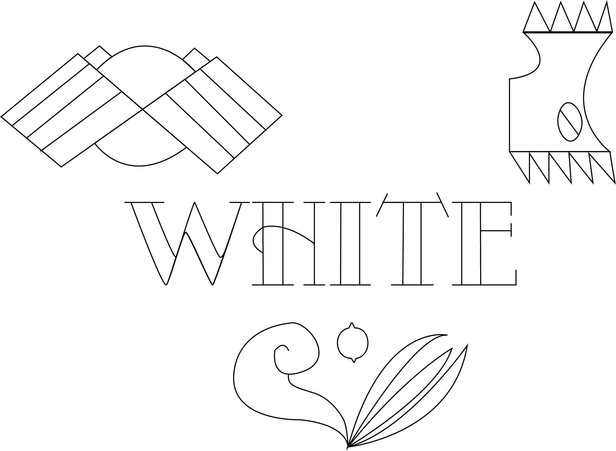
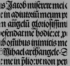
Throughout the Renaissance, several different typefaces were introduced by various people. One of these individuals include English printer William Caxton. He created the Bartarde font,used above. This font is a combination of the Rotunda and Gothic Textura lettering forms.
The topic of this unit was “Lettering during the Roman Empire and the Middle Ages.” For this page composition, I focused on typography during the introduction of the printing press. The font I decided to trace was the Bartarde font, which is also shown in the vector image. My abstract on the bottom right represents mirroring/imitation; this expresses how printed works had typefaces that imitated handwritten lettering forms.
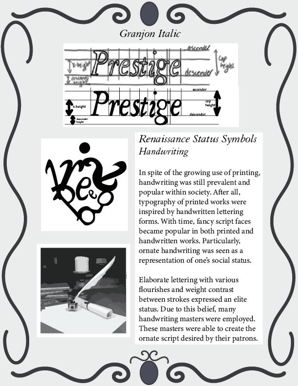
This unit focused on the Renaissance. My topic for this composition was “Handwriting as a Status Symbol.” To express this idea of status symbols, my choice word was Prestige and I chose to use Granjon Italic as my font of choice. The vector image showcases writing materials from the Renaissance and the abstract combines all the letters from my choice word.
R E N A I S S A N C E
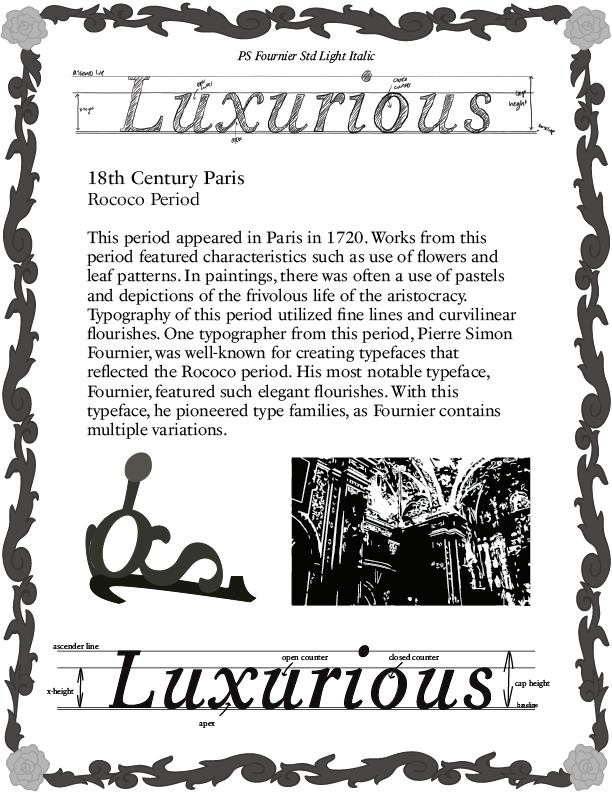
RThis unit focused on typography during colonization and industrialization. My topic was the Rococo period. To exemplify the elegance of this period, I used a font from the PS Fournier type family. I also used a floral border and an abstract that looks like a tiara. My vector image also features some Rococo architecture.
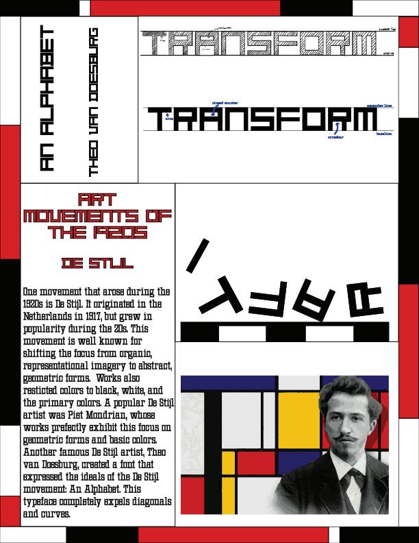
This unit focused on early 20th century typography. My topic was the De Stijl movement. The font I chose was An Alphabet by Theo Van Doesburg, which expresses the geometric forms used in De Stijl. My abstract showcases a transformation of letters, to express how the De Stijl movement transformed artist’s ideas of art. I also included a vector image of Piet Mondrian, a popular De Stijl artist.
DE S T I J L
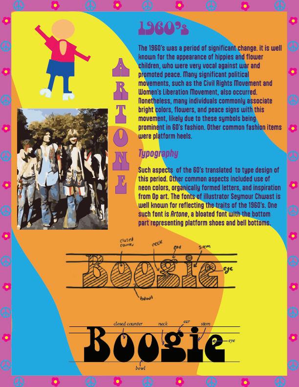
The theme for my composition was the 1960’s. I utilized the Artone font, which explicitly illustrates the era in which I was created. I also included elements that are commonly tied to this era, such as the psychedlic inspired background and the peace sign. The included text on the page further explains typography during the 60’s.
Modula OT Sans Regular
This unit focused on contemporary typography and digital technology from the 1980’s and 90’s. The theme for my composition was Adobe Systems, so I decided to focus on the Modula font, one of the early PostScript fonts. To also further express my theme, I made my composition appear as a computer screen from Apple’s early computer.
A D O B E S Y S T E M S
E R M I N A L S
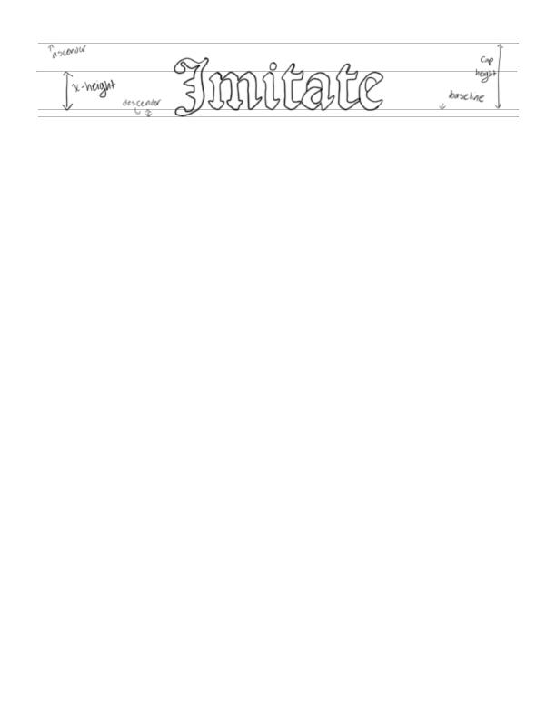
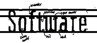
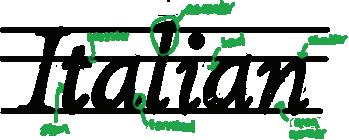
TThe objective of this assignment was to research a typographic anatomy element using a certain font. I opted for terminals, which I researched using Francesco Griffo Italic, which was used often in Italy’s early printing history. I also included additional typographic anatomy elements in both my sketch and trace of the font.
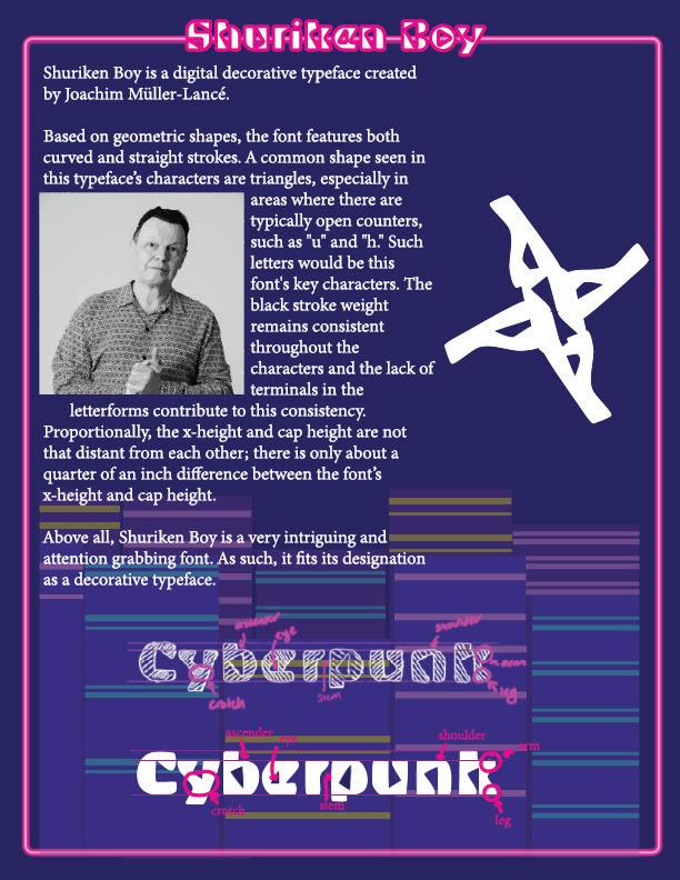
For this type classification assignment, I focused on the decorative typeface Shuriken Boy. As a very dynamic and mostly geometric font, I wanted the page to express the font’s association with the sci-fi genre. As such, I opted for a cyberpunk design, leaning into the use of a cool color palette with neon colors. I also alluded to the font’s name throught the abstract shuriken I created with the letters “y” and “u” from the traced theme word.
T Y P E C L A S S I F I C A T I O N
V A L U E A N D C O N T R A S T
This assignment allowed students to experiment with how text can be used to create contrast and value within a composition. It also allowed students to see how one can use text to create compositonal principles. In this case, the compositional principal I intended to create was movement. The contrast between the mostly bold and dynamic titles with the lighter body text helps move the reader across the page.
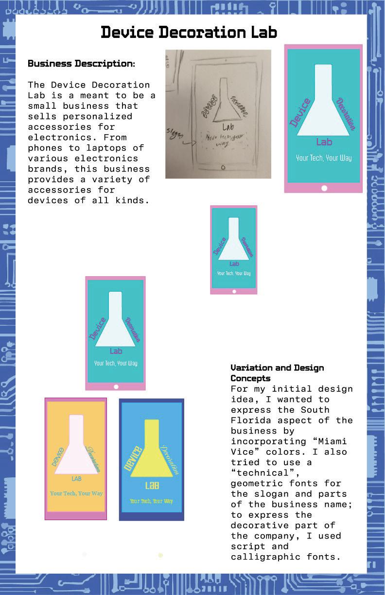
For this assignment, I created a logo for a fictional business called the “Device Decoration Lab.” Since this assignment was a means by which students could test out different font combinations, I tested various fonts on my logo. The main font combination I used was calligraphic fonts with typeset fonts.
L O G O D E S I G N
A R T I S A N E D I T O R I A L
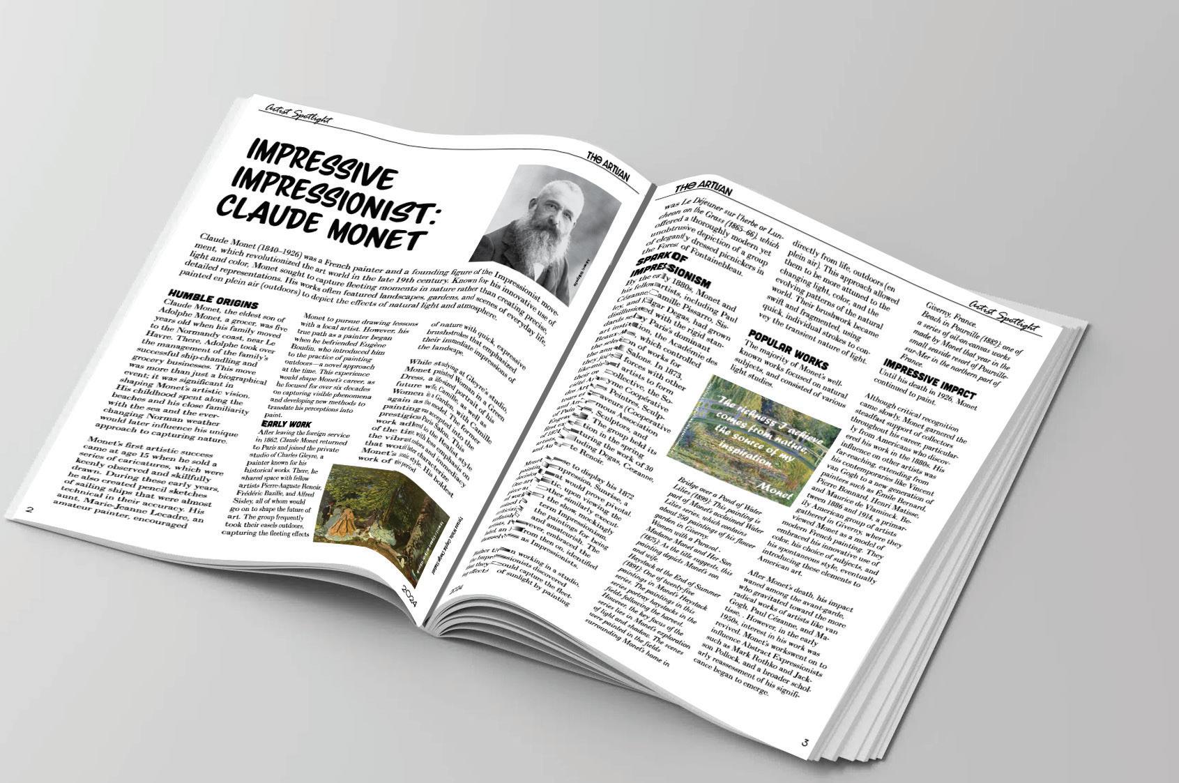
For this assignment, we were tasked with creating a conservative editorial page design. I made a magizine called The Artisan and made a spread for an Artist Spotlight article. The topic for this spread is the Impressionist painter Claude Monet. The article details information about Monet, and includes images of his works and a pullquote.
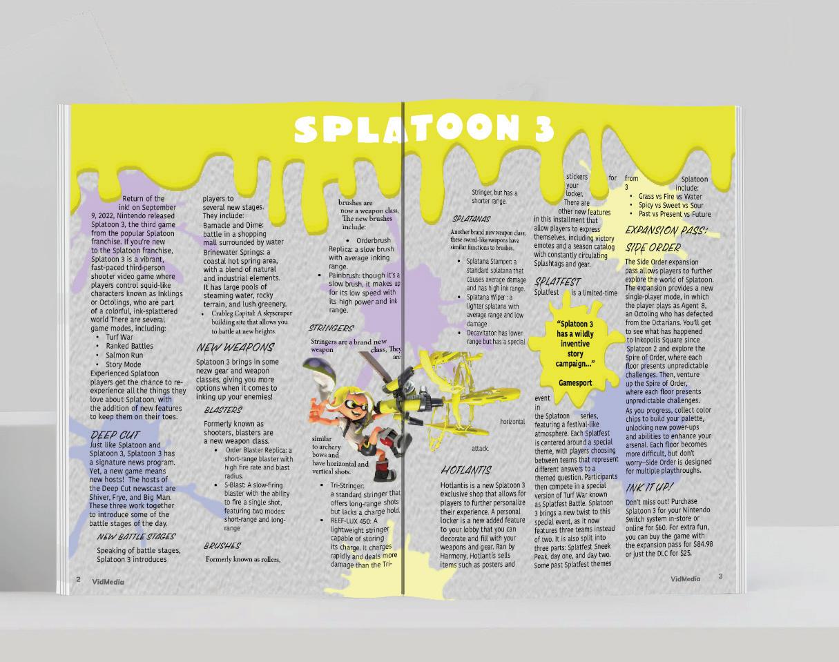
For this assignment, we were tasked with creating a Contemporary editorial page design. I made a fictional magazine titled VidMedia and made this particular article spread about the game Splatoon 3. This article includes information about the game, a pullquote, and several images and vector graphics.
V I D M E D I A E D I T O R I A L