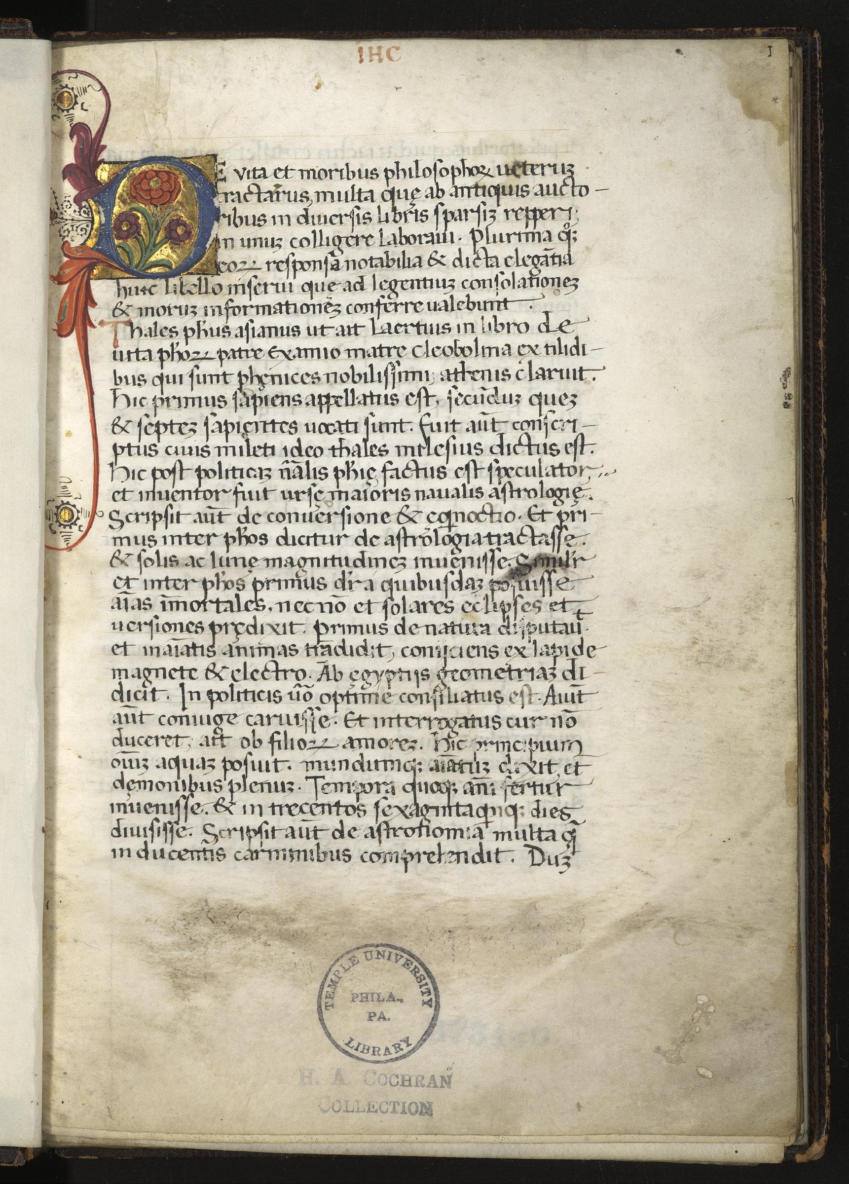
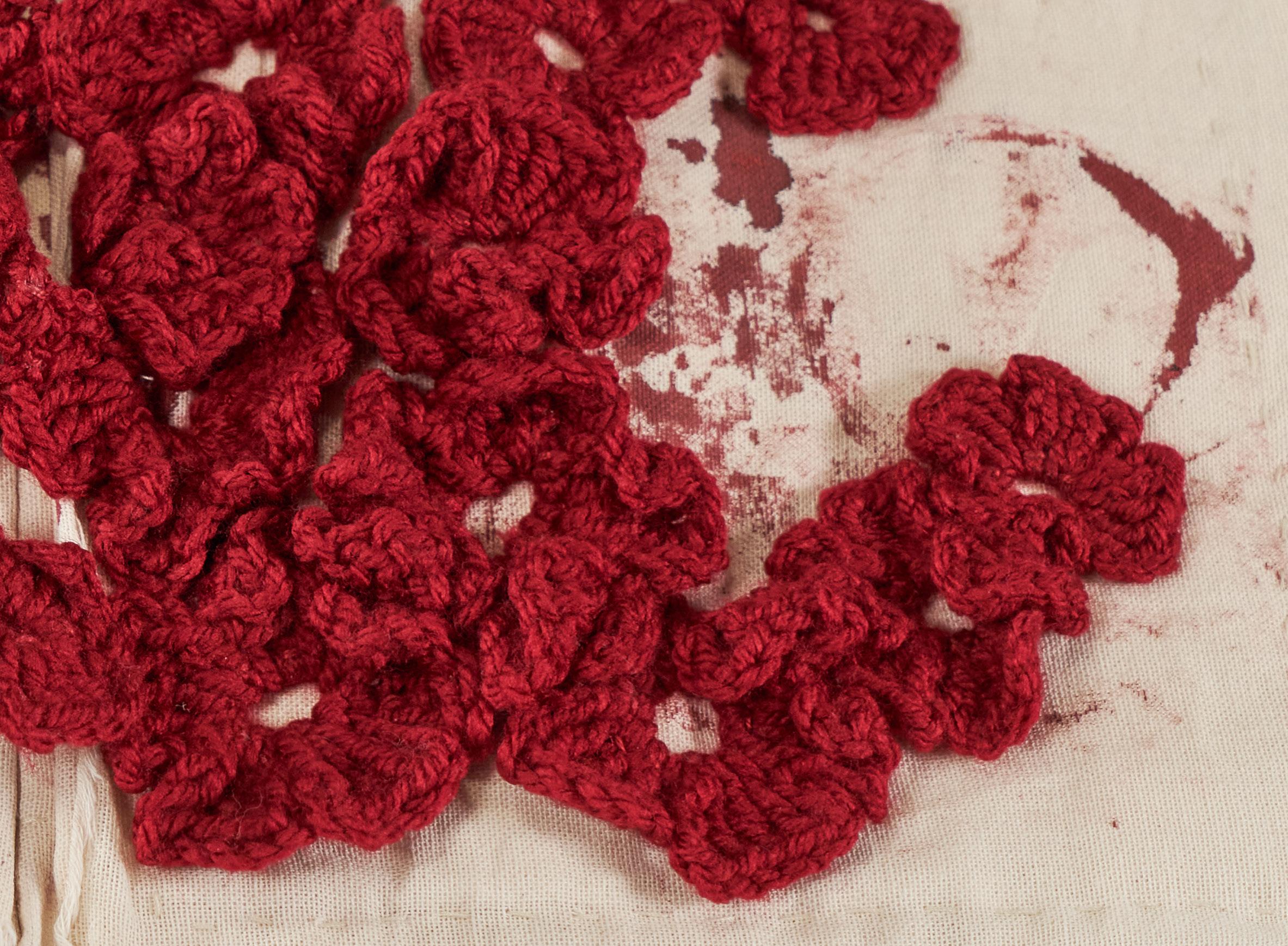
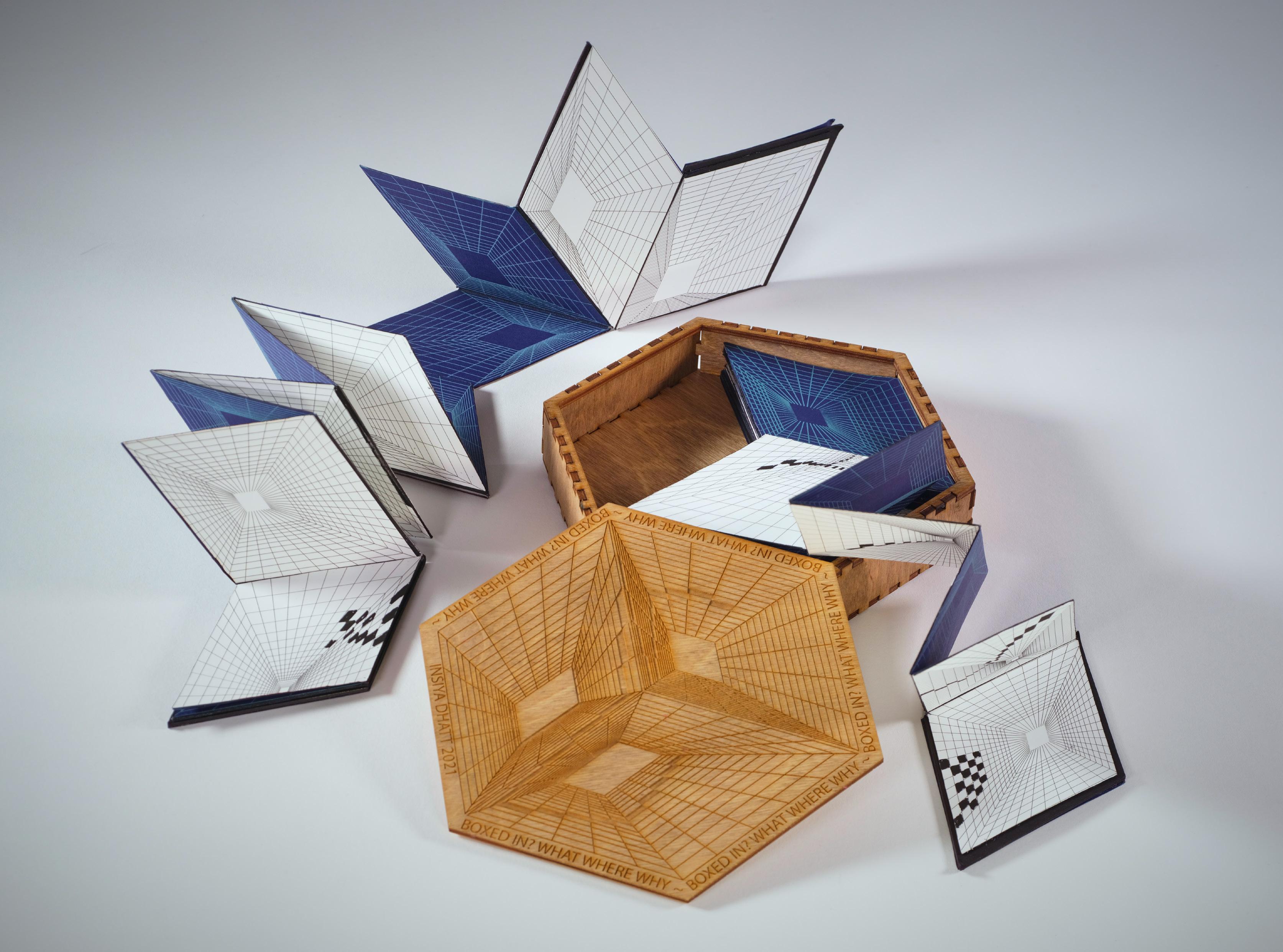
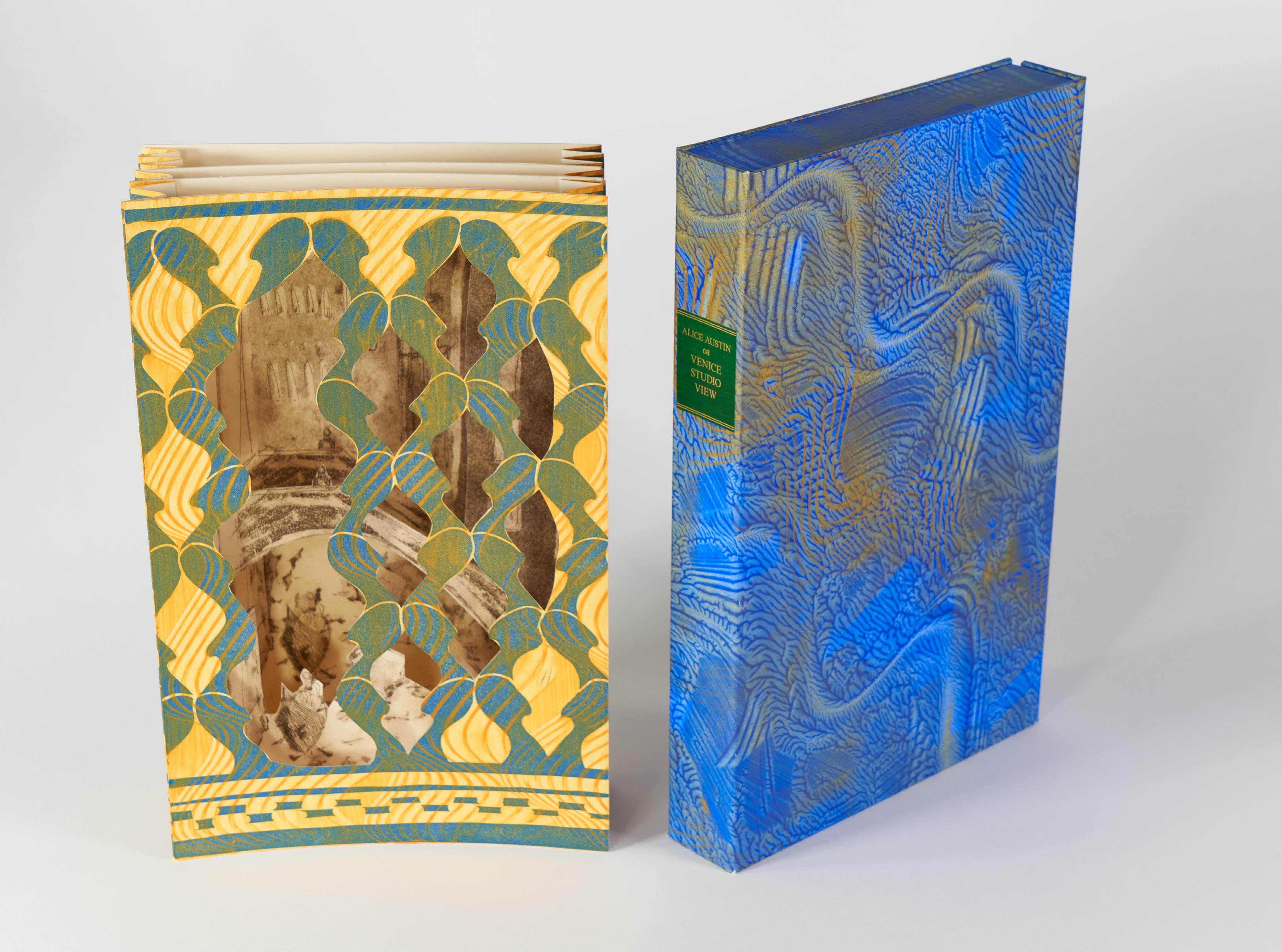
TREASURES FROM THE SPECIAL COLLECTIONS RESEARCH CENTER TEMPLE UNIVERSITY LIBRARIES
THE BOOK
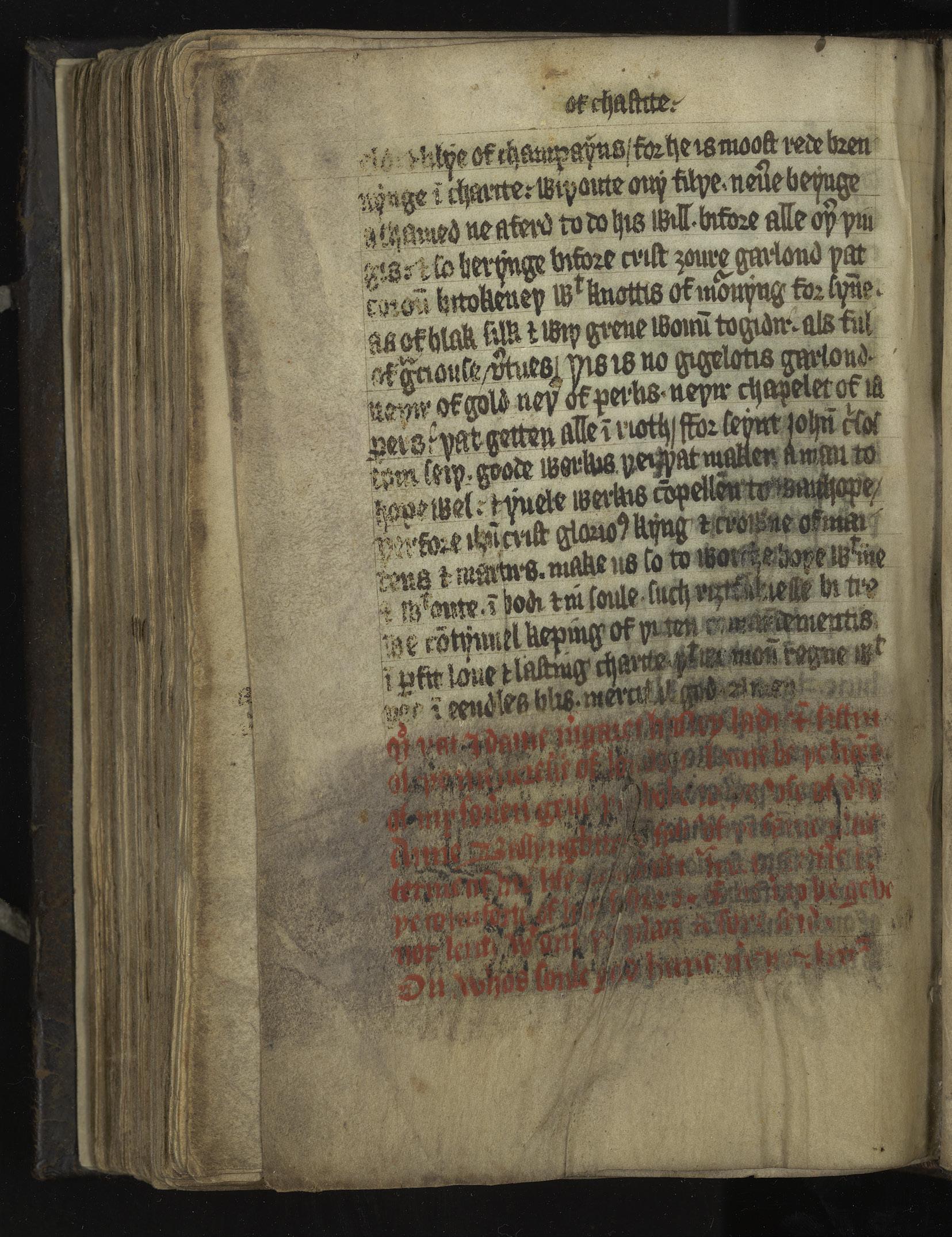
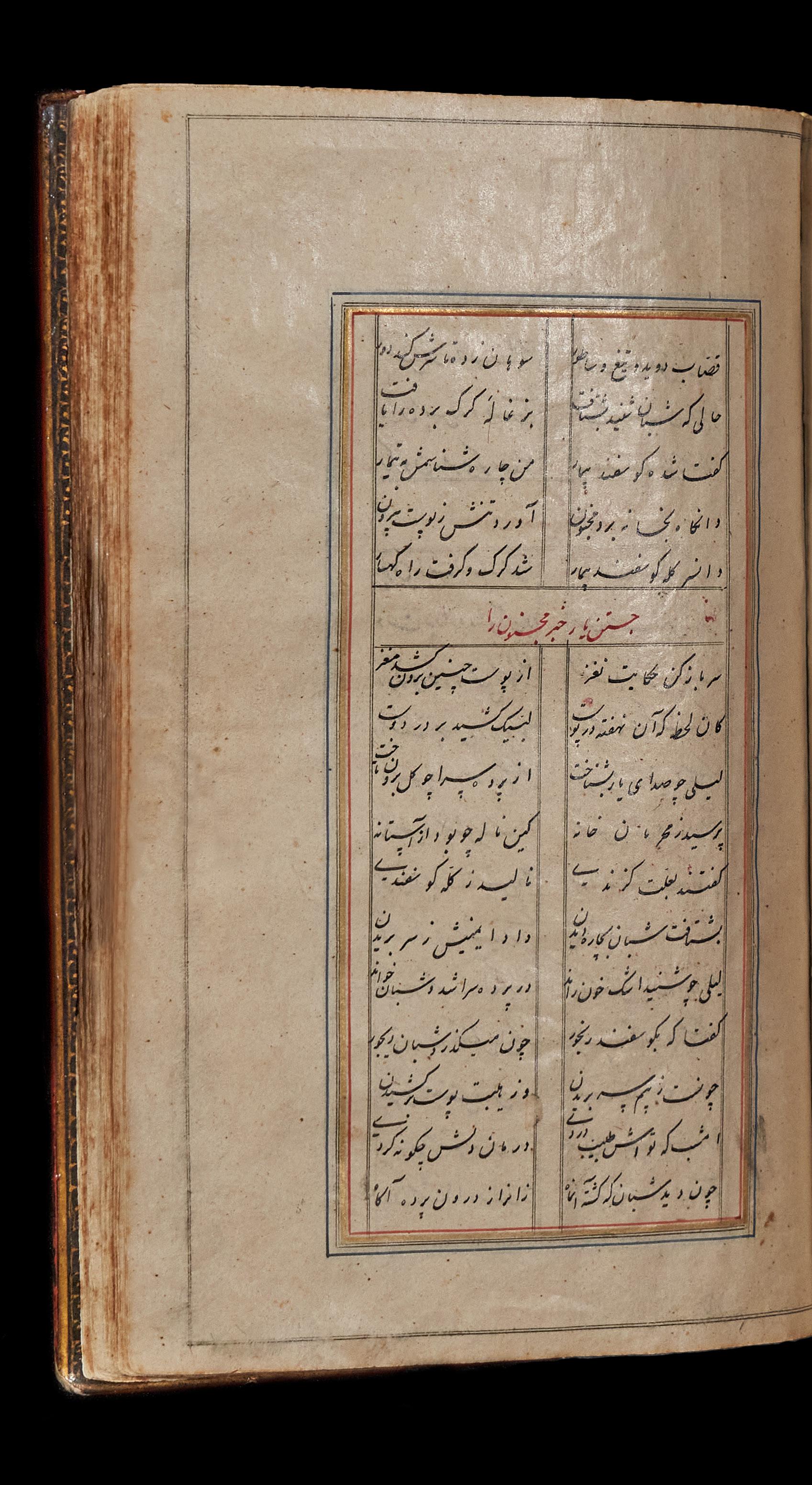
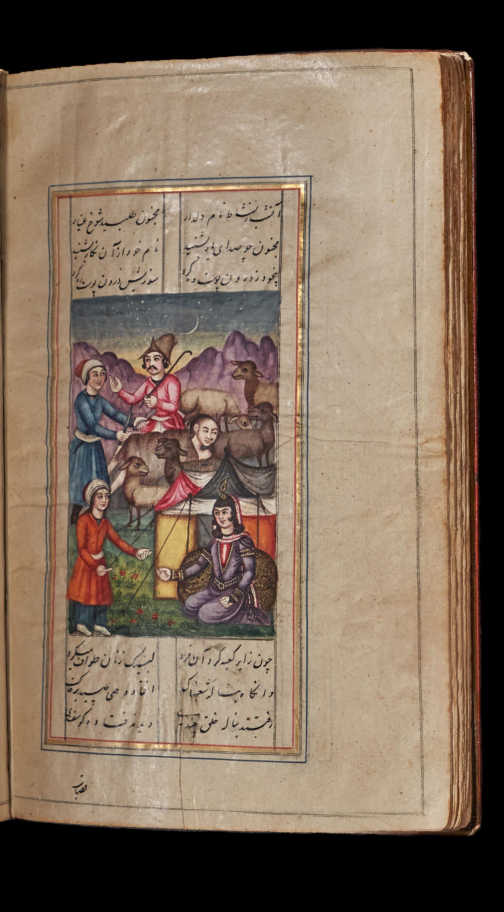
This manuscript from 1839 is an exquisitely illustrated rendition of the Persian epic poem Layli and Majnun, originally composed by the poet Niẓāmī Ganjavī in 1188. The poem tells the tragic love story of Layli and Qays, who fall in love only to be forbidden to see one another by their disapproving families. Qays goes mad and flees into the wilderness, thereafter, becoming known as Majnun (mad one). The two later attempt to reunite, but both die before they are able to realize their relationship.
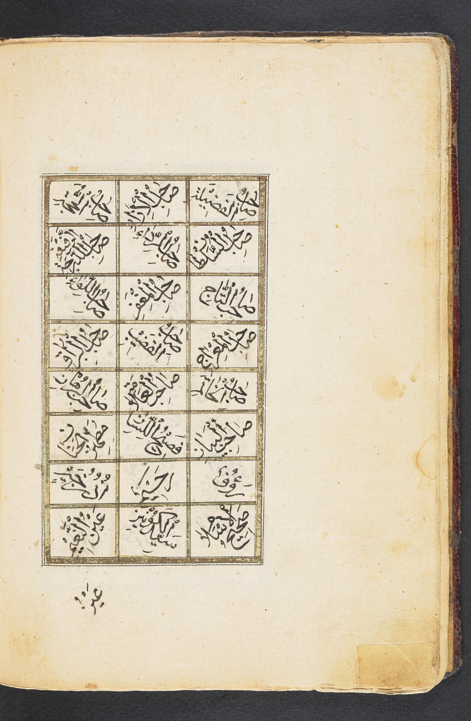
This manuscript offers multiple modes of readership, including purely visual ones. For example, while the text of the poem is written in columns in black ink, a single phrase is occasionally centered on the page in red ink. Even non-readers of Farsi will likely understand that this is a chapter title, and gives a sense of the story’s pacing. Additionally, the ruling lines that divide the space of the page closely resemble the digital guides still used to create book layouts today. Because the visual conventions used in this manuscript persist in contemporary graphic design, we can interpret it across both time and language barriers. Another way to read this manuscript is through its brilliantly colored, extraordinarily detailed illustrations. These are in the Qajar style of Persian art, with an emphasis on portraiture and saturated colors derived from Western influences. However, certain conventions of earlier Islamic painting styles prevail, including a diagrammatic, rather than distance-based, approach to perspec-
tive. In this illustration, we see Majnun hiding among a flock of sheep and peering at Layli in her tent. By rendering all characters at roughly the same scale regardless of their distance from the viewer, the artist gives equal weight to the perspectives of the two lovers and creates the sense that Majnun is lost in the crowd.
TREASURES FROM THE SPECIAL COLLECTIONS RESEARCH CENTER, TEMPLE UNIVERSITY LIBRARIES

TREASURES FROM THE SPECIAL COLLECTIONS RESEARCH CENTER, TEMPLE UNIVERSITY LIBRARIES
 Edited by Joseph R. Kopta
Managing Editors: Ana Matisse Donefer-Hickie, Emma P. Holter, Jackie Streker, and Rachel Vorsanger
With contributions by Daniel Cappello, MeiLi Carling, Ivy D’Agostino, Bradford Davis, Sophia Dell’Arciprete, James Rose Dewitt, Ana Matisse Donefer-Hickie, Müge Durusu-Tanrıöver, Emily Feyrer, Emma P. Holter, Bryan C. Keene, Angela Lorenz, Robin Morris, Dot Porter, Alice M. Rudy Price, Natalia Purchiaroni, Mike Ray, Mario Sassi, Jackie Streker, William Toney, Ha Tran, Kimberly Tully, Rachel Vorsanger, Ashley D. West, Byron Wolfe, Yaqeen Yamani, and Özlem Yıldız
Forewords by Susan E. Cahan and Joseph P. Lucia

This catalogue is published in conjunction with the exhibition The Art of the Book: Treasures from the Special Collections Research Center, Temple University Libraries, on view at Charles Library, Temple University, Philadelphia, from April 12 to July 15, 2024.
The Art of the Book project is a collaboration between the Tyler School of Art and Architecture and Temple University Libraries. It has been coordinated by Joseph R. Kopta and Kimberly Tully, together with graduate students from the Tyler School of Art and Architecture, Temple University.
The exhibition, catalogue, and public programming have been made possible by Temple University Libraries, the Tyler School of Art and Architecture, Temple University’s General Activities Fund (GAF), the Jackson Fund for Byzantine Art, the Center for the Humanities at Temple (CHAT), the Art History Department and the Art Department at Tyler, and two anonymous donors.
Edited
by
Joseph R. Kopta
Managing Editors: Ana Matisse
Donefer-Hickie, Emma P. Holter, Jackie Streker, and Rachel Vorsanger
Project Manager: Jackie Streker
Designers: MeiLi Carling, Mike Ray, and Ha Tran
Design Assistant: Emily Feyrer
Photographs of works of art in the Special Collections Research Center, Temple University Libraries are by Sophia Dell’Arciprete, Natalia Purchiaroni, William Toney, Byron Wolfe, Yaqeen Yamani, and Temple University Libraries, unless otherwise noted.
Photography credits appear at the end of the volume.
Typeset in Moret Variable Book, Byker, and Panel Sans Mono
Printed on 100 lb. smooth text
Printed by Fireball Printing, Philadelphia
Published by the Tyler School of Art and Architecture
Temple University
2001 N. 13th Street Philadelphia, PA 19122
Copyright ©2024 to the individually contributing authors and artists. All rights reserved.
No part of this book may be used or reproduced in any manner without written permission from the individual artists or authors, Temple University Libraries, or the Tyler School of Art and Architecture.
ISBN 979-8-218-38322-0
Note to the Reader:
All dates in the catalogue are in BCE or CE. As the works in this catalogue represent multiple language traditions, an effort has been made to simplify common forms of names and places in English. For this reason, diacritical marks of words in foreign languages have been avoided and common English spelling used. Catalogue entries provide objects’ geographical origin when it is known. Unless otherwise noted, dimensions are indicated as height by width by depth in centimeters. Every effort has been made to track provenance as accurately as possible. For provenance details of objects in the Special Collections Research Center, Temple University Libraries, see the online catalogue at library.temple.edu/scrc for the most up-to-date information. Many of the objects in this publication have been digitized and are available at digital.library.temple.edu.
2 Acknowledgements
4 Forewords
Susan E. Cahan, Joseph P. Lucia
6 The Art of the Book: An Exercise in Interdisciplinary Collaboration
Bradford Davis, Ivy D’Agostino, Ana Matisse Donefer-Hickie, Emma P. Holter, Robin Morris, and Rachel Vorsanger
8 Introduction to the Special Collections Research Center Collection
Kimberly Tully
10 Embodied Text and Image: The Codex in the Middle Ages and Today
Joseph R. Kopta
14 A Look at a Book
18 Economics & Labor
Emma P. Holter
30 Before (the Art of) the Book
Müge Durusu-Tanrıöver
34 Visualizing Science
Ana Matisse Donefer-Hickie
44 Printing in Early Modern Germany
Ashley D. West
50 Embodied Perspectives & Identities
Rachel Vorsanger
64 Sex Ed: A Love Story—An Interview on Zines
Ana Matisse Donefer-Hickie
with James Rose Dewitt
Table of Contents
68 Performance, Music, Visual Arts Daniel Cappello 80 The Artistic Book Alice M. Rudy Price 84 Marking Time Emma P. Holter 94 Paleography: The Shape of Writing Mario Sassi 106 An Encounter with the Ottoman Book Özlem Yıldız 110 Poetry, Philosophy, & Thinking Robin Morris 122 Manuscripts and the Digital Humanities: Bridging the Past and the Present Dot Porter 126 Dynamic Book Structures Rachel Vorsanger 138 Work for Curious People: An Interview on Artist Books with Angela Lorenz Robin Morris 142 Problematic Perceptions Daniel Cappello and Ivy D’Agostino 148 A Vision for the Future of Manuscript Curation and Book History Bryan C. Keene 152 Contributors 154 Photography Credits
TREASURES FROM THE SPECIAL COLLECTIONS RESEARCH CENTER, TEMPLE UNIVERSITY LIBRARIES
The Art of the Book: Treasures from Special Collections showcases a variety of artworks housed in the Special Collections Research Center at Temple University’s Charles Library. Organized through a curatorial collaboration between graduate students from the Tyler School of Art and Architecture, the exhibition and this catalogue examine how the format of the book has been treated across time and geography. A key question at the heart of this exhibition is, what constitutes a book? The diverse examples featured in this show challenge our preconceived notions and expand our definitions of this type of object. Melding illustration, painting,
object-making, calligraphy, and storytelling, the objects featured in The Art of the Book transmit a robust sense of the time and place in which they were created. Many of these books function as repositories of memory that simultaneously reflect the values, history, and available technologies of the particular cultural moment in which they were created. The thematic groupings of these treasures display the variety of ways in which artists from across the globe have dealt with similar subject matter and content. The essays in this catalogue endeavor to unveil the hidden histories and complicated entanglements behind each of the objects on display.
x | The Art of the Book
The Art of the Book began as a conversation in 2022 between us—an art historian of medieval manuscripts and a curator of rare books—about how the collection at Temple University Libraries could be used in an instructional setting to teach the history of the book as an art form; how best to feature the extraordinary collection of rare books, manuscripts, artist books, and zines at the Special Collections Research Center (SCRC); and how to supervise students in the theory and practice of an exhibition project. Drawing upon our complimentary expertise and our love of book objects, we began our collaboration in early 2023 with the public program A Look at a Book, in which members of the Tyler School of Art and Architecture—both faculty, graduate students, as well as the occasional guest scholar—presented, in 25-minute segments, a single object from the SCRC in a virtual platform. These presentations were recorded and subsequently uploaded for permanent viewing.
On the heels of the successful A Look at a Book program, we considered how best to pursue an exhibition project driven by students. This manifested in the graduate seminar, Problems in Medieval Art: Curating the Codex, a hybrid course combining the history and theory of the art of the book, intensive object study of books in the SCRC, theory of collecting and displaying, and a practicum on mounting an exhibition. Students across Tyler departments took on the role of conceiving, curating, and executing the exhibition project, together with the involvement and invested partnership of the Library.
The resulting exhibition, catalogue, web presence, and public programming was the result of this endeavor, with the graduate student curators from programs of Art History, Ceramics, Graphic and Interactive Design, and Sculpture. We would first and foremost like to congratulate the student curators on the success of their project: Daniel Cappello, MeiLi Carling,
Acknowledgments
Ivy D’Agostino, Bradford Davis, Ana Matisse Donefer-Hickie, Emma P. Holter, Robin Morris, Mike Ray, Ha Tran, and Rachel Vorsanger.
We are extremely grateful to the guest scholars who lent their expertise to the seminar and informed the ideas of the project in its infancy, including Bryan C. Keene, John T. McQuillen, Dot Porter, Mario Sassi, Emily Shartrand, and Ashley D. West.
We are also thankful to the scholars and artists who contributed essays and interviews to our catalogue, giving additional context to the works in the exhibition, including James Rose Dewitt, Müge Durusu-Tanrıöver, Bryan C. Keene, Angela Lorenz, Dot Porter, Alice M. Rudy Price, Mario Sassi, Ashley D. West, and Özlem Yıldız.
Byron Wolfe very generously coordinated his MFA students in a photoshoot producing beautiful new images of many exhibition objects featured in this catalogue, with photographs by Sophia Dell’Arciprete, Natalia Purchiaroni, William Toney, and Yaqeen Yamani. Jackie Streker was an excellent Research Assistant and Project Manager that kept the project on track across the finish line.
Additional colleagues, supporters, and friends, both at Temple University and elsewhere, aided in numerous ways, including Andrea M. Achi, Yasmine Amory, Mitos Andaya Hart, Julián Bértola, Erin Rose Boyle, Doug Bucci, Keia D. Carter Simmons, Theresa Davis, Maggie Downing Dunkle, Jane D. Evans, Emily Feyrer, Craig Fineburg,
Brenda Galloway-Wright, Marci Green, Morgan Griffith, Jordan Hample, D. Harland Harris, Josué Hurtado, Lynn Jackson, Nic Justice, Lydon Frank Lettuce, Ugo Mondini, Henry Morales, Ann Mosher, Wanda Odom, Alpesh Kantilal Patel, John Pyle, Paul Rardin, Katy Rawdon, David M. Rhoads, Mario Sassi, Paolo Scartoni, Kaitlyn Semborski, Courtney Smerz, Evan Weinstein, Stuart Whisnant, Brian E. White, and Sara Wilson.
We are indebted to our deans, Susan E. Cahan and Joseph P. Lucia, for their support of our collaborative project. We are extremely grateful to the entities and individuals who have financially supported The Art of the Book. The exhibition, catalogue, and public
programming have been made possible by Temple University Libraries, the Tyler School of Art and Architecture, Temple University’s General Activities Fund (GAF), the Jackson Fund for Byzantine Art, the Center for the Humanities at Temple (CHAT), the Art History Department and the Art Department at Tyler, and two anonymous donors.
Joseph R. Kopta
Assistant Professor of Instruction, Art History Tyler School of Art and Architecture
Kimberly Tully Curator of Rare Books
Special Collections Research Center Temple University Libraries
April 2024
| 3
Forewords
4 | The Art of the Book
Susan E. Cahan, PhD Dean, Tyler School of Art and Architecture
The Art of the Book reflects the essence of cross-disciplinary collaboration at the Tyler School of Art and Architecture and Temple University. This publication, exhibition, and programming result from months of research and teamwork among a range of Tyler graduate students as they sought to determine what defines a book.
They found that close study of historical objects provides a deeper understanding of the world today, just as the present creates new lenses through which past works can be considered. Through examination of diverse objects from ancient cuneiforms that mark the beginnings of recorded history, to luxurious and labor-intensive medieval manuscripts, to sculptural artist books and subversive zine publications, The Art of the Book is a testament to the power of books to tell stories, build communities, discover histories, and challenge worldviews.
I warmly acknowledge the faculty and staff who provided leadership and contributions to this project that embodies this sense of community and social justice. I am deeply grateful to Joseph R. Kopta, Assistant Professor of Art History at Tyler and Kimberly Tully, Curator of Rare Books at the Special Collections Research Center, for their vision and guidance. Finally, my deepest appreciation goes to the student curators, photographers, designers, and scholars who brought this project to life.
Joseph P. Lucia Dean, Temple University Libraries
Academic libraries are at their core catalysts for connection, for interaction and partnership, for imagination and historical (re)discovery. They connect people and ideas, people and books (both as physical objects and as digital entities), people and the diverse discourses of knowledge and culture. Any library that is viewed only as an inert repository of stuff is a morgue. Any library entered, engaged, and activated by people is a social nexus for thought, reflection and expression, a site for learning, inquiry, and exploration. At Temple, we are committed to the ideal of the engaged library. And The Art of the Book is a true exemplar of engagement fully realized.
In spite of our relatively short institutional history and our public mission, we are privileged in our Special Collections Research Center to have acquired over the years an impressive array of holdings that span the range of human inscription from cuneiforms and medieval manuscripts, incunabula and touchstones in printing history, to contemporary artist books and subculture zines. We value those items not for their rarity but rather for the way they stimulate mind and imagination when they are touched, explored, and interrogated in ways that give them new life and current resonance.
It is especially gratifying that this project is the result of a collaboration between our Curator of Rare Books Kimberly Tully and Tyler Assistant Professor of Art History Joseph R. Kopta. In the library, we often speak about partnership with faculty, educational impact, the unique value of bringing students at all levels into direct contact with the deep history and complex materiality of print culture. At a moment when networked digital affordances obfuscate handiwork and the hands of the maker, this project has drawn a group of graduate students–artists and thinkers –into the complex and various history of books and bookmaking with an intensity of focus that I am sure has been revelatory and enlightening for all involved. I am doubly proud that we are able to share this work with our campus community through an exhibition, a symposium, and this catalogue. I express my thanks to all who made this project come to fruition.
| 5
The Art of the Book: An Exercise in Interdisciplinary Collaboration
What makes a book? What makes an exhibition? This project is framed by these two questions—one of content, and the other of process. The Art of the Book is the result of a semester of work in the 2023 graduate seminar “Curating the Codex,” uniting Tyler School of Art and Architecture students from Graphic & Interactive Design, Sculpture, Ceramics, and Art History—a variety of professional backgrounds that embrace diverse disciplinary perspectives and priorities. To synthesize this multitude of viewpoints on exhibition development, the first half of the seminar focused on skill-building exercises, discussions, and conversations with experts in the field, which established a common ground from which the team could begin to build an exhibition that aligned with our respective approaches to art and the material culture of the book.
Books emerged from these dynamic conversations as objects as multitudinous as we are, defined as everything from “externalizations of ideas” and “vessels of knowledge,” to “records of journeys,” “entanglements,” and “manifestations of care,” used both for disseminating contemporary ideas
and safeguarding the ideas of the past.1 They are (sometimes) accessible repositories of memory, which simultaneously reflect the values, history, available technologies, and complicated entanglements of the particular cultural moment in which they were created. This expansive definition, focusing on function over format, was easily reflected in the Special Collections Research Center’s rich collection of manuscripts, codices, tablets, scrolls, zines, and artist books, from which the treasures that this catalogue and its accompanying exhibition explores have been drawn.
As you will see as you read through this book, each of us “adopted” two to four works to research, resulting in the entries that make up the content of this catalogue. These short case studies explore each work in more depth, but the research invested in their writing also formed the basis of the thematic groups that structure both catalogue and exhibition display. Thus, the framing essays that accompany each group grew from our explorations of the objects themselves, rather than from an overarching argument superimposed upon them.
This organic conceptual development, which responded to the stories we unraveled in each of the objects, was reflected in the exhibition workflow we developed over the course of the semester. Disrupting the traditional structure of an exhibition team, which strictly divides the labor of curation, exhibition design, education, graphic design, and editorial, our work on The Art of The Book was organized into flexible steering committees—the responsibilities and members of which adapted as the needs of both the students and the project changed. This unusual team structure allowed us the flexibility to both play to our strengths and to experiment with areas of exhibition planning we might not have had the opportunity to work in otherwise.
Though much of the project was developed through these discussions between graduate student artists and scholars, we would be remiss to ignore the integral role of Dr. Joseph R. Kopta. His expertise, encouragement, and imagination in framing the course made this exhibition project possible, and the student team owes him a heartfelt thanks. Profound thanks are also due to Kimberly Tully, whose care
6 | The Art of the Book
and attention to both the works in the exhibition and the students in the course provided much needed groundwork for our thinking. As we hope will become clear throughout this catalogue, The Art of the Book challenges preconceived notions of what a book can be, but the organization of the project also challenged standard definitions of curation, research, and design by focusing on true collaboration, integration, and mutual support.
Research Committee: Bradford Davis, Ivy D’Agostino, Ana Matisse Donefer-Hickie, Emma P. Holter, Robin Morris, and Rachel Vorsanger
Branding Committee: MeiLi Carling, Mike Ray, and Ha Tran
Catalogue Design Committee: MeiLi Carling, Robin Morris, Mike Ray, and Ha Tran
Gallery Design Committee: Daniel Cappello, MeiLi Carling, Bradford Davis, Mike Ray, and Ha Tran
Object Grouping Committee: Daniel Cappello, Ivy D’Agostino, Emma P. Holter, and Rachel Vorsanger
Public Programs & Access Committee: Daniel Cappello, Bradford Davis, Emma P. Holter, and Robin Morris
Web and Digital Presence Committee: Ana Matisse Donefer-Hickie, and Rachel Vorsanger
1. All quotes are drawn directly from notes taken during class discussion.
Introduction to the Special Collections Research Center Collection
Kimberly Tully
The Special Collections Research Center (SCRC) is the principal repository for and steward of Temple University Libraries’ rare books, manuscripts, archives, and University records. We collect, preserve, and make accessible primary resources and rare or unique materials, to stimulate, enrich, and support research, teaching, learning, and administration at Temple University. The SCRC makes these resources available to the general public as part of the University’s engagement with the larger community of scholars and independent researchers.
The books featured in this exhibition are representative of the breadth and strength of the SCRC’s print holdings and were acquired through a variety of both historical and current collecting strategies. Founded in 1967, the Rare Book Collection documents the history of printing and publishing, printmaking and illustration, typography and book design, and literature and language and supports teaching in the history of the book and book arts. In addition to rare and first edition printed books
dating from the fifteenth century to the present, the collection also includes early manuscripts and examples of ancient writing technologies. Particular strengths of the collection include private press and fine printing, herbals and botanical illustration, seventeenth and early eighteenth century AngloAmerican social and religious tracts, history of business and trade, and the history and development of lithography. The SCRC has also actively expanded its teaching collections to include non-Western books and manuscripts that illuminate the global history of book cultures and better reflect the diversity of Temple’s student body and Temple University Libraries’ users.
The SCRC houses several other print-based collections, most notably the Contemporary Culture Collection and the Science Fiction Collection. Established in 1969, the Contemporary Culture Collection (CCC) is a source of primary research materials documenting the social, political, economic, and cultural history of minority groups, the counterculture, and the fringe in North America dating from the 1960s to the present. In 1972, Temple University Libraries established the Science Fiction Collection, which traces the evolution of science fiction and fantasy writing and illustration
from the late nineteenth century to the present. In recent years, the SCRC has focused on collecting contemporary artists’ books, works of art in book form that challenge the traditional notions of what the codex can be, and zines, self-published DIY publications. Our rapidly expanding collection of artists’ books builds on earlier acquisitions from the 1980s and 1990s for the CCC and features a variety of book structures, materials, and printmaking techniques. Our fast-growing zine collection is one of the most highly-used collections by our faculty and students in the classroom and by researchers in our reading room. Both collections feature the work of book artists and creators from underrepresented and marginalized communities.
All of the collections mentioned above are “living” collections used regularly in the SCRC’s instruction and outreach initiatives and activities, as well as by individual researchers from the Temple community and beyond. This exhibition collaboration with the Tyler School of Art and Architecture’s faculty and graduate students reflects this dynamic use of our rich collections.
8 | The Art of the Book
Embodied Text and Image: The Codex in the Middle Ages and Today
10 | The Art of the Book
Joseph R. Kopta
Around the world, codices are packed with knowledge and meaning. The codex, or the structure composed of pages bound together on one side at a spine (what we usually refer to when we call something a “book”), is a complex, expensive object, requiring careful planning by its makers and patrons before and during its design and execution. Profoundly different in cost and means of production from a mass-produced modern paperback, the value of a premodern codex is difficult for modern users of books to grasp. Preserving and transmitting knowledge through texts and images, the materials of a manuscript (a book written by hand), and the great effort of its multi-step production, demonstrate that it is both valuable and requiring of careful planning.
The codex first appeared in the early Middle Ages, largely eclipsing (although not entirely replacing) scrolls, ostraca, and wax tablets from antiquity as formats for conveying information in image and text.1 Its compact, sturdy form was advantageous, as well as the use of both sides of pages (recto and verso). Likewise, its bound structure allowed information encoded into its pages to be indexical and easily accessible, a system of reference different from the sequential access of a scroll.2
Although many other supports were used (including papyrus, wax, wood, ceramic, and paper), the great majority of medieval manuscripts were made from parchment, or animal skin. The number of animals required for a manuscript project and the long process of cleaning, depilating, stretching, and drying the parchment is an indication that a manuscript’s value was intimately tied to its materials.3 The making of text and images on the
laboriously prepared surfaces of manuscripts was complex, involving mapping out eventual pages and their sequencing for later binding on large expanses of parchment. Both ink and pigments had to be collected and made.4
Text pages were ruled and then inscribed with inks. Some surviving partially complete manuscripts show that the next step involved the adhesion of gold leaf applied to the surface using a mordant. Following this, the scribe or artist painted the illuminations. Finally, the manuscript makers assembled these large sheets of parchment into quires, which were then bound and stored.5
Medieval book makers and users cared about their manuscripts, and placed a high value on the materials required for their construction. This appreciation is visible in the manuscripts themselves; even the unobservant user would have been aware of the codex as a rare and vulnerable object, materially embodying tremendous labor. Additionally, something of the great worth placed on a manuscript, and its elevation as a prized object in medieval societies, is evident in tantalizing textual references. One such reference by the ninth-century Theodore the Studite6 lists penances for transgressions of monastic duties by librarians, users of books, and manuscript scribes.7 For the librarians—the caretakers of the Monastery of Stoudios’ precious library in present-day Istanbul—and borrowers, he indicates:
If anyone takes out a book and does not take good care of it; or if he touches the book of another without the permission of him who has taken it out; or if, grumbling, he seeks a book other than that which he has already taken, let him touch no book whatsoever the whole day.
If the Librarian does not show proper solicitude [for the books], shaking and re-stacking and dusting each one, let him eat no cooked food.
If anyone is found hiding a book in his cell which, without good excuse, he does not give back the moment the Librarian strikes [the gong], let him stand in the refectory.
Likewise, the great cost of materials, the importance of staying true in the copying of a text, and the respect of other scribes is revealed in Theodore’s rules for those working in the scriptorium:
If anyone makes more glue than is necessary, and wastes it by letting it sit too long, fifty genuflections.8
If anyone does not take good care of the quire [in which he is writing], as well as the book out of which he is copying, putting both away at the proper time, and does not retain the spelling, accentuation and punctuation [of the original], one hundred and thirty genuflections.9
If anyone recites by heart [anything] from the book out of which he is copying, let him not attend Church for three days.
If anyone reads more than is written in the book out of which he is copying, let him eat no cooked food.
If anyone breaks his pen out of anger, thirty genuflections.
If anyone takes up the quire of another without the consent of him who is writing in it, fifty genuflections.
| 11
If anyone does not follow the instructions of the Chief Scribe, let him not attend Church for two days.
If the Chief Scribe distributes the work with partiality towards anyone; or if he does not carefully maintain the pieces of parchment and the tools for binding, lest any of the things used in this work be ruined, let him do one hundred and fifty genuflections and not attend Church.
For modern audiences, Theodore’s list begins to nuance how profoundly medieval bookmakers held their manuscripts dear. When it comes to the extraordinarily high cost of producing a manuscript,10 the default assumption in modern eyes seems to be that its expensive materials and the great effort of its making are a display of conspicuous consumption on the part of patrons and book owners.11 While this is certainly true—and explicit dedicatory inscriptions and colophons do survive, which ensure that a patron, monastic institution, or collection was recognized or associated with a manuscript—it is a reductive position in that it negates the specific meanings and, indeed, the power that certain ideas and materials had for medieval book users themselves.
The medieval manuscript, with its intricate illuminations, calligraphy, and bound parchment, exists as a testament to the profound role of the book as both a vessel and transmitter of knowledge and ideas. The codex format laid the foundation that would allow the book to grow into various creative forms through the early modern period into our contemporary world. The wide adoption of moveable type in the fifteenth century—a technology that existed for centuries in China and Korea, and which was later independently innovated by Johannes Gutenberg in Mainz—revolutionized the production of books, making
them more accessible and less costly to produce than their handwritten predecessors.12 However, handmade codices, far from disappearing, flourished around the world; as witnessed in bookmaking in the Ottoman, Safavid, and Mughal cultural spheres, the hand-written manuscript continued to be of supreme value.13 Such was also the case in Ethiopian and Southeast Asian bookmaking traditions, where painting and writing texts by hand continued to be paramount.14
Rather than diminishing the value and artistic potential of the book, the technological inventions of modern printing in all its forms—including moveable type, relief printing, engraving, and lithography— might better be understood as paving the way for an explosion of creative bookmaking. In Japan, mokuhanga or relief woodblock printing allowed the dissemination of thousands of books. In the nineteenth and early twentieth centuries, a renewed appreciation for the craftsmanship of the medieval codex inspired publishers such as the Kelmscott Press, which printed books that were not merely texts but works of art in their own right—emphasizing that even in an age of increased accessibility, a book could still be a rare and beautiful object.15
The tradition of the artistic book has continued to be explored through the twentieth and into the twenty-first century. Modern and contemporary artists, including those represented in this catalogue, have taken the format of the codex and pushed its boundaries, experimenting with its structure, materials, and the very concept of what a book can be.16 Embracing a wide range of forms—from pop-up books to those made of fabric and even books that incorporate digital elements—such artist books reflect an ongoing dialogue between tradition and innovation. These works often challenge the reader’s perception of what constitutes a book, inviting a deeper engagement with the text and images contained
within. Contemporary artist’s books likewise often explore the book as an object of interaction, not merely a passive vessel of information.17 By altering the structure of the codex—through unconventional binding techniques, foldouts, and sculptural elements—artists invite readers to engage with the book in a physical, tactile manner that harkens back to the (oftentimes) intimate experience of handling a medieval manuscript. This physical engagement adds layers of meaning, making the act of “reading” an affective experience that encompasses sight, touch, and sometimes even sound.
Despite vast technological changes that have transformed how we produce and consume information,18 the enduring legacy of the codex is evident in the continued vitality of the book object as a creative form. As the works in this catalogue from across the globe19 demonstrate, even in a digital age, the book remains a powerful medium for expression and cultural exchange. Rather than follow a chronological or geographic narrative of the codex’s transformation as an elite, handwritten object of the Middle Ages to the innovative artist’s books of today, this catalogue and the accompanying exhibition consider the diverse and myriad ways that the art of the book convey meaning for those who make and use them. The thematic groupings chosen by the student curators, ranging from “Marking Time” to “The Shape of Writing,” “Economics and Labor” and “Visualizing Science,” “Performance, Music, Visual Arts,” “Poetry, Philosophy, and Thinking,” “Dynamic Book Structures,” “Embodied Perspectives and Identities,” and “Problematic Perceptions,” moves towards a global understanding of the book as more than a repository of text and image, but a means of human interaction, identity, and as agents of social justice.20
12 | The Art of the Book
The collection of objects in The Art of the Book underscores the adaptability and enduring appeal of the codex as a repository of creativity and continuing transmitter of ideas. Far from becoming obsolete, the book continues to be infused with meaning, its form
and content constantly reimagined by artists who respect its history while pushing its boundaries into new realms of possibility.
1. See the essay by Müge Durusu-Tanrıöver, “Before (the Art of) the Book” in this volume on the early history of writing.
2. Contrary to popular belief, scrolls did not disappear in the Middle Ages, and continued to be used and valued; see e.g. Memorandum de operationibus in this catalogue.
3. For a discussion on issues of materiality in medieval manuscripts with particular attention to the Byzantine world, see Joseph R. Kopta, “Materiality and Materialism of Middle Byzantine Gospel Lectionaries (Eleventh–Twelfth Centuries CE),” PhD diss. (Temple University, 2022).
4. Raymond Clemens and Timothy Graham, Introduction to Manuscript Studies (Ithaca, NY: Cornell University Press, 2007), 18–34. For monographs on western medieval manuscript production and history, see Jonathan J. G. Alexander, Medieval Illuminators and their Methods of Work (New Haven: Yale University Press, 1992), and Christopher de Hamel, A History of Illuminated Manuscripts, 2nd ed. (London: Phaidon, 1997).
5. Clemens and Graham, 49–64.
6. Jeffrey Featherstone and Meridel Holland, “A Note on Penances Prescribed for Negligent Scribes and Librarians in the Monastery of Studios,” Scriptorium 36, no. 2 (1982): 258–260; also referenced in Nancy Patterson Ševčenko, “Illuminating the Liturgy: Illustrated Service Books in Byzantium,” in Heaven on Earth: Art and the Church in Byzantium ed. Linda Safran (University Park: Pennsylvania State University Press, 1998), 186–228, at 190.
7. For a view on the authenticity of this text, see Hans–Georg Beck, Kirche und theologische Literatur im byzantinischen Reich (Munich: C. H. Beck, 1959), at 494.
8. Featherstone and Holland, “A Note on Penances,” question whether this rule applies to a bookbinder requiring glue, or to the shoemakers of the preceding section. For a brief but useful overview of Byzantine bookmaking, see Berthe van Regemorter, “La reliure des manuscrits grecs,” Scriptorium 8, no. 1 (1954): 3–23.
9. An early text proposing the systematic identification of Byzantine manuscript centers through copying and textual transmission, and a review of the state of the field at the time, is found in Jean Irigoin, “Pour une étude des centres de copie byzantins,” Scriptorium 12, no. 2 (1958): 218–27, 219.
10. Nicolas Oikonomides, “Writing Materials, Documents, and Books,” in The Economic History of Byzantium ed. Angeliki E. Laiou, (Washington, D.C.: Dumbarton Oaks, 2002), II:589–592, at 591, while not indicating the source of these numbers, claims that the price of a manuscript in the tenth century on average cost 21–26 gold nomismata against the cost of a cow (3), a warhorse (12), and a mule (15), or the annual salary of an official protospatharios (72).
11. This is a point raised also with regards to marble by Fabio Barry, Painting in Stone: Architecture and the Poetics of Marble from Antiquity to the Present (New Haven: Yale University Press, 2020).
12. See the essay by Ashley D. West, “Printing in Early Modern Germany,” in this volume on the European transition from manuscript to printed book in Northern Europe.
13. Özlem Yıldız discusses this tradition in the Ottoman context in “An Encounter with the Ottoman Book” in this volume.
14. These are by no means the only examples of manuscript cultures in the modern world.
15. In this volume, Alice M. Rudy Price, “The Artistic Book,” explores the nineteenth- and early twentieth-century tradition of artists’ books and presses.
16. See especially the “Dynamic Book Structures” section of this catalogue for innovations in the structure of the book object.
17. Interviews with artists James Rose Dewitt and Angela Lorenz in this volume explore the mediums of zines and artist books in terms of issues of accessibility, expression, process, and defining the book objects.
18. See Dot Porter’s essay, “Manuscripts and the Digital Humanities: Bridging the Past and Present,” in this volume for issues of the manuscript object in the digital world.
19. Scholarship that emphasizes a global history of the book is transforming the understanding of this object type; see e.g. Bryan C. Keene, ed., Towards a Global Middle Ages: Encountering the World through Illuminated Manuscripts (Los Angeles: J. Paul Getty Museum, 2019).
20. I am grateful to Bryan C. Keene for visiting my graduate seminar early on and sharing their experience in the curation of premodern manuscript collections with an eye towards social justice, which helped frame the conversations that the student curators enjoyed through the semester. Some of Bryan’s thoughts are summarized in “A Vision for the Future of Manuscript Curation and Book History” in this volume.
A Look at a Book
A Look at a Book is a video series and public program hosted jointly by the Art History Department at the Tyler School of Art and Architecture and the Special Collections Research Center (SCRC), Temple University Libraries. In this virtual series, we explore the wonderful collection of rare books, manuscripts, zines, and artist books housed in Temple’s SCRC. Each week, via Zoom, scholars open a different artifact from the collection, flip through its pages, and share the knowledge within. This virtual series is open to the public and occurs weekly during the academic semester. Recordings of this series are on view in the gallery at Charles Library for the duration of the exhibition.
To view past episodes of A Look at a Book visit stellaonline.art/look-book.
A Look at a Book is a collaboration between the Art History Department at the Tyler School of Art and Architecture and the Special Collections Research Center (SCRC), Temple University Libraries. It is jointly organized by Joseph R. Kopta, Assistant Professor of Instruction, Art History, and Kimberly Tully, Curator of Rare Books, SCRC.

14 | The Art of the Book
Economics & Labor
Cuneiform Tablet Recording Sailors’ Wages
Dogale issued by Doge Girolamo
Priuli to Pandolfo Guoro, Captain of Famagusta, Cyprus
Libro de thesorero Diego de Salzedo para deste ano de 1571
Memorandum de operationibus
Questo e ellibro che tracta di marcantie et usanze di paesi
One of the strengths of the Special Collections at Temple University is the number of rare books and manuscripts relating to the history of business, economics, and labor. Most of the books included in this subsection entered the collection through the generosity of Dr. Harry A. Cochran, who from 1939–1960 was the Dean of the School of Commerce (now the Fox School of Business). Cochran’s personal collection of rare books focused thematically on the history of commerce and the many forms that it took throughout the centuries and across the globe.
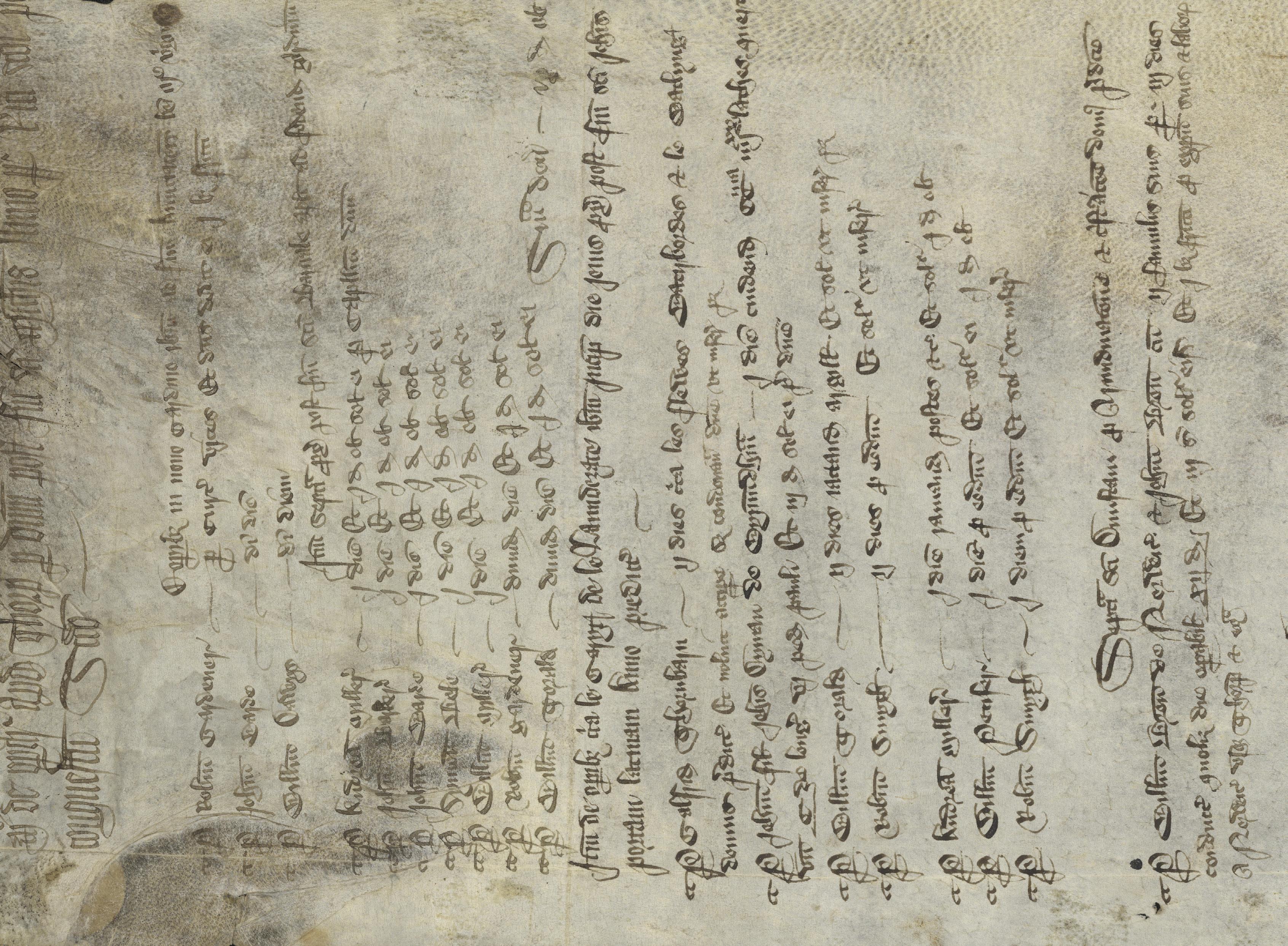
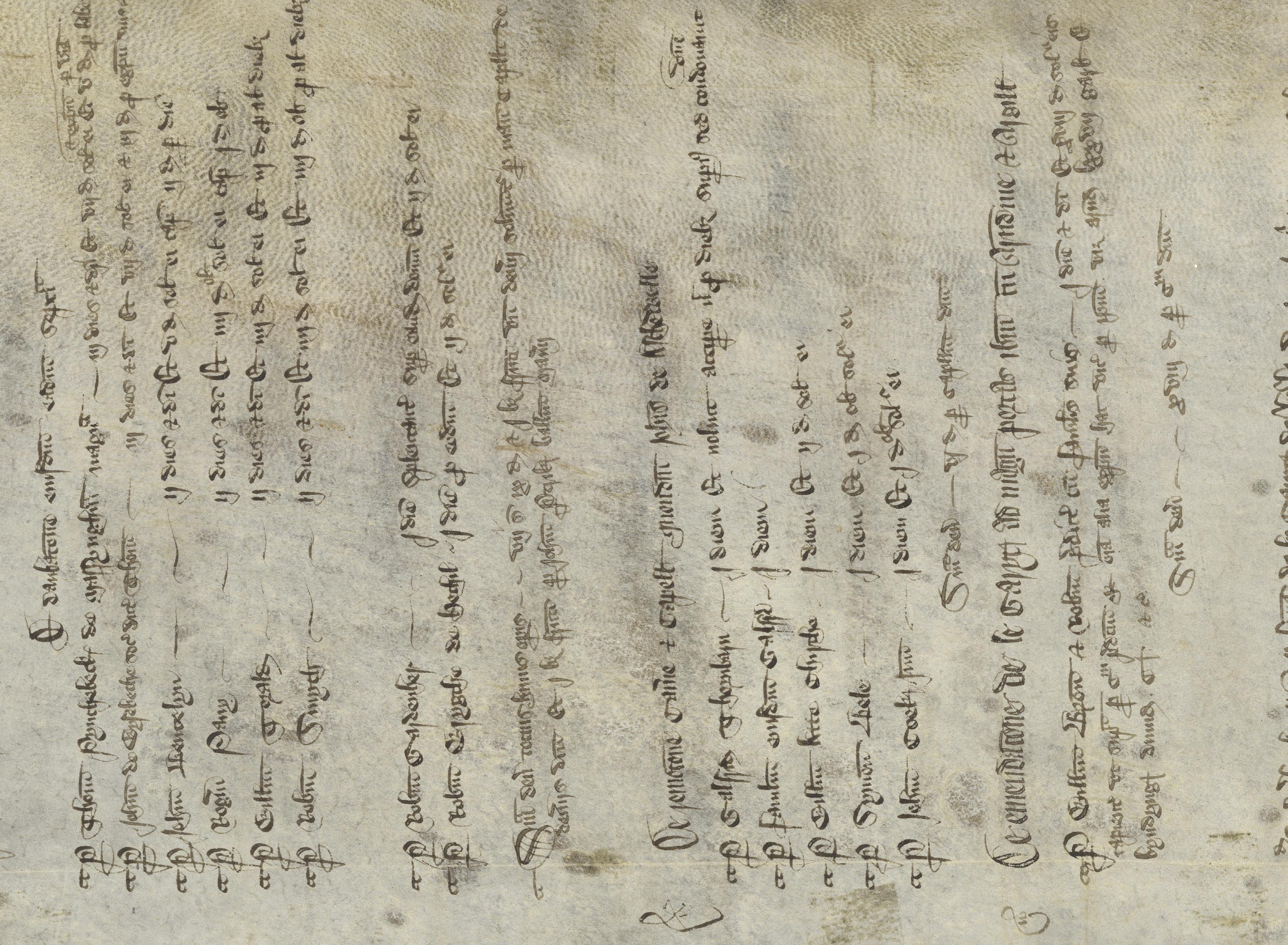
The oldest object in Special Collections is sourced from Cochran’s collection: a 4,000-year-old cuneiform tablet from the ancient Mesopotamian city of Ur that was used to document the labor and wages of sailors. Similarly, a parchment scroll from fourteenthcentury England, Memorandum de operationibus accounts the distribution of wages.
Several of the other notable mercantile texts date to the Renaissance in Southern Europe, such as the Book of Trade and Customs of Countries, a business manual written in vernacular Italian from fifteenth-century Florence that detailed the trade practices and customs duties of over 195 cities in the Mediterranean world. Another example is a painting that once illustrated the first page of an employment contract issued by the Doge of Venice to one of his senators in 1560 CE. A final example is a sixteenth-century ledger that records taxes levied by the Spanish imperial crown upon what is now Peru. This orderly financial account documents the extraction of natural resources from land that the Spanish
had recently colonized and the theft of precious materials from a civilization they had enslaved.
While these books are presented in different formats, they all served utilitarian purposes. These objects demonstrate the ways in which labor, currency, and economics have been a fundamental component of our collective history for millennia.
Emma P. Holter
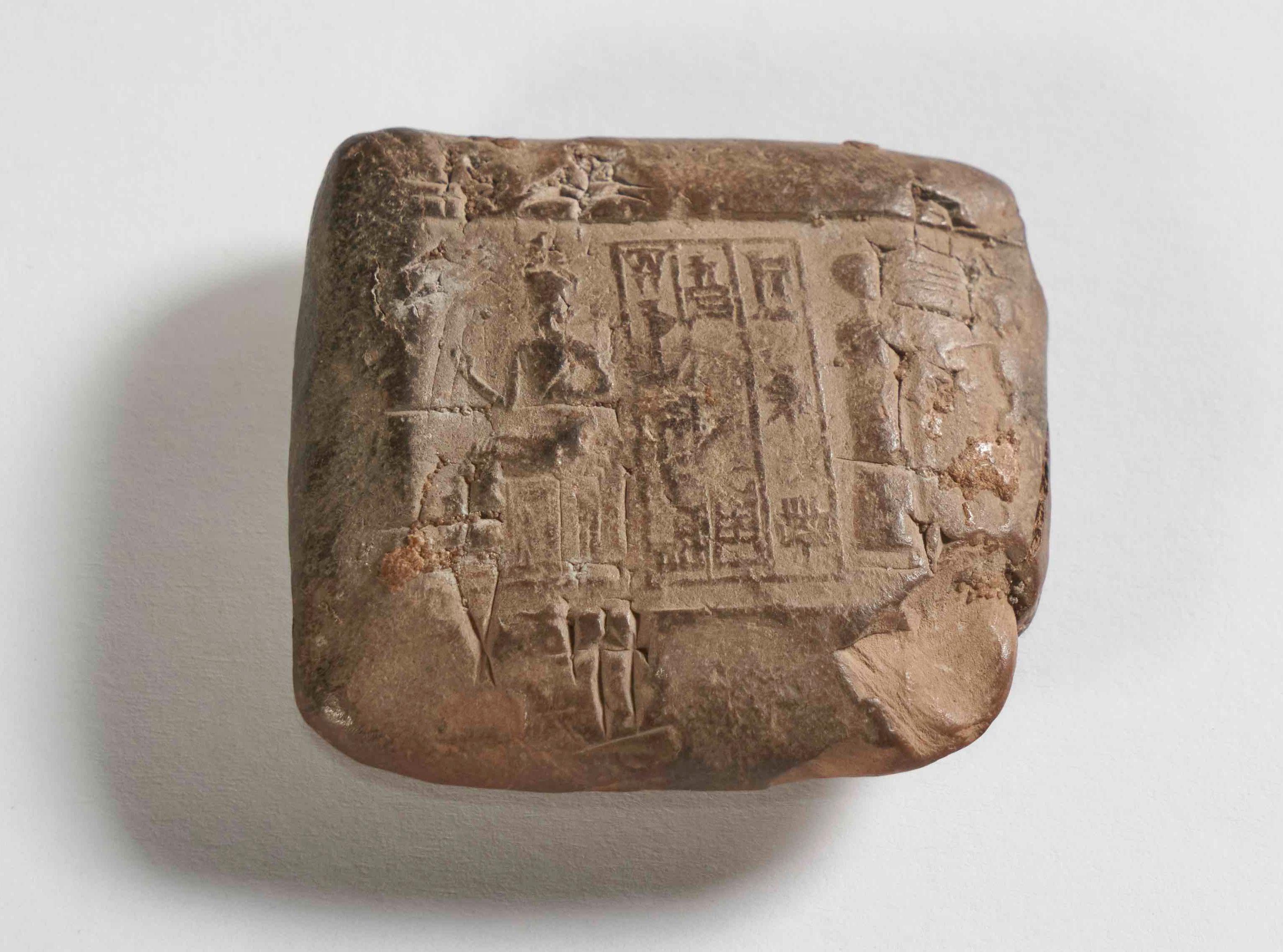
Cuneiform Tablet Recording
Sailors’ Wages
Ur-dingir-ra
Ceramic earthenware
4 x 4.3 x 1.5 cm
ca. 2150—2000 BCE, 3rd Dynasty of Ur (Neo-Sumerian Period), Sumeria (present-day Iraq)
SCRC 47 Cochran
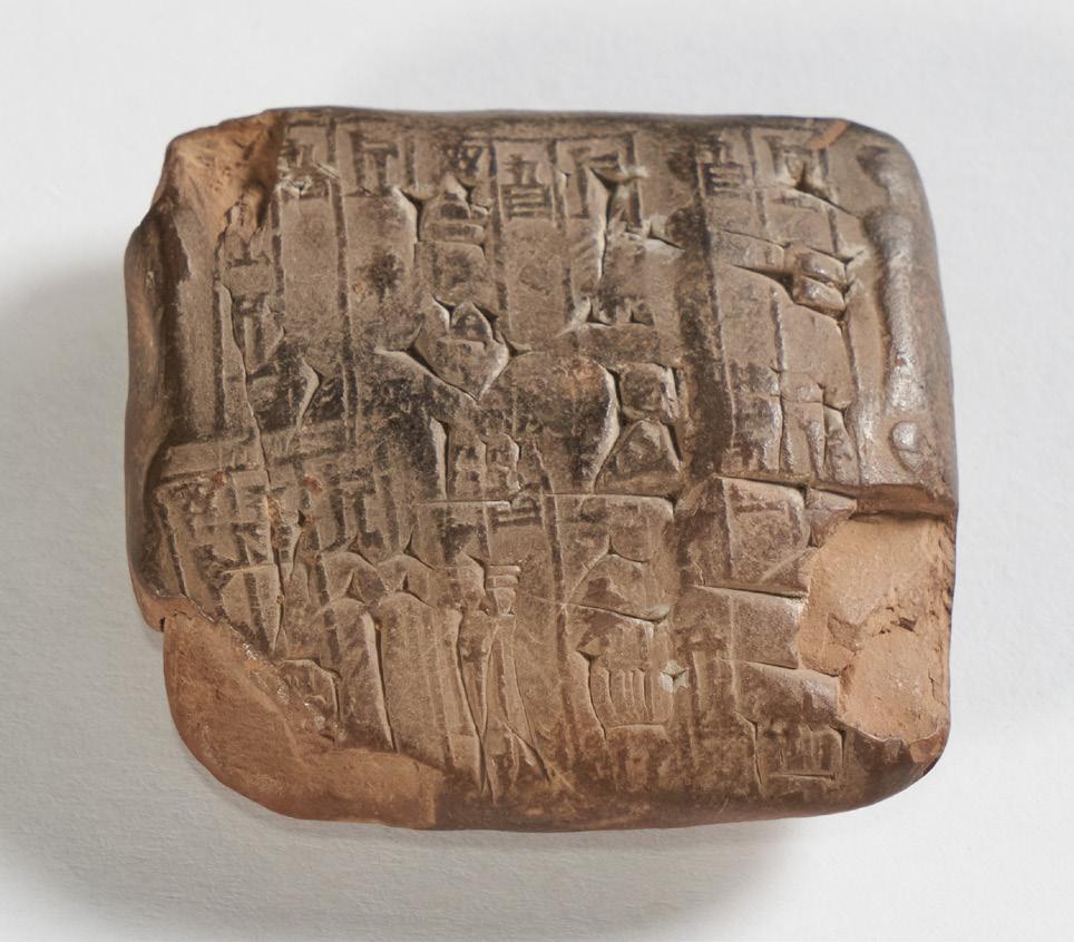
Roughly 4,100 years ago, Ur-dingir-ra, a Sumerian scribe, sat down to “balance his accounts.”1 Recorded in soft wet clay that has dried and hardened, this diminutive tablet was the result. It describes payment to a sailor for services rendered.
Ur-dingir-ra, like other scribes in ancient Mesopotamia, used a dual system of mark-making to record the information on the tablet’s surfaces. First, he rolled out a “notarial” impression using a cylindrical seal into the surface of a small lump of clay. This seal includes three figures in a typical image called a “presentation scene.” At left, a standing goddess presents a human figure to a seated deity at right, identifiable as such by his conical cap; both standing figures raise their hands in veneration of the seated god. The cylinder seal also impressed three registers of text in a writing system called cuneiform (“wedge-shaped”).2 This Sumerian-language text is read by rotating the tablet 90 degrees counterclockwise from the figures. In this new position, reading from left to right, and top register to bottom, the inscription gives the scribe’s name: “Urdingir-ra, Scribe, Son of […].” Analogous to a modern-day notarial document, the impression has been made multiple times on both sides of the tablet, certifying the transaction of wages paid as witnessed by Ur-dingir-ra.3
Atop the now-impressed clay tablet, Ur-dingir-ra then pushed a reed into the still-soft clay to write the actual transaction—in this case, a payment of barley made to a sailor as wages, along with an indication of the year. Was this tablet created and then handed to the sailor? Or was it created by the scribe and set aside as a record of payments made? We will likely never know, but as a so-called wage tablet, we might do well to think of this object less as a receipt, and more as a Sumerian bureaucratic way of tracking expenses.4
Bradford Davis
1. I am grateful to Müge Durusu-Tanrıöver for lending her expertise as I was writing this entry.
2. C. B. F. Walker, Cuneiform (Berkeley and London: University of California Press and British Museum, 1987); Jean-Jacques Glassner, The Invention of Cuneiform Writing in Sumer (Baltimore: Johns Hopkins University Press, 2003).
3. The entire process of making and reading the object in its Sumerian context has been explained by Müge Durusu-Tanrıöver, “Cuneiform tablet recording sailors’ wages, Ur III,” A Look at a Book, episode 9, April 19, 2023, stellaonline.art/look-book
4. Hans J. Nissen, Peter Damerow, and Robert K. Englund, Archaic Bookkeeping: Early Writing and Techniques of Economic Administration in the Ancient Near East (Chicago: University of Chicago Press, 1993).
Economics & Labor | 21
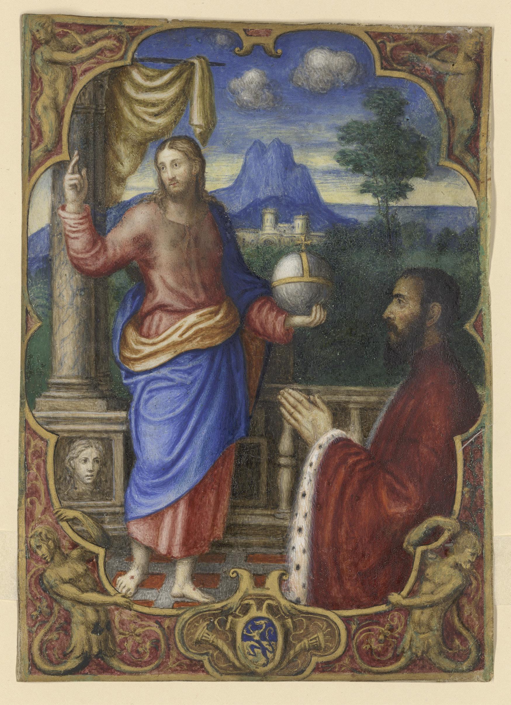
Dogale issued by Doge Girolamo Priuli to Pandolfo Guoro, Captain of Famagusta, Cyprus
Attributed to Master To. Ve. Illumination on parchment
22.7 x 16.2 cm
1560-61 CE, Venice, Venetian Republic (present-day Italy)
SCRC 375
22 | The Art of the Book
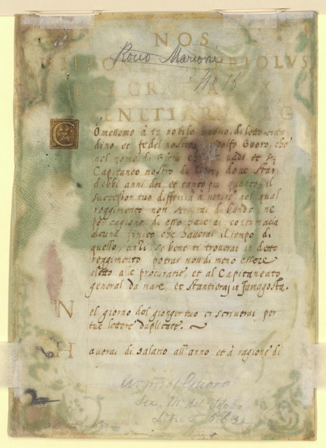
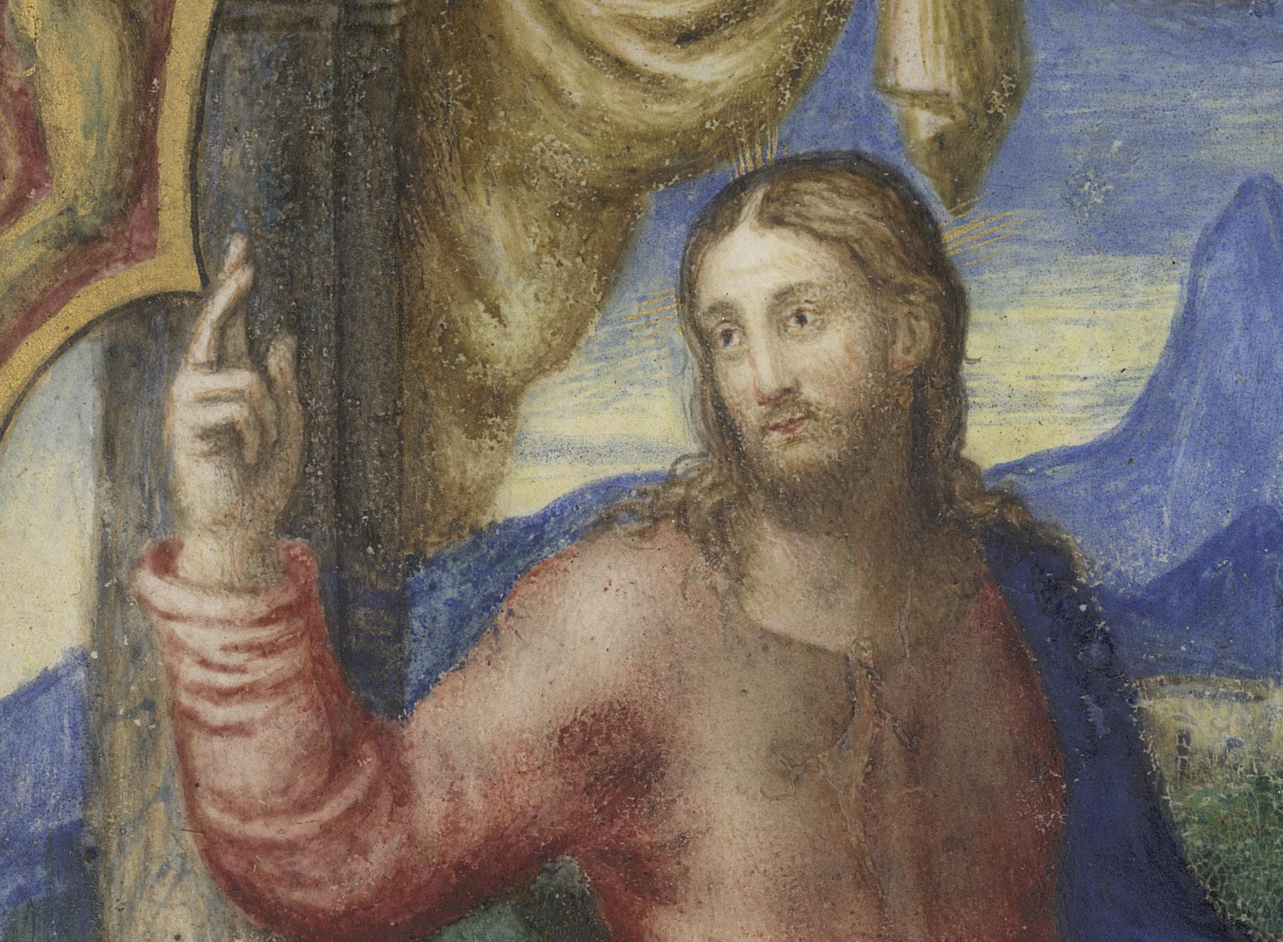
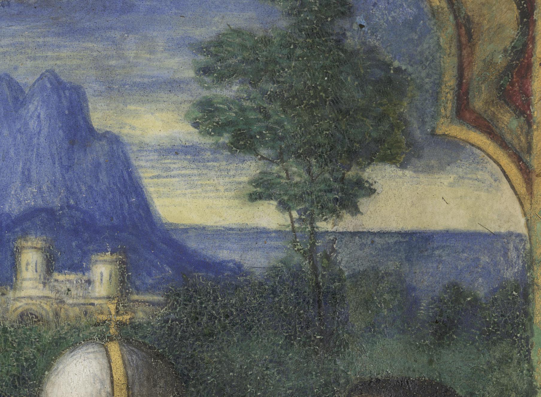
Dressed in the sumptuous red velvet garments of a Venetian senator, Pandolfo Guoro kneels in adoration before Christ. Despite the religious subject matter of the illumination, this image once decorated the opening page of a secular, official document, a dogale Dogali transmitted power from the Doge of Venice to an individual and outlined their legal obligations, responsibilities, and functions. This particular dogale was issued by the Doge Girolamo Priuli to nominate the Venetian senator Pandolfo Guoro as the capitan of the city of Famagusta in present-day Cyprus. Around 1560, when this legal document was drawn up, Cyprus was a strategically important stronghold in the Venetian empire because it was a stop for pilgrims en route to the Holy Land, and close to trading partners in Alexandria and Damascus. Much like a job description, the dogale would have outlined the role’s expectations, responsibilities, and functions for Guoro before he accepted his post and set sail for Famagusta. The details of his appointment begin with an inscription on the back of this image. However, one key piece of information is missing that would have been quite important to Guoro: his salary. The final line on the verso of this document states, “You will have the annual salary of…,”1 but the crucial number is nowhere to be found. Presumably the amount would have been included on the following page, but unfortunately that detail has not come down to us.
It is uncertain who painted this illumination, but based on the style of the decorative frame, scholars have likened it to the work of Master To. Ve. whose workshop was actively illuminating dogali between 1550 and 1570. There are two examples of dogali signed by Master To. Ve., now in the Fitzwilliam Museum and the Cini Foundation, that have very similar decorative frames around the illumination.2
Emma P. Holter
1. “Haverai di salario all’anno et à ragione di”… Transcription by Mario Sassi.
2. Consuelo Dutschke, “Leaf from a Dogale,” in Leaves of Gold: Manuscript Illumination from Philadelphia Collections ed. James R. Tanis (Philadelphia: Philadelphia Museum of Art, 2002), 222–23. Cat. 77.
Economics & Labor | 23
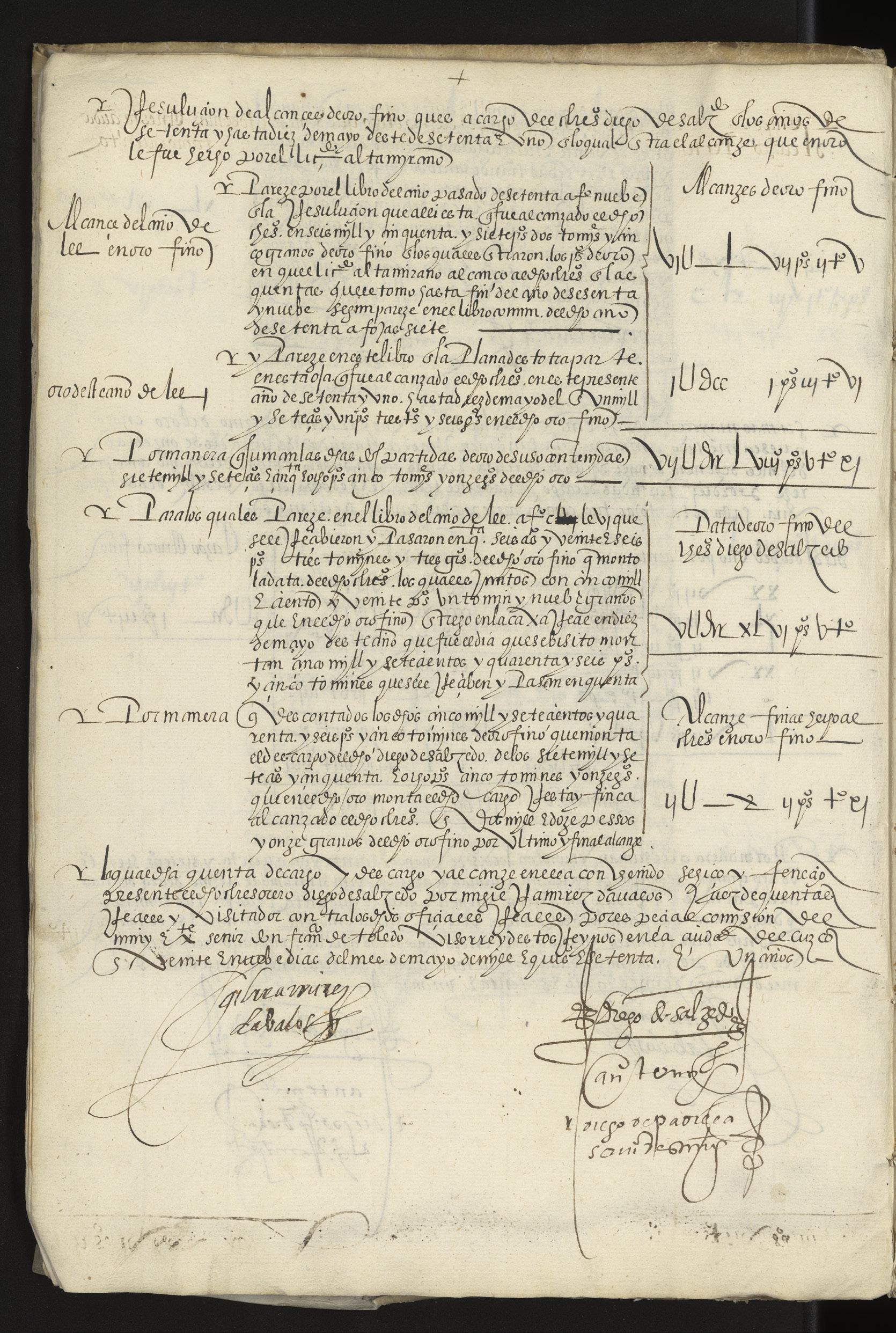
At first glance, this object may seem as simple as it appears: a plain, leatherbound notebook used to keep track of financial accounts. The entries on its thin paper pages are evenly spaced and neatly organized, with figures and sums appearing at regular intervals throughout its margins. Yet this ledger’s utilitarian design both facilitates and masks its true purpose: to aid the Spanish Empire in systematically subjugating and exploiting the indigenous peoples of Peru for its own political and financial gain.
Almost forty years before the creation of this ledger, the Spanish soldierexplorer Francisco Pizarro led his army of conquistadors in storming and pillaging Cuzco, the capital of the Inca Empire. Pizarro encountered overwhelming quantities of gold, silver, precious stones, fine cloth, and other valuable goods throughout the city, especially in the Temple of the Sun, which held the treasures of Incan kings.1 Shortly after this conquest, the Spanish Crown established the Viceroyalty of Peru. For close to three centuries, Spain implemented a system of colonial rule in which it mined Peru’s plentiful mineral resources, particularly silver, on the backs of the local population it enslaved.
Diego de Salzedo, the author of this ledger, was part of that matrix of oppression. As a Spanish royal treasurer living in Cusco, he worked within a fiscal system (the real hacienda) that collected royal taxes,2 disbursed funds throughout the colonies, sent surpluses back to Castile, and ensured the financial interests of the crown.3 Salzedo recorded these and other transactions in exacting detail in this ledger, which spans the year 1571 CE. The glimmering treasures Pizarro encountered in person appear in Salzedo’s ledger in black ink, reduced to sums and figures, as a numerical cost of colonization.
Rachel Vorsanger
1. Pedro De Cieza De León, The Discovery and Conquest of Peru, ed. Alexandra Parma Cook and Noble David Cook (Durham: Duke University Press, 1998), 317–21.
2. Known as “royal fifths.” The royal fifth consisted of a large quantity of gold ingots and four llamas of gold, and eleven gold women. Ibid.
3. Herbert Klein and John Jay TePaske, Introduction. The Royal Treasuries of the Spanish Empire in America, vol. 1 (Durham: Duke University Press, 1982).
24 | The Art of the Book
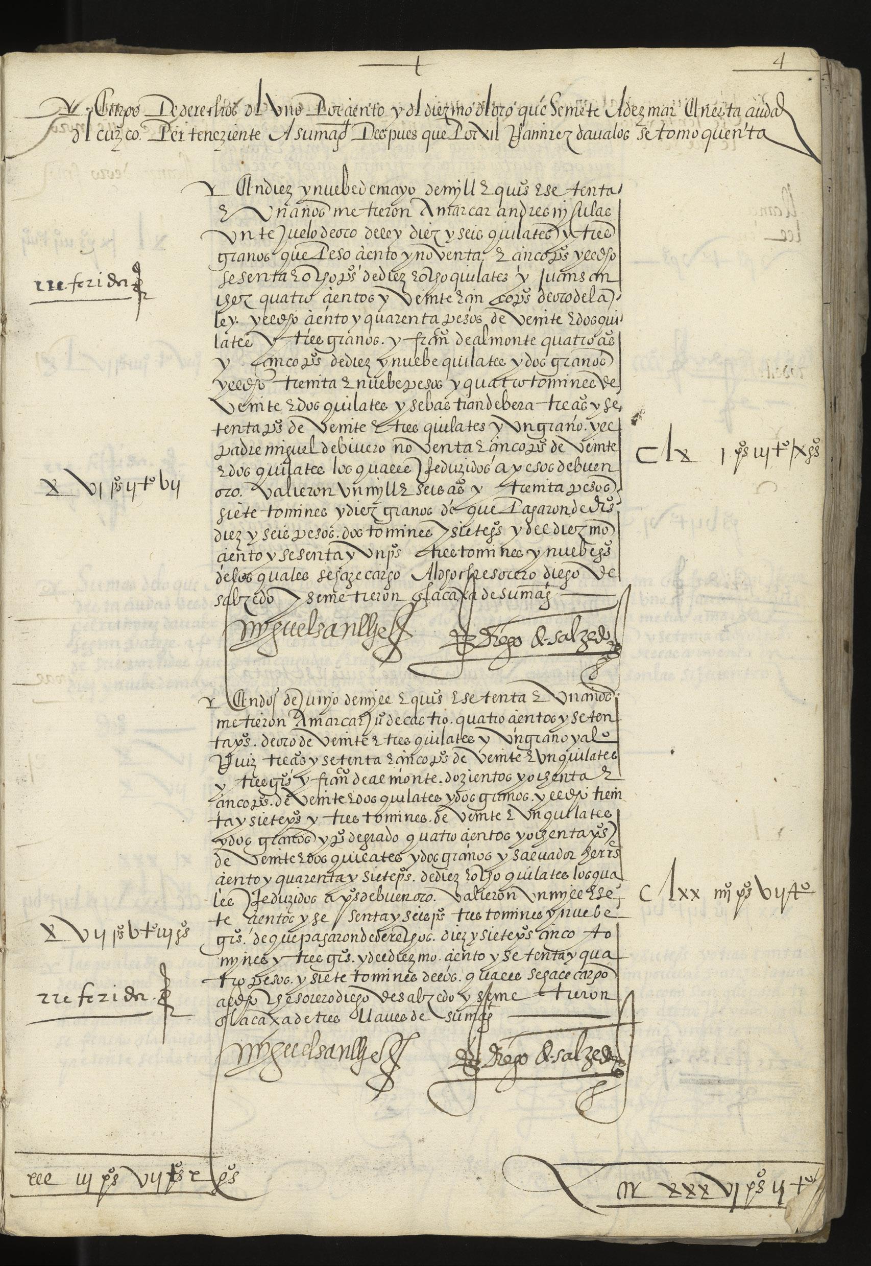
Libro de thesorero Diego de Salzedo para deste ano de 1571
Ledger of the Treasurer, Diego de Salzedo, for this year of 1571
Diego de Salzedo
Paper manuscript bound in limp vellum with bands of leather
30.5 x 21 cm bound to 31.3 x 21.5 cm
1571 CE, Cuzco, Viceroyalty of Peru (present-day Peru)
SCRC 560 Cochran
Economics & Labor | 25
Memorandum de operationibus
Memorandum de operationibus apud Thorp per dominicam post festum Sancti Michaelis anno regni Ricardi Secundi post conquestum secundo
A Memorandum of the Proceedings at Thorpe on the Sunday after the Feast of St. Michael in the Reign of Richard II after the Second Conquest Ink on flattened parchment roll
70 x 20 cm
1378 CE, Ashwellthorpe, Norfolk, Kingdom of England (present-day United Kingdom) (SPC) MSS BH 057 COCH
26 | The Art of the Book

This flattened roll is an accounting record from Ashwellthorpe (abbreviated as Thorpe in the document), a community in the county of Norfolk, England. It was drawn up during the second Regnal Year of Richard II (beginning June 1378 CE), and records work completed and wages paid through the Sunday after the feast of Saint Michael (September 29, 1378 CE). Memoranda like this were often written in Latin until the early sixteenth century and used Roman numerals instead of Arabic numbers.
Accounting in late-medieval England was important, as the legal system and government relied heavily upon written evidence. This roll was made at a particularly violent and disruptive period in English history during the Hundred Years’ War, which had already been underway for nearly half a century. King Richard II, just eleven years old when this document was written, was a firm believer in royal prerogative (the authority and privilege afforded to monarchy) and as such, limited the power of the aristocracy, upon which a king would normally rely for military protection.1 Instead, Richard employed a private retinue, whose members’ salaries would likely be recorded in a way similar to this roll.
The format of this long document, measuring 70 centimeters in height, is related to the way it was kept: it would have originally been rolled up for storage, held shut with something like a string, and unrolled when needed for reference, either in sections or in its entirety.2 This opisthographic roll (one which is used on both sides) has its text oriented vertically, indicative of a medieval origin, rather than horizontally, as scrolls in antiquity were arranged. Although the format of the codex was common for the preservation of text by the late Middle Ages, rolls continued to be used and valued. One especially important genre that used the roll format was the Genealogy, such as the well-dispersed medieval text Genealogia Christi by Peter of Poitiers.3 For business records like this Memorandum, the length of text to be recorded would not always be known at the outset. Since scrolls can be extended by connecting additional lengths of parchment to one end, it is a format that can easily accommodate growing contents.
While the difference in physical construction and activation between a roll and a codex often leads us to discount rolls as books, rolls function identically to the codex, preserving and transmitting knowledge for posterity.
Ivy D’Agostino
1. James L. Gillespie, ed., The Age of Richard II (New York: St. Martin’s Press, 1997).
2. Peter Beal, “scroll,” in A Dictionary of English Manuscript Terminology, 1450–2000 (Oxford: Oxford University Press, 2008).
3. Sonja Drimmer, “The Rollodex: An Experiment around the Prepositional Paradigm through Peter of Poitiers’s Genealogia Christi,” The Journal of the Walters Art Museum 76 (2023), https://journal.thewalters.org/volume/76/essay/the-rollodex-an-experiment-around-the-prepositional-paradigm-through-peter-of-poitierss-genealogia-christi/.
Economics & Labor | 27
Questo e ellibro che tracta di marcantie et usanze di paesi
Book of Trade and Customs of Countries
Giorgio di Lorenzo Chiarini, author
Ludovico Bertini, scribe
Ink on parchment manuscript with blind-tooled and stamped leather binding and two closing straps
17 x 12.5 cm
July 1481 CE, Florence (?), Republic of Florence (present-day Italy)
SCRC 541 Cochran
28 | The Art of the Book
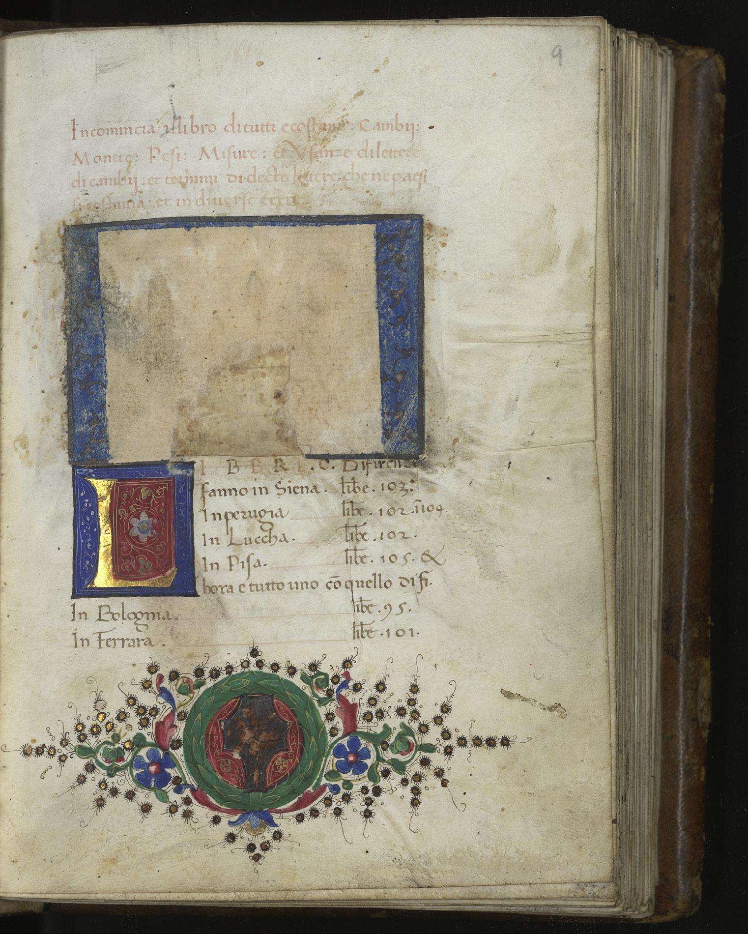
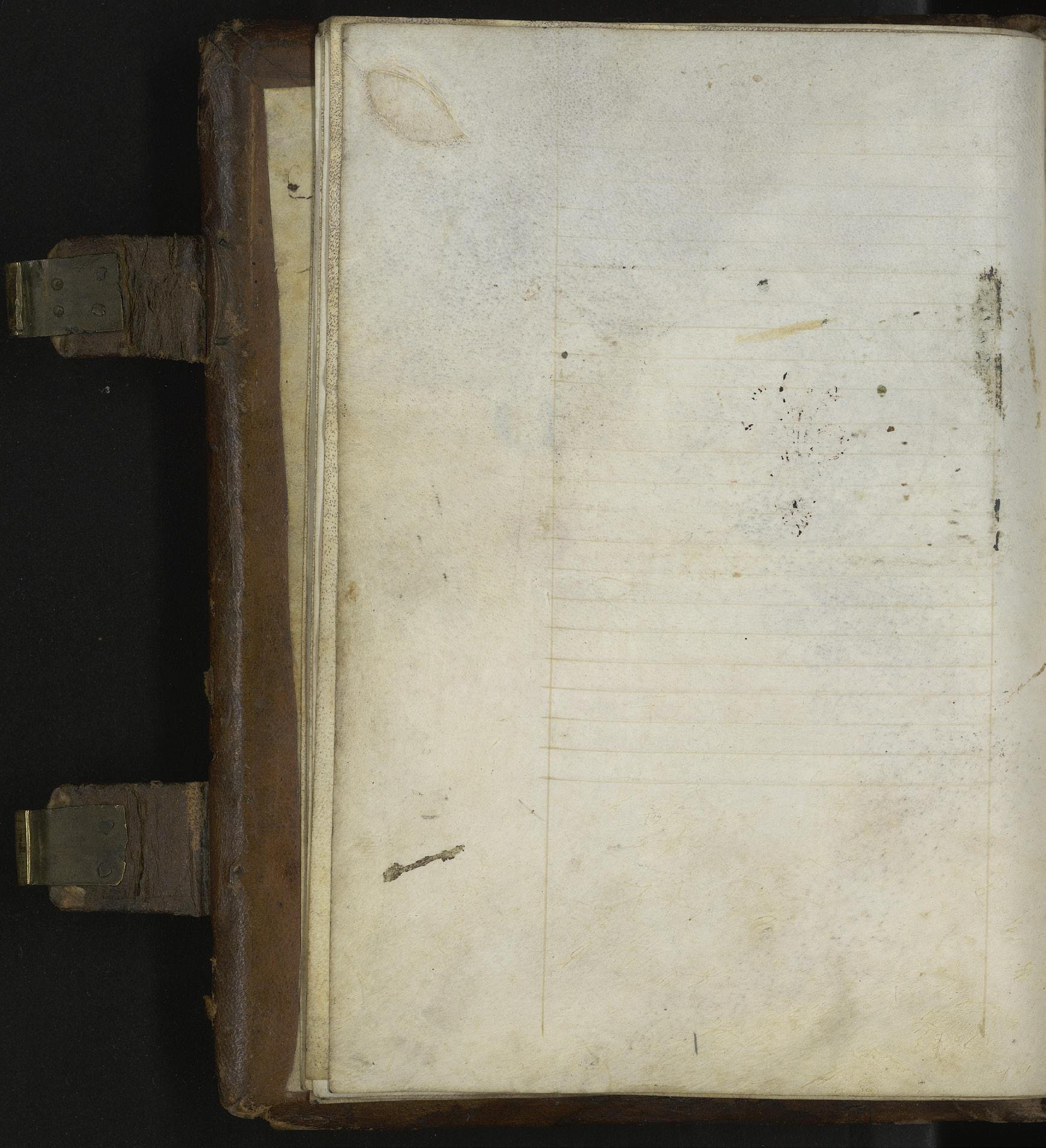
Businessmen in fifteenth-century Florence had to navigate a complex network of trades, customs, exchange rates, and a lack of standardization in units of measure, weight, and currency. In order to parse this tangled web, they consulted books such as the Tracta di marcantie et usanze di paesi. This business manual, written in vernacular Italian, details the trade practices and customs of 195 locations in the Mediterranean world—a testament to the interconnectedness of Western Europe, North Africa, and the Eastern Mediterranean five hundred years ago. Remarkably, the name of the author of this text, Giorgio di Lorenzo Chiarini, and the scribe who transcribed it, Ludovico Bertini, are both preserved in this codex.1 Originally, the title page would have been decorated with a small miniature painting and the coat of arms of the patron or owner of this book.2 For reasons that remain unclear, those details have been removed, cut out, and obliterated from the page at some point in this book’s long history.
Emma P. Holter
1. Written by Ludovico Bertini, Florence, 1481 CE (colophon, fol. 100r); formerly owned by Matteo di Lorenzo di Francesco, Scarperia, 1591 CE (ownership note, fol. 100r); formerly owned by Sir Thomas Phillipps, Phillipps mss. no. 6994; purchased by Temple University from Wm. H. Robinson, 1951 CE (dealer’s label inside front cover; Catalogue 81 (1950) Item 115).
2. Nicholas Herman, Making the Renaissance Manuscript: Discoveries from Philadelphia Libraries (Philadelphia: University of Pennsylvania Press, 2020), 256–57, Cat. 77.
Economics & Labor | 29
Before (the Art of) the Book
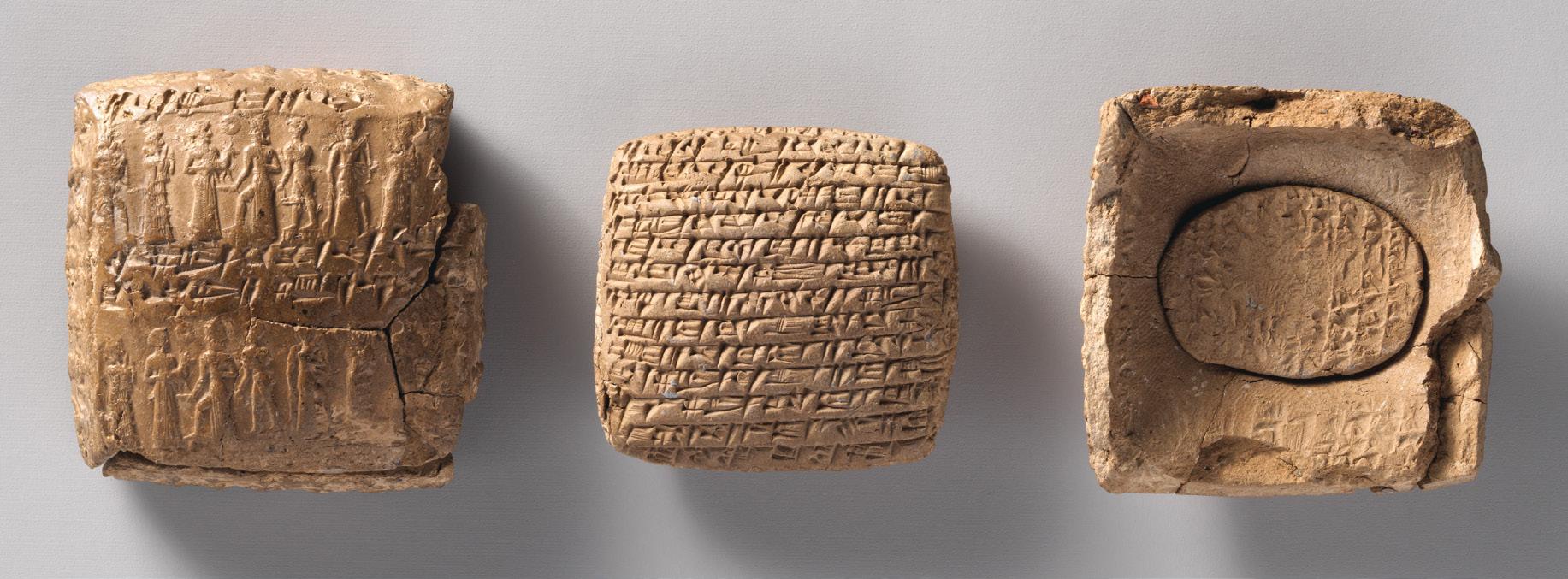
Cuneiform tablet with a small second tablet: private letter ca. 20th–19th century BCE, Middle Bronze Age, Anatolia, probably from Kültepe (Karum Kanesh), clay, 4 x 4.3 x 1.7 cm, 2.2 x 3 x 0.7 cm. Metropolitan Museum of Art, New York, 1983. 135.4a, b
Müge Durusu-Tanrıöver
In many parts of the eastern Mediterranean, writing first emerged as a tool for recording and stock-taking. The earliest written artifacts so far known from Mesopotamia (i.e. the land between the rivers of Tigris and Euphrates, today part of Syria, Iraq, and Türkiye) come from the site of Uruk. There, clay tablets dating to ca. 3400 BCE were discovered in an archive of economic texts in the Eanna temple complex, containing lists and inventories inscribed with proto-cuneiform signs.1
What follows is, literally, history. The combined power of the accessibility and the cheapness of the medium (fine clay just left to dry in the sun afterward to become permanent) and the gradually increasing versatility of the cuneiform script that could render both words and syllables made this early writing technology the dominant choice in ancient Western Asia for more almost three and a half millennia. In Mesopotamia, cuneiform was continuously used to record first Sumerian, a language isolate, and then various dialects of Akkadian, a Semitic language. Second millennium
BCE archives found in central Türkiye yielded thousands of clay tablets bearing texts mainly in Hittite (an IndoEuropean language) and Akkadian. At this point, writing had already evolved beyond recording transactions or state business, and was used for epics, rituals, or ways to make sense of the universe, i.e. divination. In the first millennium BCE, inscriptions were carved in eastern Türkiye’s highlands in Urartian, while Assyrian king Ashurbanipal compiled his library of tens of thousands of tablets in the capital city, Nineveh. Later, Persepolis’s funerary monuments boasted Old Persian, Elamite, and Akkadian; all recorded in cuneiform.
From its earliest days, the development of the cuneiform writing in Mesopotamia was intertwined with the rise of cities, state, and administrative technologies.2 Clay tablets or their envelopes were often sealed with cylinder seals, carved objects that could impress a visual narrative endlessly as they were rolled on clay tablets. In other words, writing—a tool we tend to identify with the liberation and democratization of knowledge—started out as a tool for stock-taking and control in the ancient world. Even when it was opened to documenting various genres of text including fiction, cuneiform writing continued to be a technology taught in schools attached to temples, and tried to be gatekept as an exclusive practice intended for a stratum of the society that would move on to become scribes, bureaucrats, and high-level priests. Furthermore, as archaeological excavations of the last two centuries tended to focus on monumental structures and large cities, the cuneiform corpus we have is almost entirely yielded from state-related contexts.
The more than 3000-year journey of cuneiform, however, also instills hope, as it demonstrates that tools of oppression can ultimately be claimed by the oppressed. Merchants learned and used cuneiform to ask for tax breaks from states. Vassal kings denied their overlords’ requests for more resources to be sent to the imperial center in cuneiform. Local writing systems evolved and countered the exclusivity of cuneiform with graffiti carved over monuments. The incentives for the conceptual leap using an abstract system of signs might have been record-keeping and control, but the results fulfilled much broader needs that ultimately made writing a technology claimed by all levels of the society.
1. Hans-Jörg Nissen, “Uruk: Early Administration Practices and the Development of Proto-Cuneiform Writing,” Archéo-Nil 26 (2016): 33–48.
2. This is by no means endemic to Mesopotamia. Linear A in Crete, Linear B in Greece, and hieroglyphs in Egypt all demonstrate the same trajectory.
Visualizing Science
Historia Naturalis Ranarum Nostratium, oder, Die naturliche Historie der Frosche hiedigen Landes
Individual cut Leaf from Der Gart der Gesundheit
Textbook on curing small-pox, fever, cold, and red eyes
Cosmographia Petri Apiani
The production of texts and images is central to investigations of the natural world. To observe and synthesize empirical phenomena into scientific theory almost always involves graphic visualizations. The process is not straightforward, however, as scientific “theory often struggles to reflect the dynamic nature of living phenomena,” a difficulty reflected in the challenge of visually representing natural processes.1 Scientific images, then, might be understood as partial constituents of the relationship between scientific theory and the reality it hopes to explain. As tools for conveying information, images display visually salient features of the observable objects under investigation, be they toads, onions, tumors, or stars.
Historian of science Ottavio Bueno points out that, “scientific images… are generated in order to provide evidence regarding the sample under study.”2 Thus, in the process of scientific imaging, it is those features chosen to be visually salient, with an eye towards providing evidence to support certain theories, that construct empirical understandings of phenomena. Rather than direct, uncomplicated representations of reality, scientific images are constructed, informed by the cultural beliefs, values, and practices of those producing them.3 In this way, they are not so different from artistic representations, and the interplay between science and aesthetic considerations are part and parcel of the construction and interpretation of scientific knowledge.
Varied in the time and place of their writing and publication, the books in this section nevertheless all negotiate this central tension in human efforts to make sense of our environment.
From the marks on the bodies in the Thai folding manuscript that signify an ailment’s severity, to the volvelles of Peter Apian’s Cosmographia they are all exercises in the various ways science was visualized, framed, and filtered through the cultural concerns of their makers. The representational strategies that art makes available to science thus leave their mark on these pages, and in our understanding of their contents.
Ana Matisse Donefer-Hickie
1. Gemma Anderson, John Dupré, and James G Wakefield, “Drawing and the Dynamic Nature of Living Systems,” eLife 8 (March 27, 2019).
2. See Otavio Bueno, “Interpreting Scientific Images: Aesthetic Considerations at Work,” in On Art and Science: Tangle of an Eternally Inseparable Duo, ed. Shyam Wuppuluri and Dali Wu (New York: Springer, 2019), 104, who draws on Noel Carroll’s theory of images as “detached display.”
3. Jan Golinski, Making Natural Knowledge: Constructivism and the History of Science (Chicago: University of Chicago Press, 2005).
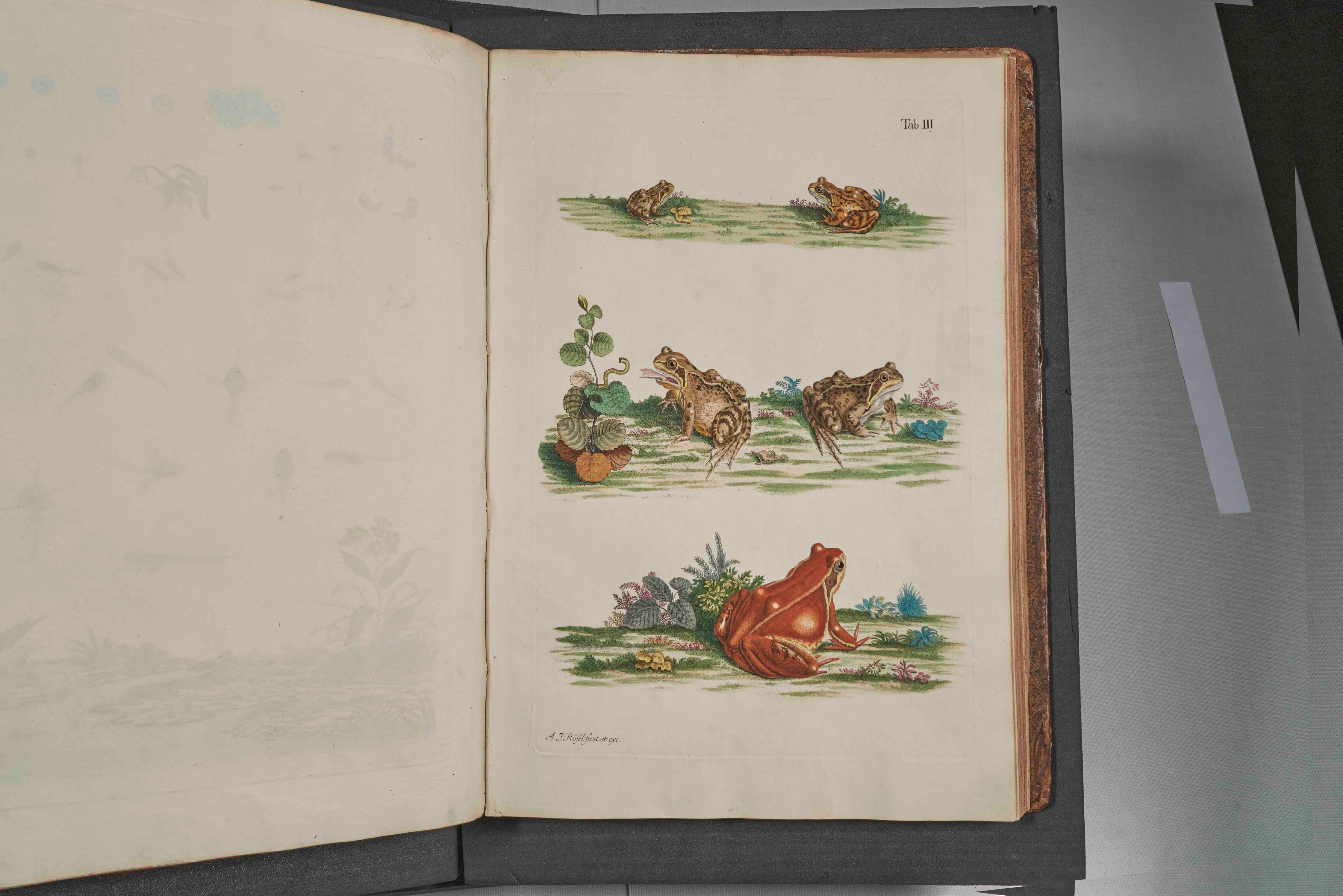
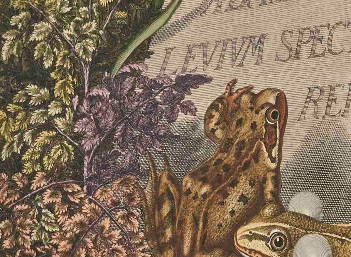
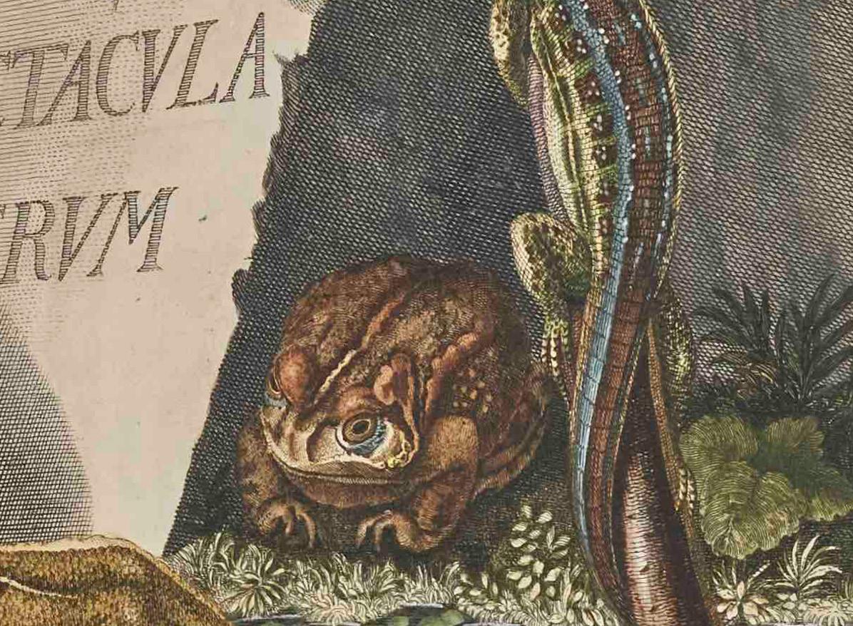
Published at the height of the Enlightenment, this text is known as the first major published work that accurately describes amphibian life cycles.1 The text, written in both Latin and German, describes the behavior and reproductive biology of the frogs and toads found around Nuremberg. The 24 hand-colored plates depict both live frogs in the acts of reproduction and frogs in the process of dissection, pins and all, laid open to reveal their anatomy. An aristocrat from the German-speaking principality of Arnstadt-Schwarzburg, Rösel von Rosenhof’s noble status allowed him the freedom to both study art and practice He was a portrait and miniature painter at the Danish Court in Copenhagen, but is better known today for his later work on bugs, salamanders, and frogs. His interest in insects and amphibians drew upon Maria Sybilla Merian’s (1647–1717 CE) ecological writings and illustrations based on her close observations of insect behavior. Despite Rosenhof’s several illustrations of frogs within the natural environment, like Merian, his observations of frog development were made at home, where he collected and raised the amphibians Also like Merian, this remove did not impact the success of Rosenhof’s work. Many of his illustrations and descriptions were used by Linnaeus as the basis for his influential classification system.
There is tension, however, between Rosenhof’s accuracy and the aestheticized design of his engravings. In plate VIII, for example, Rosenhof has arranged exquisitely detailed frog organs as if they were a set of jewelry: hearts glistening like garnets, fat curled like gold wire, and ovaries glittering like jet beads. This stylized depiction drawing on artistic convention that is incongruous with the true appearance of viscera suggests just how closely art and biology are linked.
Natural Histories: Extraordinary Rare Book Selections from the American Museum of Natural History Library ed. Tom Baione (New York: Sterling Publishing, 2012), 38. The SCRC copy was formerly in the collection of David
Dance of the Dung Beetles: Their
Historia Naturalis Ranarum Nostratium, oder, Die naturliche Historie der Frosche hiedigen Landes
A Natural History of the Frogs of these Lands
August Johann Rösel von Rosenhof, author and illustrator
Typis Iohannis Iosephi Fleischmann, printer
Paper, hand-colored copper engraving
43.5 x 32.5 cm
1758 CE, Nuremberg, Holy Roman Empire (present-day Germany)
QL668.E2 R6
Visualizing Science | 37
Individual cut Leaf from Der Gart der Gesundheit
The Garden of Health
Attributed to Johann Wonnecke von Kaub, writer
Johann Schönsberger, publisher
Woodblock printing on paper, ink
26 x 17 cm
1486 CE, Augsburg, Holy Roman Empire
(present-day Germany)
QK99.A1 G37 1486
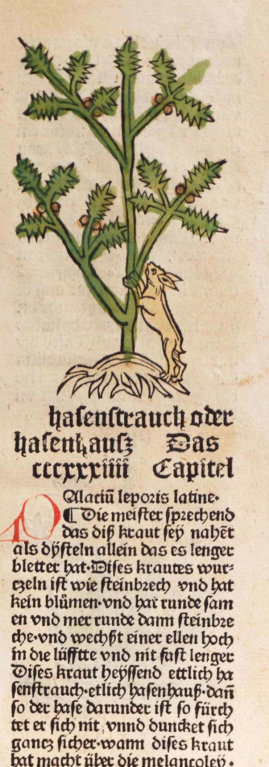
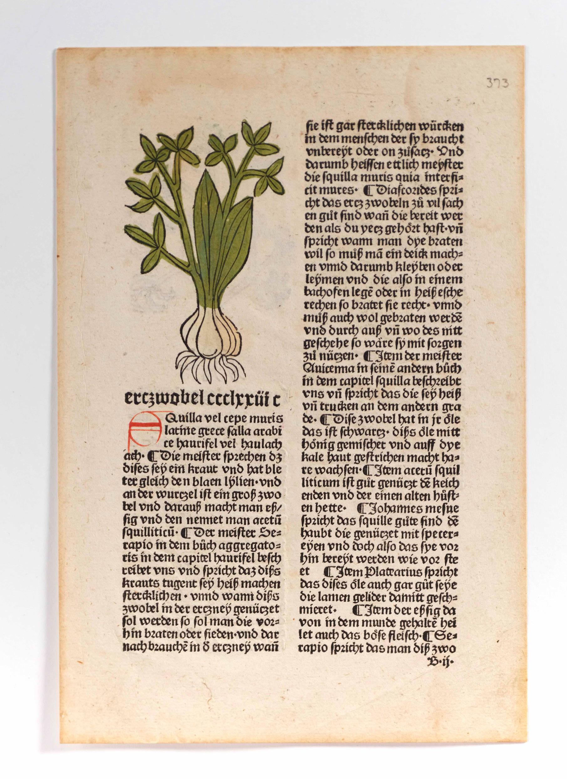
This page is one of twenty-five in the SCRC collection that come from an edition of Der Gart der Gesundheit, or The Garden of Health Gart der Gesundheit is an herbal, or a medico-pharmaceutical text describing the medicinal virtues of plants. The pages in the SCRC collection include a large variety of plants including Liverwort, Strawberries, Masterwort, Wormwood, Spinach, and Sandalwood.
The Gart der Gesundheit is a complicated text, reprinted many times between 1484 and 1541 CE. Its precursor, called the [H]ortus Sanitatis, was published in Mainz by Peter Schöffer, with the Gart der Gesundheit following soon after, in 1485 CE.1 This leaf, which is laid out in two columns with hand-colored woodcuts and handwritten initials atop each chapter, was most likely cut from a copy of the 1486 edition printed by Johann Schönsberger in Augsburg.2
The information in some of the Gart der Gesundheit’s chapters is cited from the writings of historical authorities like Galen, Pliny, Serapion, and Dioscorides (referred to as the “masters”), while others recount local folk remedies. Chapter 207, for example, describes the usefulness of roses to women for making “menstruation easier.” Chapter 154, on Elecampane (inula helenium, also known as horse-heal or elfdock), cites Dioscorides’ description of the herb: “sharp with long light leaves and a stem that is not too small.”3
The woodcuts are less descriptive, and served more as mnemonics for people already familiar with the appearance of these plants than as guides to identification.
Ana Matisse Donefer-Hickie
1. Christian J. Bay, “HORTUS SANITATIS,” The Papers of the Bibliographical Society of America 11, no. 2 (1917): 57–58.
2. Johannes von Cuba, Gart der Gesundheit (Augsburg: Johann Schönsberger, 1486). Bayerisches Staatsbibliothek 2 Inc.c.a. 1771 b.
3. “Auch diss den frauwen menstruum behendigklich”; “Diascorides beschzeibet uns das diss seyein kraut scharpff und lange licht an den bletern umid hatt ein jtarn der ist nicht zu Klein.”
Visualizing Science | 39
Textbook on curing small-pox, fever, cold, and red eyes
From the Thai Folding Manuscripts collection
Khoi paper, ink
11.5 x 34.5 cm
ca. 19th century CE, Kingdom of Siam (present-day Thailand)
SCRC 219
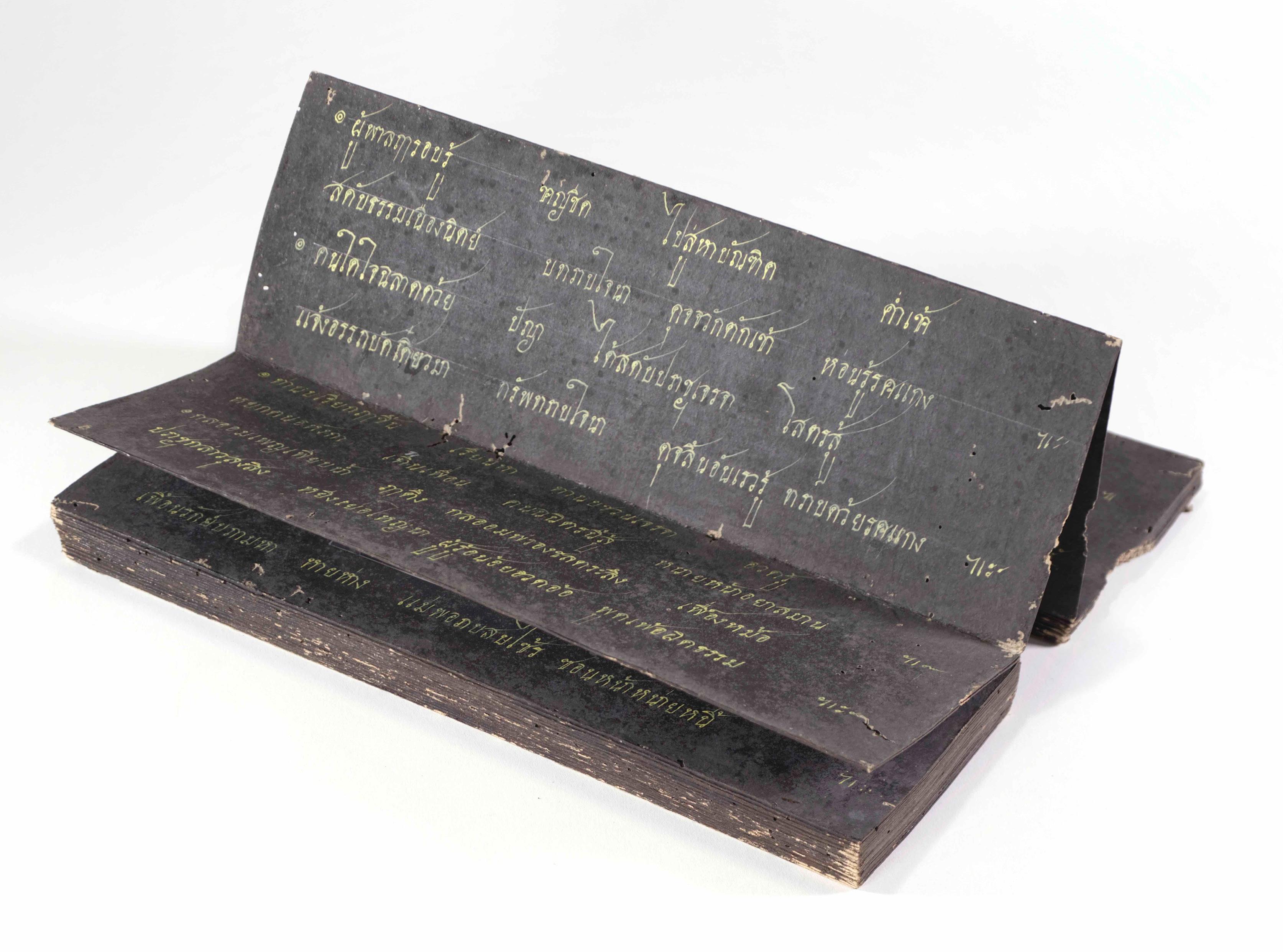
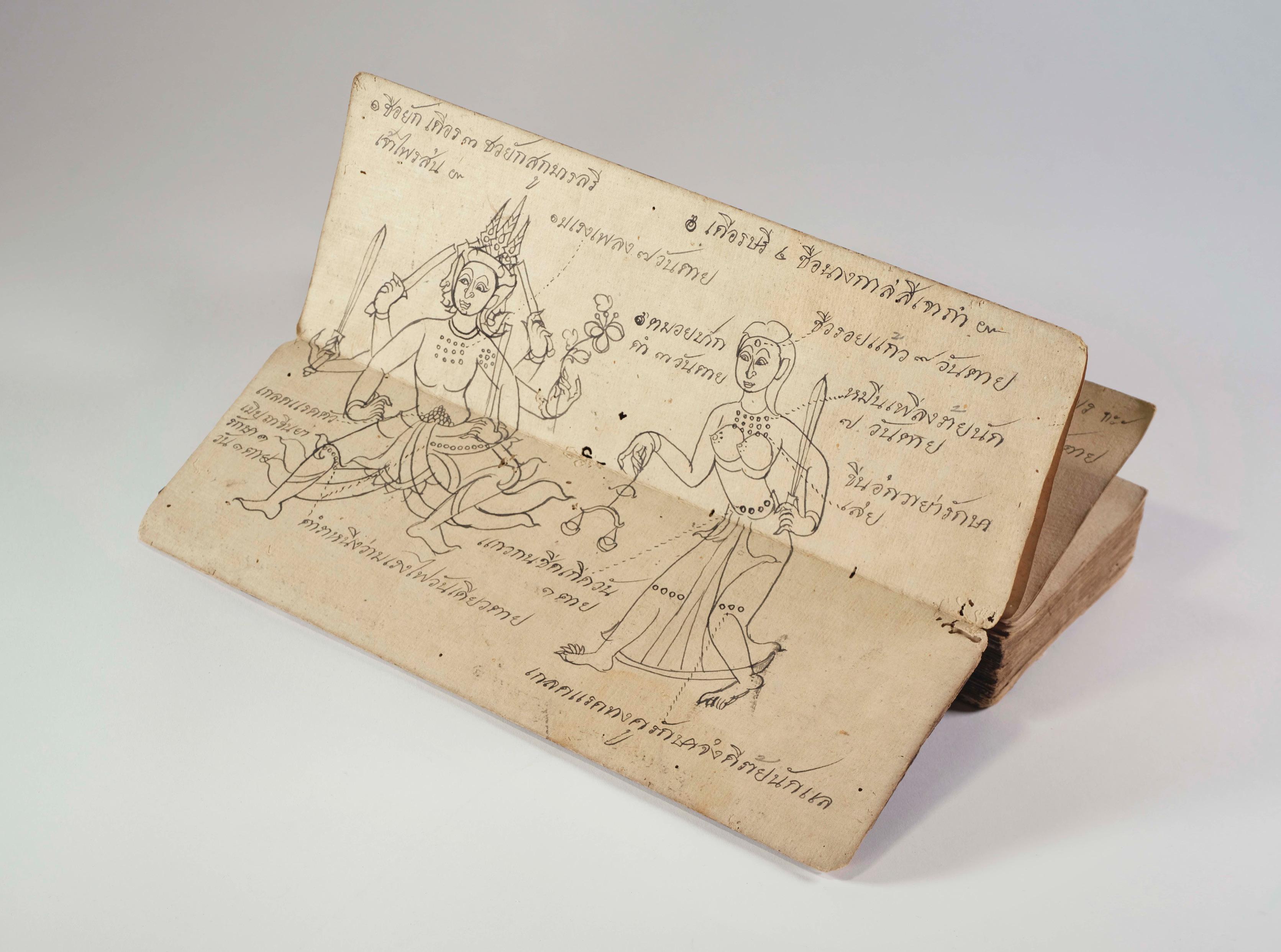
The three objects in the SCRC’s Thai Folding Manuscript collection can all be classified as samut khoi, a type of paper-folding manuscript characteristic of nineteenth-century Thai tradition.1 Each of the three objects was created for a different purpose; the medicine manuscript featured here is an example of a medical divination manual that provides instructions for curing diseases. Both the proverbs and poetry manuscripts are primarily textual, with the exception of a few detached folia that feature drawings of floral forms with text incorporated in their shapes.
Thai manuscripts’ concertina folding format allows the reader to flip through each page in opposite directions and access information through two different channels, challenging the Western expectation of a book. As observed in the proverbs and poetry lesson manuscripts, samut khoi were also commonly dyed black, creating a dark ground for text written in gold ink.2
The medicine manuscript, titled Textbook on curing small-pox, fever, cold, and red eyes, likewise follows the samut khoi format. Medical manuals of this type often include both written records of different types of diseases and illustrations to aid healing practices.3 Said illustrations are either presented as geometric patterns or as diagrams that identify tumors on the human body. Because medicine was informed by astrology, the time of year and the geographical location of the patient were also essential for a diagnosis.4 The illustrated human-like figures in this manuscript with varying numbers of limbs bear markings that signify the type and severity of a patient’s ailment, disease, or malignancy.5
Ha Tran
1. Joshua Kueh, “Tai Manuscripts in the Southeast Asia Rare Book Collection at the Library of Congress: Siamese Manuscripts and an Early Printed Book,” Research Guides, Library of Congress, last modified September 13, 2022, https://guides.loc.gov/tai-manuscripts/siamese-manuscripts.
2. “Figuring out Folds: Conserving a Thai Buddhist manuscript,” Chester Beatty Library, June 13, 2019, https://chesterbeatty.ie/conservation/figuring-out-folds/.
3. Henry Ginsburg, “Medical Divination,” in Thai Manuscript Painting (London: British Library, 1989), 28–30.
4. Kueh, “Tai Manuscripts.”
5. Ginsburg, “Medical Divination,” 28.
Visualizing Science | 41
Cosmographia Petri Apiani
Cosmographia, or A View of Terrestrial and Celestial Globes
Peter Apian, author
Gemma Frisius, editor
Arnold Birckmann, Coloniae Agrippinae Press, publisher
Ink on paper
20.5 x 16 cm
1574 CE, Antwerp, Habsburg Netherlands (present-day Belgium)
GA6 .A53

42 | The Art of the Book
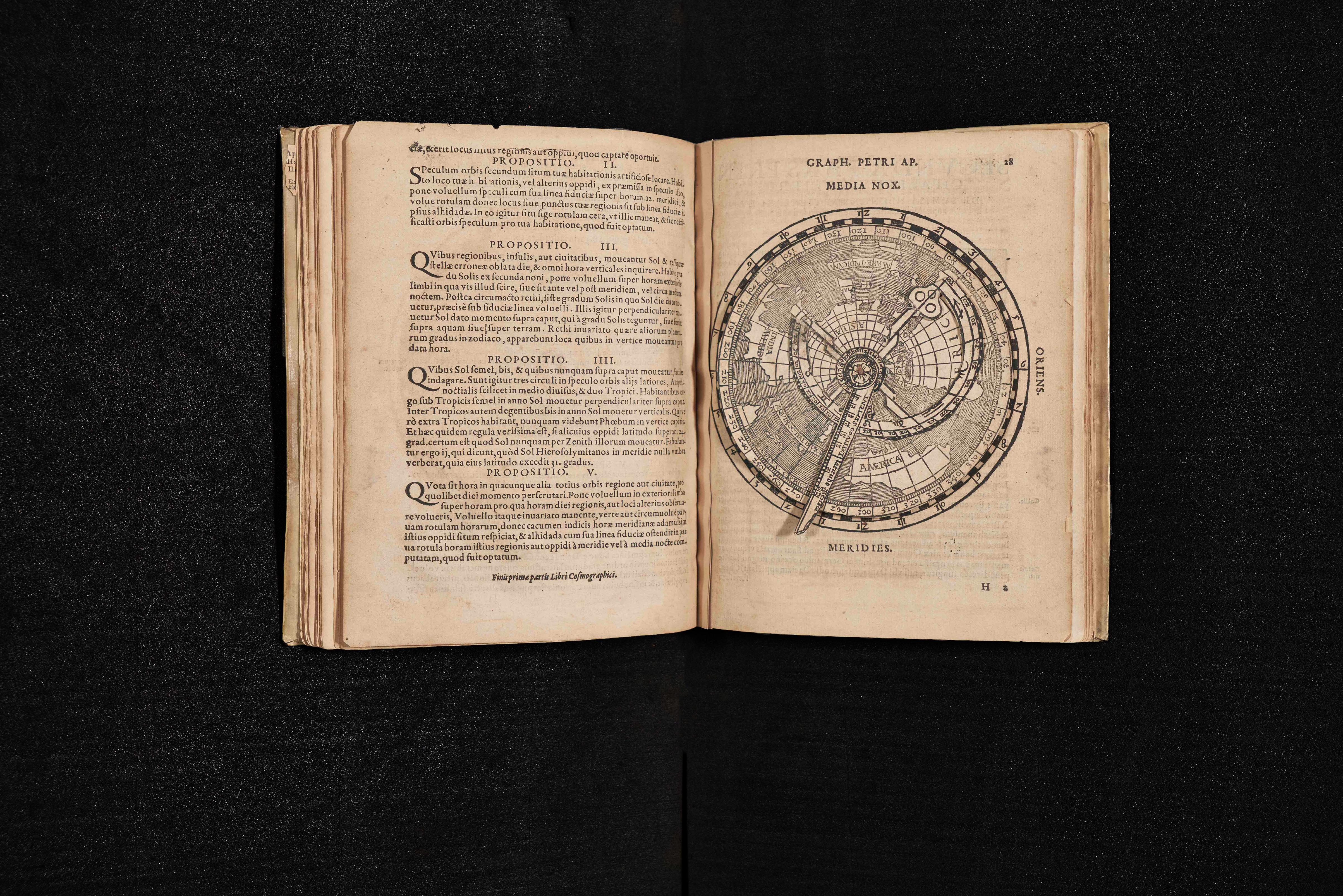
Peter Apian’s Cosmographia is a printed book on astronomy and navigation that includes several maneuverable diagrams and dials that were tools used to observe, measure, and calculate the movement of the cosmos. Apian’s text was first published in Landshut in 1524, but this edition was printed in Antwerp in 1574 with Gemma Frisius’s additions and corrections. The sixteenth-century astronomical and cosmographical text incorporated volvelles, or scientific instruments made of paper that the user could revolve to aid in mathematical calculations. Volvelle comes from the Latin verb volvere to turn, pointing to the interactive nature of this book. The one illustrated here features a terrestrial globe with a dial for calculating the movement of the cosmos throughout the calendar year. The text describes techniques for surveying, mapping, and triangulating one’s position in relation to the stars, and includes descriptions of each of the continents (including the Americas), a table of the latitudes of major European cities, and descriptions of techniques and instruments for making celestial observations—all of which encouraged readers to become amateur astronomers.1 The 1574 edition of the book also describes cosmological phenomena with illustrations of comets and eclipses of the moon.
Emma P. Holter
1. Margaret Gaida, “Reading Cosmographia Peter Apian’s Book-Instrument Hybrid and the Rise of the Mathematical Amateur in the Sixteenth Century,” Early Science and Medicine 21, no. 4 (2016): 277–302.
Visualizing Science | 43
Printing in Early Modern Germany
Ashley D. West
The title plate of Johannes Stradanus’ book of ca. 1590 CE, the Nova Reperta (New Inventions of Modern Times) prominently features at its center an image of a printing press, with newly printed sheets printed with movable type hanging to dry like a banner behind it. The press shares the page with other ‘inventions’ and technologies of the Renaissance period highlighted in the rest of the book: the compass; clock; saddle with stirrups; distillation process; the domestication of the silkworm; guaiacum wood (from the Americas and used to treat syphilis); gunpowder; and a canon, whose shaft points likes a finger upward to the image of the press above it, as if suitably singling it out above all else as the invention that made the book itself possible in its printed form.
Scholars have described Johannes Gutenberg’s invention of the printing press in Mainz, Germany, ca. 1440 CE—along with movable type (metal cast forms for printing language)—as constituting a media revolution.1 But to what extent is that an accurate assessment, both from our own twenty-first-century vantage and historically from that of the fifteenth and sixteenth centuries? What were the benefits and consequences of early printing in Europe, as well as some of the concerns?
Like many of the ‘inventions’ on Stradanus’ title plate (gunpowder and compass included), Gutenberg’s printing press and movable type were not, in fact, ‘pure’ Renaissance European inventions, but rather might be thought of as useful adaptations of existing technologies from older crafts and cultures. Print—if we think of it in its most basic terms as a ‘replicating technology’ and process of making repeatable impressions onto a surface— goes back at least to ca. 3100 BCE to Mesopotamian cylinder seals.2 The invention of movable type for repeating forms—though without a mechanical press—took place as early as the mideleventh century in China and Korea, first made in wood and ceramic, and by the early thirteenth century, in bronze.
Gutenberg’s printing press enabled the mechanical reproduction of text using a system of cast lead metal movable type to print on paper with greasy ink. One impact of Gutenberg’s printing press and movable type—in conjunction with the wide availability of paper on which it relied3—was an increase in the output of book production and a decrease in the number of laborhours to do so. According to one scholar, “A man born in 1453, the year of the fall of Constantinople, could look back from his fiftieth year on a lifetime in which about eight million books had been printed, more perhaps than all the scribes of Europe had produced since Constantine founded his city in A.D. 330.”4 It was an innovation that allowed for the dissemination through time and space of repeatable texts, and could be combined with printed images if desired. The press and book printing were also important catalysts for the development of printed images as an art form. Woodcuts could be combined with movable type as a print relief medium: as many as one-third of books printed in Europe before 1500 CE were illustrated with graphic images.5
Even so, printing did not suddenly supplant manual scribal copying and hand-illumination. There was a long period of overlap of manuscript traditions and printing, and of mixing hand-done aspects of manuscripts with mechanical ones.6
Many early printed books (called incunables if printed before ca. 1500 CE) deliberately imitated the visual effects and reading techniques established in the manuscript tradition: using rubrication (i.e., red ink) to tag a letter at the beginning of a sentence or section; catch words at the end of a page anticipating the first word on the following folio; and hand-illuminated or printed marginal decorations or historiated initials.
Among the earliest to take positive advantage of the printing press to produce and disseminate books, as well as single sheets and pamphlets, was the Protestant Reformer Martin Luther, who published his vernacular translation of the New Testament (Wittenberg, 1522 CE) as part of his effort to give educated laypeople direct access to Scripture.7 Fellow reformers utilized the press to publish loads of pamphlets on Lutheran beliefs and anti-papal polemics. Key printing centers and printers beyond Wittenberg and Mainz included Anton Koberger of Nuremberg;8 in Augsburg: Gunther Zainer, Anton Sorg, and Johannes Schönsperger; in Venice: Erhard Ratdolt, who developed new typographic forms to
print geometric shapes for an illustrated edition of Euclid’s Elements (Venice, 1482 CE), before returning to Augsburg; and Aldus Manutius, whose press was renowned for its publication of ancient Greek and Latin texts, developing a particularly legible font we now recognize as italics, and a Greek font to print Theocritus’ Idylls (1495/96 CE). Manutius also played with scale, developing portable small octavo-sized editions that were desired by humanist scholars on the move. Other notable printing cities include Basel, with printer Johann Froben, who printed satirical works by Sebastian Brandt and Erasmus of Rotterdam; Strasbourg, which developed something of a specialty in scientific publications, even building exceptionally large presses to print world maps; and by mid-century, Antwerp, where Christophe Plantin produced a Polyglot Bible (1568-73 CE, in Hebrew, Greek, Latin, Syriac, Aramaic), and by 1579 CE took over the production of Abraham Ortelius’ Theatrum Orbis Terrarum considered the first modern atlas (begun 1570 CE).
Above all, early modern and modern scholars have celebrated the printing press with movable type for its capacity to ‘fix’ texts, that is, to standardize them and to slow or disrupt the textual ‘drift’ that was viewed as a real risk in the scribal arts of handcopying.9 Print enabled many people to examine the same edition of a publication— be it the New Testament, Ortelius’ atlas, or Copernicus’ De Revolutionibus—from diverse locales, and correspond with one another about it. It has been argued that this process of multiple people being able to consult ‘exactly repeatable’ statements has had direct consequences not only for religious reforms and the critical study of texts, but also for the refinement and improvement of scientific knowledge—including Renaissance knowledge of herbals for medical texts, or the natural history of frogs.10
Despite the benefits of studying a common text, some Renaissance humanists, such as Johannes Trithemius, early on expressed fears that printing would only serve to ‘fix’ and disseminate errors more widely.11 Consequently, many early printed books include messages by their printers asserting the degree of labor, diligence, and supervision they provided to allay such concerns. Particularly savvy makers and consumers of print media were also aware how the increase in volume enabled by publications could flood the public with messages that created their own truth, spread rumors, and could serve propagandistic purposes from authorities and institutions in power. We now recognize well the power of the press to construct and instantiate Euro-centric hierarchies and systems of knowledge, implicating this ‘invention’ in colonial efforts to oppress and convert.12 Nonetheless, print has never solely been in the hands of the powerful, but has always occupied a space of potential dissent, subversion, and critique— as Luther knew well through the mid-1540s, and as modern groups like the Weiße Rose (White Rose) in early-1940s Germany, and social justice activists for immigration rights and the Black Lives Matter movement have demonstrated more recently. The authorities have understood that well, too, which is why the Roman Curia’s list of forbidden books (the Index Librorum Prohibitorum 1560–1966 CE) and censorship are nearly as old as the invention of the printing press itself.
1. Elizabeth L. Eisenstein, The Printing Press as an Agent of Change: Communications and Cultural Transformations 2 vols. (Cambridge and London: Cambridge University Press, 1979); with opposing view by Adrian Johns, The Nature of the Book: Print and Knowledge in the Making (Chicago: University of Chicago Press, 1998). For an expansion on Eisenstein’s legacy: Sabrina Alcorn Baron, Eric N. Lindquist, and Eleanor F. Shevlin, eds., Agent of Change: Print Culture Studies after Elizabeth L. Eisenstein (Amherst: University of Massachusetts Press, 2007).
2. See, e.g., Müge Dururu’s essay in this volume.
3. Caroline Fowler, The Art of Paper: From the Holy Land to the Americas (New Haven: Yale University Press, 2019); David Landau and Peter Parshall, The Renaissance Print, 1470–1550 (New Haven: Yale University Press, 1994), 15-21.
4. Cited in Michael Clapham, “Printing,” in A History of Technology II From the Renaissance to the Industrial Revolution eds. Charles Singer, F. J. Holmyard, A.R. Hall, and Trevor Williams (Oxford: Clarendon Press, 1957), 377-411, esp. 377-79. While it is not possible to quantify the numbers precisely or count the number of manuscripts in existence for comparison, the overall premise is sound in recognizing a dramatic increase in the sheer volume of book production.
5. Landau and Parshall, 33.
6. David McKitterick, Print, Manuscript and the Search for Order, 1450-1830 (Cambridge and London: Cambridge University Press, 2003).
7. Luther’s German translation of the New Testament would be followed by the printing of the Bible in other vernaculars, notable among them, the Great Bible authorized by King Henry VIII in English, published in Paris and London, 1539. Estimates of literacy rates in the Holy Roman Empire range and may have been around 5% in the early 1500s, with as much as 30% among men in urban areas by mid-century. On the relationship between the Protestant Reformation and promotion of literacy rates, see Mark U. Edwards, Printing, Propaganda, and Martin Luther (Minneapolis: Fortress Press, 2004), 38. Richard Gawthrop and Gerald Strauss, “Protestantism and Literacy in Early Modern Germany,” Past & Present 104 (Aug. 1984): 31-55.
8. See, e.g., the Liber chronicarum in this catalogue.
9. See, e.g., Joseph Kopta’s essay on the medieval manuscript in this volume.
10. William Ivins, Prints and Visual Communication (Cambridge, MA: Harvard University Press, 1953). Eisenstein builds on this premise in considering the ‘revolutionary’ impact of the printing press. For examples of these types of books, see entries in this catalogue on the Gart der Gesundheit 1486 CE, and the Historia Naturalis Ranarum nostratium 1758 CE.
11. To this end, Trithemius composed De laude scriptorum (“In Praise of Scribes”), which, ironically, he published in print in 1516.
12. See, e.g. "Problematic Perceptions" essays in this volume.
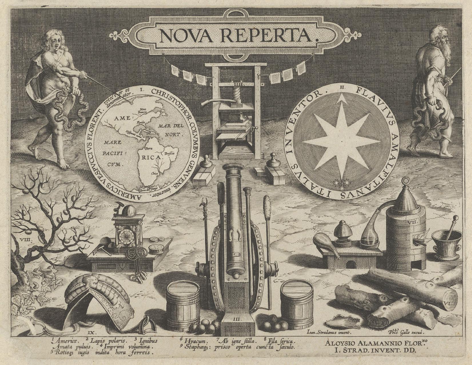 Johannes Stradanus, Nova Reperta (New Inventions of Modern Times), title plate, engraved by Jan Collaert I, published by Philips Galle, ca. 1590 CE. Engraving, 27 x 20 cm. Metropolitan Museum of Art, New York, 34.30(1).


Embodied Perspectives & Identities
Transgender History: A LOVE STORY
Wrongly Bodied Two
Pore Caitif Nudos
The Fortune Teller Konglish
It could be argued that, whether intentional or otherwise, the identities of literary authors permeate each page of their written works. Jhumpa Lahiri’s dual-language novel In Other Words, which she first wrote in her non-native Italian and then translated into English, physically and figuratively represents her fascination with and reverence for Italian culture and language.1 Her words, which appear in parallel translation on opposite-facing pages in the novel, are her tools of choice to convey the experiences and perceptions of her world.
The artists in Embodied Perspectives & Identities use language as deliberately as Lahiri, but extend their tools beyond the written word. They consider the materiality of the page upon which their prose rests as an avenue to explore and express their singular identities. It is no surprise that they felt compelled to do so. Sociologists Vlad Petre Glăveanu and Lene Tanggaard have conceptualized creative identity as a “representational project engaging the self in dialogue with multiple others” across a variety of social contexts.2 In order to bridge conceptual blindness to their existence, the artists in this section have made visible their perspectives by creating tangible representations of themselves.
In Konglish, Jana Sim presents separate texts in English and Korean that are not translations of one another to mimic the opacity of her identity as a South Korean student living in the United States. The fabric that comprises the pages in Nudos and the woven, incense-infused paper of The Fortune Teller reference each artist’s respective culture and provide a tangible link to the survival stories within each work. In Wrongly Bodied Two and Transgender History: A LOVE STORY, the struggles of marginalized peoples sit atop richly textured pages and collages that illustrate their narratives. And in the case of the medieval manuscript containing the Pore Caitif, it is the organizers of this exhibition who have given it a new identity based on the individuals who gifted and used this work—a series of fifteenth-century Catholic nuns.
Rachel Vorsanger
1. Joumana Khatib, “Writing in Italian, Jhumpa Lahiri Found a New Voice,” The New York Times, June 3, 2021, https://www.nytimes.com/2021/04/21/books/ jhumpa-lahiri-whereabouts.html.
2. Vlad Petre Glăveanu and Lene Tanggaard Pedersen, “Creativity, Identity, and Representation: Towards a Socio-Cultural Theory of Creative Identity,” New Ideas in Psychology 34 (August 1, 2014): 18.

Transgender History: A LOVE STORY
James Rose Dewitt
One paper sheet folded to 14 pages, ink
11.1 x 7.7 cm
2014 CE, Minneapolis, Minnesota, USA
HQ77.9 .D495 2015 zines
Transgender History is one part of James Rose Dewitt’s larger zine project, comprised of eighteen small-format, educational and personal zines collectively titled Sex Ed: A Love Story. Dewitt, a sexual health researcher and educator, frames trans and gender nonconforming history facts with personal stories from his everyday life, aiming to “broaden our shared understanding of bodies, love, desire, gender, and sex.”1 Using collages of images and text, the zine relates four stories from trans history, ranging from the nineteenth-century riots of the Daughters of Rebecca to Leslie Feinberg’s and Laverne Cox’s efforts to draw media attention to the unjust incarceration of CeCe “Honey Bea” McDonald. The booklet, which is printed double-sided and totals fourteen pages, also includes definitions of terms like trans-misogyny as well as introductions to Dewitt’s personal trans heroes, Venus de Mars and Antonio.
Sex Ed: A Love Story is Dewitt’s entry in their Trans Sex Zine project, an ongoing storytelling project that invites trans and gender-nonconforming people to create zines about their identity. Dewitt seeks to create a holistic corpus of writings on queer sexuality and sexual health by and for the people affected most. By calling for contributions from the public, Dewitt draws upon the expertise of people with lived experience of gender non-conformity.2 The peer-to-peer education that the zines embody is political, infusing personal activism into overarching sex education and advocacy work.
The SCRC houses several of Dewitt’s Sex Ed: A Love Story zines in addition to Transgender History, including Memory: A LOVE STORY, B’s Story Feeling Myself: A LOVE STORY, and My True Self: A LOVE STORY. Volumes One and Two of the Trans Sex Zine project are available for download from Dewitt’s website at sliding scale, and all of Dewitt’s Sex Ed: A Love Story zines can be downloaded for free.
Ana Matisse Donefer-Hickie
1. “Sex Ed: A Love Story,” https://transsexzine.com/a-love-story/
2. “Trans Sex Zine,” https://transsexzine.com/
Embodied Perspectives & Identities | 53
Wrongly Bodied Two
Clarissa Sligh, artist
Women’s Studio Workshop, publisher
ArjoWiggins, papermaker
Silkscreen and inkjet pigment on Rives
Heavyweight bound Paper/handmade paper
25 x 18 x 3 cm
2004 CE, Rosendale, New York, USA
N7433.4.S427 W762 2004 artists book

54 | The Art of the Book

By intertwining two distinct narratives—one of a white man as he transitions from female to liberate his biological body, and another of a black woman and her husband who masquerade as a white male slave owner and his slave to seek freedom—Clarissa Sligh crafts a compelling story of identity and persistence.
Photography, illustration, historical accounts, and first-hand interviews come together in an artist’s book that reflects on what it means to be black or white, woman or man, free or enslaved.
A hand-sewn cloth cover with the color and texture of unbleached canvas is silkscreened with bold illustrations evoking woodcuts of plant matter and topographical maps. The foliage-like gestures continue inside on richly textured pages of text and image. The accounts of Jake, Ellen, and William alternate throughout the book, two pages at a time. Tension builds as they move through their unsettling narratives. Jake endures painful surgery and adapts to his changing body, while Ellen and William travel by train and foot to evade their oppressors. The artist is present too, entangled in their stories as a black cisgender woman. We watch as she examines her own relationship with race and gender and reconfigures identity as a tool of liberation rather than affixed, assigned, and resigned. Occasionally, the artist manipulates the pacing of the text, allowing certain words and phrases to move to the foreground and create moments of poetry.
Wrongly Bodied Two is a tactile work with a sensitivity to material and structure that excites the artist's storytelling and draws in the reader. It is a book meant to be held and touched with the hands, the eyes, and the heart.
Embodied Perspectives & Identities | 55
Daniel Cappello
Pore Caitif
Poor Wretch
Possibly Dame Margaret Hasley, scribe
Ink on paper in 16th-century black Moroccan leather binding 17 x 11.4 cm bound to 17.5 x 12 cm
ca. 15th century CE, London, Kingdom of England (present-day United Kingdom) (SPC) MSS LT 085

56 | The Art of the Book
The Pore Caitif (or Poor Wretch), an anonymous English devotional manual written in the late fourteenth century, was intended for a lay audience, yet found itself entwined with monastic lives of the period. This popular text, containing fourteen treatises on topics ranging from the Creed, the Ten Commandments, the Paternoster, and Chastity, circulated widely in late medieval England.1 It served as a guide for personal reflection and prayer and the pursuit of a virtuous Christian life.
What sets this small copy apart is its remarkable provenance and the intimate connection it reveals between two nuns, Dame Margaret Hasley and Dame Ann Bassynburne, sisters of the Minoresses of London.2 The book’s final page includes a personal inscription written in red ink by Hasley, bestowing the volume upon Bassynburne, and instructions that after her death it should remain in their Priory “to the comforte of hir sisters.”3 This inscription is not merely a gesture of generosity; it is a testament to the networks of spiritual kinship and mentorship that flourished within religious communities in the late Middle Ages.
Intriguingly, the handwriting of Dame Hasley’s inscription seems to closely match the main text of the book, suggesting that she may have been the scribe that copied this manual herself. Women living together in monastic communities during the Middle Ages both made and owned a remarkable array of manuscripts. While it is possible that Hasley commissioned the codex from a scribe, her potential role as scribe adds depth to our understanding of religious and literary culture among women in fourteenth- and fifteenth-century England. It contributes to the changing notions about the roles women played in the production and dissemination of books.4
This copy of the Pore Caitif thus emerges not only as a manual of spiritual guidance, but as a tangible link to the lived experiences of medieval religious women, offering a glimpse into their intellectual and spiritual lives, highlighting their agency in shaping their own devotional practices and, by extension, contributing to the religious and cultural landscape of late medieval England.
Joseph R. Kopta
1. Karine Moreau-Guibert, Pore Caitif: A Middle English Manual of Religion and Devotion (Turnhout: Brepols, 2020); Mary Teresa Brady, “The ‘Pore Caitif’: An Introductory Study,” Traditio 10 (1954): 529–548.
2. This is likely the Franciscan female Abbey of the Minoresses of St. Claire without Aldgate, just outside the medieval walls of London.
3. “M[emorandum] that I dame Margaret Hasley ladi and sister of the Meneresie [Minoresses] of London have be [by] the lecense of my sovren geve this boke to the use of Dame Anne Bassynburne sister of the same Priory and after hir death to the comforte of hir sisters and not to be geve nor lent without the place aforesaid. On whos soule God have mercy. Amen.” Fol. 96v. Transcription in James Tregaskis & Son, cat. 1006 (January 1933), 10, lot 59.
4. See, for instance, Anita Radini et al., “Medieval woman’s early involvement in manuscript production suggested by lapis lazuli identification in dental calculus,” Science Advances 5, no. 1 (9 January 2019), https://doi.org/10.1126/sciadv.aau7126.
Embodied Perspectives & Identities | 57

Nudos
Gloribel Delgado Esquilín
Textile
26 x 30 x 2.5 cm
2022 CE, Trujillo Alto, Puerto Rico
N7433.4.E78 N83 2022 artists book
This book, whose title translates to “Knots,” is a one-of-a kind textile artist book by Puerto Rico-based artist and writer Gloribel Delgado Esquilín. It tells the story of the artist’s childhood sexual abuse and chronicles her process of recovering from trauma. In addition to addressing her personal healing journey, Esquilín’s work pays tribute to the women of Latin America, their histories of resistance, and their emotional resilience.1 It is fitting, therefore, that Nudos shares many characteristics with the textile art form of arpilleras, quilted illustrations historically used to document the lives and struggles of Latin American women.2
The use of arpilleras as a subversive art form began in Chile, where women created them to resist and denounce the Pinochet dictatorship (1973–1990 CE) and document its human rights abuses. The art form subsequently spread throughout Latin America, and today is especially common in Perú.3 Arpilleras share many formal characteristics with Nudos: they are constructed from found fabric, incorporating many colors and patterns; they are typically mounted on a burlap backing made from repurposed potato and flour sacks; they use brightly colored thread to define the forms and details of their illustrations; and they are constructed as rough shapes with irregular edges, rather than as precise rectangles.4 Esquilín has described the making of Nudos as a cathartic healing prayer through which she released the knots of guilt trapped in her body after forty-eight years of silence.5 Because engaging with one’s senses can be grounding in moments of trauma, it is appropriate that the book is a multi-sensory, tactile experience. Through the lively array of colors, varying fabric textures, and the sounds of fingers brushing over the cloth, when we read Nudos, we are inevitably immersed in our own physicality. In this way, we join Esquilín on her journey to re-inhabit her body.
MeiLi Carling
1. Ey Boricua, “Abre exhibición de la polifacética periodista y artista Gloribel Delgado Esquilín,” Ey Boricua, September 29, 2022, https://eyboricua.com/entretenimiento/abre-exhibicion-de-la-polifacetica-periodista-y-artista-gloribel-delgado-esquilin/.
2. Maryuri Mora Grisales, “Women Who Weave Together Memories and Resistance,” Sur: International Journal on Human Rights 17, no. 30 (2020): 151–54.
3. Elizabeth Doolan, “Arpilleras and Archives: Textiles as Records of Conflict,” Curator 63, no. 4 (2020): 547–54.
4. Mora Grisales, “Women Who Weave,” 151–54.
5. Gloribel Delgado Esquilín, “Nudos,” Booklyn, accessed December 8, 2023, https://booklyn.org/catalog/nudos/.
Embodied Perspectives & Identities | 59
The Fortune Teller
Malini Gupta, artist
OCHRE {art + design}, publisher
Folded paper fortune teller accompanied by a Japanese stab-bound book; sandstone 28-lb. paper ironed with wax 14.2 x 14.2 x 10.2 cm closed
2016 CE, Portland, Oregon, USA
N7433.4.G87 F67 2016 artists book
This artist’s book by Malini Gupta is the physical manifestation of her reckoning with the traumatic experiences of her childhood. It is comprised of two parts: first, a fortune teller game that reveals grim statistics of gender inequality in India, Gupta’s home country; second, a topbound book in which Gupta narrates how she personally experienced these deeply entrenched gender biases. At first, the memories she shares are unfortunate but not sinister: her grandmother wished she had been a boy, and unlike her brother she did not receive preferential treatment or even lavish birthday parties.
The years of Gupta’s life march on with each turn of the page. But the words that recount her story are not fixed in their size and position. Rather, they increasingly grow smaller and inch closer to the bottom edge of the book as Gupta enters into her teen years. At thirteen, she began vacationing with the extended family of her older sister’s husband. In the smallest typeset yet, Gupta reveals that she was sexually abused on these trips for the next five years until she stopped going when she turned eighteen. On the penultimate page, Gupta explains she never had the courage to tell anyone the reason until now. But on the last page of this book—in the smallest font at the lowest position—Gupta makes a final admission that is as horrifying as it is heartbreaking: her family knew what was happening to her, but chose to ignore it.
Gupta entices us to play with the cootie-catcher but upends its light-hearted nature by including chilling “fortunes,” such as “you may be violated because you are a girl.” Additionally, she designed this two-part book with deliberate references to Hindu scripture: the imagery, colors, incense-infused pages, layout of the fortuneteller, and thread binding all mimic sacred texts.1 Contradictions and dualities pervade The Fortune Teller both in content and design to underscore how arbitrary factors determine a young girl’s fate.
Rachel Vorsanger
1. 23 Sandy, “The Fortune Teller by Malini Gupta-SOLD OUT!,” https://23sandy.com/products/the-fortune-teller-by-malinigupta-sold-out.
60 | The Art of the Book


Konglish
Jana Sim
Letterpress printing on paper, ink, laser cut on red acetate
21.59 x 19.05 cm (closed); 50.8 x 19.05 cm (open)
2010 CE, Center for Book & Paper Arts, Columbia College, Chicago, Illinois, USA
N7433.4.S56 K66 2010 artists book
Konglish which combines the words Korean and English, is a linguistic concept that has long existed in Korean culture, and in this case, it is a visual representation of the interplay between two different identities. Its author Jana Sim came from South Korea to the United States in 2002 to pursue an art education in bookmaking.1 In her work, Sim often explores themes of language and culture, and the struggles that she goes through as an international student in a foreign land.2
Through masterful manipulation of letterforms in both the Korean and English alphabets, Sim created an experience that transcends the form and function of a traditional book. In her own words, “the book will be very different depending on what language you are able to speak. If you only speak English, the Korean side will be seen as exotic shapes and patterns and vice versa. If you understand both languages, you will be able to compare the two sides, understand both sides of my stories.”3 The duality of the languages also manifests through the physical properties of the book, which includes the way it opens in opposite directions, and the appearance of text in both red and blue. By obscuring the legibility of one language over another, emphasizing certain words in a sentence that breaks up the reading flow, and telling stories of when the two cultures cross paths in humorous ways, Jana Sim highlights the difficulty of bilingual speakers who navigate the world by always juggling between two distinct parts of their identities.
In challenging the notion that English is the default language, and that other languages must be translated for a larger audience to understand, Konglish becomes both an object of storytelling and of resistance against the Eurocentric point of view that dominates American culture.
Ha Tran
1. “Konglish by Jana Sim,” 23Sandy https://23sandy.com/products/konglish-by-jana-sim.
2. Ibid.
3. “Jana Sim,” Vamp & Tramp http://www.vampandtramp.com/finepress/s/jana-sim.html.
Embodied Perspectives & Identities | 63
Sex Ed: A Love Story—An Interview on Zines
with James Rose Dewitt
Ana Matisse Donefer-Hickie
A zine maker and sexual health researcher, James Rose Dewitt’s zine series called Sex Ed: A Love Story, merges quotidian stories with facts about transgender and gendernonconforming history and health. The SCRC collection holds all eighteen zines in the series, and they are also available to download and assemble from Dewitt’s website, transsexzine.com. Here, he responds to questions about the nature of zines, and what attracted him to them as a vehicle for communication and self-expression.
Ana Matisse Donefer-Hickie: What drew you to zines as a medium of expression and communication?
James Rose Dewitt: I was first introduced to zines as a teenager coming of age in a punk/anarchist scene. I didn’t start making zines until I was in my 20s. At that time, it appealed to me that I could communicate
my story in a format that really had no rules or one right way to express yourself. My first zine I ever made was a real hodge podge of my own writing and drawings, things I had photocopied from other zines and texts, and messages to my loved ones.
AMDH: Could you give us a brief insight into the process of making your zines?
JRD: When I make zines, I usually map out the concept in some way, thinking of the key points I want to cover, and how I want to make it flow with the format I use (I mostly create mini zines using a one-page format). I usually have a backstock of images I’ve already cut out of magazines that I use to collage my background for any text or drawing. At this point I can usually make a mini zine in one sitting, so it’s more that the opportunity or inspiration strikes, and it all comes rushing out.
AMDH: This exhibition catalogue is titled “The Art of the Book.” What, to you, is the relationship between zines and books?
JRD: To me, zines give access to anyone to create and publish. The relationship as I see it is that the writer is passing along a message and a story; the difference as I see it is that zines are more accessible and personal than books.
AMDH: Many of your zines are free to download from your website. What do you think a digital platform adds to the zine as a form of self-expression and communication?
JRD: It’s really important to me that the information in our zines is available to anyone! We purposely format our zines so that they’re super easy to print rather than putting them in a traditional booklet style. Having them available this way also makes it so that resource centers can download multiple copies!
We had high hopes for making the zine more multi-media in a digital platform to include video and other ways to interact with the content—I still hope this happens someday!
AMDH: For your Trans Sex Zine project, you invite trans and gender nonconforming people to submit their own stories and artworks. What do you think makes zines such a good format for circulating these stories?
JRD: In my opinion, there is never a bad format for these stories—the more the better! And zines are just a way to contribute to the volume of literature that covers these topics in my own way! I would love for trans sex zine to continue to be circulated and am optimistic about future editions coming out!


Performance, Music, Visual Arts
Shu zhu zhai shu hua pu
Leaf from the Beauvais Missal Yakusha sangai kyo
Le antichità romane
Spanish Antiphonary Leaf for the Feast of the Purification of the Blessed Virgin Mary
This collection of four texts builds relationships between readers, creators, and communities, suggesting that books can present complex entanglements that go far beyond the reader–writer binary. Through word and image, texture and tone, they beg to be enacted and enliven ways of worship, recreation, and expression.
Two of the objects, the French Beauvais Missal Leaf and the Spanish Antiphonary Leaf from Jaén, blend liturgical text and musical notation, serving as guides for congregations during a Catholic Mass. A profound dialogue unfolds between the text’s creator and the reader. It is a conversation of shared devotion, where the composer’s expression of faith finds its echo in the voices of the congregation.
Ruminating on aesthetics, Shu zhu zhaishu hua pu, or Ten Bamboo Studio
Collection is an intimate guide to the art of painting. Its exquisite woodblock prints and accompanying poems invite introspection, as opposed to collective performance and communal engagement. The text is more than just a manual; it is a personal companion and a source of inspiration and reflection for aspiring artists in early twentieth-century China.
The Yakusha sangai kyo takes a unique approach to cultivating a connection with its readers by transforming them into voyeurs. Just as contemporary publications chronicle the lives of celebrities, this ukiyo-e book provides a tantalizing glimpse into the on-and off-stage lives of Japanese Kabuki actors. Adorned in elaborate costumes and embodying iconic roles, the actors perform on grand stages or engage in backstage interactions. Through its approach, the book cultivates a sense of intimacy and intrigue.
These objects are enlivened by their relationships to singers, actors, and artists. Whether instructional, devotional, or documentary, they transcend their primary functions, operating as tools that enrich the pursuit of creative expression.
Daniel Cappello
十竹齋書画譜
Shu zhu zhai shu hua pu
Ten Bamboo Studio Collection
Hu Zhengyan, original editor
Zhu Huailu, Jiaojin Shanfang Printing House, printer
Woodblock printing on onionskin paper, ink, bone, silk, cardstock
25.7 x 15 cm
1904 CE, Shanghai, Qing-Dynasty China (present-day People’s Republic of China)
NE768 .H8x

70 | The Art of the Book

First published in Nanjing in 1633 CE, the Shu zhu zhai shu hua pu is a volume of prints and poems by different authors collated by Hu Zhengyan, a publisher, calligrapher, and carver in his own right.1
Variously called a letter catalogue, painting manual, and a print book, the work studies the harmony of nature as expressed through the techniques of Chinese painting, skillfully reproduced with printing techniques. Flipping through its pages has been described as “a walk through a Chinese garden.”2 The eight fascicles contain contributions by different artists, whose seals accompany several of the images. The variety of colors was achieved with douban, or assembled block printing. With this technique, several different woodblocks are carved, each for a different color placement, and then printed atop one another to achieve the desired image.3 The volume’s complex printing history has made cataloguing the many versions of the Ten Bamboo a challenge for scholars across the globe.4
This example is a late printing, published by Zhu Huailu (1848–1912 CE) at his famous Jiaojin Shanfang printing house.5 The presence of a butterfly on an image of a begonia with grasses and aster suggests that Zhu used the 1897 recut of the original seventeenth-century blocks.6
Ana Matisse Donefer-Hickie
1. Thomas Ebrey, “The Editions, Superstates, and States of the Ten Bamboo Studio Collection of Calligraphy and Painting,” East Asian Library Journal 14, no. 1 (2010): 2; Suzanne Wright, ““Luoxuan biangu jianpu” and “Shizhuzhai jianpu”: Two Late-Ming Catalogues of Letter Paper Designs,” Artibus Asiae 63, no. 1 (2003): 69; and Suzanne Wright, “Hu Zhengyan: Fashioning Biography,” Ars Orientalis 35 (2008): 129.
2. June Li, “Ten Bamboo Studio Manual of Calligraphy and Painting,” September 2016, The Huntington Library, 5:52. https://vimeo. com/635699422/dc3e741f92.
3. Ebrey, “Editions,” 2.
4. See ibid. for the most comprehensive list of editions.
5. Zixiao Huang, email correspondence with author, October 16, 2023.
6. Ebrey, “Editions,” 68.
Performance, Music, Visual Arts | 71
This is a leaf from the Beauvais Missal a three-volume manuscript made in the late thirteenth century CE and used in Beauvais Cathedral, a community in France, north of Paris. As a missal, or a liturgical book containing readings and instructions for the celebration of mass throughout the year, this Latinlanguage codex aided in the singing of hymns for feast days, or special celebrations of saints. The ornamentation in the book, notably the sinewy, tendril-like extensions of illuminated initials, the strong Gothic bookhand, along with the square musical notation on four-line red staves, heightened the luxurious value of the manuscript, in use for several centuries at Beauvais.
A missal is organized around two liturgical calendars that correspond to superimposed cycles: the temporale (or movable feasts, especially Easter), and the sanctorale or offices tied to saints’ feast days.1 This leaf appeared in November of the sanctorale
section of the book. The text here begins on the recto with the phrase “Sacrificium tibi domine laudis,” ending on the verso with “Tui domine perceptione...” These particular readings were used to celebrate the feasts of Saints Clement and Felicity of Rome (November 23) and Saint Chrysogonus (November 24) in song.
According to a now-lost inscription on the first leaf, the missal was given to the Cathedral by its Canon, Robert de Hangest, in exchange for the promise that he would be remembered in a mass every year on November 3.2 The missal was famously dismembered in 1942 by Philip Duschnes, and its leaves have spread to public and private collections alike thanks to bookseller Otto F. Ege, who bought many from Duschnes and included them in his “Fifty Original Leaves of Medieval Manuscripts” portfolios.3 Scholar Lisa Fagin Davis has undertaken an ongoing project to reconstruct the missal’s scattered leaves in a digital facsimile.4 While the reconstructed facsimile helps
scholars understand the original structure of the intact volumes, this missal remains one of the best-known victims of mid-twentieth-century American “biblioclasm,” or the dismemberment of codices for the purpose of selling off individual leaves, and it serves, according to Davis, as “a perfect example of just how great a loss is incurred when a codex is dismembered and its leaves scattered.”5
Ivy D’Agostino
1. The same phenomenon of concurrent Christian liturgical calendars is also an organizing principle of the Book of Hours, Use of Toul included in this catalogue.
2. Christie’s, “MISSAL -- BEAUVAIS MISSAL, three leaves, in Latin, ILLUMINATED MANUSCRIPT ON VELLUM,” lot 262, The Collection of Arthur & Charlotte Vershbow 10 April 2013; Peter Kidd, “Robert de Hangest, Canon of Beauvais Cathedral,” Medieval Manuscripts Provenance: Notes and Observations 14 February 2015, https://mssprovenance.blogspot.com/2015/02/robert-de-hangest-canon-of-beauvais.html. For a summary of the early history of the Beauvais Missal see Kidd, “The Early Provenance of the Beauvais Missal,” Medieval Manuscripts Provenance: Notes and Observations, 3 January 2015, https://mssprovenance.blogspot.com/2015/01/the-early-provenance-of-beauvais-missal.html.
3. These portfolios sought to provide buyers with alluring leaves from many different manuscripts to provide an overview of the form, rather than selling whole manuscripts. On the dismemberment and “bookbreaking” history, see Lisa Fagin Davis, “The Beauvais Missal: Otto Ege’s Scattered Leaves and Digital Surrogacy,” Florilegium (2016): 143–166; and Peter Stoicheff, “Putting Humpty Together Again: Otto Ege’s Scattered Leaves,” Digital Studies/le Champ Numérique 12 (2008), https://www.digitalstudies.org/article/id/7182/.
4. Lisa Fagin Davis, Beauvais Missal (Virtual Reconstruction) https://fragmentarium.ms/overview/F-4ihz.
5. Ibid., Reconstructing the Beauvais Missal https://brokenbooks2.omeka.net. On biblioclasm, see also Debra Taylor Cashion, “Broken Books,” Manuscript Studies 1, no. 2 (Fall 2016): 342–351; Nina Rowe, “Reconstructions: Recuperation of Manuscript Illumination in Nineteenth- and Twentieth-Century America,” in Manuscript Illumination in the Modern Age: Recovery and Reconstruction, ed. Sandra Hindman and Nina Rowe (Evanston: Block Museum of Art, 2001), 215–274; and Christopher de Hamel, Cutting Up Manuscripts for Pleasure and Profit, ed. Terry Berlanger (Charlottesville: Book Arts Press, 1996).
72 | The Art of the Book

Leaf from the Beauvais
Missal
Pigment and gold on parchment
28.7 x 19.6 cm
ca. 1285 CE, Beauvais, Kingdom of France
(present-day France)
SCRC 368
Performance, Music, Visual Arts | 73
俳優三階興
Yakusha sangai kyo, Teachings on the Living Images of Actors (Alternative title: Amusements of Actors on the Third Floor)
Shikitei Sanba, author
Toyokuni I Utagawa, woodblock illustrations
Nishinomiya Shinroku, printer
Polychrome woodblock-printed books, 2 volumes; ink and color on paper; Japanese sewn with fukuro-toji double-leaf structure in original blue-green blind-stamped wrappers with printed paper labels affixed to covers
22 x 15.2 x 1 cm each
1801 CE (Kansei 13 [first month]), Edo, Tokugawa Shogunate (present-day Tokyo, Japan)
NE1325.U793 A73 1801
This exquisite set of illustrated texts features works by one of the great masters of ukiyo-e polychrome woodblock printmaking, Toyokuni I Utagawa. Toyokuni, the principle student in the largest and longest existing ukiyo-e school founded by Utagawa Toyoharu,1 was well known for his yakusha-e portraits of kabuki theater artists.2 However, these two volumes represent a collaboration with the comic writer Shikitei Sanba in producing a gekisho (theater book) in the relatively-new illustrated gazette format.3 Within these textured and fragile pages, Toyokuni’s artistry comes to life through the actors’ everyday activities and intimate moments, including greeting each other at New Year’s in the first illustration. While actors may not be adorned in their elaborate theater costumes, they are depicted in stunningly patterned kimonos, suggesting that even off duty, smart and fashionable attire was important.

74 | The Art of the Book

The weathered nature of the books, which combine Toyokuni’s illustrations and Sanba’s text describing actor Danjuro VI’s metaphorical journey to “Kabuki Kingdom,”4 suggest that they have passed through many hands. The spines of each volume are secured in a traditional Japanese thread binding, and they are both housed in a custom fabric-covered chitsu case secured with clasps.
Books like this align with the ukiyo-e culture of Edo-period Japan, in which entertainment districts of the cities flourished, especially in Edo (Tokyo).5 Colorful prints of actors, entertainers, and courtesans became available for purchase at affordable prices, and fans and tourists alike clamored for Toyokuni’s portraits of famous personalities in a competitive and lucrative mass-market industry.6 It is easy to draw a parallel between this text and modern-day tabloid magazines (Stars, They’re Just Like Us!). Toyokuni’s prints in Yakusha sangai kyo are accompanied by inscriptions identifying contemporary actors, with whom Toyokuni was intimately familiar—spending time “on the third floor,” or the actor’s dressing room in a kabuki theater, as mentioned in the colophon by Sanba.7
1. Laura J. Mueller, Competition and Collaboration: Japanese Prints of the Utagawa School (Leiden: Hotei Publishing, 2007).
2. Sadao Kikuchi, Utagawa Toyokuni (1769–1825) Eng. trans. Roy Andrew Miller (Rutland and Tokyo: Charles E. Tuttle, 1957).
3. Robert Goree, “Publishing Kabukiland: Late Edo Culture and Kyokutei Bakin’s Yakusha meisho zue,” in Publishing the Stage: Print and Performance in Early Modern Japan, ed. Keller Kimbrough and Satoko Shimazaki (Boulder: Center for Asian Studies, University of Colorado, Boulder, 2011), 191–213.
4. Ibid., 74.
5. Julie Nelson Davis, Picturing the Floating World: Ukiyo-e in Context (Honolulu: University of Hawai’i Press, 2021).
6. C. Andrew Gerstle, Kabuki heroes on the Osaka stage, 1780-1830 (London: British Museum, 2005).
7. Barbara Jane Cross, “Reading fiction as performance: Shikitei Sanba (1776–1822) and woodblock print,” Ph.D. diss. (School of Oriental and African Studies, University of London, 2006), 76; Cross summarizes the text of the Yakusha sangia kyo in English.
Performance, Music, Visual Arts | 75
Mike Ray and Joseph R. Kopta
Giovanni Battista Piranesi is best known for his architectural studies of Rome. Although born in Venice, he moved and worked in Rome beginning in the early 1750s. While he is notable as a virtuoso printmaker of the eighteenth century, he identified foremost as an architect. Le antichità romane consist of elephant folio1 prints in a four-volume set interpreting existing Roman architectural monuments from the mid eighteenth century. Many of the monuments Piranesi depicted have since disappeared, making his work valuable as a historical record in addition to the bravura of his printmaking and architectural skill. Piranesi was fascinated with making vedute, or views, of Roman architecture. The juxtaposition between his precise architectural studies and his staffage figures, often markedly distorted or off balance, creates a sense of surreal fantasy. The structures of his vedute exist in an expansive layered atmosphere surrounded by figures, objects, flora, and debris. His
use of linear and atmospheric perspective, as well as his extreme depth of detail in engraving, pulls the viewer’s eye deeper into the scene. Piranesi depicts humanity struggling with poverty, lameness, and apparent drunkenness. Such visible flaws are echoed in the decay of the ruins. These crumbling structures relate to a familiar trope of Early Modern literature, where the ruins of Rome acted as a metaphor for the imperfection and transience of human existence.2
The illustrative scenes were created through intaglio, or etching an image into large copper plates using an acid solution; the plate was then inked and printed onto paper.3 Piranesi’s technical skills as a draftsman, as well as his ability to create a conversation between deteriorating figures and remnants of antiquity, highlight his visual artistry and storytelling mastery.
1. An elephant folio is large, up to 23 inches in height.
2. Jeanne Morgan Zarucchi, “The Literary Tradition of Ruins of Rome and a New Consideration of Piranesi’s Staffage Figures,” Journal for Eighteenth-Century Studies 35 (2012): 359–80.
3. John Ross, Claire Romano, and Tim Ross, The Complete Printmaker revised and expanded edition (New York: Simon & Schuster, 1991).
76 | The Art of the Book
Bradford Davis
Le antichità romane
Roman Antiquities
Giovanni Battista Piranesi
Angelo Rotilj, printer
Etchings on cotton linen rag paper in red Morocco binding
58 x 68 cm
1756 CE, Rome, Papal States (present-day Italy)
NE662.P5 A53x


Spanish Antiphonary Leaf for the Feast of the Purification of the Blessed Virgin Mary
Parchment
84.2 x 58 cm
ca. 16th century CE, Catedral de la Asunción, Jaén,
Kingdom of Spain (present-day Spain)
SCRC 369
This enormous leaf originally came from a sixteenthcentury antiphonary used by the choir of Jaén Cathedral in southern Spain. Antiphonaries or books containing short chants sung as a refrain during the Canonical Hours (or set times of prayer during the day), were one of the most typical music manuscripts in use in the European Middle Ages and Renaissance.1 This page contains an antiphon in Latin sung for the Feast of the Purification of the Blessed Virgin Mary (or Candlemas, February 2).2 The large size of the parchment reveals its utility—it needed to be visible from a short distance in the choir area. Large choirs such as those at Jaén could consist of up to 100 singing members.
The production of parchment, or animal skin, was the most expensive part of making a medieval or Renaissance manuscript. Before it was cut from its original binding, this parchment leaf was attached to
another folio (page), which made a bifolium (or two pages). The size of this bifolium at approximately 45 by 33 inches was likely the entire skin that a single animal could provide. A typical large antiphonary book like could consist of up to 200 pages, which would require approximately 50 animals, or an entire flock.
The careful ruling of this manuscript, the regular size of the Gothic script and neumes, and the large, elaborate illuminated initial S, suggest that it was a gift from a wealthy patron to the cathedral, which was being reconstructed in a Renaissance style in the sixteenth century.3 The inclusion of abbreviations— such as “mu[n]di” (“of the world”) at the top of the page, with the “n” represented as a vertical line— suggest that the musical text on the page served more as a mnemonic device for choir members, and was not strictly read.
Joseph R. Kopta & MeiLi Carling
1. See Nicholas Bell, Music in Medieval Manuscripts (Toronto: University of Toronto Press, 2001), and John Haines and Randal Rosenfeld, eds., Music and Medieval Manuscripts: Paleography and Performance. Essays dedicated to Andrew Hughes (Abingdon: Routledge, 2016), with additional references following.
2. “Ecce Maria genuit nobis salvatorem quem Joannes videns exclamavit dicens ecce agnus dei ecce qui tollit peccata mundi alleluia / Senex puerum portabat puer autem senem regebat que[m]…” “Behold, Mary bore the Savior for us. When John saw this, he exclaimed ‘Behold the lamb of God who takes away the sins of the world, Alleluia. / An ancient man held up an infant, but the infant held up the ancient man…”
3. Narcisco Casas, Historia y arte en las catedrales de España (Madrid: Bubok Publishing, 2016), 101–107.
Performance, Music, Visual Arts | 79
The Artistic Book
Alice M. Rudy Price
At the end of the nineteenth century, fine letterpress, avant-garde, and commercial publishers in Europe and the United States entered a new phase in producing illustrated books. These seeming disparate makers shared in emphasizing the physicality and design of the book as aesthetic object and innovated in its exchange.
William Morris founded the Kelmscott Press in the 1890s to elevate the beauty of the artistic book, to recapture the grace and ornament of medieval calligraphy, and to revive the intimate relationship between artisanal craft and a work of art.1 Syr Ysambrace with engraved illustrations by Edward Burnes-Jones and printed at Kelmscott, exemplifies Morris’s focus on craftsmanship and materiality: handmade paper, handpress printing using handset type that Morris himself designed. Although modernists of the next generation opposed the pretentiousness of the lavish Kelmscott publications, they embraced the revolutionary attention to craft and a book’s possibility to be produced in multiples, reaching audiences outside of the mainstream museums and galleries.
Some avant-garde ventures, like the futurist Filippo Tommaso Marinetti’s 1912 Zang Tumb Tuuum abandoned emergent conventions for illustration, experimenting with typography, layouts, and materials instead of naturalist or symbolist representation. Marinetti
elided the barriers between text and image to convey the sounds and events of the Balkan War. A forerunner of concrete poetry, Marinetti intended that the book subvert conventions for word use and layout. Jeffrey T. Schnapp describes the artist/author’s intent to free poetry from “the shackles of syntax, grammar, punctuation,” but likewise to break the chains of “typographical standardization.”2
In contrast to the precious materials used by Morris, avant-garde publishers and illustrators often printed their books on inexpensive papers with cheap bindings. However different the aesthetics, both Burne-Jones and Belgian Frans Masereel exemplify the heightened significance of illustrations and of printing as labor and art. Masereel’s angular woodcut illustrations, like the whimsical handcolored illustrations of the German Emma van Medem, transformed the look of modestly priced books put out by avant-garde presses in the 1920s. Their art carries, parallels, or supplants the text’s conventional didactic, poetic, or storytelling role.
Only commercial presses successfully profited from artistic books. Although fine letterpresses emerged as specialty publishers with limited editions and narrow profit margins, larger publishing houses like David Nutt, Hodder & Stoughton and Charles Scribner’s Sons produced lavish volumes for children and adults illustrated by artists such as Arthur Rackham, Edmund Dulac, or Theodor Kittelsen reaching an increasingly wealthy middle-class market. Quality materials, like leather bindings and deckled edge papers implied the craftsmanship of Kelmscott yet employed machines for four-color printing and house illustrators with little control over design.
1. William Morris, “A Note by William Morris on His Aims in Founding the Kelmscott Press: An Essay Published in 1896,” in The Ideal Book: Essays on Lectures on the Arts of the Book ed. William S. Peterson (DGO-Digital original, University of California Press, 1982), 75–78, <https://doi. org/10.2307/jj.8362612.14>.
2. Jeffrey T. Schnapp, “On Zang Tumb Tuuum,” in Italian Futurism 1909–1944: Reconstructing the Universe ed. Vivien Greene (New York: Guggenheim, 2014), 156–159.


Marking Time
Book of Hours, Use of Toul Fores’ Correct Representation of the State Procession on the Occasion of the August Ceremony of Her Majesty Coronation, June 28th, 1838
20’ of facts, or, What happens every minute
Over the last six centuries, readers have used books to interact with and interpret the passage of time. Texts have allowed book makers and book owners to locate themselves in time, observe the passage of time, and to collapse time. One of the earliest examples of such a text in Temple’s Special Collections is a richly illustrated Book of Hours from fifteenth-century France.1 This kind of book was a best seller in the European Middle Ages. It would have been carried around on the owner’s person and consulted multiple times per day in accordance with the liturgical calendar. Passages of text
could be referenced to determine the particular saint’s day, or to calculate those religious holidays (like Easter) that move throughout the calendar.
The structure of the book can also reflect the passage of time. In a tunnel book produced by Forbes Publishers in 1838 CE, this piece of commemorative memorabilia depicts the procession of dignitaries, diplomats, aristocrats, and guests on route to the coronation of Queen Victoria of the United Kingdom. The edges of the book collapse and expand like an accordion, condensing and folding a lengthy parade into a single consumable image.
Furthermore, the structure of the book can take time to unravel and for the information to reveal itself. In Werner Pfeiffer’s 2016 artist book, 20’ of facts, or, What happens every minute, the artist has inscribed scientific facts
about phenomena that occur every minute of the day on a utilitarian object: a measuring tape. As the reader carefully stretches out the measuring tape to its full length, more information can be absorbed. The facts that Pfeiffer
selected also correlate to time; the first entry reads, “Every minute we generate more data and information as is currently in the Library of Congress.”
The information that he brings to the reader’s attention highlights the frequency and regularity that the phenomena are occurring. Taken together, this grouping demonstrates the diverse set of ways in which artists have grappled with, interpreted, and marked time over the last 600 years.
Emma P. Holter
1.
See Roger S. Wieck, The Medieval Calendar: Locating Time in the Middle Ages (New York: Morgan Library and Museum, 2017) for one recent study on how books can serve as markers of time.
Book of Hours, Use of Toul
Parchment, 124 leaves with color illustrations, gold, and 19th-century leather binding 18.8 x 12.8 cm bound to 20 x 14.5 cm ca. 1450–75 CE, with addition of ca. 1500 CE, Free Imperial City of Toul, Holy Roman Empire (present-day France) (SPC) MSS 133
A Book of Hours (Latin: Horae)1 is a personal prayer book used to recite the Christian canonical hours, or fixed prayers, at regular intervals during the day. After the Bible, this was the most popular book type in late-medieval Europe, often commissioned by an increasingly affluent middle class.2

86 | The Art of the Book

While each Book of Hours is unique, most contain a standard set of texts.
Central is the Little Office of the Blessed Virgin Mary, also called the Hours of the Virgin, containing prayers to be recited at eight times of the day. There is also usually a twelve-month liturgical calendar indicating yearly fixed feast days, with a formula to calculate movable dates such as Easter. The order and selection of the texts, as well as the saints celebrated in the twelve-month calendar, indicate where a particular Book of Hours was produced or commissioned—in this case, Toul, in Lorraine, northeast France.
Lavish Books of Hours like this contained rich illuminations that helped users find the correct page.3 The opening here shows Pentecost, with a buoyant dove of the Holy Spirit descending upon apostles and the Virgin Mary. Appropriately, it opens the Hours of the Holy Spirit, recited at Matins.
Books of Hours were especially associated with female use and patronage.4 As an object enjoyed in a private, personal context, the book is small enough to be carried on one’s person. The texts within are heavily abbreviated, suggesting its reader used it as a mnemonic device to remember texts she knew by heart.5
Joseph R. Kopta
1. This Book of Hours was formerly owned by Sampson Hodgkinson; loaned to the National Exhibition of Works of Art held in Leeds in 1868, no. 586; sold at auction at the Hôtel Drouot (Roger Glandaz, auctioneer), 2 June 1933, lot 34; purchased by “GV” at a sale on 14 Dec. 1967; formerly owned by Pierre Bosviel; sold by Les Enluminures (Paris and Chicago) to Temple University, 2010.
2. Sandra Hindman and James H. Marrow, eds., Books of Hours Reconsidered (London: Harvey Miller, 2013); Christopher De Hamel, A History of Illuminated Manuscripts (London: Phaidon, 1994), esp. 168–199.
3. See e.g. Timothy B. Husband, The Art of Illumination: The Limbourg Brothers and the Belles Heures of Jean de France, Duc de Berry (New York: Metropolitan Museum of Art, 2008).
4. See e.g. Rob Dückers and Ruud Priem, eds., The Hours of Catherine of Cleves: Devotion, Demons and Daily Life in the Fifteenth Century (New York: Harry N. Abrams, 2010).
5. Roger S. Wieck, Time Sanctified: The Book of Hours in Medieval Art and Life 2nd ed. (Baltimore: Walters Art Museum, 2001); ibid., The Medieval Calendar: Locating Time in the Middle Ages (New York: Morgan Library and Museum, 2017).
Marking Time | 87

Fores’ Correct
Representation of the State Procession on the Occasion of the August Ceremony of Her Majesty
Coronation, June 28th, 1838
Messrs. Fores, publisher
Hand-colored lithograph folded into binding; embossed canvas over cardboard with gold foil
12.2 x 20 cm closed; 17.14 m opened
1838 CE, London, United Kingdom of Great Britain and Ireland (present-day United Kingdom)
VIS LITH 004
This rare and remarkably well-preserved commemorative memorabilia book depicts the Coronation Grand Procession of the United Kingdom’s Queen Victoria, a year after she acceded to the throne. The gold foil-stamped cover offers a touch of opulence, hinting at the pageantry revealed within the book’s pages. Letterpress typography on the interior cover has been set in various font styles and sizes, reflecting the preferred design of nineteenthcentury English presses. While the cover’s wear and tear, including the broken brass clasp, suggest that this book has been explored by many hands, the interior pages tell a different story. Inside the unique binding, we find lithographic images, hand-painted with watercolor, that remain exceptionally vibrant. The accordion-style paper pages have maintained their construction despite their need to be carefully unfolded to be viewed in full. The paper expands to an impressive 58 feet, with each page depicting a new, distinguished attendee of the event in horse-drawn carriage in a “record” of the procession. From foreign ambassadors to royal guests, the demographic is notably male-dominant. The first female attendee, the Duchess of Kent, appears on page 42. While the book celebrates the first female monarch to rule Britain in decades, traditional gender roles remain evident.
Samuel William Fores, the founding member of the family print shop at no. 3 Piccadilly in London, was a respected leader in the printmaking and printselling industry who specialized in equestrian art.1 His background, combined with the Queen’s personal passion for horses, explain the attention paid to these creatures. The name of each horse (including Viscount, Midnight, and Faddy) is inscribed next to their illustration. When juxtaposed with the identification of the high-profile ambassadors, indicated by their nationality instead of surname, this presentation feels as if the authors were catering to their British audience, if not subtly insinuating a preference by prioritizing horses over humans.
Mike Ray
1. Mark Bills, Samuel William Fores, Satirist: Caricatures from the Reform Club (Sudbury: Gainsborough’s House Society, 2014).
Marking Time | 89
20’ of facts, or, What happens every minute
Werner Pfeiffer, artist
Pear Whistle Press, publisher
Modified Stanley Tools 25' PowerLock tape measure
610 cm (unrolled) in a 11 x 11 x 11 cm box
2016 CE, Red Hook, New York, USA N7433.4.P45 A122 artists book
Werner Pfeiffer’s 20’ of facts, or, What happens every minute, challenges our perceptions of what a book can be. The object, a modified mass-produced tape measure nested in a bespoke yellow and blue box, is inspired by Medieval girdle books. Girdle books were bound into a pouch, secured by leather straps, and worn around the waists of monks, clergymen, and members of nobility. As signifiers of class and intelligence, these books provided instant accessibility to religious or philosophical content. Pfeiffer mimics and recasts this action by modifying a Stanley Tools 25' PowerLock tape measure, a common tool readily available to the average consumer. He has replaced the measurements with statistics pulled from information publicly available on the internet. In these ways, it is both an artifact and a contemporary art object.
The work’s first two inscriptions, “Every minute we generate more data and information as is currently in the Library of Congress,” and, “Every minute 9,500,000 gallons of water are depleted from global aquifers threatening the habitat and livelihood of large parts of the world's population,” set the tone for the remainder of the scroll, which includes measurements of atmospheric carbon, blood in the human circulatory system, and more. Between each of the hand-written inscriptions is a small illustration, abstract yet machine-like. They evoke tiny futurist machines that evade clear recognition, yet appear to have some undisclosed utilitarian function.
Although some of the inscriptions seem not much more than observations on the passage of time, many of them deal with issues of ecology and climate, which makes it difficult to parse the matter-of-fact from the potentially apocalyptic, and results in a sort of poem that entangles the human body and its residue on the earth.
Daniel Cappello
90 | The Art of the Book


Paleography: The Shape of Writing
Five Fonts Inspired by Lesbian Hand Lettering: A Type Specimen and History Zine
Qur’an Papyrus fragment of a letter placing an order
Dala’il al-Khayrat wa shawariq alanwar fi dhikr al-salah ‘alá al-nabi al-mukhtar
Illuminated Latin Prayer Leaf
Before the printing press, sharing direct knowledge involved text written by hand, executed on different supports—although soon the book became the dominant one. Styles of handwriting were quickly codified into scripts, norms, and preferences: standardized writing styles were so different from how we write nowadays that it might be challenging for us to understand ancient texts without some training. Paleography, or the study of different writing scripts, analyses these hands to recognize their forms and provide the tools to read past writings.1 It is, however, more than just a practical instrument: paleography allows us to not only identify various aesthetic features of handwritten letter forms, but also infer greater meaning from their presence in a particular manuscript.
Through the study of handwriting, we can extrapolate the text’s provenance, locate it in a more precise geographical area, within social groups (including religious, political, and socio-economical), or even tell the material objects that the scribe used to write. Sometimes, we can even understand who the author is. When the Italian Renaissance adopted the Humanistic Script (see pages 28–29), for instance, it symbolized a political and social choice. By using a writing style very different from the more popular Gothic Script (see pages 78–79), now seen as representing an outdated understanding of society, humanists aspired to connect back with the earlier Carolingian Script of the ninth century and thus present themselves as heir of the Roman Empire against the text form of the Middle Ages represented by a difficult to read script.
Although paleography usually applies to manuscripts for the availability of these objects, it applies to every written language and linguistic family. It can be used to study handwriting around the world, and some of its lessons can be applied to modern and contemporary understandings of writing,2 demonstrating that often the shape of writing is not casual, but holds a power worth investigating.3
Mario Sassi
1. Paleography can apply to every written language. For Latin-alphabet languages, see Patricia Lovett, The Art and History of Calligraphy (London: The British Library, 2017); Raymond Clemens and Timothy Graham, Introduction to Manuscript Studies (Ithaca: Cornell University Press, 2007), esp. 135–178; for Greek, see Bruce G. Metzger, Manuscripts of the Greek Bible: An Introduction to Greek Paleography (New York: Oxford University Press, 1981); for Arabic, see Gabriel Mandel Khan, Arabic Script: Styles, Variants, and Calligraphic Adaptations (New York: Abbeville Press, 2001) and Maryam D. Ekhtiar, How to Read Islamic Calligraphy (New York: Metropolitan Museum of Art, 2018).
2. Such is the case with Erin Moore’s Five Fonts Inspired by Lesbian Hand Lettering: A Type Specimen and History Zine included in this catalogue.
3. One recent study that considers paleography in a cross-cultural perspective is Brigitte Miriam Bedos-Rezak and Jeffrey F. Hamburger, eds., Sign and Design: Script as Image in Cross-Cultural Perspective (300—1600 CE) (Washington, D.C.: Dumbarton Oaks, 2016).

Five Fonts Inspired by lesbian hand lettering: A Type Specimen and History Zine
Erin Moore
Risograph screenprint on paper
Zine 21.5 x 14 cm; six type specimen sheets 14 x 10.2 cm
2022 CE, Baltimore, Maryland, USA
Z250 .M825 2022 zines
The creation of digital typography placed much emphasis on standardized and easily replicable fonts. Amidst the serifs and sans-serifs that reference either traditional typesetting or the uniformity of modernist aesthetics, there exists a host of custom typefaces that exude personality and yet hold just as much historical significance. Created as a tribute to lesbian/feminist newspapers from the 70s and 80s, which were often produced with limited funds and resources, Five Fonts epitomizes both the visual and conceptual culture of zines. It references these publications’ lack of refinement in typesetting and layout, as well as the significance of hand-lettering in forming a distinctly anti-mainstream look.
In this zine, Erin Moore catalogs five typefaces they created, as well as the names and backgrounds of the five publications that inspired them. These fonts, listed in order, are “Lavender” from Lavender Woman, “AIAW?” from Ain’t I a Woman?, “leaping” from the leaping lesbian “onyx" from Onyx: Black Lesbian Newsletter and “Vision” from Lavender Vision. Moore designed each font to mirror the hand-done type on the cover illustration of each publication, and by doing so, they have immortalized the visual language of lesbian and queer history in America. Not only is the digitization of these typefaces significant for their archival value, but it has also brought them to the public consciousness and made them accessible for anyone to use at no cost. The digital age marks a democratization of type, yet the value of handmade letters persists.
“Lavender,” “AIAW?,” “leaping,” “onyx,” and “Vision” can be downloaded at the following link: bit.ly/leslettering.
Ha Tran
Paleography: The Shape of Writing | 97
Qur’an
Dirish Muhammad ibn Musa, scribe
نآرقلا
Leather-bound illumination on paper 16 x 10.3 cm, bound to 16.1 x 12 cm 1730 CE (Muharram 1143 AH), Ottoman Empire (likely present-day Republic of Türkiye)
SCRC 447

98 | The Art of the Book

This exquisitely illuminated Qur’an, hand-transcribed in the clear and legible Naskh script, is a testament to the artistic and spiritual devotion of its creators. Understood by Muslims to be the word of God as revealed to the Prophet Mohammed, this eighteenth-century book derives from a long tradition of elevating the written word in Islam.1 Its leather binding, embossed with a golden medallion of interlaced vines, echoes the motif of abstracted floral medallions that recurs throughout the text. An opulent frontispiece, adorned with flowers, branches, and filigree, graces the opening pages and establishes a geometric motif that harmonizes with the precisely ruled rectangular frame of the verses.
For the majority of the book, within this frame, thirteen lines of Qur’anic verses penned in alternating red and black ink unfold across each page, punctuated by circles of gold called ayah separators. Generous margins of 5 centimeters border the text, further enhancing its architectural elegance. The formality of the layout is occasionally interrupted by brilliantly colored floral medallions serving as separators between surahs (or chapters), which add visual interest and help readers find a passage within the text.2
The pristine condition of the delicate, satin-smooth pages suggests that this sacred text was more likely revered as an object of beauty and devotion rather than regularly used or carried on one’s person. One can only imagine the original owner, perhaps a member of the provincial elite or a prosperous merchant, poring over its pages with the same awe and reverence that it inspires today. This Qur'an, elevated by the calligrapher's artistry and the exquisite embellishments, links us both to spiritual power, and stands as a tangible link to the Ottoman Empire’s intricate tapestry of economy, social structure, and religion.
Daniel Cappello
1. See George N. Atiyeh, The Book in the Islamic World: The Written Word and Communication in the Middle East (Albany: State University of New York Press, 1995); M. Uğur Derman, Letters in Gold: Ottoman Calligraphy from the Sakip Sabanci Collection, Istanbul (New York: Metropolitan Museum of Art, 1998).
2. The entire process of reading and approaching this Ottoman Qur’an has been explored by Özlem Yıldız, “Qur’an, 1730 CE,” A Look at a Book, episode 7, April 5, 2023, stellaonline.art/look-book.
Paleography:
Shape of Writing | 99
The

Papyrus fragment of a letter placing an order
Papyrus
8.89 x 8.25 cm
ca. 400 CE, Province of Egypt, Roman Empire (present-day Egypt)
SCRC 207 Cochran
This small papyrus fragment contains part of a hastily-scrawled letter written in Greek. A man named Melas orders twenty units of an unknown item, and states that the payment has already been deposited at the public bank. This tantalizing sliver of a message gives modern readers a glimpse into daily commercial transactions of late-antique Roman Egypt.
Papyrus was the most widespread writing surface in the ancient Mediterranean, made from the Egyptian Cyperus papyrus plant, which once grew abundantly on the banks of the Nile River.1 The long stalks of this fibrous plant were cultivated, harvested, and cut into thin strips. These strips were pressed together perpendicularly in two layers, one on top of the other, creating a durable surface that could receive ink and pigments. The typical writing side, or recto, corresponds to the horizontal placement of the reed fibers, as is the case in this fragment. Oftentimes, papyrus sheets would then be assembled into longer rolls by fixing together overlapping sheets with a starchbased glue. The relative ubiquity of papyrus in the ancient world meant that an enormous number of commonplace texts were recorded on its surface. These include the commercial transactions of this fragment to shopping lists, receipts for bills of sale, tax returns, students’ homework, and—less commonly—works of literature and official documents.
Papyrus was slowly replaced in the Mediterranean world by the more durable parchment. One wellknown story by the Roman author Pliny suggested that the export of papyrus was limited during Ptolemaic times, necessitating the use of a different writing support: animal skin.2
Joseph R. Kopta
1. Bridget Leach and John Tait, “Papyrus,” in Ancient Egyptian Materials and Technology ed. Paul T. Nicholson and Ian Shaw (Cambridge: Cambridge University Press, 2000); ibid., “Papyrus,” in The Oxford Encyclopedia of Ancient Egypt ed. Donald B. Redford (Oxford: Oxford University Press, 2001).
2. Pliny, Natural History 13.70; repeated in the sixth century CE by John the Lydian, de Mensibus 1.28.
Paleography: The Shape of Writing | 101
Dala’il al-Khayrat wa shawariq al-anwar fi dhikr al-salah ‘alá al-nabi al-mukhtar
The Waymarks of Benefits and the Brilliant Burst of Lights in the Remembrance of Blessings on the Chosen Prophet Muhammad ibn Sulayman al-Jazuli, author ‘Uthman ibn ‘Ali ibn ‘Abd al-Rahim al-shahir bi-al-Libqi, scribe 130-leaf manuscript: gold and polychrome illustrations on paper in a leather binding with medallions 21 x 14.5 cm, bound to 21 x 15 cm August-September 1765 CE (Rabi’ al-Awwal 1179 AH), Possibly Egypt, Ottoman Empire (present-day Egypt) SCRC 441

قراوشو تايرخلا لئلاد لىع ةلاصلا ركذ في راونلأا راتخلما يبنلا 102 | The Art of the Book

This 1765 CE edition of the famous fifteenth-century CE text, Dala’il al-Khayrat was inscribed and illustrated by hand. On the manuscript’s first page, consistent with the entire book’s layout, a gold border acts as a frame. To head the text, the scribe ‘Uthman used shapes that reflect the architecture of a mosque. The dome shape (or qubba) characteristic of mosque architecture often serves as a metaphor for the infinite space of heaven. The points atop the dome mimic a mosque’s minarets (towers), the place from where the call to prayer is announced. The mosque imagery indicates the manuscript’s religious nature. Elsewhere in the manuscript, more explicit imagery connected to the Prophet is present, including an image of Mohammed’s mosque (fol. 16v) and tomb (fol. 17r).
The Dala’il al-Khayrat translated as The Waymarks, contains devotional blessings, called salawat, to the Prophet Mohammed compiled by the Moroccan Sufi and scholar al-Jazuli in the fifteenth century CE. Al- Jazuli, a teacher of Islam, played a large role in the ideology of Sharifism, which called for the political leadership of the descendants of the Prophet Muhammad, and its distinct doctrinal identity in Morocco.1 The threat of European dominance of Morocco, mirroring recent events in the Emirate of Granada in al-Andalus (present-day Spain), was a deep concern of the Moroccans during al-Jazuli’s life, and resulted in the country’s declining integrity. According to tradition, while leading a jihad against the Portuguese who had invaded the Moroccan coastline, al-Jazuli received a message from a holy woman instructing him to compile The Waymarks (sometimes translated as The Guide) for the benefit of his countrymen. He left the fight to do so. The Waymarks quickly became one the most popular works of Islamic devotional literature, and served as a spiritual compass for those who seek God.2
Robin Morris
1. Vincent J. Cornell, “Muhammad ibn Sulaymān al-Jazūlī and the Place of Dalā’il al-Khayrāt in Jazūlite Sufism” Journal of Islamic Manuscripts 12 (2021): 235–64.
2. Ibid., 239.
Paleography: The Shape of Writing | 103

Illuminated Latin Prayer Leaf
Ink, gold, and pigments on parchment
15 x 10.6 cm
ca. 15th century CE, possibly from the Kingdom of France (present-day France)
SCRC 119
This diminutive folio comes from a fifteenth-century Latin prayer book. The small size of prayer books like these points to their use, as they could typically be carried around with their reader throughout the day. This particular leaf is beautifully illuminated, with hand-drawn floral motifs and decorative margin borders executed in black ink and accentuated with alternating patterns of gold, red, and blue. These motifs are common to late medieval French books, similar to some borders of the Book of Hours, Use of Toul featured in this catalogue.
The text is neatly arranged in fourteen lines of Gothic script and contains a Fidelium prayer:
Oh God, creator and redeemer of all faithful, grant to the souls of your servants and handmaids the remission of all their sins; that through pious supplications they may obtain the pardon which they have always hoped. Through our Lord, Jesus Christ, your son, who lives and reigns with you.
Let us bless the Lord.
Thanks be to god.1
Ironically, the water damage that has obliterated part of the upper quadrant of this folio has partly revealed how the manuscript was made. Black gall ink from the facing page has stuck to the surface and appears superimposed and backwards, along with small blue illuminations that would have divided up parts of the text. The neat ruling for the scribe to carefully place the text is also visible, as is the gilding of the vegetal motifs, lifting up off the surface as its mordant has washed away.
1. Fidelium deus omni um conditor et rede(m)p tor animabus famuloru(m) famularumque tuarum re missionem cunctorum tri bue peccatorum ut indul gen[c]iam quam semper op taverunt piis supplicatio nibus consequantur. Per quidem dominum n[ost]r[u]m ihe sum xpistum filium tuum qui tecum vivit et regnat Benedicamus d(omi)no. Deo gratias.
Paleography: The Shape of Writing | 105
Bradford Davis
An Encounter with the Ottoman Book
The Ottoman book can be many things: a small, personal handwritten copy of the Qur'an in its original Arabic;1 a lavishly illustrated royal manuscript boasting the sultan’s conquests in Ottoman Turkish or Persian; a printed copy of a Turkish dictionary or a scientific treatise…
Today, Ottoman books are located in large collections around the world, such as the Süleymaniye Library or Topkapı Palace Museum Library in Istanbul, the British Library in London, the New York Public Library, and many others. Let us imagine ourselves in one of those quiet reading rooms with an Ottoman manuscript on the desk before us.
It is a manuscript, a handwritten book. The Ottoman Empire (ca. 1300—1922 CE) spanned large masses of land in Asia, Europe, and Africa. The book culture throughout the empire’s six centuries and three continents no doubt varied. Still, manuscripts remained the primary type of book produced in the Ottoman centers until the late eighteenth century, as opposed to the ascent of the print in Europe from the fifteenth century.2
You are facing the front cover, and the book’s spine is on your right-hand side, as the book opens from the left edge.
If you are looking at a luxury book from the sixteenth century, as I often do, it will likely have a maroon-colored leather binding, decorated in the middle of the cover with a medallion, which is itself adorned with intricate floral motifs.3
As you open the book, you may see various owners’ seals. As you read, greet, and respectfully move past them, you might encounter a title page, which, if you are lucky enough to be looking at an expensive, maybe even royal manuscript, will be illuminated with geometric and floral designs similar to the ones on the binding, but this time in bright colors: dominated by blue, with white, red, and green running through.
Flip the pages gently and look at the script. This is why the book exists. Not only the text but also the calligraphy, the beautiful artistry of the scribe. The neat nesih script is an Ottoman favorite.4 It might look familiar, because standard Arabic script fonts in print today were based on it. Calligraphy kept its status as the highest form of art in the Ottoman Empire. Istanbul, the empire's capital from its conquest in 1453 CE, housed a long-standing tradition of Arabic-script calligraphy, and this tradition is still alive—despite the Turkish Republic’s transition to the Latin alphabet in 1928.5
Several pages into the manuscript, you could encounter paintings depicting Ottoman armies conquering fortresses, Abrahamic prophets performing miracles, a meeting of the lovers Leyla and Mecnun,6 or princely figures drinking wine and listening to musicians on lush meadows.7 Sure, illustrated manuscripts are rare and precious, and there are many more unillustrated ones, but why limit our imagination? In fact, you can go ahead and imagine the sixteenth-century Ottoman readers, one of them reading out loud, and others leaning over to look at the paintings illustrating the story.8
It is hard to say goodbye to this beautiful imaginary object so soon. As you close the back cover lightly, you can keep pondering about its readers, viewers, and conservators over the centuries, and how it ended up at your rendezvous location, may it be across the street from where it was produced, or across the Atlantic Ocean.
1. See, e.g., the eighteenth-century Ottoman-era Qur’an in this catalogue.
2. Orlin Sabev, Waiting for Müteferrika: Glimpses of Ottoman Print Culture (Boston: Academic Studies Press, 2018), xi–xxiii.
3. Examples of this type of bookbinding can be found in Julian Raby and Zeren Tanındı, Turkish Bookbinding in the 15th Century: The Foundation of an Ottoman Court Style ed. Tim Stanley (London: Azimuth editions on behalf of l’Association Internationale de Bibliophil, 1993), 105–214.
4. Sheila S. Blair, Islamic Calligraphy (Edinburgh: Edinburgh University Press, 2006), 479–93.
5. Ibid., 595–601.
6. This story of Arabic origin also has a significant presence in the Persianate world, such as the Qajar-era manuscript of Layli and Majnun by Niẓami in this catalogue.
7. Serpil Bağcı, Günsel Renda, Filiz Çağman, and Zeren Tanındı, Ottoman Painting (Istanbul: T.C. Kültür ve Turizm Bakanlığı, 2019). A look at the table of contents of this book gives the reader an idea on the themes of Ottoman book painting over time.
8. For a study of social reading practices in the Ottoman Empire, see Tülün Değirmenci, “A Book Is Read by How Many People? Some Observations on Readers and Reading Modes in the Ottoman Empire,” Lingua Franca. The History of Book in Translation., no. 5 (2019).
Özlem Yıldız


Poetry, Philosophy, & Thinking
Love Letter II
Layli and Majnun
She’elot u-teshuvot
The Faerie Queene
De vita et moribus philosophorum
Poetic and philosophical reflections serve as contemporary guides for ethical ways of being. They also question the relevancy of past traditions and help to write evolved paths on which to walk forward. Temple’s Special Collections feature a diverse offering of philosophical and poetic texts that span global geographies across six centuries, demonstrating humanity’s universal need to provide, question, and redirect value codes while discovering new moral perspectives.
The works in this grouping also highlight how shared societal philosophies disseminate to the individual. Within the tragic poem Layli and Majnun two lovers are denied marriage by disapproving families and grow mad with heartbreak. Truly a tale as old as time, this story of medieval Arabic origin, written as a narrative poem in Persian by Nizami Ganjavi in 1188 CE, speaks to universal themes of desire, family discord, and the human psyche.
Ways of thinking, and consequently being, have historically been steered by religious doctrine. Through poetic verse, The Fairie Queene instructs its readers on Elizabethan notions of virtue including Holiness, Temperance, and Chastity. The poem serves as a guide for ethical ways of being in late sixteenth-century England, a time in the country’s history marked by a diverse Christian population of Protestants, Catholics, and Puritans. Just as The Fairie Queene presents moral standards of its time, so does the Hebrew text She'elot u-teshuvot (Questions and Answers) Addressing century-old questions regarding ancient Jewish law, She'elot demonstrates that even religious doctrine requires review as times evolve. By applying a contemporary lens to ancient law, Rabbi Moses ben Isaac Alashkaar established a clear path forward for his people.
Love, in its most personal sense, is also the subject of Halah Kahn’s autobiographical poem, Love Letter II created in 2021 CE. The materiality of this fabric artist book and its illustrative elements evoke physical sensations of romantic love. As reflecting on tradition allows philosophers to re-think the path ahead, we hope Khan’s poetic exploration of private memory and longing prepare her, and us, for a personal future abundant with tender experiences. As a group, these texts exemplify the manners in which we reflect on our shared ideologies, and the paths we take to steer our collective and personal consciouses forward.
Robin Morris

Love Letter II
Halah Khan
Saddle-sewn textile panels embroidered with Arabic poetry in red thread and other gold-embroidered decorations, crocheted yarn, and red ink
21 x 22 cm
2021 CE
N7433.4.K4739 L68 2021 artists book
Halah Khan speaks of her artwork as “often impulsive and deeply inspired from the surrealist practice of automatism; these works are based on several subjects, most of which are derived from my own and others’ poetry and with a recurring theme of the human figure, which is an exploration of gender and sexuality in relation to the body.”1 Khan artist’s book, Love Letter II, demonstrates the very essence of her practice most evidently through poetic arrangement and evocation of bodily functions through choices of materiality. Poetry that speaks to the shared experience of longing for a time that has passed combined with the red ink stains and crocheted elements create a dreamlike sensation, while visually appearing as blood and clots from a menstrual period. Khan’s interest in the overlap of body and memory is foregrounded in this work.
Love Letter II, with its multimedia elements, both references traditional bookmaking and contrasts with the normative perception of book. The wide, textile pages and privileging of red and gold echo the structure and colors of ancient manuscripts. However, the works feel both futuristic and familiar as it pushes past printed letters, incorporating embroidery and crochet. Futhermore, Khan not only asks us to expand our idea of the book, but of the body. The red thread, golden wire, crocheted elements, and ink stains create a visceral reading experience that, when coupled with the words of Khan’s poetry, call into consideration the connection between our bodies and our memories.
Ivy D’Agostino
How silent was that night
How deep
Like those magical eyes
I went astray to the sound of a dead heart
Someone is calling still
From that forgotten evening of my childhood
1. Booklyn, “Halah Khan Archives - Booklyn,” https://booklyn.org/artists/halah-khan/?posts=all.
Calling out for me I long to go Far away.2
2. Booklyn. “Love Letter II - Booklyn,” May 25, 2022, https://new.booklyn.org/catalog/love-letter-ii/.
بش ہو یھت زاوآ ےب ردق سک یرہگ ینتک حرط یک ںوھکنآ زیگنا رحس یک سا یسک ںیہ ےتکٹھب مہ رپ زاوآ یک لد ناجےب یھب با ےہ اہر لاب یئوک ےس ماش سا یئوہ یلوھب یک نپچب ےھجم ےہ اتراکپ ںوہ یتہاچ اناج رود تہب Poetry, Philosophy, & Thinking | 113
نونجم و یلیل
Layli and Majnun
Nizami Ganjavi, author
Recension of Maktabi Shirazi
Karam ‘Ali, scribe
Manuscript codex, illustrations, contemporary leather-backed gilt lacquered board binding 18.2 x 11 cm bound to 18.4 x 11.3 cm
1838–39 CE, Qajar Empire (present-day Iran)
SCRC 696

114 | The Art of the Book

This manuscript from 1839 CE1 is an exquisitely illustrated rendition of the Persian epic poem Layli and Majnun, originally composed by the poet Nizami Ganjavi in 1188 CE. The poem tells the tragic love story of Layli and Qays, who fall in love only to be forbidden to see one another by their disapproving families. Qays goes mad and flees into the wilderness, thereafter becoming known as Majnun (“mad one”). The two later attempt to reunite, but both die before they are able to realize their relationship.2
This manuscript offers multiple modes of readership, including purely visual ones. For example, while the text of the poem is written in columns in black ink, a single phrase is occasionally centered on the page in red ink. Even non-readers of Farsi will likely understand that this is a chapter title, which gives a sense of the story’s pacing. Additionally, the ruling lines that divide the space of the page closely resemble the digital guides still used to create book layouts today. Because the visual conventions used in this manuscript persist in contemporary graphic design, we can interpret it across both time and language barriers.
Another way to read this manuscript is through its brilliantly colored, extraordinarily detailed illustrations.3 These are in the Qajar style of Persian art,4 with an emphasis on portraiture and saturated colors derived from Western images. However, certain conventions of earlier Persian painting styles prevail, including a diagrammatic, rather than distance-based, approach to perspective.5 In this illustration, we see Majnun hiding among a flock of sheep and peering at Layli in her tent. By rendering all characters at roughly the same scale regardless of their distance from the viewer, the artist gives equal weight to the perspectives of the two lovers and creates the sense that Majnun is lost in the crowd.
MeiLi Carling
1. Provenance: Mirza Mahmud Khan, Charge D’affaires of Persia in The Hauge, Netherlands, early 20th century; purchased by Temple University Libraries from Shapero Rare Books Ltd., 2023.
2. Nezami Ganjavi, Layli and Majnun trans. Dick Davis (New York: Penguin Books, 2021).
3. Negar Habibi, “Farangi-Sazi,” Encyclopaedia Iranica Online (Leiden: Brill, 2021), https://doi.org/10.1163/2330-4804_EIRO_COM_362477.
4. See e.g. Elton L. Daniel, ed., Society and Culture in Qajar Iran: Studies in Honor of Hafez Farmayan (Costa Mesa: Mazda, 2002); Layla S. Diba, ed., Royal Persian Paintings: The Qajar Epoch, 1785–1925 (Brooklyn: Brooklyn Museum of Art, 1998); and Julian Raby, Qajar Portraits (London: Azimuth, 1999).
5. Robert Hillenbrand, ed., Persian Painting: From the Mongols to the Qajars: Studies in Honour of Basil W. Robinson (London and New York: I.B. Tauris in association with the Centre of Middle Eastern Studies, University of Cambridge, 2000), 39.
Poetry, Philosophy, & Thinking | 115

תולאש
תובושתו
She’elot u-teshuvot
Questions and Answers
Moses ben Isaac Alashkar, author
Cornelio Adelkind for Tobia ben Eliezer Foà, printer Paper leaves bound in marbled paper over board with cloth spine
20.5 x 14.5 x 2.5 cm
1553 CE, Sabbioneta, Duchy of Mantua (present-day Italy)
BM522.21 .L3
The laws of the United States are derived from the Constitution and from the decisions made by the Supreme Court as it interprets this eighteenth-century document for contemporary life. Judaism derives its laws from two sources foundational to that religion: the Torah,1 the liturgical text completed by the fifth century BCE; and the Talmud, debates between rabbis from the second to the fifth centuries CE about how to interpret the decrees of the Torah. But as biblical times receded into the past, Jewish people sought counsel from religious leaders and scholars for how to follow Jewish laws, ethics, and religious observances in more modern times. The published decisions these leaders made are known as responsa a genre of rabbinic literature that functions as a commentary on Jewish law. Rabbi Moses ben Isaac Alashkar inscribed such laws in Questions and Answers (She'elot u-teshuvot), his responses to 121 queries that had no precedent since they were written over one thousand years after the foundational Jewish texts came into existence.
Alashkar was likely responding to queries from his congregation in Cairo, where he distinguished himself as a Talmudist and in 1522 CE became dayyan (a rabbinic judge), publishing widely-cited decisions on
halakhic (Jewish) law.2 In this book, Alashkar addresses issues such as whether a young woman who converted during the Inquisition is permitted to wed a priest (Kohen) as she is deemed to have had improper sexual relations.3
Originally from Spain, Alashkar experienced religious persecution and displacement throughout his life. After Inquisition forces expelled practicing Jews in 1492 CE, he settled in Tunisia only to flee once again when Spain invaded North Africa. Appended to this responsa are personal poems that Alashkar wrote of these experiences, mainly how he and other Jewish refugees almost drowned when they were kept below the deck of a ship that foundered, and how he was rescued from a “prisoners pit” while in captivity.
This particular volume was published by the famous Jewish printing house established by wealthy Tobia ben Eliezer Foà in Sabbioneta,4 near Parma, eleven years after Alashkar’s death. Foà’s press, which was located and operated in his own home from 1551–59 CE, employed printing experts, including Cornelio Adelkind, whose name appears on the title page.
1. The Torah comprises the first five books of the Tanakh, or Hebrew Bible: Genesis, Exodus, Leviticus, Numbers, and Deuteronomy.
2. Samuel Abba Horodezky, “Alashkar, Moses ben Isaac,” Encyclopedia Judaica ed. Michael Berenbaum and Fred Skolnik, 2nd ed. (Farmington Hills: Macmillian Reference USA, 2007), I:576–77.
3. Kestenbaum & Company, “Shailoth U’Teshuvoth [Responsa].,” Auction 94: Rare & Excellent Hebrew Printed Books: From the Library of Arthur A. Marx auction results, lot 11, https://www.kestenbaum.net/auction/lot/Auction-94/094-011/.
4. “Sabbioneta,” in Encyclopedia Judaica, ed. Michael Berenbaum and Fred Skolnik, 2nd ed. (Farmington Hills: Macmillian Reference USA, 2007), XVII:630–31.
Poetry, Philosophy, & Thinking | 117
Rachel Vorsanger
The
Faerie Queene; The shepheards
calendar: Together with other works of England’s arch-poët
Edmund Spenser, author
Humphrey Lownes for Mathew Lownes, printer
Letterpress printing, woodblock printed ornamentations, contemporary leather binding 28 x 19 x 3.5 cm bound to 29 x 21 x 4.5 cm
1617 CE, London, Kingdom of England (present-day United Kingdom)
PR2350 1617

118 | The Art of the Book

This 1617 CE edition of Edmund Spenser’s The Faerie Queene would sit heavy in one’s lap. At 29 x 19 x 4.5 cm, this printing includes six completed volumes of the story, as well as a partially completed seventh volume, and eleven additional short works by Spenser. Bound in contemporary calf leather with the title and date embossed on the spine, the cover and the pages show signs of wear, suggesting that the text was read often by its owners. The inside cover is marked in seventeenth-century script, naming four different gentlemen, an indication of the object’s long provenance. On many pages of the story, previous owners have added small annotations, including hand-drawn manicules—small hands with extended pointer fingers that indicate key passages of the text, similar to how underlining functions today. By investigating the typeface and ornamentation, we can determine that relief printing and woodblock printing techniques were used in the production of this edition.
The Faerie Queene is a well-known work of English literature, written by Edmund Spenser in 1590 CE. Spenser intended to tell the story in twelve volumes. Although he only completed six, these alone make up one of the longest poems in the English language, with over 4,000 stanzas.1
Drawing upon the literary traditions of Chaucer and his contemporary William Shakespeare, Spenser invented the so-called “Spenserian stanza” to write a lyrical, allegorical tale presenting Elizabethan notions of virtue. Set in a mythical fairyland, each book follows a knight who represents a particular virtue that is challenged by the plot.2 Spenser wrote the epic poem in praise of the House of Tudor, specifically Queen Elizabeth I, to whom the poem is dedicated.
Robin Morris
1. David Loewenstein and Janel M. Mueller, The Cambridge History of Early Modern English Literature (Cambridge: Cambridge University Press, 2003).
2. The British Library, “The Faerie Queene by Edmund Spenser, 1590,” https://www.bl.uk/collection-items/the-faerie-queene-by-edmund-spenser-1590.
Poetry, Philosophy, & Thinking | 119
De vita et moribus philosophorum
The Life and Death of Philosophers
Manuscript: 68 parchment leaves, bound in 19th-century English leather 20.6 x 13.8 cm bound to 21.3 x 14.4 cm ca 1450–1500 CE, attributed to the Burgundian or Hapsburg Netherlands (present-day Belgium or The Netherlands) (SPC) MSS LT 055
120 | The Art of the Book

The Life and Death of Philosophers is a biographical dictionary of 130 ancient Greek and Roman philosophers and poets. Formerly attributed to the English logician Walter Burley (d. 1344 CE),1 modern scholarship has demonstrated that the text was composed in northern Italy in the 1320s, based upon the second century CE Greek text Lives of the Philosophers by Diogenes Laertius.2 Regardless, The Life, compressing and simplifying the biographies of ancient thinkers, was a popular book in the early modern period: over 270 manuscript copies and many incunabula and printed editions survive.3 In many ways, this text represents an easily-accessible series of biographies for literate individuals wanting to connect with the Classical past.
This fifteenth-century CE Latin edition4 of De vita et moribus philosophorum reveals something of the bookmaking process in early modern times. Ruled lines drawn for the scribe are still visible, especially on the final pages that do not include text. Folio 1r includes a five-lined illuminated initial “D” with accent colors of ultramarine and red that may be made with pigments lapis lazuli, red lake, and vermillion. In some places, there are small organic holes in the parchment. The shape and placement of some of these holes reflects the condition of the animal’s skin; deviations within the skin (a belly button, perhaps) may have been further accentuated as the parchment was stretched during the preparation process. Another set of much smaller holes may have been caused by insects.
Robin Morris
1. John O. Stigall, “The Manuscript Tradition of the De vita et moribus philosophorum of Walter Burley,” Medievalia et Humanistica 11 (1957): 44–57.
2. Mario Grignaschi, “Lo Pseudo Walter Burley e il Liber de vita et moribus philosophorum,” Medioevo 16 (1990): 131–190; and ibid., “’Corrigenda et addenda’ sulla questione dello ps. Burley,” Medioevo 16 (1990): 325–354. The transmission of Diogenes Laertius’ Lives of the Philosophers to the De vita et moribus philosophorum is explored by Rita Copeland, “Behind the Lives of Philosophers Reading Diogenes Laertius in the Western Middle Ages,” Interfaces: A Journal of Medieval European Literatures 3 (2018): 245–263, with additional references following.
3. Royal Collection Trust, “De vita et moribus philosophorum (incomplete edition),” https://www.rct.uk/collection/1071409/de-vita-et-moribus-philosophorum-incomplete-edition.
4. Purchased by Temple University in 1957.
Poetry, Philosophy, & Thinking | 121
Manuscripts and the Digital Humanities: Bridging the Past and Present
Medieval manuscripts have long captivated scholars and non-academics alike. They offer a glimpse into the intellectual and artistic endeavors of the past, and humans have long been fascinated in particular with the duplication of manuscripts. In a very literal way, the history of the copying of manuscripts is a history of technology. The chronicle of manuscript digitization includes scribal copying, hand-drawn facsimiles, hand-colored engravings, photographs of various types, transparencies, slides, and finally the modern digital photographs.
Digitization technologies have increased access to medieval manuscripts dramatically. Where previously, access to these precious books was restricted to scholars and archivists, digital reproductions now make them available to a global audience. Online repositories have been built by libraries and museums and are supported by private and governmental foundations, illustrating their importance. These repositories house vast collections of digitized manuscripts, breaking down geographical barriers and enabling researchers, students, and enthusiasts from around the world to explore the details of medieval texts and illustrations. This democratization of access fosters a more inclusive and diverse engagement with historical materials.
In recent years, digital tools have significantly expanded the scope of research possibilities within the field of medieval studies, far beyond relatively simple “flat” photography of pages. In recent years, computer handwritten text recognition (HTR) has enabled scholars to transcribe more text in less time, and with textual analysis software they can examine that text for linguistic patterns, track variations in script and language over time, and conduct comparative studies. Chemical and DNA analysis provides insight into the material contents of manuscripts in ways unimaginable even 50 years ago. Multispectral imaging and other advanced imaging technologies enable the exploration of hidden or faded details in illuminated manuscripts, unveiling layers of artistic and intellectual richness that may have remained obscured for centuries.
These tools empower researchers to explore medieval manuscripts in ways that were difficult or impossible in the past, opening new avenues for understanding the cultural, social, and intellectual contexts of their creation. The combination of technologies available for manuscript studies enables a collaborative approach that promotes a more comprehensive and interdisciplinary understanding of medieval manuscripts, as scholars bring diverse perspectives to the study of these artifacts.
While the digitization of medieval manuscripts presents numerous advantages, it also raises important challenges and ethical considerations. Issues such as copyright, data security, and the potential for cultural commodification require careful consideration. Additionally, the reliance on digital technologies introduces concerns about the long-term preservation of manuscripts–given potential contact with damaging technologies–the sustainability of digital files and the compatibility of formats over time.
The marriage of medieval manuscripts and the digital humanities has ushered in a new era of exploration and understanding. By enhancing accessibility, enabling advanced research opportunities, and fostering collaborative scholarship, technology continues to be a powerful ally in unlocking the secrets of the past. However, even as we navigate the evolving landscape of digital humanities, it is crucial to address the challenges to ensure the responsible and sustainable advancement of this transformative field.
Porter
Dot


Dynamic Book Structures
Boxed In? What, Where, Why
Venice Studio View
Mazmura Dawit Cosmeceutical Collection
Balzaculator: La Comédie humaine as a binary system for Balzacolytes
It is easy to associate the term “book” with the concept of a Western codex, a set of pages of the same size bound together along a common edge.1
Referencing that conception alone, however, is too limiting for viewing the objects in Dynamic Book Structures. The majority of these works are artists’ books: book-like objects that exist at the intersections of printmaking, photography, poetry, experimental narrative, visual arts, graphic design, and publishing that are intended as works of art.2 The makers in this section challenge our understanding of a Western codex by building upon, upending, and even abstracting that traditional form.
The results of these explorations are carefully constructed works that
express unique points of view through distinct modes of visual expression and engagement. Alice Austin’s tunnel book recreates her literal viewpoint of Venice as seen from her studio window, whereas Angela Lorenz’s computer punch cards make evident her desire to impose order upon Honoré de Balzac’s erratic literary world. Each piece of faux makeup in Cosmecuetical Collection reveals stories of how women have been subjected to dangerous beauty standards throughout history, whereas Boxed In? What, Where, Why conveys its message of wanting to escape confinement without using written words. Their encased forms echo how the Ethiopian Psalms of David (Mazmura Dawit) was carried in its accompanying leather satchel.
In his volume on somaesthetics, Richard Shusterman underscores the driving principle behind the objects in this section: the necessity of experiential activation. By building upon German philosopher Hans-Georg Gadamer’s theory that art reaches its truest form only when it becomes an experience, Shusterman states that we must accept the central role experience plays when interacting with art in order to “understand correctly the mode of the artwork’s being.”3 The researchers who selected these works had the privilege of handling them, activating them to approximate each object’s truest being—an act that cannot be done from afar.
Rachel Vorsanger
1. See the essay by Joseph R. Kopta in this volume.
2. “Introduction,” n.d., https://library.si.edu/ collection/artists-books/introduction.
3. Richard Shusterman, ed., Aesthetic Experience and Somaesthetics 1st ed., vol. 1 (Leiden: Brill, 2018), 44.

Boxed In? What, Where, Why
Insiya Dhatt
Wood, paper
18 x 11 x 3 cm
2021 CE, San Francisco, California, USA
N7433.4.D493 B69 2021 artists book
Breaking the expectation and perception of what a book is, or could be, Insiya Dhatt’s artists book Boxed In? What, Where, Why exists as a beautifully crafted handmade item full of meaning, inference, and thought-provoking symbolism—with as little text as possible. A laser-engraved, handmade hexagonal wooden box serves as a reliquary, holding three precious diamond-shaped accordionbound booklets.
Boxed in? What, Where, Why was created in response to experiences Dhatt believed she had moved beyond, only to discover through events during and following the Covid epidemic that she was not beyond them. The physical confinement as a result of the pandemic, a toxic political environment, and social injustices “exacerbated the feeling of being compartmentalized and categorized.”1 Structures of race, gender, color, environment, family, and country of birth provide advantages and disadvantages to all our lives. As an expression of this truth, Dhatt’s three separate books combine into a singular geometric form, posing questions about what we are boxed in by, where associations of being boxed in come from, and how disadvantages arise due to biases.2
Insiya Dhatt spent fifteen years shaping the e-commerce world before she chose to pursue art as a means of expression. Her art is a diverse canvas of artist books, paper cutouts, and photography that meticulously explore patterns, illusions, and storytelling. She invites viewers to delve deeper, uncovering layers of meaning within the patterns and scenes she creates.
Bradford Davis
1. Insiya Dhatt, “Boxed In? What Where Why,” https://insiya.com/boxed-in-what-wherewhy/.
2. Insiya Dhatt, About, https://insiya.com/about-2/.
Dynamic Book Structures | 129
Venice Studio View
Alice Austin
Tunnel book, etching, hand-painted paper
30.5 x 19 x 4 cm
2012 CE, Venice, Italy and Philadelphia, Pennsylvania, USA N7433.4.A87 V46 2012 artists book
Contemporary Philadelphia-based artist Alice Austin has recreated the view from her Venice studio in the form of a tunnel book. This historic book structure creates the illusion of optical depth in the two-dimensional medium by layering pieces of paper within a binding that expands and contracts. Created during Austin’s artist residency at the Scuola Internazionale di Grafica in Venice in 2012, the book showcases a typically Venetian view. We glimpse the vista through a window grill created with a series of cutouts made in a single piece of hand painted paper in the shape of ogee arches, an architectural form that comes to a tapered and elongated point, which is quite common in medieval Venetian architecture. We see a narrow canal snaking between tall palazzi with a gondola and boat passing beneath a footbridge. Standing on the top of the bridge is the silhouette of a single pedestrian, who seems to look down the length of the canal at a distant palazzo with tall arched windows. These elements of the image evoke the quotidian experience of being in the lagoon city and demonstrate what singles it out from all the cities on the globe. While Austin was an undergraduate student at the Philadelphia College of Art, she studied abroad at Temple University’s campus in Rome, and it was during that semester that she first visited Venice. The city has been a well-spring of inspiration for her art ever since. Austin was trained as a book and paper conservator and worked for twenty years at the Library Company of Philadelphia. She uses the deep knowledge of book structures and bindings that she gained in her professional career to play with the form of the book in her artistic practice.
Emma P. Holter
130 | The Art of the Book


መዝሙረ ዳዊት
Mazmura Dawit
Psalms of David
Parchment, 171 folios with ink and pigment bound in leather-covered wooden boards, with leather satchel
Manuscript 18 x 16 x 8 cm; leather satchel 20 x 19 x 8.5 cm ca. 19th century CE, Ethiopian Empire (present-day Ethiopia) SCRC 701
Written in Ge’ez, the liturgical language of Ethiopia, this book contains the Psalms. Psalters of the Ethiopian Orthodox Tewahedo Church normally contain the Psalms of David, Canticles (or songs), the Song of Songs, and liturgical texts devoted to the Virgin Mary.1 The extensive sketches and notes in pencil throughout the volume suggests personal use and study by a later owner.
The ancient Kingdom of Aksum was among the first to adopt Christianity in the fourth century CE; as such, Ethiopia has one of the longest continuous Christian traditions in the world.2 Ethiopian Orthodoxy has a particularly strong identity with Judaism,3 for which a Psalter like this—composed by the Jewish (Old Testament) King David—is actively used by priests.
The book’s parchment folios are bound between two wooden boards and covered with leather.4 Remarkably, this Psalter still has its accompanying mahdar (leather satchel), which allowed the manuscript to be both transported and preserved from elements such as moisture and insects. Books in Ethiopia were stored in satchels like these by being hung on pegs from the wall.5 Typically, mahdars are two parts—the book slips into an inner pouch, and then a second leather cover slides over the first, which is missing in the SCRC's copy.
Joseph R. Kopta
1. See Jacopo Gnisci, “Constructing Kingship in Early Solomonic Ethiopia: The David and Solomon Portraits in the Juel-Jensen Psalter,” The Art Bulletin 102, no. 4 (December 2020): 7–36; and Eyob Derillo, “Psalter,” in Africa and Byzantium ed. Andrea Myers Achi (New York: Metropolitan Museum of Art, 2023), 218, cat. 123.
2. This historical tradition is evident in the works of art and architecture from late antiquity and the Middle Ages, such as the Garima Gospels, dated to 330–660 CE and 530–660 CE; see Judith S. McKenzie and Francis Watson, The Garima Gospels: Early Illuminated Gospel Books from Ethiopia (Oxford: Manar al-Athar, University of Oxford, 2016). For a recent collection of essays in English on Ethiopian manuscripts from medieval and early modern times, see Andrea Myers Achi, ed., Africa and Byzantium (New York: Metropolitan Museum of Art, 2023), esp. 215–23, 248–49, 274, and 283–85.
3. Afework Hailu, Jewish Cultural Elements in the Ethiopian Orthodox Täwahedo Church (Piscataway, NJ: Gorgias Press, 2020); see also Verena Krebs, Medieval Ethiopian Kingship, Craft, and Diplomacy with Latin Europe (Cham: Palgrave Macmillian, 2021).
4. Sergew Hable Selassie, Bookmaking in Ethiopia (Leiden: Karstens Drukkers B.v., 1981).
5. For a comparable 19th-century example, see Kristen Windmuller-Luna, “Prayer book with case (mahdar),” The Metropolitan Museum of Art (95.67a, b), 2016, https://www.metmuseum.org/art/collection/search/307602.
Dynamic Book Structures | 133
Cosmeceutical Collection
Alicia Bailey
Ravenpress, publisher
Box: book board, leather, bristol board with surface applied color, laserfoil, balsafoam, acrylic mediums and pigment, Tairei paperpaper; Belladonna: Cosmetics case, laserprint on paper, polymer clay with laserprint transfer, metal foil; Compact Beauty: Cosmetics case, paper, suede, polymer clay; Lash Lure: Glass test tube, mascara brush, wood bead, Tairei paper, wood 17 x 24 x 4 cm
2006 CE, Denver, Colorado, USA
N7433.4.B328 C67 2006 artists book
Alicia Bailey’s artistic practice finds its basis in her impulse to make sense of the beauty, confusion, and uncertainty of our complex world.1 Sifting through and meditating upon her lived experiences, Bailey makes her ideas manifest in her artists’ books: interactive sculptures that are reminiscent of and yet push past our conception of a book. Her structural and material innovations occupy the meeting place of printmaking, sculpture, and experimental narrative. The results are unique creations that showcase not only Bailey’s ideas but also her facility in rendering them in three-dimensional terms.
Cosmeceutical Collection is Bailey’s reckoning with how women have come to harm, both physically and psychologically, while trying to meet society’s arbitrary and oftentimes unattainable standards of beauty. By playing with visual devices that are usually reserved for cosmetic packaging, Bailey subverts our expectations of what we will encounter in this object.
The top-folding pink case, which features this work’s title and Bailey’s name written in looping silver script, opens to showcase three pieces of makeup each in its own recession. Upon closer inspection, however, these “products” are in fact books whose covers and form mimic different cosmetics. The eyeshadow palette Belladonna discusses in its three volumes how Venetian women once used the deadly herb by the same name to dilate their pupils for a “dreamy” effect. The powder compact entitled Compact Beauty discusses Simone de Beauvoir’s revelatory text The Second Sex. And Lash Lure, a scroll wrapped around a mascara applicator, recounts how this product (an eyelash dye) blinded several women and poisoned one in the 1930s before the government regulated the chemicals used in cosmetics.
Our haptic activation of Cosmeceutical Collection requires the same movements as applying makeup, but yields a drastically different result: one that bring awareness to the ugly history which these charming façades belie.
Rachel Vorsanger
1. abecedarian artists’ books, abecedariangallery.com.
134 | The Art of the Book


Balzaculator: La Comédie humaine as a binary system for Balzacolytes
Angela Lorenz
91 loose paper cards, laser printed and hand-marked color in archival ink, assembled in a canvas-covered portfolio held together with linen bookbinding threads
15.9 x 22.9 x 3.8 cm
2013 CE, Bologna, Italy
N7433.4.L67 B35 2013 artists book
In the mid 1830s, the prolific French writer, Honoré de Balzac, wished to pursue a project where he would create a unified series of books, providing a complete profile of contemporary society. An eccentric author, with an infamously furious writing schedule, Balzac pursued the project for thirteen years. He often reused characters across novels, a technique that allowed readers to witness a character’s evolution as the project developed. A character with an altruistic reputation might surprisingly perform a betrayal in a novel written years later. This technique allowed Balzac to demonstrate the depth of the individual human experience. He titled his series La Comédie Humaine (The Human Comedy).1 At the time of his death, Balzac had written 90 works as part of the project.
Artist Angela Lorenz read each of these 90 works to compile data for her impressive piece. Balzaculator is an interactive book containing 91 loose pieces of paper. Each piece is titled with the name of one of Balzac's characters and contains colored dots, strategically placed to coordinate with the "key card," which contains the titles of novels and novellas by Balzac. The book is appropriately constructed as a file folder. When the “key card” is placed atop a “character card,” the many stories in which the character appears are revealed.
Every choice Lorenz made for the book’s construction was intentional: each detail of the Balzaculator’s physicality is a reference to Balzac’s writing process. Lorenz’s handwritten edits reference Balzac’s renowned, relentless editing practices. The eight strands of thread that work as a mechanism to open and close the book refer to the eight sections of La Comédie Humaine. 2
Robin Morris
1. Honoré de Balzac, La Comédie Humaine ed. Pierre-Georges Castex, 12 vols. (Paris: Gallimard, 1976–).
2. Angela Lorenz, “Balzaculator–La Comedie Humaine as a Binary System for Balzacolytes,” https://angelonium.com/76-balzaculator.
Dynamic Book Structures | 137
Work for Curious People: An Interview on Artist Books with Angela
Lorenz
Robin Morris
A lifelong visual artist with formal studies in Fine Arts and Semiotics, Angela Lorenz uses text and imagery to create non-fictional, conceptual, and often whimsical artist books. The SCRC collection holds over thirty works by Lorenz. Balzaculator, featured in the exhibition, playfully categorizes the characters within Honoré de Balzac’s The Human Comedy Below, Lorenz responds to questions about the versatility of book artistry as well as her creative process and artistic intentions.
Robin Morris: The work you make appears in many forms from sculptural to 2-D, and is most often described as an artist book. What term/s do you use for your product?
Angela Lorenz: I don’t really think about categories. I consider myself, certainly a visual artist, but overall, a multidisciplinary artist. I am also a conceptual artist—in all of my projects there is a marriage of content and form, often in visual ways. My content is non-fiction and intensively researched. By employing different materials to share my research, I try to provide people entry points into subjects they wouldn’t have otherwise discovered. While categories are important for discussing art, as a maker my interest is in how to best communicate an idea. I use materials that feel conceptually appropriate.
RM: While making, do you separate the text and image creation processes from each other? Do you find that you subconsciously privilege text or image?
AL: I believe in total freedom when it comes to media and that’s one reason that I keep making these objects that have text. I can’t fight the inclination to mix text and image. There is overlap among the two, and I make decisions regarding them as I go. Like a film director, I assume control over all aspects of the artist book, directing the whole process and the final product. I can predict constrictions, many which affect image and/or text such as limited material or space, but others crop up along the way. Working toward resolutions and developing text and image at the same time allows for them to grow organically. Through this, a cohesive project can emerge.
RM: Will you tell us a bit about your studio environment?
AL: I’m pretty much alone, spending time thinking and reading, making prototypes, a lot of experiments. I am known for doing almost all the processes by myself. But I have commissioned things such as die cuts or certain printing from artisans, which means I need to understand many processes. I try to keep my appointments to a minimum because writing and art require blocks of uninterrupted time.
RM: What do you listen to in the studio?
AL: I listen to my brain. I work in silence most of the time. Having that empty space, and listening, allows me to work through my ideas.
RM: Do you create work for an intended audience?
AL: I create work for curious people. I often try to use low-tech processes and materials that are available to almost everyone. Balzaculator, for example, was created with pencil erasers and archival ink pads; the holes were made by hand with a hole punch. I think about what can be done with basic processes and readily available, inexpensive materials. It’s also important for me to show evidence of the process within the work, to communicate what I did and how. This is a teaching tool. I would like other people to see my work and recognize that they have more opportunity to create than they might have originally imagined.


Problematic Perceptions
De gli habiti antichi, et moderni di diverse parti del mondo libri due
Liber Chronicarum
The Art of the Book includes many examples of complex relationships between two belief systems: that of a text’s intended audience, which is often bound to time and place in ways unfamiliar to our modern experience, and that of our increasingly globalized value structures. Two particular books, the Liber Chronicarum (Nuremberg Chronicle) and De gli habiti antichi, et moderni di diverse parti del mondo libri due (On the Clothing, Ancient and Modern, of Diverse Parts of the World, Two Books) express a tension between these two belief systems. These two early-modern European texts display
limited knowledge of various cultures outside Europe, and a lack of equity among peoples. This manifests itself as primitive and/or exoticized depictions of dress, customs, and cultures.
Art historian Michael Baxandall coined the concept of “the period eye,” a notion by which visual comprehension takes place in the body—starting with the eye and then moving to the brain.1 He concludes that each of our brains has the capacity to assign unique meanings to visual stimuli based on our unique experiences in the world. Expanding to consider cultural interpretation, he posits that there are “culturally-relative pressures” that condition the way societies at varying points in history view art.2 Recognizing that our reading and interpretation of these books is different from that of audiences in fifteenth-century Europe, it is necessary to frame these objects in a way that highlights the potentially damaging
effects they can have on viewers today as well as the potential damage they inflicted then.
We recognize that what may begin as exoticized, or even fantastical illustrations of “outsiders,” no matter how attributable to a “period eye,” paves a road to discrimination, racism, violence, and oppression,3 and for this reason, have separated these objects in their own category, called Problematic Perceptions. Through displaying these texts in this manner, we are aware that parsing their value from their dangerous biases requires thoughtful framing. One way to accomplish this is to acknowledge that even our modern sensibilities of treating the “other” with dignity and generosity require constant refinement and reflection.
1. Michael Baxandall, Painting and Experience in Fifteenth-Century Italy (Oxford: Oxford University Press, 1988), 29–30.
2. Ibid., 30–36.
3. There is a great deal of scholarship that addresses “othering” in Early Modern art; for a recent study, see Victor I. Stoichita, Darker Shades: The Racial Other in Early Modern Art (Chicago: Reaktion, 2019).
Daniel Cappello and Ivy D’Agostino
De gli habiti antichi, et moderni di diverse parti del mondo libri due
On the clothing, ancient and modern, of diverse parts of the world, two books
Cesare Vecellio, author
Christoph Krieger, woodcuts
Damiano Zenaro, printer
Printed book with woodcut illustrations, possibly rebacked, bound in calfskin over specked paper-covered boards with gilt title and decoration 19 x 12.5 x 5.2 cm
1590 CE, Venice, Venetian Republic (present-day Italy)
GT509 .V4

144 | The Art of the Book

Cesare Vecellio published De gli habiti antichi, et moderni di diverse parti del mondo libri due (On the Clothing, Ancient and Modern, of Diverse Parts of the World, Two Books) in Venice in 1590 CE. He worked as the writer and illustrator, Christoph Krieger cut the woodblocks for the illustrations, and Damiano Zenaro published the work. This early-modern book largely consists of full-page woodcut illustrations of people in costumes accompanying a facing page explaining their place of origin, customs, how they dress and conduct themselves, and/or how these characteristics relate to Venetian society.
De gli habiti marks the culmination of the sixteenth-century trend of costume books, in which the author would compile a list of different styles of clothing from people in one or more regions to explain what their dress indicates about them.1 Costume books were part of a larger movement during the Age of Exploration in which travelers would write their observations about the places they traveled to tell the tale of their expedition. These were enjoyed by other travelers, historians, learned scholars, and those educated enough to read but unable or unwilling to travel themselves.
Costume books were oftentimes, as in the case of Vecellio’s work here, seen as primitive ethnographies, containing information about what the author (and the people in the region the author is from) thought about their status in relation to the foreigners they observed. We can see this hierarchical structure appear throughout Vecellio’s work, as many of the entries are explicitly designated by status and occupation, like “Nobile Armeno” (Noble Armenian) and “Armeno Mercante” (Armenian Merchant).2 Vecellio makes the claim that dress defines rank, age, or office. Therefore, we can understand dress not only as performative of one’s status, but also as an avenue for discrimination and racial hierarchization.
Ivy D’Agostino
1. Vecellio’s costume book, for instance, describes how each stage of a woman’s life was signaled by a change in dress. Wendy Thompson, “De gli habiti antichi et moderni di diversi parti del mondo libri due… (Of Ancient and Modern Dress of Diverse Parts of the World in Two Books…),” in Art and Love in Renaissance Italy ed. Andrea Bayer (New York: Metropolitan Museum of Art, 2008), 145–47, cat. 64.
2. The five representations of Armenians in Vecellio’s book are contextualized through their Christian identity and emphasis on differentiating the Armenian Church from Greek and Catholic Churches. See Constance Alchermes, “De gli habiti antichi et moderni di diversi parti del mondo,” in Armenia: Art, Religion, and Trade in the Middle Ages ed. Helen C. Evans (New York: Metropolitan Museum of Art, 2018), 293, cat. 136.
Problematic Perceptions | 145
Liber Chronicarum
The Nuremberg Chronicle
Hartmann Schedel, compiler
Michael Wolgemut, woodcut illustrations
Anton Koberger, printer
Letterpress printing, woodblock printed images, 15th-century pigskin binding, with evidence of original metal clasps
46 x 32 x 9 cm
1493 CE, Nuremberg, Holy Roman Empire (present-day Germany)
CE57 .S3 1493

146 | The Art of the Book

The Liber Chronicarum, or Nuremberg Chronicle is widely considered a key text in the history of the book in Europe. Conservatively, 1,400 Latin and 700 vernacular German copies were printed, assuming an international and domestic audience.1 The text, compiled by Hartmann Schedel, combines religious, ancient, and medival histories to convey a fifteenth-century European understanding of the world, consisting of seven time periods:
• First age — Creation to the Flood
• Second age — Till the birth of Abraham
• Third age — Till the reign of King David
• Fourth age — Till the Babylonian captivity of Israel
• Fifth age — Till the birth of Jesus Christ
• Sixth age — Till the present time
• Seventh age — Till the end of the world
Over 1,800 images accompany and re-enforce the text. Included in the Second Age is a list of “monstrous races,” with their associated images framing a world map. The monsters literally surround the world known to the reader, implying a safety in the familiar, i.e. European, geography. These races derived from the travels of Alexander the Great through Asia, legitimizing their existence.
The European history is dubious as well. Included in the list of Popes in the Sixth Age is “Pope Joan.” Allegedly, Joan was a ninth-century woman who dressed as a man, was elected Pope, and was exposed when she gave birth. Depicted as a holy mother, when motherhood ended her religious role, Joan is rendered in a blend of fable and fact. In Temple’s copy of the Chronicle, a previous reader has defaced the entry about Joan, clearly disagreeing with her inclusion.
The groundbreaking arrangement of text and images, for which the Chronicle is perhaps most celebrated, emphasizes the problematic Euro-centric views created by blending fable and fact into a reputable history.
Jackie Streker
1. Adrian Wilson, The Making of the Nuremberg Chronicle (Amsterdam: Nico Israel, 1976). For an English translation, see Michael Zellmann-Rohrer, Liber Chronicarum: Translation 4 vols. (Boston: Selim S. Nahas Press, 2010–21).
Problematic Perceptions | 147
A Vision for the Future of Manuscript Curation and Book History
Bryan C. Keene
Libraries, archives, and museums have long been called to take accountability for their histories and the provenance of materials they house. In the last decade, we have witnessed a rise in digitization and open access to high-resolution images, debates over in-person and object-based experiences versus online and social media initiatives, and use of augmented and virtual reality and artificial intelligence. Beyond often performative statements, many of these institutions have committed to making meaningful change toward ensuring their spaces are accessible and their practices are centered on diversity, equity, inclusion, anti-racism, and justice.
Within the field of medieval studies, we have heard the call from Premodern Critical Race Studies (PCRS), Indigenous studies, and queer and trans studies to look inward, backward, and forward; the same can be said of manuscript and bibliographic studies and of museum curation more broadly. Noémie
Ndiaye and Lia Markey assert that PCRS involves, “an ethical mandate for scholars to consider their own implication in the racial histories that they study.”1 They also note that archives, like museum collections, tell multiple stories of power dynamics in history and also act as a mirror to our concerns today—what Geraldine Heng refers to as the “urgencies of the present.”2 In light of the Indigenous turn in medieval studies, Tarren Andrews has called us to take stock of our discipline’s racist, colonialist, and imperialist mistakes by fully practicing what she terms x̣est spú ʔ us, which “cultivates an ethic of relationality and kinship that is contingent not on a regular assessment of exchange or a balancing of scales but on continual proof of intent, motivation, and communal goals.”3 And as I have argued elsewhere, any history that does not acknowledge the presence of LGBTQIA2+ individuals is anachronistic and harmful.4
Recently, I have been turning to Ariella Aïsha Azoulay’s Potential History: Unlearning Imperialism. 5 Azoulay defines potential history as an attempt to unlearn and reject the imperial and colonialist narratives embedded in the study of history and all those related fields that consider archives
and people through the lens of history (including museums and the academy). An excerpt from her volume, “Imagine Going on Strike: Museum Workers and Historians,” outlines various trajectories that this (re-)imagining might take, such as rejecting periodization, using academic privilege to disrupt harmful hierarchical structures, and giving the public full access to produce their own knowledge in galleries and library stacks.6 With this very brief premise in mind, what is at stake, for example, when we research, curate, and teach medieval European art and history on stolen Indigenous lands or with care for the urgencies of the present related to race, gender, sexuality, class, and disability? How can we de-center writing and textual materialities while emphasizing the importance of oral tradition and sign languages that have been important aspects of global Indigenous cultures since time immemorial and remain vibrant today? What might this practice look like if we adopt Azoulay’s call to strike, that is, to leverage power and position to resist practices and structures that perpetuate cycles of trauma? The exhibition The Art of the Book and the present publication take steps to provide possible pathways forward and a model for others committed to this work to follow.
My sincerest gratitude is due to Joseph Kopta for inviting me to contribute this essay and to the students in his seminar for the spirited session we shared together. Congratulations to all involved in bringing this important exhibition and publication to fruition.
1. Noémie Ndiaye and Lia Markey, “Introduction,” in Seeing Race Before Race: Visual Culture and the Racial Matrix in the Premodern World, eds. Noémie Ndiaye and Lia Markey (Phoenix, AZ: ACMRS Press, 2023), xix. https://asu.pressbooks.pub/ seeing-race-before-race/front-matter/ introduction/.
2. Ibid., xxi. Heng’s comment was made at the 53rd International Congress on Medieval Studies in the session, “Whiteness in Medieval Studies 2.0” (2018).
3. Tarren Andrews, “Indigenous Futures and Medieval Pasts: An Introduction,” English Language Notes 58.2 (2020): 2.
4. LGBTQIA2+ stands for lesbian, gay, bisexual, transgender, queer, intersex, asexual, Two-Spirit, and those with other gender expansive identities and individuals who are sexually fluid. Various terms have been used historically around the globe to describe expansive ideas about gender identity and sexuality. Bryan C. Keene, “An Art History of Gender Identity and Sexuality,” Reframing Art History Smarthistory, 2022, https://smarthistory.org/reframing-arthistory/an-art-history-of-gender-identityand-sexuality/.
5. Ariella Aïsha Azoulay, Potential History: Unlearning Imperialism (London: Verso Books, 2019).
6. Ariella Aïsha Azoulay, “Imagine Going on Strike: Museum Workers and Historians,” e-flux journal 104 (2019): 1-8. https:// www.e-flux.com/journal/104/299944/ imagine-going-on-strike-museum-workersand-historians/


Contributors
Daniel Cappello is an MFA Candidate in Sculpture at the Tyler School of Art and Architecture, Temple University. His work explores the architecture of queer spaces and the relationships between sound and structure through the lens of pattern, rhythm, and geometry.
MeiLi Carling (they/them) is an MFA Candidate in Graphic & Interactive Design at the Tyler School of Art and Architecture, Temple University. Drawing on their background in fine art, music, and education, MeiLi’s work takes an interdisciplinary approach to user experience, branding, and accessible design.
Ivy D’Agostino is an MA student in Art History at the Tyler School of Art and Architecture, Temple University. Her research interests include the Age of Exploration, the Conquest/Colonization of Mexico, and the religious implications of the Baroque period.
Bradford Davis is an MFA Candidate in Ceramics at the Tyler School of Art and Architecture, Temple University. His work currently explores the embodiment of the vessel through manipulation of form to express states of emotional distress and resilience.
Sophia Dell’Arciprete is an MFA student in Photography at the Tyler School of Art and Architecture, Temple University.
James Rose Dewitt makes zines that aim for a holistic approach to sexuality and sexual health content for queer and trans folks. Their artistic work and the way they move through the world is informed by their work as a sex educator, trans advocate, and their identity as a white, lower middle class, agender, queer, asexual, able-bodied, and non-neurotypical trans person.
Ana Matisse Donefer-Hickie is a PhD student in Art History at the Tyler School of Art and Architecture, Temple University. Their area of focus is knowledge exchange between artisans in the sixteenth-century Holy Roman Empire, with particular interest in glassmaking and glassworking.
Müge Durusu-Tanrıöver, PhD is Assistant Professor in Art History at the Tyler School of Art and Architecture, Temple University. She studies the archaeologies, landscapes, and arts of the eastern Mediterranean, with a specific focus on the hybrid material practices created on the borderlands of Bronze and Iron Age empires.
Emily Feyrer is a BFA student in Graphic and Interactive Design and Art History at the Tyler School of Art and Architecture, Temple University.
152 | The Art of the Book
Emma P. Holter is a PhD student in Art History at the Tyler School of Art and Architecture, Temple University, where she specializes in drawings and prints from Renaissance Italy.
Bryan C. Keene, PhD (he/él/they/ elle), is Associate Professor of Art History and Theatre at Riverside City College, where they advocate for LGBTQIA2+ equity, and was previously Associate Curator of Manuscripts at the Getty Museum. They authored or edited eight books and over forty articles on global medieval art or medievalism.
Joseph R. Kopta, PhD (he/they), is Assistant Professor of Instruction, Global Medieval Art, in the Art History Department at the Tyler School of Art and Architecture, Temple University. His research investigates the visual and material culture of the medieval world, with particular attention to Byzantine manuscripts.
Angela Lorenz (b. USA) lives in New England with annual stays in Bologna, Italy. The artist’s conceptual approach in researchdriven art projects fosters data visualization: any artistic process or material is ripe for use to express an idea. Her work centers on material culture, visual culture, and language. Lorenz
infuses humor whenever possible, as a mnemonic to aid memory, and because laughing is healthy.
Robin Morris (she/her) is an MA student in Art History at the Tyler School of Art and Architecture, Temple University. Her research interests include anti-authoritarian zine culture in Post-Francoist Spain and the politics of The Artist and The Academy.
Dot Porter is the Schoenberg Institute for Manuscript Studies Curator of Digital Humanities, University of Pennsylvania. Her research focuses on the digitization, modeling, and visualization of medieval manuscripts in virtual spaces.
Alice M. Rudy Price, PhD is Adjunct Assistant Professor in the Art History Department at the Tyler School of Art and Architecture, Temple University. Price specializes in identity, especially issues of aging and gender in modern Scandinavian painting, illustration, and design.
Natalia Purchiaroni (she/her) is an MFA student in Photography at the Tyler School of Art and Architecture, Temple University, and an alumna from Susquehanna University.
Mike Ray is an MFA Candidate in Graphic & Interactive Design at the Tyler School of Art and Architecture, Temple University. His research and practice focus on leveraging the transformative power of design to
foster profound connections between individuals.
Mario Sassi, PhD (he/him/lui), is Visiting Assistant Professor of Romance Languages at Williams College, where he teaches Italian Language and Literature, and is Managing Editor of Bibliotheca Dantesca. His research deals with the Supernatural in Medieval preaching texts, with an emphasis on Italian vernacular exempla and the intersection with Dante and Boccaccio.
Jackie Streker (she/they) is a PhD student in Art History at the Tyler School of Art and Architecture, Temple University. They focus on the history of printmaking, especially that happening in the early-modern Holy Roman Empire.
William Toney is an MFA candidate in Photography at the Tyler School of Art and Architecture, Temple University.
Ha Tran is a queer Vietnamese designer based in Philadelphia. Through her MFA program in Graphic & Interactive Design at Tyler School of Art and Architecture, Temple University, Ha has been exploring themes of queer joy, grief, humor, and celebration of Vietnamese culture in her work.
Kimberly Tully is Curator of Rare Books, Special Collections Research Center, Temple University Libraries. She promotes and facilitates the use of the
SCRC’s rare and print materials by a diverse group of users.
Rachel Vorsanger is a PhD student in Art History at the Tyler School of Art and Architecture, Temple University. Her research examines gender, displacement, and nationality as a transcultural concept in Modernist and abstract works of artists from the United States and Spain.
Ashley D. West, PhD, is Associate Professor in Art History at the Tyler School of Art and Architecture, Temple University. A print specialist of the early modern period, her research addresses intersections of art, materials, and technologies with cultures of knowledge.
Byron Wolfe is Professor and Art Department Chair at the Tyler School of Art and Architecture, Temple University.
Yaqeen Yamani is an MFA Candidate in Photography at the Tyler School of Art and Architecture, Temple University.
Özlem Yıldız (she/her) is a PhD candidate in Art History at the Tyler School of Art and Architecture, Temple University, and a doctoral fellow in the Islamic Art Department at the Metropolitan Museum of Art. She specializes in Ottoman, Safavid, and Mughal illustrated manuscripts.
| 153
Works in the Collection of the Special Collections Research Center, Temple University Libraries, Philadelphia
Photographs by Sophia Dell’Arciprete, Natalia Purchiaroni, William Toney, Byron Wolfe, and Yaqeen Yamani: pages iv, vii, 1, 4, 9, 13, 16–17, 20, 21, 27, 36, 38, 40, 42–43, 48–49, 52, 54–55, 58, 61, 62, 66–67, 70–71, 74–75, 77, 82–83, 88, 91, 92–93, 96, 112, 114–15, 116, 118–19, 124–25, 128, 131, 132, 135, 136, 140–41, 144–45, 146–47, 150–51, 156–57
Photographs by Temple University Libraries: pages i, 15, 22, 23, 24–25, 28–29, 32–33, 56, 73, 78, 86–87, 98–99, 100, 102–103, 104, 108–109, 121, 158
Works in the Collection of the Metropolitan Museum of Art, New York
Photographs by the Metropolitan Museum of Art: pages 30, 47
Frontispiece: Detail of the Dala’il al-khayrat, fol. 17r, SCRC 441
Page 9: Textbook on Proverbs from the Thai Folding Manuscripts Collection, SCRC 219
Page 13: Detail of an individual cut leaf from Der Gart der Gesundheit QK99.A1 G37 1486
Pages 48–49: Detail of Historia Naturalis Ranarum Nostratium, frontispiece, QL668.E2 R6
Pages 66–67: Detail of Gloribel Delgado Esquilín, Nudos, N7433.4.E78 N83 2022 artists book
Pages 82–83: Detail of Piranesi, Le antichità romane, vol. 3, frontispiece, NE662.P5 A53x
Pages 124–25: Detail of Halah Khan, Love Letter II, N7433.4.K4739 L68 2021 artists book
Pages 150–51: Detail of Salzburg from the Liber Chronicarum, CE57 .S3 1493
Endsheet: Detail of the Dala’il al-khayrat fol. 16v, SCRC 441
154 | The Art of the Book
Credits
Photography


The Art of the Book: Treasures from Special Collections showcases a variety of artworks housed in the Special Collections Research Center at Temple University’s Charles Library. Organized through a curatorial collaboration between graduate students from the Tyler School of Art and Architecture, the exhibition and this catalogue examine how the format of the book has been treated across time and geography. A key question at the heart of this exhibition is, what constitutes a book? The diverse examples featured in this show challenge our preconceived notions and expand our definitions of this type of object. Melding illustration, painting, objectmaking, calligraphy, and storytelling, the objects featured in The Art of the Book transmit a robust sense of the time and place in which they were created. Many of these books function as repositories of memory that simultaneously reflect the values, history, and available technologies of the particular cultural moment in which they were created. The thematic groupings of these treasures display the variety of ways in which artists from across the globe have dealt with similar subject matter and content. The essays in this catalogue endeavor to unveil the hidden histories and complicated entanglements behind each of the objects on display.
ISBN 979-8-218-38322-0


 Edited by Joseph R. Kopta


 Johannes Stradanus, Nova Reperta (New Inventions of Modern Times), title plate, engraved by Jan Collaert I, published by Philips Galle, ca. 1590 CE. Engraving, 27 x 20 cm. Metropolitan Museum of Art, New York, 34.30(1).
