JACK KIRBY COLLECTOR

Mark Evanier, John Morrow, and Gary Sassaman pick their fave FF covers
Cover inks: RICHARD KOLKMAN
Cover color: GLENN WHITMORE
COPYRIGHTS: Absorbing Man, Alicia Masters, AntMan, Avengers, Black Panther, Bruce Banner, Captain America, Daredevil, Diablo, Don Blake, Dr. Doom, Dragon Man, Fantastic Four and all related characters, Galactus, Giant-Man, Hank Pym, Hate-Monger, Hulk, Human Torch, Impossible Man, Inhumans, Invisible Girl, Iron Man, Jane Foster, Ka-Zar, Kid Colt, Loki, Mandarin, Mangog, Mister Hyde, Mole Man, Molecule Man, Mr. Doll, Mr. Fantastic, Odin, Psycho-Man, Recorder, Rick Jones, Ronan, Sandman, She-Hulk, Sif, Silver Surfer, Spider-Man, SubMariner, Surtur, Thing, Thor, Trapster, Warriors Three, Watcher, Wizard, X-Men TM & © Marvel Characters, Inc. • Angry Charlie, Avia, Ben Boxer, Big Barda, Challengers of the Unknown, Deadman, Demon, Granny Goodness, Izaya, Jimmy Olsen, Kalibak, Kamandi, Kanto, Madame Evil Eyes, Mister Miracle, Newsboy Legion, Oberon, OMAC, Orion, Superman TM & © DC Comics • Phantom Force, Thunder Hunter, Whitestar Knight and his flying Wonder Horse TM & © Genesis West • Face on Mars, Fighting American, Look Before You Love, Pipe the Devil On Board TM & © Joe Simon & Jack Kirby Estates • Pioneer Plaque, She-Demon, Tracy Rand TM & © Jack Kirby Estate • Future Force, Goldie Gold and Action Jack TM & © Ruby-Spears Productions, Inc.
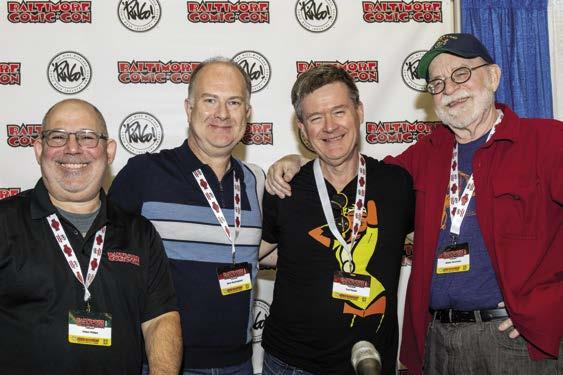
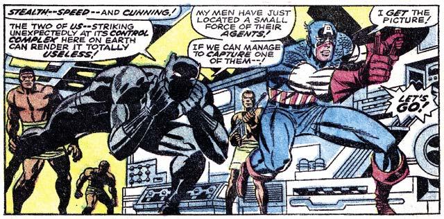
ADAM PHILLIPS: All right, I think we’ll get started. Even though the PowerPoint isn’t running yet for some reason, the PowerPoint isn’t super necessary to talk about Jack Kirby. I’m not sure Jack Kirby ever interacted with a PowerPoint presentation, and maybe that’s for the best. I’m Adam Phillips, and thank you all for coming. This is the Jack Kirby: Beyond Square Fingers panel, and I was really thrilled to invite these panelists to be with me. From the end, we’ve got Walter Simonson, and then Karl Kesel, and right here, Mark Buckingham. And just quickly—I’m going to let you guys do a little talking—I wanted to just say that I titled the panel Beyond Square Fingers because, when I was kid in the Seventies and Jack Kirby came back to Marvel Comics, all my friends who read comics said, “Isn’t he the guy who draws square fingers?” And we learned to appreciate him beyond that. But just to get things started, I was hoping the three of you could talk a little about, not necessarily the first Jack Kirby comic you saw, because everyone’s talked about that, I think—and feel free if that fits the bill here—but the first one that really made an impact on you, that made you go, “Wow!” So take it away, anyone. Walter?
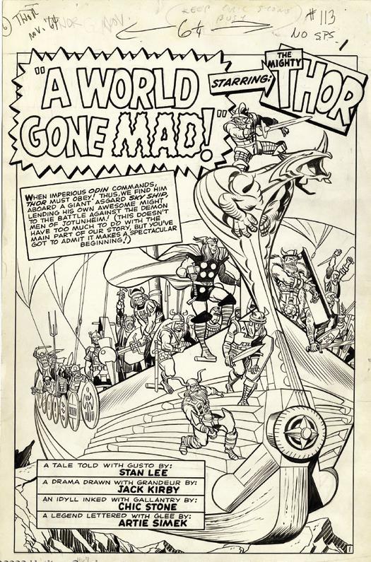
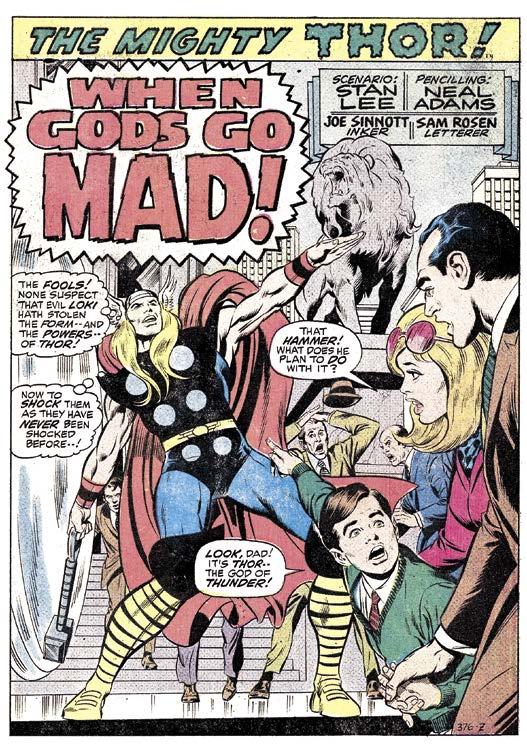
WALTER SIMONSON: All right. I grew up in College Park, Maryland, which isn’t that far from here. They did not have Marvel comics distributed anywhere in the area. So I never saw Atlas Comics as a kid. I didn’t see the early Marvels. My freshman year in college in, let’s see, I went there in ’64, so it was probably in ’65, I was in a friend’s room. He had a copy of Journey into Mystery #113, and I believe it’s the return of the Grey Gargoyle. I hadn’t really seen Marvel comics. I picked it up.
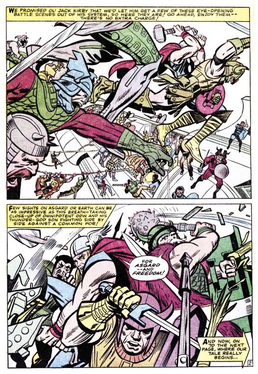
It was Jack Kirby, Stan Lee, and Chic Stone did the inking on it, and it looked very… I read comics. I was a big duck fan. I read a bunch of Carl Barks, all that I could find. I read every comic. I just liked comics. I read them all, whatever I could find. But I’d never seen art like that, and it was very striking. And that particular comic starts off with a shot of a giant Viking ship flying through the sky full of Asgardians [right]. Thor’s riding outside the ship on the bow, sort of. I’m not quite sure that worked. But Odin’s there, and they’re going off to fight the demon men or somebody—some name they made up. I forget what they call them. And then it had a caption that said, “We promised ol’ Jack Kirby we’d let him draw a couple of pages of action, blah, blah, blah, blah, before we get started.” [see next page top] And there were a couple pages of action, and they
beat the guys in about a page-and-a-half or two-and-a-half pages, maybe. Then Thor goes back to Earth, and the story begins. But at the time I read that, Marvel was, by that time, putting credits in their comics, but I didn’t read that, or at least it didn’t register. And so my thought at the time was, “Wow, man, some kid named Jack Kirby wrote in and asked if they could maybe start off with this cool scene. And they said, ‘Alright, that’s great. We’ll do it.’ Man, these guys are awesome.” [laughter] And then God knows how many years later I was back rereading some of that stuff. I got to that and went, “Oh, ‘Jack Kirby’—thanks, Walt. Oh, no. Really?!” [laughter]
But I loved the comic. I had no idea what it was. I had been a Norse mythology fan from the time I was very young. My parents had a grownup book about it, which I read and loved. And so I loved finding a book about Thor. I didn’t care that he had blonde hair. I didn’t care that he didn’t have iron gauntlets or a goat chariot. I just loved the fact that it was Thor and the Norse gods. And then within about four months, I discovered the only chain of drug stores near College Park that carried Marvel comics. And so I bought Journey into Mystery #120, which was the first of a four-issue storyline with the Absorbing Man and Loki, and it was fabulous. If we have time, I’ll tell a story about that later. I won’t go into that now.
But that was my introduction to Jack Kirby. It turned out I had seen a little Jack Kirby earlier, a couple of monster books I bought out of town, but there weren’t any credits. I didn’t have a way to know who it was. But [after that] I got Jack Kirby’s stuff instantly when I saw
it. I became an immense Jack Kirby fan, and I was thrilled to buy it and keep track of the stories. Within three or four months—that was my entry drug—I was buying every Marvel comic they put out. So that was how it started. And that was, I will say, largely thanks to Stan and Jack. But I started buying that stuff, whoever was drawing it, after a while. Of course, back then there were 11 comics a month for about 15 cents apiece. This was ’65, so 12 cents, maybe. So even in college, I could afford to buy all the Marvel comics that came out, and never regretted it.
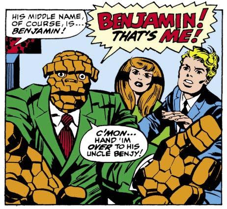
KARL KESEL: I started reading comics in the late ’60s, like ’68, and I know I started with Fantastic Four #80, which leads right into the famous Dr. Doom story where he takes the FF prisoner. It’s a swipe of the Prisoner TV series, but I didn’t know about that TV series; I just really loved that story. But the one that really left an impression on me was the Annual that came out that year, which was about the birth of Franklin, and it introduced Annihilus. It was really big and cosmic, and I was worried that Sue was going to die. I believe it’s at the end of that when they—is that when they named Franklin, or is he only born? [Editor’s note: Franklin wasn’t named until FF #94 a few months later, as shown at right.] Anyway, maybe my memory is wrong, but at the end of it, they mentioned that Franklin’s middle name is Benjamin, and Ben starts crying. And even as a kid that really touched me deeply. That moment really left an impression on me.
Fantastic Four was quickly becoming my favorite comic. And then they did the four-part “The Skrull Takes a Slave!” [FF #90-93]. I did not watch Star Trek, so I didn’t know that basically Jack was ripping off the “A Piece of the Action” episode of Star Trek. [laughter] But I loved the idea of alien gangsters, and they ran a gladiator thing. It was just this mash-up of ideas. It just kept brimming over, and I loved it.
And once again, at the end, Reed and Sue and Johnny, they have the Skrull spaceship, they go find Ben, they save him. And it really became apparent to me the friendship between Ben and Reed. And once again, I was really deeply touched by that. That’s when Kirby’s work, and quite honestly, obviously, Stan Lee’s work, made a huge impression on me. That was, I think, one of those turning points with my appreciation of comics.
I specifically remember two of the FF covers: the one [#92] where Ben’s hand is tearing down the “Ben Grimm: [Killer]” poster. I love that cover. I remember sitting there looking at the drugstore going, “This is the best cover I have ever seen.” And then the next issue was—I believe there are no words on the cover. It’s just Ben fighting the robot gladiator Torgo—I think that’s his name. And once again, it was a beautiful cover, and I remember thinking, “Two Fantastic Four covers in a row, which are the best covers I’ve ever seen!” Jack Kirby was really making an impression on me right at that moment. And that’s when I really became aware of that.
MARK BUCKINGHAM: For my part, I mean, obviously I was growing up in the UK, so our access to American comics was slightly different in that we had our own sort of Marvel UK that would repackage American books in black-and-white as anthologies. So we’d get a sort of a newsstand weekly comic that would have about 40 pages of Marvel Comics material in it, and it would be taking stuff from two or three different issues of different books. There was Mighty World of Marvel that had the Hulk in it, and I remember Daredevil was in there, and various other things.
I think the one that really resonated with me first, actually, was when I came across Fantastic Four in there. It was around the early forties, so it was Joe Sinnott on inks, and it was starting to introduce the Inhumans and Dragon Man, and characters like that were sort of crashing through—Maximus the Mad. Triton ended up captured, and they’re trying to keep him alive. I was reading this thinking, “This is incredible.” And hordes of his minions attacking the FF, and all that sort of stuff going on. I just remember at the time thinking, “This is unlike anything I’ve ever seen before.” I was only six or seven. So it absolutely blew that little boy’s mind. I mean, prior to that, I think the thing that probably appealed to me the most was a Spider-Man weekly comic that had come out around the same time. The first issue of that had a free gift, which was basically a paper bag with Spider-Man’s face printed on it, [laughter] and they sold it as “Your free Spider-Man mask.” Kids all over the UK were running around with paper bags over their heads. [laughter] It was hilarious, but great fun.
But yeah, the FF was the thing that really hit me straight from the outset. And I’ve been a lifelong fan of that stuff, and of Jack ever since. But of course, at that age, I wasn’t really aware of the names. You would fall in love with characters and with storylines, but you wouldn’t really associate them with having been created by anybody. I think I only really started to become more aware of Jack later on when I started to be able to access American copies of comics
by Shane Foley
Ihave a very short question for Jack. (Sometimes it seems like when I write I’m always criticizing elements of Kirby’s work. But can I say I do that because usually his work is genius! How his creativity is drawn into even minor places is staggering—and appreciated all the more since I now draw a couple of strips myself and am totally intimidated by Kirby’s thinking when he draws creatively, even the most pedestrian part of a story. But when he does something that seems to me to be not up to his normal standard, it can really stand out. And since this issue is about questions, I thought I’d ask one of mine.)
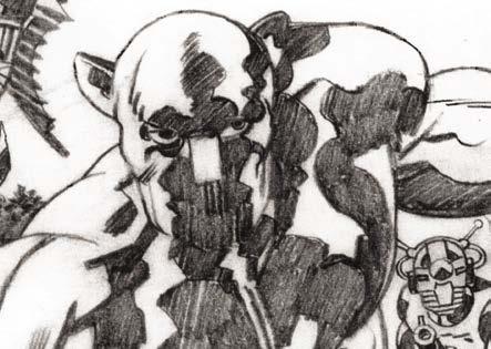
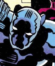
Back to my question: Why, o’ why Jack, did you draw the face of your wonderful creation—the Black Panther—like this?
You used to draw him like this!
Your original way was simpler and far more dynamic. Why, when the Panther had his own strip under your guidance, did his face look like this 1 when you used to draw him like this 2
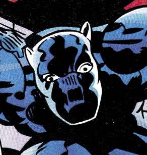
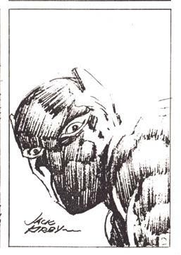
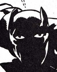
In what way is this face 3 better than this 4 ? The cover of Black Panther #3 wasn’t bad 5 —but one of the few that got close to your previous way, such as this or this 6 .
Dare I say it? Your way of drawing the Panther got even worse as your ’70s stint went on, where the tendency to draw ears that stick out like a teddy bear, and that horrible square nose—as well as way too many lines rather than the simplicity of the solid black you used to draw—reached a crescendo. Black Panther #12, page 1 wasn’t too bad (despite the nose), but the cover and other panels were... ugh! Am I the only one who finds the way the Panther was drawn in Jack’s ’70s series baffling and (I’ll admit) annoying?
I don’t mind a style evolving and changing, but to my eye, the Panther in these issues was drawn very poorly. (I sound like a heretic, don’t I?) For the record, I have no problem with most of the stories in this series. I
3 4 6 1 5 2
was not a fan of the previous Don McGregor approach. My one complaint is the way Panther’s masked face was drawn. Is there anyone who thought the newer way in the ’70s was better, or even as good as, the old, ’60s way? I’d like to know if there are any.
So for me, the question remains: “Why, Jack?”

It bears mentioning that Kirby, with a background in animation, often thought of ways to bring vitality and motion to a medium that was essentially composed of still images. He would consistently use his skills to make his work as cinematic as possible. Kirby would often speak of his interest in keeping up with the work of groundbreaking filmmakers such as Stanley Kubrick. He would also speak about developing features to stay ahead of cinematic larger-than-life characters such as James Bond. In an interview in The Nostalgia Journal, he would state, “SHIELD was to be patterned on the super-secret agent just like James Bond. But James Bond already was, and I had to go beyond him, and that was my job. I had to experiment with things, I had to take one leap beyond James Bond.”
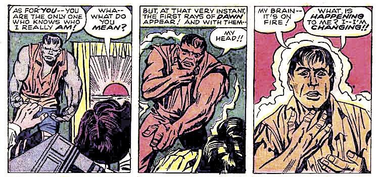
One of Kirby’s remarkable talents as an artist was his ability to depict the transformation of a character from his original state to that of an enhanced super-powered being. A fairly early example is Simon & Kirby’s Fighting American. This character had a unique origin, in that his life essence had been transferred from his own frail body into that of his revitalized brother. 1 This panel features a wondrous piece of Kirby-tech gadgetry, a device that looks capable of actually performing such an astounding operation. As we scan this intricate composition, we first see the top of the machine with bolts of energy dancing around it. Following the tendency of reading from left to right, we initially might overlook the slim figure of Nelson Flagg, as the prominence of the machine’s horizontal red bar takes the eye to the larger and more colorful costumed form of Johnny. However, the semicircular shapes of the seats, as well as the hands below operating the machinery, bring the eye back around to Nelson’s slim unobtrusive shape.
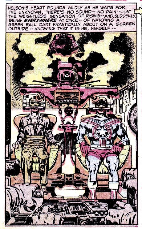
1
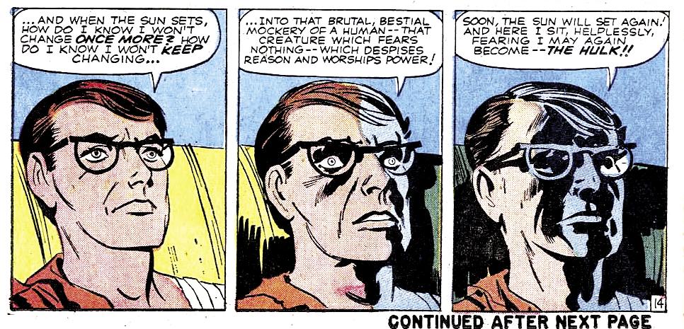
Moving forward to his early work with Marvel, the three-panel sequence generally seemed to be Kirby’s choice to most effectively depict moment-bymoment transformations. As a boy of ten, I quickly noticed this technique in the Hulk’s first issue. 2 On page eleven in the middle tier, the rising sun causes him to revert to Bruce Banner’s human form. Notice that Kirby’s camera eye zooms in closer as the Hulk transitions to Banner. In panel two, his massive torso looms threateningly with hand extended, but by panel three his rapidly changing face is proportionately
2 4 3
by Will Murray
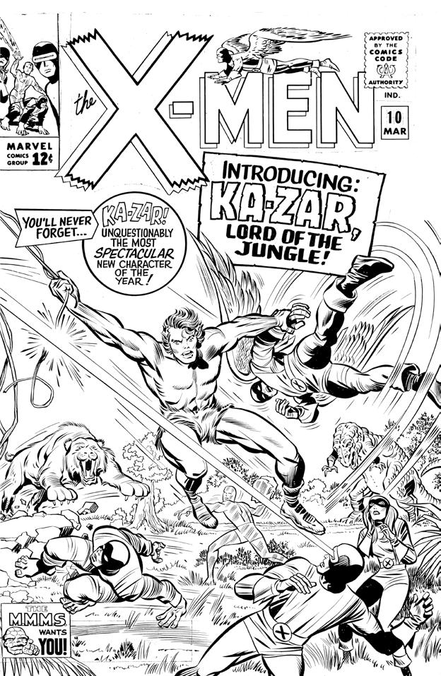
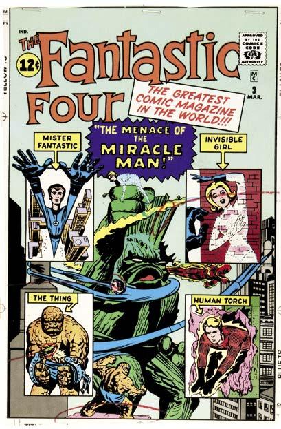
(this spread) Examples of rejected/unused Kirby covers. Below is for Fantastic Four #20 (Nov. 1963), which was never inked. Next page, top is Fantastic Four #3 (March 1962), which actually got to the production stage before being replaced. Finally is X-Men #10 (March 1965) which was inked by Chic Stone before being abandoned.
Recently, on online forums on Facebook and elsewhere, fresh controversy has erupted over who actually wrote many of the Stan Lee/Jack Kirby Marvel comics of the early 1960s.
Controversy is understandable from the standpoint of the fact that at some point in the early 1960s, there was a shift away from artists working from full scripts to having the artist draw from written plots or premises or verbal suggestions, leaving Marvel artists to establish the narrative virtually single-handedly. In these cases, Stan Lee would write the dialogue and captions directly on the illustration boards for the letterer to follow, claiming full credit for scripting a story.
Whenever two creators collaborate, especially under the pressure of monthly deadlines, who created
which element can become easily blurred by the passage of time, the failure to keep scripts, or the complete absence of written records.
As editor and writer, Stan Lee has come in for a great deal of criticism, owing to the discrepancies in his stories and new evidence surfacing that he may not have been as responsible for the formative Marvel Comics stories as he had claimed.
Many of these criticisms are valid. The evidence for others range from scant to nonexistent, or stems from a willingness to castigate Lee for decisions that may not have been entirely his.
One example is the issue of rejected covers. Even as fabulous a talent as Jack Kirby suffered from having his first-attempt cover submissions rejected sometimes.
It’s claimed that Kirby wasn’t paid a kill-fee for these covers. That may well be true. We don’t know because there are no records to tell us. But it’s entirely likely that he wasn’t paid in at least some cases.
Where Kirby wasn’t paid, that wasn’t a Stan Lee issue, but a Martin Goodman edict. In fact, it was probably Goodman’s policy to pay for unused covers only under certain circumstances, if at all.
One error researchers seem to make is confusing the difference between a rejected penciled draft cover with a fully-inked front cover that was not used. Stan Lee is usually blamed for both of these types of rejections.
That seems highly unlikely. It appears to me that when a cover was rejected in the pencil stage, that is probably Stan Lee, but it might be Martin Goodman. More likely it would be Stan Lee, but that is speculation on my part.
But in those cases where a cover is taken all the way to the inked and lettered stage, I doubt very much that Stan Lee would have second thoughts at that point. It would have to be Martin Goodman who objected to the finished cover for some reason or other. That only makes sense.
I would think in those instances, where a penciler, inker and letterer created a finished cover, they were likely to have been paid if the rejection was a Martin Goodman decision, which seems to be the most probable explanation. After all, the illustration was accepted at all stages of production, and the original artist would have been paid promptly, surely before the inker and letterer came in.
Not that Stan Lee is off the hook. There are many instances where changes are made on fully finished covers, such as erasing partial backgrounds, changing elements, and other modifications. Those decisions may not have been the work of individuals, but the result of a combination of Lee and Goodman, and probably production supervisor Sol Brodsky, discovering last-minute problems.
Whenever a comic book is being ready to go to press, a “make-ready” proof copy is shipped back to the editorial office and examined for problems. I think
in some cases covers may have looked confusing and problematic once printed in full-color, so someone in the office realized that cosmetic changes needed to be made, whether in the drawing itself or of the colors chosen.
Other changes, such as the repositioning of a foot on a minor character, or the disappearance of background figures on the cover of Fantastic Four #1, seem incredibly pointless and fussy. It’s just that we can’t necessarily blame any one individual in hindsight—especially since we can’t know their reasoning.
Another significant issue is that of who really wrote some of the early Marvel stories. Kirby claimed that he did, but his definition of writing is really more a description of converting a premise into a coherent graphic narrative.
Asked by Gary Groth if Stan Lee wrote the pre-hero monster stories, Kirby replied, “No, I dialogued them. If Stan Lee ever got a thing dialogued, he would get it from someone working in the office. I would write out the whole story on the back of every page. I would write the dialogue on the back or a description of what was going on. Then Stan Lee would hand them to some guy and he would write in the dialogue.”
The “some guy” was usually fledgling scripter Larry Lieber. Lee once told me that he polished Lieber’s dialogue, which is why those stories often read like “Stan Lee Light,” and why Lee’s name does not appear on them.
Contrary to surviving pre-hero Kirby pages, back-ofthe-board dialogue or story directions are never found.
Once the no-script Marvel Method was inaugurated circa 1964, the working routine changed radically.
As Kirby told James Van Hise, “Well, the policy there is the artist is not allowed to do the dialogue, and therefore has to confine himself to the script. What the artist does is the script and the drawing, and the dialogue is filled in by the writer in the balloons. The artist writes the action in the margin of the illustration board, and the writer is therefore able to follow the action in each individual panel. What the artist does is make the framework for the dialogue writer.”
Here, Kirby is referring to the full-blown Marvel Method period of the 1960s, where his story directions and suggested dialogue can be found in the margins. These margin notes, which Lee used as guidelines, do not appear on art boards from the pre-hero and early superhero Marvel titles.
Challenged on his claim to have scripted Marvel stories credited to Lee, Leonard Pitts, Jr. suggested that Kirby was really plotting, not writing the stories.
“You can call it plotted,” Kirby retorted. “I call it script. I wrote the script, and I drew the story.”
Jack is misusing, if not abusing, the specific term “script,” which in other media always included the dialogue. In the film business, Kirby’s task would be called storyboarding. It’s been the case for decades that prior to filming a script, a studio artist would break it down like a comic book into a series of sequences, as a guide for the director. That’s not writing. That’s essentially visual storytelling and an extremely valuable skill when a seasoned and
(below)
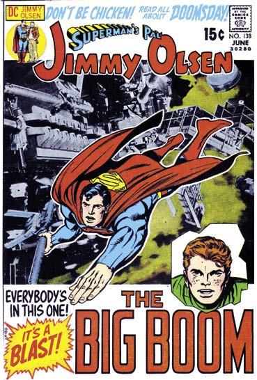
eal Adams sadly passed away on April 28, 2022 after a stellar career in both comics and advertising. In the late ’60s, Adams revolutionized comics with his hyper-realistic dramatic approach and the dynamism of his storytelling, at DC on Batman, Deadman, and Green Lantern/Green Arrow, and on Marvel’s Avengers and X-Men—and his path crossed that of Kirby, whom he inked on several Jimmy Olsen covers. Adams was also a strong personality, the stubborn defender of a profession often abused by its publishers—supporting Siegel & Shuster, the creators of Superman, against DC, and Kirby against Marvel.
At the 2017 San Diego Comic-Con, on Saturday July 22, Jean Depelley, along with co-director Marc Azéma, was present to shoot their Kirby at War documentary on the occasion of the King of Comics’ centenary. Contacts had been made with Marc’s friend, artist Neal Adams. It was obvious that Neal had forgotten their previous meeting at Comic-Con—hence a certain annoyance at the start of the interview. But when they started discussing Kirby, the passion came back quickly. It was a short but intense meeting, not beating around the bush!
QUESTION: Hello Neal, I’m so pleased to meet you at the San Diego Comic-Con.
NEAL ADAMS: It’s a pleasure!
Q: So, this would be the 100th anniversary of Jack Kirby.
NEAL: Anniversary—you mean birthday? Not anniversary. It’s as if you imply that he would be married to someone for one hundred years. I don’t think that happened. It would be more his one hundredth birthday, I guess... what is Stan Lee’s age now? 100?
Q: Ninety... 95 ? 94 ?
NEAL: God! Wow! The addiction to smoke cigars. Anybody out there, don’t smoke cigars or cigarettes. The pleasure will make you sick. Very bad. Bad for your throat, awful. If he were alive today, he’d be smoking his cigars, and that’s bad. [laughs]
Q: What about his art?
NEAL: It’s ugly! Jack Kirby’s art was ugly. Don’t you guys know that? Ugly, it’s ugly art. Early on, Jack Kirby’s art was ugly and then it got better. Jack Kirby’s not known for having pretty art, he is known for having kind of ugly art, but creative, unbelievably creative, and he created worlds. If I were Stan Lee, I would be terrified working with Jack Kirby, because, I mean he... Jack Kirby was in the middle of doing—I don’t know, four books a month. He started to do the “Tales of Asgard”. Well, of course, Stan Lee had to go and look up what Asgard was, what the Norse gods were— Jack already knew, and he knew everything. He created new worlds, and so made life miserable for anybody else, because he was so far better than anybody else. You could say you have had to run to catch
The many, odd variations of Pure Imagination’s 1987
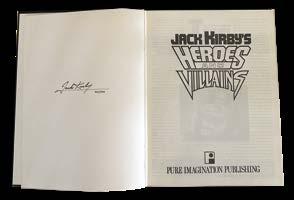
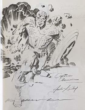
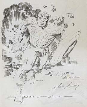
In 1987, Greg Theakston convinced the Kirbys to allow him to print the sketchbook which Jack drew for Roz for Valentines Day in 1979, planning to offer 1000 signed and numbered copies through his Pure Imagination imprint. But things didn’t go as planned, leading to quite a mix of variations—and that’s based only on what I’ve uncovered so far. I polled readers and scoured online sources and auction sites for every copy I could find, and the results are on the next page.
Some are signed/numbered with Dream Machine endpapers, some unnumbered with Dream Machine endpapers, some with neither, some numbered with only a loose Dream Machine plate. One thing is certain, though—there were two printings done: one in the USA, one in Canada, and at right are their most basic differences.
There are a couple of additional things to know. I personally scanned Jack’s original sketchbook over a decade ago, when the Kirbys loaned it to me. Both of Greg’s printings present the sketches in a different order than the original, and the Canadian printing has inferior print quality, and a vastly different page order than the US one. Neither printing includes Jack’s original page 61 Bullseye drawing (Jack drew two different Bullseyes, but only one got printed) or his page 135 Atlas Monsters illo. Furthermore, the Canada printing also omits Odin, the Avenger, Spragg, and the early “Hulk” Atlas monster that are in the US printing.
A Kirby family friend, posting in September 1998, relayed that Greg told him the first 333 copies were bound one way, the second 333 another way, and the last 333 never bound. That theoretically means only 666 of these books ever got out to the marketplace, but I’m skeptical, since so many unsigned/unnumbered copies are in circulation. Greg also followed up with him and said, “One printing, two bindings”, which makes no sense, in light of his interview in TJKC #17 (Nov. 1997):
THEAKSTON: “When it came time to print the book, I mixed a combination of high grade black ink with a metallic ink until I achieved the exact shade of a #2 pencil lead... I printed 1000 copies, and bound one-third. Those were signed and numbered, but they do not have the decorative endpapers. The binder sent the box of endpapers back with the bound books, saying, ‘What is this for?’
“So I put the 666 unbound volumes in my storage room, and told my brother to call the recycling place to come get the scrap that was sitting out in the front of the print shop. And when I went to have the other 666 sent for binding three or four months later, they said, ‘The paper guy took all that stuff.’ [Editor’s note: Greg told me on two separate occasions, prior to TJKC #17’s interview, that the unbound pages were lost first in a flood, and then in a fire. I wish I would’ve called him out on that.]
US FIRST PRINTING:
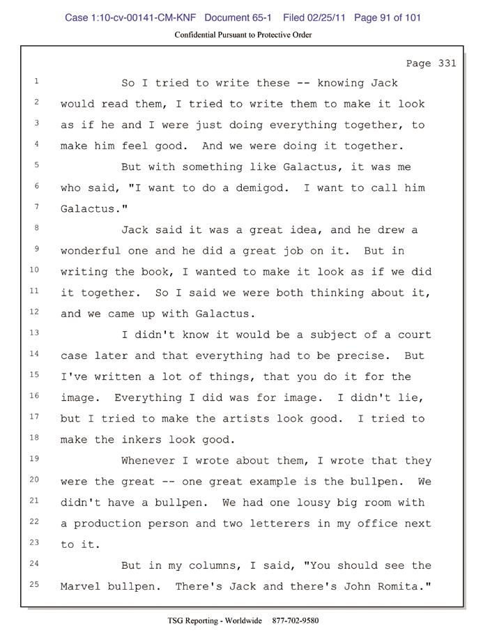
(right) Michael Vassallo is on record saying that George Mair contacted him three years prior to the publication of Excelsior! for (eventually uncredited) help on what was originally to be a biography, but later changed by the publisher to make the book appear that Stan was narrating it to Mair.
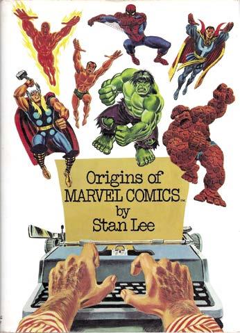
(below) Part of Stan’s heavily redacted deposition from the Marvel vs. Kirby court battle, taking back statements he made in 1974’s Origins of Marvel Comics that might’ve hurt Marvel’s case.
[Barry Forshaw spoke to Stan Lee when he was in the UK for the London launch of the first Spider-Man film in 2002, coinciding with the release of the book Excelsior!]
Along with such giants of illustration as Jack Kirby and Steve Ditko, he was the man who co-created Spider-Man. And The X-Men. And the Fantastic Four. And the Incredible Hulk. Yes, the man without whom many of the biggest blockbusters in recent Hollywood history would not have existed was the ebullient Stan Lee, the public face Marvel Comics. And after nearly half a century in comics, Lee penned his autobiography, Excelsior! But reading the book, Barry Forshaw found that this was no mere self-publicity exercise—Excelsior! is remarkably frank. As was the man, in conversation in London for UK Starlog
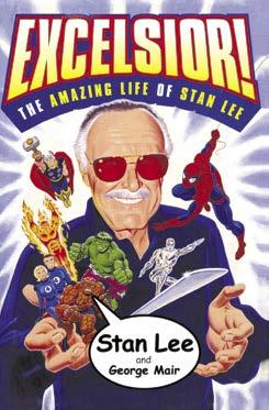
Was the late editor/writer ready for the daunting publicity tours that would accompany Sam Raimi’s then-new Spider-Man movie?
“Am I ready? Probably not—but it has to be done. And although I usually dread a whole slew of interviews in a row, I usually find I’m enjoying them when I start. I’m in the Spider-Man movie, did you know? Just a walk-on…”. Excelsior! is a captivating read. It’s fascinating to learn how both Lee and his key artists Jack Kirby and Steve Ditko came up with so many enduring superheroes, most of whom have been the subject of highly successful movies. But Lee told me it’s not really an autobiography—or not quite.
“I’m glad you enjoyed the book. Actually, it’s not really an autobiography. It is, in fact, the world’s first bio-autography: George Mair supplied a lot of the information about my career, and I pick up from his introductions. But it’s 99% me. They wanted me to do an autobiography, but I said I’d never have the time. In the book, I try to maintain a self-deprecating tone; I didn’t want a succession of self-aggrandizing chapters beginning ‘and then I created…’. It was important to me that I did that. For a start, I was keen to acknowledge all the incredible talents I’d worked with over the years. Marvel Comics was not a one-man show.”
Excelsior! is notable for its frankness: although Lee can never be accused of paying off old scores, he tells it like it is. Was there ever any pressure on him (even self-applied) to write a book that avoided the contentious issues such as the fallings-out with Jack Kirby and Steve Ditko?
by John Morrow, with thanks to sounding-board Glen Gold
(below) Page 13 original from Thor #169, inked (and well erased) by George Klein, likely days before his death.
(next page) More Klein #169 inks, and a note to George from Artie Simek, as Klein was starting inking and waiting on more lettered pages to arrive.
I’ve long been obsessed with figuring out the behindthe-scenes goings-on with Kirby’s Galactus origin arc that ran from Thor #168-170 in 1969. For details, check out TJKC #52, where I presented an exhaustive article attempting to reassemble Thor #168-170, incorporating the myriad unused pencil pages, and reorganizing some published pages. Tom Brevoort also has a concise recap at: https://tombrevoort.com/2025/03/15/ lee-kirby-the-troubled-birth-of-thor-169/
This late in the 1960s, I’d assume Roy Thomas—or someone else in the office—would’ve been taking some of the load off Stan while he was spending more time promoting the Marvel line at colleges and on TV and
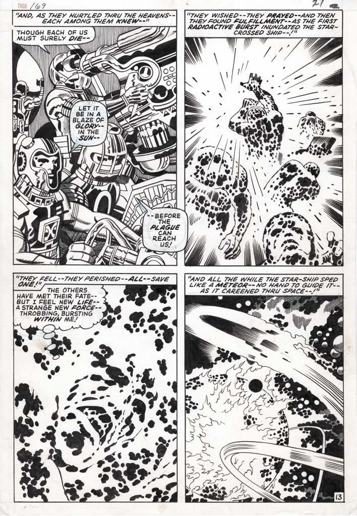
radio, and less on production issues. This arc was so extensively reworked, it seems even more likely Stan wouldn’t have been able to spend that amount of time on it. Also, it seems to me Stan’s story sense and editing would have resulted in less clunky page and panel transitions if he were actively involved. So I asked Roy if he had any recollections of it, and he said, “I was aware at the time that Stan didn’t like a lot of what Jack had come up with for Galactus’ origin, but I forget the details, if I ever knew them... Stan was still the guy in charge of the FF and Thor, in terms of guiding Jack (or, more usually as time went on, accepting or occasionally rejecting what Jack came up with), and writing all dialogue, etc., for the FF, Spidey, and Thor. I can, with something close to 100% certainty, guarantee you that every change or decision for change made to Jack’s story and art in Thor #169 was made directly because of Stan’s specific wishes, and not the input of anyone else.”
As for the why of Jack’s Galactus origin being changed, conventional wisdom is that it directly connected to what Jack had in mind for the Watcher’s origin—but the Watcher’s origin had already been documented in Tales of Suspense #53 (May 1964), in a five-page story that credits Stan Lee for the plot, and Larry Lieber for the script and art. It was also retold, by Stan with Gene Colan art, in Silver Surfer #1 in 1968. Jack may’ve never read either of those tales, so going with his likely original conception of the Watcher as the catalyst for the creation of Galactus (and thus, his vow to never again interfere—or only if it meant stopping his creation) likely contradicted already established continuity.
Roy further commented: “I’ll admit, while I think both Watcher origins are good stories, I prefer the notion that makes Uatu unique, a sort of response to Galactus... but it was way too late for that by the time Jack did that Thor Just a result of the fact that, as Stan said once or twice, Jack didn’t really read the Marvel comics to keep up with what had gone on... and that he wasn’t on a wavelength sometimes with Stan’s feel about Marvel continuity. Of course, in retrospect, Stan was guilty of that sometimes as well, Silver Surfer #1 being very much a case in point. I recall liking the story, but thinking that it totally undercut what had been established before (including by Stan, since he edited and wrote the dialogue for every one of those earlier Surfer appearances).”
Like it or not, part of an editor’s job is to keep things consistent. So fair enough—that gives us a solid reason why such extensive changes were made, even if it made for a weaker story. Now, the trick is to figure out what Jack originally put down on paper for Thor #169. My article in
(below) Jack’s initial map from Kamandi #1 (Nov. 1972). Throughout this article, you’ll see the other maps Kirby delineated to pique readers’ curiosity.
Earth: After the Great Disaster, is a tumultuous world forever changed by an Earth-killing event linked to radiation. In this far-flung future of savage humans and talking animals, Kamandi (The Last Boy on Earth) explores this world with the heart and guts of a man— beyond his years. Jack Kirby’s geographic travelogue is filled with unexpected twists and turns.
Kamandi #1: This unforgettable comic book series opens with Kamandi in a raft navigating the swirling
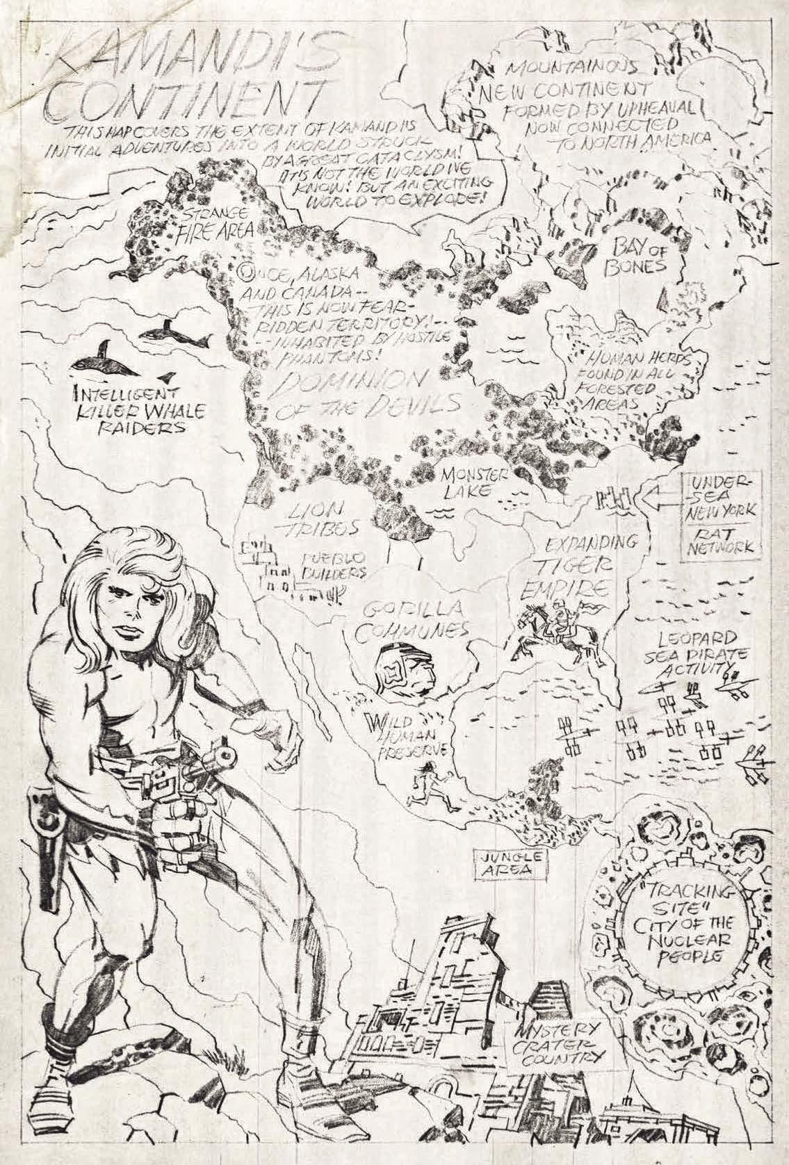
ocean of what remains of New York City. The iconic visage of the Statue of Liberty is a nod to the final scene in 1968’s film Planet of the Apes. Lady Liberty has moved from her pedestal on Ellis Island, as she is next to shattered buildings, including the Empire State Building— leaning close by. It takes several days of paddling up the Hudson River (due north) for Kamandi to encounter bestial humans. They are in the vicinity of Kamandi’s home: A US military bunker complex on the Hudson River named “Command D”—a strategic planning center. [Note: While paddling up the river, Kamandi would have passed near the remains of the Jack Kirby Museum and Research Center in Hoboken, NJ. Imagine Kamandi’s shock if he had found Kirby’s original art photocopies in the ruins? He could have read his own future.] After defeating the wolves who had killed his grandfather, Kamandi commandeers the wolves’ “kinky truck” and roars southward on the aged New Jersey Turnpike—south towards New York City. Curiously, in reality, the turnpike is much nearer the Hackensack River than the Hudson, but perhaps the topography was shifted during the Great Disaster. Kamandi is captured and endures a ride (east) in a hay wagon. In a place called the “Royal City Kennels,” Kamandi witnesses an aged missile rising from its silo. Who knew the US stored nuclear ICBMs so close to New York City? Eventually, Kamandi joins Dr. Canus in his laboratory. A map of the western hemisphere [left] graces the end of issue #1. The map details the locales of Kamandi’s initial adventures as he explores this new world. “Tracking Site” is extraordinarily huge, as it fills a large part of South America.
#2: Kamandi evidently didn’t get far on the New Jersey Turnpike, as Dr. Canus’ lab is within view of the ruins of the George Washington Bridge. This connects them to the Big Apple, north of Harlem—straight east from the northern terminus of the NJ Turnpike. Kamandi and Ben Boxer head out in a mini-sub through the underground river passage into the open Hudson River. Most of NYC is underwater; the domain of a “hijack” society of rats. Notice how Kirby equates NYC with rats, based on his experiences growing up in the Lower East Side. The rats capture Kamandi and Ben, loading them unto a subway car at 81st Street, west of Central Park. Kamandi and three compatriots (Ben, Renzi and Steve) escape across a “craggy field” and into their balloon—on their way south to home base: “Tracking Site” (in South America). In the text piece
by Mike Breen
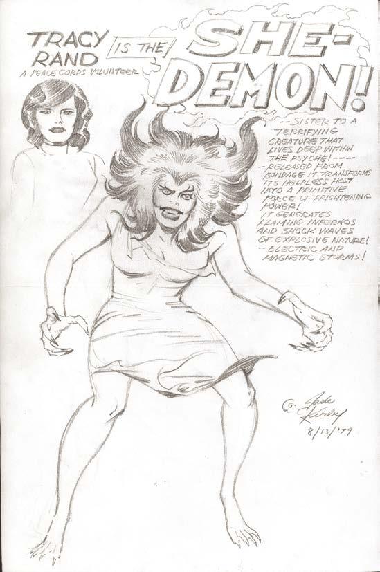
[Editor’s note: In 1978, Jack was doing storyboards for the Depatie-Freleng New Fantastic Four animated series. Some of those storyboards found their way to Marvel’s offices, and ended up being repurposed in Fantastic Four #236 (Nov. 1981) as a “new” Kirby story, without his knowledge or permission. So if Jack created She-Demon as an animation proposal, isn’t it conceivable it made its way back to Marvel the same way those 1979 storyboards did...?]
“The plan for season five of The Incredible Hulk (the CBS TV show), was to have Banner’s (previously unmentioned) sister suffering from a disease where only the blood of a sibling could save her life, which would turn her into a ‘woman hulk’ who was crazy and scary and dangerous.”
Producer Kenneth Johnson (attributed)
“It was done under duress. It was like ‘we need to create a character called She-Hulk and we need to get it out in the next 30 seconds’.”
David Anthony Kraft (Savage She-Hulk writer from #2-on)
“… sister to a terrifying creature that lives deep within the psyche!... released from bondage, it transforms its helpless host into a primitive force of terrifying power!”
?????????
So, the received history is that Stan Lee got wind of Johnson’s intentions and rushed a version of a “woman Hulk” onto the schedule to ensure that Marvel would hold license/copyright for any such character (much the same mentality apparently drove the creation of Ms. Marvel and Spider-Woman). The (previously unmentioned) sister became a (previously unmentioned) cousin who was “like a sister” (Jen says so herself in the first issue of Savage She-Hulk, so it must be true, despite the fact that no-first-name Banner has never mentioned her before and she doesn’t even know that he’s the Hulk). The plot was slightly reworked to add some action and drama (rather than contracting a mundane disease, Jen is shot by gangsters and needs an emergency transfusion, and subsequently fights the hapless gangsters) and, for no readily apparent reason, the comic was written in the style and the continuity of the TV series (nobody knows that fugitive Banner is the Hulk, not even his sister-like cousin; no larger-than-life supervillains or antagonists; and no in-continuity references to the rest of the Marvel universe1).
It was also a bit generic and rubbish, to be honest, like the physicist Dr. Banner’s sudden and conveniently acquired (and dodgy) medical knowledge, the garden hose with the same pressure as a riot-control water cannon2 and, as noted, the whole idea of a lawyer cousin who had never been mentioned in the previous decade-anda-half, despite all the occasions when Dr. B. might have seriously benefited from sympathetic legal counsel.
The finished product, Savage She-Hulk #1 (done in “30 seconds” as per DAK’s quote above) was published in November 1979, with a cover date of February 1980, and, as noted, credited to Stan Lee as creator/writer and John Buscema as artist. The character is frequently cited as Stan Lee’s last great creation for Marvel. Now, you might be pedantic or exact and suggest that creator-credit should actually go to Kenneth Johnson, as it was his idea after all; but I have a further problem with assigning credit, and it’s the source of that third quote after the title above.
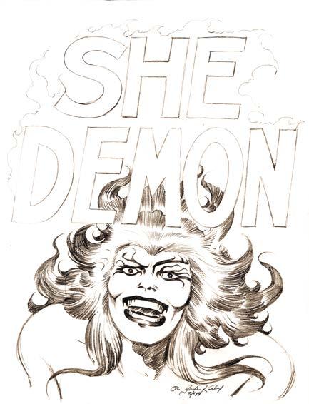
TwoMorrows’ Jack Kirby Collector #56 and #61 published concept art by Jack Kirby, apparently done in August 1979, for a comic-book character called “She-Demon.” She was described in Kirby’s concept notes as a “…terrifying creature that lives deep within the psyche… a primitive force of terrifying power!” and she looks exactly like the early savage She-Hulk, right down to her shock of dark hair, taloned fingernails, savage expression, imposing physique, and the little torn/ ragged dress (courtesy of the Beautiful Dreamer school of fashion
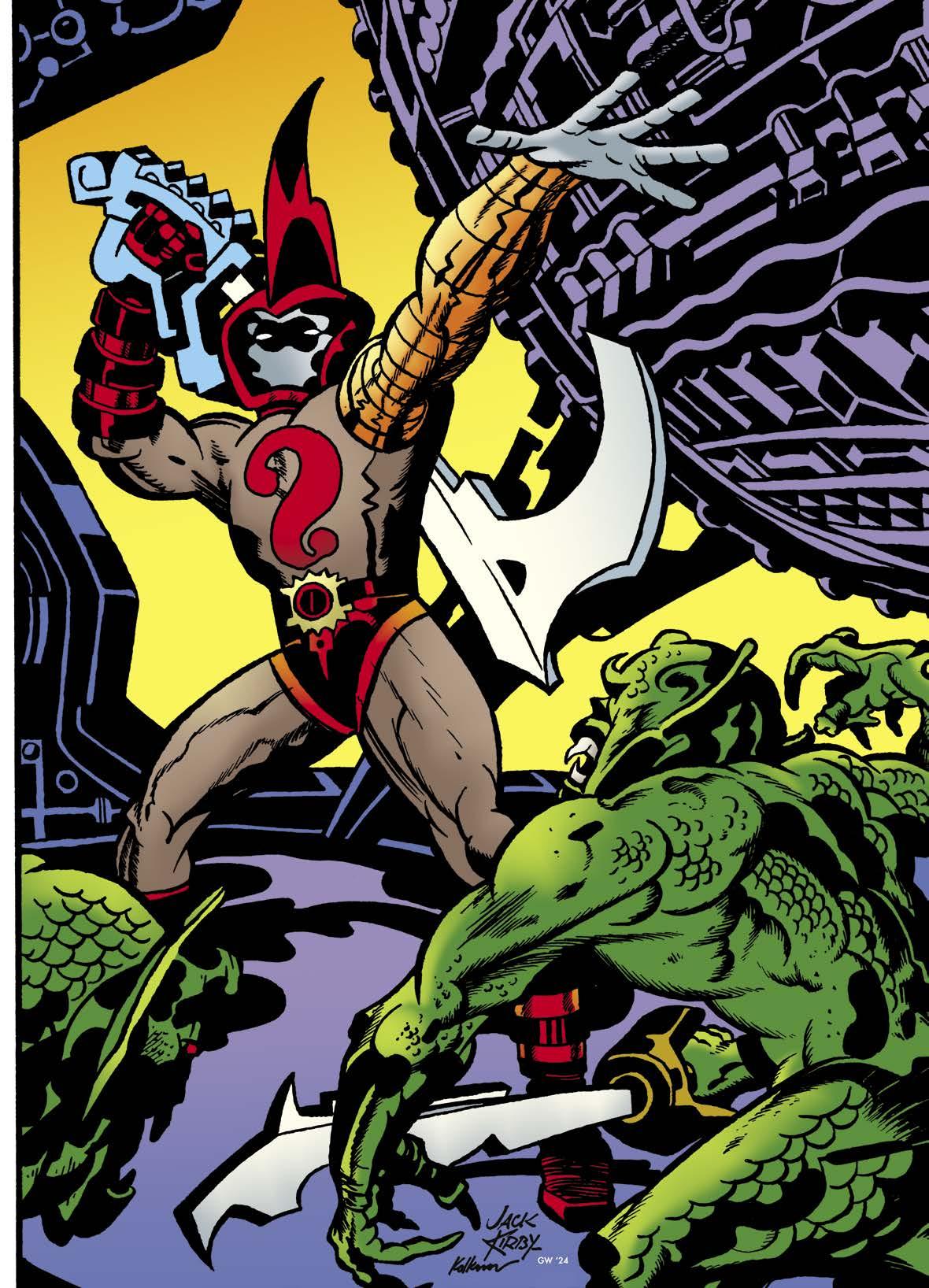
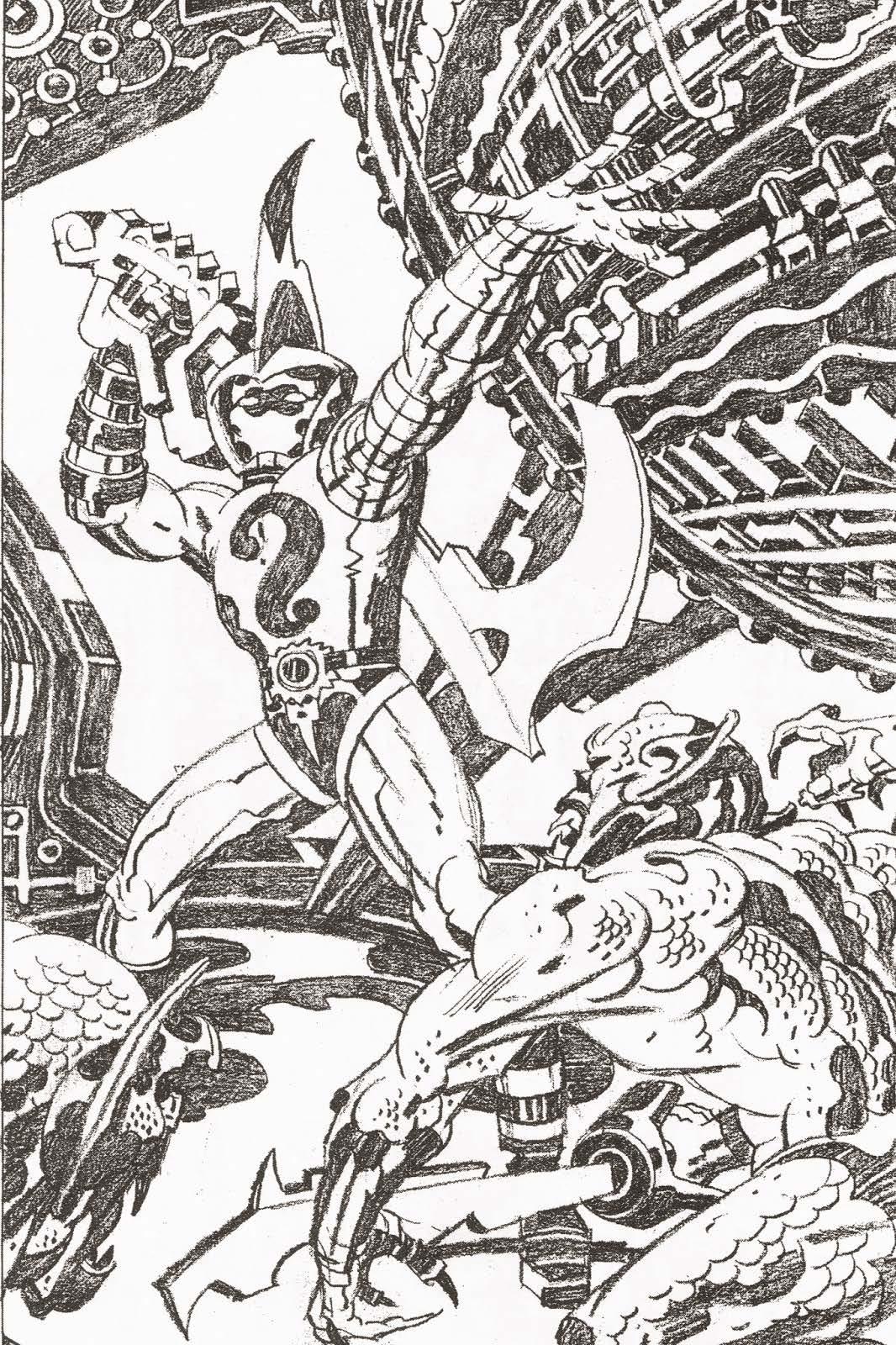
Kirby loved mysteries, and was a huge enigma himself—so let’s explore a few curious images, with commentary by Shane Foley

Barry Forshaw is the author of Crime Fiction: A Reader’s Guide and American Noir (available from Amazon) and the editor of Crime Time (www.crimetime. co.uk); he lives in London.

A regular column focusing on Kirby’s least known work, by
Barry Forshaw
(below) Challengers of the Unknown #5 (Jan. 1959), and Howard Nostrand’s cover for 1953’s Adventures In 3-D #1

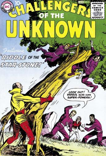
Are there any readers of the Jack Kirby Collector who are not aware of the inking collaborations between The King and the massively talented, but self-destructive illustrator Wally Wood? Unlikely, I know, but just in case you’re a new reader who hasn’t encountered this matchless pairing of talents, let me point you to one of the less appreciated pieces that the duo worked on. For Challengers of the Unknown #5 (Jan. 1959), “The Riddle of the Star-Stone” continued the impeccable work Kirby and Wood had previously essayed in this title with “The Wizard of Time” in the fourth issue of the magazine. While the Challs title is not a superhero book, the cover of this issue might have led unwary readers of the day into making that assumption. It shows a man in a poster-colored red and yellow superhero (or perhaps super-villain) costume tearing up a tree by its roots, and shaking free two of the Challs while the others (including June, the distaff member of the group) crouch nearby. Striking though this cover is, it is perhaps topped by the splash page of the first story [right] which again shows the group at bay—Ace and Rocky are crouching behind a boulder, while heading towards the viewer is a herd of animals running in panic; and the leopard that leaps towards the viewer evokes the cover of 1953’s Adventures In 3-D #1, produced at Harvey Comics alongside Simon & Kirby’s Captain 3-D #1—but who needs 3-D when the impact of a page such as this is created by the best illustrators in the business?
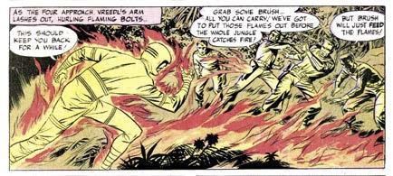
grants the villain Vreedl a variety of short-lived superpowers. Once again, Kirby demonstrates that he was the most dynamic artist at work in DC in the period—there is a panel [above] stretching across an entire page which shows the villain’s arm lashing out with flaming bolts—with the Challs in a variety of different defensive positions. Those used to
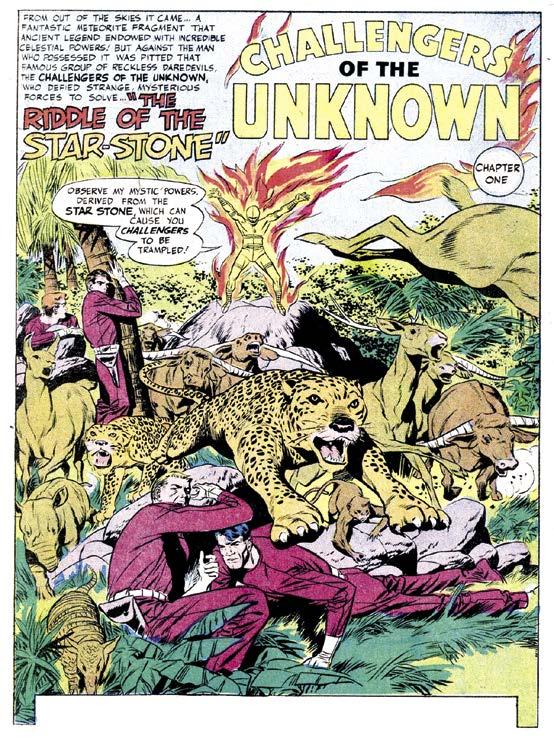
The story itself is a classic case of the syndrome quite often to be found in the title: a quest in which the heroes follow the villain in the latter’s own search for some fabulous power-giving object—in this case, the eponymous “star-stone” which
the artwork of Jack Kirby might be forgiven for taking such things for granted, but it’s worth noting that in the entire book, there is no repetition of the highly individual figure work that he comes up with in each panel. Another classic example of the King’s nonpareil treatment of action has Red leaping from a stampeding animal onto a tree and catching the arms of Prof Haley, running away from the stampede [next page, top]. The page could almost be storyboards for an action film, as could most of this impressive book— admittedly not as jawdropping as the previous issue, but still vintage Kirby and Wood. My own first exposure to the
..are better than one!
An ongoing analysis of Kirby’s visual shorthand, and how he inadvertently used it to develop his characters, by Sean
Kleefeld
n March 2, 1972, the Pioneer 10 space probe was launched from Cape Canaveral, Florida. It was the first man-made object of any sort that would be capable of leaving our solar system. Its primary objective was to study Jupiter up close (“close” being around 130,000 km above the planet’s outer atmosphere), but since it would eventually leave the solar system, Carl Sagan argued for—and got approved for— including a plaque on the craft that might let any potential aliens who stumble across it, know who we are and where we come from.
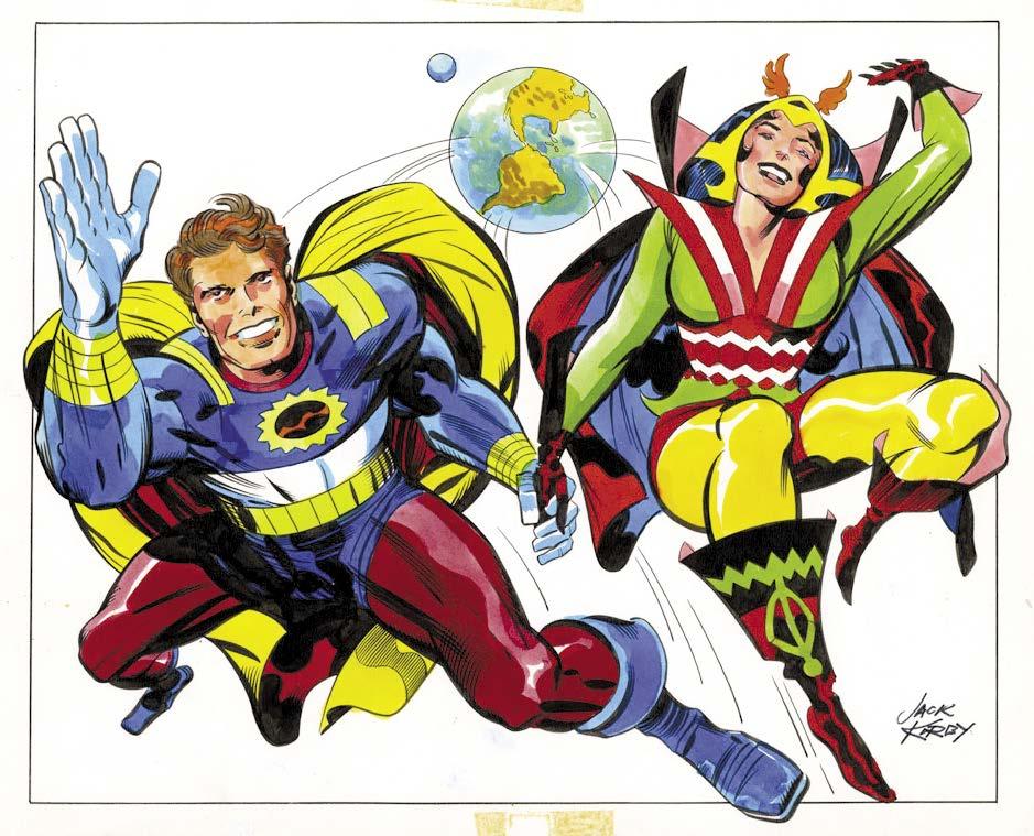
The plaque image stirred more than a little controversy at the time, and the public at large were quite vocally opposed to the two nude figures as being pornographic [right]. And it is with that background, that the West Magazine supplement of the Los Angeles Times asked several other artists to take their crack at what the plaque should look like. Enter: Jack Kirby.
green with a couple of highlights in pinks and oranges. In many ways, they are precisely what you’d expect if you asked Jack in 1972 to draw two generic superheroes.
Indeed, Jack’s statement included with the piece [next page] not only points to his proclivity for drawing superheroes generally, but gets to his view of humanity itself: “It appears to me that man’s self-image has always spoken more truthfully about him than does his realityfigure. My version of the plaque would have revealed the exuberant, self-confident supervisions with which we’ve clothed ourselves since time immemorial. The comic strip super-heroes and heroines, in my belief, personify humanity’s innate idealism and drive.”
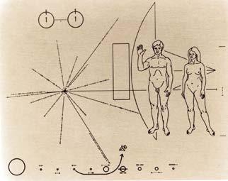
To little surprise, Jack drew two athletic, costumed characters leaping off the planet Earth towards the viewer, breaking beyond the confines of the art panel itself. Their hands are clasped together in the virtual center of the piece, with their other arms outstretched above their heads. The male figure is clad almost entirely in primary reds, blues, and yellows, while the female figure has some additional
Jack’s piece, as well as several other artists’, were published on September 12, 1972, roughly halfway between the launches of Pioneers 10 and 11. Not surprisingly, though, the plaque on Pioneer 11 was just a repeat of the original and not Jack’s design. After all, Jack’s was commissioned specifically by West Magazine and had no connection to NASA whatsoever. (I’m calling that out because I have seen in the past references to Jack’s piece as a “rejected” design; but it was never requested by, nor submitted to, anyone at NASA, so there was never anything to reject! It was just a bit of whimsy on the part of West Magazine.)
Now, some of you may have a couple of fundamental questions about my covering this piece here. In the first place, why am I discussing a single illustration in a column talking about how Jack’s character designs evolved over time? In the second place, I mentioned that the coloring was primarily red, blue, and yellow, and you likely know the illustration as being more orange and green from the version printed in Mark Evanier’s book Kirby: King of Comics.
There are, in fact, two distinct pieces of art we’re talking about. While a casual comparison might suggest one is just a different set of colors done on a stat of the original, closer inspection reveals that the inking is different between the two. The differences are most notable to me in the feathering on the male figure’s left leg and the hex design across the woman’s torso. It does seem pretty clear that both pieces use the same set of pencils to start with, but there are enough minor variations that point to two separate finished pieces.
We know Mike Royer inked the one West Magazine published [left], but he remembers inking only the one. Did he simply forget inking a second version? If he didn’t
Mark Evanier
by JohnAMorrow column
Narrated and presented by Gary Sassaman

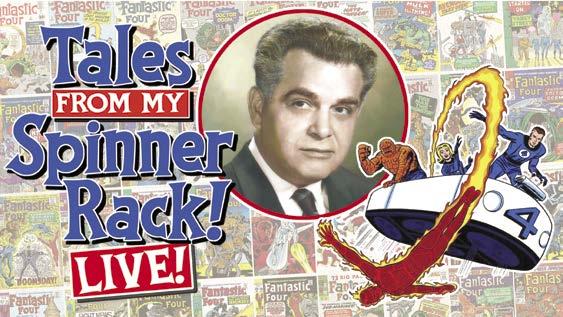
[In honor of the premiere of Fantastic Four: First Steps from Marvel Studios on Thursday, July 24th, 2025, Tales From My Spinner Rack! did a LIVE presentation at San Diego Comic-Con focusing on where it all started: The original run of comics by Stan Lee and Jack Kirby. Strap yourself in to that flying bathtub known as the FantastiCar as we take a wild ride through a decade of King Kirby’s Fantastic Four covers and highlight our favorites. Who is “we,” you may ask? Stay tuned and find out, or view the proceedings at: https://www.youtube.com/watch?v=RHTohuNkHGg]
This is a re-creation of my San Diego Comic-Con 2025 panel, titled “Our Favorite Fantastic Four Covers by Jack Kirby.” That panel happened on Thursday, July 24th, 2025 at noon in Room 9 at the San Diego Convention Center and featured yours truly as moderator, with a look at all 101 Kirby FF covers from 1961 through 1970, plus his seven FF Annual covers, in the order in which they were published.
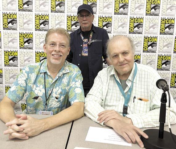
And while I’m a huge fan of both the Fantastic Four and Jack Kirby’s work, I’m hardly an expert. So I called in two friends who are experts to join me on the panel, hence the name “Our Favorite Fantastic Four Covers by Jack Kirby.” That’s John Morrow seated on the left, editor/publisher of the Jack Kirby Collector magazine, just one of the many great comic history mags and books from his company TwoMorrows Publishing. And seated next to him is Mark Evanier, Comic-Con’s panel-master, joining me for one of his 19 panel appearances at this year’s event. Evanier is the expert on Kirby; he was his assistant in the early 1970s
and a family friend until Jack died in 1994, and he still is today. He’s also the author of the definitive biography, Kirby: King of Comics. Both Mark and John not only offered their personal thoughts about their favorite covers, but amazing insights and unknown facts about some of them.
Oh, and that’s me, all dark and glowering, standing in the back. Typical.
Full disclosure: This is not a transcript of the panel. Comic-Con has a number of rules about recording panels, and while most people ignore them, as a former employee of the organization for more than 20 years, I feel the need to respect them. You can look at this as more of a “visual transcription” of the panel, in which I’ll tell you what Mark and John said about their favorite FF covers, along with my own faves.
So here’s how the panel worked: Mark, John, and myself each picked our Top Ten favorite Fantastic Four covers. The presentation showed all 101 Kirby covers (plus his seven Annual covers) and when we came to a Top Ten pick, we called that one out in a separate graphic. Each Top Ten cover was identified with those graphics at far left. Oh, and just to be fair, we tried to get the Invisible Woman to make it an official Fantastic Foursome… but she kept disappearing on us.
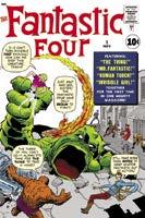
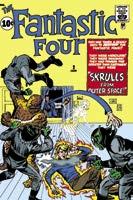
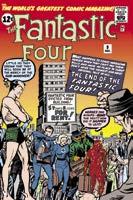
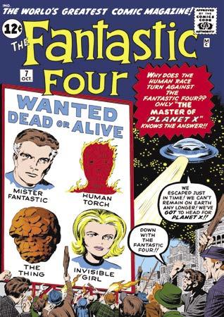
So let’s jump right in: Fantastic Four #1 debuted in August 1961 (cover-dated for November), with issue #2 following in late September and cover-dated for January 1962. Both covers looked very much like just another monster book, which was what the yet-to-be-called Marvel Comics was publishing at the time.
They were followed of course, by FF #3 and #4… and these are two of my favorite covers, pretty much right out of the gate.
Fantastic Four #3 totally changed my feelings towards the book. The addition of
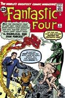
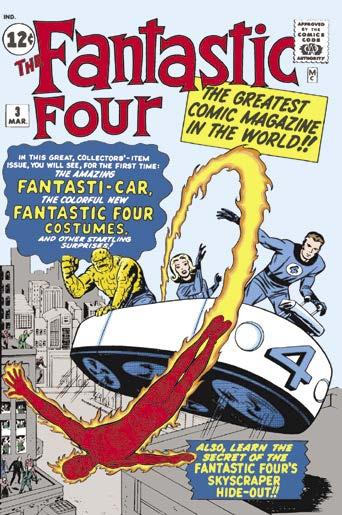
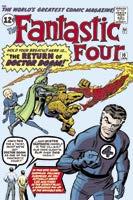
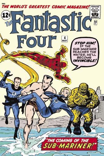
costumes and that dopey looking flying bathtub, called the FantastiCar, meant the world to seven-year-old me. It meant that there were brand new super-heroes in town, and not just the ones over at DC. And issue #4’s action packed cover with Sub-Mariner running towards the reader, stealing the Invisible Girl from her teammates, blew my mind. My brother knew that Subby was a character from comics in the 1940s… but my feeble little second-grade brain couldn’t quite comprehend what that meant. There were comics in the ’40s?!
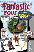
FF #5 featured the first appearance of Doctor Doom, looming over the team on the cover. And as we shall see, it’s one of many “Doom looms” covers in this run. Issue #6 was the first monthly issue and the first super-villain team-up at Marvel, bringing together Dr. Doom and Sub-Mariner.
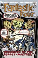
Issue #7 featured an outer space story, “The Master of Planet X.” Issue #8 introduced the Puppet Master and the Thing’s girlfriend, blind sculptress Alicia Masters. Issue #9 featured a shady movie deal with studio mogul Sub-Mariner. But we have Mark Evanier’s first Top Ten cover here…
Mark explained what the cover of
IF YOU ENJOYED THIS PREVIEW, CLICK THE LINK TO ORDER THIS ISSUE IN PRINT OR DIGITAL FORMAT!
Fantastic Four #7 meant to him: “It didn’t stand out for me for a long time. And then years later, after I knew Jack for a while, I looked at this cover and I noticed two things: This cover was inked by Jack Kirby, he penciled and inked it. He didn’t ink a lot of covers for Marvel because he was so busy penciling. But this is pure Jack Kirby penciling and inking. And then I noticed, if you look at Mister Fantastic, and you just keep staring at him, he starts looking like Jack Kirby. So this cover, I get a little tingle and I ask myself, why didn’t I notice that before?”
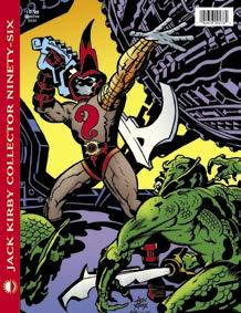
KIRBY COLLECTOR #96
QUESTIONS!
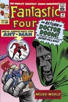
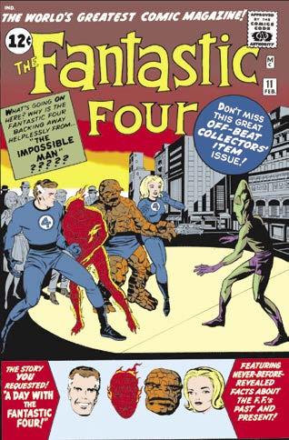
FF #10 moves us into 1963, with an appearance by Stan and Jack on the cover and inside. Issue #11 introduces the Impossible Man and issue #12 features the first Marvel crossover with the Incredible Hulk. This issue and Amazing Spider-Man #1 both came out on the same day, December 10, 1962, with Spidey also meeting the FF in his first issue. The Marvel Universe was born. But we have another Top Ten issue in this threesome for Mark…
Kirby’s unpublished/unknown work, Heroes & Villains Sketchbook variants, Jack’s Phantom Force involvement, his daughter’s 1960s pop star career, revealing STAN LEE interview, exploring the Kamandi #1 Earth A.D. map, mysteries behind Thor #169’s Galactus origin, the 2024 Baltimore Kirby panel (featuring WALTER SIMONSON, MARK BUCKINGHAM, and KARL KESEL), MARK EVANIER, and more! (84-page FULL-COLOR magazine) $10.95 (Digital Edition) $4.99
https://twomorrows.com/index.php?main_page=product_info&cPath=98_57&products_id=1840
Issue #11: “This is the first Marvel superhero comic I ever read,” Mark explained. “I had read some of the monster books that preceded it, but I missed Fantastic Four #1–10, but I picked this one up at a secondhand shop… and I really liked it until I read the first ten and realized this was the worst issue. It really is, it’s like the worst issue they ever did, but it will have a place in my heart forever.”
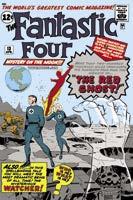
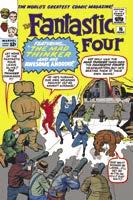
Issues #13, 14, and #15 followed, with #13 introducing the Red Ghost and “his indescribable super-apes,” plus the Watcher, an alien being who just observes and never, ever interferes. #14 had the return of Sub-Mariner, and #15 introduced the Mad Thinker and his awesome android. Stan Lee never met an adjective he didn’t like. #14 is also one of Mark’s favorite covers. “This cover was inked by Steve Ditko,” Mark said. “In the early days of Marvel—this was not a hard and fast rule, but they would hand the issue to the inker along with the cover for the next issue. Quite often, the guy who inked this issue’s cover was the guy who inked the previous issue, and Ditko inked the issue before this, the one with the Red Ghost. But this cover just struck me as something I hadn’t seen before. Since then we’ve seen this layout on tons of covers,