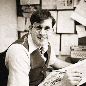
JIM APAROJIM APARO BRAVE & BOLD ARTIST
by ERIC NOLEN-WEATHINGTON and JIM AMASH
by ERIC NOLEN-WEATHINGTON and JIM AMASH
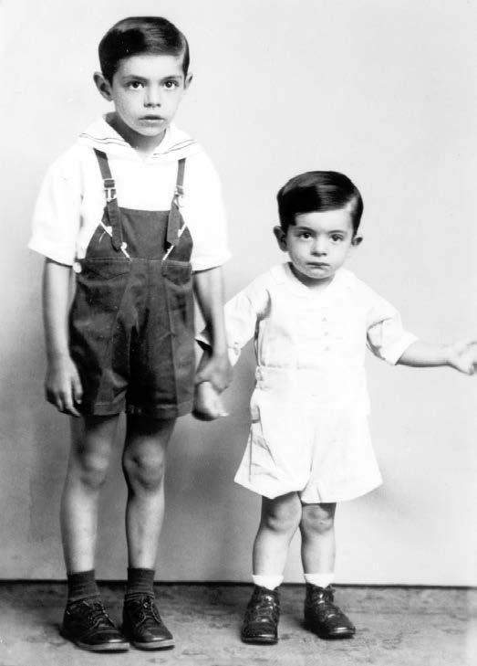
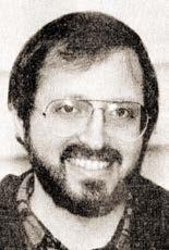
JamesNicholas Aparo was born in New Britain, Connecticut, on August 24, 1932, to Gaetano and Rose Aparo. At the time, New Britain, with a population of just over 68,000, was a manufacturing town, nicknamed the “Hardware Capital of the World” due to The Stanley Works (now Stanley Black & Decker), the P&F Corbin Company, and North & Judd, among others, making their headquarters there. About nine miles from Hartford, the town’s industry attracted a large population of Polish immigrants—
in 1930 about one quarter of the town was of Polish descent. But there was also a sizeable number of Italian immigrants, including Gaetano and Rose Aparo.
Gaetano Aparo was born on May 15, 1895, in Priolo, Siracusa, Italy. Priolo lies on the island of Sicily, where the Aparo family name originated. But in August of 1912, Gaetano moved to the United States, first living in New Haven, Connecticut, before eventually settling in New Britain. He was officially declared a naturalized citizen in May 1919.
Angela “Rose” Scricca of Campodipietra, Campobasso, Italy, was born July 10, 1909. She came to America in May 1921. At some point she and Gaetano connected, and they were married on June 28, 1928. James Nicholas, or “Jim,” was the first of their three sons—he was followed by Michael, born June 17, 1936, and John, born March 31, 1940.
At the time of their wedding, Gaetano was working for the Corbin Screw Company. But the Great Depression led to some lean years for the Aparo family. Gaetano spent time doing road work for the WPA, and the family was able to make it through to better times.
Jim Aparo first encountered comic books when he was sick in bed with scarlet fever at the age of eight. One of his parents bought him a comic book to help him pass the time. As Aparo recalled to Bob Brodsky in an article for Comic Book Marketplace #49 (July 1997), “This comic book had wooden puppet characters, a horse and a kid, and maybe another animal, and I was so fascinated that I kept drawing from it.”
and
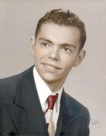
Soon those around him began to recognize that he had some talent for it. Aparo received encouragement from his parents, his school teachers, and his peers. By the time he reached New Britain High School, Aparo was being recruited to put his drawing ability to use in the school yearbooks, posters, and whatever else needed an illustration around the school, all while taking any art or design class available.
Aparo’s parents wanted him to go on to college after graduating high school. His father suggested that he go into teaching, but Aparo wasn’t particularly interested in a getting a standard college education. He wanted to start working and making money, preferably as a newspaper strip artist, and after one semester of studying life drawing at the Hartford Art School (now named the University of Hartford), he took what he could find. Aparo explained in this excerpt from an unpublished interview conducted by Neal Cino in 2004:
ne A l Cino: After you graduated high school, where did you go?
Jim A pA ro: I worked for a big company called Stanley Works. It was a factory. I did all sorts of odd stuff in the press room. But I was still interested in art and in attending art school.
Cino: What kind of factory was Stanley Works?
A pA ro: They made all kinds of things. I was pressing hinges. I was also working on different kinds of machines. I needed to work until I broke into the art world.
Cino: I noticed that part of your middle finger is missing. Did that happen in the factory?
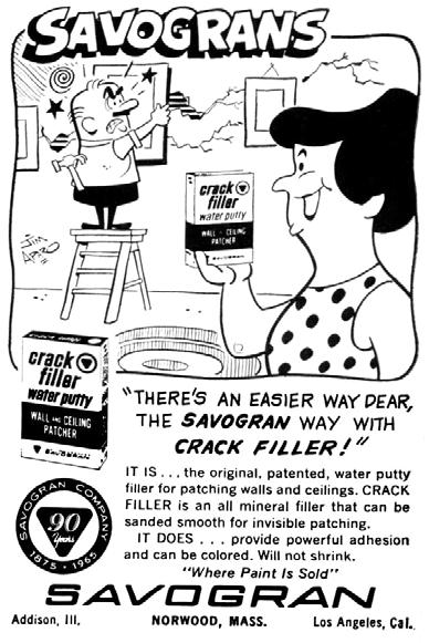
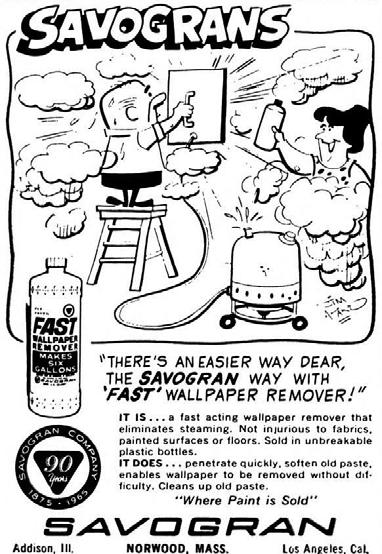
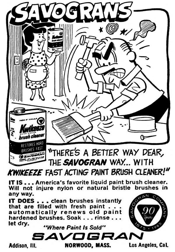
Left and Below: In 1965, working for the William Schaller Company advertising agency, Aparo drew a series of gag panels for the Bostonbased Savogran Company, producers of paint and varnish removal and other solvents, for a year-long ad campaign that ran in Popular Science and possibly other periodicals. The quarter-page ads needed to be readable at a small size, so a simple, open style was called for, and Aparo delivered.
Savograns © Sunnyside Corp.
A pA ro: That was from working on the press. I was making a hinge. I slid the hinge in, and my finger got caught while working on bending the hinge. It pulled my finger. It took the first part of the joint right off.
Cino: Is that your drawing hand?
A pA ro: Yes, it is. At first I was worried that I wouldn’t be able to draw anymore, but later on I realized that I could still lean my pencil against that finger.
Cino: So what did you do after that?
A pA ro: Well, I worked in different jobs. I worked in a store called Plimpton’s that sold art supplies. Then I got a job with someone who had a small art agency in Plainville, Connecticut. I did artwork for him. What I was doing for him was… You know the yellow pages in the phone book? I was illustrating the ads that he was getting from the phone company, which any person can do if you’re an artist and they know you’re an artist. They’ll send it to you directly. In this case it would go through him. That didn’t last long—he went out of business—but it was interesting.
Cino: Where did you go from there?
A pA ro: I went to work for an advertising agency in West Hartford, Connecticut [in 1957]. I would illustrate ads for air conditioning companies or refrigerator companies, things of that sort. The company was called the William Schaller Company. I worked for them for about ten years.
* * * * *
Along the way, Jim met a young lady by the name of Julieann Derkach. Jim was working at Plimpton’s at the time, and was unsure he would ever secure a job as an artist. Julie described the events to Todd Dezago in a 2013 interview conducted for this book:
Julie A pA ro: Jim and I lived not too far from each other. We met when I was in my late teens and he was in his early twenties. We didn’t live too far apart and, actually, I knew his brother before I met Jim. In fact, Jim had gone to school with my sister, and I didn’t know that until after we met. Unfortunately, the first time I met him he kept calling me my sister’s name. That annoyed me. I actually had to tell him, “I am
[Editors’ note: The following interview originally ran in Comic Book Artist #9 (August 2000). The bulk of that interview focused on Jim Aparo’s time at Charlton, and the time leading up to it, and that part of the interview is presented here. The remainder of the interview, briefly touching on his time at DC, appears later in this book.]
Jim A m A sh: You started later in life than the average comics artist, so let’s start off with what you did before comics.
Jim A pA ro: Before comics, I worked in an advertising agency in West Hartford, Connecticut, about five or six miles from where I’m living now. Our main account was an air conditioner manufacturer; you know those big units you see on roof tops? They were based in West Hartford. Mostly stuff of that nature.
A m A sh: Did you go to art school?
A pA ro: Yes, I went to Hartford Art School for a semester, just to brush up on anatomy. I’m self-taught. I just drew as a kid and went with it. I studied and copied comic strips and comic books. I grew up with Superman, Batman, and Captain Marvel. I really liked Captain Marvel Jr. by Mac Raboy. That was beautiful stuff. I liked Alex Raymond, Milton Caniff … all of those guys.
A m A sh: Why did you leave advertising?
A pA ro: I was on summer vacation. I didn’t have any money to go anywhere. We had just bought our own home and had three kids. I just decided to run down to Charlton, which was about an hour or so away. I brought samples of my stuff that I had made up on my own; a page of this, a page-and-a-half of that, and I met Dick Giordano for the first time. Prior to that, I used to send samples of my work through the mail and they always sent them back. That was before Dick. Pat Masulli was the editor, but I never met him.
Anyway, when I met Dick, he was the man in charge at the time. I showed Dick what I could do. It was my
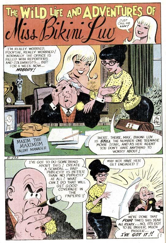
The first page of Aparo’s professional career: page 1 of the “Bikini Luv” feature in Go-Go #5 (Feb. 1967).
Bikini Luv © respective owner.
own stuff that I made up. I would take comic pages that existed from books and write the copy down like a script, ignoring the artist who did it. I said, “Now, how would I do this if I was drawing it?” Dick saw the possibilities were there. He liked what he saw, so he gave me a script [for “Bikini Love”] to do.
A m A sh: Why Charlton? Because they were near?
A pA ro: Yes. And I heard it would be a stepping stone to New York, because I had made many trips back in those days, even when I was just out of high school. I was working after I finished high school in factories, doing
labor work like most people, stock clerk work, and all kinds of jobs. The drawing part was at night on my own when I had time. I was 18, 19, or 20 years old, and was roaming around New York in the summer, living on a few bucks and banging on doors, trying to see if I could get any work. But comic companies were basically closed shops in those days.
A m A sh: Were your samples pencils, inks, and letters?
A pA ro: Yeah, I did it all.
A m A sh: That’s unusual because most people start in either as a penciler or inker, and even when they do both, they seldom do both and lettering too.
A pA ro: Let me tell you why: At the ad agency, I used to do layout work that was in pencil for the client, and then they would turn it over to the typesetter to do the paste-up for the mechanical to shoot the ads. Then if there was any fancy script lettering or a special type of lettering that the typesetter didn’t have, I would do it. I was always fascinated with lettering; I liked to letter.
A m A sh: Unlike other artists who didn’t letter, you could lay out the entire page yourself and have total control.
A pA ro: Right.
A m A sh: Then you considered the lettering an important part of page layout? It made it easier for you to pick the right camera angles?
A pA ro: Yes, I used to do the lettering first. I kept it far away from the art area. Very seldom would I have to re-letter something. I did it pretty well.
A m A sh: Will Eisner worked that way and so did Jack Kirby when he lettered his own stuff.
A pA ro: Then they did the artwork.
A m A sh: Right.
A pA ro: Did they like it?
A m A sh: Yes, though Kirby gave it up to concentrate on drawing. Eisner had letterers too, until later in his career.
Above: “Just a pen and ink sketch,” as Aparo wrote on the board. This piece was done around the time Aparo began working at Charlton. Previous Page: This sample page showed off Aparo’s lettering chops along with a Wally Wood–influenced sci-fi esthetic.
Artwork © the Jim Aparo estate. Courtesy of Jerome Sinkovec and Heritage Auctions.
Then he did everything.
A pA ro: That’s what I did. I got paid for the entire job, so I’d get the whole pie instead of just a third of it. Through the years, your rate escalates the more work you do. That’s the way it’s been, anyway.
A m A sh: Do you remember what you got paid when you started at Charlton?
A pA ro: I don’t remember. I think it was about $15 a page for everything. I could be wrong. I might have been $20 or $25, but that was a lot of work for little money. But don’t forget: Money was worth more back in the ’60s.
A m A sh: That was still low for all three jobs.
Maybe there was a rough to give me an idea. I had to submit cover roughs at DC.
A m A sh: Then Charlton was very laissezfaire?
A pA ro: Yes, but they kept me very busy. As soon as I finished a job, they’d give me another one.
A m A sh: I noticed you used a lot of Zip-a-Tone at Charlton, which was unusual there. It made your work stand out from the other artists at Charlton.
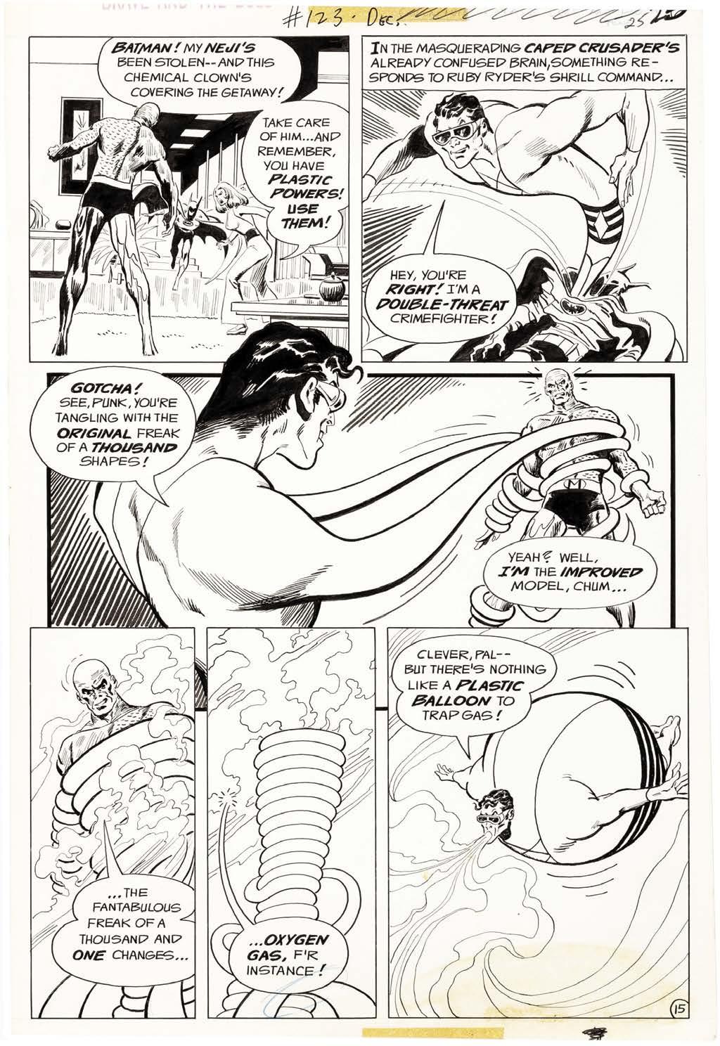
A pA ro: I used Zip at first, but then it got to be too much of a chore because you’re cutting it out and sticking it down. I used it in Aquaman at DC.
A m A sh: Did you use Zip because of the ad work or the love of the old ECs?
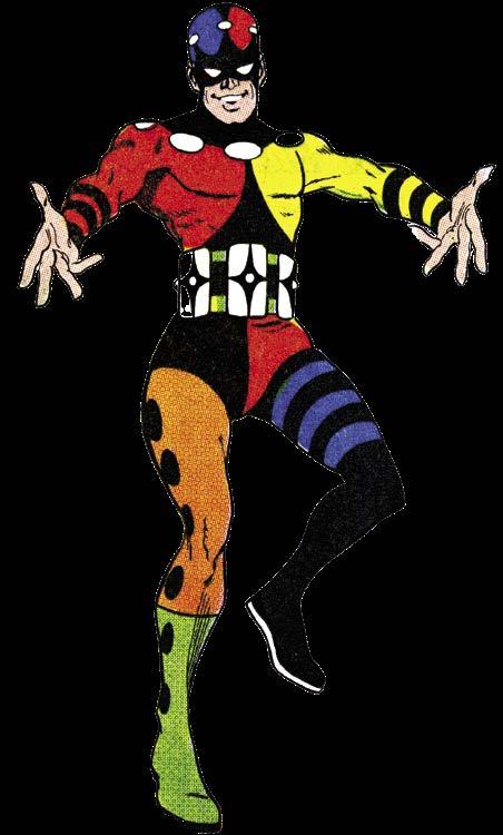
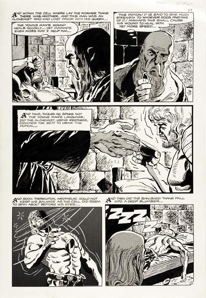
Left: Aparo designed the Prankster’s costume, but the character didn’t stick. Above: Page 2 of “Thane of Bagarth” from Hercules #8. Note the Zip-a-Tone usage in panels 2, 4, and 5. Prankster, Thane © respective owner. “Thane of Bagarth” original art courtesy of Heritage Auctions.
A pA ro: I think it came from the love of the comic strips. Black and white comics used it, but not much in the comic books. They didn’t put any color over it, but they’d put it around the Zip.
A m A sh: So Dick was your main editor?
A pA ro: Pat Masulli was there before Dick, who was an artist at the company. Then Masulli moved up and Dick moved into the editor position. Dick got a lot of people into the business.
A m A sh: How often did you go into the office?
A lot of guys didn’t sign their names. There was one guy named Norm DiPluhm....
A m A sh: Who was he? I always wondered about that.
A pA ro: I don’t know. Maybe he was an editor there. I never found out who he was. Maybe he was [Charlton editor] Sal Gentile? I got the gag though. [Ed. note: Comic historian Martin O’Hearn has since identified the writer to be D. J. Arneson.]
A m A sh: How fast were you in those days?
A pA ro: I was never fast. I’d do a page a day, pencils, inks, and letters—I was never a Jack Kirby—and I stayed at a pace and never increased it. I remember when I went to DC and Carmine Infantino was in charge of the whole operation then. He called me on the phone and said, “Gee, I wish you could do more work.” I said, “How do you want it? Good or fast?” He said, “I want it good.” I said, “Okay.” He looked up to me for that. He never hassled me.
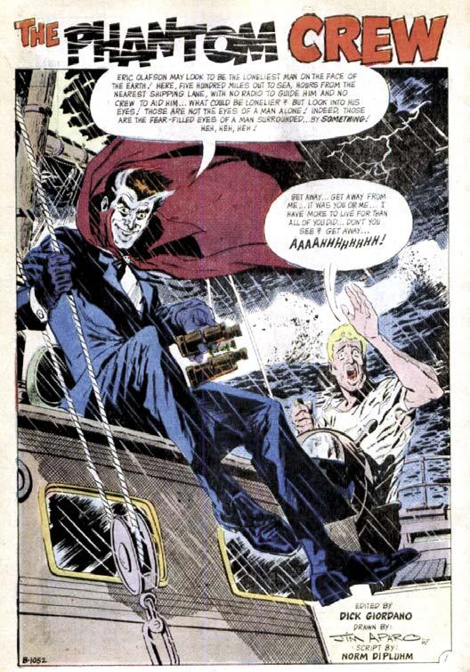
D. J. Arneson (inset), a.k.a. Norm DiPluhm, worked with Aparo on most of his stories for “Bikini Luv” and The Phantom. They also handled this story for Ghostly Tales #65 (Feb. 1968). Ghostly Tales © respective owner.
A pA ro: I’d bring in every job I did. Then later, I just mailed it in.
A m A sh: Did you ever meet co-workers when you went into the offices?
A pA ro: No. Isn’t that amazing? Every time I went to the offices, I never met anybody except Dick. Everybody thinks we knew everybody but I never met anyone but Dick. I’d call him up and tell him I’m coming down, and when I did he’d say, “Oh, you just missed Ditko,” or “You just missed so-and-so.”
A m A sh: You signed your work when many people didn’t. You must have taken a lot of pride in working there.
A pA ro: Yes, I did. More than most of the things I’ve done. I’d sign my name so kids would know who I was.
A m A sh: Pat Boyette used to letter and sometimes rewrite the scripts. Since you lettered too, I wondered if you ever did what he did?
A pA ro: No, I never changed dialogue. No, wait a minute! When I was at DC, they were writing the Batman stuff and writing it like the TV show—very campy—and even Neal Adams got disturbed about that. Like it would be written “Hey, Batguy!” and I would just change it to “Batman.” That’s no big deal, right? I never changed the dialogue or took away from the story. I know what you’re talking about though.
A m A sh: You never reduced verbiage if something was redundant?
A pA ro: No. The writers I worked with, whoever they were, did a good job. I fixed misspellings, of course.
A m A sh: You also did “Thane of Bagath.” Since you were a Hal Foster fan....
A pA ro: I made it look like Prince Valiant. Which is what
Growing up, Aparo’s dream was to become a newspaper comic strip artist like his heroes: Milton Caniff, Alex Raymond, and Hal Foster, the Big Three in the adventure genre. Those three artists influenced practically every future comic book artist in some way, and Aparo was no exception. One can see their influence in his work, particularly that of Caniff, whose spotting of blacks, use of negative space, and blending of cartooniness and realism had the most obvious impact.
Milton “Milt” Caniff (Feb. 28, 1907–Apr. 3, 1988) created Terry and the Pirates for the Chicago Tribune–New York News Syndicate in 1934, which first ran in the New York Daily News. It quickly rose in popularity and spread to newspapers across the globe. In 1946, Caniff left Terry and the Pirates to create another successful strip, Steve Canyon, for which Caniff kept the rights. He was one of only a handful of cartoonists who owned their own creations at that time.
Above: Title panel for Terry and the Pirates (Sunday, Apr. 1, 1945).
Aparo would have read this as a twelve-year-old kid.
Top: A Steve Canyon Sunday strip from Nov. 6, 1949. Aparo was in high school at the time, and reading with a more critical eye.
Terry and the Pirates © News Syndicate Co., Inc. Steve Canyon © Field Enterprises, Inc.
Though perhaps not as impactful an influence as either Caniff or Raymond, Aparo greatly admired Hal Foster’s drawing ability. His influence on Aparo was displayed when Aparo became the artist of “Thane of Bagarth,” which was designed as a pastiche of the Prince Valiant newspaper strip.
Canadian-born Harold R. Foster (Aug. 16, 1892–July 25, 1982) began his cartooning career in 1928, adapting Edgar Rice Burroughs’ novel Tarzan into a weekly strip for Tit-Bits magazine. The series was soon republished as a Sunday newpaper strip in the US, and in 1931 continued with Foster as the ongoing artist.
In 1936, Foster left Tarzan to create Prince Valiant. Like Raymond, he was able to maintain ownership of his work, and continued producing the Sunday-only strip for the rest of his career. Foster retired in 1971, but his Prince Valiant continues on today.
Aparo collected Captain Marvel Jr. as a kid. He not only loved the character, but Jr.’s main artist, Mac Raboy. Aparo was nine years old—the perfect age—when Captain Marvel Jr. was introduced in the pages of Whiz Comics #25 in late November 1941. Aparo likely noticed the resemblance of Raboy’s work to that of Alex Raymond. He surely noticed when Raboy, who had left comics in 1946, took over the art duties of the Flash Gordon Sunday page in late 1948. Raboy drew Flash Gordon until his death in 1967.
Emmanuel “Mac” Raboy (Apr. 9, 1914–Dec. 12, 1967) did not enjoy comics or newspaper strips, but he was one of the best to ever make them.
In the summer of 1944, T. W. O. Charles Company published its first comic book, listing the name Frank Comunale Publishing Company as its publishing house. A year (and two name changes) later, they would be known as Charlton Publishing. And in 1951 the company would set up an in-house comic book division called Charlton Comics, where Jim Aparo would finally get his big break and his first job as a comic book artist.
Charlton’s original impetus for publishing comics was simply to have something that would enable its presses to be up and running around the clock. At the time, publishing comics must have looked like the obvious answer to owners John Santangelo and Edward Levy, as the comic book industry was in its heyday. Santangelo and Levy had started their business publishing song lyrics magazines, and were very successful at it, Hit Parader being one of their best sellers. They were so successful that through the mid- and late ’40s, they were looking for ways to expand their operations. Besides publishing more comics, they formed their own distribution arm, Capital Distributing Company, and their own bindery, Colonial Paper Company. They also formed a division to handle engraving and color separation: Tops Engraving. Basically, Charlton Publishing became equipped to handle every aspect of creating magazines and getting them to retailers. It was a strategy that worked well for the company for many years, and it was in large part because of this strategy that its comics division survived for so long.
Despite its advantages over other publishers though, Charlton’s comics line never made much money, mainly because as far as Charlton Publishing was concerned, comics were, and always would be, fodder to keep the presses running. Even after setting up Charlton Comics as an in-house editorial department, bringing in the talented Al Fago as its managing editor—along with a staff of writers and artists, including Dick Giordano— and expanding its line of titles, the company was more concerned with publishing comics cheaply than producing good comics.
Joe Gill, one of the writers initially hired in 1951 and who became Charlton’s chief writer, as well as one of the
most prolific writers in the history of the industry, had this to say on the subject in a 2006 interview with Jim Amash for Charlton Spotlight #5:
“I think [Santangelo] was mainly concerned with keeping his presses running day and night. He would make a speech at Christmas, and he’d say, “Charlton is a building … very strong, except one wall that has weaknesses. That’s the comics.” Comics never really made money at Charlton, even though he paid low rates.
“He had immigrants from Italy, used them in the press rooms, in every aspect of the printing. One mistake they made down there was they put the covers for Fightin’ Navy on a romance body! [laughter] Honest to God! I packaged magazines for Charlton a lot, but there might be a two-page spread in the middle, or I might have a two-page spread through the title page and illustration, and the pictures might be an inch out of whack on one half of the [spread]. There was no quality at all. No concern with quality. If they knew there was some kind of major mistake, they wouldn’t dream of stopping the presses to correct it.
“They bought the cheapest ink. They had used presses that printed badly. They [were] the worst
distributors. Charlton had Capital Distributing, but they didn’t have any roadmen at all. So we could be publishing the best comic books in the field, and we still wouldn’t be selling because they offered no inducements. You know, most of the comics that went out to retailers, they’d be bound or wired together, and they’d come back bound or wired together. They were never opened. It was just a whistle-in-the-dark business with them.”
Nothing had really changed when Dick Giordano took over as managing editor in 1965. Al Fago had left the job in 1957 after a dispute with Santangelo and the undermining of a couple of fellow employees. He’d been replaced by his assistant, Pat Masulli, who originally had been hired as a letterer. Masulli wasn’t a particularly good comic book editor; he was more interested in, and better at, art directing Charlton Press’ magazines. Giordano, still a staff artist, recognized this, and as Masulli spent more and more of his time art directing Charlton’s increasing line of magazines, and less working
with his writers and artists on the suffering comics line, Giordano pled his case to Charles Santangelo, John Santagelo’s son, who had recently bought out Ed Levy’s half of the company. Masulli was promoted to co-general manager of Charlton Press; Giordano was given the position of Charlton Comics’ new managing editor. It was a win-win for everyone.
Despite an initial rocky start with his staff, who had been largely ignored by Masulli, Giordano quickly won them over with his enthusiasm and commitment to putting out quality work. It didn’t take long for word to get around that Charlton Comics was now a good environment for creators looking to break into the business, or those who were simply looking for a bit of creative freedom. Giordano even set up an office in New York City, which he would occupy one day a week, in order to be in closer contact with the pool of freelance talent. Giordano’s efforts paid off, and he hired several newcomers who would go on to make names for themselves, including Roy Thomas, Denny O’Neil, Steve Skeates, Pat Boyette… and Jim Aparo.
In 1967 the comic book industry was in a state of flux. Longtime leader DC Comics was on the wane, while their rival Marvel Comics was on the rise. At the urging of recently appointed art director Carmine Infantino, editorial director of DC Irwin Donenfeld made it known that he was looking for more visually oriented editors. Steve Ditko, who was in the process of developing new titles for DC, passed this information along to Dick Giordano. The timing couldn’t have been any better, as that fall Giordano saw the sales figures for his Action Heroes line were unsustainable, and knew he would have to cancel the books. After months of talks with Infantino, Giordano let it be known his tenure at Charlton would end on December 4th of that year. Giordano offered his most talented Charlton creators work at DC if they wanted to come along. Considering the difference in page rates between DC and stingy Charlton, where Aparo was only making $15–20 a page for pencils, inks, and lettering, they happily agreed to work for DC.
Julie Aparo said, “When Dick told Jim that he wanted Jim to go with him to DC, Jim was just tickled! He jumped for joy! He said, ‘I tried to get into those places, and they kept shoving me out the door!’” Times had changed, and now DC welcomed Aparo—along with Steve Skeates, Denny O’Neil, and Pat Boyette— with open arms.
Of the eight titles initially given to Giordano to oversee, Aquaman may have been the last to bear his credit line, but it was number one on the list in terms of prominence largely due to the new CBS Saturday morning cartoon Superman/Aquaman Hour of Adventure. Aquaman had been doing fairly well under the guidance of writer Bob Haney and artist Nick Cardy, but Giordano wanted to expunge some of the silly and formulaic elements of the book which he felt were holding it back. He decided a new creative team was in order. In Michael Eury’s book Dick Giordano: Changing Comics, One Day at a Time, Giordano explains
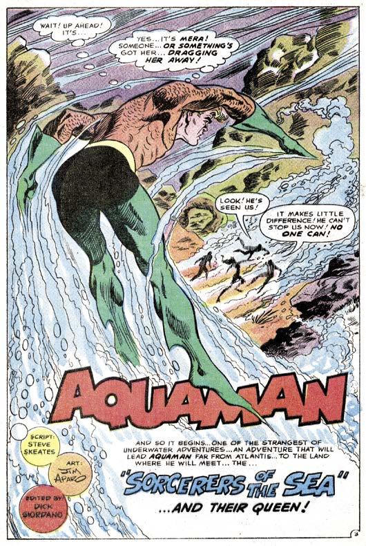
Page 3 splash from Aquaman #40 (above), Aparo’s first work for DC, and (left to right, inset) editor Dick Giordano and writer Steve Skeates. Aquaman TM & © DC Comics.
the change: “I love Nick Cardy’s art, but if you want to make the statement, ‘We’re changing this,’ then you have to change the art. I wanted to start with a clean slate—a new artist, new writer, and new approach.” Cardy was given the assignment of launching a new western title, Bat Lash, (though he would remain on Aquaman as cover artist for the duration of the title’s run). This provided Giordano the perfect opportunity to go in a new direction, and how much newer could one get than by bringing in a writer and an artist who had never worked for DC: Steve Skeates and Jim Aparo.
The fact that Steve Skeates ended up writing Aquaman came down to Skeates arriving at Giordano’s new
Top Left: Nick Cardy’s Aquaman in Aquaman #37 (Jan. 1968).
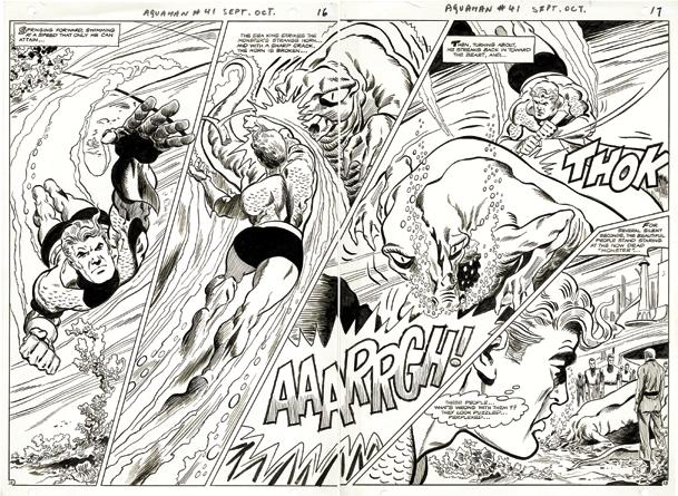
Top Right: Aparo’s early Cardy-esque take on Aquaman in Aquaman #41 (Sept.–Oct. 1968).
Right: The figures get leaner and longer, as seen here in Aquaman #50 (Mar.–Apr. 1970).
Far Right: A readjustment to a still lean, but more muscular figure in Brave and the Bold #114.
Aquaman, Scavenger TM & © DC Comics. Original art courtesy of Heritage Auctions.
Nick Cardy’s Aquaman was 100% beefsteak—a barrel-chested muscleman reminiscent of a 1950s-era Al Plastino-drawn Superman. He looked like he could lift mountains. While Aparo began his tenure on Aquaman emulating Cardy’s style (left), the differences were already apparent. Rather than Cardy’s soft, organic linework, Aparo favored a bolder, sharper line, and his Aquaman was slightly leaner and more defined, falling somewhere between Mike Sekowsky’s approach to the character and Cardy’s.
The main similarity was in how each drew Aquaman’s square-jawed face and hair. Aparo drew the hair tightly cropped, and the prominent forelock remained securely in place at all times. The first change was a forelock that was a little longer, and floated a little more freely. By issue #44, more of Aparo’s natural style was creeping into Aquaman’s
faces. Issue #46’s Aquaman started Aparo’s trend towards a longer, leaner torso—something more like a competitive swimmer’s physique. More importantly, his posing became more dynamic. Whereas Cardy’s Aquaman mostly seemed to “fly” through the water (arms usually pointed straight ahead), by this point Aparo used a great variety poses. Aquaman would often appear to be using his whole body to swim, arms slicing through the water, looking more like a freestyle swimmer than Superman flying through the sky.
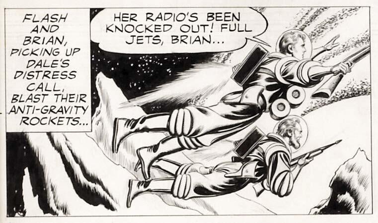
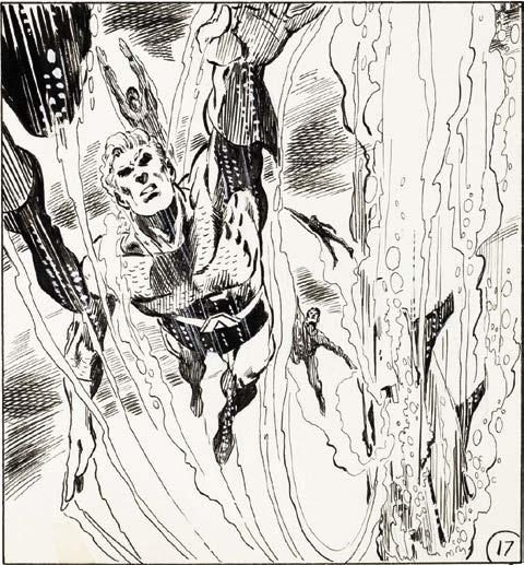
As Aparo logged more and more pages, his Aquaman became more consistent. But it wasn’t until after a nearly four-year break from the character that readers finally saw the Aparo Aquaman everyone remembers, when Batman went under the sea to meet the Atlantean king in Brave and the Bold #114 (Aug.–Sept. 1974).
currents. All of the figures were more dancing than swimming.
Julie A pA ro: [laughs] That was a funny thing; he said that he’d look at other artists’ [versions], and he’d see Aquaman’s hair—and that was one thing that’d drive him crazy. He’d say, “It has no motion. What, is it stuck to their heads? He’s underwater, things move. Your hair would move.” And he would try to convey that by making it shift from panel to panel. They had to look like they were underwater! [laughs] I guess he was particular about that.
* * * * *
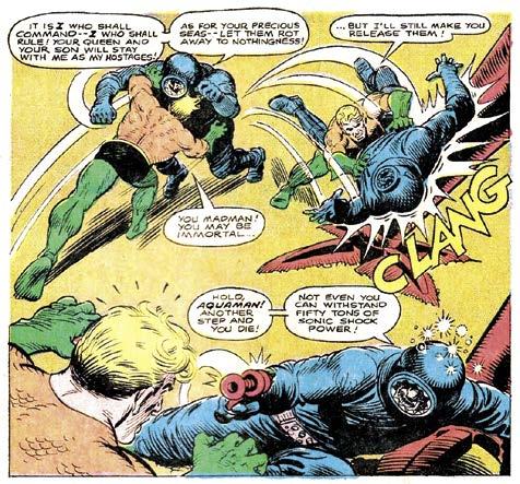
With his initiation story out of the way, the next few issues saw Aparo get more comfortable with his Cardy emulation. And after dealing with a Mera look-alike,
and a slight twist on the old “human sacrifice to a big monster” trope, the trail of Mera led to an encounter with Black Manta. As one might expect, the issue was largely made up of the resulting slugfest. Aparo was able to show his chops as the issue contained more action than any story he’d drawn to this point in his career.
In Aquaman #43, the action primarily focused on Aqualad, who began his own search for Aquaman, getting into a couple of fights along the way. Meanwhile, an injured Aquaman took refuge aboard the submarine of a surface-dweller explorer. Perhaps more notable though is the familiar looking fellow wearing glasses in the second panel of the first page—Aparo himself, waving to the reader! It wouldn’t be the last time Aparo drew himself into a comic.
While Aparo was getting settled in with Aquaman, Charlton picked up the licensing agreements for seven King Features Syndicate properties: Beetle Bailey, Blondie, Flash Gordon, Jungle Jim, Mandrake the Magician, the Phantom, and Popeye. King Features had been running them as solo titles under their King Comics imprint, but the line had been stagnant for nearly a year due to distribution problems. When Aparo got word of the deal, he hoped to get the Flash Gordon assignment, as he was a longtime fan of the strip. However, he didn’t make his wishes known to Editor-in-Chief Sal Gentile, so Aparo was assigned The Phantom, with Flash Gordon (and Jungle Jim) falling to Pat Boyette.
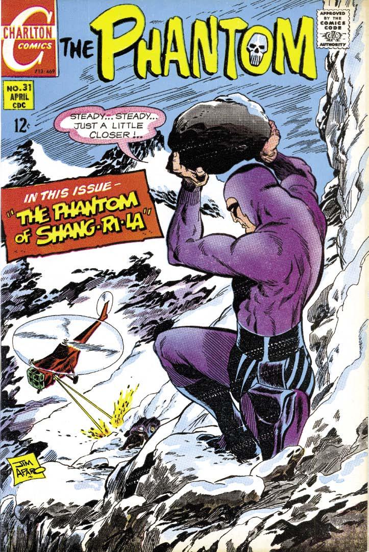
Not that Phantom fans minded. Charlton’s debut issue #30 (for some reason skipping an issue number from where King Comics left off with issue #28) featured four different artists for each of the short stories inside, none of them by Aparo. Presumably, Aparo was too busy wrapping up his other various assignments for Charlton or DC. Aparo’s work did show up in the next issue, which was a 24-page story titled, “The Phantom of Shang-Ri-La” in The Phantom #31 (Apr. 1969). Aparo quickly became a favorite amongst the legion of Phantom followers, and it was no wonder. His lush, moody jungle backdrops and dynamic page layouts were a marked improvement over the previous Phantom comic books published by other companies, and looked much more like the Sy Barry–drawn newspaper strip.
Under King Comics—and before them, Dell—The Phantom comic mostly featured full-length adaptations of older Lee Falk-written stories from the newspaper strips, but Charlton preferred to create new stories. And aside from Aparo’s first two issues as the main artist of
the series, Charlton usually ran three to four short stories per issue. Both of those full-length stories were written by veteran comic book writer Dick Wood, but from issue #33 on, Aparo worked solely with his early Charlton collaborator D. J. Arneson, on stories ranging from seven to 14 pages.
Then Aparo contracted a lingering illness which, while not putting him completely out of commission, did slow his production down considerably. For each of the next seven issues, he still managed to draw not only the covers, but at least one short story of the Ghost Who Walks—with the exception of issue #35 for which Aparo only drew the cover.
Over in the pages of Aquaman, it was the same story. Aquaman #46 (July–Aug. 1969) featured the only issue of the title Aparo did not ink his pencils. Veteran inker Frank Giacoia was brought in to help the struggling Aparo. For the next two issues—the final two chapters of
the “Search for Mera” saga—Skeates kept Aparo’s scripts to 16 pages, rather than the usual 22. The remainder of each book was filled out with a seven-page reprint story. Perhaps it was not exactly the big extravaganza finish either creator had envisioned, but they made the best of the circumstances.
Aparo very rarely went in to the DC offices, and Skeates came in only slightly more often. According to Giordano, he would call them both in to his office every six months for story plotting sessions. Shortly after the conclusion of “Search for Mera,” one such meeting
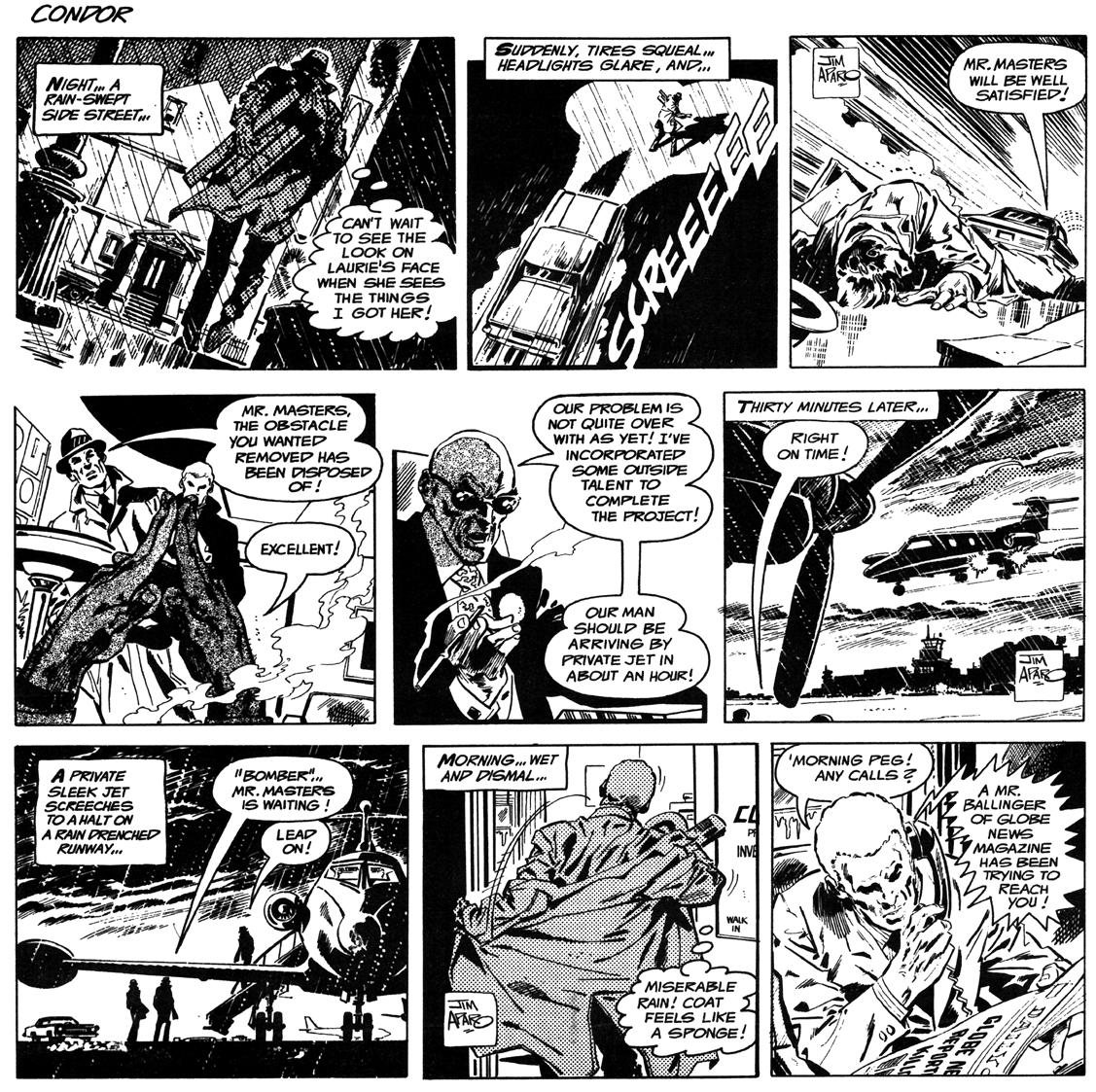
Above: Condor was created in the early 1970s, during the time Aparo was transitioning to working for DC full time. It was most likely drawn just before he was assigned to The Brave and the Bold, because these three samples were as far as he developed the strip.
Pages 60–62: Aparo created these Zip Tyro and Father Peter Faith newspaper strip samples in the mid-’60s. The Zip Tyro story is in the
vein of Jack Kirby and Wally Wood’s Sky Masters of the Space Force, which ran from September 8, 1958, to February 25, 1961. It appears that Aparo intended Father Peter Faith to be a weekly Sunday-only strip, as each of the three samples is comprised of two tiers of panels.
Condor, Father Peter Faith, Zip Tyro © the estate of Jim Aparo. Zip Tyro and Condor artwork courtesy of Jerome Sinkovec.
The comparisons are inevitable, the debate forever endless. One artist redefined the character; the other rendered that character for nearly four decades at DC Comics. Both are beloved by legions of admirers for their stellar artwork and selfless contributions to the enduring popularity of the comic book arts. And after all is said and done, the one thing that binds them together in history is one character: Batman.
As one of the few individuals to have closely worked with both Neal Adams and Jim Aparo, how would the legendary writer Denny O’Neil compare the two? O’Neil replies, “Well, I’m not an artist. I have to be careful how I use this word: Jim’s stuff was a little more plastic. That maybe comes a little bit more from cartooning rather than illustration. It is flexible. It takes advantage of, as Will Eisner did, some of the freedom that’s afforded by not always having to be literal. Again, he was serving the story. I think that the style he brought to that ‘Wanderer’ Western of mine was maybe his natural style—flexible, bright, insofar as this word can possibly apply to Batman, [laughs] a cheerful kind of style. Though he did not slight the noir elements. He understood a lot of what that character’s about is darkness, and alleys, and cold nights. Neal’s more the illustrator. He summarized it perfectly when he told me that if Batman existed, he would have to be how Neal drew him, and I agree completely.”
“A penciler is really a director,” says artist Mike DeCarlo, Aparo’s artistic partner on the classic “A Death in the Family” storyline. “He takes a script and directs it in his own manner. Neal always looked for the most dynamic and almost obscure, offbeat, eclectic way of attempting to tell a story, and he had the skills and imagination to make things work in ways that other people were afraid to. And Jim was like, ‘I’m just going to tell a solid, straightforward story.’ I think he had the affiliations or the sensibilities of the late ’50s and early ’60s where it was just a straight on, solid, nuts-and-bolts, professional way of telling a story without trying to be too clever or egotistical about it. He wanted to just tell the story in a way that everybody could understand and enjoy. He wasn’t trying to show off—and I’m not saying
Neal was—or be a superstar. He felt he was doing his job in the most professional manner possible.”
Pointing out the differences between the Adams and Aparo approaches to Batman, DeCarlo continues, “When you have a fantastic talent and imagination, I guess you want to—I hate to use the word ‘show it off,’ but maybe he felt that way. ‘Look how well I can do things, and I’m going to use my ability in every way I can,’ and I don’t think Jim looked at it that way. Both were famous and professional and accomplished in their own manner, but very, very different in their approach. And there are great fans of both approaches. I never really worked with Neal, but of course working with Jim was very, very enjoyable for all those years.”
In his long distinguished career, modern comics master Kevin Nowlan has embellished the artwork of the top comic artists, and among those are both Neal Adams and Jim Aparo—so, one wonders how he would compare the work of these two men? Nowlan explains, “I did do one two-page thing [with Aparo]. It almost doesn’t count. It was a layout more than finished pencils. Aparo was one of those guys who inked his pencils for so long, I don’t think he was penciling for another inker. Again, like I said about the textures he poured into his inks, it’s really tough to suggest that in pencil. Even if you could do it, it’s a waste of time if you’re going to ink it yourself. A lot of those guys like Ditko, and Joe Kubert, and Aparo, because they nearly always did their
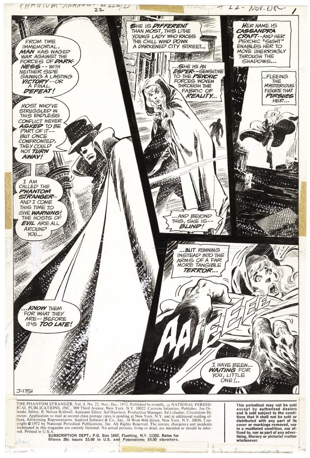
While Carmine Infantino had decided to unnecessarily cancel Aquaman, he wasn’t about to ignore the talents of Aparo. In fact, Infantino wanted to get more work from Aparo than Aparo was already providing DC. Aparo preferred to maintain a higher level of quality, and that required time. But at this point, with no Aquaman, and with Phantom Stranger cutting back to shorter main features to make room for “Dr. Thirteen” backup stories, Aparo had to be flexible for the majority of 1971 just to get the quantity of pages he was accustomed to drawing.
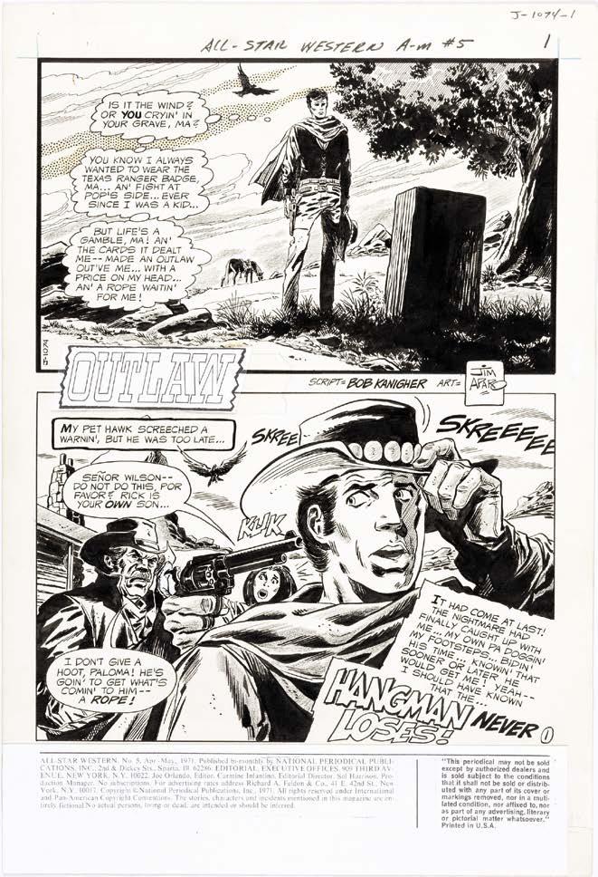
Editors Joe Orlando and Murray Boltinoff helped fill that void with a 12-page story for All-Star Western #5 (Apr.–May 1971), a ten-page story for House of Mystery #192 (May–June 1971), a ninepage story for House of Secrets #93 (Aug.–Sept. 1971) which reunited him with writer Steve Skeates, a nine-page story for Ghosts #1 (Sept.–Oct. 1971), an eight-page story for The Unexpected #127 (Sept. 1971), a three-page “Aqualad” backup for Teen Titans #36 (Nov.–Dec. 1971) originally written for what would have been Aquaman #57, and an illustration for Witching Hour #18 (Dec. 1971–Jan. 1972).
Aparo was already familiar with Orlando, who operated in a similar fashion to Dick Giordano, but Boltinoff had a very different approach. Paul Levitz described the two to Jim Amash:
“Generally speaking, Joe was astronomically better at handling relationships with artists than Murray was at that point in his career. Murray was pretty old, and had some challenges at home in those years. His wife was in the process of going blind. He was
not an incredibly happy human being, and I think he worked some of that off on his freelancers along the way. Some of the worst habits that DC had exhibited through the 1950s and early 1960s had lingered on in him probably more than anybody else in the place at that time. He didn’t have the kind of mean streak that Mort Weisinger or Bob Kanigher exhibited at their worst times,
but he was used to treating the talent as second-rate people. I don’t think that ever impacted his relationship with Jim, because it wasn’t in person.
“And the other thing about working with Jim, because he did the penciling, inking, and lettering, and sent it in that way, it diminished the editor’s opportunity to be arbitrary. Here’s the finished job, the deadline was probably two minutes away—not because Jim was late, but because it was the timeframe the company ran on—so you either accepted it as is, or in a way that it could be corrected by the production department. If Kurt Schaffenberger came in with a pencil job for Murray, it was easy for Murray to point to something that maybe could have legitimately been done better, and to get Kurt to sit at a desk and make a correction quickly. The peculiar way Jim worked just made for a somewhat different dynamic.
“Joe was great at getting the best work out of people. Having been a freelancer most of his life, he had tremendous respect for the freelancers. He taught really well. If there was an artist who was learning what to do, he’d throw tracing paper over the pages, and show them the tricks and the better way to do it. Some guys it turned into professional artists, some guys it apparently did not. But it was always in the spirit of what was best for the work, not a power play.”
Two issues later Aparo found himself drawing another issue of The Brave and the Bold, once again replacing Nick Cardy on a book due to a schedule conflict. Aparo stepped in easily from his anthology book assignments to draw the 25-page lead story, and very quickly found himself assigned to the book as the regular artist.
When asked by Steve Ringgenberg about how he got the full-time gig in an unpublished 1995 interview, Aparo said “I think it was after … I did issue #100 (Feb.–Mar. 1972). That was a thick issue … I don’t remember when I got it full-time, but I started … not too long after that 100th issue.” DC’s then-Publisher Carmine Infantino, revealed in an interview with Jim Amash for Alter Ego #38 (July 2004) his fundamental role in Aparo’s assignment. “It was my idea to put Jim Aparo on Murray’s book, The Brave and the Bold, and that book was our best selling Batman title,” Infantino said.
Eventually, Aparo was assigned a full-length 22-page story for The Brave and the Bold #98 (Oct.–Nov. 1971), a bi-monthly title edited by Murray Boltinoff and written by Bob Haney. The book hadn’t had an artist draw more than three consecutive issues since Neal Adams finished his noteworthy run nearly three years prior. Aparo explained why he was assigned to draw the issue to Jim Amash: “They were going to have the Phantom Stranger in the book, so they said, ‘Let’s get the guy who’s drawing Phantom Stranger.’”
But Aparo was excited for any opportunity to draw Batman. He told Jack C. Harris for an article in Comics Scene #5, “That was my first crack at the Batman. I was so nervous about it that I did the splash page twice because I just wasn’t happy with it the first time.”
“Aparo was great.”
It made for a creative team completely in synch with one another. Editor Boltinoff, writer Haney, and artist Aparo each valued the story above all else.
The increasing amount of editorial notes, references to other stories, and related trivia seen in other DC titles (heavily influenced by Marvel’s approach) had no place in The Brave and the Bold. Often even major conflicts in character continuity would find their way into Haney’s stories, but as long as they didn’t interfere with a strong story, it didn’t matter. What some readers viewed as a weakness of the book, was actually the book’s greatest strength, as proved by the sales figures.
As for Batman’s rotating cast of co-stars, Jack C. Harris, who came onto the book as Boltinoff’s assistant editor in 1974, wrote in Back Issue #7, “The teams were never based on ‘fan favorites,’ but on sales. This is why Wildcat and Sgt. Rock appeared often in the Brave and the Bold pages (while totally ignoring the multiple Earths theory running rampant throughout other titles) … Haney followed Murray’s philosophy, often reading only one issue of Batman’s teammate; taking enough to make his story intriguing, but not enough to absorb influence from the other character’s writer.”
It proved to be a winnng strategy, as noted by Paul Levitz: “Murray was the most commercial editor at DC in those years. If you had a mystery book, Murray’s books outsold Joe’s. They outsold Dick [Giordano’s] when Dick was editing them, as well. I would argue aesthetically that I preferred Joe’s. I thought he took more interesting creative chances. But Murray outsold him every day. Not by enormous numbers, but by a clear enough margin that you had to say, ‘Something’s going on here.’ He was always focused on who had sold well as a previous guest-star, or what he thought would be a commercial selling gimmick.”
Taking over the art chores for Brave and the Bold #100 meant having to skip an issue of Phantom Stranger, but Aparo made up the work with a trio of short stories for the horror anthologies. Just as he was finally settling into a smooth schedule like he had when working on Aquaman and Phantom Stranger, tragedy struck. On January 3, while just over halfway through drawing The Brave and the Bold #102 (June–July 1972), Aparo’s father passed away. Aparo stepped away from the title temporarily to mourn and help take care of family affairs, and the team of Neal Adams and Dick Giordano, now working with Adams at Coninuity Studios, were rushed in to finish the issue. While Aparo was able to return to Phantom Stranger with its next issue, Bob Brown and Frank McLaughlin were brought in to cover for him on The Brave and the Bold #103 (Sept.–Oct. 1972), with the issue also pushed back one month on the schedule. This meant that when Aparo returned to the book, it was on the same shipping schedule as Phantom Stranger, just like Aquaman had been.
to publisher, and had less time to be as hands-on with cover design as before.
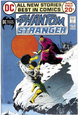
Not only that, but starting in that issue of Phantom Stranger (#20, [July–Aug. 1972]), Aparo drew his first cover for DC, becoming the regular cover artist on the book. At the time Aparo joined DC, Carmine Infantino was the art director, and preferred to work out cover ideas with the artists in person in his DC office. Because Aparo didn’t care to make that journey a regular part of his schedule, Infantino hesitated to give him cover work. By this point, though, Infantino had been promoted
Another factor was that Aparo now had a little extra time in his schedule. Phantom Stranger stories had been cut back from 20 pages to stories ranging from 15 to 18 pages, and Brave and the Bold stories had been cut back from 25 pages to 23½. More importantly, Aparo could complete a cover very quickly.
Aparo described the cover process with Steve Ringgenberg this way: “What has to be done on a cover first is you had to submit sketches. And that took time. [I’d] do two or three sketches, then send them down. There were no faxes then, you’d just mail them down,
and then they would look them over and pick the best one and make whatever changes they wanted. Then they would call [me] up—I had Xerox copies [of the sketches] here—and we would go over the changes. Then I would pencil it out, and then ink it, and that would take a day.”
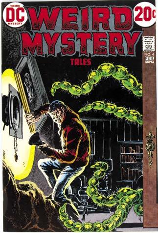
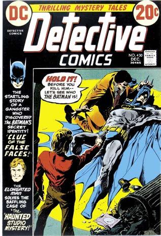
Besides his Phantom Stranger covers, he soon did the covers for Detective Comics #430 (Dec. 1972), his first work for Editor Julie Schwartz, and Weird Mystery Tales #4 (Jan.–Feb. 1973). And finally, beginning with issue #105 (Jan.–Feb. 1973), Aparo became the regular cover artist for The Brave and the Bold
Aparo enjoyed researching and drawing the exotic locations in Phantom Stranger, and he was getting even more of that in the pages of The Brave and the Bold, as Haney’s Batman was as much a globe-trotting adventure
hero than a dark knight detective haunting the alleyways of Gotham. Haney’s depiction was more James Bond than Sherlock Holmes. This was on full display in Brave and the Bold #106 (Mar.–Apr. 1973) when Batman and Green Arrow follow a trail of murders to the Swiss Alps. The four-page ski chase down the mountainside, ending with Two-Face’s apparent death, was clearly inspired by the great chase scene in 1969’s On Her Majesty’s Secret Service. But it was Aparo’s pacing and composition of the sequence that gave the sense of movement and speed the chase needed to be not just convincing, but exciting.
Aparo still had enough time in his schedule to help start up a new feature in the Joe Orlando-edited Adventure Comics, fittingly titled, “Adventurer’s Club,” written by John Albano, an under-appreciated writer (and also a cartoonist and colorist), who went on to co-create the western bounty hunter Jonah Hex. “Adventurer’s Club” was an anthology feature consisting of action/adventure stories with an element of the supernatural. As with DC’s horror
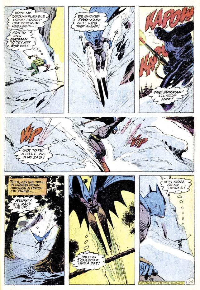
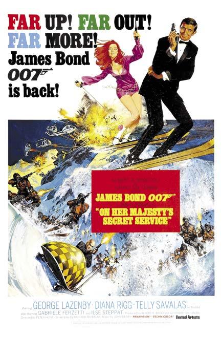
Batman and Green Arrow pursue Two-Face down the slope of a snow-covered mountain (The Brave and the Bold #106 [May–Apr. 1973]), and a poster for the 1969 movie that likely inspired the scene: On Her Majesty’s Secret Service Batman, Green Arrow, Two-Face TM & © DC Comics.
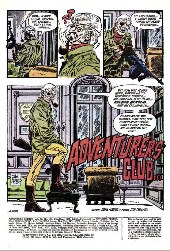
anthologies, the feature had a host who introduced each tale, in this case a distinguished older gentleman decked out in an eyepatch and safari gear, and smoking a large bowled pipe: Nelson Strong, chairman of the Adventurer’s Club. As a concept, it was an ideal fit for Aparo’s artwork, but after only two issues (Adventure Comics #426–427, [Feb.–Mar. and Apr.–May 1973]), Orlando moved on to other ideas (though the series would be brought back for one final appearance a few months later with a completely different creative team).
Nothing in comics lasts forever, and with Phantom Stranger #26 (Aug.–Sept. 1973), after just over two years of working consistently with writer Len Wein, Aparo drew his last issue of the series. He wasn’t completely done with the book, though. A year later he would return as the cover artist, starting with Phantom Stranger #33 and not missing an issue until the series was canceled with issue #41 (Feb.–Mar. 1976). But, of course, Aparo did not ask to leave the book. There was a reason for his departure.
Aparo was now an in-demand artist at DC. As Paul Levitz put it, “For my money, and I think it was very much the house perception, he was as close to the top working artist in ’73, ’74, as [DC] had. Neal [Adams] wasn’t producing anything anymore. You can make arguments over Curt Swan versus Jim Aparo. García-López hadn’t come into his own yet. He was still learning how to do this stuff. And that’s the period we were really valuing Ernie Chan. Objectively speaking from a historical distance, Ernie never really rose above a good, solid B. Hard working, very useful to the company, but Ernie, John Calnan—a lot of the yeomen were really valuable to the company at that point, because there were very few stars. Marvel had picked off a lot of the good people, and the shitty working conditions in general in comics, and shitty pay, had eliminated other people from wanting to be in the business. So we didn’t have a real generation of the young turks.”
One editor in particular took notice of this. Archie Goodwin, having recently departed as the long-time
years. Nothing much was selling well. Two issues’ worth of sales estimates might have come in looking bad, and that would be enough for Carmine [Infantino] to kill something, particularly something like Adventure, where it wasn’t even killing the title. “That doesn’t look like it’s working. Try something else.”
We’d done a couple of “Aquaman” stories in the back. I might have suggested it as the next thing, trying to snare some writing for myself. I doubt that Carmine suggested it, but it’s possible. I certainly doubt that Joe suggested it.
Jim A m A sh: And since Jim was already the artist on the lead feature, it was easy to just keep him there.
l eviTz: Yes. I don’t think any large amount of thought went into it.
A m A sh: Did Aquaman being in the Super Friends cartoon have anything to do with it?
l eviTz: It might have helped. At some point Joe had to say something to Carmine about what he was doing, and maybe that made it make more sense. But they didn’t give stuff like that a lot of thought.
* * * * *
Adventure Comics #441 (Sept.–Oct. 1975) launched the new “Aquaman” series under writer Paul Levitz, who was still the assistant editor of the book, and as mentioned earlier, had written the last of the four “Aquaman” backups several months back. But Publisher Carmine Infantino felt the new lead feature needed a more experienced writer (Levitz had been writing comics regularly for less than a year at that point) to handle the dialogue, so David Michelinie was brought in to rescript. Aparo had already turned in the artwork for the story, which included the lettering of Levitz’s original dialogue. Veteran Ben Oda was brought in to letter the new dialogue, which was then pasted over Aparo’s word balloons, making the story one of the few to appear with Aparo’s art but without his lettering. It was also the first and only appearance (until very recently) of Captain Demo, a would-be king in a pirate get-up, but with super-science-y gimmicks in the guise of 1700s-era accessories. (Aquaman’s rogues’ gallery was never his biggest strength as a character.) But it offered Aparo a chance to draw, at least in part, yet another genre for the first time.
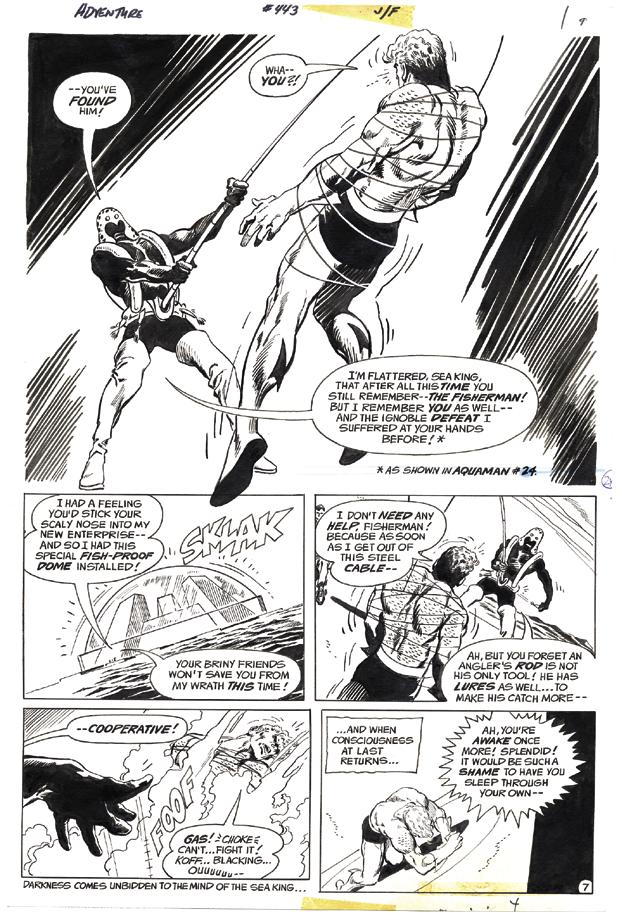
The next issue, also written by Levitz, introduced another one-and-done villain, General Horgan, the one who got away. Aquaman set out to track him down in Adventure Comics #442 (Nov.–Dec. 1975), but Horgan turned out to be only bait for the Fisherman. Aparo, to his credit, managed to make the normally ridiculous looking Fisherman look credibly menacing by keeping him in constant shadow, particularly his hooded face.
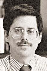
Right: Page 7 of the psychological horror story, “Case 333 — The Cat”, which first appeared in The Many Ghosts of Dr. Graves #4 (Nov. 1967). The story was reprinted in Scary Tales #22 (Oct. 1980). Next Page: Cover art for Ghostly Tales #76 (Nov. 1969), featuring series host, Mr. L. Dedd.
Page 71: Cover art for Strange Suspense Stories #7 (May 1969). All stories © the respective owners. Original artwork courtesy of Heritage Auctions.
In the letter column of Aquaman #60 (Feb.–Mar. 1978), editor Paul Levitz wrote, “We must sadly announce that this issue represents Jim Aparo’s last appearance in these pages for the predictable future. Jim has been promoted to the new ‘Batman’ series in the Batman Family dollar comic that debuts in January, and though we wish him well there, in the words of his replacement, ‘that’s a tough act to follow’.”
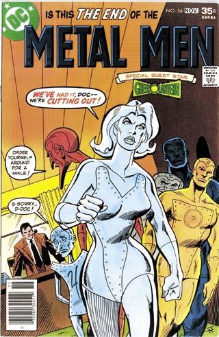
In the four months between the releases of Aparo’s last issue as the penciler of Aquaman and his first as the penciler of the “Batman and Robin” feature in Batman Family #17 (Apr.–May 1978), Aparo was only visible on the comic racks as a cover artist. That included continuing his role as Aquaman’s cover artist for the remainder of its rather brief run, and his covers for The Brave and the Bold. Aparo had already been working regularly with Batman line editor Julie Schwartz as a cover artist, beginning with covers for Batman #284–286 (Feb.–Apr. 1977), and overlapping with covers for Detective Comics #468–470 (Mar.–June 1977) and the aforementioned Batman Family #11–16 (May 1977–Mar. 1978), along with a second run of Batman cover for issues #291–295 (Sept. 1977–Jan. 1978). During this time he also drew covers for Showcase, Metal Men, DC Super Stars, DC Special Series (a Brave and the Bold special issue featuring a story not drawn by Aparo), and World’s Finest
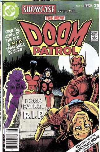
The number of covers Aparo churned out during this time was an anomaly in his career. Paul Levitz, for whom Aparo drew three New Doom Patrol covers for Showcase (Aug. 1977–Jan. 1978) as mentioned above, explained, “[H]e would only do a cover if he was going to knock it out over a weekend. You had to wheedle your way onto his schedule.”
Aparo’s first “Batman and Robin” feature hit the stands in January as promised. Batman Family #17 came with a new price (a dollar instead of 60¢), a larger page count (84 pages instead of 52), and a brand new editor, Al Milgrom. As the lead feature, “Batman and Robin” was 23 pages, the length of a normal comic. That’s just over twice as long as the Aquaman stories Aparo had been drawing, which explains the need for a four-month lead-in. In order to sustain that amount of production, Aparo would likely have had to give up most of his cover
work. But the point is moot, as his first story for Batman Family would also be his last. Big plans were afoot at DC for what they called “The DC Explosion.”
On December 14, 1977, DC Publisher Jenette Kahn issued a statement announcing higher prices and higher page counts were coming across its comic book line. Kahn had been brought in to the company in 1976 to bring a fresh perspective to a slowly dying company. Sales had been dwindling throughout the ’70s, and much of the blame was attributed to comics simply not being profitable enough for newsstands and retailers to carry and push onto their customers. Printing costs had already been cut to the bone. DC was already using the cheapest paper, the cheapest inks, and the cheapest printing plates available. Raising prices was the obvious next step. It was hoped that a larger price tag would entice retailers, while a heftier product would entice buyers and offset the sticker shock, enough that sales would turn around. And recent price increases suggested the strategy would work.
DC already had a small number of Dollar Comics, but they didn’t want that for the whole line. Instead, most of the titles would move from 32 pages to 40 pages, with their price raising from 35¢ to 50¢. Adventure Comics was one of the few being promoted to the Dollar Comic format, now reduced from 84 to 68 pages for the same dollar.
The plan for Adventure Comics was to run six ongoing features ranging from seven to 15 pages in length. It was intended to contain a mix of characters not quite popular enough to carry their own book—characters like Deadman—along with more popular characters who had solo titles, but who couldn’t sustain multiple solo titles in the way only Batman and Superman could. Aparo returned as the cover artist, and also reunited with Len Wein, likely at Wein’s behest, as the creative team for the new 10-page “Deadman” feature. “Deadman” straddled the line between moody supernatural fare, like Phantom Stranger, and the brighter world of superheroes. As such, Aparo was the perfect artist for the series, as he excelled in both genres.
But months before Adventure Comics #459 (Sept.–Oct. 1978), featuring its new lineup, was published, disaster struck in the form of the Blizzard of 1978. From the 5th of February through the 7th, heavy snow and strong winds battered the northeastern United States, bringing business—including the delivery of comic books to retailers—to a sudden halt. This event, combined with several other factors, such as growing concerns over work-for-hire and copyright issues, had a cascading effect on the comic book industry, and most prominently DC.
Adventure Comics #459 hit the stands on June 13, 1978. Nine days later, DC announced the cancellation of several titles, some of which had not yet begun to implement their new formats, others had not even seen publication at all. It was the beginning of “The DC Implosion.” Not long after, layoffs were announced at a staff meeting in the DC offices. Staff proofreader and aspiring writer Mike W. Barr was in attendance and had this to say in an interview for Back Issue #2:
“We were informed … that virtually all staff freelancing would come to a halt, save for those who had their output secured contractually. DC would need all its pages … for the freelancers who had contracts and work guaranteed to them.
“[Editorial Coordinator] Paul Levitz … handed out a list of DC titles still being published, and tallying up
Above and Top Left Next Page: These two pages’ worth of story were cut from the “Deadman” story intended for Showcase #105 to fit in Adventure Comics #464. For copyright purposes, DC ran the full story within volume two of the thick, photocopied ashcan editions of Cancelled Comics Cavalcade. Deadman TM & © DC Comics. Courtesy of Bill Alger.
the available editorial pages, then produced a list of contracted freelancers and the number of pages they were guaranteed. The rest of the meeting was a matter of seeing which pegs fit which holes. … Jim Aparo, for example, would simply continue on The Brave and the Bold, which was his regular assignment anyway, and which had just been made a monthly.”
Paul Levitz expanded on this with Jim Amash:
pAul l eviTz: One of the things we tried to do, and I think by and large succeeded at, was to keep all the contract guys working at whatever our obligations to them were. We just juggled around what they were working on.…
I don’t remember what Jim’s schedule was prior to that, but what we did with the Implosion is that we made all the 32-page books monthly. If it had been monthly, it stayed monthly. If it was bi-monthly, it was made monthly.
Jim A m A sh: So it wasn’t done to accommodate Jim and the other contract artists.
l eviTz: Right. Nobody did anything to accommodate the artists.
Aparo’s famed loyalty to DC had paid off. His exclusive contract kept him working when many other writers and artists had to scramble to find work elsewhere. But it did mean significant changes. Aquaman was canceled, so Aparo was out of a cover assignment. And while his three “Deadman” stories for Adventure Comics did see print, the 25-page “Deadman” story he had drawn for Showcase #105 did not, at least not as intended.
That story was originally based heavily on the “Deadman” backup feature by Neal Adams that appeared in
In the Fall of 1982, when it was decided to end The Brave and the Bold, there was one major complication. One of DC’s foreign licensed publishers was using the material from the series in a weekly Batman umbrella series, along with material from Batman, Detective Comics, and World’s Finest To fulfill the number of pages of new Batman stories the publisher required, DC would need to create a new Batmanrelated series.
Enter: Mike W. Barr. Up to this point, Barr had mainly been writing fill-in stories and backup features. But his star was rising, as he had successfully pitched and was working on a twelve-issue limited series called Camelot 3000. It was one of DC’s first projects to be sold solely to the growing direct market, and the first “maxi-series.” It would prove to be a success. Barr was still looking for his first ongoing series, though, and quickly came up with the idea of Batman taking a leave of absence from the Justice League and forming his own team of heroes. When discussing it with Len Wein, editor of The Brave and the Bold and its future replacement, Wein decided a definitive resignation from the Justice League would make more sense. As Wein was also the editor of Justice League of America, that was that.
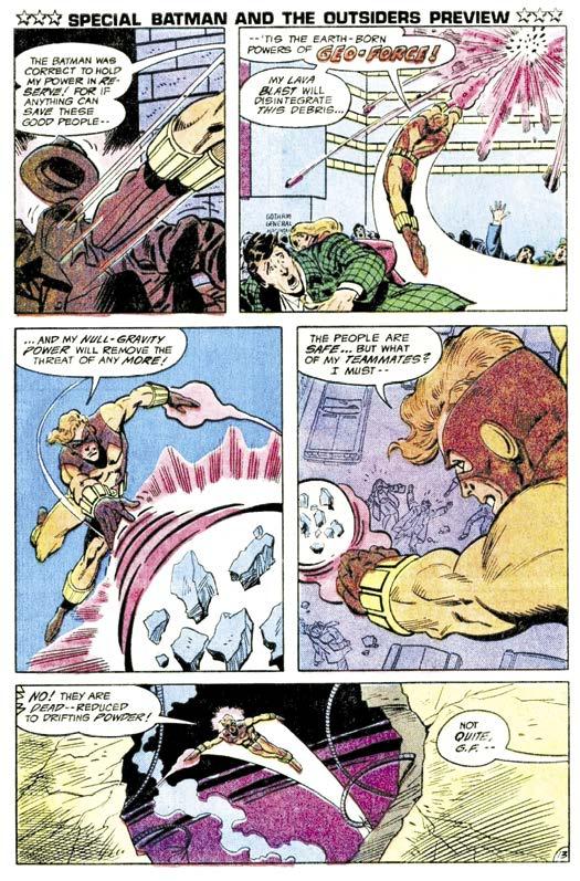
Next came the construction of the team, beginning with two established heroes who were currently without a home in the DC lineup: Black Lightning and Metamorpho. Both had rejected Justice League membership in the past, so they fit the vibe of the book’s general direction. Barr also wanted to add new characters into the mix, and set about brainstorming over a two-tothree day period. First was Geo-Force, intended to be a take on Siegel and Shuster’s original concept for Superman. Next came Halo, who shared characteristics with an earlier Barr creation, Green Lantern Arisia Rrab (Tales of the Green Lantern Corp #1 [May 1981]). Katana, a reflection of Barr’s interest in Japanese culture, filled out the roster.
But there was a problem. As it happened, over in the pages of The New Teen Titans, Marv Wolfman had just come up with a character for an upcoming story line who bore a striking similarity to Geo-Force. Titans artist George Pérez explained in Modern Masters Vol. 2: George Pérez: “Mike Barr on Outsiders had come up with a character with almost the same, exact powers as Terra. So coming up with the characterization for Terra, now she had a brother, which wasn’t in the original plan. We didn’t want Mike to have to make a compromise, because Mike’s character was ongoing. We knew our character had a finale to her, so [Marv and I] compromised. Marv and Mike Barr were friends, so they
worked out the relationship between Geo-Force and Terra.”
Given the new connection between the characters, Pérez was given the task of designing Geo-Force to ensure a cohesive look between him and his sister, Terra. The designs for Halo and Katana fell to Batman and the Outsiders’ regular artist, Jim Aparo.
It was a given that Aparo would draw the new series. He needed the pages to fulfill the terms of his contract, and Batman and the Outsiders was for all intents and purposes another Batman team-up book, but with more characters. Aparo had never drawn a team book, though, and expressed his concerns. As Barr described it to Philip Youngman for Back Issue #73, “Jim was a little leery about the idea, but soon grew to love the new characters. His only advice to me was: ‘Let’s have plenty of the Batman in there.’ And I tried to oblige.”
In the lead-up to the launch of Batman and the Outsiders, Aparo relinquished his regular work on The Brave and the Bold, providing only cover art for issues
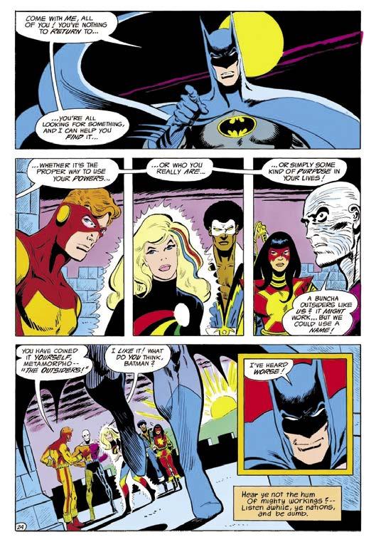
#197–199. One month after the preview story in The Brave and the Bold #200, Batman and the Outsiders #1 (Aug. 1983) hit the stands.
The story began prior to the events shown in the Brave and the Bold preview, and was centered around a war in Markovia, home of Prince Brion Markov, a.k.a. GeoForce. War can provide an excellent justification for a group of diverse individuals to come together as a team. One need look no further than the film The Dirty Dozen or its source of inspiration, The Seven Samurai. It certainly worked well for the Outsiders. Over the course of two issues, the team gradually converged and took down the leader of the revolution, Baron Bedlam. The two part story ended with team giving themselves a name.
Baron Bedlam, like most of the villains appearing in Batman and the Outsiders, was created for the series. Many of the villains ended up being one-offs, but some became recurring characters. A few also appeared in other titles and even in other media, like the Black Lightning TV show. During those first two years, Aparo designed and co-created with Barr the Masters of Disaster, Major Victory and the Force of July, and Syonide.
Aparo penciled, lettered, and inked the first 21 issues of the Batman and the Outsiders except for issues #10, 12–15, and 21, for which he only provided the cover art. Issue #12 was only penciled by Aparo with Dick Giordano inks. Aparo drew every cover of those issues, as well, except for Batman and the Outsiders #5, which crossed over with The New Teen Titans #37. The covers for those two books were penciled by Titans artist, the aforementioned George Pérez, with Aparo handling the inking.
During this run, Aparo also inked the first Batman and the Outsiders Annual, which consisted of four different pencilers’ interior work and Frank Miller’s cover pencils. For the second annual, Aparo only drew the cover. And Aparo provided illustrations for many Outsiders-related entries in Who’s Who: The Definitive Directory of the DC Universe and the DC Sampler promotional comics. For the next two years, it was Batman and the Outsiders month in and month out before things became a bit more complicated.
At the time Batman and the Outsiders launched in 1983, comic book sales through the traditional newsstand distribution system had been continually shrinking for many years, and were nearing a breaking point. But the direct market, which began with Phil Seuling’s Sea Gate Distributors in 1972, was rapidly growing.
Batman, Metamorpho, Plastic Man TM & © DC Comics. Original art courtesy of Heritage Auctions.
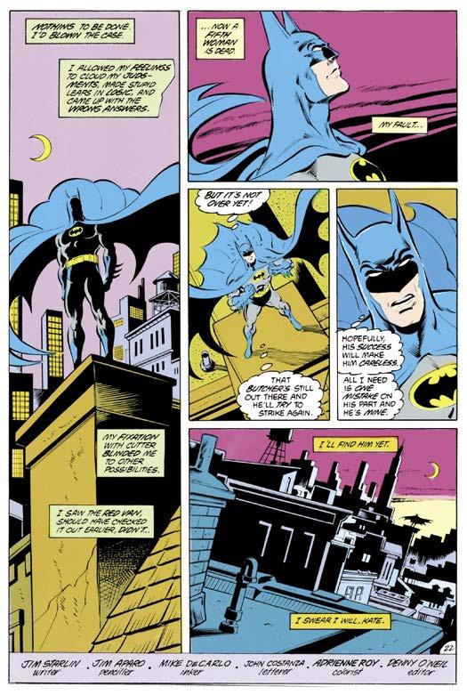
It was Frank Miller’s work in The Dark Knight Returns which ignited a revival in Batman that shifted the iconic character away from a childproof hero into a modern day badass, much closer to his Golden Age roots. Even if DC had planned it, the timing couldn’t have been better for a rebirth than it was in 1986. With the conclusion of the Crisis on Infinite Earths maxiseries, DC brought forth a massive relaunch throughout their line where many titles either started anew or completely shifted editorial direction. The aftermath gave comics fans some of the finest Batman stories of all time: The Dark Knight Returns, “Year One,” The Killing Joke, The Cult, “Blind Justice,” Son of the Demon, and various other standouts. At the epicenter of it all was veteran comics artist Jim Aparo, who had joined writer Jim Starlin and inker Mike DeCarlo in completing a legendary creative team that produced a succession of wellremembered Dark Knight stories beginning in Batman #414 (Dec. 1987).
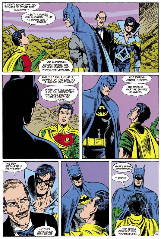
For some odd reason or oversight, Jim Aparo had never drawn interior art pages on Batman’s main book despite having been heavily associated with the character since Aparo’s debut in The Brave and the Bold in 1971. This oversight was corrected by DC’s Executive Editor Dick Giordano and new incoming Batman Editor Dennis (Denny) O’Neil. Although O’Neil and Aparo had been frequent collaborators at Charlton, they were not close friends. They had only worked together twice during the 20 years they’d been employed by DC: Phantom Stranger #8 (July–Aug. 1970) and The Brave and the Bold #159 (Feb. 1980), featuring a team-up with Ra’s al Ghul. However, their collaborative reunion was amicably professional due to the mutual respect they had for each other’s talents. The confident editorial atmosphere set at DC by Dick Giordano, and within the Batman line by Denny O’Neil, gave Aparo enough job security and comfort to focus on his artwork without any distractions or drama. Aparo enjoyed the opportunity to do what he
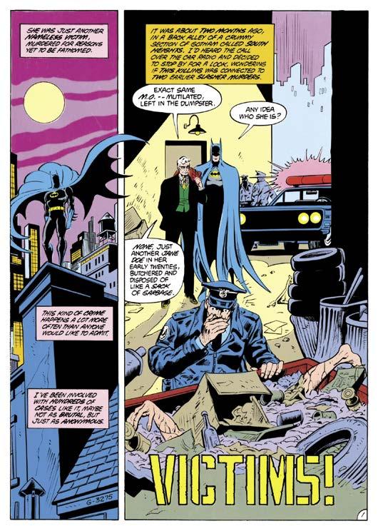
Above: Aparo’s run on Batman begins with the investigation of a serial killing in Batman #414. Left to Right: Aparo’s collaborators, editor Denny O’Neil, writer Jim Starlin, and inker Mike DeCarlo. Batman TM & © DC Comics.
did best: draw sequential stories. “I don’t think I’ve ever met anyone more professional,” said Denny O’Neil, the legendary writer of many comics classics. “I can’t remember a single time when he was late by so much as a day. And often he did the entire job—pencils, inks, and letters. You didn’t need to edit it. You knew when it came in that you could send it out to the printer without looking at it. I did look at it, because I enjoyed looking at his stuff, but I didn’t need to. It was going to be
okay—or better than okay. He was a real writer’s artist in that no matter what kind of absurd demands you made on him, he’d find a way to deliver. If he ever had any ego, I never saw it. Everything was about doing the job and telling the story.”
Another editorial fine touch was the genial idea of creating an informal mini-series within a series. The idea of grouping three or four successive regular monthly issues into one giant storyline was an innovative notion in the mid-1980s in comparison to earlier times when readers expected a full story in every comic. The format allowed for more fully realized stories that were resourceful and refined for audiences. It was also a godsend for DC brass because they could now collect and market these monthly epics into trade paperback collections as “graphic novels” for specialty shops and bookstores. Stories like “Ten Nights of the Beast,” “The Many Deaths of the Batman” (written by John Byrne), and “A
Death in the Family” showed readers that Aparo didn’t pull his artistic punches, because his storytelling delivered the frankness and darkness required in this new era. The post–Dark Knight Gotham hero was more in-yourface and hard-boiled than all previous interpretations of Batman.
O’Neil arrived back at DC in time to edit Dark Knight Returns and “Year One” with Frank Miller, the writer and artist he mentored at Marvel, but the winds of change had already begun prior to his arrival. The distinguished editor recalled, “Much of the creative work was done before I got there. As I understood my job—maybe I misunderstood what they were asking of me—was to do a new spin on Batman. I thought doing [“Year One”] would send the clearest possible message to the readers that, as we said in one house ad, ‘This ain’t your father’s Batman any more.’ So I talked the two creative guys, Frank and Dave [Mazzucchelli], into letting me run it as a serialized comic book first, and we gave them contracts with all kinds of guarantees that it would be published as a hardcover within a certain amount of time and blah, blah, blah, blah, blah, but they were generous to let me do that, and I could not have commissioned a better story for what I was hoping to accomplish, that we were doing a new take.”
After the completion of the renovated origin of Batman in “Year One” (issues #404–407), and a brief stint with Max Allan Collins as the writer, the Starlin/ Aparo/DeCarlo team made their mark on the book by expanding upon the tone of Miller’s story to the point that their own work ultimately defined the mainstream version of Batman today. Their first outing in Batman #414, “Victims,” made readers believe that the Batman they knew had evolved permanently. This tale showed a Batman who failed to solve a murder case because his emotions got the best of him. Future stories in this run pushed Batman into dramatic places both he and the readers had never seen before.
Jim Starlin was a fan favorite creator due to his stellar written and illustrated work on Captain Marvel, Warlock, and Dreadstar at Marvel Comics during the 1970s and early 1980s. His arrival to the Batman title was a welcome change from the grand space operas that have always been his hallmark. Recalling how he joined the Batman creative team, Starlin said, “Denny O’Neil needed a fill-in issue written. I forget who the writer was—Max Allan Collins. Denny wanted to go a different way, and asked me to do a fill-in issue. He hadn’t
JimAparo was devoted to his art and never thought about being a writer. Denny O’Neil remembered, “I once overheard a conversation with him and another artist—who shall remain nameless, [chuckles] but I know the name well—and the other artist said that he wanted to start writing his scripts. And Jim seemed puzzled by that, like, ‘We’re artists. We draw the pictures. Why do you want to write?’ But [Jim] embraced his job, and I don’t think, while he was alive, ever got anywhere near the credit he deserved. The consummate pro, and, as I said, a writer’s artist in that his concern seemed to be with telling the story—not showing off, not doing fancy layouts—getting the story told as solidly and clearly as possible.”
Fellow Connecticut native Spencer Beck became Aparo’s longtime original art dealer when he earned the artist’s trust in 1987. In describing the attributes of one of his first clients, Beck said, “[Jim’s] been gone for a few years now, but I can still hear his voice. ‘Hey, Spencer, it’s Jim.’ He had a little bit of a Southern twang to his voice even though he wasn’t Southern. The term in Yiddish is he was a mensch. He was an amazing man.
“He was very, very shy and unassuming. You would never know that the man that drew these incredibly powerful images—I think Jim was, like, 5' 3", 5' 4". He was a very short, frail, petite guy. And it wasn’t just at the end of his life; I knew him for 25 years before he passed away. He was a very shy, unassuming guy. If you ran into him at the supermarket, you would just think he was your next door neighbor.”
1989 saw the low-profile artist continue to helm the most visible book of the era. Nothing could contain the public’s appetite for Batman. After Jim Starlin left Batman, the title continued to thrive as Aparo would go on to render a handful of issues written by James Owsley (two standalone issues) and John Byrne (the aforementioned four-issue story arc, “The Many Deaths of the Batman”), before the highly regarded Marv Wolfman became the regular writer of the series. Wolfman began his tenure with the story arc “Batman: Year Three” (Batman #436–439). Given the success of “Year One” and “Year Two,” DC decided to publish the four issues semi-monthly to attract kids on summer vacation. This
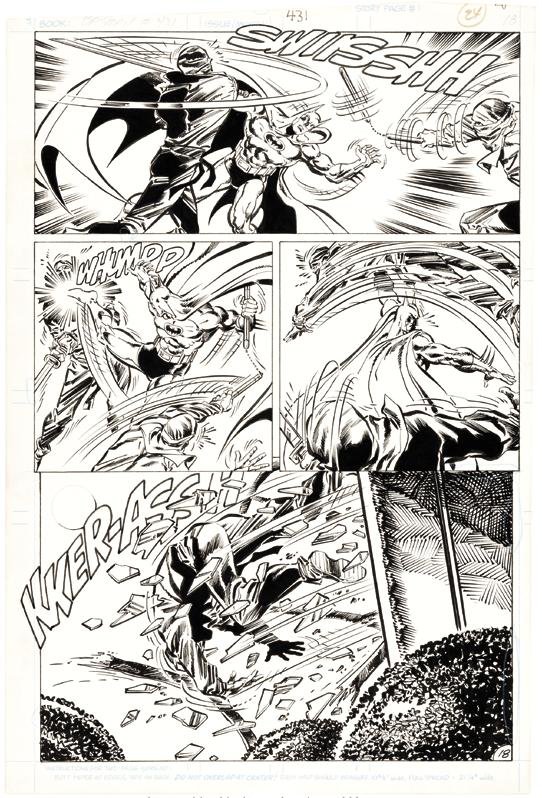
Batman takes on the League of Assassins in Batman #431, written by Jim Owlsley, a.k.a. Christopher Priest.
Batman TM & © DC Comics. Original art courtesy of Heritage Auctions.
meant the story had to be drawn well ahead of time by another artist: Pat Broderick. During this off month in his schedule, Aparo was kept busy with part of a story for Action Comics Weekly #642 (Mar. 14, 1989). The following month Wolfman and Aparo collaborated on the multi-issue storyline, “A Lonely Place of Dying.” This eventful story officially introduced 13-year-old Tim Drake as the new Robin. Wolfman, Aparo, and DeCarlo were on the series until Batman #451 (late-July 1990), when they were transferred to Detective Comics as of issue #625 (Jan. 1991).
In 1992, Scott Peterson became a key part of the Batman family of books as an editor. Remembering the
It seemed that, with “A
Place of
atmosphere of that era, Peterson stated, “Batman and Detective were really the only two monthlies that we had. Archie Goodwin was the editor of Legends of the Dark Knight. Denny and I only had the two monthlies, although we always had a ton of mini-series and one-shots and specials, and every year we would have a hardcover to come out around Thanksgiving. At the exact time I came on board, which was about a year before the second Tim Burton movie came out, it wasn’t nearly as hectic.
“Shortly after I joined is when we started adding things like the Catwoman ongoing and the Robin ongoing. I guess Shadow of the Bat came out about a year after I came onboard. So, it wasn’t stressful like it became just a few years later. While it was very much
convince
as much, if
than
that there

a commercial business, the Batman sales per issue were so high at that point that we didn’t have any fear of cancellation or anything like that. At the same time, we weren’t being forced to add more and more and more product. The product we were adding was generally speaking either Denny’s idea or a trusted, admired freelancer’s idea. Most of that stuff got greenlit, but we had a decent amount of time to get it up and running. It wasn’t the pressure cooker the entire industry is these days.”
Although Detective Comics is the namesake of the company, the book was a notch down in the totem pole from the popular adjectiveless Batman series. For Aparo, the reasons behind the switch of titles did not concern him as long as he was kept busy producing the same
JimAparo worked with numerous collaborators over the course of his long career. He was an influence and inspiration to many professionals who came after him. Often, the two categories overlapped, as those who worked with him tended to admire his work. In this chapter we share their thoughts on Aparo as a professional artist, and as a friend.
We begin with Carmine Infantino. Infantino was one of the most important figures in comic book history, for his work as an artist, art director, editor, and publisher. Infantino, DC’s art director at the time, was instrumental in hiring Dick Giordano, who then hired Jim Aparo. Here’s a quick word from Infantino:
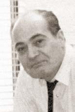
Jim Aparo was not only a classy gentleman, but a very unrecognized artist! His work was always on time and he never sent in a bad job. Lastly, his Batman outsold everyone else’s up and down the line! It’s about time he was recognized!
* * * * *
Joe Staton is an accomplished comic book and newspaper strip artist. He, like Aparo, began his career drawing for Charlton, working on short stories for their anthology titles before co-creating E-Man. He is one of only a small handful of artists who have drawn layouts for Aparo. Staton shared his encounters with Aparo:
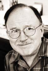
Before I started working in comics, as a reader I was impressed by Jim’s work on the Charlton Phantom book. I guess I was amazed that something that good could be coming out of Charlton. I especially remember a cover with the Phantom facing off against a giant ape. When I first went to work for Charlton, Sal Gentile and George Wildman gave me a stack of original pages from the books, and told me that this was what they were looking for. There were several Ditko horror pages in the stack, and a complete six- or eight-page ‘Wander’ story
A page from The Brave and the Bold #148, with Aparo’s finishes over Joe Staton’s layouts. Batman, Plastic Man TM & © DC Comics.
that Jim and Denny O’Neil had done. You can bet I studied those pages pretty closely.
On The Brave and the Bold #148 (Mar. 1979), Jim didn’t have time to do the whole art job. The guest star was Plastic Man, so Paul Levitz had me do layouts for Jim from a nice Bob Haney script about “buttleggers.” I studied Jim’s Batman work as intensely as I could, and tried to do pages that would try to match his approach. I must have given Jim enough to work with, since the finished art sure looked great. As layout artist, I was due a third or less of the pages. I was lamenting that to Paul, that I was so pleased to be a part of something so nice, did he think Jim might let me have a bigger cut.
“Why don’t you ask him? He’s a nice guy,” Paul said and handed me the phone. I stumbled around a bit, asking Jim, did he, uh, maybe, uh, think that I could, uh, maybe, have more pages. Jim sort of giggled, and said how would I like the whole job? I didn’t stutter at all when I said, “Yes.”
Just a few years ago, I saw that Jim would be the main guest at a New York show that I was attending. I managed to get through the crowd lined up in front of him, and handed him the “Wander” story that I had been given at Charlton. He said it was the only art he had ever gotten back from all he had done at Charlton. I’m still hanging onto that The Brave and the Bold job.
* * * * *
Pat Bastienne worked in DC’s editorial department for 16 years, beginning in 1980. As part of her role, she was in regular contact with Aparo. Here is how she remembered him:
As Manager/Editorial Coordinator at DC for a number of years, I often called the artists and writers to check on their schedules and when their pages would be coming in to DC. Most of the freelancers would give me some kind of excuse why they were late, but Jim, always on time, would say, when I asked how was he doing: “I’m just pooping along.” That phrase became his mantra, and since he penciled, lettered, and inked at that time, it was quite a job to stay on schedule, but he managed with grace and dedication. He was an example to those who came later on that the only way to make a deadline was to “keep pooping along” until it was done, still keeping the work on a high level of artistic value.
* * * * *
Bob Greenberger joined DC as an assistant editor in 1984. He eventually worked his way up to a managerial role, before leaving the company in 2000. During his time there, he worked with Aparo on a variety of projects. Here are his recollections of the artist:
When I joined DC’s staff, Jim was still going strong, illustrating mainly super-hero stories, including his well received run on The Outsiders. I truly was looking forward to the day I would get to work with him. It started small—some pieces for the Who’s Who—and I quickly learned what a true professional he was. Jim quickly grasped our needs and executed his work to perfection. In 1988, it was decided to collect his work in our line of then-high end reprints. Paul Levitz still possessed the three undrawn [“Spectre”] scripts from the Adventure Comics run, and it was deemed a cool notion to have Jim step in and finish the run. His time commitments by then meant we needed
IF YOU ENJOYED THIS PREVIEW, CLICK THE LINK BELOW TO ORDER THIS BOOK!
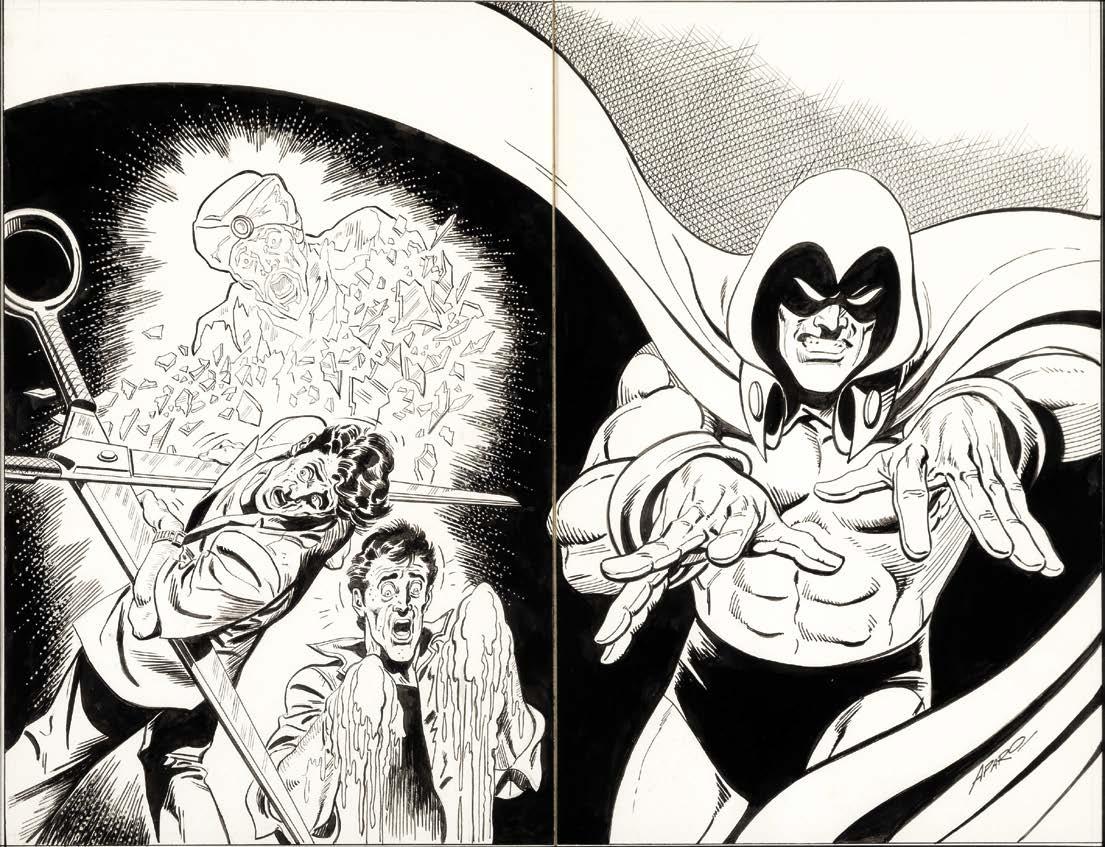
Wraparound cover art for
by ERIC NOLEN-WEATHINGTON & JIM AMASH
For a generation of comic-book readers, JIM APARO is considered the greatest Batman artist of them all. Aparo—with his strong, dynamic style, well-grounded in realism—together with Batman made a team worthy of the title, The Brave and the Bold. But before that team-up book, he made a name for himself on such series as Aquaman, the controversial “Spectre,” and the mysterious Phantom Stranger, and is considered by many to be the definitive artist for each. Now, the team of JIM AMASH and ERIC NOLEN-WEATHINGTON (editors of Matt Baker: The Art of Glamour; Carmine Infantino: Penciler, Publisher, Provocateur; and Sal Buscema: Comics’ Fast and Furious Artist) turn the Bat Signal on the life and work of one of comics’ finest! From his time in the world of advertising art, at Charlton Comics on Nightshade and The Phantom, through the heyday of the ’70s, and beyond the death of Robin, Aparo’s career is finally given the attention it so richly deserves. The book is lavishly illustrated with Aparo’s work, including many rare and previouslyunpublished pieces. Includes an introduction by ALAN DAVIS, and a new Aparo cover inked by MIKE DeCARLO!
#1 (May 1988) featuring a montage of the gruesome endings of the three “Spectre” stories inside.
to bring in an inker for him, which was a shame, but a necessary fact of life. Jim was pleased to get the assignment, displaying no great emotion about revisiting the past. He was more grateful that people at DC still wanted his work and his schedule to remain full and varied. I think we had the most fun figuring out the four wraparound covers for the series. He enjoyed sketching those, having the freedom to expand. The third cover, which was more or less the Spectre’s origin, was a particular favorite of mine, and when he learned that, made a gift of the original art.
(176-page FULL-COLOR HARDCOVER) $39.95 • (Digital Edition) $14.99 ISBN: 978-1-60549-137-0 https://twomorrows.com/index.php?main_page=product_info&cPath=95_93&products_id=1877
The one time I really spent any time with him was when we brought Jim to the Chicago Comic Con, and he was overwhelmed by the fans and their adulation. He knew they were out there, buying his work and writing letters of praise. But to actually see them, en masse, was more than this imaginative artist ever envisioned. * * * * *
Soon after, I shifted over to the administrative side of the company. Jim continued to work with us, but I no longer worked directly with him. Still, he was a consummate gentleman, and I cherished remaining on his Christmas card list long after we stopped working together.
Jordan B. Gorfinkel is a writer, artist, and editor, who worked in various editorial roles for DC Comics from 1991–1999. His entire tenure there was spent in the Batman department, where he worked closely with Aparo for several years. Here are some of his memories:
There was only one thing Jim Aparo ever demanded of me: to call him when his artwork arrived. As the assistant, associate, or full editor of his latter day Batman