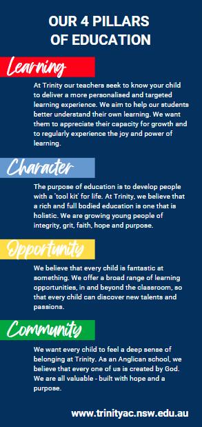
Learning Character Opportunity Community


At Trinity our teachers seek to know your child to deliver a more personalised and targeted learning experience. We are helping our students to better understand their own learning. We want them to appreciate their capacity for growth and to regularly experience the joy and power of learning.
The purpose of education is to develop people with a ‘tool kit’ for life. At Trinity, we believe that a rich and full bodied education is one that is holistic. We are growing young men and women of integrity, faith, hope and purpose.


We believe that every child is fantastic at something. We offer a broad range of learning opportunities, in and beyond the classroom, so that every child can discover new talents and passions.
We want every child to feel a deep sense of belonging at Trinity. As an Anglican school, we believe that every one of us is created by God. We are all valuable - formed with hope and a purpose.
four
of education / narrative pillars
Our
pillars
We are:
Friendly > Honest > Warm
Welcoming > Inclusive
Educated > Experts
How do we sound?
Brand personality and tone of voice are intrinsically connected.
Our brand personality informs the way we speak to our audience on every platform of engagement.
Because we are friendly, honest and warm, we shy away from sounding too formal or stiff when writing and speaking. We sound welcoming and inclusive, and given we are a school, we can even be a little playful!
At the same time, to ensure we remain competitive and are viewed as the school of choice in the local and broader region, we need to remain professional at all times. So run that spellcheck and have someone proof your work!
Our
voice
personality & tone of

Our offer:
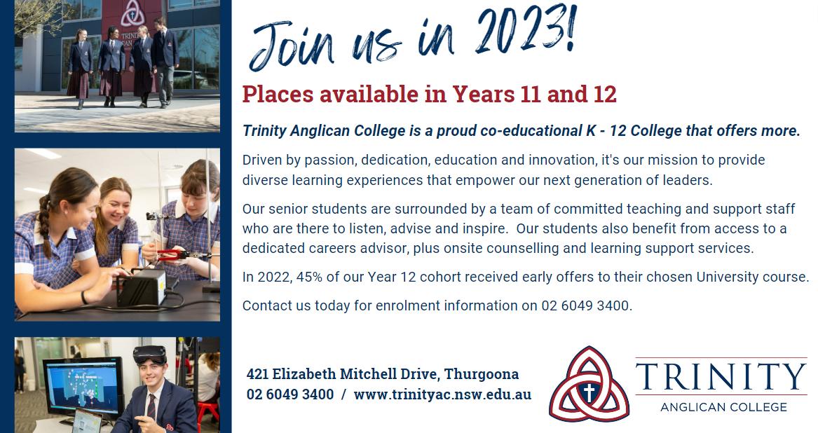
Kindergarten to Year 12 with purpose built, state of the art facilities. Our educational excellence is supported by a rich and diverse curriculum alongside co-curricular and creative programs that encompass everything from the arts and sport to technological pursuits. Our student centred curriculum ensures that each child is engaged, inspired, challenged and nurtured.
An education at Trinity is impactful. It is meaningful.
Our location:
10ha semi-rural location in Thurgoona NSW, surrounded by the natural environment. The location of our College means that our students can take their learning outside the classroom and connect with their natural environment right outside our doorstep. This gives students the opportunity to appreciate the natural world and develop the understanding and belief that they can do something to protect, preserve and enhance their local environment.
Our unique points of difference
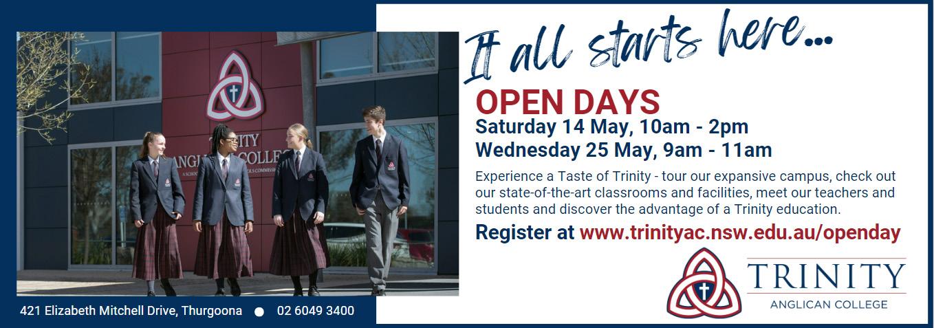
It all starts here / Proudly Trinity
Nurturing our students in their education from foundation (it all starts here) through their education journey (launch, flying ) through to Year 12 (soar and flight).
A strong brand position:
- Brings clarity of purpose
- Articulates unique value
- Maintains a consistent story
- Resonates with our audiences
Trinity Anglican College offers distinguished learning with a challenge enriched curriculum that nurtures each student to be empowered, courageous and be driven by innovative experiences and discoveries. It is our mission to provide a global understanding to enable the development and enhancements of minds to succeed in any educational environment.
Our positioning statement / key messages
Our student centred curriculum ensures that each child is engaged, inspired, challenged and nurtured.
New families
School change
Out of region Existing families


Our staff

It all starts here. Learn to fly. Leading students into the future, no matter what path they choose.
It all starts here / Proudly Trinity. We’re here for you. Embrace your future with our programs. At Trinity, every student is welcomed, supported and nurtured.
It all starts here. We’re here for you. At Trinity, every student is welcomed, supported and nurtured.
It all starts here / Proudly Trinity. With the skills to succeed in any environment. At Trinity, every student is welcomed, supported and nurtured.
It all starts here / Proudly Trinity. Part of the big picture. Committed educators = committed students. Educational leaders.
Target markets and key messages

02 / Style Guide
The following pages present the visual guidelines for our brand. The purpose of these guidelines is to ensure a consistent approach to the College brand and its application.
This style guide aims to inform, assist and inspire you to use the brand across all internal and external communications. Consistency is the key.
For questions on how to apply any aspect of our brand identity please contact the Marketing & Enrolments Team.
Introduction
The Trinity Anglican College logo is the central visual element that identifies our college and must be present on all communications.
When using the Trinity Anglican College logo you must use the crest versions below:


Logo
The master logo has an exclusion zone designed to protect its integrity. Clear space principles aim to ensure the logo is never presented in a cluttered environment.
The minimum ‘clear space’ is calculated by the formula below. The logo must not be used smaller than 25mm in width or legibility of the type will become compromised.
X = height of ‘Trinity’. This is the clear space margin required around the master logo.


Clear
space and minimum size
X X
Don’t overuse the logo - it should only appear once on a page or piece of collateral, or at the beginning (cover) of a document (Not on every page!).
Only use supplied Trinity Anglican College logo files and please observe the following rules:
• No stretching or distorting
• No change to the typeface or removal of any text from the logo
• No change to the colours of any part of the logo
• No rotating/tilting of the logo
• No logo placement on poor contrast (patterned or visually busy backgrounds).
There is a white (reversed) logo that can be used on dark backgrounds.


What to avoid
Co-branding situations will be uncommon for our College brand, however, guidance is provided below if this occurs.
The goal is to ensure the logo is always clearly represented. As such, the clear space rules must always be applied (X).

Co-branding
X X BRAND BRAND
This palette is to be used in representation with all of our College digital and printed collateral. Our Marketing team will design templates utilising this palette in line with our College brand for all collateral and documents.
Primary
Secondary
C/M/Y/K
100/68/8/52
R/G/B 26/50/92
PMS 295
C/M/Y/K
24/99/89/20
R/G/B 159/32/40 PMS 207
C/M/Y/K 0/0/0/7
R/G/B 237/237/237
C/M/Y/K 26/13/0/7
R/G/B 175/207/238
C/M/Y/K 0/22/75/13
R/G/B 223/175/55
C/M/Y/K 0/0/0/0
R/G/B 255/255/255
Navy Blue Representing our core College colour, carrying elegance, sophistication, unity and conservatism associated with the colour.
Red Associated with bold, intensity and strength.
Grey Cool neural balanced tone that will complement the additional Primary colours.
Pale Blue Association with trustworthiness and reliability.
Gold Association with prosperity and courage, sophistication and old wealth.
White Clean, crisp and clear. White space improves readability and comprehension.
Colour
C/M/Y/K 0/13/65/0
R/G/B 255/222/89
C/M/Y/K 76/2/100/0
R/G/B 50/177/65
C/M/Y/K 92/56/0/27
R/G/B 15/82/186
C/M/Y/K 0/53/86/11
R/G/B 228/107/32
C/M/Y/K 30/63/0/36
R/G/B 109/58/155
C/M/Y/K 0/88/88/17
R/G/B 212/26/26
House Colours
Hoffman Kelton Petts Kimball Lankaster Rosborough

The Trinity Anglican College brand typeface is Calibri. This is a simple highly legible font making it suitable for print, digital and signage applications.
Calibri Light
ABCDEFGHIJKLMNOPQRSTUVWXYZ
abcdefghijklmnopqrstuvwxyz1234567890
Calibri Light Italic
ABCDEFGHIJKLMNOPQRSTUVWXYZ
abcdefghijklmnopqrstuvwxyz1234567890
Calibri Regular
ABCDEFGHIJKLMNOPQRSTUVWXYZ
abcdefghijklmnopqrstuvwxyz1234567890
Calibri Italic
ABCDEFGHIJKLMNOPQRSTUVWXYZ
abcdefghijklmnopqrstuvwxyz1234567890
Calibri Bold
ABCDEFGHIJKLMNOPQRSTUVWXYZ
abcdefghijklmnopqrstuvwxyz1234567890
Calibri Bold Italic
ABCDEFGHIJKLMNOPQRSTUVWXYZ
abcdefghijklmnopqrstuvwxyz1234567890
Typography
Typography - titles and headings
Heading 1 - 24pt bold
Heading 1 - 24 pt
Heading 2 - 16pt
General content - 13pt
Light single spacing for Seqta correspondence
Light 1.15 spacing for proposal and presentation documents
Margin�
A margin is the space between the text and the edge of your document. By default, a new document’s margins are set to normal, which means it has a one-inch space between the text and border . This must be taken into regard when placing our logo on any documentation (one-inch white space between logo and margin to edge).
Page Numbering and Location
Page numbering - consecutive from 01, 02, 03, 04 through to 10 and continuing.
Location for printed document - bottom left.
Location for printed booklet - bottom left for odd numbers and bottom right for even numbers.
Layout and Tables
Background (white only)
We do not use borders on external documents. Internal documents may use bordering for in-house distribution and awards.
Table layout - one inch from margin, clean black lines. Formatted tables will be pre-designed in most documents.
Typography - signage
Trajan Pro (master logo font)
Gotham (logo subline - work horse font)
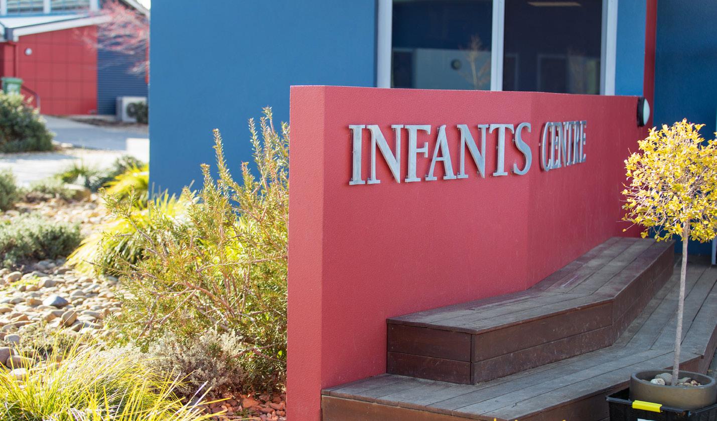
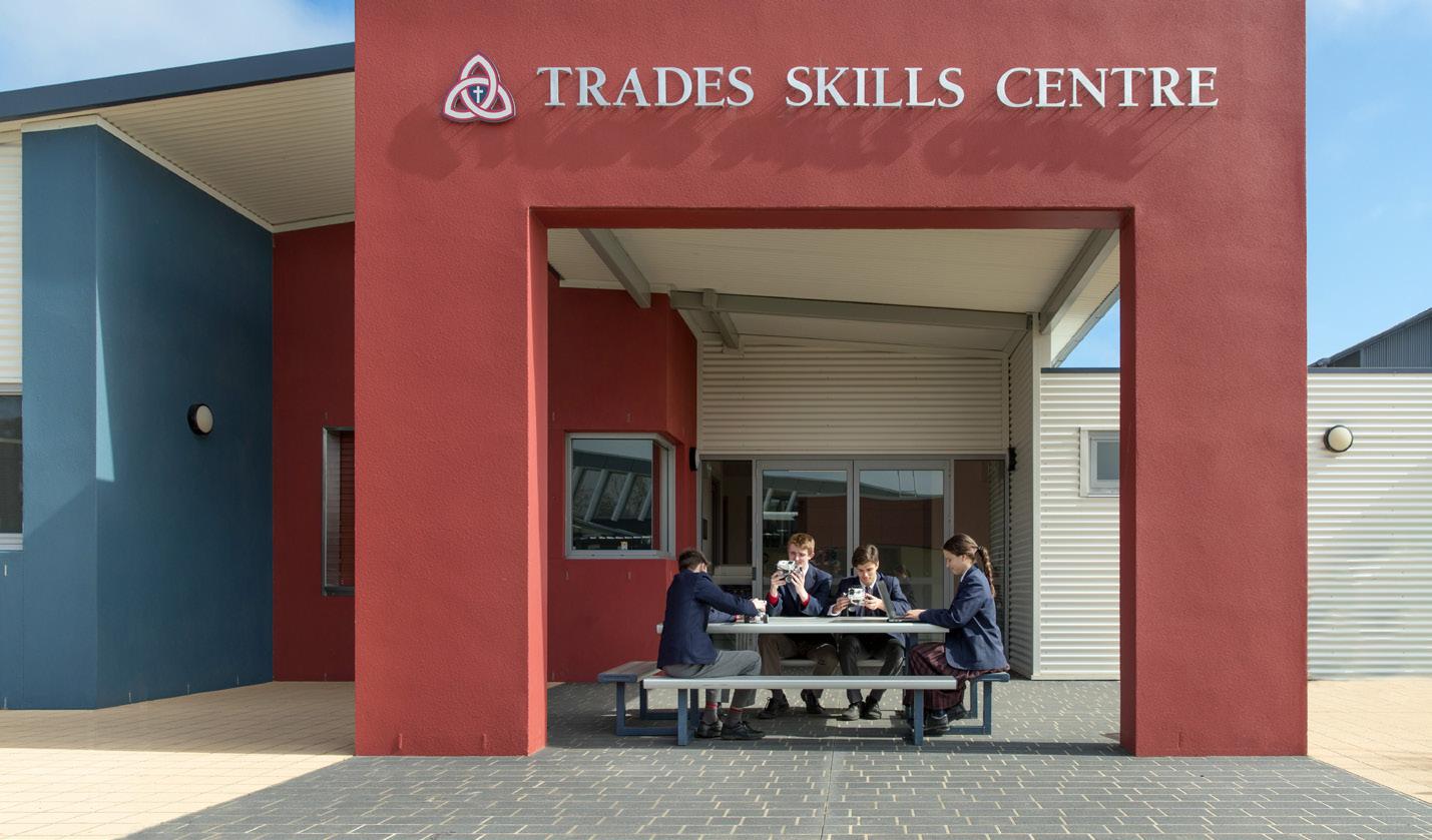
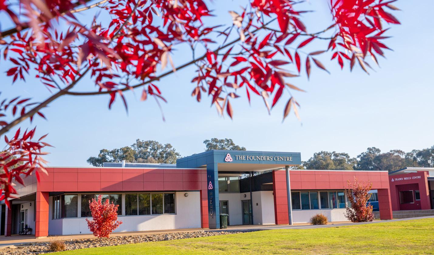
Bookman Old Style (school building names)
Size and application dependent on where sign is located
Our brand has an opportunity to tell our full brand story most effectively through the use of imagery; photography is a key tool in portraying the college in a positive and desirable way and to show authentic, genuine, honest and open connections.
To capture great images for our brand, show the experience and subject from a first person perspective. Our images should show what it’s like to be an active part of the experience. Be unobtrusive, observational and allow events to unfold as they would naturally. Minimal direction and interference will always give authentic results and show the essence of positive and active engagement.
Please ensure any imagery captured on students is approved by the parents/guardians prior to publication.


Imagery
03 / Applications


Print collateral - examples
Pull-up banner
Yearbook / publication
Booklet
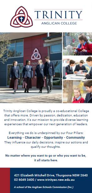
DL Brochure


Print advertisements - examples


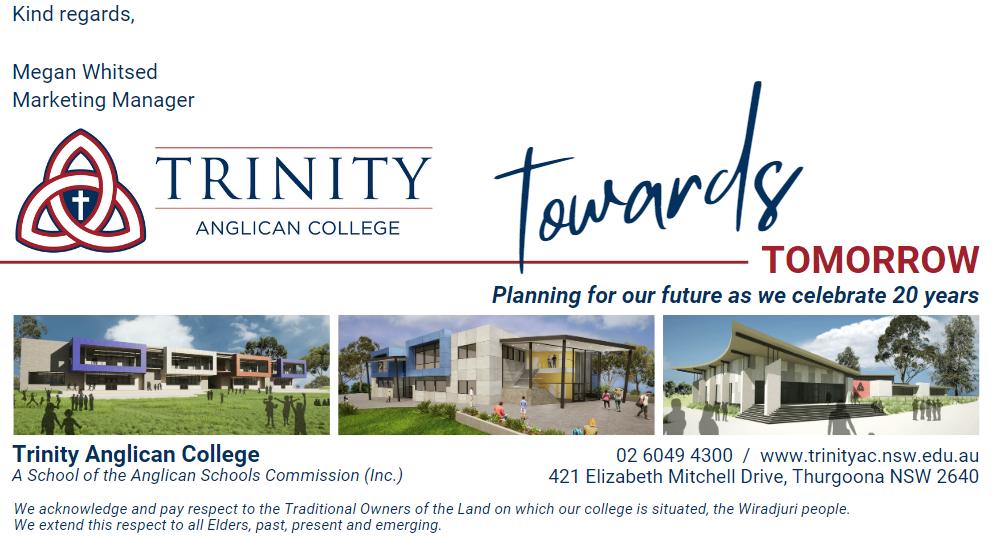
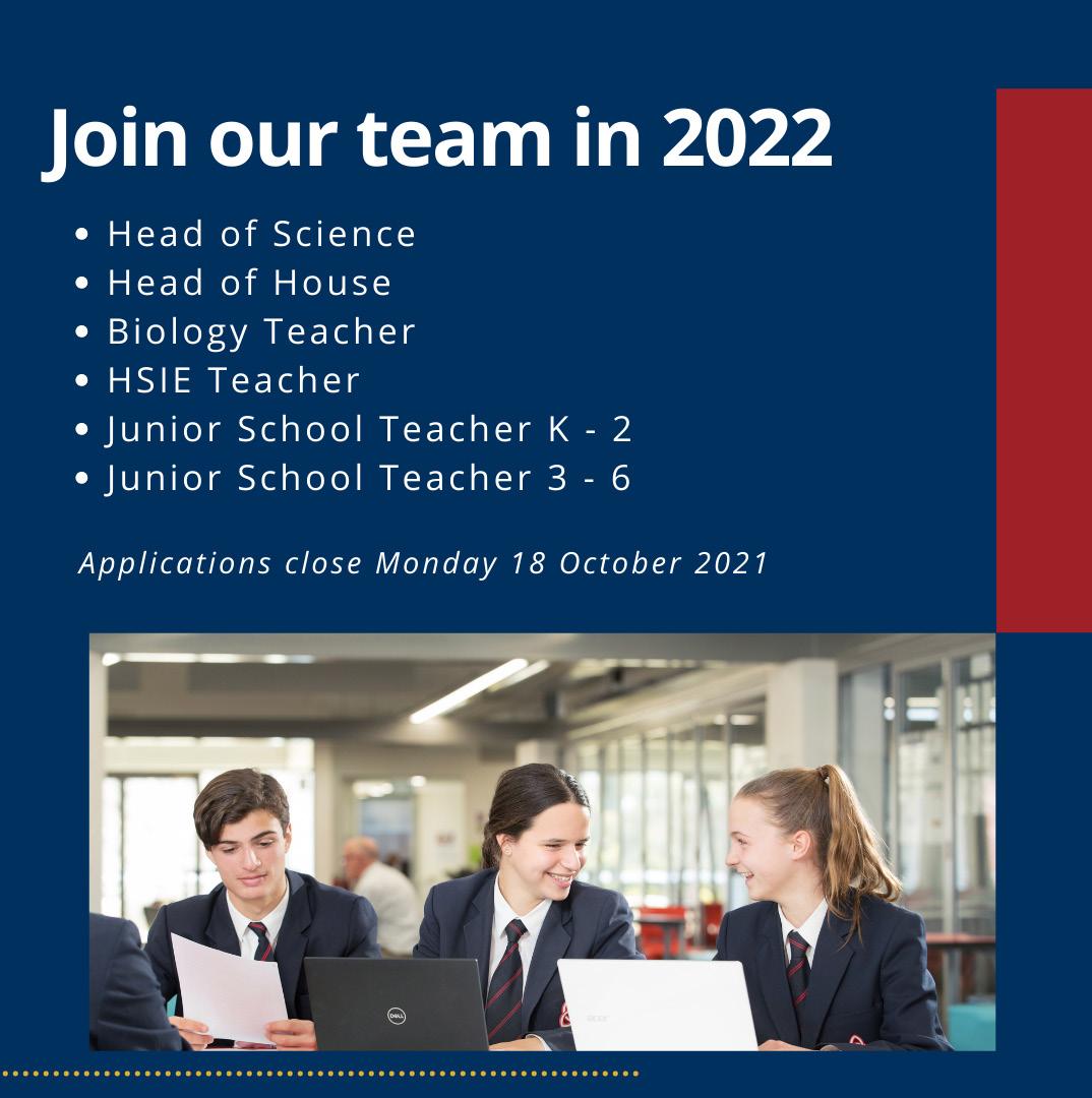
Email banners - examples

Letterhead template


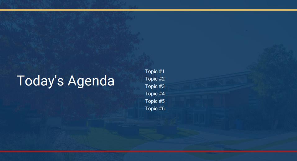
Powerpoint template
