Ridges & Rivers Book Festival where ideas take flight
Inspired by the rural area of the Southwest Wisconsin and focused on the public and writers that this event will reach out, the brand was chosen following the next Mission Statement: Celebrate Reading, Writing, Creativity, and Community.
Ridges & Rivers Book Festival | BRAND GUIDELINES 5
MARK Primary Logos
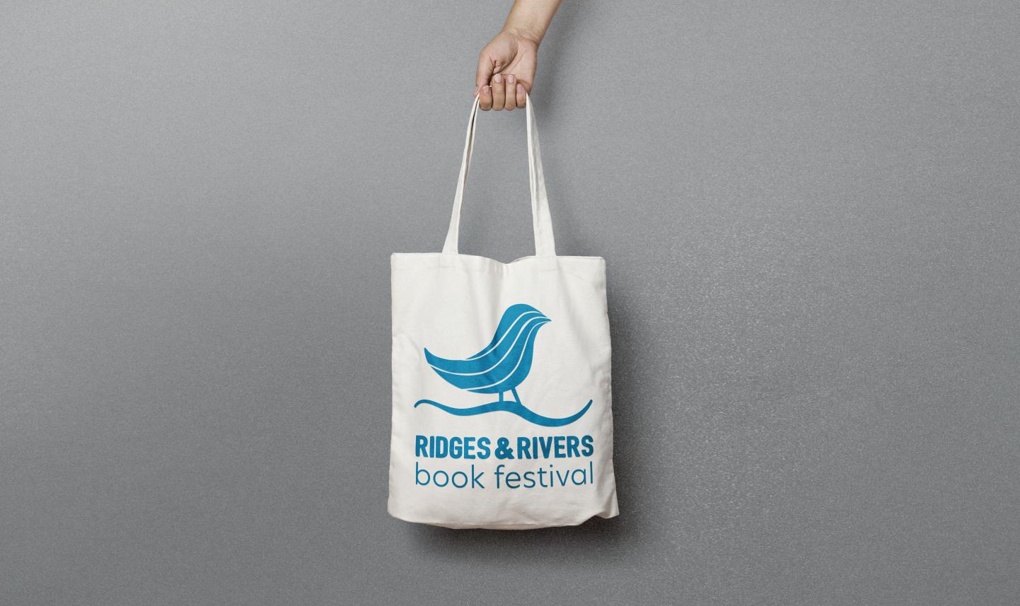
The tone of voice of the brand is fun and proud. It communicates movement and love for learning. This is reflected in the logo and brand development. The image includes a sillouette of a bird that represents the rural area. Inside of the main form, there are curves in different colors ,that represent the movement that the pages do when we are passing the pages on a book, which at the same time represent the elds of the country. New paths are discove red on each page. Each color of the page symbolize inclusiveness. Green for ridges, blue for water (rivers). The way how the bird is stand up communicates a positive message. The horizontal line at the bottom gives support and cona message of reliability to the event.
6
Ridges & Rivers Book Festival | BRAND GUIDELINES 7 HORIZONTAL VERTICAL 1 inch 1.8 inch MINIMUM SIZE
MARK
Primary Logos - blue background
When using the primary logo on a blue background (C:76, M:18, Y:26, K:2 ), the logo can be used on horizontal or on a vertical version as showed on the next page.
8
Ridges & Rivers Book Festival | BRAND GUIDELINES 9
MARK Secondary Logos
The next images are how the logo is used in grayscale and black or one tint. Depending on the application, it will be used horizontally or vertically.
10
HORIZONTAL VERTICAL
Ridges & Rivers Book Festival | BRAND GUIDELINES 11
MARK
One color
When having a dark or color background, the logo should be used as illustrated on the next page. The color of the logo could also change to blue ( C:86 M:42 Y:18 K:1 ) when using the logo on a white background (see pages 12 and 13).
12
Ridges & Rivers Book Festival | BRAND GUIDELINES 13
14
MARK
Unacceptable Usage
A) Dont’ stretch or squash
B) Don’t rotate the logo or any of its parts
C) Don’t change the proportion between the elements
D) Don’t use drop shadows
E) Don’t change the color palette.
F) Don’t use the incorrect logo on photography or on dark bakground. See page 10.
16
Ridges & Rivers Book Festival | BRAND GUIDELINES 17
A) D) E) F) B) C)
MARK Color Palette
Here is the official color palette for printing, digital and web.
18
Ridges & Rivers Book Festival | BRAND GUIDELINES 19 53 154 55 R G B C M Y K 78 11 100 2 #359a37 7739 C 54 86 163 87 68 0 0 #3656a3 7684 C 80 195 241 62 0 0 0 #50c3f1 2985 C 58 109 45 79 34 100 24 #3a6d2d 7743 C 182 205 1 37 0 100 0 #c2d500 382 C 0 122 169 86 42 18 1 #007aa9 314 C 92 92 93 65 55 53 27 #5c5c5d 425 C COLOR MODE RGB CMYK HEXADECIMAL PANTONE
MARK Secondary Colors
Here is the official secondary colors for printing, digital and web.
20
Ridges & Rivers Book Festival | BRAND GUIDELINES 21 39 156 179 76 19 27 0 #279cb3 11913 C 242 145 11 R G B C M Y K 1 51 97 0 #f2910b 144 C 18 73 91 92 56 43 37 #12495b 11116 C 240 234 116 10 0 65 0 #f0ea74 114 C 135 135 135 0 0 0 60 #878787 1799 C 12 120 83 86 28 76 15 #0c7853 13814 C COLOR MODE RGB CMYK HEXADECIMAL PANTONE
MARK Typography (body text)
The main typography to use on tittles and body text on files is Montserrat in all its variants. This font is free to use.
Montserrat Black
a b c d e f g h i j k l m n o p q r s t u v w x y z A
Montserrat Extra Bold
a b c d e f g h i j k l m n o p q r s t u v w x y z A
& # $ * @ +
22
B C D E F G H I J K L M N O P Q R S T U V W X Y Z 1 2 3 4 5 6 7 8 9 0 & # $
@
*
+
B C D E F G H I J K L M N O P Q R S T U V W X Y Z 1 2 3 4 5 6 7 8 9 0
Montserrat Bold
a b c d e f g h i j k l m n o p q r s t u v w x y z
A B C D E F G H I J K L M N O P Q R S T U V W X Y Z
1 2 3 4 5 6 7 8 9 0 & # $ * @ +
Montserrat Medium
a b c d e f g h i j k l m n o p q r s t u v w x y z
A B C D E F G H I J K L M N O P Q R S T U V W X Y Z
1 2 3 4 5 6 7 8 9 0 & # $ * @ +
Montserrat Light
a b c d e f g h i j k l m n o p q r s t u v w x y z
A B C D E F G H I J K L M N O P Q R S T U V W X Y Z
1 2 3 4 5 6 7 8 9 0 & # $ * @ +
Montserrat Semi Bold
a b c d e f g h i j k l m n o p q r s t u v w x y z
A B C D E F G H I J K L M N O P Q R S T U V W X Y Z
1 2 3 4 5 6 7 8 9 0 & # $ * @ +
Montserrat Regular
a b c d e f g h i j k l m n o p q r s t u v w x y z
A B C D E F G H I J K L M N O P Q R S T U V W X Y Z
1 2 3 4 5 6 7 8 9 0 & # $ * @ +
Montserrat Extra Light
a b c d e f g h i j k l m n o p q r s t u v w x y z
A B C D E F G H I J K L M N O P Q R S T U V W X Y Z
1 2 3 4 5 6 7 8 9 0 & # $ * @ +
GUIDELINES 23
Ridges & Rivers Book Festival | BRAND
MARK
Typography (letterhead and applications)
The main typography to use on letterhead information and secondary applications such as address, website, phone number, etc is Euphemia UCAS in all its variants.
24
Euphemia UCAS Bold
a b c d e f g h i j k l m n o p q r s t u v w x y z
A B C D E F G H I J K L M N O P Q R S T U V W X Y Z
1 2 3 4 5 6 7 8 9 0
& # $ * @ +
Euphemia UCAS Regular
a b c d e f g h i j k l m n o p q r s t u v w x y z
A B C D E F G H I J K L M N O P Q R S T U V W X
Y Z
1 2 3 4 5 6 7 8 9 0
& # $ * @ +
Euphemia UCAS Italic
a b c d e f g h i j k l m n o p q r s t u v w x y z
A B C D E F G H I J K L M N O P Q R S T U V W X Y Z
1 2 3 4 5 6 7 8 9 0
& # $ * @ +
| BRAND GUIDELINES 25
Ridges & Rivers Book Festival
MARK
Typography (display)
When using main tittles, the typography to use can be ASAP Condensed for web or DIN Condensed Bold for printed materials.
26
Ridges & Rivers Book Festival | BRAND GUIDELINES 27 Asap Condensed a b c d e f g h i j k l m n o p q r s t u v w x y z A B C D E F G H I J K L M N O P Q R S T U V W X Y Z 1 2 3 4 5 6 7 8 9 0 & # $ * @ + D-Din Condensed Bold a b c d e f g h i j k l m n o p q r s t u v w x y z A B C D E F G H I J K L M N O P Q R S T U V W X Y Z 1 2 3 4 5 6 7 8 9 0 & # $ * @ +
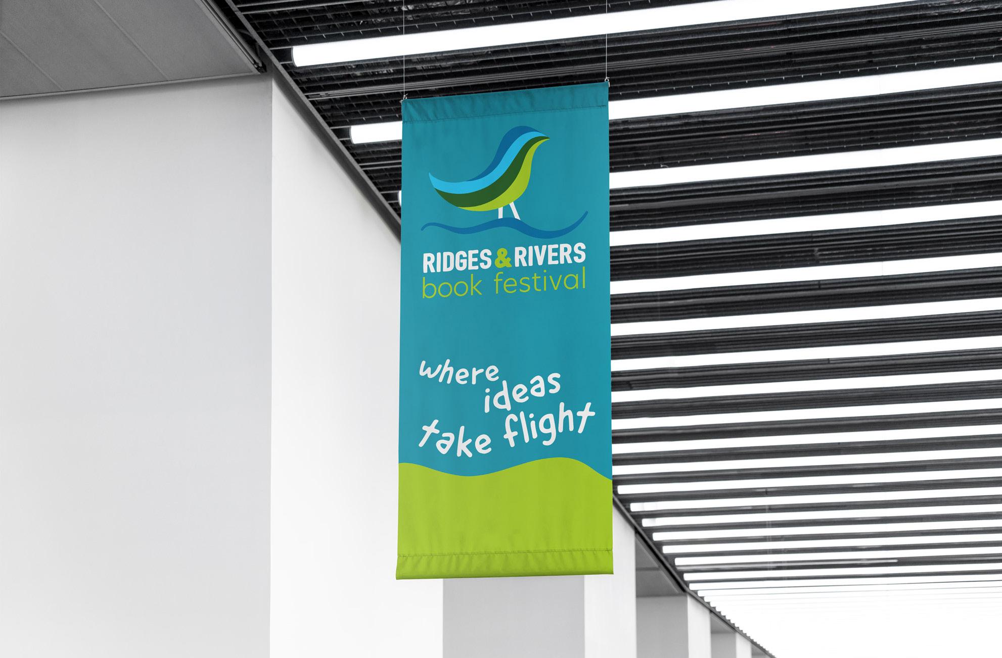
Secondary Graphics & Applications
Following the voice of the brand, and the physical characteristics of the rivers and rivers, the secondary elements were created. Organic and geometric forms on a texture, are consistent with the logo and the voice of the brand.
Ridges & Rivers Book Festival | BRAND GUIDELINES 33
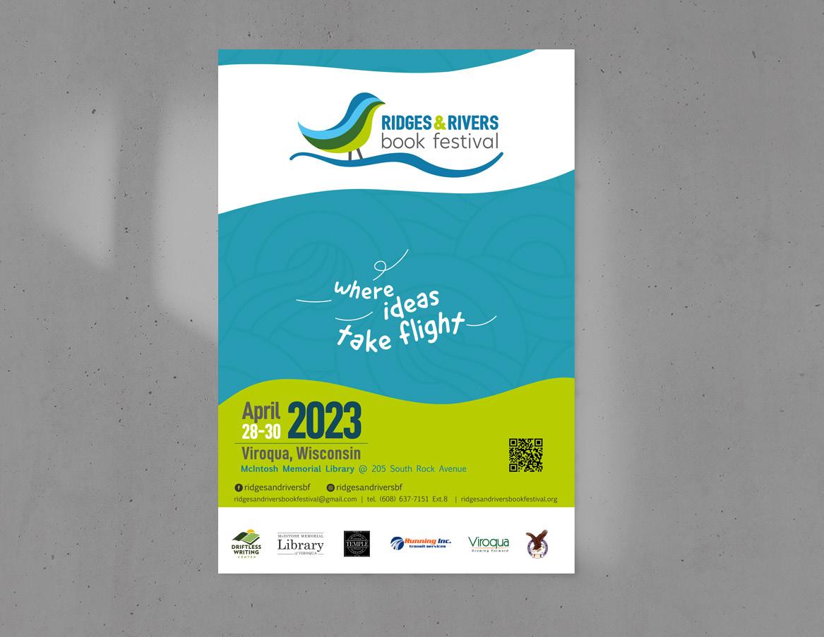
APPLICATIONS Poster
The official poster is the main piece of the communication materials. All the other applications are based on it and on the graphics included on it.
34
36
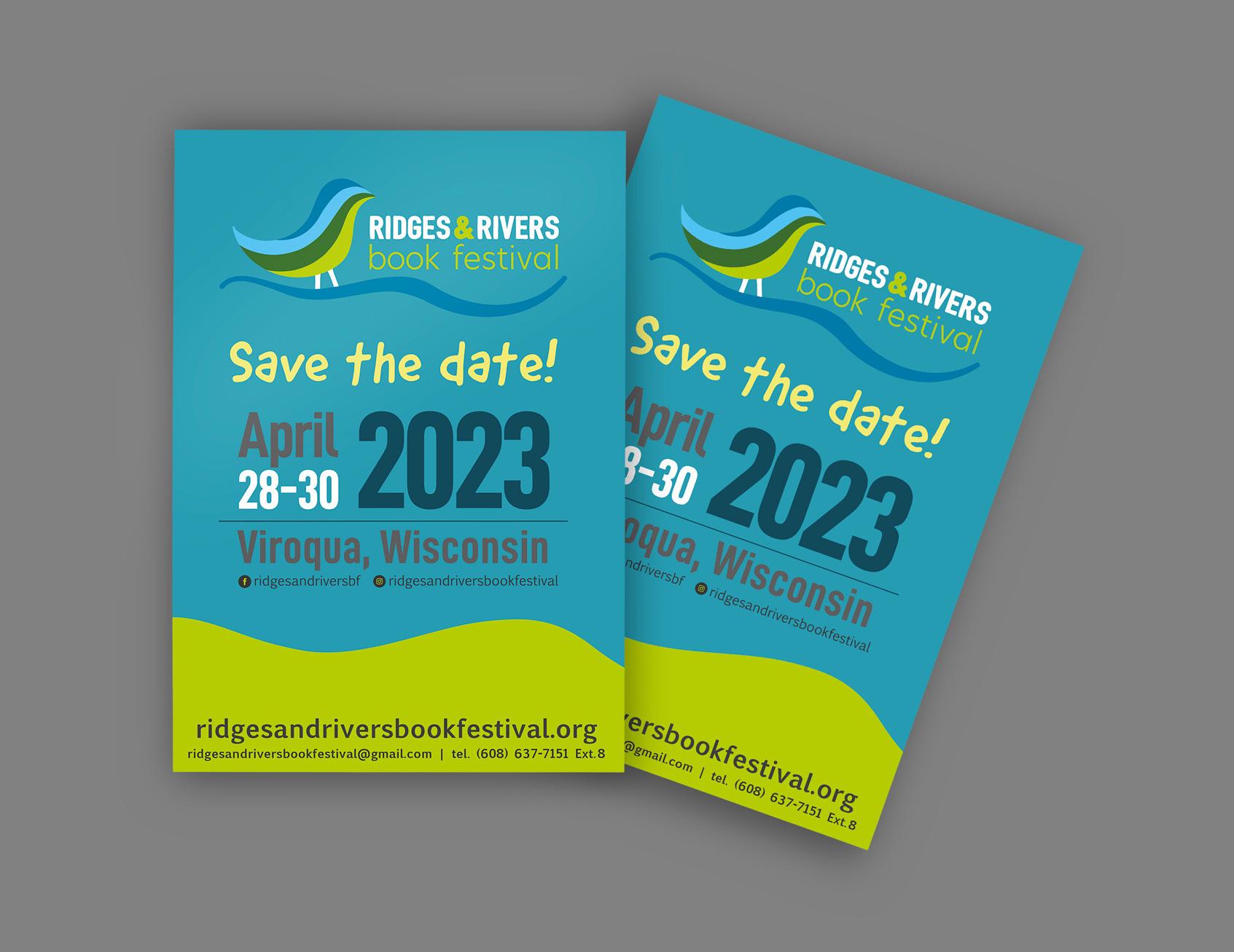
APPLICATIONS Save the Date
APPLICATIONS
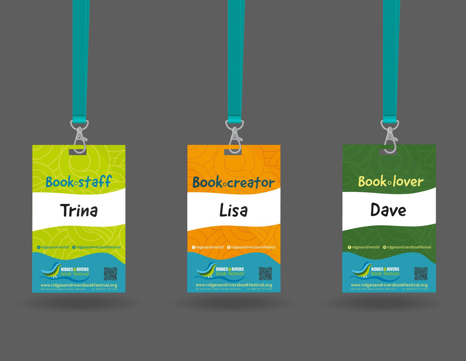
Badge
38
APPLICATIONS
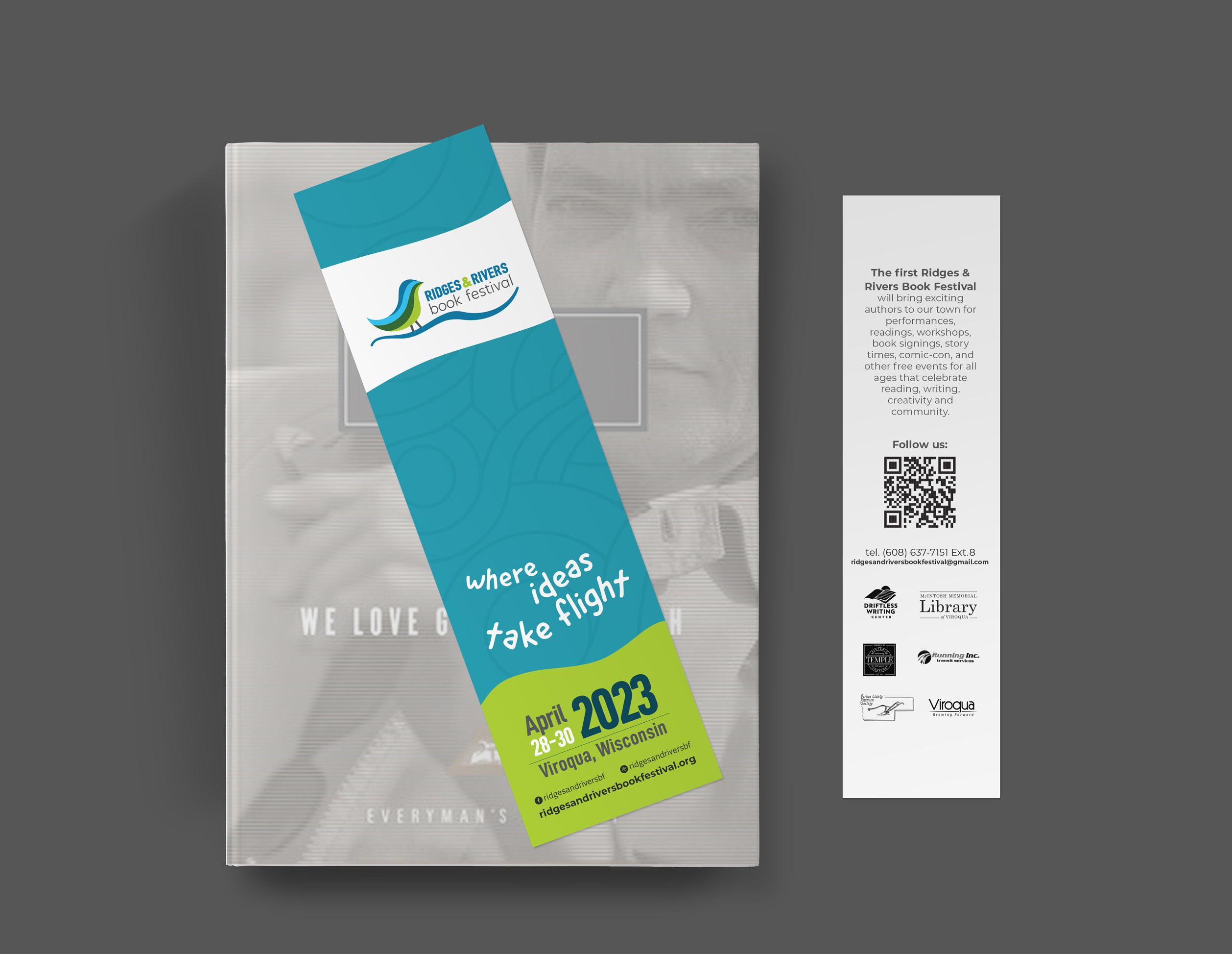
Bookmark
40
APPLICATIONS
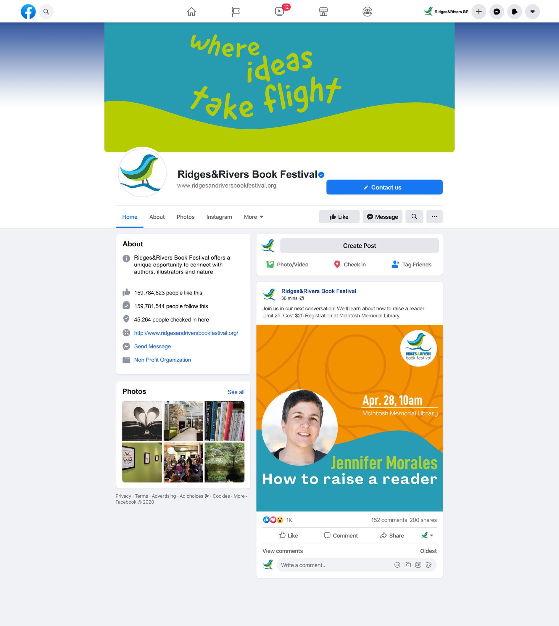
Social Media
42
Ridges & Rivers Book Festival | BRAND GUIDELINES 43
APPLICATIONS
Canva Templates
a)Text Post
b)Facebook post
c) Instagram post
44
45 a)
b) c)
APPLICATIONS
Canva Templates
d) Full Calendar template
46
Ridges & Rivers Book Festival | BRAND GUIDELINES 47
d)
APPLICATIONS
Power Point Stills
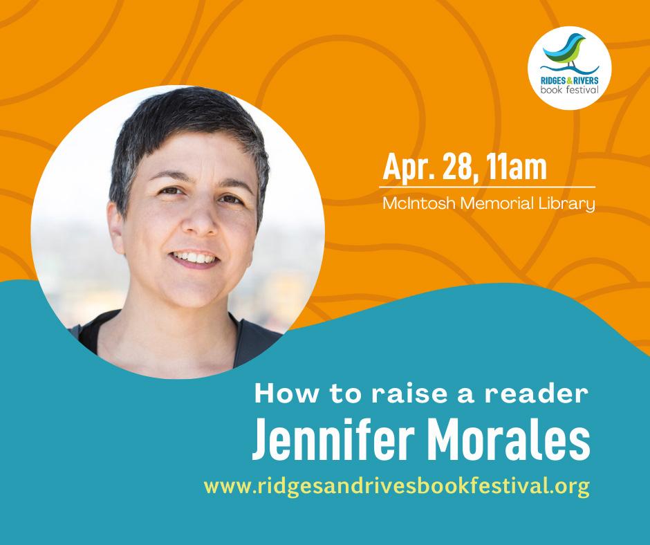
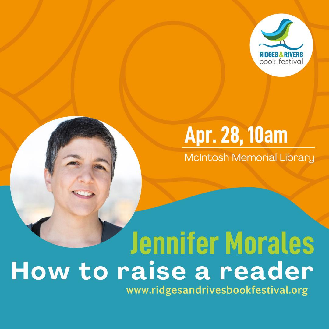
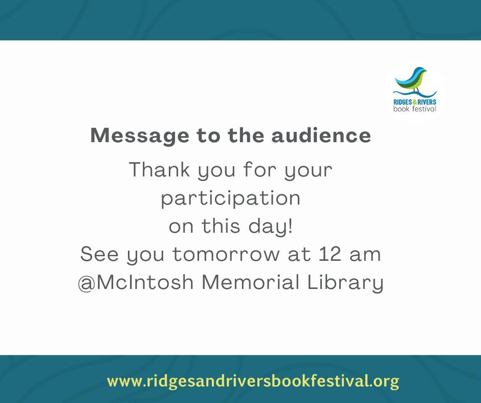
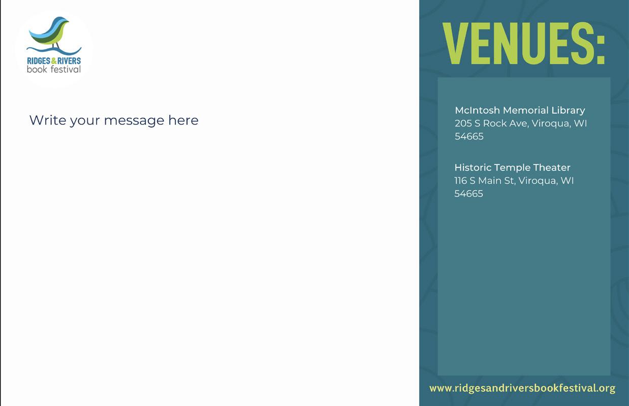
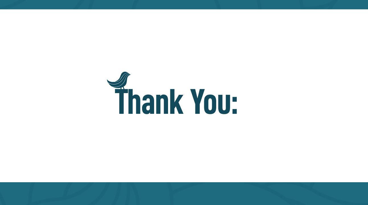
a)Background for writers and illustrators profiles.
b)Background for general Information.
c) Background for long body text.
d) “Thank You” for final screen.
48


Ridges & Rivers Book Festival | BRAND GUIDELINES 49
a) c) b) d)
Right Reserved 2023 Ridges&Rivers Book Festival
50 All

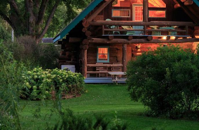
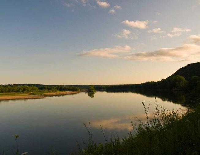 photo from driftlesswisconsin.com