ISSUE THE


Created by:

Robyn Marie George
Zack Zens
Quintynn Vaughn
Sydney Taylor Collins
Camille Miles
Mara Hansen
Filip Jawdosiuk
Kaldan Knopp
Brianna Stehling Santacruz
Mia Staszcuk
Tessa Devine
Ben Yeiser
Macy Chen Featuring:
Francis Faye
Lauren Macdougal
Zayaan Alamgir
Mia Staszcuk
Noah White
Brenna Paul
Lizzy Morris
Special thanks to: ReThreads
4 6 10 12 15 22 24 29 30
A word from the editors
Chromophobia

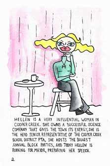
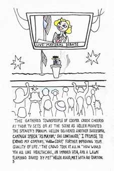
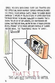
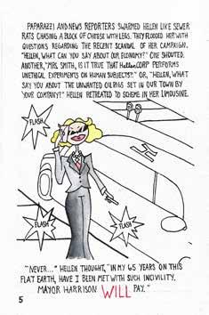
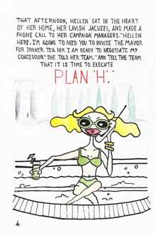
Helen for Mayor
Something Blue
The Death of Designer Fashion
Fake Fashion Facilitates Future
Galactic Groove
Amethyst
No More Ikea Malm
A WORD FROM
Robyn George, Executive Editor

I would like to thank my psychiatrist, Marisa Hiley, for making this Issue possible. If it werent for my Vyvanse perscription, this publication would be nothing but photos in several mislabeled google drive folders. I would also like to thank my situationship for cancelling on me. If he hadn’t, I surely would’ve procrastinated this even longer!
Unfortunately, Camille did not see our group chat message in time to send a bio and picture. Luckily for Camille she is very photogenic and we can’t nd any ACUALLY bad pictures.
 -exec
Zack Zens, Deputy Executive Editor
-exec
Zack Zens, Deputy Executive Editor

With book bans, anti-LGBTQ legislation, and rising levels of surrealistic hate, the value and potency of creating art that epitomizes humanity free from restriction cannot be understated. While anger and division sew their gritty thread through American life, we face it all as a mirror re ecting back unabashed and authentic creative joy. It took a long time for me to love and accept myself, and that journey would have only been that much easier were I not so often traveling it alone. This publication, above everything else, can be that friend to anyone trekking the long steep climb to self-acceptance or facing the hot arrows of hate by demonstrating that we are here and proud to be ourselves. Proud of our hair, our fashion, our skin, our sexuality, our love, our language, and everything else. Thank you for reading and being proud, even when it feels out of reach.
Camille Miles, Diversity Equinty + Inclusion Chair
THE EDITORS

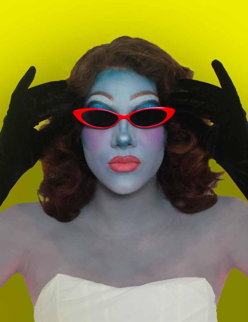
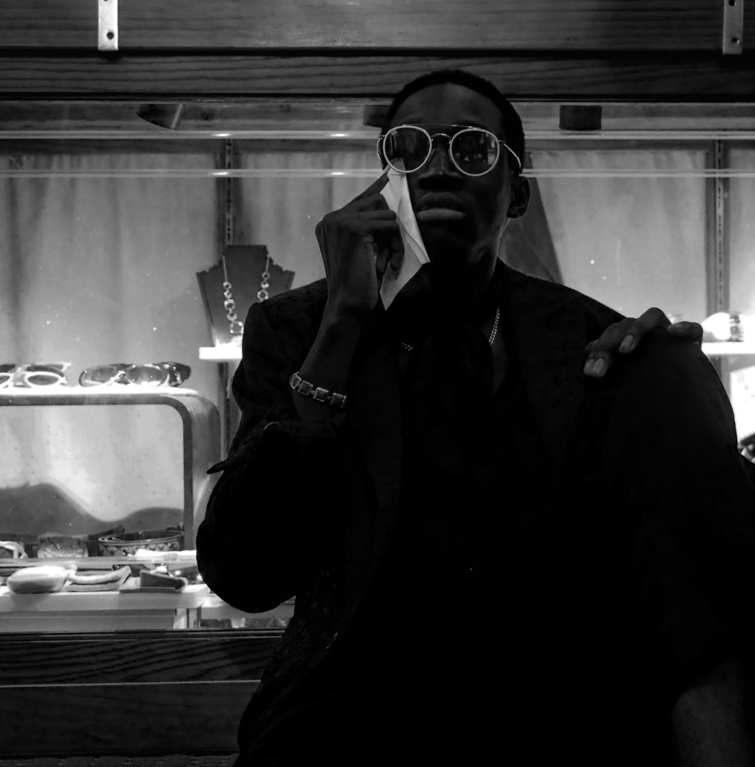
To make someone look is empowering. To be looked at is dehumanizing. The di erence is choice. As a woman, I often feel looked at by men. This happens most often when I don’t want to be looked at: walking down the street alone. When I want people to look at me, I wear eccentric out ts and wild makeup. Feeling beautiful and con dent will always turn heads. Made You Look is about having the power to attract attention and more importantly making the choice to do so.


As kids, we might have said something to get our friends attention and then said “Made you Look”. The joke in saying this simple line lies in the immense power you so easily relinquish when you stop what you’re doing and give your undivided attention to something. Giving your vision to someone gives them control. And for that split second , they control your entire perception of your surroundings. As adults, we command the attention of others not through silly pranks, but through the ways that we stand out. Your uniqueness gives you power, so keep making people look.
While I know that not everyone has the privilege of doing so, I encourage readers to “make others look,” when able. I have come to nd that people are so wrapped up in their own self-judgement and standards that were set thousands of years ago by a predominantly white, cisgender, male polity, that it is almost a relief when they see people challenging them. If not for yourself, do so for others who society deems as un t to make noise. Make them look.”
FROM
Quintynn Vaughn, Events Coordinator
Mara Hansen, Makeup Director
Sydney Taylor Collins, Social Media Director

THE GRAYSCALE WEST
By Sydney Taylor Collins, Social Media Director
Chromophobia, as defined by the Cleveland Clinic, is “an intense fear of colors,” and is a diagnosable disorder. However, the term acquired cultural relevance when David Batchelor, a Scottish artist and writer, released his book, Chromophobia. Batchelor’s work does not focus on Chromophobia as a diagnosable disorder, rather as an “impulse” that exists within Western culture and intellectual thought. One can see this impulse across a wide range of domains: however, it is arguably most pertinent to both art and architecture.
A simple google search for “classy aesthetic” or “professional,” brings about mostly neutral, muted results. Black is also frequently associated with “sophistication, [...] power, and self-control.” Batchelor describes a Western belief that color is “something for children, savages, minorities, and women.” This sentiment has deep, historical roots.

A disdain for color dates back to Plato, who attacked color for the same reason he attacked rhetoric, associating the two with “makeup and polish and clothes” and seeing them as ornaments distracting from the truth. Philosopher Aristotle continued this sentiment, arguing that in drama, character is subordinate to the plot in the same way color is subordinate to form in paintings. He stated, “a random distribution of the most attractive colors would never yield as much pleasure as a definite image without color.” During the reformation in Europe, Calvinistic ideas began being seen as a distraction from God, symbolizing ‘sensuality and excess. Color was seen as unessential, being a superficial symbol of deceit and pretending.
“warm seat”
With the emergence of protestant Europe and supremacy of Dutch mercantilism during the reformation, black signified self-control, becoming a symbol of power, control, and business. Condescension of color continued throughout the Renaissance as well, and has continued to exist across history: examples of which exist today.
One can see chromophobia and Western beliefs toward color in a wide variety of media, art, architecture, fashion, and broader popular culture. The 1939 classic American film, Wizard of Oz, is a perfect example of this. The New York Times cites that “Dorothy’s drift into color results from her fall into unconsciousness.” There are many other citations of chemophobia in cultural phenomenons. The most commonly cited example of chromophobia exists within artwork, more particularly Ancient Greek and Roman busts and statues.
1https://my.clevelandclinic.org/health/diseases/22580-chromophobia-fear-of-colors#:~:text=Chromophobia%20is%20an%20intense%20fear,color%20they're%20afraid%20of. 2https://press.uchicago.edu/ucp/books/book/distributed/C/bo3536650.html
3https://www.thejuggernaut.com/why-the-west-is-afraid-of-color
Jonathan Lyndon Chase (2019)
Picture Ancient Greek and Roman statues: what comes to mind? You are probably envisioning white marble statues, which lack any color. This is a commonly held belief and one that even historians and academics often still hold. However, it is a myth. A myth which the West has insulated, preserved, and perpetuated across time.
In 2000, during an archaeological dig in Aphrodisias, an ancient Greek city (in present day Turkey), Mark Abbe, a current Professor of Art History at the Lamar Dodd School of Art at UGA, was surprised to see color. A systematic excavation of the city had begun in 1961, and since then, thousands of sculptures and fragments had been stored in depots. It was during his exploration and poking through of the depots that Abbe discovered this color. Like many, he believed that sculptors crafted ancient Greek and Roman stonework with white marble, devoid of any color.
Other archeologists have had similar realizations, including Vinzenz Brinman, who was pursuing his master’s degree in Munich, Germany, during the early 1980s. As part of his studies, he developed a special lamp, hoping to determine what kinds of tool marks existed on Greek marble. His examination of sculptures brought some understanding of a few tool marks found on the statues. However, his lamp also brought something else to light, evidence of color. Once he learned that ancient Greek and Roman statues were colorful, he saw that the pigment was visible to even the human eye. In an interview with the New Yorker, he stated,
The historical lack of color cannot purely be attributed to Western values and beliefs. Over time, paint wore off as statues and busts were exposed to elements. Even buried objects, while they retained some color, were often buried under an accumulation of dirt and minerals, such as calcite. It is ascertainable to believe that this color was often brushed away during cleaning of the artifacts. As the New Yorker stated, “idealization of white marble is an aesthetic born of a mistake” “in time though, a fantasy took hold. Scholars of Greek and Roman art argued that sculptures were left white and colorless intentionally, differentiating them from non-Western art”.
Starting during the Renaissance, sculptures and architecture were constructed lacking color, in admiration of Greek and Roman colorless art. When colorful statues were excavated, they were attributed to the Etruscans, who were perceived as less civilized than their Greek and Roman counterparts. As excavations continued into the 19th century, discovery of color should have ended this white marble myth. However, an adoration for white led to the continued narrative of colorless statues.
https://medium.com/swlh/men-in-black-the-fear-of-color-in-western-culture-33e42a5e92c2#:~:text=Color%20was%20feared%20and%20marginalized,the%20emotions% 20rather%20than%20reason.
https://www.nytimes.com/2001/04/28/movies/vivid-color-in-a-world-of-black-and-white.html
https://www.newyorker.com/magazine/2018/10/29/the-myth-of-whiteness-in-classical-sculpture

“you need to transform your eye into an objective tool in order to overcome this powerful imprint,” one of Western collective blindness.
4, 5, 8, 9
6, 7, 10
11, 12, 13, 14, 15, 16
“Head of a Boy” (r. 63 BC - 14 A.D.)
This was coupled with the fact that art restorers felt the need to clean Roman and Greek artifacts to enhance their perceived collectibility and value. As Batchelor wrote, “at a certain point, ignore [became] willful denial.”
In an interview with “The Juggernaut,” Padma Kaimal, a professor at Colgate University in the Department of art and history states archeologists, anthropologists, and historians “misperceived monochrome as the original state of classical sculpture and architecture, and they heroized the monochrome as part of heroizing the classical past.” “These monochrome objects that have been excavated become victims of the project of creating a white self, a white self that deserves to dominate colored others,” said Kaimal in the same interview with “The Juggernaut.”
Even today, modern design seems exceptionally “achromatic.” TikTok creators have also highlighted that

However, this claim has garnered less attention than the chromophobia cited in artwork. If you wish to do some of your own exploration on the subject, you can find the subsequent video at: https://www.tiktok.com/ @eggmcmuffinofficial/video/712764823715 8288686?_r=1&_t=8aaJnxkbFio.
In ancient Greek and Roman artwork, what started as ignorance transformed into willful denial through the insulation and perpetuation of the myth of monochromatic marble. However, this is not a phenomenon that is exclusive to ancient Greek and Roman statues, art as a concept, or other broader cultural phenomena. At some point, ignorance turns into intentional disregard. Art is simply one facet in a wide, dynamic, complex system idolizing Western, white ideals.
 “Bar Boy” by Salaman Toor (2019)
17 https://colgate.academia.edu/PadmaKaimal/CurriculumVitae 18 https://www.thejuggernaut.com/why-the-west-is-afraid-of-color 19 https://www.newstatesman.com/science-tech/2016/05/everything-iphones-clothing-turning-monochrome-west-afraid-colour 20 https://www.nytimes.com/2020/06/29/t-magazine/queer-bipoc-artists.html 21https://www.glbthistory.org/reigning-queens-info 22 https://www.artsy.net/artwork/salman-toor-bar-boy
“Reigning Queens: The Lost Photos of Roz Joseph” (1970)
chromophobia exists in fashion as designers digress to mass production and a somewhat monochromatic, standardized branding.


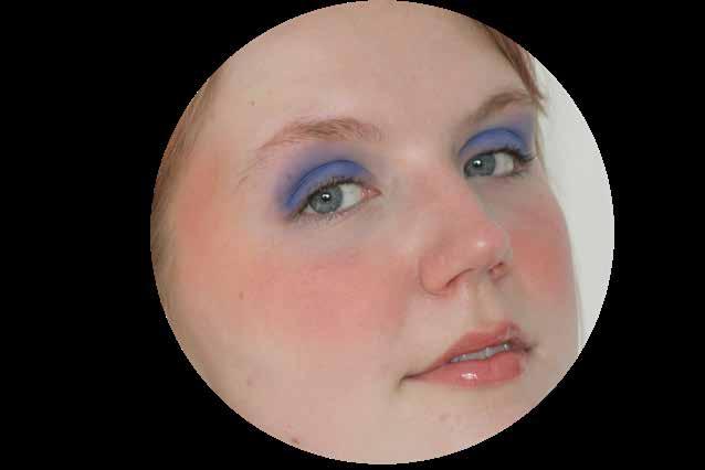
Something Blue
By Mara Hansen, Makeup Director
Whenever I put on makeup, I can still practically hear the advice from teen magazines ringing in my ears : “Makeup should enhance your natural beauty. Never pair a bold eye with a strong lip. Use only a touch of blush to give you a youthful look”
Wait a second. Why are other people deciding what I should do with my own face? Makeup is all about creativity and expressing yourself. It should be a fun process where you can explore what makes you feel the most confident and beautiful.
What I love most about makeup is getting to be radically feminine and to honor beauty icons of the past. This isn't to say that makeup is inherent ly feminine: makeup is for everyone. But for me personally, makeup helps me connect with my gender expression and with women from history. These ideas are what inspired me to wear blue eyeshadow for the first time.
I had always heard that blue eyeshadow was outdated, trashy, tacky, or clown-ish. But then I thought about it more and realized that blue makeup is truly timeless. Although many people relegate blue eyeshadow to being a relic of the 80’s, the shade has been worn throughout history, even dating back to ancient Egypt! Icons from every decade have worn this shade from the original Mattel Barbie in 1959, Twiggie in the 60’s, drag legend Divine in the 70’s, Princess Diana in the 80’s, to supermodels like Kate Moss in the 90’s. Blue eyeshadow has even been making a comeback recently on runways such as New York Fashion Week and on red carpets with the likes of Taylor Swift and Dua Lipa donning the bold hue.
Feeling ready to give blue eyeshadow a try?
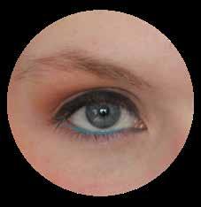
 1 Blue Eyeliner
If you're just dipping your toe into the waters, try adding blue to your waterline! You can accomplish this look by gently pulling your bottom lashes down and running a blue eyeliner pencil along the space between your lashes and your eyeball. If you don't have a blue eyeliner pencil, mixing a bit of blue eyeshadow with setting spray and applying it with a brush will give the same effect. This look is absolutely gorgeous and makes brown eyes especially pop!
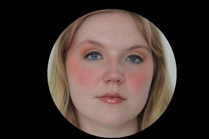
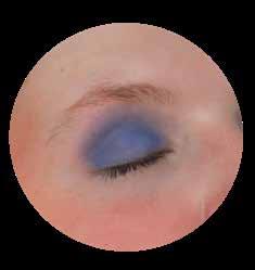
2 Blue Eyeshadow
Feeling a little more bold? Try blending blue eyeshadow onto your lid and crease in a rounded shape. You can choose to blend it out for a more dramatic look or keep it bold and graphic by lining the edges with a darker blue or black. To get the most out of your eyeshadow, make sure to apply an eyeshadow primer or concealer to your eyelid before apply ing eyeshadow to help it stick. This look is simple but an absolute complement magnet!
Rules are meant to be broken, especially when it comes to makeup. It’s a form of expression: there is no right or wrong. Don’t let anyone tell you differently. So wear that “tacky” blue eyeshadow, put on “too much” blush and walk out into the world feeling confident and beautiful.
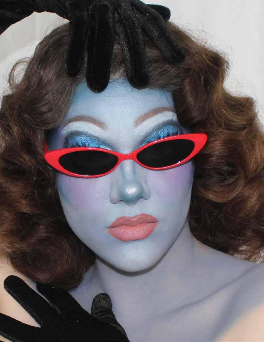
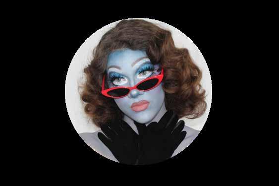
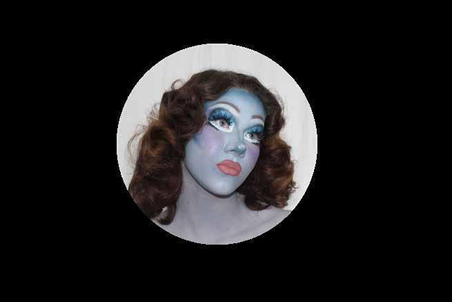
3 Blue Alien Drag
There are truly no boundaries to makeup. Consider this Juno Birch inspired blue alien drag look! After shooting this look, I wore this face out to a performance. I If I can wear blue drag out and about and confuse my Uber driver, surely you’ll have the confidence to try looks 1 or 2!
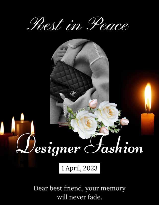
The Death of Designer Fashion
A case for why luxury fashion houses should die along with their namesake ateliers.
By Robyn George, Executive Editor
Dear readers, I have gathered you all here today to
both celebrate the amazing heir of designer fashion and bid adieu to its reign in the apparel industry. Designer fashion was beloved by most and hated by very few. I could go on all day about the number of iconic looks and moments given to us by so-called “heritage” designer brands, from Christian Dior’s New Look and Jean Paul Gaultier’s mesh tops to Schiaperelli’s shoulder pads and Gucci’s logo mania. But alas, the departure from true heritage practices, uninspired design, decrease in quality, and disproportionate price increases have brought us here today to mourn the loss of a once untouchable part of fashion.
I would be lying if I said that I hadn’t foreseen this detrimental event. In fact, one of designer fashion’s founding fathers, Cristobal Balenciaga, prophesied this very moment in his most famous quote:
“A woman of fashion cannot be elegant unless she patronizes a single dressmaker”.
Despite this sentiment, nearly 30 years after the passing of its namesake designer, Balenciaga SA was acquired by the Kering group and deemed a “heritage” brand that would see four different creative directors before the appointment of current lead, Demna Gvasalia. The brand, like many other luxury fashion houses, has undergone a number of rebrands since its founding. It would be impossible to argue that Balenciaga has lost social relevance. However, many fashion consumers, including myself, question just how, and why the culture of this “heritage” brand has evolved from being known as the premier fashion house in terms of timeless designs, tailoring and quality, to being known for its social experiments, media stunts and “trendy” designs.
The answer is clear, “heritage” brands are an illusion; an effect of capitalism. The acquisition of a designer brand to a conglomerate company is the monopoly man’s last grasp at a once flourishing fashion business. But as we all know, businessmen have a terrible sense
of fashion. I mean, surely nobody with a nuanced sense of style would make the workwear standard neutral toned wool suits. . . right? In addition, the genius of Cristobal Balenciaga and other legacy designers can never be replicated. Executives look to fill this gap by hiring designers to carry on production, without ample research or due process needed to create a true “heritage” brand. Surely, Cristobal would not approve of high-heel crocs, trash bag totes and caution tape bodysuits. So, what is a heritage brand without tradition?
Before the assembly line and mass production, clothing was largely bespoke. Designers were successful in being specialists of a particular process, material, or style, desired for their extensive experience and quality of work. Dressmaking maintained elements of domesticity. Fashion “houses” were just that, homes in which clients and the designers themselves visited for fittings. The names of the oldest fashion houses are simply the name of their original dressmaker,
because consumers referred to the individual who designed and constructed the garments. The same cannot be said for the current fashion industry. Today, the role of creative designer at a luxury fashion house is only a throne and a crown, which ambitious designers lust to take and fill in order to rule their kingdoms. Their kingdom is a brand, which they plan to rule most with their liking, giving little thought to those who had previously occupied that space. “Heritage” in fashion is not real: there is no bloodline, only administration. Designer fashion houses were never meant to survive past the lifespan of their founding Atelier.
Their life’s work was once survived by their apprentices, who would go on to create their own fashion houses and acquire their own students. The influence of a mentor’s prestige married evolving styles created by the next generation of
designers. Subsequently, wildly successful fashion houses, empowered by individualism, would emerge alongside those of dressmaking mentors with the mastery of their teachers ever present in traces of quality, technique and silhouette. Previously, the fashion industry was able to maintain its true luxury experience by doing just that. As many of us know, Cristobal Balenciaga tried his best to continue his legacy by mentoring and unofficially keeping Hubert de Givenchy as an apprentice. The success of this dynamic is incredibly clear when comparing designs and creative direction of Givenchy during the designer’s tenure with those produced by Balenciaga SA in the same season. Where Givenchy continued to maintain a balance of tradition and quality with design innovation, looks from Balenciaga became wary of the major influences of creative directors who longed to create their own fashion houses. Yet, for some reason this dynamic has become unpopular among designers, and instead we have
ended up with the current state of luxury fashion which boasts a false sense of quality and attention, despite recycling thoughtless designs, ignoring both financial and physical accessibility, and cutting as many corners as possible in terms of quality materials, craftsmanship, and paying their workers a living wage.
It is important that we fashion enthusiasts and creators remain hopeful about the future of fashion despite this passing. I want to remind everyone about the alternatives to designer fashion and propose a path forward.
The first step in mourning is denial. I, personally, am a huge proponent of living in a state of delusion. Let us deny the passing of designer fashion by opting for counterfeit alternatives. At these times, we can be very grateful and lean on our support system for help, such as DHGate and Canal Street.
The second stage of mourning is anger. Personally, I am not an angry person, but I’m sure that many of those who have
indulged in designer pieces in recent years may feel regret or betrayal from those designer bags. I encourage anyone struggling with anger to find peace by creating a designer-free space. Give your designer pieces to me personally, and I will assure you that they are in good hands.
The third stage of grief is bargaining. I’m honestly not sure what bargaining looks like in this context, but from my experience it would also be helpful to visit canal street for this stage.
The fourth stage of mourning is depression and personally, for this stage, I would recommend Prozac because I have not had much luck with Zoloft, and I found it made me quite tired.
Finally, the last stage of grief is acceptance. Once we accept the death of designer fashion, let us find happiness in what once was, by shopping vintage designer. This way, we can find peace and joy in remembering the good that designers once brought us: quality materials, impenetrable stitching, artisan quality, durability and one-of-a-kind designs.
We can once again keep an idealized and unrealistic memory of designer fashion while ignoring who they became toward the end, like I do when thinking about my ex.
Thank you all again for taking the time to remember the past, present and future of our beloved friend, Designer Fashion.
Directed by: Robyn George and Quintynn Vaughn.
Assisted by: Kaldan Knopp, Zack Zens
Photographed by: Tessa Devine
Modeled by: Brenna Paul, Sydney Taylor Collins and Francis Faye.
Makeup by: Macy Chen
Location and Wardrobe Courtesy of: ReThreads Madison.
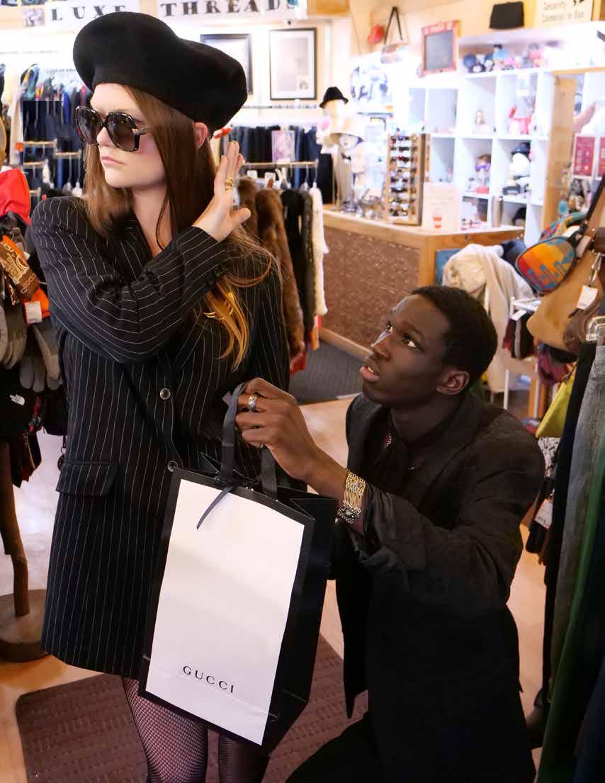
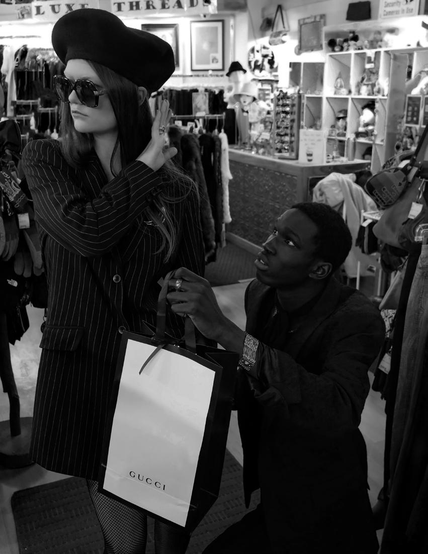
Fakes Facilitate Fashion Future
HOW FAKE BAGS ALLOW FOR ADULTERATION AND INDIVIDUALITY
 By Zack Zens, Deputy Executive Editor
Year after year, legacy designer brands, like Chanel, produce garments which dwindle in creativity and innovation. The only novel interpretations of concept and design come from the adulteration and reinterpretation of those legacy brands through street artists and replica works. Many can remember the prominent resurgence and eventual acknowledgment of the genius creative savant Dapper Dan by the House of Gucci some forty years after his career and namesake boutique began. This monumental lapse in time, even while countless celebrities, such as Jay-Z,Salt-N'-Pepa, and Floyd Mayweather, drummed Dan’s innovative talents, is profoundly constitutive of the predominantly white monoliths of fashion representation that often cast down works which originate from talented artists of color.
the average buyer hoping to take back those antiquated ideas, tear them asunder, and reveal the beauty and inspiration of everyday life in new and exciting ways? In truth, the real change comes from humanity’s familiar and ancient tool: hands.
High fashion and the intricacies surrounding it should not be out of reach for the average consumer. New York City’s annealed Canal Street features hundreds of vendors whose displays of knock-off bags on blankets or foldable tables lay the groundwork for reinterpretation and personalization of nominally out of reach styles.
In more ways than one, the freshest and most exhilarating pieces to come out of brands like Gucci or Louis Vuitton come about expressly because of Black creatives. When artists harness the power of personal experience, street style, and unconventional thinking, a breath of fresh air awakens largely stale silhouettes and styles.

Were it not for Virgil Abloh, streetwear would not be on the runway of every influential high-fashion designer from Chanel to Burberry, brands which, just three decades prior, were known for their stiff and traditional designs. So, where does that leave
Few, if any, people would walk into Bottega Venetta, buy a cool two-thousand-dollar bag, rush home, and begin painting it. However, the same cannot be said for a twenty-dollar Louis tote, and therein lies the epiphany of the knock-offs. Creative expression, like that of Dapper Dan throughout his illustrious career, becomes viable when one can readily access fake bags which are the ideal canvases for new and bold forms of expression. For the up-and-coming designer, these fake bags offer a solid foundation, borrowing silhouettes that were and remain tenants of design in the fashion world and act as a springboard for new creative interpretation, which may, eventually, take the world by storm.
American model Amber Rose wears infamous Sonique Sunday “YFLB Asher” bag (2015).
It must be clear that this is not advocating for the general theft of designs to hurt those who create
Many trends denote actual bags getting stripped and painted, yet this is just the tip of the iceberg as one can bejewel, rhinestone, embroider, crochet, pin, glue, “glitter-fy,” and so much more. The only limits to creative expression and possibility come from the artist themselves and what they so choose to produce. Taking control of the production and design of one’s personal style is a long-standing and ancient human tradition that has been lost due to the rise of consumerism and capitalism which promote blending in and buying goods to fit socie tal standards.
By rejecting these very standards, which often shun fakes and handmade goods, a radical act of protest emerges, taking the power and space to define aesthetics back into the comprehensive control of the individual, often grounding taste and feeling in the location and culture of its origin rather than a homogenized global sense which


Taking a fake piece and elevating it through adulteration, manipu lation, and artistry creates some thing entirely new and even sets the tone for new avenues of design and aesthetic which designers claim to seek.

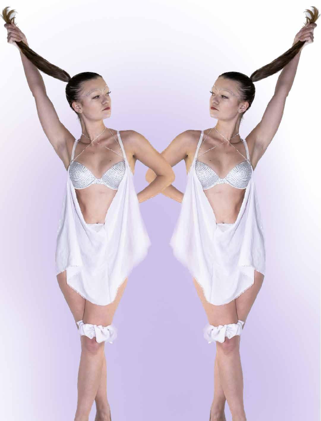
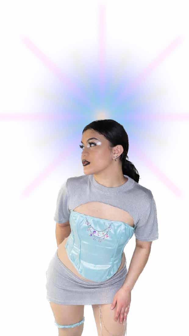
From new fashion campaigns and rockets on runways to the rise of MoonBoots and fresh TikTok trends the “new space age” could be closer than ever and may even be landing this summer. The space age emerged in the mid-60s inspired by the space race and the escapism of the 1950s. Designers like Paco Rabanne and films like Barbarella inspired metallic textiles, mini skirts, and bold silhouettes.
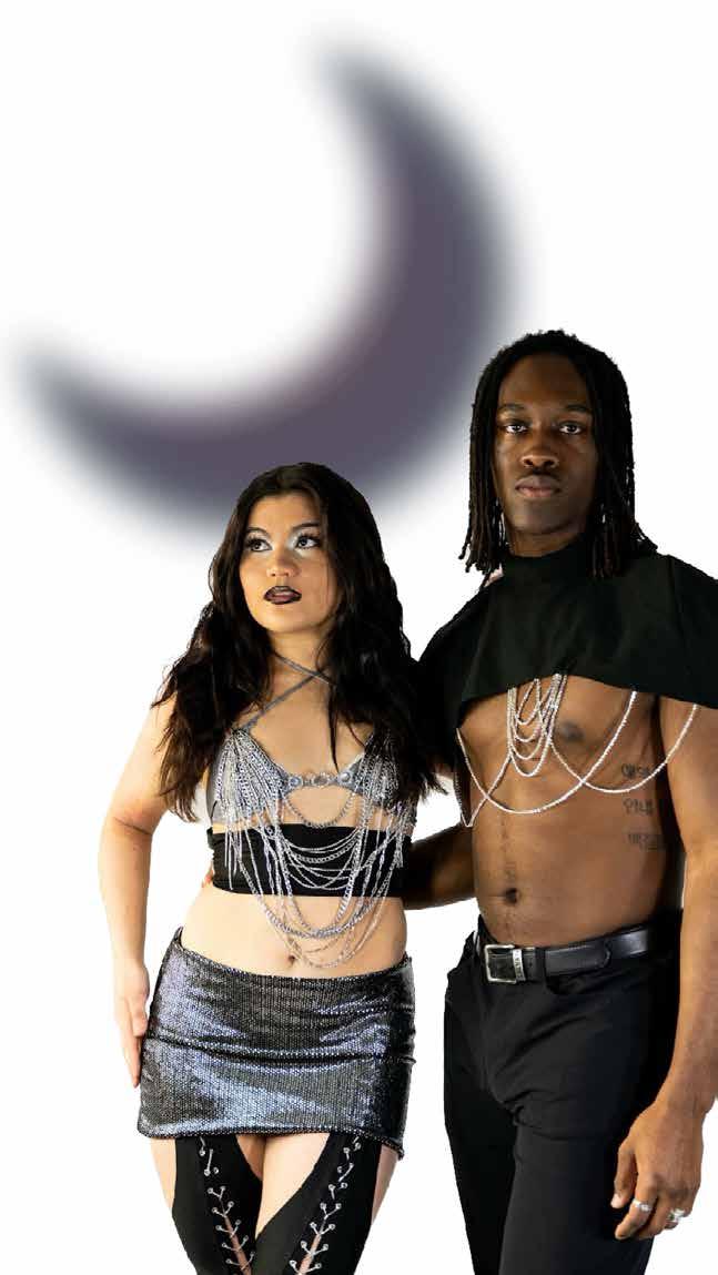
The space age inspires this collection in the context of today. More specifically I drew inspiration from artists such as Drag icon Trixie Mattel with her campy 60s glam and music like “Video Killed the Radio Star” and “Starman.” Every piece of material used in the making of this collection was second-hand, and I aimed to combine metallics and colorful fabrics as well as layering silhouettes that can be mixed and matched on any body. I added signature QSM touches like lace-ups chaps, shoulder shirts, garters, and shaped cutouts.
 Modeled by: Zayaan Alamgir, Mara Hansen, Noah White, Sydney Collins, Mia Staszcuk.
Photographed by: Ben Yeiser
Directed by: Mia Staszcuk
Outfits by: QSM Designs
Modeled by: Zayaan Alamgir, Mara Hansen, Noah White, Sydney Collins, Mia Staszcuk.
Photographed by: Ben Yeiser
Directed by: Mia Staszcuk
Outfits by: QSM Designs
In this piece I wanted to expand on the concept of creating a visual representing exterior and interior. With that in mind, I was trying to think of objects that share this idea in the real world. I connected this idea to crystals, how their form includes and interior and exterior. Thinking about different crystals and their meanings, I landed on Amethyst, my birthstone because of its significance. After choosing Amethyst, I wanted to play into the purple of the piece and create an abstracted formation of different layers the crystal showing its interior and exterior qualities. Having previously wanted to create a monochromatic piece, I let that concept lead me to the development of the work.
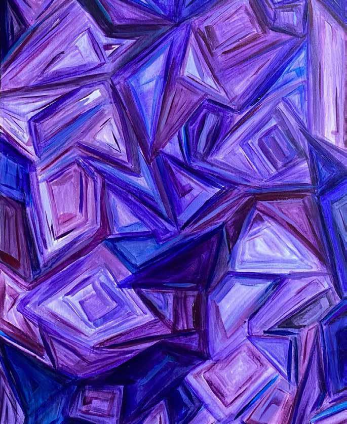 Amethyst (2022)
Brianna Stehling Santacruz
Amethyst (2022)
Brianna Stehling Santacruz
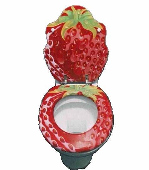
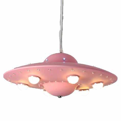
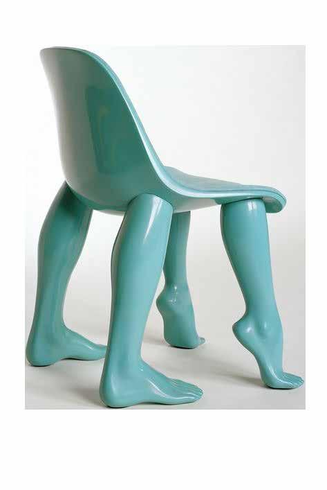
NO MORE IKEA MALM
How gen-Z is revolutionizing the furniture and home decor industry with maximalism.
By Quintynn Vaughn, Events Coordinator
Each generation has a color: Boomers were neutrals, Gen X was basics, Millen-
nials were Millennial Pink, and Gen Z is bright yellow. Over the past century, each generation has witnessed a series of historical events and technological advances that have made the differences between generations more stark than ever before. While a couple decades ago, it was uncommon for one to identify strongly with the time period in which one was born, modern day youth heavily define themselves based on their generation. It's important to understand why Gen Z and Millennials feel that they are so different from the elders because it demonstrates how much progress and change has happened in the past few decades.
The different identities of each generation are historically and culturally complex. To understand a generation and the point of view of the world and the future that is shared by its members can be attributed to the circumstances at play during the first 15-20 years of the lives of the members. Hillary Hoffower of Business Insider writes that “It's typical for the economy to affect consumers' color choices. During a recession, they seek out familiar and reassuring colors like browns, neutrals, and blacks.” She continues by discussing how when the economy is strong, there is more hopefulness for the future and bright colors and neons tend to resurface. Recently, these identities have been reduced down, for simplicity's sake, to a color that represents each generation - Gen Z yellow and Millennial Pink being the most iconic examples of this phenomenon.
Millennials associated with the subdued pastel pink that later came to be defined as millennial pink. This color and its muted tones in many ways represents the generations’ favor of minimalism which was seen everywhere in the early 2010’s as Millennials moved away from home and started decorating their living spaces. In fact, minimalism was not just a trend during this time, it took over the fashion industry, social media, the marketing industry, and decor and furniture companies everywhere.
Following the Covid-19 Pandemic, the world underwent a massive shift that integrated the extreme use of technology in every aspect of human life. This time period and the increased usage of social media while everyone was at home during quarantine allowed for and inspired great social change that many would argue was long overdue. These events in addition to the fact that today's youth grew up in a post-9/11 and post-2008 recession world caused this generation, Gen Z, to be defined by a desire to implement change and a hopefulness for the future all through the lens of the new digital world. Gen Z’s individualistic attitudes have also contributed to the defining of the bright colors they are attracted to. Angelica Ray of FastCompany.com writes that “Gen Z has adopted a distinct palette that has one foot in techno-nostalgia and another in the aesthetics of the current digital world. It’s a preference that’s seeped from viral social media campaigns into Gen Z-focused brands, and finally into the mainstream for everyone else to consume”
Therefore, bright yellow emerged as Gen Z’s color.
As this generation moves out of their family homes and starts to purchase furniture and decor for their new living spaces, the furniture market has had to accommodate the overwhelming demand for exciting and out of the box pieces that are colorful and eye-catching. In addition to furniture, marketing campaigns, fashion, television shows, movies, everyday products, and more has had to change to incorporate bright, jaw dropping, attention grabbing aspects of their products in order to reel in this new generation of consumers.


As this generation’s desire for minimalistic and out of this world products continues to dominate the consumer industry, all of America will continue to shift towards maximalism and its overwhelming call for the extreme as Gen Z continues to call for radical change and begins to enter the workforce with beautiful and bright hopes for the future.

1https://www.fastcompany.com/90865212/once-you-spot-gen-zs-favorite-colors-youll-see-them-everywhere 2https://www.businessoffashion.com/articles/beauty/why-gen-z-yellow-will-never-be-millennial-pink/ 3https://www.businessinsider.com/millennial-pink-gen-z-yellow-very-peri-orchid-flower-generational-colors-202 2-1
WE'VE BEEN LOOKING FOR SOMEONE JUST LIKE YOU.

JOIN THE NEWEST STUDENTRUN PUBLICATION ON CAMPUS.

ON INSTAGRAM
@THEISSUEUW
