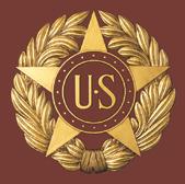
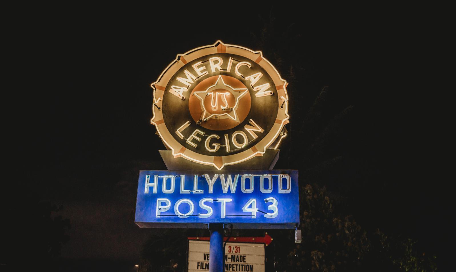
Created in 1919 by Eric Fisher Wood, every part of The American Legion emblem carries deep meaning.
It rests on the rays of the sun; a symbol of life, warmth, courage, and the enduring fight against fear and darkness. Each element of the emblem represents values that every Legionnaire should understand and uphold from the moment they first wear it.
The star stands for constancy of purpose, just as the stars remain fixed in the sky; a reminder that The American Legion must stay true to its mission. The words “The American Legion” call on every member to protect the sanctity of home, country, and free institutions.
This emblem is more than a symbol — it is a badge of pride, honor, distinction, and service.
The rays of the sun form the background of the emblem and suggest the Legion’s principles will dispel the darkness of violence and evil.
The larger of the two outer rings signifies the rehabilitation of our sick and disabled comrades. The smaller inside ring denotes the welfare of America’s children.
The words “American Legion” tie the ring together for truth, remembrance, constancy, loyalty, honor, service, veterans affairs and rehabilitation, children and youth, national security and Americanism.
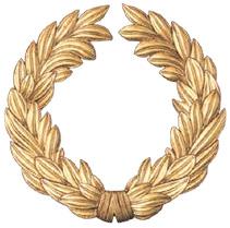
The wreath forms the center, in loving memory of those brave comrades who gave their lives in the service of the United States that liberty might endure.
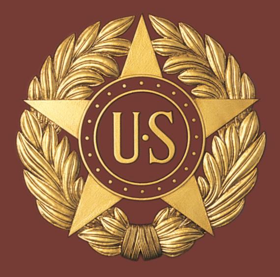
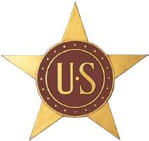
The smaller of two inner rings set upon the star represents service to our communities, states and nation. The larger outer ring pledges loyalty to Americanism.
The star, victory symbol of World War I, symbolizes honor, glory and constancy. The letters “U.S.” leave no doubt as to the brightest star in the Legion’s constellation.
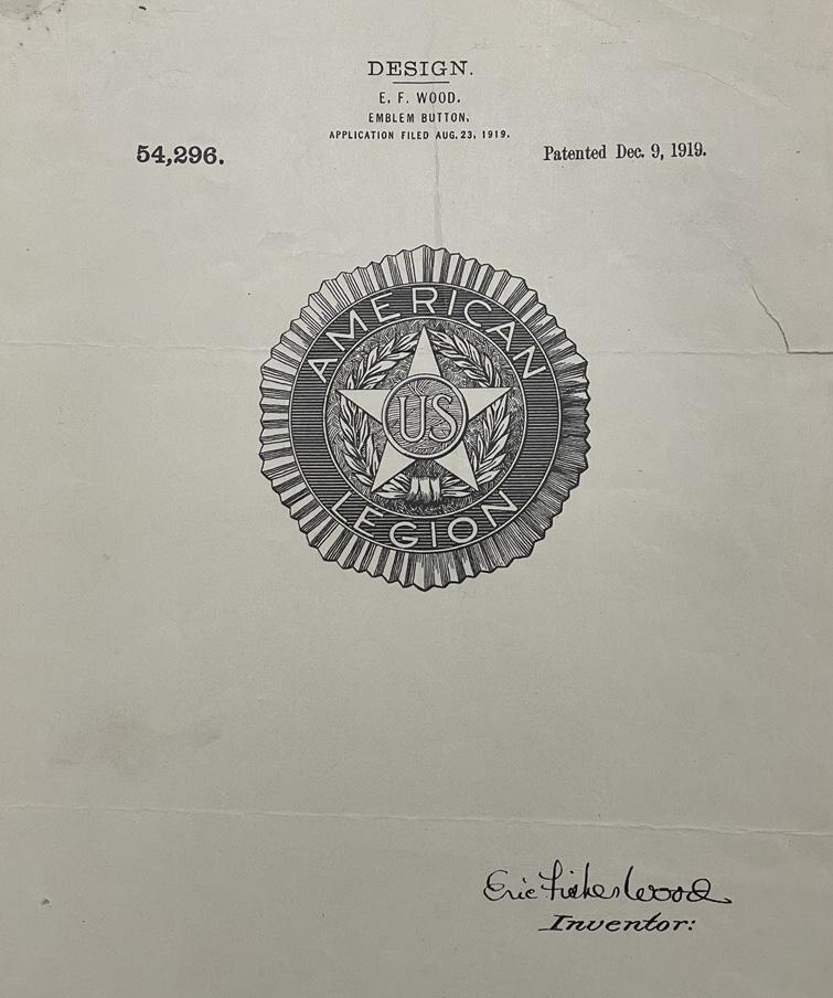
Original Patent Application for The American Legion Emblem Button, August 23, 1919, Patented December 9, 1919
The American Legion brandmark was created to address the need to modernize our brand to appeal to the next generation of veterans. Moreover, the new brandmark takes into consideration a host of applications that the original emblem could never have anticipated. Those include online and social media, event and sports marketing, lifestyle apparel and more.
The new brandmark does not replace the emblem. Instead, the emblems and the brandmarks alike are to be used in specific applications that will better serve The American Legion going forward.
The American Legion emblem, designed in 1919, uses a bold, geometric sans-serif style typical of its time: clear, structured, and built for visibility. While the exact typeface isn’t known, it closely resembles early 20thcentury fonts like Akzidenz-Grotesk (1898) and Franklin Gothic (1902), which were commonly used in military and public service materials for their legibility and modern feel.
The two main fonts represented in the American Legion brandmark and sub-branding, Rexton Medium and Futura PT, carry that same spirit forward. Futura, created in 1927, was part of a design movement focused on simplicity and function, and it shares many of the same qualities as the original emblem’s lettering. Rexton Medium, used in the marketing brandmarks, builds on that legacy with a more contemporary tone while still honoring the geometric roots.
This continuity in style helps bridge the Legion’s historic identity with its modern voice. By pairing the traditional emblem with fonts like Futura PT, the brand stays visually consistent while signaling its relevance to new generations.
Development of The American Legion brandmark followed a deliberative three-month journey to understand the origins of the Legion, its role in American society and the people who are, and will be, its members. This process involved several focus groups as well as an in-depth audit of the emblem and how it is used throughout the organization.
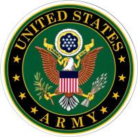
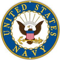
other veterans organizations, corporate brands and the Department of Defense were also benchmarked. In the process, a precedent established by the Department of Defense (DoD) served as a model for how the Legion brand could evolve.
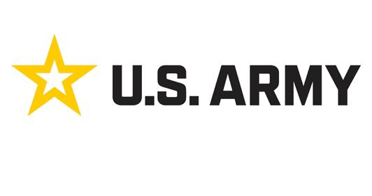
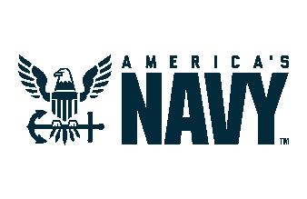
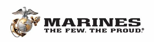
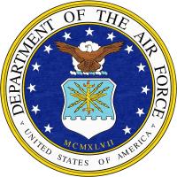
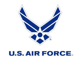
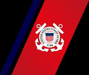
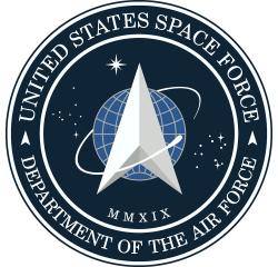
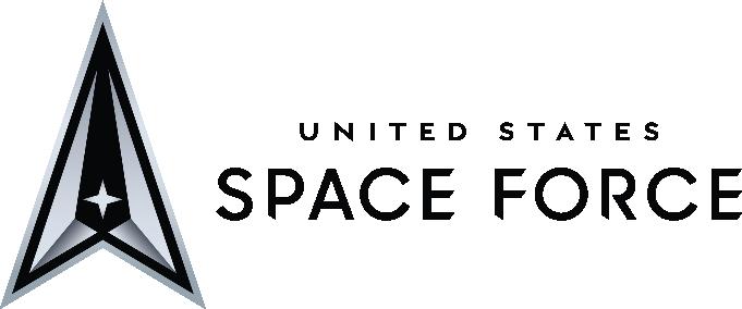
Each department of the U.S. Armed Forces effectively utilizes two separate identities. one is the “department seal” and the other is its own brandmark. The department seal is used for all DoD documents, communications and identifying marks. However, when it comes to marketing communications for events, recruitment and other promotional functions, each department has a marketing brand. It is this marketing brand that is most familiar to the general public.
Examples of each U.S. Armed Forces department and its respective marketing identity is shown to the left.
THESE GUIDELINES PROVIDE DIRECTION ON WHEN TO USE THE BRANDMARK OR THE EMBLEM.
While most uses will fall clearly into one category or the other, some situations may not be as straightforward. In those cases, consider the primary audience and the purpose of the communication when deciding which to use.
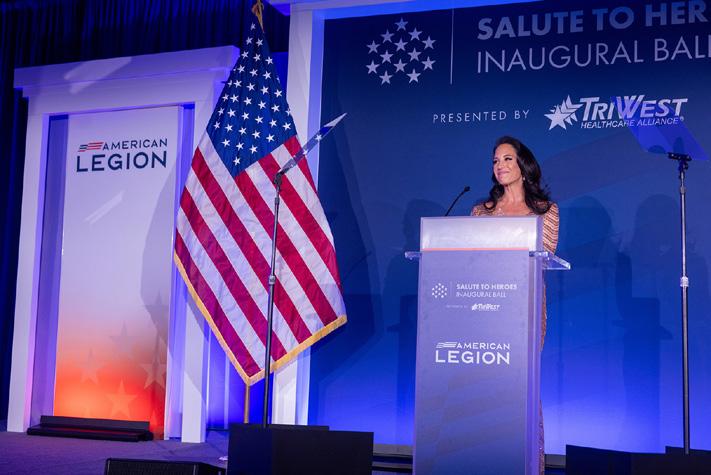
Use the brandmark for materials aimed at external audiences, particularly for marketing, recruitment, and fundraising. It’s best suited for promotional, publicfacing communications designed to engage or inform.
Use the emblem for internal, official, or ceremonial contexts, especially where the organization’s legal, historical, or institutional identity is being emphasized. In certain formal situations, such as awards, building signage, or government communications, either the brandmark or emblem may be appropriate, depending on tone and audience.
When in doubt, please reach out for guidance. Contact information is on Page 25.
Marketing, recruiting, & fundraising uses, such as:
• Advertising
• Apparel & merchandise
• New building signage
• Business cards
• Event invitations (public-facing events)
• Brochures or membership packets
• Community partnership materials
• Credentials (for external events or public access)
• Digital applications (apps, website, social media, email newsletters, PowerPoint presentations)
• Donor recognition displays (public-facing)
• Email campaigns (for fundraising, outreach, or events)
• Event signage and materials (signs, backdrops, tents, tablecloths, swag/giveaways, flags, banners)
• Marketing and recruitment presentations
• Media/press kits or press releases
• Newsletters (external)
• Promotional communications (flyers, handouts, etc.)
• Promotional videos or PSAs
• Public-facing annual reports
• Social media profile imagery
• Vehicle signage (wraps, decals or magnets)
• Volunteer and donor recognition items
• Website content and features
Internal, official, legal, ceremonial uses:
• Certificates (official recognition, service, or retirement)
• Ceremonial uniforms, pins, patches, insignia, or flags
• Financial documents
• History books or heritage publications
• Internal-facing newsletters or bulletins
• Legal affairs materials
• Meeting agendas, minutes, and voting materials (official proceedings)
• Memorial or tribute materials (e.g., ceremonies, remembrance programs)
• organizational charters or bylaws
• Reports and resolutions (internal or formal governancerelated)
• Seals on plaques or certificates
• Uniform caps
While most uses will fall clearly into one category or the other, some situations may not be as straightforward—either the brandmark or emblem may be appropriate, depending on tone and audience.
In those cases, consider the primary audience and the purpose of the application when deciding which to use.
When in doubt, please reach out for guidance. Contact information is on Page 25.
• Awards (internal and external recognition)
• Building signage (some Legion buildings have existing historical signage, for example)
• Credentials (internal security VS. public event access)
• Event badges (official meetings VS. marketing events)
• Some government communications (depends on event tone and audience)
• Stationery for board members or executive correspondence
• Challenge coins (emblem for tradition, brandmark for modern tone)
• Partnerships, MoUs or joint statements
• Public-facing gala or ceremony programs
• official meeting materials (if shared externally or in government settings)
Use the primary brandmark whenever possible, especially on white or light-colored backgrounds that offer sufficient contrast to ensure the mark remains clear, legible, and visually prominent.
Using this version helps maintain consistency and reinforces brand recognition across all materials.
If the background is too dark or visually busy, consider the secondary or alternative versions to preserve visibility and impact.
The primary brandmark is available in CMYK, RGB, and Spot/Pantone color versions.
EMBLEM BLUE
PANToNE 541 C
C:100 M:57 Y:0 K:38
R:0 G:70 B:127
HEX # 00467F
POPPY RED
PANToNE 200 C
C:0 M:100 Y:96 K:28
R:181 G:18 B:27
HEX # B5121B
Keeping clear space around the brandmark free of other design elements is vital to ensure the integrity of The American Legion brandmark.
The clear space should be the same as the width of the “L” that appears in the brandmark, as seen below.
The secondary brandmark is the one-color version in either black or white.
This version should be used when a clean white or light gray background is not available.
Keeping clear space around the brandmark free of other design elements is vital to ensure the integrity of The American Legion brandmark.
The clear space should be the same as the width of the “L” that appears in the brandmark, as seen below.
This version of the brandmark should only be used on complex backgrounds where the primary and secondary brandmarks cannot be used.
The alternate brandmark is designed with a container shape and white fill, to be used in any circumstances where the primary or secondary brandmarks are unsuitable due to background noise, insufficient color contrast or to maintain the color equity of the brandmark on a contrasting color application.
Preference should always be given to the primary or secondary brandmarks.
This mark is not permitted for embroidery purposes.
Keeping clear space around the brandmark free of other design elements is vital to ensure the integrity of The American Legion brandmark.
The clear space should be the same as the width of the flag symbol that appears in the brandmark, as seen below.
When using the emblem, the full-detail version should be used whenever possible and in a size that ensures all parts of the emblem remain clear, legible and visually prominent.
Using this version helps maintain consistency and reinforces brand recognition across all materials.
When limited by sizing or printing process, there are other versions of the emblem that can be used in its place.
The two main colors of focus for the emblem are Emblem Blue and Riders Gold, though the full detail version of the emblem contains additional colors for enhanced visual impact and depth.
EMBLEM BLUE
PANToNE 541 C
C:100 M:57 Y:0 K:38
R:0 G:70 B:127
HEX # 00467F
RIDERS GOLD
PANToNE 1245 C
C:0 M:28 Y:100 K:18
R:214 G:165 B:41
HEX # D6A529
The emblem should always be rendered with a white outline around the edge to ensure the visual integrity of the rays of the sun when on colored or complex backgrounds.
For some applications, such as embroidery on caps and uniforms, the white outline is not necessary. When in doubt, please reach out for guidance. Contact information is on Page 25.
Keeping clear space around the emblem free of other design elements is vital to ensure its integrity.
The clear space should be the same as the height of the peaks of the star, as seen to the right.
Use this version of the emblem when a size or printing technique might render parts of the full-detail version of the emblem unclear, illegible or otherwise visually disfigured.
Using this simpler version will help maintain consistency and reinforce brand recognition across all materials.
The two main colors of focus for the emblem are Emblem Blue and Riders Gold, though the CMYK line art version of the emblem contains additional colors for enhanced visual impact and depth.
PANToNE 541 C
C:100 M:57 Y:0 K:38
R:0 G:70 B:127
HEX # 00467F
PANToNE 1245 C
C:22 M:42 Y:100 K:2
R:200 G:145 B:18
HEX # C89212
The emblem should always be rendered with a white outline around the edge to ensure the visual integrity of the rays of the sun when on colored or complex backgrounds.
For some applications, such as embroidery on caps and uniforms, the white outline is not necessary. When in doubt, please reach out for guidance. Contact information is on Page 25.
Keeping clear space around the emblem free of other design elements is vital to ensure its integrity.
The clear space should be the same as the height of the peaks of the star, as seen to the right.
Use this version of the emblem whenever a “spot” color print process is required.
Using this version helps maintain consistency and reinforces brand recognition across all materials by ensuring precise matching with Pantone spot colors.
The emblem should always be rendered with a white outline around the edge to ensure the visual integrity of the rays of the sun when on colored or complex backgrounds.
For some applications, such as embroidery on caps and uniforms, the white outline is not necessary. When in doubt, please reach out for guidance. Contact information is on Page 25.
Keeping clear space around the emblem free of other design elements is vital to ensure its integrity.
The clear space should be the same as the height of the peaks of the star, as seen to the right.
Use this version of the emblem whenever a black and white print process is required.
Using this version when only able to print in black and white helps maintain consistency and reinforces brand recognition across all materials.
The emblem should always be rendered with a white outline around the edge to ensure the visual integrity of the rays of the sun when on colored or complex backgrounds.
For some applications, such as embroidery on caps and uniforms, the white outline is not necessary. When in doubt, please reach out for guidance. Contact information is on Page 25.
Keeping clear space around the emblem free of other design elements is vital to ensure its integrity.
The clear space should be the same as the height of the peaks of the star, as seen to the right.
DON’T CHANGE ANY COLORS
Use only the approved color versions of the brandmark or emblem. Custom or alternate colors are not allowed.
DON’T USE THE BRANDMARK AND EMBLEM TOGETHER
To maintain consistency, use either the brandmark or the emblem in a layout, not both.
DON’T ADD OUTLINES OR BORDERS
The brandmark should appear on its own, without strokes, borders or decorative lines.
DON’T STRETCH THE BRANDMARK OR EMBLEM
Maintain the original proportions. only scale uniformly.
USE ONLY APPROVED COLORS
CHOOSE EITHER THE BRANDMARK OR THE EMBLEM, NOT BOTH
PRESENT THE BRANDMARK CLEANLY WITHOUT ADDED OUTLINES

SCALE THE BRANDMARK OR EMBLEM PROPORTIONALLY

DON’T RECREATE OR REDRAW THE BRANDMARK OR EMBLEM
Always use the official files provided. Do not redraw, trace or approximate the brandmark or emblem.
DON’T REARRANGE OR RESIZE PARTS
All elements of the brandmark and emblem must remain in their original positions and scale.
DON’T USE INDIVIDUAL PARTS ON THEIR OWN
The brandmark and emblem must be used as complete units. Do not separate or isolate individual elements.
DON’T ADD OR REPLACE ANYTHING INSIDE THE BRANDMARK OR EMBLEM
Do not add or replace any fonts, text, icons or graphics within or touching the brandmark or emblem.
USE ONLY OFFICIAL BRANDMARK OR EMBLEM FILES
MAINTAIN ORIGINAL ARRANGEMENT AND SCALE OF ALL ELEMENTS
USE THE BRANDMARK AND EMBLEM AS COMPLETE UNITS
KEEP THE BRANDMARK AND EMBLEM INTACT
DON’T USE ON BUSY OR COMPLEX BACKGROUNDS
Always place the brandmark on a clean background with enough contrast to ensure legibility. For busy or complex backgrounds, use the alternate brandmark.
DON’T PUT IT INSIDE A SHAPE
Avoid placing the brandmark within circles, boxes or other graphic containers.
PLACE THE TERTIARY BRANDMARK OR EMBLEM WITH WHITE OUTLINE ON COMPLEX BACKGROUNDS
DISPLAY THE BRANDMARK OR EMBLEM WITHOUT CONTAINING SHAPES*
*Unless using the approved tertiary version of the brandmark for complex backgrounds.
DON’T PLACE TOO CLOSE TO OTHER LOGOS
Follow clear space requirements for brandmark and emblem to maintain visual clarity and brand presence.
DON’T IMITATE THE BRANDMARK STYLE
Avoid replicating the brandmark’s typography or styling to create new words or designs.
RESPECT CLEAR SPACE AROUND THE BRANDMARK AND EMBLEM
KEEP THE BRANDMARK STYLE UNIQUE
DON’T USE VERSIONS OF THE MARK THAT CAUSE POOR CONTRAST AND VISIBILITY
Do not use versions of the brandmark on too light a background or the black version over too dark a background.
ENSURE VISIBILITY WITH PROPER CONTRAST
Make sure you use the correct version of the brandmark to achieve the most contrast to ensure excellent visibility.
EMBLEM BLUE
PANToNE 541 C
C:100 M:57 Y:0 K:38
R:0 G:70 B:127
HEX # 00467F
POPPY RED
PANToNE 200 C
C:0 M:100 Y:96 K:28
R:181 G:18 B:27
HEX # B5121B
RIDERS GOLD
PANToNE 1245 C
C:22 M:42 Y:100 K:2
R:200 G:145 B:18
HEX # C89212
SONS BLUE
PANToNE 3005 C
C:100 M:46 Y:2 K:0
R:0 G:119 B:200
HEX # 0077C8
LIGHT BLUE
PANToNE
C:4 M:2 Y:0 K:2
R:245 G:248 B:250
HEX # F5F8FA
LIGHT GRAY
PANToNE
C:0 M:0 Y:0 K:4
R:245 G:245 B:245 HEX # F5F5F5
FAMILY PURPLE
PANToNE 2593 C
C:65 M:95 Y:2 K:0
R:128 G:53 B:145
HEX # 803591
These colors are listed for vendor reference only, and are not to be used other than in the PANToNE/ Spot Color Emblem.
EMBLEM GOLD
PANToNE 116 C EMBLEM BRONZE
PANToNE 469 C
The typeface used in The American Legion’s brandmark is a customized version of Rexton Medium. This font was carefully chosen and modified just for our official brandmarks.
To protect the integrity of the brand, Rexton should only be used in those official brandmarks and wordmarks. Using it anywhere else in a design, such as in headlines, body text or sub-brandings is not permitted.
The typeface that best complements the brandmarks of The American Legion Family is Futura PT – a widely available font that will be accessible to any professional designer with an Adobe Creative Cloud license.
ABCDEFGHIJKLMNOPQRSTUVWXYZ
abcdefghijklmnopqrstuvwxyz
1234567890 !@#$%^&*()_+-=[]{};:’”,.<>/?
In cases where Futura PT is not an option, Avenir Next should be used. Avenir Next is included with Microsoft office and will be available in most professional settings.
ABCDEFGHIJKLMNOPQRSTUVWXYZ
abcdefghijklmnopqrstuvwxyz
1234567890 !@#$%^&*()_+-=[]{};:’”,.<>/?
When selecting a font for body copy, choose a font with good readability that works well with Futura PT or Avenir Next.
Suggested options:
• Proxima Nova (Adobe Fonts)
• Aptos (available with Microsoft products)
• Helvetica
(GOOGLE FONTS)
Suggested options:
• Inter
• Roboto
• Noto Sans
When you receive branding artwork, it typically comes as a full suite of files to ensure it looks great wherever it’s used, whether that’s online, in print, or on merchandise.
These suites include every officially approved color variation of the brandmark and emblem. Each variation is provided in multiple file formats and resolutions, each designed for specific uses.
Below is a quick guide to the different file types you might see and what they’re best suited for.
.eps for vendors – a universal vector art file type for highest quality reproduction in print
.png for digital applications on any background or lower resolution document print use (transparent background)
.pdf for higher quality document print use
To get access and approval for use, please fill out the form located at: https://www.legion.org/brand/
For any additional brand-related questions, please contact the American Legion Marketing Division at: 317-630-1398 marketing@legion.org