AMA Newspaper

Page 1


The Graphic Design House GOOD NEWS

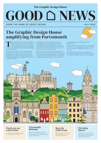
The Graphic Design House amplifying from Portsmouth

This year’s AMA theme, Amplify, couldn’t be more relevant. But for us, it’s never been about cranking the volume for the sake of it. Design brings structure to the story so it can be heard clearly, helping the right messages rise above the rest.

At The Graphic Design House, we believe good design doesn’t just shout, it connects. It finds the signal in the static. It gives shape, style and, strength to ideas worth hearing. Because when something’s designed well, people don’t just notice it, they remember it.

Unfortunately, we weren’t able to join you in Edinburgh this year, but we’re still tuned in to what’s going on. This newspaper is our way of joining the conversation from afar, a creative echo from Portsmouth, filled with the same spark we bring to our studio work every day.

We’ve always loved what the AMA conference stands for, a chance to step away from the day-today, swap ideas, and find inspiration in unexpected places. Whether we’re there in person or sending something through the post, it’s about showing

up, staying curious, and being part of the bigger picture.

So while our stand may have been missing (sadly, no sticks of rock or seaside fact cards), we were with you in spirit, turning up the volume in our own way.

This paper is our amplifier. A snapshot of the creativity, thinking and care we bring to the work we do and the people we do it for. Please enjoy!

How NAM’s ‘Muster’ Magazine got a Major Design Reboot.

When the National Army Museum (NAM) unveiled its striking new brand identity, it sparked a realisation; its member and visitor magazine, Muster, no longer measured up. It was ready for the next stage in its evolution - a redesign that could fully harness the creative potential of NAM’s new brand identity.

Enter The Graphic Design House. We were brought on board to reimagine Muster as a magazine that would not only do justice to NAM’s new look but also connect more deeply with both military history enthusiasts and the culturally curious.

The brief was clear. Retain the integrity of the museum’s new visual identity, but push the design into more editorial, high-end territory. TGDH proposed two creative routes, both rooted in NAM’s brand toolkit, with a standout new masthead as the centrepiece commanding attention from the front cover onwards.

While early concepts leaned into a more vibrant colour palette, client collaboration steered the design toward a more pared-back but still visually rich approach. This balance struck the right chord between accessibility, brand consistency, and impact.

Typography and layout were overhauled to create a strong hierarchy and seamless reading experience. Hero images were given space to breathe and tell a story, while content blocks were structured to guide readers intuitively through features, interviews, and museum updates.

The result? A polished, professional-grade publication that now matches NAM’s status as a leading cultural institution. More than just a cosmetic upgrade, the redesigned Muster plays a pivotal role in deepening audience engagement and supporting the museum’s strategic goals, from growing membership to reinforcing its authority in the sector. It’s a reminder that good design doesn’t just look the part. It works harder, says more, and earns its place as part of the brand experience.

Read the full story here. Or to find out more call Laura Bray on 023 9233 4971

Heritage Meets Elegance: Our Work with Jersey Opera House

After five years behind closed doors and a £12.5 million refurbishment funded by the people of Jersey, the island’s much-loved Opera House has reopened - restored, revitalised, and ready to take centre stage once again.

A cultural cornerstone for 125 years, the venue has hosted everyone from local performers to international touring acts. Its very first performance starred the legendary ‘Jersey Lily’ Lillie Langtry, and its impact on the island’s artistic life is hard to overstate. So, when we were asked to design and print the special anniversary programme for a high-profile fundraising event, we knew the stakes were high.

The twist? The venue hadn’t yet unveiled its new brand, but didn’t want to use its previous identity either.

Enter our Creative Lead, Mark Gee, who took on the challenge and delivered a solution that’s as elegant as it is enduring. Inspired by the Opera House’s iconic chandelier, the final piece nods to the venue’s heritage while subtly hinting at the new branding still to come. Something refined enough for VIP guests to keep, yet versatile enough to sit comfortably alongside the brand’s next chapter.

It’s been a privilege to play a small part in such a landmark moment, and we send our congratulations to everyone who brought this beautiful building back to life. We’re excited to see the curtain rise on the new season this September and to continue supporting the Opera House on its next act.

Spotlight on Rachel TGDH Team News

Business Development Executive

I’ve spent most of my career working for creative agencies of one kind or another, including a literary agency and social media company, but I had taken a step away to work in the charitable sector. I missed the buzz of agency life, and the variety of projects that come through TGDH’s doors means that I’m always learning.

I’m a great communicator and take a passionate interest in my clients. I could talk your ear off about all the amazing things I learned on my visit to The Henry Moore Sculpture Gardens!

What made you chose to work at TGDH? What Skills do you bring to TGDH? Who would be your dream client and why?

I would love to work with Dr Martens (not least because I’m a fan and own several pairs!) but because it’s really impressive that they manage to stay true to their subcultural roots while being a huge international brand.

us 2 truths and 1 lie:

I was Caliban in a school production of The Tempest, Martin McDonagh once bought me a G&T, and my grandad was 6ft 9 inches.

Turn to the back page for the answer!

Last year, you may remember that we reported on Lead Digital Designer Tom Shave’s wedding to his childhood sweetheart, Lucy. This year, we’re delighted to announce that the celebrations are continuing as they prepare to welcome their first baby - a boy - in the autumn. Huge congratulations to the soon-to-be parents!

DON’T JUST TAKE OUR WORD FOR IT

I reconnected with The Graphic Design House at the 2024 AMA conference. The materials I was given stood out as being fun & different (the seaside fact cards are actually on our wall in the office!). We had recently relaunched our full venue brochures and had some teething problems so after a chat with TGDH, we decided to switch to them for the next brochure. I’m pleased to say we’re about to start work on our fourth brochure with them which speaks for itself! The team are lovely & always on hand to advise, explain and help. Our printing, data and distribution is in safe hands so would highly recommend.

BIC | Bournemouth Pavilion | Fairfield Halls

Working with The Graphic Design House was a great experience – very straightforward and they seamlessly met our deadlines. We had regular communications from the team which resulted in a very slick, on-brand design for our annual review infographics. We received great feedback on how effectively the information was presented.

Rebranding Without the Clichés:

Circomedia’s Identity Gets a Bold New Balance

For over 30 years, Circomedia has championed contemporary circus and physical theatre, but its brand hadn’t kept pace. With a new generation of performers and students looking for training that feels as current as it is rigorous, the Bristol-based organisation knew it was time for change.

Circomedia turned to The Graphic Design House to refresh its identity - not with gimmicks or circus tropes, but with thoughtful design that reflected its vibrant community, bold creative ethos, and forward-thinking mission.

Our brief? The new brand needed to be energised but cohesive, modern but recognisable. It also had to work hard across everything from digital marketing to internal comms and crucially, it would make its first major appearance in the organisation’s redesigned prospectus.

Through close collaboration with Circomedia’s team, we focused on three core elements: logo, colour palette, and typography. The logo became a point of healthy debate within the organisation. Evolve the existing one or start fresh? We explored both routes, ultimately landing on bespoke letterforms that modernised the wordmark while keeping a visual thread to the brand’s heritage. A more abstract, icon-led option was also introduced for flexibility across channels.

Colour was key to this transformation. The old palette relied heavily on monochrome photography and dark tones. We developed a brighter, more dynamic colour system that was bold enough to convey the energy of Circomedia’s training and performances

yet structured enough to ensure clarity and accessibility.

Typographic consistency was another priority. With no set brand fonts previously, communications had become inconsistent. We introduced a tight set of three free-touse, legible, and characterful typefaces that could flex between digital and print, headings and body copy, all while improving access and cohesion.

To support long-term implementation, we delivered a brand guideline sheet that Circomedia’s team could use and build on independently. And then came the real test: applying the refreshed identity to the new student prospectus. The result? A striking, dynamic publication that embodies the organisation’s spirit and speaks directly to prospective students. It’s more than a recruitment tool - it’s a confident expression of who Circomedia is and where it’s headed.

This project underscores the power of branding done right: clear, collaborative, and purpose-led. For arts organisations like Circomedia, it’s not about reinventing who you are – it’s about helping the outside world see what was there all along.

Want to see more?

Find out why theatres work with us.

“I personally go back to TGDH time and time again because I trust that their team want the best for their clients and genuinely understand the needs of arts organisations and charities. TGDH always go out of their way to provide creative solutions that work for everyone – from large venues to small charities with limited resources and big ambitions!”

6 months to Christmas and counting...

“Oh

no it

isn’t. Oh yes it is!”

We love the festive lead-up to Christmas, especially when panto season takes centre stage. Our studio has a wealth of experience creating all the elements you need to market your show. Roll-out is our speciality! From animated title treatments and glittery direct mail to funfilled programmes packed with games and activities to keep your audiences engaged.

Shall we see if the slipper fits? Check out our theatre showreel.

Special Offer

10% on new show programme orders placed before October 31st. Speak to laura@tgdh. co.uk 023 9233 4971, and don’t miss out!

Helping The Planet

With sustainability high on everyone’s agenda, we thought you’d like to know what we’re doing to minimise our environmental impact across The Graphic Design House, Bishops Printers, and The Mailing People.

We’re ISO 14001 certified for environmental management.

All waste is sorted and recycled by accredited experts to ensure it is handled responsibly.

We prioritise paper-based packaging over plastic and any plastic we do use is recycled.

All our paper is FSC® accredited, which means it can be traced back to sustainably managed forests.

Bishops Printers is accredited under the FSC® scheme (license code C141094), so you can choose to continue the sustainability chain of evidence with your printed materials.

Our 100% recycled paper stock is carbon balanced through the World Land Trust. If recycled paper’s not in budget, we can enable you to offset the carbon emissions by specifying carbon balanced paper.

• Our house stock is chlorine-free and made in European mills top rated for sustainability and environmental excellence.

• As a group, we’ve installed 1,600 solar panels across our two sites.

• We use vegetable-based inks and water-based plate-making technology.

Paper waste during print setup has been cut by a third thanks to Inpress Control on Bishops’ litho presses We can help you reduce waste by cleansing your mailing data. Our free data audit will show you exactly what can be improved and at what cost.

• Our Mailing House’s energy efficient print room can now run entirely on solar power.

Speed up your approvals process

If your creative approvals feel more backstage drama than smooth production, you’re not alone.

Tight turnarounds. Small teams. Big expectations. Sound familiar?

When you’re juggling packed season launches, print deadlines and a growing list of stakeholders, emailing PDFs back and forth just doesn’t cut it. That’s where our online proofing tool comes in, and why more theatres and arts organisations are making the switch to The Graphic Design House.

• Highlight, circle and annotate designs for accurate feedback.

• Faster sign-off times

• One central place for all stakeholders feedback

• Total visibility on version history For under-resourced marketing teams, it’s a genuine gamechanger – helping you get brilliant campaigns out the door, without the drama.

In fact, one theatre client moved back to us after struggling without it. “We didn’t realise how much we relied on online proofing until we lost it.”

Get in touch to arrange a demo.

laura@tgdh.co.uk 023 9233 4971

Spot the difference Wordsearch

Can you spot the 8 differences? Answers are on the back.

Can you find the 12 words hidden in the wordsearch? Answers are on the back.

FRINGE

FESTIVAL

LOCH NESS

TARTAN

HIGHLAND

A Complete Solution

DESIGN, PRINT AND MAILING UNDER ONE ROOF

We are part of a wider group, consisting of a top 100 printer and mailing company on-site, meaning we can take ownership of an entire project from conception, through to printing and mailing. This means the buck starts and stops with us.

BISHOPS PRINTERS

Being attached to one of the UK’s top printers gives us unprecedented access to decades of print experience and expertise. We use this to your advantage testing theories and designs before committing, asking in depth questions, checking progress and following your work as it moves through the processes.

THE MAILING PEOPLE

Our team can ensure maximum success from your direct mail campaigns by working in partnership with our on-site mailing company, The Mailing People. Whether it’s personalised letters, bulk mail, or challenging data campaigns, we handle everything in-house.

Turn static files into dynamic content formats.

Create a flipbook
Issuu converts static files into: digital portfolios, online yearbooks, online catalogs, digital photo albums and more. Sign up and create your flipbook.
AMA Newspaper by TGDH - Issuu