Logo Guidelines
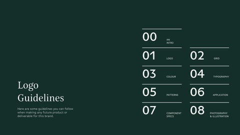
01 LOGO 00 AN INTRO 02 GRID 05 PATTERNS 06 APPLICATION 03 COLOUR 04 TYPOGRAPHY 07 COMPONENT SPECS 08 PHOTOGRAPHY & ILLUSTRATION
Here are some guidelines you can follow when making any future product or deliverable for this brand.
THE BRAND
Our brand is a local flower store in Guwahati, Assam that didn’t have a name or even a face. But somehow the family-run business thrives in a interconnected ecosystem of flower purchase and delivery.
We picked the name ‘Rongali’ derived from ‘Rong’ meaning ‘full of life’ in Assamese.
00 AN INTRO
Target audience
A GIFT FOR THE COMMUNITY
Rongali focuses on not just providing flowers but also creating lasting memories for its local community (youth and above). Building on trust and loyalty, the brand strives to create a rapport with their clients and families.
00 AN INTRO
Loyalty Collaborative Family Comfort
The mission and vision
‘Rongali intends to lead a people-connected business that prioritises the selling & reusability of the flowers.’
rongali
Logo
Logotype
01 LOGO
PRIMARY LOGO AND SYMBOL VARIABLES
Implementing the logo and symbol in different situations appropriately can be a challenge. And so three versions of the logo are made for that purpose.
rongali rongali
PRIMARY
SECONDARY
SECONDARY
01 LOGO
Anywhere between 64px and 129 px height is a comfortable height for online and other digital deliverables. But below 64px point height it’s better to use the motif part of the logo.
01 LOGO
AND LIMITS 129 px rongali 64 px rongali 32 px 64 px Min mum size for D gital Minimum size for Print
LOGO REDUCTION OPTIONS
02 GRID
X
X
X rongali X
X
“A structured method on spacing for the logo hence allowing it to breathe when placed in different situations”
LOGO IN COLOURS
Putting the logo in our brand colours. The main point here is that its flexible to be within monochromatic schemes.
rongali rongali
rongali rongali
rongali rongali
03 COLOUR
MONOCHROMATIC LOGO OPTIONS
On some occasions we may require the use of monochromatic options.
Here are our recommendations:
rongali rongali rongali rongali
When applied on a light background
When applied on a dark background White on black
Cadillac white on dark greens
03 COLOUR
COLOUR PALETTE
Why did our flower shop pick green and brown as part of our main colours? Because we believe that a flower starts its journey as a seed, and green is the first thing we see before it flourishes into a vivid colour and wilts into a brown. But our journey doesn’t end there. We repurpose them into soaps, oils and candles with pastels as below. The colours we use represents our journey.
Hex code: #142F2A
Hex code: #B7C08A
Hex code: #E2AC44 Hex code: #944E2D
Hex code: #D5E0E1 Hex code: #EACFCC
Hex code: #F9F8F1
Hex code: #FFFFFF
R=20 G=47 B=42 R=183 G=192 B=138 R=X226 G=172 B=68 R=148 G=78 B=45 R=213 G=224 B=225 R=234 G=207 B=204 R=249 G=248 B=241 R=255 G=255 B=255
GREEN SUNLIT GREEN NOON YELLOW BARK
EGG BLUE GOOSE PINK MARBLE CADILLAC WHITE
MIDNIGHT
BROWN
03 COLOUR
04 TYPOGRAPHY BELDA Our catchy heading font abcdefghijklmnopqrstuvwxyz ABCDEFGHIJKLMNOPQRSTU VWXYZ 1234567890 !@#$%^&*()-=+:;” <>,./?[]{}\|`~ Norm regular
04 TYPOGRAPHY BASIC GOTHIC PRO abcdefghijklmnopqrstuvwxyz ABCDEFGHIJKLMNOPQRSTUVWXYZ 1234567890 !@#$%^&*()-=+:;”<>,./?[]{}\| `~ abcdefghijklmnopqrstuvwxyz ABCDEFGHIJKLMNOPQRSTUVWXYZ 1234567890 !@#$%^&*()-=+:;”<>,./?[]{}\|`~ abcdefghijklmnopqrstuvwxyz ABCDEFGHIJKLMNOPQRSTUVWXYZ 1234567890 !@#$%^&*()-=+:;”<>,./?[]{} \|`~ abcdefghijklmnopqrstuvwxyz ABCDEFGHIJKLMNOPQRSTUVWXYZ 1234567890 !@#$%^&*()-=+:;”<>,./?[]{}\| ` ~ Body copy and subtitles BASIC GOTHIC PRO LIGHT BASIC GOTHIC PRO MEDIUM BASIC GOTHIC PRO BOOK BASIC GOTHIC PRO DEMIBOLD
PATTERNS
Our motif has the possibility if creating patterns in any angle and compositions. Whether you use the motif whole or rip it apart, the different elements can create a bigger component which allows us to generate yet another pattern. Seriously, try it. Take a petal. Or 2 or even the whole thing and playyyyy.
05 PATTERNS
05 PATTERNS
USE CASES
Where
Well first we need a shop nameplate as they don’t have one yet.
Next is our main product! The flower bouquets packaging.
Then we have our secondary productssoap, candle and essential oil packaging.
And lastly our large baskets at the drop off point that collects used flowers.
06 APPLICATION
do we intend on pasting our brand?
07 COMPONENT SPECS
BUTTONS
State Hover
State States
State Radio Bu�ons Hover Naviga�on Sign in Go Now Know More Sign in Go Now Know More Purchase Purchase SHOW ME SOME MORE SHOW ME SOME MORE
These are some of our featured buttons and icons we intend on using. Our main buttons are styled after our leaf motif and are coloured to gain attention THE
Default
Default
Default
PHOTOGRAPHY
Our photographs are quite colourful. Yes, quite literally the entire colour wheel. Which is why we have left a lot of our background and elements on websites and other platforms a mellow colour tone. So that our images and illustrations stand out for themselves.
08 PHOTOGRAPHY & ILLUSTRATION
ILLUSTRATION
The illustrations are mainly made for our storytelling purposes. The illustration backgrounds are patchy shapes with textured bases. The other elements involved are funky cutout features. The only element that isn’t quite an illustration within our illustration is the flowers, which is a top view version of our flowers.
02 PHOTOGRAPHY & ILLUSTRATION
02 PHOTOGRAPHY & ILLUSTRATION Haha Yes Words Please. Something something flowers. These words have a lot of mistakes cus I no English thanks bye With you in every celebration