BRAND GUIDELINES


February 2023


Dots’ brand guidelines were developed to represent our mission and vision. Consistency is key. Solid branding helps clarify what your business stands for, allowing your business to communicate your purpose, personality, and promises.
This document serves as a rulebook containing specifications and defining the appropriate treatment of Dots brand elements. Its focus is to address any wonders about Dots’ visual language and inspire people along its journey. For any questions about the brand guide, please get in touch with the Communications Director at communications@dots.org

Established in 2023, Dots, came together to address the food insecurity concern within the Muncie, Indiana area. Through the network of 25+ food banks/resources in the area, the mission to lower the number of food-insecure household can be achieved.

D efining the level of food insecurity
O utreaching to food banks and resources
Food Insecurity is more common than not and can happen on a seasonal or everyday need. There are 25+ food resources within Muncie alone that can provide food security to these families.
T ransforming families and individuals
Overcoming food insecurity is not a journey of a straight line, but over time can make a difference.
S tabilizing the Muncie Community
Lowering the number of food insecurity will see direct positive change in other community areas.
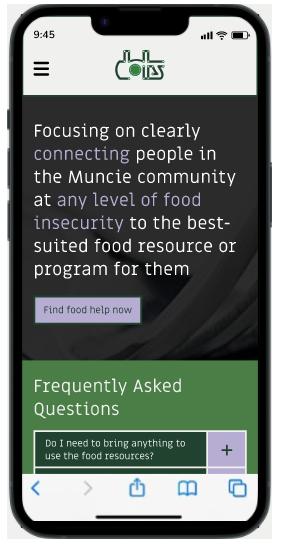
Focusing on clearly connecting people in the Muncie community at any level of food insecurity to the best-suited food resource or program for them.
Envisioning a community where the number of f ood insecure households lowers through the rise of food shelters and banks being used throughout the Muncie community.
Dots brand is...
Accessible
Dependable
Helpful
Inviting
Professional
Responsible
Dots brand is not...
Biased
Careless
Confusing
Exclusive
Intimidating
Judgmental
Transparent
Trustworthy
Up–to–date
Manipulative
Stubborn
Unreliable
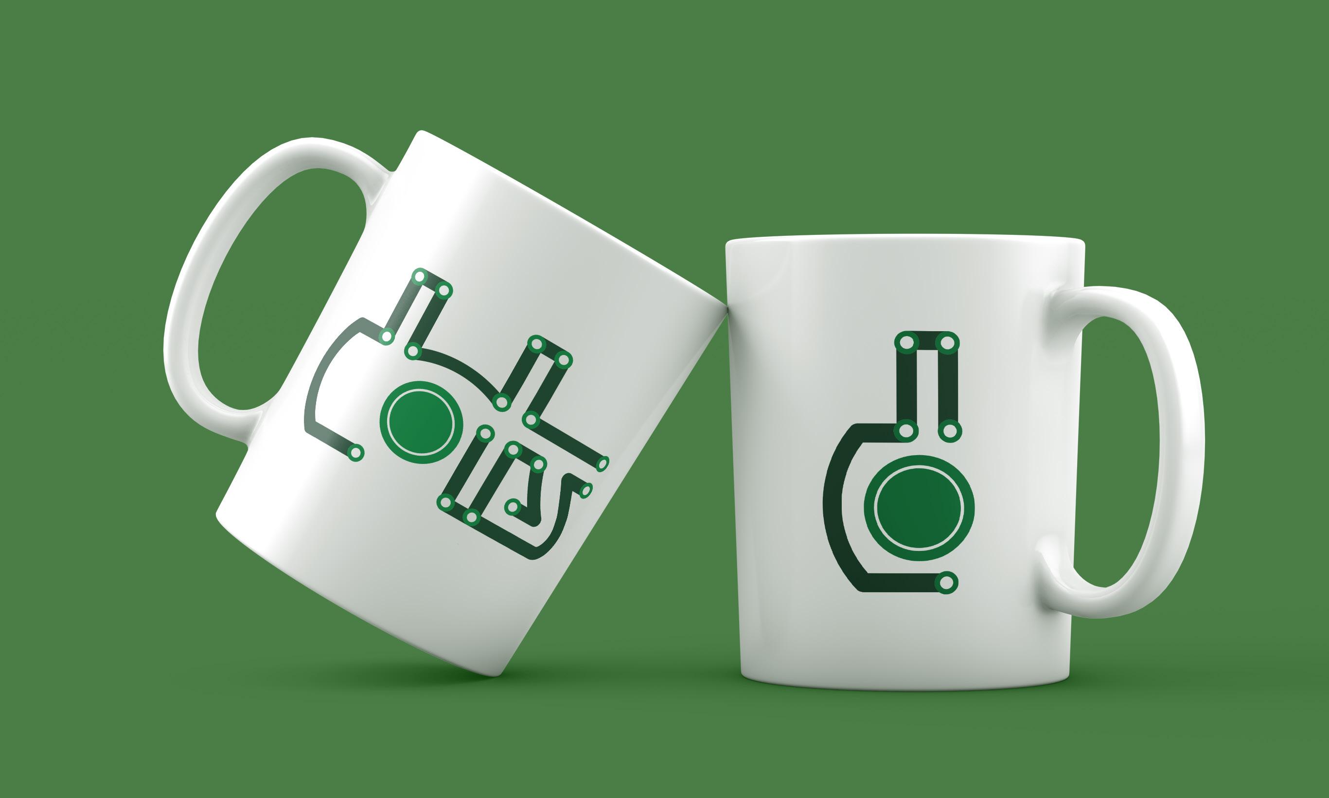
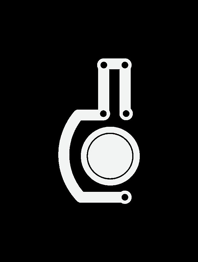
Learn more about the exact logo design meaning on page 11. In sum, the primary logo symbolizes connecting food-insecure households to food resources.
The line in the logo symbolizes how all journeys take a different path, and overcoming food insecurity is not a straight path. To connect with food visually, the “o” in “d–o–t–s” references a plate silhouette.

Imperfect line alludes to the different journeys people take to overcome food insecurity
Hidden plate silhouette
Food Resources
Food Insecure Households
Strong foundation feel of stabilizing which overcoming food insecurity can bring to the community
Plate icon height


Minimum Size
Print = 1.0"
Screen = 96 px
To keep to the integrity of Dots’ primary logo, there needs to be a specific measurement of space around the Lockup. Keeping to this space is crucial to the balance and breathable design with surrounding ele-
ments. The diagram on this page will show the right amount of space to surround the Lockup. The primary logo should never have a width smaller than 1 inch for print needs and 96 pixels for the digital task.
The primary logo is the main symbol when representing the Dots’ brand. To also have another character to represent the brand, the monogram can be used.
The Dots’ monogram combines the first letter from the lockup and the plate icon that makes the center of the letter “d” Important note: the plate icon’s placement changes between the primary logo and monogram, but never the size.

Minimum Size
Plate icon height


Equally, to keep the primary logo’s integrity, the monogram also needs to stay within size restrictions for usage to keep readability. The monogram should never have a width smaller than 0.5 of an inch for print needs and 45 pixels for the digital task.
Print = 0.5"
Screen = 45 px


Do not stretch or warp the logo in any way
Do not flip the orientation of the logo

Do not apply any distracting backgrounds to the logo


Do not use a stroke to any part of the logo
Do not use a drop shadow or any effect
The appearance of Dots’ visual identity must remain consistent. The visual identity should not be misinterpreted, modified, or added to. No attempt should be made to alter the logo in any way. Its orientation, color, and

Do not outline the logo
composition should remain indicated in Dots’ Brand Guidelines. When stating “logo” it also applies to the use of the monogram identity.
HEX: #107F40
RGB: 16 127 64
CMYK: 88 26 100 13
The primary color palette for Dots was selected to align with the brand personality with recognizable colors. All primary colors displayed are used regularly throughout the brand equally.
Easy Purple
HEX: #B7ACD2
RGB: 183 172 210
CMYK: 27 31 01 00
Supportive Green
HEX: #20422F
RGB: 32 66 47
CMYK: 81 48 79 53
HEX: #F0F0EF
RGB: 240 240 239
CMYK: 05 03 04 00
Contrast Ratio: 5.23:1
Contrast Ratio: 5.23:1
A main focus of the Dots’ brand is be clearly accessible for its audience. Color pairings are important to accomplishing this focus of the brand. Here are some of the acceptable primary color pairings that pass the Web AIM contrast checker.
Contrast Ratio: 9.78:1
Contrast Ratio: 9.78:1
Contrast Ratio: 4.73:1
Contrast Ratio: 4.73:1
Contrast Ratio: 8.45:1
Contrast Ratio: 8.45:1
Contrast Ratio: 5.42:1
Contrast Ratio: 5.42:1
Kind Light Orange
HEX: #F19F40
RGB: 241 159 64
CMYK: 03 43 85 00
The secondary color palette for Dots was selected to focus on accessibility and the clarity that Dots’ mission hopes to bring to the community. All secondary colors are used in less common cases.
Essential Dark Orange
HEX: #E36135
RGB: 227 97 53
CMYK: 06 76 89 00
Usable Dark Blue
HEX: #211f1f
RGB: 33 31 31
CMYK: 71 67 65 74
Thoughtful Teal
HEX: #40999D
RGB: 64 153 157
CMYK: 74 23 38 01
Contrast Ratio: 7.63:1
Contrast Ratio: 7.63:1
A main focus of the Dots’ brand is be clearly accessible for its audience. Color pairings are important to accomplishing this focus of the brand. Here are some of the acceptable secondary color pairings that pass the Web AIM contrast checker.
Contrast Ratio: 9.78:1
Contrast Ratio: 9.78:1
Contrast Ratio: 14.35:1
Contrast Ratio: 14.35:1
Contrast Ratio: 4.88:1
Contrast Ratio: 4.88:1
Contrast Ratio: 12.42:1
Contrast Ratio: 12.42:1
The neutral color palette for Dots. All neutral colors can be used with the primary and secondary color palette as a neutral tone throughout.
Transforming Grey
HEX: #616161
RGB: 97 97 97
CMYK: 61 53 52 23
Stronger Together Tan
HEX: #F2DDC3
RGB: 242 221 195
CMYK: 04 12 23 00
HEX: #F0F0EF
RGB: 240 240 239
CMYK: 05 03 04 00
Dots’ primary typeface is Miriam Libre. Miriam Libre is a mono-linear sans–serif font family designed by Michal Sahar and used for all primary headlines and some subheads. This typeface was selected due to its solid and foundational feel.
It is free for commercial use and can be downloaded from: https://fonts.google.com/specimen/Miriam+Libre?query=mir
Miriam Libre, Bold
All secondary typeface needs, such as some subheads, body copy, and captions, will use Open Sans Bold and Medium weights. Open Sans is a humanist sans serif typeface designed by Steve Matteson, which is accessible for reading with print and digital collateral.
It is free for commercial use and can be downloaded from: https://fonts.google.com/specimen/ Open+Sans?query=open
Open Sans Bold, Medium
Typeface: Miriam Libre Weight: Bold Size: 59 pt Leading: x1.0 pt
Each rule for typefaces used in the Dots’ brand is purposeful and should follow according to these types of settings.
Typeface: Miriam Libre Weight: Bold Size: 59 pt Leading: x1.0 pt
Subhead One
Typeface: Miriam Libre Weight: Bold Size: 12 pt Leading: x1.1 pt
Subhead Two
Typeface: Open Sans Weight: Bold Size: 13 pt Leading: x1.1 pt
Tracking: 0 pt
Tracking: 10 pt
Tracking: 20 pt
Tracking: 20 pt
Body Copy Size: 11 pt Leading: x1.7
Typeface: Open Sans Weight: Medium
Captions
Typeface: Open Sans Weight: Bold, Medium Size: 9 pt Leading: x0.7
Tracking: 10 pt
Tracking: 20 pt

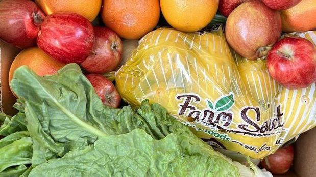
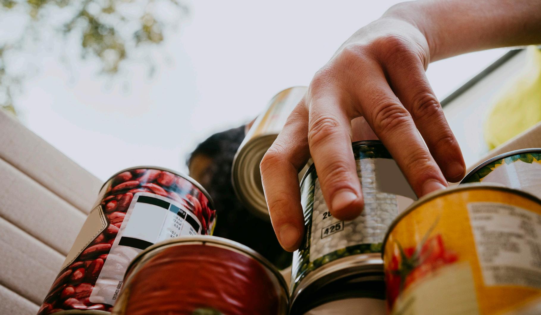
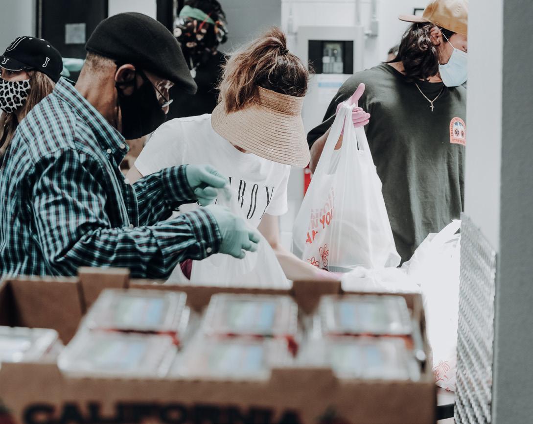
Dots’ brand pulls images from all its partners to help convey the brand. Image tone aligns with brand personality. With pictures from multiple resources, Dots’ brand does little editing to the images but focuses on making its style fit the brand.

Dots’ imagery will be used with a 3px inside stroke that falls in the Dots’ brand colors.
When placing text or identity over the image, the Dots’ brand follows a color overlay using black, hex code #000000, at 55% over images.
This allows the images to serve as backgrounds but still over the text or icon to be visible.
Note: The top acceptable Dots’ brand colors over this image overlay are Defining White and Easy Purple. The stroke border still applies to all photos.
55% black overlay
By communicating food insecurity clearly to the community, the Dots’ brand has some goto elements that are either pulled from the logo or designed to help illustrate statistics.
The pattern for the dates bran this the repetition of the monogram and is commonly used as a background pattern.

Dot’s identity application is the overall the professional feel of the brand. Designs reading from left to right and top to bottom as letterhead, business card, envelope, and sticker.

Dot’s poster series are purposeful to engage and inform audience members quickly. The location of this poster design series is in high foot traffic areas, for example, downtown within a community.

Dots’ posters can also be found in its partner’s facilities. The purpose is to create recognition for the brand and showcase to viewers how there is a more significant number of resources.
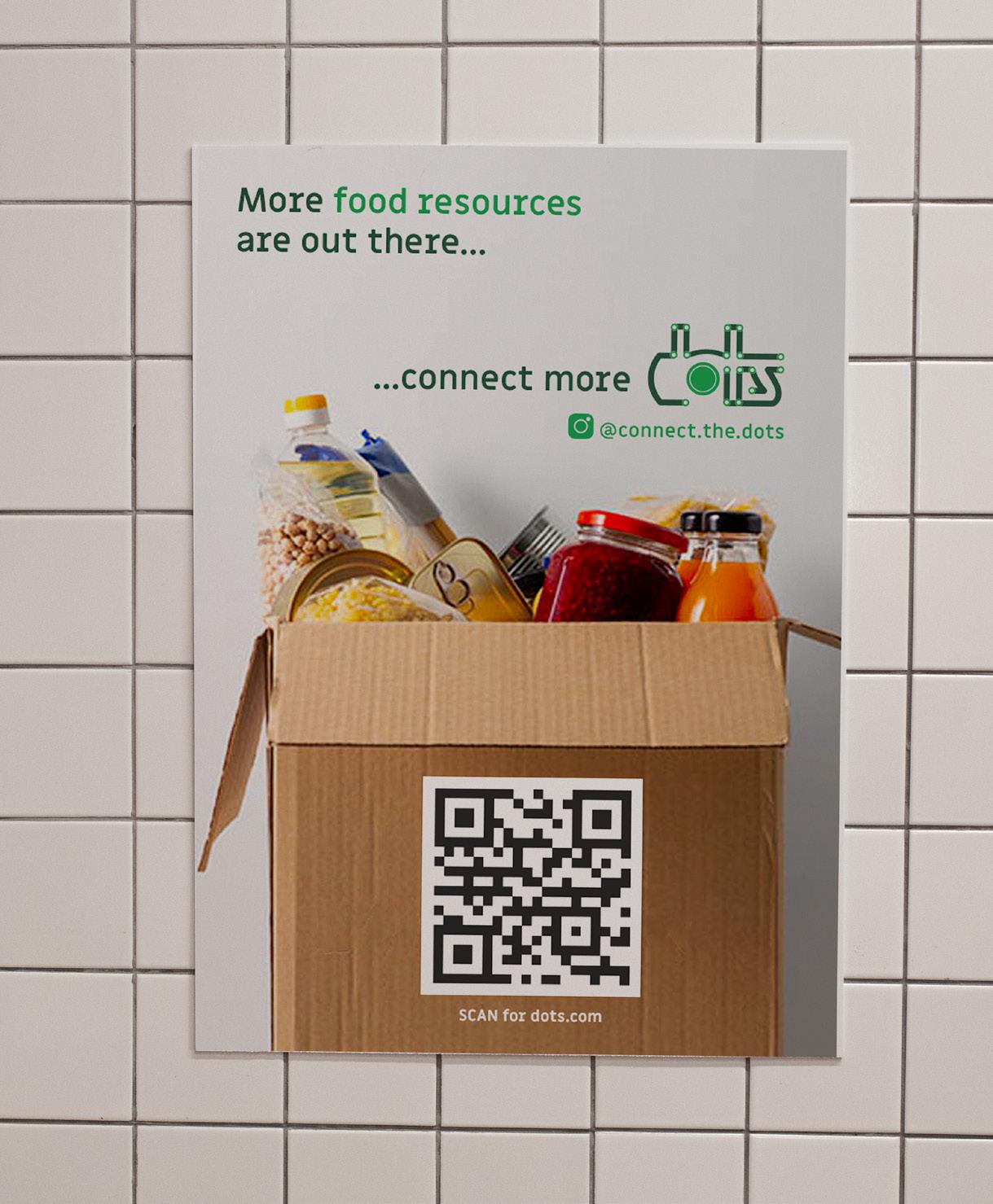
Dot’s poster series are purposeful to engage and inform audience members quickly. The location of this poster design series is in high foot traffic areas, for example, downtown within a community.


Instagram page
All content put out that is tied to the Dots’ brand will remain to the same standard of communicating the brand and its values on every occasion. The purpose of the social media page is to be able to relate to and directly address the target audience on a platform most use every day. Feed content will include daily updates on food resource events, news, and announcements.
