MUNCIE BALLET IDENTITY MANUAL AND GUIDELINES
Muncie Ballet is a local ballet studio in Muncie, IN. The mission of Muncie Ballet is to increase the awareness and appreciation of classical dance and music among all children through dance instruction and by creating audiences for today and tomorrow through classical dance and music performances.
these standards, and guidelines will ensure continuity, a high standard of quality, and a clear, consistent identity for Muncie Ballet.
This manual contains recommendations for various ways the Muncie Ballet visual identity system, defines its graphic design standards and illustrates how these standards are applied. These standards depend on the relative size, proportion, and position of individual elements. They have been developed through careful consideration of many factors, both functional and aesthetic. Adhering to
Guidelines establish a rulebook for a group of individuals that work on the company materials. The use of guidelines ensures how the visual identity should appear across all media. These guidelines help your company hold the value of its visual identity for many years through the proper use of its components.
MUNCIE BALLET IDENTITY MANUAL AND GUIDELINES

TABLE OF CONTENTS
Design Meaning 04
Logomark Design Meaning 05
Lockup Design Meaning 06
Components of the Identity System 07–08
Identity Elements Combinations 09
Muncie Ballet Logomark 10
Muncie Ballet Logomark Clearspace 11
Muncie Ballet Primary Lockup 12
Muncie Ballet Primary Lockup Clearspace 13
Muncie Ballet Vertical Lockup 14
Muncie Ballet Vertical Lockup Clearspace 15
Color Palette 16–17
Typography 18–19
Logo Misuses 20–22
Identity Files Index 23-26
MUNCIE BALLET IDENTITY MANUAL AND GUIDELINES
MEANING
LOGOMARK DESIGN MEANING

The Muncie Ballet Logomark was designed by tracing over the signature ballet pose known as Tendu.
Tendu means “tight or stretched.” A tendu is one of the fundamental movements in ballet where the working leg is extended along the floor until only the tip of the toe remains touching the floor. This movement is to help start all the next foot postions with giving support for the leg.
Information about Tendu can be found at https:// www.balletbeautiful.com/blog/ballet-glossa ry-tendu/
 MUNCIE BALLET IDENTITY MANUAL AND GUIDELINES
LOCKUP DESIGN MEANING
The Muncie Ballet visual identity system was designed to have special meaning for the features that make Muncie Ballet so special.
Keywords used were community, support, and balance. In the process of design, ballet elements and symbols are referred to in the Lockup design to showcase these keywords.
Refer to the diagram on this page to point out the design features for each keyword. To learn about the desgin meaning for the letter “M”, refer back to page 5.
Smaller shapes refer to some of the beginning ballet feet positions learned. As well as symbolizing the ballet student community and have they are immersed within the Muncie Community.
Ballet beam silhouette supporting the logo and offer balance just like it does for its students in setting the foundation
Bigger shapes symblozing the Muncie Community
MUNCIE BALLET IDENTITY MANUAL AND GUIDELINES
OF THE IDENTITY
COMPONENTS OF THE IDENTITY SYSTEM
The Muncie Ballet visual identity system is made of a Logomark and then completely combined to make the Lockup.
The “Lockup” is the defined relationship between the Logomark and the rest of the design. Refer to pages 09–15 for detailed information on using the various versions of the Muncie Ballet Lockups.
Muncie Ballet Logomark
Muncie Ballet Lockup
MUNCIE BALLET IDENTITY MANUAL AND GUIDELINES
MUNCIE BALLET LOGOMARK
The Muncie Ballet Logomark is a symbol stemming from the Lockup design. The Muncie Ballet Logo mark should never to used smaller than 1/2 ” for height and width

Minimun height and width of 1/2 "
MUNCIE BALLET IDENTITY MANUAL AND GUIDELINES
MUNCIE BALLET LOGOMARK CLEARSPACE
To keep the integrity of the Muncie Ballet Logomark, there needs to be a specific measurement of space around the Logomark. Keeping this space correct is crucial to have a balance and breathable design with surrounding elements. The diagram on this page will show the right amount of space to surround the Logomark.
MUNCIE BALLET IDENTITY MANUAL AND GUIDELINES

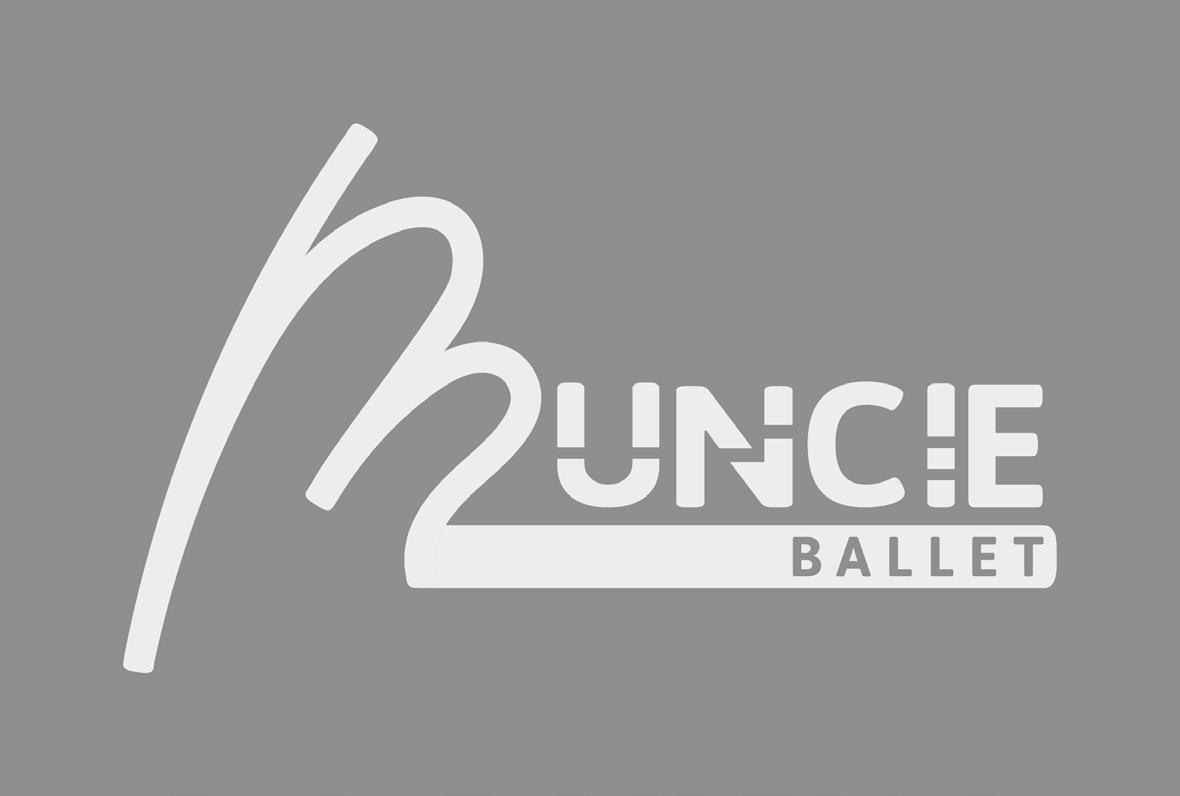
MUNCIE BALLET PRIMARY LOCKUP
The Muncie Ballet Primary Lockup combines the Logomark and the rest of the design in a horizon tal layout. There is a vertical version of the Lockup available on pages 14-15.
The Muncie Ballet Primary Lockup is intended for use when the height and width of the applciation are equal to or more than 1”.
The Muncie Ballet Primary Lockup may be used in one color usage and as well as black and white. See page 25 for the file names provided.
Every Lockup defines the relationship of the Muncie Ballet Logomark and the rest of the logo design. All Lockups must be used as the specific files provided, these provide the correct relationship with scale and space.
Minimun height and width of 1 "
MUNCIE BALLET IDENTITY MANUAL AND GUIDELINES

MUNCIE BALLET PRIMARY LOCKUP CLEARSPACE
To keep the integrity of the Muncie Ballet Primary Lockup, there needs to be a specific measurement of space around the Lockup. Keeping this space correct is crucial to have a balance and breathable design with surrounding elements. The diagram on this page will show the right amount of space to surround the Lockup.
MUNCIE BALLET IDENTITY MANUAL AND GUIDELINES

MUNCIE BALLET VERTICAL LOCKUP
The Muncie Ballet Vertical Lockup combines the Logomark and the rest of the design in a vertical layout. There is a horizontal version of the Lockup available on pages 12-13.
The Muncie Ballet Primary Lockup is intended for use when the height and width of the applciation are equal to or more than 1”.
The Muncie Ballet Vertical Lockup may be used in one color usage and as well as black and white. See page 26 for the file names provided.
Every Lockup defines the relationship of the Muncie Ballet Logomark and the rest of the logo design. All Lockups must be used as the specific files provided, these provide the correct relationship with scale and space.
Minimun height and width of 1 "
MUNCIE BALLET IDENTITY MANUAL AND GUIDELINES


MUNCIE BALLET VERTICAL LOCKUP CLEARSPACE
To keep the integrity of the Muncie Ballet Vertical Lockup, there needs to be a specific measurement of space around the Lockup. Keeping this space correct is crucial to have a balance and breathable design with surrounding elements. The diagram on this page will show the right amount of space to surround the Lockup.
MUNCIE BALLET IDENTITY MANUAL AND GUIDELINES

Ballet identity should never be remade
other colors than the two core colors.
The CMYK, RBG, and Hex values are given and should be used in the correct context. For print needs use the CMYK. RBG and Hex values are used when in an online context.
The Muncie Ballet’s identity uses the typefaces Asap Bold for all logotypes. This typeface should not be considered an everyday typeface, but only be reserved for identity design.
Asap is free for commercial use and is designed by Omnibus-Type. The typeface can be downloaded from: https://fonts.google.com/specimen/Asap
The Muncie Ballet Lockup can never be manipulated or created directly from the Asap typeface itself. The Lockup combines other shapes and the use of Asap type has been arranged to work at different scales. To keep the correct arrange ment, always refer to using the provided files.