Logos
apex experience
Visit us at apex.aero
The Color of a New Horizon
DESIGN:
Hornall Anderson LATEST REFRESH:
January 2016
Alaska Airlines expands its network of routes without losing its point of origin. by Katie Sehl
“It may not be the best representation of an Eskimo, but it’s our Eskimo.” Tim Kelly, former Alaska senator
66
volume 7, edition 2
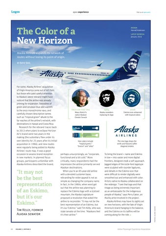
face on the tail Many think it’s native Alaskan Chester Seveck
1984
Alaska considers replacing its logo
New colors include “tropical green,” “breeze” and “atlas”
perhaps unsurprisingly, as “corporate, functional and a bit cold.” More critically, many respondents had the impression the airline primarily served Alaskan destinations. When you’re an 85-year-old airline with a devoted customer base, rebranding for wider appeal is not as simple as changing the company name. In fact, in the 1980s, when word got out that the airline was planning to replace the Eskimo logo with a stylized mountain, the Alaska Legislature proposed a resolution that asked the airline to reconsider. “It may not be the best representation of an Eskimo, but it’s our Eskimo,” said Tim Kelly, who was state senator at the time. “Alaskans feel it’s their airline.”
2016
Eskimo icon enhanced with tropical colors
The new logo drops the serifs and features softer diagonal strokes
To bring the brand – name and Eskimo in tow – into vaster and more digital frontiers, designers took a soft approach. Jagged edges of the icicle-font logotype were sculpted with rounder ligatures, and details in the Eskimo icon that were difficult to render digitally were smoothed out and enhanced with color. Artists native to Alaska collaborated on the redesign. “I see that logo and that image as being extremely important as an ambassador for the indigenous people of Alaska,” says Perry Eaton, an Alutiiq artist involved in the project. Alaska Airlines may have its sights set on new horizons, with the fate of Virgin America’s brand hanging in the balance, and the Eskimo on its tailfins will be coming along for the ride.
Airline Passenger Experience Association
PHOTOS: ALASKA AILINES
For some, Alaska Airlines’ acquisition of Virgin America came out of left field, but those who paid careful attention to Alaska’s latest rebrand might have noticed that the airline was already priming for expansion. Swooshes of green and cerulean blue add warmth to the once monochrome navy, and carefully chosen descriptive names such as “tropical green” allude to the far reaches of the airline’s network, with destinations in Hawaii and Costa Rica. Research for the rebrand traces back to 2013 when plans to eclipse Horizon Air’s brand were two years in the making (the subsidiary flew under its own identity for 25 years after its initial acquisition in 1986), and new routes were regularly being added to Alaska Airlines’ route map. It was a good occasion to assess brand reception in new markets. In planned focus groups, participants unfamiliar with Alaska Airlines described the brand,