DECEMBER 2023

Shaping Yves Rocher’s Legacy:
The CEO’s Vision on a Strong Brand IdentityIn navigating the ever-evolving beauty and wellness landscape, I, as the CEO of Yves Rocher, firmly believe in the pivotal role of a robust brand identity. Here’s why it’s at the core of our strategy:
1. Building Trust and Recognition:
Yves Rocher’s unwavering commitment to a consistent and recognizable identity is the bedrock of trust and brand recognition in an industry teeming with options.
2. Emotional Connection: Beyond being a collection of products, our brand identity creates a profound emotional connection with our customers. It transforms them into dedicated advocates of our natural beauty ethos.
3. Differentiation Amidst Competition:
Yves Rocher’s unique identity sets us apart, offering consumers a distinct and authentic choice in a market flooded with options. It’s not just about products; it’s about a lifestyle rooted in authenticity.
5. Adaptability and Consistency:
Yves Rocher’s brand identity is a dynamic force, adapting to market changes while unwaveringly maintaining our commitment to natural beauty. It’s about balancing adaptability with the timeless consistency that defines our essence.In essence, a strong brand identity is not just a strategic choice; it is the very fabric that weaves
Yves Rocher’s legacy. It guides us with purpose and integrity, ensuring that our journey in the pursuit of natural beauty remains both unique and authentic.
This version presents the importance of a strong brand identity from the perspective of the CEO, emphasizing personal commitment and vision.
Warm regards,

Guy Flament
Secondary Elements
4.0 1.0 5.0 2.0 6.0 3.0
Promo Items
Primary Elements Signage Applications
Corporate Applications
Ambient Media
Mission Statement
Nurturing Beauty, Preserving Nature at Yves Rocher, our mission is to enhance the beauty of individuals while preserving the beauty of our planet. We are dedicated to creating natural and sustainable beauty solutions that empower everyone to embrace their unique radiance. Through innovation, eco-conscious practices, and a commitment to well-being, we aspire to be a beacon of beauty that harmonizes with the essence of nature.

When the corporate colors are unavailable, please use only 100% black.
Use only the reverse on dark grounds.
The brand mark should be positioned quite large in relation to the surrounding elements as it aims to be distinctive and memorable.
Minimum Size
Do not reproduce the mark any smaller than 1.86 inches based on the longest side.
Always surround brand mark with the amount of clear space shown (equal to the cap height) to ensure that the logo is easily identifiable as well as legible.
cap height
Primary colours
Secondary colours
Franklin Gothic Bold
Use for most prominent texts such as headlines.
Subhead Typeface
Use for subheadings and callout text.
Futura Bold Aa Bb Cc Dd Ee Ff Gg Hh Ii Jj Kk Ll Mm Nn Oo Pp Qq Rr Ss Tt Uu Vv Ww Xx Yy Zz
1234567890
Body Typeface
Use for smaller text such as body copy and captions.
Futura Regular Aa Bb Cc Dd Ee Ff Gg Hh Ii Jj Kk Ll Mm Nn Oo Pp Qq Rr Ss Tt Uu Vv Ww Xx Yy Zz
1234567890

The leaves and flowers in the Yves Rocher icons embody the brand’s commitment to natural elegance.
For use on dark backgrounds and as design element for promotional items.
Leaves signify growth and vitality, while flowers represent the delicate beauty found in Yves Rocher’s botanical products. Together, they create a visual harmony, encapsulating the brand’s dedication to natural goodness, sustainability, and the celebration of individual beauty.
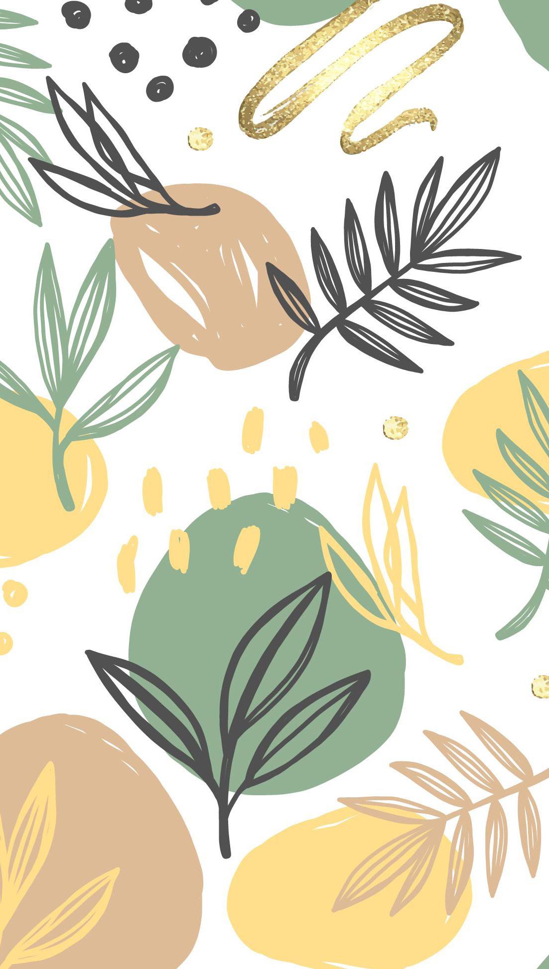
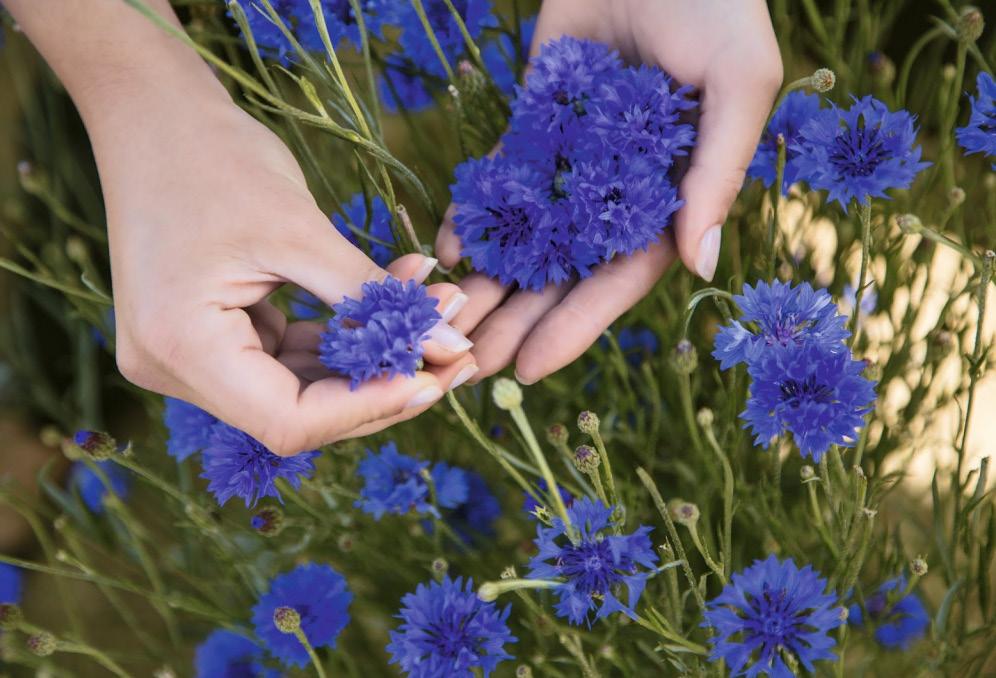
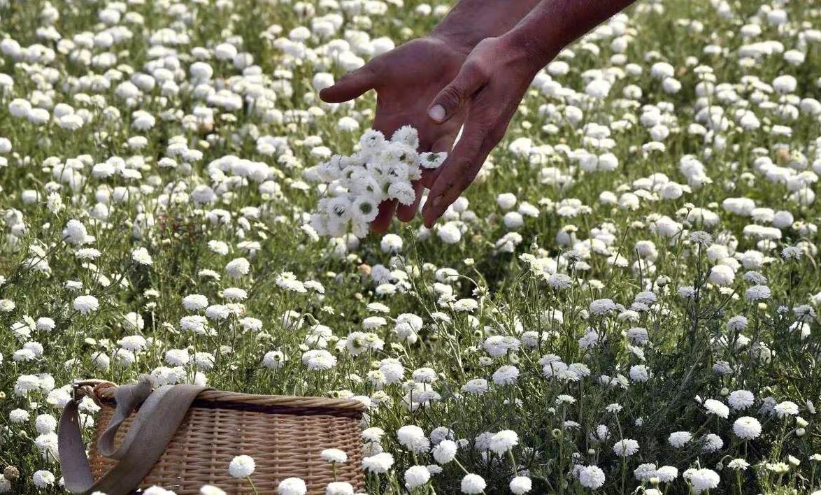
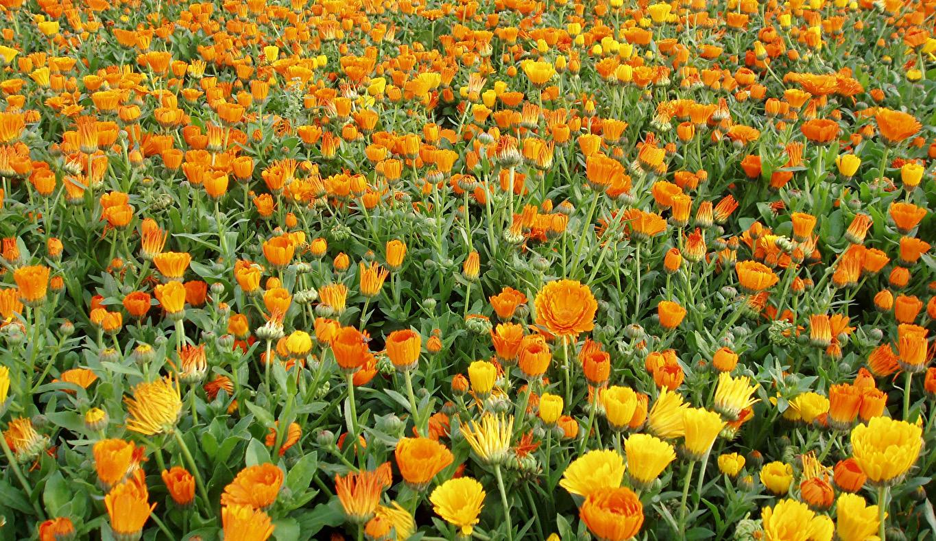
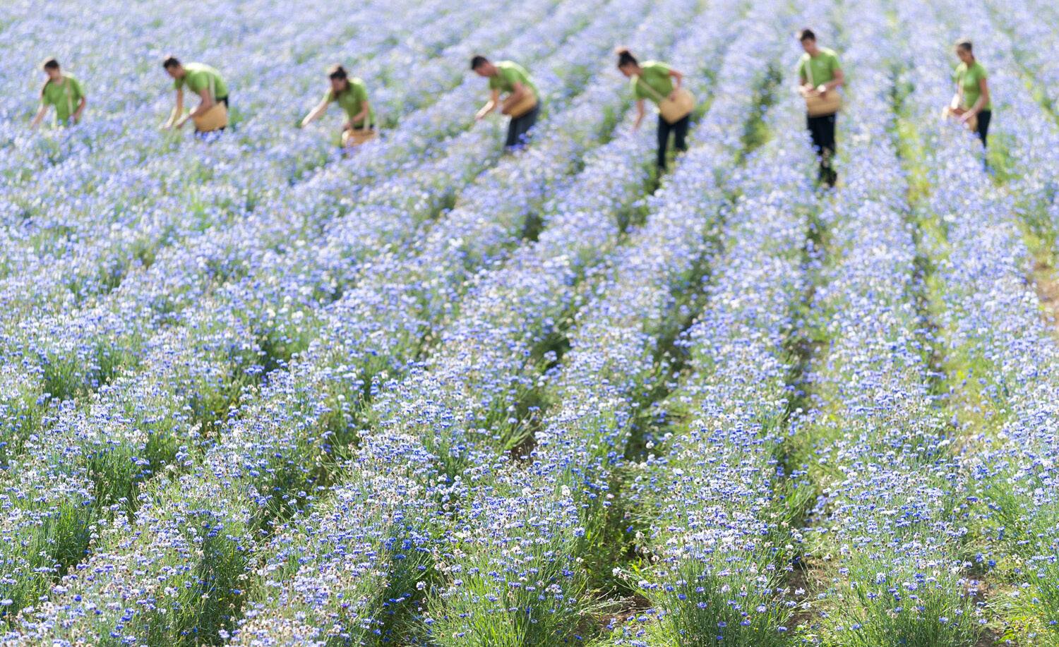
Nature-inspired settings aligns with Yves Rocher’s brand ethos, emphasizing the brand’s deep connection to natural beauty. The images evoke a sense of tranquility and purity, reflecting the botanical essence of Yves Rocher’s products and reinforcing the brand’s commitment to a sustainable and eco-friendly lifestyle.

The tone of voice will be warm, friendly, natural, gentle. Yves Rocher strives to convey a natural and authentic tone. They often use language that emphasizes the use of botanical ingredients and the benefits of nature in their products. This tone aligns with their commitment to natural beauty.
Brand Key Words
Eco-Friendly
Botanical
Nature-Inspired
Affordable Clean Beauty


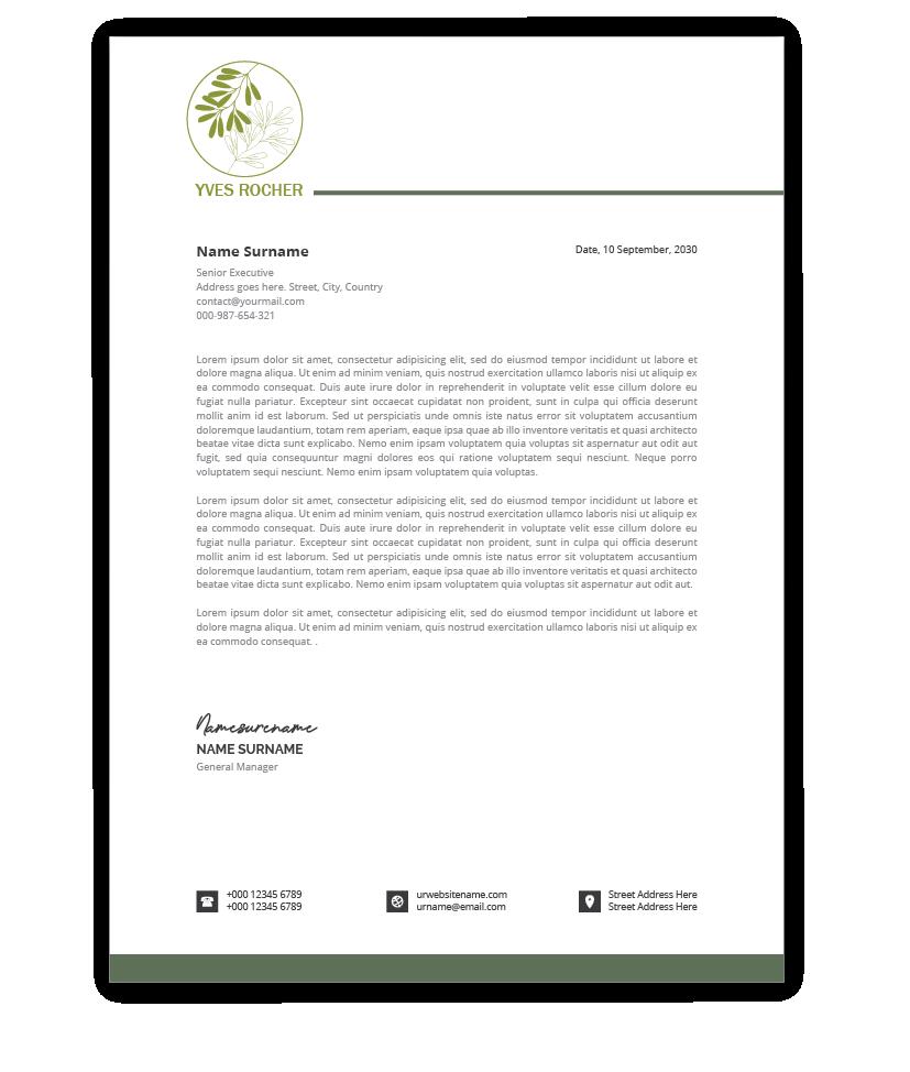
Includes the primary color with a strong emphasis on branding.
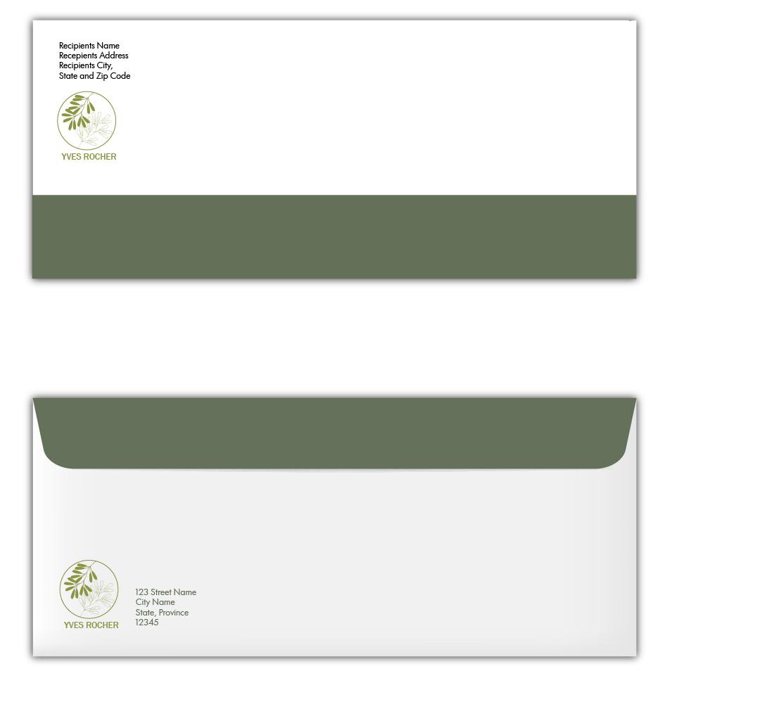
Large centred placed logo for the front side, used a primary color.
The logo will be placed on the top right of the front side. The seal flap will be green as the primary colour, on the inside it is green as well.
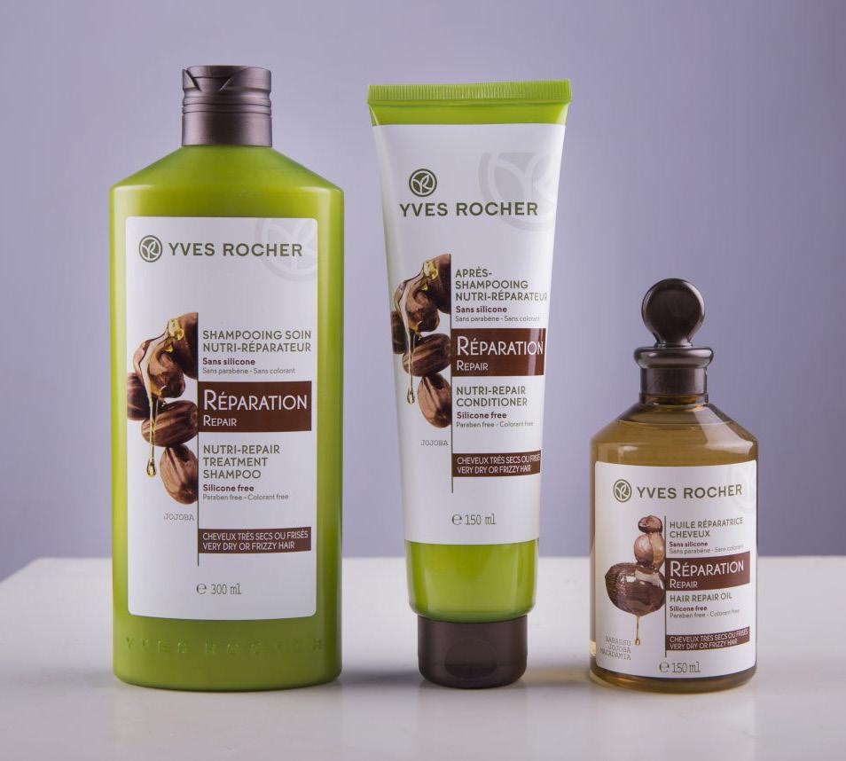
The advertisement poster represent the collection of shampoos with the slogan “Nature will Take Care of Your Hair” so the viewer knows right after that the products are organic and what these products are used for. The logo is placed on the right top corner and the primary green color is used for the slogan.

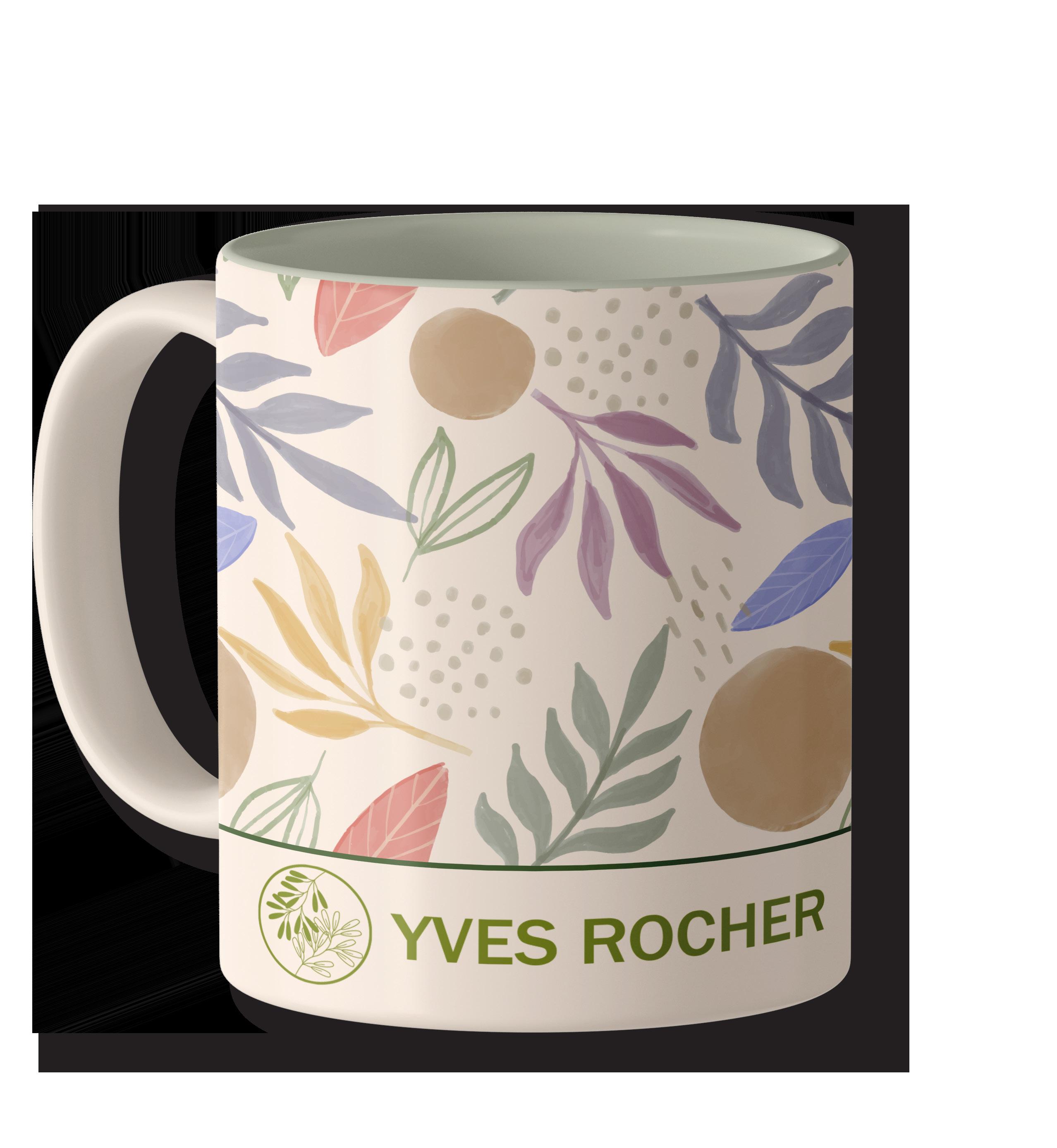
4.1 MUG
Brand mark is featured on the front of the mug with the pattern.
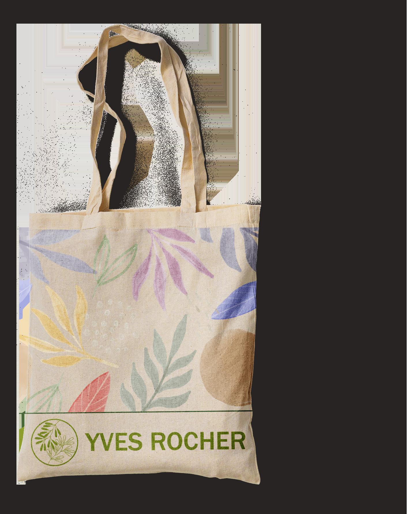
Brand mark is featured on the front of the Tote Bag with the pattern.
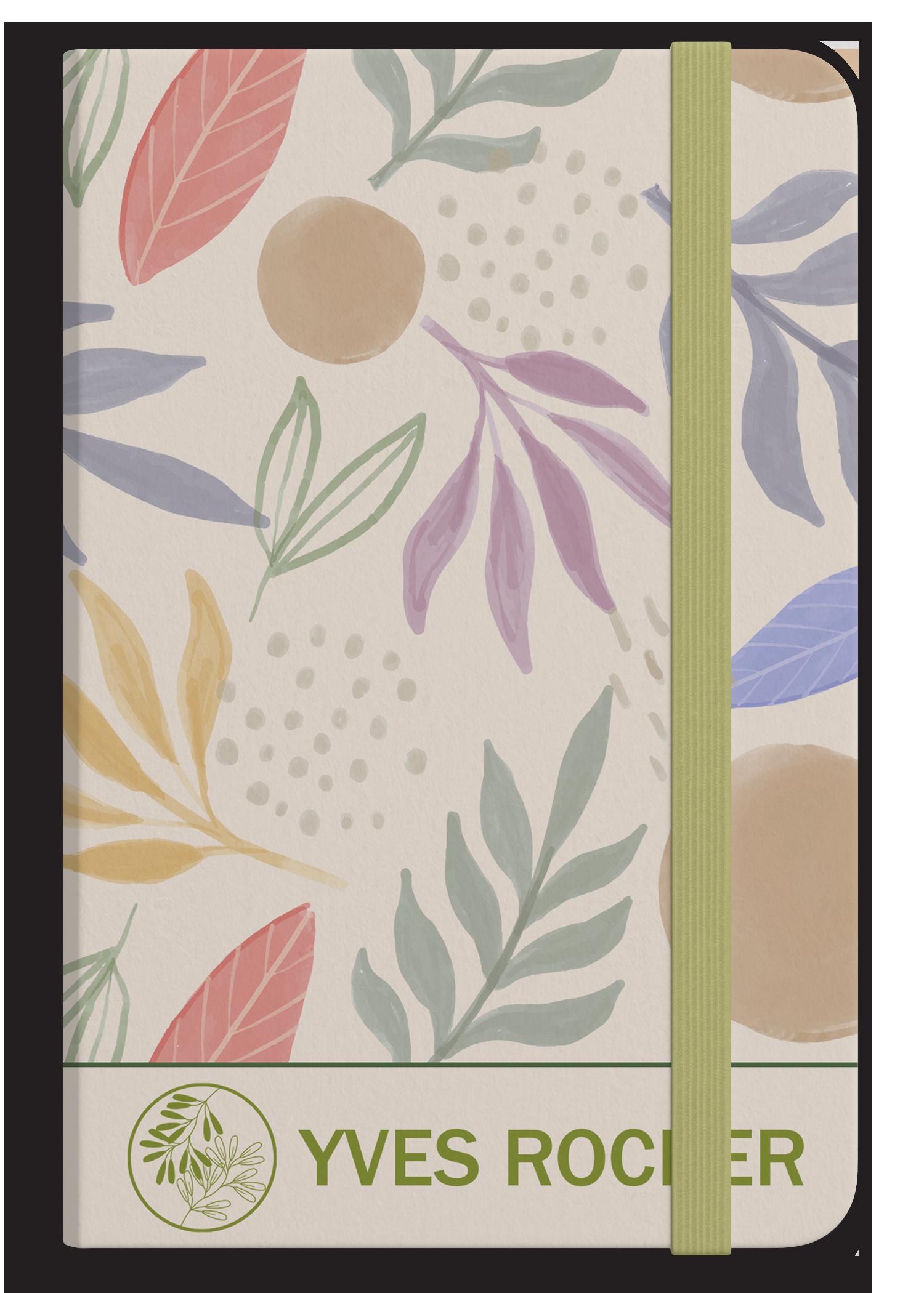
Brand mark is featured on the front of the notebook with the pattern.
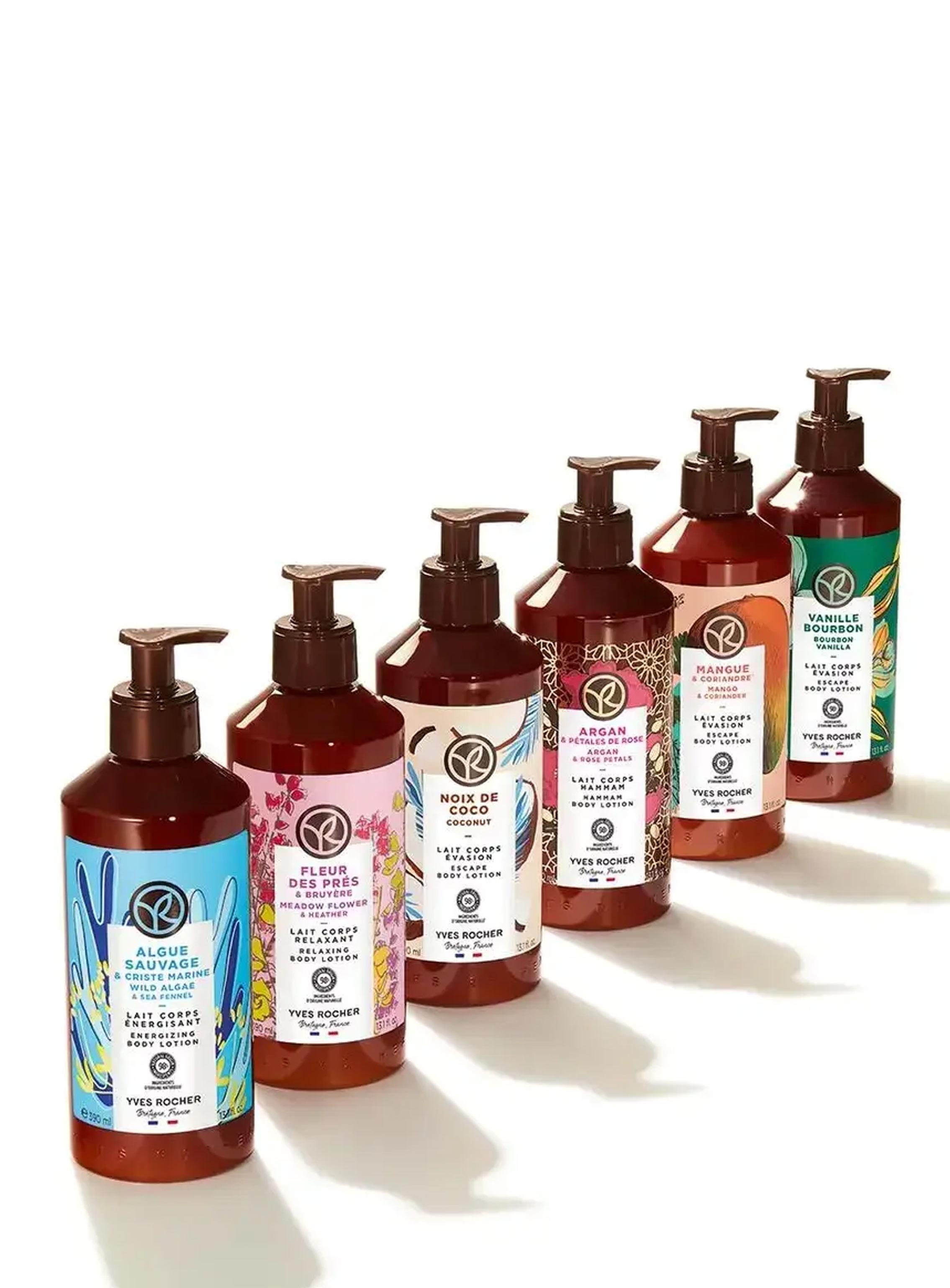
Brand mark is featured on the front of the bottle with the pattern.


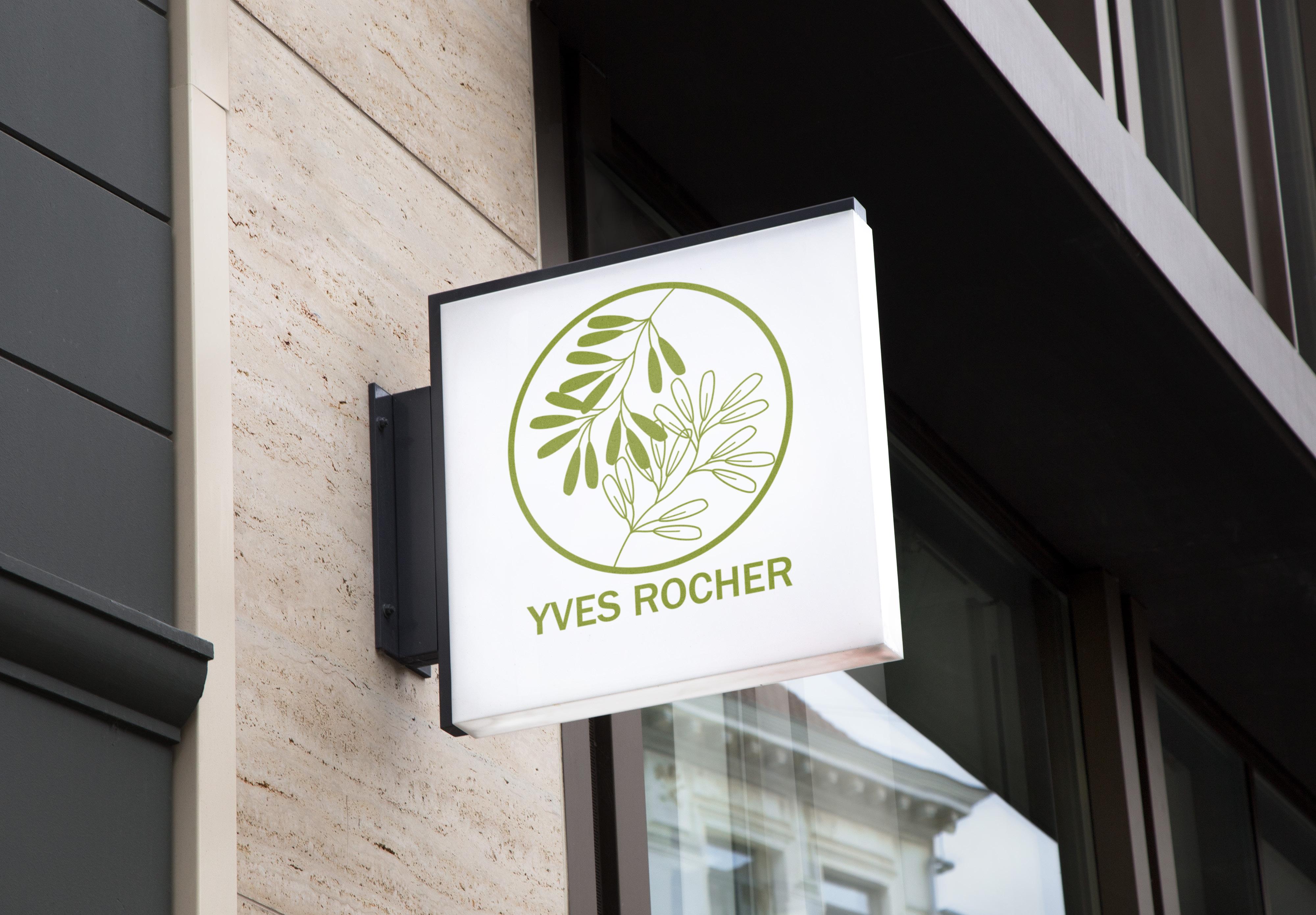
The exterior sig represents the Yves Rocher store that is located in the city.
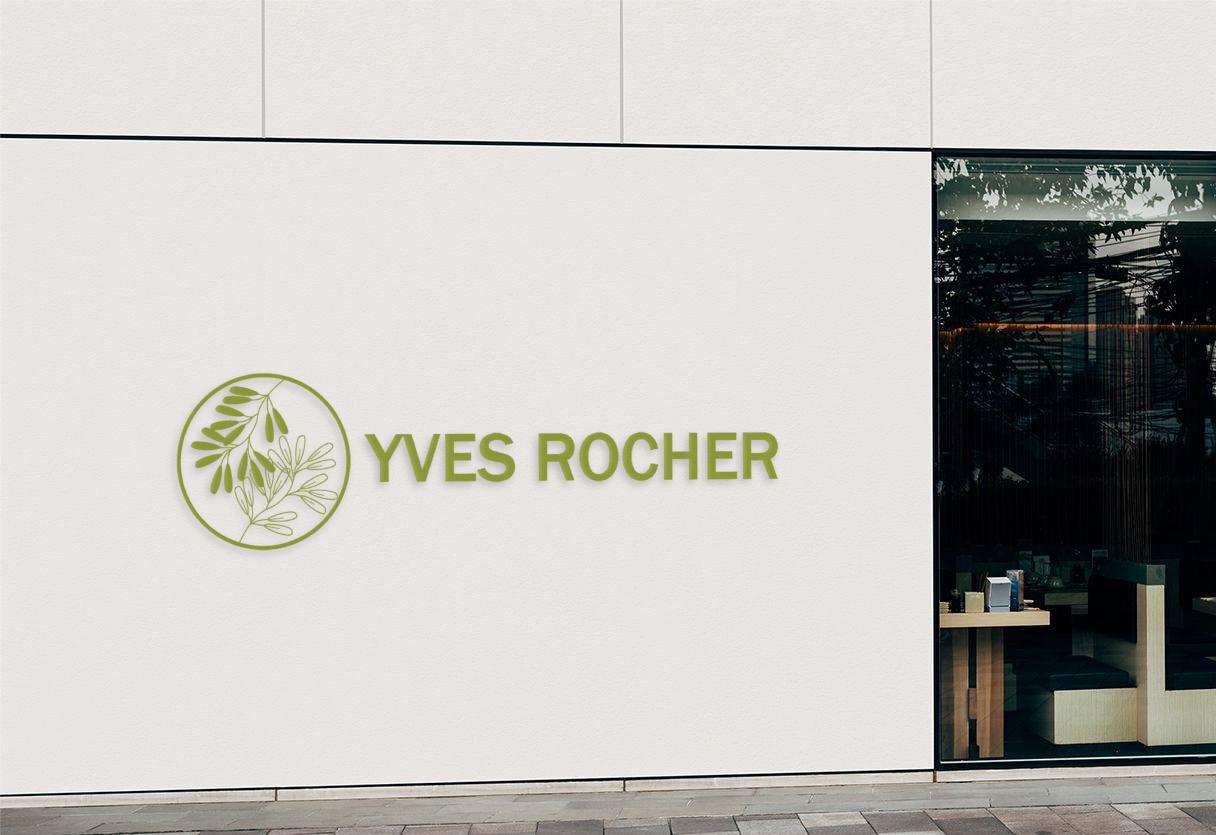
The wall sign represents the brand of mark of Yves Rocher. The wall sign serves as a distinctive and inviting marker, guiding customers to the heart of a beauty sanctuary.
Billboard to be displayed in popular areas around the city. “Let Nature Take Care of You” is a slogan for Yves’ Rocher that attracts clients with its organics and tells them what to do. The image of their care products displayed.
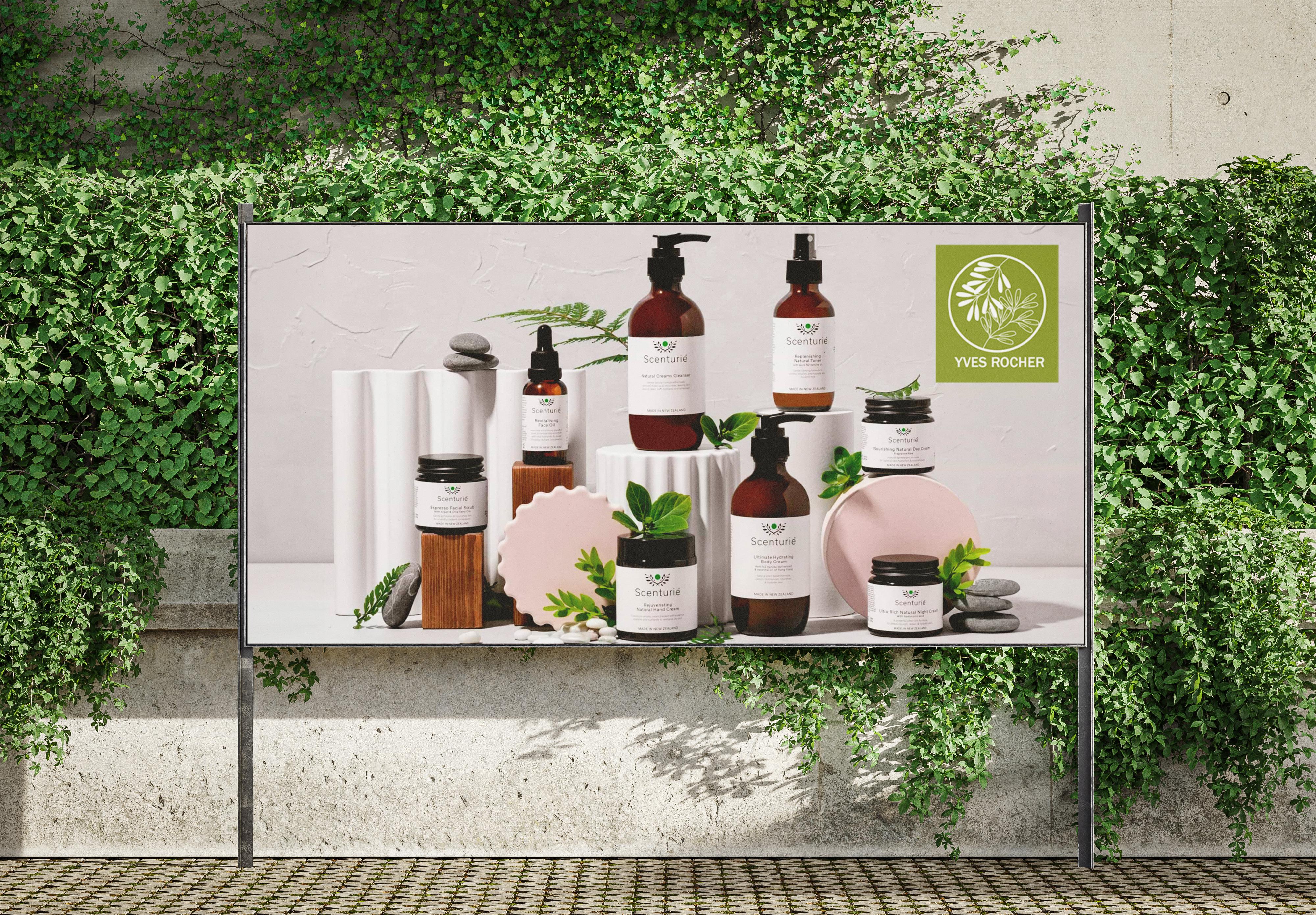
Let Nature Take Care of You
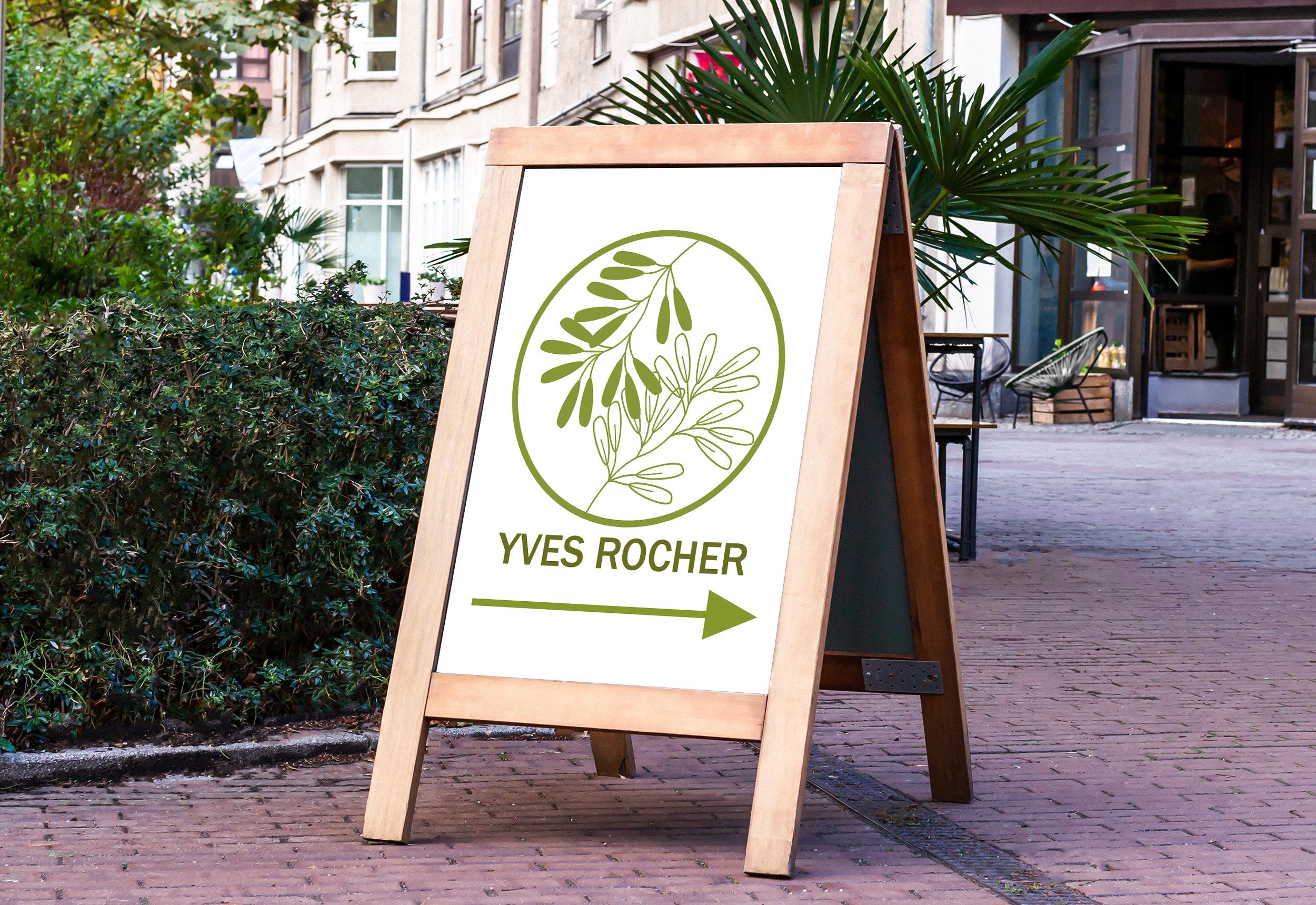
A frame sign serves for wayfinding purposes, it represents the brandmark of Yves Rocher.

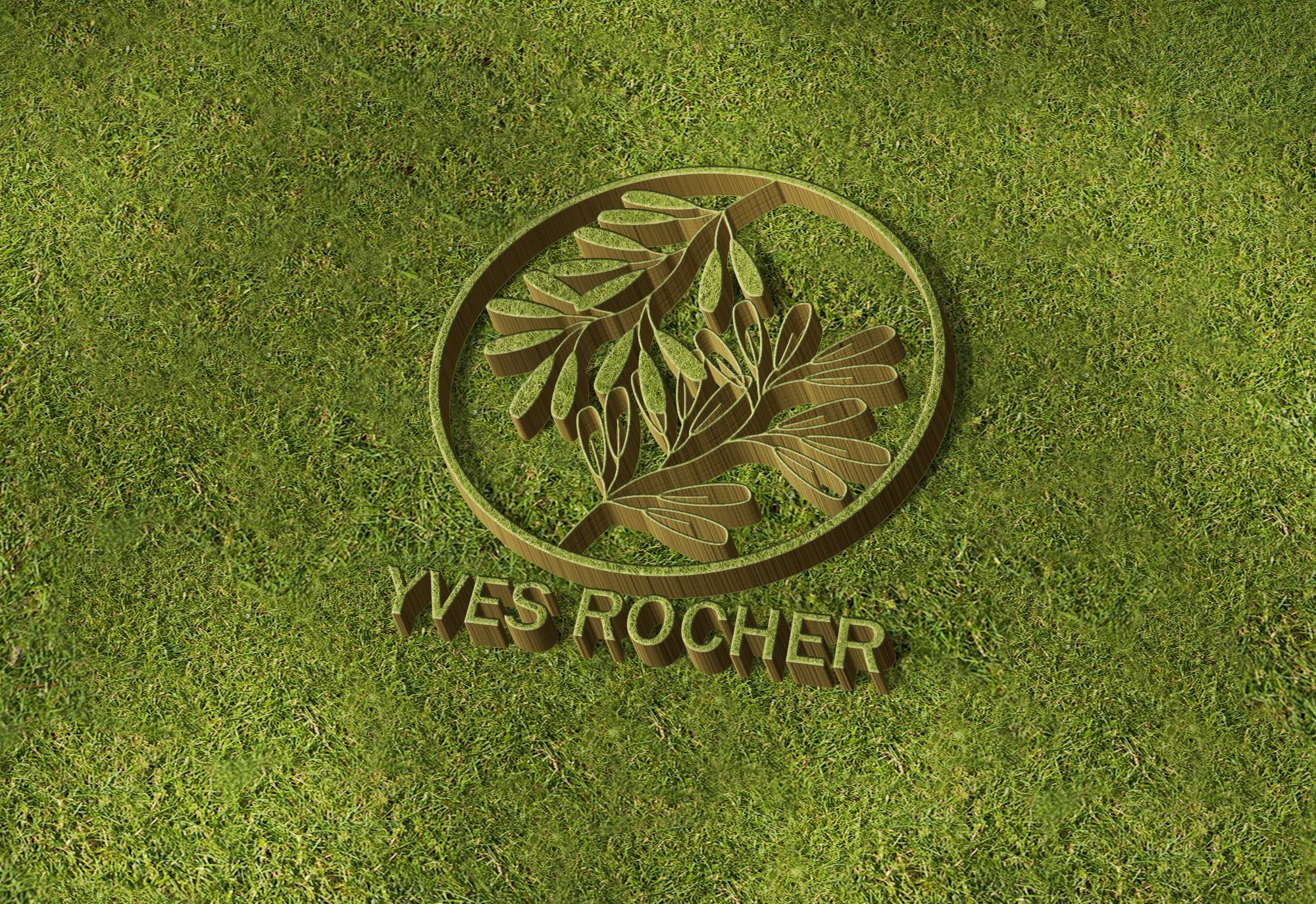
3D Yves Rocher logo is set against a lush bed of organic grass. This ambient display beautifully showcases the commitment to organic beauty, where every leaf of grass symbolizes the pure, natural ingredients that define the skincare, fragrances and cosmetics that the company provide.
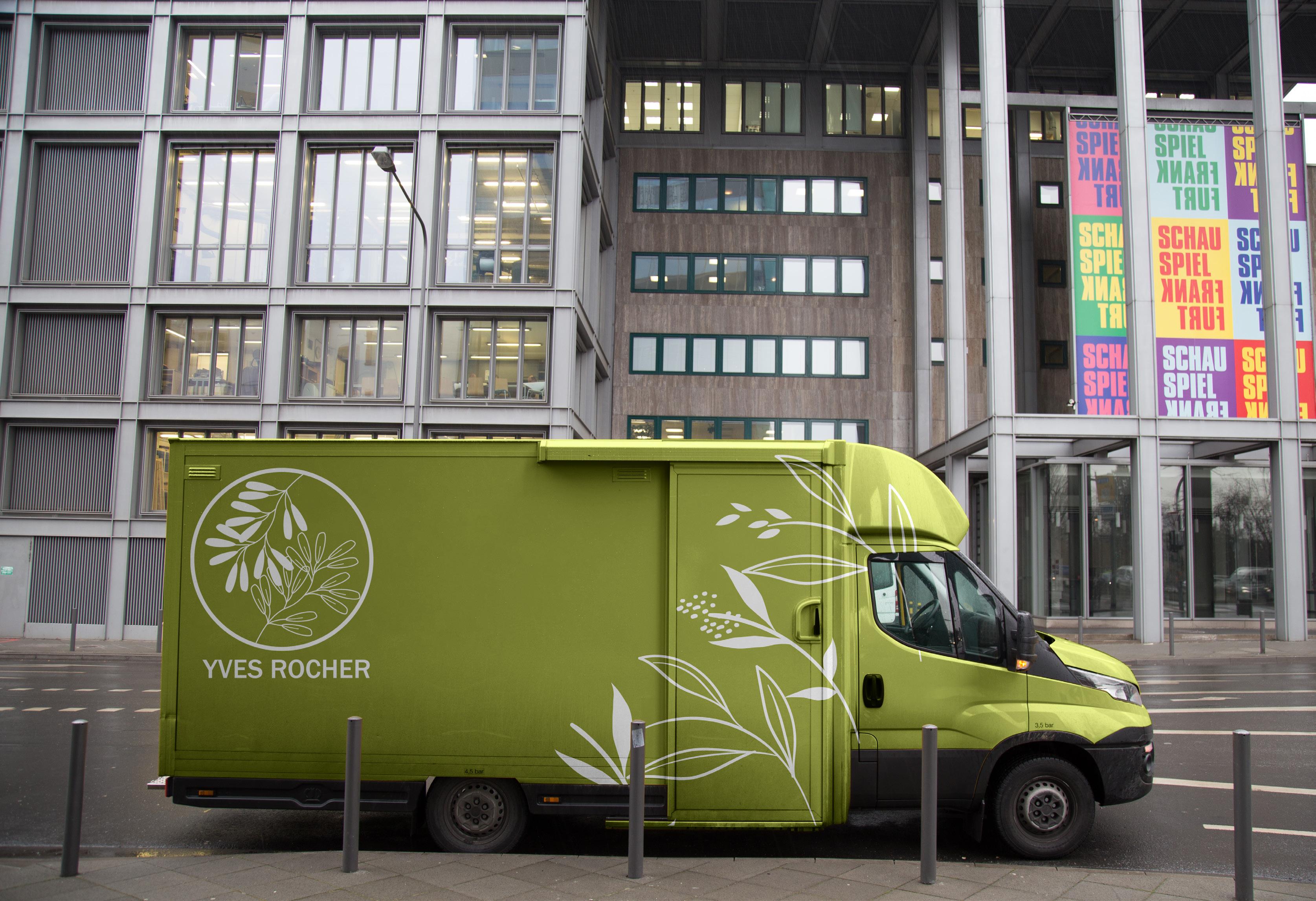
Used to transfer beauty products. The brandmark and pattern elemnts are integrated. Green as a primary color is used on the van.
Wall Mural is placed in the shopping centre the visitors could see what Yves Rocher represents: organic care products with a slogan “Let Nature Take Care of You” that speaks itself what the brand represents.
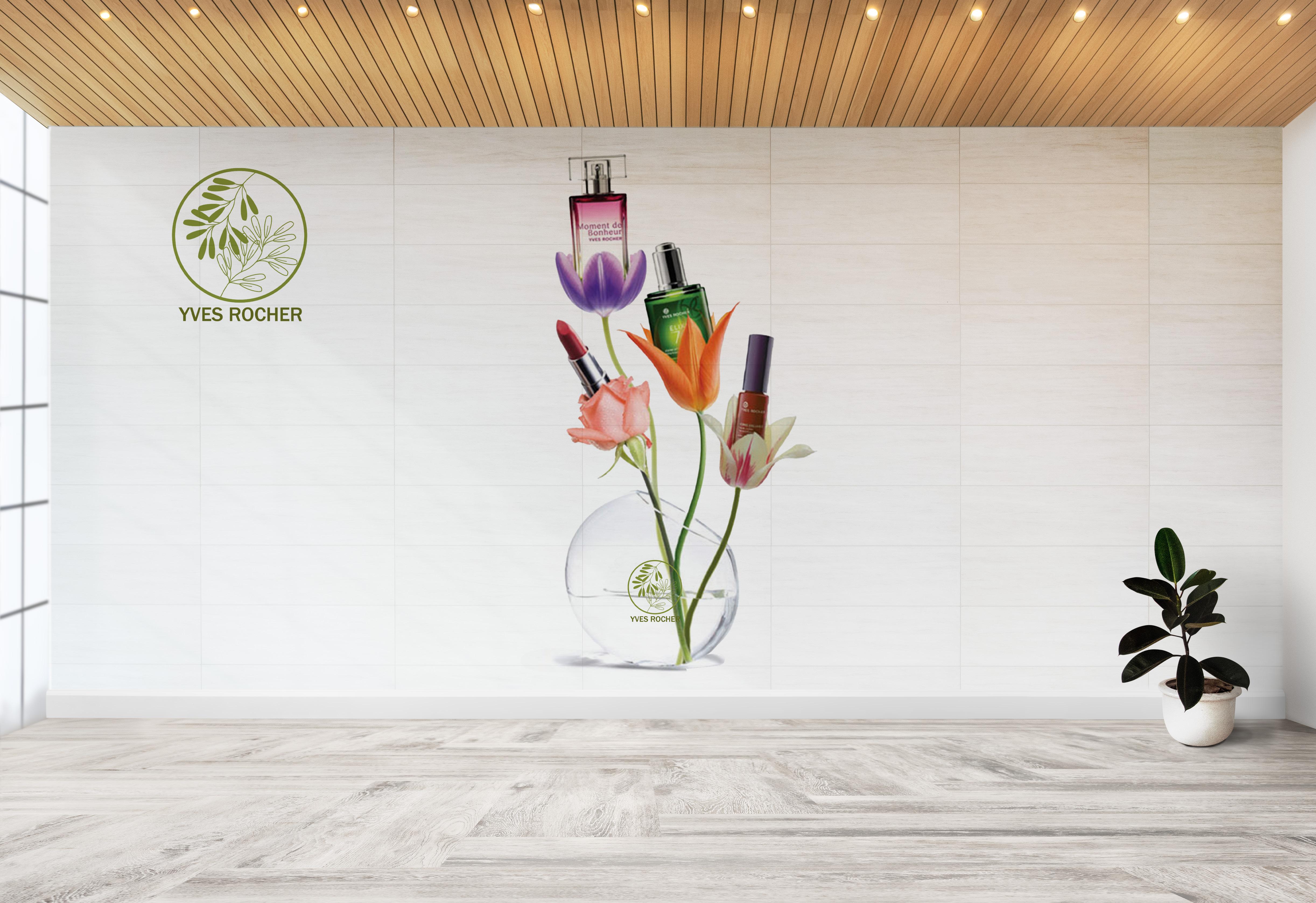
Let Nature Take Care of You
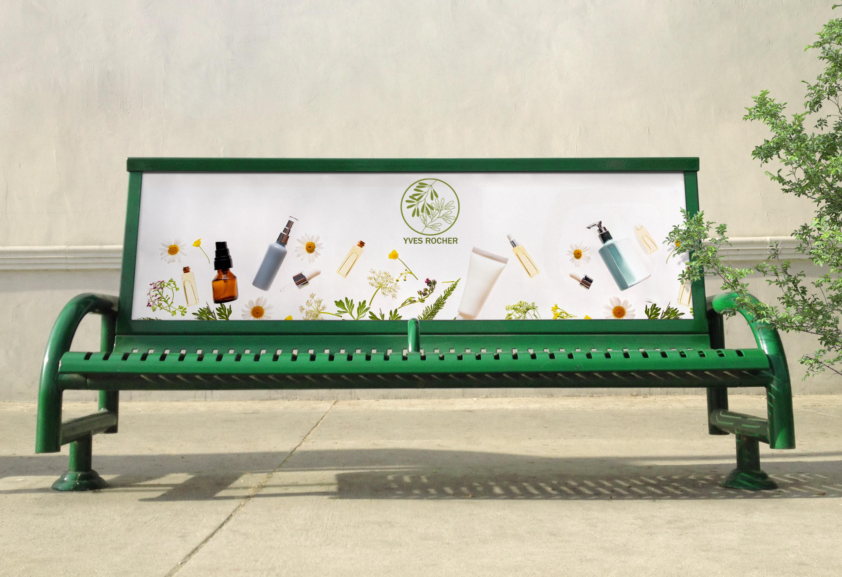
The bench is placed in the park or outside of the Yves Rocher store. The primary green color and logo is used for the bench. Let Nature Take Care of You