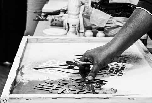
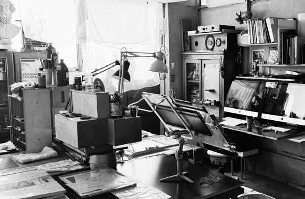
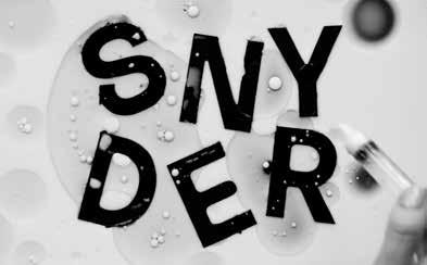
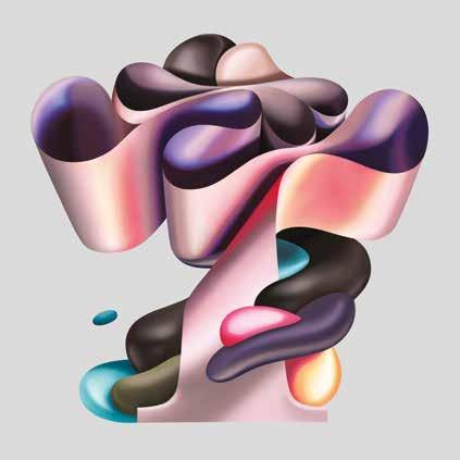
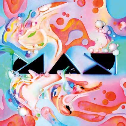
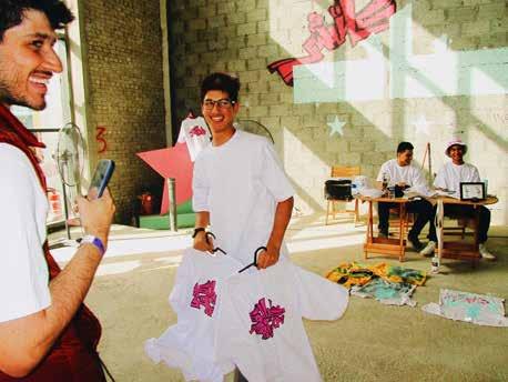
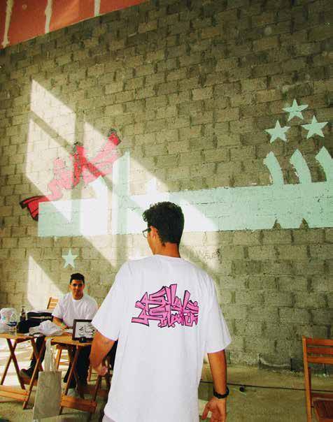
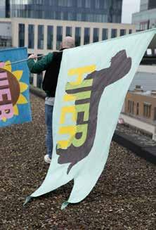
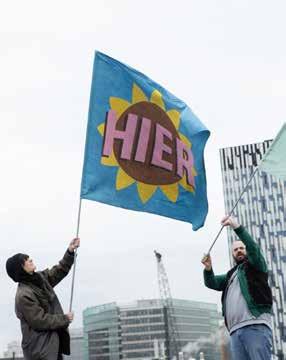
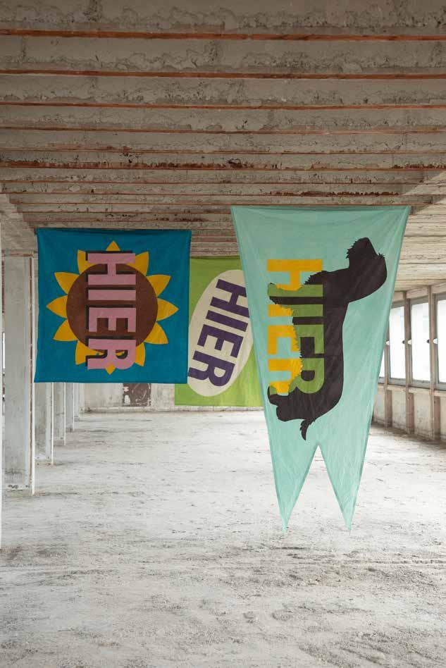
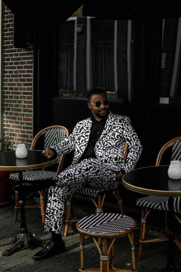
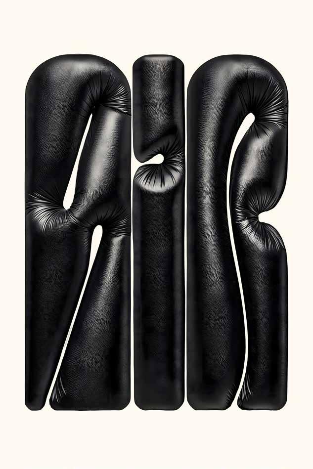
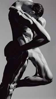
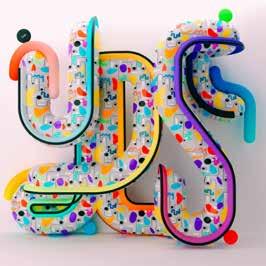
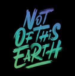
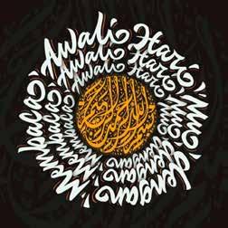
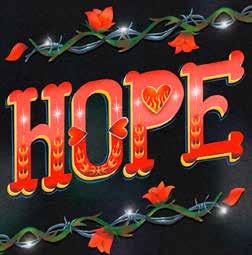
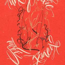
Abdelrahman Barakat, Multaqa Alkhatt 02 Ruben Malayan Studio in Yerevan, 2024 03 Tina Touli, Synder, Behind the Scenes
Carmi Grau
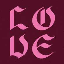
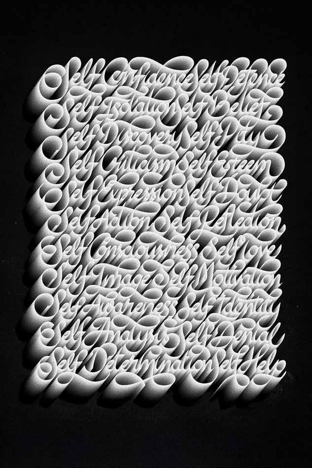
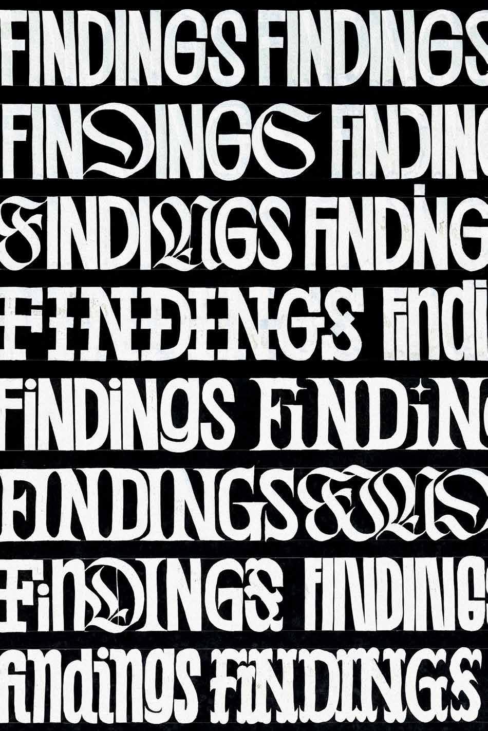
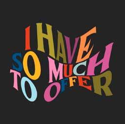
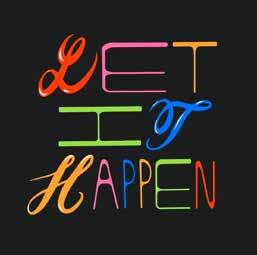
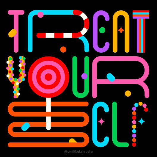
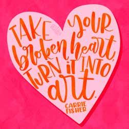
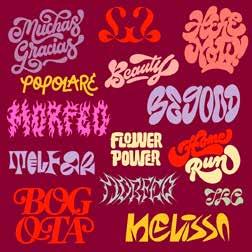
Every lettering piece starts with a single letter. A simple line becomes a form, then a letter. One leads to another, gradually building words and visual statements. This process is intentional yet open, each stroke adding meaning and personality.
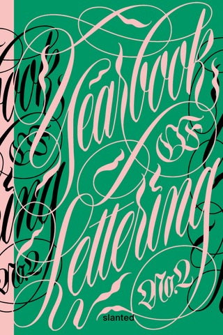
The Yearbook of Lettering began as a single collection, bringing together lettering from diverse artists worldwide. This second edition expands that narrative. Like letters joining to form words, these new works connect to the first volume while introducing fresh perspectives and styles.
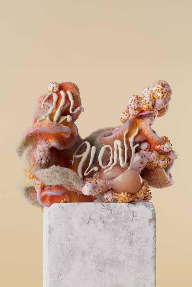
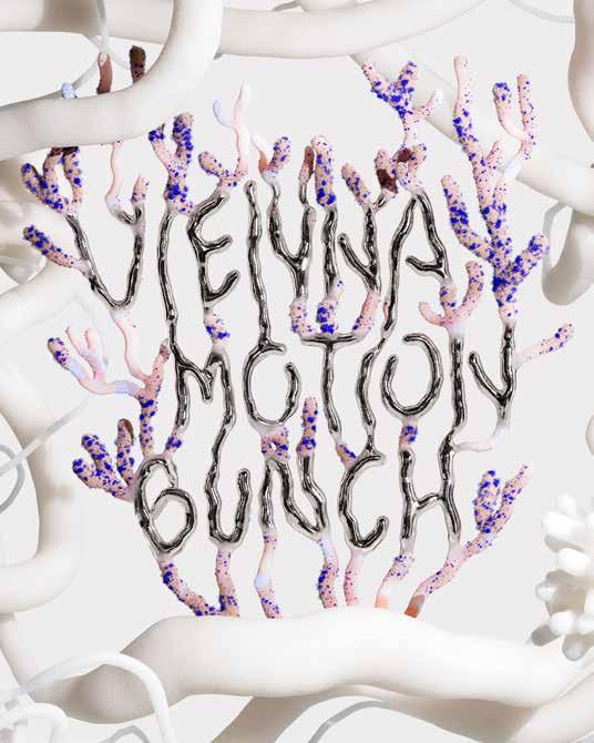
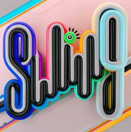
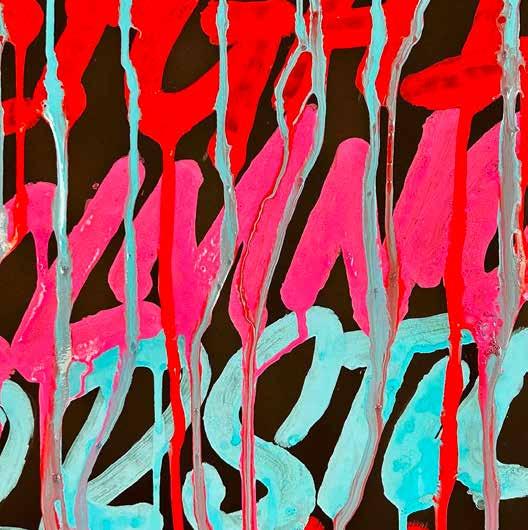
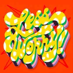
Letters and typefaces don’t just communicate—they evoke feeling and convey character. Lettering goes further: through dynamic strokes, textures, and movement, it captures energy and tension, shaping space and form.
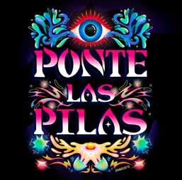
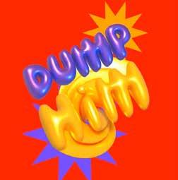
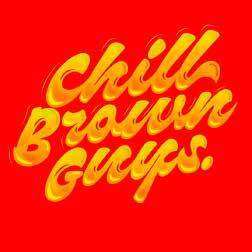
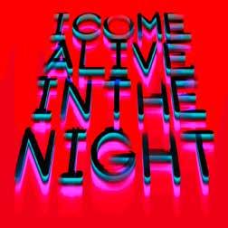
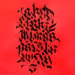
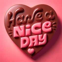
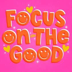
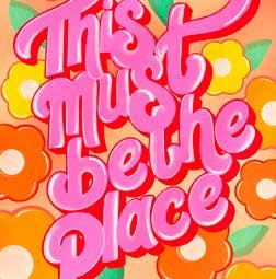
Words turn into images, evolving into compositions that communicate stories in a visual language. This edition spans classical calligraphy, hand lettering, graffiti, and street art, reflecting the ongoing evolution of the craft. It offers both inspiration and a resource, connecting clients with skilled artists and celebrating the variety of styles—from calligraphers to brush letterers, graffiti artists, and more.
We thank all artists for their contributions, and give special recognition to our Ambassadors for sharing their work and insights:
“Tyrsa” Alexis Taïeb, Ying Chang, Ken Barber, Ruben Malayan, Tina Touli, Carmi Grau, Abdelrahman Barakat, and Dave Towers.
Enjoy exploring each page, discovering the stories and personality that every stroke conveys.
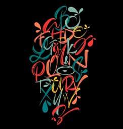
FROM CALLIGRAPHY TO 3D LETTERING
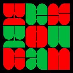
OUR PICKS FROM INSTAGRAM

“Tyrsa” Alexis Taïeb
PARIS — FRANCE
Ying
NEW YORK — UNITED STATES
Ken Barber
PHILADELPHIA — UNITED STATES
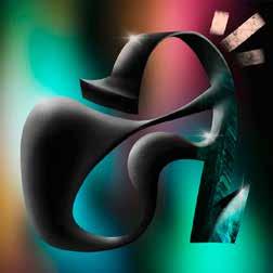
Ruben
YEREVAN — ARMENIA
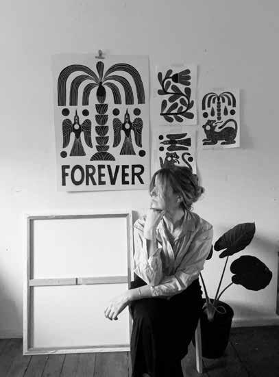
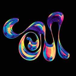
Tina Touli
LONDON — UNITED KINGDOM
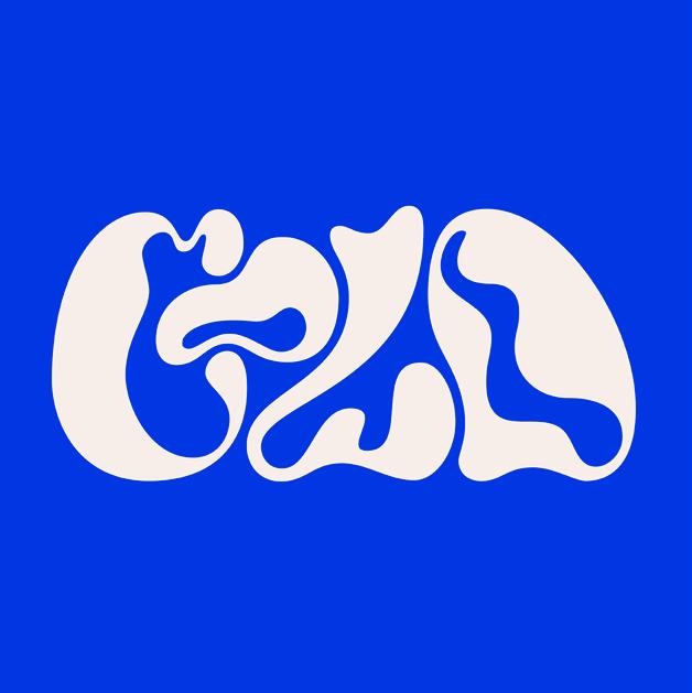
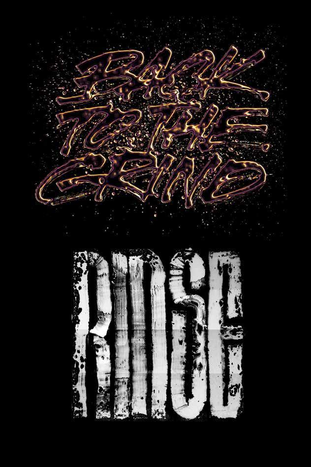
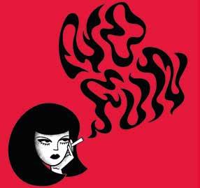
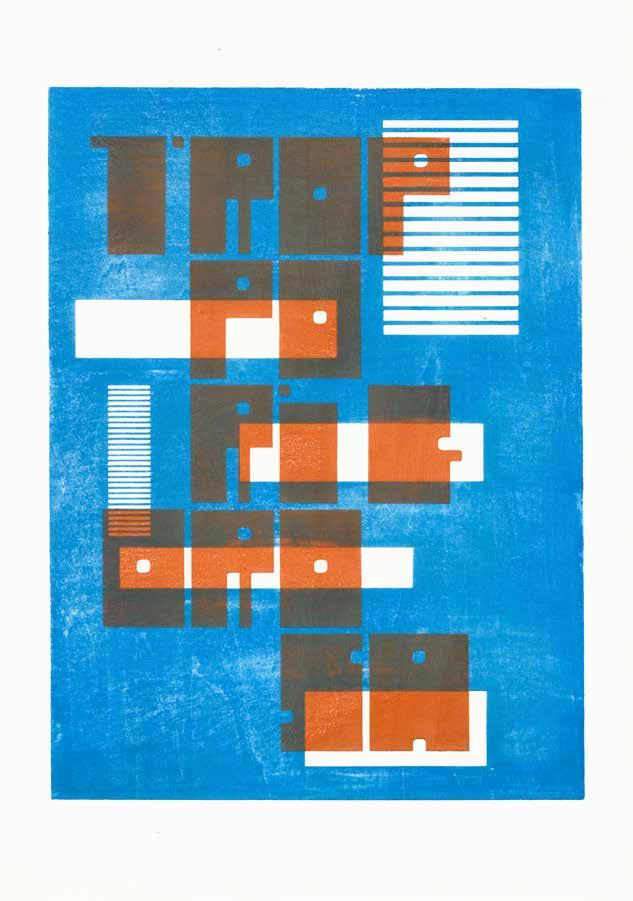
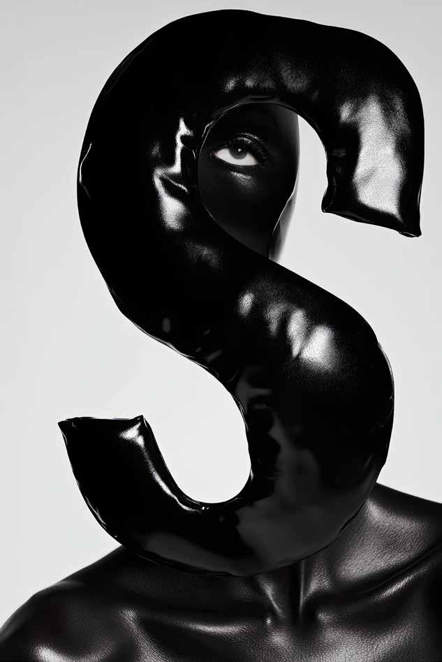
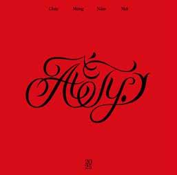
Carmi
ZÜRICH — SWITZERLAND
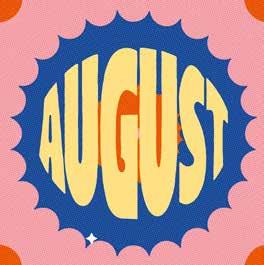
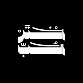
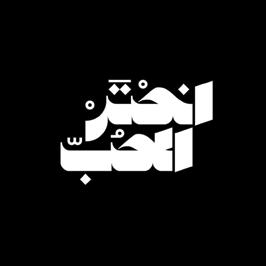
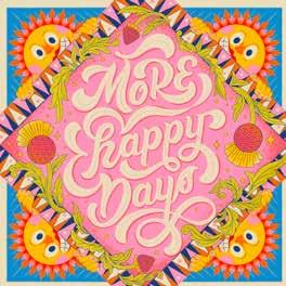
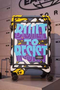
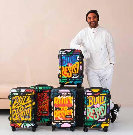
Abdelrahman
CAIRO — EGYPTIAN
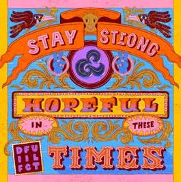
Dave Towers
LONDON — UNITED KINGDOM
Are there any techniques, tools, or processes you still want to try and experiment with?
In reality, the possibilities are almost infinite, any tool can be used to create typography. The only real limit is what humans can create and manipulate. I don’t have a precise idea in mind right now, but I’m eager to collaborate more. That’s where it gets exciting, when I explore tools from other fields and integrate them into my work.
What is your favorite project you have worked on so far in your career?
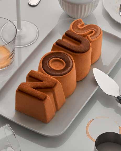
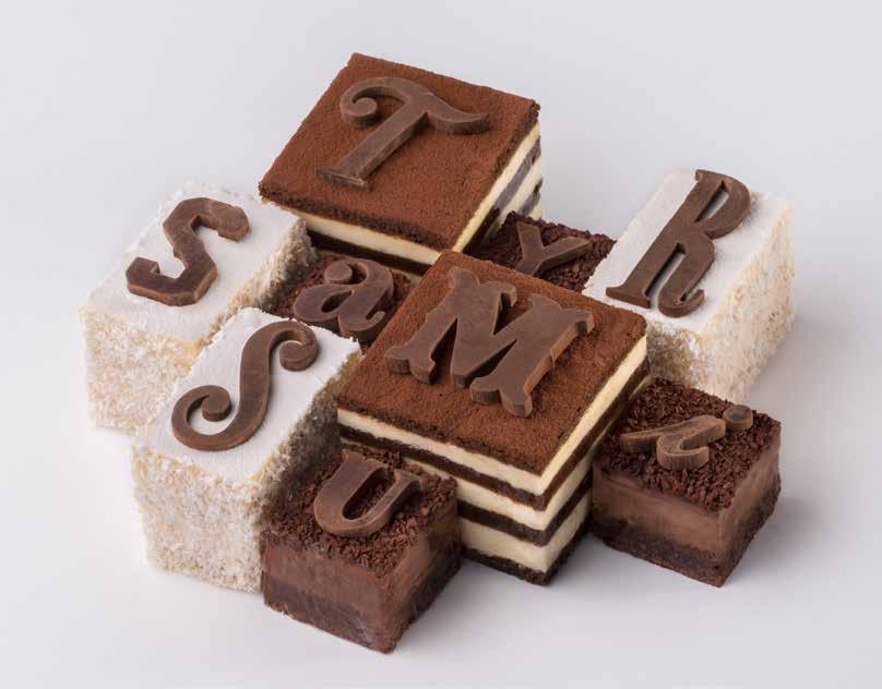
My favorite projects are those involving collaboration, I love working as part of a team. This passion comes from my background in graffiti, where tasks are naturally divided among the group. One of my favorite collaborations has been with chef Benoît Castel with whom we made the Tyrsamisu and the Nous Yule log. It’s the meeting of two artisans, two distinct skill sets coming together to create something truly unexpected. We incorporated the sense of taste in typography and brought a whole new dimension to the work.
You work with a variety of different clients and brands throughout different fields. Where do you draw your inspiration from?
I work extensively with references, always trying to analyze and understand the field in depth. For example, when designing a main title, I study movie posters from the relevant era, questioning their design to bring something fresh and original. A deep understanding of the field and the client allows me to introduce something truly new once I know the foundations.
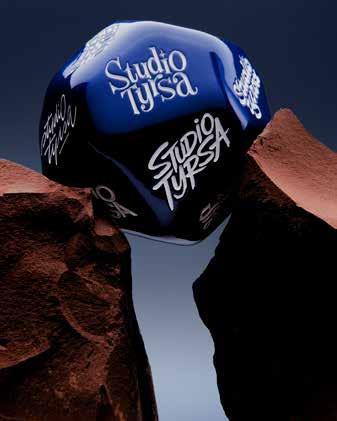
Around two years ago you’ve opened Studio Tyrsa—what made you expand your own practice? How did this decision change your work?
I’ve actually been operating like a studio for a long time, as I’ve always worked with external collaborators for things I don’t specialize in, such as animation or 3D. Before transitioning into a studio, many people saw me as just an artist and didn’t realize I could take branding projects further. Since establishing myself as a studio, I feel much more legitimate in handling larger brand identities while continuing to collaborate with specialists. Today, my love for collaboration makes this approach feel even more natural. It has helped me embrace the fact that I enjoy working with others, allowing me to recognize my strengths and weaknesses and surround myself with experts in their respective fields to bring the maximum out of a project.
What is something that you know now that you would have liked to know when you started your career?
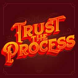
I’m grateful for everything I’ve learned along the way, picking up so many skills through hands-on experience. If I could talk to my younger self from 20 years ago, I’d say: trust the process and follow your instincts. I had ambitions, but in reality, it was my projects that led me to unexpected places. I’d remind myself to stay as curious as possible and not hold back. It’s important to remain open to projects we never initially envisioned, they often turn out to be the most rewarding.
Ruben Malayan is an Armenian artist, calligrapher, and educator renowned for his impactful contributions to Armenian calligraphy and visual arts. He has been instrumental in revitalizing and promoting the rich tradition of Armenian script, reimagining it as a contemporary art form while safeguarding its historical and cultural essence. His design career spans over 25 years, with expertise extending into graphic design, typography, visual identity, and calligraphy. Beyond his artistic achievements, Ruben Malayan is also recognized for his work in social activism. He founded the Armenian Genocide in Contemporary Graphic & Art Posters project and contributed protest art during the Second Artsakh War, reflecting his commitment to raising awareness through visual media. Over the years he has taught academic drawing, graphic design, and calligraphy in the United States, Canada, Italy, Russia, Poland, Romania, and Armenia. His works have been widely published in books and magazines globally, showcasing his influence and dedication to both art and education.
Tina Touli is a London-based creative director, multidisciplinary graphic communication designer, artist, maker, and speaker. She works across a wide variety of design fields, encompassing print and digital design, collaborating with diverse clients, including Adobe, CNN, Dell, HP, Ciroc Vodka, Fiorucci, Tate, LinkedIn, Converse, Kappa, and Dropbox. She had the honor of being selected by Print Magazine as one of the 15 best young designers in the world under 30 (2017). Tina has been invited to present her work at various events and conferences worldwide, such as the OFFF Festival, Adobe MAX, FITC Amsterdam, and the Typomania Festival. Her work has been featured in notable publications like Communication Arts magazine, Computer Arts magazine, Digital Arts magazine, and Design{h}ers by Viction:ary.
tinatouli.com
@tinatouli
Your work often showcases a dynamic fusion of analog and digital techniques. How do you approach the interplay between these two worlds?
I love exploring the intersection of the physical and digital realms, as it opens up endless possibilities for design. By working between these two worlds, I often discover new creative avenues and unexpected solutions. Some of the strongest designs emerge from simple ideas and hands-on experimentation. I sometimes even let the materials and tools guide me, embracing the natural evolution of a project. Understanding the strengths and limitations of both analog and digital methods allows me to turn them into tools, prototypes, or even final design outcomes.
Creativity, to me, is a journey—an ongoing process of exploration. The digital world offers incredible tools and flexibility, but it sometimes lacks the tangible materiality of the physical world. On the other hand, the analog world is rich in texture and depth, yet the digital realm provides the means to push those elements further. It’s this constant dialog between the two that excites me the most!
Working with both analog and digital techniques comes with unique challenges. Do you strive for perfection, or do you embrace serendipity and imperfections?
The unpredictability of analog techniques is exactly what makes them so exciting! Those little accidents and unexpected surprises often lead to the most unique outcomes. I embrace exploration and experimentation, allowing the process to unfold rather than trying to control every detail. This openness can lead to new discoveries and innovative techniques. However, when it comes to digital work, I’m much more of a perfectionist. I meticulously refine every detail, whether it’s an entirely digital creation or retouching an analog piece. Even the smallest elements—ones that no one else may notice—are important to me.
What has been the most challenging project of your career, and what did you learn from the experience?
What excites me most about design is its limitless potential. I really enjoy experimenting— exploring new mediums, techniques, and processes—to keep my creativity constantly refreshed. Each project presents unique challenges, both big and small, and that’s what I love most: those challenges!
One of the most challenging recent projects I worked on was the Pentawards 2025 identity. The biggest hurdle was shaping the pentagon within a physical liquid composition—it had to be perfectly positioned and scaled to work seamlessly across different applications, from social media to print. Achieving the right proportions while ensuring a visually striking outcome required careful experimentation and countless iterations. Ultimately, this challenge reinforced an essential aspect of modern design: creating adaptable graphics that work across multiple formats.
If you could work on any dream project or collaborate with a dream client, what would it be?
Rather than focusing on a single dream client or project, I’m driven by opportunities that push me beyond my comfort zone. Having worked with a diverse range of clients—from major brands like Adobe, Dell, Converse, and HP to smaller independent businesses—I find excitement in new challenges and unexplored territories. My goal is always to make each project the best I’ve ever created, constantly learning and evolving along the way.
Your work often revolves around lettering and language. What draws you to typography, and how has it influenced your artistic approach?
Typography has always been an intuitive passion for me. As a child, my mother taught me to read and write in German using a calligraphy book, sparking my fascination with letterforms. Over time, I realized that typography is much more than beautifully designed characters—it’s a powerful tool for communication. On one side, there’s the power of the words themselves, and on the other, the way a word is visualized can entirely change its meaning and emotional impact.
You started learning calligraphy at a very young age. What drew you to this art form back then, and how has it shaped your approach to design?
When I was in primary school, I first noticed my deep attachment to calligraphy through my teachers’ writings on the board. I began imitating book titles and signage, gradually developing a passion for letterforms. As I grew older, I pursued formal education at Khalil Agha, the oldest Arabic calligraphy school in the world. This journey ignited my fascination with pushing the boundaries of calligraphy—breaking traditional rules while ensuring the letters remained well-structured and beautifully crafted. That’s why my designs are deeply rooted in classical calligraphy, yet always infused with a contemporary design twist.
How would you describe yourself or your profession? Calligrapher, graphic designer, or something else?
I primarily identify as a calligrapher and lettering artist when it comes to my artistic work. However, beyond calligraphy and lettering, I also have solid knowledge of graphic design, type design, entrepreneurship, and Arabic and Islamic arts. This multidisciplinary expertise enables me to innovate and reshape the Arabic type and design scene through Alkhatt projects.
Do you have any calligraphy or design heroes, mentors, or role models who inspire you?
First and foremost, in calligraphy, my main mentor is Waleed Abdeen, who guided me through my first steps in learning the fundamentals of classical calligraphy. In lettering, Abdelghany Shoair was the first artist whose work introduced me to the world of typography beyond traditional calligraphy.
I also consider Mahmoud Hassan a role model in both lettering and graphic design—not only because he is, in my opinion, one of the best, but also for his deep understanding of the philosophy and thought behind design and lettering. His ethical approach throughout his career, along with his dedication to supporting and elevating the Arabic design and type scene, makes him truly inspiring.
How do you see the future of calligraphy and graphic design in an increasingly digital world? Are you noticing any shifts in how traditional calligraphy is being perceived and used in design today?
I believe Arabic calligraphy is deeply rooted in our culture, largely due to its strong connection to our religious and historical heritage. Since the advent of Islam, calligraphy has been the primary visual art and means of communication, used to write scriptures, transcribe books, and embellish mosques and buildings. Beyond that, it played a crucial role in daily life—it was used for writing messages between people, documenting state affairs, and labeling currencies and banknotes. In other words, calligraphy was the dominant visual language for centuries.
With the rise of digital technology, calligraphy has often been perceived as a traditional or outdated art form. This shift has significantly impacted the type and lettering scene, leading to the production of visuals that lack depth and authenticity. While there is no issue with exploring lettering or type design, I believe that without a solid foundation in classical calligraphy, the results often fall short in quality and aesthetic appeal. Our goal is to reintegrate calligraphy with digital arts and contemporary design—not just to preserve our cultural heritage but also to evolve and expand it in a contemporary and meaningful way.
How would you describe the design and art scene in Cairo?
Cairo is a fusion of art and design. Since ancient times, it has embodied visual and architectural beauty—from the art of the Egyptian pharaohs to Roman, Greek, Christian, and a rich legacy of Islamic art. In our current time, what i see is that Cairo lacks to integrate different type and design themes into one community. We see that the calligraphy community is isolated, the type design community is scattered, and graphic and lettering design with their various branches are joined together.
All this is better than the disconnection between people of different ages and segments in the same field. Despite all these difficulties, Cairo continues to produce spectacular artistic and design work and embraces a wide range of talents and professionals.
FINE

It’s


Ap. 75
Abadi, Marat
@marat_abadi @maratsigns maratabadi.info
Calligraphy, BlaCkletter, Brush, 3D, Calligrafitti, glass gliDing, sign painting, Nibs / broad-edged Nibs, iN k, ruliNg PeN, brushes, acrylic colors, Mixed Media, eNaMel Marat is a independent typographer and designer based in Leipzig, Germany. After completing their master’s degree in communication design they chose to specialize in analog mediums including calligraphy, letterpress printing and sign painting. Marat is also an educator and part of WERK 2—Kulturfabrik, where they have been leading a workshop for letterpress and calligraphy.
p. 74
Accorsi, Júlia
@juliaaccorsi, juliaaccorsi.com
illustrative, experimental, Digital, digital tools
Julia is a designer and type designer from Brazil and a postgrad in Typography from Type@Cooper, NY. She has created lettering for brands like Sol de Janeiro, TikTok, and Coca-Cola and is expanding her expertise in typography. With experience in branding, her work blends technical skill, pop culture curiosity, and everyday inspiration to create impactful visuals.
p. 109
Addante, Clarissa
@c_addante, clarissa-addante.com
Calligraphy, BlaCkletter, illustrative, experimental, Digital, Mixed Media
Clarissa Addante is an Art Director and Senior Designer based in Toronto, Canada. She is a branding and packaging specialist with a background in illustration. She enjoys typographic design and uses her artistic talents to curate memorable identities and lettering works.
p. 120 / 121
Agarwal, Pragun
@pragunagarwal pragunagarwal.com
Calligraphy, hanDwriting, Brush, illustrative, experimental, Digital, iNk, brushPeN, brushes, acrylic colors, Mixed Media, digital tools
Pragun Agarwal is a Graphic designer who is currently based in Germany. He is working at Landor, Munich as a Design Director. A typography enthusiast, his work is inspired by constant experimentation with different materials, textures, and tools.
p. 184
Aguilar, Jorge @jorgeaguilart
illustrative, Digital, viCtorian lettering, PeNcils, digital tools
Jorge Aguilar is a freelance graphic designer and illustrator based in Santiago, Chile. He specializes in vintage lettering and vector graphics.
p. 172
Allison, Claire @clairenstuff claireallisoncreative.com illustrative, experimental, Digital, 3D, digital tools
Claire Allison is a brand designer and illustrator known for her bold use of vibrant color, experimental typography, and striking visual storytelling. Her work combines imagnative flair with meticulous precision, creating expressive, maximalist pieces that leave a lasting impression.
p. 220 / 221
AlSaidni, Khalid @khalid.alsaidni behance.net/khalidalsaidni hanDwriting, illustrative, Digital, 3D, mural, chalk, PeNcils, digital tools
Khalid is a multidisciplinary lettering artist, designer & architect based in Gaza Strip, Palestine. Focusing on 3D type design and animation and using vibrant colors and textures, his distinct 3D Arabic lettering style has become recognizable. He worked
with some big brands such as Citroën and Godus brothers. Recently, he was commissioned to reimagine the SHOWstudio logo design and animation.
p. 112 / 113
Amini, Sajad @aminisajad, sajadamini.com experimental, Digital, digital tools
Sajad Amini is an Iranian-American artist, designer, and educator. His primary research focuses on language and semiotics and their impact on sociopolitical contexts. His work has been recognized, exhibited, and published by various galleries and institutions, including STA, SOTA, CAA, GDUSA, AGDA, TypeCon, among others. He serves as an Assistant Professor in Design at DePaul University, Chicago.
Bp. 101
Bacharach, Eran @eranb, bee-creations.com hanDwriting, experimental, Digital, 3D
Eran Bacharach is a multidisciplinary designer, typographer, and lecturer based in Tel Aviv. He co-founded Bee-Creations, where he has served as Creative Director for over a decade, leading branding, UX/UI, and interactive design projects. His work and essays on Hebrew typography and design have been internationally published, exhibited, and awarded.
p. 142
Balnova, Natalya @natalya_balnova natalyabalnova.com
hanDwriting, Brush, illustrative, experimental, Digital, iN k, brushes, Mixed Media, digital tools
Natalya Balnova is a New York based illustrator, designer and printmaker. Her work was recognized by Art Directors Club, American Illustration, Print Magazine, 3x3 International Illustration Annual, and
The Society of Illustrators. Her clients include: Apple, The New York Times, Samsung, and many others.
p. 111
Bauer, David
@_dab, designedbydab.com
Calligraphy, BlaCkletter, hanDwriting, Brush, Digital, graffiti / street art, typographiC iN k, brushPeN, Pilot Parallel PeN, ruliNg PeN, Markers, chalk, PeNcils, brushes, digital tools
David is a graphic designer, art director, and lettering artist based in Lausanne, Switzerland. He blends handcrafted lettering and calligraphy with visual design, typography, and storytelling. Inspired by movies, title sequences, video games, urban art, and literature, he creates textured, unique designs that truly connect with audiences.
p. 158 / 159
Beck, Kate
@kate_letters_lots kateletterslots.com
Calligraphy, hanDwriting, Brush, illustrative, experimental, Digital, iN k, brushes, Mixed Media, digital tools
Kate Beck is a lettering and illustration artist based in Calgary, Canada. She runs the studio Kate Letters Lots, where she specializes in bold colors and beautiful words. Kate’s work has been featured in Applied Arts Magazine, the Woman of Type Book, and in the Yearbook of Lettering #1. Her favorite projects to work on are gig and event posters, book covers, murals, and editorial illustrations.
p. 234 / 235
Betti, Leonardo @leonardoworx behance.net/leonardoworx
illustrative, experimental, Digital, 3D, Markers, PeNcils, Watercolors, acrylic colors, Mixed Media, digital tools
Leonardo Betti aka Leonardoworx is a digital artist focused on 3D abstract and typographic artworks. In all his art works there’s a constant
research on finding the perfect balance between shapes and color palettes, also mixing hand-drawn textures with 3D forms. He works for global advertising campaigns and editorials for clients like: Adobe, Microsoft, Wired, Billboard magazine and many more.
p. 79
Bhagat, Hiral
@hiral.bhagat
Calligraphy, experimental, iN k, brushes, Watercolor
Hiral is a pioneer of Gujarati Calligraphy and first female International Awardwinning Calligrapher from Gujarat. She is well versed in Latin and Devanagari Script too. Her keen interest is to look at calligraphy as art form rather than just writing form. Many Art and Design Institute have invited her nationally and internationally and works have been selected at various exhibitions and events.
p. 92 / 93
Biersack, Scott
@youbringfire, youbringfire.com
BlaCkletter, illustrative, experimental, Nibs / broadedged Nibs, brushPeN, PeNcils, Mixed Media, digital tools
Scott Biersack is a freelance Designer, Illustrator and Lettering Artist. His playful, vibrant work spans all kinds of industries, varying sized companies, and completely different avenues of creativity. He is a chameleon that can tackle all kinds of design and illustration styles to solve the problem at hand. Scott has learned there’s more to life than work and it’s a good thing his work is play.
p. 88 / 89
Bolis, Maxime @maximebolis
BlaCkletter, illustrative, Dotwork, iNk, rotriNg isograPh
Discovering typography through graffiti, I quickly developed an interest in graphic design. I would observe posters, signs, logos … The construction of a character, a word, or a sentence is a fascinating exercise in experimentation. Technically,
I love working in dotwork, a style that provides a textured effect, allowing me to play with volume and perspectives.
p. 165
Bortoloni, Laura @laurabortoloni laurabortoloni.com
Digital, Watercolors, Mixed Media, digital tools
Visual communication designer, graphic facilitator, lecturer, artist and printmaker based in Rovigo, Italy. Creative director at Ida Studio, awarded visual communication studio. Since 2020 she has been experimenting with woodblock printing, mixing traditional and digital techniques, exploring the concept of transmediality in visual narratives.
p. 214 / 215
Burmistrov, Anton @antoncreations antonburmistrov.com
illustrative, experimental, Digital, 3D, PeNcils, Mixed Media, digital tools
Born in Estonia, I studied and lived in the UK and now work in sunny Spain. I don’t stick to a single style but specialize in branding and typography. With over a decade in advertising, I’ve worked as a design director at top London agencies for brands like Apple, Serif, and Guinness. My focus on experimental type has earned recognition from Adobe, MK&G, Computer Arts, and more.
Cp. 122-125
Chekal, Oleksii @oleksiy_chekal, chekal.art Calligraphy, pointeD pen, BlaCkletter, hanDwriting, Brush, illustrative, experimental, Digital, graffiti / street art, Nibs / broad-edged Nibs, iNk, brushPeN, ruliNg PeN, Pilot Parallel PeN, Markers, brushes, digital tools
Oleksii Chekal is a Ukrainian graphic designer, calligrapher, and art historian.
Publisher
Slanted Publishers UG (haftungsbeschränkt)
Nördliche Uferstraße 4–6 76189 Karlsruhe, Germany
T +49 (0) 721 85 14 82 68 info@slanted.de slanted.de
@slanted_publishers
© Slanted Publishers, Karlsruhe, 2025
Nördliche Uferstraße 4–6, 76189 Karlsruhe, Germany
All rights reserved.
ISBN 978-3-948440-92-3
The publisher assumes no responsibility for the accuracy of all information. Publisher and editor assume that material that was made available for publishing, is free of third party rights. Reproduction and storage require the permission of the publisher. Signed contributions do not necessarily represent the opinion of the publisher or the editor.
The German National Library lists this publication in the German National Bibliography; detailed bibliographic data is available on the Internet at dnb.de.
About Slanted Publishers
Slanted Publishers is an independent design, publishing, and media house founded in 2014 by Lars Harmsen and Julia Kahl. They publish the award-winning Slanted Magazine, which appears twice a year and focuses on international design and culture. Since 2004, the daily Slanted blog has featured news, events, portfolios, and video interviews from the global design scene. In addition, Slanted initiates and produces high-quality publications on contemporary design and culture, working closely with editors and authors. Driven by passion, Slanted has earned international recognition for its vibrant design and open-minded, tolerant and curious philosophy.
Publishing Direction
Lars Harmsen, Julia Kahl
Creative Direction
Lars Harmsen
Art Direction & Editing
Juliane Lipp, Samira Niedermayer
Assistance Graphic Design & Editing
Linus Haug
Production
Julia Kahl
Website yearbookoflettering.com
Cover Artwork & Chapter Page Artworks: “Xesta” Hugo Moura, xestastudio.com
Fonts
Reynaldo, Benjamin Woodlock, abstractoffice.xyz Astloch, Dan Rhatigan, fonts.google.com
Printing
NINO Druck GmbH, ninodruck.de
Cover Material
PEYDUR Neuleinen, 135 g / sm peyer cover gmbh, peyer-cover.com
Paper
Inside: Munken Print White 15, 100 g / sm, Endpaper: SURBALIN seda 8240 gelbgrün, 115 g / sm, peyer cover gmbh, peyer-cover.com
With Special Thanks to “Tyrsa” Alexis Taïeb, Ying Chang, Ken Barber, Ruben Malayan, Tina Touli, Carmi Grau, Abdelrahman Barakat, and Dave Towers
The world of lettering, calligraphy, graffiti, and 3D-lettering continues to expand alive, diverse, and endlessly inspiring. Once you immerse yourself in this domain, you encounter not only incredible skill and creativity, but also an astonishing range of styles and approaches. This second Yearbook of Lettering carries ... the journey forward, showcasing the breadth of possibilities now being explored across the global lettering scene. Lettering artists from all over the world submitted their work, and this book brings together a carefully curated selection that reflects both diversity and quality..
Within this volume, you’ll discover works by outstanding artists, with our Ambassadors as a special highlight. “Tyrsa” Alexis Taïeb, Ying Chang, Ken Barber,,,,, Ruben Malayan, Tina Touli, Carmi Grau,, Abdelrahman Barakat, and Dave Towers–alongside fresh voices redefining the craft.