“... (i) imagined they probably smelled amazing, too”
— LINDA ZHENGOVÁ, 10 × 10 interview, page 147

— LINDA ZHENGOVÁ, 10 × 10 interview, page 147
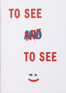
Typographic covers in zines and artist publications can be analyzed through two primary lenses: formal design and conceptual intention. From a formal perspective, a defining characteristic is their minimalist approach. Many zines within the AAP archive adopt a restrained aesthetic, often employing default system fonts and minimal design choices devoid of ornamentation or well thought typeface decisions. This reductionist style emphasizes clarity and immediacy, directing focus to the publication’s core message.
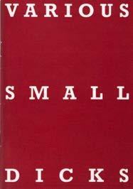
Despite this formal simplicity, these typographic covers frequently conceal content of significant visual intensity, as demonstrated in publications like VARIOUS SMALL DICKS. The choice to avoid imagery on covers, even when addressing photography, reflects deeper conceptual considerations. Conceptually, this design strategy aligns with principles of conceptual art, which prioritize the idea over aesthetic representation. Typographic titles can act as provocations, challenging conventional modes of viewing and interpreting photography. They engage readers by stimulating mental imagery and encouraging them to consider photography beyond its function as a visual medium. The absence of visual elements on the cover prompts a critical examination of the medium’s conceptual framework.
In some cases, the typographic design elevates the book to an art object, where the formal qualities of the cover—its typography, layout, and materiality—take precedence over its content. This approach can for example be seen in works like LIEBE IST DA, where the design becomes integral to the artistic statement.
Minimalism in typographic design often hinges on a stark, reductionist approach. This strategy not only ensures clarity but also transforms the cover into a gateway for engaging with the publication’s deeper themes. Examples include the eighth volume of 001 → BOYS! BOYS! BOYS!
THE MAGAZINE – VOLUME 8, Ghislain Pascal (ed.), The Little Black Gallery, 2024, 160 pp., 20 × 27 cm (↦ see № 160), which
spotlights queer and gay fine art photography with contributions from ten photographers across the globe, presenting works that span various photographic styles, including portraiture, studio imagery, fashion, and
documentary photography. The magazine’s carefully crafted visual presentation, enhances the impact of the imagery while maintaining a cohesive design. The written content complements the visuals with

poetry, and stories for a contemporary audience, it is a collaboration between editors Lucy Roeber and Saskia Vogel, designers Studio Frith, and a guest art curator.41, 42 In contrast to the preceding detailed and vibrantly illustrated covers, line art emphasizes simplicity and elegance through clean, often monochromatic drawings. This can be seen, for exmple, in 030 → ALLES GLÜCK DIESER ERDE, Romina Abate, 2023, 264 pp., 19.6 × 25.5 cm, where intricate compositions and minimalist drawings examine relationships and movement across diverse contexts. The artist book delves into the loose relationships between different entities and their multiplicity of meanings in diverse contexts, exploring what it means to relate to other bodies, including the practice of riding horses and the sexual behavior of sea animals.45 The exploration deepens in 031 → TINY PORN, Funs Kurstjens, OOOZ Club, 2018, 10 pp., 12 × 12 cm, which explores the perception of forms through abstract representations of sexual situations. The imagery retains its sensual essence by distilling it into simplified shapes, offering a unique and playful take on eroticism. The concept of TINY PORN draws inspiration from a passage in Ovid’s Metamorphoses, which reflects on the transformative nature of existence: “Nothing keeps its own form, and Nature, the renewer of things, refreshes one shape from another.”43, 44 032 → 100FOR10 – STUDIES OF ECSTASY – EDITION NO. 016, Myla Dalbesio, Melville Brand Design, 2017, 106 pp., 14.8 × 21 cm continues with clear linework to connect femininity with the natural world in a striking yet delicate visual narrative. Published as part of the 100for10 series by Melville Brand Design, STUDIES OF ECSTASY explores the relationship between femininity and the
natural world. Myla DalBesio, an American artist, examines identity and the intersection of sexuality and mysticism in her work. The cover features a minimalist design: the lower part of a leg in a platform high heel, sketched with white lines on a black background. Inside, the book continues with clear and simple line drawings on white paper.46
Transitioning into bold contrasts, 033 → MOAN ZINE
ISSUE 5, Moan, 2024, 98 pp., 13 × 18 cm, riso print by Dizzy Ink (↦ see № 164 & 196) uses a vibrant combination of risograph printing and dynamic design to juxtapose its linework with rich textures and provocative themes. MOAN ZINE ISSUE 5 is a bold exploration of sexual liberation, featuring 98 pages filled with honest and unique submissions from around the globe. Each piece delves into fantasies, fetishes, and desires, showcasing new voices and experiences while sparking essential conversations about safe sex, consent, and positivity. As a radical and political statement, MOAN continues to challenge societal norms that shame and limit sexual freedom.47 Rounding off this series, 034 → 100FOR10 EROTICISM ON THE LINE
EDITION NO. 086, Fabio Bacchini, Melville Brand Design, 2017, 106 pp., 14.8 × 21 cm distills desire into its most essential forms, using single-line drawings to create an intimate and elegant exploration of sensuality. EROTICISM ON THE LINE features a captivating collection of erotic illustrations in a minimalist single-line style. Each piece is a delicate exploration of sensuality, with the reduced forms evoking passion and intimacy. This book uniquely combines art and desire, drawing viewers into a world of subtle yet powerful eroticism.48
Rough, sketch-like drawings that exude raw energy— doodles that feel unpolished
and spontaneous, aligning with the irreverent, antiestablishment attitude of many zines. 035 → 100FOR10 – HI – EDITION NO. 104, Guillaume Kashima, Melville Brand Design, 2019, 106 pp., 14.8 × 21 cm reflects Kashima’s versatile approach to visual aesthetics, rooted in boldness and humor. The idea for this publication stemmed from life-drawing sessions in Berlin bars, where Kashima began experimenting with markers. He accumulated drawings weekly, eventually creating a fanzine to pause, review, and select the best.49, 50, 51 Shifting from this minimalism, 036 → VON VORNE IS AUCH ALLES SCHICK, Franziska Schaum, Re:Surgo!, 2011, 20 pp., 12 × 23 cm, screen print (↦ see № 212) incorporates vibrant silkscreen techniques to create a sense of layered depth and playful irreverence. This publication captures a mosaic of observations and experiences, blending personal anecdotes with a broader social commentary. 037 → MASTER FLAME, Patrick Rieve, Bone Response Publications, 2015, 8 pp., 7.7 × 10 cm (↦ see № 206) takes a more intimate approach to illustration with its compact and highly personal format. The original seven ink drawings of MASTER FLAME were created “in one night’s pour” in 1998. The pages feature juicy and occasionally violent ink drawings, exploring themes of Eros and Thanatos. Due to its sexual content and eightpage format, the work bears a resemblance to a Tijuana Bible. This reprint from 2015 consists of a folded A4 sheet, printed on one side on pink paper.52, 53 038 → 100FOR10 – NO!BODY! –EDITION NO. 012, Esther Czaya, Melville Brand Design, 2015, 106 pp., 14.8 × 21 cm shifts to bold, graphic pencil drawings that reject refinement in favor of raw expression. This monography features 100 pages of bold and
uninhibited pencil drawings by Hamburg-based illustrator and graphic designer Esther Czaya. Her work reflects a balance between introspective creativity and thoughtful social engagement.54, 55 Building on this boldness, 039 → NEEDLER, Mike Diana, Re:Surgo!, 2014, 16 pp., 10.8 × 14.8 cm, screen print intensifies the energy with chaotic and provocative imagery. NEEDLER is a mini zine featuring perverse doodles by Mike Diana, an iconoclastic and provocative underground cartoonist. Known for his crass humor and controversial themes, Diana’s work often explores sexuality, violence, and religion. He is the first person in the United States to receive a criminal conviction for artistic obscenity, stemming from his comic Boiled Angel.56, 57, 58 Moving toward a more figurative yet abstract style, 040 → SHVANTZ: AXIS, Baumann E. Walther (ed.), 1982, 21 × 29.7 cm, Xerox print employs expressive red line-work to blur the boundaries between illustration and emotion. “SHVANTZ is not an art magazine—it is the artwork itself.” SHVANTZ is a series of handmade and limited-edition publications, primarily produced using Xerox with added collage and other manual techniques. Each issue was limited to 50 copies. The cover illustration features an intimate scene depicted with expressive linework, blending abstraction and figurative elements. Many of the lines resemble doodles or notations, introducing a sense of unease and movement to the composition. Dominated by the color red, the provocative title “Shvantz” is derived from the Yiddish word meaning “penis.”59 041 → GRIECHISCHE MYTHEN 03 – ZEUS, Frank KlausPeter & Hans von Rimscha, icon Verlag Hubert Kretschmer, 2017, 48 pp., 14.8 × 21 cm builds on the abstraction of SHVANTZ: AXIS by incorporating vibrant, painterly
strokes that evoke mythological themes. The booklet features a short and bold text in Cypriot dialect and colorful, unconventional drawings and paintings, designed by Johannes Bissinger with philological input from Theodora Hadjimichael.60, 61 From bold strokes to refined linework, 042 → DAS TYPISCHE DING, Tabea Blumenschein, Dagmar Dimitroff, Wolfgang Müller & Nikolaus Utermöhlen, Die Tödliche Doris, 1981, 7 × 11 cm simplifies its composition to convey a conceptual narrative. DAS TYPISCHE DING was released as an audiotape in 1981, reissued in 1986, and later as a vinyl edition in 2004. The cover design was created by Nikolaus Utermöhlen and Wolfgang Müller (© Archiv der Tödlichen Doris). 043 → TABEA UND DORIS DÜRFEN DOCH WOHL
NOCH APACHE TANZEN, Tabea Blumenschein, Dagmar Dimitroff, Wolfgang Müller & Nikolaus Utermöhlen, Die Tödliche Doris, 1981, 7 × 11 cm concludes this series with playful and provocative cartoon-like illustrations. TABEA UND DORIS DÜRFEN DOCH WOHL
NOCH APACHE TANZEN was first released as an audiotape in 1981, with a reissue in 1986 and a vinyl edition the same year. The cover design, by Wolfgang Müller and Nikolaus Utermöhlen, features a drawing by Tabea Blumenschein. The music, composed by Die Tödliche Doris, includes contributions from Tabea Blumenschein, Nikolaus Utermöhlen, and Wolfgang Müller (© Archiv der Tödlichen Doris).
Illustrations that employ satire, irony, or exaggerated forms approach sensitive themes like sex and eroticism with humor and accessibility. This section explores how zines use playful and bold graphic language to reframe provocative ideas into entertaining, thought-provoking narratives. 044 → ¡QUE SUERTE! 22 – CANIBAL, Olaf Ladousse
(ed.), 2013, 124 pp., 15.6 × 21 cm, screen print features black-and-white comics by various international artists. Contributions come from both professionals and amateurs, offering a diverse and eclectic collection. The cover is always a multicolored screen print, and each zine includes unique, handmade details added post-production.62, 63 045 → DAS MAGAZIN HEFT 06 / 1982, Manfred Gebhardt (ed.), Berliner Verlag, 1982, 80 pp., 16.2 × 23 cm shifts to a softer, illustrative aesthetic with refined linework. DAS MAGAZIN HEFT, a cultural and entertainment magazine founded in 1924, remains one of the few East German publications to continue after reunification. The magazine became known for its unique blend of provocative themes, including erotic photography, intelligent puzzles, and literary contributions. The cover for this issue features artwork by Werner Klemke.64, 65, 66, 67 With a sharper edge, 046 → MINI ZINE – SMOKING TALR’S STASH Frodo Mikkelsen, Re:Surgo!, 2017, 16 pp., 10.8 × 14.9 cm, screen print introduces caricature and stylized exaggeration, contrasting the subtlety of its predecessor. This mini zine, printed by Johnathan Lawes, showcases Frodo Mikkelsen’s unique approach to visual art. The cover features a stylized illustration of a nude female figure, blending sketch-like elements with printmaking techniques. The caricatured stylization, unusual details, and ironic exaggeration reflect Mikkelsen’s distinct artistic voice.68 The abstraction and vibrant color schemes of 047 → HOLOGRAMA, Llucia Font & Grip Face (ed.), Rua Ediciones, 2014, 32 pp., 8 × 14.8 cm further push the boundaries of visual expression, moving away from stark minimalism. HOLOGRAMA is a provocative zine featuring pornographic and sexual illustrations by various artists, with a focus
on women, the female body, and their sexuality. This graphic book-zine delves into themes of shamanism and fetishism, interpreted through the lens of nine international illustrators.69, 70 Building on abstraction, 048 → SPRING #16 – SEX, Mairisch Verlag, 2019, 256 pp., 20 × 24 cm, neon print (↦ see № 209) explores identity through collaborative and dynamic visual storytelling. The 16th issue, SEX , tackles the deeply private and culturally shaped topic of sex. Thirteen illustrators explore themes such as the evolutionary history of sexuality, personal experiences from puberty, everyday sexism, the absence of physicality, and female identity across generations. The issue is brought to life with the cover design by Nina Pagalies.71 Shifting to an introspective tone, 049 → SPRING #12 – PRIVÉE, Mairisch Verlag, 2015, 200 pp., 24 × 20 cm (↦ see № 208 & 210) delves into the private sphere with a subdued color palette. Life is divided into two boxes: one labeled public and the other private. While the public box sometimes resembles a bargain bin in a department store— anyone can rummage through it as they please— the twelfth issue of SPRING focuses primarily on the private box: that side of us we only share with chosen people, a side filled with secrets. This intimate exploration is framed by the cover design of Line Hoven.
In contrast, 050 → MINI ZINE – FRANCIS BACON ON MUSHROOMS, Fuzz Chriss, Re:Surgo!, 2019, 16 pp., 10.8 × 14.8 cm, screen print (↦ see № 207) embraces bold symbolism and satirical humor through exaggerated visuals. This mini zine combines spirit and satire in a unique exploration of themes through a bold, graphic style. The cover features a stylized illustration with strong symbolic and humorous elements, blending spiritual
and sexual motifs. The imagery employs exaggerated, ironic symbols that reflect the zine’s playful yet thought-provoking tone.72 With playful reinterpretation, 051 → NOT SO NUDE –NUS VESTIDOS, Neo Nuvens, Serrote, 2016, 32 pp., 16 × 16 cm, humorously reframes classical art through a contemporary lens. NOT SO NUDE is a tribute to Daniele da Volterra, nicknamed “the breeches maker,” the infamous Mannerist Italian painter tasked with covering the genitals of Michelangelo’s The Last Judgment in the Sistine Chapel with loincloths and fig leaves under the recommendations of the Council of Trent, which condemned nudity in religious painting. The author of this book humorously went beyond these historic prescriptions, using a ballpoint pen to draw underwear on thirteen reclining nudes from secular paintings. Odalisques, goddesses, nymphs, lovers, prostitutes, and wives— displayed on the walls of famous museums—were reimagined, dressed in bodysuits, nightgowns, bras, panties, and socks.73 The exaggerated comic style of 052 → SEXACIONAL DE COLEGIALAS Y ESTUDIANTES NO 24, Guillermo Dominguez Muñoz, Editorial Ejea, 1997, 80 pp., 12.5 × 14 cm adopts a humorous, vibrant approach to provocative themes. The cover features a sexualized and humorous illustration in an exaggerated comic style. Below the title “Colegiala” (“Schoolgirl”), the text “¿Qué Nalgotras Clases No Nos Vimos?” appears a playful pun referencing the female figure. Translated, it humorously asks, “What (other) butt-classes did we miss?”74, 75, 76 Turning reflective, 053 → ALMANAC JOURNAL OF TRANSPOETICS ISSUE #2 SEXUALITIES, Almanac Press, 112 pp., 21 × 13 cm, combines poetic expression with graphic experimentation. This second issue focuses on transsexuality,
Unlike illustrations, photography on covers is often perceived as more commercial or “polished.” Some titles in the archive do indeed exude a classic appeal, yet a notable sense of humor emerges. This humor can stem from inherently comical subjects or the way a specific crop highlights the situational comedy. It’s all about the crop! Nude photography, when framed just right, often transforms into graphic art.
068 → VENUS INTERNATIONAL. EINE DOKUMENTATION DER FOTOKUNST, Horst Mössler (ed.), EHAPAVerlag, 1970, 281 pp., 21.5 × 30 cm, gives a sense of timeless elegance, where the warm lighting and intimate framing elevate the nude photograph on its cover into a refined work of art. This publication is a comprehensive documentation of photographic art, featuring both blackand-white and color photography. The refined sensuality of VENUS INTERNATIONAL transitions seamlessly into 069 → ULALUME, Evren Tekinoktay, Lubok Verlag, 2015, 4 pp., 17 × 24.5 cm, where Evren Tekinoktay’s pastel-toned collages reinterpret elegance with a surreal and poetic edge. This artist book, printed in a limited run of 500 editions and designed by Jacob Birch, features 44 full-page color illustrations. Evren
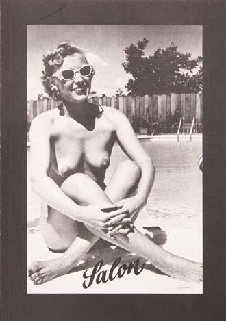
Tekinoktay’s artistic practice centers around the exploration of media images of women. She describes her approach as “gender science fiction—where gender collapses or disintegrates.”98, 99 From the dreamy collages of ULALUME, the black-and-white photograph on the cover of 070 → THE COMPLETE COLLECTION OF NUDISTS, Gerhard Theewen, Salon Verlag im Verlag Kretschmer & Großmann, 1982, 160 pp., 14.8 × 21 cm (↦ see № 180 & 182) captures a playful yet timeless elegance, blending simplicity with natural beauty. Nudist photography can be divided into different categories, and Gerhard Theewen focuses on its humorous aspects. His work emphasizes the lighthearted and genuine comfort found in nudist camps, showcasing why nudism thrives: it is both amusing and provides
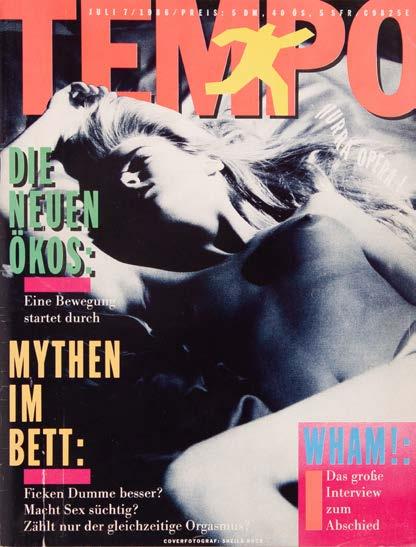
people with a sense of wellbeing. To lose sight of this core perspective is to misunderstand the essence of nudist photography. Moving from THE COMPLETE COLLECTION OF NUDISTS’S candid charm, 071 → DER SPRENGREITER NO. 2 –EMPIRIE UND ORNAMENTIK, Der Kern Verlag, 1984, 12 pp., 30 × 42 cm, linocut combines linocut ornamentation with nostalgic photography, adding a layer of irony to its aesthetic. This photo issue of EMPIRIE UND ORNAMENTIK was printed in an edition of 300 copies on pink paper, combining black-and-white photographs with ornamental linocuts. 072 → TEMPO 07, Markus Peichl (ed.), JahreszeitenVerlag, 1986, 21 × 29.7 cm captures the bold and dynamic energy of late 20thcentury culture, combining sleek design with provocative themes. TEMPO was a
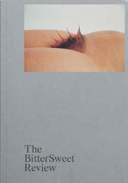
German monthly magazine that captured the zeitgeist of the late 1980s and early 1990s, blending themes of lifestyle, rebellion, consumerism, AIDS, pop culture, and high culture. It served as a vibrant cultural barometer, establishing itself as a cult favorite before succumbing to increasing competition from other zeitgeist magazines like Wiener and Max.100, 101, 102 From the refined compositions and timeless aesthetics, the focus shifts to works that embrace humor and satire, blending playful irreverence with sharp social commentary. Describing itself as, “a literary magazine for queers and their friends,” 073 → THE BITTERSWEET REVIEW NO. 02 – I STARTED A JOKE, Fulmine Kole, Benoît Loiseau & Louis Shankar (eds.), The BitterSweet Review, 2023, 200 pp., 13 × 19 cm is a


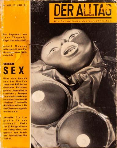
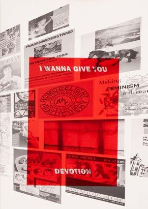
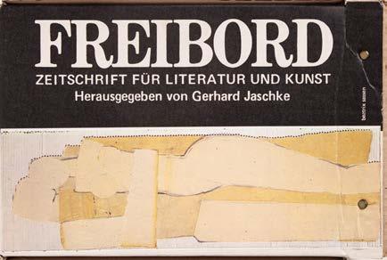
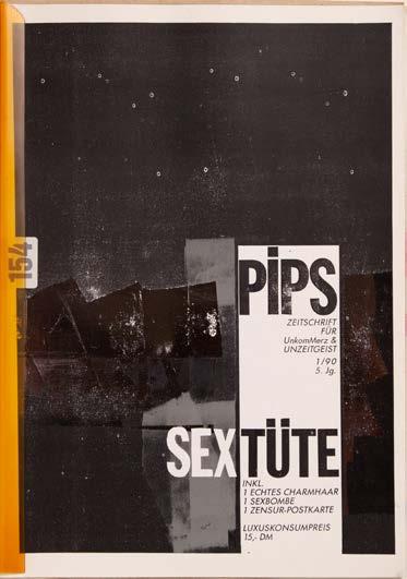
This artist book was created alongside the exhibition, presenting posters and other works that reflect the intersection of queer history, art, and activism. This publication with text contributions by Kerstin Stakemeier, Philipp Gufler & Laura Lang, and members of the forum, combines historical posters and flyers with new contributions from 29 artists and collectives, invited by Gufler to engage with and reinterpret the archive’s materials.156, 157 The curated simplicity of I WANNA GIVE YOU DEVOTION leads into the tactile and layered minimalism of 111 → FREIBORD –ZEITSCHRIFT FÜR LITERATUR UND KUNST, Gerhard Jaschke (ed.), Edition Freibord, 1984, 28 × 19 cm where every element finds its place. The carton, bound with fasteners, contains eight morning editions. FREIBORD aimed to merge literature and art with cultural criticism and sociopolitical engagement. Quickly, it became a vital platform for underground authors and established itself as an avant-garde publication.158 112 → PIPS –ZEITSCHRIFT FÜR UNKOMMERZ & UNZEITGEIST 1/90 SEXTÜTE, Katharina Eckart, Claudia Pütz, et al. (eds.), PipsDadaCorporation, 1990, 35 pp., 21 × 29.7 cm experiments playfully, yet still grounded in minimalist presentation. The 1/90 edition of PIPS is a zine held together with a plastic clip, comprising various papers and materials. Unlike later editions, which appeared in box formats, this early issue reflects the zine’s experimental origins. Limited to 200 numbered copies, it included bizarre and provocative elements such as a real pubic hair, a “sex bomb,” or a censorship postcard.159 The handcrafted minimalism of PIPS transitions naturally into the ethnographic focus of 113 → DER ALLTAG. DIE SENSATIONEN DES GEWÖHNLICHEN. THEMA: SEX. NR. 1/89, Walter Keller
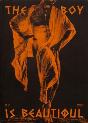
(ed.), Der Alltag, 1990, 192 pp., 21.5 × 27 cm which reflects on everyday life and aims to “intelligently accompany” it. This issue, centered on the theme of sex, caters to sociological interests through photography, interviews, reports, and essays. In the foreword, Michael Rutschky remarks that readers of DER ALLTAG can discover “what else they can be taught and delighted by—just while waiting at the crosswalk for the pedestrian light to change.”160 Straightforward design evolves into 114 → THE OPÉRA ANNIVERSARY ISSUE – BEST OF CLASSIC & CONTEMPORARY NUDE PHOTOGRAPHY, Matthias Straub (ed.), Kerber Verlag, 2022, 320 pp., 24 × 31 cm (↦ see № 152, 165 & 174), blending elegance and simplicity to celebrate the human form. The cover features textured linen with silver print and a banderole, adding a luxurious finish. Designed by Steffen Knöll and Sven Tillack from Studio TillackKnöll, Stuttgart, the ANNIVERSARY ISSUE is a strictly limited edition of 1,111 highquality copies, offering a comprehensive celebration of classic and contemporary nude photography over the last decade.161 The refined style of THE OPÉRA shifts to the intimate warmth of 115 → THE BOY IS BEAUTIFUL #3, Leonidas Liolios (ed.), The Boy Is Beautiful, 2024, 112 pp., 17 × 23 cm, lith print where minimalist tones meet layers of meaning. THE BOY IS BEAUTIFUL unravels the thread of queer Greek chronicles, weaving together narratives from myth and history to contemporary life. Each issue illuminates the closeted history of a gay utopia while celebrating the work of contemporary artists, photographers, writers, and sex workers who engage with Greece as a symbolic and literal space for queer identities everywhere. The third issue, Hyacinth, continues this exploration with bold and
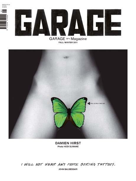
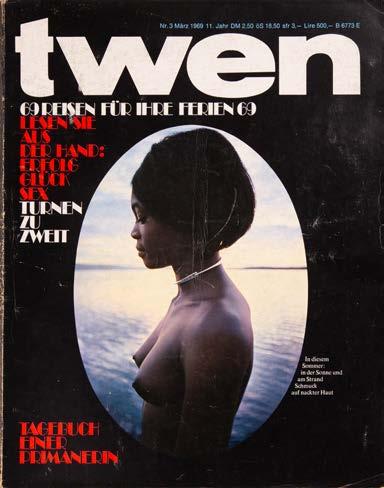
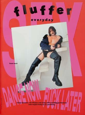
unapologetically queer storytelling on its signature terracotta pages. It reimagines Greece as a haven for diverse expressions of identity, blending ancient mythological references with modern perspectives on sexuality, desire, and culture.162 From this warm minimalism, 116 → GARAGE MAGAZINE NO. 1, Dasha Zhukova (ed.), garagemag, 2011, 274 pp., 26 × 34.2 cm (↦ see № 149 & 189) shifts to bold simplicity, showcasing graphic design’s power to create impact through experimental yet minimalist layouts. GARAGE MAGAZINE is a biannual print publication that brings to life the most original and ambitious collaborative projects across contemporary art and fashion. The magazine features an iconic butterfly-sticker cover, concealing a tattoo design by Damien Hirst, setting the tone for its innovative approach. GARAGE MAGAZINE fosters a dynamic dialog between emerging and established creators, uniting influential voices in art, fashion, and design. Mike Meiré and his editorial team have been responsible for the style-defining artwork since the very first edition.163, 164 165 Boldly redefining visual storytelling, GARAGE MAGAZINE NO. 1 flows seamlessly into the innovative design of 117 → TWEN 1969 NR. 3, Willy Fleckhaus & Udo Wüst (eds.), Kindler & Schiermeyer, 1969, 26.5 × 33.5 cm, a magazine for young adults in postwar Germany, published from 1959 to 1971. Known for its bold coverage of political and societal topics, it stood out for its innovative design and striking visual storytelling. This 1969 issue highlights a shift toward vibrant use of color and a growing emphasis on themes like the human body, sex, and eroticism. TWEN embodied the controversial ideas and burgeoning freedoms of its time, often pushing boundaries with provocative content.166, 167 118 → FLUFFER
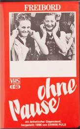
EVERYDAY ISSUE NO. 6, Sotiris Trechas (ed.), Fluffer Everyday, 2024, 64 pp., 21 × 28.4 cm (↦ see № 215) is an erotic publication that celebrates arousal in the everyday. Promoting body and sex positivity, the magazine challenges traditional notions of what is considered sexy and “normal,” emphasizing moments over societal or gendered standards. Each issue delves into a specific kink, offering visual and mental stimulation that embraces diversity and inclusivity. This sixth issue highlights performers who inspire body and sex positivity. The issue is presented in two specialedition covers, each printed in a limited run of 500 copies. As a platform that combines print with an online blog, FLUFFER EVERYDAY aims to make the daily life feel more adventurous and provocative. By transforming fantasies into obsessions and finding erotic potential in mundane moments, it encourages readers to embrace a more open and diverse perspective on sexuality.168 Building on the boldness of FLUFFER EVERYDAY , 119 → OHNE PAUSE –EIN ÄSTHETISCHER GEGENSTAND, Erwin Puls, Edition Freibord, 1986, VHS cassette introduces a layered and thought-provoking aesthetic. OHNE PAUSE (“without a break”) is a compilation film by Erwin Puls that combines pornographic footage from the interwar period and postwar era with amateur recordings and unused material from Austrian director Michael Pilz. In addition to the visual material, a philosophical text runs at half reading speed, where Puls reflects on film, montage, aesthetics, pornography, art, and its reception. This interplay of visuals and text creates a dense aesthetic framework that examines the relationship between art and erotica.169, 170 Puls broadens OHNE PAUSE’s exploration of taboo themes, but here,
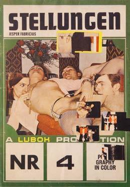
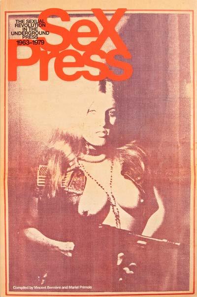
the layered typography and the provocative image heighten the chaotic yet intentional aesthetic. 120 → PULS FÜR DEN INTIMBEREICH, Erwin Puls, 1975, 120 pp., 13.6 × 9.8 cm is presented with a delicately illustrated dust jacket and features numerous black-and-white pornographic photographs. From the early 1970s onward, Puls worked predominantly with reproduced and found materials, often incorporating pornographic imagery into his montages. His provocative approach garnered significant attention and led to several legal disputes. PULS FÜR DEN INTIMBEREICH exemplifies Puls’ exploration of art through a transgressive lens, pushing boundaries between aesthetic creation and societal taboos.171 While Puls provokes through layered visuals, 121 → STELLUNGEN, Jesper Fabricius, Lubok Verlag, 2011, 24 pp., 14.8 × 21 cm (↦ see № 194 & 195), takes this chaos further with cut-out windows and cubist-inspired layering. In STELLUNGEN, Jesper Fabricius reproduces a magazine that served as source material for his artistic process. Known for his collages, Fabricius frequently incorporates image and text fragments from 1970s porn magazines. This work features cut-out windows that reveal glimpses of subsequent pages, creating a unique interplay of form and content. The resulting layered visuals evoke an almost cubistic tension, blending provocative themes with experimental design.172 The bold, collage-like layouts of STELLUNGEN evolve into the visual rebellion of 122 → SEX PRESS: THE SEXUAL REVOLUTION IN THE UNDERGROUND PRESS, 19631979, Vincent Bernière & Mariel Primois (eds.), Abrams, 2012, 240 pp., 22.5 × 34 cm. This publication captures the vibrant and rebellious spirit of the sexual revolution as chronicled in underground press publications from
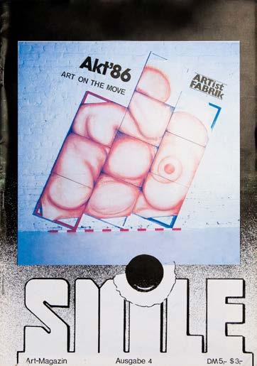
1965 to 1975. Covering a wide array of journals, magazines, and fanzines, SEX PRESS delves into the bold and provocative era when publications such as Other Scenes, Yellow Dog, Actuel, Suck, The Body, and Screw challenged societal norms. Illustrated with vivid fullpage facsimiles, the publication traces the evolution of sexual expression from the exuberance of the 1960s to the codified forms of pornography in the mid1970s. SEX PRESS offers a compelling visual narrative of this extraordinary period of experimentation, creativity, and freedom, celebrating the groundbreaking role of the underground press in shaping the sexual revolution.173 123 → SMILE ARTMAGAZIN AUSGABE 4, Josef Klaffki (ed.), SmileMagazin, 1986, 51 pp., 30 × 21 cm carries forward the chaotic energy of SEX PRESS , blending Mail Art aesthetics with provocative yet playful imagery to create a unique visual dialog. This fourth issue of SMILE, edited by Josef Klaffki (also known as “Joki”), features blackand-white photographs alongside orange-colored graphics. SMILE itself was conceived as an experimental, multi-origin publication by Monty Cantsin. Various contributors used the same title, with no fixed format or singular responsibility, fostering a unique collective creative endeavor.174, 175
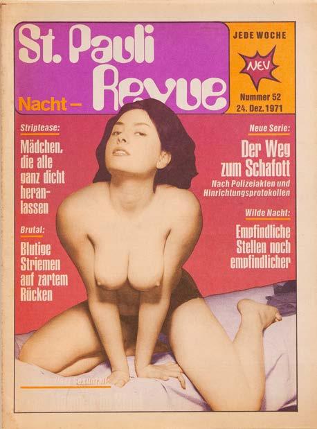
The bold experimentation of SMILE transitions into the raw, unapologetic documentation of Hamburg’s nightlife in 124 → ST.PAULINACHTREVUE NR. 52, Peter Martens (ed.), HANSEATA, 1971, 39 pp., 23.5 × 32 cm. The ST.PAULINACHTREVUE was a weekly publication released in Hamburg by the HanseataZeitschriften-Verlag. The magazine documented nightlife and cultural themes of the St. Pauli district, reflecting its vibrant and notorious character.176
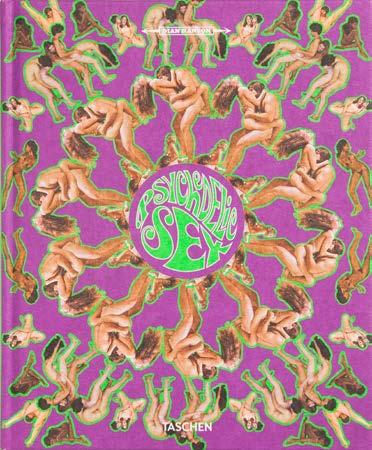
125 → PSYCHEDELIC SEX, Dian Hanson (ed.),
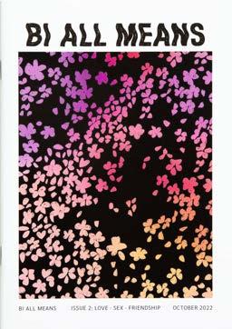
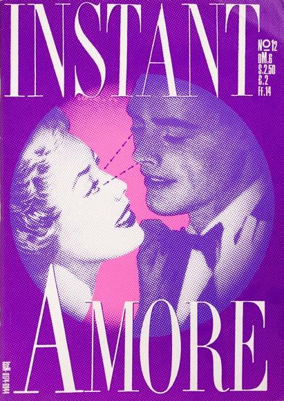
Taschen Verlag, 2014, 408 pp., 25.5 × 21 cm captures the experimental spirit of St. Pauli but elevates it with mesmerizing visuals, embodying the vibrant chaos of the 1960s counterculture. In a brief yet transformative period between 1967 and 1972, the sexual revolution and the rise of recreational drug experimentation converged, creating what is now referred to as “psychedelic sex.” During this time, men’s magazine publishers attempted to visually emulate the effects of LSD, using colorful, kaleidoscopic projections on nude bodies, often portraying the carefree and uninhibited lifestyle of hippies. These images were aimed at enticing a conservative audience curious about the promises of free love and the counterculture movement. PSYCHEDELIC SEX explores this fascinating era through over 400 pages of photographs and text, presenting naked figures with psychedelic designs on their bodies, surrounded by quintessential elements of the time—beaded necklaces, drug paraphernalia, and posters of bands like Led Zeppelin.177, 178 From the psychedelic era, the layered visuals of PSYCHEDELIC SEX seamlessly transition into 126 → BI ALL MEANS, Julia Koschler, 2022, 46 pp., 14.8 × 21 cm, showcasing a celebration of identity with bold, diverse graphics. BI ALL MEANS is a threepart zine exploring the bi+ spectrum, created in response to bi+ erasure and hostility in mainstream society and queer communities. It aims to provide a platform for sharing experiences, perspectives, anger, and joy, promoting visibility and connection. BI ALL MEANS celebrates the diversity and resilience of the bi+ community, fostering a deeper understanding of identity and relationships.179 BI ALL MEANS’ delicate florals transition into the striking typography of 127 → INSTANT NR. 12 – AMORE,
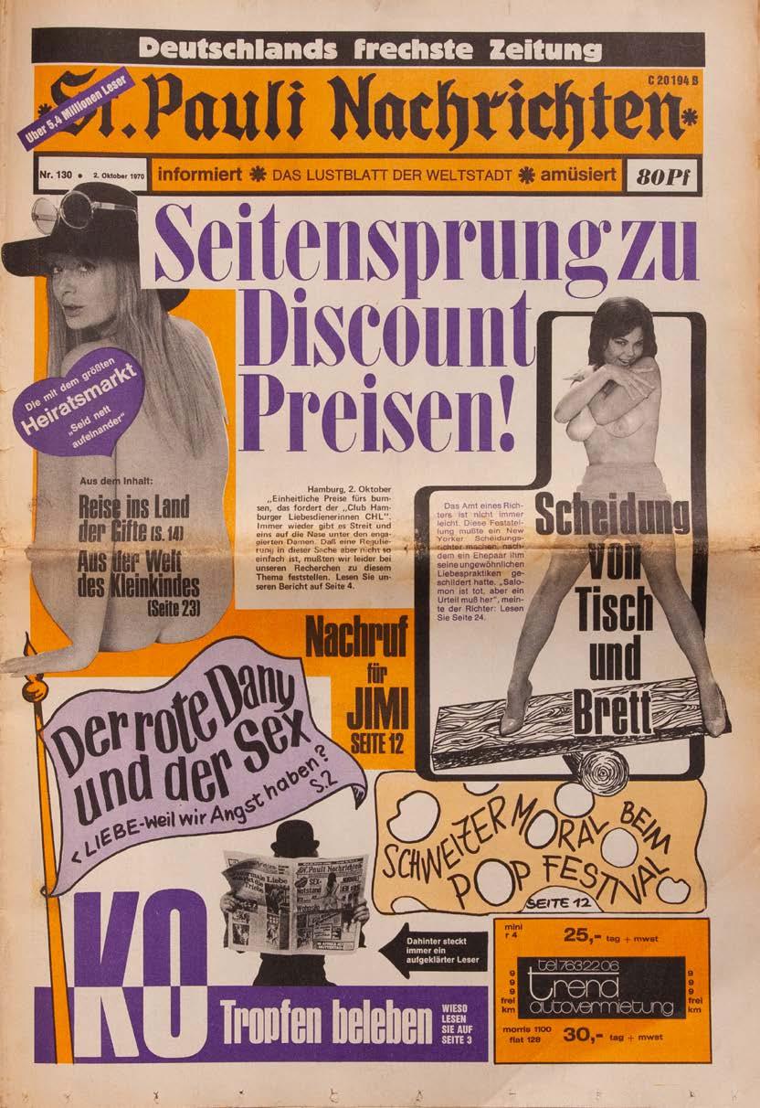
Franz Aumüller, Thomas Feicht & James Nitsch (eds.), Trust, 1985, 29.5 × 42 cm, blending intimacy with bold expressions of love. INSTANT is a magazine situated at the intersection of design, advertising, and art, with each issue centered on a specific theme. Issue 12, titled AMORE , explores the concept of love through a blend of numerous photographs. The magazine’s mission is to dissolve boundaries between advertising, art, opinion, and self-expression.180 Finally, 128 → ST. PAULI NACHRICHTEN NR. 130, Helmut Rosenberg (ed.), St. Pauli Verlag, 1970, 32 × 47 cm pushes boundaries with provocative visuals and daring typographic elements. The ST. PAULI NACHRICHTEN was a men’s magazine published in Hamburg, known for its mix of provocative content and, in its early years, politically left-leaning, ambitious, and sometimes controversial articles. Founded in 1968 by photographer Günter Zint and antiques dealer Helmut Rosenberg, the magazine combined explicit imagery, contact ads, and sociopolitical commentary. Rosenberg described the publication as fulfilling a “ventilation function” for its readership, evidenced by the weekly influx of postsacks containing personal ads and messages.181, 182


→
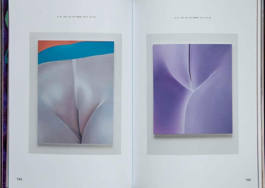
4 –BELT OF VENUS, Greta Futura Langianni (ed.), Mulieris, 2022, 224 pp., 16.8 × 23.7 cm, (↦ see № 101, 171, 173, 192 & 221)
X IV & X X, Vivian Greven (Artsit), Ivo Faber (Photos), Laura Rositani (Interview)
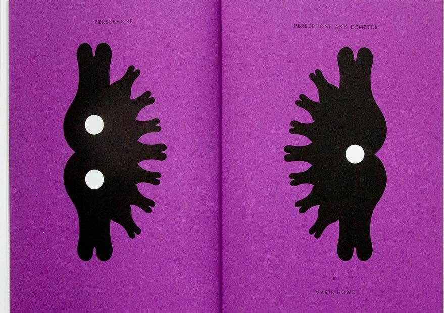
190 → EROTIC REVIEW ISSUE 2, Lucy Roeber & Saskia Vogel, (eds.), 2024, 168 pp., 17 × 24 cm, Litho Print (↦ see № 029, 193 & 218) Peresphone & Peresphone and Demeter, Marie Howe


BOYS! BOYS! BOYS! –– Ghislain Pascal
EROTIC REVIEW –– Lucy Roeber
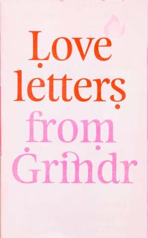
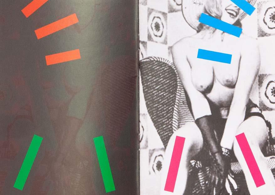
EXTRA EXTRA –– Linda Zhengová
FLUFFER EVERYDAY –– Sotiris Trechas
MOAN ZINE –– Moan
MULIERIS –– Greta Futura Langianni
PLAYBOY –– Florian Boitin
THE BITTERSWEET REVIEW –– Kole Fulmine, Benoît Loiseau, Louis Shankar
THE BOY IS BEAUTIFUL –– Leonidas Liolios
THE OPÉRA –– Matthias Straub
1
Could you share your personal journey into the world of magazines? Was there a defining moment or influence that shaped your career path?
Ghislain Pascal, BOYS! BOYS! BOYS! I fell into the world of magazines by default―as with most things in my career. My gallery, The Little Black Gallery, launched BOYS! BOYS! BOYS!, a program to promote queer and gay fine art photography, back in 2018. We had already published two BOYS! BOYS! BOYS! books and done several exhibitions when Covid hit in 2020. While in lockdown in the Canary Islands, I was talking to a photographer on Zoom who was showing me his pictures, and I thought they’d look really good in a magazine. That’s when I had the idea to launch the BOYS! BOYS! BOYS! magazine. Little did I know it would take off in such a way, and we have just published our ninth volume. None of this would have happened without my amazing Art Director, Jeremy Kunze of Kunze Design, and our distributor, Ra & Olly.
Lucy Roeber, EROTIC REVIEW
I grew up in the 80s and 90s and magazines were very much part of youth culture then. Without the Internet, magazines were the way we thought about where we were, who we were, or wanted to be in the world. They were extremely influential. I edited my school magazine and had early ambitions to create and edit a magazine for women that didn’t focus so much on the clothes, bags, and makeup we were supposed to be wearing.
Linda Zhengová, EXTRA EXTRA
My relationship with magazines goes way back. Even as a child, I was obsessed with them. I started by collecting cartoon magazines, but I’d also leaf through my mom’s Cosmopolitans, even though I had no idea what they were about at the time. It was the glossy, shiny paper, and striking visuals that mesmerized me. Later, as a teenager, I fell headfirst into BRAVO and similar publications. I’ll never forget the thrill of buying an issue, the excitement of shutting myself in my room to devour its contents. The extra bits inside―perfume samples,
accessible, mostly straight erotic magazines at kiosks, and they never excited me. These catalogs were something special―somewhere between art and commerce, and I always found the professionalism that my boss had towards that so inspiring. The colors, the design elements, the language― everything felt so fresh compared to the overly saturated Hollywood stuff that would fill up the store’s shelves.
Moan
Yes! The first sexpositive magazine I encountered was Nin Magazine. During Leticia’s talk, I was blown away by her confidence and depth of knowledge on the subject. The way she spoke about sex, liberation, and womanhood was incredibly inspiring. She sparked a sense of feminism in me that has only grown stronger since!
Greta Futura Langianni
My first encounter with an erotic magazine was through more of a male lens I guess, which makes sense because my first approach to sex wasn’t about what I wanted but about what I thought I should do to be wanted
A guy I was dating in my teens was into Milo Manara’s work and showed me some magazines related to his artistic research. It’s odd to think that at the time I was so deeply fascinated by what I was looking at, and now, many years later, I feel like that portrayal of women belongs more to a man’s idea of what sex should look like rather than a woman’s perspective. I think for women, a huge step is breaking free from being constantly sexualized in ways that don’t represent us, shifting from objects of desire to humans who desire.
Florian Boitin
My first experience with erotic magazines was studying the sex education pages of BRAVO. Not only did they write about sexuality without taboos, but they also depicted the adolescent sexuality in very explicit photos. My mother found this much more offensive than the first Playboy she discovered when I was 15.
Benoît Loiseau
The first meaningful encounter I had with a sexpositive magazine must have been BUTT magazine in the mid2000s. The fact that it featured interesting people, artists, and writers, but also hot imagery, blew my mind. I think for a long time I assumed these two things couldn’t coexist in the same space. I also liked how DIY it looked.
Leonidas Liolios
It must have been a straight magazine that my cousins and I dug out of my uncle’s basement. It felt like I was looking at something I wasn’t supposed to see, and it was unlike anything I’d ever seen before. I felt like I had suddenly opened my eyes to
this whole other side of the human experience―a collective horniness among all of us naughty kids flipping through the pages, as well as an obligation to engage and comment on the female parts shown because it was the “straight” thing to do.
When you’re young, queer, and growing up in the suburbs of Athens in the 90s, access to gay erotica magazines or series like Queer As Folk is completely out of reach. It was the Internet that did for me what queer magazines did for previous generations. A chat with an emo on MSN or abeardedboy’s blog on Tumblr. The Internet was interesting at the time because it was kind of like a locked drawer that our parents didn’t have the key to because they didn’t know how to use it.
In many ways, this meant that many of us queers were engaging with content relevant to us for the first time in our late teenage or adult years. It’s like a second education. But hopefully things are changing for the better and now kids have access to shows like Heartstopper and queer children’s books from the getgo―that is, if they live in a safe and supportive environment where watching or reading something like that is an option.
Matthias Straub
When I was a little boy of five years, my cousins used to show me a porn magazine. To this day, I still don’t fully understand what I saw back then. I still think there’s something pretty weird about what goes on in people’s heads when they watch naked strangers having sex.
3
The sexual revolution was marked by bold liberation and breaking taboos, yet today’s climate of political correctness and increasing prudishness seems to stifle open dialog. Do you think prudery is making a comeback, and how does this affect meaningful discussions about sexuality in your work?
Ghislain Pascal
I do think that we are entering a new era of conservatism, prudishness, and censorship. I think that this is particularly prevalent when it comes to anything queer or gay. It is virtually impossible to get anything related to queer or gay fine art photography published in the mainstream media. Similarly, social media platforms like Facebook and Instagram remove anything queer or gay, making it virtually impossible to post on their platforms. I fear we are regressing to the 1950s.
Lucy Roeber
I wouldn’t call it prudery exactly. I mean, the UK has always had a heavy dose of prudishness and awkward humor, but generally, I think the world is far more open to different sexual inclinations
than ever before, but the saturation of Internet porn has confused the concept of sexual liberation and all the other conversations are lost.
We are both trying to define everything and hide what is “inappropriate” rather than acknowledging the very gray area so many of our desires inhabit.
Linda Zhengová
The sexual revolution was critical because it gave people the freedom to talk about previously taboo topics without shame or guilt. But now we’ve reached a strange new point. In Europe, at least, there’s so much openness around sexuality that explicitness has started to feel shoved in our faces, and ironically, this overexposure has led to a resurgence of prudishness.
I want to choose what I see, who I see, and what I find erotic. I don’t need to be forced into witnessing everyone else’s private lives. It feels like an obligation at this point. Kinks, fetishes, polygamy, and our sex lives have been mainstreamed into spectacles for entertainment, heavily monetized, and drained of mystery. And yet, it’s mystery and connection that people are craving.
For me, the issue isn’t prudery; it’s the commodification of sexuality and desire. These “liberations” have become part of the same system they originally resisted. Michel Foucault’s theories come to mind here―sexuality, once a site of resistance, has now been absorbed into the machinery of consumerism.
Sexuality is deeply personal. It’s about intimacy, pleasure, and connection. I prefer to keep some things obscured, some desires unspoken, and some pleasures secret. Not out of prudishness, but because I value the power of subtlety and the sacredness of private experiences. The problem isn’t openness, it’s that we’ve lost the balance between what’s shared and what’s sacred.
Thankfully, society has made great strides forward, considering acceptance and sexual expression. Of course there is still a long way to go, but we should not forget the victories. Progress has helped us realize that there are better ways to address certain things, and I am totally on board with that. It is only limiting if you let it be. It’s just another parameter to keep in mind.
There are a million ways to express yourself and your creative thinking. Many taboos still need to be broken, and many artists feel the need to break them. So I am positive that we will come up with bold new ways to do so.
The key to conveying the message you want to share and starting the conversation you want to have, is doing what you want in the most
legal and professional way possible. If what you are doing is not a crime, then no one can stop you from creating the work you want to share with the world.
I’m not sure prudishness ever really left―yes, it seems to fluctuate alongside politics and social beliefs, but there’s always an undertone of it. It always amazes me how much people shy away from talking about sex. It’s something that touches all of us―it shapes our relationships, our identities, and our deepest experiences. But we’re still scared to explore it openly. This saddens me because, for me, meaningful discussions and education on the topic are empowering.
Generally, it really depends on the community you’re speaking to. Liberal, creative, and diverse spaces are often more open, accepting, and less judgmental, making room for meaningful discussions about sexuality. Outside of those circles, judgment remains a big obstacle, though I’ve had some interactions I approached with hesitancy that pleasantly surprised me. I’ve found prudishness often stems from fear or deeply internalized shame that gets projected outward. Since starting MOAN, I’ve watched societal attitudes shift back and forth. But these fluctuations only remind me how vital it is to keep these conversations going, especially from a female and queer perspective. Sexuality connects us all―it’s a fundamental part of being human―and creating space to talk about it without shame is one of the most important things we can do.
When breaking a taboo, the process often involves rejecting it so completely that we dive into the opposite extreme of the issue we’re trying to address. However, in any quest, what we ultimately seek is balance―and achieving that often requires exploring both extremes
For instance, if you overindulge in sex simply because you feel socially pressured by the notion that it’s “liberating,” you’re acting in much the same way as someone who avoids sex because they’ve been told it makes them more valuable. Both scenarios are driven by external expectations. This is the opposite of sexual freedom: in different ways, you’re still confined, because what matters isn’t the presence or absence of sex but how you approach it.
Any choice made out of fear of judgment isn’t truly free and, therefore, it’s never truly liberating. We can only speak of sexual liberation when the choice is fully our own―when I can freely decide to have ten partners in a week or only one in my entire life―and that decision reflects who I am and what I want, rather than how I’m expected to act.
in THE OPÉRA always supports the art and the photographer’s work, it’s also a code of zeitgeist and offers another layer of approachability.
6
What emotional or intellectual journey do you hope readers undergo when engaging with your magazine? What questions or feelings should linger after the last page is turned?
Ghislain Pascal
My aim is to persuade people that it’s fine to buy and hang beautiful queer artworks on your walls at home. There is still a huge stigma and barriers to overcome. However, by producing such a beautiful magazine filled with amazing images by queer and gay fine art photographers I hope we can normalize it and make it acceptable.
Lucy Roeber
I hope that readers feel that we are responding to a general curiosity and openness around desire. I would love to think that they might read or look at work with which they feel a real connection. We believe desire is an aspect of our common humanity, and we are not highlighting a particular gender, sexuality, or practice. More a feeling that we all long for sexual connection, it is just the object that changes.
Linda Zhengová
I can guide a certain mental space, shape the atmosphere of a publication, text, or body of work, but I can’t predict people’s reactions. That’s not my job. What I hope to create is an open space―a place where readers can project parts of themselves onto what they see. If a page lingers in someone’s mind or evokes a question they can’t quite answer, then I’ve done my part.
The point of the magazine is to inspire and find ways to enjoy being sexual, regardless of gender or societal norms. Understanding our bodies, accepting them, and feeling safe to experiment―that’s what I aim to achieve.
The purpose of Fluffer Everyday isn’t to help you jerk off or reach orgasm. I want you to flip through the magazine, get inspired, grab your phone, and text your lover―or even your best friend―and start a conversation. I strive to spark excitement in people.
Moan
A journey of exploration, education, liberation, and curiosity. Through my illustrations, I aim to spark feelings of desire and intimacy in ways that feel authentic and inclusive. When it comes to the written features, they span emotionally led content as well as researchdriven, educational articles. I strive to find a balance between the two
because I believe passion and education go hand in hand―they complement and deepen our understanding of ourselves and our sexual experiences. I hope to inspire conversations and ideas for new, shared experiences. I want readers to walk away feeling less shame and more curiosity―excited to explore pleasure, embrace passions, and pursue meaningful connections.
After the last page is turned, I want questions and feelings to linger: What does intimacy mean to me? How can I connect more deeply with myself and others? By sparking this introspection, I hope MOAN becomes more than just a publication―it becomes a catalyst for liberation and meaningful exploration.
I hope readers feel encouraged to explore sexuality from various perspectives, some of which may resonate with them and prompt deeper selfreflection. My hope is that by the time they reach the last page, they not only gain new insights but also find themselves asking questions they hadn’t considered before.
Of course, our primary goal is to entertain our readers. It is not our intention to instruct or educate them. And yet, we ensure this entertainment never falls below a certain intellectual level. We want to inspire our readers, to stimulate them― even in areas that are clearly above the belt. However, I follow the principle of brain researcher Prof. Dr. HansGeorg Häusel, who says, “Information which doesn’t reach a person’s emotional center is worthless to their brain.”
I hope that our readers experience a sense of light knowing that our magazine exists! That queer and trans voices are rising up in a literary landscape that can, at times, feel overwhelmingly dominated by normativity.
When I read the magazine, I get a sense of collective joy from the community we have gathered in print―I hope our readers feel that too. I also hope we inspire curiosity and encourage readers to seek out more work from some of the writers, poets, and artists we feature.
Leonidas Liolios
I hope that when they see the magazine for the first time on a shelf, they’ll experience a sense of déjà vu ―like it’s an object they’ve always owned but somehow misplaced and now want to reclaim. When they catch the scent of the first few pages, I want them to feel a sense of excitement, like sitting in a class with a very passionate history teacher who doesn’t read from a book, but animates her voice and body to convey a
feeling. I want them to feel aroused by the way people describe one another and the emotions they’ve shared.
I hope they feel invigorated by the brilliant queer minds who infuse their lived experiences into beautiful architecture, photography, writing, and beyond. Nostalgic for what’s come before and horny for what’s to come.
Matthias Straub
THE OPÉRA does not have a purpose or an aim. It does not want to educate or teach. It’s a manifesto for eternal beauty, that can easily be understood by any audience―with or without background knowledge of the culture of nude photography.
7
To what extent do you believe erotic magazines should challenge societal moral conventions, and where do you draw the line between provocation and alienation?
Ghislain Pascal
It’s a question I always ask myself when editing and curating every issue of my magazine. My mantra to my photographers is always: “Less willy!” But then I also need to remind myself not to be prudish and that art is a form of selfexpression and reflects our diverse community.
I often ask myself: What would I think if Robert Mapplethorpe submitted his artworks for publication today? As with everything, it is all about getting the balance right in each issue and every exhibition.
Lucy Roeber
Art has always been a provocation, it challenges convention at the edges. We aim to provoke but not salaciously shock. I don’t want to alienate people; rather, I want them to reconsider societal conventions in different ways.
Linda Zhengová
Erotic magazines challenge societal conventions simply by existing. Their presence alone pushes against moral boundaries. I don’t see the need to follow rules or trends when it comes to erotica― the power lies in its multiplicity and diversity of expression. There’s no singular way to showcase or expose it.
As for provocation and alienation, those are reactions. They don’t belong to the maker―they belong to the audience. My focus is on creating something authentic, not tailoring it to avoid or provoke a specific response.
The Dreamer aka Sotiris Trechas
Erotic magazines, like all magazines in general, are a medium that hold great power in inspiring conversations and bridging communities. By its nature, Fluffer Everyday presents everyday people in
everyday scenarios, allowing the readers to expand the scope of their own imagination. I believe this approach allows the magazine to gently provoke and educate while never alienating.
Moan
Erotic magazines have always had a rebellious edge, and MOAN is no different. They exist to challenge societal moral conventions, provoke thought, and create space for conversations that have been silenced or repressed. Historically, banned erotic books were condemned not only for their content but for the ideas they represented: freedom, exploration, and liberation. That same spirit drives MOAN.
For me, provocation is essential to this process―it’s what makes people uncomfortable enough to question their assumptions and consider new ideas. It sparks curiosity and challenges outdated norms, but it must feel intentional and empowering, not alienating. The line I draw is where the work risks isolating or excluding the very people it seeks to empower.
MOAN strives to challenge societal conventions while remaining deeply human, inclusive, and celebratory. Erotic magazines should feel radical and rebellious, but they should also feel like a space to connect, reflect, and celebrate sexuality without shame.
When it comes to art, it’s one of the few spaces where humans should feel free to dive deep into anything, especially those things they cannot explore through politics, society, or daily life. Creating is like entering another dimension where you are free to experience what you can’t in life. When you exit that reality, it becomes your duty to understand. As we quote in our issue, from the Roman poet Ovid: “Venus ventus temerarius”―“Venus favors the bold.”
Florian
I don’t want to overestimate the role of erotic publications in society. On the other hand, we’ve noticed, reflected in our steadily growing subscriber numbers over the years, that more and more people see Playboy as a welcome counterpoint in an increasingly repressive present. In terms of content, we are not interested in breaking taboos or attracting attention with provocations. However, when we featured the model Giuliana Farfalla on the cover of the February 2018 issue―the first time in Playboy’s history that a woman born as Pascal, i.e., assigned male at birth, was featured―there was a measurable amount of public outrage. In our perception, this reaction exposes those who are upset about the alleged taboobreaking more than it reflects on us, the authors of the message.
Florian Boitin
Nudity hasn’t always been taboo. In antiquity, for example, there was a cult of the body that celebrated, rather than demonized, the naked form. Even in churches decorated by Renaissance artists, physicality was represented as vitality and sensuality. It’s clear that art has always been strongly driven and influenced by human sexuality―while simultaneously being taboo. Whether it’s Auguste Rodin’s The Kiss, which once caused a major scandal, or later, the kitsch artist Jeff Koons, who transformed his partner, the wellknown porn star Cicciolina, into a work of art―there is little black and white in art. The line between art and porn has always been thin―and it still is.
Louis Shankar
It’s all about context, isn’t it? It’s the difference between “naked” and “nude”―between a body in the changing room and one in the bedroom. The erotic invariably comes up against censorship, but both forces are constantly changing and evolving. Art has always had the potential to challenge our assumptions and expectations, but its impact depends on where it appears—a gallery, public space, social media, print, etc.
Leonidas Liolios
If we look at ancient Greece, the naked body was present in art in a casual way―often in sexual play. I use art here in the postneoclassical sense of the word, because for the ancient Greeks, these were often just everyday objects like wine cups and amphoras used for storing grain.
In the Renaissance, rich men in power, whose male gaze ruled supreme, commissioned myriads of paintings that borrowed themes from Greek mythology to disguise their nudity as “pure,” which was only necessary because those same people had vilified nudity through religion over the course of 16 centuries. It’s quite absurd. Almost 400 years later, the same people who experience awe and wonder when looking at a Botticelli painting feel shame or disgust when looking at someone else’s―or even their own―naked body. It’s a shame, really, but it’s theirs to bear. In The Boy Is Beautiful, there is no space for shame or taboos―only terracottacolored pages filled with beautiful people, words, and ideas, in the way of my ancestors. Casually.
Matthias Straub
Everyone has a body and can relate to nudity. Still there is a tension between what we are accustomed to seeing and what we desire to look at. This space is filled by artists and explored with different media and techniques. THE OPÉRA is investigating more of multidimensional universe in which the human body is a play and stage at the same time.
Dan Rhatigan
Dermot Mac Cormack
Larissa Brochella
Karina Panko
Ian Lynam
Pia Kristin Lobodzinski
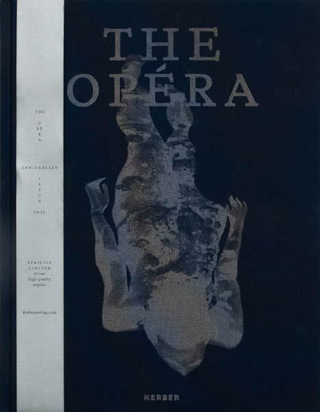
Rebekka Seubert
Hubert Kretschmer
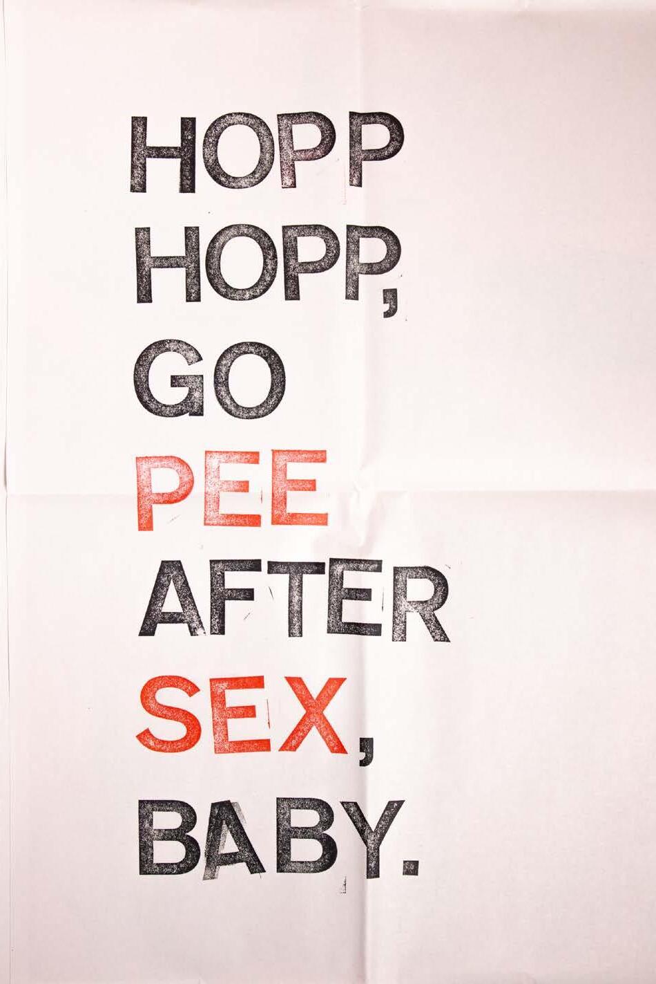
Dan Rhatigan is a typographer living in Portland, Oregon, with over three decades of eclectic experience as a typesetter, graphic designer, typeface designer, and educator. He runs a small type foundry called Bijou Type, and since 2009 has published Pink Mince, a zine devoted to queer culture and typography. He also maintains two web sites documenting his research into dry transfer type → letraslut.com and the history of gay magazines → hottype.club (Image 1)
During the second half of the twentieth century, the United States and many European countries developed more accepting attitudes towards? LGBT people, due to the cumulative efforts of numerous groups engaged in social and political activism. Along the way, one of the many challenges facing gay publishers and audiences was the difficulty of producing and distributing any books or periodicals with overtly gay content, which was under threat of various methods of censorship. However, even as legal hurdles fell away, social censure remained an ongoing challenge to gay communities and the publications targeted to them.
During that same period, the graphic arts industry experienced its own rapid evolution, as the development of ever faster and cheaper means of typesetting and printing made more typographic choices available with fewer barriers to their use and reproduction. Typewriters, phototypesetting systems, dry transfer type, and eventually desktop publishing software provided an increasing number of ways to easily prepare text for layout and reproduction, with less and less formal training required to do so.
Suffice to say, there was both the will and the ways to publish for gay audiences, whether the message was intended to lift up or turn on. A comprehensive discussion of that complex intersection of social and graphic history would be a meaty text, but for now, this is about how I started to find some unexpected design flair in a space where publishers weren’t concerned with what the mainstream thought
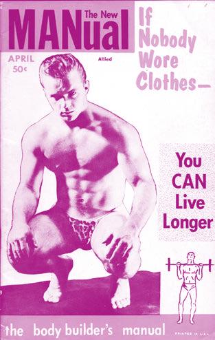
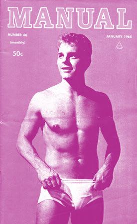
of them. A few years ago, I published an issue of my own queer zine, Pink Mince, in which I stripped away the pornography from the pornography, carefully recreating just the typography from a number of vintage gay porn magazines. In doing so, I discovered how much lively typography had been hiding in plain sight. (Image 2 & 3) This journey started when I stumbled across a beautiful old magazine cover, and that led to that little Pink Mince project, which then led to research, and then many more questions. The magazine in question was the beefcake-focused premiere issue of Bold! (1978), but what really caught my eye was its use of the typeface Stilla by François Boltana. I have always struggled to find examples of Stilla in use, no doubt because its zesty letterforms can be awfully difficult to compose. The letters have to be arranged with care, and it almost never sets all that easily by default. Trying to reset the cover type, I realized that this particularly helpful form of “L” didn’t exist in the digital font. The answer was in my reference material―a Letraset specimen book. The original design published by Letraset in 1973 included a number of alternate characters for many letters, including that form of the “L” that I was looking for. (Image 4 & 5) At that time, it was typical to use dry transfer type for the titling graphics, and it certainly made sense for a typeface like Stilla that works at its best when set down one letter at a time, consciously controlling the combination of the forms. This small epiphany led me to look more closely at how other magazines of the era handled their typefaces. (Image 6) Later, I encountered an image of the cover from Drummer magazine, a title better known for its S & M content than its novel typography. Drummer was a very adult magazine specializing in very adult themes, but this particular cover avoided photography in lieu of a really lively typographic approach―practically a specimen poster for dry transfer designs from Letraset. It startled me once again to see a magazine like this taking such a fresh approach to its design.
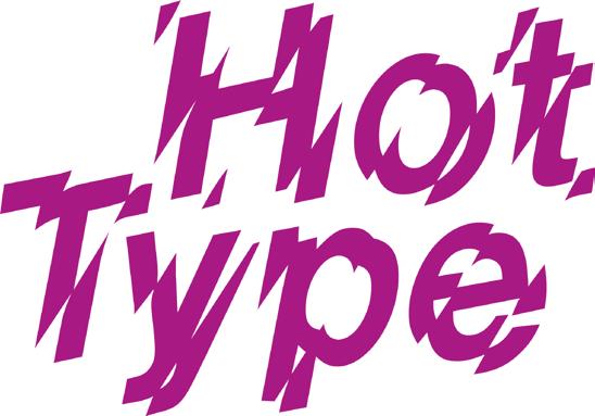
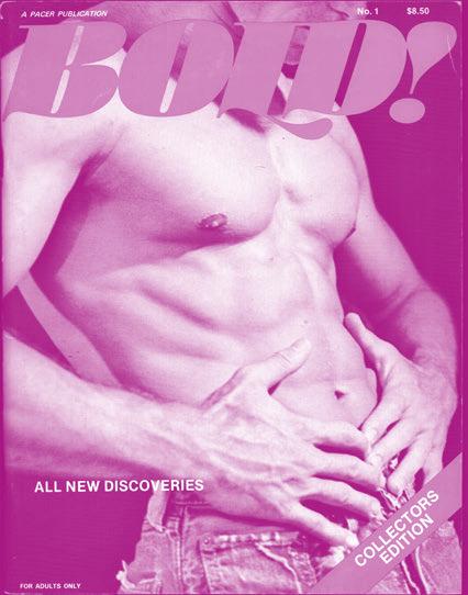
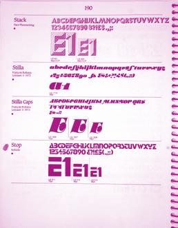
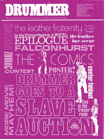
Image 4: The typography of Bold!, issue 1. Above is what the digital version of François Boltana’s Stilla looks like with its default spacing. Image 5: Sample of the typeface Stilla from a 1987 Letraset catalog, showing multiple versions of some capital letters like A, E, L, M, N, and T. Image 6: Drummer no. 6, May/June 1976. Image 6: Drummer no. 6, May/June 1976.
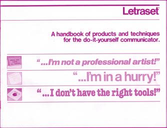
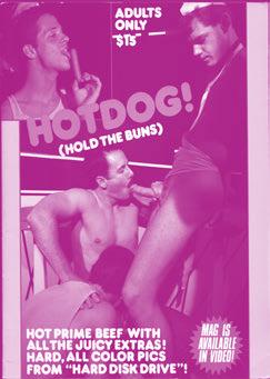
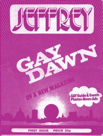
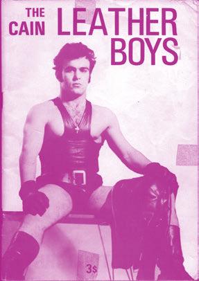
Image 7. Image 8: Jeffrey’s first issue from 1972 used faces from French dry transfer brand Mecanorma, such as First Ombre and Volta Bold, plus more commonly available faces like Futura Extra Bold Condensed and Helvetica Bold. The radiant pattern in the background would have been done with an adhesive film, another graphic product from Mecanorma. Image 9: The cover for photographer Cain of London’s self-published was made by rubbing Letraset transfer type right onto the photo print, which was then re-shot for offset reproduction.
Larissa Brochella
Larissa Brochella is a queer visual artist and graphic designer based in Basel, Switzerland. In her work she is interested in exploring social issues and the way they interact with the mundanity of everyday life. In her master project at the Academy for Art and Design in Basel she explored two topics close to her heart―language and queerness― through a multimedia installation.
Language as a means of expression and storytelling first conquered my heart in my childhood, when I discovered that through books I could disappear into more exciting worlds and live more adventurous stories than my own. Although this is still true today, my interest in language has since shifted beyond the way words are spun to transform even the most mundane experience into poetic prose. And it has gained a social layer, that I would summarize quite broadly as: what language can do.
The interaction between our social reality and language frequently remains invisible. But there is a materiality to language. It’s hidden in the way we speak―the air released from our lungs, the vibrations of our vocal cords, and the movement of the tongue as it shapes sounds, wrapping itself around vowels. It’s in how our lips form syllables, creating the final boundary between thought and speech. There is materiality in the way we write―with color on paper, wood, concrete, and in the typing paragraphs into documents on a keyboard, letter by letter. And there is a material quality to language beyond the physiology of its use in speech and writing. Language can be understood as material in the sense that it constitutes the real―the institutions, structures, and bodies it encompasses.1
Language plays an important role in the mediation between these institutions and structures of power and the individual person.2 It mediates, what Michel Foucault called discourse, so simply put: the way societies talk about things, people, groups. Discourse, and at its foundation the words used, often appear as a natural representation of reality. But for the latter half of a century post-structuralist theorists and social linguists have argued the importance of discourse, not only in representing reality, but also in its production.3 Discourse analysis challenges notions of language as a stable and transparent medium for communication. Instead, discourse and language are perceived as being impacted by power structures and, additionally, playing a part in their production and reproduction. Ultimately, though the way we talk about social groups and issues―so through discourse―unequal relationships are produced and reproduced between larger social groups, classes, or communities.4
Language works to uphold social inequality, because it shapes a supposedly subjective perception of the world through the collective lens of a shared vocabulary and narratives about people, structures, and things―about how the world “works.” This happens in many ways. One example of how discourse and language perpetuate inequality is stereotypical characterizations and prejudices. Historically, marginalized groups of people (women, people of color, working-class, etc.) have been afforded with less power. This is reinforced by stereotyping that tends to “involve association with some attribute inversely related to competence or sincerity or both”.5 These negative qualities of the prejudices affecting marginalized people limit their capacity to gain social and economic power. This includes, on one hand, the power to shape discourse more generally speaking, and on the other hand, the narratives about their own group and the words available to describe the experiences commonly had within this group.6 This phenomenon is what Miranda Fricker coins hermeneutical injustice. According to Fricker, the experiences and knowledge of marginalized people are typically not included in the general production of knowledge and therefore also significantly underrepresented in our shared conceptions and vocabulary. This not only reinforces inequality in the sense of reproducing false and hurtful conceptions of certain identities, but also in limiting marginalized people in achieving self-knowledge, going so far as in impacting their self-identity negatively.7
In my master thesis, I was especially interested in exploring this personal impact of language on the queer experience. One participant in the installation that resulted from my practice formulated their experience with the term gay as follows: “Since elementary school, the word gay was a bad word. Being gay was something you really didn’t want to be, but also something that was far removed from myself. Something there was no question of me being, and the same goes for my social circle. There were people that were different and there was us, and those two were clearly separable.”8
Even a single word can be molded to hold meaning that oppresses and goes far beyond the simple act of naming. This is the case for many words queer people use to describe their gender and sexual identity. Words that are being weighed down
by their history and sometimes also by their present use to degrade or pathologize. A weight that strongly impacts the path of self-discovery for queer people. In her lecture Queer Use, Sarah Ahmed elaborates on the word “queer,”9 which was, and still sometimes is, used as a weapon. Ahmed argues that the reuse of the word “queer” can disrupt the insult of the word. To reuse a word, it can’t be separated from its history and used “jokingly” as an insult. If “we reuse the word queer, we hold onto the weight, the baggage”.10 Although the term gay (“schwul” in German), similarly to the term “queer,” has been reappropriated in the 70s to fight against the discrimination of gay men, the negative implications attached to this term persist― at least in part―to this day. This linguistic baggage not only impacts the relationship of queer people to these terms, but to the whole process of identity formation. Our understanding of ourselves in the world determines how we can move through it, if we can find community and move into collective action and resistance. The ability to recognize oneself, and for this recognition to be good, is crucial.
We make sense of the world through language. We use words to communicate our experiences, and the words available to us shape our experiences in turn. And still, debates about “words” oftentimes ridicule and trivialize demands for the introduction of new words and the leaving behind of old ones.11 Especially so, when these demands come from marginalized groups of people.12 This was the case recently in Switzerland when the debate about the inclusion of a third gender in the civil registry was reignited with renewed fervor after Swiss non-binary artist Nemo won the Eurovision Song Contest 2023.13 There is nothing trivial about the pursuit of space in language: It is about taking up space in reality―not merely at the margins of society,


but in bold letters, in a collective vocabulary and understanding, and, in this case, on an official document. The backlash that frequently arises from debates about the inclusion of marginalized persons occurs because they pose a challenge to the status quo and, with it, existing power structures.14 The admission of a third gender is a challenge to a world that is split into clear and distinct categories of two genders. Categories that appear natural and all-encompassing, with margins that are invisible to those who fit but restrict the space of those who do not. This restriction of space is an important aspect of marginalization as Ahmed defines it in her lecture on Queer use:
“You can stop others from using a space by how that space is being used (…). But it is not just that use is a restriction of possibility that is material. Restrictions can also become material through use. What is material to some, leaving you with no room, no room to breathe, to nest, to be, can be what does not matter to others because it does not get in the way of their occupation of space; it might even enable their occupation.”15
The categories of sex, gender, and desire are organized and regulated by societal forces that they reinforce in turn―one of them being heteronormativity.16 In Gender Trouble, Butler argues that heterosexuality has normative power on gender because it depends on the discursive construction of the binary of femininity and masculinity17. This is to say: Heterosexuality depends on the existence of two genders, that are constructed in opposition to each other. Heterosexuality itself serves a patriarchal system, by reproducing a binary logic of gender that allows for the dominance of one gender over the other. According to Butler, the categories of the biological sex are produced, similar to the way gender is, through practices, institutions, and discourses, and used politically18 to restrict the formation of gender identities along the “axis of heterosexual desire”.19 During this process, Butler argues, neutral attributes of the body are artificially unified, reinterpreted, and imbued with social meaning.20 The normative power of the linguistic categories of sex and gender are mirrored in the norms that regulate the use of the body through which gender is performed, and it is on the surface of the body, that cultural inscription takes place and social meaning becomes internalized. Language is the tool that casts “sheaves of reality upon the social body”21.
A word is more than the sum of its letters and it can be affected by and reproduce inequality in several ways: In how linguistic categories limit identities to what is considered the biological norm, but also in the negative meanings that are still associated with many of the words used by queer people for their identity today. Words contain the power to injure, but what became apparent to me in my practical thesis work was that words also hold the power to offer identity, community, belonging, and connection.
I felt the power of words when the fear of being an undesirable word took hold of me at 13. There is terror and shame in the realization that you are different―and not in the cute and quirky way one desires to be different at that age, but in a way that feels like a threat, that tastes of loneliness. But there is also freedom. This, I would discover
Hubert Kretschmer
From 1969 to 1975, he studied in Munich and Heidelberg. He then worked as a lecturer at design universities until 1992. From 1978 to 2021, he taught at various institutions and began developing the AAP Archive in 1979. In 1980, he founded his own publishing house, now known as icon Verlag. He was also involved in new media and arts promotion. Since 1993, he has been active in Munich as a publisher, curator, and archivist. → artistbooks.de
At documenta 6 in 1977, so-called artists’ books were shown to a wider public for the first time in Germany. On the second floor of the Neue Galerie, The Metamorphoses of the Book presented by Rolf Dittmar (Wiesbaden) and Peter Frank (New York), as well as concept books, as well as concept books, in case you were looking for them. .After all, a start had been made. Dittmar showed largely sculptural works in the book by 53 predominantly German artists (including six women) and Frank brought works by 12 conceptual artists from New York to Kassel. The fact that the two curators were already at loggerheads during the preparations―documented in New York Art-Rite #14 from 1976―shows the enormous range of what was then and is now commonly understood as an artist’s book.
My call a year later in KUNSTmagazin #84 for an exhibition of artists’ books at the Produzentengalerie Adelgundenstrasse in Munich was just as broadly defined as at documenta 6. The response was overwhelming. 320 international artists submitted over 500 works. About half of these were reproductions of conceptual works. I was allowed to keep almost all of these books, as they did not have to be sent back to the artists. An archive―the Archive for Artists’ Books―was born without me even realizing it. In other words, an archive was created here, and not a collection. The artists themselves had decided what was to become part of the exhibition when they sent it in. There was no conscious curation, as the participating artists understood what was meant by an artist’s book:
“The artist’s book is not an art book. The artist’s book is not a book about art. The artist’s book is a work of art.”
― Guy Schraenen
This unintentional archive continued to grow organically when I founded a publishing house and a distribution company for artistic publications. The opportunity to swap books at trade fairs and meet new international artists meant the archive eventually grew to over 80 banana boxes by the end of the nineties.
Just as artists practice their art in unique ways, they approach the concept of books just as differently―especially in the post-avant-garde era. Since the late 1960s, art objects have emerged that “are not presented as works of written culture or the information sector, although their various designations are always formed in some way with the noun book.”1 This includes concept books, book objects, object books―in short: artists’ books.
The artist’s approach to the book depends on their artistic focus, whether it’s painting, performance, photography, poetry, music, architecture, sculpture, comics, drawing, typography, fashion, film, theater, installation, or even pedagogy. Each artist engages with the medium of the book in their own unique way, questioning its role as a carrier of information, a container of ideas, a means of agitation, a form of documentation, a stimulus for behavior, an object of representation, or a subject of technical and economic experimentation.
As a result, both the form and content of books have experienced unprecedented diversity, challenging traditional ideas of what a book can be and expanding its artistic possibilities.
Printed or reproduced artists’ books predominate in my archive. These publications are usually produced in larger editions with around 100 to 1,000 copies. This makes them inexpensive and, more importantly, accessible―unlike rare or costly works of art. Similar to the multiple or a graphic, a larger group of buyers can be addressed. The two quotes from Anne Moeglin-Delcroix and Judith A. Hoffberg make it clear why I prefer the printed form to book objects and object books, such as unique copies or bibliophile books and hand-pressed prints:
“Like any other medium, artists’ books are a means of transporting art ideas from the artist to the viewer / reader. Unlike most other media, they are available to everyone at low cost. They don’t need a special place to be seen. Their value lies in the ideas they contain. They contain the material in an order determined by the artist. […] Art exhibitions come and go, but books remain for years. They are works themselves, not reproductions of works. Books are the best medium for many artists working today. […] Artists want their ideas to be understood by as many people as possible. Books make it easier to achieve this. […]”2
― Anne Moeglin-Delcroix
interests and working methods. As a result, the archive’s themes and genres have expanded considerably. What began as a Künstlerbuch archive has grown into a pluralistic and inclusive archive of printed materials that were considered important by the contributing artists and should be preserved. These include, for example, all kinds of academic works related to the artist’s book― bold and experimental graphic and typographic examples from graphic design, printed materials from protest culture, subcultures, the DIY movement, works by schoolchildren and students from museum education, relics from the street, articles in newspapers and magazines, advertising material from art institutions, printed matter from committed political and socio-critical work, entire artists’ estates, as well as, for example, the extensive poster archive of a regional printing company. The decision to create an archive instead of building up a collection therefore had enormous consequences for the selection of what was to be preserved. In other words, with the archive there is actually no more choice. Access is not curated by me. The donors check my online database beforehand to see whether their collection fits into the AAP, they contact me and clarify whether it makes sense to hand it over. The archive grows according to these other laws.
“... Archives that are useful for the scientific study of history must house open, heterogeneous, uncensored collections. ...”
― Gabriele
Weitenauer in a letter to the AAP, Munich 2024.
Mail art is certainly the most democratic art form since the 1960s. There is no selection process. Every submission to a call is accepted as long as it corresponds to the theme. It doesn’t matter who made the mail art object, whether they are an artist, student, graphic designer, or househusband. Each mail art project is its own archive. With over 15,000 mail art artifacts, there are a lot of archives within the archive. Klaus Groh alone has contributed over 12,700 pieces. The mail art archive thus spans 57 years and 47 countries, and represents a comprehensive document of international subculture and the political and social commitment of over 700 artists. An art critic and a photographer donated approximately 20,000 invitation cards and press releases. With the acquisition of Olli Nauertz’s private punk collection, consisting of over 2,100 pieces, a unique and distinct culture found its way into the AAP. A younger generation of artists―represented by over 900 active contributors from 37 countries― use zines to address a wide range of social issues while showcasing a broad aesthetic spectrum tied to the Do It Yourself (DIY) movement. Over 900 printed delivery lists from bookstores and publishing brochures are important documents for more recent art studies research.
As an archivist, my role is not only to preserve materials, but, more importantly, to make them accessible to the public and ensure they are known. Since the early 1980s, parts of the archive have been showcased in numerous German cultural institutions, as well as at the Goethe Institute in Paris and the Swiss National Library in Bern. From 1982–1989, I was able to organize a large joint stand at ART Basel. This project was then continued for another three years at ART Frankfurt.
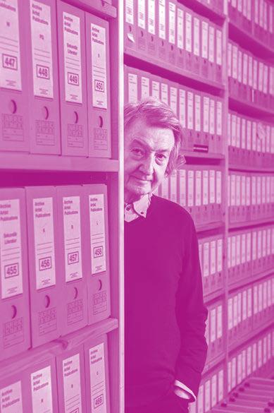

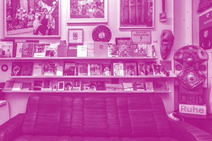

In addition to numerous lectures, publications, and exhibitions, visits to the archive play a decisive role. Groups of art students, students of architecture, book design, art history, art studies, and students of design and layout have selected exhibits from the APP presented to them. It is important that all archive materials can be handled. Direct sensory contact with the publications provides a more meaningful and engaging experience than digital copies ever could. Workshops for students from secondary schools, technical colleges and grammar schools offer participants access to unique opportunities and to engage with rare and historical materials, which would hardly or not at all be possible in this form in a public museum or library.
For many artists, the digital visibility of their publications is highly important. Every object in the database is assigned its own URL (permalink), enabling artists to clearly communicate about their work. In many cases, the entries in the AAP OPAC serve as the only references for these works on the Internet. Public libraries rarely include gray literature in their catalogs, and ephemera are even more infrequently represented online.
A separate script ensures that new database entries are sent to the Google index on a daily basis and can therefore be found in the search engine promptly. All these aspects make it interesting for young artists to be represented in the AAP, but older artists also appreciate being found online. The detailed description and linking of the recorded titles has a very positive effect on the placement in the search results. The listing in the AAP catalog increases the attractiveness of the publications. The convenient location of the archive in Munich’s Kunstareal facilitates uncomplicated access for students at the surrounding universities as well as for interested art lovers from Germany and abroad. Events as part of the Open Studio Days, the Archive Day, and various other events in the Karrée often attract hundreds of curious and art-interested people to the archive. The breadth of content and history of the archive holdings makes it easy to develop exciting events. It is possible to put together meaningful exhibits on almost every topic of art from the 1970s to the present day, e. g. on nutrition, protest and resistance, typography, layout and design, punk and subculture, forms of the book, reproduction techniques, zines, independent publishing, dealing with recent history, the use and impact of printed materials in urban spaces, youth culture. This also includes―as this publication makes particularly clear―the examination of the body, skin, queerness, nudity, pornography, and sexuality.
I hope you enjoy reading this issue of Slanted. I would be delighted if we could get to know each other at one of the AAP’s events or exchange ideas about exciting print products at the Unterbau at Türkenstraße 60 in Munich.
Hubert Kretschmer, January 2025
With many thanks to Lars Harmsen, Samira Niedermayer and the team at Slanted.
1 Artur Bralll, Künstlerbücher, Artists’ Books, Book as Art, (Darmstadt: 1986), 3.
2 Anne Moeglin-Delcroix in Art-Rite #14. (1976), 10.
3 Judith A. Hoffberg in Art-Rite #14 (1976), 9.
Index A–Z References 1–200 Imprint
SLANTED MAGAZINE
TYPOGRAPHY & DESIGN CULTURE
SPRING / SUMMER 2025 45 SEX
PUBLISHER
Slanted Publishers UG (haftungsbeschränkt)
Nördliche Uferstraße 4–6 76189 Karlsruhe
Germany
T +49 (0) 721 85 14 82 68 magazine@slanted.de slanted.de
TEAM
Editor in Chief (V.i.S.d.P.)
Lars Harmsen
Co-Editor
Samira Niedermayer
Managing Editor
Julia Kahl
Creative Direction
Lars Harmsen
Graphic Design
Juliane Lipp, Samira Niedermayer
Final Design
Julia Kahl, Juliane Lipp Cover Artwork
Guillaume Kashima guillaumekashima.com
SLANTED WEBLOG
Editor in Chief (V.i.S.d.P.)
Julia Kahl
Editors slanted.de/editors
VIDEO
Video Interviews slanted.de/videos
ISBN: 978-3-948440-83-1 ISSN 1867-6510
Copyright © Slanted Publishers, 2025 Nördliche Uferstraße 4–6, 76189 Karlsruhe Germany All rights reserved.
Printing
Stober Medien GmbH
Eggenstein / Germany stober-medien.de
Bookbinding Buchbinderei Spinner Ottersweier / Germany josef-spinner.de
Cardboard Cover
Bindakote Chromolux 300 g / sm
Paper Inside Visual Part Extramatt Recycling 120 g / sm
Paper Inside Text Part
Rough Air, 100 g / sm
Distributed by Metapaper Stuttgart / Germany metapaper.io
Spot Colors
HKS 43 K (Cover), HKS 33 N
Fonts
Calvino, 2021
Design: Andrea Tartarelli Label: Zetafonts / zetafonts.com
Snapshot, 2022
Design: Selma Losch Label: Kilotype / kilotype.de
Suisse Int’l , 2011
Design: Swiss Typefaces Design Team Label: Swiss Typefaces / swisstypefaces.com
All publications presented in this issue originate exclusively from the Archive Artist Publications (AAP) collection and have either been purchased by or donated to the archive.
The texts accompanying the publications in the first chapter, COVERS, have been carefully compiled from the information and metadata available in the AAP database and supplemented through extensive online research. Despite our best efforts to ensure accuracy, errors or omissions may still occur.
The publisher assumes no liability for the correctness, completeness, or up-to-dateness of the provided information. The publisher and editor assume that all materials made available for publication are free from third-party rights. If you believe that any content in this publication infringes upon your rights, please contact the publisher immediately.
Reproduction, distribution, or storage of any part of this publication requires the publisher’s prior written permission. While we strive to properly acknowledge all sources, inadvertent errors may occur.
Submitted photos and texts are welcome; however, the publisher assumes no liability for unsolicited materials. The views expressed in signed contributions do not necessarily reflect those of the publisher or editor.
The German National Library lists this publication in the German National Bibliography; detailed bibliographic data is available on the Internet at dnb.de
Subscribe to Slanted Magazine and support what we do. Magazines via subscriptions are at a reduced rate and get shipped directly at release, for free within Germany.
slanted.de/subscription
Frequency 2 × p. a. (Spring / Summer, Autumn / Winter)
2-Issues-Subscription
€ 40.– + shipping
4-Issues-Subscription
€ 80.– + shipping
Student Subscription
2 issues for € 37.– + shipping
Gift Subscription
2 issues wrapped as present for € 42.– + shipping
2-Issues-Subscritpion + related Special Editions
2 issues + 2 special editions for € 60.– + shipping
4-Issues-Subscritpion + related Special Editions
4 issues + 4 special editions + free issue for € 120.– + shipping
Slanted Magazine can be purchased online, in selected bookstores, concept stores, and galleries worldwide. If you own a shop and would like to stock Slanted Magazine or other publications from us, please get in touch:
Contact / Distribution DE
Julia Klose, T +49 (0) 721 85148268 julia.klose@slanted.de
Distribution UK
Public Knowledge Books / publicknowledgebooks.com
Distribution US
Small Changes / smallchanges.com
Distribution EU & WORLD Idea Books / ideabooks.nl
Slanted Shop slanted.de/shop
Retail & Distribution slanted.de/distribution
We offer a wide range of advertising possibilities online and in print. For advertising inquiries please get in touch with:
Julia Kahl (advertising management / sales) +49 (0) 721 851 482 68, julia.kahl@slanted.de slanted.de/publisher/advertising
ADC of Europe, ADC Germany, Annual Multimedia, Berliner Type, DDC, Designpreis der BRD, European Design Awards, Faces of Design Awards, iF communication design award, German Design Award, Laus Awards, Lead Awards (Weblog of the Year & Visual Leader),red dot communication design awards, Type Directors Club NY, Tokyo Type Directors Club, Werkbund Label
First and foremost, we extend our sincere gratitude to Hubert Kretschmer for granting us access to his remarkable archive of artists' books, zines, and more— an absolute treasure trove. We truly appreciate the opportunity to explore it over the course of three months and to showcase its unique works in this issue.
Our heartfelt appreciation goes to Samira Niedermayer for her patience, meticulous work, and dedication in handling all communication with the artists. Your efforts have been invaluable—you are the soul and driving force behind this issue!
A huge thank you to Christian Topp for his support in photographing the publications from the archive. Ultimately, it was you who introduced us to your neighbor Hubert, opening the door to this collaboration. We are deeply grateful!
In response to our call for submissions in fall 2024, many artists contributed their zines, booklets, and publications exploring themes such as gender, feminism, sex, eroticism, love, pornography, intimacy, nudity, LGBTQ+, femininity, body image, emancipation, relationships, polyamory, sexuality, punk, cyberfeminism, sexual freedom, and beauty. Your work is now part of the Archive Artist Publications (AAP) in Munich, and we are thrilled by the overwhelming participation. Unfortunately, not all submissions could be included in the magazine, but we look forward to future opportunities for collaboration.
We are big fans of Guillaume Kashima’s humorous works—thank you for allowing us to feature them on the cover of this issue! We first discovered your work through a collaboration with Melville Brand Design for a 100for10 edition. For those who can’t get enough— or would love to see Guillaume’s illustrations on their walls—this magazine comes with a limited special edition of four art prints. These were printed in offset with special colors on high-quality cast-coated paper and are exclusively available at the Slanted Shop: slanted.de/product/special-edition-sex
We are also delighted to present this issue on carefully selected papers from Metapaper. Many thanks to Axel Scheufelen for making this possible!
A big shout-out to our printing partner, Stober Medien near Karlsruhe, for their impeccable printing of this magazine. Our gratitude also goes to Marcus Grunvinck and the entire team for their outstanding work on this issue.
Finally, a special thank you to all our supporters and fans. Your enthusiasm, engagement, and willingness to share our work with the world help make Slanted the thriving design community it is today. We appreciate you!


The discovery began almost casually: Hubert Kretschmer’s AAP archive. Hidden in the basement of a backyard in Munich, this trove of artistic publications reaches to the ceiling—magazines, flyers, artists’ books, zines, multiples, brochures, copy art, and small editions. More than just a storage room, the AAP archive is a living testament to the diversity of artistic expression within alternative and independent media. Since its inception in 1980, it has preserved works that might seem ephemeral but carry profound messages—a reflection of the transformative power of print.
Over the years, we contributed our own publications to this archive, including Slanted issues and the 100for10 artist series (by Melville Brand Design). In early 2024, the idea of creating an edition in collaboration with Hubert was born. Yet where to begin in an archive with over 90,000 entries? By chance, we came across publications focusing on sexuality, eroticism, and the women’s movement—topics central to the seismic shifts of the 1960s and 70s.
This era was the dawn of social upheaval. Discussions around sexuality and gender began to challenge deeply entrenched taboos. The sexual revolution and the women’s movement took center stage, advocating for issues like contraception, abortion, homosexuality, and women’s rights. These debates unfolded against fierce resistance from conservative and religious groups. While gender was largely perceived in binary terms, non-heteronormative identities and lifestyles were stigmatized.
Today, the conversation is broader and more nuanced. LGBTQ+ rights, gender fluidity, asexuality, and intersexuality have emerged as vital elements of social discourse. Progress, such as the legalization of same-sex marriage and anti-discrimination laws, exists alongside renewed culture wars and rising populist movements that threaten these achievements.
Amidst this backdrop, we unearthed over 250 works in the archive— ranging from bizarre to explicit, minimalist to opulent, finely arranged to raw punk. Each piece shares a common goal: to push boundaries, challenge norms, and create a platform for resistance. Supplemented by a call for entries, the contributions bridge past and present struggles.
For some, sexuality and gender symbolize liberation; for others, they provoke discomfort. Yet they remain central to the ongoing struggle for freedom and equality. The works in this collection, spanning from the 1960s to today, challenge societal norms, reimagine identity, and ignite dialog about desire and power. Often created outside traditional art circles, they embody a spirit of resistance that refuses complacency.
The AAP archive serves as a powerful reminder: independent publishing is not merely a creative pursuit but a tool for social change. It ensures that essential conversations about sexuality and gender endure, refusing to be silenced.
This, we believe, is absolutely vital.
All Slanted Magazines are accompanied by video interviews—with the exception of this issue. Have a look at the interviews from Amsterdam to New York … Enjoy!
To watch the videos, please scan the QR code, or visit slanted.de/videos