Brand Guideline
Visual Identity

2023
This manual is designed to explain a consistent look and tone of our Graphic elements in all Bond brand communications.
The following pages will help you understand our brand, and how to express it in the best possible way on digital platforms and print materials.
Bond is the first “meet & greet” application built for people to find the right place to hang-out, by accessing insights and demographics showing the atmosphere in real-time. The application also enables engagement and interaction to maximise the enjoyability of the moment.

By using bond, bonders do not waste their time anymore in trying to find-out the venue's atmosphere matching their mood and style.
Launch the app, navigate the venues, visualise the ambiance there, choose the one that suits you and go there straight away!
Enjoy and happy bonding!
The company’s plan has been to federate a global community of experts & partners from different industries and make an extensive experience at the disposal of our society.
Company’s plan has been to federate a global community of experts and partners from different industries and make an extensive experience at the disposal of our Society.
Founded with the ambition to bring value to our Society and meet the increasing demands of our citizens &organisations.

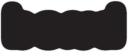
Brand Name
The road shape (n) signifies the path individuals take to establish connectionst
Facing each other as people do when they meet
Logo Designed by Grid Method
The Logo size is measured in pixels; Keep the right proportion between the logo elements for best quality, alignment, and balance.
standard size
80 px H
To ensure visibility, the logo should never be presented in sizes smaller than these requirements
For print use:
The minimum size for print materials shouldn’t be less than 8 mm in height.
For digital use:
The minimum size on digital platforms shouldn’t be less than 23 px in height.
This space provides visual breathing between the logo and other graphic elements around it such as (text, images, icons, etc).
This distance is equivalent to the letter O and can't be violated.
Horizontal version is to be used for digital platforms and print materials.
enjoy the moment
Horizontal
enjoy the moment
Horizontal with icon
Horizontal with icon & slogan
To make sure the logomark is always consistent in its application, avoid the following:
Colours are essential to our brand identity. The consistent application of the colours & their roles in the visual identity enhances brand recognition.
Psychology of colours is an important consideration when we build our brand identity. The right palette can represent the deep meaning of our brand values.
Arial Font was selected due to its similarity to the main logo typeface. It is used in order to maintain readable communication in both web and print applications.
H1 Arial Regular 24 pt
H2 Arial Regular 20 pt
H3 Arial Regular 16 pt
H4 Arial Regular 14 pt
Paragraph Arial Regular 16 pt
Sub paragraph Arial Regular 14 pt
Sub sub paragraph Arial Regular 12 pt
Setting the Arial Font style should be implemented as the following.
enjoy the moment