ES T . 196 7 1


OUR STORY LOGO 03. Redesign 04. Construction 05. Clearance Area 06. Proper Usage 08. Improper Usage BRAND ELEMENTS 11. Color Palette 13. Typography STATIONERY 15. Business Card 17. Envelope 18. Letterhead PACKAGING 21. Bottle Packaging 22. Product Box 24. Shopping Bag 25. Shipping Box MARKETING 27. Magazine Advertisement 28. Social Media 29. Website Banner
OUR STORY
A Romanian native, Mario Badescu a chemist and pharmacist who had his own skin laboratory in Vienna before he moved to New York City in 1966. He understood the uniqueness of skin and strongly believed in the importance of a skin analysis and knowing what type of skin each client has before treating the skin. Finding an untapped synergy between beauty and skin care, Badescu was committed to helping clients realize and value their inner beauty rather than cosmetic. His facial treatments and formulas he created featured a blend of organic fruits and vegetables to feed, nourish and revitalize the skin. Offering by appointment only facials out of his NYC apartment and developing a line of handmade products to suit client’s individual skin types and needs.
For over 50 years, Mario Badescu has been relied upon as a source for quality skin care. Today our products and services are one of New York's best kept secrets. Our valued clientele includes models and actors as well as everyday men and women who understand the importance of good skin care.
The brand's enduring success and loyal following are the result of the late Mario Badescu's timeless philosophy that skin care should be simple, gentle and effective. We continue our founder's tradition by using fresh fruits, botanicals and other natural ingredients as the basis for our products and salon services.
Now with over three generations and countless faces later, the Mario Badescu salon has expanded to a 24-room signature salon filled with Badescu-trained facialists and a line of 200 products available around the world.
For half a century, Mario Badescu has been the name that transcends generations: from powerful acne solutions to potent anti-aging treatments, we specialize in customizing entire regimens for every skin type and concern imaginable.
LOGOS
ORIGINAL LOGO NEW LOGO
REDESIGN
The old logo that represents Mario Badescu Skincare Company displays a traditional serif typeface in the color green following a structured heirarchy. The last line in the logo states the year the company was established in a light italicized format using a thinner version of the original typeface.

The main issue detected with the original logo is its simple use of typography that is not recognizable or memorable to its target audience. Although it is representative of the brands values, there is no unique element to make this logo stand out in comparison to other popular brands.
The redesigned logo consists of a modern approach to the original logo with an updated serif typeface that looks more luxurious with added leaf embellishments. The new logo follows an asymmetrical hierarchy divided by a thin line. The “skincare” text has been removed due to redundancy. The date establishment is important to the brand, therefore, it will remain a part of the logo. It is placed on top of the divider line aligning with the descender line of "Mario" in a small point size, italicized sans serif typeface.
3
|
BRAND GUIDELINES
LOGOS
EST. 1967
PRIMARY
4 BRAND GUIDELINES | LOGOS
LOGO SCALED DOWN TO FIT OTHER FORMATS
LOGO SECONDARY MONOGRAM LEAF ACCENT DIVISION BAR LEAF SERIF ITALIC TYPE LEAF ACCENT LEAF SERIF COMBINED STEM SECONDARY
SERIF TYPE EST. 1967
CLEARANCE AREA
In order for the Mario Badescu Skincare logo to have the greatest visual impact, it is important that it is not competing for space with other graphic, digital, or contextual elements. The minimum white space around the primary and secondary logo should measure no less than the height of the letter “B” in Badescu in the size that it is used. No images, text, or other graphic elements should enter this space. If possible, additional clear space is preferred past the descender line.
EST. 1967
5
| LOGOS
BRAND GUIDELINES
PROPER USAGE
Treatment must be applied the same to both the wordmark and monogram logo. It can be used in black, white, or various shades of a cool-toned green color as described in the color palette. All color variations must be placed on an image or background with enough contrast to be seen clearly. Both usages of the logos must be easily visible on packaging, advertisement, marketing, merchandise, and other material produced by Mario Badescu Skincare brand.
The primary Mario Badescu Skincare wordmark logo must be readable at all times and with all applications. The wordmark logo can be used alone or placed in a box setting as pictured. The full logo should not appear smaller than 2" in width.
The secondary monogram logo must be readable at all times and with all applications. The full logo should not appear smaller than 1/4" in width. This logo must not not be boxed or cased like other formats of the primary logo.
GUIDELINES | LOGOS
6 BRAND
EST. 1967 EST. 1967
7 BRAND GUIDELINES | LOGOS EST. 1967 EST. 1967 EST. 1967 EST. 1967
IMPROPER USAGE
DO NOT DEVIATE FROM COLOR PALETTE
Listed are examples of the various ways the primary and secondary logo cannot be treated when applied. To ensure successful usage of both of the logos, avoid following the examples as stated at all times. It is essential to the essence of the brand that the two logos do not deviate from the color palette, the typeface does not change, the logo is not distorted nor changed in size and spacing. In addition, the box forms can not be altered or change shape.
For readability purposes, the primary logo cannot be smaller than 1/2" in marketing, branding, and product material. The secondary logo must not be smaller than 1/4" or bigger than 1" in all settings.
DO NOT CHANGE TYPEFACE
8 BRAND GUIDELINES | LOGOS
EST. 1967 MARIO BADESCU EST. 1967
9 BRAND GUIDELINES | LOGOS EST. 1967 EST. 1967 EST. 1967 DO NOT DISTORT OR CHANGE PROPORTIONS DO NOT ALTER BOX FORMAT
COLOR PALETTE
PANTONE 560
RGB: 26, 61, 53 CMYK: 84%, 52%, 69%, 55% HEX: #1a3d35
PANTONE 561
RGB: 0, 89, 78 CMYK: 93%, 42%, 68%, 33% HEX: #00594e
PANTONE 5487
RGB: 92, 119, 118 CMYK: 66%, 42%, 48%, 13% HEX: #5c7776
PANTONE 624
RGB: 118, 158, 145 CMYK: 57%, 25%, 45%, 2% HEX: #769e91
PANTONE 559
RGB: 173, 201, 185 CMYK: 33%, 10%, 29%, 0% HEX: #adc9b8
PANTONE 7534
RGB: 208, 203, 188 CMYK: 19%, 16%, 25%, 0% HEX: #d0cbbc
BRAND GUIDELINES | COLOR PALETTE
11
TYPOGRAPHY
FreightBig Pro
The primary typeface chosen to represent the Mario Badescu Skincare brand is FreightBig Pro. It is a classical serif typeface that carries a graceful balance between the weight of each stroke. It has a luxurious quality. It resonates with the typeface used for the original logo with updated features.
Aa
Aa
FreightBig Pro Book
A quick brown fox jumps over the lazy dog.
FreightBig Pro Light
A quick brown fox jumps over the lazy dog.
Bicyclette
The typeface used for the date of establishment in the primary logo is Bicyclette Italic. It is a simple, serif typeface that pairs perfectly with FreightBig Pro. This typeface is important because it is readable in a small point size.
Aa
Aa
Bicyclette Regular
A quick brown fox jumps over the lazy dog.
Bicyclette Italic
A quick brown fox jumps over the lazy dog.
Avenir
The secondary typeface that is used for marketing, advertising, packaging or other branding elements is Avenir. The various styles in the font family are used interchangeably. This sans serif typeface is a simple, contemporary typeface that coordinates well with FreightBig Pro.
Aa
Aa
Aa
Avenir Book
A quick brown fox jumps over the lazy dog.
Avenir Medium
A quick brown fox jumps over the lazy dog.
Avenir Black
A quick brown fox jumps over the lazy dog.
13 BRAND GUIDELINES | TYPOGRAPHY
STATIONERY
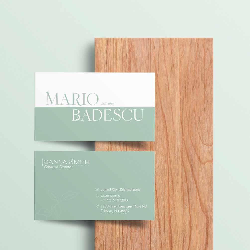
BUSINESS CARD

DIMENSIONS
3 1/2" x 2"
MARGINS
Top: 0.6" Bottom: 0.6" Left: 0.35" Right: 0.35" DETAILS Logo: 0.875"
MARGINS
Top: 0.2" Bottom: 0.2" Left: 0.2" Right: 0.2"
DETAILS
ART: 1.08"x 0.9" NAME: 1.3"x 0.28" TEXT SPACING: 0.1"
0.6"
0.35" 2.85"
0.875" 0.28"
0.2" Beloved Sans Bold
Avenir Light Oblique 0.9" 1.08" 1.33"
Avenir Light
0.1"
0.2"
15
BRAND GUIDELINES | STATIONERY
DIMENSIONS
9 1/2" x 4 1/8"
ENVELOPE

MARGINS
DETAILS
Logo: 0.81" x 0.6" Address: 0.81"
0.24" 0.46" 0.33"
Top: 0.24" Bottom: 0.46" Left: 0.33" EST 1967
0.6" Avenir Book
0.81"
17 BRAND GUIDELINES | STATIONERY
DIMENSIONS
8 1/2" x 11"
MARGINS
Top: 0.38" Bottom: 0.43" Left: 0.38" Right: 0.38"
DETAILS
Logo: 1.9" x 0.54" Text: 1.9" x 0.34"
GUIDELINES | STATIONERY
LETTERHEAD

1.9"
0.34"
Avenir Light
18
0.38" 0.27" 0.54" 0.43" BRAND
PACKAGING
PACKAGING
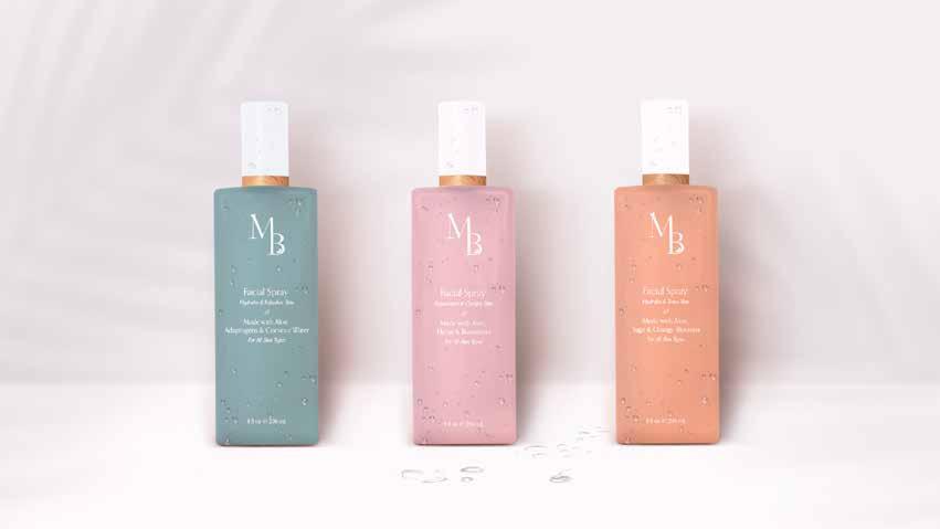
The product packaging will follow a simple, minimalist design to embody the values of the brand.
The Mario Badescu Skincare product containers will consist of frosted, pastel colored bottles. The color will vary coordinating with the ingredients of the product. The product bottle will feature the secondary logo, the product name, its ingredients, treatment purpose, and the bottle size. The cap of the bottle is a matte white finish with a bamboo wood accent to show our brands connection with nature.
21 BRAND GUIDELINES | PACKAGING
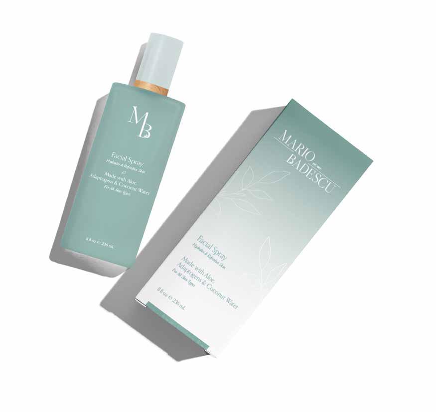
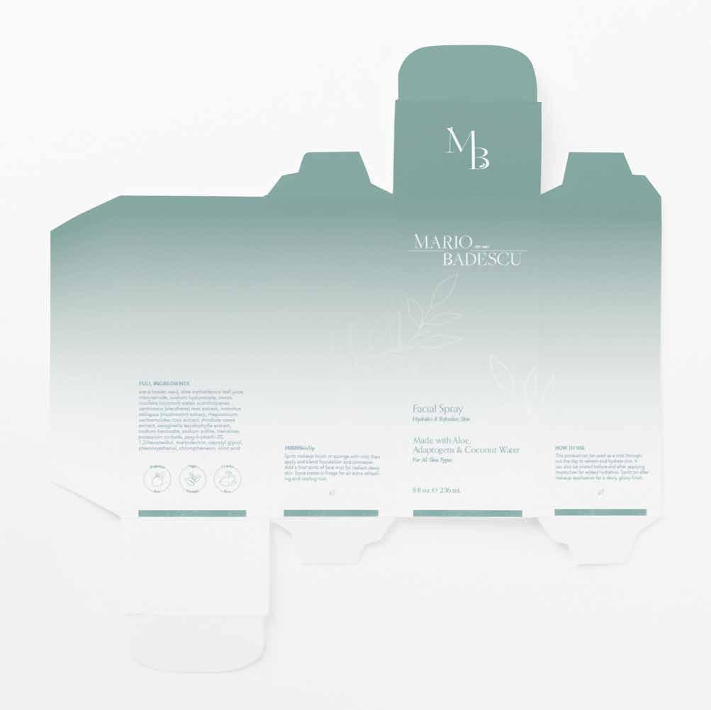
PACKAGING
The boxes that will hold the Mario Badescu Skincare product will coordinate with the design of the product container. The product box will feature: the primary logo, the secondary logo, the product name, its ingredients, bottle size, full ingredient list, brand values, treatment purpose, our skin tips for the best application and instructions.
22
BRAND GUIDELINES | PACKAGING
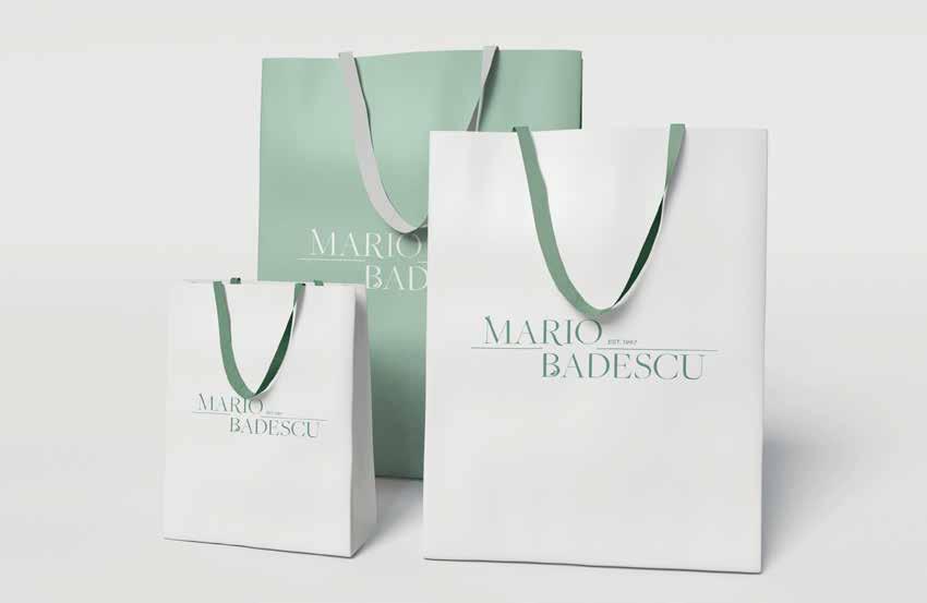
SHOPPING BAG
When customers shop directly from our retail stores and spas, purchased products will be placed in branded shopping bags. The face of the bag will display the primary logo. The colors on the bag invert back and forth between a bag that is the color PANTONE 559 with white details and vice versa. The bags will come in various sizes to hold different loads of products.
24 BRAND GUIDELINES | PACKAGING
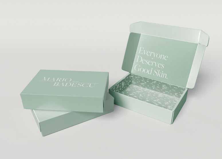
SHIPPING BOX
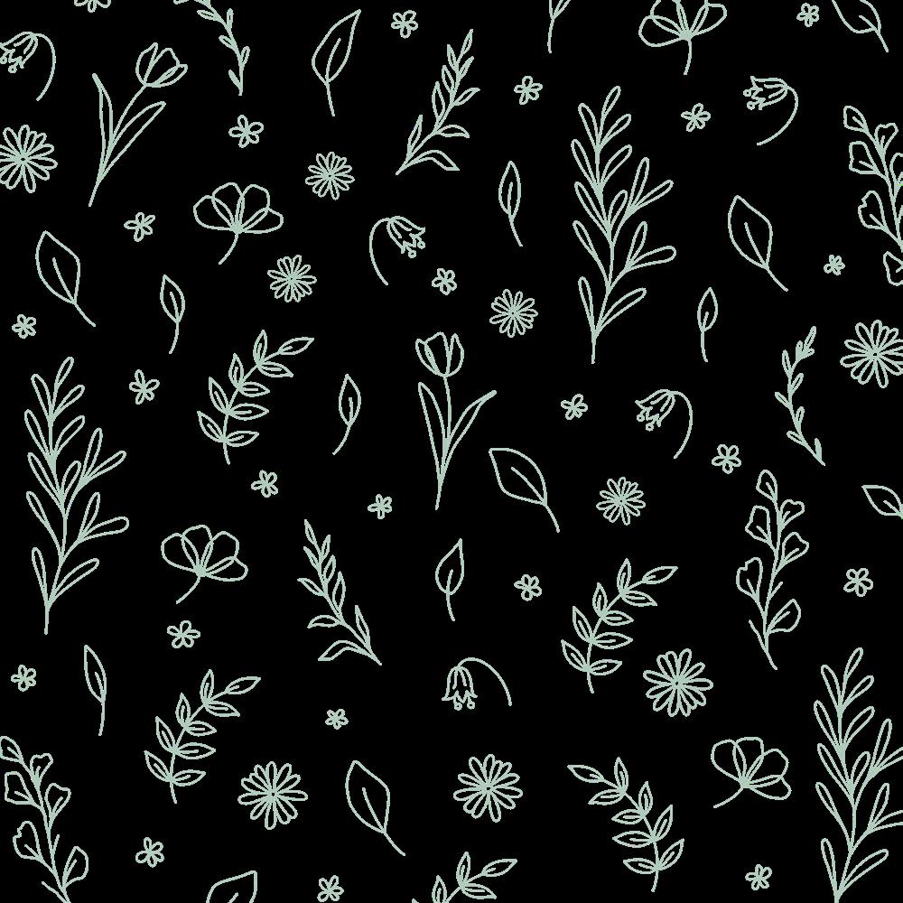
When customers shop directly from the website, the products will be delivered in a light green sustainable cardboard box. Additionally, it will contain short playful remarks or compliments to intrigue and encourage the customer. The statements will use the FreightBig Pro Book typeface. The interior of the box will have minmalist line art of leaves scaling up the box as a decorative ornament.
25
BRAND GUIDELINES | PACKAGING
MARKETING
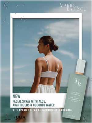
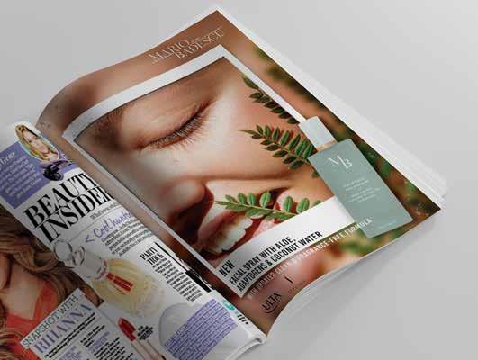
MAGAZINE ADVERTISEMENT
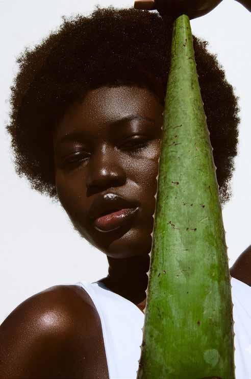
All advertisements should be image-based by displaying pictures of models with beautiful skin to display how well the product works. Important elements in the advertisement to include are: product images, the primary logo, purchasing details, and text that highlights the products main ingredients.
27 BRAND GUIDELINES | MARKETING
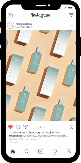
SOCIAL MEDIA
The social media content will have creative freedom and will be deliberated by the marketing team in charge of accounts. However, it will still follow minimal rules to ensure unity and consistency between marketing material.
Picture and video content that is intended for social media posts must also be image-based. For example, it will need to contain images of the products. It can be the product packaging or the product itself. In addition, all pictures and graphics must must display a fresh and exciting composition of the products. It should have a bright color palette. Therefore, it can include colors outside of our color palette for additional creative elements. The theme of the post design should coordinate with the product.
28 BRAND GUIDELINES | MARKETING
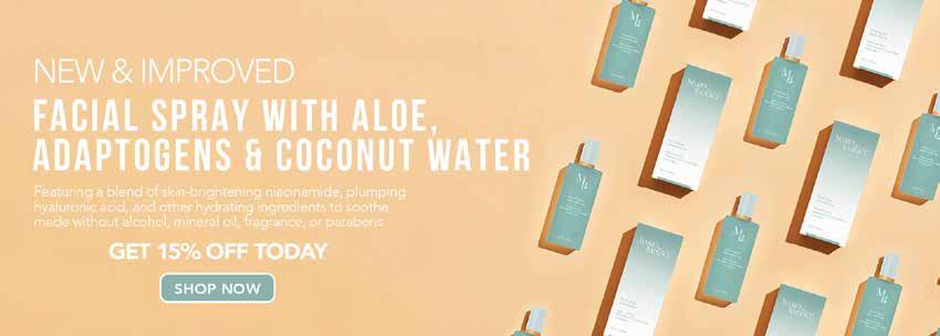
WEB BANNER
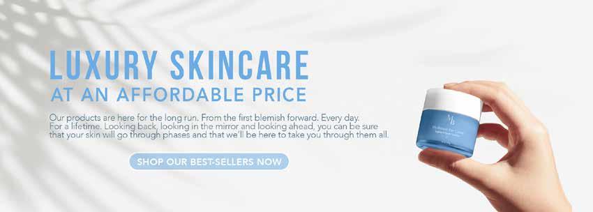
The web banner for the website should follow the same guidelines as other marketing material. It must contain pictures of the products or models with radiant skin and positive attitudes to promote newly released products. Web banners can advertise current promotions, new product releases, or feature a popular product. They must include pictures of the product with a description, and intuitive icons to guide the user on the website.