Bloc | Brand Foundations BRAND FOUNDATIONS
Bloc | Brand Foundations
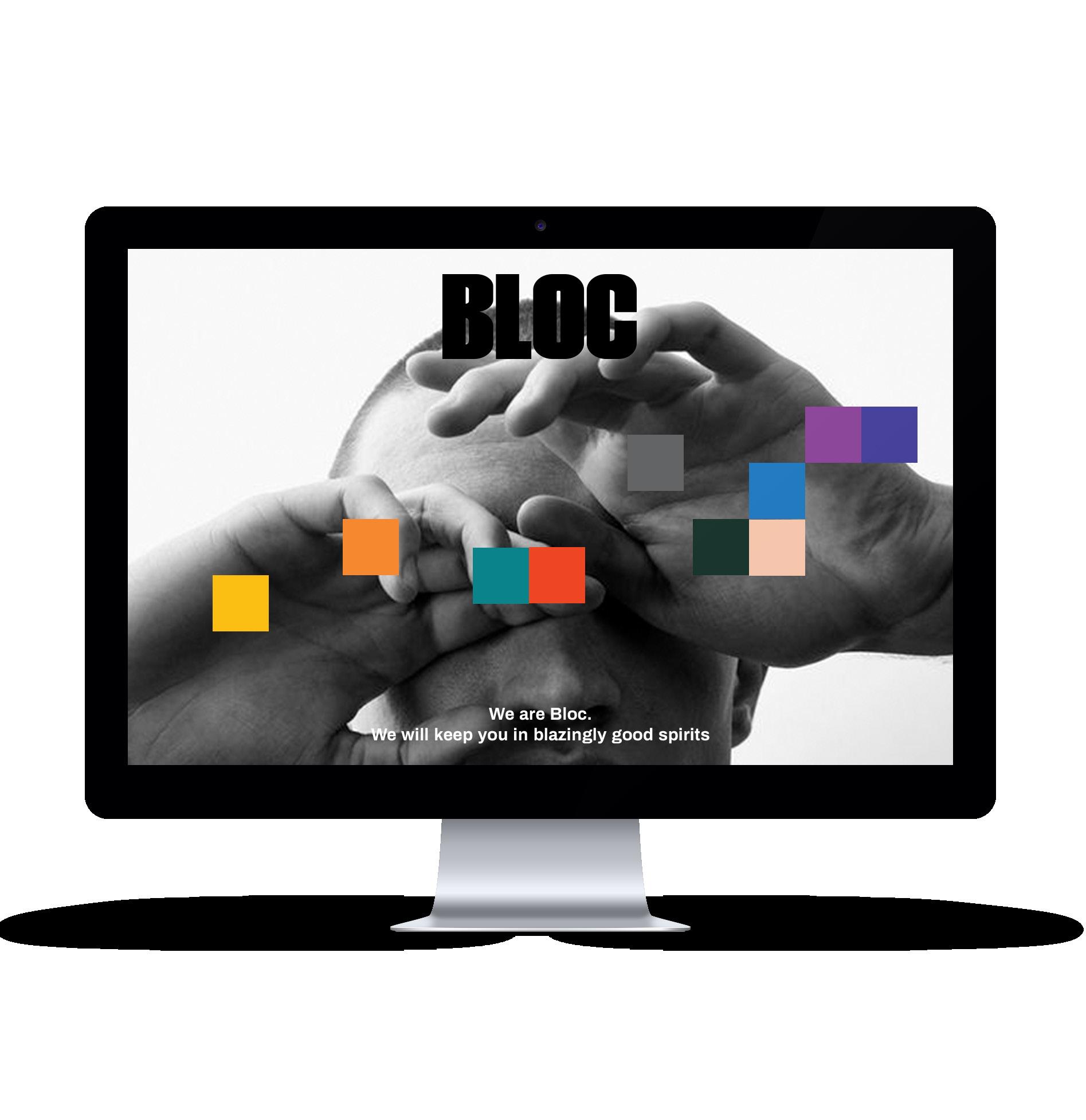
Hi. We’re Bloc. We’ll keep you in blazingly good spirits.
ABOUT
Brand
Brand History
Brand Personality
Brand
Goals
BRAND POSITIONING
Target Market Competitors
Position in the Market
Unique Selling Propositions
Tone
Visual Style
Social Media
Style Guide
Bloc | Brand Foundations 01.
Story
Values
and Objectives
of Voice
THE BRAND BRAND DELIVERY
BRAND EXECUTION 04 34 25 39 Contents. 02. 03. 04.
Chapter One ABOUT THE BRAND
Bloc | Brand Foundations 01
Brand Story
Despite what we offer and who we are, Bloc is different for everyone. It can mean whatever you need it to mean: Maybe it’s a supportive shoulder because you’re not feeling great, or a timely boost for your mental state. Maybe it’s an interesting chat on a mediocre day, or some sleep support so you can hit the hay. Maybe it’s some pain relief because you’re feeling sore, or the perfect hit because it’s twenty past four.
One thing is for sure: At Bloc we’re not just a dispensary, we’re a lifestyle and a community.
We believe in the power of people, plants and the combination of the two.
We believe in sticking to our values and stand in truth.
We believe in community, connection and real conversation.
We believe in hugs, high vibes and high fives.
WHO WE ARE.
We are a collective of curious, interested and excited cannabis connoisseurs on a mission to make people feel good.
WHAT WE DO.
We develop unique dispensary concepts that stock a range of best in class cannabis products, coupled with unparalleled customer service.
HOW WE DO IT.
Expert curation, honest connection and a mission founded on the deepest respect for our customer.
WHY WE DO IT.
To keep you in blazingly good spirits.
THE BRAND DNA5 Bloc | Brand Foundations
Bloc explores, curates and celebrates all things cannabis from a place of openness, inclusivity and fun, with the idea that we all deserve to feel good.
A cannabis curation
with something for everyone. made good to make you feel good. enjoyed in good company. to discover your best self. for people like you.
THE BRAND DNA6 Bloc | Brand Foundations
Our Roots
In 2014, civil rights attorneys in Chicago, Illinois, founded Justice Grown out of a desire to bring great quality cannabis products into the everyday, for everyone.
Our founders have spent their careers fighting for the rights of the wrongly convicted. The work of their civil rights law firm, Loevy & Loevy aptly represents the values of our cannabis company.
The holding company now known as Justice Cannabis Co. was formed to house their dispensary stores and future product ranges.
Today, Justice Cannabis Co. is an industry force to be reckoned with.
Bloc is Justice Cannabis Co.’s growing line of national dispensaries.
The Bloc concept was formed in 2019 by Justice Cannabis Co.’s pioneering and experienced team, who saw an opportunity to bring more meaning to the existing dispensary landscape.
Bloc was born from a love of cannabis, its ability to make us feel better and the appetite to build a community where people can feel supported to discover their best selves.

The vision for our stores was to create more than a place where people could get great products. We wanted to create a community hub where people could meet, socialize, learn and feel better, together. The customer experience of our retail concepts has become a paramount and defining feature of our company. It has allowed us to build a brand known to foster real conversation, human connection, genuine support and above all, a place to have fun.
By 2020, our dispensary movement expanded across the country, with licenses in 7 states (and counting).
THE BRAND DNA7 Bloc | Brand Foundations
The concept was simple: Cannabis made good, that does good, to make you feel good.
Our Roots (cont’d)
Each Bloc store aims to carry on the values of adventure, connection and quality along with the fundamental belief that cannabis can be a powerful vehicle in bringing people together, to feel good.
Today, our loyal customers gather in Bloc dispensaries nationwide to enjoy carefully curated products, expert advice and honest connections with like-minded people.
THE BRAND DNA8 Bloc | Brand Foundations
Bloc.
The name Bloc originates from our central theme of community.
A ‘Bloc’ is a group of people with common interests, who have formed community together, united by the same purpose. Access to legal, quality cannabis is the foundational building block that brings us all together.
The notion of ‘Bloc’ is all inclusive -- a community minded spirit, whereby no- one exists on the ‘outer’. Inclusivity and diversity are fundamental pillars of our brand ethos and we love that this name evokes a sense of familiarity and inclusivity for one and all.
Bloc | Brand Foundations
OUR BRAND NAME
I’ve spent years studying the power and science of cannabis. The more I learn, the more I am convinced: Cannabis can improve every aspect of one’s life. Good quality cannabis products can change everything. It can make us healthier, happier, calmer, more connected and more creative. It opens up a world of self exploration and particularly through the Bloc dispensaries, a world of like-minded, extraordinarily extraordinary people.
Above all else, it can make you feel good. Blazingly good, in fact.
Whether it’s relief from pain, a pathway to creativity or simply a higher vibration, I truly believe that everyone stands to benefit from the power of cannabis. And so, with this in mind, the Justice Cannabis Co. team and I set out to create an offering and an experience that brings the benefits of cannabis into the hands of those that need them.
And we did. And we’ve been pairing good weed to good people ever since.
Our company is made up of multiple professionals from other industries and alumni from some of the cannabis industry’s most influential and impactful brands.
Ultimately, what we’re building is a community of vibrant and varied cannabis consumers who believe in the power of cannabis to help people feel good, together. Our core values of adventure, quality, connection and fun are lived by our people every day and are at the heart of our unique company culture.
Bloc is first and foremost about discovery - a place where you can source a considered and carefully curated range of cannabis products. But it’s also more than that. It’s place for self exploration and an opportunity to discover your best self.
Bloc is also founded on the premise of connection - we’ve built a platform that provides an opportunity for the Bloc community to connect and feel good, together. Along the way, we promise to nurture, educate, uplift, excite and delight them into feeling blazingly better.
Welcome to the world of Bloc, - Darin Carpenter
THE BRAND DNA10 Bloc | Brand Foundations
A word from our CEO. “Quality is never an accident; it is always the result of high intention, sincere effort, intelligent direction and skillful execution; it represents the wise choice of many alternatives.”
- WILLIAM FOSTER
OUR
PROMISE
Sure, it starts with curating the perfect range of cannabis products, but our mission goes well beyond that. It’s really about individuals finding their way to feeling good, together.
THE BRAND DNA11 Bloc | Brand Foundations
To keep you in blazingly good spirits.
BRAND
Brand Personality
The ‘explorer’ archetype:
The ‘explorer’ brand archetype is constantly seeking self-realization and freedom through adventure and discovery. The explorer wants you to experience a more fulfilling life and encourages you to go on a journey, to find and experience new things by escaping the mediocre. It’s secret weapons are independence, authenticity and curiosity.
The explorer’s motto: Blaze your own trail.
WE ARE
Expert / Credible Innovative Meaningful Dynamic Relaxed / Human Humble Considered
Seamless / Sophisticated Open / Inclusive Confident Memorable Inspiring
WE AREN'T
Self-important / Stiff Irresponsible Boring Flash-in-the-pan / Trend driven Sloppy Egotistical Reactionary Overly convoluted No man’s brand Arrogant Whimsical Fabricated
THE BRAND DNA12 Bloc | Brand Foundations
To help people feel blazingly good
Our Vision Our Mission
To encourage discovery and connection to deliver a meaningful and memorable experience that is blazingly better.
THE BRAND DNA13 Bloc | Brand Foundations
THE BRAND DNA14 Bloc | Brand Foundations
‘How can we make feeling good easy, effective, accessible and fun, for as many people as possible?’ That’s what we ask ourselves each day.
Our value proposition
High quality cannabis paired to your needs, enjoyed in good company.
The Bloc dispensary is where people go to not only feel better, but to feel a sense of belonging.
Experience and expertise, couple with ingenuity and integrity across all stages of the process.
Our focus on exotic and rare strains found nowhere else in the city.
“FOR EVERYBODY.”
“All are welcome here” embracing everyone for exactly who they are.

A brand built on the foundation of incomparable inclusivity.
THE BRAND DNA15 Bloc | Brand Foundations
“BETTER TOGETHER.”
“EXPERTLY CURATED.”
THE BRAND DNA16 Bloc | Brand Foundations A cannabis curation tailored to your taste buds.
We want to help you;
“DISCOVER AND EXPLORE.”
Discover new and unique products you’ll love.

Discover yourself.
Discover a better you (the you without the pain).
“EMPOWER YOUR PALATE.”
Learn as little or as much as you like with the help of our cannabis connoisseurs.
Tailored to your taste buds.
“GET ONLY THE GOOD.”
We choose strains and products with a focus on efficacy and brilliance.
Our careful and considered curation is led by integrity.
“HAVE SOME FUN.”
Cannabis is about feeling good. Period.
We exist to surprise and delight, support and enhance your cannabis experience, and your life.
THE BRAND DNA17 Bloc | Brand Foundations
Our customer experience.
The Bloc customer experience is paramount, it’s what we are known and loved for.
MAYA ANGELOU
At Bloc we are hellbent on providing a customer experience that is meaningful and memorable. One that goes above and beyond to display how much we value and genuinely care for our customers.
Our customer experience is founded on a trifold approach -
EDUCATE AND EMPOWER
• Our staff are trained experts who empower our customers to feel like they are in control to choose what’s best for their needs.
• Everyone of our staff is trained to help you find exactly what is right for you.
• We offer a tailored, uncomplicated experience and believe you shouldn’t feel overwhelmed or uncertain when picking out a product, the experience should be fun.
CONNECT AND SUPPORT
“We’re here for you.”
• We offer unparalleled customer service founded on the premise of authentic connection and genuine care
• Human connection is the heartbeat of our business.
• Our staff genuinely want our customers to feel their best.
• No matter what walk of life you are from, you’re welcome at Bloc. Our staff will make the effort to connect with you and learn how they can truly support you on your way to feeling in good spirits.
• We value conversation above transaction.
UPLIFT AND DELIGHT
“Make it memorable.”
• Our daily mission is to connect with, laugh with and uplift the lives of our customerseven if just for a second
THE BRAND DNA18 Bloc | Brand Foundations
“At the end of the day people won’t remember what you said or did, they will remember how you made them feel.”
“Let us be your guide.”
Our customer experience (cont’d).
Every interaction with our customer is an opportunity for us to more deeply understand what our community needs from us. What makes them feel good, like, really good.
WALTER ROGERS
OUR FEEL GOOD PROMISE
Don’t love a product? We’ll add a <benefit> to your next purchase / do something generous. No questions asked.
OUR FEEL GOOD PERKS
As a Bloc member, you’ll <benefit> (get recommended buds / keep track of your preferences / receive tailored recommendations / and collect badges for trying new strains.
At Bloc, we believe that when we are feeling good, we’re better able to connect with, laugh with and uplift the lives of others. That’s why feeling good is at the center of our business.
THE BRAND DNA19 Bloc | Brand Foundations
“The more we understand what’s motivating our customers at a personal level, the better we’ll be able to partner with them to reach their desired outcomes.”
.
Our in-store experience
Welcome to Bloc, a network of cannabis community spaces designed with feeling good in mind.
At Bloc, we believe cannabis should make you feel good, and that starts from the moment you step into the dispensary.
Our dispensary concepts are designed with feeling good in mind. Our design-forward interiors help to redefine outdated expectations of the industry and provide a welcoming hub to further elevate the cannabis experience.
Our retail stores showcase our impressive product range IRL, as well as providing support that’s centered around feeling better, together. Visit us to learn the stories behind our products, get personally tailored support or just drop in to drop out with a like-minded crew.
We invite you to take a seat and enjoy the pleasure of good company and great conversation.
Space to explore a blazingly better you.
THE BRAND DNA20 Bloc | Brand Foundations
THE BRAND DNA21 Bloc | Brand Foundations
Bloc dispensaries are synonymous with uncompromising quality, honest connections and helping people feel good.
This is how we roll
WE’RE FOR INCLUSIVITY.
We’re building a culture of joyful inclusiveness, because two minds are better than one, and more than that, two perspectives are better than one. We respect, value and celebrate lives from every background, and we thrive as a result.
WE’RE FOR LISTENING.
We’re relentless in our pursuit to be the best place to experience cannabis and know the only way to do that is to place our customers at the heart of every decision. We open up a two-way conversation to hear exactly what you want from us.
WE’RE FOR CARING.
No planet, no pot. No hope, no hash. It’s simple really, we care about the earth and the people who inhabit it. Success for us, is being able to say that we’re proud of what we achieved and how we went about achieving it.
WE’RE FOR COMMUNITY.
Community is the heartbeat of our business. Providing genuine, heartfelt support and an opportunity for real connection is our superpower. It’s our mission to be your ultimate comrade in cannabis.
WE’RE FOR ADVENTURE.
We’re not bound by convention and believe in trying new things, pushing the boundaries and avoiding the ordinary to score the extraordinary. Our success — and much of the fun — lies in developing new ways of doing things.
WE’RE FOR BEING REMARKABLE.
We believe in order to achieve excellence, attention to detail, quality and integrity is paramount to every step of our process. We live on the edge of innovation, constantly striving to be better today than we were yesterday.
THE BRAND DNA22 Bloc | Brand Foundations
THE BRAND DNA23 Bloc | Brand Foundations
Feeling good. Vibing high. Sounds good doesn’t it?
In 2020 and beyond...
• Drive more sales
• Grow brand awareness
• Expand market share
• Develop stronger relationships with our customers
• Enter new markets / territories
• Reach new audiences / demographics
• Raise more revenue
• Secure funding
• Increase profits
• Innovate new products/services
Doing this will require resources and a structure dedicated to brand creation, product development, production, and continuous improvement, resulting in a valuable portfolio of branded cannabis products:
Brands that are relevant, meaningful, and approachable to targeted segments Product formats that are newcomer friendly and appeals to connoisseurs
We need to focus on being No. 1 in one category than to be No. 5 in three categories (we can pivot to new areas of focus after the original product concept is a success)
Product formulations that are proven to work with the foundation and background of tested and accepted research approved by the FDA. Keeping ahead of the industry is an ongoing process. R&D for new products will be determined based on the market. Product formulations with cannabinoid combinations are rigorously researched and continuously improved via data gathered on an ongoing basis from the consumer experience and market intelligence
We are in the process of developing in-house brands as well as exploring brand partnerships to create brand awareness and gain market visibility
THE BRAND DNA24 Bloc | Brand Foundations
Two BRAND POSITIONING
Bloc | Brand Foundations 02 Chapter
We Are
EXPERT. CURIOUS. THOUGHT-LEADERS. EMPOWERING. TRUSTED. MODERN. SEAMLESS. INNOVATIVE. DYNAMIC. CONSIDERED. FORWARD-THINKING. IMPACTFUL. FUN. THOUGHTFUL. RIGOROUS. RELIABLE. HUMAN. CREATIVE. TRUSTWORTHY. CREDIBLE. INFORMED. UNIQUE. ETHICAL. AUTHENTIC. INSPIRING. INCLUSIVE. ORIGINAL. EXCITED. DISRUPTIVE. INNOVATIVE. RESPONSIBLE. TREND-SETTERS.
THE BRAND POSITIONING26 Bloc | Brand Foundations
THE BRAND POSITIONING27 Bloc | Brand Foundations
“Connection is the energy that is created between people when they feel seen, heard and valued.”
- BRENE BROWN
Persona one - Kyle, 29. (recreational user)
ATTRIBUTES:

The everyday smoker
Loves to puff and hike.
SEEKS:
Adventure. Fun. Creativity. Socializing.
SHOPS FOR:
Concentrates, flower, inhalable products.
Kyle knows what he wants and likes, but can’t go past a good old fashioned chat with the retail assistant to learn something new.
He loves understanding how the different strains create different experiences and is willing to try anything the Bloc assistant recommends.
Kyle loves that Bloc stock such a range of exotic, hard to find strains.
He drops into Bloc at least a few times a week, to stock up but mainly because he’s always guaranteed to bump into someone he knows for a good chat.
He responds to messaging such as;
“New strain X, in-store today”
“The perfect puff and hike Product X”
“Fresh drop coming to Bloc”
“Stay lifted”
and the way we infuse culture into our brand.
THE BRAND POSITIONING28 Bloc | Brand Foundations
Persona two - Stan, 51.

(pain relief user)
ATTRIBUTES:
Medical use
Relief from long term pain
SEEKS:
Pain relief. Being understood and cared for.
SHOPS FOR:
Flower, concentrates, edibles.
Stan has suffered from pain caused by a few ailments. Life without relief from this pain is hard-going and Stan has turned to the power of cannabis for relief. It took him a while to get past the stigma surrounding this form of medication, but now that he has experienced the benefits he shouts it’s praises to anyone who will listen.
He loves going into his local Bloc dispensary because the crew there are always so welcoming, caring and supportive. They all have a good sense of humour too, which helps because Stan is quite the comedian. Or at least, he thinks he is.
Stan loves that Bloc makes it easy for him - there’s no complex conversations or hard decisions to make. The team knows exactly how to help Stan get the relief he so desperately needs. Stan is also glad to know the retail assistants have extensive product knowledge, particularly when it comes to cannabinoids and terpenes.
He responds to messaging such as;
“Feel better”
“Quality you can trust”
“Pharmaceutical grade”
“Dose controlled medical cannabis”
“Find relief, today”
and the fact that we genuinely care about the needs of our customers and place them at the center of our business.
THE BRAND POSITIONING29 Bloc | Brand Foundations
Persona three - Sofia, 32. (wellness seeker)

ATTRIBUTES:
The occassional user
Wants to experience the health benefits of cannabis
SEEKS:
Better wellbeing. Better sleep.
SHOPS FOR:
Beginner friendly products and microdose products. Strong preference for wellness-adjacent products, eg. tinctures and sublinguals, topicals, capsules.
Sofia was enticed into the market by the CBD wellness trend. When she first stepped into Bloc she really had no idea what products would suit her best and she felt a little intimidated by the whole thing. After speaking with the retail assistant though, she felt confident and excited to try some new wellness-adjacent products.
Sofia is looking to improve her overall wellbeing, get better sleep and be able to better cope with her daily anxiety. She is also proud to tell her friends she now uses cannabis - afterall, it’s what all the cool kids are doing these days.
She shops at Bloc a couple of times a month and loves both the interior design and welcoming feeling.
He responds to messaging such as;
“Greater wellbeing”
“Improved mood”
“Better sleep”
“You deserve to feel good”
“Live your best life”
and press articles that feature the benefits of our products.
THE BRAND POSITIONING30 Bloc | Brand Foundations
THE BRAND POSITIONING31 Bloc | Brand Foundations
“We don’t heal in isolation, but in community.”
- S.KELLEY HARRELL
Competitors
HARVEST
“Improving lives through the goodness of cannabis”
World’s most welcoming cannabis experience. Harvest wants you to feel at home, they provide a welcoming experience with questions answered and provide pamphlets with their products.
“We’re here to inspire impact at every level of the cannabis industry”
Provide safe access, Welcome public Educate What They Do and What Medical Mmj Is (Safe, Effective, Legal).
“We’re on a mission to normalize, professionalize and revolutionize cannabis”
Grouped 3 benefits rise, refresh, rest. Cresco wants to be the whole foods of cannabis wants to service customers who feel cannabis is a viable health and wellness tool.
”Legal, Natural, Californian Cannabis, Finally.”
Organic fertilizer, no pesticides, pay employees a proper living wage, use sustainable materials from seed to sale. High quality oil, flower, pre-rolls.
GTI CRESCO LOWELL HERB TERRAPIN CARE STATION
“A consumer-focused cultivator, processor and provider of highquality medical and retail cannabis products.”
With some of the most competitive prices on the market, the company leads the industry in corporate responsibility, developing one of the most comprehensive cannabis training programs for its staff of nearly 250.
BLOC STRENGTHS.
• Expertise in Genetics, Manufacturing, and Operations
• Cost Advantages from proprietary know-how
• Exclusive access to production resources
• Favorable access to distribution networks
Investment in Employee Training Programs and improved workflow
Our strategic partnerships and brand endorsements
THE BRAND POSITIONING32 Bloc | Brand Foundations
Position in the market.
WE ARE ATTAINABLE
We believe high-quality and responsibly produced cannabis products don’t need to come at great expense. We are committed to remaining attainable and providing value for money with our entire product range.

WE ARE FOR EVERYONE
We want our offerings to pair well for you regardless of age, background, education, race, gender or your past experiences with cannabis.
THE BRAND POSITIONING33 Bloc | Brand Foundations
Three BRAND DELIVERY
Bloc | Brand Foundations 03 Chapter
Tone of Voice
• The Bloc tone of voice is straightforward, energetic and engaging.
• It is direct with a touch of wit, a sprinkling of fun and an ounce of cool.
• The language is succinct and sharp. It’s to the point and it doesn’t mess around with whimsical, flowery words.
• We never use a long word where a short one will do. And if it is possible to cut out a word, we always cut it out.
• We tell it how it is, whilst still remaining approachable, personable and fun.
• We are informative, credible and demonstrate our expertise. And yet we avoid language that feels stiff, cold or egotistic.
• We are entertaining and compelling without using language shrouded in fluff or nonsense.
• We are always friendly, but forward in our language. We never use a foreign phrase, a scientific word or a jargon word if we can think of an everyday English equivalent.
• We write for our audience, and nobody else. We are never self indulgent or too self-promotional. It’s all about our customers and their experience with us.
• Our tone of voice must represent our brand character -
• He is the person you aspire to be. Intelligent, inclusive, witty, cool, collected and loved by people from all walks of life.
• He is a true individual with confidence to walk to the beat of his own drum. And whilst he certainly knows what he’s talking about, he is never intimidating or unprepared to listen.
• His language is always carefully considered but effortlessly personable, witty and occasionally bold.

BRAND DELIVERY35
Doing this will require resources and a structure dedicated to brand creation, product development, production, and continuous improvement, resulting in a valuable portfolio of branded cannabis products:
Tone of Voice (cont’d)
• We are fun but not childish. Clever but not silly. Confident but not cocky. Smart but not stodgy.

• Cool but not alienating. Relaxed but not sloppy. Expert but not bossy. Fun but not silly.
• We use ‘we’ and ‘you’ and are inclusive to all types of people from all walks of life.
• We are focused on the experience and always focus on the experience of making our customers feel good.
• We love to inspire, educate and encourage.
• We are personal. But we don’t sacrifice clarity for colloquialisms.
• We empower our audience with confidence and hold them in the highest regard.
• Our copy, language and tone shows that, despite our professionalism, we are personable, approachable and like to have fun.
ARE ALWAYS
WE ARE NEVER
THE BRAND POSITIONING36 Bloc | Brand Foundations
Cold or stark Gimmicky or salesy Boring or uninspiring Overly self promotional Formal or stiff WE
Clear and concise Warm and witty Creative and compelling Memorable and meaningful Entertaining and engaging
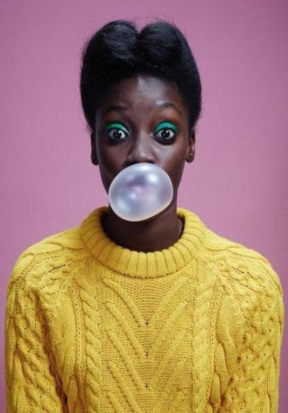
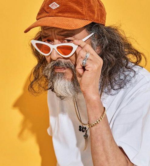
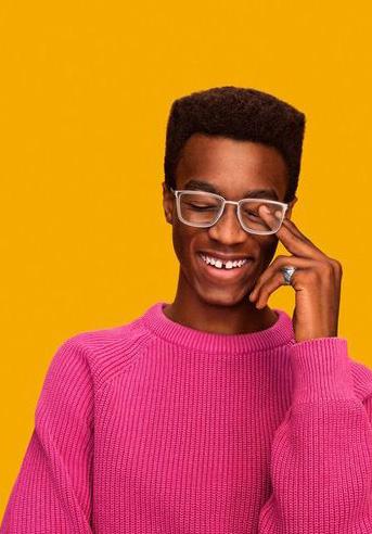
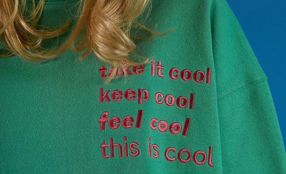
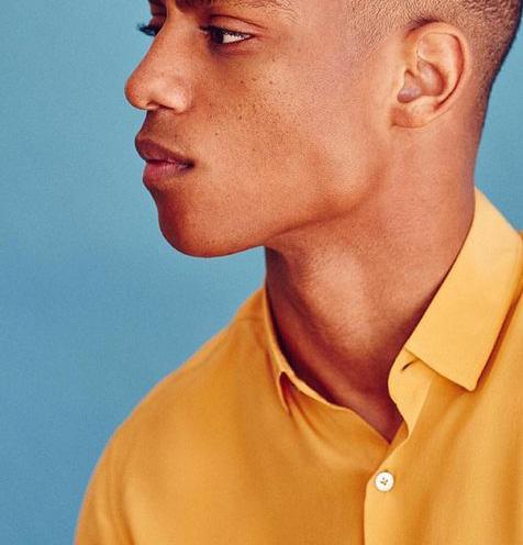
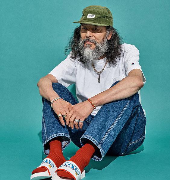
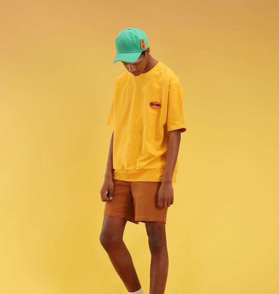
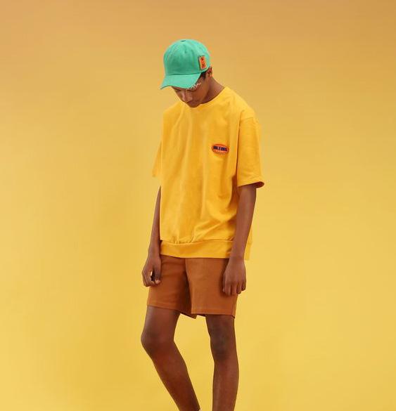
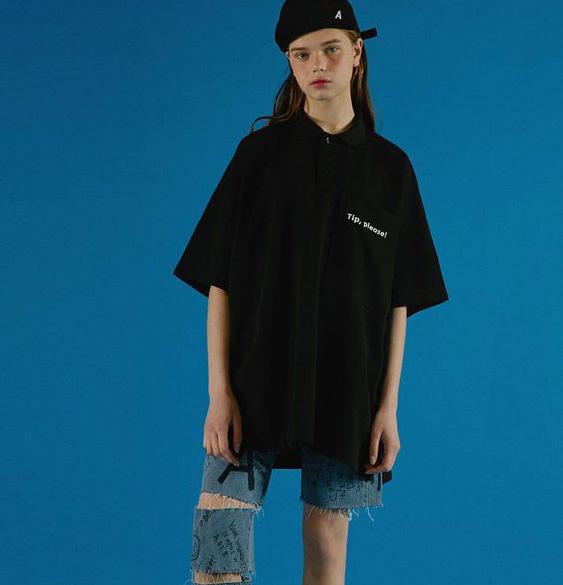
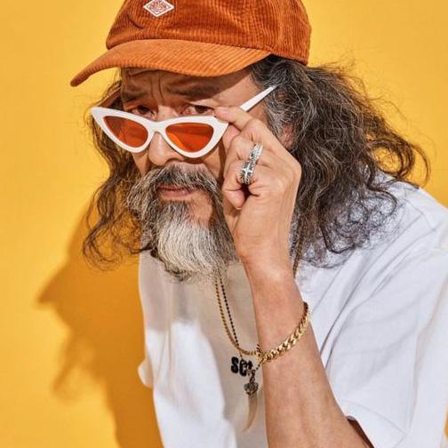
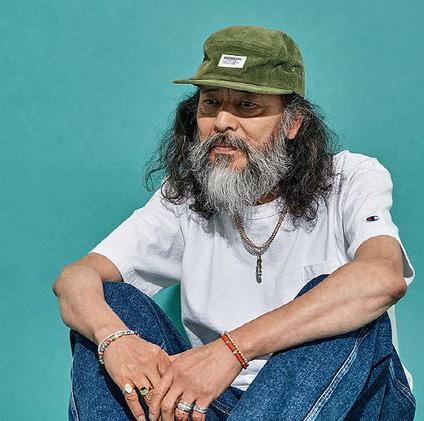
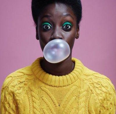
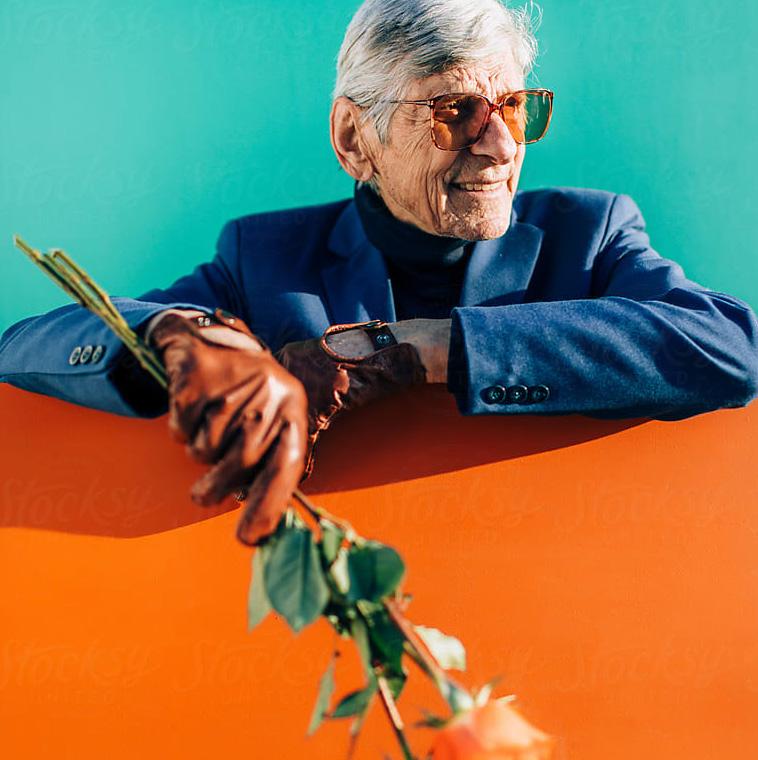
Visual Style
MODERN / DISRUPTIVE / FRESH / CREATIVE / GENDER NEUTRAL / EDGY / FUN / RICH / DISTINCTIVE
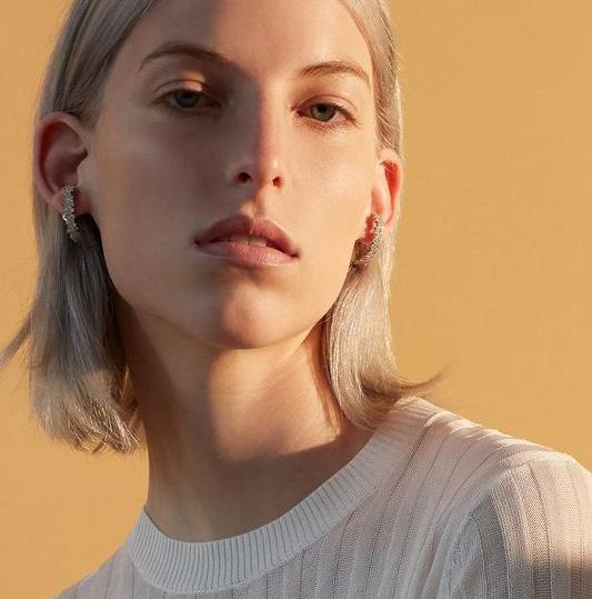
Bloc cannabis dispensaries provide spaces that feel inclusive and welcoming, which is paramount to the customer experience. Each dispensary needs to have a recognisable aesthetic as the Bloc brand, whilst retaining the unique character of the local community. The branding incorporates bold pops of colour, that signifies each of the different states that hold dispensaries. The branding, signage, photography and space all feel clean and modern with a bold and eye-catching appeal that is different to any other cannabis dispensary. The applications of use will showcase how to best use the branding and colours to maintain a clean and consistent feel to the brand.
BRAND DELIVERY37 Bloc | Brand Foundations
Social Media
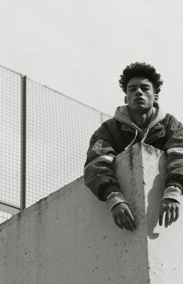
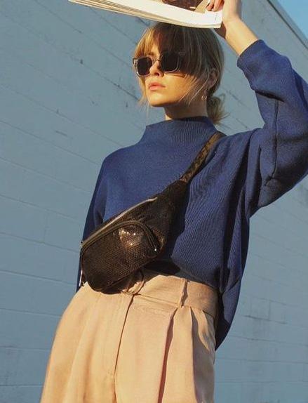
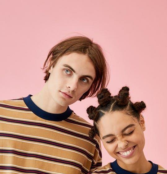
Our social media is where the Bloc brand really comes to life.
Our feed should feel like the Bloc dispensary experience itself - a relaxed cocktail of community, quality and good vibes presented in a fresh and engaging way.
The Bloc Instagram feed is a combination of our own images as well as sourced shots from places and people that inspire us. This imagery however, should only ever be posted if it is aligned with our standard and quality of aesthetic.
Posts should never be blurry, or cluttered and the overall feel of the feed should never be compromised.
We should have consistent, on-brand templates that we use for announcements, quotes and call to actions.
THERE SHOULD BE A BLEND OF;
• 60% of Bloc’s own content from the stores (shots of interiors, close-up details of merchandising and features of people interacting with the experience) or from campaign or relevant content we’ve created to support our brand story.
• The remaining 40% should come from the brands we stock, with appropriate credits.
User customer generated content should be reserved for IG stories, so as not to compromise the aesthetics of our feed.
RULES OF THE GAME:
• Close ups and more atmospheric imagery will create the feel of the brand and evoke the personality behind the brand.
• Faces and human elements will keep the brand engaging and relatable
• Captions must also capture the ethos of the brand and stick to our tone of voice. We want to be witty, compelling and clever. Spelling and grammar needs to prove our professionalism and ensure our high quality at all times.
• Let’s showcase a diverse range of people, brands and industries to ensure that we remain true to our value of diversity.
• Try not to show the obvious moments - let’s show off the more detailed, interesting crops and angles.
• Nothing too staged or cliche. Aim for creativity and originality at all times.
BRAND DELIVERY38 Bloc | Brand Foundations
Chapter Four STYLEGUIDE
Bloc | Brand Foundations 04
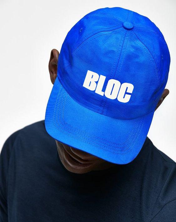
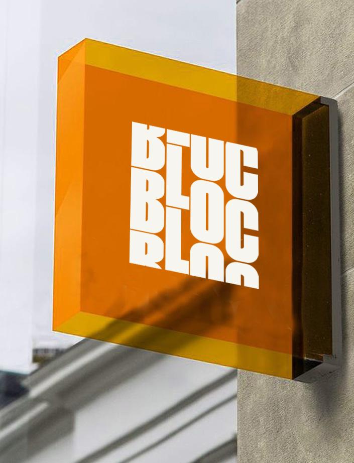
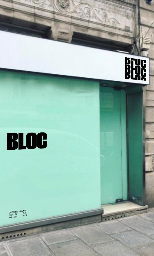
Primary Logo
This is the primary logo. Logo must be resized proportionately, never stretched.
The logo can be used in black over light colored backgrounds,
or cream over dark colored backgrounds. The logo can also be used in the allocated state color. If the state color is used as the background, the logo should be used in Black or Cream.
The logo can also be used over an image, but must always be legible.
This is to be used as the predominant logo.
STYLE GUIDE40 Bloc | Brand Foundations
Primary Logo Clear Space
In order for the logo to be presented clearly, there must always be a certain amount of clear space surrounding it.
To work this area out, use the height of the base of the letter ‘L’ as a guideline.
STYLE GUIDE41 Bloc | Brand Foundations
Posh Peanut | Brand Bible
Secondary Logo
This is the secondary logo. Logo must be resized proportionately, never stretched.
The logo can be used in black over light colored backgrounds,
or cream over dark colored backgrounds, or the state colors.
This logo can be used as a brand feature, supporting the primary logo. This can be used alone,
however the primary logo must be close by and legible so people can draw connections between the two.
STYLE GUIDE42 Bloc | Brand Foundations
Secondary Logo Clear Space
In order for the logo to be presented clearly, there must always be a certain amount of clear space surrounding it.
To work this area out, use the height of the base of the letter ‘L’ as a guideline.
STYLE GUIDE43 Bloc | Brand Foundations
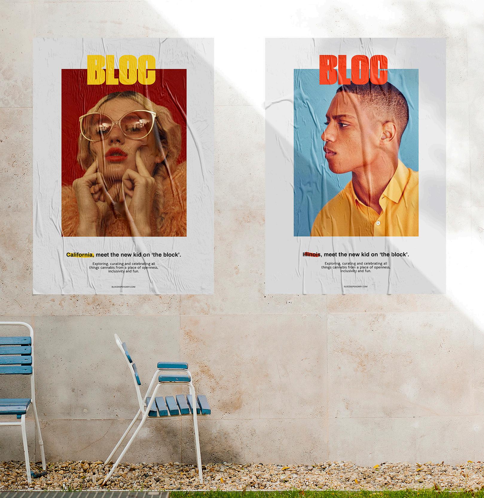
Tagline Logo
The Bloc dispensaries are to be described differently from state to state.
These are the different tagline versions of the logo to be used.
The taglines are only to be used on the primary logo variation.
Tagline variations are to be used when the brand needs instant recognition for what it is.
STYLE GUIDE44 Bloc | Brand Foundations
Logo Color Uses
When color is used in the state of Illinois, the cream or black version should sit over the red background. Black can sit over cream, red can sit over cream, and red over imagery (unless it is too similar to the image colours, then please use cream or black). This is applicable for Primary, Secondary and Tagline versions of Illinois logos.
When color is used in the state of Massachusetts, the cream or black version should sit over the purple background. Black can sit over cream, purple can sit over cream, and purple over imagery (unless it is too similar to the image colours, then please use cream or black). This is applicable for Primary, Secondary and Tagline versions of Massachusetts logos.
Please use this as a guide on how to best use the logo for each state.
Logo can be used in the state color or in black or cream over the state color background. If the logo
is illegible in the color, use black or cream.
If the state color clashes with its surroundings, use the cream or black.
If the state color can be used as the primary logo for the state, then use this. This will create brand recognition for that state.
STYLE GUIDE45 Bloc | Brand Foundations
ILLINOIS MASSACHUSETTS
Logo Color Uses (cont’d)
When color is used in the state of Maryland, the cream or black version should sit over the pink background. Cream can sit over black, pink can sit over cream, and pink over imagery (unless it is too similar to the image colours, then please use cream or black). This is applicable for Primary, Secondary and Tagline versions of Maryland logos.
When color is used in the state of Michigan, the cream version should sit over the green background (not black). Black can sit over cream, green can sit over cream, and green over imagery (unless it is too similar to the image colours, then please use cream or black). This is applicable for Primary, Secondary and Tagline versions of Michigan logos.
Please use this as a guide on how to best use the logo for each state.
Logo can be used in the state color or in black or cream over the state color background. If the logo
is illegible in the color, use black or cream.
If the state color clashes with its surroundings, use the cream or black.
If the state color can be used as the primary logo for the state, then use this. This will create brand recognition for that state.
STYLE GUIDE46 Bloc | Brand Foundations
MARYLAND
MICHIGAN
Logo Color Uses (cont’d)
When color is used in the state of Missouri, the cream or black version should sit over the teal background. Black can sit over cream, teal can sit over cream, and teal over imagery (unless it is too similar to the image colours, then please use cream or black). This is applicable for Primary, Secondary and Tagline versions of Missouri logos.
OHIO
When color is used in the state of Ohio, the cream version should sit over the grey background (not black). Black can sit over cream, grey can sit over cream, and grey over imagery (unless it is too similar to the image colours, then please use cream or black). This is applicable for Primary, Secondary and Tagline versions of Ohio logos.
Please use this as a guide on how to best use the logo for each state.
Logo can be used in the state color or in black or cream over the state color background. If the logo
is illegible in the color, use black or cream.
If the state color clashes with its surroundings, use the cream or black.
If the state color can be used as the primary logo for the state, then use this. This will create brand recognition for that state.
STYLE GUIDE47 Bloc | Brand Foundations
MISSOURI
Logo Color Uses (cont’d)
When color is used in the state of New Jersey, the cream or black version should sit over the blue background. Black can sit over cream, blue can sit over cream, and blue over imagery (unless it is too similar to the image colours, then please use cream or black). This is applicable for Primary, Secondary and Tagline versions of New Jersey logos.
When color is used in the state of California, the cream or black version should sit over the yellow background. Black can sit over cream, yellow can sit over cream, and yellow over imagery (unless it is too similar to the image colours, then please use cream or black). This is applicable for Primary, Secondary and Tagline versions of California logos.

Please use this as a guide on how to best use the logo for each state.
Logo can be used in the state color or in black or cream over the state color background. If the logo
is illegible in the color, use black or cream.
If the state color clashes with its surroundings, use the cream or black.
If the state color can be used as the primary logo for the state, then use this. This will create brand recognition for that state.
STYLE GUIDE48 Bloc | Brand Foundations
NEW JERSEY
CALIFORNIA
Logo Color Uses (cont’d)
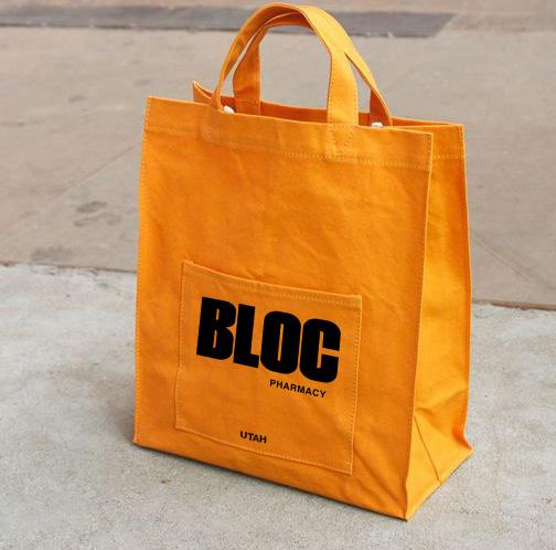
When color is used in the state of Utah, the cream or black version should sit over the orange background. Black can sit over cream, orange can sit over cream, and orange over imagery (unless it is too similar to the image colours, then please use cream or black). This is applicable for Primary, Secondary and Tagline versions of Utah logos.
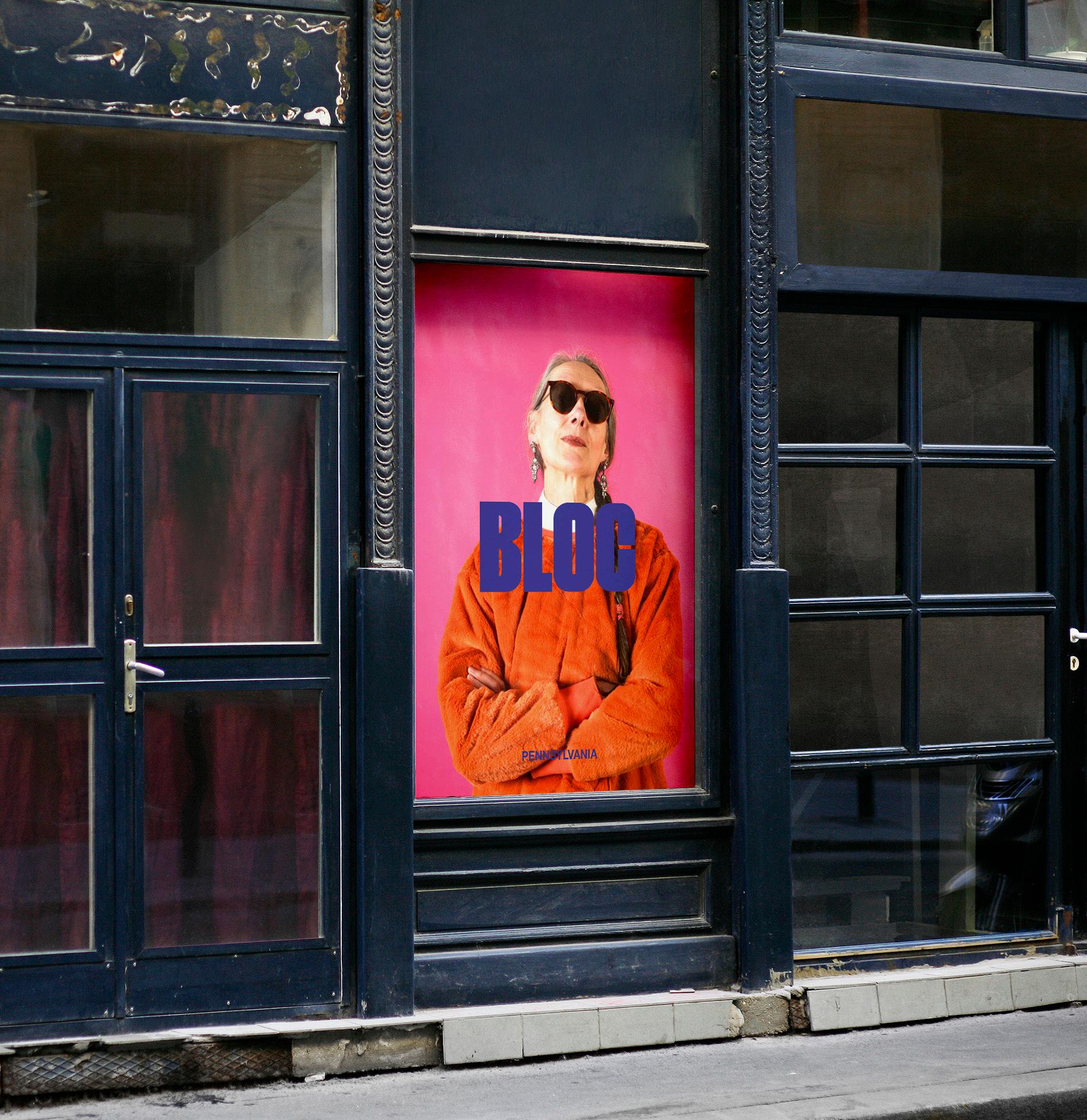
When color is used in the state of Pennsylvania, the cream version should sit over the blue background (not black). Black can sit over cream, blue can sit over cream, and blue over imagery (unless it is too similar to the image colours, then please use cream or black). This is applicable for Primary, Secondary and Tagline versions of Pennsylvania logos.
Please use this as a guide on how to best use the logo for each state.
Logo can be used in the state color or in black or cream over the state color background. If the logo
is illegible in the color, use black or cream.
If the state color clashes with its surroundings, use the cream or black.
If the state color can be used as the primary logo for the state, then use this. This will create brand recognition for that state.
STYLE GUIDE49 Bloc | Brand Foundations
UTAH PENNSYLVANIA
Incorrect Colour Uses
This is an example of incorrect color uses over imagery. Colors aren’t varied enough in tone with the imagery color to allow for legibility and contrast. In these cases, please use either the black


or cream logo instead of the state color.
STYLE GUIDE50 Bloc | Brand Foundations
Heading font
THIS IS TO BE USED FOR SUBHEADINGS ONLY
This is to be used for body copy only. Fecem publicit ficavertum acepsenat, praestre coena, spicaverena, nicia verfex nos, eti foriter iondemnox nos vit; nonsili catripio ius obut qua restrum remperrio, constas confes hordit; ina, sa ina, videnis; nonsulervis, audam consta, quos publiaet, Catquastrid di cuppl. Hae huconsul ce ficaturs hilique consulium ora rem nihil vis C. Dam Pateati, Castiliam siliusa arendi publiisque mis; et virit; nonsil vesit Castarterid die morum co cotatiam adhuconveri perferiam in temnem, novehebemus se cibemus Maedentra nos crum mus caet; inatilis conloca timacch uctusu interip iestria mdius, quo vericaedi ponfex sperte ad senam.
This is a pull quote font
STYLE GUIDE51 Bloc | Brand Foundations
Brand Fonts
HEADING FONT.
Archivo
Bold / Sentence case / 0pt tracking abcdefghijklmnopqrstuvwxyz 0123456789
SUBHEADING FONT.
INTER SEMIBOLD / UPPERCASE / 0PT TRACKING ABCDEFGHIJKLMNOPQRSTUVWXYZ 0123456789
BODY COPY FONT.
Montserrat
Light / Sentence Case / 20pt tracking Abcdefghijklmnopqrstuvwxyz 0123456789
PULL QUOTE FONT.
Bellota Text
Bold / Sentence case / 0pt tracking abcdefghijklmnopqrstuvwxyz 0123456789
HEADING FONT. This is to be used for main headings.
SUBHEADING FONT.
To be used for subheadings. Must always be significantly smaller than the heading type.
BODY FONT. Main copy font.
PULL QUOTE FONT. This is to be used where a pull quote sits amongst body copy.
STYLE GUIDE52 Bloc | Brand Foundations
Color Palette
Black and cream are the core brand colors.
Each state has it’s own core color. Each of these are shown above, labelled with the State name.
STYLE GUIDE53 Bloc | Brand Foundations
BLACK CREAM
ILLINOIS MASSACHUSETTS MARYLAND
MISSOURI
CALIFORNIA
OHIO UTAH
NEW JERSEY
PENNSYLVANIA
MICHIGAN
Color Palette (cont’d)
ADDITIONAL ADDITIONAL ADDITIONAL
ADDITIONAL
ADDITIONAL
ADDITIONAL
ADDITIONAL
ADDITIONAL
Black and cream are the core brand colors.
Each state has it’s own core color. These are additional colors that can be used when more dispensaries open in new states.
STYLE GUIDE54 Bloc | Brand Foundations
BLACK CREAM
BLACK
C 60 - M 40 - Y 40 - K 100
R 0 - G 0 - B 0
# 000000
CREAM
C 3 - M 2 - Y 6 - K 0
R 245 - G 244 - B 236
# f5f4ec
Closest PMS 9043 C Closest PMS 9043 U
ILLINOIS
C 0 - M 88 - Y 98 - K 0
R 239 - G 70 - B 37
# ef4625
Closest PMS 2349 C Closest PMS 2347 U
MASSACHUSETTS
C 52 - M 87 - Y 0 - K 0
R 140 - G 69 - B 154
# 8c449a
Closest PMS 2593 C Closest PMS 2593 U
MARYLAND
C 2 - M 25 - Y 30 - K 0
R 245 - G 198 - B 172
# f4c6ac
Closest PMS 489 C Closest PMS 489 U
MICHIGAN
C 82 - M 55 - Y 70 - K 63
R 24 - G 51 - B 43
# 17332c
Closest PMS 560 C Closest PMS 560 U
STYLE GUIDE55 Bloc | Brand Foundations
MISSOURI
C 85 - M 32 - Y 42 - K 6
R 12 - G 131 - B 139
# 0d838b
Closest PMS 2212 C Closest PMS 2222 U
OHIO
C 61 - M 52 - Y 50 - K 21
R 99 - G 100 - B 102
# 636466
Closest PMS 430 C Closest PMS 431 U
NEW JERSEY
C 87 - M 43 - Y 0 - K 0
R 34 - G 122 - B 199
# 2179bf
Closest PMS 2172 C Closest PMS 2172 U
CALIFORNIA
C 1 - M 26 - Y 100 - K 0
R 251 - G 191 - B 19
# fbc013
Closest PMS 1235 C Closest PMS 121 U
UTAH
C 0 - M 56 - Y 91 - K 0
R 246 - G 137 - B 49
# f68931
Closest PMS 1375 C Closest PMS 2013 U
PENNSYLVANIA
C 88 - M 90 - Y 0 - K 0
R 70 - G 64 - B 153
# 443f99
Closest PMS 2104 C Closest PMS 2369 U
STYLE GUIDE56 Bloc | Brand Foundations
ADDITIONAL #1
C 42 - M 2 - Y 12 - K 0
R 143 - G 208 - B 212
# 8fd0dc
Closest PMS 283 C Closest PMS 283 U
ADDITIONAL #2
C 28 - M 0 - Y 21 - K 0
R 183 - G 224 - B 209
# b8e0d0
Closest PMS 317 C Closest PMS 317 U
ADDITIONAL #3
C 7 - M 0 - Y 35 - K 0
R 239 - G 241 - B 184
# f0f1b8
Closest PMS 9141 C Closest PMS 9064 U
ADDITIONAL #4
C 41 - M 16 - Y 53 - K 0
R 158 - G 183 - B 141
# 9eb78d
Closest PMS 2404 C Closest PMS 2404 U
ADDITIONAL #5
C 65 - M 7 - Y 47 - K 0
R 87 - G 180 - B 156
# 57b49c
Closest PMS 3258 C Closest PMS 3258 U
ADDITIONAL #6
C 4 - M 76 - Y 61 - K 0
R 232 - G 99 - B 92 # e8625c
Closest PMS 2348 C Closest PMS 2034 U
STYLE GUIDE57 Bloc | Brand Foundations
ADDITIONAL #7
C 22 - M 97 - Y 82 - K 13
R 175 - G 40 - B 53
# af2835
Closest PMS 187 C
Closest PMS 200 U
ADDITIONAL #8
C 34 - M 33 - Y 9 - K 0
R 170 - G 164 - B 194
# a9a4c2
Closest PMS 2093 C Closest PMS 2092 U
STYLE GUIDE58 Bloc | Brand Foundations
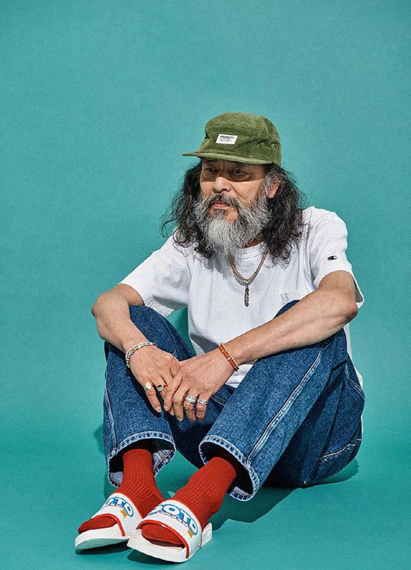
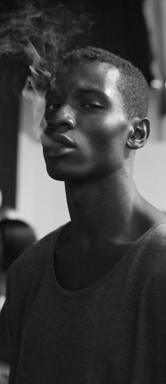
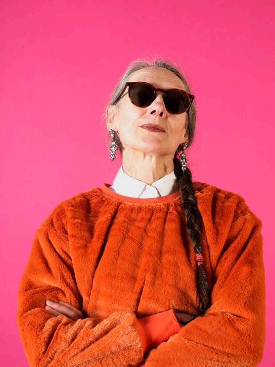
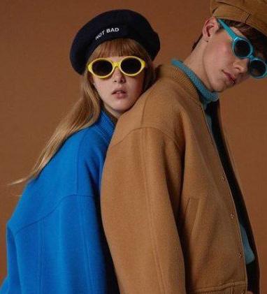
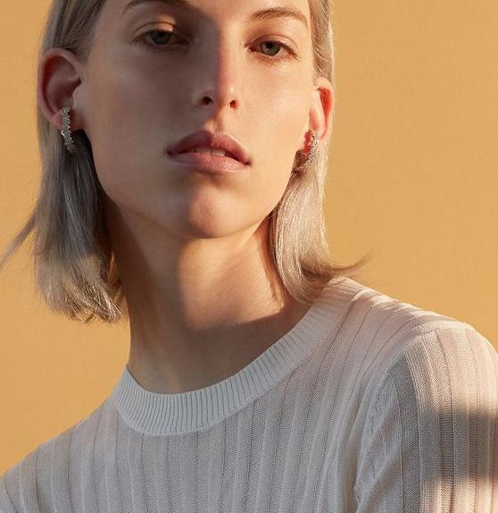
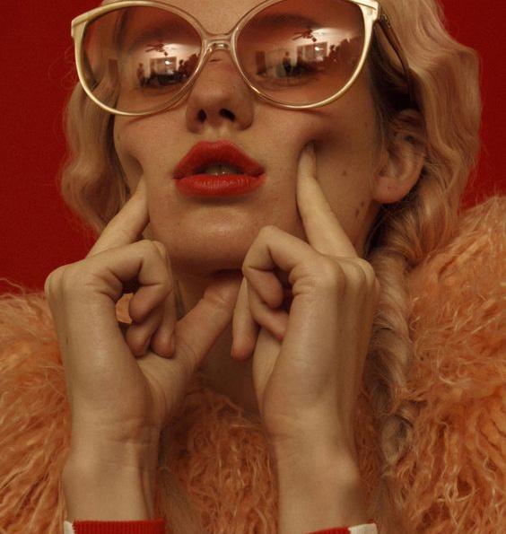
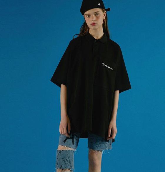
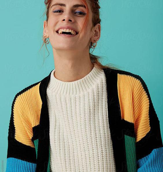
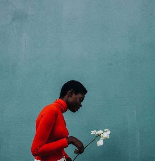
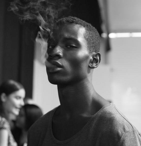
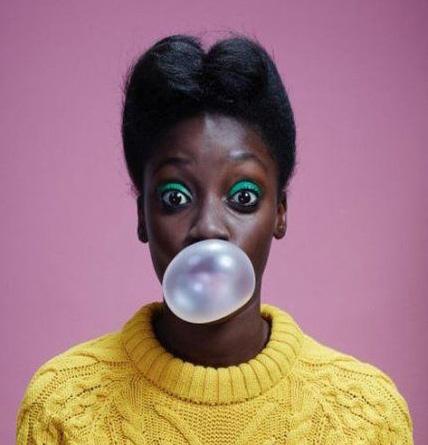
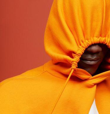
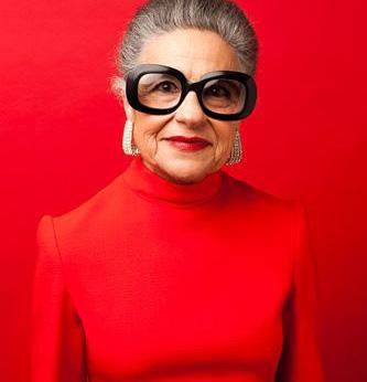
Visual Direction - Lifestyle
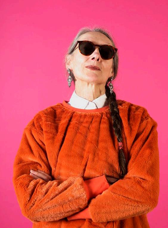
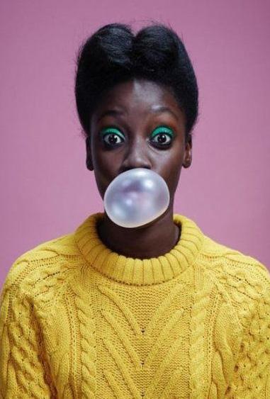
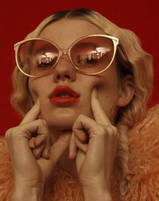
The Bloc brand is approachable, inclusive and welcoming. The Bloc is also cool and edgy, standing out from the crowd of cannabis dispensaries.
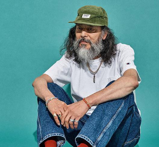
The imagery that is used needs to reflect this and remain consistent with the overall brand direction. Bold colors that complement the state colors will create instant appeal.
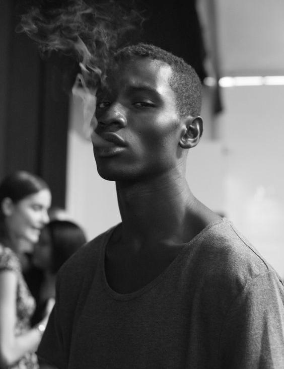
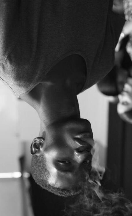
Or black and white with the logo in bright color. Capturing raw, real and honest portraits of community will feel relatable and attractive.
STYLE GUIDE59 Bloc | Brand Foundations
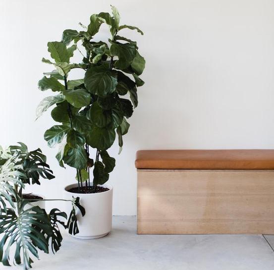
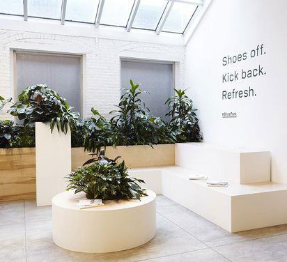
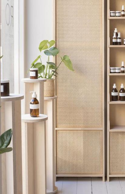
Visual Direction - Interiors
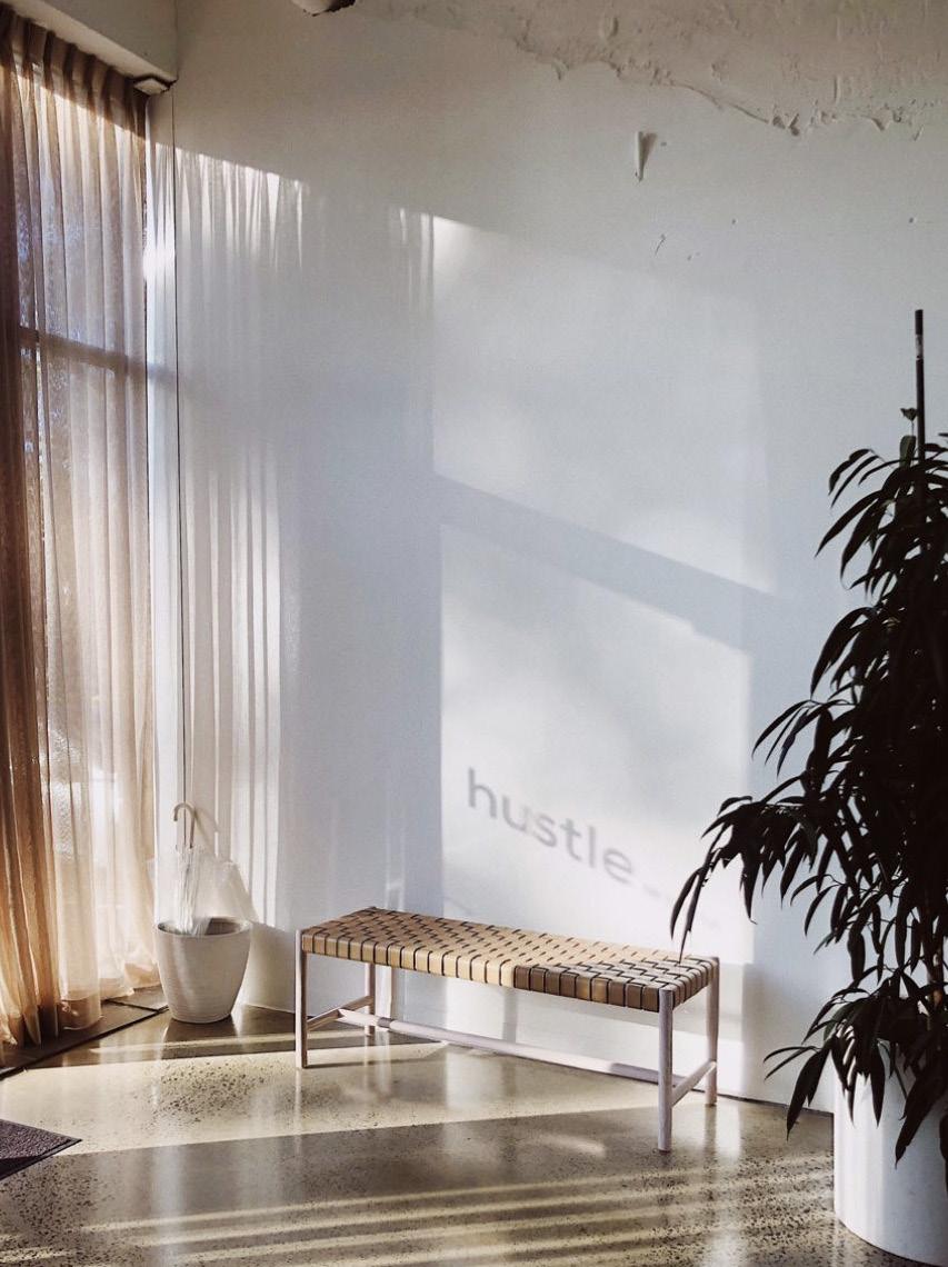
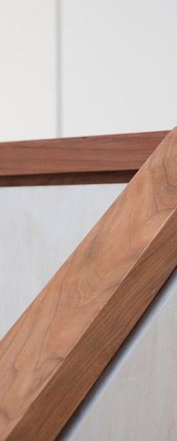
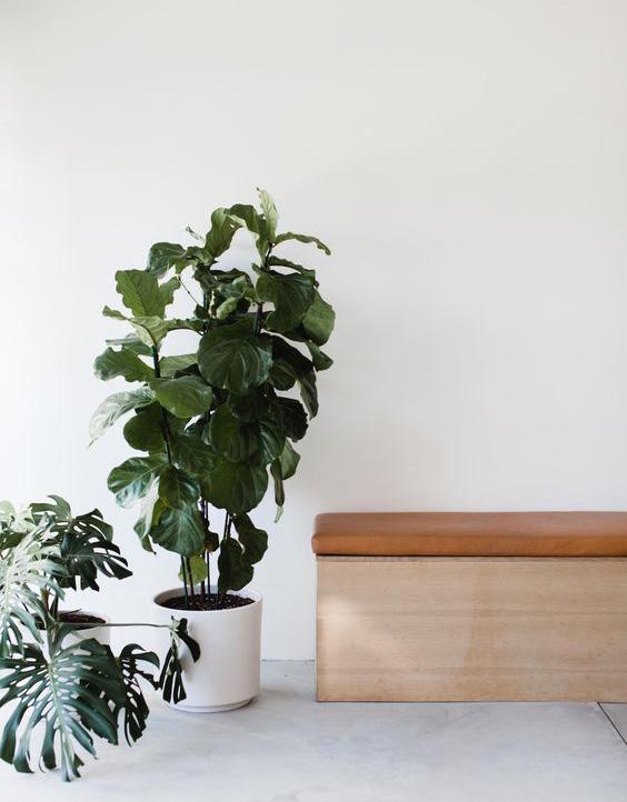
Interiors should be clean with warm touches. Polished concrete flooring, white walls with some exposed white brick, allowing plenty of room for local art murals. The state

color will provide pops of color throughout the space. This can come through a feature wall created by hanging the brand color shopping bags behind the counter, as well as staff uniforms.
Plants and wooden finishes of table tops, benches, railings, and shelving will add warmth and a sense of approachability to the space.
STYLE GUIDE60 Bloc | Brand Foundations
Examples Of Use

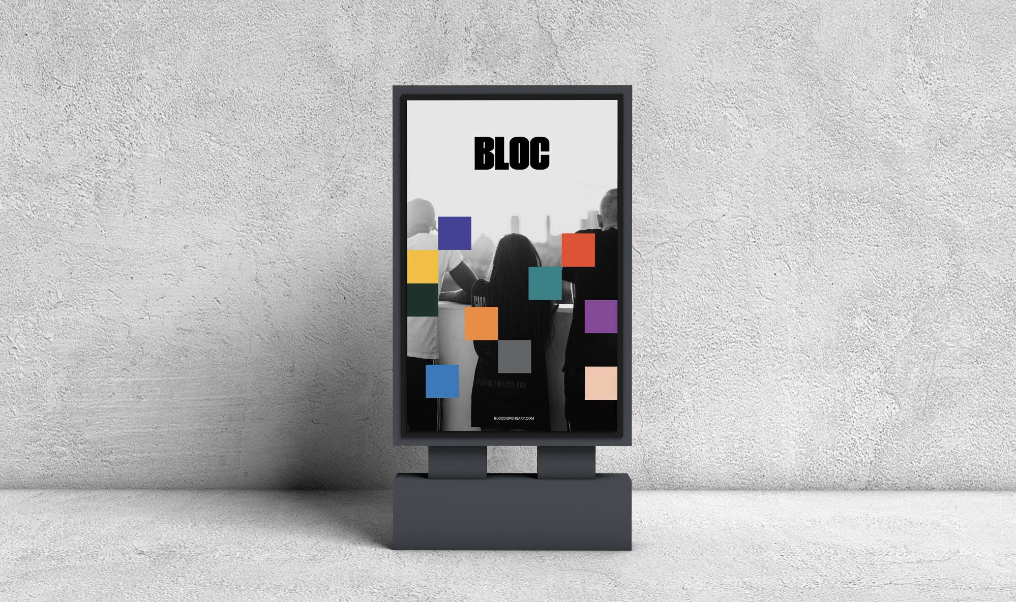
These are some examples of how Bloc’s branding can be used.
STYLE GUIDE61 Bloc | Brand Foundations
Examples Of Use
These are some examples of how Bloc’s branding can be used.
STYLE GUIDE62 Bloc | Brand Foundations
Examples Of Use
These are some examples of how Bloc’s branding can be used.
STYLE GUIDE63 Bloc | Brand Foundations
ILLINOIS
Examples Of Use
These are some examples of how Bloc’s branding can be used.
STYLE GUIDE64 Bloc | Brand Foundations
Examples Of Use
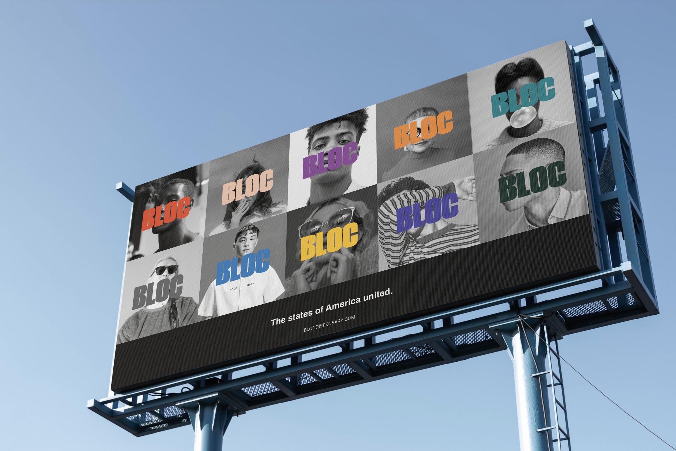
These are some examples of how Bloc’s branding can be used. This shows how all the colors can be used to showcase the different states, together.
The blocks refer to the dispensaries. These are mapped out in similar positions to the geographic dwelling.
STYLE GUIDE65 Bloc | Brand Foundations
These are some examples of how Bloc’s branding can be used. This shows how all the colors can be used to showcase the different states, together.
When all of the Bloc states are represented together, the background imagery should be in greyscale to allow the state colors to stand out.
STYLE GUIDE66 Bloc | Brand Foundations
Social Media
This is how Bloc’s social media would best look to maintain consistency across the brand. This should be made up of Bloc’s own content, showcasing
photography, their spaces, community and quotes. Bloc could profile people in their community to create a wider sense of inclusivity and provide a


human
STYLE GUIDE67 Bloc | Brand Foundations
connection to the social media platform. Get to know: Frank #KNOWYOURLOCALCOMMUNIY CA BLOC DISPENSARY Get to know: Roger #KNOWYOURLOCALCOMMUNIY UTAH BLOC DISPENSARY
