
Du ring much of the letterpress era, m ovable type wa s comp osed by hand for each pa ge by workers called compositors. A tray with ma ny dividers, called a case, contained cas t metal sort s, each with a single letter or symbol, but backwa rds (so they would print corr ectly). The comp ositor assem bled these sort s into wor ds, then lines, then pa ges of text, w hich were then bound tightly together by a fram e, mak ing up a form or pa ge. If done corr ectly, all letters wer e of the sam e height, and a fl at sur face of type was cre ated. The form wa s placed in a pr ess and in ked, and then printed (an im pr ession made) on pape r.[3]
Metal type r ead backwa rds, fro m right to left, and a key skill of the comp ositor was their ability to r ead this backw ar ds text.
Before compu ters wer e invented, font sizes wer e chan ged by physi-
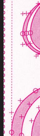
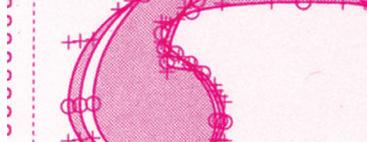
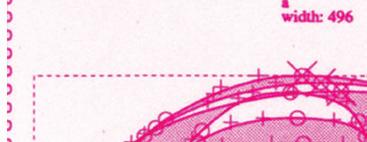
Los tipos móviles son unas piezas habitualmente metálicas en forma de prisma. Creadas de una aleación llamada «tipográfica» (plomo, antimonio y estaño). Cada una de estas piezas contiene un carácter o símbolo en relieve e invertido especularmente
La invención de los tipos móviles en occidente se atribuye a Johannes Gutenberg (hacia 1440); se cree que los inventó sin conocimiento de la existencia de inventos similares ocurridos en China. La primera referencia a algún modelo de tipos móviles en la historia parece ser la del aparato inventado por el chino Bi Sheng hacia el año 1040 d. C.2
Anteriormente se imprimieron en Oriente y en Europa grabados en los que una sola plancha de madera tallada era la matriz para la impresión de cada página. Cada vez que se detectaba un error había que volver a tallar toda la plancha. A partir de ahí surgieron los tipos móviles, que permitían componer una página, y si se cometía un error, únicamente había que sustituir el carácter erróneo. Dado que estos tipos permitían ser usados una y otra vez, se optó por fundirlos en metal.
La fundición de tipos era una técnica utilizada para fundir los caracteres de impresión individ -
uales (conocidos como tipos móviles). Se llevaba a término vertiendo metal fundido en unos moldes de latón que tenían en su parte inferior unas matrices (totales o parciales) fabricadas previamente por impacto con punzones u otras herramientas.
El término inglés “font” usado para “tipo móvil”, viene del francés “fonte”, que lo define muy bien ya que se trata de una “pieza fundida”, que se “fundía” en una “Type foundry”, y que como es evidente, no guarda ninguna relación con la palabra “fuente” usada de forma inapropiada en castellano (falso amigo: “font” en catalán significa fuente, que en francés es “fontaine”).Los tipos móviles son unas piezas habitualmente metálicas en forma de prisma. Creadas de una aleación llamada «tipográfica» (plomo, antimonio y estaño). Cada una de estas piezas contiene un carácter o
símbolo en relieve e invertido especularmente
La invención de los tipos móviles en occidente se atribuye a Johannes Gutenberg (hacia 1440); se cree que los inventó sin conocimiento de la existencia de inventos similares ocurridos en China. La primera referencia a algún modelo de tipos móviles en la historia parece ser la del aparato inventado por el chino Bi Sheng hacia el año 1040 d. C.2
Anteriormente se imprimieron en Oriente y en Europa grabados en los que una sola plancha de madera tallada era la matriz para la impresión de cada página. Cada vez que se detectaba un error había que volver a tallar toda la plancha. A partir de ahí surgieron los tipos móviles, que permitían componer una página, y si se cometía un error, únicamente había que sustituir el carácter erróneo. Dado que estos tipos
permitían ser usados una y otra vez, se optó por fundirlos en metal.
La fundición de tipos era una técnica utilizada para fundir los caracteres de impresión individuales (conocidos como tipos móviles). Se llevaba a término vertiendo metal fundido en unos moldes de latón que tenían en su parte inferior unas matrices (totales o parciales) fabricadas previamente por impacto con punzones u otras herramientas.
El término inglés “font” usado para “tipo móvil”, viene del francés “fonte”, que lo define muy bien ya que se trata de una “pieza fundida”, que se “fundía” en una “Type foundry”, y que como es evidente, no guarda ninguna relación con la palabra “fuente” usada de forma inapropiada en castellano (falso amigo: “font” en catalán significa fuente, que en francés es “fontaine”).Los
conth co-
PURO COTILLEO

odoni is the name given to the serif
designed by Giambattista Bodoni (1740–1813) in the late eighteenth century and frequently revived since. Bodoni’s typefaces are followed the ideas of John Baskerville, as found in the printing type Baskerville—increased stroke contrastnology and a more vertical axis—but he took them to a more extreme conclusion. Bodoni had a long career and his designs changed and varied, ending with a typeface of a slightly condensed underlying structure with
contrast between thick and thin strokes, and an overall geometric construction.
didone fonts were called classical designs because of their rational structure. However, these fonts were not updated versions of Roman or Renaissance letter styles, but new designs. They came to be called ‘modern’ serif fonts; since the mid-20th century, they are also known
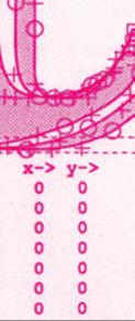
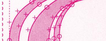
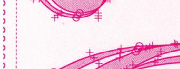
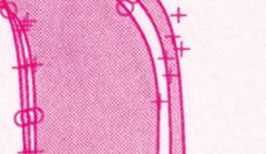
Some digital versions of Bodoni are said to be hard to read due to “dazzle” caused by the alternating thick and thin strokes, particularly as the thin strokes are very thin at small point sizes. This is very common when optical sizes of font intended for use at display sizes are printed at text size, at which point the hairline strokes can recede to being hard to see. Versions of Bodoni that are intended to be used at text size are “Bodoni Old Face”, optimized for 9 points; ITC Bodoni 12 (for 12 points); and ITC Bodoni 6 (for 6 points).
Massimo Vignelli stated that “Bodoni is one of the most elegant typefaces ever designed.” In the English-speaking world, “modern” serif designs like Bodoni are most commonly used in headings and display uses and in upmarket magazine printing, which is often done on high-gloss paper that retains and sets off the crisp detail are more often used in body text.
Bodoni admired the work of John Baskerville and studied in detail the designs of French type founders Pierre Simon Fournier and Firmin
from the work of these designers, found his own style for his typefaces, which deservedly gained worldwide acceptance among printers.
is best known as the name of a typeface, Bodoni was an expert printer who ran a prestigious print-
type was permitted by and showcased the quality of his company’s work in metal-casting, printing and of the paper made in Parma. The hairline
high quality of casting, since on poor-quality printing equipment serifs had to be large to avoid wear
7
retained on the surface. Bodoni also took care in the composition of his printing, using hierarchy and borders to create an appearance of elegance, and his range of typebility of composition.
Writing of meeting him in the year 1786, James
very great curiosity in its way is the Parma
on under the direction of Mr. Bodoni, who has brought that art to a degree of perfection scarcely known before him. Nothing could exceed his civility in showing us numbers of the beautiful productions of his press...as well as the operations of letters...his paper is all made at Parma. The manner in which Mr. Bodoni gives his works their beautiful smoothness, so that no impression of the letters is perceptible on either side, is the only part of his business that he keeps secret”
The effective use of Bodoni in modern printing poses challenges
designs. While it can look very elegant due to the regular, rational
a known effect on readers is ‘dazzle’, where
the thick verticals draw the reader’s attention and cause them to struggle to concentrate on the other, much thinner
letter is which.For this reason, using the right optical size of font has been described as particularly essential to achieve professional results.Fonts to be used at text sizes will be sturdier designs with thicker ‘thin’ strokes and serifs (less stroke contrast) and more space between letters than on display designs, to increase legibility. Optical sizes were a natural requirement of printing technology at the time of Bodoni, who had to cut each size of type separately, but declined as the pantograph, phototypesetting and digital fonts made printing the same font at any size simpler; a revival has taken place in recent years as automated font development has become possi-
8
ble.French designer Loïc Sander has suggested that the dazzle effect, common to all
particularly common in designs produced in countries where designers are unfamiliar with how to use them effectively and where the fonts that are easily commercially available will tend to have been designed for headings.[18] Modern Bodoni revivals intended for professional use such as Parmagiano and ITC Bodoni have a range of opti-

cal sizes, but this is less common on default computer fonts. There have been many revivals of the Bodoni
and Bauer Bodoni are two of the more successful.
created in 1909, was release to be a direct revival of Bodoni’s
were designed by Morris Fuller Benton who captured the

9
original while emphasizing legibility rather than trying to push against the limits of printing technology. This revival is re-rate revival of a historical face for general printing and design applications”.However, some details were less based on Bodoni than on the work of his French contemporary slanted top.
10

i


13

14


17
ventions for writing a language, including norms of spelling, hyphenation, capitalization, word boundaries, emphasis, and punctuation.
Most transnational languages in the modern period have a writing system, and most of these systems have undergone substantial standardization, thus exhibiting less dialect variation than the spoken language.These processes can fossilize pronunciation patterns that are no longer routinely observed in speech (e.g., “would” and “should”); they -
forts to introduce variability for the sake of national identity, as seen in Noah Webster’s efforts to introduce easily noticeable differences between
Some nations (e.g. France and Spain) have established language academies in an attempt to regu-
most languages (including English), no such authority exists, and a sense of “correct” orthography develops through encounters with print in schooling, workplace, and informal contexts. Some organizations, such as newspapers of record and academic journals, choose greater orthographic homogeneity by enforcing a particular style guide. The English word orthography dates from the 15th century. It comes from the French: orthographie, from Latin: orthographia, which
(orthós, ‘correct’) and (gráphein, ‘to write’).
Orthography is largely concerned with matters of spelling, and in particular the relationship between phonemes and graphemes in a language.[4][5] Other elements that may be considered part
of orthography include hyphenation, capitalization, word breaks/boundaries, emphasis, and punctuation.[6] Orthography thus
symbols used in writing a language and the conventions that broadly regulate their use.
Most natural languages developed as oral languages, and writing systems have usually been crafted or adapted as ways of representing the spoken language. The rules for doing this tend to become standardized for a given language, leading to the development of an orthography that is generally considered “correct”. In linguistics, the term orthography is often used to refer.
without judgment as to right andstanding that orthographic standardization exists on a spectrum of strength of convention.
The original sense of the word, though, implies a dichotomy of correct and incorrect, and the word is still most often used to
-
Def: typo /noun/ Plural·typos
[count] informal; misspelled word) in typed or printed text
I spotted three typos on the menu.
the typed or printed text and is short for typographical error

For example, a spelling incidence with one “c” or “r”—or “receive” as “recieve”—are two short examples. Likewise, it’s simple to mistype a frequently used word like “science” as “sceince,” even if you’re an expert.
anything you want here no one will read.

standardized, prescriptively correct, way of writing a lan-
here between etic and emic viewpoints: the purely descriptive (etic) approach, which simply considers any system that is actually used—and the emic view, which takes account of language users’ perceptions of correctness. Orthographic units, such as letters of an alphabet, are
technically called graphemes. These are a type of abstraction, analogous to the phonemes of spoken languages; different physical forms of written symbols are considered tvo represent the same grapheme if the for meaning. Thus, a grapheme can be regarded as an abstraction of a collection of glyphs that are all functionally equivalent. For example, in written English (or other languages using the Latin alphabet), there are two different physical representations (glyphs) of the lowercase Latin letter ‘a’: a
either of them for the other cannot change the meaning of a word, they are considered to be allographs of the same face forms are also allographic.
21
Graphemes or sequences of them are sometimes placed between angle brackets, as in or. This distinguishes them from phonemic transcription, which is placed between slashes (/b/, /bæk/), and from phonetic transcription, which is placed between square brackets ([b], [bæk]).
Orthographies that use alphabets and syllabaries are based on the principle that the written symbols (graphemes) correspond to units of sound of the spoken language: phonemes in the former case, and syllables in the latter. However, in virtually all cases, this corredifferent degrees of correspondence between spelling and pronuncia-
phy, for example, are highly irregular, whereas the orthographies of languages such as Russian, German and Spanish represent pronunciation much more faithfully, although the correspondence between letters and phonemes is still not exact. Finnish, Turkish and Serbo-Croatian orthographies more consistently approximate the principle “one letter per sound.”[citation needed]
pronunciation are highly complex or inconsistent is called a deep orthography (or less formally, the language is said to have irregularsistent correspondences is called shallow (and the language has regular spelling).
One of the main reasons why spelling and pronunciation diverge is that sound changes taking place in the spoken
hence spellings correspond to historical rather than present-day pronunciation. One consequence of this is that many rather than its purely phonemic structure (for example, the English regular past tense morpheme is consistently spelled -ed in spite of its different pronunciations in various words). This is discussed further at Phonemic orthography § Morphophonemic features.
The syllabary systems of Japanese (hiragana and katakana) are examples of almost perfectly shallow orthographies—the kana correspond with almost perfect consistency to the spoken
historical or morphophonemic features: notably the use of ji and zu (rather than ji and zu, their pronunciation in standard Tokyo dialect) when the character is a voicing of an underlying
22