PORTFOLIO
PRODUCT DESIGN
Sakshi Seth


PRODUCT DESIGN
Sakshi Seth
Self-directed project exploring self-sufficiency in achieving nutrition security.
Live project with Müller to redesign an on-thego yogurt pot focusing on sustainability and convenience.
First exposure to professional design in a multidisciplinary consultancy, sparking initial understanding of industry dynamics.
Self-directed project based on the growing popularity of the metaverse trend.
BHAVA
I am driven by a passion to transform everyday details into ‘talkative’ designs that solve practical problems while telling engaging stories. My approach is characterised by the use of vibrant colours, unique forms, and innovative solutions, creating meaningful interactions with each user. I believe that the key to successful design lies in user interaction—creating products that not only reflect positivity but also foster a connection with their users. As I continue my journey, my focus is on crafting simple, practical products that engage and resonate with people, giving them a glimpse into the creative journey behind each piece.
NOTTINGHAM TRENT UNIVERSITY
BA (Hons) Product Design
NOTTINGHAM TRENT INTERANTIONAL COLLEGE
Foundation Year in Art, Media, and Design
ROYAL CONCORDE INTERNATIONAL SCHOOL
CBSE Science
Sakshiseth2001@gmail.com +447598417811
INSTAGRAM PROFILE
Sakshisethproductdesign
LINKEDIN PROFILE
linkedin.com/in/sakshi-seth-products


Each of the live projects and internships I’ve engaged with over the past five years represents a mini chapter in the evolving book of my design career. These experiences have not only provided me with a window into the practical world of design but have also been crucial in crafting the structured and efficient design process I apply today. As I continue to add pages to this book, I am eager to deepen and enrich my understanding, turning every challenge into a meaningful addition to my journey in design.
First exposure to professional design in a multidisciplinary consultancy, sparking initial understanding of industry dynamics.
Five-week engagement focusing on the hybrid working lifestyle; team led research through to delivery, mastering a full design cycle.
Rapid trend identification and design project; selected to present top five solutions directly to Speedo’s team.
Deep dive into advanced design processes, enhancing skills in prototyping, visualisation, and packaging within a leading consultancy.
Final year project to redesign yogurt packaging for sustainability and convenience, refining advanced research and CAD modeling techniques.
Nutritional advice is plentiful but often lacks personal relevance. Recognising this gap, Thrive was conceived from a unique angle on nutrition security—focusing not just on the abundance and availability of food, but on optimising the value of what individuals already consume. The goal was to transcend generic dietary recommendations, transforming how personal nutritional information is received and utilised, tailoring it as uniquely as each individual’s breath.
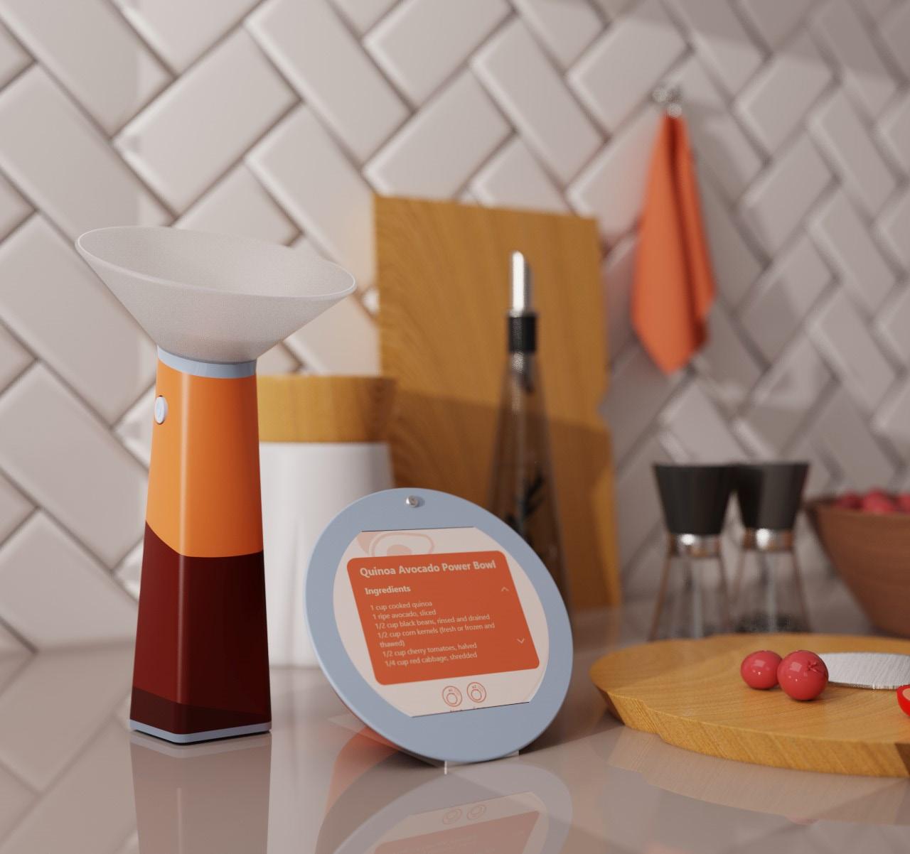
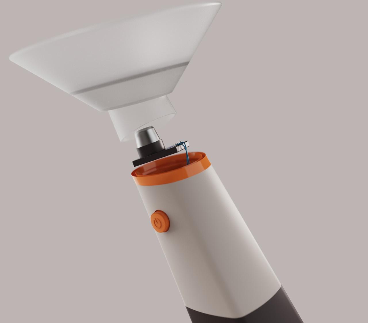
Thrive uses VOC detection technology to analyse breathprints, offering a revolutionary approach to personal nutrition. This device converts subtle chemical signals into clear, actionable insights and tailored recipes, empowering users to make informed dietary choices. With each interaction, Thrive provides real-time, personalised guidance that enhances individual well-being, paving the way for a more nutritionally secure future.
_Based on trends and forecast leveraging consumer drive to take nutrition and health into their own hands through new operating models focused more around consumer accesible touchpoints like nutrition patterns and diet based routes
Regaining intuition of bodily needsworking with wellness and health through simpler opertating models focused on merging nutrition education with nutrition interaction
How might improved self-sufficiency in understanding nutritional needs enhance nutrition security for individuals?
Defining nutrition security not through the lens of abundance rather as a dynamic state where individuals are equipped with both the understanding and the tools to maintain a balanced diet tailored to their unique physiological requirements.
Shifting the locus of control into the hands of the people themselves, enabling them to discern their own nutritional need. This empowerment fosters a more proactive approach to health, as people are no longer passive recipients of nutritional guidelines but active participants in shaping their nutritional landscapes
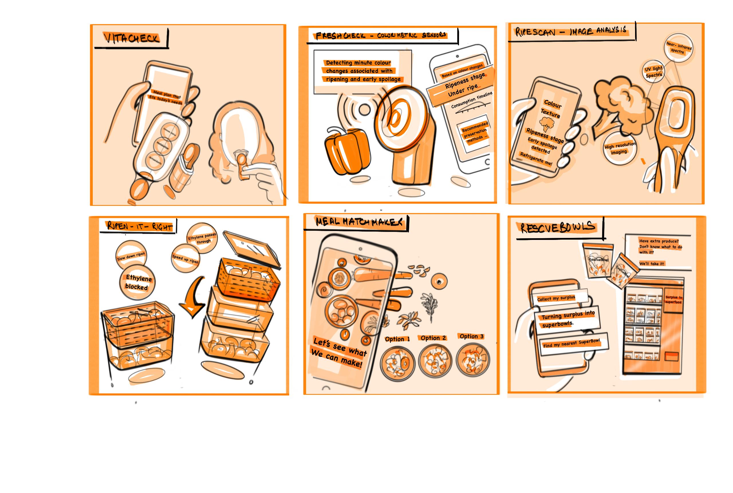
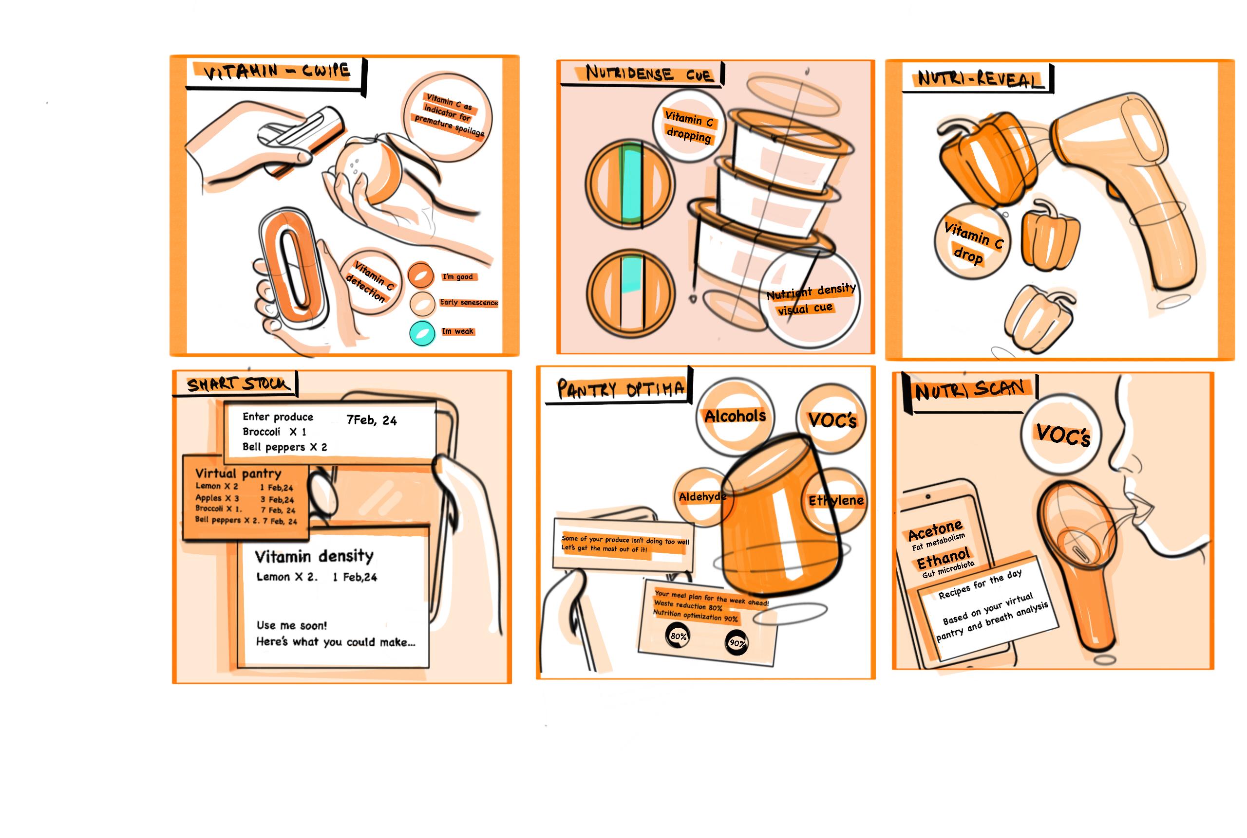
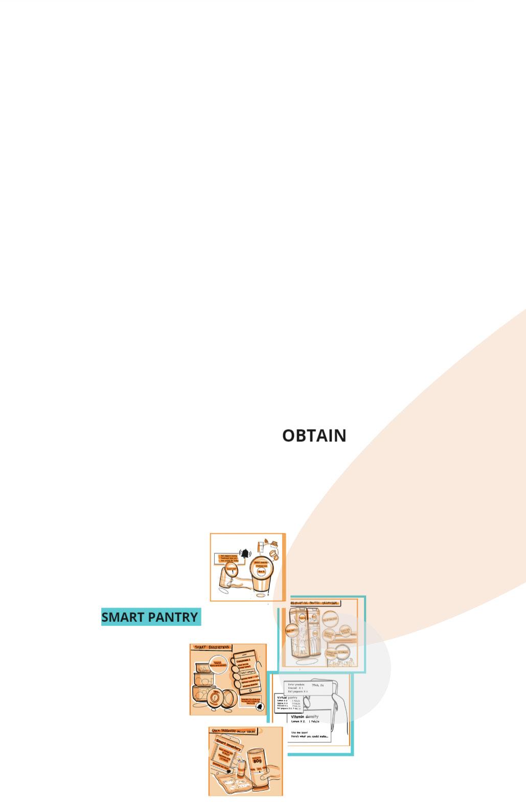
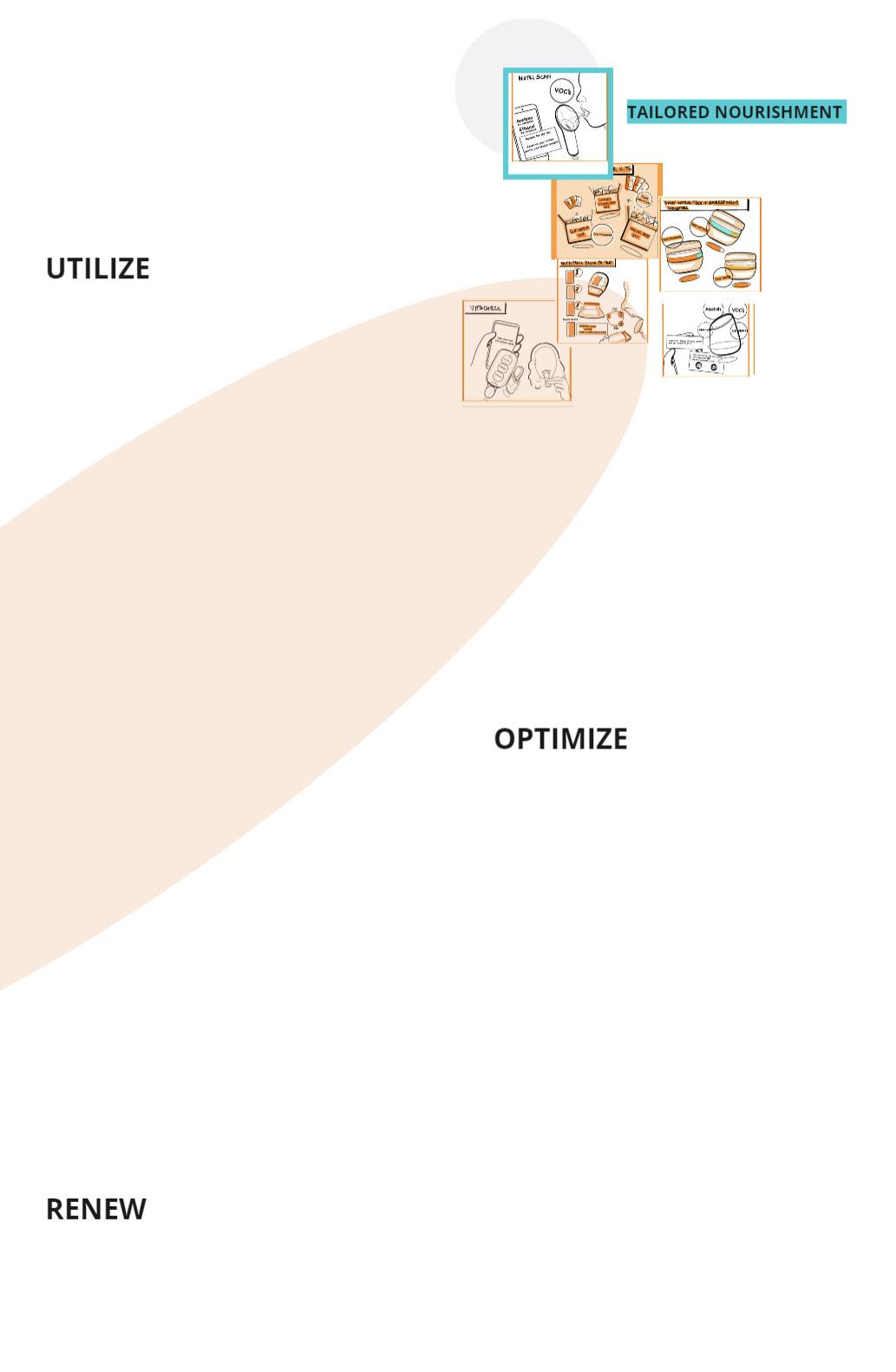
The journey to creating Thrive began with exploring diverse ideas around personal nutrition enhancement. From this broad array of concepts, a particularly promising idea emerged, evolving into the device known today as Thrive. This tool, which analyses VOCs in exhaled breath to tailor meal suggestions, represents a focused refinement of initial explorations. The development process transformed a collection of varied ideas into a singular, effective solution that enriches users’ dietary insights in a user-friendly manner.
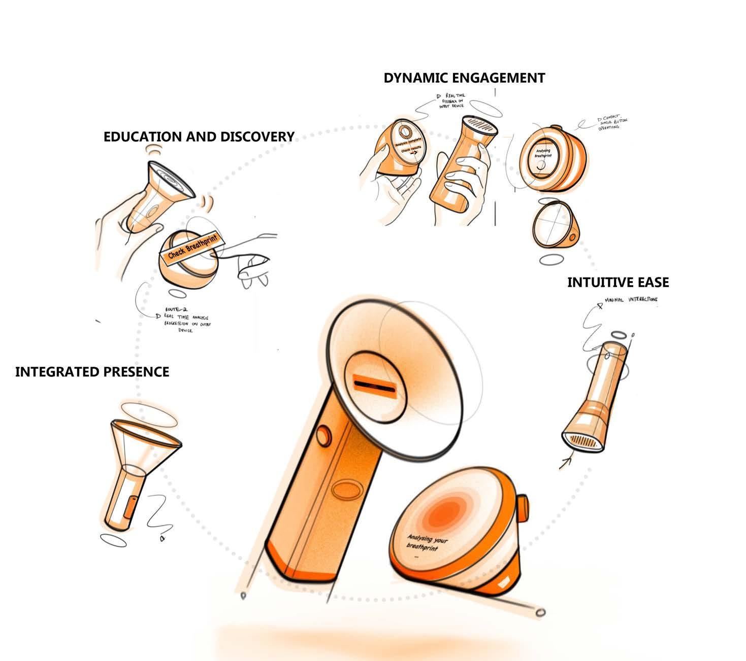
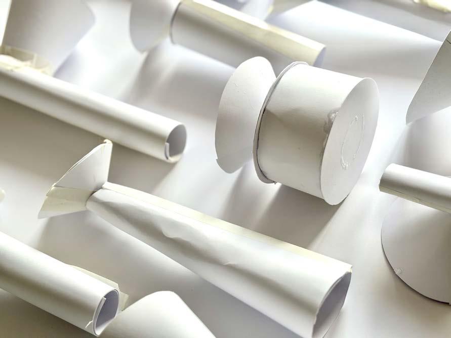
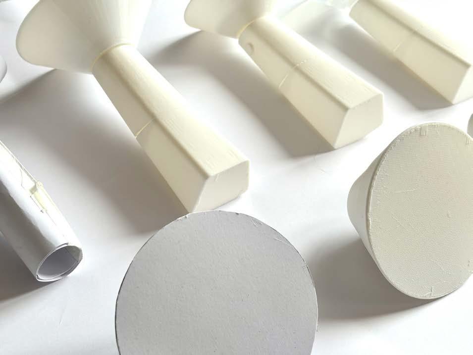
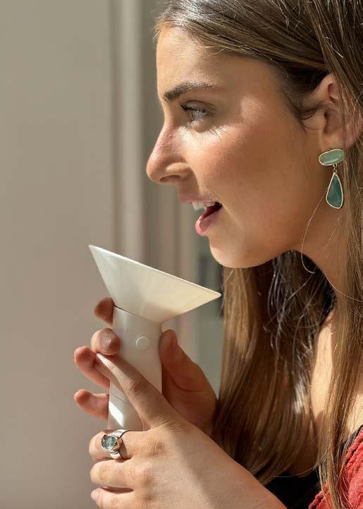
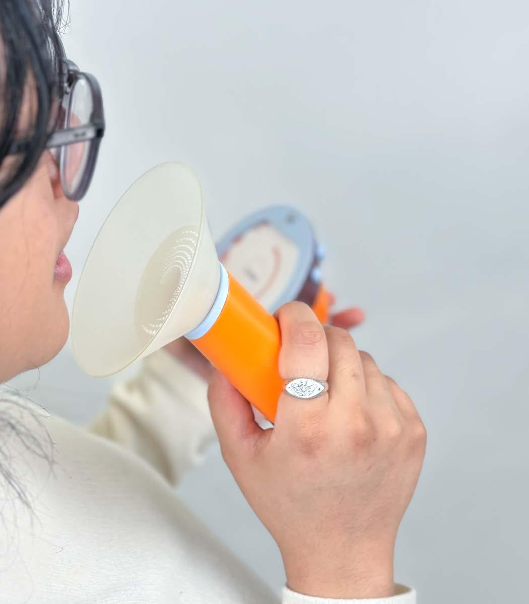
This phase transformed Thrive from a two-dimensional concept to three-dimensional models using rapid, iterative card modeling. These prototypes were user-tested to evaluate preferences, intuitiveness, and ease of use, focusing on how users naturally interacted with the device, including optimal placement for exhaling. Insights from this process directly informed the ergonomic and functional refinement of Thrive, enhancing its user-centered design.

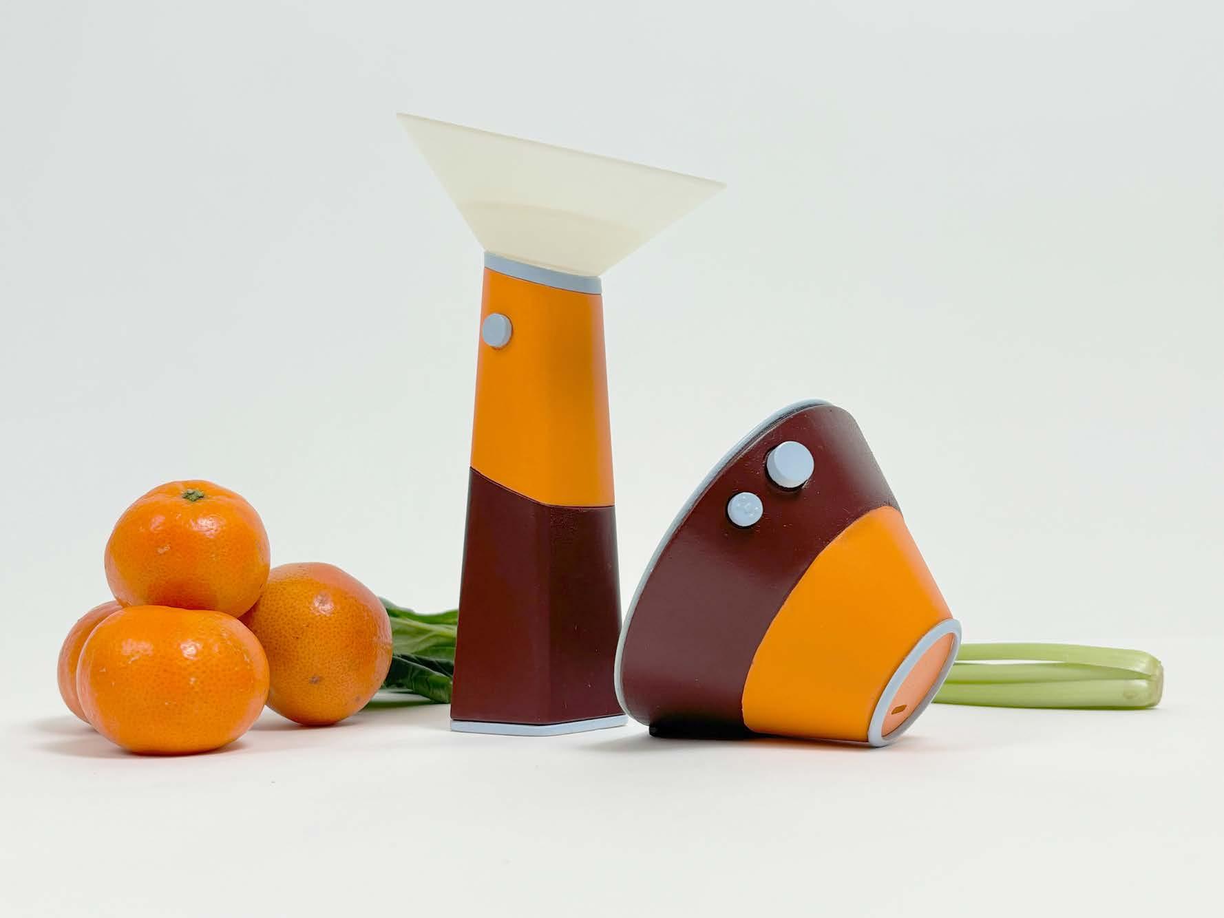
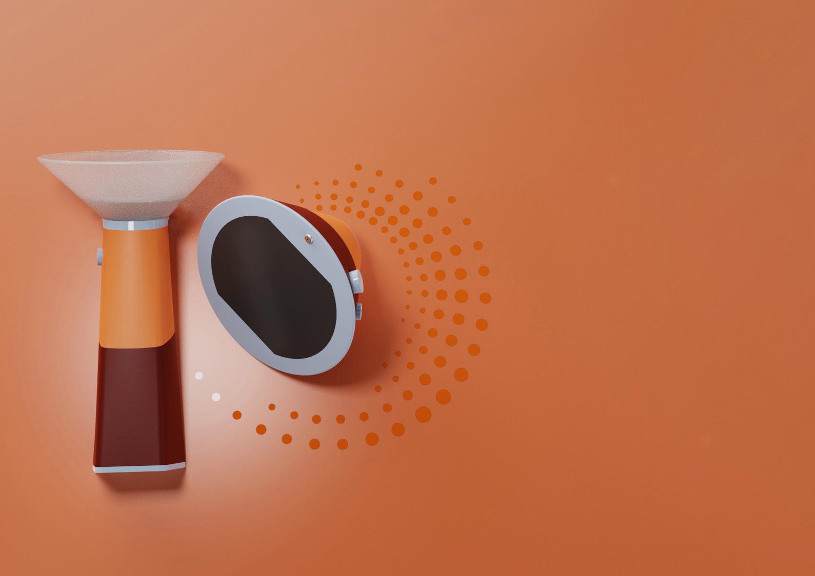
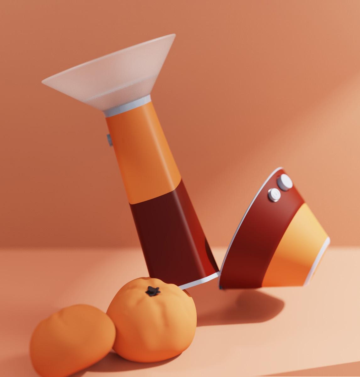
Thrive revolutionises daily health routines with its VOC detection technology, translating your breath into a personalised nutritional guide. This easyto-use device distills nutritional complexities into clear, actionable insights and doubles as a personal culinary library to store tailored recipes. By analysing your breathprint, Thrive translates your body’s subtle chemical signals into straightforward health directions, supporting you in making informed dietary choices to enhance overall well-being.
_ The breathalyser and output device work in tandem to provide a seamless experience from data collection to nutritional guidance. SEAMLESS SYMBIOSIS
_ Together, they offer a novel approach to nutritional health, combining immediate insight with the ability to act on that information through PRECISION NUTRITION
_ This duo stands as a constant in your kitchen, offering reassurance and a fallback to ensure that nutritional needs are met, supporting users in thriving through personalised guidance PILLAR OF NUTRITION SECURITY

Every person’s breath is a unique combination of VOCs, providing a real-time reflection of their nutrition processes. This breathprint is as distinctive as a fingerprint, offering a window into how your body interacts with the nutrients you consume. By analysing this breathprint, this device captures a comprehensive snapshot of your nutritional status, translating complex chemical signals into clear, actionable insights.
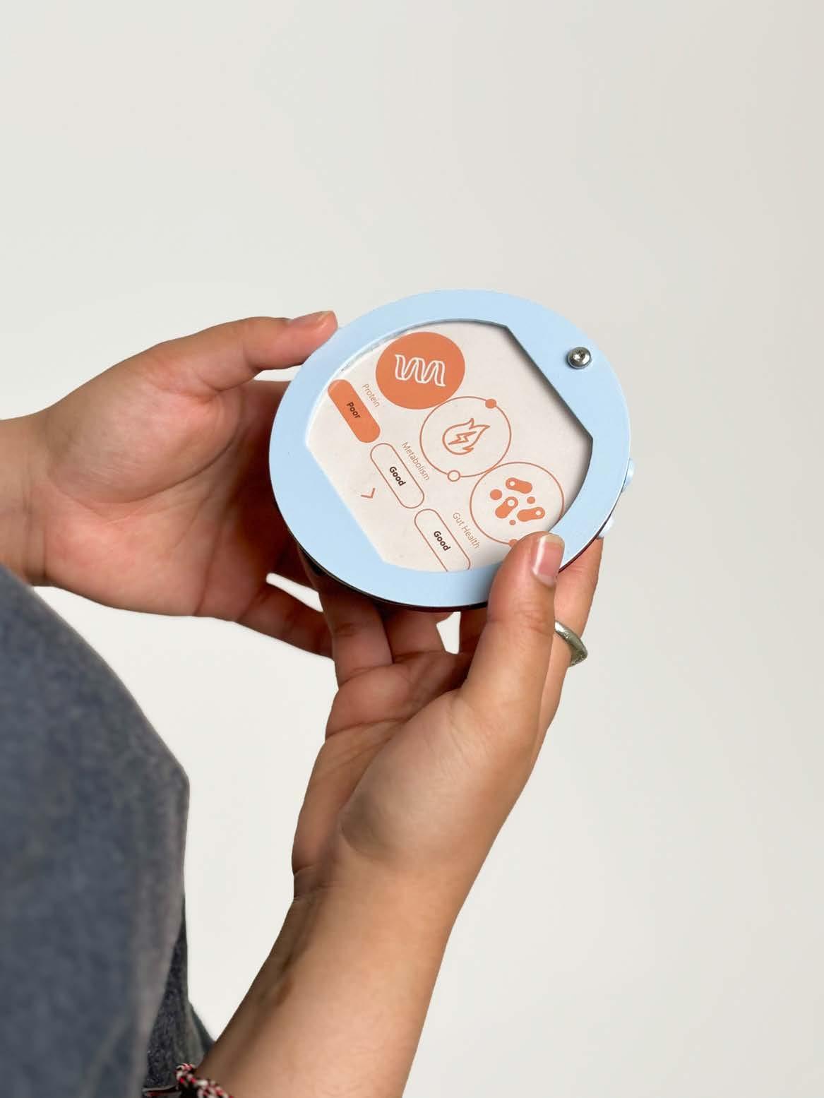

Scan the QR code to directly interact with a sample analysis and see the insights in action.
_ Thrive weaves together three core pillars —carbohydrates metabolism , gut health, and protein utilisation—into a cohesive nutritional index.
_ Advanced sensing technology measures a spectrum of biomarkers to create an indepth nutritional profile, fostering a holistic approach to well-being
_ This powerful synthesis offers a comprehensive scorecard of your dietary habits, laying the foundation for a tailored path to enhanced well-being.
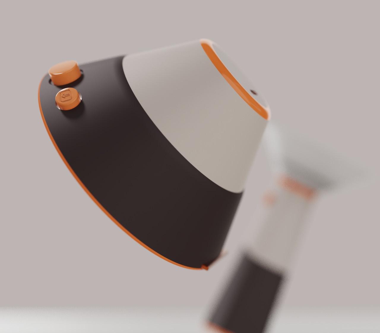
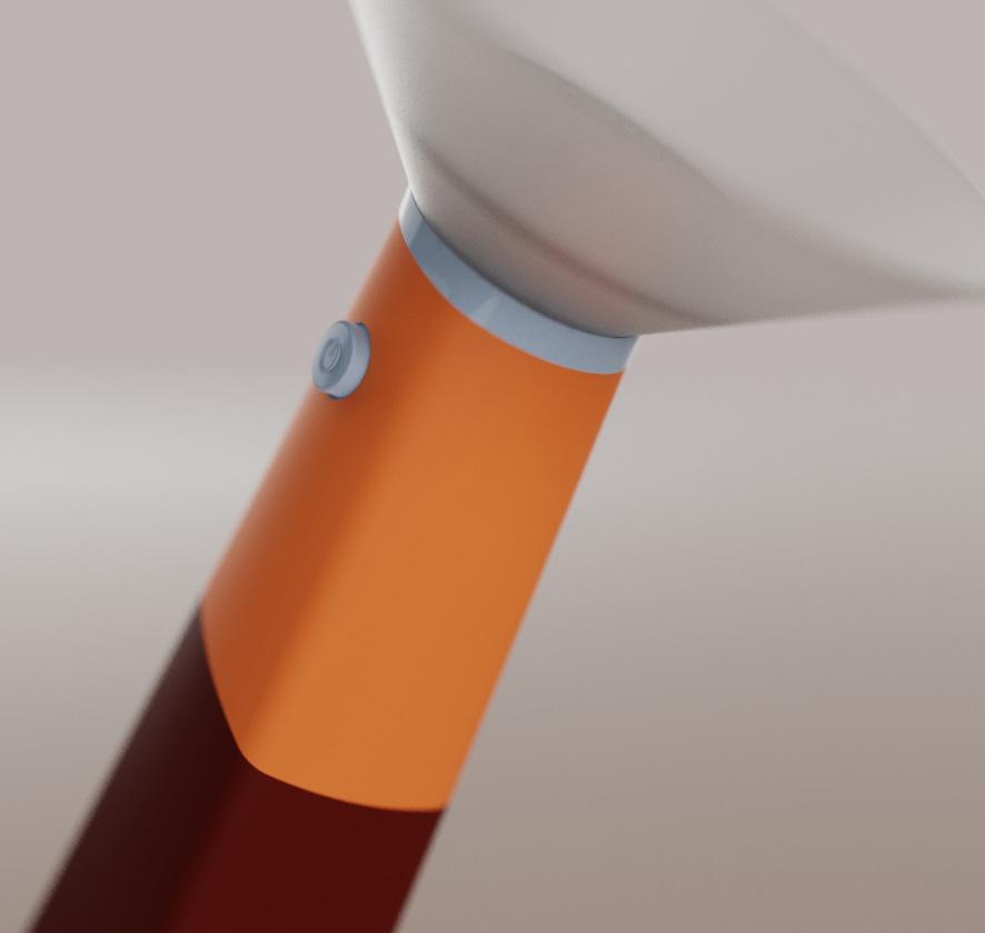
The device reimagines the integration of advanced technology with the simplicity of analog operation. With a single button, users access digital accuracy in monitoring their nutrition while enjoying the straightforward, tactile satisfaction of analog controls. This unique blend ensures that managing nutritional health is both precise and effortlessly intuitive.

Scan the QR code to watch the Thrive product launch video.
Discover ThriveFollow the link for the full Thrive experience https://sakshiseth2001.wixsite.com/ my-site-4 OR
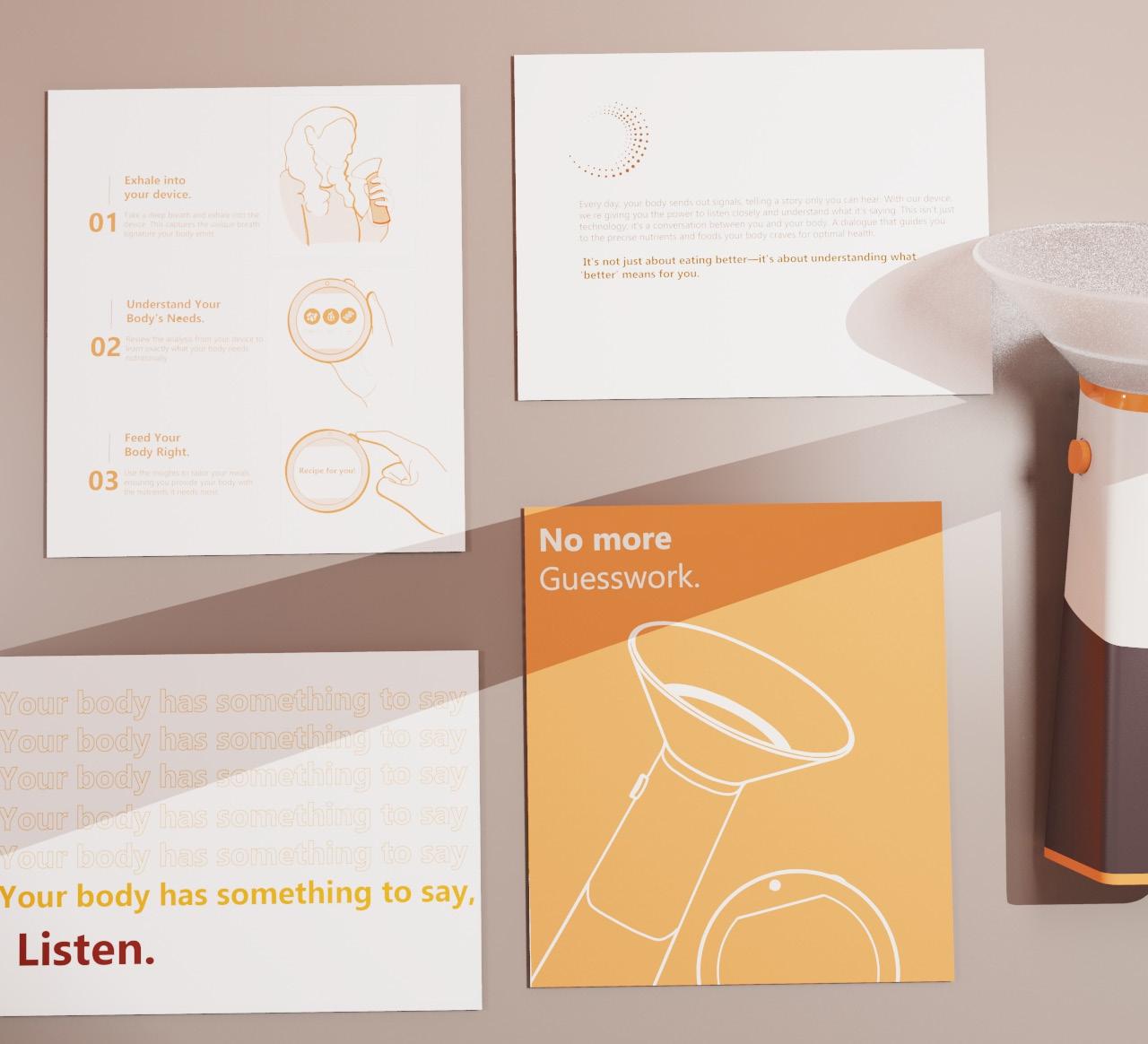
Thrive’s branding and website are crafted to deepen the understanding of its core philosophy, presenting users with insights in an engaging and accessible manner. These platforms offer a welcoming space where the science and data behind the device are communicated in a friendly, approachable style. Developed in response to demands for enhanced instructional support, the branding and website explain the technological and scientific principles of Thrive through clear, actionable steps. They effectively bridge complex data with straightforward insights, providing a seamless introduction to the device’s capabilities and fostering a deep connection and trust as users embark on their journey to nutritional sufficiency.
In a world brimming with nutritional advice, Thrive emerged from the simple idea that our breath holds the secret map to our body’s needs. Traditional diets operate on generalisations, but we noticed a lack in personalised nutrition. Thrive offers a revolutionary journey—transforming breath into a bespoke nutritional compass. Our innovative system reads your unique ‘breath print’, converting it into a personalised food guide. With Thrive, we’re not just changing how you eat; we’re redefining your relationship with food.
“Currently, plastic remains the most common packaging material for snacks, accounting for 77% of all new launches, however consumer demand for sustainable packaging and looming single-use plastic packaging legislation are both pushing snack companies to seek alternative pack-aging materials.”


_Moving away from virgin fossil fuel-based plastics.
_Easy wins available in switching from plastic to paper-based materials due to advances in barrier coating technologies.
DESIGN SPECIFICATIONS
Based on four checkpoints -
_Sustainability - Designing a pack that aims to maintain mono materiality to allow for a simplified discard process.
_Convenience - Naturally embeds features of easy open, carry, consume and dispose for people on the move.
_Behaviour influence - Designing a pack that in a way naturally educates and encourages consumers in more concious, thoughtful and sustainable choices.
_Experience - Designing a pack that is not just visually engaging and appealing but guides the user’s hand through simplified functions creating an overall tactile, rich experience.

An everyday material with a clear sustainable narrative which is immediately apparent to the consumer
Making the switch from plastic to paperboard seems natural and easy through simplified, thought out design, leaving no room for natural resistance to change
How might we design an innovative on-the-go yogurt pack that explores the familiar material route of paperboard to promote new sustainable behaviours and drive simplified pack interactions to create an overall seamless, positive, feel good experience?
Designing in elements that stand out for their user friendliness - driving convenience through approachability and guided interactions
Creating an overall experience - from shelf presence, to ease of carry, to consumption - creating an overall convenient network or system not just a fragment
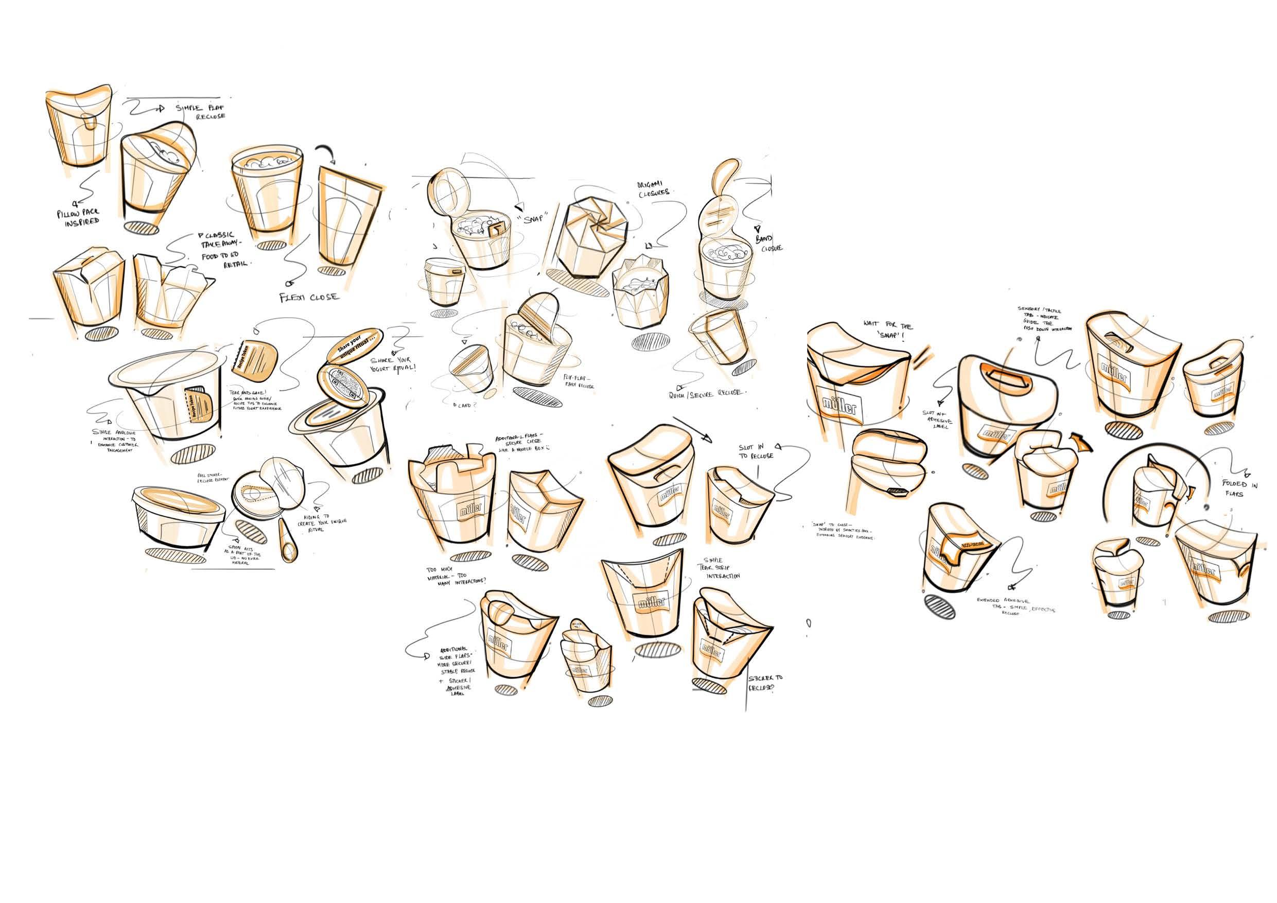
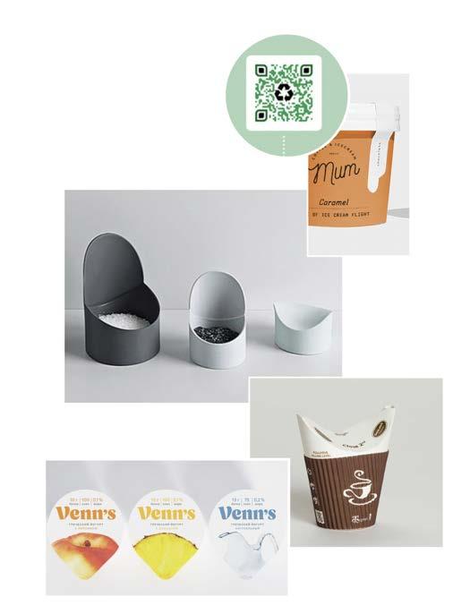
This section reveals the iterative journey from sketches to a fully realised eco packaging solution. The iterative process explored the the initail realms of packaging in all its forms before finding its way into the clever cardboard route. The progressiion highlights that the inherent versatility of cardboard can be harnessed to forge solutions that embody simplicity, facilitate ease of use, and promote consciousness.
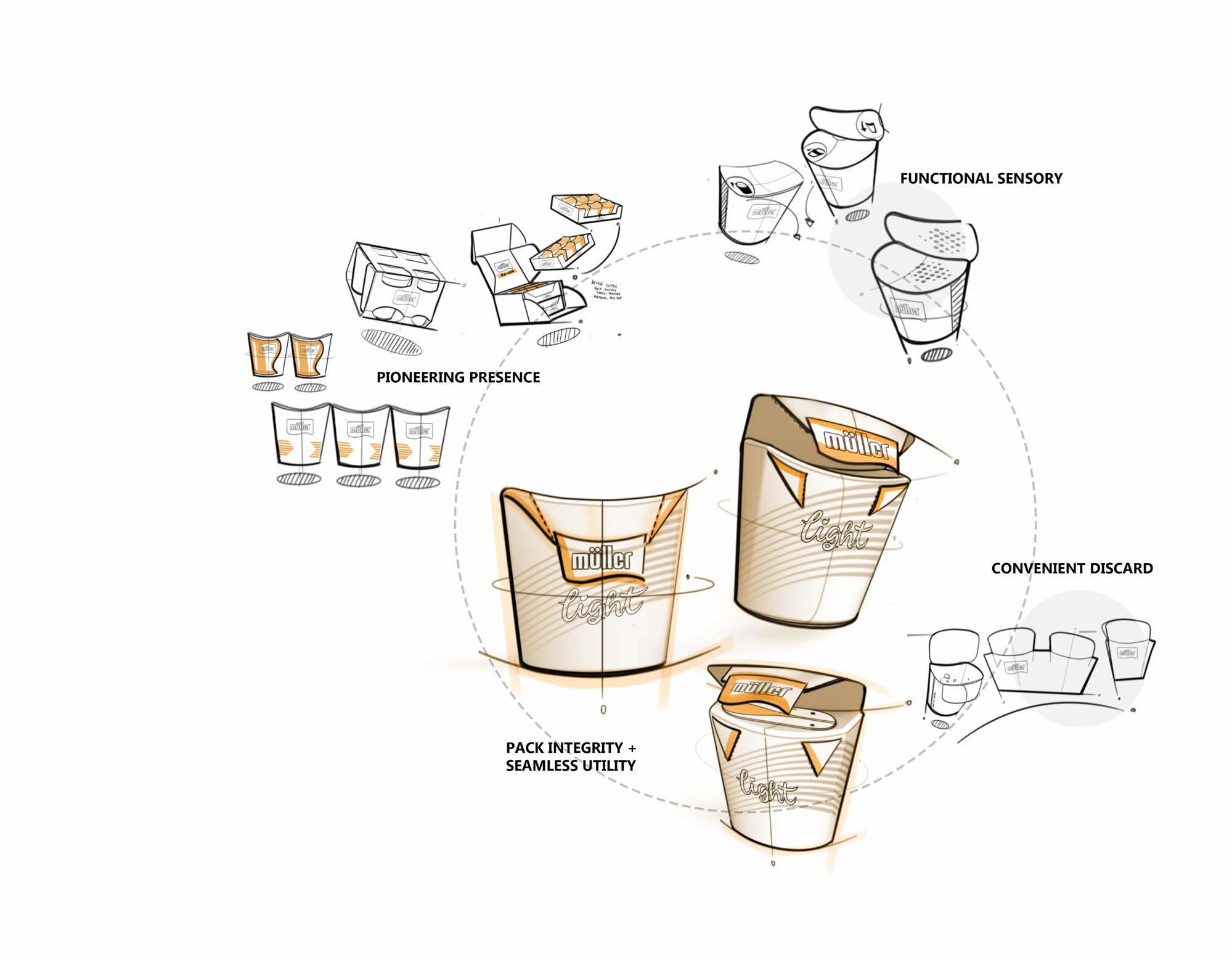
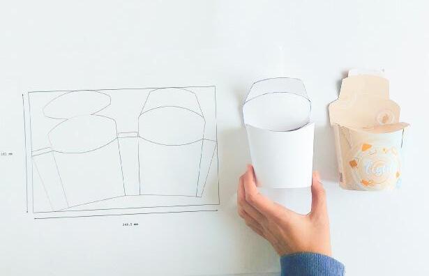
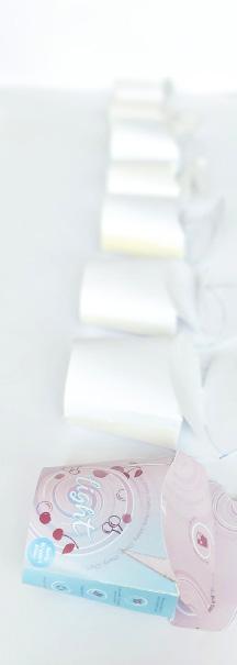

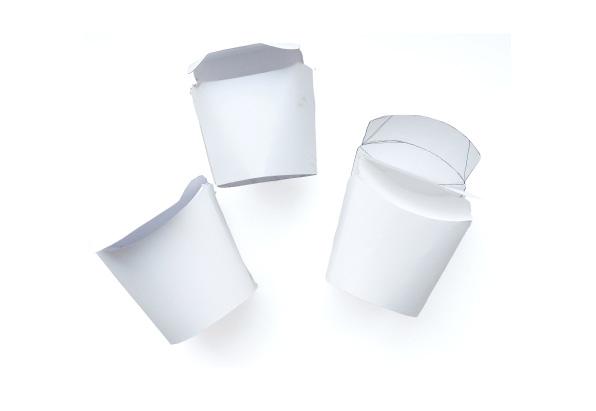
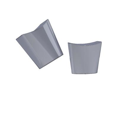
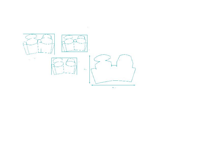
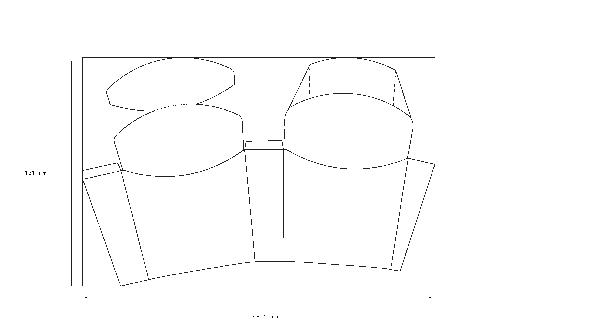
_Capturing the different stages of the iterative process with each stage having its own unique set of iterations -
_The initial stage involved trying roughly to create a model that captured the size and shape of the pack to its best - this process also involved using illustartor to rapidly test out different nets
_The model was then mocked up in solidworks and flattend in Rhino to retrieve the flat faces of the pack _These were assembled in illustrator to get the final net
THOUGHTFUL PICK
‘Rich, creamy flavour of Muller yogurt with a lighter eco footprint. Sustainably sourced and fully recyclable, this is indulgence you can feel good about.’
_Drawing attention to -
_Environmental responsibility
_Sustainable sourcing
_Positive overall experiencefeel good indulgence
_Quality and responsibility
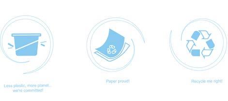
_Driving accesibility and approachability into pack communication
_Simple cues that highlight pack benefits of recyclability, reduced plastic and sustainbly sourced materials
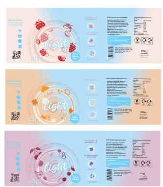
#MULLERVIBES
_Community building touchpoint - driving in the human element into the pack
_Making the ‘Muller moment’ about people
_Encouraging interaction through user generated platforms - with the aim of encouraging brand loyalty
_Increasing brand awarness and reach while extending the product communication and marketing canvas
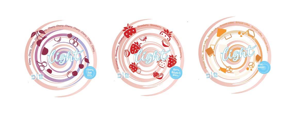
CHERRY SET GO
Ripe cherries in every uplifting spoon to get you pumped and moving
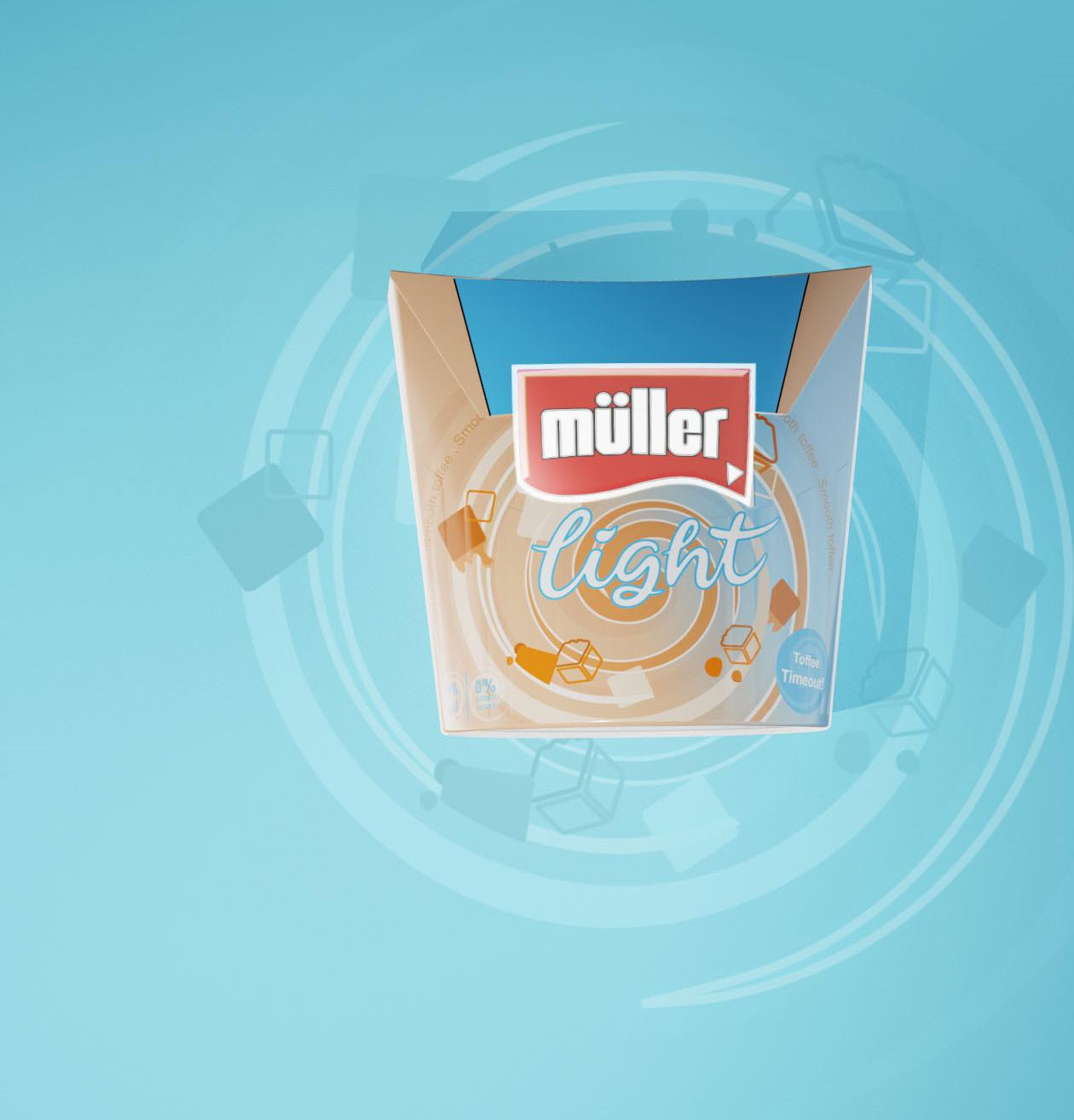
TOFFEE TIMEOUT
Indulgent, rich swirls for a luxurious finale to a long day
BERRRY BRUNCH BLISS
Refreshing burst of strawberry delight - perfect for a sweet late morning start
Müller’s curated selections like Berry Brunch Bliss, Toffee Timeout, and Cherry Set Go are designed to align offerings with daily rituals. These occasion-based narratives encourage consumers to integrate Müller into diverse facets of their day, paving the way for frequent engagement and repeat purchases.
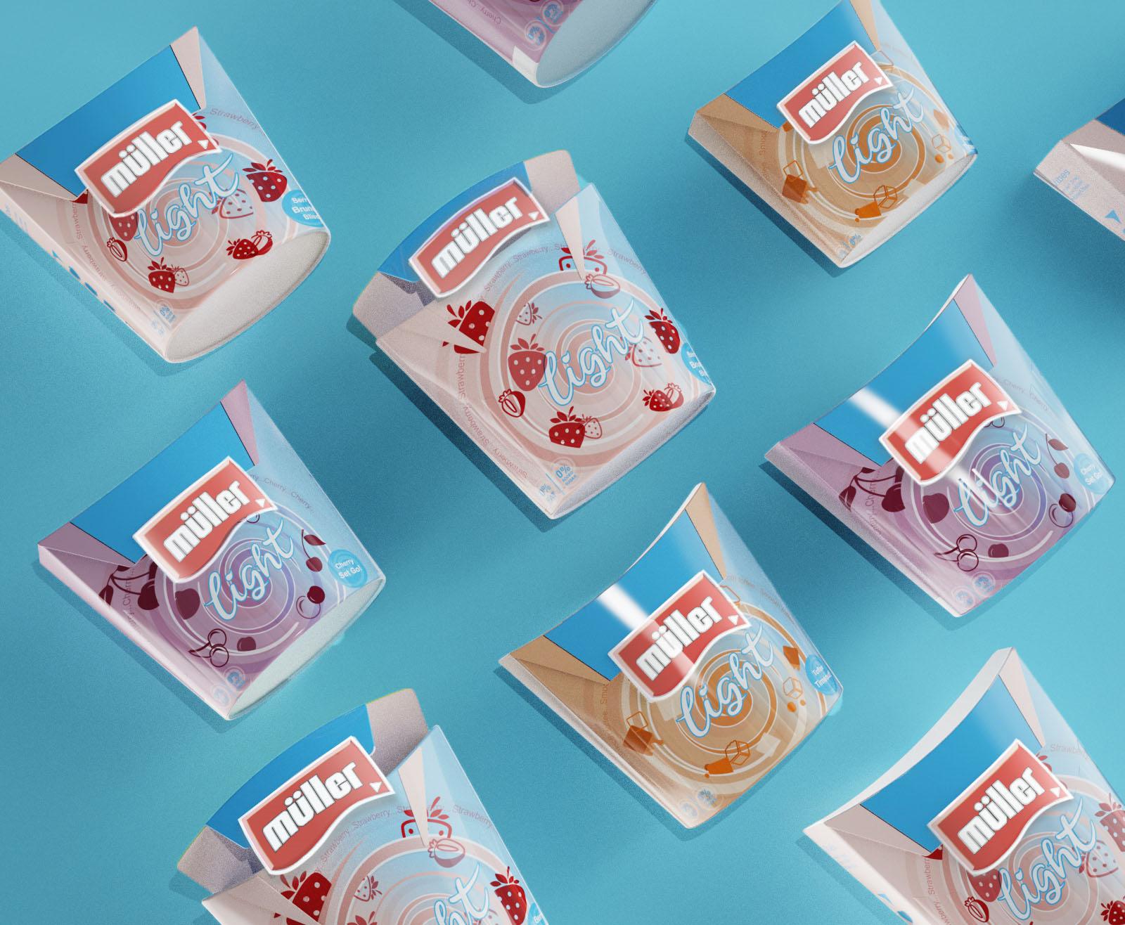
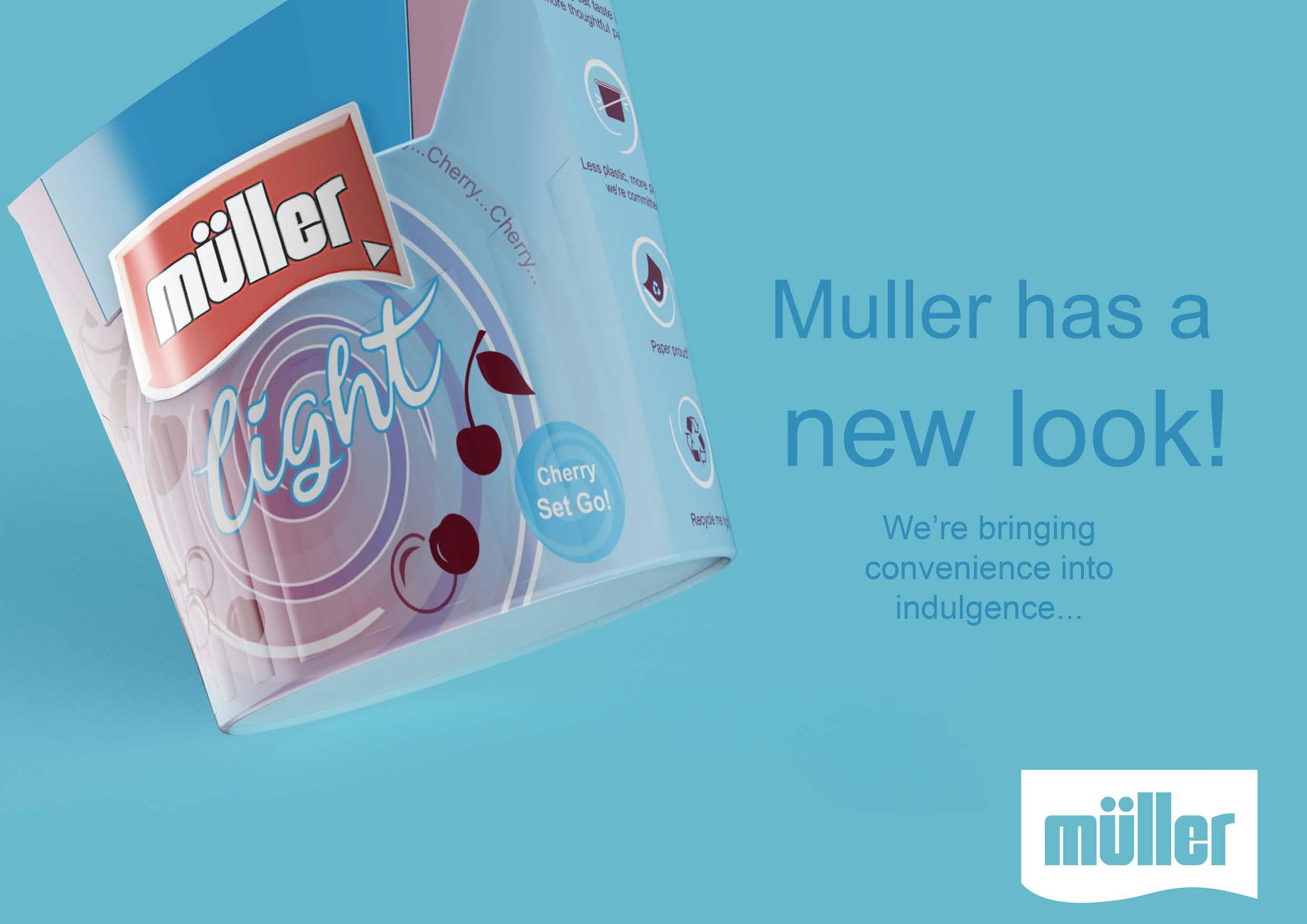
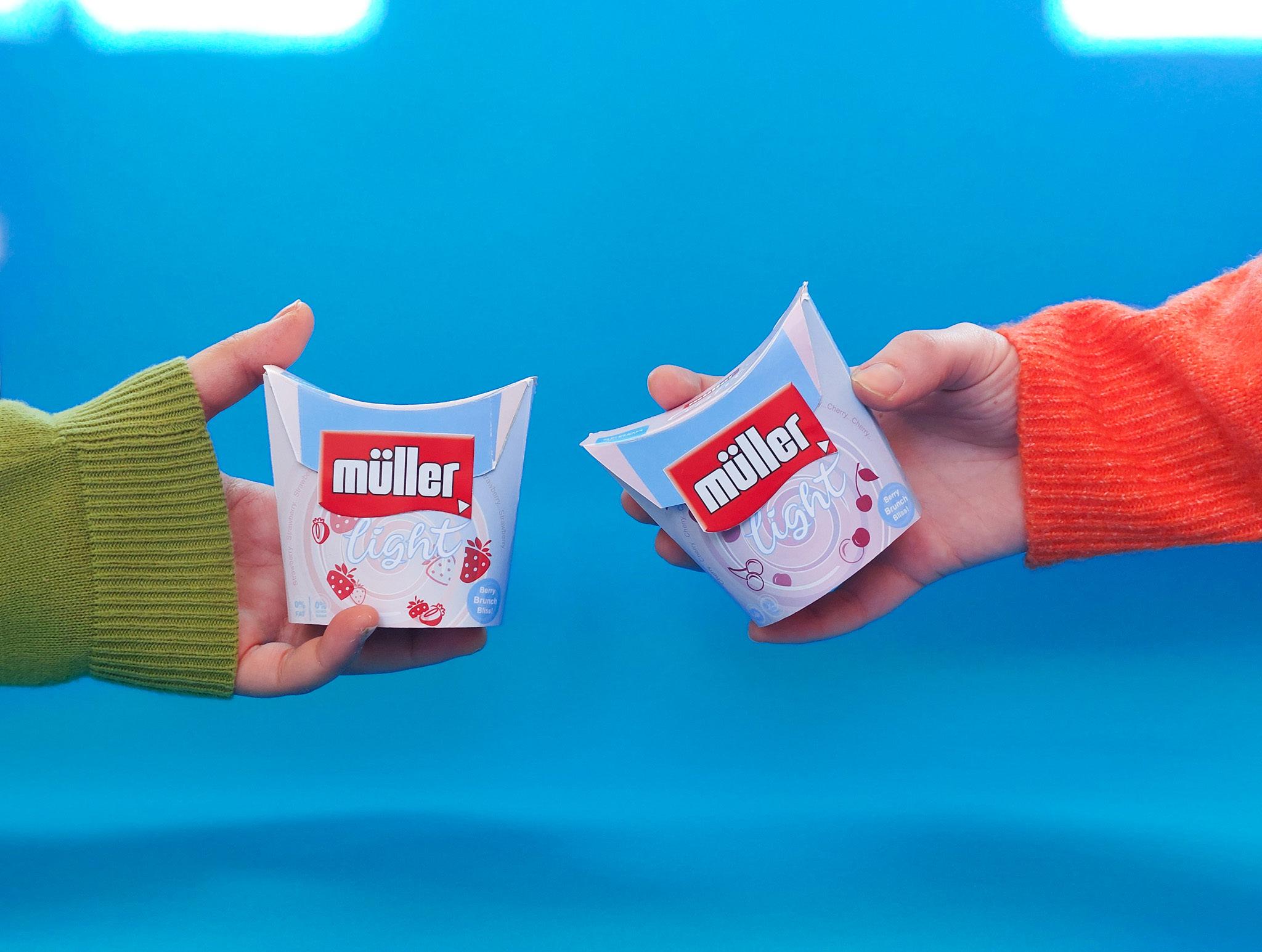
Müller Light’s new “Eco-venience” packaging introduces a refreshing blend of eco-conscious living and indulgent convenience. Embracing a “less plastic, more planet” philosophy, this design redefines the way we enjoy Müller’s classic flavors. With the use of paperboard and barrier technology, the packaging steps lightly on the earth, ensuring every spoonful carries a sustainable commitment. This thoughtful design offers simplified interactions – peel, savor, reseal –weaving indulgence seamlessly into the busy pace of life. The new look celebrates Müller’s pledge to convenience without compromise. It’s not just about the taste, but also about savoring the joy of a choice that’s both delightfully Müller and considerately green.
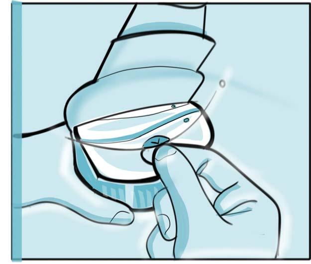
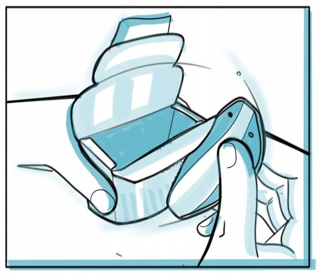
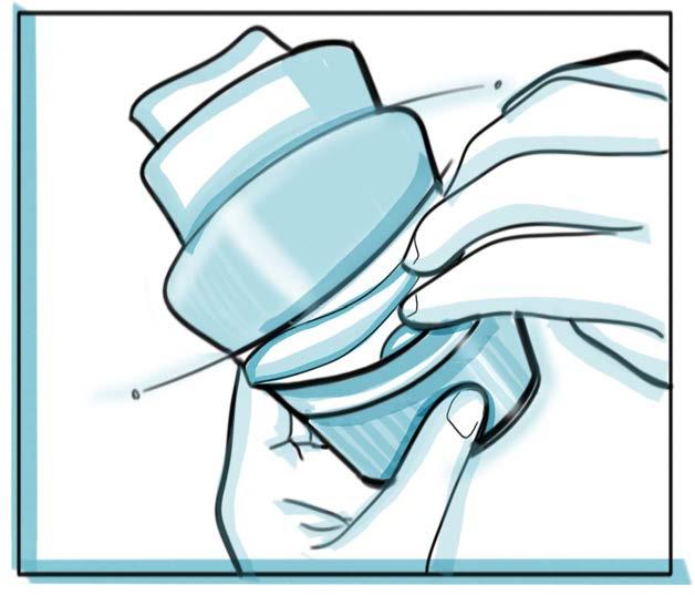
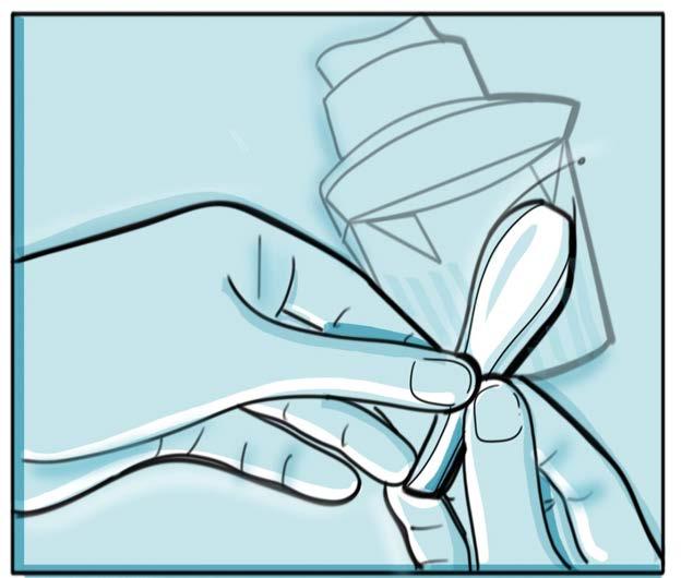
STEP BY STEP REVEAL
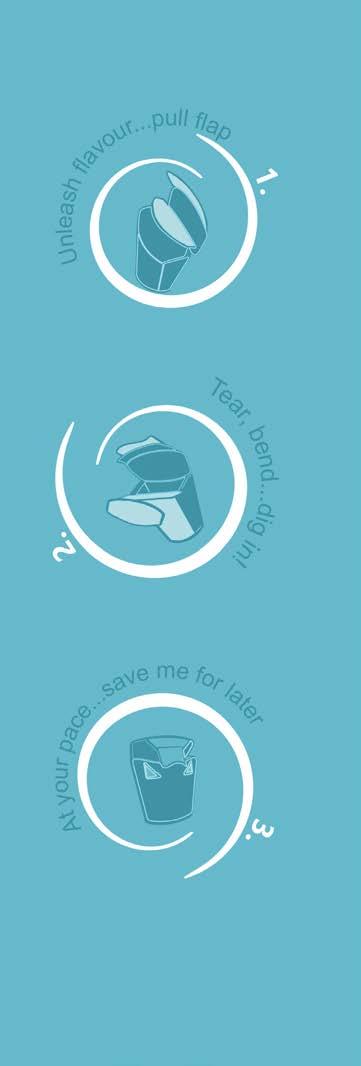
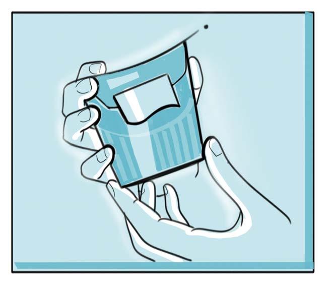
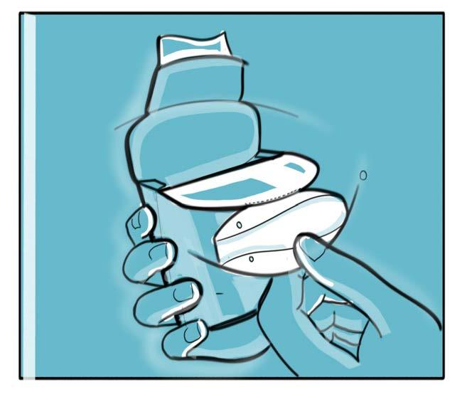
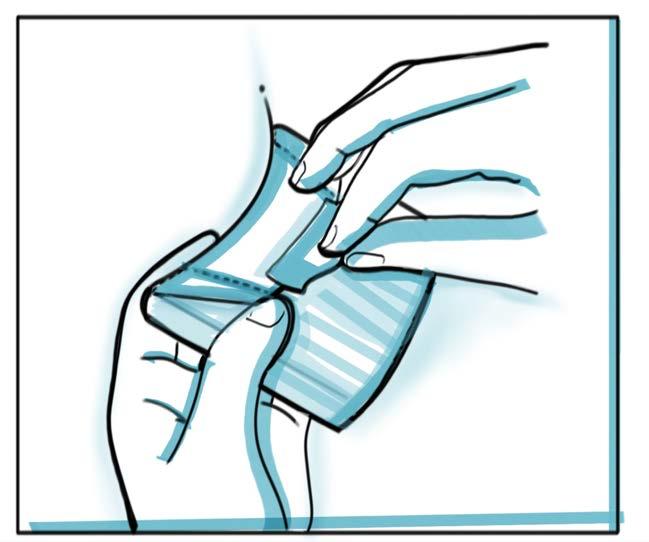
- Icons are places such that they are revealed in stages, as the consumer slowy peels away the layers creating a sort of dynamic guidance
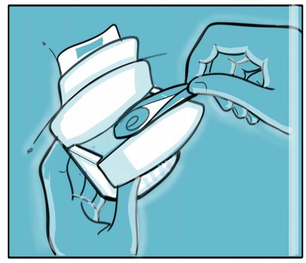
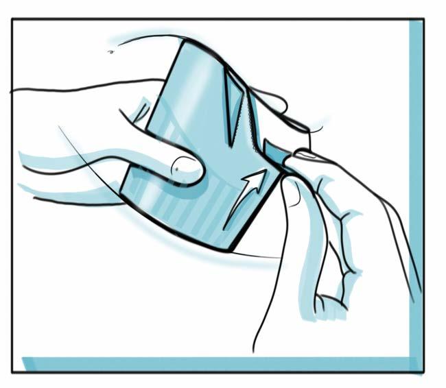
_Simple tear strip interaction to guide the opening path
_Reclose tab allows the pack to be closed again once opened, preserving freshness and working cohesively with the consumer’s routine
_Rippled second layer acts as means to provide extra structural stability and while also providing an extra layer of insulation and reducing pack condensation - curating the perfect overall experience
_Playing out pack inetractions - focusing on functions over graphic details
_Drawing attention to inetraction of pack with teh hand, open, tear, consume and reclose fetaures and how the pack naturally allows for the consumer to flow through them
Modus, a leader in workspace and hospi tality furniture, sought innovative mate rial solutions to enhance the design of occasional furniture. This collaborative project focused on exploring the ‘in-be tweens,’ aiming to create functional and aesthetic opportunities with new material solutions.




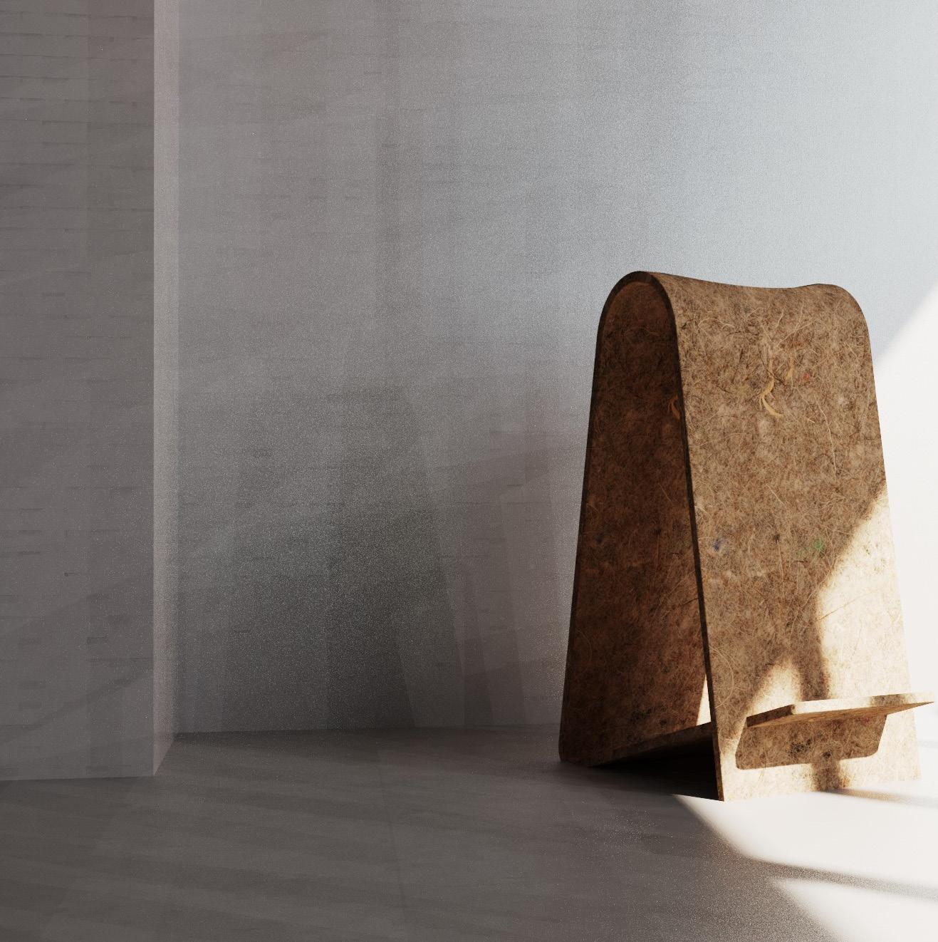
Answering the call, Perch redefines occasional furniture by blending traditional materials with modern design. Utilising a biocomposite of hemp and casein, Perch reinvigorates the old as the new, introducing a sustainable, lightweight, and portable seating solution. It uniquely celebrates ‘in-between’ moments in workspaces, enabling quick, flowing conversations and the creation of casual interaction islands. This contemporary approach not only meets but elevates the brief by fostering dynamic and versatile conversation spaces, encouraging users to pause and ‘perch’.

Exploring current and ongoing material innovations, along with the traditional and forgotten
Common thread of positivity running through the make and use cycles. A more holistic commitment - keeping in mind the user and the planet
Explore new material opportunities for the positive future of contemporary furniture design and bring to life in an inspirational product concept
Focus on occasional furniture. Concepts in line with current needs, trends and Modus client profile.
‘Making it count’ - Design that looks beyond the concept of the immediate. Design with a soul - justifying the overall life of the product
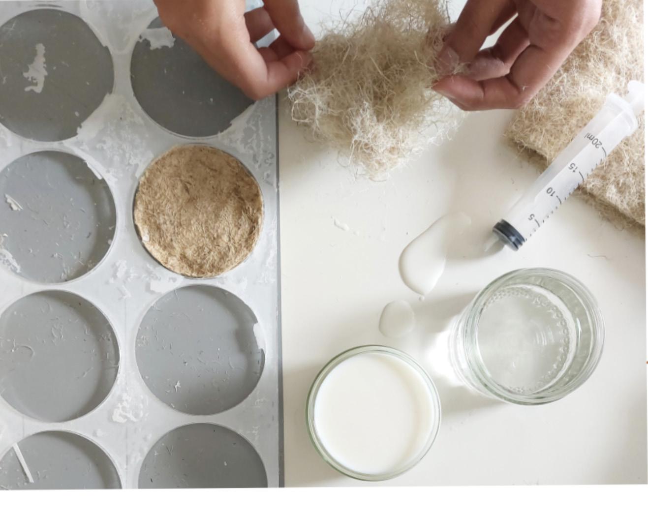
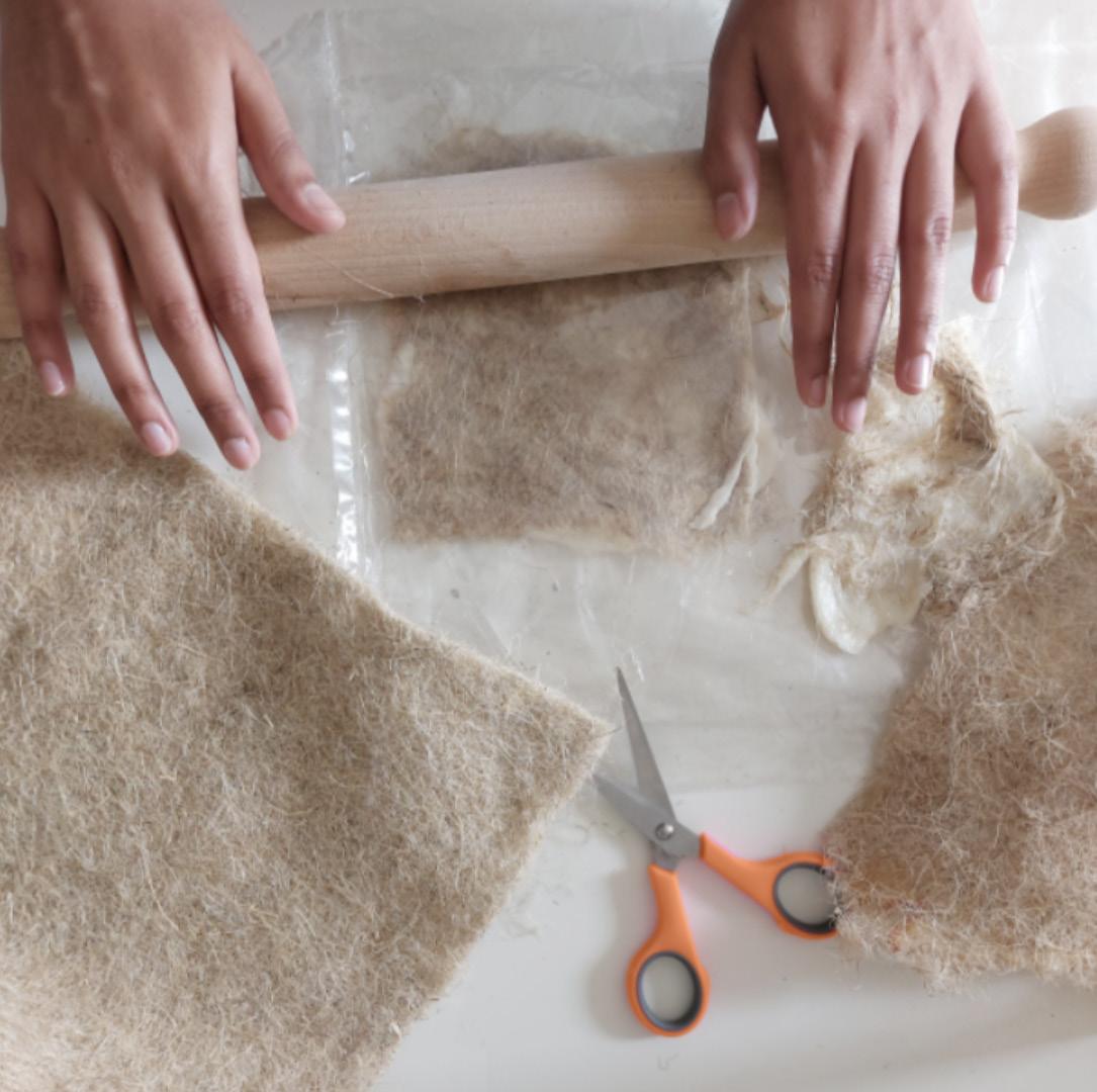

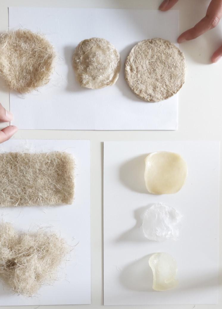
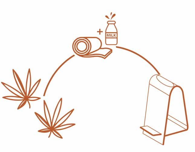
Leveraging renewable materials, this project forms a biocomposite grounded in traditional practices and modern sustainable design. Hemp’s resilience and casein’s durability— derived from dairy processing—converge in a distinctive material fusion. This biocomposite embodies eco-conscious innovation, contributing to the circular material movement.
A tiered approach binds casein resin and hemp into a sturdy, yet light biocomposite. Molding and air-drying solidify the blend, showcasing a new sustainable material direction FABRICATION
Trial iterations refined a biocomposite, with casein and hemp as the optimal duo over other starch-based bioresins. This final version is noted for its durability and retention of hemp’s textural integrity, hinting at scalable advancements.
Note: The developed biocomposite is based on small-scale production, and larger scale processes may optimise its composition for even greater efficiency.
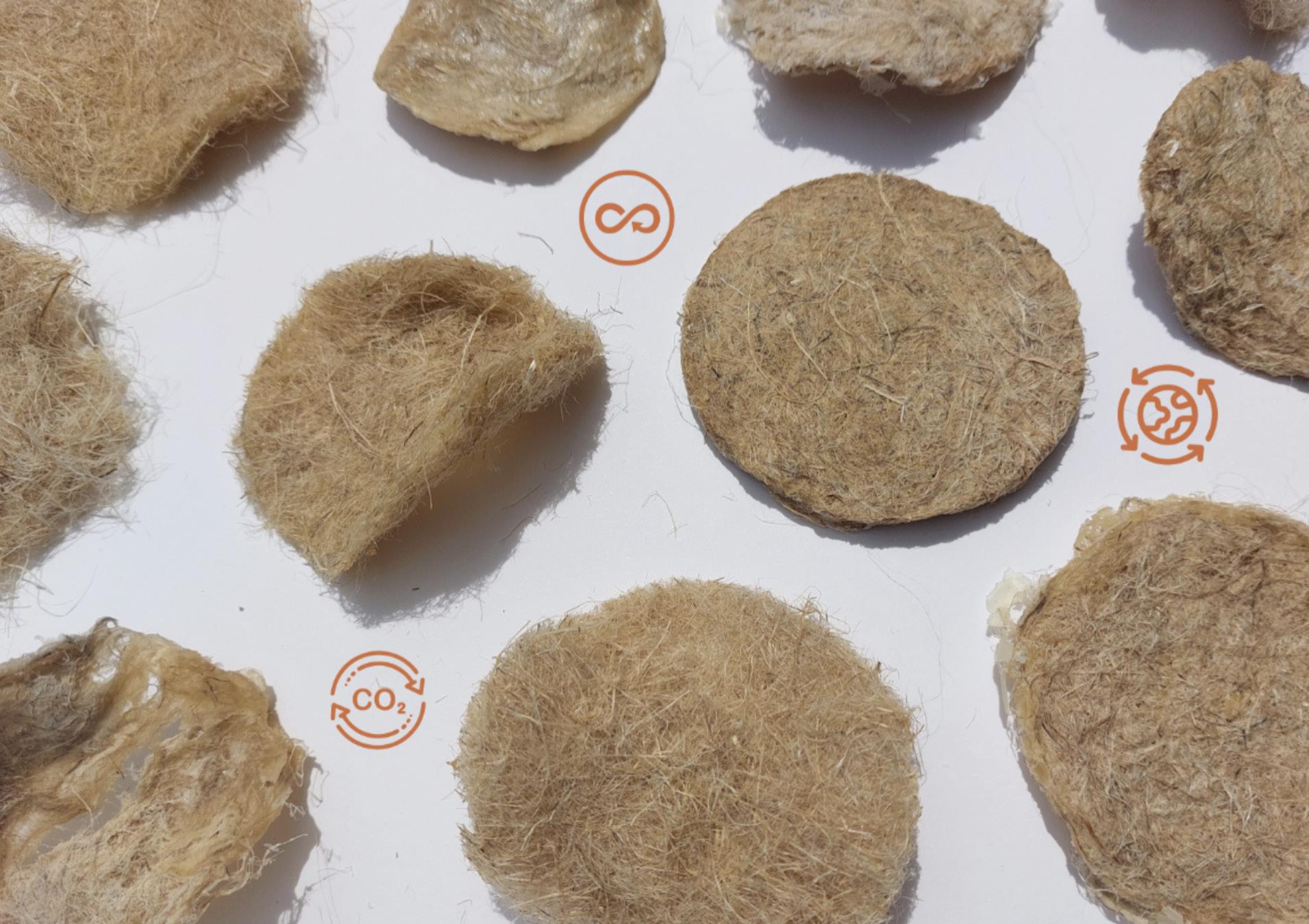
Perch, with its unique material, embodies the fusion of circular design with enduring elements of construction. Drawing from nature, it leverages hemp’s ecological benefits and comforting familiarity to impart stability and comfort in interiors. Complementing hemp, casein serves as a natural binder with roots in the dairy industry, highlighting a shift towards using byproducts to minimise environmental impact.
This project explored quick card iterative modeling, examining elements like structure stability, bend radius, and form construction. The method focused on sheet material forms allowing for simple construction through bending processes. Challenges with the initial route of self-assembly and flat-pack packaging redirected the process and form to a pre-assembled perch, improving ease of production, stability of form, and addressing material limitations.
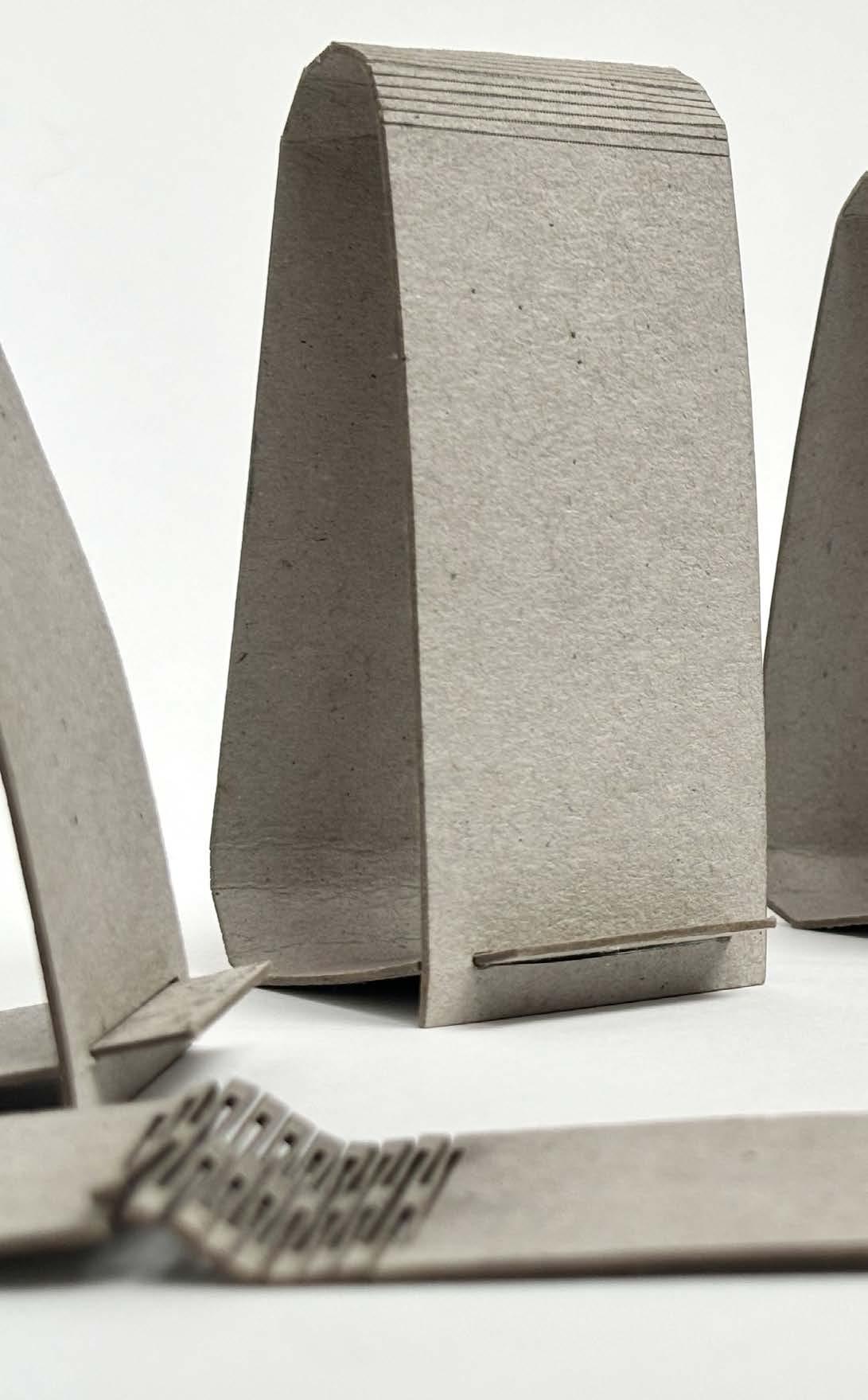
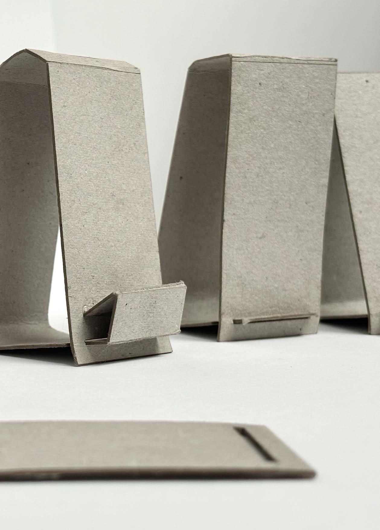
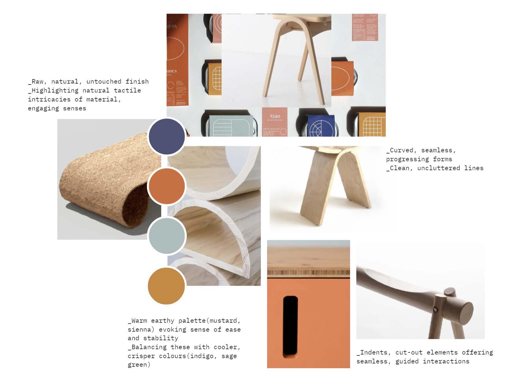
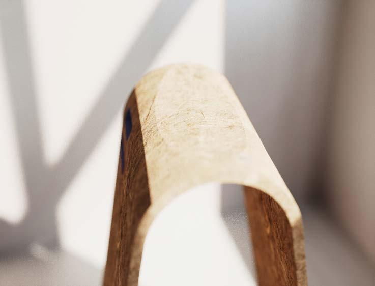
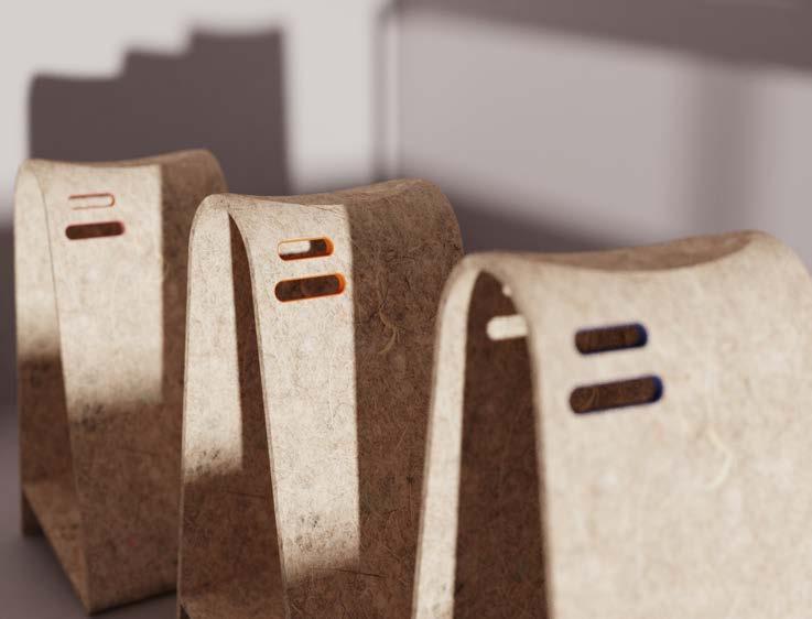
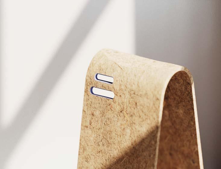
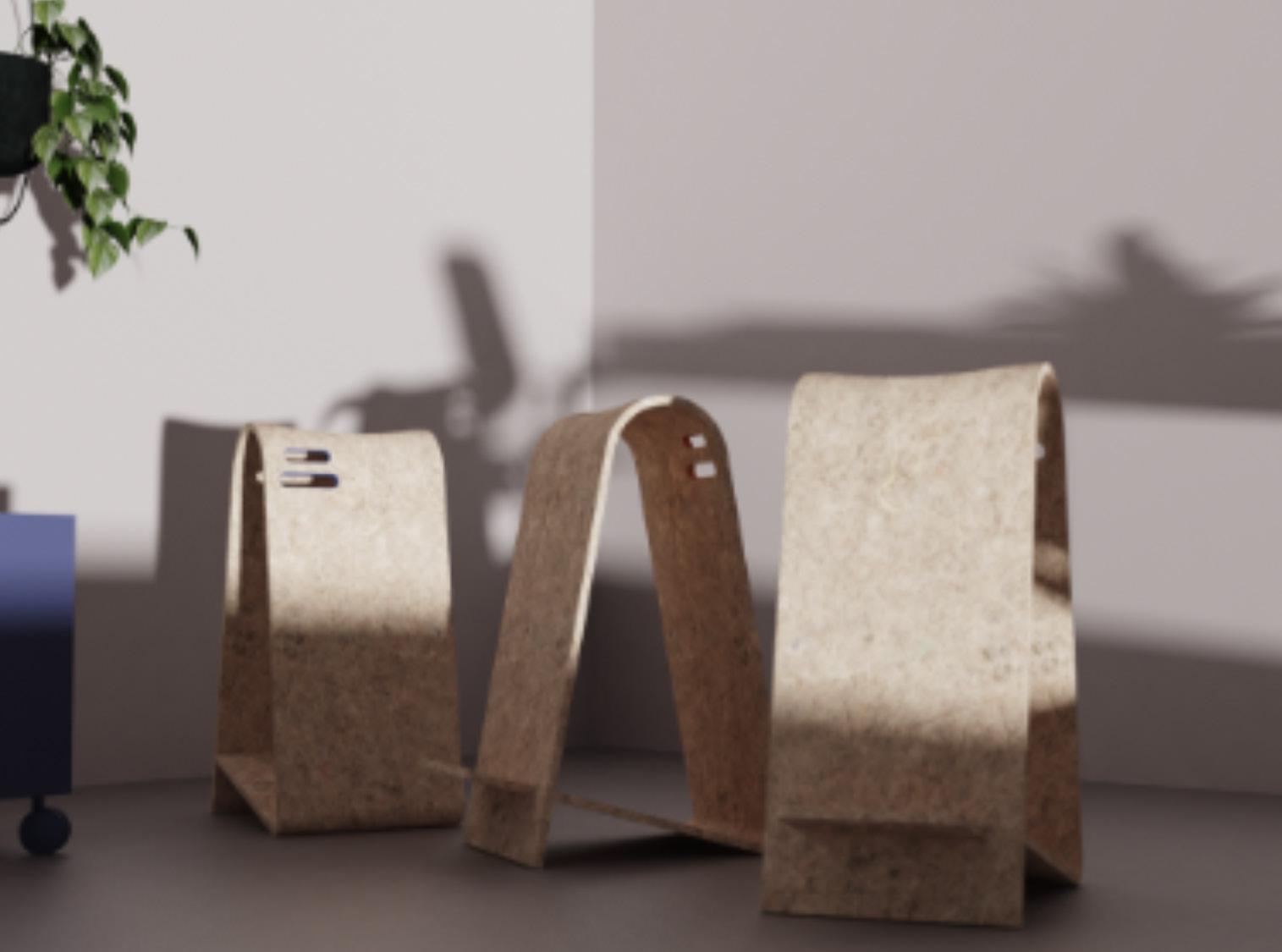
Here, Perch’s design comes to life through a palette that balances natural textures with ease of use. Earthy colors and clever details combine to invite touch and interaction.
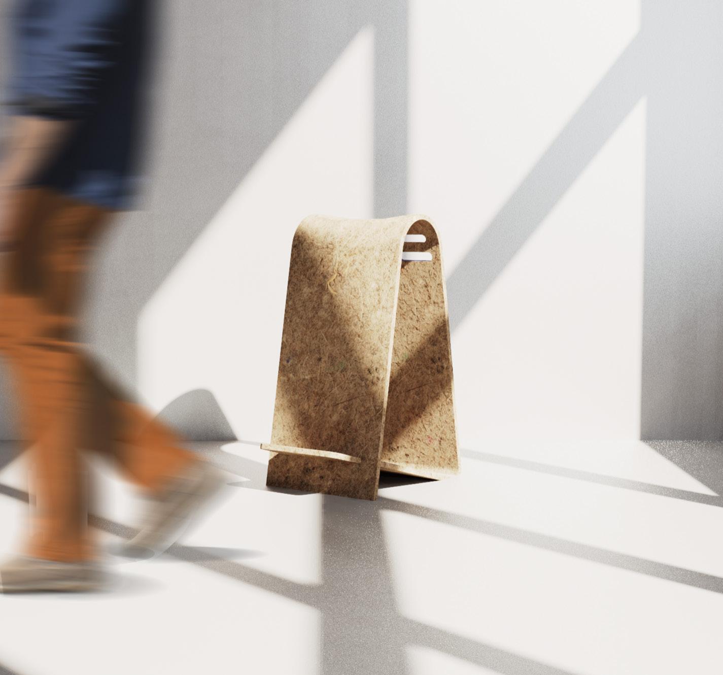
Perch is a casual piece of furniture that celebrates an alternative form of seating designed for those impromptu, ‘pull up a chair’ conversations in a workspace.
Perch is born from a biocomposite comprising of hemp and casein plastic, encouraging new directions for material exploration in furniture making. It explores using sheet material to create its simple, stripped-back form which exploits the lightweight nature of the material. It has two clean slots with a cheeky little pop of colour, inspired by bold earthy tones, which act as simple guiding points of interaction to lift and move the Perch around, creating little conver sation islands anywhere in the workspace seamlessly.
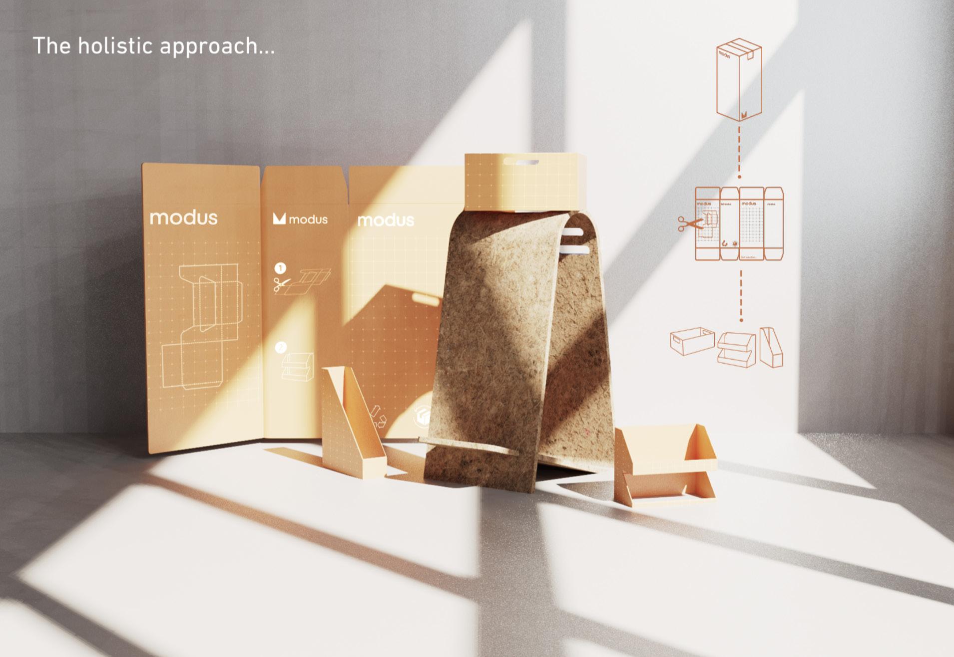
Perch explores a holistic sustainability approach by driving the element of repurposing into its packaging. The packaging can be upcycled to create small, versatile workspace companions that educate and inspire consumers in a more engaging manner, to rethink their consumption patterns and consider alternative uses for materials, inspiring them to adopt more sustainable practices in their daily lives.
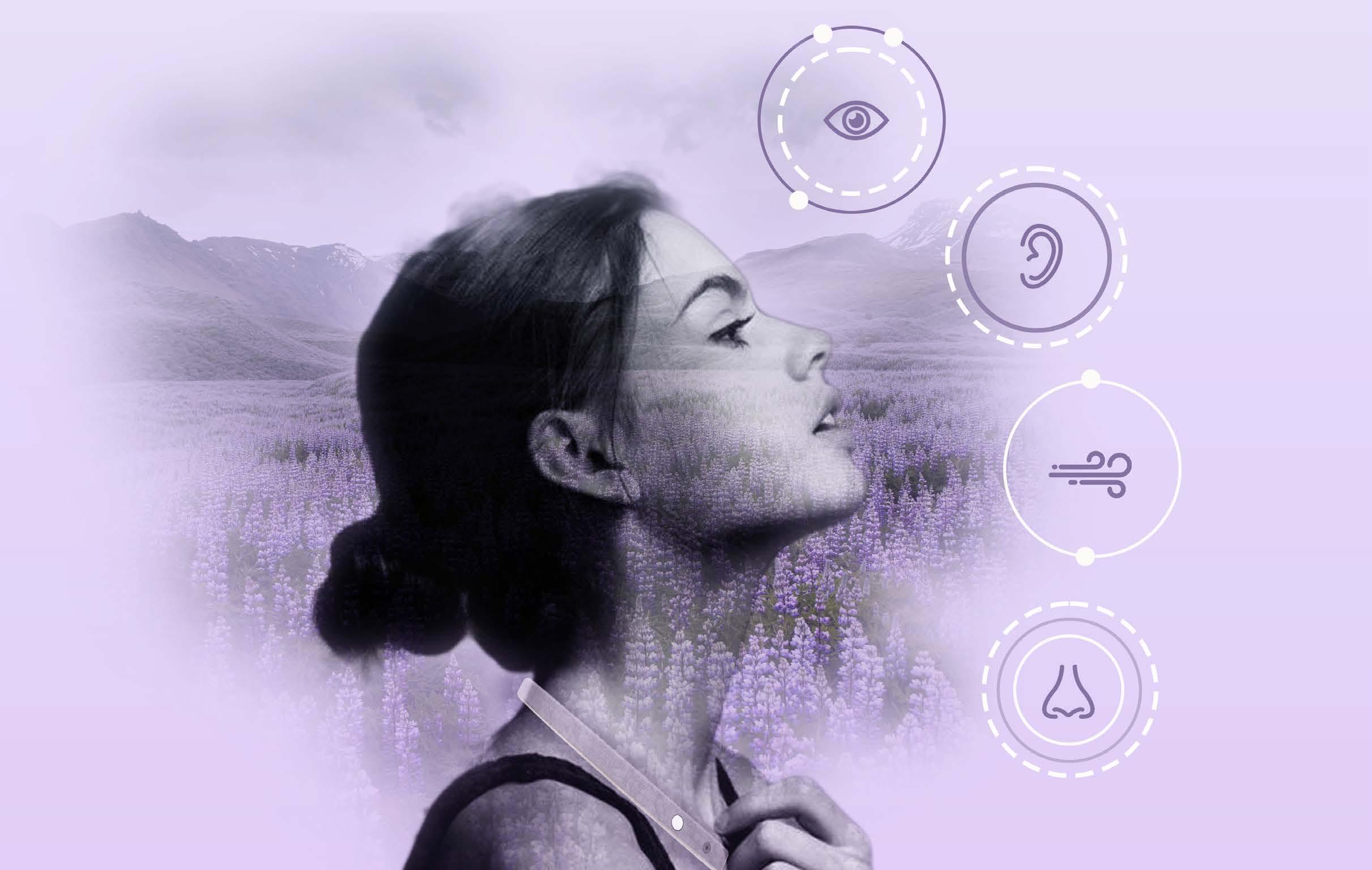
Initiated during the peak of the metaverse trend, Bhava was a self-di rected project designed to address the starkly contrasting views of the digital realm. The brief evolved from the need to blend the tangible and virtual, aiming to mitigate the extreme perceptions asso ciated with the metaverse by leveraging personal, real-world experiences.

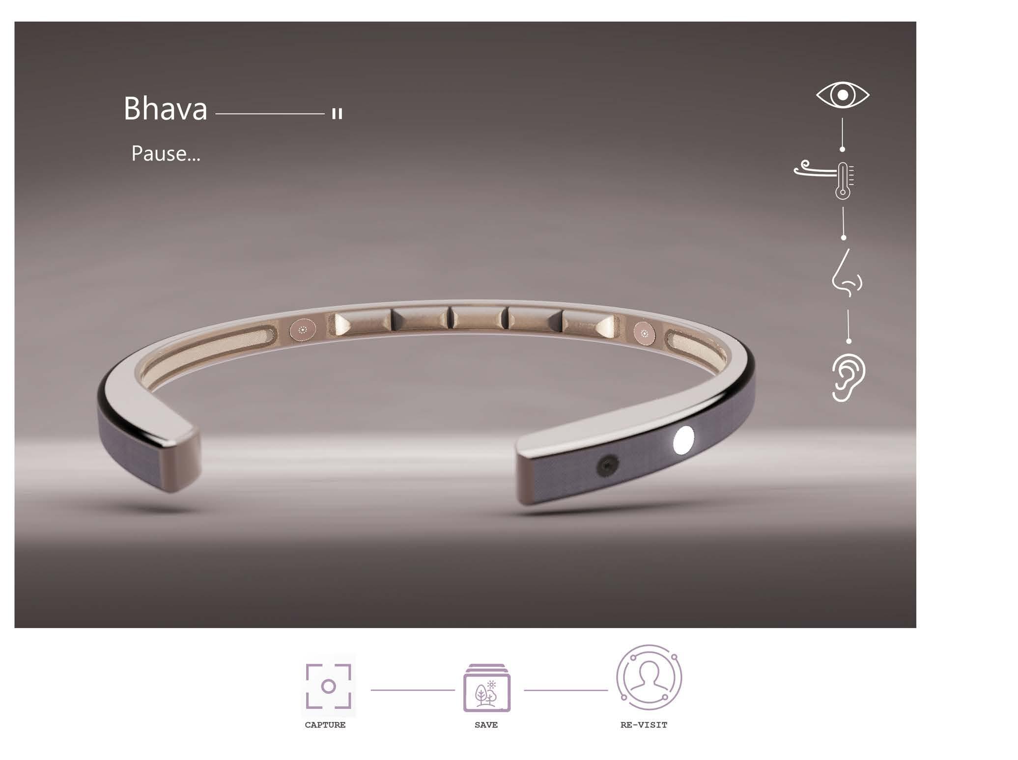
Bhava redefines the integration of real and virtual by capturing and revisiting real-world sensory experiences within a virtual framework. This device ensures that virtual interactions remain rooted in the physical world, enhancing personal connection and immersion. Bhava exemplifies how technology can extend our sensory experiences, making virtual spaces a natural extension of our reality.
Looking at design less from a commercial point of view. The speculative theory opens dooes to explore design through fictional scenarios to better understand the topic
How might we integrate speculative design principles to develop a product that enables users to curate their own spaces for wellbeing and meditative pauses?
Defining the relationship and perception of the virtual world as a positive escape that creates a bridge between the real and virtual.
Highlighting the personalisation and individuality aspects within the metaverse, allowing users to create and tailor their environments.
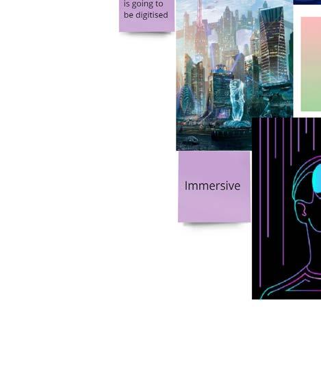
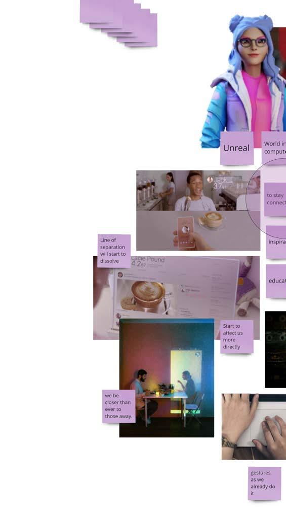
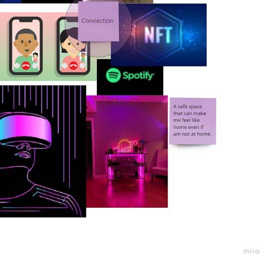
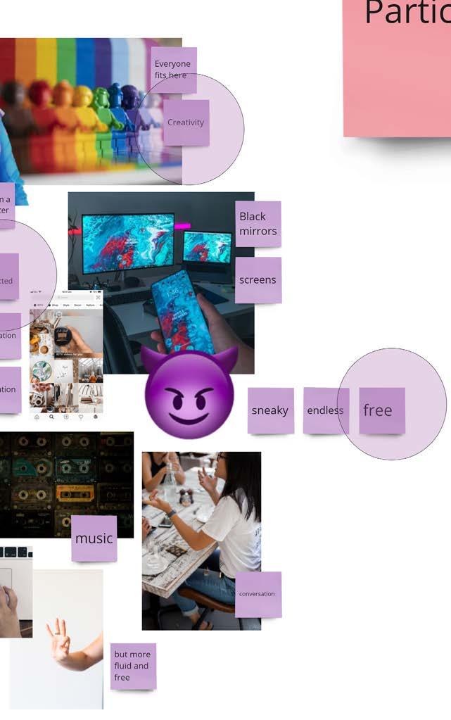




Given the broad and undefined nature of the metaverse, collaging emerged as an ideal research method to better understand people’s current perceptions of it. Participants were asked to visualise their responses to a set of questions using images, keywords, and other visual aids. This approach facilitated the identification of common themes and perceptions, as it is often easier for individuals to express complex ideas visually rather than through written or verbal responses. The collages provided rich, qualitative data that helped us gain deeper insights into how people perceive and imagine the metaverse.
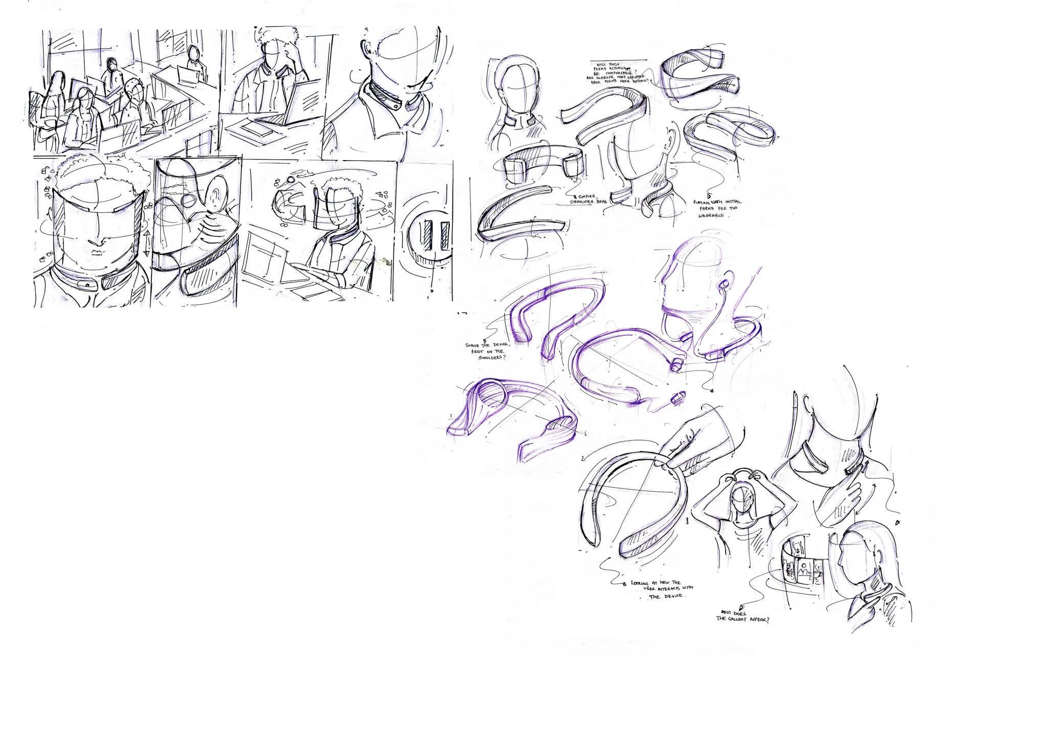
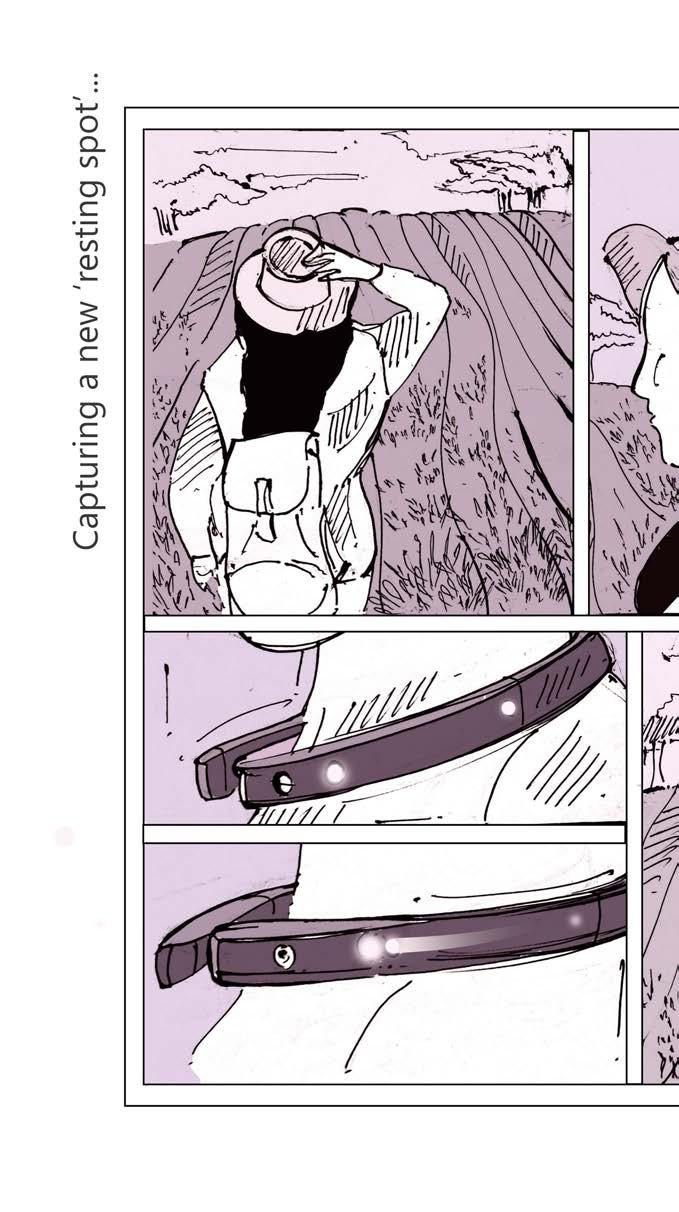
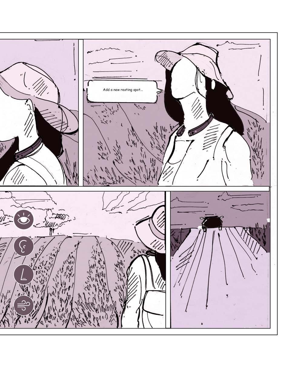
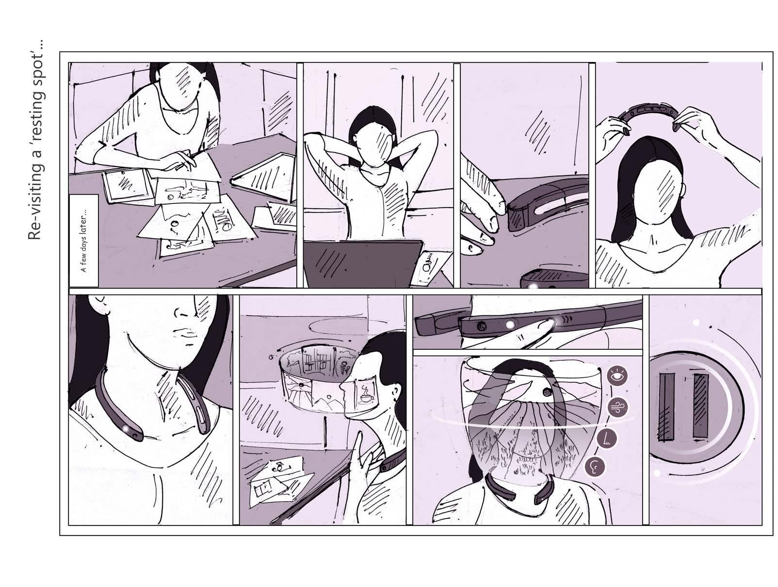
Following the initial concept development, storyboarding was crucial in refining Bhava’s design by illustrating the user-device interactions. It provided a visual framework to anticipate and solve potential challenges in real-time use, ensuring the final product not only meets but enhances the user’s daily experience. These storyboards acted as a bridge, turning abstract ideas into concrete scenarios that depict how Bhava functions seamlessly in various settings.
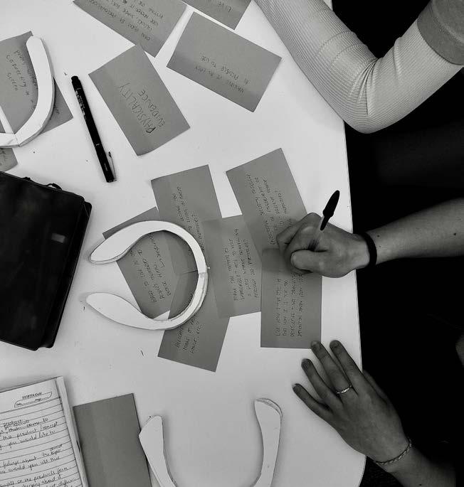
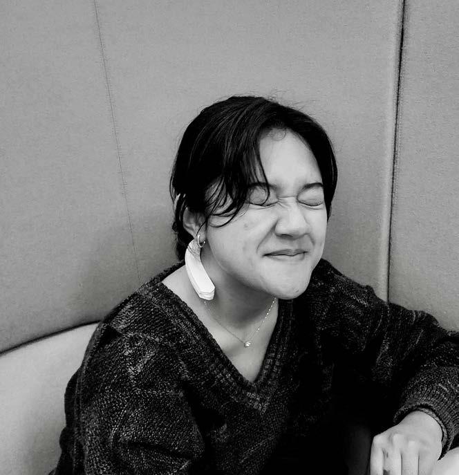
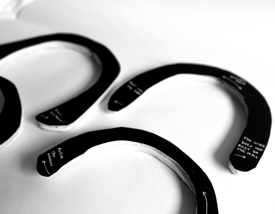
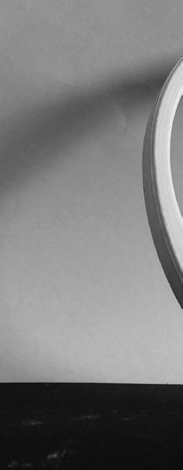
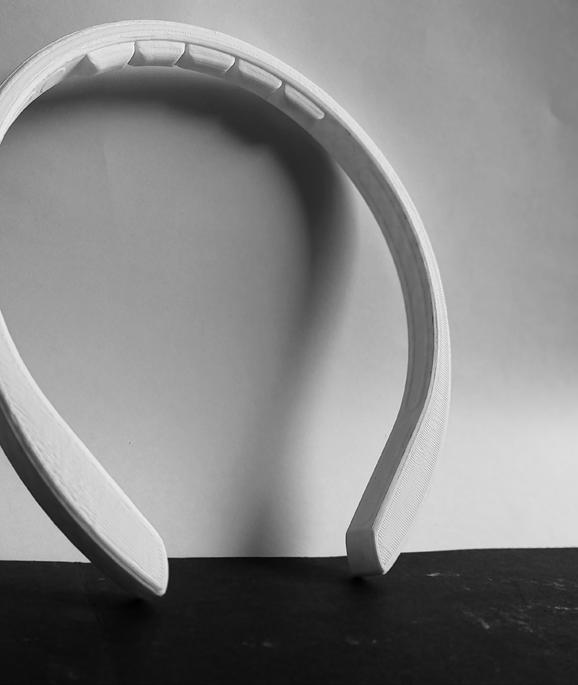
The rapid iterative process that brought Bhava’s design from concept to form is inspired by the interactions detailed in the storyboards. Showcasing the evolution of the device’s shape and user engagement, it illustrates how the device contours to the user and facilitates interaction. These iterations demonstrate the practical translation of storyboard narratives into a tangible product that integrates seamlessly into the user’s life.
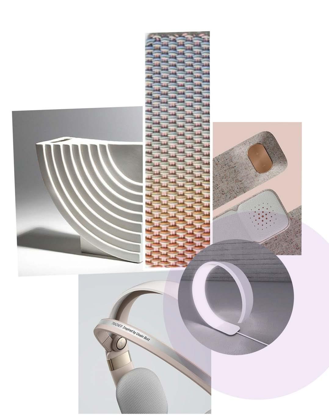
This CMF board is a curated showcase of the materials and finishes that define Bhava’s aesthetic and functional identity. It highlights the careful selection of colours, textures, and materials that harmonise to create a product that is not only visually appealing but also tactilely engaging. Each element—smooth, flowing curves and a blend of polished and rustic textures—illustrates the design’s emphasis on calm, balance, and seamless integration into everyday life. The board exemplifies the skilful application of CMF principles, demonstrating how thoughtful material choices elevate user experience and product functionality.
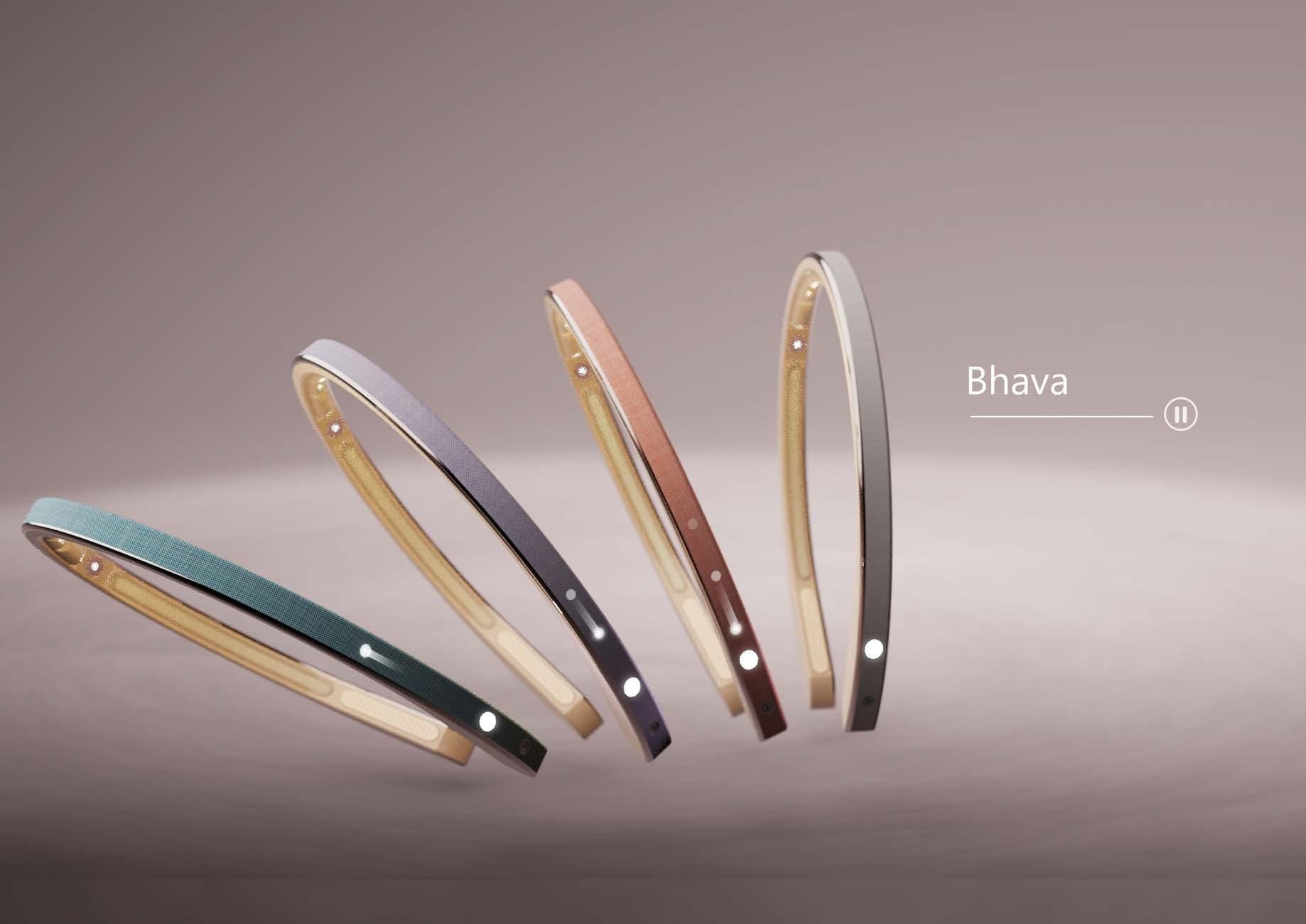
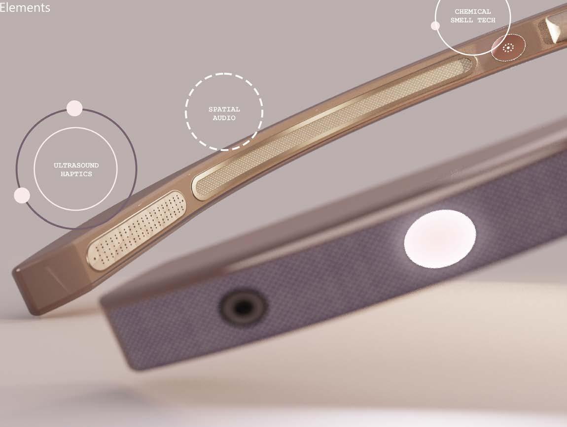
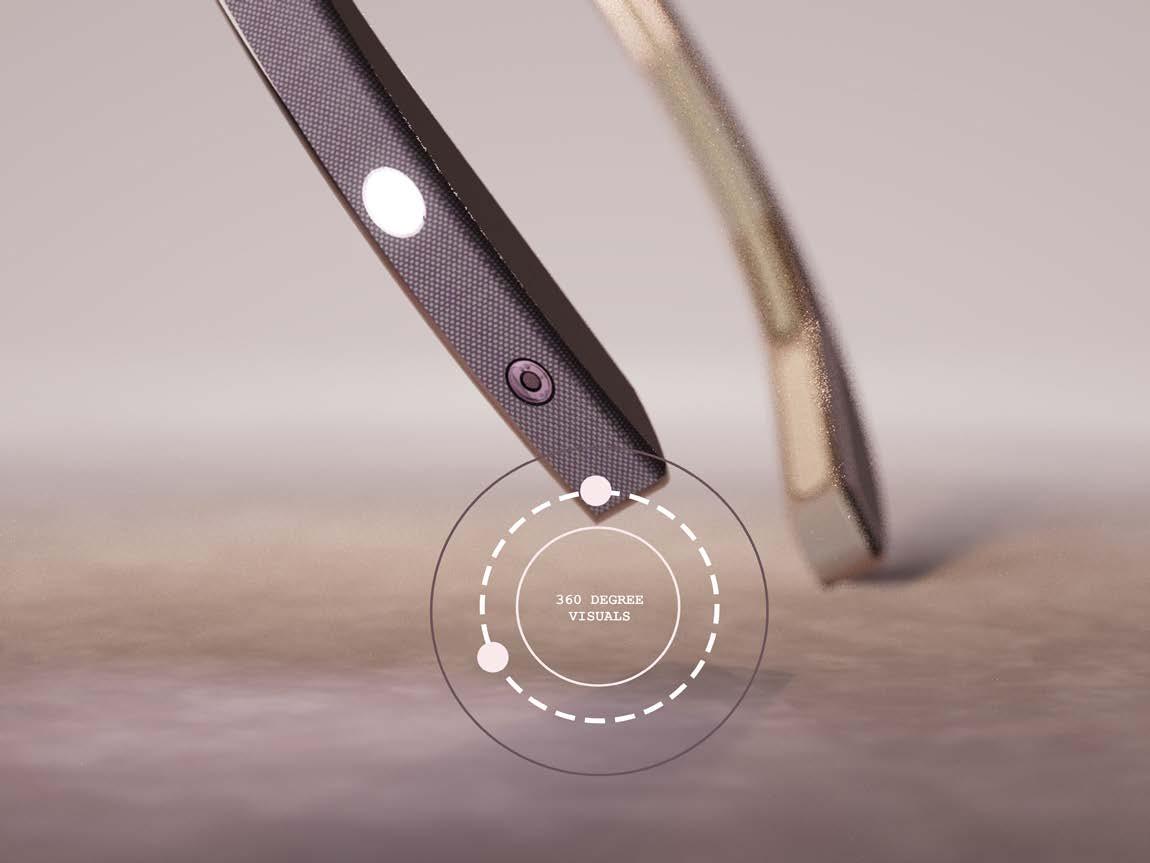
Bhava represents the culmination of technology and sensory experience, allowing users to craft their own gallery of meditative spaces. The device captures and recreates the sights, sounds, and scents of cherished environments, offering a moment of calm tailored to personal memories. By integrating these sensory elements, Bhava introduces a new vision for technology—one deeply rooted in the tangible aspects of the real world. This approach not only enriches user experience but also bridges the gap between the virtual and the real, setting a new standard for immersive personal technology.
