Visual Development Guide


CONTENTS 01 02 03 04 05 Key Phrases Description Round 1 Rough and Refined Round 11 Rough and Refined Round 111 Sketches and Digital | Logo refining Visual Research Logo look-alikes | Inspiration Colophon ..... 05 ...... 09 ...... 21 ...... 29 ...... 43
01
KEY PHRASES
This section we are expanding our chosen keywords to robust key phrases that reflect the brand soul. These unique phrases help guide the visual development process.
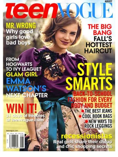
MODERN
The readers of Teen Vogue are evolving and so does the content. Teen Vogue wants to be more inclusive and cater to different sectors of the society. Having said that, it want to be able to accessible for more and more people.
With an aim to be able to accessible for more and more people, Teen vogue expanded the content horizon from just Fashion, make-up and beauty to Politics and general news. This has encouraged it being more widely accepted and give its audience a more holistic perspective.
Todays youth is constantly looking out for avenues for recreation. With busy everyday schedules, Teen Vogue wants to be able to add that fun element through its variety of content.
6
For open-minded audience ENTERTAINING Stay up to date PLAYFUL You deserve a break
TEEN VOGUE

7 VISUAL DEVELOPMENT GUIDE
02
Round-1 Sketches
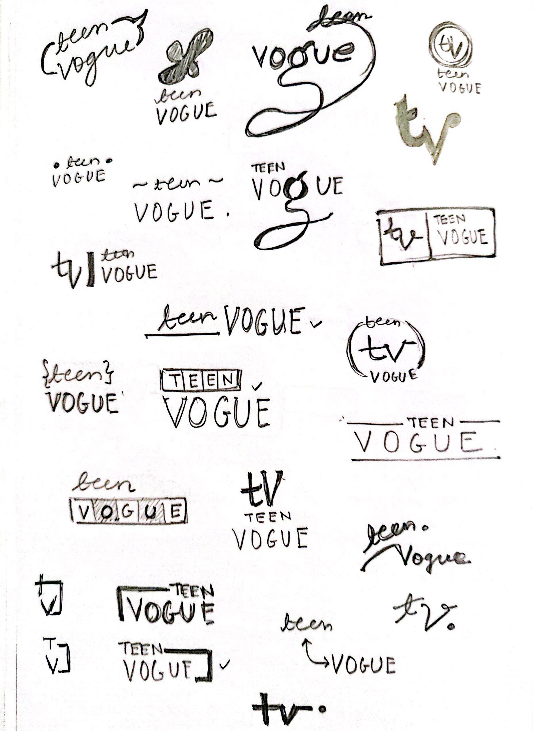
This step marks the first round of visual development. We had to brainstorm and sketch several varied ideas for the brand logo. This was an attempt to develop initial ideas to redesign the logo to align with the brand.

TEEN VOGUE 10

VISUAL DEVELOPMENT GUIDE 11

TEEN VOGUE 12

VISUAL DEVELOPMENT GUIDE 13
The sketches explore the idea of combination of an addition of a ‘teen’ to something that is very recognizable to the audience which is ‘Vogue’.

TEEN VOGUE 14

VISUAL DEVELOPMENT GUIDE 15
TEEN VOGUE 16

VISUAL DEVELOPMENT GUIDE 17
REFINED SKETCHES
The sketches depict the idea of combination of an addition of a separate entity to something that is very recognizable. The ‘teen’ is an new direction the brand Vogue is taking to add to their existing sector of the audience.
TEEN VOGUE 18

VISUAL DEVELOPMENT GUIDE 19
03
Round-2 Sketches
This section takes us to the second round of the visual development process. Here, we develop more on some of the potential ideas from the first round and at the same time make some sketches for new ideas. Also, we start to translate some ideas digitally.
ROUGH SKETCHES
These sketches involve experiments using Vogue ‘V’ with a Teen ‘t’. We are using the idea of communication and expression here.

TEEN VOGUE 22

VISUAL DEVELOPMENT GUIDE 23

TEEN VOGUE 24
This sketch seemed very relevant to the idea of teens having a voice and expressing themselves.

VISUAL DEVELOPMENT GUIDE 25
REFINED SKETCHES
These sketches with are combination of letter marks and symbols to show the idea of expression and also the idea of moving forwards, evolving.


TEEN VOGUE 26
teen
VISUAL DEVELOPMENT GUIDE 27 teen V
04
Round-3 Sketches
This section takes us to the last round of the visual development process and exploration. Here, we work on three of the most potential ideas and concept from the first two rounds.
The V and T: CONCEPT 01
This concept is a combination of the existing Vogue ‘V’ with a more playful Teen ‘t’. They are combined in a way that it forms one unit.

TEEN VOGUE 30
VISUAL DEVELOPMENT GUIDE 31
The Dialogue
box : CONCEPT 02
This concept is a combination of the Vogue ‘V’ with a dialogue box that says ‘teen’. This reflects the idea of the brand to initiate dialogue on social issues and also be a platform for teens to have voice.

TEEN VOGUE 32


VISUAL DEVELOPMENT GUIDE 33 teen
The blow horn: CONCEPT 03
This reflects the idea of the brand providing a voice to the youth to raise issues. The platform allows talking about social taboos to educate and spread awareness.

TEEN VOGUE 34
VOGUE VOGUE
VISUAL DEVELOPMENT GUIDE 35
T E E N
LOGO REFINING
This step involved refining the logos from the third round both structurally and digitally.

TEEN VOGUE 36
VISUAL DEVELOPMENT GUIDE 37 teen OGUE teen teen OGUE teen teen teen
LOGO REFINING- 2
This step involved refining the logos from the third round both structurally and digitally. In this step we tried to incorporate the idea of expression and dialogue box with the parent brand.

TEEN VOGUE 38


VISUAL DEVELOPMENT GUIDE 39
FINAL LOGO

The logo shows the very essence of expression that the brand aims to provide.
The parent brand ‘Vogue’ is shown in its original form. The dialogue box originating from ‘v’ has ‘teen’ in it. This is a way to show that this platform by Vogue is for the people to express their thought and allow dialogue on various topic amongst the people.
To show that this platform stands for expression
To pay homage to the parent brand
TEEN VOGUE 40


VISUAL DEVELOPMENT GUIDE 41
05
Visual Research
This is the logo research and inspiration we derived from looking at the other brands. We studied how other brands have build their logos and presented them to the audiences. We have tried to incorporate our learnings in our work.
LOGO RESEARCH: Letter Logos

The original V&A, named after Queen Victoria and Prince Albert, has stood in South Kensington for more than 150 years and is the world’s largest museum of decorative arts and design.
Louis Vuitton is the world’s most valuable luxury brand. Its products include leather goods, handbags, trunks, shoes, watches, jewelry and accessories.
Calvin Klein is known for womenswear, menswear, jeans, cosmetics and perfumes, bed and bath linens, and other collections.
HP is an American multinational information technology company that develops personal computers, printers and related supplies, as well as 3D printing solutions.


TEEN VOGUE 44
EA Sports is a division of Electronic Arts that develops and publishes sports video games.


General Electric Company is an American multinational conglomerate founded in 1892. The company operates in aviation, power, renewable energy, digital industry, additive manufacturing and venture capital and finance.

VISUAL DEVELOPMENT GUIDE 45
The New York Yankees are an American professional baseball team based in the New York City borough of the Bronx.
LOGO RESEARCH: Dialogue Box logos
WeChat and Weixin are a Chinese instant messaging, social media, and mobile payment app developed by Tencent.

Signal is an encrypted messaging service for instant messaging, voice, and video calls. The instant messaging function includes sending text, voice notes, images, videos, and other files.

Line is a freeware app for instant communications on electronic devices such as smartphones, tablet computers and personal computers.

Zalo is a messaging application that provides fast, stable, convenient, and private connection for users anytime, anywhere.

TEEN VOGUE 46
Viber, or Rakuten Viber, is a cross-platform voice over IP and instant messaging software application owned by Japanese multinational company Rakuten,

Google Hangouts was a cross-platform instant messaging service developed by Google.

VISUAL DEVELOPMENT GUIDE 47
LOGO
RESEARCH:
Graphic + type logos
Blowhorn is an intra-city logistics provider headquartered in Bengaluru, India.

Target Corporation is an American retail corporation headquartered in Minneapolis, Minnesota. It is the eighth largest retailer in the United States,

Dropbox is a file hosting service that offers cloud storage, file synchronization, personal cloud, and client software.

Spotify is a proprietary Swedish audio streaming and media services provider. It is one of the largest music streaming service providers.

TEEN VOGUE 48
The Xbox network, formerly and still sometimes branded as Xbox Live, is an online multiplayer gaming and digital media delivery service created and operated by Microsoft.

Stitch Fix is an online personal styling service. It uses recommendation algorithms and data science to personalize clothing items based on size, budget and style.
The Public Broadcasting Service is an American public broadcaster and non-commercial, free-to-air television network based in Arlington, Virginia.

VISUAL DEVELOPMENT GUIDE 49
INSPIRATION
In this section we looked at several other brand identity and the way they have showcased their visual identities. We picked examples of brand that have successfully represented their visuals.

TEEN VOGUE 50

VISUAL DEVELOPMENT GUIDE 51
NEW IDENTITY
INTRODUCTION : (RED)
(RED) introduces the logo with a motto. They incorporate the logo in a phrase that reflects their ideas. I think this is an interesting way to display the identity.

TEEN VOGUE 52
LOGO ANATOMY: Devon
Devon clearly shows the structure of the logo. They also specify the clear space around the logo and minimum sizes.

VISUAL DEVELOPMENT GUIDE 53
TYPE SPECS: Vantiv
Vantiv shows typography specifications using keywords. They clearly list down the how the chosen type and different weight be used in the communication. They also specify an alternate type that aligns to the brands visual guide.

TEEN VOGUE 54
MAIN ID COLORS: Workday
Workday clearly segregates color hierarchy by specifying the correct usage of the colors. They also list both the print and digital color codes.

VISUAL DEVELOPMENT GUIDE 55
LOGO DON’Ts: Exploratorium
Exploratorium has a very playful layout throughout just like their graphic style. They show through examples how the identity cannot be used.


TEEN VOGUE 56
ALTERNATE VERSIONS OF THE
LOGO: DFW
DFW has both primary and secondary way of using the logo. They also have listed ways both configurations can be used. The have black and white variations of the logos as well.

VISUAL DEVELOPMENT GUIDE 57
Colophon
Images
Adobe Stock
Wikipedia
Teen Vogue cover gallery
VISUAL DEVELOPMENT GUIDE 59
