Bob Bracher ARPS (Exhibitions Member) rpbracher@yahoo.co.uk
Paul Bullock LRPS (Exhibitions Member) paulbullock@fastmail.co.uk
Robert Herringshaw ARPS (Coordinator of The Stephen H. Tyng Foundation) robertherringshaw@me.com
SUB-GROUP ORGANISERS
Rollright
Barry Barker FRPS visualartrollright@rps.org
Visual Art North
Mary Crowther ARPS visualartnorth@rps.org
Visual Art South West
Marija Lees LRPS visualartsouthwest@rps.org
Visual Art London
Linda Wevill FRPS lindawevill@gmail.com
If you are interested in having or organising a Visual Art Sub-group in your area, please contact:
Mark Deutsch LRPS visualart@rps.org
Front Cover Image: by Polina Plotnikova FRPS
Inside Front Cover Image: by Cheryl Hamer
VISUAL ART
Linda Wevill FRPS
Bizzie Frost FRPS
Polina Plotnikova FRPS
A View from the Chair
MARK DEUTSCH LRPS
Welcome to the Visual Art Group’s Magazine – this year’s second, edited by Linda Wevill FRPS. What a delightful edition it turns out to be, with a collection of fascinating and inspiring articles.
I am particularly impressed by the very wide range of techniques now being used by the featured writers. From the necessarily relatively formalised set-ups of Bizzie Frost FRPS, ready to view straight from the camera, via the flexible but planned work of José Closs, to the casually observed (sometimes!) phone pictures of Martin Addison FRPS, whose impact is produced by multiple exposure and other postproduction methods unimaginable to
photographers of previous generations, we are treated to feasts of truly artistic work which, in theory, is within the reach of us all. The fact that the work of these and many other notable photographers stands out, as it always does, shows that true artistry rises above the norm and that the artist’s skill will always test the limits of the available tools, as indeed it should. Cheryl Hamer’s work with its beautiful multiple exposures is a feast for the senses, calmer and less ‘street’ than Martin’s, where Polina Plotnikova FRPS produces equal beauty with simplicity and the clever use of lighting and ICM. Fantastic.
I was recently encouraged to discover that a younger family member is
Editor’s Comments
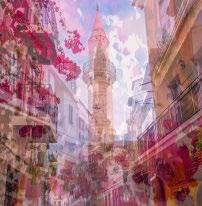
I am delighted to put together another edition for you and I hope you enjoy the variety of approaches and styles included in this issue. It is always interesting to read how other photographers approach their work and this can often motivate us to view our own photography differently. José Closs has more time now to look around and find the beauty that is not obvious at first glance. She enjoys responding to whatever grabs her interest and to give her own interpretation of her subject. Her images here show her unplanned project that evolved during a trip to Lanzarote. The beautiful light on the buildings shows a subtlety of colour and led José to concentrate on the abstract shapes which appeared and disappeared with the moving sun.
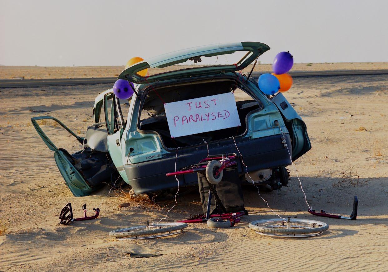
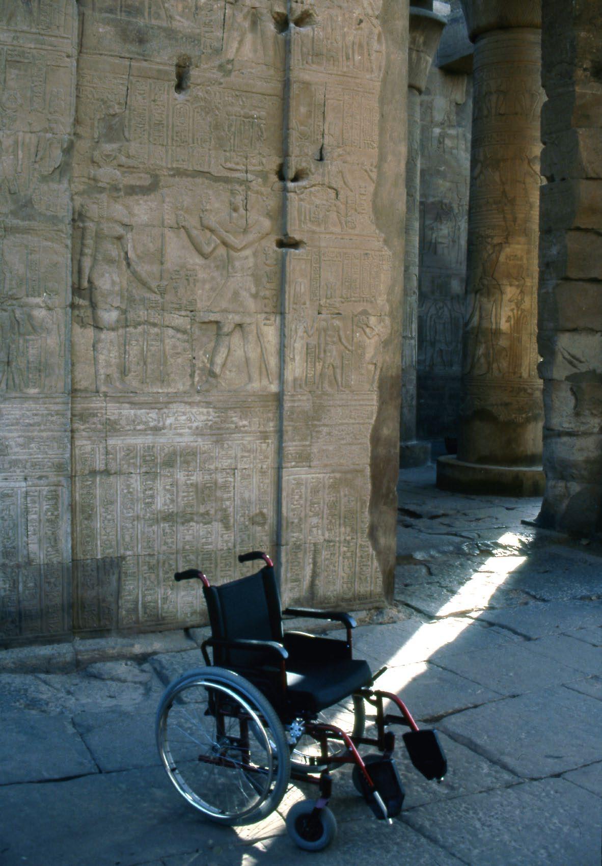
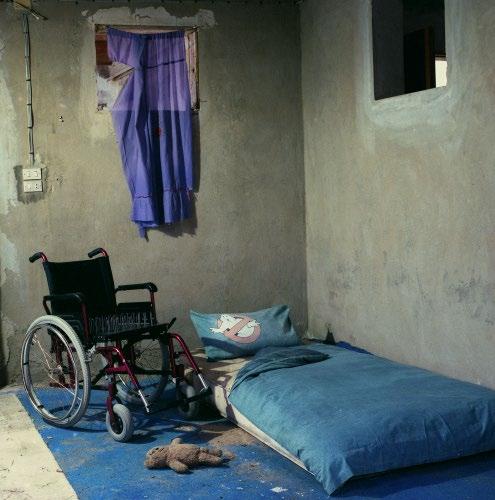
In a very moving article, Bizzie Frost describes how, after a back operation, she was left paralysed down her right side from her waist. She describes feeling downhearted on a trip to the ancient temples in Luxor as she was
unable to stroll around, so she took a photo of her wheelchair instead. This was the start of her creative journey towards her Fellowship and finally, peace and acceptance.
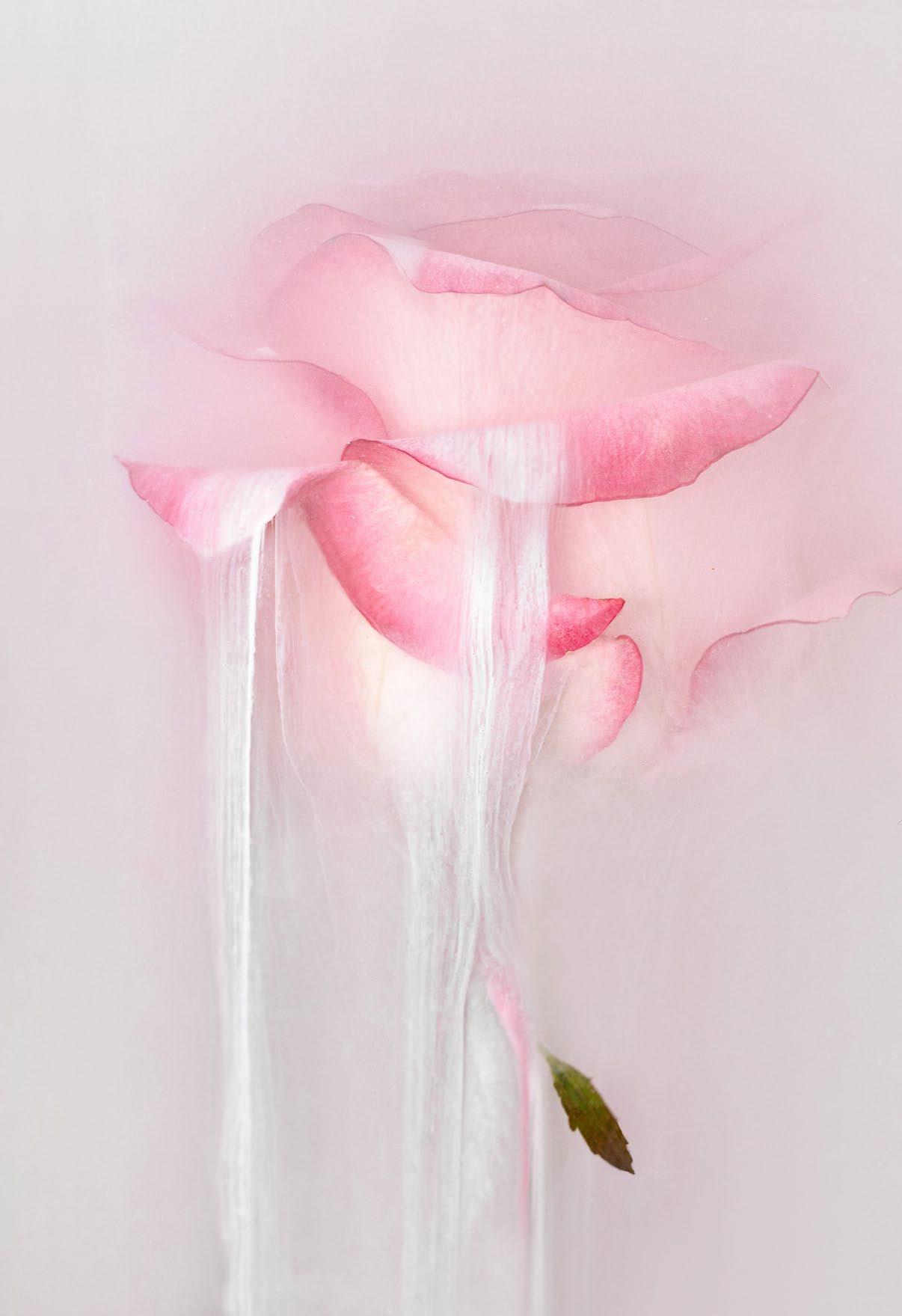
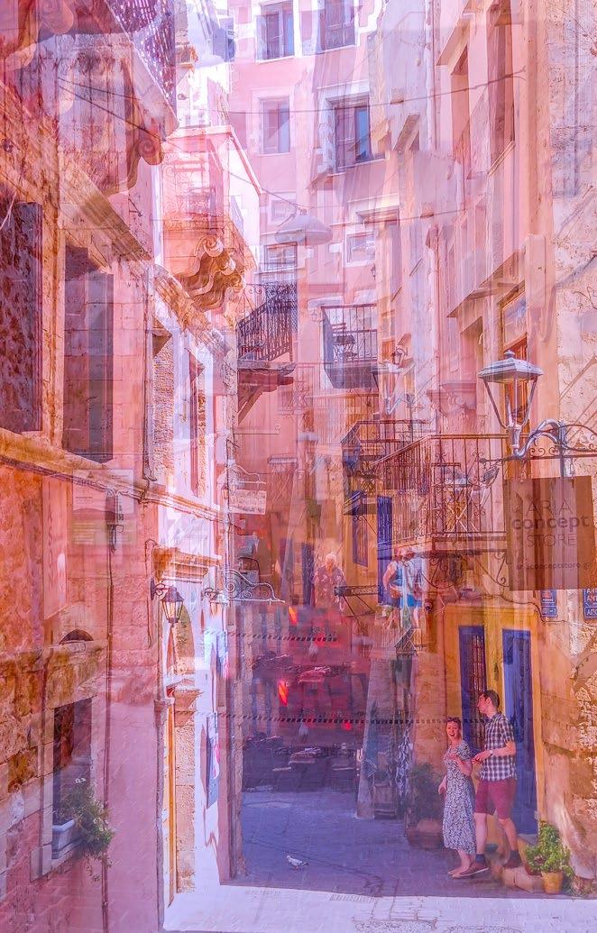
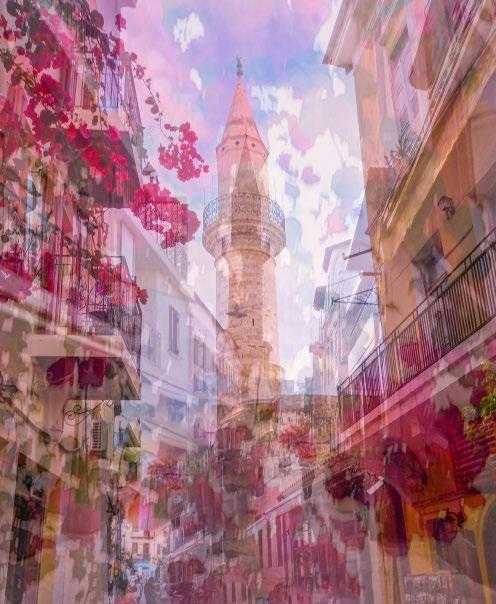
Cheryl Hamer now lives in Crete and finds it an impressionist photographer’s paradise. In her article, she describes her journey from originally taking sharp, classical landscape images to making her images deliberately soft, blurry and impressionistic. In the early days, she was told by camera club judges that she was ‘Doing it all Wrong’. She now uses her mobile phone to capture her images and enjoys the stunning old architecture in the towns and villages, and the beautiful light and colour in her new-found ‘paradise’.
Martin Addison is a very prolific photographer and ‘sees’ images everywhere. In his article he goes through how he creates images using camera movement to create blur. These are sometimes of mundane subjects, but they can produce interesting results using his favourite technique, the
interested in the challenge of working with film and was very pleased to be able to lend my now unused film camera in the hope that this may develop and perhaps lead to the RPS gaining at least one more member in the future.
Do show this Magazine to your photographic friends and encourage them to join us. And please also provide our secretary, Carol, with material for the VA Newsletter. The Group exists solely for the benefit of its members. As ever, I hope you continue to enjoy membership of the Visual Art Group.
Best wishes, Mark
multiple exposure function. He now uses his iPhone with the PhotoSplit app and can be creative wherever he goes, from the theatre to walking round a museum. He encourages us all to ‘give it a try’.
As Polina Plotnikova’s photographic journey progressed, the first subject she fell in love with was flowers. She believes that if you are passionate about your subject, you will be able to uncover something unique and put your own mark on the subject. This may be done using different styles and techniques and, although it is a personal choice, Polina favours a more impressionistic and creative approach in her photography. She encourages us not to stand still but to keep experimenting in our chosen area.
I would like to thank our designer, Jacqui, for putting together this wonderful magazine. Many thanks also to our contributors for sharing their thoughts on their own photography and sharing their images and the techniques used in creating them.
Linda
LINDA WEVILL FRPS
Journey With My Wheelchair
BIZZIE FROST FRPS
From the day I joined the Royal Photographic Society, I aspired to becoming a Fellow. I secured my LRPS in June 1994 and, on completion of a BA (Hons) (Photography and Multi-Media), I was awarded my ARPS in October 1998. Nothing could have prepared me for what was to become the subject for my Fellowship two years later.
In January 1999, I had a back operation in Jeddah, Saudi Arabia (where we were living) to remedy the rare condition of a herniated disc in my thoracic spine. This left me paralysed down my right side from my waist. After a year of spinal injury rehab, I could walk with crutches
and use a wheelchair when going longer distances.
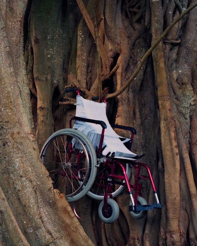
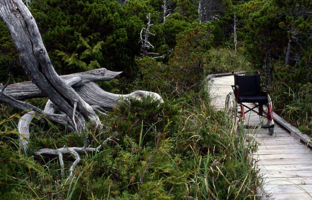
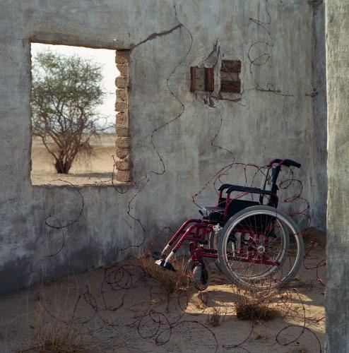
In April 2000, we went on a Nile Cruise with our teenage son and daughter and my husband’s parents. It was the second time I’d done this trip, and my third time visiting Luxor, my favourite archaeological town. When visiting one of the ancient temples, I was feeling downhearted because I couldn’t stroll around the ruins taking photos as I’d done in the past, and the flagstones were too uneven for my wheelchair. Instead, I was stuck in one place. I positioned my wheelchair in a shaft of light with a background of a high wall and giant pillars covered in
hieroglyphics. I took a single photo, not realising its significance.
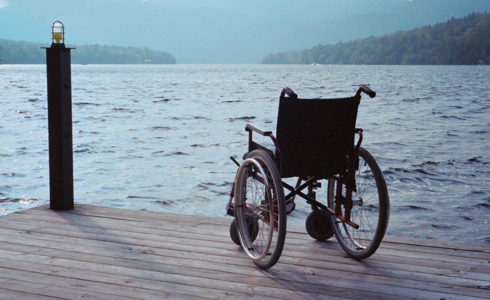
A few months later, when visiting my brother on Vancouver Island, I met an artist and we got talking about our work. I told him about the wheelchair shot, and he said, ‘You’ve got a great theme there – the symbolism of the wheelchair in among the ruins.’ For the rest of that holiday, which also took us to Lake Placid in Upstate New York, I took photos of my wheelchair in all sorts of different settings. My ‘Journey with my Wheelchair’ project had begun. Once back in Jeddah, my search for dilapidated settings began in earnest.
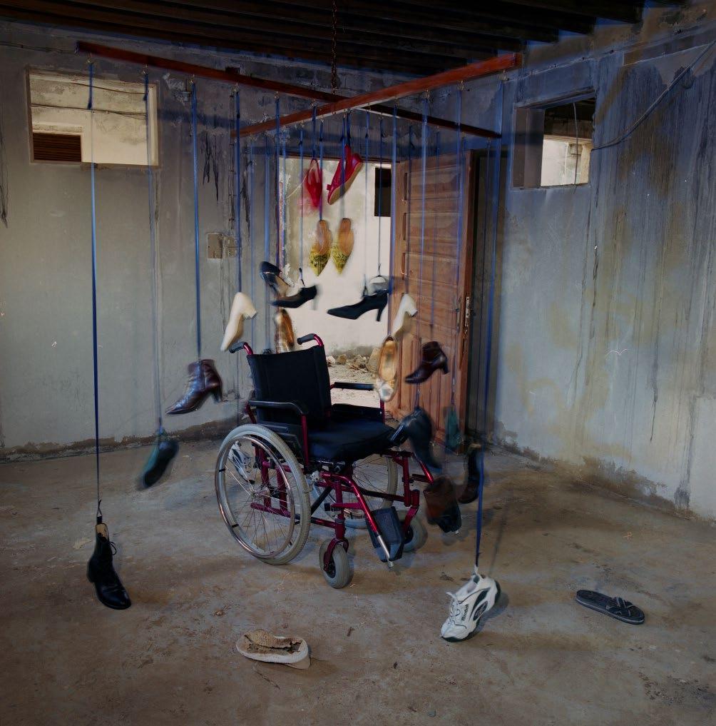
I discovered a derelict compound that had once received an architectural award for innovation because the houses were made from old containers. I got permission from the owner to go there whenever I wanted and I discovered a fascinating source of settings for my project. My husband was a vital assistant for several reasons - in Saudi Arabia, I wasn’t allowed to drive, and I needed him to carry things for me and to help set up the scenes once we were at my chosen site. Once, when he was away, my daughter came with me, in a taxi, to help set up one of my shoots.
My mind went into overdrive as I visualised how to translate the physical and emotional trauma of the spinal injury into images: the ‘clipped wings’ and restrictions on my movement; my exclusion from sporting activities; a sense of the crushing of my personality; feeling like an old lady, or a child, as I was pushed in my wheelchair by various friends and family; the burning neuropathic pain; the nightmare of a condition that was with me for life; the anger; the struggle to find my way as to who I had become; the mourning for my lost, healthy body and the ‘me’ that I’d been; my high-heeled shoes
and boots I could no longer wear; and finally, peace and acceptance.
Prior to doing my degree at the University of Westminster, I’d been a freelance wedding and portrait photographer in Jeddah, with some industrial photography thrown in.
I was already experienced at processing and printing black and white and colour images, but if I hadn’t done the photography degree, I wouldn’t have known how to approach this
FRPS project. I’d learned about representation and symbolism, how to ‘read’ photographs, and how to construct images.
I was fascinated at how my mind came up with the ideas: the craziness of spray-painting coils of barbed wire bright red; getting my husband to find some carpenters to make a large frame for a giant mobile from which to hang my shoes, like a bizarre children’s playroom mobile; bashing 42 five-inch nails through a square piece of plywood and putting it on my wheelchair in place of the cushion; lighting candles,
as you do in a church to remember someone who has died. The project was exciting and mentally absorbing. For two shots, we drove 100 kilometres into the desert. We felt sure that my back problem had been set off by a car accident we’d had in Nairobi in July 1998, so I wanted a car wreck for the opening shot. In Saudi Arabia, car wrecks were left in the desert where they’d crashed. I also wanted to shoot one scene in a derelict building where sand had encroached over time. Some images were taken during a visit to my husband’s parents in Kenya, in the old stables, and one on a huge old fig tree. When I shot the final image of the series, that was it. The ideas dried up.
My mind literally shut the door on the project.
Most of the images were taken with my Hasselblad 503 with 100 ISO Kodak negative film, with the camera on a tripod – I was using a shutter speed usually below 1/60, and the f-stops F11 or smaller for maximum depth of field. Although the pictures are in colour, they all have a monochromatic feel. The excellent printers at Samir Kodak lab in Jeddah printed the images to 12 x 12 inches, or 16 x 12, and then I took them
to the UK and cut the mounts myself. They were accompanied by excerpts from my diary and a hanging plan.
I sent my submission to the RPS in a huge portfolio, and waited. It arrived back some weeks later and my heart sank – until I saw the letters FRPS after my name on the address panel.
BIZZIE FROST
Since then, I’ve often wondered if I would have had it in me to come up with a Fellowship panel if I hadn’t had that back operation. I feel very lucky that I was able to convert this devastating event in my life into creative success.
www.bizziefrostphotography.com
Flower Photography: Seeking A Path Closest
POLINA PLOTNIKOVA FRPS
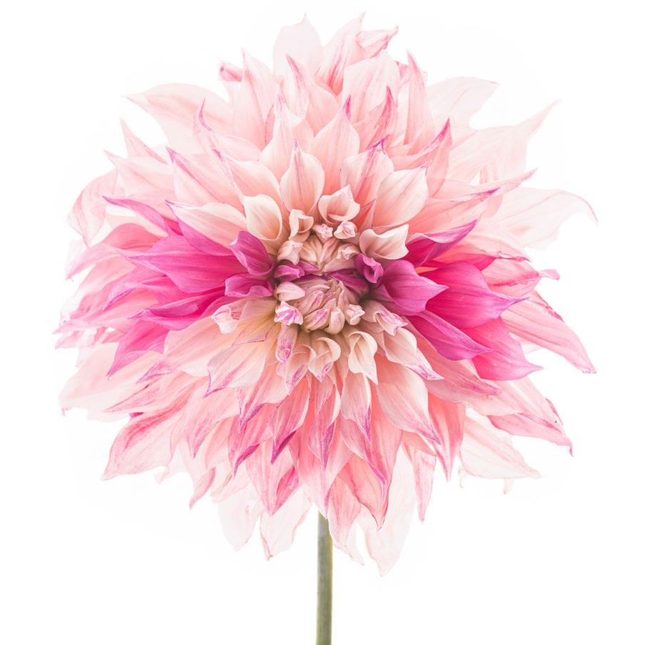
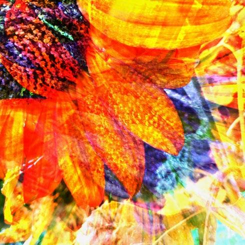
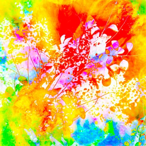
Flowers were the very first subject I fell in love with as my photography was gradually becoming something more than just a hobby. Flowers have been significant in different cultures and historical contexts, inspiring artists to explore themes related to rituals, traditions, and historical art movements. Flowers are rich in symbolism and emotional associations; for instance: roses for love or lilies for purity. Artists have often used these images to convey deeper symbolic meanings or moods in their work.
I am forever fascinated by the process of uncovering something unique and special about every single bloom I am photographing. Defining what draws me to one or the other style or technique is often a puzzle even for
To Your Heart
myself, as I seek a source of inspiration both observing the nature and drawing from my academic background in studying history of art. Finding your own voice in your chosen photographic subject is a tricky task these days; we all have almost instant access to photographs from all over the world, and, as you browse through seemingly endless images, it might look at times that everything has already been done. But I strongly believe that if you are passionate about the subject, you can always put your own mark on it.
They often say that a photographer is either a ‘picture taker’ or a ‘picture maker’, and this certainly applies to flower photography.
I think it helps to have a clear idea in your mind of the approach that would work best for you. Some photographers want to produce an accurate record of a flower’s beauty (a ‘record’ shot), while others are more interested in conveying their emotions through various creative techniques. For me, there is no right or wrong approach here.
Flower images of a ‘picture taker’ are often similar to botanical illustrations: they are scientific and educational, focusing on accurate and detailed representations of a flower’s structure, often including roots, stems, leaves, and reproductive parts. They are used for many practical purposes, for instance to document plant species for identification and study. Muted, natural colours are often used to reflect the actual appearance of the plant.
Flower images of a ‘picture maker’ - what you might call creative flower photography - are artistic and expressive, aiming to capture the beauty, emotion, or unique perspective of a flower.
It often emphasises the mood, lighting, and composition over strict botanical accuracy. The resulting images can be abstract or highly stylized, with a focus on aesthetic appeal. Photographers might explore the use of exposure, colour saturation or depth of field, and try various vantage points to create a particular mood or visual effect. With a more creative, unrestricted approach, you can use lighting and perspective
to create a dynamic image, focus on a single aspect of the flower, such as its petals or colours, to evoke a specific response from the viewer. The choice of techniques is vast!
As is often the case with artists working in all kinds of areas, flower photographers typically get their inspiration from various, sometimes quite unusual, sources.
Among my personal favourites are images of the artists of the past; I find many fascinating details in the oil paintings of Old Masters and Impressionists. Other art movements, such as Romanticism or Surrealism, also often evoke specific moods or atmospheres that resonate with me. I find that photographers can channel these styles to create images that not only capture the beauty of flowers but
also convey a deeper emotional or symbolic narrative.
Thanks to highly advanced modern technology - both photographic equipment and computer-based image processing - there is so much that can be done with so little effort! You can do an awful lot with special effect lenses and filters, or you can mimic the textures and brushstrokes seen in different painting styles. For example, soft focus or intentional blurring can replicate the delicate, fluid strokes of watercolour paintings, while sharp contrasts and exaggerated textures can evoke the boldness of oil painting. Techniques like emphasised bokeh or selective focus can be used to create a painterly effect, giving the photograph a tactile quality reminiscent of a painted surface. Classic painting composition
techniques, such as the Rule of Thirds, Golden Ratio, or leading lines, can guide photographers in framing their shots for maximum impact.
Nature is obviously a great source of inspiration for both ‘picture takers’ and ‘picture makers’. Flower photographers often draw inspiration from the changing seasons, capturing flowers in different stages of bloom, colours, and environments, from spring blossoms to autumnal decay. The interplay of natural light and shadows on flowers
can inspire unique compositions, highlighting textures, translucency, or creating dramatic contrasts. The intricate shapes and patterns of flowers, from the spiral of a petal to the symmetry of a bloom, inspire abstract and macro photography that focuses on details and forms rather than the whole flower. Personal memories or experiences associated with certain flowers can drive a photographer to capture their essence in a way that reflects their unique relationship to the subject.
POLINA PLOTNIKOVA
I favour a more impressionistic and creative approach in my photography and prefer to explore in-camera techniques rather than extensive post-processing. But it is a very personal choice.
Artists like Claude Monet and PierreAuguste Renoir focused on capturing
the effects of natural light and the changing atmosphere, often painting outdoors to observe how light interacted with their subjects.
Flower photographers can use a similar approach by paying close attention to natural light, shooting during the Golden Hour (early morning or late afternoon) to capture the soft, warm light that enhances the colours and textures of flowers. Additionally, using backlighting or diffused light can create a luminous, ethereal quality reminiscent of Impressionist paintings.
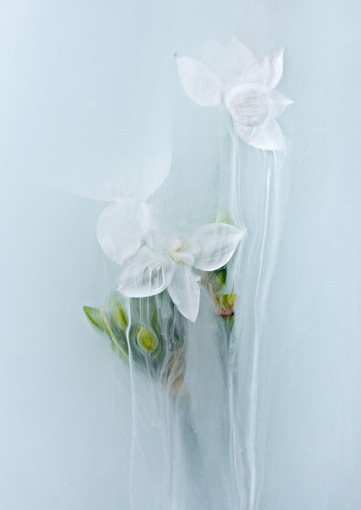
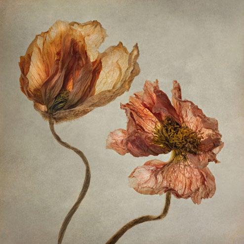
Using slower shutter speeds to capture the gentle sway of flowers or the movement of petals can introduce a sense of dynamism. Intentional camera movement gives you a unique combination of controlled result and serendipity in the final image. Vintage lenses would render light and sharpness in their own unique way and selective focus can guide your viewer’s eyes to the elements you deemed significant. Choosing decayed withered flowers as your models would challenge traditional perceptions of beauty but can create more visually striking and emotionally resonant images. I often find it rewarding trying to push the boundaries of traditional floral art by placing flowers in unconventional environments, including water, and introducing various added acrylic paints, milk or waterbased ink. It is a unique and creative technique that can produce stunning, ethereal images.
Ultimately, I feel that it is very important to not stand still admiring your own work, but to keep experimenting, to seek your own path or style that is closest to your heart.
www.polinaplotnikova.com
Doing It All ‘Wrong’!
CHERYL HAMER
It all started for me back on 26 February 2014 on a windy beachfront in Wales. I was there for the sunset and Golden Hour to, hopefully, get some classic seascape images. In truth, though, I was a bit bored. I had the feeling that I’d ‘been here and done this before’, and I’d had that feeling on several other occasions too. So, I was idly scrolling through my camera menus to pass the time - no idea what I was looking for, but I came across something called multiple exposure. I spent the next couple of hours playing with it as huge waves rolled into the beach, and that was it, I was hooked. It’s been difficult for me to take a ‘straight shot’ ever since that moment!
I was entranced by the subtly different images this facility could create - the gentle frothing and foaming of the waves just captivated me. Little did I know what a world of creativity was awaiting me.
Of course, at this point, I really was ‘doing it all wrong’ - making images deliberately soft, blurry and impressionistic. It was most definitely not ‘in’ and I got many caustic comments from camera club judges.
Nevertheless, I was hooked and simply couldn’t stop, so I decided that competitions were not for me and that I would just do my own thing. I turned pro at a similar time and began to teach these techniques as well and the popularity of these workshops grew over time.
At that point I was using a Canon 5D - shortly followed by the ‘R’ when it came out. Lots of years of happy shooting; playing and experimenting followed - you can probably imagine the number of ‘duff’ shots I got! Nevertheless, amongst the rubbish were some super images that I was really proud of. These cameras would let me take up to nine frames, which
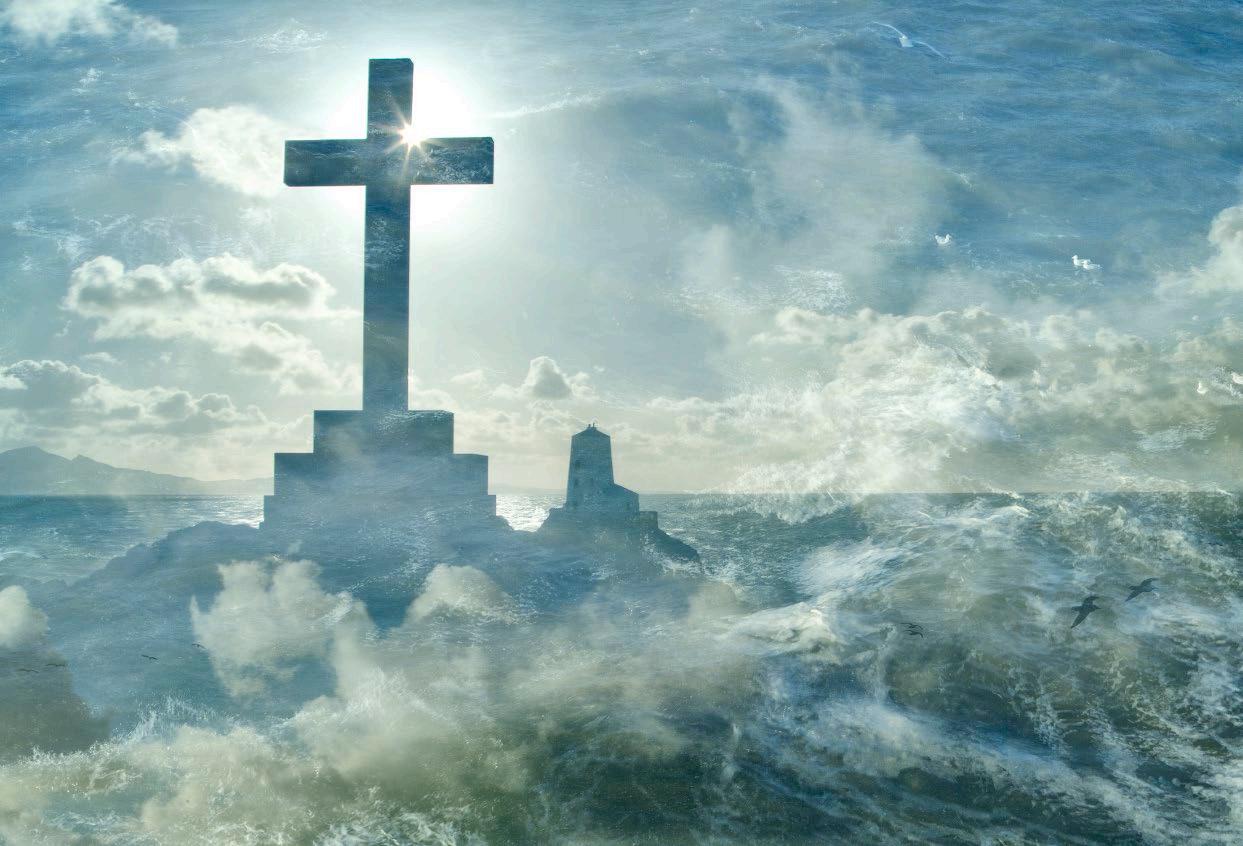
were then combined in-camera, and I used to take full advantage of that and usually used the full nine. I worked out that I could control the opacity of the in-camera layers by doing more frames of one thing, and less frames of another - see Shot 1. I took most frames of the cross and lighthouse, followed by less of the white waves on the sea, and the fewest of some fluffy clouds in the sky. Obviously, you can do other things like change the exposure level, white balance, or focal length, between frames too. My aim is always to make my images in-camera, not in post-processing, and I’m always trying to capture the ‘essence’ of a place and really add to the atmosphere of the setting. So, although I want my images to be an ‘impression’ of a place, I also want them to be recognisable. It’s for this reason that I rarely use in-camera ‘blend modes’ because my experience is that, more often, they will result in an image becoming more abstract and less recognisable - and that’s fine, but it’s not what I’m after!
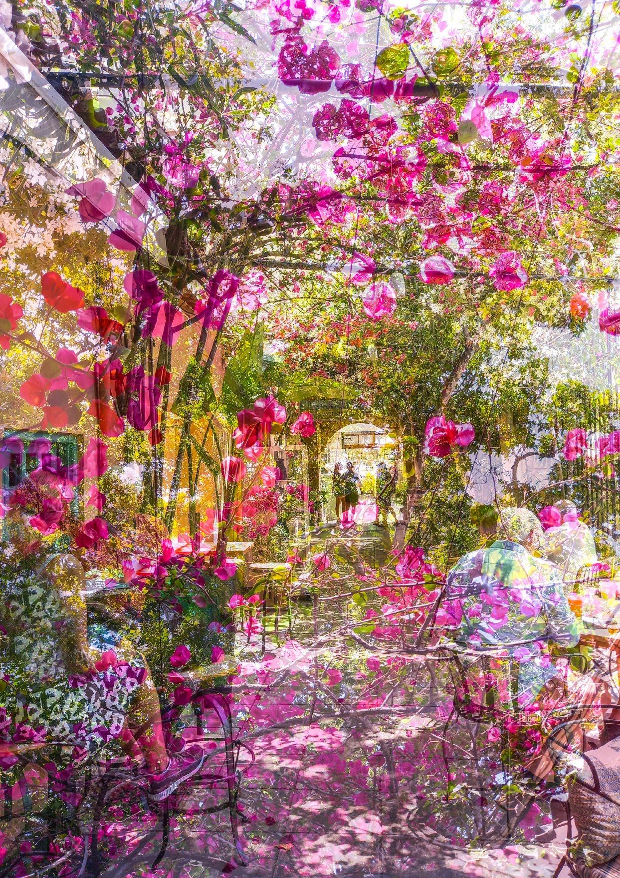
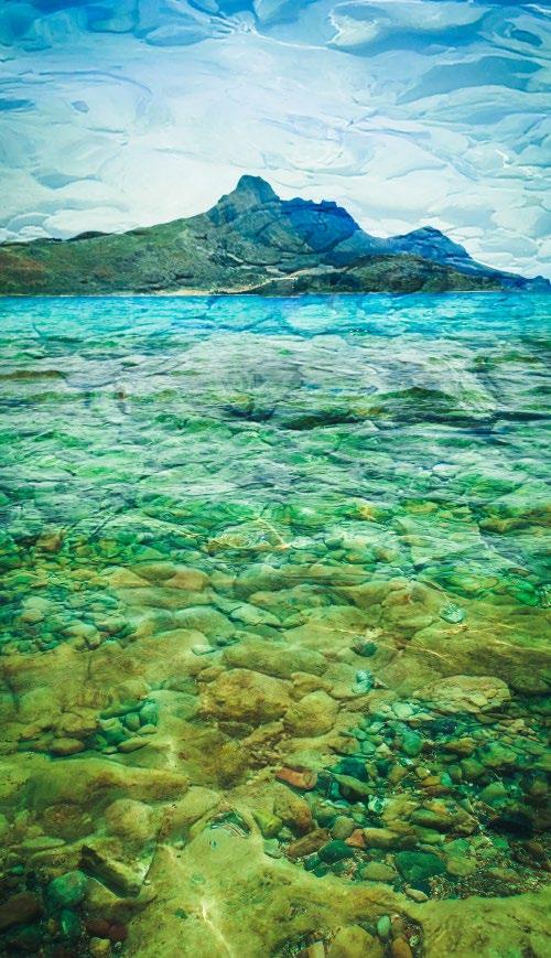
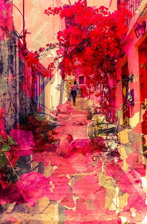
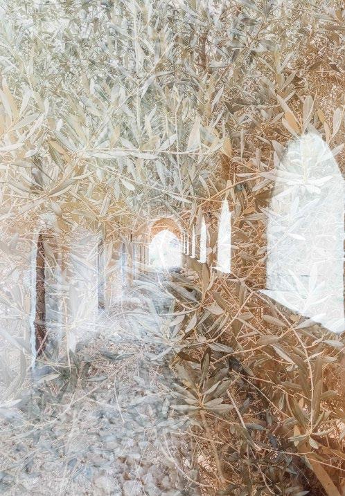
So, fast forward ten years and I’m a retired photographer who now lives in Crete, and I have found that this place is an impressionist photographer’s paradise.
Life often ‘throws us curved balls’, though, doesn’t it, and shortly after I arrived here in 2020, I found that I had pretty chronic arthritis in my hips and spine, which meant that carrying even the smaller and lighter ‘R’ was really difficult. Necessity really is the mother of invention though, as I relied more and more on my (Android) phone and then discovered a number of apps that enable me to do multiple exposures on it. So, I was well away again and all fired up to create some impressionist images of my new home.
There is so much to inspire here; obviously the light is gorgeous (see Shot 6) and so different from the UK. It really took some adaptation to find out what would work and what wouldn’t. There is colour everywhere, which is wonderful for me as I have always loved
Shot 4
Shot 3
Shot 8
Shot 7
Shot 6
Shot 5
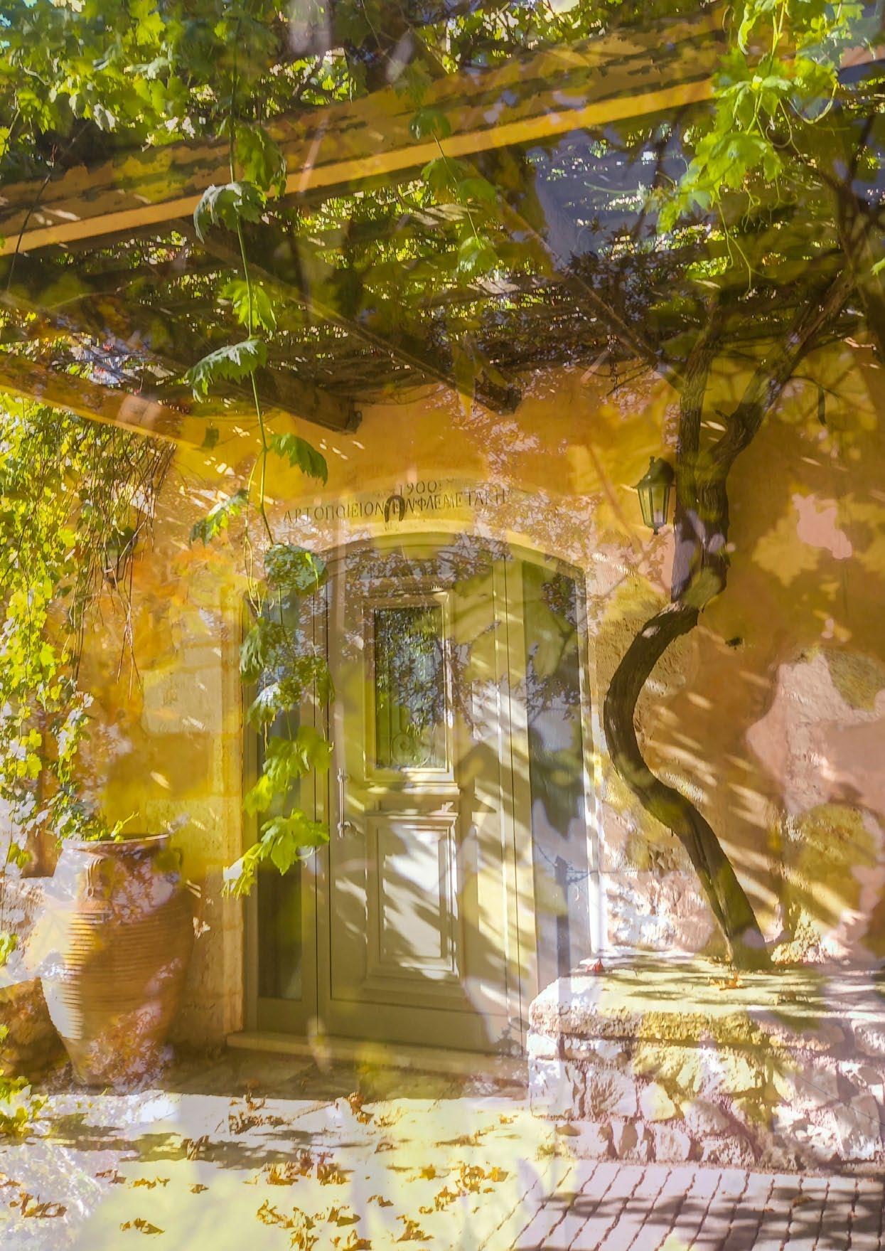
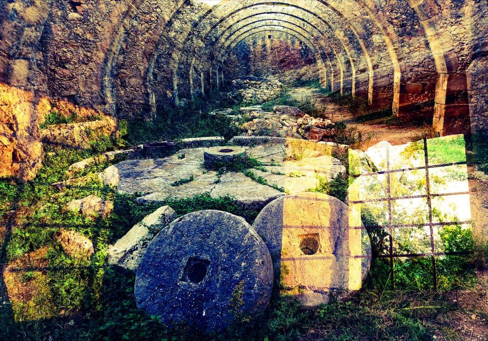
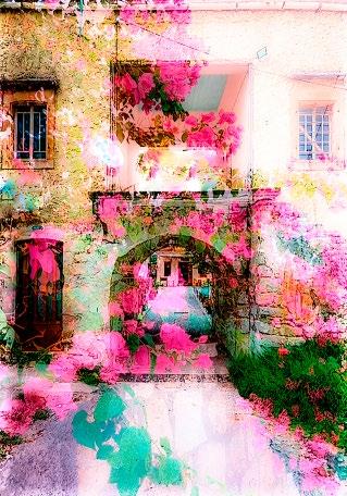
it - and I don’t just mean the ubiquitous blue! There is some stunning old architecture in the towns and villages (see Shots 2 ,4, 5 & 10) and lots of lovely dereliction too (see Shot 9).
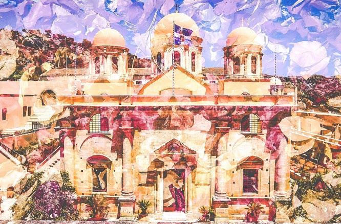
I particularly love the Greek arches, lots of those everywhere, especially at the monasteries; I can’t get enough of the latter, not only are they beautiful but also wonderfully tranquil, just the kind of place to get the old creative juices flowing (see Shot 3)!
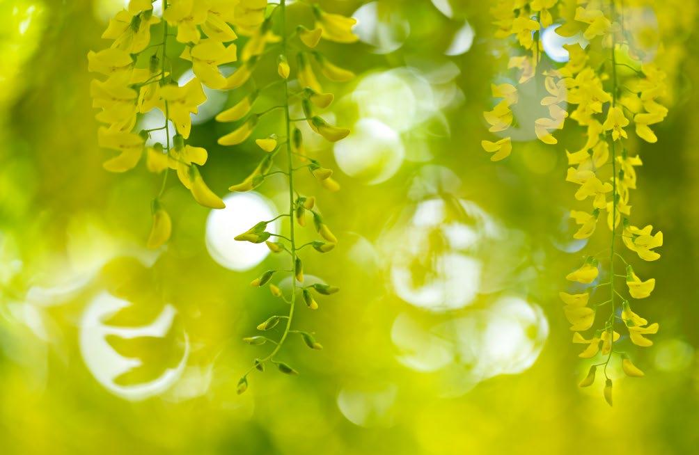
Flowers in profusion (see inside front cover & Shot 7) - even in winter - and of course olive trees everywhere. The latter are surprisingly difficult to photograph and my favourite image depicting one is a mixture of an olive tree with the colonnade of a monastery - two for the price of one (see Shot 8)! I make no apology for the fact that I am always simply striving to create something beautiful - no hidden
messages or social commentary; just a photographic ode to beauty. Hopefully that will give some people pleasure and that’s more than enough for me.
In some ways, mobile phone impressionism is easier than working with a camera, because they enable you to control the opacity just by the means of a slider. I still do all my images ‘live’ as I go along, because to me that is photography, although you can now get apps that will enable you to combine images from the comfort of your armchair when you get home. That’s not for me, though, so if you fancy giving it a try, live on location, I use ‘BlendCamera’ but if you have an iPhone you will need ‘PhotoSplit’ or ‘DoubleExposure’ (for the latter search in Google etc., as it’s quite hard to find on the app store).
It takes a lot of practice but is so worth the effort when you begin to produce images that are uniquely yours - and you have such a lot of fun in the process.
www.cherylhamer.com
Shot 10
Shot 9
Time and Looking
JOSÉ CLOSS
The pleasure of looking
Stopping work in 2017 gave me the luxury of more time simply to look. Not having to rush, taking as much time as I like to consider what I’m seeing, has been a huge and unexpected pleasure. Unprepossessing sights in cities, even litter, can present intriguing and sometimes beautiful images.
This ‘seeing past the obvious’ was expressed clearly by David Hockney: ‘you’ve got to look – most people are not looking. I love looking, I get intense pleasure from my eyes.’
I would echo this along with his additional thought: ‘I believe that the very process of looking can make a thing beautiful.’ His ability to see and represent colours, and his repeated painting of the same scenes during different seasons, has nudged me into looking differently at my world.
To plan or not to plan?
Most mortals, whose day jobs don’t involve photography, have limited time to create images. Consequently, we tend to capitalise on whatever events, light and weather conditions present themselves. Conversely, professional landscape photographers identify the exact location, season and time of day which will be optimal for their image in advance, typically sunrises and sunsets.
This, no doubt, is a successful approach, but one which reduces spontaneity and the possibilities of serendipity. It also focuses attention on the anticipated specifics of an imagined image, which might interfere both with seeing what is actually there and the possibility of different interpretations of what is there.
My approach to photography is pretty much the opposite of detailed planning.
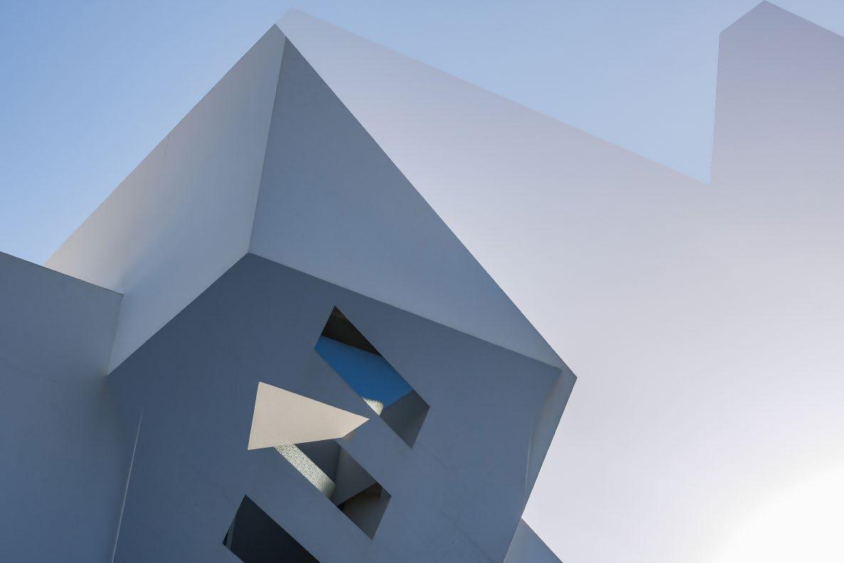
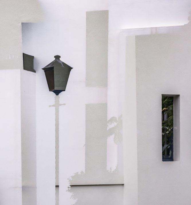
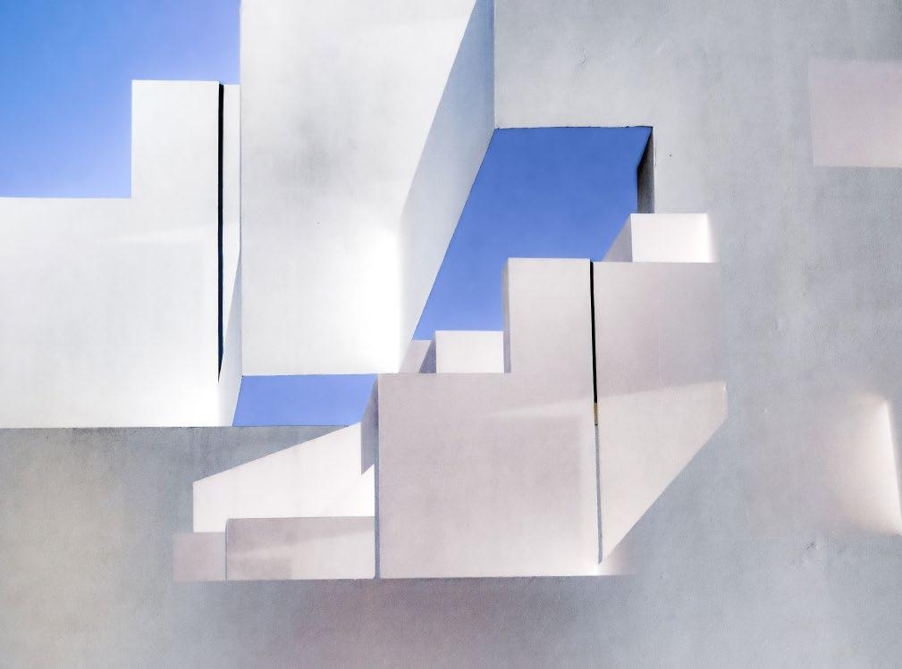
I have a general idea of what is ahead, but with the delicious anticipation of possible surprises and the ability to head off at tangents responding to whatever grabs my interest, whenever it does so. An example of this was an unplanned
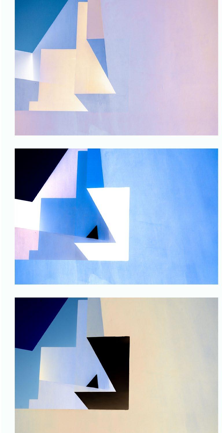
Image 3
project that developed during a trip to Lanzarote. I had expected to focus on the remarkable volcanic landscape and the colourful calderas, in particular. However, I became beguiled by something simpler and rather more mundane. My home for a week was in Puerto Calero, a coastal village with mostly low-rise buildings, painted white.
The light on the buildings changed dramatically throughout the day and, at first glance, was a dazzling array of blue sky, white stucco and strong shadows.
Closer attention showed the subtlety of colour, with wide ranging soft and pastel hues (e.g., Image 4). I visited and revisited nearby buildings at different times of day as colours and shapes continually changed, sculpted by light and shade.
Adding a bit of myself
Perhaps the aspect of other
Image 4
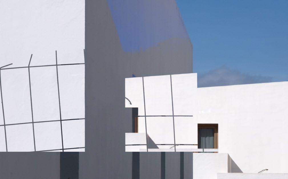
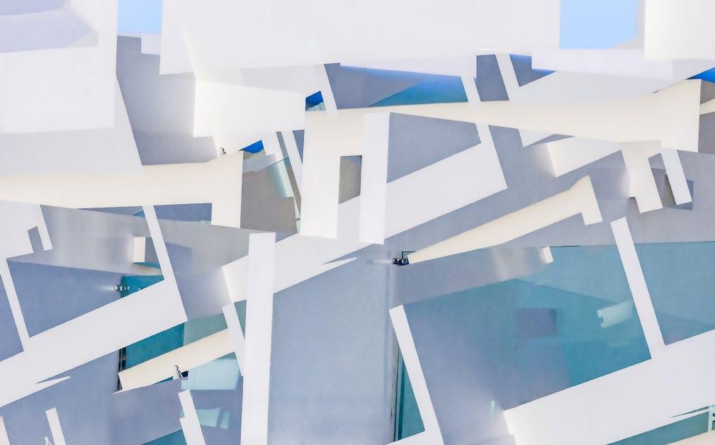
photographers’ work that I most enjoy is their individual interpretation of something seen, particularly something familiar seen differently. My own work feels like a failure unless I manage to add a bit of myself to it. In Lanzarote, I attempted to mould the images through my enjoyment of geometric shapes and attempts to capture the essence of what I was seeing. This was done through single images and both in-camera and Photoshop double exposures to meld the shapes and colours together. I started out by including clearly recognisable images of the details in the street, such as lamp-posts, fences and windows (Images 3 & 8). Hotel balconies (Image 9) were intriguing with their multiplicity of lines and angles. Although most of the time the sky was clear and blue, there were occasional clouds that added to the interest (Image 1). As the week went on, I became more interested in the abstract shapes which appeared and disappeared as the sun moved around the sky (Image 2).
I have been influenced by artists more than photographers, and particularly Maurits Escher, Andy Goldsworthy and, as already mentioned, David Hockney. They have changed how I view natural and artificial geometry, and colour.
I tend to use Lightroom rather like a child’s paintbox, although for most of these images the emphasis was more on composition than colour management. However, I had enjoyed the subtle colours in the clean Atlantic light and extended my thinking to making some additional images from the raw materials I had. One of these was a triptych constructed from one double exposure (Images 5, 6 & 7). Each version of the same image
Image 5
Image 6
Image 7
JOSÉ CLOSS
was modified using the colour palette I had been immersed in.
So, in conclusion, fascination with a photographic subject, for me, tends to evolve around my direct response to what I see. Having time to look carefully at what is in front of me makes
it possible to portray at least some of it through what my internal (mental) filters have imposed. I hesitate to call it art, a loaded term with many meanings, but will finish with a quote from Edgar Degas: ‘Art is not what you see, but what you make others see.’
www.josecloss.co.uk
Firing the Imagination
MARTIN ADDISON FRPS
For as long as I can remember, I have loved creating images which either cannot be seen without the use of a camera or which appear to be something other than the subject photographed. Going in close to a subject can give it a semi-abstract appearance and, at first glance, the viewer may be misled until a closer look confirms the subject matter. A good example is a photograph of a texture which resembles a landscape.
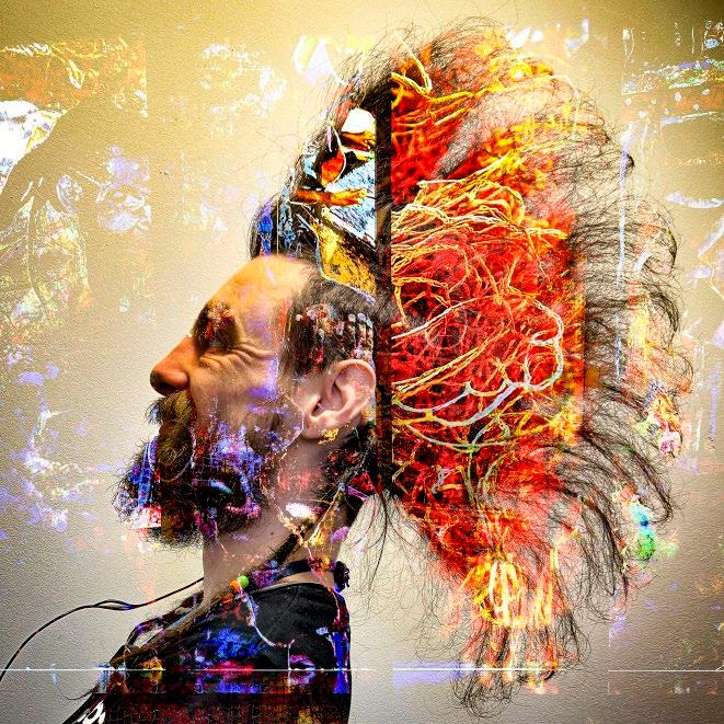
Other ways to break away from a more factual appearance is the use of very shallow depth of field with just a few points in focus and, of course, by using camera movement to create blur. Another method is to use multiple exposure, which is a particular favourite technique of mine and is the subject of this article.
I first started using multiple exposure in the 1970s using film, of course. It was difficult then as most cameras did not offer the facility, so it involved some rather hit-and-miss methods of not winding on the film or exposing a roll of film twice.
When I managed to buy a camera with the ability to create multiple exposures, things got a little easier although there were no previews, so you had to remember what you had taken and where the key items were placed in the frame.
There were other ways to combine images, by projecting two or more slides on to a screen and rephotographing the result. Another way was to bind two images together in a slide mount, making sure that both
were over exposed to get a satisfactory result.
I also printed several images on to one piece of paper using the Cibachrome colour process. This was made more difficult as it had to be done in total darkness with no safelight. I did enjoy this process and, on one occasion, printed sections of 13 slides on to one sheet of paper.
I also achieved my FRPS with a set of prints created in this way using slides and Cibachrome.
With the digital age and the arrival of Photoshop, everything opened up. The use of layers allowed precision placing with an unlimited number of images. I had so much fun in those early days of Photoshop allowing my imagination to run free - looking back, probably too far, but that’s how you learn things.
Digital cameras came along and that made it easier, with the ability to see the image building up in the camera. Different cameras allow different ways of doing this and for a long time I used a Nikon camera which allowed ten exposures. I eventually moved over to Sony full frame cameras for a smaller
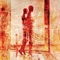
This man was on the door of a theatre when I attended a concert, so a quick snap of him, combined with images of a stained glass panel in the same theatre taken a few minutes earlier. A series (of about 12 images) was made while I waited for the concert to start.
and lighter option. What is really annoying is that two upgrades later Sony removed the facility and so I can no longer use my camera for this. How infuriating is that!
I can, of course, do this in Photoshop, but I have moved away from making images in the computer and much prefer creating my images in-camera
which, for me, is more intuitive and also far more enjoyable.
So now I create my multiple exposures in my iPhone, which allows me to be creative whenever I have a few minutes to spare and no matter where I am. I use an app called ‘PhotoSplit’, which is Apple only.
Although PhotoSplit has not been updated for a long time, it still offers
a huge amount for the creative photographer. The number of exposures is unlimited, they are simply added on top of each other. Once the exposure has been made, it is possible to move the image, enlarge, rotate or make it smaller and to adjust the opacity of the exposure on top. You can also choose one of 16 different blend modes and, if necessary, delete the exposure.
There are two ways of using PhotoSplit. The way I mainly use it is to do everything at the time I am taking the
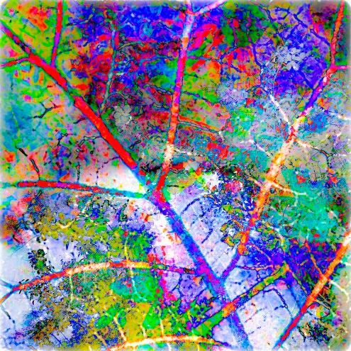
Four variations using leaves as the subject. No colours have been added here or in any of my images - they are the result of various blend modes at the time of taking.
photographs. I like this as it gives me a great deal of spontaneity and I can alter the direction of the result as I take the photographs. The other way, is to take the photographs with the usual phone camera and blend them together at a later date. The advantage of this method is that you have more time to consider each step and may have a greater variety of images on your phone. You can, of course, combine both methods.
Going past the factual details of using the app, what about the artistic side, what subjects should you be trying? Well, just about anything is the answer.
One of the things I find very attractive about using this app is that you can create images literally anywhere.
To give you a couple of examples, recently I attended a talk before going to the opera and, as I was about ten minutes early, I made a series of photographs just sitting in my seat. On another occasion, I was going to a concert and the young man on the door had a very interesting haircut, so I asked him if I could take his photograph and took a couple of shots against a white wall. I then sat down in my seat and made a series of images combining
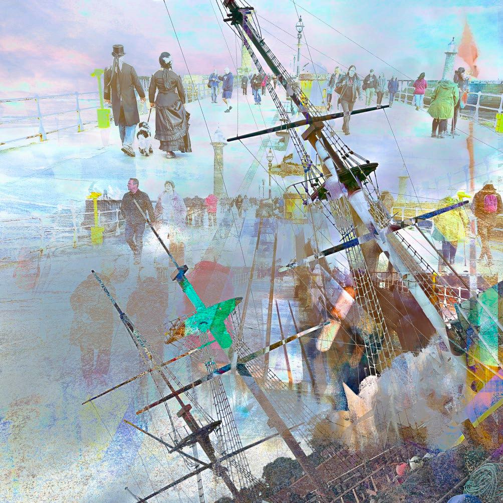
An old sailing ship in Whitby has been combined with photographs taken on the same day at the Whitby Goth Festival. I liked the ghostly appearance of the figures top left which suit the period, contrasted with the more modern clothes of many of the other people. A combination of Exclusion, Difference and Hard Light blend modes were used.
the photograph of him with some I had taken a little earlier in the theatre.
Of course, everyone thinks that I am writing messages while in reality I am being creative, which is much more interesting! On yet another occasion, I visited a Museum of Pop Culture and had a wonderful time taking a whole series of images while I walked around. During that time, I kept adding new exposures on top of each other for 105 exposures before I started a new series.
I have uploaded several ebooks to my website which show the images that make up some of my series
You might find it interesting to see how mundane many of the individual images are, yet they can produce interesting results.
So, if you haven’t tried multiple exposure, do give it a try. Check out your camera and see what it has to offer or find what apps are available for your phone.
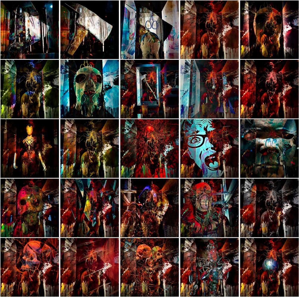
These images are part of a series I created in the Museum of Pop Culture in Seattle and specifically in the exhibition room which featured horror films. Not a genre which I enjoy, but they provided me with many strong images which I could blend as I walked through the space.
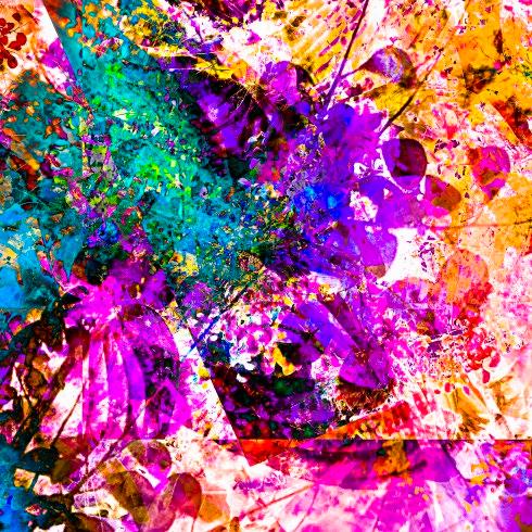
Leaves and Ferns. Sometimes a very attractive colour combination appears as a result of a series of different blend modes being used, but I find that it is impossible to recreate the steps and get the same result, which suits me as I prefer not to repeat myself.
These figures were photographed in the M&S window in Worcester while on a night shoot. This was combined with a close-up of materials from another window plus some other shapes, which I cannot now recall.
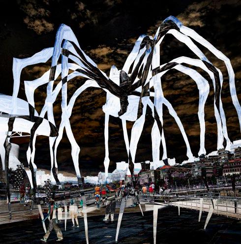
This is the large Spider at the Guggenheim in Bilbao. I used the Difference blend mode to get the negative effect and made the exposures while walking towards the artwork.
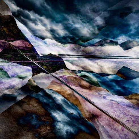
You may well recognise the mountains around Buttermere - or perhaps not. This is my interpretation of the view from the lakeside and much more interesting than my ‘straight’ images in my opinion. I used Difference and Hard Light blend modes to create this overlapping effect and I turned the phone diagonally and upside down for some exposures.
Website: martinaddison.photography
Facebook: facebook.com/martin.addison.777
Vero: vero.co/martin2233
POSTAL AND EMAIL PORTFOLIOS
Get even better value from your membership of the Visual Art Group: join a circle. Email circles are free to join, while print circles will cost you no more than postage. Meet new people keen to share their experience, to ask questions and to comment on your photographs. Get a different angle on your work from people who are neither fellow club members, nor your family! Members range from new recruits to very experienced photographers, from people who just want to enjoy their photography with new friends, to people working towards distinctions. There are print and email circles and we’d welcome a few more members. Join a circle. To join or ask for more information, just email Gill Dishart ARPS (gill@dishart.plus.com).
Members’ Print Exhibition 2024
To see the whole exhibition digitally, please scan the QR symbol above.