The Royal Photographic Society, RPS Landscape Group and the Editor accept no liability for any misuse or breach of copyright by a contributor. The views expressed in this magazine do not necessarily reflect the policies of the Royal Photographic Society or of the Landscape group.
Printed
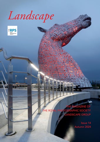
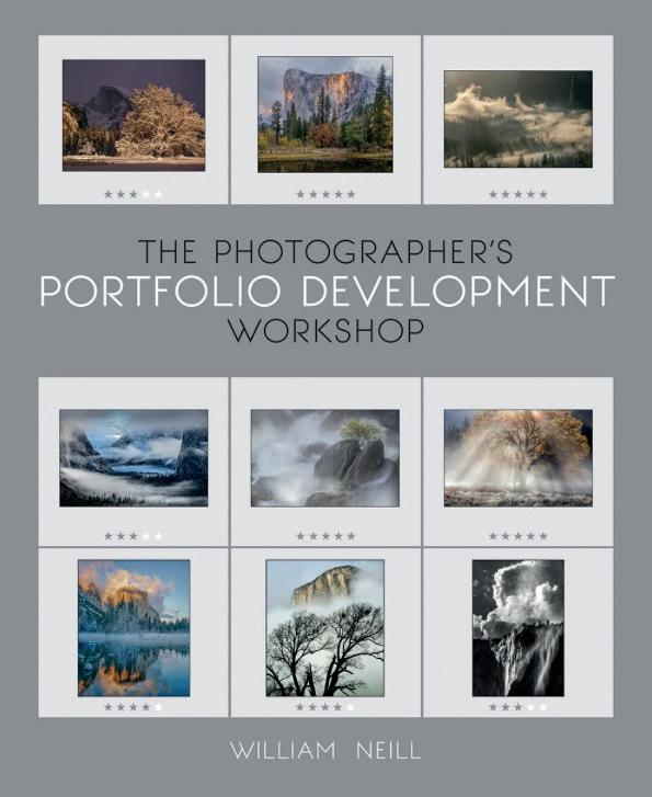
Landscape
The Magazine of The Royal Photographic Society Landscape Group Issue 14 - Autumn 2024
Regulars
4. Welcome
48. Webb Watch
Stunning images from the Webb Telescope - the ultimate landscape.
62. Inspiration
Watch, follow, read and listen – some ideas to keep your landscape photography fresh.
Professional Photographers
24. The Post Processing Page
Jonathan Vaines looks at the technique for producing perfect pastels.
28. The Nature of Landscape
Joe Cornish HonFRPS continues his series on different themes in landscape photography by looking at the Sublime and Iconic in photography.
34. An Alternative View
Martin Annand shares his sublime minimalism.
Member Contributions
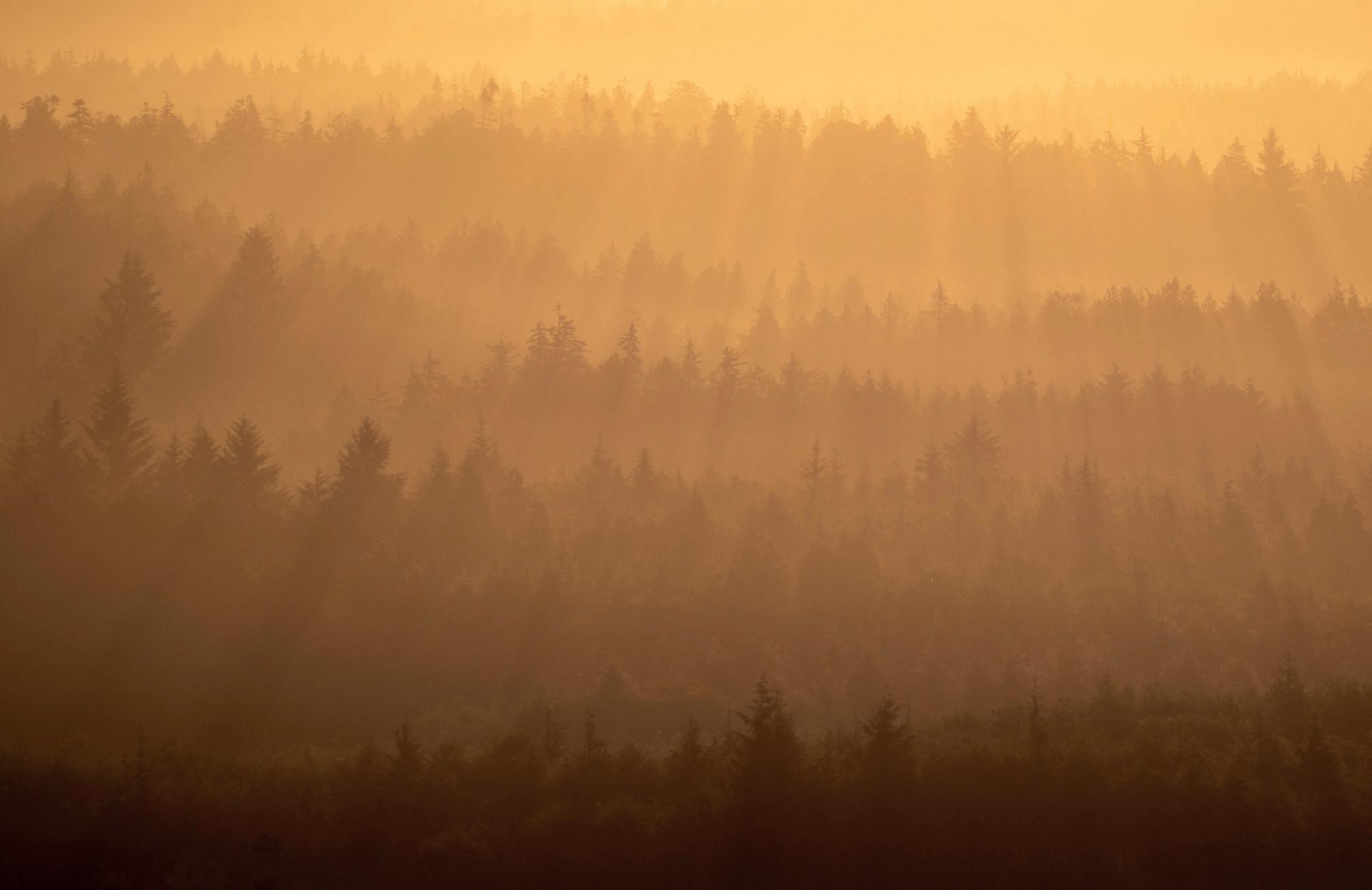
6. Where in the World? I - Ilan Jacobson
Ilan describes his travels on and around Vancouver Island.
12. Mentored Landscape Project - Jeff Underwood
Jeff describes his experiences working with Tim Daly FRPS on a mentored project in the orchards of Kent.
18. The Human Landscape – Irene Del Pino
Irene takes us on a journey along the Thames River, east of London, as it gradually widens to the estuary.
40. The Zine Project - Fiona McCowan FRPS
Fiona describes the aims and outcomes of the Zine Project and presents a selection of those produced by members.
50. Success at the RHS Botanical Art and Photography show – Richard Milton Worssell
Richard talks about Painshill Park and his silver medal winning infrared panel of images.
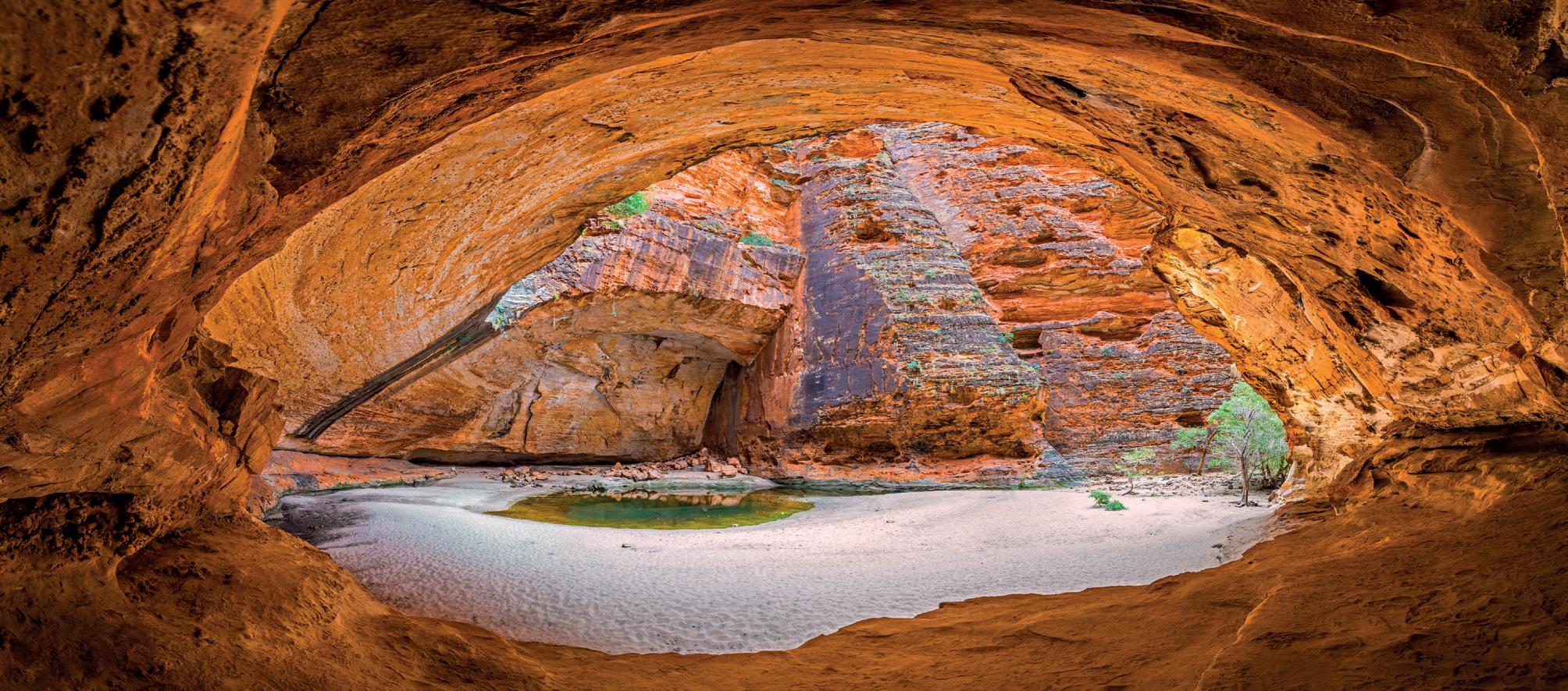
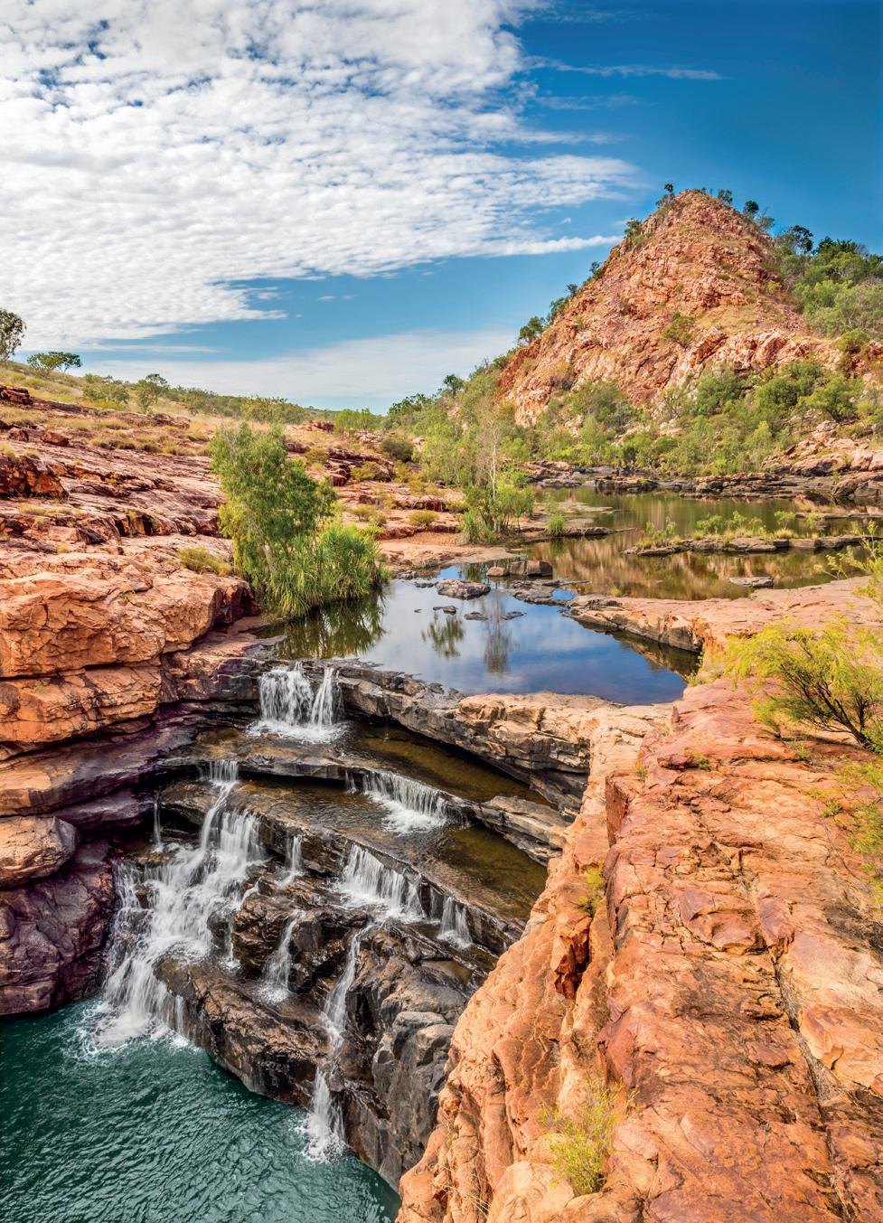
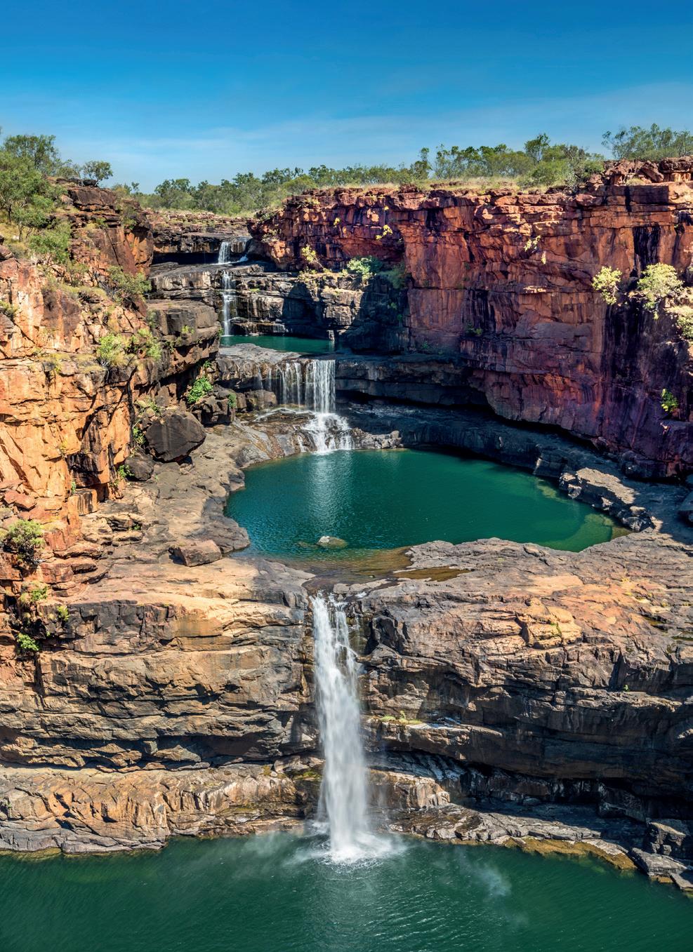
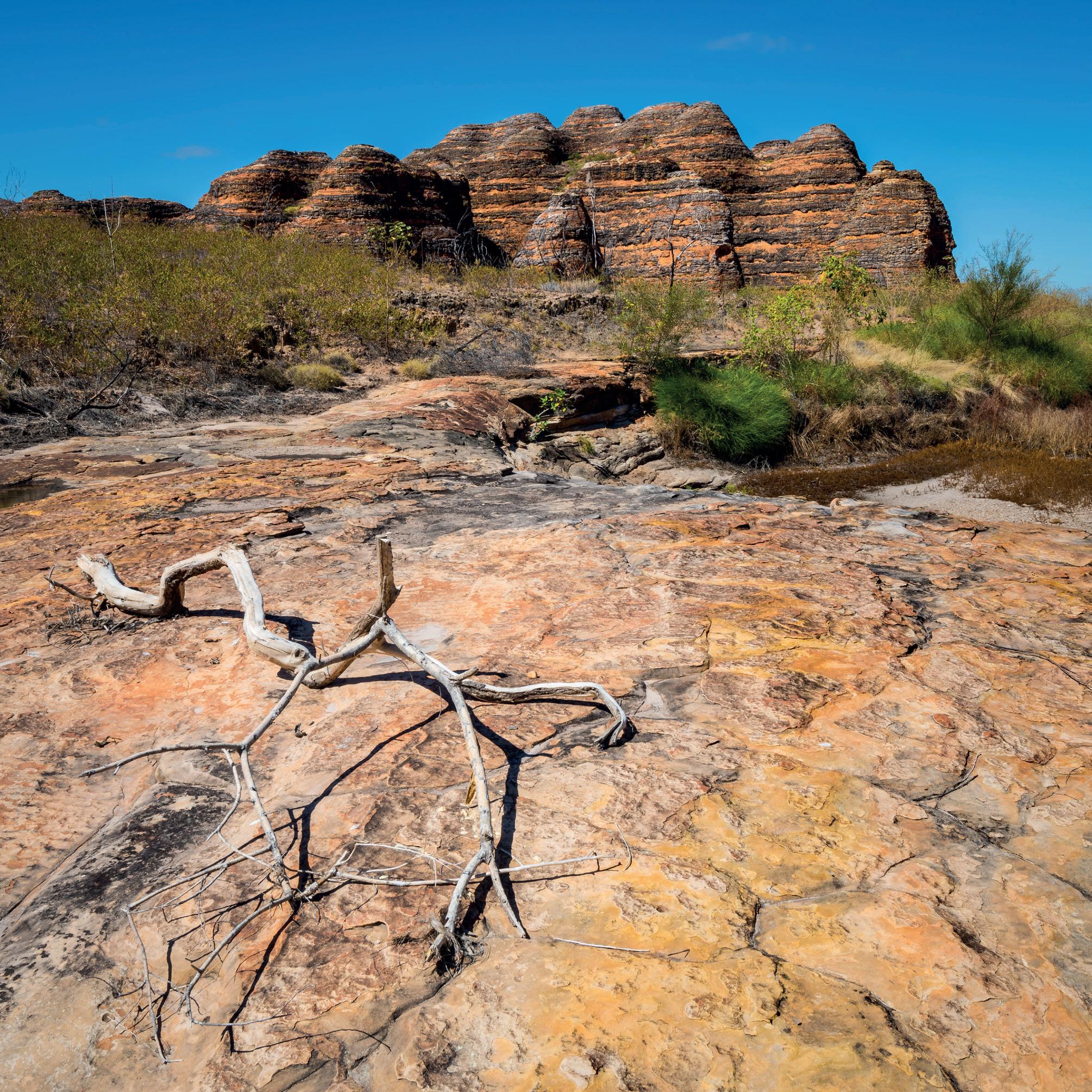
56. Where in the World II – Robin Williams FRPS and Gigi Williams FRPS
Robin and Gigi take us on a tour of a remote region of their native Australia.
Welcome
Welcome from the Editor
to the magazine of the RPS Landscape Group.
Welcome to the Autumn Edition of the RPS Landscape Group Magazine. This issue is full of new work from a very interesting group of photographers and I hope that you will find the very diverse series of images both enjoyable and inspirational. From pastel to infrared and from minimalist water to scenes of a busy, working river, we have something for all tastes.
In Spring of 2023, the Landscape Group launched its Zine Project which was met with a great response. I’m delighted to be able to feature some of the entries. These and others will be on display at the Landscape Group Conference to be held in March next year.
Joe Cornish is back for the penultimate in his series entitled ‘The Nature of Landscape’. This time he is looking at landscapes that are both Sublime and Iconic. In recognition of Joe’s current, on-going and long-term support of the Landscape Group and this magazine, the group’s committee is delighted to donate to two charities of his choice - the Woodland Trust and The World Land Trust.
Our ‘Alternative View’ this time comes from Martin Annand, whose ethereal, long exposure pastel land and waterscapes are truly beautiful. To complement his work, Jonathan Vaines, in our Post Processing page, looks at a Photoshop technique for creating pastel landscapes.
Elsewhere, our member contributions explore Australia with husband and wife team Robin
Williams FRPS and Gigi Williams FRPS and Vancouver Island through the eyes and lens of Ilan Jacobson. Closer to home, The Human Landscape looks at life on the easterly reaches of the River Thames with Irene del Pino. We feature two project success stories, with a mentored study of the orchards of Kent by Jeff Underwood and a beautiful infrared panel by Richard Milton Worssell which won plaudits in the RHS Botanical and Art photography Show.
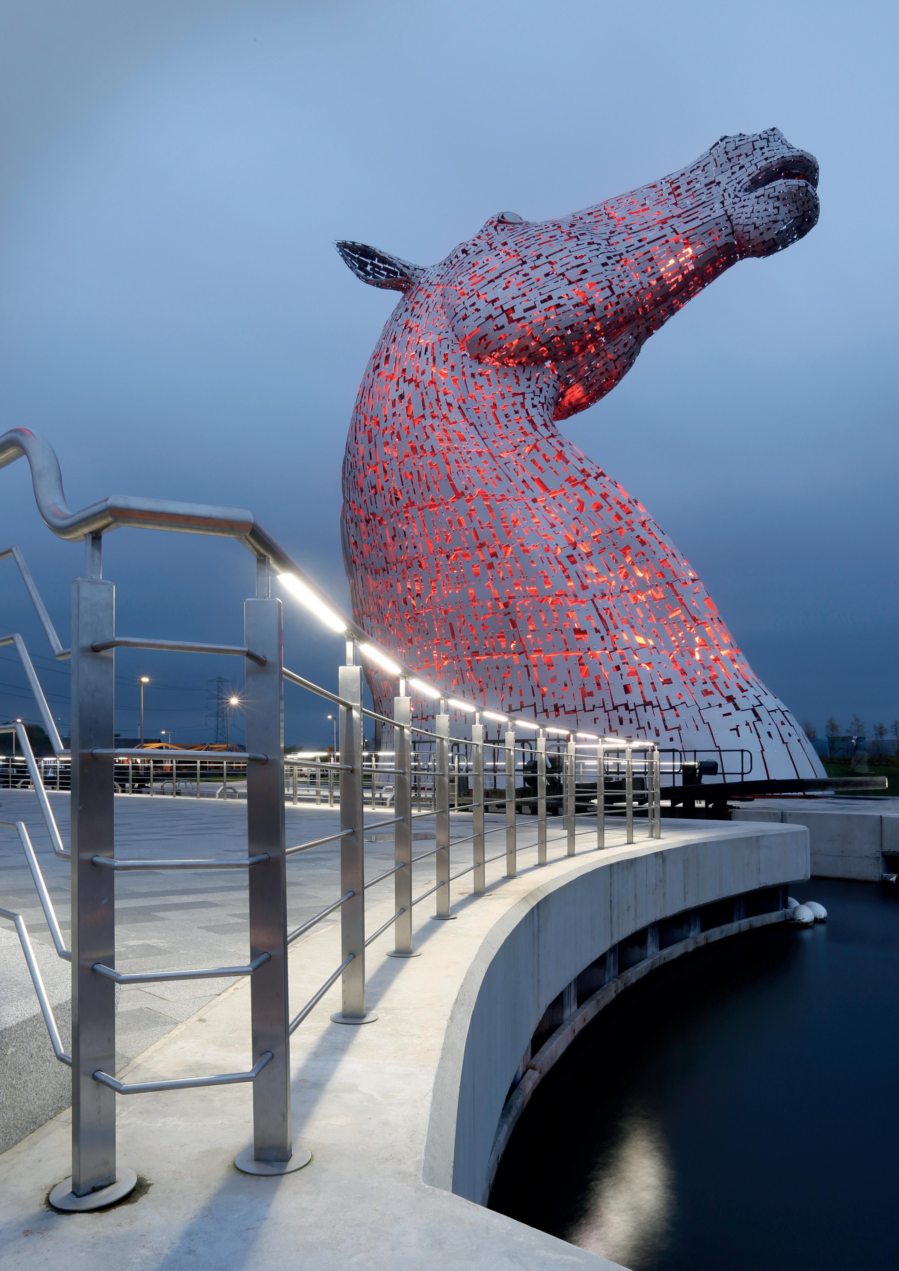
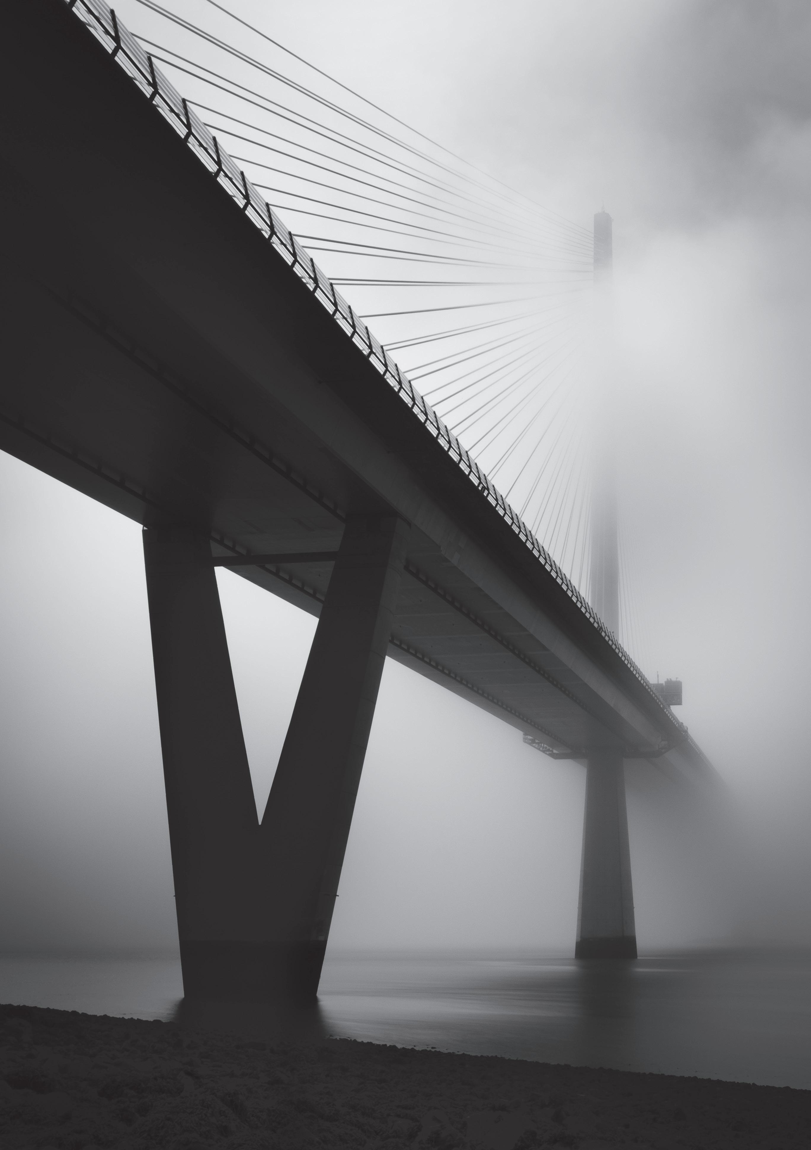
Mark Reeves, our Vice Chair, has done a fantastic amount of hard work in organising next year’s conference which promises to be a great event with some fab mentors to lead and educate us. Please take some time to read Mark’s words below, follow the link and do please sign up. I shall look forward to meeting many of you in person. Mark’s image of Queensferry crossing opposite is a fine example of what we may expect to see and photograph during the conference. Viv Cotton’s photo of the Kelpie on our front cover is a little further afield but a must for those of you coming by car.
I hope you will enjoy reading this edition as much as Gaynor Davies, Paul Cayton and I have enjoyed putting it together. Without their fabulous and constructive help as Assistant Editor and Publication Manager, I could not have managed to achieve what you are now reading and I’d like to offer huge thanks to them.
Candia Peterson ARPS Magazine Editor
Landscape Group Conference - 7th to 9th March 2025
Reminder – don’t leave your conference tickets to the last minute!
Unless you are a new member (in which case welcome to the Landscape Group!) or you have had your head in a bucket for the last six months, you will almost certainly know that the Landscape Group’s next residential conference will be taking place over the weekend of 7/8/9 March 2025 on the banks of the glorious Firth of Forth in Scotland.
This is a great chance to hear from a range of inspiring and excellent speakers, take part in your choice of workshops and guided location shoots and, of course, meet some of your fellow photographers.
If you haven’t got your ticket yet, now is the time to book. Some of the activities (workshops etc.) during the conference will have limited numbers of places available and, if you leave your booking to the last minute, you could miss out on your first choices. To find out more about the conference and to get your ticket go to https://shorturl.at/9aG4W or scan this QR code.
Mark Reeves FRPS - Vice Chair
The Queensferry Crossing by Mark Reeves FRPS
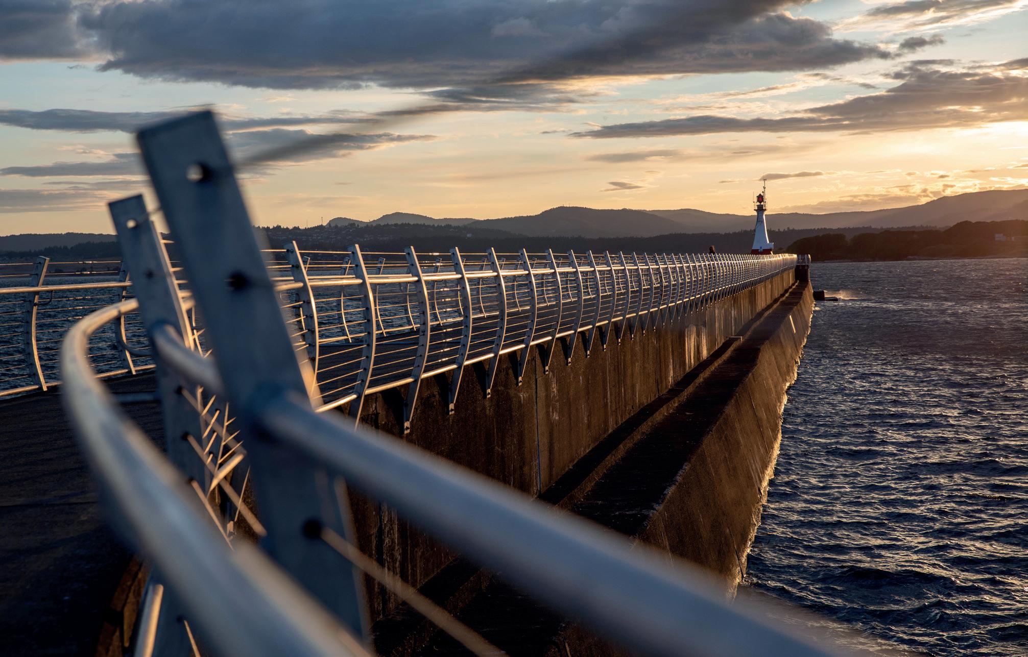
Where in the World? I
Ilan Jacobson
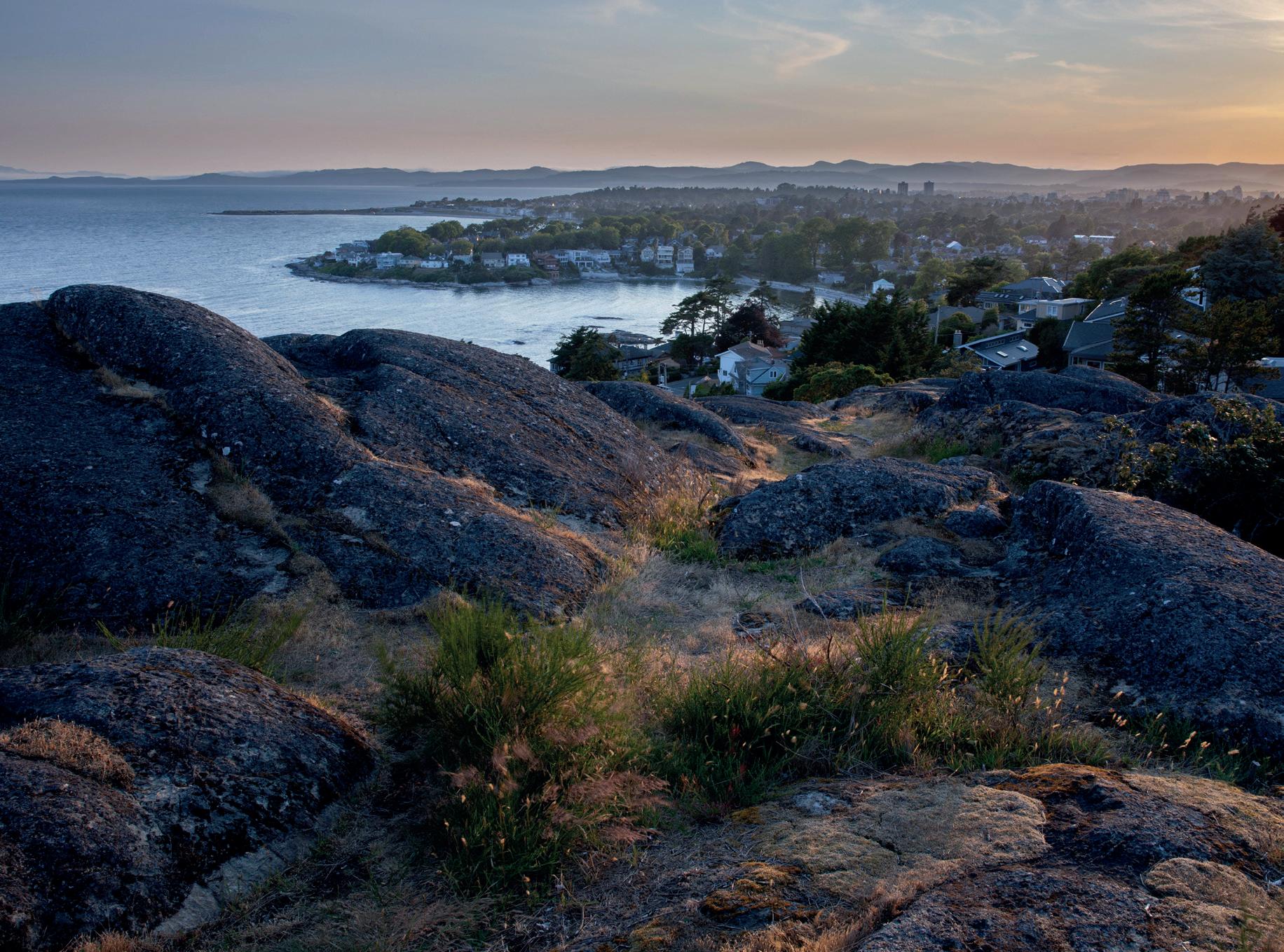
Ilan Jacobson gives us a rich account of his travels on Vancouver Island towards the end of a sabbatical of travel through the Americas. From the city of Victoria to the wide beaches of Tofino, he shows us the variety of landscapes this lovely piece of Canada has to offer.
From towering mountains and pristine lakes to secluded beaches, Vancouver Island holds an incredible array of landscapes that call to photographers near and far. My appreciation for the island began the moment I first set my eyes on it by sea from Seattle and deepened as soon as I took my first steps. My journey would take me through the
city of Victoria, stopping in coastal camping areas, enchanted spots such as Fairy Lake, through to the serene shores of Tofino. With each day bringing a new opportunity for not only my landscape photography but also for memories of a place that will be with me forever, my heart would call out to me with its endless beauty and opportunities.
Victoria View
Vancouver Island: One Photographer’s Journey Through Nature’s Masterpiece
In early 2003, I embarked on a sabbatical travelling up the Americas and finally arriving in Vancouver Island. I planned to seek out remote locations and get a taste of what I knew was a land of so much photographic potential. Though I had planned several locations, once on the island I discovered there was so much more which could only be experienced in person; that no matter how much research you carry out, the experience far surpasses your imagination. On the trip I embraced spontaneity in letting my photography guide me, leading me to experiences that gave the trip that much more meaning.
Settling in Victoria after weeks in the US was the next part of my journey and my fingers were itching to start shooting with a blank canvas ahead of me of photographic inspiration.
Walking through Victoria, with its pristine, peaceful streets, I found the city to be full of energy that brought me a sense of calmness. This is by far unlike where I grew up in South Africa or where I live now in England. Victoria’s unique charm, surrounded by stunning landscapes and parks, created some of my most cherished memories.
Victoria Lighthouse
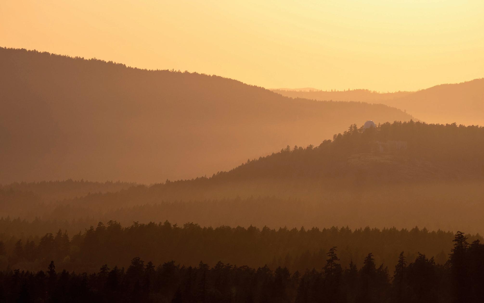
While the beauty of Victoria caught me by surprise, my yearning for nature gave me the means to explore its surroundings. I was able to scout various locations and decide where my focus would be, which led to an unforgettable moment atop Mount Douglas. On my second visit there, as the evening sun slowly dipped behind the horizon, the elements aligned and I was presented with a scene of utmost beauty which nature shared with open arms.
As the last light of the sun backlit the trees, it cast a magnificent light which captured the essence of that evening. This was topped off by rays of light providing a sense of direction to the observatory I used as my subject. This magical alignment was a moment I will cherish forever and is the reason I continue to explore the world and gain a deeper connection through my photography.
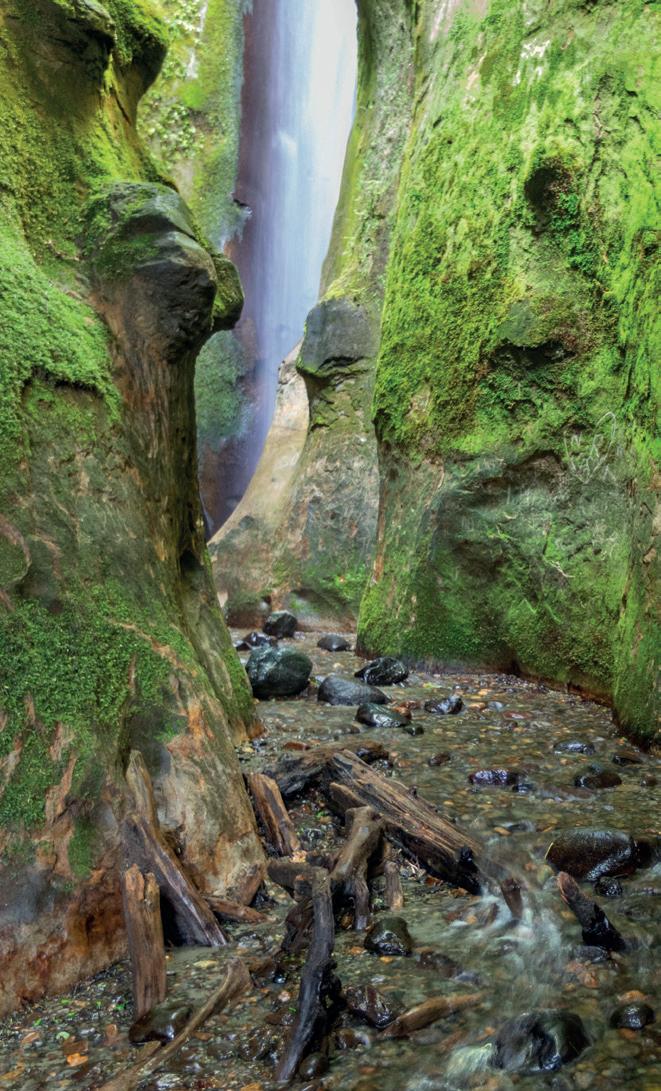
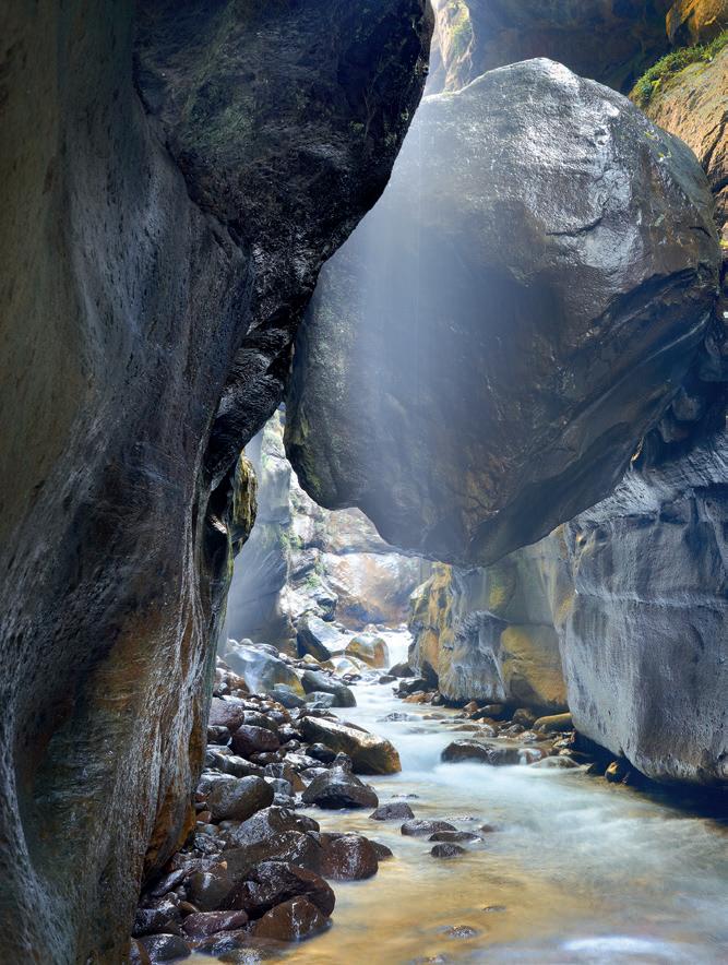
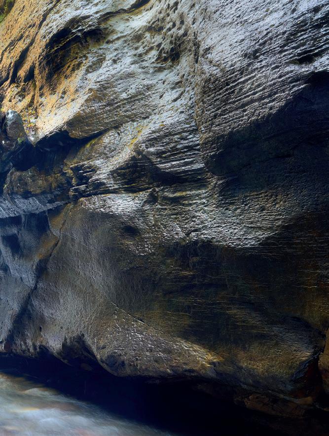
Leaving Victoria, it was time to venture to beaches and enjoy camping in nature. One of the areas I had researched was The Juan de Fuca trail in the Southwest. Here I found Sombrio beach, which was one of my highlights in the Southwest, with its pristine shores, secret waterfall and a natural landscape. Discovering the secret waterfall felt like an adventure. While it isn’t truly a secret, it certainly is a gem to discover, as if taking you to another world. You find yourself walking up the creek into a slot canyon, surrounded, for the most part, by mossy walls and, at the end, a fresh waterfall peeking out from the corner, providing the perfect setting for photography. Having visited the location several times and studied the light, I gained an understanding of when it was at its most balanced. It is a surreal experience finding your way into this location and Sombrio was one of many beaches that offered a pure and natural experience.
Mount Douglas
Secret Waterfall
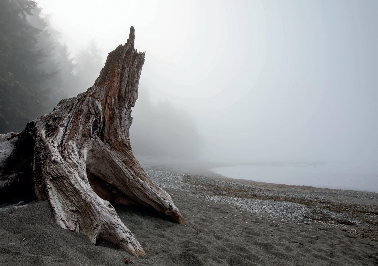
Tree Silhouette
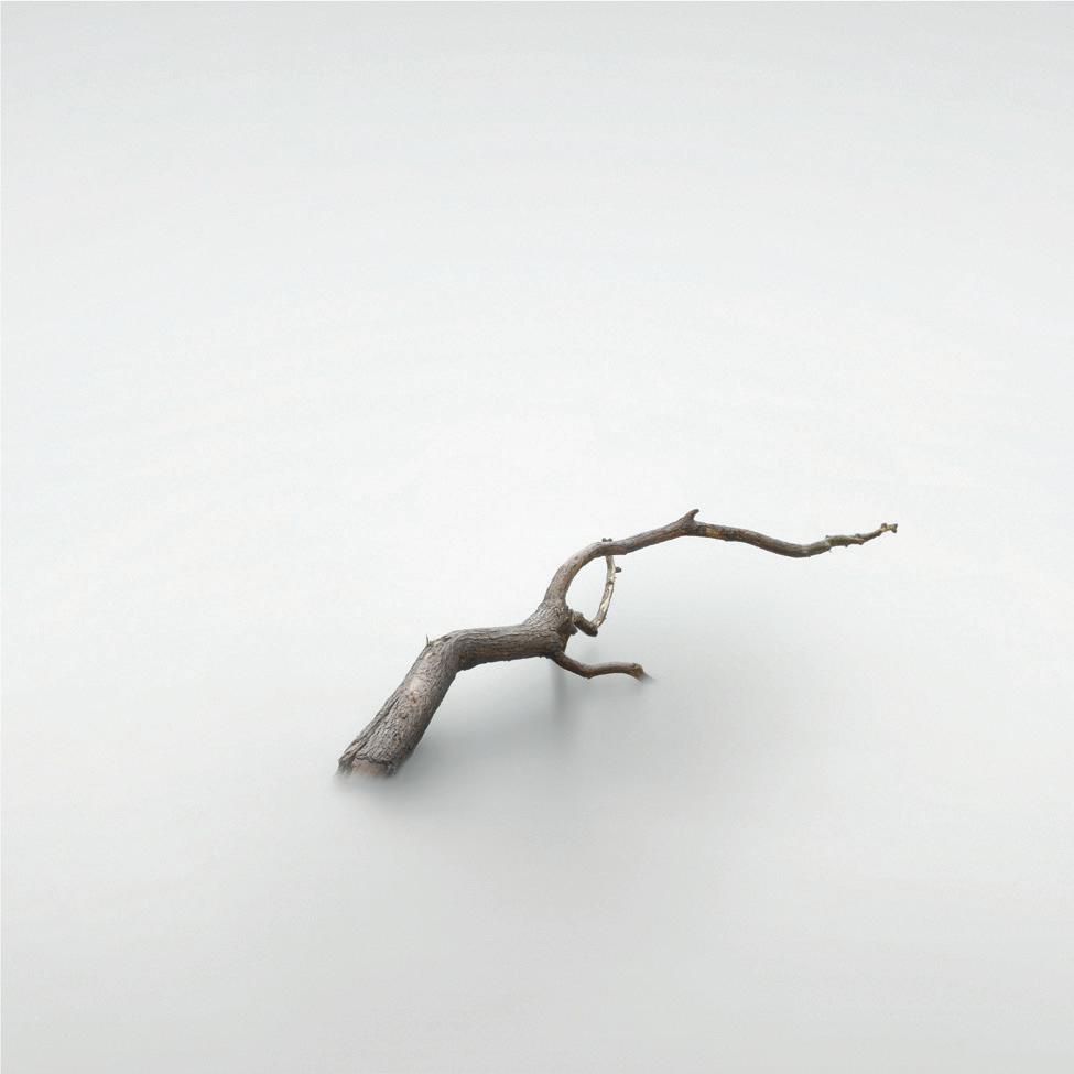
Waking up a morning or two later, to my surprise and elation I discovered that fog had rolled in to the beach, providing a moody atmosphere with silence echoing all around. With this sudden change in weather I seized the moment and quickly grabbed my camera. At any moment the fog could start thinning out as the sun burnt through. As I had some
knowledge of the area, there was one interesting subject I had in mind; the remnants from a driftwood tree trunk. There it stood, as if alive, watching over the beach. Its sheer strength, while unspoken, was clearly seen in its posture and stance. For me this was a story so I set up my gear and got this shot just moments before the fog started dissipating.
Foggy Beach
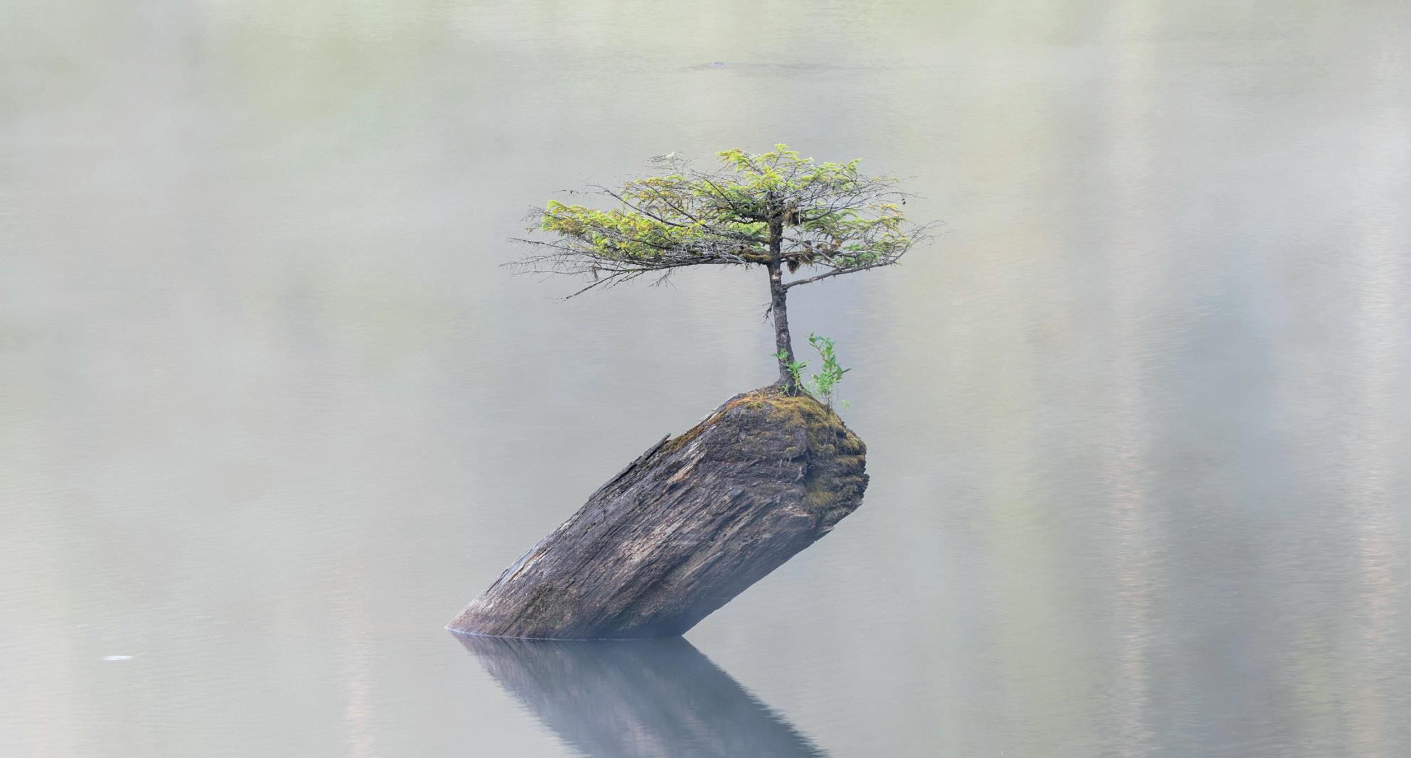
One of the many places that touched my heart was Fairy Lake; it really is like something out of a fairy tale. Reading articles, it didn’t seem real but, arriving there one early morning with a surprising blanket of fog, it slowly appeared as the fog thinned. This little angel of a bonsai thriving off a long-fallen tree in the middle of a lake was a sight! The fog added the right atmosphere and separation that sometimes a photograph can’t always truly express. This bonsai tree in all its beauty has withstood the elements and become one of Vancouver Islands’ treasures.
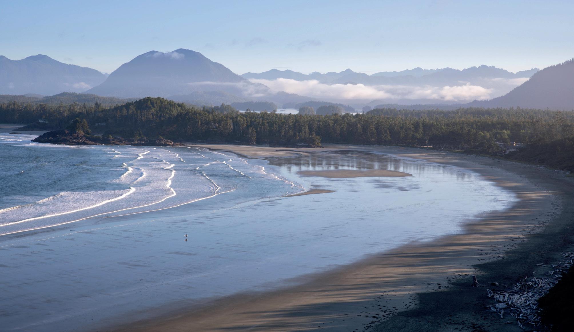
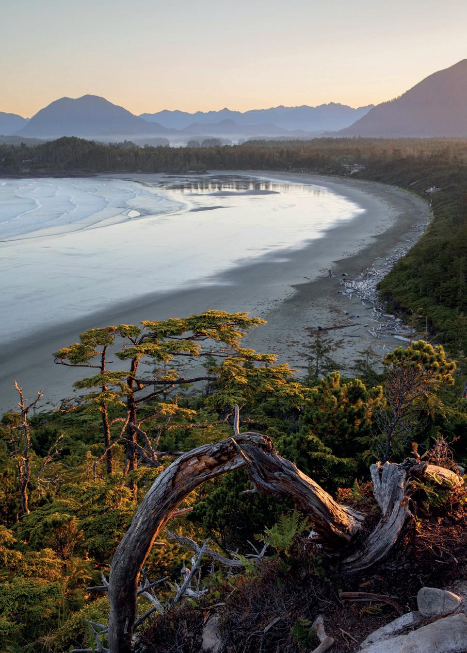
Towards the end of my trip I explored Tofino, renowned for its magnificent coastal landscapes and its popular surfers’ locations. Here I spent several days hiking, surfing and enjoying photography in a new location. Inspired by a photographer I follow on YouTube I was excited to finally be there after admiring their images of Tofino’s beaches. As the days went on, exploring the various beaches brought a sense of peace and tranquillity. While starting off my journey there, I still had my research at the back of my mind and I had a location in mind for either a sunset or sunrise shoot.
Fairy Lake
Cox Bay
During my many visits to this location, I learned about the landscape and how the positioning of the sun influences the scene. On one of my last mornings I woke up early to ensure I was at the location an hour before sunrise - in the summer, there’s nothing like an early morning to energise your day - and I was mesmerised by the scene in front of me; it was as if a painting was brought to life. With its perfect waves meandering up the coast, islands scattered in the distance and, to the east, the sun rising with its golden light painting the landscape, time stood still as I immersed myself in the photography to portray how I saw the scene in front of me.
Whilst Vancouver Island was the last leg on my Americas trip, it captivated my mind and gave me experiences with photography that will be with me forever. Its diverse and dramatic landscapes, from the city life of Victoria to the surreal landscape of coastal regions, from Sombrio to Tofino, all offered endless opportunities for capturing moments in time that have inspired me. Each moment spent on the island deepened my connection to the art of photography and the natural world. The experience has shaped me as a photographer and, in doing so, a piece of me will always be there, calling me back for a new adventure, discovering more of the Island whose beauty has no boundary.
Cox Bay Sunrise
Tree Layers and Light
A Mentored Landscape Project
Jeff Underwood
Jeff describes the process and shares his results from taking part in an RPS-conceived mentored landscape project led by Tim Daly FRPS.
Tim Daly Website: www.timdaly.com
When I opened an RPS email that said ‘Mentored Landscape Project’, I thought “That’s for me”. After a year focusing on landscapes, I felt I’d stalled. Mentoring appealed, providing me with someone who would guide and direct, bringing something out in me rather than
just “do it this way”. Tim Daly, Senior Lecturer in Photography at the University of Chester was the mentor; his website is impressive.
In addition to pre-course documentation, there was an initial Zoom session examining the nature of a project, choosing
a theme and how to progress to success. Then regular waypoint checks leading up to a final presentation, shared with fellow photographers a few short days later. Supportive help was available along the way, together with a post-project evaluation from Tim Daly FRPS.
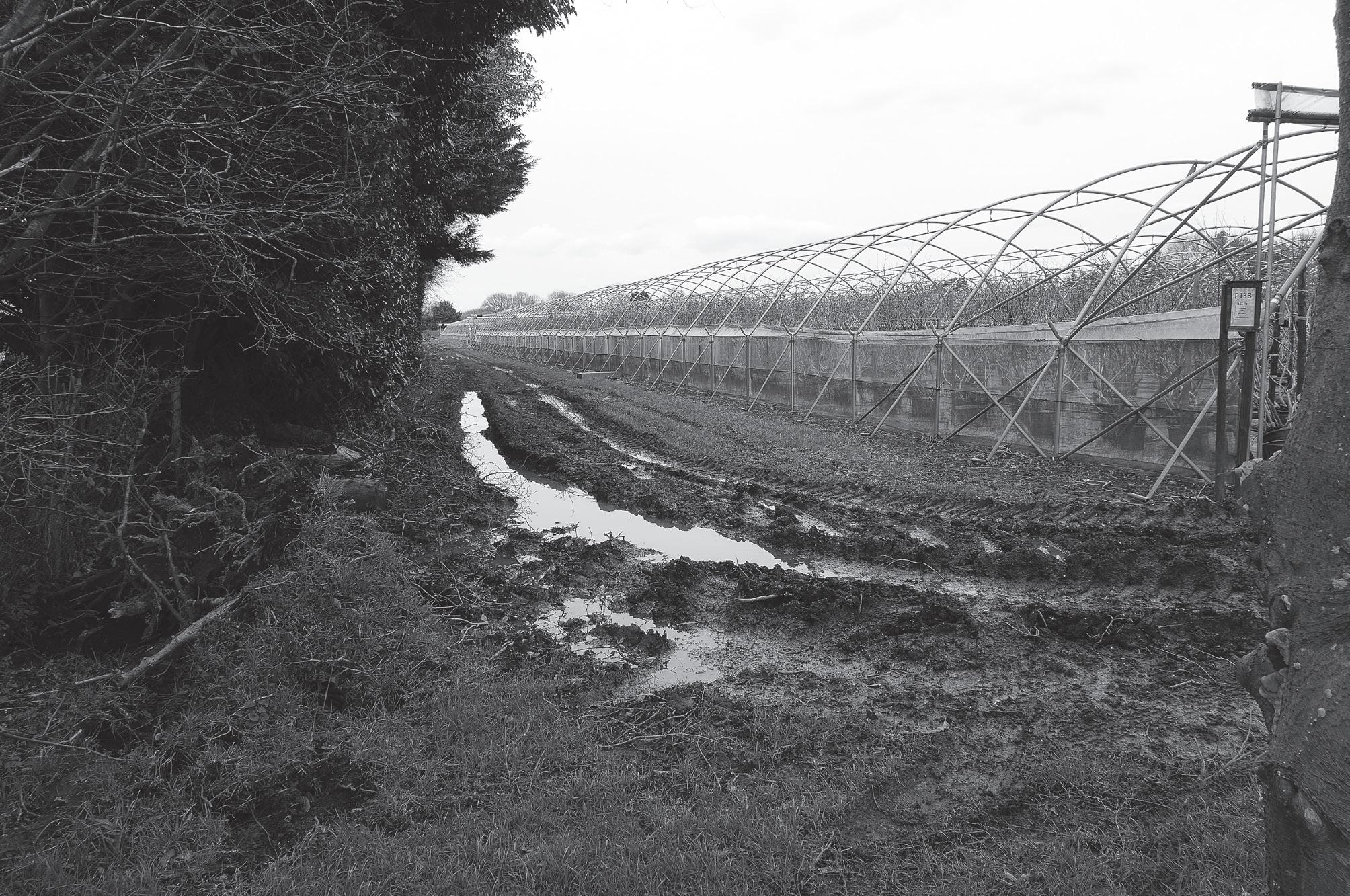
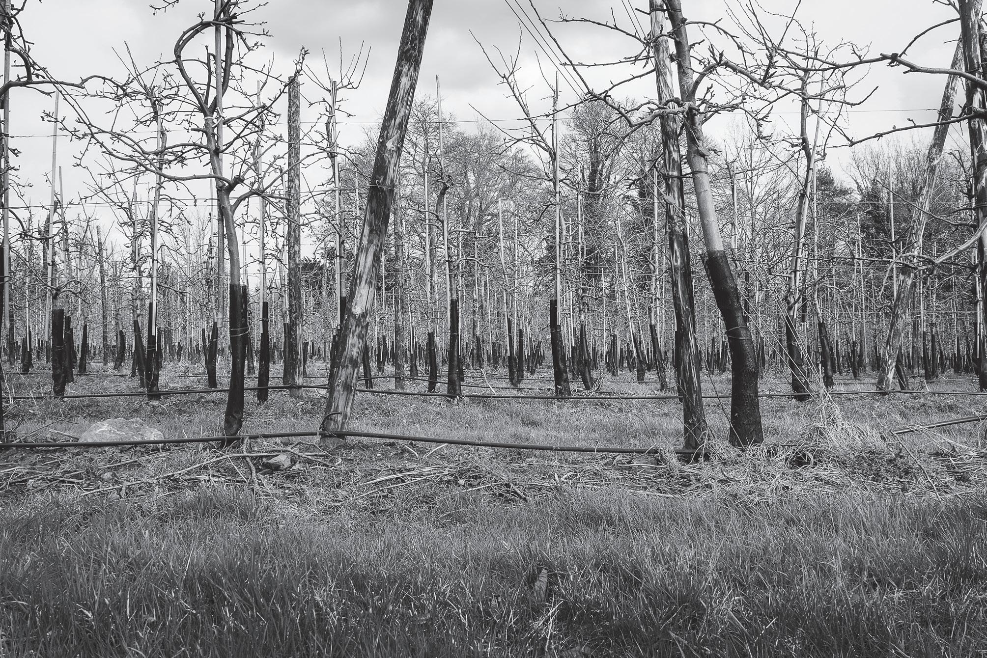
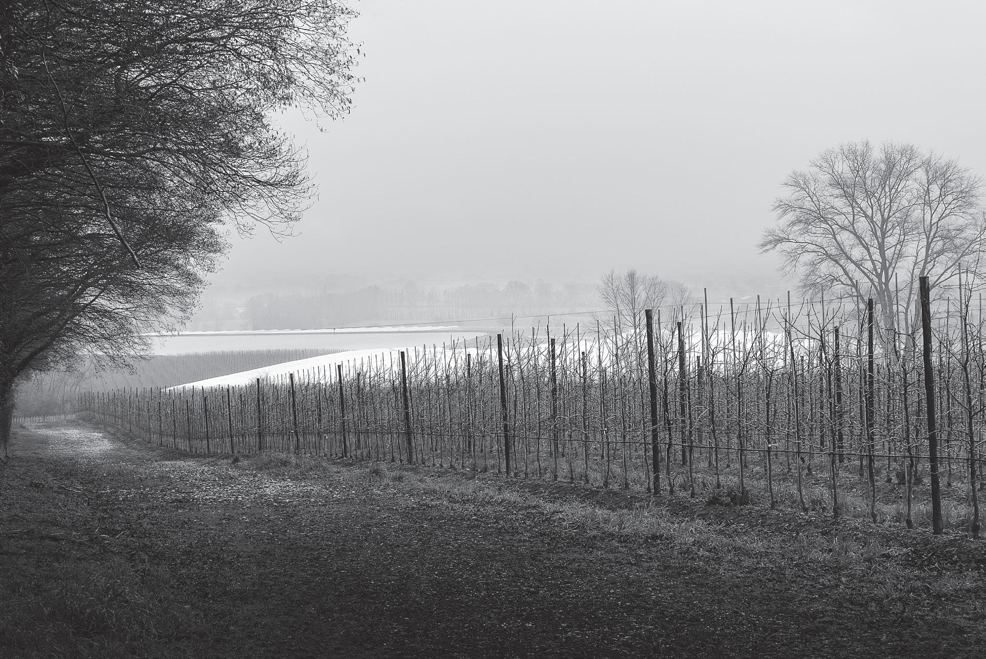
Slab grey skies and waterlogged paths - ideal landscape conditions.
In the orchards of Kent
A project was intimidating. I got up early, stayed late and took some decent shots but only one or two, here and there. I was daunted by the challenge of taking a themed series of images, all to a reasonable standard. Kent is great but it’s not Iceland or Scotland.
My terror of the project was assuaged by Tim talking us through suggested themes, his mentoring style being guidance and encouragement. He shared some of his images taken with an iphone; outstanding pastoral landscapes taken on daily walks, only metres from his home. In monochrome. It was love at first sight; I wanted to create that type of imagery.
Engaging in a project will take you to another level. I have been guilty of thinking of black and white as being inferior to colour; if all else fails, convert to mono to see if you can rescue the image. Shooting with the objective of creating mono pictures, that was challenging but I knew it would get me off my plateau.
As the weeks unfolded, the term that drove me is “intentional monochrome landscapes”, embodying a style and approach I felt enthusiastic about, sufficient to face the challenges of landscape photography. What do you do between the blue and golden hours of the day? When it’s cold, damp and soggy outdoors? When all you have are slab-grey skies? Shooting in those
conditions was the key driver in my project.
I resolved that every day, rain or shine, I would walk with my camera. I took my Sony RX100 Va, inside a Ziplock bag, tucked in my raincoat. No paraphernalia, just a 20.1mp pocket camera with zoom lens. Heresy - the camera was set to Intelligent Auto! I would take the camera out, shoot a frame or two, then quickly stow it away from the rain. Freed from the demands of fretting about camera settings, I was looking at my surroundings. We live close to the Greensand Way, a footpath from Sussex across Kent, along the Greensand ridge. That covers most of my local walks. If Kent is the Garden of England, our part is the orchard.
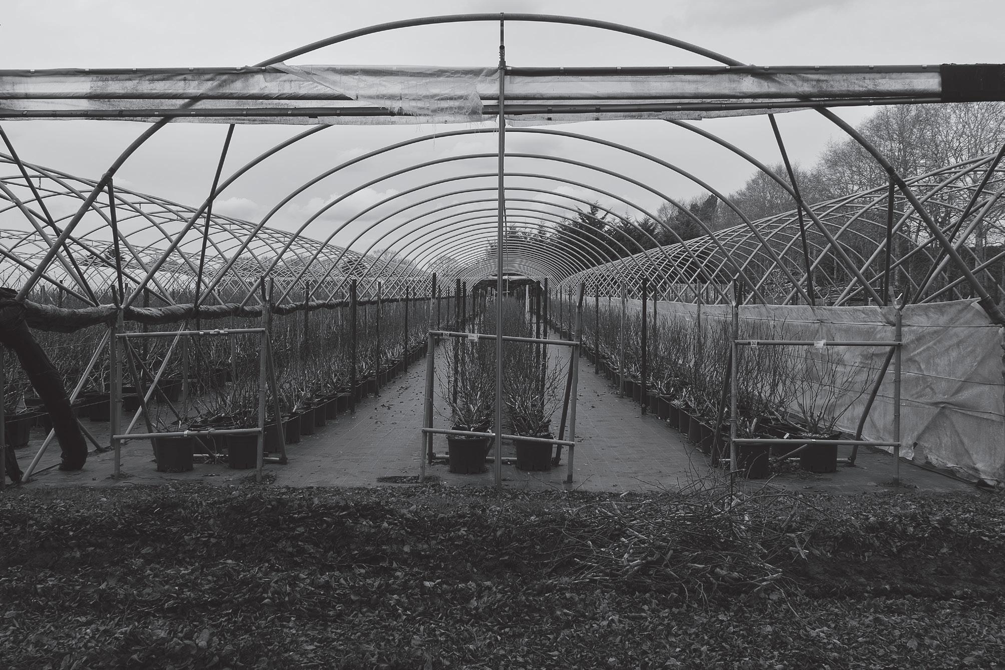
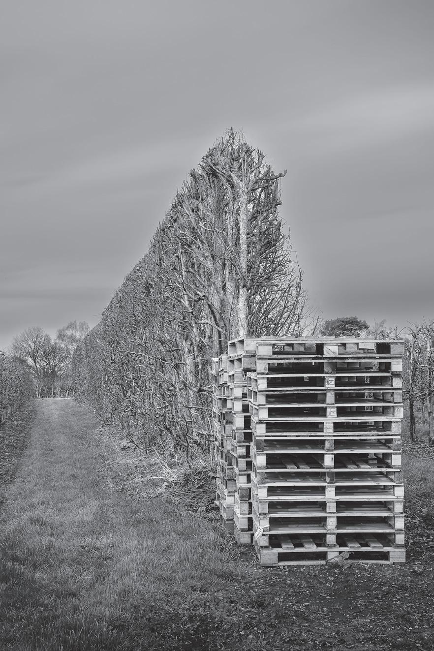
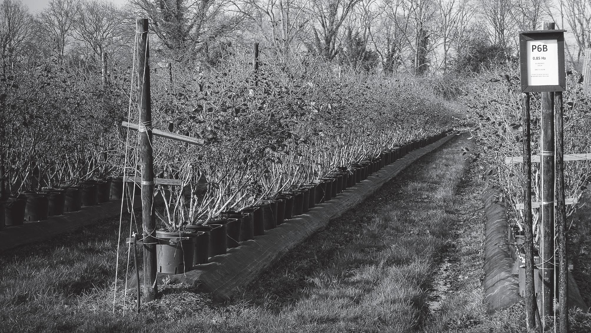
Pot-grown berries - poised in skeletal frames, awaiting plastic shelter.
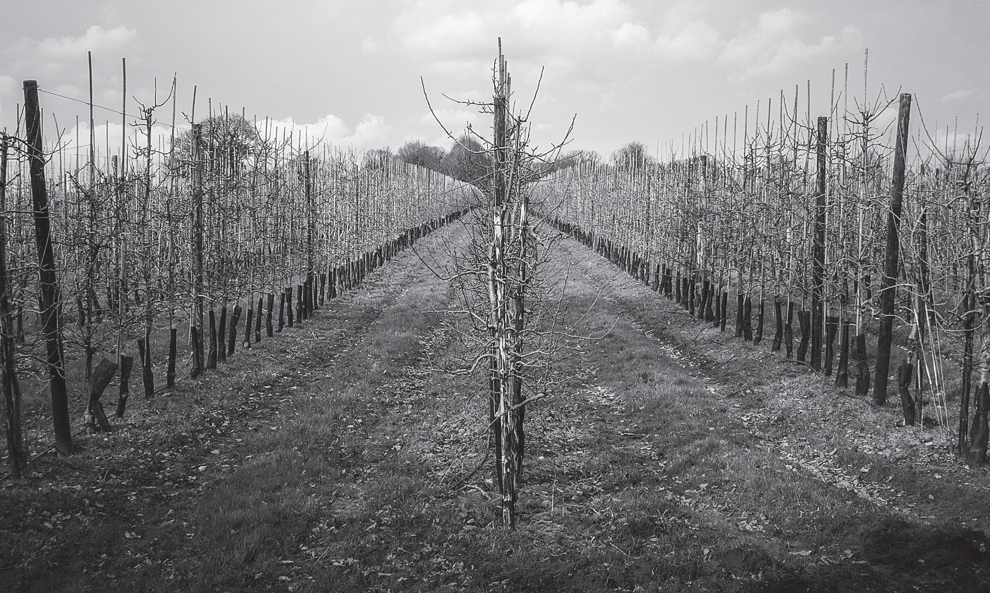
Modern fruit trees - tall and slender, no longer lollipop-shaped.
Miles of water pipes and cables - stout posts brace the trees while sleeves fend off rodents.
I walked by and through apple and pear trees and areas of berry cultivation. That became the theme for my project; fruit cultivation along the Greensand Way.
It is lovely in spring, summer and autumn. Our project was February/March. Nothing in bloom, barely a leaf out and a lot of mud. The bare bones of horticulture highlight the engineering in fruit growing. Modern trees are not lollipop shaped, they’re tall and thin, grown in ranks, held up by stakes, braced by stout cables, watered through black pipes controlled by monitoring equipment. I saw the leading lines, the verticals that I so enjoy in compositions. Even the trees at the edge of each field are grown to a height for a purpose - when the wind blows on the ridge it’s amazingly strong so trees shelter the crop.
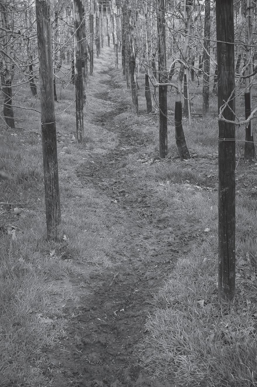
Within each section are shorter trees, allowing air to circulate and discourage blight.
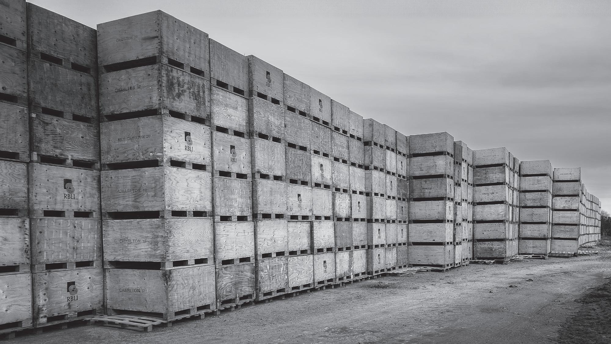
I chatted to the workers, mostly from Eastern Europe and incredibly proud of what they do. I found tower blocks of crates stacked as high as houses. The tele-handler operator explained the care he took trying to get all the crates the right way round. Even the farm machinery began to make sense. Huge tractors and wide trailers take bulky supplies to the fields, working around the edges. Specialised narrow units go between rows pulling spraying units, wires and pipes, then bounce along the road to the next field. Looking through the eyepiece of my Sony, my neighbour’s commerce was making sense. Fruit growing is truly awe inspiring. It also had its humorous aspects, such as the narrow zig-zag path created
when, begrudgingly, a farmer allowed a path to be diverted through his crop.
Pre-project, my habit was to choose a single image then spend hours in post. I didn’t have time for that; efficiency demanded a standard process. On return, I removed the camera from the plastic bag and uploaded RAW files. Even in the rain you can shoot and shoot with a pocketable camera. At first glance the images seemed somewhere between poor and awful but then there were one or two better ones, then a few more. I found great guidance in monochrome photography from Thibault Rolands’ talk ‘The Art of Black and White Photography’ (YouTube) and from Alister Benn FRPS in ’Luminosity and Contrast’. Their suggestions informed my process, including shoot in colour then convert to mono.
Right of zig-zag way.
Hedges shelter shorter fruit trees - pallets prevent shortcuts by tractors.
Then in to Lightroom to remove noise. Having listened to my inner camera club judge, I also used Photoshop to remove stray twigs, dead grass, debris (farmers aren’t the tidiest) and sharpen using a High Pass filter. Back into Lightroom, I used a B&W preset to get consistent monochromes, colour sliders for global adjustments and finished with local fine-tuning via linear or radial gradients to focus attention. As much as I love the RX100, comparing it to my A7Riiia, it has shortcomings.
Previously, if a location didn’t work, I’d move on. Now I had to return, time and again. There was a goal, meaning and purpose. I was looking not just for compositions (and finding similar themes to those I enjoy so
much in architectural shots) but also seeking the type of contrast and luminosity that works well in monochrome. I was also avoiding pointing my camera at the grey sky and keeping it safe in my pocket between downpours.
The final session consisted of presentations by the photographers in the programme. I presented a slideshow, created in Apple Photos - it’s quick, easy to reorder images, you can add a soundtrack and I love its Ken Burns’ effect. I never thought I’d find myself agonising about the order of 20 images. I saw a last-minute gap - I needed an opening shot of the traditional orchard. Thankfully there is one still standing and, at 45 minutes there and back, that was my longest walk.
The final presentations showed how people from across the UK had tackled similar challenges. It was a huge learning experience and I scribbled page after page of notes. We had learned so much in a few weeks. Where does that leave me? I want to do more in this project, shooting the same images in summer and again in winter. I’m thinking of another project, ‘Beware of the Dog’.
I’m trying to see in monochrome and I want to claim “intentional monochrome landscapes” for my own style. Thank you RPS for your sponsorship of this programme. If that email appears in your inbox don’t hesitate.
Royal British Legion Industries - from poppies to pallets and crates; this mountain and more will be filled in summer.
Serried ranks of apple trees, stakes and cabling - braced in winter, storing hopes for spring.
Labelled and counted - the final crop is linked to plant suppliers and next year’s contracts.
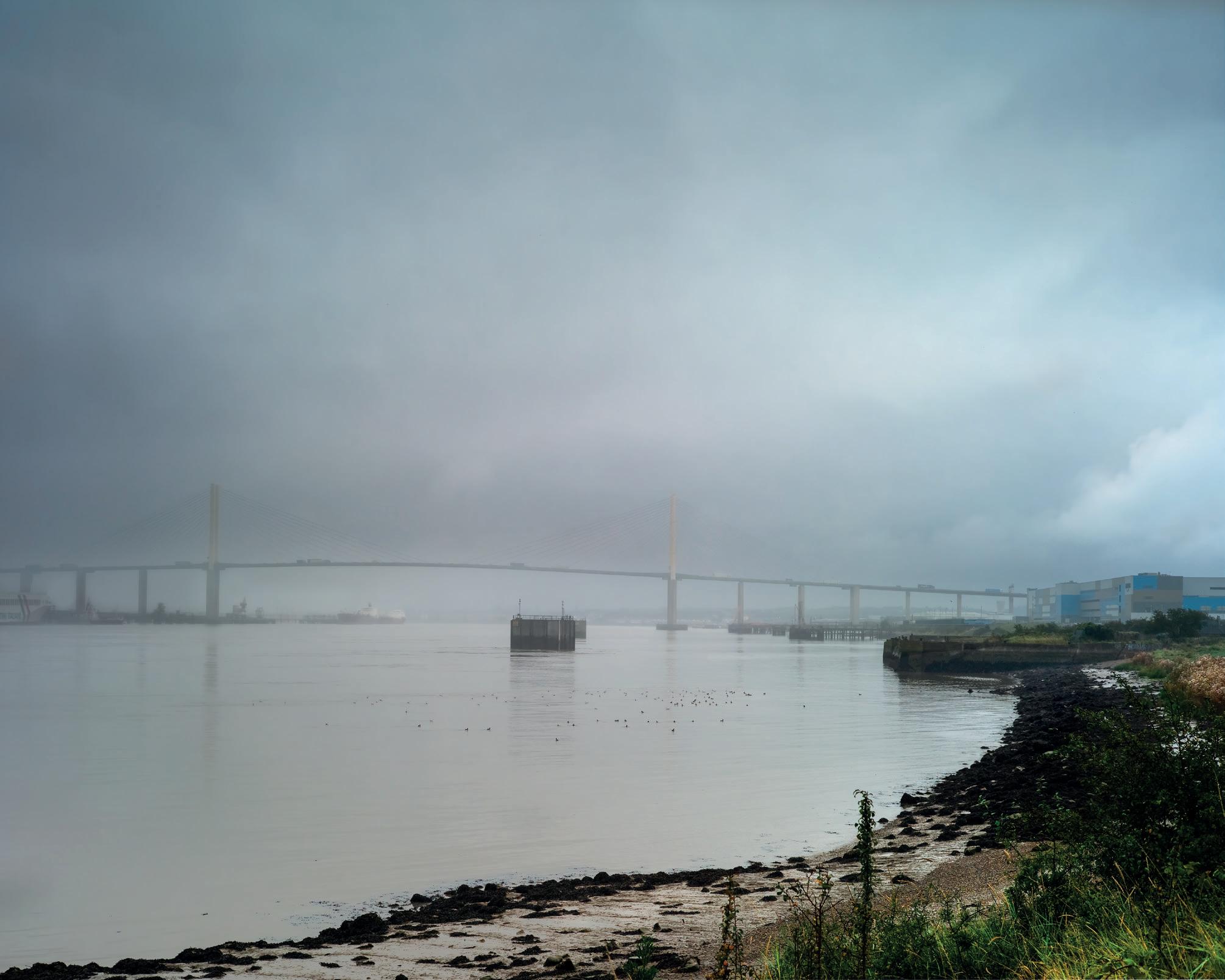
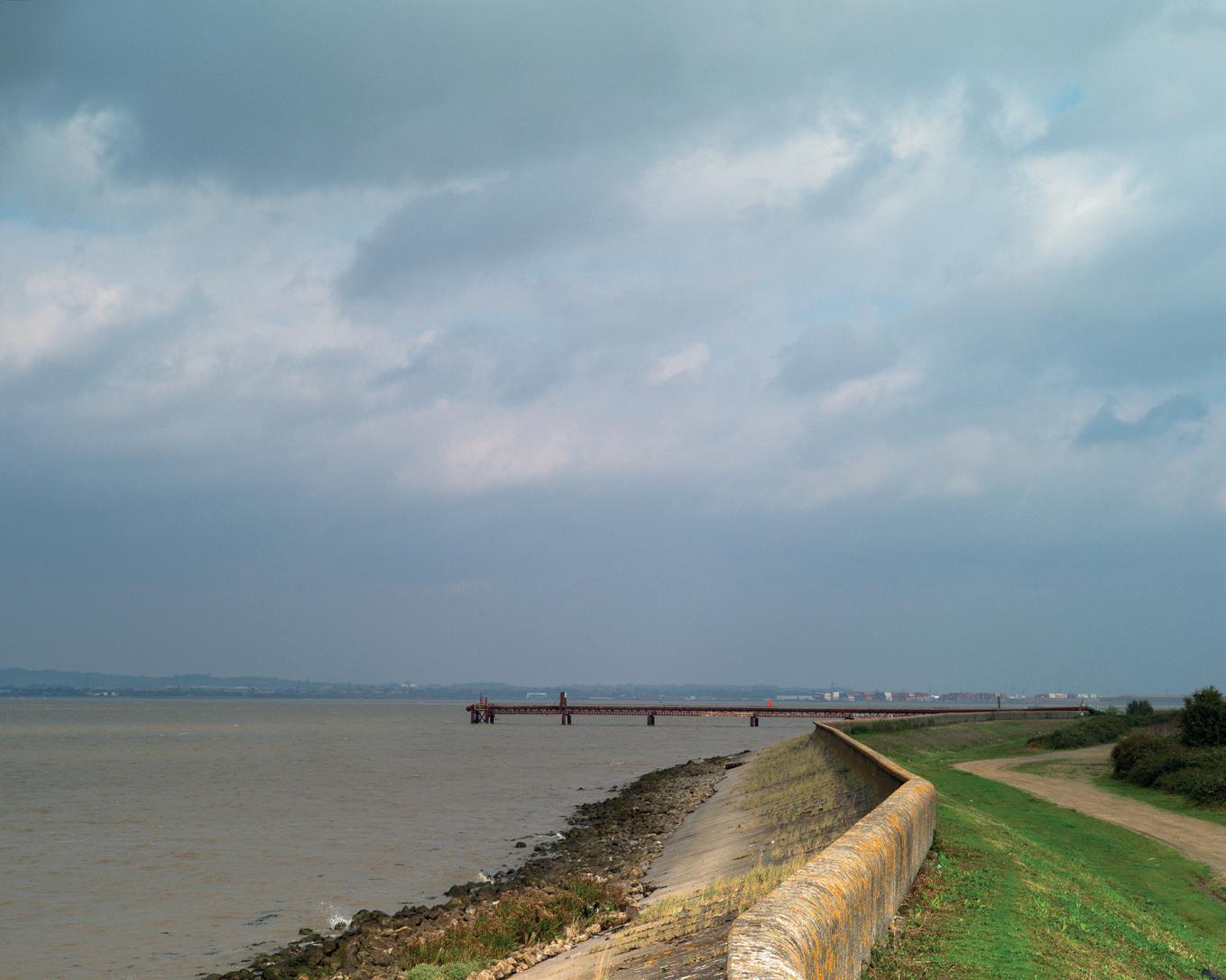
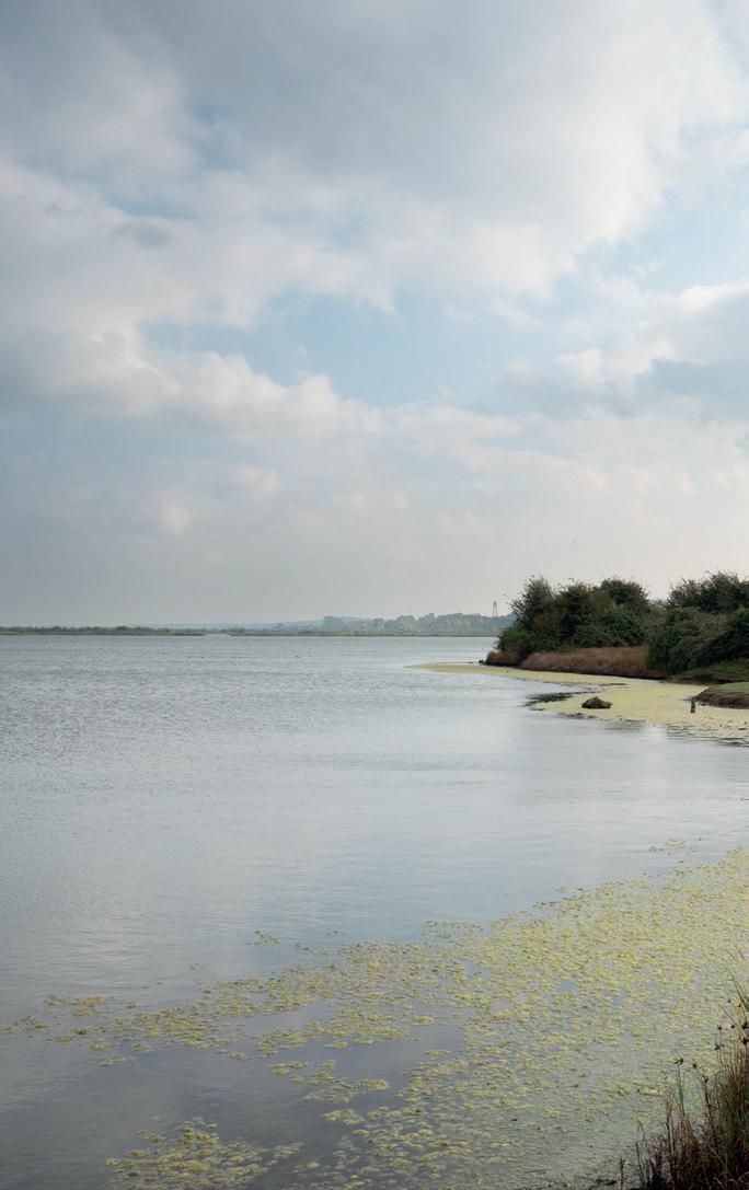
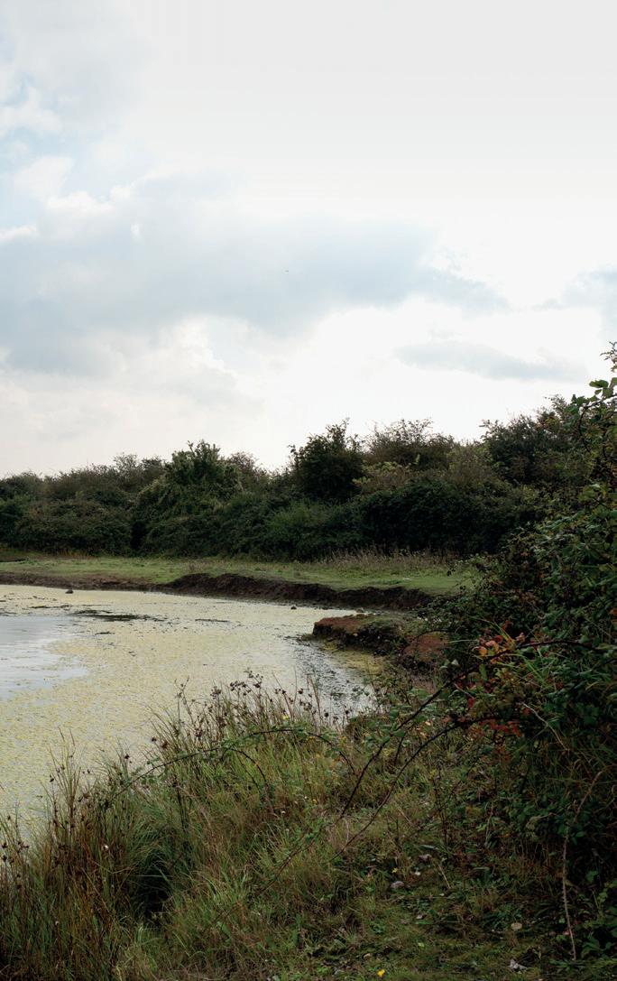
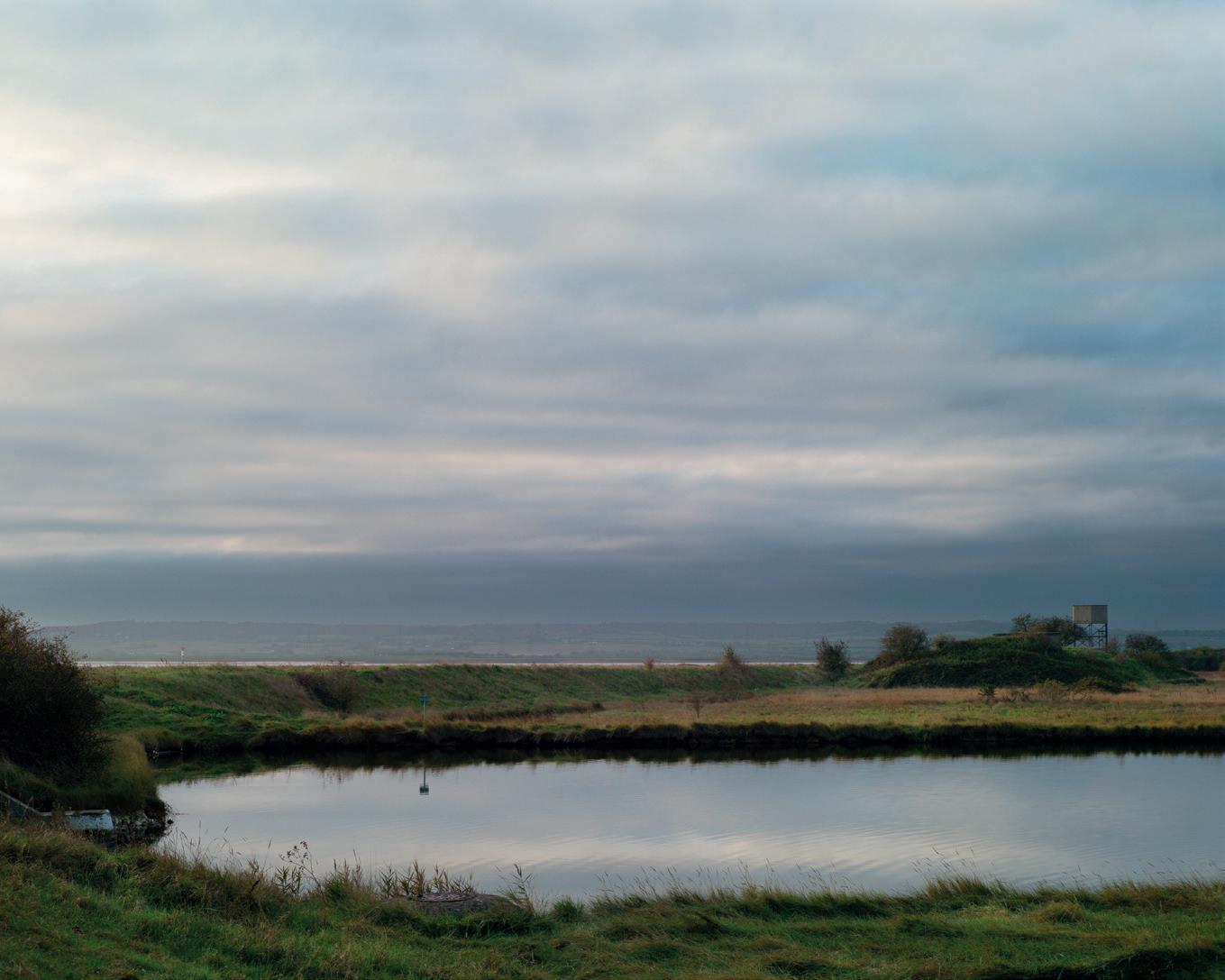
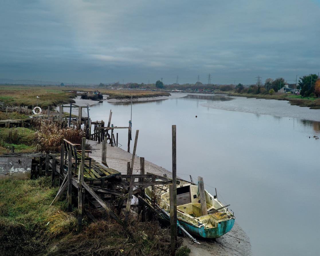
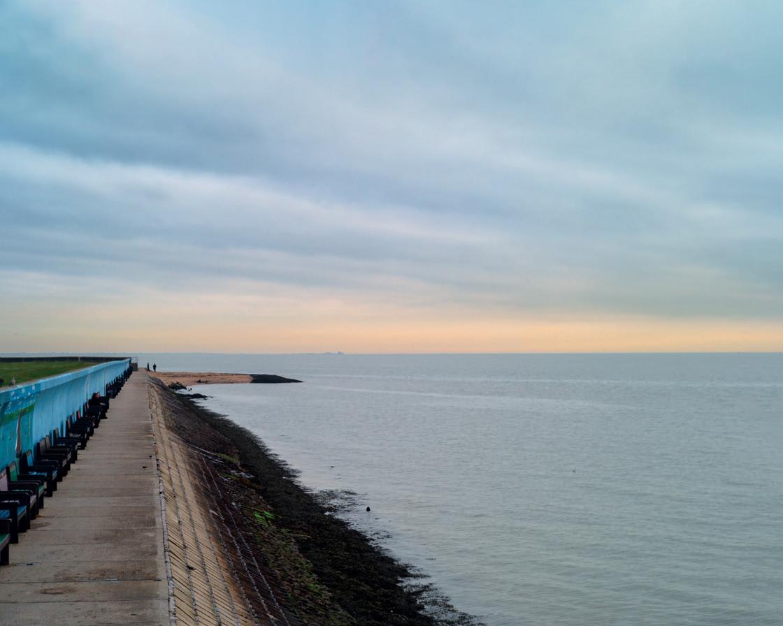
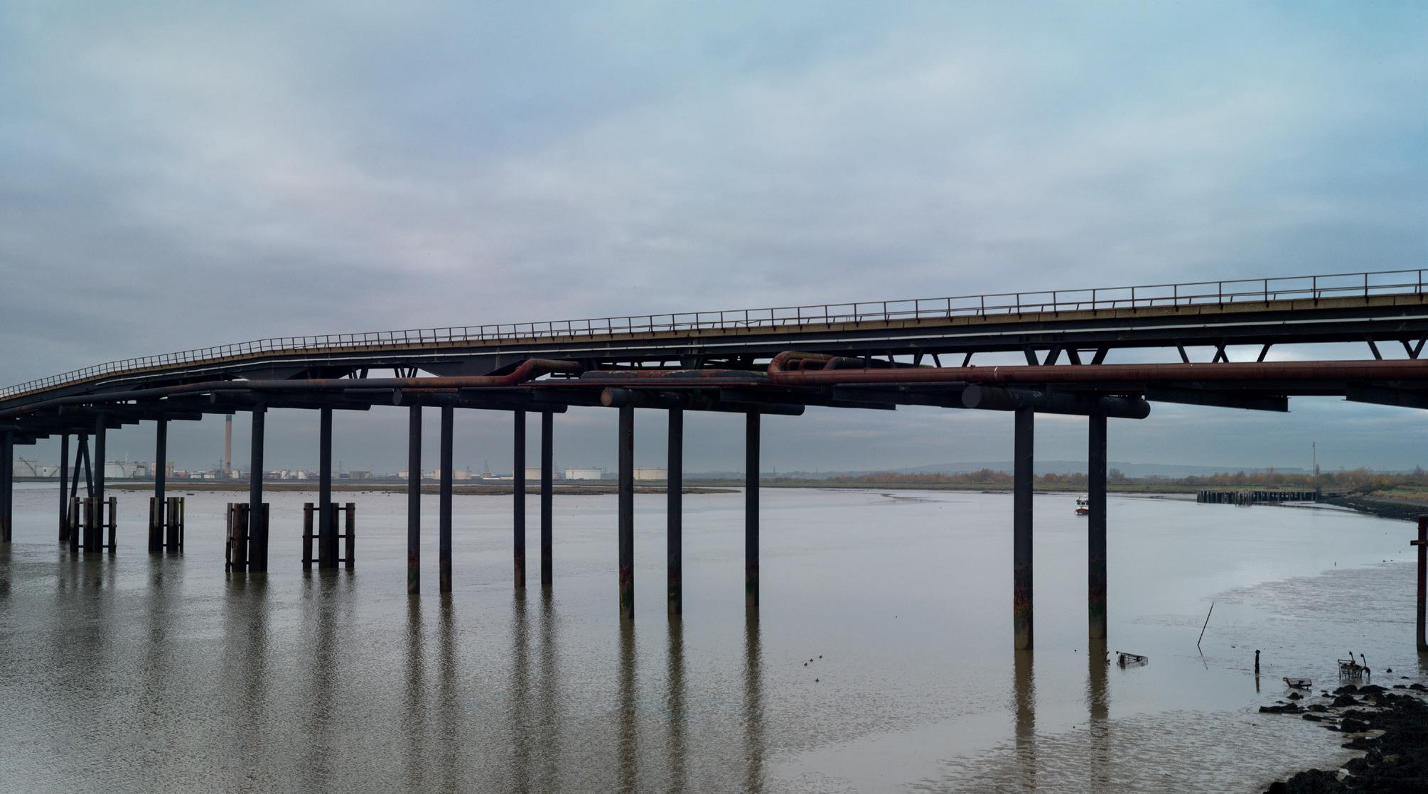
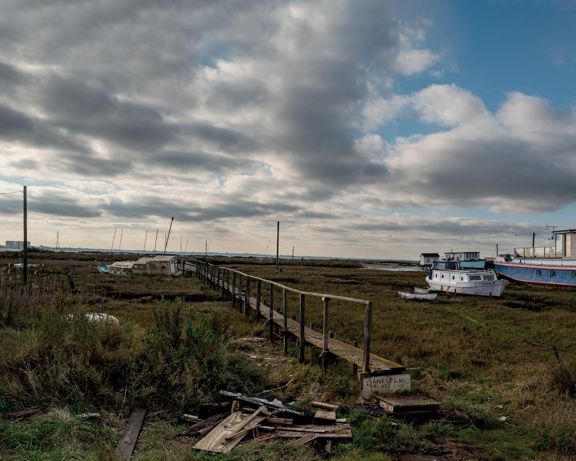
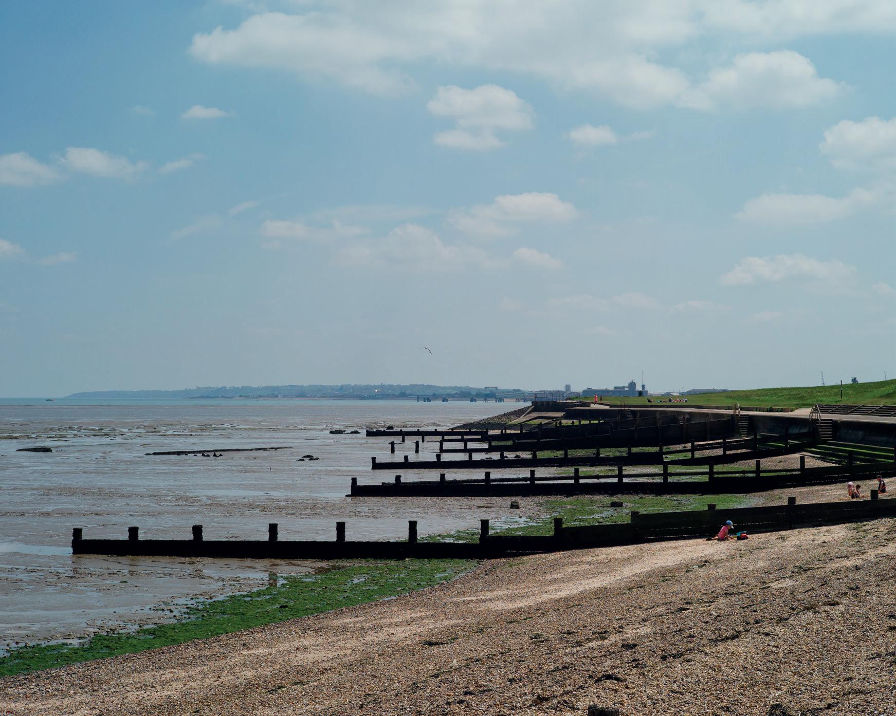
The Human Landscape
Irene Del Pino
Irene takes us along the section of the River Thames to the east of London and out to the estuary. These photographs and more can be found in her book ‘River’, available through her website.
Website: www.irenedelpino.com
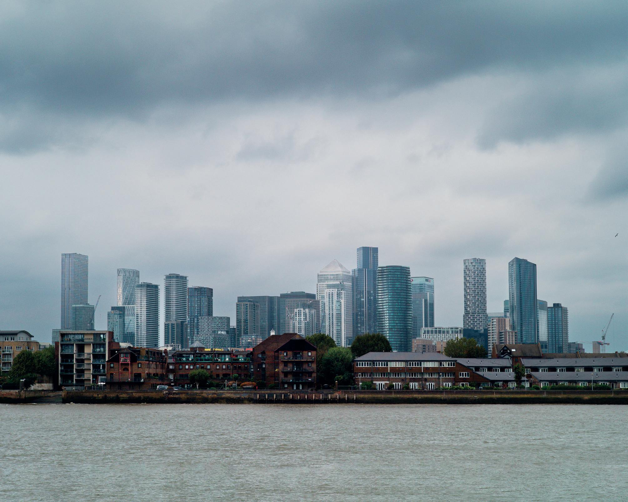
River
On Christmas morning 2020, my daughter and I took a drive with her dog. We were in the middle of the pandemic and we thought that a walk along the Thames would help dissipate somewhat our sense of isolation.
Instead of heading west - we lived in London and often went to Richmond Park - we drove to the south bank and ended up in Dartford. I had recently read a description of the river at the onset of the 18th century by an American novelist Neal Stephenson and was curious
about the area. I brought a camera with me and took a few images.
A few months earlier I was accepted on to an MA programme in Photography at the University of Brighton. I obviously had to produce some work and the photographs taken at the Thames on Christmas morning came to mind.
I photographed River throughout the rest of 2021, at first with some hesitation and then, during autumn, in a more systematic way, finishing the project in early 2022. Although I have been an amateur
photographer most of my life, I photographed exclusively family, children and holidays. It was only after 2012 that I took an interest in photographing ‘with intention’. One thing led to another; small workshops and photographic trips, until I ended up enrolled in a professional photography school which, in turn, led to Brighton.
Although I came out from school as a documentary photographer, landscape was my first love. And River became a landscape or, more precisely, a documentary landscape project.
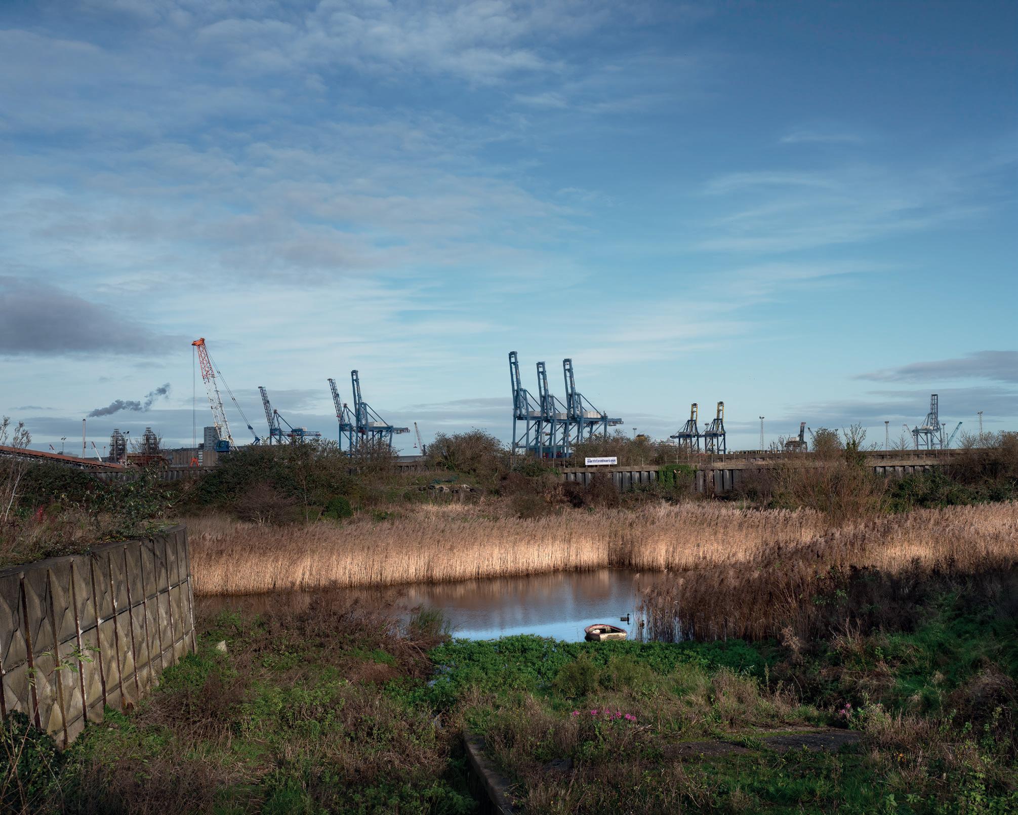
The idea of documentary landscape is not new. It goes back to the work of the photographers of Roosevelt’s Farm Security Administration and, particularly, to Walker Evans’ work. His acclaimed image Steel Mill in Bethlehem Pa is an excellent example of the genre. The photograph shows a cemetery, right behind which is a row of working-class homes and, behind them, the chimneys of the steel mill (Bethlehem Steel, the main industry in town) can be seen. The workers’ homes seem sandwiched between the cemetery and the factory, hinting at an inevitable destiny. In essence, by showing the landscape - sometimes untouched, sometimes modified by humans - we provide information about the lives of those who dwell in it, although not all are as obviously evident as Evans’ photograph.
For me as a foreign photographer, exploring unknown territory is always attractive. It is also a way of knowing and internalising the land. Choosing the east side of the river (the edgelands of the big
city) fitted well with my previous work and my interest in those who live at the margins of modern society.
The river east of London is not always easy to access. I soon learned that, at times, it involved long walks from where I could park the car to the river banks. That implied that my equipment had to be simple. I used a single lightweight camera, an old Leica with a CCD sensor and a 50 mm lens. The choice of lens was natural; 50mm is my preferred focal length as it gives human eye distance. That was how I wanted to show the landscape, as I saw it.
Crossing London in the early mornings from west to east can take an hour and a half on a good day so I was lucky when I was at my first planned location around 9 am. I photographed for two or three hours, stopped for a quick sandwich and continued for a little while before heading back to my daughter’s place.
On weekends I processed my photographs and planned the
ensuing work. Google Earth was a great way of identifying places to go and where to park. Although River, in the book, starts east of the city at Greenwich and goes all the way to the estuary, I was not so systematic in my work. I sometimes discovered something interesting that I had missed or decided to do a follow-up session in an area that I had previously photographed but with which I felt unhappy.
Anyone familiar with the south of England will know that the weather, even in the good months, can change several times in a day, so I abandoned all pretence of having any kind of consistency in skies, blue or cloudy. In retrospect, I feel it adds something, as the atmospheric component is a key feature in the skies of southern England.
Working by projects is a complex thing. Some people have an idea, think about its implications and may even write a script beforehand. I start with a confused idea, maybe with something I read in the paper or
something glimpsed during a car trip. I start taking photographs and slowly, if I like what I do, the project starts to take shape and assume a life of its own. At that stage, when it happens, it is no longer tentative; I know what to do.
River grew that way. I found that the Thames east of London is, on some stretches, an abandoned and neglected land and the people who live along its banks don’t have an easy life. Some of them, like some of those on the north bank around Benfleet, may well live on the margins of society. But the river has great beauty, untouched zones and wildlife, particularly birds. Recovery efforts of marshlands are underway or already bearing fruit like at Cliffe or the marshes east of Tilbury Park. It is a tough environment but with a lot of beauty and hope for the future.
I hope that I have been able to capture it.
The Post Processing Page
Jonathan Vaines
Jonathan Vaines takes us through the steps in Photoshop to produce the perfect pastel. Jonathan teaches this as a workshop through the Digital Imaging Group and he has kindly organised one to time with our publication. To find out more visit https://tinyurl.com/tab96xe3 or scan the QR Code.
Producing images with a softer and evenly distributed light is one of those processing skills I am regularly asked to teach. When I ask people why they are attracted to the style the answer is often the painterly look, a step away from reality. It’s one of the things that attracts me to pastels too. Most of my image-making is far from reality but much of it has some evidence of the real world within in.
I had owned a camera for a couple of years when I discovered the work of Irene Froy. At that time, I didn’t know that she had lived just a few miles from me and that many local photographers were friends of, associated with, and followed the work of, Irene. I was fascinated by her work and enrolled on a workshop to learn the art of Pastel. I am now a photographic educator myself, working with people with a desire to explore their creativity. I spent a few years evolving some of those early techniques I had learnt. When Irene said to me “You’ve made this yours” I knew she approved of my altered approach although I never convinced her to make a change to hers.
I enjoy being by the sea. Seascapes fit this style but with all photography you need the light on your side. My top tip for a softer image is to shoot for soft which leads to the question “what is a soft / pastel image”. I would describe it as an image with low contrast in the main but, if it has contrast, then let that be the subject but it can be low contrast throughout. The light is better if it is even and a common misunderstanding is that it needs to be very bright. Pastel does appear bright but, due to the large area of similar light and lack of contrast, the luminosity does not need to extend to the limits of the right-hand side of a histogram.
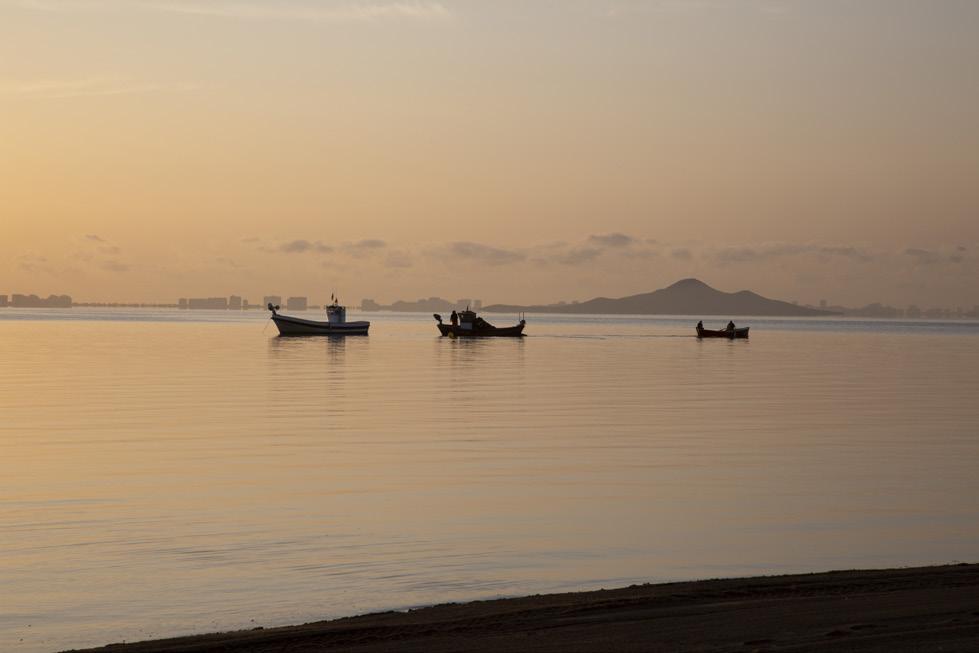
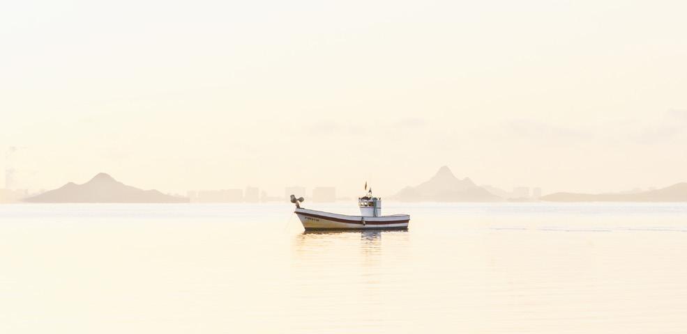
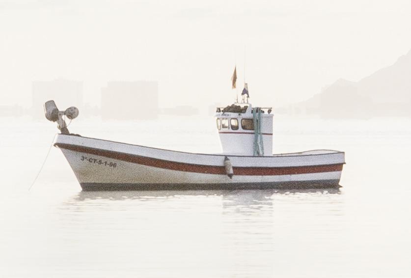
In this image I am shooting with the thought of producing a lighter, painterly image. I was travelling and the lazy in me did not want to carry a tripod.
It’s 6am with the sun just about to appear. The ambient light is soft but orange. I don’t consider colour when taking photographs but the light is everything. In this low-light, non-tripod situation I will need to consider my options for exposure. Depth of field is essential and I chose f16, although, looking back, a larger aperture would have been fine. The boats are some distance out so I find myself at full reach on my 24 - 105mm. I need speed to keep this sharp so dial in 1/125th sec. This leaves me with an ISO that many would not attempt, 25,600. ISO and noise generation is far less of an issue using this process so I find it’s not of great concern. The lifting of light by washing the image in brighter layers helps mask noise and too much noise reduction can leave the image looking clinically clean.
Image 1 - this is the RAW file
I process using Adobe Camera RAW (ACR) and Photoshop (Ps). ACR is used to prepare an image in my workflow, not process it. Lowering highlights, lifting shadows and heading towards a correct white balance are priority. I will ensure things such as chromatic aberrations are removed here. I also presharpen and denoise in ACR, with great care being taken not to remove detail and I mask between
Photographing and Processing Pastels
those now-contrasted edges and the softening of noise grain. In an image with low ISO I may add noise from ACR but I would suggest large soft grain be used rather than fine as this can look too “digital”.
Once in Ps my first step is to consider the crop. If undecided, then I process and crop later but, if possible, I make this a first step just so I don’t process parts I later find I need to chop off. In this style small artefacts like a dust spot or a fast-flying bird can easily become a distraction. I recommend seascapes be taken with minimal water movement and no direct sunlight. The whole soft effect can be destroyed with glistening water and I wouldn’t advise an afternoon of spot healing highlights becoming a new hobby. With highlight fixes done and small objects removed I spend the time looking for contrast and will deal with this locally. I use a Threshold layer (found in the adjustment layers) to visualise the light. Swinging the slider side to side will show where the brighter and darker parts are. It may not be intuitive to darken the bright parts but this is my suggestion. I do this as lifting the darker parts to match the luminosity value of the brighter ones can lead to over-brightness. Darkening brighter sections to match the luminosity of the darker parts is easier to see on screen too. Once it is balanced you can lift the whole image together. The levelling of the luminosity is a key element of the painterly look.
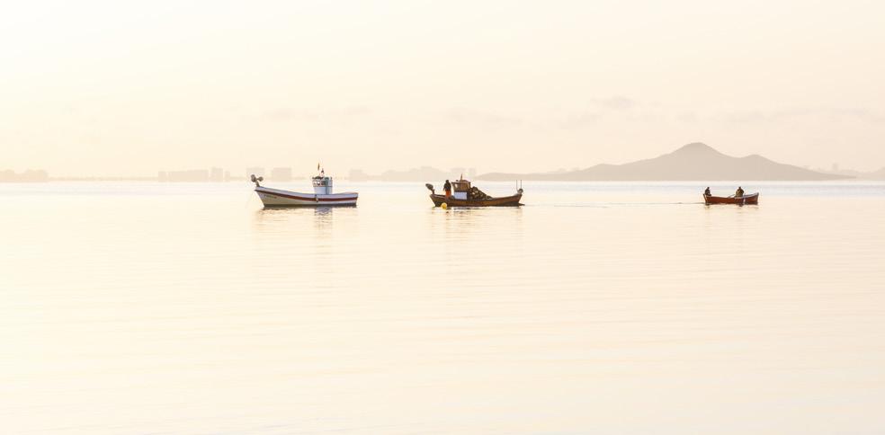
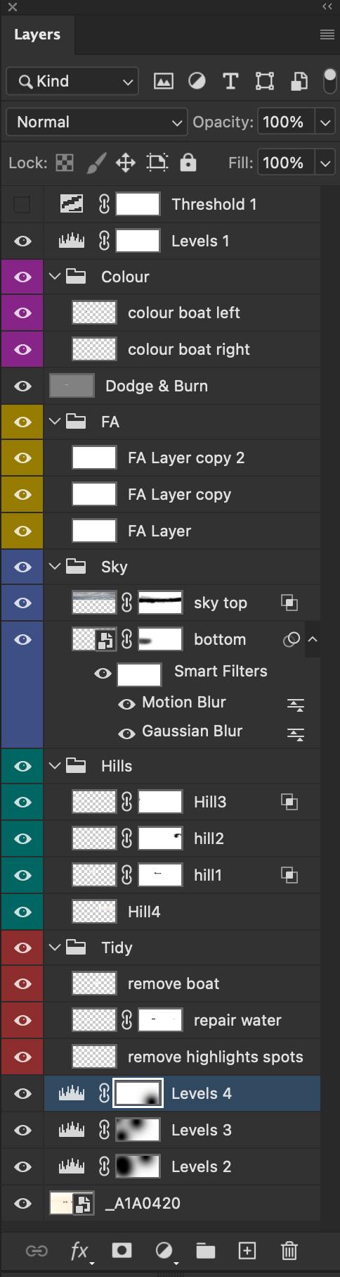
My thoughts are to remove the central boat as this blocks the image and complicates the foreground. I used Patch to remove this. With all edits and adjustments, I use empty layers to ensure the workflow is non-destructive. Patch can be very good when working on larger objects, especially in areas with varied depth of field. You often need to play around with structure and colour settings for the tool; I start with both in a central position and work from there.
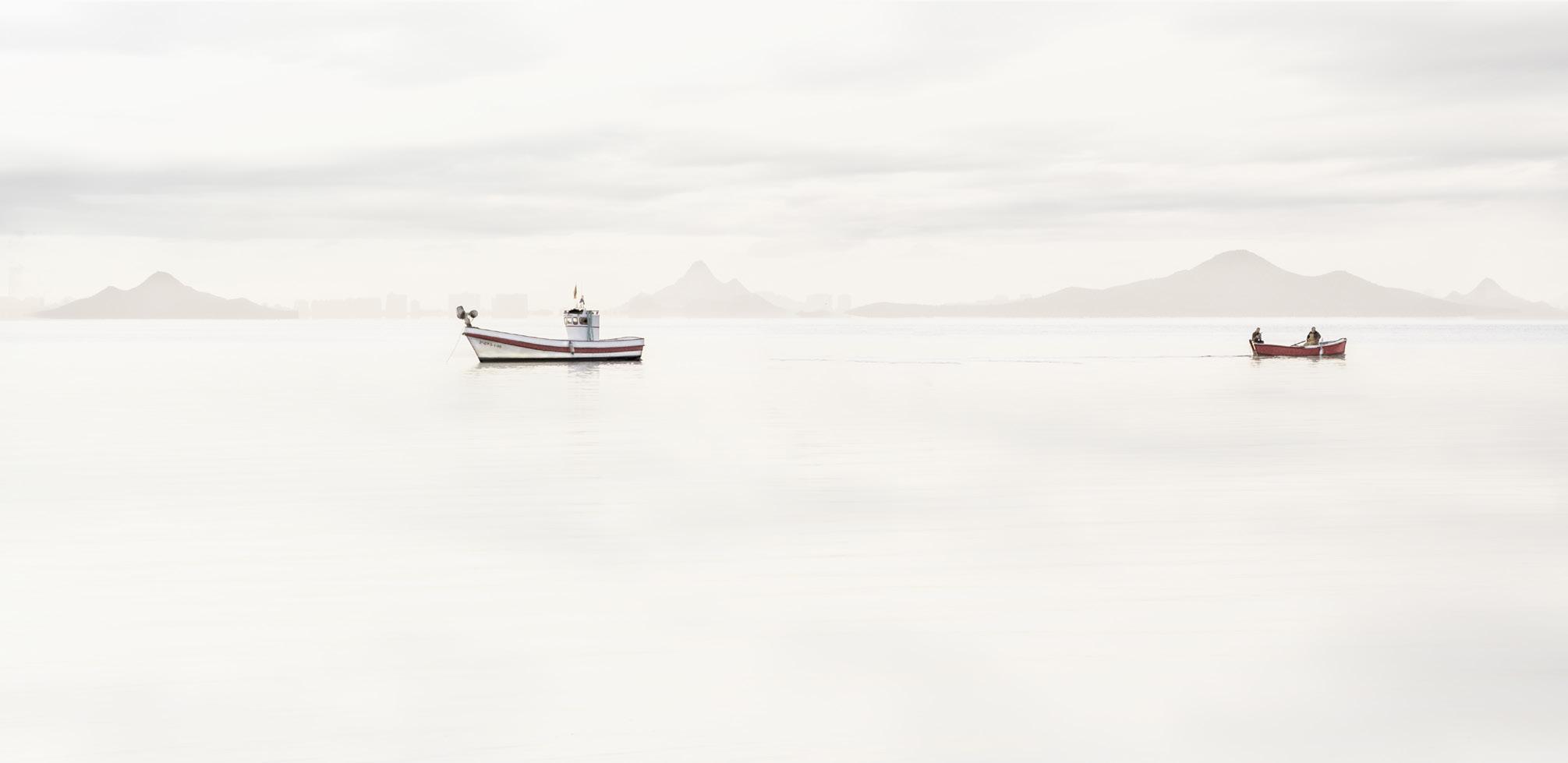
When the luminosity was even and composition to my liking, I added some hills in the rear, hiding some of the high-rise hotels. Small they may be but, if simplifying the colour palette, the eye can be drawn to detail more easily. Using the marquee tool I made a selection around the existing hills and duplicated it before using the transform tool to place over the hotels. I have repeated this a couple of times to give the impression of a fuller backdrop. In this case I have lowered the opacity selectively in some of the hills. Although this can appear to be an error, I find it improves the overall painterly look. Think of a painter; their paintings are not accurate in all areas; it is the overall impression that counts.
Analysing the image, it now appears that the look is too simple in the top and on the water. A painter tends to not leave space without detail and I see a lack of detail in both areas. I am a person who never changes sky, as blending it in is a risk; instead, I add sky elements to existing skies, resulting in a seamless addition. I have added the cloud here by placing a piece of sky over the top of the image and blended it in using the “Blend If” module under the fx button, found bottom right on the Ps workspace. Using the current layer option has let me remove both dark and light parts of the sky to leave a hint of soft cloud. I then duplicate this and, using Transform, flip it vertically to place it in the base of the image. This may mirror the cloud but high definition must be removed if it is to blend with the sea. I control this with the addition of motion and gaussian blur. I converted the layer to a smart object ahead of applying blur. This makes it nondestructive and allows me to step back and adjust if needed and I often have that need. It can be seen in the picture below that the tone of the sky is blue and the base picture is yellow. This is not a concern as the whole image will be washed in a single colour (Image 4 overleaf).
Image 2
Image 3
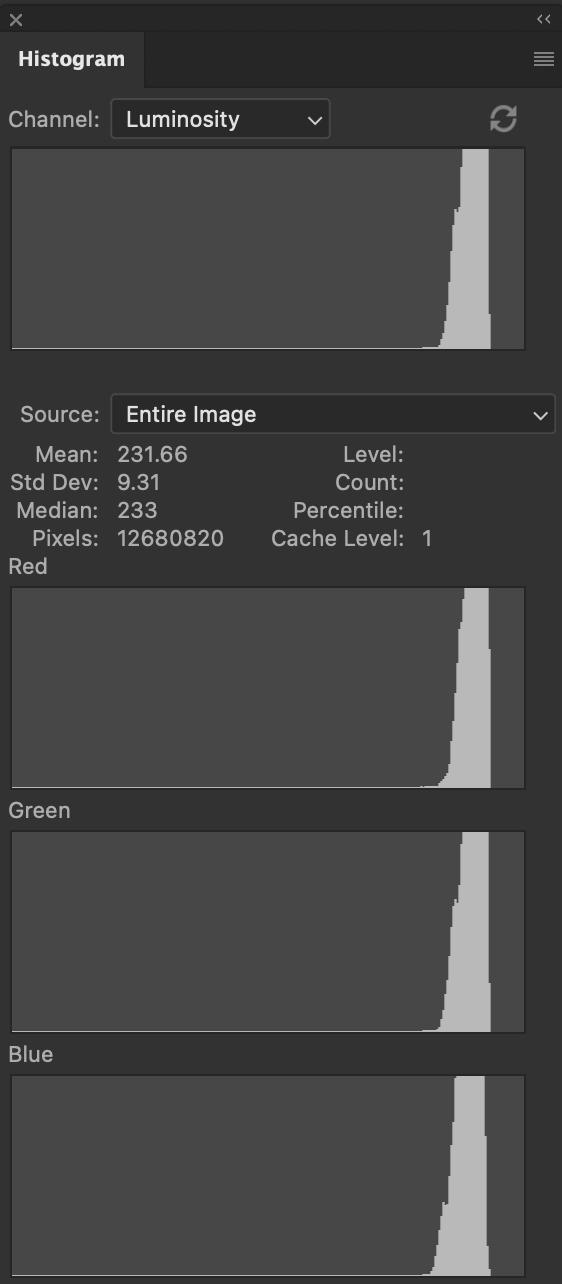
I now apply light layers which give the soft effect. I select a colour which is off-white and has a value of 250 in all three channels. The code for this is FAFAFA in the colour picker; I refer to them as FA layers. These solid layers are blended with soft light mode at an opacity of 20%. If one is not strong enough, I do not lift the opacity, I duplicate the layer. Like Irene, I am a believer that thinner layers give better results, especially when in print. Throughout the processing I keep a close eye on the histogram. My aim is to compact the graph and shift it to the right. This is an area many find a
challenge as we have had “full tonal range” driven in to us over the years and here we are trying to achieve the opposite. The other common error is to go over-bright and push that histogram too far right. The lack of contrast, combined with the compaction of the histogram over to the right, make the image appear brighter than it is. Once the shift is completed, I can see that other colours are becoming washed out. I can paint though with a mask to give me an even colour and not impact on the work just done; I have chosen to add an empty layer in colour blend mode and painted what I want red, red.
After a final levels layer to check I am happy with the light distribution the picture is done and saved. When it comes to print, I would make a further gamma adjustment in the midtones to allow for the difference between printing on paper as opposed to how it appears on a back-lit monitor. After all, no one wants the print to come out too dark when you have spent all that time making it brighter.
These three images (Images 6, 7 and 8) of the main subject show the changes made during the process. Although the start image contains a high degree of noise, I have not attempted to remove very much of it as, under light layers, this noise will be needed to give detail. In the first image you see the boat as it comes into Ps, the second with its reflection desaturated and contrast lowered and, in the final one, where Dodge and Burn, along with painting in with colour blend mode, have been applied.
Image 4
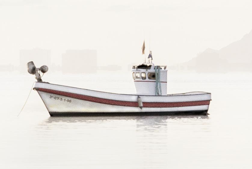
Image 5 (This is the result)
Having a plan and working to it results in a smoother, cleaner workflow. I work in sections and group the task. Always working in a non-destructive environment allows me to make small adjustments at any time, regardless of where that adjustment is within the layer stack. (Image 9).
The histogram is king in a pastel. I work in a dedicated Soft Workspace with these images with an expanded histogram displaying all colour channels. This is simply to allow me to monitor the light as I work to compact it and shift it to the right. (Image 10).
Image 7
Image 8
The Nature of Landscape
Joe Cornish HonFRPS
We continue our series of articles by Joe Cornish. These articles were previously published in On Landscape Magazine (which Joe co-founded) and we are extremely grateful to Charlotte and Tim Parkin for allowing their inclusion. For this edition, we have taken two of his original pieces and merged them to give a sense of two different aspects of an emotional connection with the landscape: Sublime and Iconic.
www.joecornishphotographer.com
www.onlandscape.co.uk
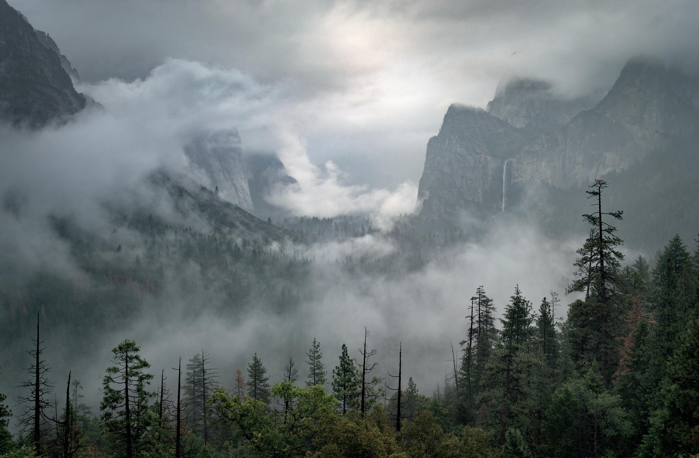
Yosemite Valley Mist
Sublime and Iconic
This article combines two avenues of landscape photography which are distinct, yet for historical reasons can be seen to overlap: The Iconic and the Sublime.
But firstly, what are they? Iconic landscapes are ones that are instantly familiar. They may be ‘culturally-commodified’ and are often overwhelmed with visitors who seek them out as attractive backgrounds for selfies. The Grand Canyon, the Torres del Paine, the Matterhorn and Beachy Head are all examples of iconic natural landscapes. Iconic subjects are often also notable for their architectural content, such as the Great Wall of China, the Eiffel Tower, Bamburgh beach (and castle) or Stonehenge.
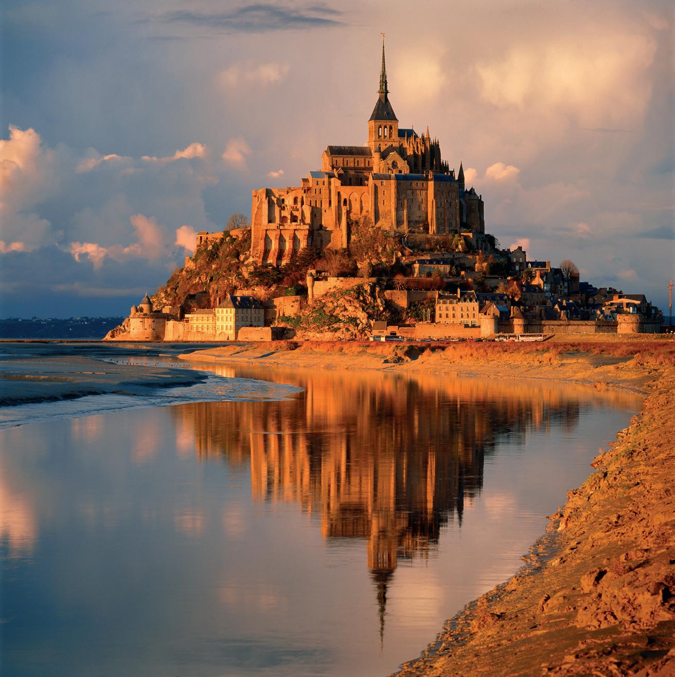
My personal experience of iconic subjects goes back almost four decades to my early years as a travel photographer. From 1987 to 1995 there were many book commissions. A proportion of the subjects requested by authors might be described as ‘iconic’. Not that I gave that much thought until I went to Mont St Michel in France. Here was a place that was instantly familiar, the mostvisited site in France outside of Paris. Its unique coastal setting, beautiful gothic architecture and geographic and historical associations make it a magnetic location. Pictures of it proliferated even before the internet.
The idea of making just another picture was unsatisfactory. Yet I
also felt a responsibility to convey an impression that was respectful of the familiar, that showed it in context. My client expected me to illustrate, not to reinvent the wheel. Limited time and budget inevitably reduced my options and a lack of weather forecasting made my photographic encounters a bit hit and miss (it was 1989 after all). But my third visit to Mont St Michel coincided with some stormy light about half an hour before sunset. I might have worked in such conditions before but the result reinforced my sense that great light could transform the familiar. This experience helped me believe I could rise to the enjoyable challenge of photographing the iconic.
Mont St Michel
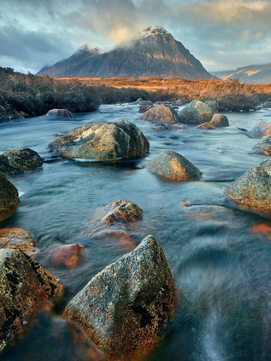
Do photographers themselves contribute to subjects becoming iconic? Colin Prior’s epic panoramas of Buachaille Etive Mor were certainly much copied and it was Colin’s perspective I was desperate to avoid when I first started making my own photographs here in 1998. I had been commissioned by Photo Technique to produce a series called the Seven Wonders of Great Britain. Buachaille Etive Mor was the first ‘Wonder’ and the view I made then is still a favourite.
I have passed this mountain countless time since. It still gives me joy to see if I can use the light and the conditions at the time in a way that feels authentically my own and yet respects the form and space of the mountain. Buachaille Etive Mor is as iconic as any landscape in the UK and the challenge to do something different and personal with it remains.
Of all the world’s landscapes Yosemite might be the most celebrated by photographers, if
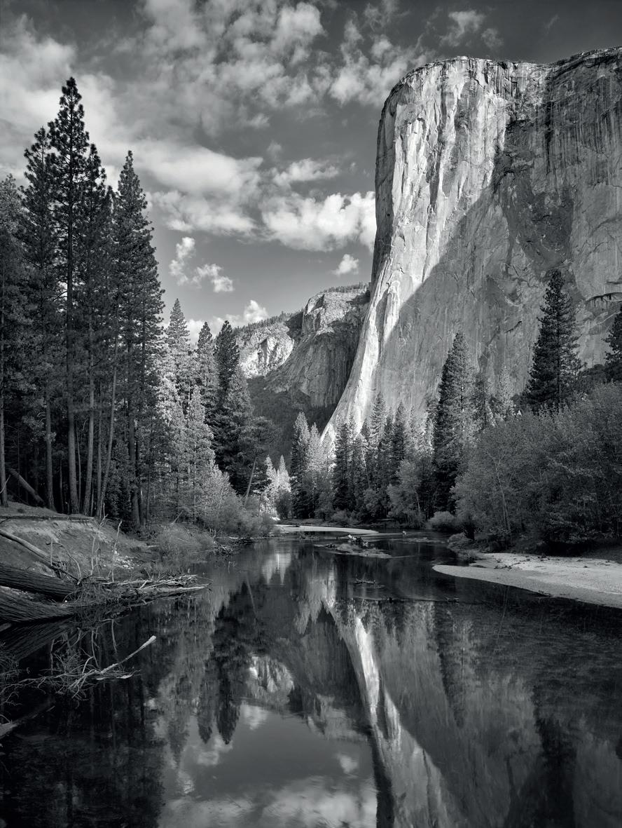
only because of its association with Ansel Adams. While the management of the valley for tourism compromises it, this great granite cliff-scape is still undeniably breath-taking. It is however extraordinarily difficult to make an image here that feels personal. The scale of the place is quite overwhelming. Through the years I have made images that are direct homages to Ansel Adams. But there is one, of El Capitan, the south-facing 914 metre high rampart which dominates the gates of the valley, that I consider truly my own. The cliff face appears reflected in the slowmoving waters of the Merced River and a fallen tree lies across its summit, reflecting it in a way that is strangely disturbing yet, in some way, still quite beautiful. Perhaps, ironically, it was made on a morning of minimal drama, with a hazy blue sky, little breeze and weak sunlight. In the absence of lighting ‘gifts’ I probably dug deeper than I might otherwise have done.
I was lucky to start my photography before the abundance of imagery that you find online today; in most cases I was discovering places for myself. It was rare to have seen pictures of the subject in question before pitching up there with my camera. But iconic landscapes and places had been discovered even before the internet! And so, of the three examples above, I did know what to expect.
The creative instinct is to seek out the new and discover the unfamiliar. Yet the challenge of the iconic landscape is to find a new angle, perspective or lighting; to see the familiar in an unfamiliar way. For anyone with truly creative aspirations, the familiar subject demands a distinctive approach to make it your own.
“The real voyage of discovery consists not in seeking new landscapes but in having new eyes.”
Marcel Proust
Restless River Etive
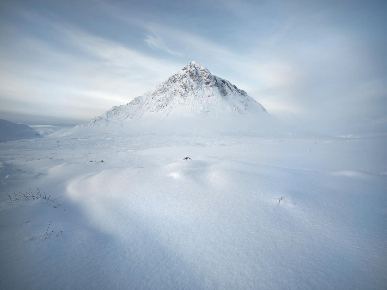
Buachaille Etive Mor, Deep Snow
Yosemite, a granite valley in the heart of the Californian Sierra Nevada, is the landscape that links the Iconic to the Sublime. As well as being familiar, it also represents all the characteristics we associate with the Sublime in the historic sense. That is to say, it is dangerous, it is awe-inspiring and it is almost overwhelmingly beautiful. Anyone who has watched the recent documentary film, Free Solo, starring superstar rock climber Alex Honnold, will surely agree.
In contemporary speech, sublime is often diminished to a fancy version of delightful or delicious, as in, “You look sublime in that dress/suit,” or, even more annoyingly, “The profiteroles are just sublime, darling!” This is an undignified home for a word which, in its philosophical origins, connects with the awe-inspiring, the life-threatening, the edge-ofcatastrophe thrill of nature’s power.
The meaning of the word sublime varies through history and
cultures; but in recent centuries it has been associated with Edmund Burke’s A Philosophical Enquiry into the Origin of Our ideas of the Sublime and Beautiful. It turns out that Burke saw Sublime and Beautiful as two very distinct concepts. But in modern use the two words overlap greatly. From my perspective, it is in the life-threatening potential and the destructive power of nature where the term Sublime becomes relevant to landscape photography (and film making).
A close encounter with a hurricane/tornado/erupting volcano/avalanche/earthquake/ thunderstorm/tsunami is to have a sublime experience. These events were illustrated by many landscape painters of the late 18th and 19th centuries. Giant icebergs and sites of Arctic expedition disaster were also favourite themes of this artistic movement. Although its roots lay in European culture, the art of the
Sublime found its full flowering in America and its direct inheritance in photographic and cinematic culture continues there.
Pioneering photography has its own illustrations of the power of nature; Frank Meadow Sutcliffe’s storm waves breaking over the harbour walls of Whitby is an example that’s over a hundred years old. Also working in the early 20th century, Antarctic expedition photographers Herbert Ponting and Frank Hurley made photographs that epitomise the Sublime. ‘Clearing Winter Storm, Yosemite Valley’, by Ansel Adams is an image of a Sublime landscape moment. And Himalayan climbing expeditions of the ‘50s, ‘60s and ‘70s produced many Sublime –danger-filled – photographs.
However, photography did not produce that much Sublime landscape imagery until the final decades of the 20th century. Two World Wars, the cultural dominance of modernism and
El Capitan - Ansel Adams Homage
Yosemite, Gathering Spring Storm
the march of industry meant that, artistically-speaking, nature was seen as the domain of escapists and romantics. Serious photographers were expected to address the rise of the machine age, the horrors of war and political concerns, such as anti-war protest and pervasive social deprivation. Additionally, film-based photo technology was a limiting factor. Cameras that could produce the high image quality preferred for landscapes were mostly large and cumbersome and ill-suited to dark and dangerous environments.
For much of the 20th century, sublime landscape art in the Edmund Burke sense must have seemed an anachronism. And
yet, in the 21st century, there are powerful philosophical and cultural reasons why it’s a real movement in contemporary landscape photography. Each year it is clearer that we need to pilot the ship of human civilisation on a more sustainable course. Each year our chances of doing so look a little bleaker.
In response, the artistic need to reflect our growing unease includes a search for nature’s beauty and power and also her anger and ability to retaliate. It may not be too far-fetched to describe the Coronavirus crisis as a (non-landscape) example of the Sublime in action. Climatechange has increased flooding events and wildfires around the
world and this trend looks likely to accelerate in the years ahead. So our desire to express awe (fear) and wonder for nature may, in part, be driven by anxiety about climate-change and habitat destruction, as well as a desire to record nature in all its moods, both life-threatening and life-affirming. As story tellers, photographers have to respond to these events, either directly or by seeing a metaphoric message in their subjects.
The technology has helped too. Modern digital cameras are now supremely sensitive, able to see far more luminance and colour in low light than the human eye. It is no coincidence that the rise in northern lights’ photography
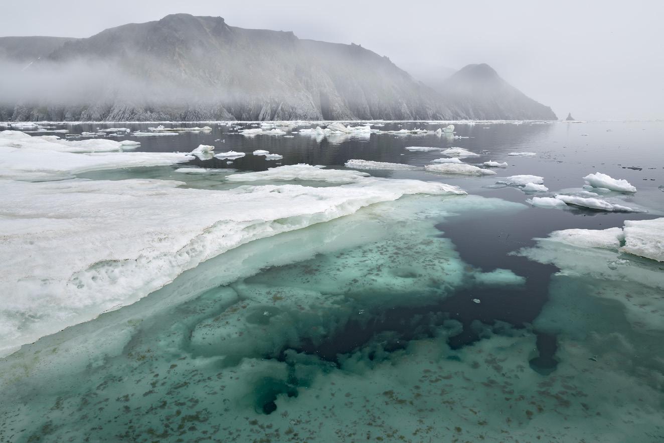
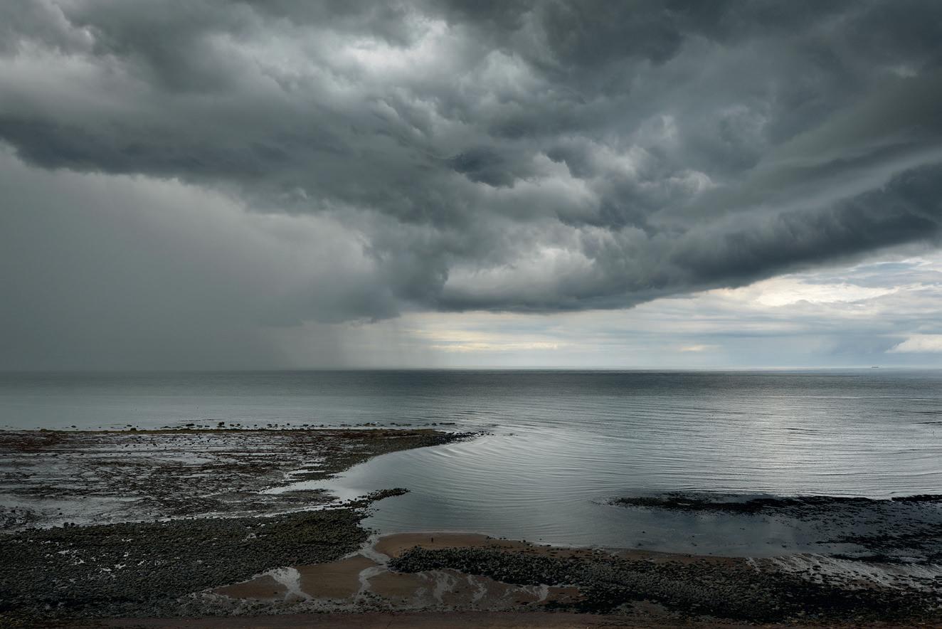
On Thin Ice, Herald Island
Storm Front, Saltwick
Rainbow Gorge, Drakensberg
Iceberg Congestion, Greenland
began with the first useable fullframe DSLRs and fast, super-wide angle lenses around 2005. Since 2015, photographers are regularly photographing the Milky Way in the night sky, with exposures short enough to show stars as dots, not streaks. Combining such skies with complex, artfully-lit foregrounds requires incredible sensor capabilities. Photographers also need the skill, application and imagination to see and create these images in dark and, often, bitterly cold conditions.
No summary of technology could miss the essential role played by post-production. A well-exposed raw file can be persuaded to render almost any conceivable tone and colour by
the expert practitioner, freeing the imagination to emphasise, interpret or exaggerate, according to preference. When I first saw Mitch Dobrowner’s black and white storm photographs in a Santa Fe gallery in 2010 they amazed me; I was also baffled as to how they were achieved. Dobrowner’s imagery starts through an encounter with a spectacular weather event, yet also depends on the ability to render the experience powerfully and creatively. Now, the postproduction techniques required to achieve such dramatic results are more widely-known and heightened effects of contrast, clarity and texture have become part of the mainstream in landscape photography practice.
In the 1970s, when I was a fine art student at Reading university, the worst insults that could be directed at any artist included: Sentimental; romantic; pretentious; bombastic and irrelevant. I can imagine that some of these criticisms might have been applied to quite a lot of contemporary landscape photography.
But, at its best, sublime landscape photography reminds us of our vulnerability. Surely this helps give enhanced meaning to our lives. And if that is not a relevant, vital, rational and essential theme for our times, then I don’t know what is.
El Capitan Reflected
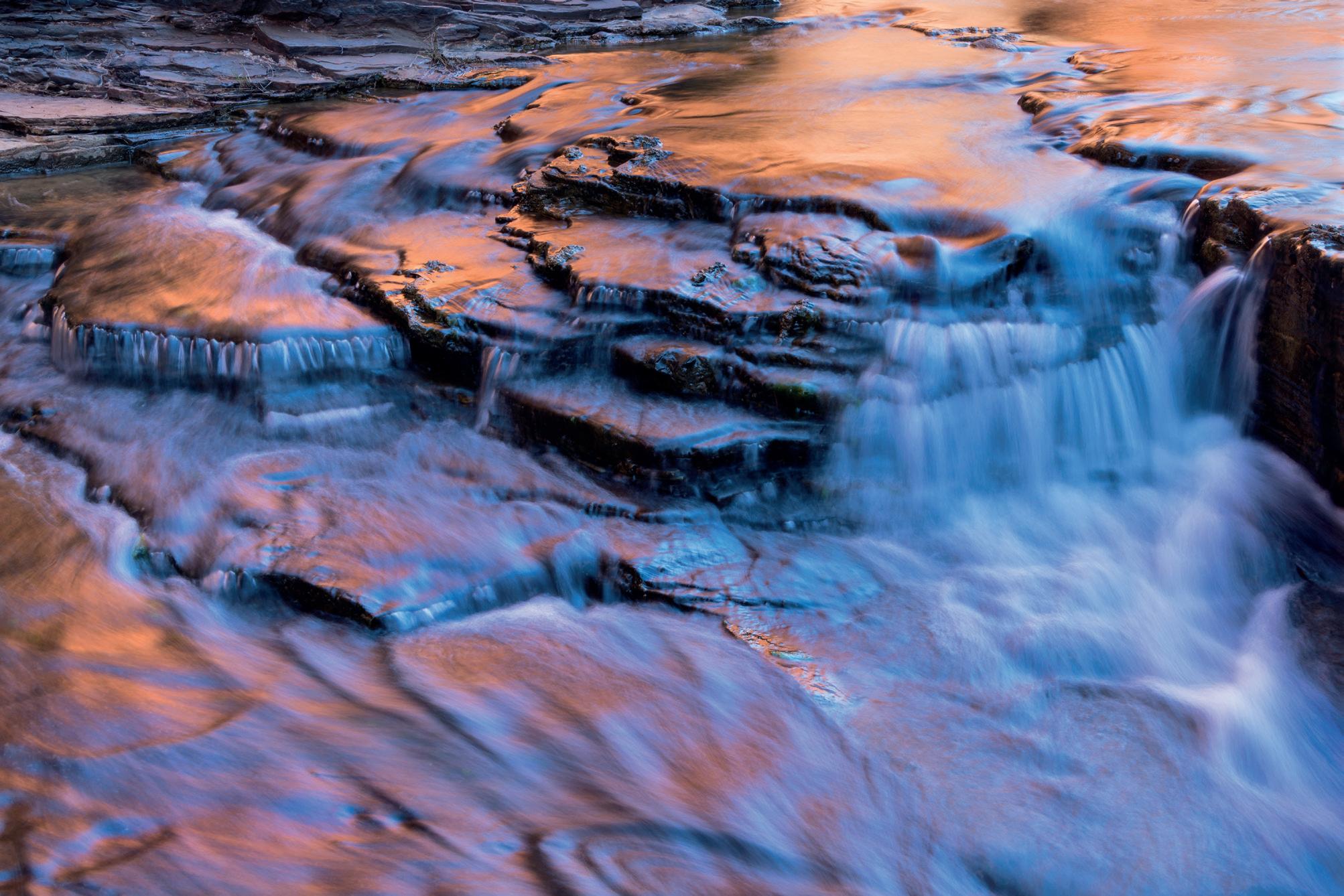
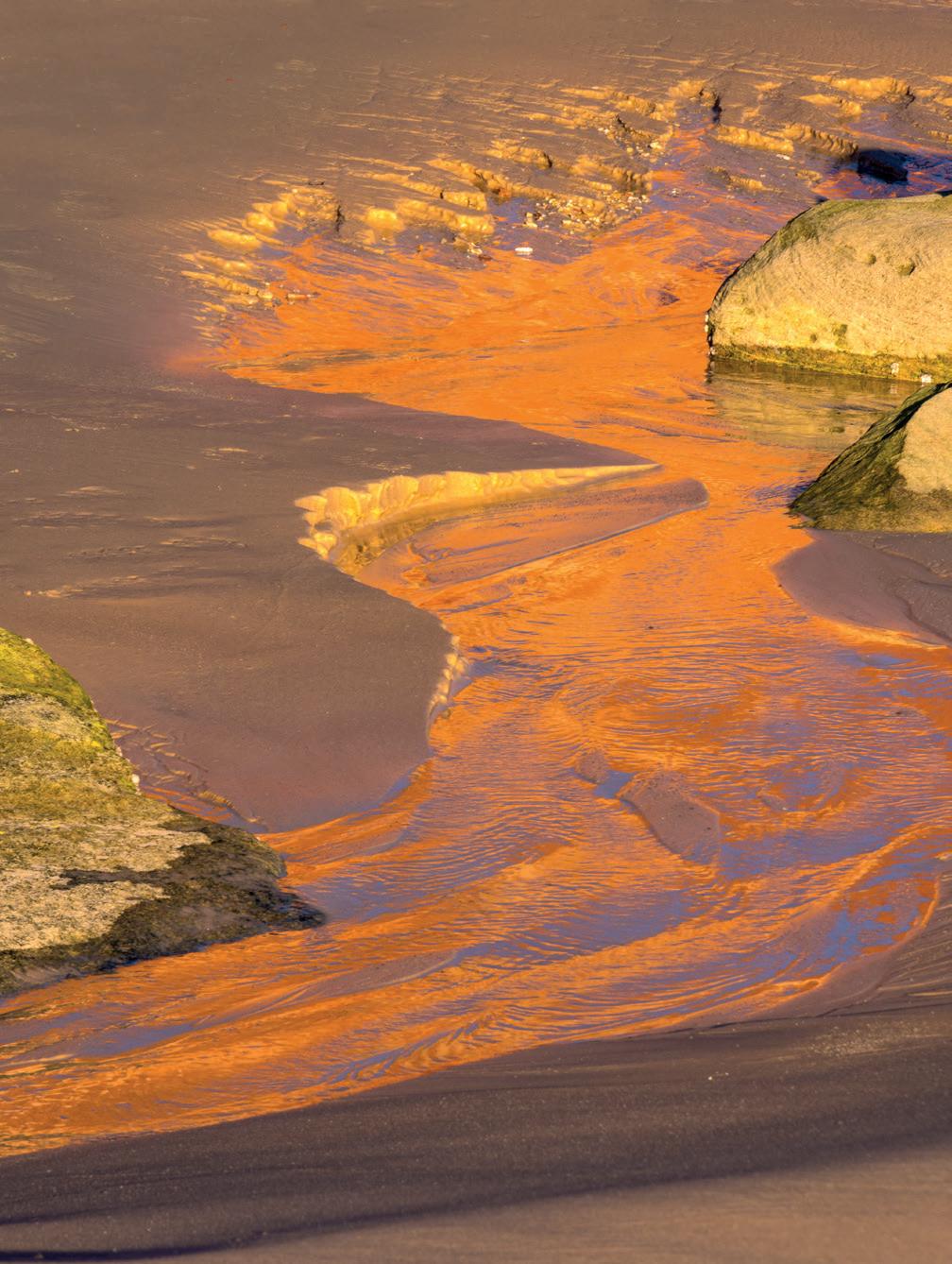
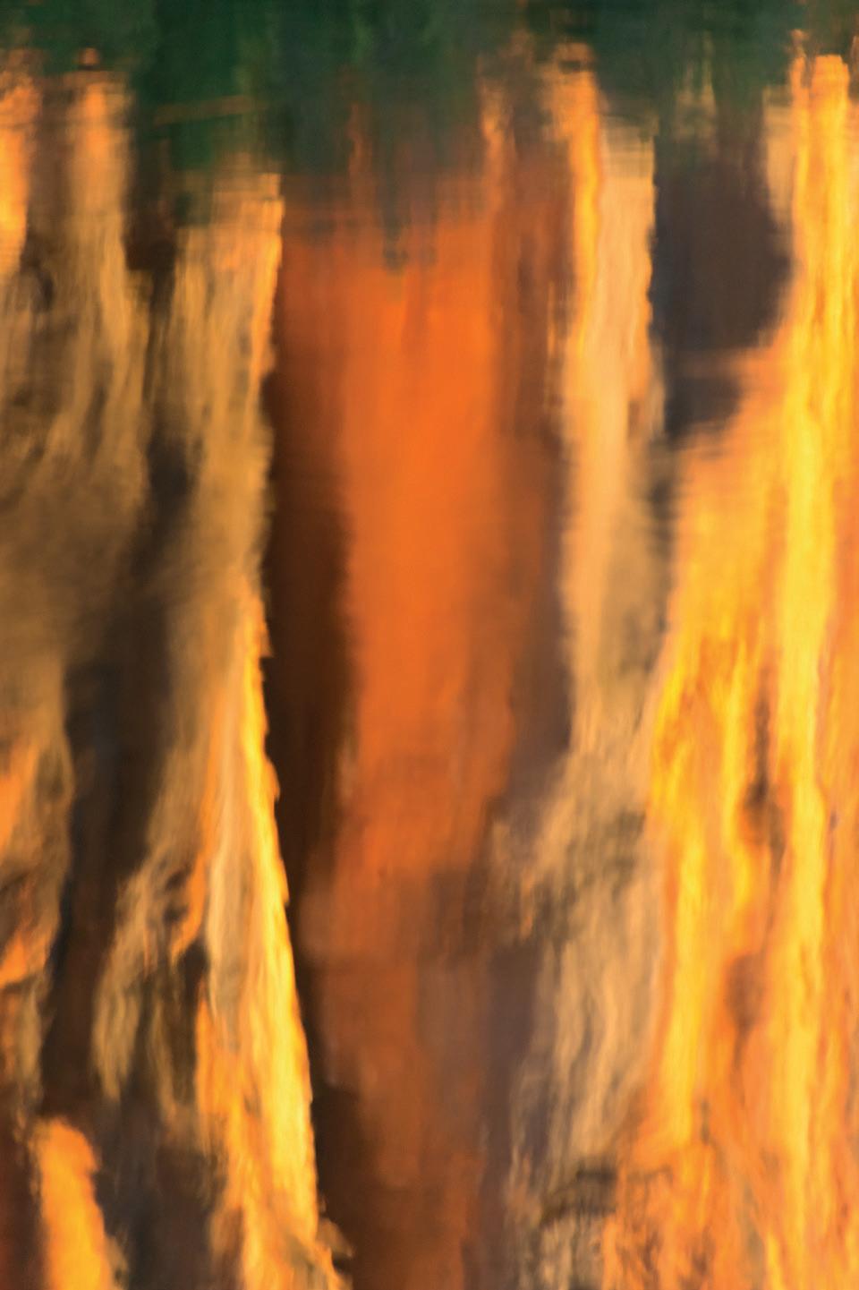
An Alternative View
Martin Annand
Martin has developed a beautiful and distinctive style of landscape photography using long exposures and a soft colour palette.
Website: 23martian.co.uk
Bude
Pro-Pastel
I came to photography pretty late in life. I’m 52 now and started taking photographs around 6 years ago. My sister used to live in New Hampshire in the States and, one time I visited her, I picked up her camera, having never picked up a DSLR or, indeed, any camera before. I was immediately fascinated by it and just started playing with it; the mix of creativity and the technical aspects of photography instantly appealing to me. I used it the whole time I was there, taking shots of anything and everything... badly, it has to be said. I initially used the auto settings but it sparked something in me that made me want to find out more. So, when I got home, I bought a Canon cropped sensor camera; a Canon 750d with just the kit lens and I started learning as much as I could about aperture, shutter speeds, ISO etc. I bought a book on the basics and
watched a whole lot of YouTube videos to try and learn as much as I could.
There was no real direction when I first started; I would take shots of anything I thought would make an image. I can remember I always enjoyed slowing the shutter speeds to get light trails or blur from moving objects and reflections always drew my attention too. Watching YouTube videos, I was attracted to landscape photography. I’ve always enjoyed getting out to the coast or the countryside and things quickly changed from going somewhere and taking my camera to going somewhere because of my camera. Part of the appeal is finding locations and checking conditions, whether it’s tides or weather; they all add to the enjoyment of photography. Delving further into photography on YouTube and social media,
I discovered long exposure photography and it instantly resonated with me. Seeing the work of Trevor Cotton and Noel Clegg made me want to understand this genre and what it takes to produce these beautiful images. I saw these images as transforming photography from documenting to creating art.
I’ve always had an interest in art all the way back from my time in school, where it was probably my favourite subject. I then went on to college to study graphic design, which gave me a decent understanding of Photoshop and that has certainly helped me in the direction I have chosen. But, as far as photography itself goes, I am self-taught. Books, YouTube and a lot of trial and error have got me to where I am now. I do feel there is always more to learn; whether it is in-camera or in post-processing, I feel I can
Burnham Tree
Genva Platform
improve. There is never a finished article as far as I’m concerned in photography.
The minimalist style appealed to me very early on. Amazing sunrises and sunsets are beautiful to witness but they’re not what I wanted to capture. Being a bit more subtle and reserved is more me, I think, and using long exposure techniques and processing suited what I wanted to achieve. I had a fascination and a strong desire to understand long exposure photography and how to use neutral density filters effectively. I enjoy the slowing down of the photography process. The time taken to make the long exposure is a time to take in your surroundings and savour the moment of where you are. There is also an element of anticipation as you are never 100% sure how your exposure is going to go. You can dial in your settings but there is always that factor of not knowing what you are going to get.
The challenge of taking that frame from my camera into Photoshop and stripping it back
to its bare essentials, sometimes isolating a subject completely, is something I enjoy too. I know photographers say time in front of a screen processing is time you’re wasting not being out taking images but I enjoy the editing process.
My style that I have got to thus far has been a journey of trial and error, necessity and a conscious decision to concentrate on one genre; the necessity being the limits imposed by outside influences on my photography. I am a hobby photographer. I have a full-time job and a family which comes first, although my wife may dispute this at times. I only get out once or twice a month and, as it’s a 2 hour drive to my nearest coast, it’s not a quick trip if I want to get out.
Time or the lack of it behind the camera has shaped my style. I can’t always get to locations when the light is at its best or when the tides are right so I started to try and create a more timeless feel to my images. Isolating a subject with negative space can sometimes speak louder than a
busy scene, I believe, so I found that simplifying a scene was a way to utilise my photography time more efficiently and try to form a style for myself. At the same time, having a style can be a little constricting. Sometimes I have found myself not shooting or posting something because it won’t fit with my other work. I’d love to shoot a wider range of subjects and genres but, with the time I have available, I’ve decided to concentrate on one style of photography.
I am very much drawn to water for my photography. Living in one of the most landlocked counties in the UK I didn’t plan that very well but I feel that, with water and the coast especially, you can get the most out of long exposure photography. Changing tides and variable weather conditions can make scenes so different. I think just being on the coast can be good for the soul anyway. From wild winds and sea spray in the face, to calm, lapping waves when you are the only one on the beach; it’s a great place to be!
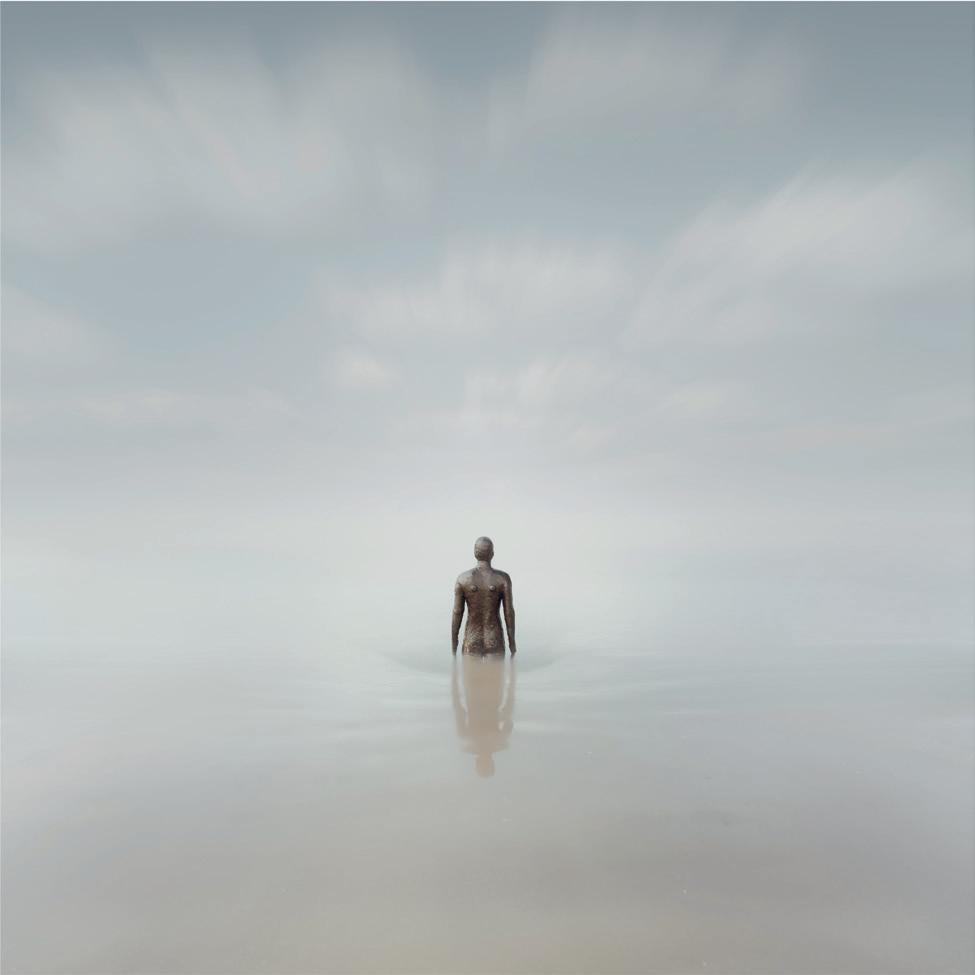
Gormley
Lakes Pier 01
I generally go out on a shoot with a plan. I’ll scan Google maps, looking round the coastline for anything that looks interesting, whether it’s man-made or natural. I’ll check weather conditions and tide times. For weather, I use apps like Clear Outside and Ventusky and for tides, I use WillyWeather. I also use The Photographer’s Ephemeris and PhotoPills Apps for sunrise/ sunset times and directions etc. If it’s a new location I may look on Instagram to see if anyone else has shot that area, just to get an idea on, for example, the height of tides to see if a high tide is a better time to shoot. My ideal conditions are overcast and low winds and fog always make for interesting conditions. Harsh sunlight and strong winds are my nemesis. Overcast weather makes for a more even exposure and low winds reduce the risk of your camera or tripod shaking and causing a blurred shot.
For the most part, I have a plan and a subject in mind but, on more than one occasion, I have reached a location and something else has caught my eye rather
than what I had originally planned. As a result, I have often come away with, in my opinion, a better and less obvious shot. I think you always have to be open to what is around and sometimes, when taking a 2 minute plus exposure, it can give you enough time to look around for different subjects and compositions.
The kit that I use is the Sony A7rV. I came to photography at the time when mirrorless was becoming popular and, at the time, I think Sony were leading the field so I opted to go with them. With other systems it’s not a new thing but I do like that the A7rV now has an in-camera intervalometer which makes life a lot easier, rather than having a remote timer connected to your camera and wires hanging from it when doing a long exposure. I find it much easier to dial in the time I need and that’s it. Lenswise, I have a 24-70 Sigma Art f2.8 lens, a Sony Zeiss 55mm f1.8 and my favourite lens is a Canon 135mm TSE f4. I use this lens with a Sigma M-11 adaptor. It’s the sharpest lens I own by far and the focal length is pretty good for any
subjects that are just offshore. It has manual focus and the tilt-shift function adds extra flexibility to capture panoramas and higher resolution frames. I used to have the Sony 16-35mm f2.8 GM lens and now wish I hadn’t sold it but I needed to for the new camera. I do miss the wide angle option for certain subjects. I’d also like a longer focal length 200mm plus for capturing subjects further away and for the compression that longer lengths provide but they are on my ever-growing wish-list.
The neutral density filters that I use are Kase Wolverine filters. I have a polariser, a 6-stop, a 10-stop and a 16-stop. I find that those cover pretty much most situations and conditions when doing long exposures. I use the 6-stop for blue hour, the 10-stop for most daylight exposures and, for harsher, stronger light, I’ll use the 16-stop. They have little to no colour cast and they are very durable; I’ve been using the same set for 4 years now and have dropped the 10-stop a couple of times but they are still going strong.
Lakes Pier Loch Lomond
A strong, sturdy tripod is a must too. I have a Benro Mach 3. Again, I’ve had this for around 4 years and have no reason to change it. It’s sturdy, has a good height and, with a good clean after being in salt water, it’s as good as new. I’ve only had to replace a couple of lock washers on it in that time.
For post processing, I edit the majority of my images in Photoshop and I use Lightroom mainly as a catalogue for my
shots. I will take them into Lightroom for minor adjustments such as lens corrections and white balance and then into Photoshop for the rest. I have a general workflow that I stick to but it’s only a guide and really depends on the image. If I’m isolating a subject, I usually concentrate on making a mask for the subject. This can often be a lengthy process and there really isn’t just one quick method that will give you a good mask; well, not that I know of anyway. It can be
laborious and frustrating at times but getting the mask right and realistic can make or break an image. I’ll usually only continue with editing if I feel the mask is right. From there, I will start with the background, then move onto the subject, using various adjustments to get the results I desire.
Some of the things that I have discovered include trying not to get caught up in comparing your photography with others on
Marsh Normanton Church
Quarry Quay
Shingle Street
social media, although I am often guilty of this myself. It’s well-worth seeing others’ work but it can be a little overwhelming with so many amazing photographers out there. Do what you can do, get out when you can, shoot what you love, enjoy it and stick with it. It’s always worth looking back at what you were doing a year or so ago; you might not be where you want to get to but you’ll probably be surprised at how far you’ve come in that year.
If you’re stuck with something and you can’t find it online, don’t be scared to reach out to people. I have done it in the past and I’ve found, for the most part, that the photography community is a friendly, encouraging one and, if you have a question, people are generally happy to help.
If you go shooting at the coast, know the tide times and the heights of the tides where you are going. Sometimes getting there at high tide and shooting as the
tide goes out can be the safest bet if you’re not sure; an obvious thing really, but just be safe. One thing I do keep in my camera bag is a plastic bag. Sometimes during shoots I’ll pick up any plastic or anything else that shouldn’t be on the beach. It’s a small thing but it all helps.
As for the near future, I am hoping to go out to Venice at the end of the year with Noel Clegg to shoot with him, with a view to running a joint workshop in 2025.
Ten Hut
The Landscape Zine Project
Fiona McCowan FRPS
About the Project
The aim of the ‘Zine Project’ was to encourage people to have a go and produce their own zine. For too many photographers our digital images just languish on computer hard drives. The zine (pronounced zeen) is an exciting and different way to get your photography project seen. Descended from the fanzine with its low-tech look and do-it-yourself feel, today’s zines have risen from the ranks of amateur publishing to a phenomenon enjoyed by photographers of all standings and genres.
Whilst never restricted to a single shape, size or format, photozines generally contain a small project; they are printed quickly and cheaply and are the polar opposite of expensive, luxury self-publishing. Great for giveaways (or swaps), zines are also an ideal vehicle for concluding those photographic projects that seem to linger on, desperate for an ending.
The only limitation, apart from imagination, was that the zine concept needed to fit with our definition of landscape: “Landscape photography is defined as the photographic portrayal of all elements of the land, sea and sky, whether natural or built or influenced by human endeavour. Examples include mountains, hills, farmland, coasts, bodies of water, forests and populated and industrial areas”. We had a wide range of zine concepts covered by the participants.
In spring 2023, we ran an introductory briefing with Tim Daly, Senior Lecturer in Photography at Chester University; this was followed in the summer with a talk on zines and photobooks by Euan Ross, creator of biblioscapes.com and, in the autumn, there was a follow-up review and Q&A session with Tim, looking at zines submitted by the project’s participants.
Why we did it
It was for enjoyment! The project’s main value was to get people engaged and to encourage them to produce their own zine. We were delighted that circa 80 people signed up for the project, with more than 20 participating in a ‘zine swap’.
Outputs from the project
The zines! Everyone who participated in the project has been encouraged to submit their zine for display on a stand at the Landscape Group Conference in spring 2025. If you haven’t yet done so, please send your zine to Fiona McCowan (landscape2@rps.org).
A selection of the zines produced for the project are featured in this article.
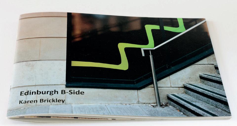
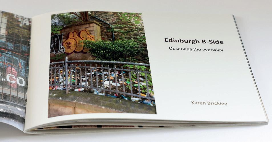
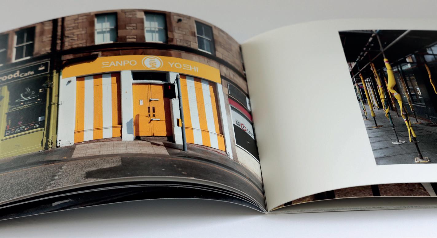
Edinburgh B-Side
Karen Brickley ARPS
Although I had made photobooks before, they were very much of the memory-keeper variety. I enjoy looking at photobooks and was keen to make a printed one of my own; this was the nudge I needed to have a go.
The project started with a zoom presentation by Tim Daly and then it was up to me to decide on a project. Choosing took longer than anticipated but an idea came to me on a trip to Edinburgh. Whilst enjoying a coffee on the Royal Mile and watching all the tourists streaming by, I decided I would stray from the well-known sights.
What I did find was an empty street, graffiti and a lot of rubbish - all of which seemed to have potential so I started taking photographs. As I wandered, I found abandoned road signs, a KX100 phone box and even a pair of knickers decorating some iron railings. Conscious that I needed images for a book I tried where possible to make both landscape and portrait images to give myself options. As I wandered, themes began to emerge and I thought about how I would pair images in the zine and searched for compositions that would work well together.
I had opted to participate in a zine swap for the project so needed more than one copy. I also knew
that I wanted to raise some money for an Edinburgh charity by printing a few more copies and selling them. I passed the Simon Community, a charity supporting the homeless and this seemed the perfect charity to support.
I had purchased Affinity Publisher but never actually opened it so I chose to learn how to use this to compile the zine. I took an online course, again with Tim Daly, and set about arranging the images and writing some text. I submitted a draft and got helpful feedback - fewer words, more images and a more arresting front cover. All good advice.
I settled on a layout that I felt worked and started to think about printers. In the end I went with Mixam. They were helpful in answering my queries, sent paper samples and were reasonably priced. I had to convert the images to CMYK for printing and uploaded my pdf. A few days later a box of zines arrived; I was ridiculously excited!
The finished product is not perfect; I need to leave more space when taking an image to give me more options and some images are a bit dark but I think they still work with the grungy theme. Looking forward to making the next book or zine!
Postscript: All copies of the zine are now sold and have raised over £300 for the Simon Community Charity.
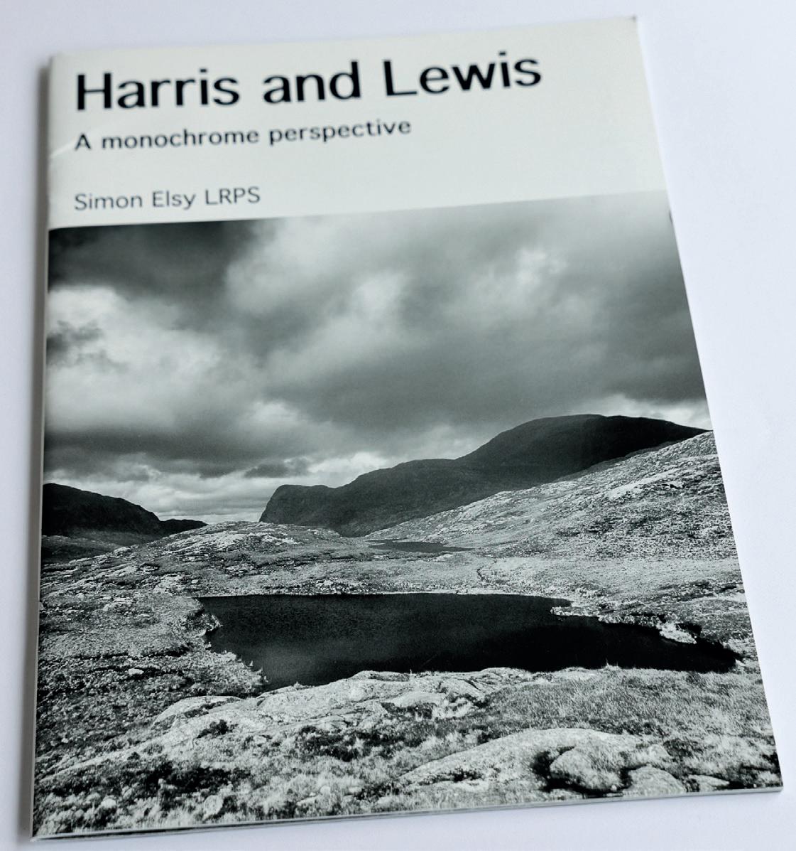
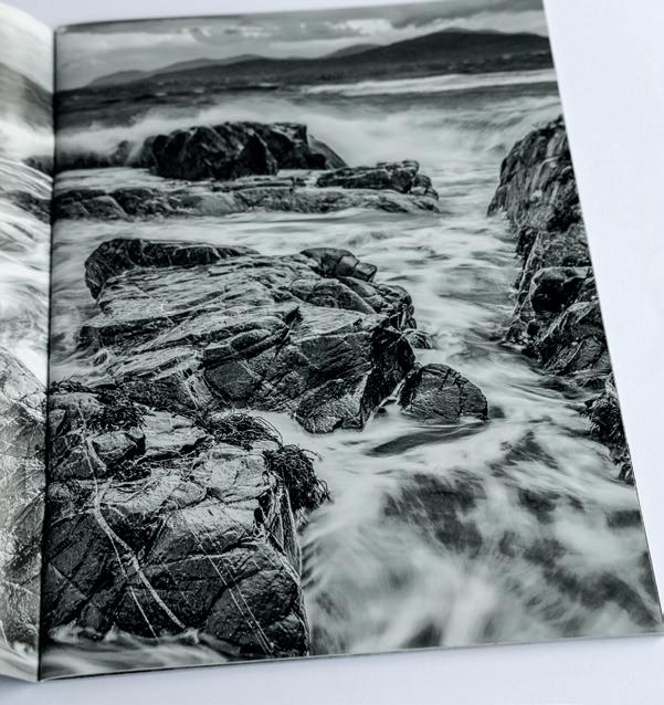
Harris and Lewis Simon Elsy LRPS
I saw the RPS Landscape SIG advert for the Zine project in April 2023 and signed up to participate as this was a theme that was of considerable interest to me. I had produced photography books over the years based upon trips and journeys, often to remote places, for the purpose of being tangible records and as a way of capturing the wildlife and landscapes we encountered, as it would be unlikely that we would visit these again. Producing such books was a challenge, in that compiling suitable text that was factually accurate, reflected the images, was of correct size and style and not misspelt, was daunting. This meant that it often took months to finish and, as I use Adobe Lightroom, the natural publishing platform would be Blurb as I could transfer images, their file names and details directly. I have found Blurb to be fine but correcting text, text sizes and styles can be a challenge. The choice of book size, binding and paper is excellent but with numerous pages of photographs it can be costly.
When the RPS announced the Zine project, I thought “here is an opportunity to quickly produce a short format booklet which can be easily printed and bound”. At that time, we had just returned from a Harris and Lewis photography week. The location was fantastic and exciting and this was a first-time visit. However, the weather was cloudy, windy, rainy and not at all great for the ideal sunrise and sunsets, yet it had a wonderfully powerful and atmospheric
impact. This would be an ideal location for a short magazine-style zine record of the trip. The Zine project was organised by Fiona McCowan and involved Tim Daly as the tutor/mentor. There were introductory sessions, a Q&A, and critique sessions which ran from late October 2023 until January 2024. Tim reviewed my zine and made extremely useful comments that I was able to use in improving the layout and format.
I initially used Blurb but found the text editing difficult as well as the style continuity, which Tim picked up on. The zine is traditionally a portrait format booklet but, being a landscape group, images had to be edited either as 2 pages, or part 2 pages, with some edited as 2 to a page. With landscapes this did not necessarily do justice to the vistas being used. In the end I decided that I would use the Blurb pdf version and Mixam Printing who were able to produce a stapled A4 zine format. The stapled format allowed 2-page spreads to be seen laid flat when opened, a real benefit for a landscape zine. The paper had sufficient strength and lustre for such a format.
The zine project was excellent in that it provided great encouragement and ideas to support using this type of format. I was really pleased with the end results and believe that a zine is a useful addition to the production of photography books. One final comment is that the weather and scenes benefited from black and white as well as colour, so in the end I produced 2 zine versions to allow for that.
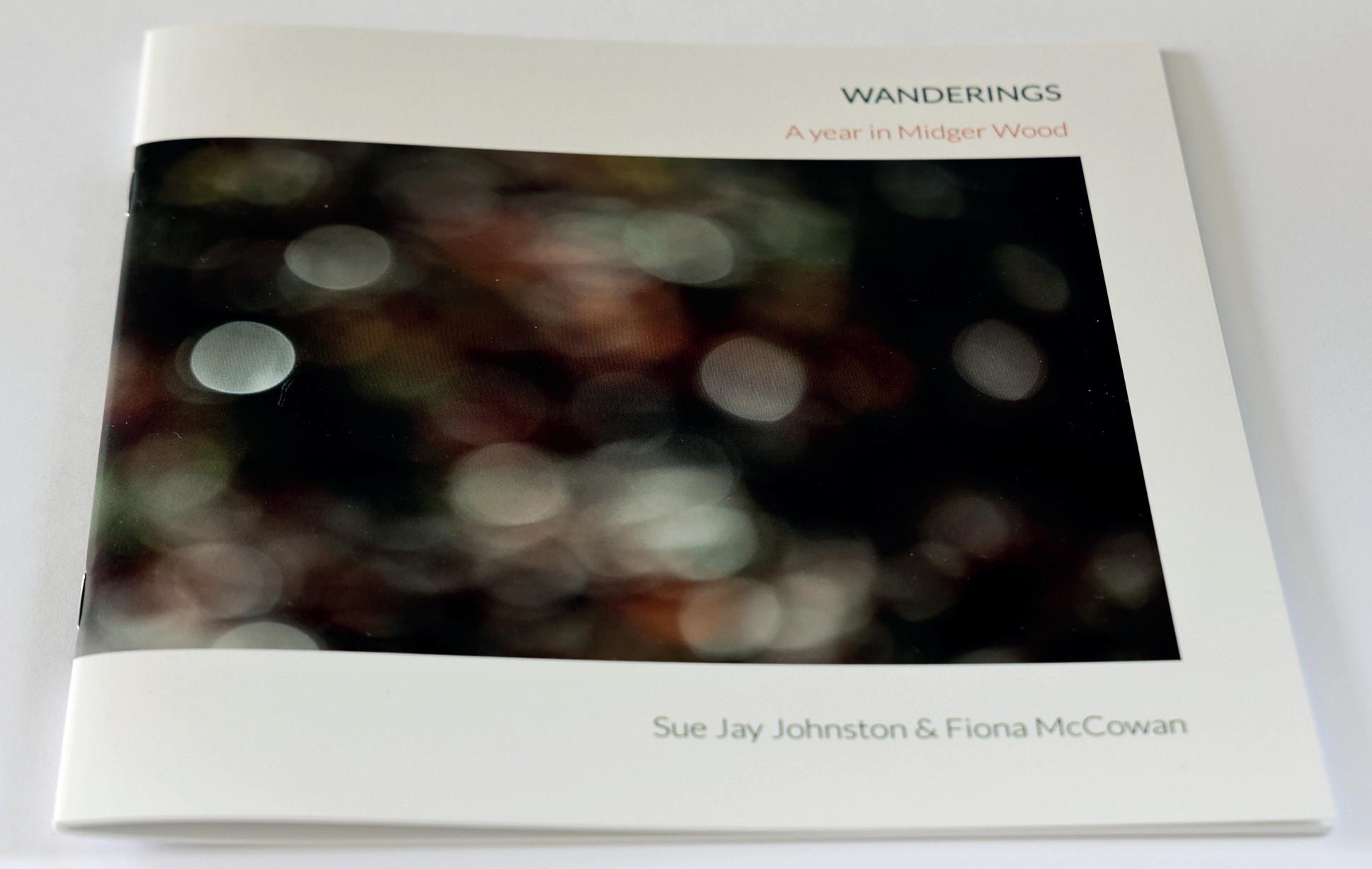
Wanderings
Fiona McCowan FRPS & Sue Jay Johnston
The Zine Project was the perfect opportunity to produce a zine for a body of work initially photographed in Midger Wood for the RPS Landscape Group ‘Close to Home’’ project in 2022. Midger Wood is a small nature reserve in the southern Cotswolds.
Following my involvement in a collaborative photobook project for the RNLI, I approached Sue, a talented fiction writer. She wrote a brief fictional
narrative for each of the six images. ‘Wanderings, a visual meander through the seasons in Midger Wood in images and words’ is the result of this collaboration between friends who share a love for this special place.
A limited edition of forty zines were produced. Copies were sold to raise funds for Stroud Women’s Refuge.
Production details: 18cm square; pages 170gsm silk; cover 350gsm silk, matt laminated; stapled; printed by Mixam.
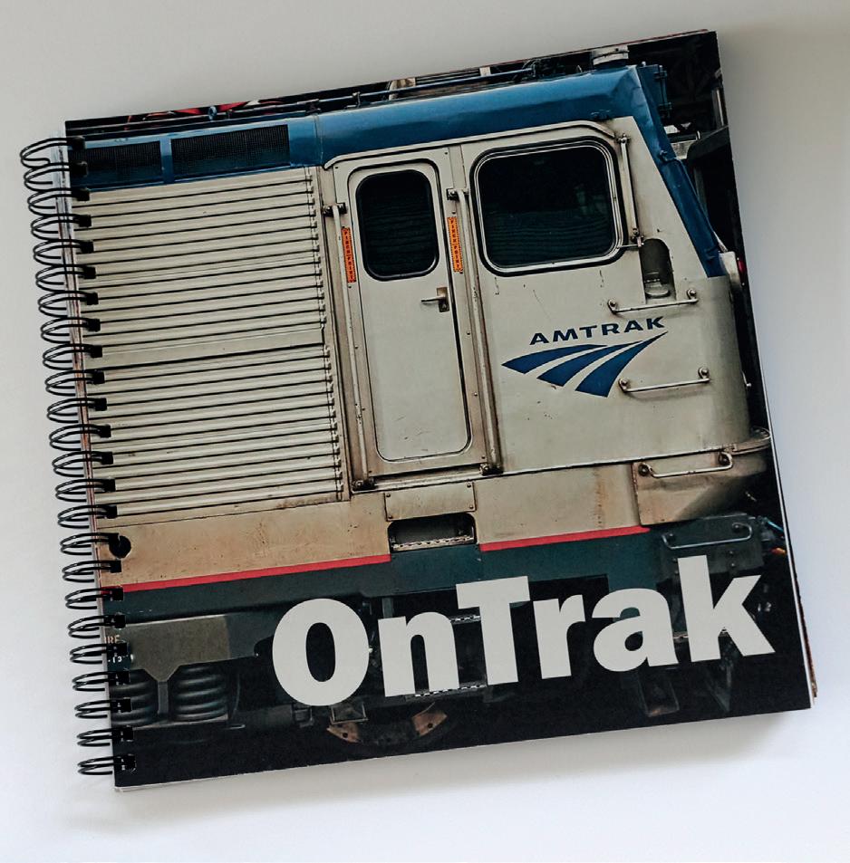
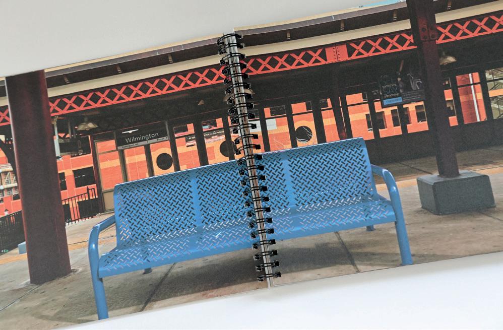
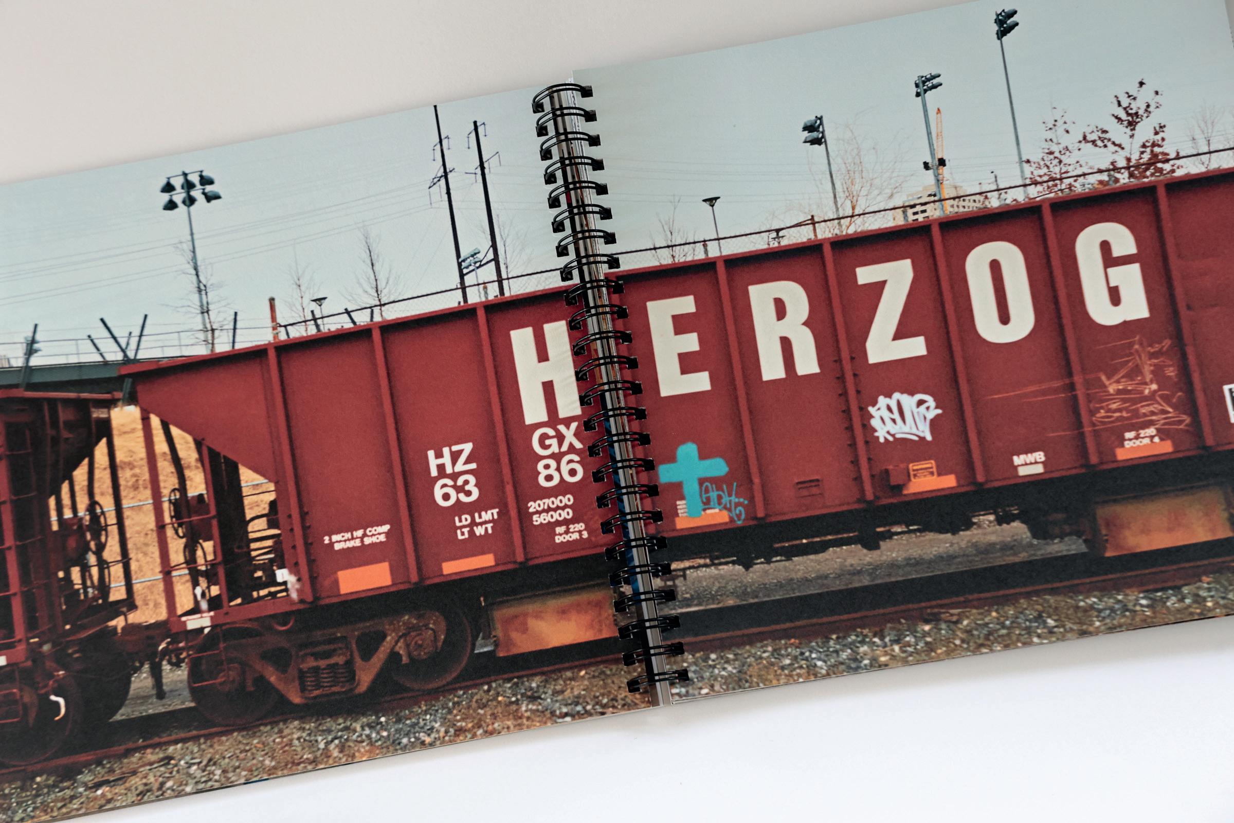
OnTrak Robin Mudge
Tim Daly reviewed OnTrak and the main point of discussion was the sequencing of the images. As each double page spread contained two images, some of them didn’t work well together. However, re-sequencing would destroy the journey sequence so the only solution was to use only one image per spread.
Tim’s comments and the Landscape zine project gave me the confidence to explore a total redesign of OnTrak. The designer Irma Boom talks about the book as an object and how it is important to let go of the ‘individual images to make a photobook and not just a book of photos.’
My redesigned book is square, with the 1:2 images stretching across a double page. I used wiro binding to allow the spread to lie flat as it splits the images in half and, for this topic, that seemed to work. It helped by using 200gsm pages and 350gsm covers.
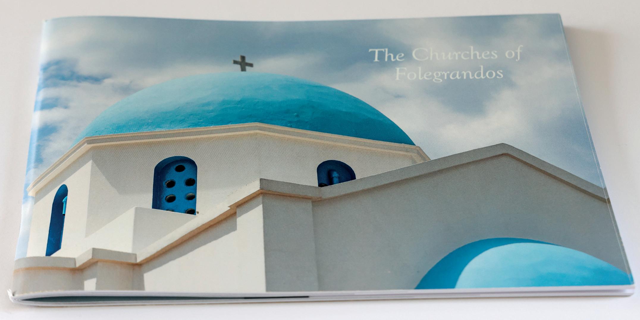
The Churches of Folegrandos
Ingrid Popplewell ARPS
I have enjoyed making books since taking part in various online classes available during lockdown through the RPS Landscape Group. The Zine was a new bookmaking challenge.
The hardest part of bookmaking is finding images that are sufficiently different but cohesive enough
to work together. In this case I wanted to show the variety of churches on a tiny Greek Island where I recently had a walking holiday.
I used Affinity Publisher for the layout and Mixam for printing. There were a variety of formats to choose from. I chose A5 pamphlet style for simplicity and each book cost around £5, which I felt was good value.
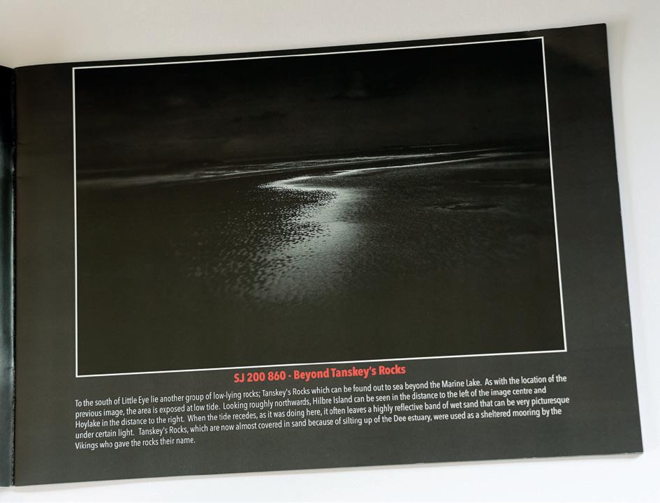
Crossing the Lines
Mark Reeves FRPS
I am an absolute believer in the power of projects to improve, if not transform, your photography. A well-chosen project can make us push boundaries, try out new things and, potentially, discover new skills or passions. And so it was with the zine project for me. I have lived in my current home for nearly nine years and yet this project encouraged me to discover nearby places that I never knew existed,
plus it led me on to research places about which I knew nothing. But most of all, it has taught me how so much satisfaction can be found from photography on my doorstep. Having undertaken all the photography for the zine with a Lensbaby lens, I am now in the process of photographing all the locations again with “straight” lenses, dispensing with the gimmick and concentrating more on composition and lighting to get the best from each scene.
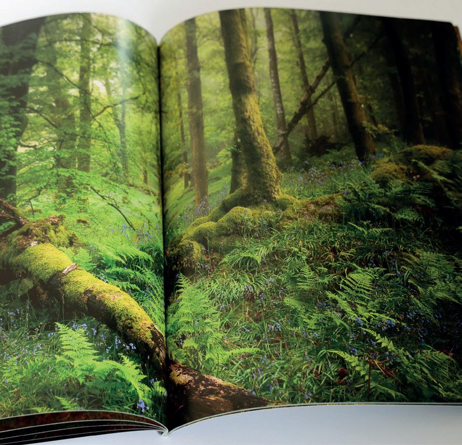
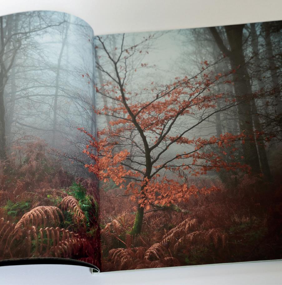
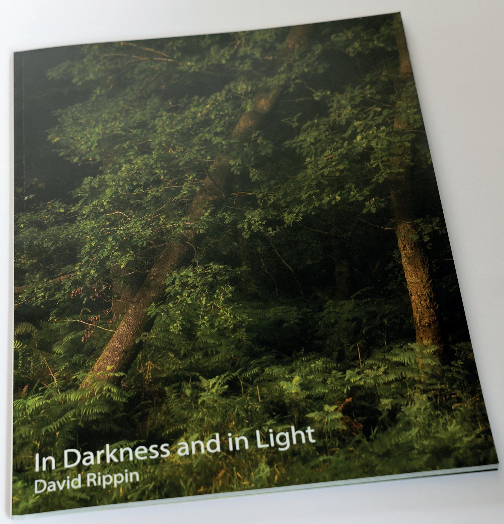
In Darkness and in Light David Rippin
The RPS Zine Project came at just the right time for me. I moved to live in the Lake District in March 2021 and became captivated by the local woodlands that I was discovering around my new home. I’d got into the habit of going out with my camera most mornings before work and was relishing this new life in which photography was
something I did almost daily. I’d been making lots of images and wanted to do something more with them; the Zine Project provided just that.
Although I already had a number of suitable images, working on the project made me think about a theme so that they were more than just a collection of pictures. I really enjoyed this process and felt that it gave my morning jaunts a deeper purpose. I really enjoyed the whole process and what I produced.
Webb Watch
Candia Peterson ARPS
Like many of us, I have been glued to images coming out of the Webb Telescope. Their website generously offers unlimited high-resolution downloads with the disclaimer that appears opposite. It is quite easy to get lost in the dozens of images on their site, although perhaps less easy to come to grips with the mind-boggling science of creating them. For an excellent read on how the images are created from start to finish, scan the QR code with your phone or type this shortened link into your browser: shorturl.at/hlwFW
In this edition we look at some magical Cosmic Cliffs which almost could have been taken in the Rockies, to the Fibonacci perfection of the so called Phantom Galaxy.
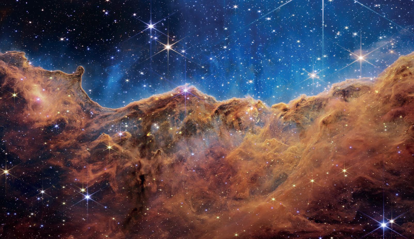
Cosmic Cliffs
What looks much like craggy mountains on a moonlit evening is actually the edge of a nearby, young, star-forming region NGC 3324 in the Carina Nebula. Captured in infrared light by the NearInfrared Camera (NIRCam) on NASA’s James Webb Space Telescope, this image reveals previously obscured areas of star birth.
Called the Cosmic Cliffs, the region is actually the edge of a gigantic, gaseous cavity within NGC 3324, roughly 7,600 light-years away. The cavernous area has been carved from the nebula by the intense ultraviolet radiation and stellar winds from extremely massive, hot, young stars located in the centre of the bubble, above the area shown in this image. The high-energy radiation from these stars is sculpting the nebula’s wall by slowly eroding it away.
NIRCam – with its crisp resolution and unparalleled sensitivity – unveils hundreds of previously hidden stars, and even numerous background galaxies. Several prominent features in this image are described below.
• The “steam” that appears to rise from the celestial “mountains” is actually hot, ionized gas and hot dust streaming away from the nebula due to intense, ultraviolet radiation.
• Dramatic pillars rise above the glowing wall of gas, resisting the blistering ultraviolet radiation from the young stars.
• Bubbles and cavities are being blown by the intense radiation and stellar winds of newborn stars.
• Protostellar jets and outflows, which appear in gold, shoot from dust-enshrouded, nascent stars.
• A “blow-out” erupts at the top-centre of the ridge, spewing gas and dust into the interstellar medium. An unusual “arch” appears, looking like a bent-over cylinder.
This period of very early star formation is difficult to capture because, for an individual star, it lasts only about 50,000 to 100,000 years – but Webb’s extreme sensitivity and exquisite spatial resolution have chronicled this rare event.
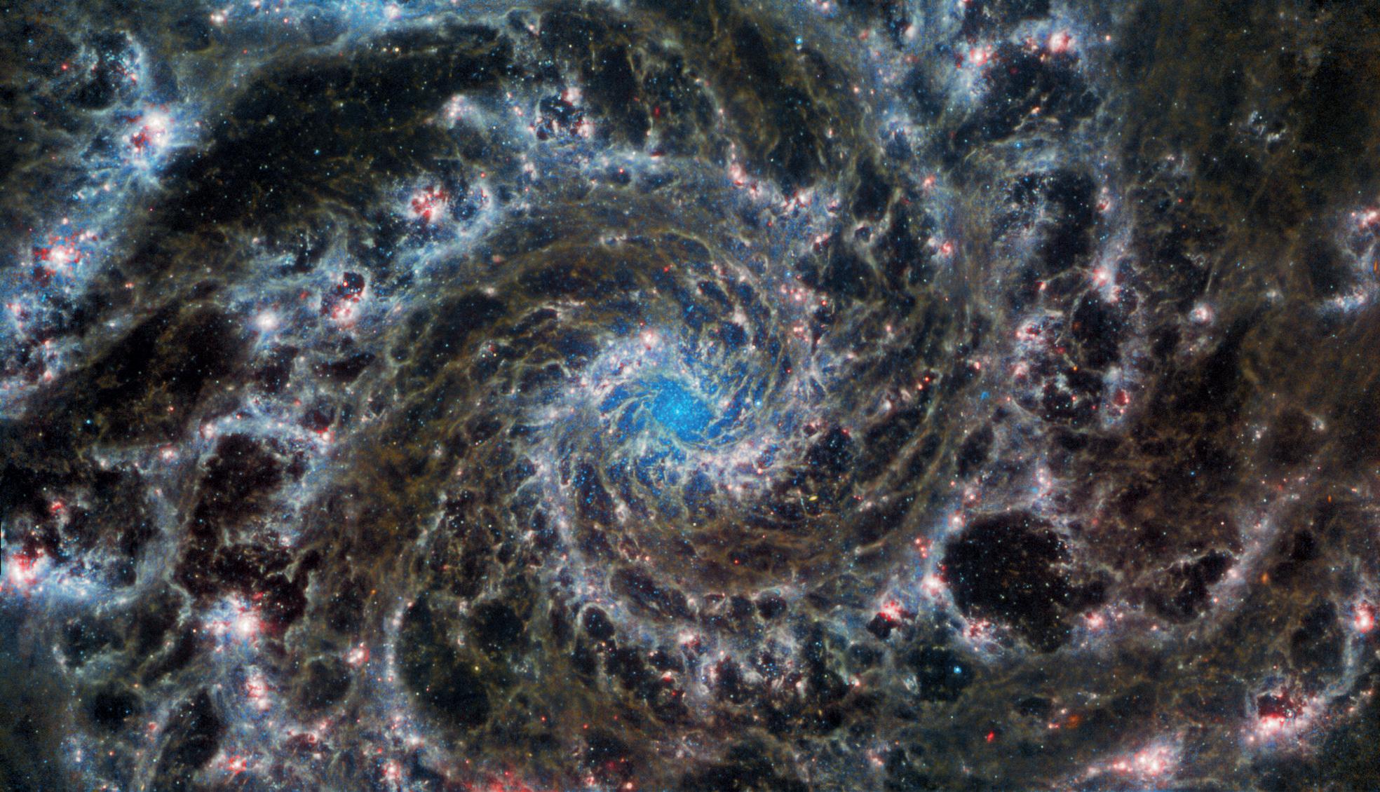
Phantom Galaxy
This image from the NASA/ESA/CSA James Webb Space Telescope shows the heart of M74, otherwise known as the Phantom Galaxy. Webb’s sharp vision has revealed delicate filaments of gas and dust in the grandiose spiral arms which wind outwards from the centre of this image. A lack of gas in the nuclear region also provides an unobscured view of the nuclear star cluster at the galaxy’s centre. M74 is a particular class of spiral galaxy known as a ‘grand design spiral’, meaning that its spiral arms are prominent and well-defined, unlike the patchy and ragged structure seen in some spiral galaxies.
The Phantom Galaxy is around 32 million light-years away from Earth in the constellation Pisces, and lies almost face-on to Earth. This, coupled with its well-defined spiral arms, makes it a favourite target for astronomers studying the origin and structure of galactic spirals.
Space - The Final Frontier and The Ultimate Landscape
Webb gazed into M74 with its Mid-InfraRed Instrument (MIRI) in order to learn more about the earliest phases of star formation in the local Universe. These observations are part of a larger effort to chart 19 nearby star-forming galaxies in the infrared by the international PHANGS collaboration. Those galaxies have already been observed using the NASA/ESA Hubble Space Telescope and
ground-based observatories. The addition of crystalclear Webb observations at longer wavelengths will allow astronomers to pinpoint star-forming regions in the galaxies, accurately measure the masses and ages of star clusters, and gain insights into the nature of the small grains of dust drifting in interstellar space.
Acknowledgement: J. Schmidt
Cosmic Cliffs
Image: NASA, ESA, CSA, STScI
Phantom Galaxy Image:
ESA/Webb, NASA & CSA, J. Lee and the PHANGS-JWST Team.
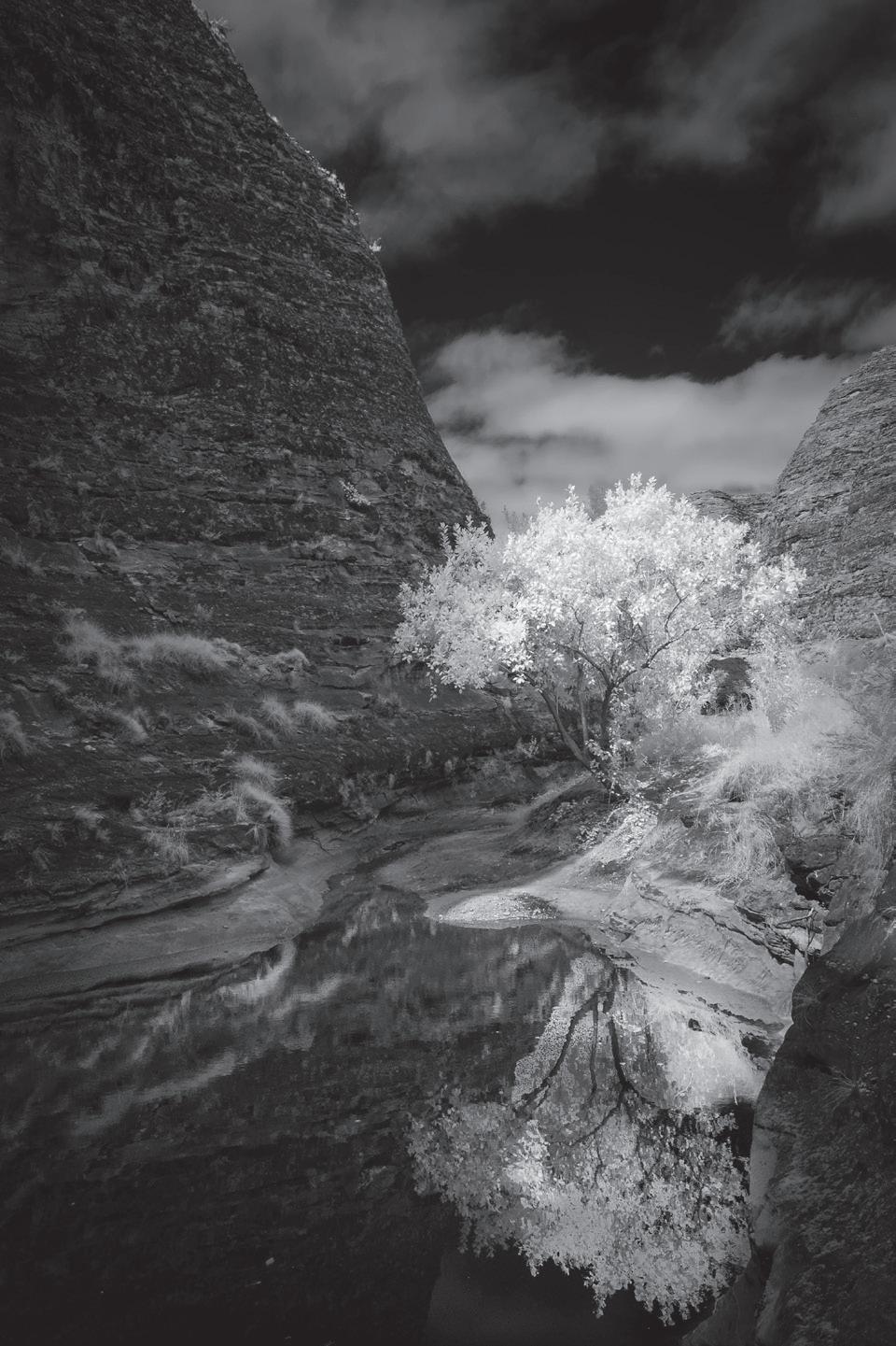
Infrared Photography
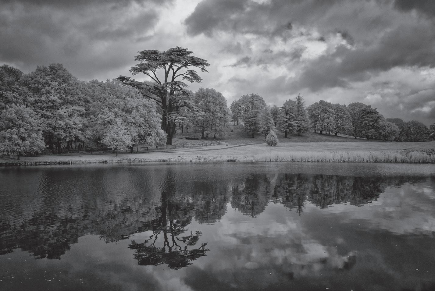
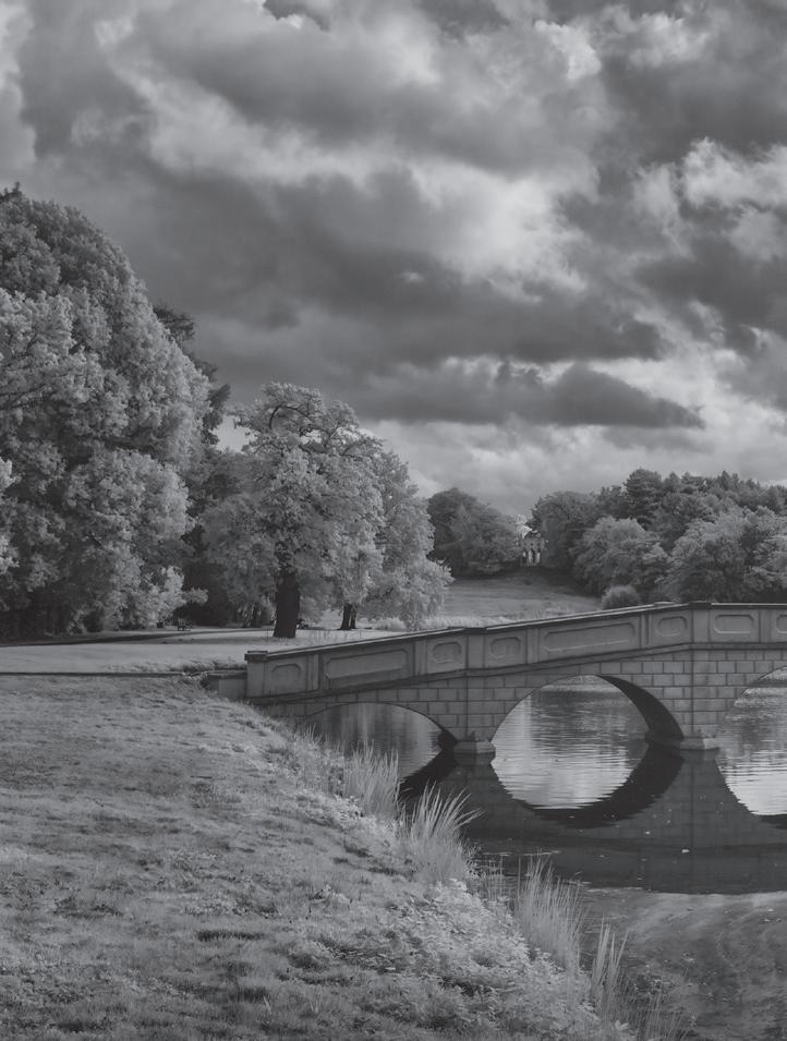
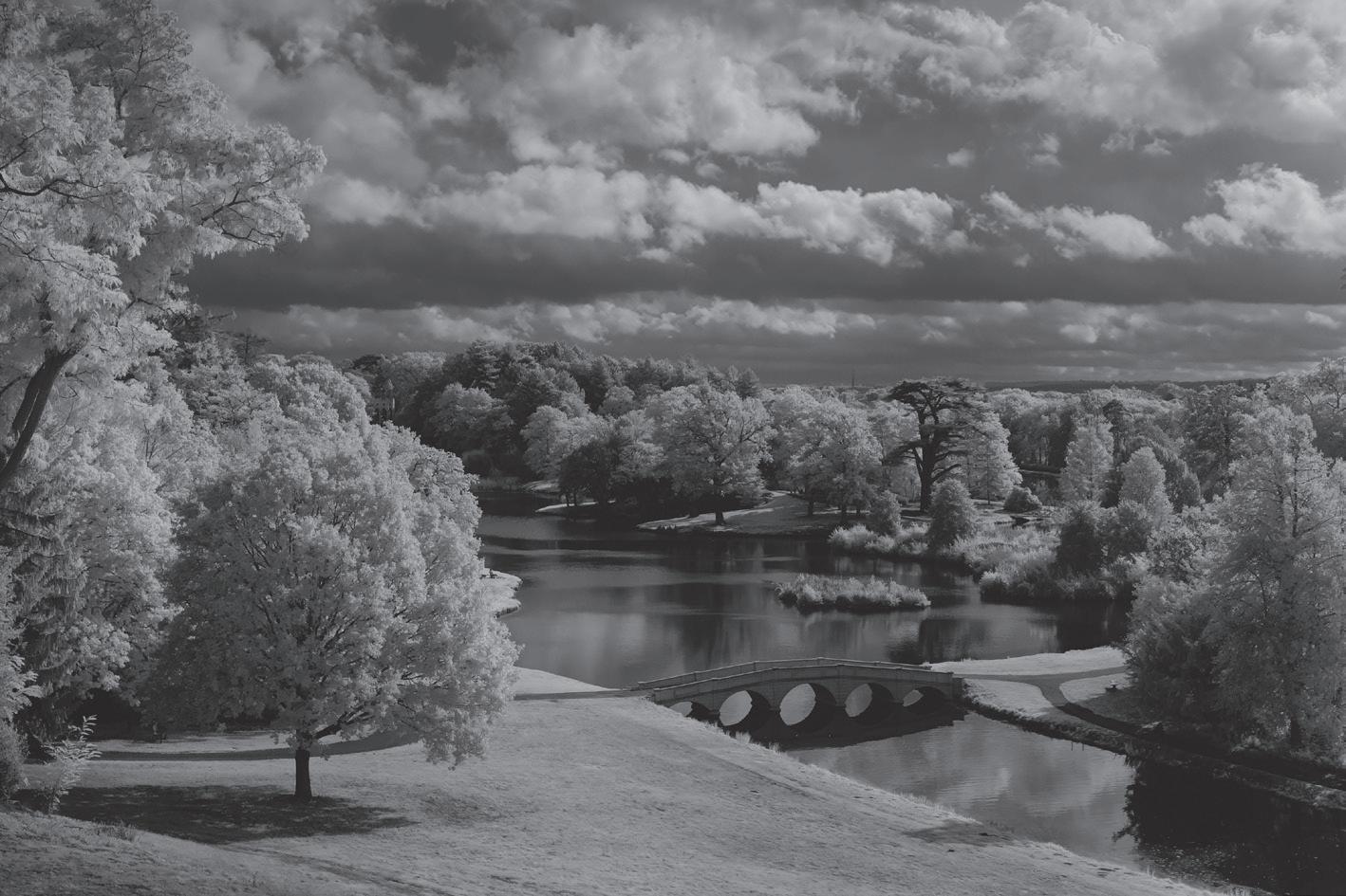
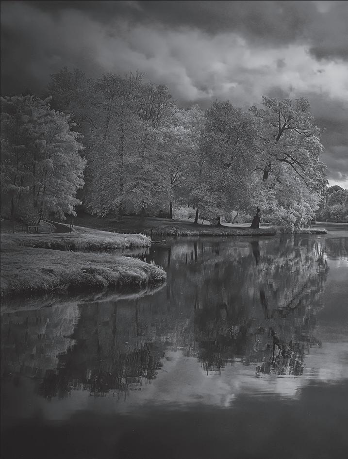
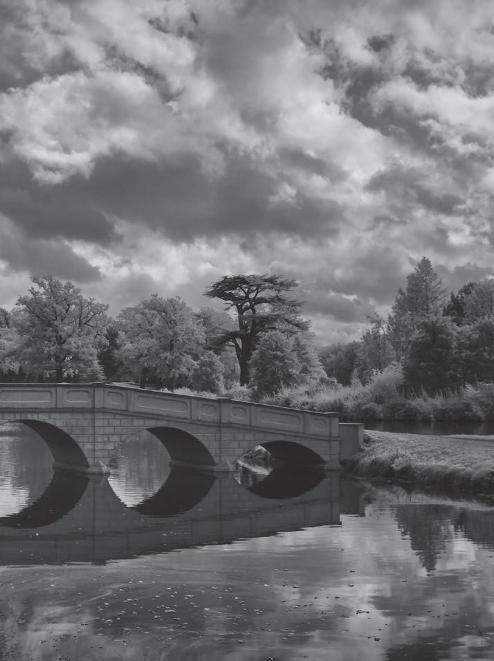
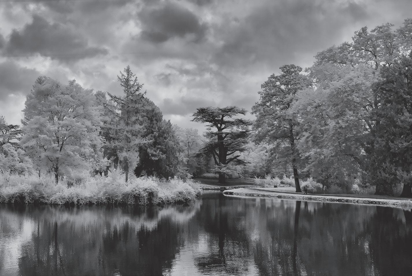
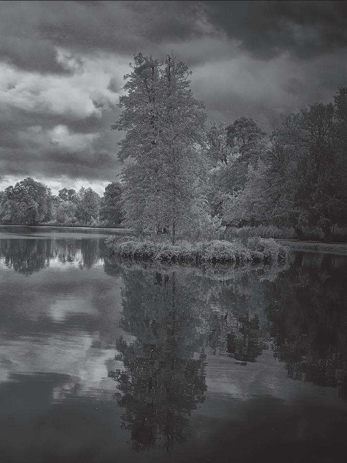
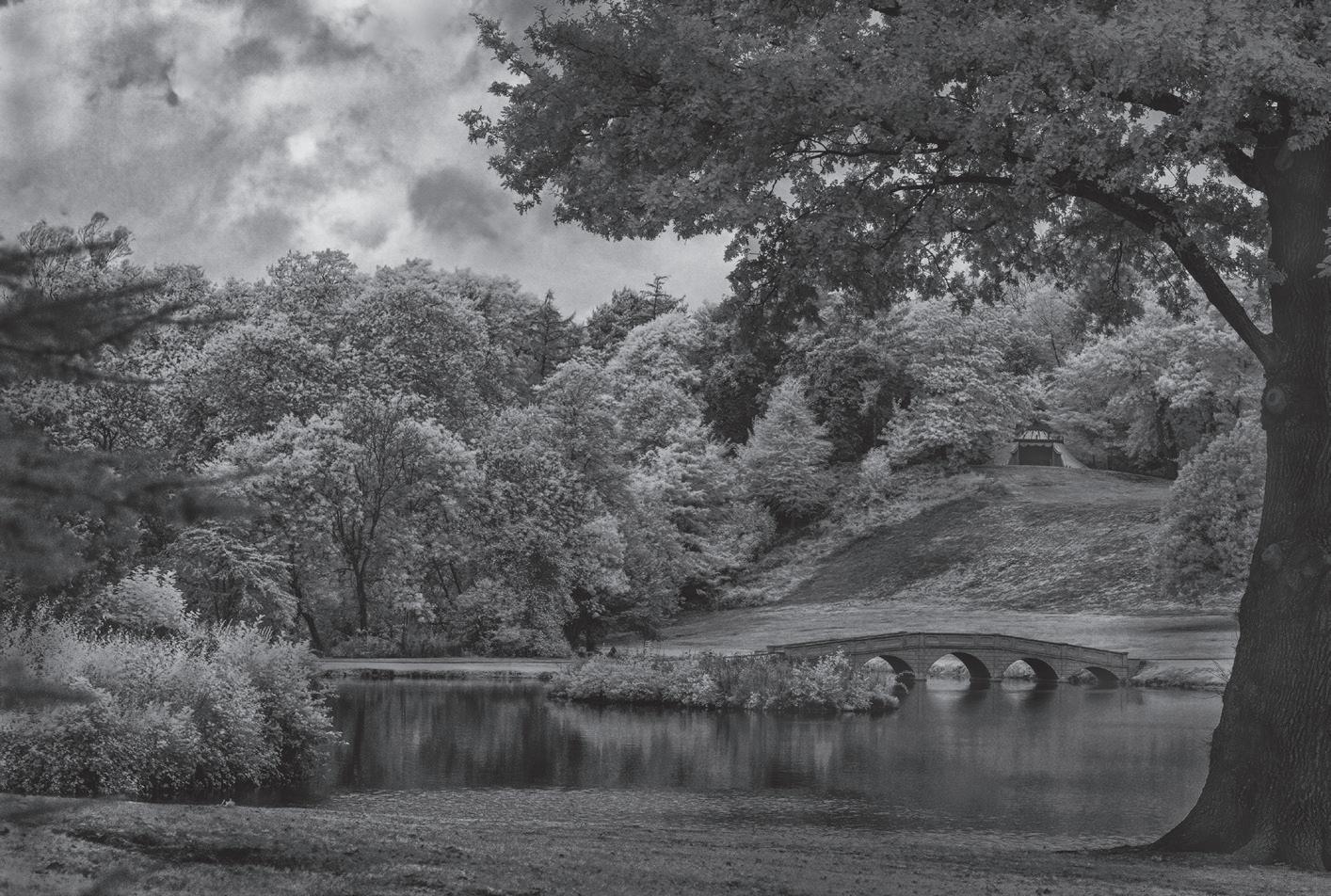
Richard Milton Worssell
RHS Botanical Art and Photography Show, Botanical Photography - Silver Medal
The competition was for a compilation of six images in a series or on a common theme. It was judged for RHS medals at the RHS Botanical Art & Photography Show at the Saatchi Gallery, London, from 14 June - 7 July 2024.
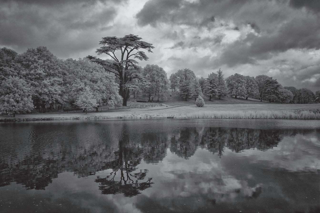
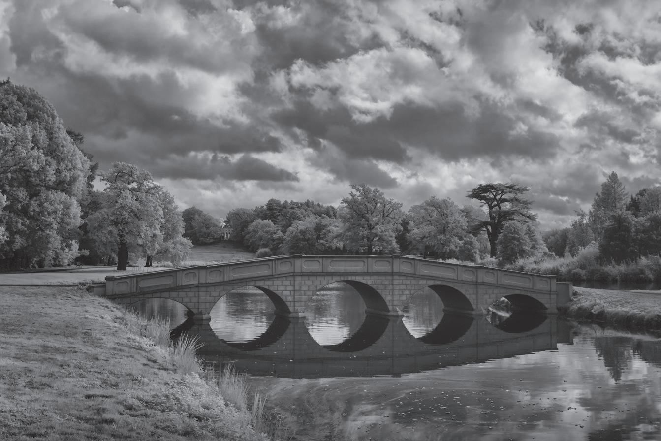
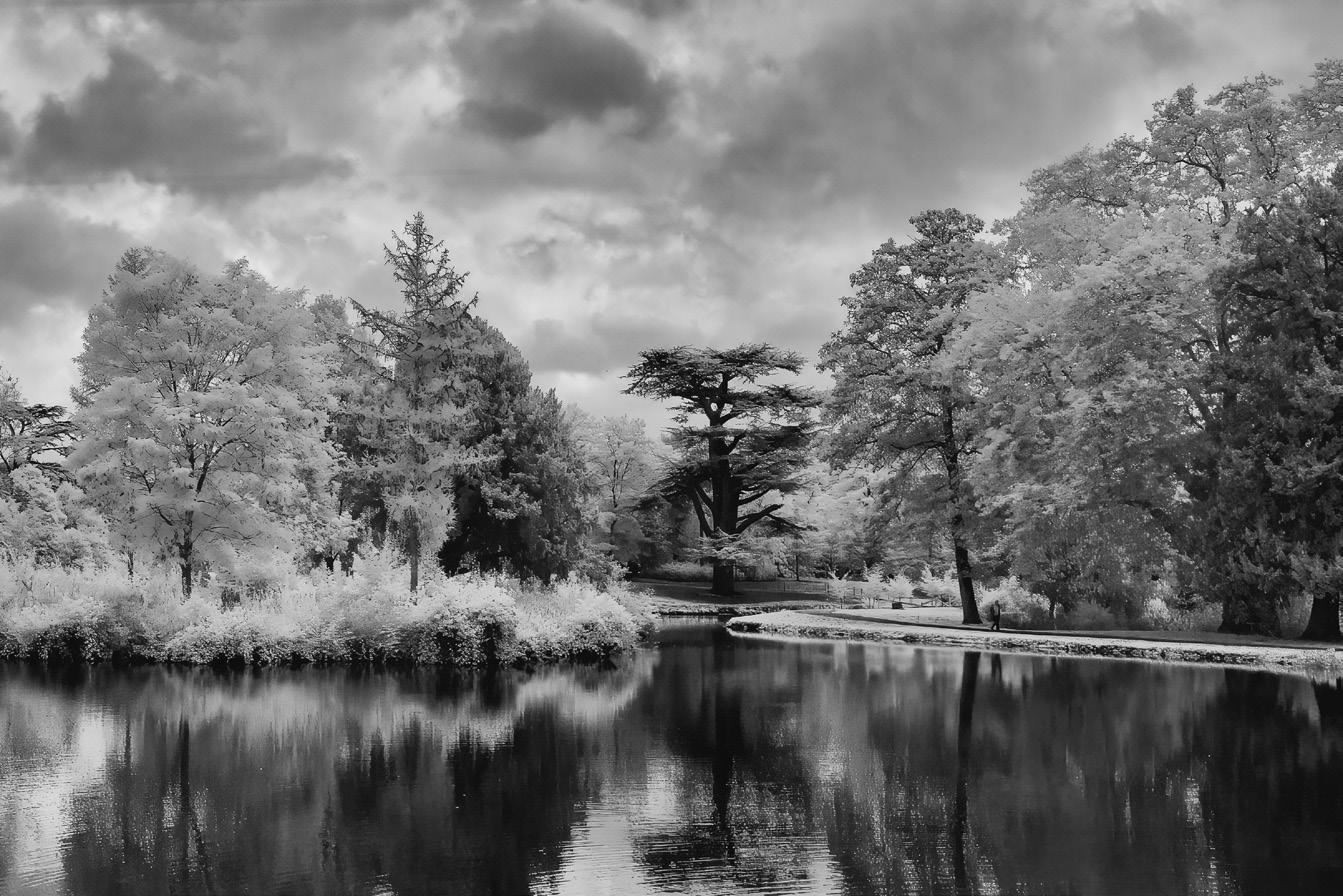
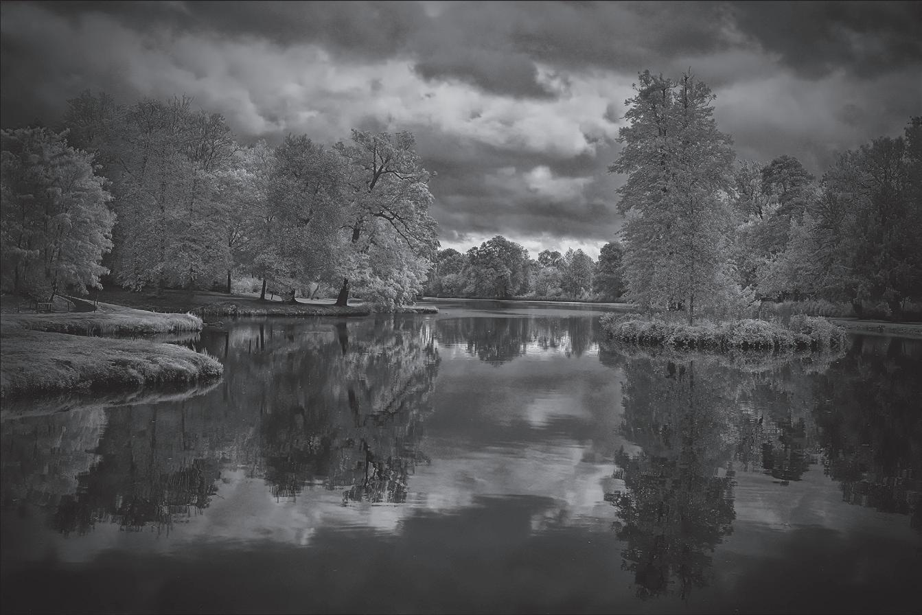
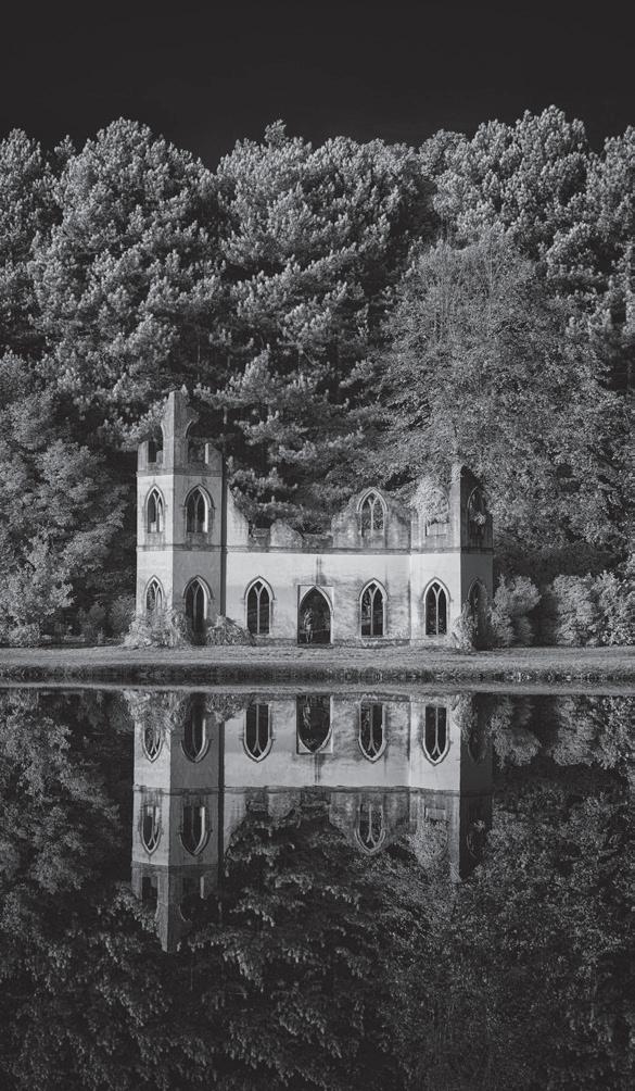
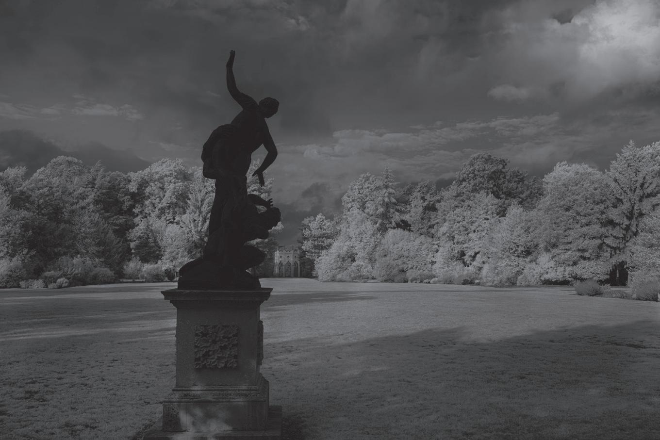
My panel of six infrared images was taken at Painshill Park, Surrey, around midday on Tuesday September 26th 2023. The trees are beginning to turn to autumn colours and some leaves are beginning to drop, displaying the structure of the tree branches. The images were taken on a Sony A6000 full-spectrum infrared converted camera using a 720 nm filter. I converted the images to black and white using Topaz Denoise and Nik6 Silver Efex.
Painshill Park is one of Europe’s most important 18th-century landscape parks. It was created between 1738 and 1773 by Charles Hamilton, who had enjoyed two Grand Tours and was influenced by Italy’s art, architecture and landscape. With his distinctive style, Hamilton was a forerunner of Capability Brown and the late 18th-century Picturesque Movement.
I wanted to imitate the style of the paintings that had inspired Hamilton (he undoubtedly saw
Nicolas Poussin’s landscapes with the classic framing of trees and reflections). I have explored the form and structure of the lake and how the trees and reflections create a picture, with the clouds adding texture. For the panel, I chose three themes that can be seen from many vantage points: the Serpentine Lake, the Five Arch Bridge and the majestic cedars. I hope the images reflect a classic form Hamilton might enjoy 300 years on.
During the exhibition, I was asked why I had used infrared and not just converted colour images to black and white. In the infrared part of the spectrum, the blue colour of the water and sky is not captured, rendering those elements very dark as no infrared energy is returned to the sensor. Therefore, infrared-only images show water as almost black and skies as very dark if no clouds are present. If clouds are present, as in most images below, the infrared light reflected from the clouds enhances the structure of
the clouds as the water vapour in the clouds reflects infrared images back into the camera. Lakes at Painshill have benefited from the infrared approach since the water offers little colour or light from its depths; the reflections are better defined because the water is a highly reflective dark surface and a very effective light reflector. Reflections are better in infrared because the water surface is more mirror-like, with fewer distracting elements. The amount of infrared energy reflected from foliage and tree trunks varies much more markedly than in colour images as the trees and foliage give a much more comprehensive range of textures and the amount of chlorophyll in the leaves governs the intensity of the infrared. Cedars reflect little infrared and are dark.
The images were taken on a day with patchy clouds. When the sun broke through, the trees were bathed in sunlight and reflected more infrared, giving the images depth.
The Great Cedar is the largest multi-stemmed Cedar in Europe and is over 450 years old. The branches’ infrared response emphasises their structure, which is picked up in the reflection.
The Five Arch Bridge will be familiar to all those who watch Netflix’s Bridgerton and it forms the central portion of the image, whilst also featuring the Cedar and the Gothic temple in the distance.
Cedar on the Island highlights the structure of a smaller cedar and its reflections, illustrating how infrared gives textures to the leaves that would otherwise be missing in colour.
I produced a panel of six images, with the hanging plan as the seventh image. In my hanging plan, I tried to achieve a balance between the various aspects of Painshill Park. I settled on three images, which are predominantly reflections, plus three images containing the Five Arch Bridge. In the hanging plan, the three top images also contain cedars, which form a dominant part of the landscape garden. A common theme in all the images is the textures derived from the clouds. On the day in question, the clouds had gaps that allowed the sun to come through and illuminate the chlorophyll in the leaves at the back of some of the images. The clouds also added texture to the infrared.
As with all panels, some photographs don’t make the cut so I thought it would be interesting to show some that didn’t and why. Mainly, they were omitted because I felt that they did not fit as well into my hanging plan to create the ‘seventh image’ shown at the Saatchi Gallery. In selecting these images, I have tried to build on the idea behind a landscaped garden: As visitors walk around the paths in the landscaped garden, they repeatedly glimpse the dramatic follies, reflective lakes and stunning views of a romantic landscape full of surprises.
I have also included an image of The Ruined Abbey. It was taken on a different day and in different
infrared lighting conditions, resulting in a much harsher infrared light. In my original starting panel of six images, I had four picturesque images which made it in to the panel and two which didn’t. These two were dropped during the selection and editing process because the light was much harsher than in the other four and so did not contribute to a coherent and balanced panel.
The Park from Tent Hill is a classic Painshill view. The patchy sunlight coming through the clouds has stimulated the individual trees’ infrared response, especially those turning in the autumn colours. The Five Arch Bridge and its reflection in the foreground anchors the scene
Northern Serpentine Lake shows how the light illuminates the trees and gets the response in the distance, which adds depth. The lack of infrared response from the tree branches overhanging the lake adds to the detail in the branch structure of that tree.
Turkish Tent and Five Arch Bridge is a three-image, handheld, vertical panorama stitched together. Imitating the picturesque, the tree on the right-hand side overhangs the Turkish tent and the Five Arch Bridge and, on the left, the trees show their reflections in the lake.
The Ruined Abbey (L) is a folly which sits wistfully by the water’s edge and is designed to cast stunning reflections onto the Serpentine Lake. This image was taken on a different day with no water vapour in the sky, resulting in a black sky. The direct sunlight on the Abbey and the trees behind the Abbey produces a much starker, less picturesque image.
Tree overhanging Serpentine Lake (R) was taken in late autumn so the trees are only just beginning to lose their leaves and chlorophyll, which changes their infrared reflection characteristics. This has picked out the structure of the tree; its dark trunk and branches and their reflection in the near-mirror of the black water.
The Amphitheatre is a flat lawn surrounded by several varieties of trees, with a coloured statue which reflects no infrared energy and so is black. I took the image so that the black statue is set out against the sky and trees and leads to the Gothic temple, a viewpoint for other images. This is the repetition theme in a landscaped garden.
Hanging Plan
Great Cedar Five Arch Bridge looking towards Gothic Temple
The Park from Tent Hill
Northern Serpentine Lake
Cedar on the island Turkish Tent and Five Arch Bridge
Where in the World? II
Robin Williams FRPS and Gigi Williams FRPS
Gigi and Robin Williams are both Fellows of the RPS and Accredited Senior Imaging Scientists. They spent their working lives as Medical and Scientific photographers but now in retirement they concentrate on their passion for landscape photography.
Website: www.robinwilliamsphotography.com
As many will know, Australia is a vast and arid continent and, as the Australian National Anthem states, is a “Land Girt by Sea.”
In fact, 90% of all Australians live within 50 kilometres of the sea. This means that the largest proportion of the Australian landmass is dry, uninhabited desert. At 7.7 million km² it is the sixth largest country in the world and the world’s largest Island.
To put it into perspective, travelling from Sydney to Perth (East Coast to West Coast) is the same distance as travelling from New York to Los Angeles: The whole of Europe fits into approximately half of Australia. In marked contrast, the entire population of Australia is less than the State of Texas, or less than the Chinese City of Shanghai!
Visitors to Australia will most often stay in one of the State capital cities around the coast – Perth, Adelaide, Melbourne, Hobart, Sydney, Brisbane or Darwin. Well-heeled and ambitious tourists will seek to travel the “Golden Triangle” –Sydney with its beautiful harbour and opera house, Cairns with its easy access to the Great Barrier Reef and Alice Springs
Reflections - Kalamina Gorge by Gigi Williams FRPS
The Kimberley and Pilbara, Western Australia
for a taste of the “Red Centre” or “Outback.” But there is another Australia which few will ever visit, including most Australians – The Kimberley and the Pilbara. The North West is considered Australia’s final frontier. An area three times larger than Britain across the top of Western Australia, the region has only 39,000 inhabitants. Raw, untamed, scarily remote and blissfully uncluttered, this is a top destination and a landscape photographer’s delight. The Kimberley and Pilbara are characterised by large swathes of wilderness defined by rugged mountain ranges, dramatic deep gorges, semi-arid savanna and a largely isolated coastline. It’s big. Farms (Stations) here exceed 700,000 acres!
If there’s one way to earn your stripes as a true-blue outback photographer, it’s by taking on the 660-kilometre Gibb River Road, a 4WD-only track that cuts through the heart of the region. This former cattle droving route is legendary, not just for the characters you meet on the way or the bottle-shaped boab trees, but for the stretches of corrugations that’ll rattle your teeth. The deep paprika hue of the land gives way to waterfilled gorges and immense rock formations. The route between Derby and Kununurra can technically be done in five days, but it’s best to take your time and absorb this radically different landscape. A robust four-wheel drive vehicle, water, food, safety supplies and camping equipment are essential. Windjana Gorge is
rimmed by 300-metre walls that are part of a 350-million-year-old Devonian reef system. Bell Gorge, tucked inside King Leopold Conservation Park, is regarded as the jewel in the Gibb River Road’s crown, thanks to its cascading waterfalls and glassy swimming holes. The Cape Leveque track from Broome to the remote Dampier Peninsula leads to Pearl Farms, pastoral stations and remote aboriginal communities. The Kimberley was one of the earliest settled parts of Australia, with the first human habitation dated at 65,000 BC. Rock art in the Kimberley is some of the oldest in Australia and has been dated back to 40,000 years BC. The best known examples of rock art from the region are Wandjina and Gwion Gwion.
Liquid Gold, Cape Leveque by Gigi Williams FRPS
Lone Tree, Oxer Lookout by Gigi Williams FRPS
Sunset Reflected in Windjana Gorge by Gigi Williams FRPS
Waterhole, Pernululu, Infrared by Gigi Williams FRPS
Wandjina Rock Art by Gigi Williams FRPS
Reagan’s Pool, Hancock Gorge by Robin Williams FRPS Spa Pool, Hamersley Gorge by Robin Williams FRPS
Cathedral Gorge, Purnululu by Robin Williams FRPS
While driving to the Bungle Bungle Range in Purnululu National Park is neither easy nor quick, it’s well worth the effort. Known for its incredible beehivelike formations, the Bungle Bungle Range has become a Kimberley icon. The journey takes around six hours; the track into Purnululu is only 53 kilometres but it’s very challenging. You need a high clearance 4 Wheel Drive and, due to its remote location, you need plenty of water, fuel and food. Echidna Chasm, which is only one metre wide in some places, is one of the popular places to photograph. Cathedral Gorge is also not to be missed; this natural amphitheatre
was created from water erosion over three million years and is staggering in size and beauty. Karijini National Park is probably our favourite in the region, with breathtaking gorges carved deep into the ancient Hamersley ranges – to photograph in these Gorges we had to abseil/rope down under expert climbing supervision. The underlying rock is iron-ore, which oxidises (rusts) to deep orange, but where water flows over the rock constantly, the rust is removed and the pure dark-blue of the iron ore is revealed. Water reflects the blue skies and golden rock. Contrast ratios are extreme!
Although wild and remote, photographers will not be alone in the Kimberley and Pilbara, with extensive (but thankfully well-hidden) mining activities right across the North-West. The natural resources of the region have been plundered to supply the rest of the world and fuel Australia’s growth economy. Minerals and petroleum account for 94% of the State’s and 46% of Australia’s total income from exports. Iron ore, Alumina, Nickel, Copper, Gold, Lead and Zinc are all mined extensively with the latest high-demand metal –Lithium – now fuelling the world’s battery industry (and all our cameras).
Bell Gorge by Robin Williams FRPS
Mitchell Falls by Robin Williams FRPS
One third of the world’s annual production of diamonds is mined at the Argyle and Ellendale mines. The scale of these mining operations is truly mind blowing – the Fimiston open cast gold mine, for example, is 3.5km long by 1.5k\m wide and extends 700
metres into the earth. Mount Whaleback Mine alone produces 90 million metric tons per annum and will do so until 2037! Derby is the nearest export base for shipping all these metals, most of which is headed for China.
We hope that you enjoy seeing this small selection of images from the Pilbara and Kimberley. Our extensive collection of Landscape photography can be found on our website.
Beehive Rock Structure, Purululu by Robin Williams FRPS
Inspiration
Wherever we are in our photographic journey, there is always room to learn, discover and take inspiration from the work of others. Here are a few ideas.
Read this:
The Photographer’s Portfolio Development Workshop by William Neill
Subtitled “Learn to think in themes, find your passion, develop depth and edit tightly”, this book is based on an eight-week course taught by well-known landscape photographer William Neill (author of Light on the Landscape, also worth picking up). Neill takes you through the steps to objectively assess your work both technically and aesthetically, to establish a personal standard of quality and to focus your efforts into themed portfolios.
Follow on Instagram: Five Instagrammers from around the world:
@dianemcneill – based in Northern Ireland, Diane presents a nice mix of representational and ICM work; and of land, sea and architecture.
@drflynn60 – a Portuguese photographer working in the Pep Ventosa style.
@quietlandscapes – if you enjoyed Robert Bolton’s aerial shots in the last edition of our magazine, check out his dreamy mono work from Japan.
@mgoldsmith640 – based in Toronto, Matt Goldsmith offers up some diverse landscapes from around the world.
@donfreemanart – stepping outside of landscapes, Don Freeman from the Catskills of Upstate New York produces beautiful florals that are well worth a look. I met Don very recently at a show where we were both exhibiting and his work is lovely.
Check out this blog:
I’m hoping to feature the work of Trevor Sherwin in 2025. His website is well worth exploring and, in particular, he writes a regular and informative blog on all sorts of subjects of interest to landscape photographers.
www.trevorsherwin.co.uk/photography-blog
This one has his top 10 landscape photography YouTube Channels: www.trevorsherwin.co.uk/blog/my-top-10-landscape-photographer-youtube-channels