Issue 15 Spring 2025
Landscape
THE MAGAZINE OF THE ROYAL PHOTOGRAPHIC SOCIETY LANDSCAPE GROUP


THE ROYAL PHOTOGRAPHIC SOCIETY
RPS House, 337 Paintworks, Arnos Vale, Bristol, BS4 3AR, UK rps.org
Incorporated by Royal Charter
Patron
HRH THE PRINCESS OF WALES
President and Chair of Trustees
SIMON HILL FRPS
Chief Executive Officer DAN JONES
Hon Treasurer
CHARLOTTE FRAIBERG

RPS LANDSCAPE GROUP
Magazine Editor: Candia Peterson ARPS
Assistant Editor: Gaynor Davies ARPS
Publication Manager: Paul Cayton LRPS
Committee
Colin Balfour LRPS: Chair (Officer)
Viv Cotton ARPS: Secretary (Officer)
Trevor Judd: Finance Officer (Officer)
Mark Reeves FRPS: Vice Chair
Candia Peterson ARPS: Communications Officer (Officer)
Elliot Banks: Website Editor
David Travis ARPS: Circles Co-ordinator
Engagement & Events Officers (Officer)
Chris McIntosh LRPS: Professional Events
Howard Klein LRPS: Exhibition and Member-Led Events
Please send contributions to landscapemagazine@rps.org
COVER IMAGE:
Windows by Ade Gidney FRPS
Landscape is the magazine of the RPS Landscape Group and is provided as part of the annual subscription to the Group. © 2025 The Royal Photographic Society All rights reserved on behalf of the contributors and authors. No part of this publication may be reproduced, stored in a retrieval system or transmitted in any form or by any means, electronic, mechanical, photocopying, recording or otherwise without the written permission of the copyright holder. Requests for such permission must be addressed to the Editor.
The Royal Photographic Society, RPS Landscape Group and the Editor accept no liability for any misuse or breach of copyright by a contributor. The views expressed in this magazine do not necessarily reflect the policies of the Royal Photographic Society or of the Landscape group.
Printed on

Landscape
Issue 15 - Spring 2025
Regulars
4. Welcome from the Editor
48. Webb Watch
Stunning images from the Webb Telescope - the ultimate landscape.
62. Inspiration
Watch, follow, read and listen – some ideas to keep your landscape photography fresh.
Professional
Photographers
12. The Human Landscape
W. Scott Olsen shares his project looking at small-town America at night and in black and white.
24. The Post Processing Page
Ian Howard explores his methods for processing black and white images.
28. The Nature of Landscape
Joe Cornish HonFRPS continues his series on different themes in landscape photography by looking at the Altered Landscape.
34. Lunar Landscape
Robert Harvey ARPS takes us on an explanatory ride through the world of lunar photography.
50. An Alternative View
Abstract expressionist photographer Valda Bailey talks about her background and motivation and shares some of her images more rooted in the landscape.
Member Contributions
6. Where in the World? I
Hugh Milsom FRPS takes us to Iceland.
18. Retrospective
Hugh Milsom FRPS shares his journey through six decades of photography.
40. Monthly Winners
The 12 winning photographs from the Landscape Group monthly competition of 2024.
56. Where in the World II
Madeleine Lenagh photographs the Zeeland coast of Holland.
Welcome from the Editor
Welcome to the Spring 2025 edition of the RPS Landscape Group Magazine. This issue features a wide variety of material from members and pros, from at home and abroad, with some lovely colour and strong black and white images.
This edition is notable as it features two articles from a single photographer. Hugh Milsom has recently entered his tenth decade and was awarded his FRPS in 1981 and I was very keen to pay tribute to him. The first of his two pieces falls into our ‘Where in the World’ category, the result of over a decade of many visits to Iceland, mostly before the rest of us discovered it. The second describes his journey; a retrospective of his photography from black and white prints to colour slides and eventually to digital. His has been a long life in photography and I’m thrilled we are able to pay some small homage to his work.
Joe Cornish’s final article (in this series, we hope not for ever) for the magazine is about the Altered Landscape, those alterations largely coming through human design. Many of you will know that, recently, Joe suffered an horrendous accident from which, thankfully, he is now slowly recovering. In recognition of the concern expressed in many quarters, he tells us about it in his own words below.
I was very excited that the wonderful Valda Bailey agreed to contribute to our ‘Alternative View’ with an inspirational set of abstract photographs rooted
A few words from Joe Cornish HonFRPS
in the landscape. Valda also wrote the foreword to a new book by Madeleine Lenagh, the contents of which - photography of the Zeeland coast of Holland - are the basis of our second ‘Where in the World’.
Our ‘Human Landscape’ comes from American photographer W. Scott Olsen and features his ongoing black and white project looking at small-town America. To complement his work, our Post Processing page comes from Ian Howard, who shares with us his methods and approach to black and white imagery.
Finally, Robert Harvey gives us some joyous lunar photography in celebration of the ‘Major Standstill’ of the moon that is happening in 2025. Reflective of Robert’s article, we particularly chose the image facing this page from Dave Lynch as a great example of lunar photography.
I hope you will enjoy reading this edition as much as Gaynor Davies ARPS, Paul Cayton LRPS and I have enjoyed putting it together. Without their fabulous and constructive help as Assistant Editor and Publication Manager, I could not have managed to achieve what you are now reading and I’d like to offer huge thanks to them.
Candia Peterson ARPS Magazine Editor
In October 2024 I had my first (and hopefully last) major accident while co-leading a hill walking/photography workshop in north west Scotland. I was knocked off my feet by a powerful wind gust, tumbled several metres down a steep rocky slope and broke my neck (multiple fractures of the C vertebrae). Not very clever for a 66-year old with more than four decades of hill-walking experience but, accidents happen. By incredibly good fortune, my spinal cord was (relatively) undamaged. Eventually I was airlifted off the hill to hospital in Inverness and have been recovering at home since then.
November and early December were dominated by a project to raise money for the Assynt Mountain Rescue Team who co-ordinated my recovery from the mountain. Alex Nail, fellow photographer and mountain leader, had been co-leading our workshop when the accident happened. Together we created a ten print portfolio box in an edition of 120, which was offered for £130, with all proceeds going directly to the Assynt MRT. Fortunately for us, this proved extraordinarily successful (as well as being incredibly hard work!) and raised over £23,000 in donations.
Since then, things have calmed down and there has been more time to think. Inevitably perhaps, such a crisis changes – or at least bends – a perspective on life. I know how lucky I am to have been gifted more time, rather than dying on the hill. That time is now limited and I’d like to make the most of it. In essence, that means avoiding distractions and concentrating on what matters most. The accident has encouraged me to focus on my core creative themes or concepts which emerge from the landscape, both close to home and further afield. These include: Energy; beauty; connection; wildness; restoration/regeneration; biodiversity; complexity; story-telling; abstraction; reference. And hope.
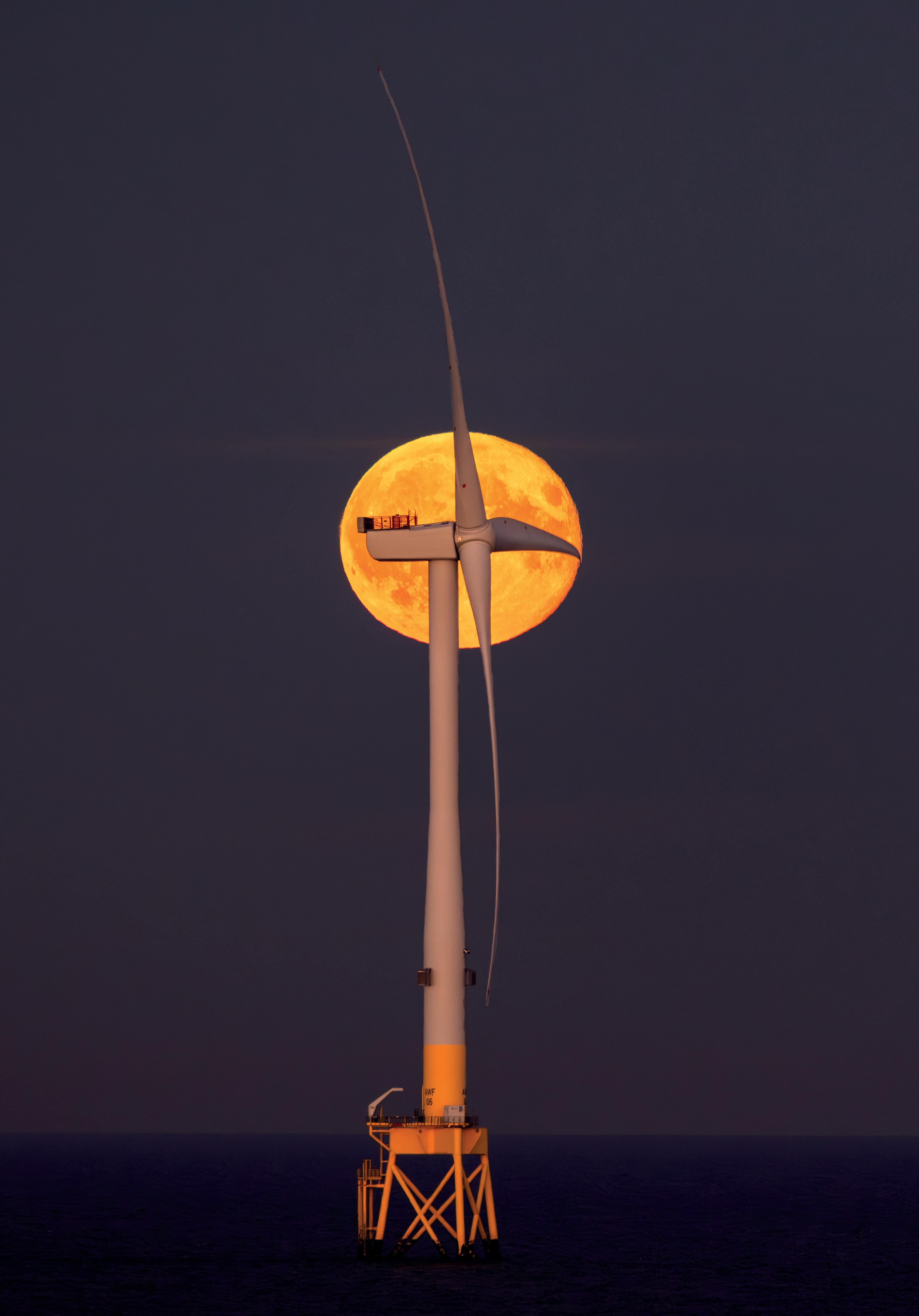
The Turbine and the Moon by David Lynch
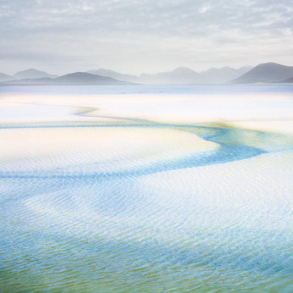
Where in the World? I
Hugh Milsom FRPS
Hugh Milsom FRPS shows us some remarkable photographs of Iceland, often with an unusual perspective, the result of many visits over several years. His book, Impressions of Iceland, is available through www.hughmilsomlandscapes.weebly.com
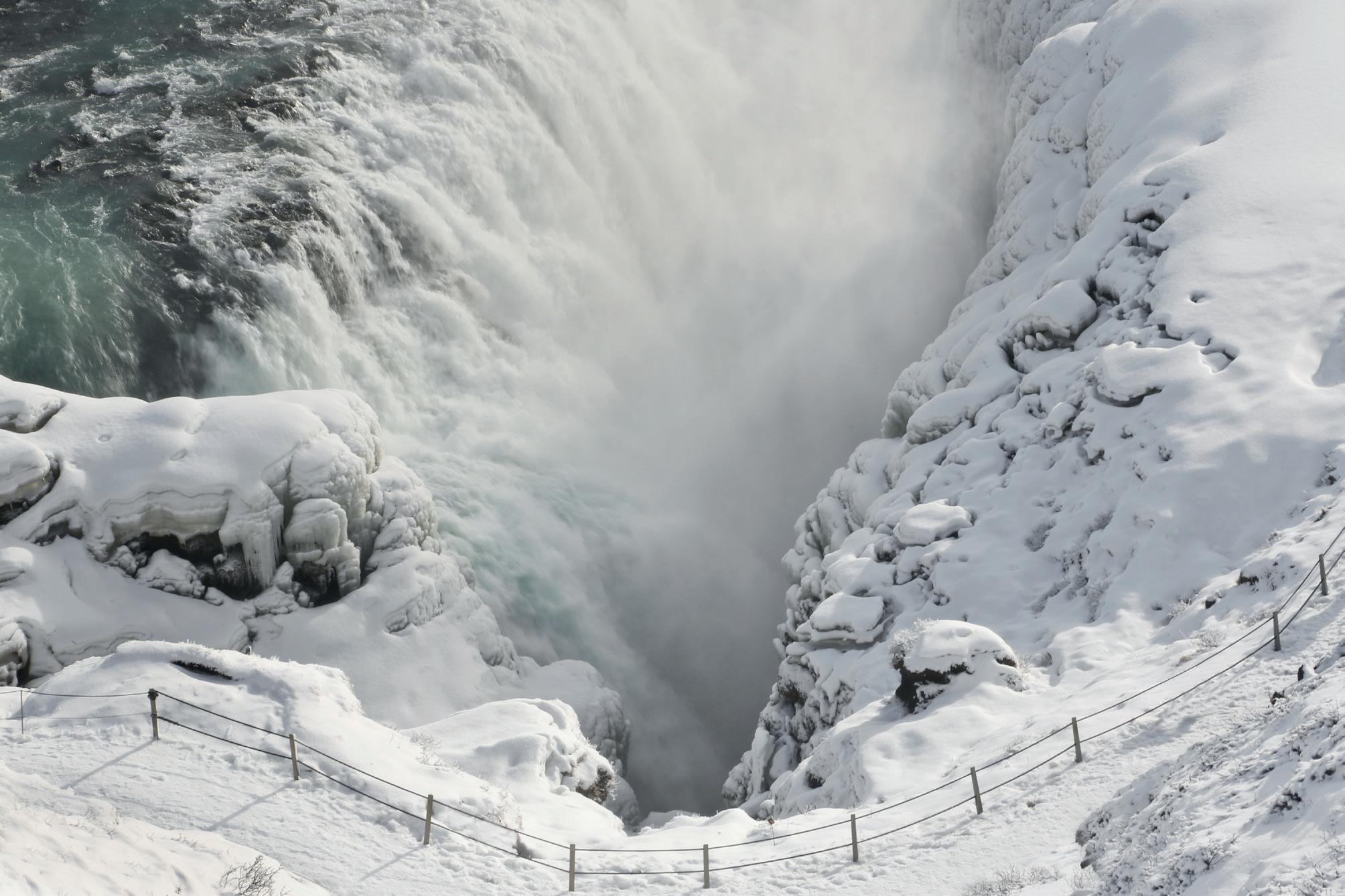
View of the lower falls with the water plummeting down into the Gullfoss Canyon.
Impressions of Iceland
I landed in Iceland in 2008 on what would be the first of many visits, eagerly anticipating photographing this new and alien landscape. After the soft rolling downland landscape of south-east England, how would I interpret the wilderness landscape that I would encounter? How would the colours and beauty of the Hebridean beaches compare with the austere drama of the black, basalt landscape? Even the wilderness landscape of Glencoe and Rannoch Moor would seem
hospitable compared with the rugged drama of the volcanic peaks of Iceland. I imagined that the divergent, erratic chords of the wild restless music of Sibelius would reflect the character of Iceland just as the structured melodies and orchestrations of Beethoven and Tchaikovsky echo the domestic landscapes of Europe. As I travelled below the eerie, mist-covered, volcanic peaks, the melodies of ‘The Hall of the Mountain King’ echoed in my mind.
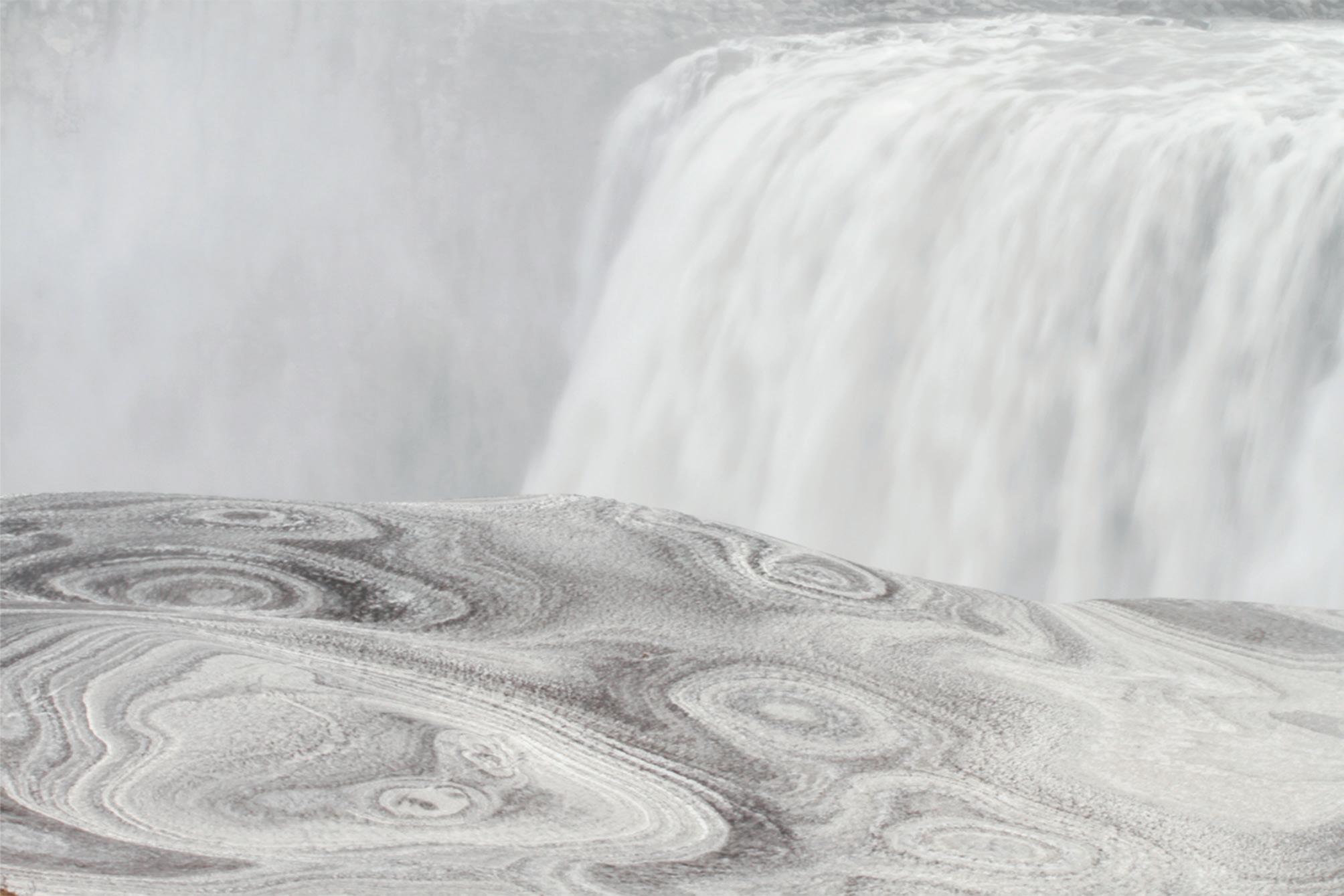
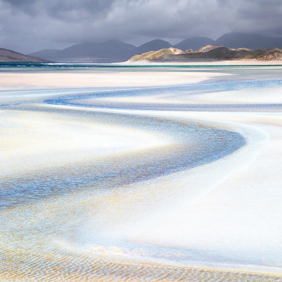
Ice Patterns at Dettifoss, the second most powerful falls in Europe, being 100 metres wide with a drop of 44 metres. The waters flowing from Vatnajökull crash down into the Jökulsárgljúfur Canyon, with the spray forming intricate ice patterns on the sides of the gorge.
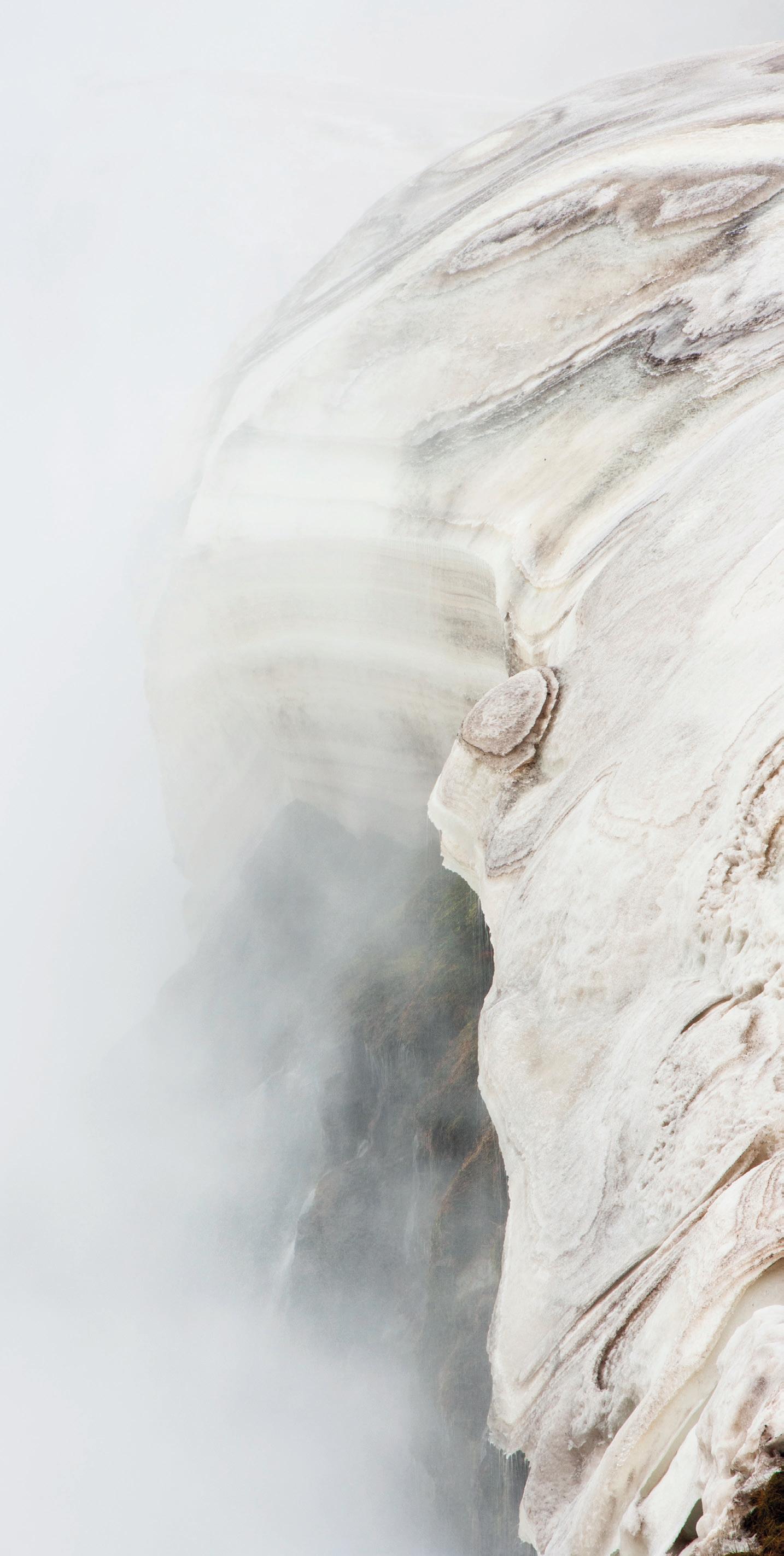

Freezing mists from the upper falls hang in the air and form intricate, sculptured patterns in banks of ice which hang precariously from the walls of the gorge.

Iceland sits astride the Mid Atlantic Ridge, formed as the Eurasian and North American tectonic plates move apart, allowing molten lava to come to the surface. Even throughout my lifetime there have been numerous cataclysmic events. Islands have been formed and are being eroded away by the sea. Ice-covered volcanoes have erupted with explosive violence, causing devastating floods and disruption. Earthquakes and episodes of lava flow are regular occurrences.
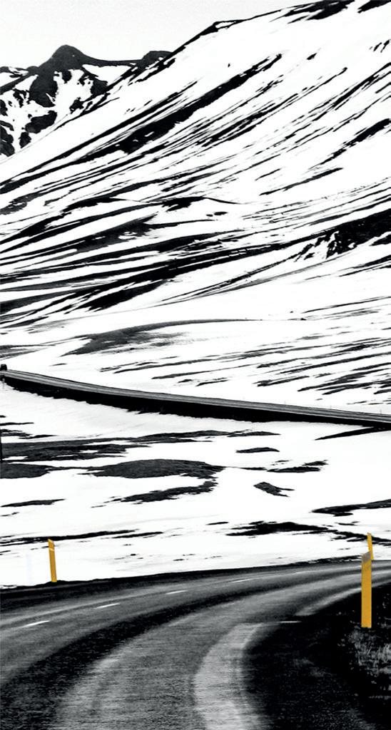
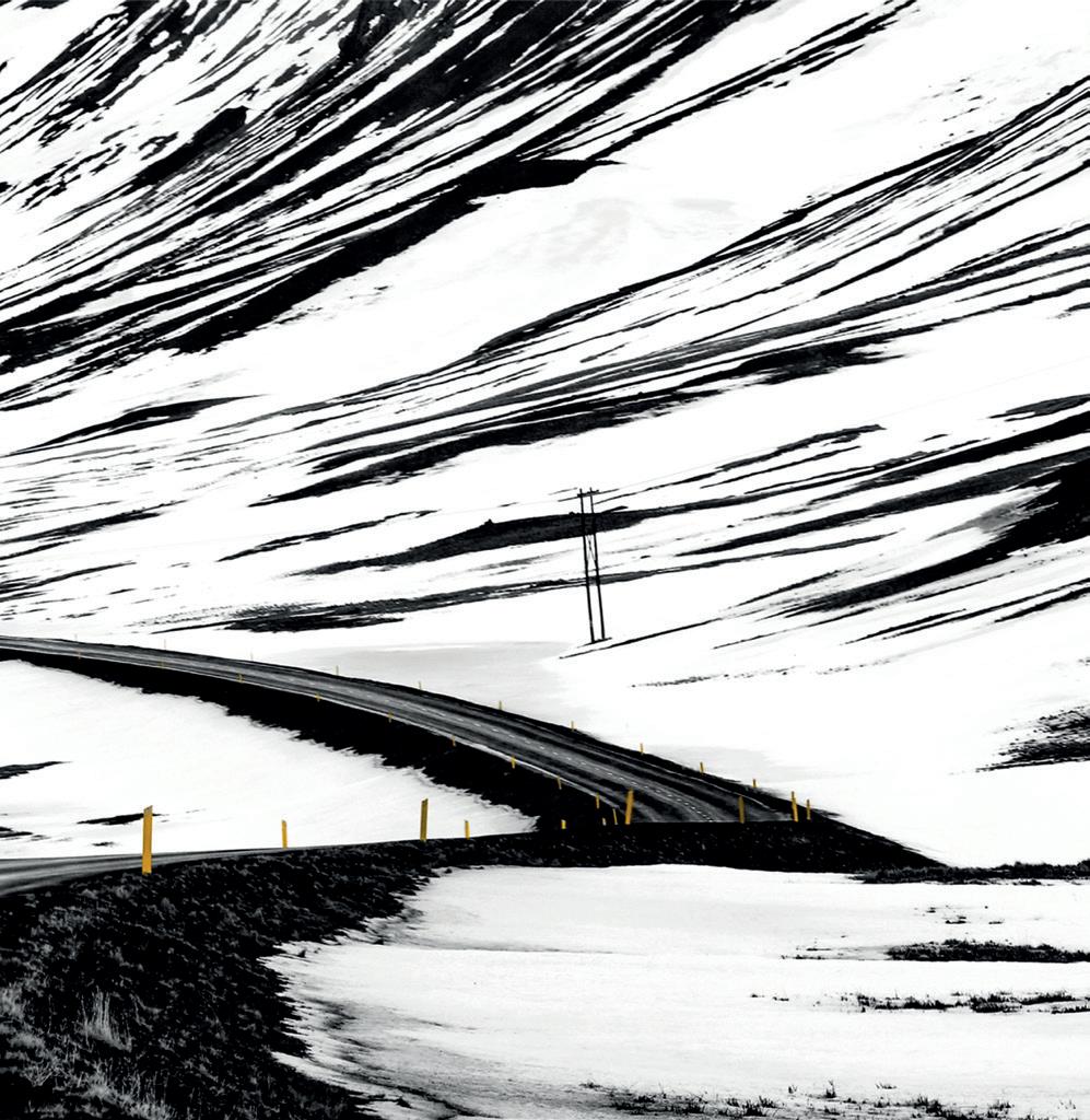
Volcanic activity is forging this new landscape and is similar to events that happened at the beginning of time during the formation of planet Earth. For the most part, there is little sign of interference by man. Around the island, a ribbon of infrastructure forms a ring as a result of roads and power lines. Along the south coast they occupy the narrow strip of land between the cliffs and the open sea. In the north they traverse the open landscape - often a snow-covered wasteland - surrounded by towering black peaks. In the areas of Iceland where man extracts power from the depths of the earth, enormous pipes zig-zag the landscape, transferring steam from bore-holes to the power generating plants. These structures are situated in thermal hot spots where the magma is closest to the surface but, in these unstable areas, all infrastructure is at risk of being destroyed by the very powers we are attempting to harness.
Geological features are all around us. We pass by the black basalt plugs of extinct volcanoes with their vertical sides projecting above black lava plains. The truncated conical shapes of extinct volcanoes surround us. We pass by the classic shapes of iceformed U-shaped valleys with winding rivers and ox-bow lakes. In the thermal areas, fumaroles emit noxious fumes of sulphur dioxide and hydrogen sulphide while geysers erupt at regular intervals.

Three simple elements; the white snow, the blue ice and the black mountain peak capture my impression of this bleak, forbidding landscape.
This smooth, black tarmac road runs through the mountains, contrasting with the high jagged peaks, the black rock etched by the white snow.
We reached the snow line at 300 metres by evening and were afforded this sunset view over the Fjallabak region. The view extended over peaks and valleys to the snow-covered mountains in the far distance.
By virtue of Iceland’s exposed position in the North Atlantic, it experiences dramatic, often violent, weather conditions. Waves which have traversed many thousands of miles of open ocean batter and erode the rocky outcrops of the south coast. The island bears the brunt, and the full force, of Atlantic storms driven in by the jet stream. Layer upon layer
of cloud systems pile up as they meet the high altitudes over the mountains. Tightly packed isobars drive moisture-laden air from warmer climes towards the colder Arctic air, precipitating heavy falls of snow which transform the landscape. The ever-changing weather adds another dimension to what is already a dramatic, awe-inspiring landscape.
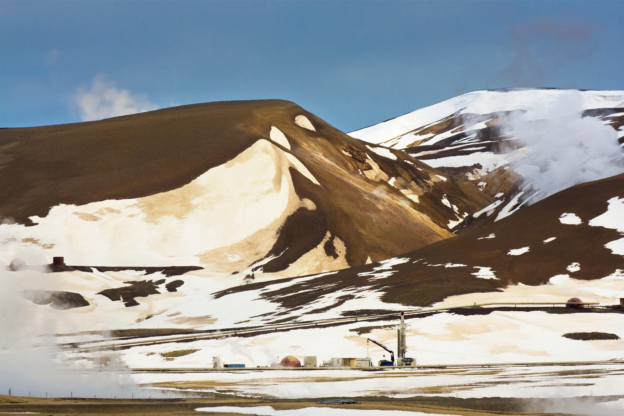

The Mount Krafla power station is overshadowed by the orange-brown Rhyolite of Mount Krafla itself. Snow drifts, stained a light ochre, form strange, almost ghost-like shapes on the mountainside. Below the mountain are the toy-like accessories associated with the power plant.
Back at our accommodation at Halle, the afternoon was spent in comfort, watching the raging blizzard and seeing the snow get deeper and deeper. The blizzard raged all night and we woke to a fine, bright morning. The snowploughs had been active throughout the night and the roads were now open but covered in ice. It was time to put on the spikes.
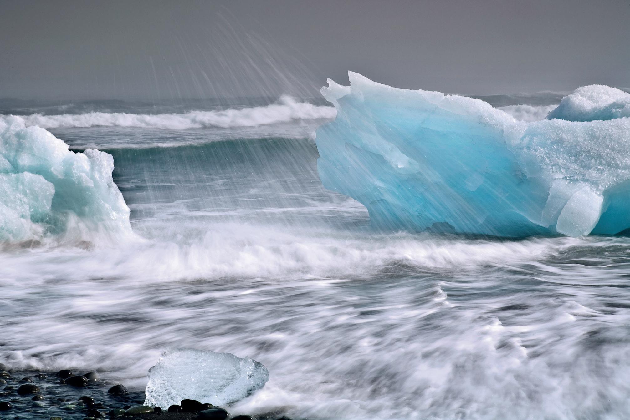
Icebergs from the lagoon slowly drift out to sea on a high tide before being driven back onto the jet-black sands of the Breiðamerkurjökull beach, sometimes called the Diamond Beach. Icebergs are strewn all the way along the beach, sculpted into intricate shapes by the waves and eventually being eroded down into small crystals of ice before finally being absorbed by the waves of the Atlantic. The colour of the ice varies, some being bright blue whilst others are pure milky white, the appearance depending on the quantity of air entrapped within the ice. It is an interplay of light and ice crystals.
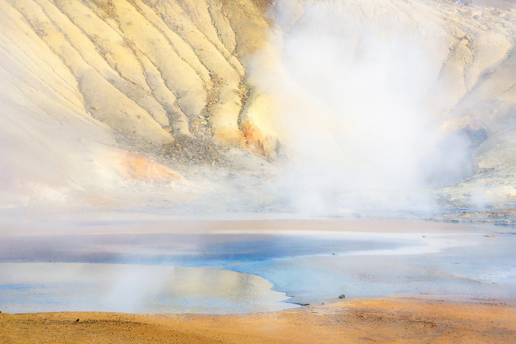
The orange and the sulphurous yellow colours are in perfect harmony with the blue of the pool. It is a place of stunning, yet lethal, beauty.
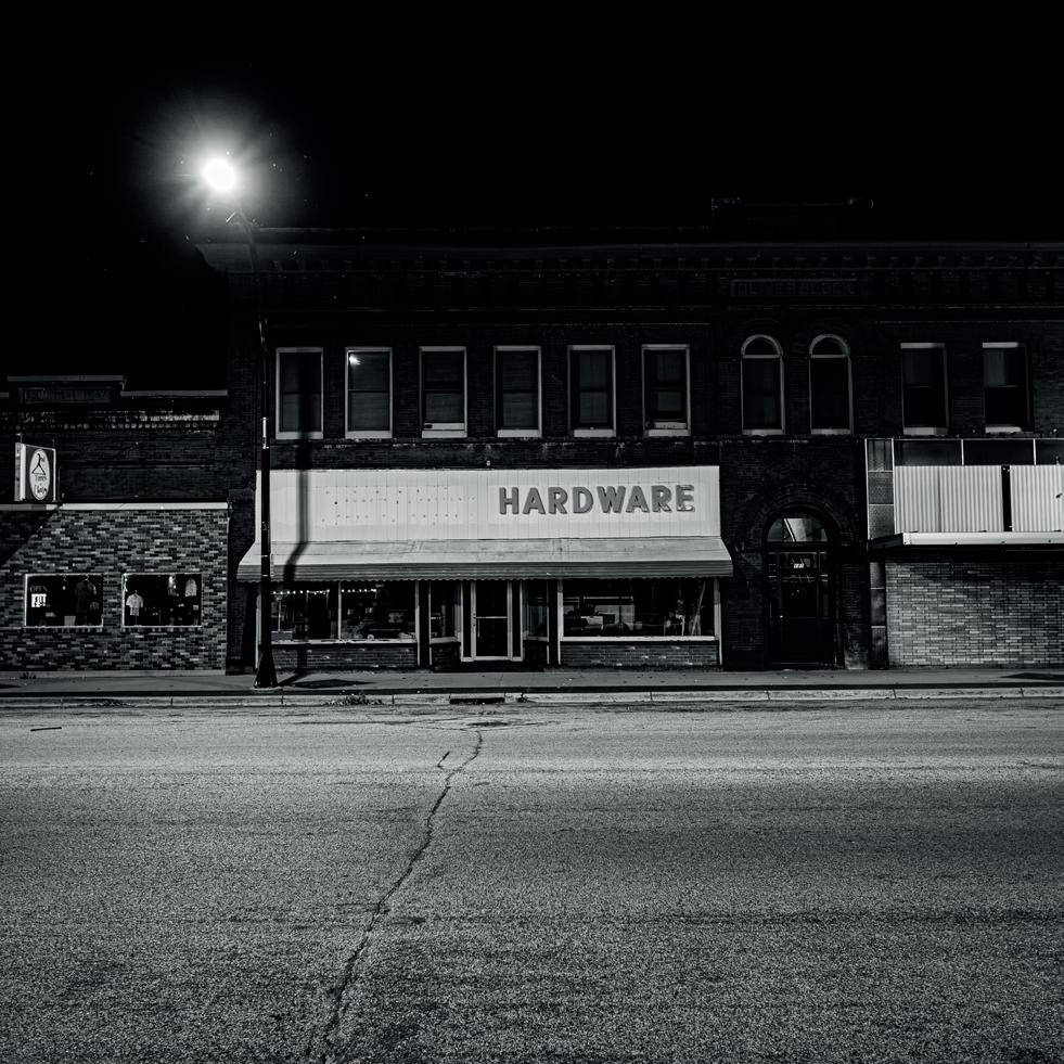
The Human Landscape
W. Scott Olsen
W. Scott Olsen is a native of Chicago and a university professor of English at Concordia College in Minnesota. He is both a published author of several works of non-fiction and has edited many anthologies. He is a regular book reviewer and, in 2023, was appointed Artist-in-Residence for Frames Magazine. I had the good fortune to meet Scott through a weekend in New York organised by Frames Magazine and was immediately drawn to his series looking at small-town America at night.
Candia Peterson ARPS
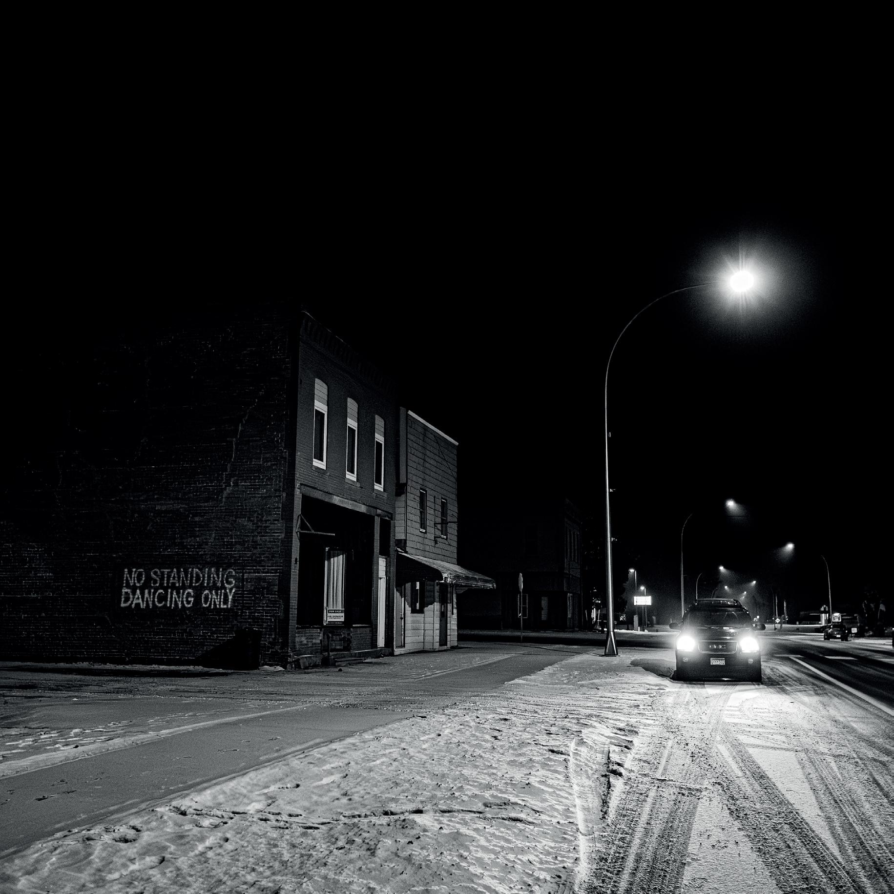
Akeley, Minnesota
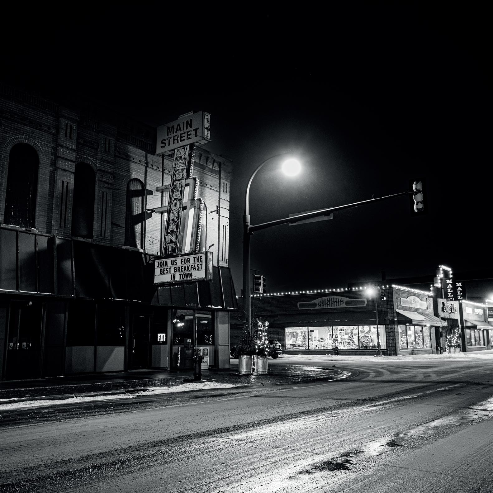
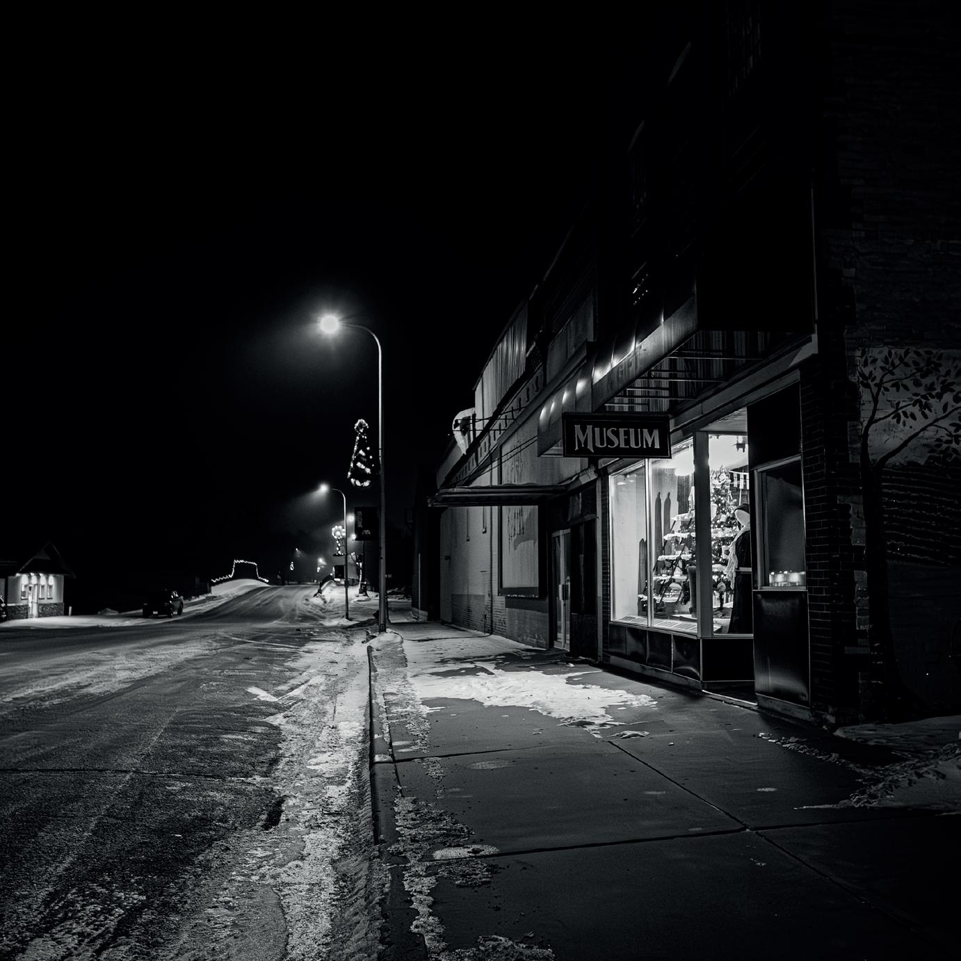
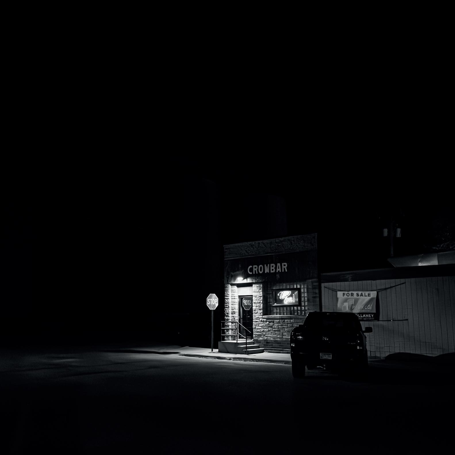
Small-Town America at Night
As ever, I started at the beginning and asked Scott for his first memories of photography and his photographic journey.
“While I remember taking pictures at a very young age - back in the days of the Instamatic and flash cubes - I never thought of myself as a photographer. I was taking pictures, yes, but I had no awareness at all of photography as more than a snapshot of
“I have always been a storyteller; however, that interest found expression in writing first. I have a dozen books of literary non-fiction, most of it focused on travel and adventure experiences. When I was working on those projects, however, I always had a camera in my hand. I used photography as a way of taking notes in the field. It was much better for me to take an image of something and then work on the words to describe it when I was back at the keyboard looking at the image. My images wound up as a book cover and the cover of many issues of a magazine I edited but still I was focused on writing. Photography was this thing on the side. Nonetheless, over time, I began to see that there were things I could say in photography I could not say in writing. I learned there were things photography could illuminate more deeply than writing too. I began to pay more attention to my own image-making and to the world of photography more broadly defined. I have no training in
family. So, my earliest memories would be of family events when I was younger than ten years old. But my first memories, as a photographer? That might be high school, where we had some introduction to darkroom practices. We had some video equipment in my school and I was deeply interested in visual storytelling but my interest was in motion. The appeal of the still photograph had yet to enter my imagination.
photography beyond my own curiosity and trial/ error but I have discovered this artistic outlet is now the essential one for me.
“It sounds a bit cliché but I’m really interested in all forms of photography. Those forms that don’t call to me very strongly as a photographer still call to me as a viewer. But for myself, street photography, documentary work and photojournalism are where I spend my energies. This goes back to my interests in storytelling and narrative. However, having said that, I seem to be spending more time trying to express my love for the North American prairie photographically. The prairie does not have the easy drama of mountains or coastlines or even forests. It’s a landscape challenge! I’m constantly taking wide-open landscape images, trying to find a voice and approach that reaches the level of beauty and complication I feel.”
Barnesville, Minnesota
Barnesville, Minnesota (2)
Moving on to Scott’s small-town project, he describes his motivations and inspiration as well as the travel involved and how long the whole project is likely to take.
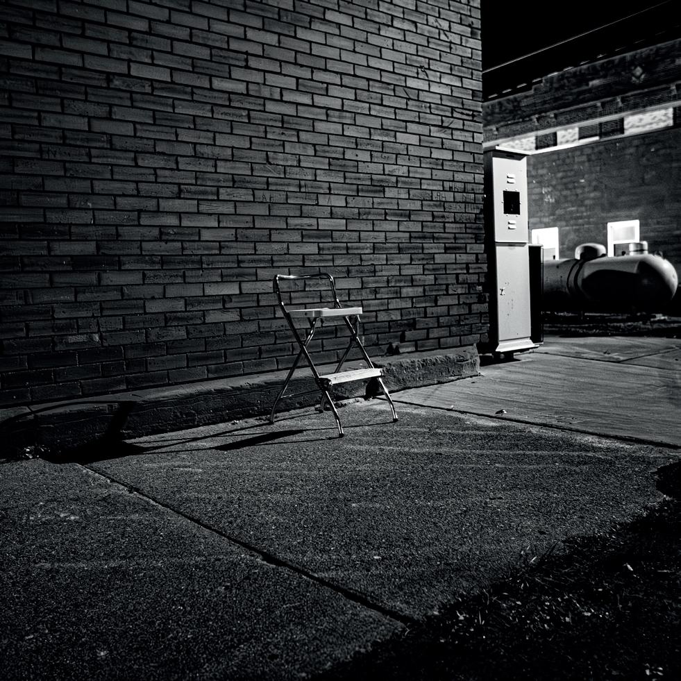
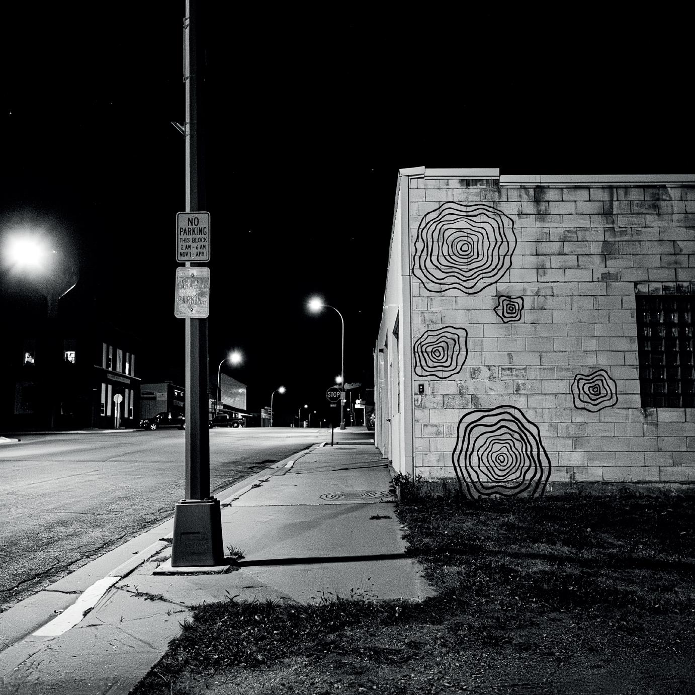
“I am by habit, as well as accident, a night-owl. And I am a great fan of the film-noir aesthetic. Because I live in a fairly rural part of the world, I am in very small towns quite a lot. And, at night, they are visually implicative. There are hints and rumors and mysteries everywhere. I have taken a lot of night photos (most recently a series called “When It Rains at Night”) and it simply occurred to me that small towns as a centering theme would be exciting to explore. My process is simple. I wait until very late, drive to a small town (usually a town I have some experience in before), get out and walk around. Just like street photography, where I am waiting for the unplanned moment to become an insight, I go without much of a plan beyond exploring. I search for those moments when my emotions are touched by what I see. Nearly all of my work is black and
white, for the usual reasons. Color, to me, places an image more firmly in time. B&W gets more to the idea of a situation than color. But color can also be the subject or, at least, the organizing idea. So, I’m not against color. Still, B&W reveals something more evocative, I think. The same goes for night work. A shadow is always a hiding. There is so much hinted at. I love the implications. It does not matter what is implied. The implication itself is the subject.
“I think the town farthest from my own home, so far, is 100 miles away. I want to include this town because of a particular bit of alley graffiti I have driven by many times before so I’ll be making a special trip out there just for the night shot. There are several very small towns between there and here I know from travel but have not explored with a camera at night. I have been working on this project for about six months now and expect a major part will be done within a year. Additions after that will be serendipitous.”
Detroit Lakes, Minnesota
Hawley, Minnesota
Lake Park, Minnesota
And finally, what next for Scott Olsen?
“I’ve just finished a small Zine about a street photography visit to New York and I’m soon to be working on a collection of street images I took in Paris a short while ago. And the new book, Fargo Street, just came out. There are landscape ideas I’d like to chase. But right now, the small towns at night project is what calls to me and I’m excited to see where it goes!”
Scott’s work can be found at https://blog.cord.edu/ olsenphotography. His book Fargo Street is available through Frames Magazine at https:// readframes.com/fargo-streetby-w-scott-olsen-the-firstmonographic-photography-bookfrom-frames/

Park Rapids, Minnesota
Sabin, Minnesota
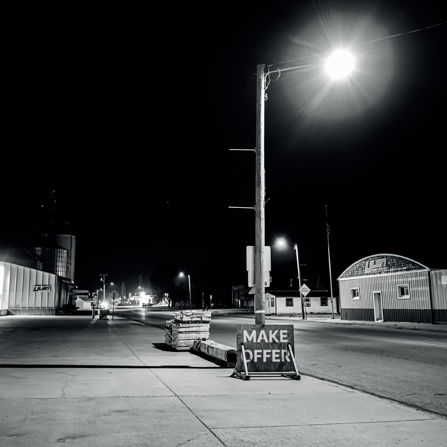
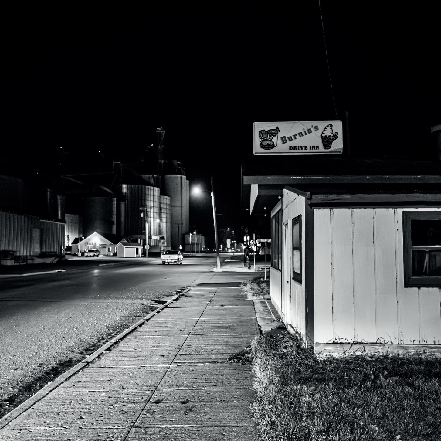
Ulan, Minnesota (2)
Ulan, Minnesota
Retrospective
Hugh Milsom FRPS
Hugh Milsom FRPS produced his book, “A Retrospective View” a decade ago following an exhibition of 80 prints to mark his 80th birthday and 50 years in photography. The images in the book dated from 1968 to the then present 2014 and follow his journey from printing in black and white in his own darkroom through colour slides and, ultimately, digital. Website: www.hughmilsomlandscapes.weebly.com
The Early Years
My interest in photography started in 1958 but it was not until 1964, when I had a house of my own and I was able to set up a darkroom, that this lifelong ‘obsession’ began. I joined a photographic society and remember being baffled by all the talk about ’print quality’ and ‘composition’. What did it all mean? This would all unravel over the following years.
During this era, it was the fashion for images to be printed from the film negative and possess a ‘full range of tones’. I felt that this type of print was a mere record of the scene in front of the photographer and lacked any input or emotion. My photography was destined to go in a different direction. I loved the simplicity created by contre jour lighting and the drama of the resulting low key prints with deep shadows and rich blacks. Alternatively, many of my early images were taken in thick fog and these were printed as delicate high key prints with soft charcoal greys to achieve the right mood and atmosphere. Quite a deviation from the conventions of the day as it was maintained that ‘every print must have a good black’.

Taken on a summer’s evening with a light mist rising over the sea and with the mountains silhouetted in the distance. As it was a bright clear evening, there were no clouds but I thought that the whiteness of the sky would emphasise the weird, dancing silhouettes of the trees. A brave image - white skies were not allowed in 1968. Although I was unaware at the time, the distant islands were the Inner Hebrides, with such exotic names as Rum, Eigg and Muck. It was 30 years later that I was to visit these islands on a regular basis.
The White Hut is just a mile from home and on the route of one of my walks. On this particular day I was interested in the ‘spiky’ shapes of the clouds which seemed to echo the shapes of the spikes of the railings. The main problem were the pylons and powerlines of the railway just behind so I had to lie down to get a viewpoint just off the ground to obscure these. I have looked at this location many times since and realised that the image was only possible on just a few days a year - the length of the shadow on the storm water pipe is just the right length to provide the balance in the print - any shorter and the effect is spoiled.
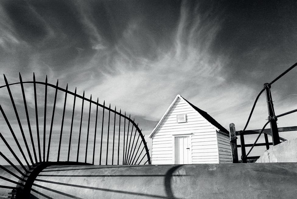
Trees at Ardnamurchan, 1968 Ilford FP3 film. (Above).
The White Hut, 1984 Ilford HP5 film, red filter.
Analogue to Digital
Developing a Style


Barleyfields at Reed, Hertfordshire, 1986
Kodak IR film, red filter. (Left).
Pathways, 1986
Kodak IR film, red filter. (Below Left).
Barn and Barleyfield, 1986
Kodak IR film, red filter. (Below Right).
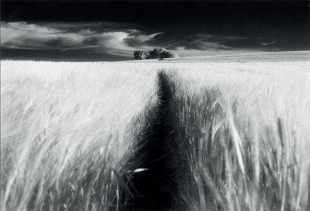
Here was a location that I enjoyed; wide open spaces covered with crops of barley or wheat in the summer. Using Infrared film, the vibrant shapes of the ears of barley became a perfect foil for the dark, sinister shape of the barn on the distant horizon, or alternatively, a copse with a spiral of cloud.

Buttermere, 1990 - Kodak Technical Pan film.
This study in tonality shows the capabilities of Technical Pan film. The dark, smooth tones of the water contrast with the highlight which picks out three figures on a spit of land jutting out into the lake. It was taken on a very dull day, with no sunlight but just a lighter patch of cloud to create a small difference in tonality which was accentuated during printing to create the impression of a patch of sunlight.
Discovering Colour
My thoughts were turning towards colour photography and these toned prints were merely steps along the way. I had always enjoyed looking for the details around me - the intimate landscapeand I made a collection of images of small sections of rock that I found around the coasts of this country. These rocks had beautiful textures and shapes and a stunning and unbelievable range of colours. After my first visit to the Isle of Harris, I was stunned by the beauty and the colour of the tidal pools in the
vast estuaries and photographed them for many years afterwards. My early prints, made using the Fujichrome process, captured what I saw but there was little interpretation, mainly because of the limitations of the printing process. I would have to wait a little longer before I could exploit these ideas by means of digital printing. Maybe this was a diversion or perhaps it was just another part of my journey into colour.
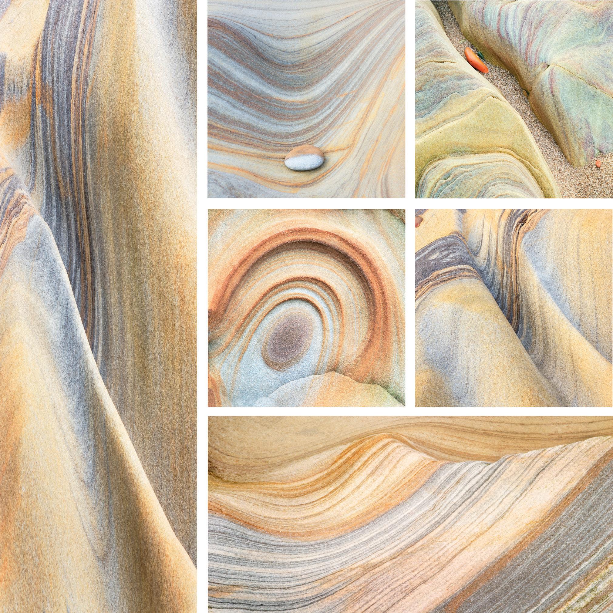
Rock Sculptures, Spittal, Northumberland, 2007
Digital print from digital file.
The Golden Years
Yet another change in lifestyle came in 1998 when, together with friend Iain McGowan, we decided to lead landscape photographic workshops. By this time, we both had considerable reputations and also detailed knowledge of many locations in England and, particularly, the Scottish islands, which at that time were little known. Over the following years, we opened up places like Northumberland, North Devon, Isle of Eigg, Isle of Harris and south west Ireland to a great many photographers.
It was a marvellous nine years and we became familiar with the landscape in all types of different conditions. I felt in tune with the landscape and its moods, even to sensing subtle changes in weather conditions, particularly as a different front moved in.
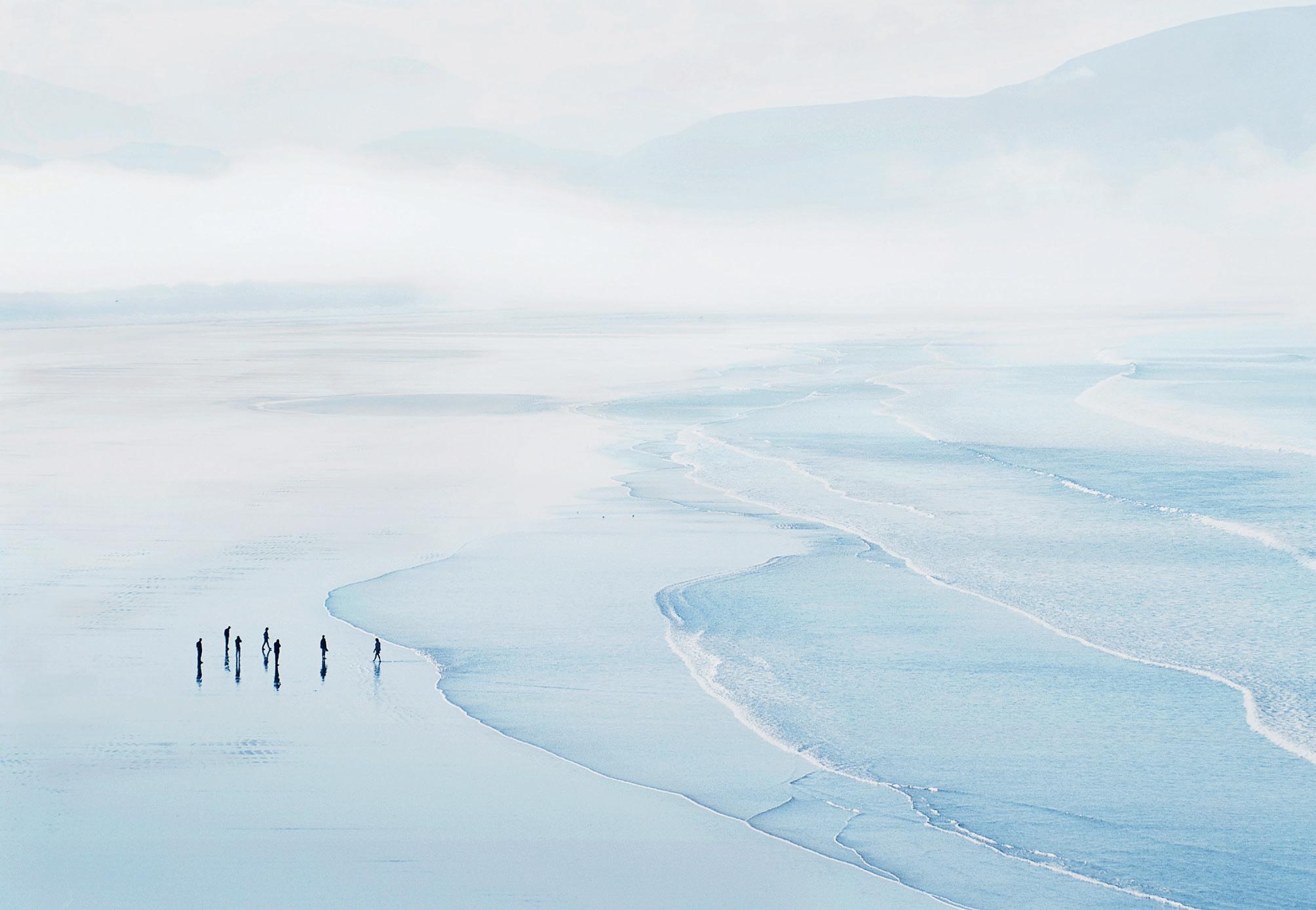
Figures on Inch Strand, 2001 Digital print from Fuji Sensia film.
Inch Strand is a fabulous beach and probably without equal. It is possible to get a high viewpoint and look over the vast stretch of beach to the mountains beyond; it just seems to have all the ingredients to make successful images. Taken on a
Over this period, there was also a technical change, almost of seismic proportions - the change to computers; first to digital printing and then finally to digital capture and a totally digital process. I had been using colour film to a greater extent but had always been held back by the limitations of the colour process. Most of my early prints, based on darkroom colour printing, have not been retained because the quality was inferior to anything that could be achieved using digital methods. My work moved to digital capture in 2004 and the quality of my prints improved as the technology improved, which included camera sensors, computer software, inkjet printers and inks and, finally, an incredible range of papers.
September morning with clearing mists, this image has a delicate blue, ethereal feel to it with the figures adding reality to the image. I waited until all the figures showed some separation before making the exposure.
Colours of Harris, 2010
Digital print from digital file.
Another aspect of Harris; just a fine ribbon of water picks up the blue colour of the sky and wanders into the distant sands. The misty backdrop of mountains completes the mood of this gentle, serene image.
Towards Luskentyre, Isle of Harris, 2006 Digital print from digital file.
This image sums up all my feelings about this area. The winding rivulets are rippled by the wind and pick up dark blues from the stormy sky, yet still retain the brown, peaty colouration from the mountain streams. In the distance are the dunes of Luskentyre which so often seem to catch a patch of sunlight, whilst in the far distance are the repetitive shapes of the mountains of North Harris.
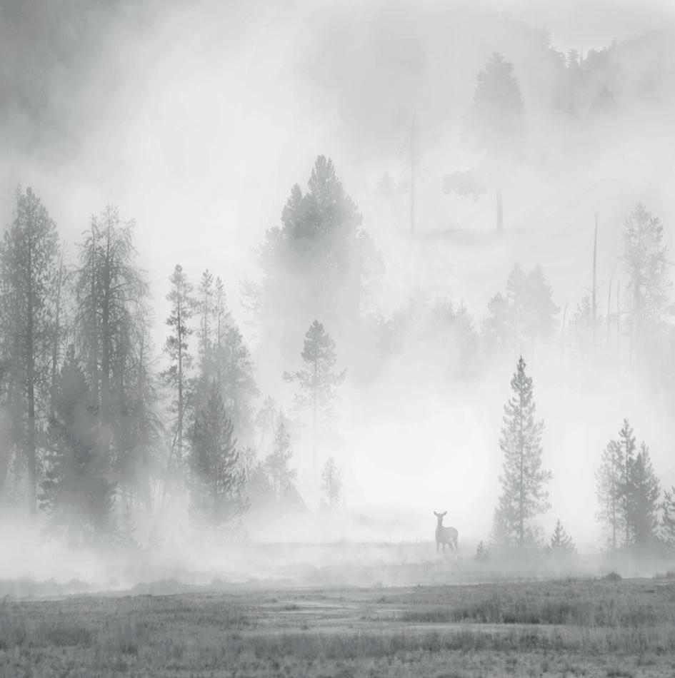
Tangle Creek, Yellowstone, USA, 2009 Digital print from digital file.
A conventional but emotive image of the mists at Tangle Creek. The trees form beautiful shapes and are arranged in different layers as they advance up the mountainside.
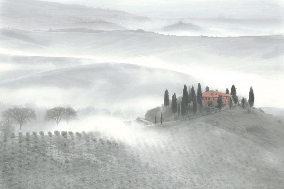
Belvedere, Tuscany, 2010
Digital print from digital file.
My love of the undulating landscape led me to explore Tuscany with its similar features. This landscape is on a much larger scale than Therfield and its damp, heavy, clay soil makes it prone to heavy mists which emphasise these contours. Farmhouses sit on the hilltops surrounded by graceful poplars and the repetitive patterns of the olive groves all provide for excellent landscape photography.
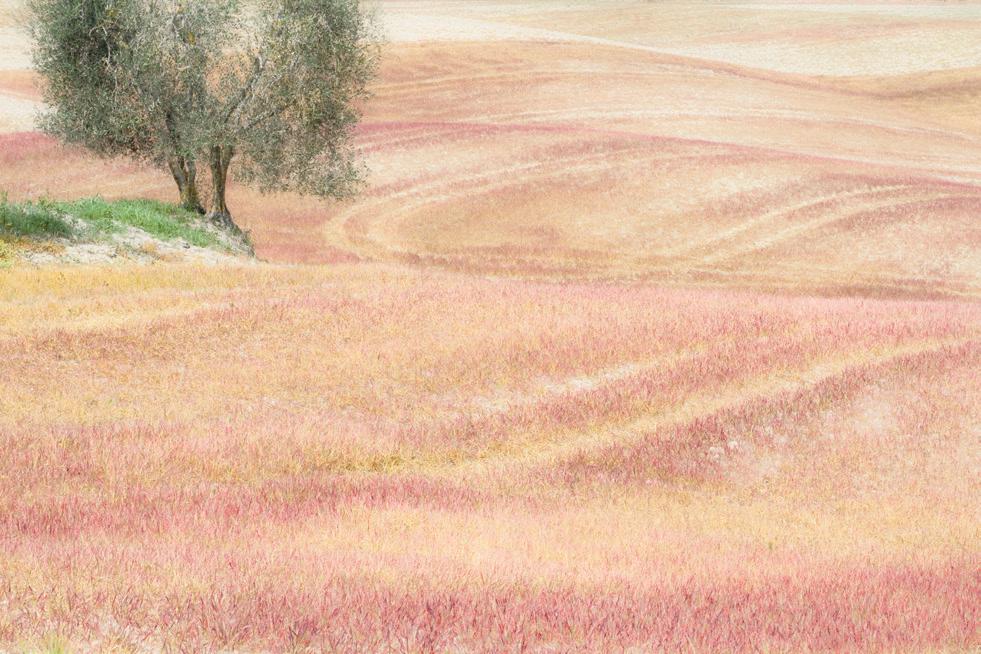
Red Fields, Tuscany, 2010
Digital print from digital file.
The sight of these red fields brought us to an abrupt halt - I do enjoy photographing such unusual conditions even if they seem unreal. Apparently, this was a field of couch grass which the farmer had recently sprayed with weed killer. At first, the grass turns a vivid red colour and then dulls down to oranges and yellows before rotting away. I liked the contrast of the orange-reddish colours of the fields with the green of the olive tree and the grass bank. The tractor lines and the folds of the landscape are quite Therfieldesque.
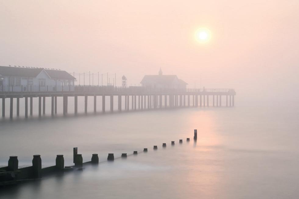
Southwold Pier, Suffolk, 2014
Digital print from digital file.
During a visit to Southwold in September we were fortunate to have two misty mornings. On the second morning, the sun broke through the mist and I was able to make this exposure. I used a neutral density filter and a shutter speed of 40 seconds as I wanted to achieve a smoothness on the water that captured the calmness and mood of the morning. Within minutes the mist had thinned out and the sun was then too bright to achieve a good exposure. Two amazing mornings.
The Post Processing Page
Ian Howard
Ian moved to Kent in 2002, joining Deal Camera Club, which he found to be a great space in which to learn, surrounded by talented and supportive photographers. In recent years, he has delivered talks and been a judge for camera clubs across the UK and for the global online community via groups such as Camversation.co.uk. Any fees he earns from this work are donated to the British Heart Foundation.
Ian also enjoys running group courses as well as undertaking one-to-one coaching, gaining satisfaction from seeing people learn new skills, develop their own style and gain the confidence to progress on their own. To further support these activities, Ian runs his own Blog site, Lensclof.com, which allows him to continue to support those who have attended the courses or the talks and any others who may find the posts interesting.
In this digital, high-tech age, it is fascinating that Black & White (B&W) images retain such integrity as a medium, both with photographers and viewers alike. B&W does not work for everything but, when applied to the right image in the right way, it can produce a powerful and dynamic result. I personally have a great affinity for B&W images and, as a medium, it has worked well for me over the years.
I took one such image of the Holocaust Memorial in Berlin which, from a B&W processing perspective, is remarkably simple because the subject matter itself was essentially B&W to the naked eye. However, this image demonstrates, what are for me, the initial criteria

for post processing of both colour and B&W images. I believe post processing does not start when we sit down at our computer and download the day’s images but, rather, it starts the minute we take our camera out of its bag and survey the scene in front of us. Our decisions at this point have a major
impact on image processing. In this digital age we have lost touch with the “time is money” concept that film photographers had a good grasp of! How long does it take to wade through a myriad of bad images, only to find that one good image which then needs excessive time spending on it in post processing to fix all those annoying elements? In the film days, when you paid for every shot, you needed to be sure you got it a as “right in camera” as you could.
We need to get the “Right things Right “. For me, previsualisation of the final image is key because, if we do not know what we want it to look like, how can we capture it? Do we know the narrative of the image? Having an understanding of what we are aiming to achieve/say will ensure we have all the correct attributes present in the right places. Are there any aspects in the image that are clipped or overlapping each other? These need to be resolved in-shoot, which may necessitate you adjusting your position accordingly. Leading lines are key to a strong image and these need to be maximised. Have we generated triangles within our image to create tension and direction? Is the depth of field correct for what needs to be in focus and is the shutter speed correct to ensure required blur or to ensure a frozen image? Finally, have we managed the light in such a manner that we have maximised our processing freedom and avoided any overexposures?
If any of the above are wrong, then these will be time consuming, if not impossible, to put right on
The Truth is Black & White (with shades of grey!)
a computer. It is worth stopping for a minute to understand what is working and what is not working within the image so you can take the appropriate corrective action when shooting.
We also need to get the “Right things wrong “. Give yourself plenty of editing space and do not frame too tightly in-camera. When lens distortion and converging verticals are corrected you may find you have significantly impacted areas of the image and these can be difficult and time consuming to
resolve. ‘Wasting’ a few pixels is worth it – you have got plenty to spare!
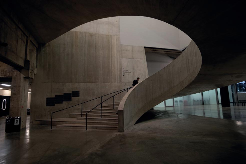
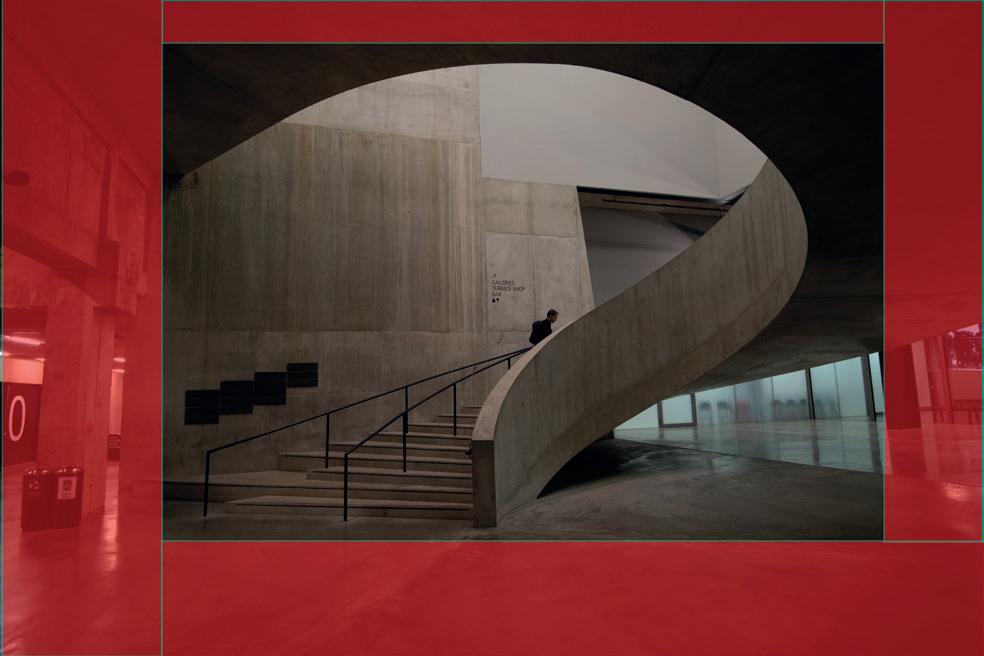
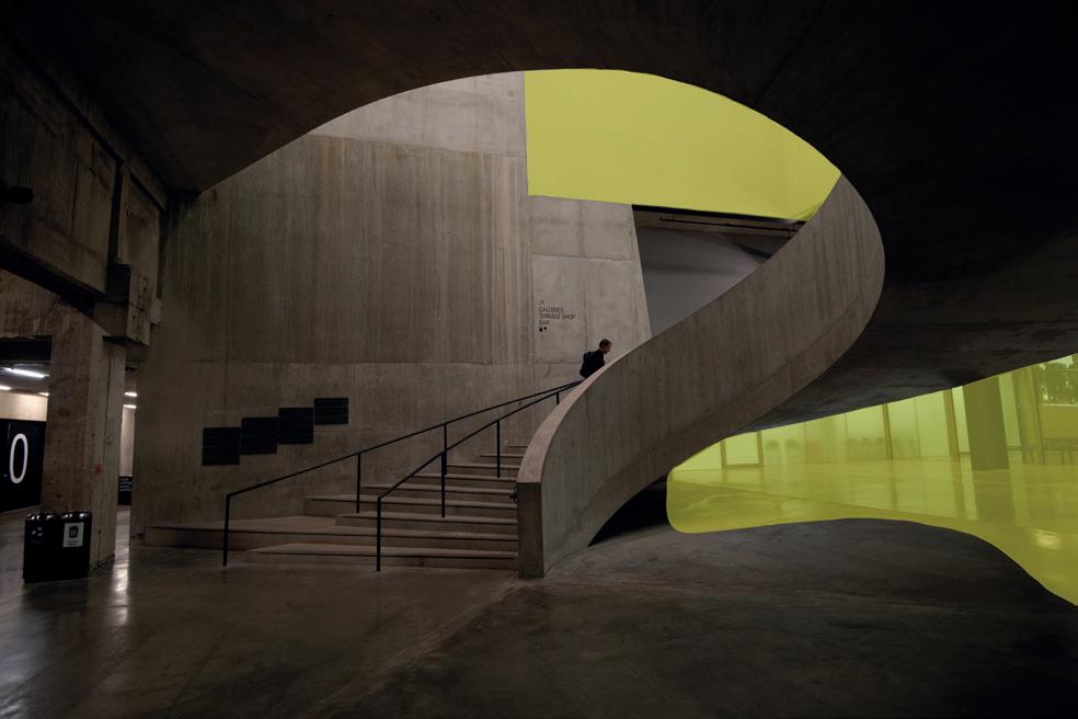
We can take a look at an image that shows many of the in-camera aspects listed above. The staircase in the Tate Modern is a location that is a magnet for photographers but I wanted to capture something a little different and in my own style. The original plan for the shot was that this would be a colour image. I wanted to capture an individual person on the staircase, ascending from a cold and foreboding basement, generating a sense of isolation and menace, moving towards the warm safety above. The cold blue tinted below-ground areas contrasting with the warm tinted above-ground is a stylistic approach I had seen used in the film Pans Labyrinth and I wanted to recreate this same feeling.
To gain as much data as possible it is always best to shoot in RAW as this gives the most data and post processing room for manoeuvre when you get to your computer.
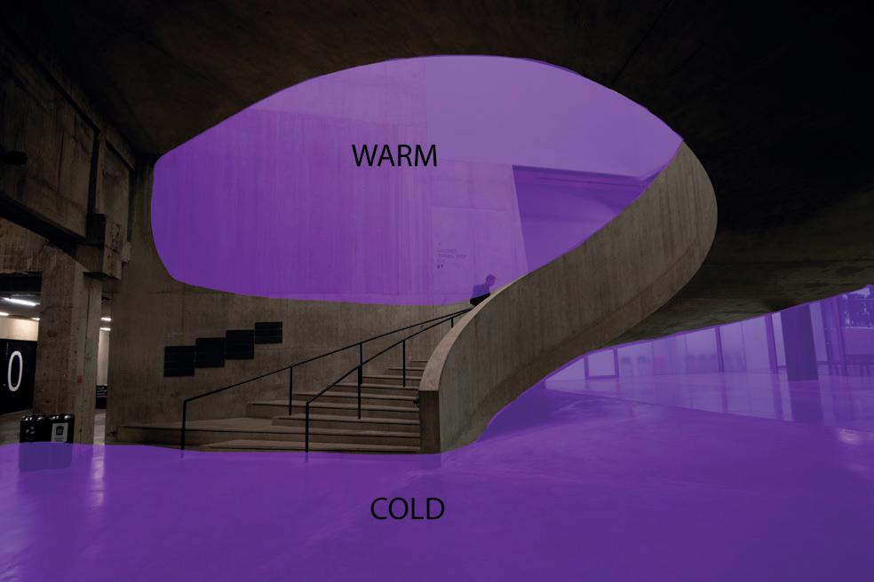
As you can see from the analysis of the RAW image, I have manged the in-camera aspects as follows:
- Allowing sufficient space around the peripheral areas of the image for cropping, lens correction and perspective corrections (Red).
- Managing my leading lines well, ensuring that
the three handrails converged at a single point and then timing the shot so the individual was at this convergence point (Dark Blue).
- Several triangles were also identified as part of the composition and these induce a tension across the image (Light Blue).
- I had a number of areas that were of concern to me as I had bright areas or areas with little detail in them (Yellow).
- The zones where I needed to adjust the temperature to generate the cold and warm tones had been identified (Purple).
With any shot, my approach is to take care setting up the non-moving parts of the image using the viewfinder and test shots. When we come to taking the actual shot, we need only concern ourselves with getting any moving parts of the image in the right location. Any overexposed areas were minimised by using the histogram in the test shots and slightly underexposing the image by shooting at -0.3ev. Overall, I was happy with the RAW image I had captured.


When generating a B&W image I always begin by processing the “best” colour image I can as this gives a good foundation and a clear decision point on the final style (original plan was a colour image). I do sometimes return to the colour image as I may need to boost the saturation of certain areas to facilitate the right tones in the B&W conversion, especially if using colour filters.
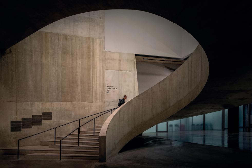
My first step was to open the image in Lightroom (Lr) to undertake basic processing of the image, correct any perspective issues, chromatic aberrations and lens distortion. This image was then transferred into Photoshop (Ps) where any cloning or repair work was undertaken, along with any adjustments using curves or levels. Using a new layer, the temperature of the image was cooled down and then with the
use of a layer mask, this was limited to the belowground areas, ensuring a feathered transition. This process was then repeated to generate the warm above-ground areas. The final colour image was as I had envisioned.
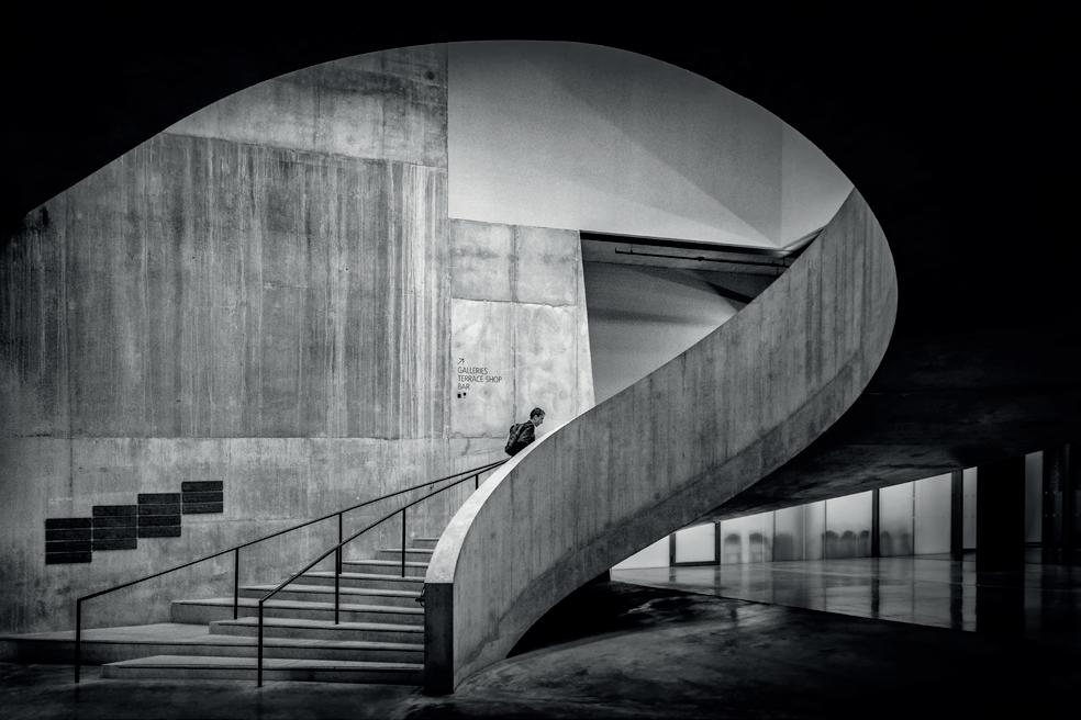
The question mark shape around the staircase was dramatic and felt under-utilised in the image, which prompted me to explore the option of a B&W version.
This B&W conversion was achieved by exporting the finished colour image into Silver Efex (part of the Nik Efex collection) where the preset High Structure (Harsh) was used and any sliders adjusted accordingly to get the look I needed. With the image back in Ps the top of the staircase canopy was burned back to black. Other areas were then dodged to bring up any midtones (individual on the stairs) and burned (hand rails and stair trims) to darken these areas. Typically, my final treatment for a B&W image is to apply a B&W gradient map to the image, the opacity of which I usually dial down to ~40%, which I find is sufficient to give the image contrast a boost and avoids the image looking “flat”. A final review of the image is done to check if any additional dodging, burning or levels adjustments are required.
Although the final image deviated from my original plan, the previsualisation and the narrative were fulfilled and the compositional attributes of the image suitably maximised.
A key aspect of generating strong B&W images is to start with a good subject that contains sufficient tonal ranges on conversion to B&W, so delivering a pleasing final image with sufficient tonal depth. As we can see from this example, different colours do not necessarily deliver different tonal ranges on conversion to B&W and it is the concept of tonal range that is the most difficult to grasp and to see. An image containing a single colour can have a greater tonal range than a multicoloured image.
When processing your image, you may want subtle changes in the tones that cover a narrow dynamic range (lightest to darkest), generating a subtle image. Alternatively, you may opt to maximise the dynamic range (lightest to darkest) by pushing the tones close to white and black, thus generating a more graphic image. It is here where the subject matter and personal choice come into play.
There are a few other techniques I regularly use in my B&W conversions that always raise interest when I deliver talks at camera clubs or to online communities:

Application of a red filter
Traditionally, film photographers have used coloured filters when shooting B&W to add drama into the blue zones of an image. As with the image of St.Paul’s Cathedral, the effect of a red filter on the sky darkens the blue areas, increasing the drama in the sky and facilitating a much better backdrop for the subtle tones of the cathedral. Today we have the advantage that we can control where this type of effect appears within the image. Using Silver Efex Pro, I will generate a duplicate layer with the red filter applied and then, using layer masks, blend the two images.

Multiple monochrome conversions
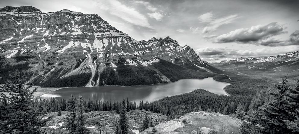
The point that causes the most discussion during my B&W talks is the realisation that most photographers apply a single B&W conversion to an image and then make this work across the entire image via dodging and burning. I personally find it is sometimes better to process multiple different B&W conversions and
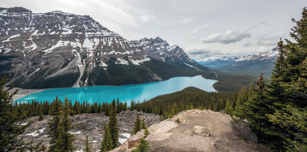
then to blend these to generate the desired final image. As with this image of Peyto Lake (originally a colour shot) the sky and the land were processed differently and blended using a layer mask. This method enables me to generate a strong B&W image where the tonal ranges in the two different sections of the image are maximised.

Gradient map to add punch
Using a B&W gradient map is an accepted method of generating a B&W conversion of a colour image. In my process flow I use this method in the latter stages of processing a B&W image, often applying a B&W gradient onto the image at the end of processing, ensuring that I dial the opacity of the gradient layer typically to ~40%. This ensures a sufficient range of contrast and tones within the image and reduces the risk of a “flat” image.
In conclusion
As photographers, we can be too quick to take images and we need to stop and enjoy the process, take our time and understand the space we are looking at. Investing time in your post processing at the shooting stage does make the photographic process and the post processing much more enjoyable. Put a value on your time and look to increase your good to bad image hit rate by investing in shooting for post processing. Explore the points raised in this article to see if they positively impact your B&W images and your enjoyment of the process.
Different Colours can gererate the same tone on B&W conversion
Different shades of the same colours can generate different tones on B&W conversion
The Nature of Landscape
Joe Cornish HonFRPS
We continue our series of articles by Joe Cornish. These articles were previously published in On Landscape Magazine (which Joe co-founded) and we are extremely grateful to Charlotte and Tim Parkin for allowing their inclusion.
For this edition we have his original piece on the The Altered Landscape which he has updated and added some new images.
www.joecornishphotographer.com
www.onlandscape.co.uk

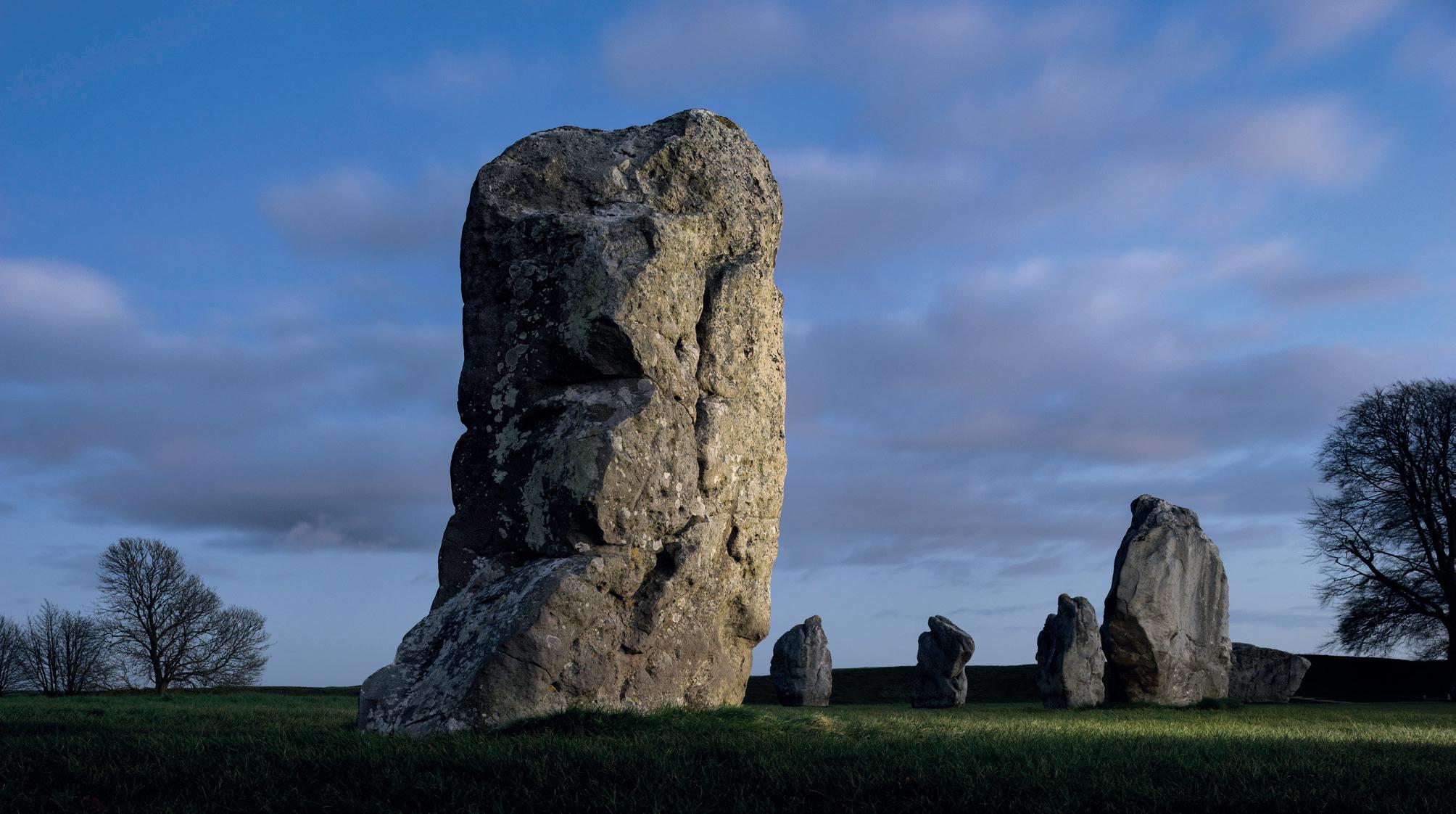
Avebury twilight
The monumental stones at Avebury date back to the Third Millennium BC. Their function and role in the landscape remain an unresolved mystery.
The Altered Landscape
I first came across the phrase ‘Altered landscape’ in conversation with Australian photographer Christian Fletcher. He uses it to describe places changed by mining and quarrying. These range from quarry cliffs, cuttings, embankments, machinery and buildings, to deep mine workings, slag heaps, tailing ponds, effluent and run-off. Christian’s pictures are often aerials and can be quite abstract and beautiful in colour and design. Canadian photographer Edward Burtynsky is another whose work addresses this theme in depth; his 2007 book ‘Quarries’ is one I have admired often. Burtynsky’s monumental work exhibited at the Saatchi Gallery in 2024 is Extraction/Abstraction. Perhaps it is the most powerful and highly charged piece of landscape
photography yet and, at its heart, is the idea of the Altered Landscape.
Currently, geologically-speaking, we are in the Holocene epoch, which began at the end of the last Ice Age. However, the effects of our occupation of the planet are so profound that many scientists choose to refer to the Anthropocene. The beginning of this new age is disputed. Some feel it should refer to the beginning of the original agricultural revolution; many more prefer the start of the industrial revolution. And yet another view points to the spike in radioactive elements that will be retained in the geological record as a result of the testing of nuclear weapons, both above and below ground, during the 1950s and ‘60s.
Whatever your view of this, there can be no doubt that humans have altered the landscape, as well as – we now realise – the atmosphere we breathe and depend on for a (relatively) stable climate.
For at least 10,000 years we have settled land, having transitioned from hunter-gathering to agriculture. Anthropologists connect the arrival of urbanisation to the food surpluses agriculture provided. Villages, towns and cities clearly alter the landscape. Monumental stone buildings in particular required enormous amounts of material and huge human effort to cut, transport and transform them into pyramids or temples. Altered landscape is by no means only a modern phenomenon.
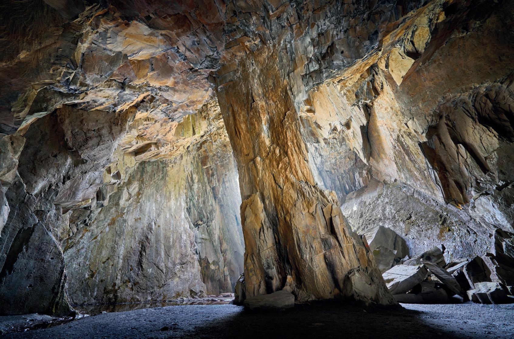
Cathedral Cave
This completely artificial space in Cumbria, near Hodge Close, is the result of slate extraction.
Yet modernity imposes itself more comprehensively. Electricity pylons criss-cross our countryside, an alteration few of us wish to see but whose energy we cannot imagine living without. All the conveniences of modern life, including all transport infrastructure, urban development, the entire industrial world; all of this inevitably leads to anthropogenic alteration of the land.
In the UK, agriculture is the greatest single territorial occupation and alters the land rather obviously when growing crops, especially with modern industrial farming. And perhaps, more subtly, where domestic animals are controlled by enclosure. Sheep over-grazing uplands in the Lake District is an example of a natural landscape changed (and degraded) by our occupation. Woodland is a natural vegetation on our hillsides and
valleys but commercial forestry is a form of alteration, especially when planting and harvesting non-native tree species. We may regard going into the countryside as visiting ‘nature’ but it is a highly controlled and managed form of nature.
The British Isles lack any extensive wilderness so all the landscapes, I would argue, are altered ones, to a greater or lesser extent. It’s true there are remote mountaintops in Scotland, vertical sea cliffs and intertidal zones at our coasts and some remnants of ancient woodland. But these are fragments, not fully-functional ecosystems. Thus, our landscape truly reflects our settlement of it.
If we contemplate non-human change for a second, we can see that geological processes readily put all other alterations into the shade. Volcanic eruptions may be immediate and obvious but
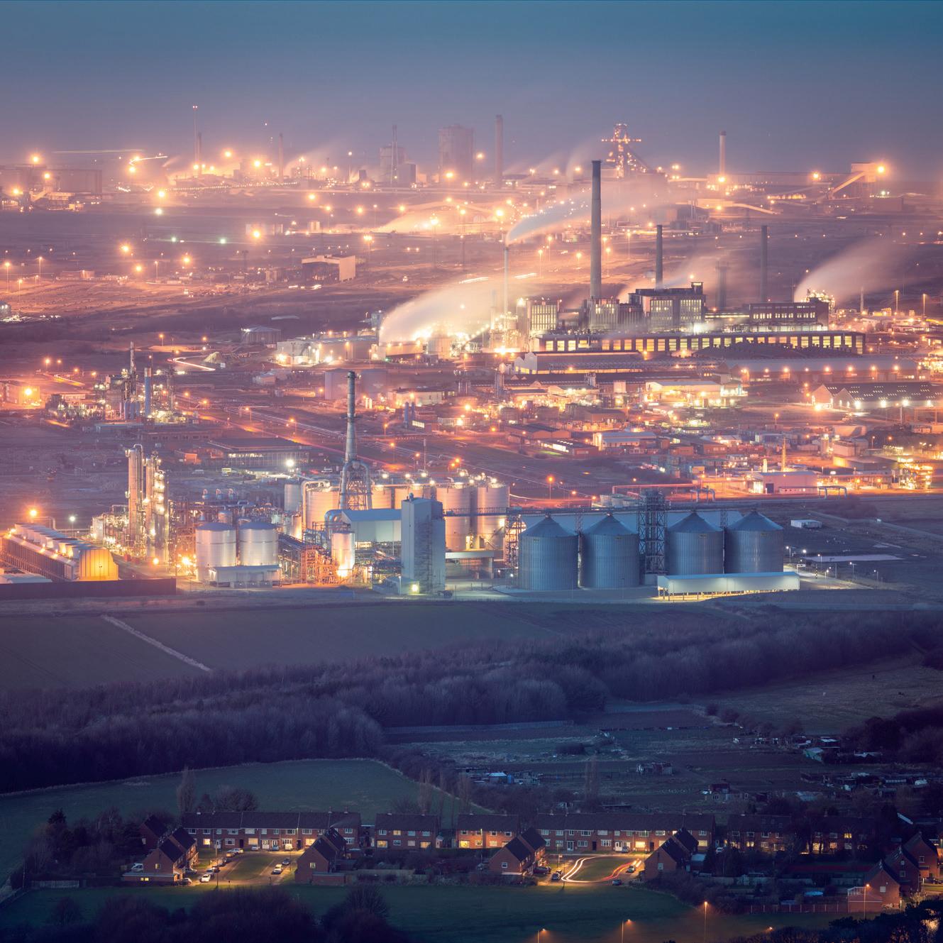
Terraced houses and allotments are dwarfed by the chemical complex of the Wilton site, east of Middlesbrough.

Carreg Cennen
Grazing pasture gives a natural appearance for any British agricultural landscape, especially on semi-open moorland. But this is hardly the natural order. Domesticated animals now exceed wild ones in biomass terms by 15:1.

Wilton, dusk.
continental collision, mountainbuilding, plate spreading and oceanic plate subduction happen over such long periods that we can only understand their enormity through the telescope of geological history. Our biggest infrastructures, such as giant dam projects, seem profound to us but are puny and temporary, both in geological time and scale.
For the sake of this article, I will stick to the human-altered landscape definition and include a few examples that I have enjoyed photographing over the years. Living in the north east of England means I am never far from a conspicuously altered landscape. The edges of the Cleveland Hills alone have the remains of over 300 separate mining enterprises from the last 400 years. Teesside, just north of us, was the industrial landscape that inspired the young Ridley Scott (who spent some of his
youth here) in his settings for the legendary movie, Bladerunner.
It is hard not to be shocked by the wanton destruction of the landscape when considering these places today. It seems almost unbelievable that our ancestors would destroy, deface, pollute and hack about so much beauty. But it makes no sense to judge in hindsight. The comforts, conveniences and opportunities of modern life are all dependent on the exploitation of nature and its services. We continue to benefit from, and are all complicit in, the ongoing exploitation of earth’s finite resources. And as an environmentalist who travels (occasionally) by plane, train and automobile, the charge of hypocrisy against me is fully justified. Although slightly less justified this year!
A decade ago, I interviewed Canadian photographer Garth
Lenz at the Natural History Museum. His most ambitious work, The True Cost of Oil, focusing on the Alberta tar sands in central Canada, contrasts the destruction of this industry with the undisturbed beauty of the adjacent wilderness. The boreal forest is a land of luminous beauty and huge ecological value. If you have twenty minutes to spare, check out Garth’s excellent TED talk on the Alberta Tar Sands; it is a brilliant explanation of the destructive nature of this industry and inspiring advocacy for the preservation of the remaining wilderness areas of Canada.
Garth told me that – in the language of industry – the trees, plants, soil, rock and water that is removed to allow access to the fossil fuel-bearing rocks below is commonly referred to as the “overburden”. Given the destruction of habitat and the climate-altering consequences
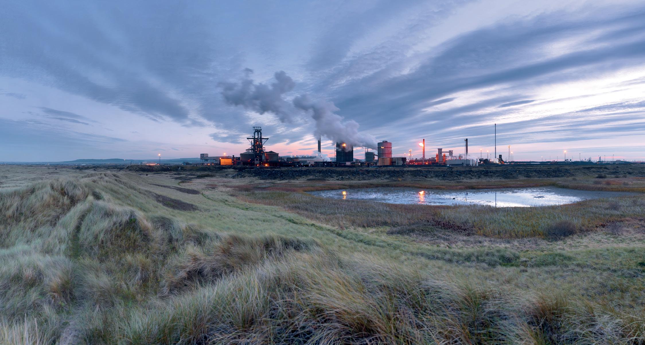
The Redcar steelworks has closed since this photograph was taken. Surrounded by apparently natural dune systems to the north-east, much of this land was used as a dump for industrial waste, heavy metals and chemical pollutants over many decades. In spite of this, nature is now making a significant return.
Steelworks panorama
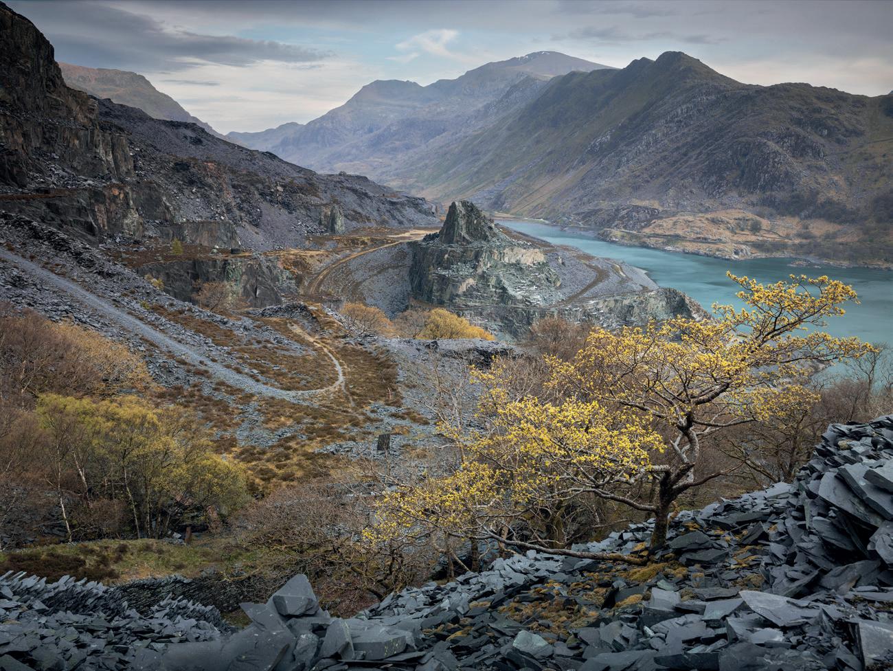
Dinorwig abandoned
Once the world’s largest slate extraction site, this vast quarry is also notable for being the home of a huge underground chamber hollowed out for the creation of the so-called Electric Mountain. The turbines in this hall are powered by water descending from a mountain lake on the slopes above.
of burning these same fossil fuels, are we humans not the real overburden?
Altered landscapes are a manifestation of industrialisation and modernity. These alterations have come at a huge cost to the beauty and life-nurturing vigour of wilderness and wild places. Many of us may never have the opportunity to experience what that beauty means or looks like because wild places, habitats and wildlife continue to disappear, threatened by the ongoing exploitation of land. Altered landscapes speak of our insatiable appetite for earth’s resources, yet we all depend on the modern way of life that has driven these alterations.
On the other hand, there is solace in exploring altered landscapes now being reclaimed by nature. There are hundreds of abandoned quarries in the British Isles which provide sanctuary for nesting birds and a wide variety of trees, plants and their attendant wildlife, including in the hills above our
village. Ponds and small lakes often occupy the hollows left behind and these further expand the diversity of habitats, as well as being a visual treat for artists and photographers. The vigour of this regeneration shows the resilience of living things and is a reminder of Aristotle’s declaration that “Nature abhors a vacuum”.
For me personally, these recovering altered landscapes are a symbol of renewal and a source of hope.
Some of the themes in this issue on the altered landscape include coastal erosion, deforestation, glacier melt, post-volcanic alteration, the damming of rivers, and mining, including for new materials such as lithium. Many of these themes are evidence of Humanity’s unsustainable and exploitative relationship with nature. The photographers who specialise in these areas are driven by a mixture of fascination and concern and their work is an important contribution to our understanding of what is
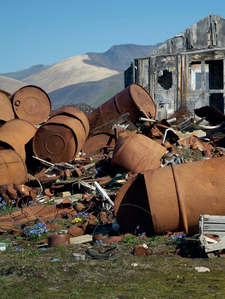
Wildflowers and oil drums, Wrangel
A remote island off the northern Chukotka coast in the Russian Arctic, most of Wrangel Island is unspoilt wilderness. But where humans have been is a toxic legacy of pollutants, dereliction and debris and these oil drums continue to leak their contents into
happening in our name, much of it being out-of-sight and so out-of-mind. Additionally, it is a vital element in the canon of landscape photography, both in the documentary and in the aesthetic sense.
In conclusion, the notion that hope is also part of the canon of landscape photography is significant. Hope is an important counterpoint to what might otherwise be an overwhelming counsel of despair. I see the photography of the altered landscape and the photography of wild beauty that remains as an ongoing and important dialogue, reflecting some of the contradictions inherent in humanity’s complex relationship with our planetary home. Nature deserves our attention, and many sorts of landscape photography can help bring it into focus.
the ground beneath. Both the sea and a river are only just out of frame. In spite of this and the harsh climate, wildflowers continue to appear, prompted by summer sunlight.

Strath Conon Clearcut
The effects of clearcut forestry can seem as harsh as a World War One battlefield site. But the healing process over the land starts rapidly. After a decade, this land will be re-covered in saplings and understorey.

Under the slopes of Yr Eifl in North Wales are the remains of an ancient township, a site thought to have been occupied for several hundred years, following its settlement in the Iron Age. Composed of many buildings which were probably once turf-roofed, their walls seem to have been composed from the scree slopes of the adjacent hillsides.
Editor’s note
The themes identified in Joe’s penultimate paragraph will be the focus of a new 6-part series running over the next three years. Contributions from members are encouraged so please send yours to landscapemagazine@rps.org
This summer, the Landscape Group will announce a new project running for a year entitled “Leave No Trace”, the focus of which will be to document the effect we have on the natural landscape; our impact on it and detritus left in it.
Tre’r Ceiri
Lunar Landscape
Robert Harvey
Robert Harvey ARPS needs no introduction as a professional photographer and friend of the RPS Landscape Group. His workshops, guided walks and talks, both in person and online, are legendary. He also describes himself as a selenophile (something your editor had to look up!). The word comes from the Greek selene (moon) and phile (having a fondness for something) and you should be left in no doubt of the veracity of his claim once you have enjoyed this wonderful set of images.
Website: www.naturalworldphotography.net.
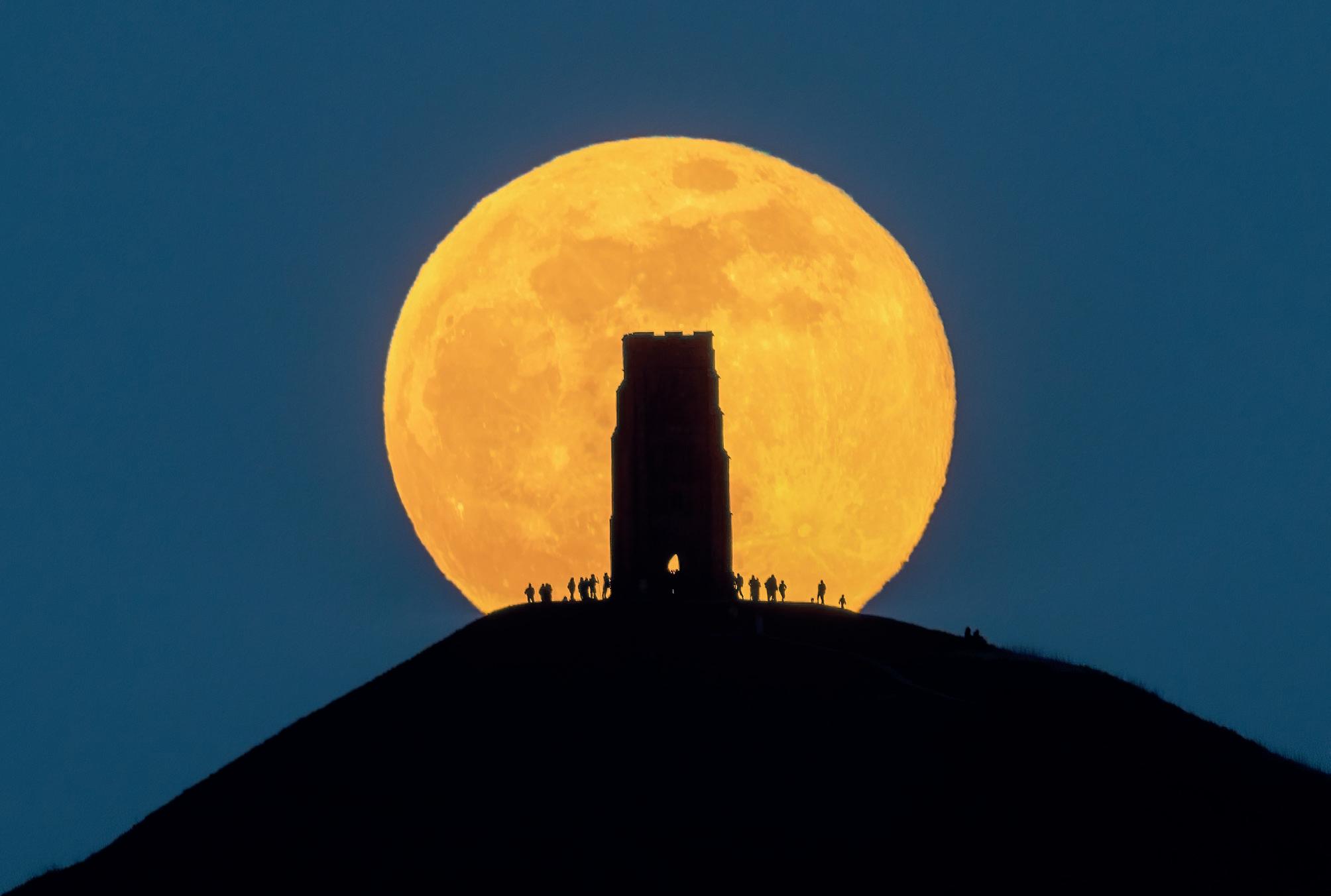
Snow Moon (February), Glastonbury Tor, Somerset. 840mm, 1/30 second at f/8 and ISO 1000.
Photographing the Moon in the landscape in a year of “Major Lunar Standstill”.
We are fortunate to live on a planet with a good Moon.
Admired for its beauty and lighting up the land, the Full Moon is imbued with a particular aesthetic, practical and spiritual significance. It makes a popular subject for our cameras but capturing an effective landscape photograph including the Moon is harder than it may seem.
The Full Moon is bright in the sky and engages our attention when we see it. However, its angular diameter is just 0.5°, which represents less than 0.001% of the area of the sky. Using a wide angle or standard lens will likely prove disappointing as the Moon will be tiny in the frame. To make a good image, a telephoto lens is needed. If we are to include the terrestrial landscape, the Moon must be close to the horizon which, in practice, means within a few minutes of moonrise or moonset.
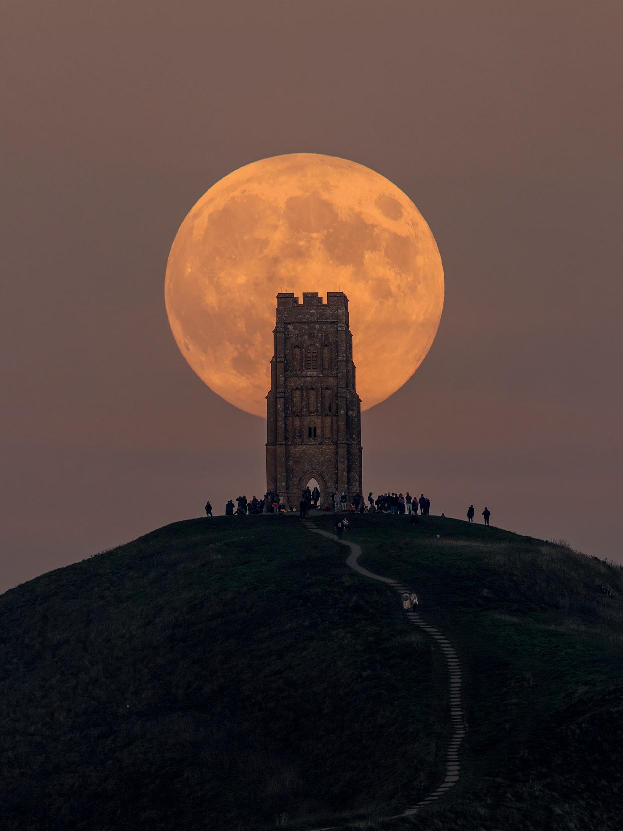
Making the Moon look impressive in a landscape photograph requires more than just a long lens. The viewer of a picture gauges its apparent size by comparison with other elements of the composition. The most effective pictures of the Moon include features of recognisable scale such as buildings, trees or people. Compare these two photographs of Full Moon rising at Glastonbury Tor in February and November 2024, from a distance of 4.5 km and 2 km respectively. The further the photographer is from the foreground subject, the bigger the Moon looks.
Getting the correct exposure can be tricky. When it is high in the sky and free from haze or clouds, a Full Moon requires 1/125th second at F/8 and ISO 100. When the Moon is close to the horizon, we view it through a thick layer of Earth’s atmosphere, plus there may be haze attenuating visibility. The result is that several stops more exposure are needed for the Moon close to the horizon. For example, the Moon rising
beyond The Needles was shot at 0.5 seconds at f/8 and ISO 400, which is 8 stops more. Atmospheric refraction results in the Moon appearing bloated and mis-shaped as it rises. If we want to see detail in the terrestrial landscape as well, its brightness needs to be comparable to that of the Moon. Whilst the Full Moon always rises and sets around the same time as the Sun sets and rises, it can
Beaver Moon (November), Glastonbury Tor, Somerset. 840mm, 1/50 second at f/11 and ISO 800.

be as much as half an hour earlier or later. The best time is usually 5 to 10 minutes before sunrise or after sunset. Sometimes the timings may be more favourable on the day before or after the Full Moon. Refer to a source such as www.timeanddate.com to quickly compare moonrise with sunset times and moonset with sunrise times.
Exposure needs to be carefully controlled so use manual settings. As the brightness of
the landscape changes rapidly around sunset or sunrise, as does that of the rising or setting Moon, use the histogram to select shutter speed and ISO a minute or so before the Moon is in the optimum position. It is advisable to bracket exposures. With a long telephoto lens, shutter speeds need to be less than one second or the Moon will become blurred due to Earth’s rotation. You will need a remote cable release to avoid camera shake.
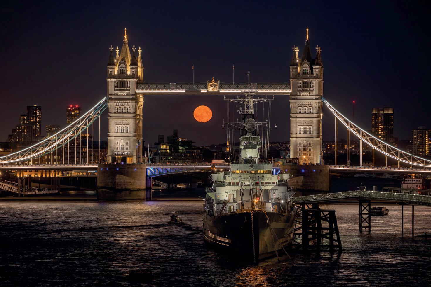
If the foreground subject is artificially lit, a balance of exposure with the Moon can be achieved well after sunset. This is often the case in an urban environment. I captured moonrise framed by Tower Bridge 49 minutes after sunset, by which time the sky was effectively dark. Getting both the foreground and the Moon sharp requires the correct aperture and point of focus. Even when the foreground is many hundreds of metres
Sturgeon Moon (August), Needles, Isle of Wight. 600mm, 0.5 seconds at f/8 and ISO 400.
Sturgeon Moon (August), Tower Bridge, London. 155mm, 1/20 second at f/5.6 and ISO 1600.
away, it may be necessary to stop down to get enough depth of field. I was standing 850m from Stonehenge using a 400mm lens stopped down to f/11. In general, focus on the foreground subject, since there is always more depth of field beyond the focus point than in front of it. Choose an aperture at which the hyperfocal distance is nearer than the subject to guarantee a sharp Moon. In this case I waited until the setting Moon appeared to be resting on one of the sarsen stones within the monument, creating the impression of a link between the two.
Perhaps the greatest challenge is getting into the correct position. This is where planning pays off. Two popular resources are The Photographers’ Ephemeris (https://app.photoephemeris. com) and Photopills, which is a phone app. Both show the position of moonrise and moonset on the horizon, overlaid on Google aerial photographs or maps, for any location and any date. Often the foreground subject may be elevated above the horizon itself, in which case we need to know the direction of the Moon when it reaches that elevation in the sky. Both The Photographers’ Ephemeris and Photopills can tell us that as well.
Drop a black or grey pin on the target to find its relative elevation, the angle it subtends from the viewpoint, along with the time and direction when the moon will be right behind it.
Once you have worked out your intended shooting position on a map, a recce is highly recommended to check access and sight lines. Buildings, trees and power lines are commonly encountered and may scupper carefully made plans.
When viewed through a telephoto lens, the Moon moves quickly
across the field of view. The perfect alignment may last only one or two seconds. Moonrise framed by the Prince of Wales Bridge was a tight fit between the pillars. My positioning had to take account of the Moon being 1.4° above the horizon to clear the deck of the bridge, by which time it had moved 2.3° south of its rising azimuth of 100.6°
As a first approximation, the Full Moon rises and sets opposite in the sky to where the Sun sets and rises. However, this is not exactly the case because the Moon’s orbit around Earth is inclined to Earth’s

Pink Moon (April), Stonehenge, Wiltshire. 400mm, 1/13 second at f/11 and ISO 200.
Harvest Moon (September), Prince of Wales Bridge, Monmouthshire. 400mm, 1/10 second at f/5.6 and ISO 800.
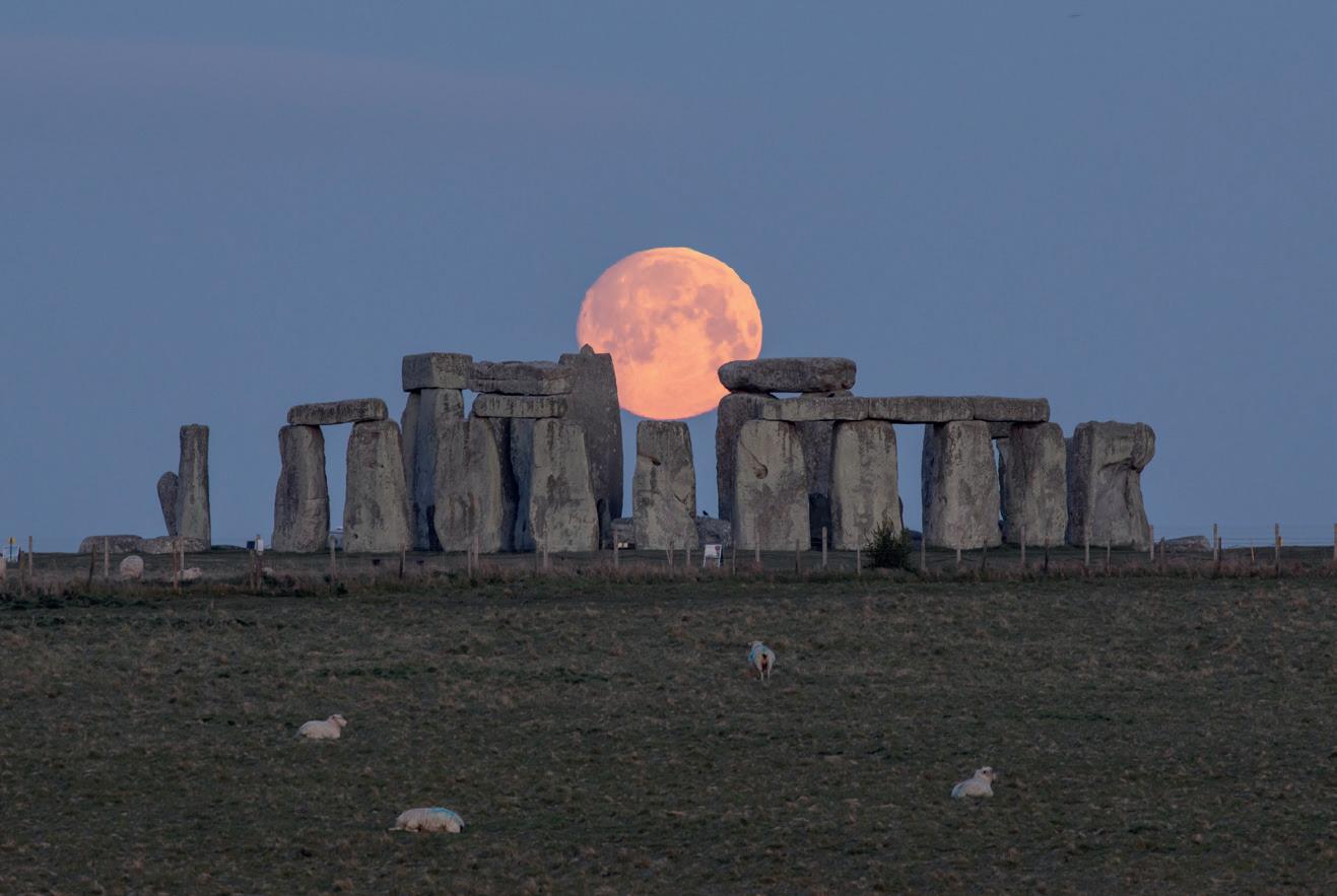
orbit around the Sun by 5.1 degrees. Sometimes the Moon will rise and set further north or south than the Sun does. This occurs in a cycle of 18.6 years, within which the most extreme rising and setting points of the Moon are referred to as a Major Lunar Standstill. 2025 is the year of such a Standstill, also known as “lunistice”.
If you regularly watch the Moon, the effects of the Major Lunar Standstill are obvious. The Moon swings wildly between extreme northern and southern rising and setting points every two weeks. This is most noticeable at Full Moons which are close to midsummer and midwinter, which respectively rise and set further south and north than at any other time. For example, the rising Full Moon shines through the doorway of St Michael’s Tower on Glastonbury Tor between
November and February around a Major Standstill. This can be seen only in December at a Minor Standstill, which last occurred in 2015. The Full Moon shining through the rock arch of Durdle Door is best captured in June, close to a Major Lunar Standstill.
In the 21st century, most people take only an occasional interest in the Moon. Before cities and electric lights were invented, it was a much more significant part of the human experience. For thousands of years, many different civilisations have kept track of time by using the Moon as a basis for their calendars. The word “month”, derived from “Moon”, is based on the most obvious lunar cycle of 29.5 days, which the Moon takes to complete its phases. Whilst Arabic and Chinese calendars use the exact length of the lunar cycle to define their months,
our western calendar rounds the number of days in each month to fit 12 months into a year.
Many archaeologists believe that Neolithic monuments such as Stonehenge in Wiltshire and Calanais on the Isle of Lewis incorporate deliberate alignments to the rising or setting Moon at a Major Lunar Standstill. That may never be proven but it offers a tantalising glimpse into the interests of our ancestors millennia ago.
While the Moon continues its celestial cycles through the ages, modern technology moves at a rapid pace. Digital photography was in its infancy at the time of the last Major Standstill in 2006. For landscape photographers, the 2025 lunistice opens up the possibility of rare lunar alignments that won’t be seen again until 2043.
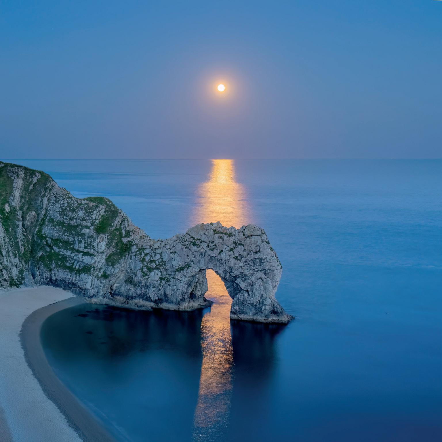
Strawberry Moon (June), Durdle Door, Dorset. 37mm, ¼ second at F/8 and ISO 1600.
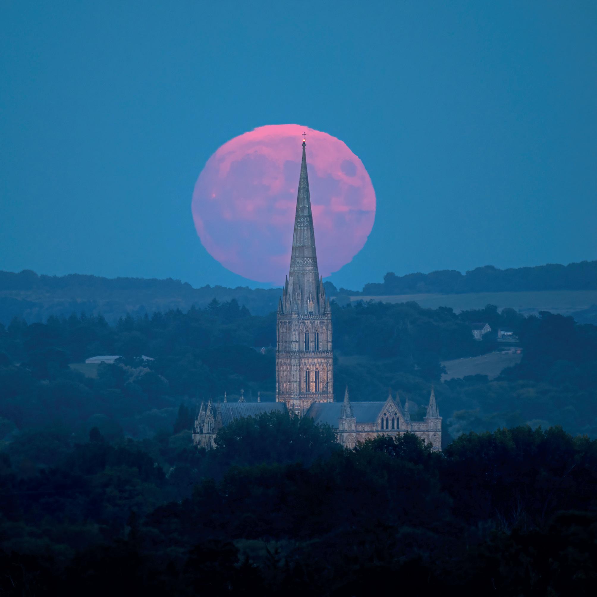
Blue Moon (August), Salisbury Cathedral, Wiltshire. 600mm, 1/13 second at f/4 and ISO 800.
Robert’s new illustrated talk for camera clubs entitled “Shooting the Moon” can be booked through his website: www.naturalworldphotography.net.
Competition Winners 2024
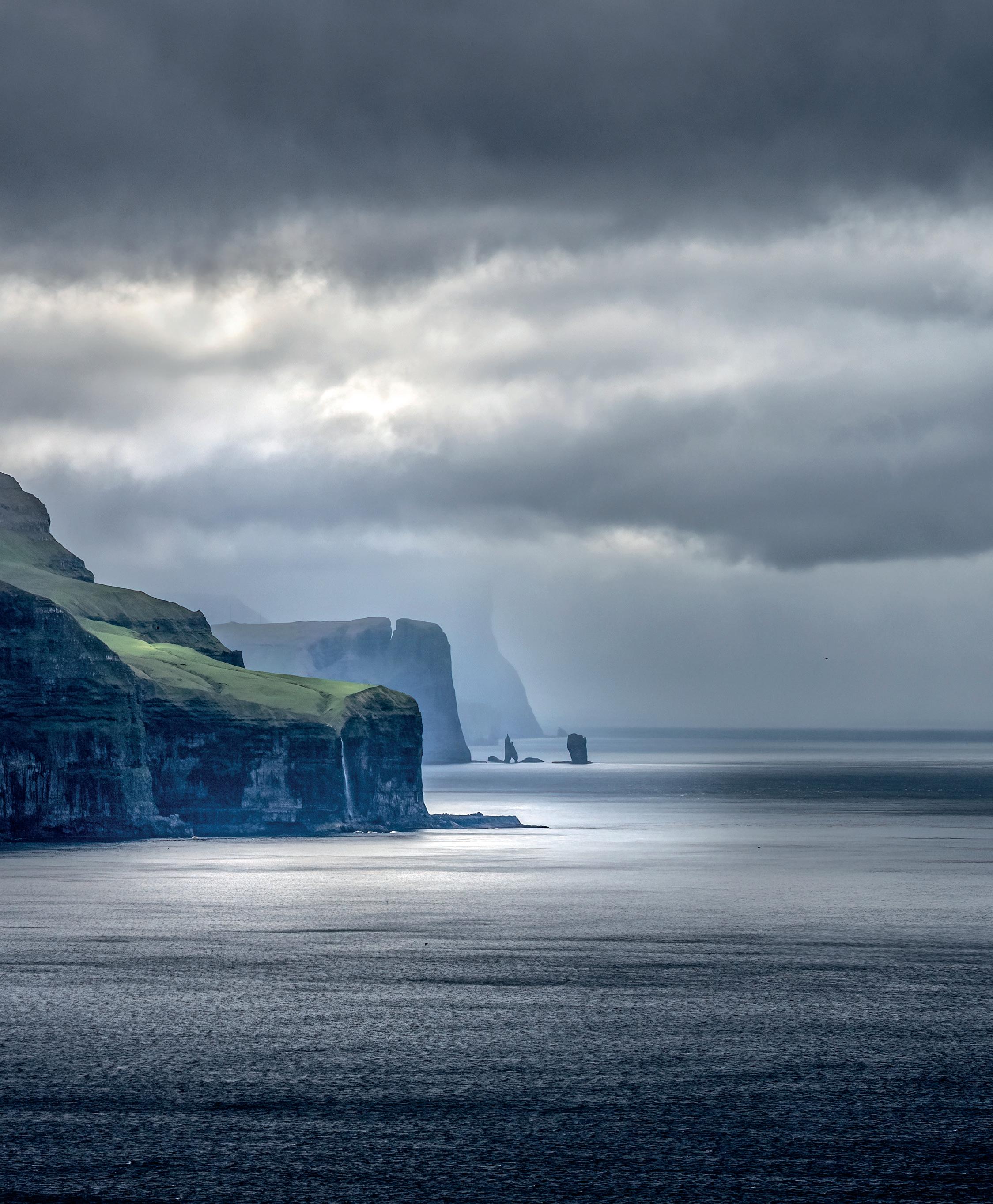
Overall Winner of 2024
Congratulations Mike Murphy for ‘Bathed in Light’
fotoVUE have been sponsoring the RPS Landscape Group Monthly Competition throughout 2024, with each winner receiving a fotoVUE photo-location guidebook of their choice.
The publisher at fotoVUE Mick Ryan, has to review photos on a daily basis for use in their publications and he has judged this year’s overall winner of the RPS Landscape Group Monthly Competition 2024.
“It was an honour to be asked to judge the overall winner of 2024’s RPS Landscape Group Monthly Competition. Despite looking at and selecting images for use in our range of books almost daily, it was incredibly challenging to choose one image out of last year’s monthly winners as the standard is so high. Congratulations to all last year’s winners.
2024’s winner is Mike Murphy with his dramatic photograph, Bathed in Light, of the sea cliffs on the Faroe Isles. The main focal points of Mike’s image are the receding lines of the cliff faces and the waterfall and sea stacks and it would have been tempting for him to zoom in or crop to isolate these features. However, by including the calm sea lit by shafts of light and the tonal graduation of the moody grey sky, Mike succeeds in placing the receding main subjects in context with dramatic effect. This image also has a subtlety and calmness enhanced by his light touch in processing.
I have two runners-up; the humour of the Dancing Trees by George Pearson and the intimate and mysterious landscape of the Frozen Forest by Peter Stott ARPS.
Website: fotovue.com
January: Ethereal by Mark Hetherington ARPS
February: Frozen Forest by Peter Stott APRS (Runner Up)
March: Milky Way above the Cuillin by David Lynch
April: Dune by Evan Will
May: Alien Throne and Galactic Core by George Pearson ARPS
June: Whitepocket Tree at Night lit by drone by George Pearson ARPS
July: Towards the Hill of the Red Fox by Mike Murphy
August: Bathed in Light by Mike Murphy (Overall Winner)
September: Radiant by Mark Hetherington ARPS
October: Dancing Trees by George Pearson ARPS (Runner Up)
November: Dawn Inversion in the Brathay Valley by Chris Burgess ARPS
December: Magic Moments by Mark Hetherington ARPS
January - Ethereal by Mark Hetherington ARPS
This image was taken on a wonderful atmospheric morning on Black Crag above Windermere in the Lake District with the cloud inversion enveloping Wray Castle and creating an ethereal scene.
February - Frozen Forest by Peter Stott ARPS (Runner Up)
This picture was taken on a frosty morning on Banstead Heath in Surrey - a still morning, just after light snow had fallen on frosted ground. In the south of England these frozen conditions usually only last a few hours and were starting to deteriorate even as I arrived. With no wind, I was able to bracket shots to balance light and shade.

March - Milky Way above The Cuillin by David Lynch I’d spotted an alignment of the Milky Way with the low point of the Cuillin ridge and the fairy pools using the app PhotoPills. So when I was sure I was going to get clear skies, I trekked up to the pools and camped out overnight to capture this image. It was a fabulous experience shooting under clear skies with virtually no light pollution and in a spectacular location.
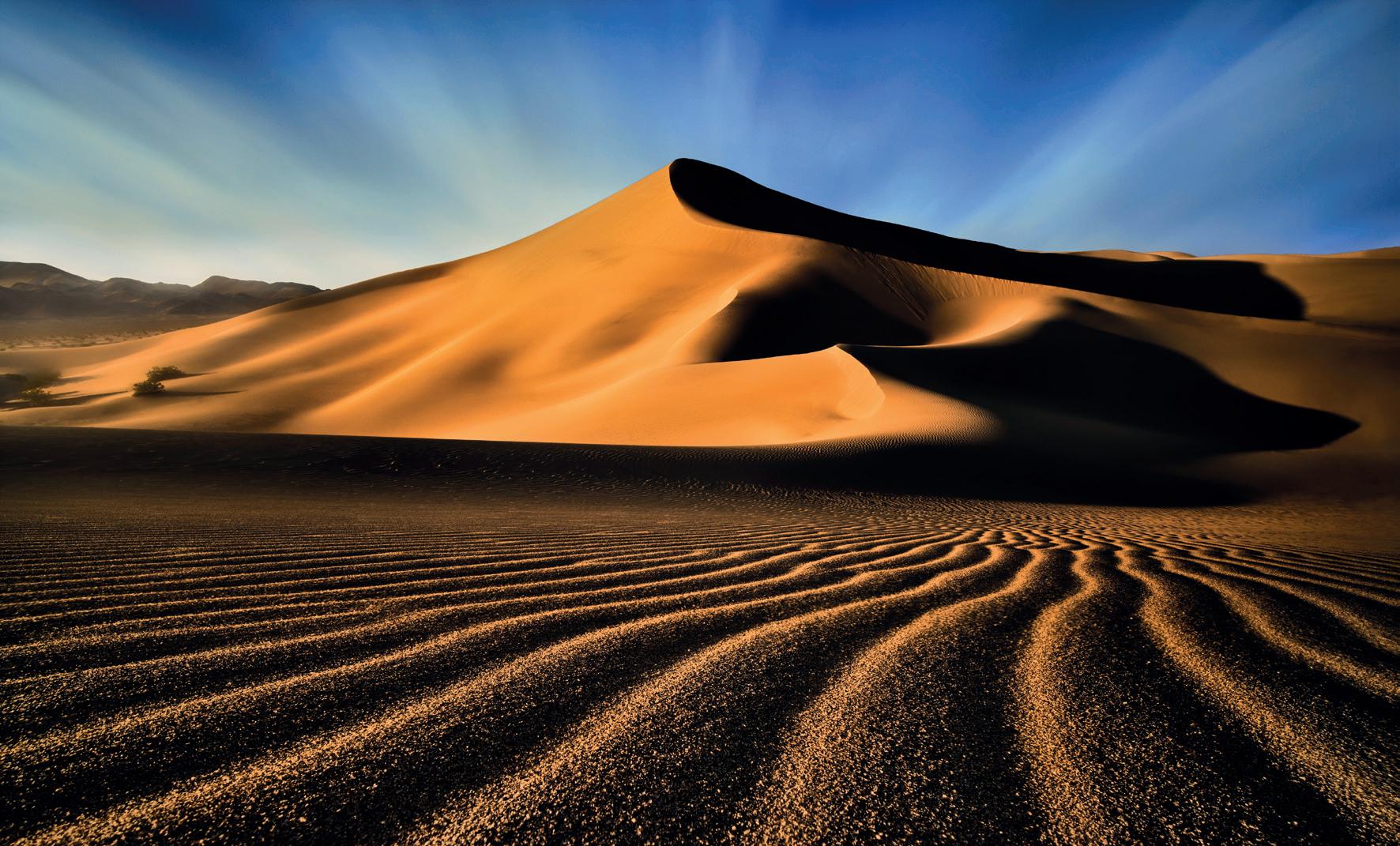
April - Dune by Evan Will ‘Dune’ was photographed in Death Valley National Park, California, during a winter trip in February. I hiked to this dune on three consecutive days at sunset, trying to get a shot with hard light and low angle sun to create the long sweeping shadows over the sand dunes and accentuate the aeolian ripples in the foreground. I wanted to use the leading lines of the ripples to guide the viewer’s eye into the base of the dune and then flow along the winding, wind-swept ridges towards the prominence where the earth meets the sky. The intent was to capture the timeless impermanence of shifting sands, creating temporary beauty in this stark vista. The image is a focus stack shot on a tripod with a 15mm prime lens to help increase the depth of field in the image.
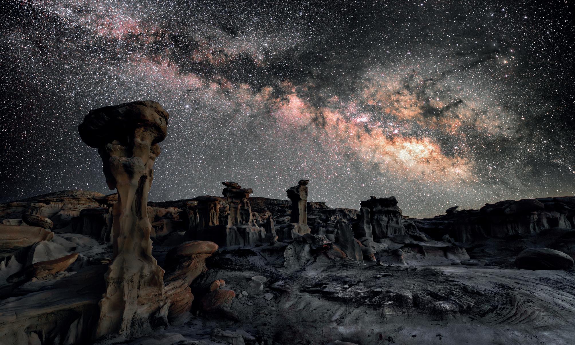
May - Alien Throne and Galactic Core by George Pearson ARPS
Located in the Bisti Badlands, New Mexico, this is an unworldly landscape. It is a composite of a blue hour foreground and a tracked Milky Way from the same area and in the correct PhotoPills position.

June - White Pocket Tree at Night - drone lit by George Pearson ARPS
This area is difficult to access, lying south of Kanab Utah in the Vermillion Cliffs National Park. The whole area is amazing but staying overnight and lighting the tree with a drone made it even more worthwhile.
Whilst travelling along an unnamed road heading towards Loch Cuither on the Isle of Syke, the stream featured in the image suddenly came into my view. I immediately stopped and, after exploring the location for a while, I eventually found my composition with the stream leading the eye towards the magnificent Hill of The Red Fox with the moody sky above it.

July - Towards the Hill of the Red Fox by Mike Murphy
August - Bathed in Light by Mike Murphy (Overall Winner)
Captured on Kalsoy in the Faroe Islands, I was studying a shaft of light moving along the headland opposite, hoping it would reach and illuminate the high cliffs and sea stacks at the very end so I setup my camera in anticipation and just waited. The light eventually arrived and, just for a few seconds, bathed the area in light, the resulting image leaving me with a strong reminder of the magic and beauty of the islands.
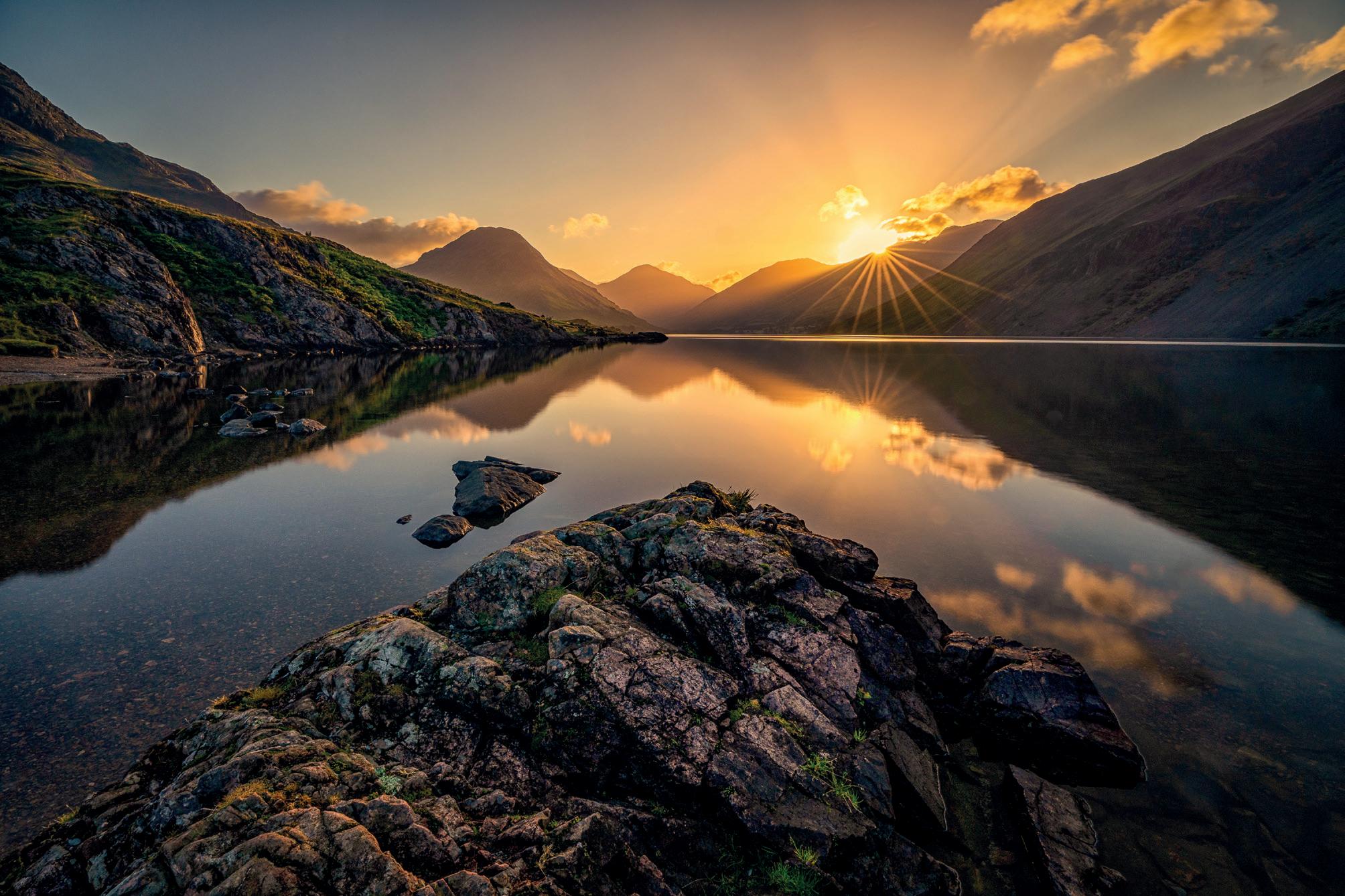
Sometimes the stars align and the planning and early starts are rewarded with fantastic moments like this sunrise image taken at Wastwater in the Lake District. To get to Wasdale in time for this shot required a bleary-eyed 3am alarm but was so worth it!

These vulnerable, beautiful mangrove trees are in Sumba Island, a short flight from Bali. The shooting position means you are knee-deep in water and getting a calm reflection is difficult when other people are around.
September - Radiant by Mark Hetherington ARPS
October - Dancing Trees by George Pearson ARPS (Runner Up)

This image was taken just after sunrise in mid-November 2024 from a favourite viewpoint close to my house – Todd Crag. It is a small Lakeland fell but a great place for capturing the higher fells and the river valleys that surround it. With Windermere close by, it witnesses several inversions every autumn and I was lucky enough to time my visit perfectly on this occasion.
November - Dawn inversion in the Brathay Valley by Chris Burgess ARPS
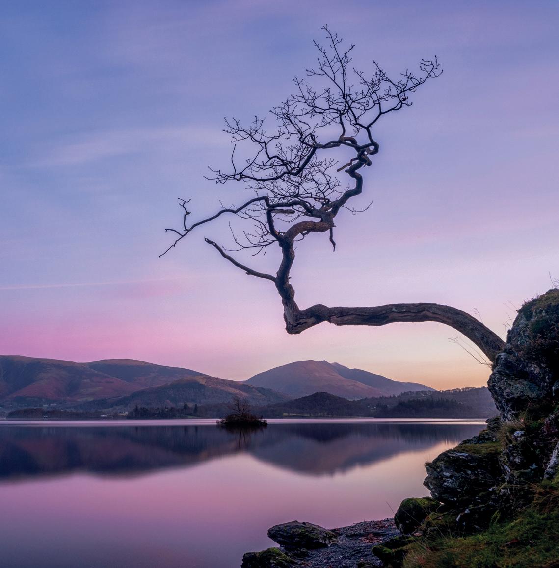
December - Magic Moments by Mark Hetherington ARPS
This image is of the lone tree at Otterbield Bay at Derwentwater in the Lake District, captured with some lovely pre-dawn colours in the sky before my journey to work.
Webb Watch
Candia Peterson ARPS
Like many of us, I have been glued to images coming out of the Webb Telescope. Their website generously offers unlimited high-resolution downloads with the disclaimer that appears below and opposite. It is quite easy to get lost in the dozens of images on their site, although perhaps less easy to come to grips with the mind-boggling science of creating them. For an excellent read on how the images are created from start to finish, scan this QR code or go to this weblink: webbtelescope.org.

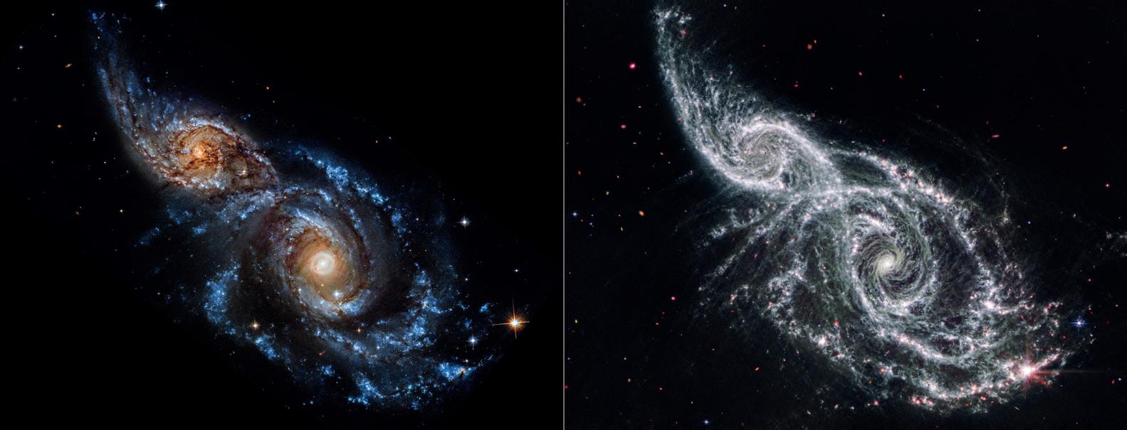
In this edition, we have three projects, all comparing the visible and ultraviolet light from the Hubble Space Telescope and the James Webb Space Telescope. The descriptions come from the Webb website.
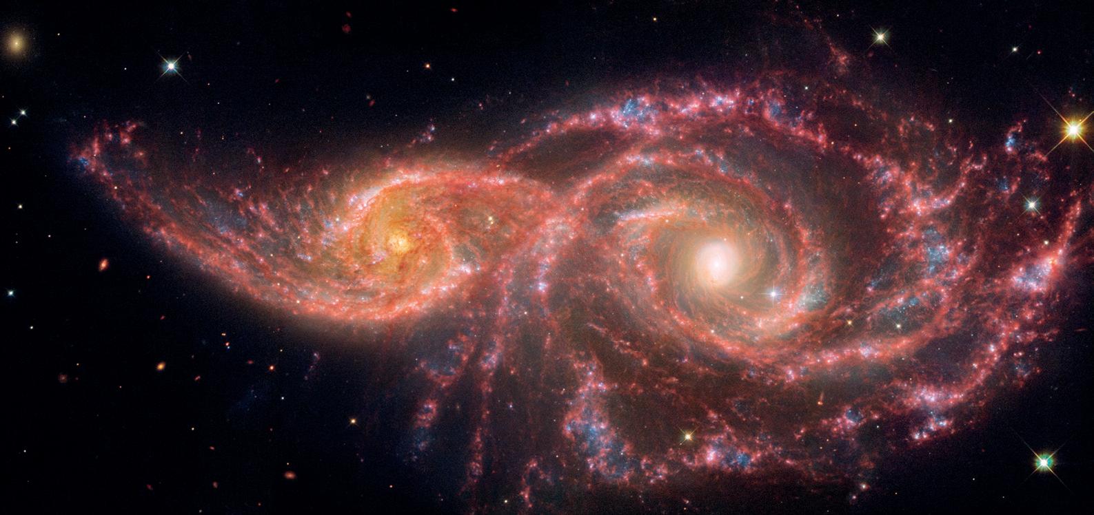
A Collision of Galaxies
The gruesome palette of these galaxies is owed to a mix of mid-infrared light from NASA’s James Webb Space Telescope, and visible and ultraviolet light from NASA’s Hubble Space Telescope. The pair grazed one another millions of years ago. The smaller spiral on the left, catalogued as IC 2163, passed behind NGC 2207, the larger spiral galaxy at right. And here are the component photographs from the two telescopes. Webb on the left and Hubble on the right.
A comparison of Hubble and Webb
Sombrero Galaxy
This image compares the view of the famous Sombrero Galaxy in mid-infrared light (top) and visible light (bottom). The James Webb Space Telescope’s MIRI (Mid-Infrared Instrument) reveals the smooth inner disk of the galaxy, while the Hubble Space Telescope’s visible-light image shows the large and extended glow of the central bulge of stars.

Vega Circumstellar Disk
A Hubble Space Telescope false-colour view of a 100-billion-mile-wide disk of dust around the summer star Vega. Hubble detects reflected light from dust that is the size of smoke particles largely in a halo on the periphery of the disk. The disk is very smooth, with no evidence of embedded large planets. The black spot at the centre blocks out the bright glow of the hot young star.
The James Webb Space Telescope resolves the glow of warm dust in a disk halo, at 23 billion miles out. The outer disk (analogous to the solar system’s Kuiper Belt) extends from 7 billion miles to 15 billion miles. The inner disk extends from the inner edge of the outer disk down to close proximity to the star. There is a notable dip in surface brightness of the inner disk from approximately 3.7 to 7.2 billion miles. The black spot at the centre is due to lack of data from saturation.
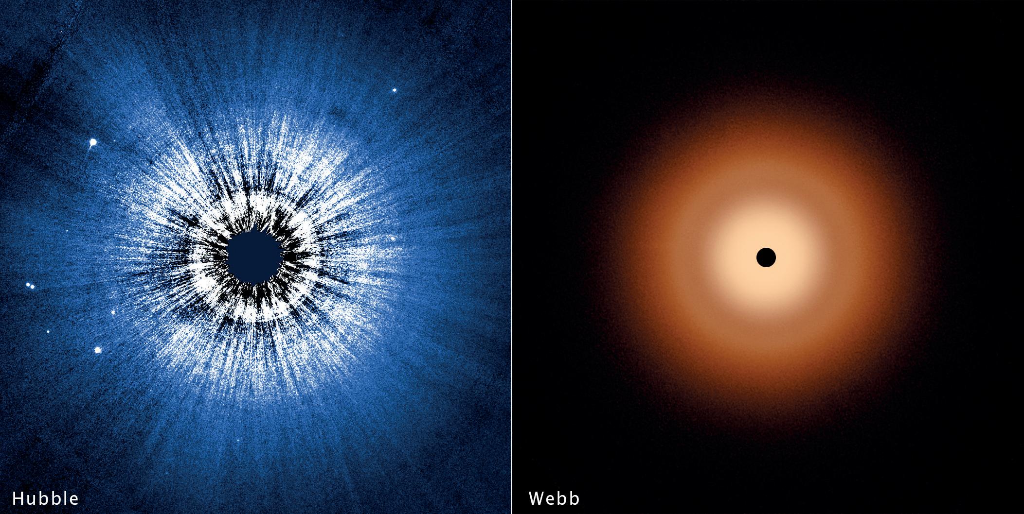
Hubble Webb Webb
Hubble
An Alternative View
Valda Bailey
The name Valda Bailey has become synonymous with abstract expressionist photography and she is a pioneer in the use of In-Camera Multiple Exposure, with which she is able to emphasise the colours, shapes and ‘feeling’ of a scene. Her work has been shown and published both nationally and internationally and is collected worldwide. Together with her creative partner, Doug Chinnery, they have founded a photographic community, “Find Your Voice” which can be found at www.fyv.art. This is open to photographers of all backgrounds to join and learn and to become immersed with their techniques. Valda’s own website is www. valdabailey.com.
I caught up with Valda to talk about her background in photography, her artistic philosophy and her landscape project, ‘Chasing Rainbows’.
Candia Peterson ARPS
Watercolour Sunrise 2013
Chasing Rainbows
I started at the very beginning and asked Valda what were her first memories as a photographer.
“Going off to evening classes with my dear old dad when I was about 14. We took over the downstairs loo as a darkroom and really threw ourselves into it. Pretty sure we didn’t ever make anything very much of artistic note but it was a lot of fun. I remember us both heading out to buy a Canon A1 - must have been around 1978. That was a very big moment for us both. I carried on making images and developing images for about five years but then life rather took over and I put it away for a few decades.”
Valda went on to tell me about her progression.
“I rekindled my enjoyment of photography when digital became a viable option. Some very predictable landscapes and still life images found their way onto Flickr and I embraced it once more. After a couple of years, I realised all I was doing was
parroting what everyone else was doing. Sunset. Still life. Milky water long exposure. Macro flowers. Cliché upon cliché. I started to hunt around for a way to express myself in a more personal way. I decided street photography would be a good avenue to pursue. The decisive moment - by definition - that cannot be repeated. I went off and did a couple of workshops in NYC with the brilliant Jay Maisel. They were eye-wateringly expensive but for me they were worth every penny. I learnt so much. Although somewhat ironically, it was not the street photography for which he is so revered that had the biggest impact. Rather, it was his use of colour and his strong graphic aesthetic. However, it didn’t take long for me to realise that street photography is not really what I am cut out for. Lack of opportunity where I live, not having the personality needed to engage with people and struggling with the idea of stealing images from behind a lamppost being the main reasons. So it was back to the drawing board.”

Blossom Blizzard 5 2015
That drawing board was where Valda embarked on her progression into abstract photography.
“I was captivated by the work of Chris Friel after I saw an image of his in a magazine. It reminded me of a Rothko painting and I couldn’t believe it was a photograph. Painting and drawing have always been my primary way of expressing myself and these images of Chris’s were very similar to the way I was trying to paint. I discovered he was using ICM - and then multiple exposure - to make his work and, as soon as I picked up a camera that employed different blend modes when combining multiple exposures, I was hooked. My first few images were of a piece of fruit on my kitchen worktop and I was delighted by the way the fruit had been abstracted. Carved up in an almost Cubist way, yet still recognisable. I finally realised I had found a way to paint with my camera. I have little interest in representational photography. So many people trotting off to the same locations taking similar images that get lost in the digital soup of Instagram. I get a kick out of using my imagination - my motto is ‘what if?’ rather than ‘I should’. For inspiration, the art of the first half of the 20th century particularly interests me. If I had to choose one artist it would be Paul Klee. He had such creative abundance and managed to combine elements of fantasy, music and personal symbolism into his work. His colours
really work for me - strong yet dark colours, muddy pastels. Beautifully combined. His work has the unique quality of seeming to be spontaneous and yet carefully constructed at the same time.”
Over time, drawing on her background as a painter, Valda began to apply other processes to her photographs and these give her work a lot of its unique presentation. I asked her how that happened.
“I came across the work of Kate Breakey when I was in Santa Fe about ten years ago. I had been playing around with gold leaf for some time but not really having any idea about where I was going with it. She was printing on glass and gilding the reverse and I felt this could be a way forward. I have been dissatisfied with the digital print for many years now. Because I started life as a painter, I still have a need to get my hands dirty - pressing buttons and pushing sliders just doesn’t do it for me. Therefore, I am investigating all manner of ways to integrate mixed media with my digital imagery. My biggest constraint is lack of time and I have ideas buzzing around in my head constantly. This is obviously very frustrating. I have recently acquired a traditional printing press and I am trying to carve out the time needed to teach myself how to use it.”

Chasing Rainbows ii 2016

Confetti II 2016
Confetti 2015
Most of the images we are showing here come from the project, ‘Chasing Rainbows’ and I asked Valda how that project came about and what was its inspiration.
“I always go out with an empty head (no jokes please). That is to say, I don’t plan, prepare, visualise or pre-visualise. I want to be spontaneous. So no inspiration as such. The ideas tend to bubble up as I am shooting. These images were taken in Northumberland, a landscape I love on account of the huge skies and amazing light. The landscape is quite minimal which suits my way of shooting and the weather fronts pass through quickly and, often, quite dramatically. I was brought up in Jersey and the one thing I miss about it is the coast so I am always drawn to the ocean. The ebb and flow of the tide. The fact that nothing stays the same. The changing weather and the ephemeral nature of things became my inspiration but the ideas didn’t form until I was out with my camera.”
I finished by asking Valda to talk a little bit about her joint venture with Doug Chinnery, FYV.
“Doug and I started Find Your Voice after the pandemic made it clear that the location-based teaching we had previously done in various
countries around the world was much more effectively delivered via Zoom. I always say that I don’t have all the answers. Maybe I can pose a few of the right questions but I would never presume to have any kind of authority. What we are doing is so new; Photoshop has only been around for a very short time so we are edging forward, pushing away at boundaries and finding our way. What we have discovered is that we have shared a way of making photographs that many people didn’t realise was possible. Camera clubs are improving but there are still those who are wedded to the rule of thirds, F/ stops and front-to-back sharpening. We express ourselves creatively with our cameras but in a way that is not representational and success relies heavily on the photographer’s willingness to play and experiment. It is important to note that multiple exposure and ICM are just techniques. A means to an end. And probably the hardest thing is to find a way to make work that transcends technique. I relate most closely to abstract expressionism and, of course, that has nothing to do with hyperfocal distance or perfectly balanced histograms. However, there are other, equally challenging demands on one’s creative ability.”
Website: fyv.art

Skyfall 2016
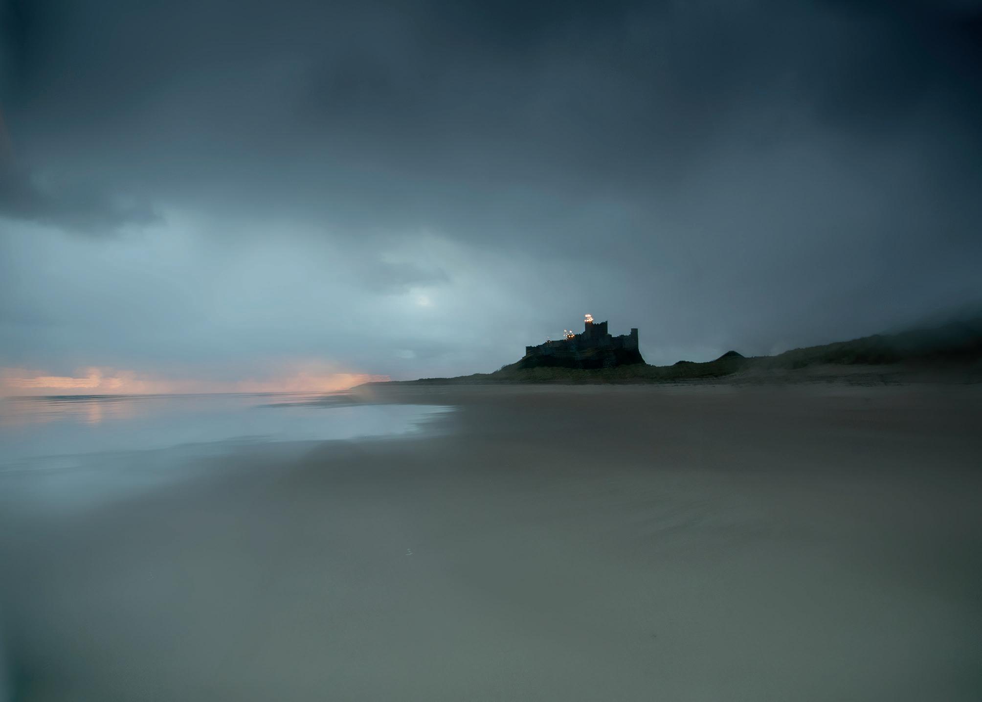
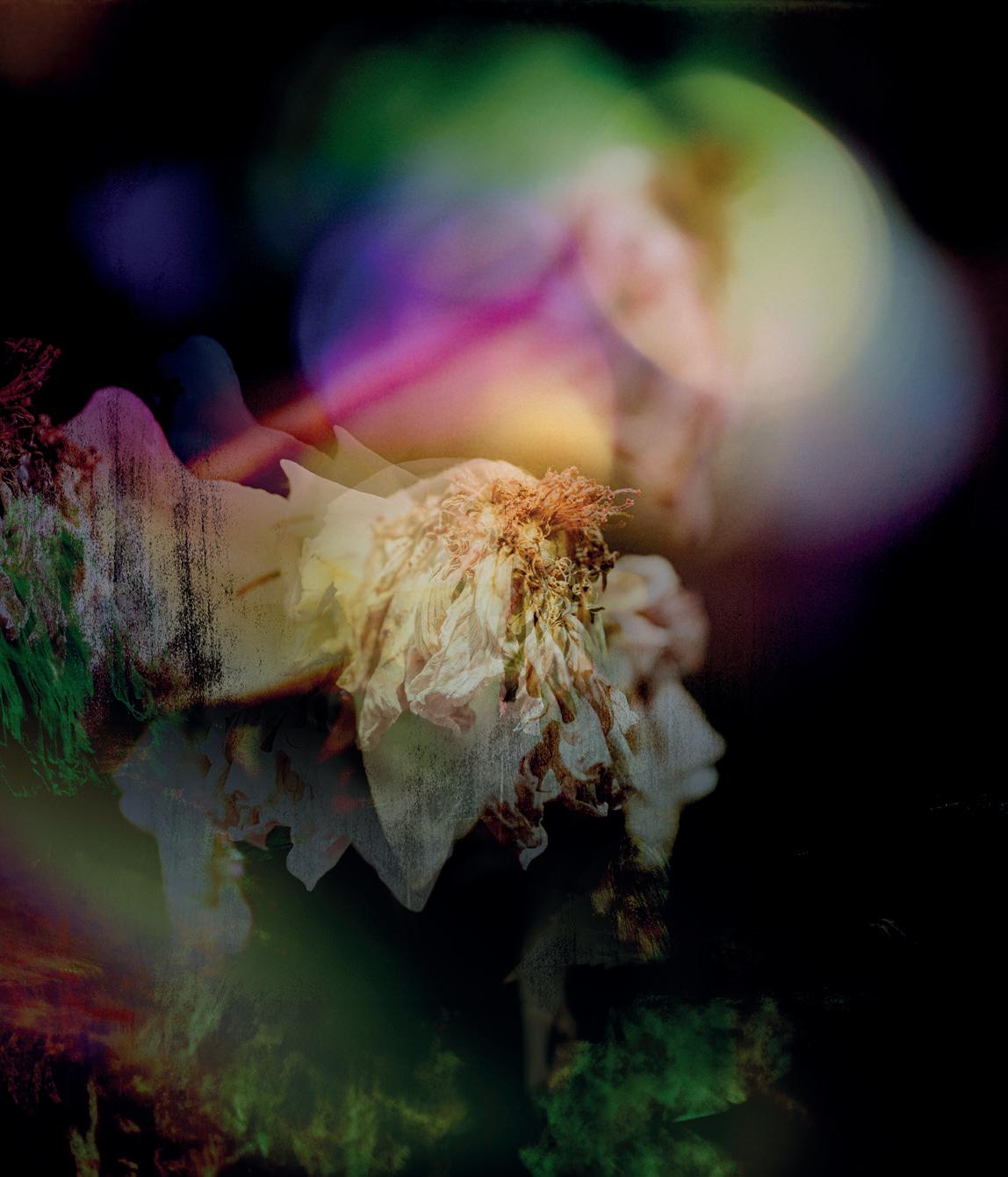
The Wakening Sky 2013
Dying Swan 2023
Where in the World? II
Madeleine Lenagh
Madeleine grew up on the north-eastern coast of the United States in the ‘50s and ‘60s. She aspired to be an artist like her creative mother but was told that, being left-handed, she couldn’t draw. She moved to the Netherlands in 1970 and spent many years working in urban development. Having first picked up a camera when she was 18, she capitalised on her early retirement to pursue photography full time. She says of this move, “All I wanted to do was go out with my camera. It was as if the barriers that had held back my urge to express myself through images were finally crumbling.”
Her book, “Perpetual Motion – the changing faces of the sea”, from which these photographs are taken, is available through her website.
Website: www.lenagh.nl
Instagram: @expatmaddi
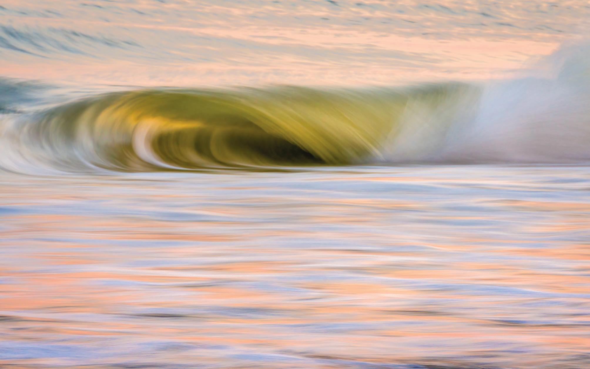
Perpetual Motion 1
Photographing the Zeeland Coast of Holland
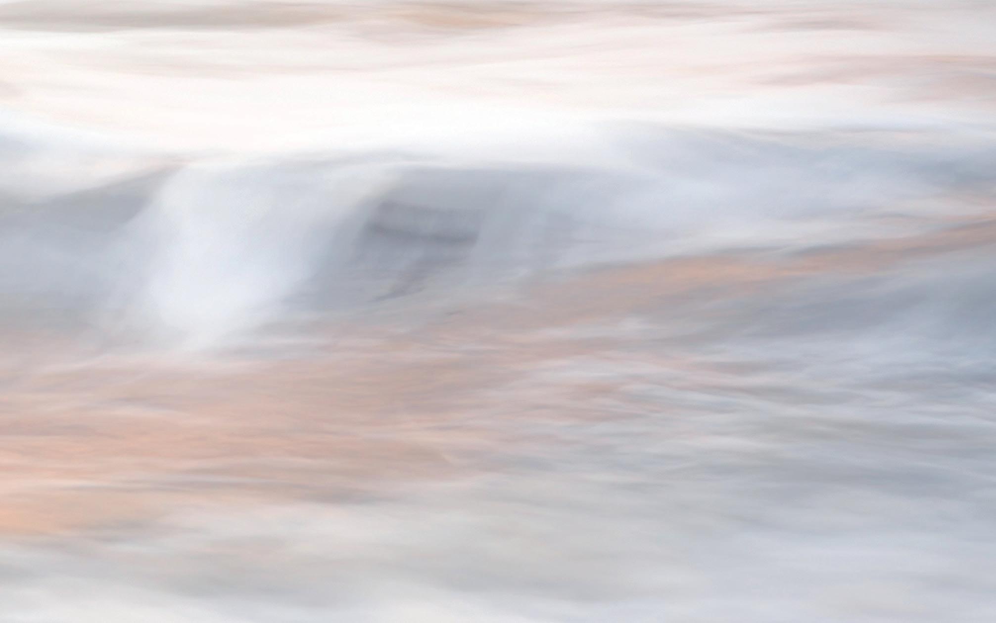
Perpetual Motion 2
The sea has always played an important part in my life. And so, when I moved to a house very near to the beach three years ago, it wasn’t a surprise to find myself out there with my camera at all hours.
My photography has always been about the wonder that I feel when I’m out in nature. But for a long time, I was pretty caught up in the desire to make images that would meet with approval. ‘Am I good enough?’ was the foremost question in my mind. It wasn’t until I started working with Theo Bosboom as a mentor that I developed enough self-confidence to understand and follow my own instincts; expressing the feelings that a scene in nature evokes in me instead of simply registering what I see. Now, when I go out with my camera, I make images that speak
to me and I don’t worry about who else might like them.
I’m a firm believer in photography projects. By returning to the same place, to the same theme, again and again, I find that I see more and that my photos gain depth. The Dutch seacoast, with its flat sandy beaches and moderate waves, may hold little interest to some landscape photographers accustomed to wilder shores but, for me, they’re an endless source of fascination. The interplay between wind, tides, waves, sand and sky creates an entire symphony of everchanging moods. I myself am a person of swiftly changing moods and I recognised myself in this landscape.
A photography book tells a story through images. My book tells the story of the changing moods
of the sea, which mirror my own inner landscape. This played a role in both the making of the photographs and the designing of the book.
Sometimes my forays to the beach with my camera were planned (according to tide tables and weather forecasts) but, more often, were spontaneous. I usually didn’t know what to expect so I stayed open and receptive to the way the landscape resonated with my emotions, memories and feelings. This is what determined when and how I pressed the shutter. And the deeper I connected to what I saw, the better I was able to express the feelings that it gave me.
At first, I focused on the beaches closest to home. Later, I started travelling up and down the coast, from the Waddenzee in the

Perpetual Motion 3
Perpetual Motion 4
north to southwestern Zeeland. Occasionally, I would stay in one location for several days (during springtide, for instance).
My most complex trip was a three-day voyage on a flatbottomed sailing barge on the Waddenzee. The ship would go aground during low tide at night and at dawn we could witness the water rising from the sand. A magical sight that I won’t easily forget.
Sometimes serendipity would play a role. I spent a few days in Zeeland, focusing on wooden pilings and sand patterns. One bright, sunny afternoon a galeforce wind struck up. The last thing I needed for the book was more pictures of waves! But the conditions were irresistible and led to one of my favourite
images. I can still feel the adrenaline of that moment. Unless I was going out for more than one day, I would take a single camera body (my Sony A7RIII), a single lens and a small pouch of circular ND filters. My choice of lenses depended on how close I wanted to focus. I prefer using the 70-200 mm but, to focus on sand patterns, I often used a 24-70 mm. And my 200-600 mm lens came in handy when I wanted to zoom deep into the waves. Sometimes I’d take a tripod with me but not always. Some of my ICM images came about because I’d gone out before dawn and forgotten to bring my tripod along!
Creating expressive - even impressionistic - images seemed to be a perfect fit for the theme of the book. I didn’t confine my style
to a single technique (ICM for example) but chose the technique to match what I was seeing and feeling in the moment. The sea shows the rhythm of the moving tides and the ebb and flow of the waves. I wanted the book to express this rhythm in the narrative so this was an important ingredient for the image selection and sequencing. That process evolved quite organically and, with the help of friend and landscape photographer Theo Bosboom, a loose structure emerged that is somewhat reminiscent of the structure of a symphony, with an introduction, a slow, calm movement, a crescendo and a conclusion.
Perpetual Motion 5
Following the musical rhythm of the sea and paying tribute to its resonance with my own inner landscape, I hope to offer the viewer an opportunity to explore and connect with an ever-changing world and its many faces. But the book also carries a message about the importance and joy of photographing close to home.
Photographing familiar scenes enriches your art, encourages a mindful way of living, raises awareness of the need to preserve and protect these landscapes and is better for the environment than travelling to one exotic destination after another.
And as an ambassador for Nature First, I’m very aware of how the crowds of photographers and tourists in general have ruined once beautiful and unspoiled landscapes. If we truly love nature and the landscape, we should do everything we can to not only keep our imprint on the landscape to a minimum, but also raise awareness in others to do the same.

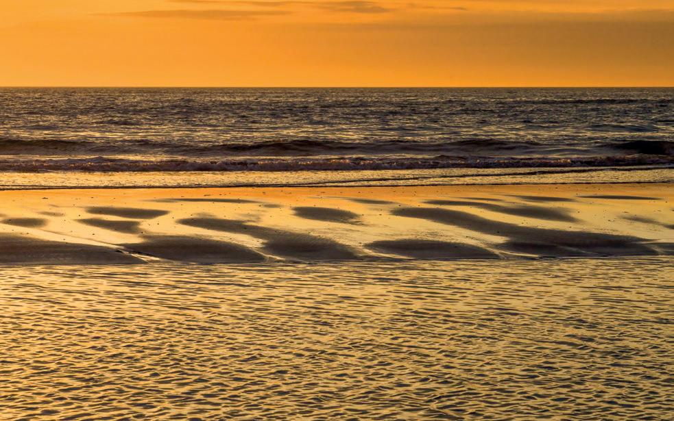
Perpetual Motion 6
Perpetual Motion 7
Perpetual Motion 8
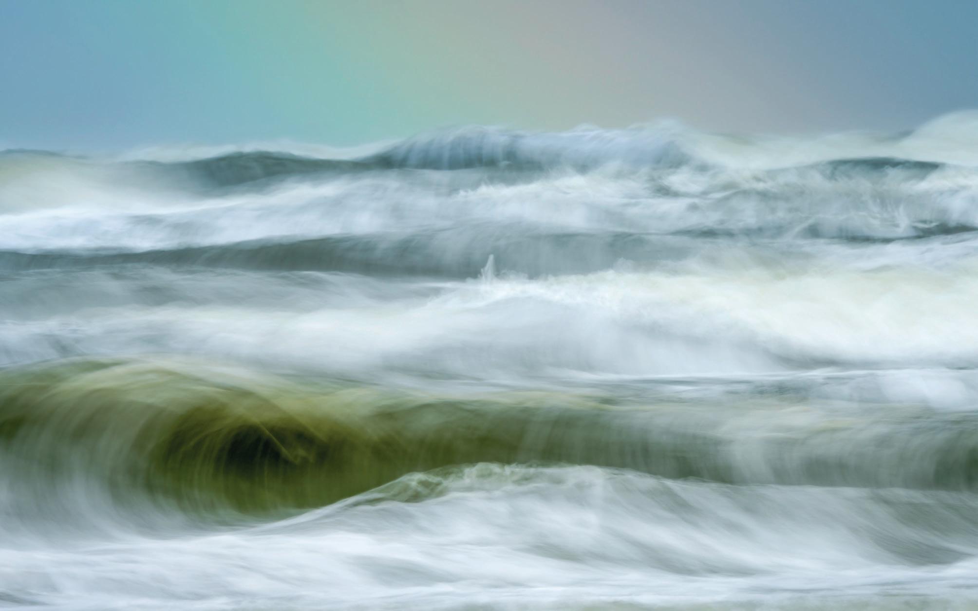
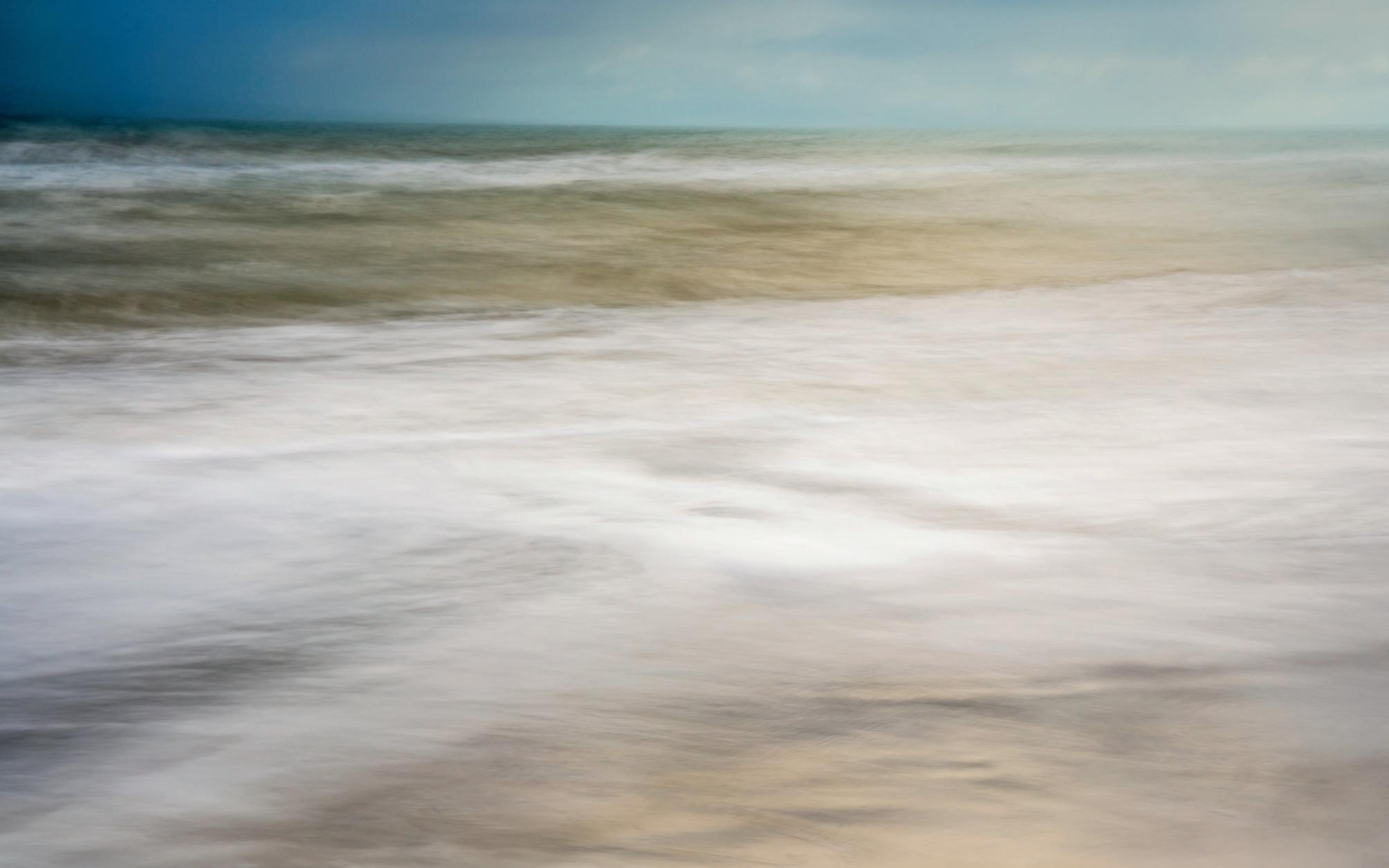
Perpetual Motion 9
Perpetual Motion 10
Inspiration
Wherever we are in our photographic journey, there is always room to learn, discover and take inspiration from the work of others. Here are a few ideas.
Read this:
Desert Forest: Life with Joshua Trees, edited by Juniper Harrower.
In keeping with our theme of the altered landscape, this book explores the entangled relationships between humans and the Joshua Trees of the Mojave desert, some of the most ancient trees on the planet. It is a collection of essays and imagery that reveals how we can protect this iconic species from the threats of climate change and development.
Follow on Instagram: Five Instagrammers from around the world:

@scottanselmophoto – Chicago-based Scott Anselmo has a wonderful portfolio of architectural photography.
@trevorccotton – UK-based Cotton specialises in minimal long exposure images inspired by a Japanese aesthetic.
@joannunaki – Jo Stephen from Dorset describes herself as an ecologist, photographer and botanist, all of which is on show in her ethereal dreamy landscapes.
@mattbeddowsphotography – also from the UK, Matt Beddows has some beautiful ICMs on offer.
@chrisgrievephoto – Australian Chris Grieve produces some fabulous seascapes that get up close and personal with the waves.
Check out this website: www.davemorrowphotography.com
Dave Morrow is a one-stop-shop for landscape photography. On his website you will find a blog, a podcast, numerous free ‘how-to’ videos and links to his workshops.
Get the App:
Location Scout: Search by country or city, look for inspiration from other photographers or use the ‘around me’ button to look for last minute opportunities. Create a profile on www.locationscout.net and upload your own images.


Valparai Landscape by Ashok Viswanathan
