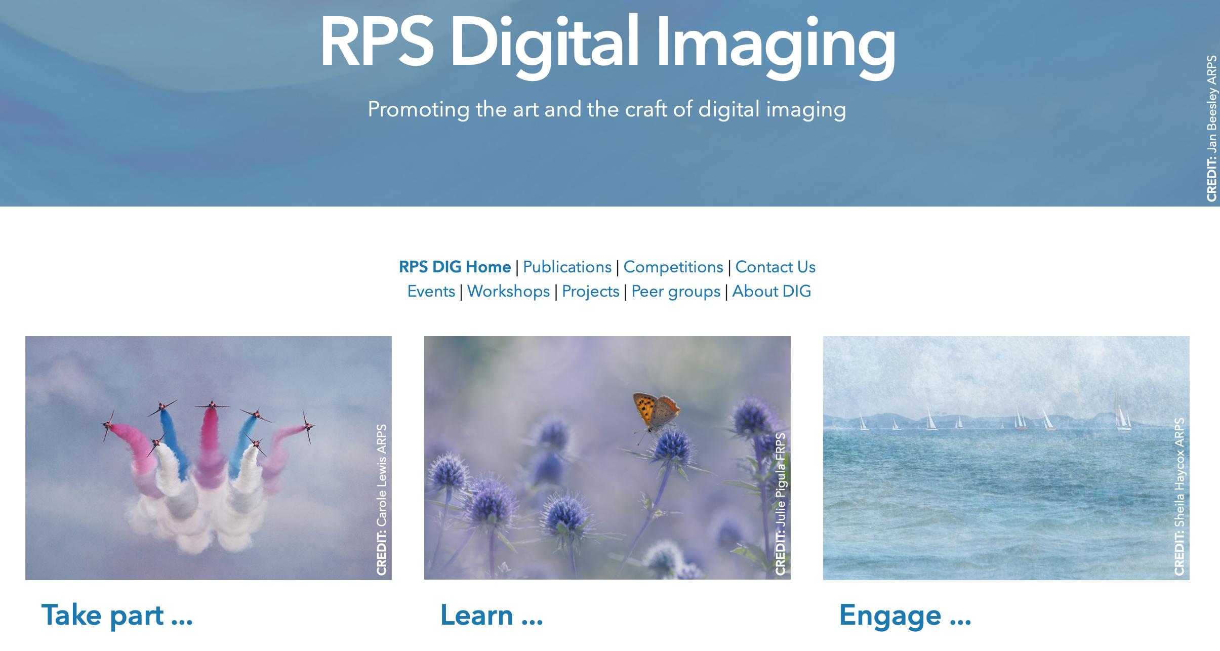
DI ONLINE


ThePhotographer: David Travis ARPS
SeeDavid’sArticle
EXPRESSIONIST PORTRAITURE on Page 22
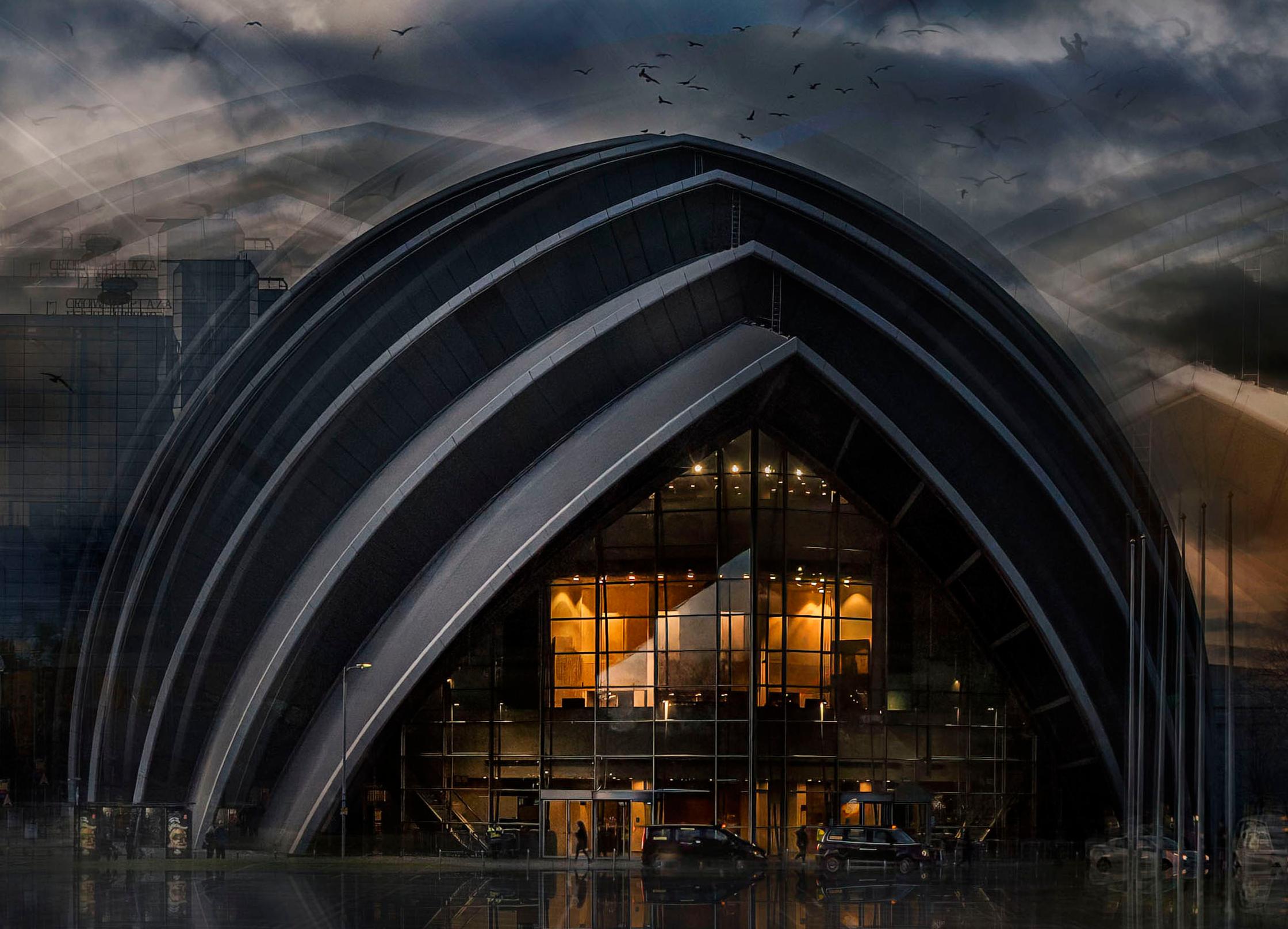
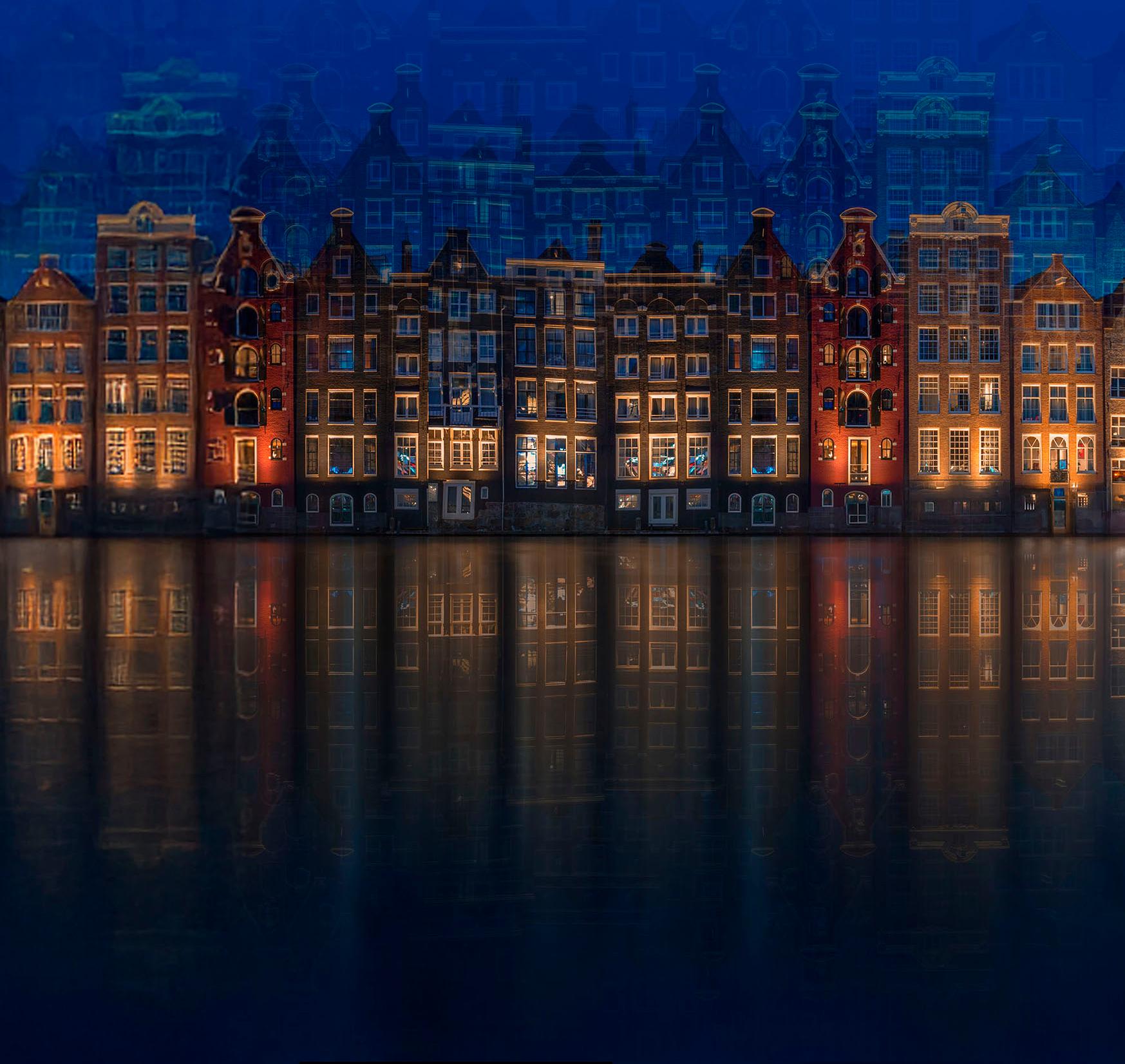
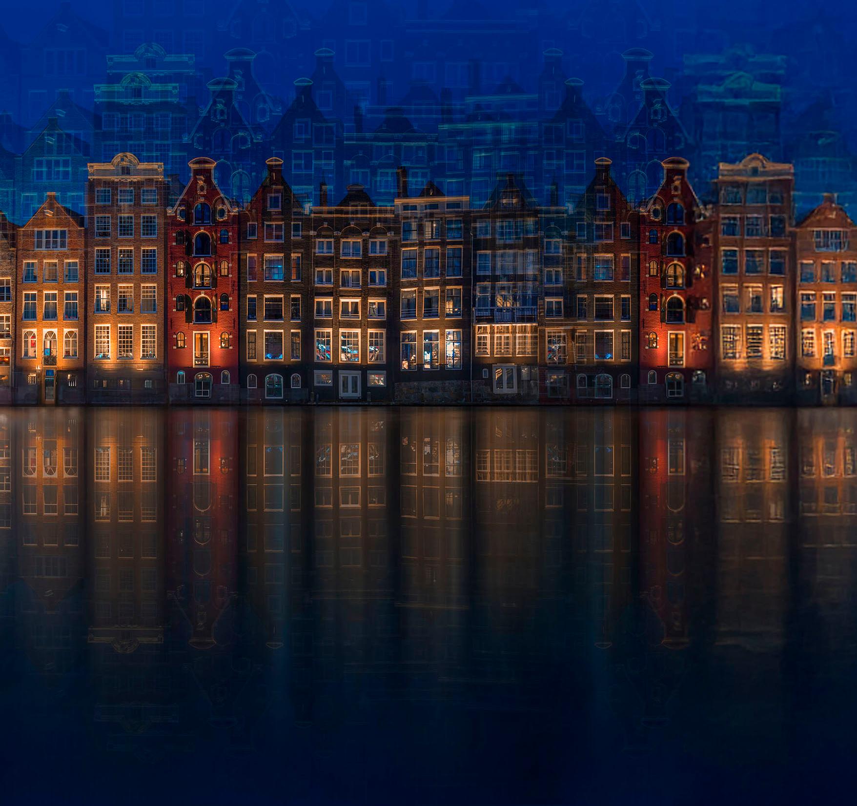
TheCoverimage isoneof David’s AbstractImages.

Editor DI ONLINE: Melanie Chalk
Contact: dionline@rps.org

As we leave a lovely summer behind and stroll towards Autumn DI activities pick up the pace too.
Melanie has got some super workshops lined up with some inspirational tutors. One or our regular tutors Joe Houghton’s series of three workshops is ideal for those of you who use Lightroom. Whereas if you wish to learn and practise more about composition then our popular tutor Judy Hancock-Holland is leading a series on Visual Design – that surely is one not to miss.
Moving into early 2026 a continuation of the Alternative View workshops will give us an opportunity to engage with some great new ideas and inspiration from several different workshop leaders.
In October a talk from Brad Carr (Landscape photographer) is the precursor to a series of workshops he will run for us.
The RPS wide Talk-Walk-Talk Inland Water starts with a talk from Vanda Ralevska on 29 September with walks in October. There are still places left on many of the UK walks and of course a separate programme for members living in UK islands or internationals.
With monthly webinars, competitions to engage with, eCircles and our LRPS Support Group we hope that you find plenty to appeal to you as the nights draw in and evenings get longer.
Regards Janet
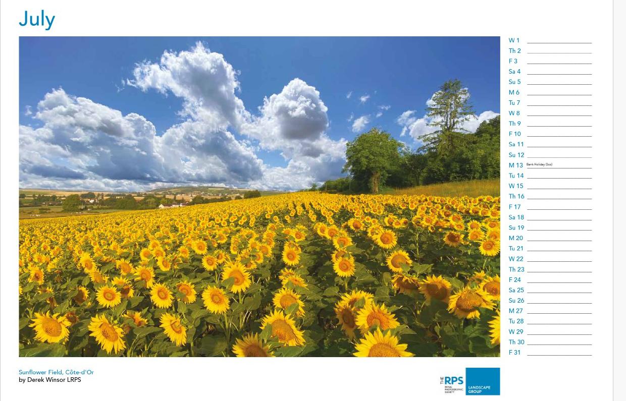
Landscape Group 2026 Calendar now on sale!
RPS Landscape Group are delighted to announce that the Landscape Group 2026 Calendar is now available to order and is on general sale until 30th September!
The calendar is priced at £18 (UK addresses) and £25 (international addresses), including delivery.
To order and for more details including the winning images, click here: https://rps.org/ groups/landscape/projects/calendar-2026launch/
Welcome back after the summer break! I took the whole of August away from my RPS Volunteer role, but I’m now back in the computer chair and ready for action. We have a bumper issue this September, showcasing our members’ inspiring and creative work.
I often follow up on images that catch my eye, sometimes on the DI Facebook page and other times during DI Workshops I attend. Many of the photographers I reach out to kindly agree to write an article, for which I’m very grateful — especially as there are always plenty of pages to fill!
Earlier this year, during a feedback session connected with our Alternative View Project led by Judy Hancock Holland, she was absolutely captivated by a creative image from David Travis. In this issue, David shares his thinking and process behind his personal project in Expressionist Portraiture.
We also feature the distinctive work of Morag Forbes, whose images regularly appear in the winners’ lists of both our friendly competitions and the Annual DI event. It’s great to gain further insight into her practice and the stories behind her pictures.
I’m really delighted to introduce the photography of a new member to our group. We recently met Adura during a ‘Welcome to Our New Members ‘Zoom chat, and he generously offered to contribute an article. Don’t miss his striking monochrome images in ‘How Eye See’.
How about this exciting news from our regular workshop presenter, Joe Houghton? You might think an August break from his packed schedule would have been a chance to relax — but not for Joe! During his “down time,” he completed two books on Lightroom, proof-read and self-published them, and then went on to achieve a top Amazon best-seller ranking in Photography Handbooks and Manuals. Wow!
The books are excellent — I already have my own copies proudly added to my library. You can read all about Joe’s achievement on page 14
Creative Development is a year long initiative designed to stretch photographers where they are encouraged to think outside the box and break boundaries. In this issue five members of the group show some of the work they have produced so far.
We’ve also included updates on forthcoming events and reminders of projects you can take part in. DI continues to offer a varied and rewarding programme of activities and publications, but PULSE is the place to go to keep totally up to date with new events and workshops as they are constantly being added to the programme. PULSE is published on the first of every month , so please make it a favourite. Or bookmark this link to ‘What’s On’ on the DI Webpage.
And to see the whole range of Talks and Workshops bookable now, please visit the DI Billetto Page HERE
See you online
Melanie Editor
1st Place - Valparai landscape by Ashok Viswanathan 23 votes
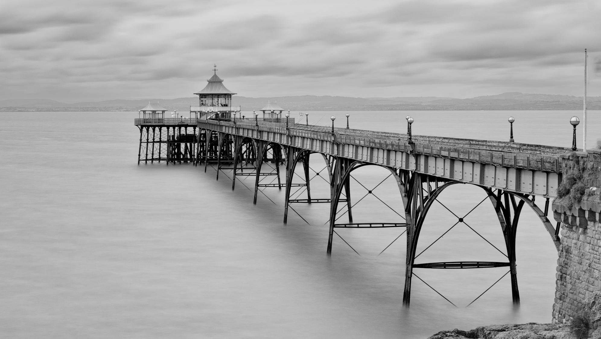
Joint 2nd Place - Clevedon Pier by Neil Purcell LRPS 14 votes
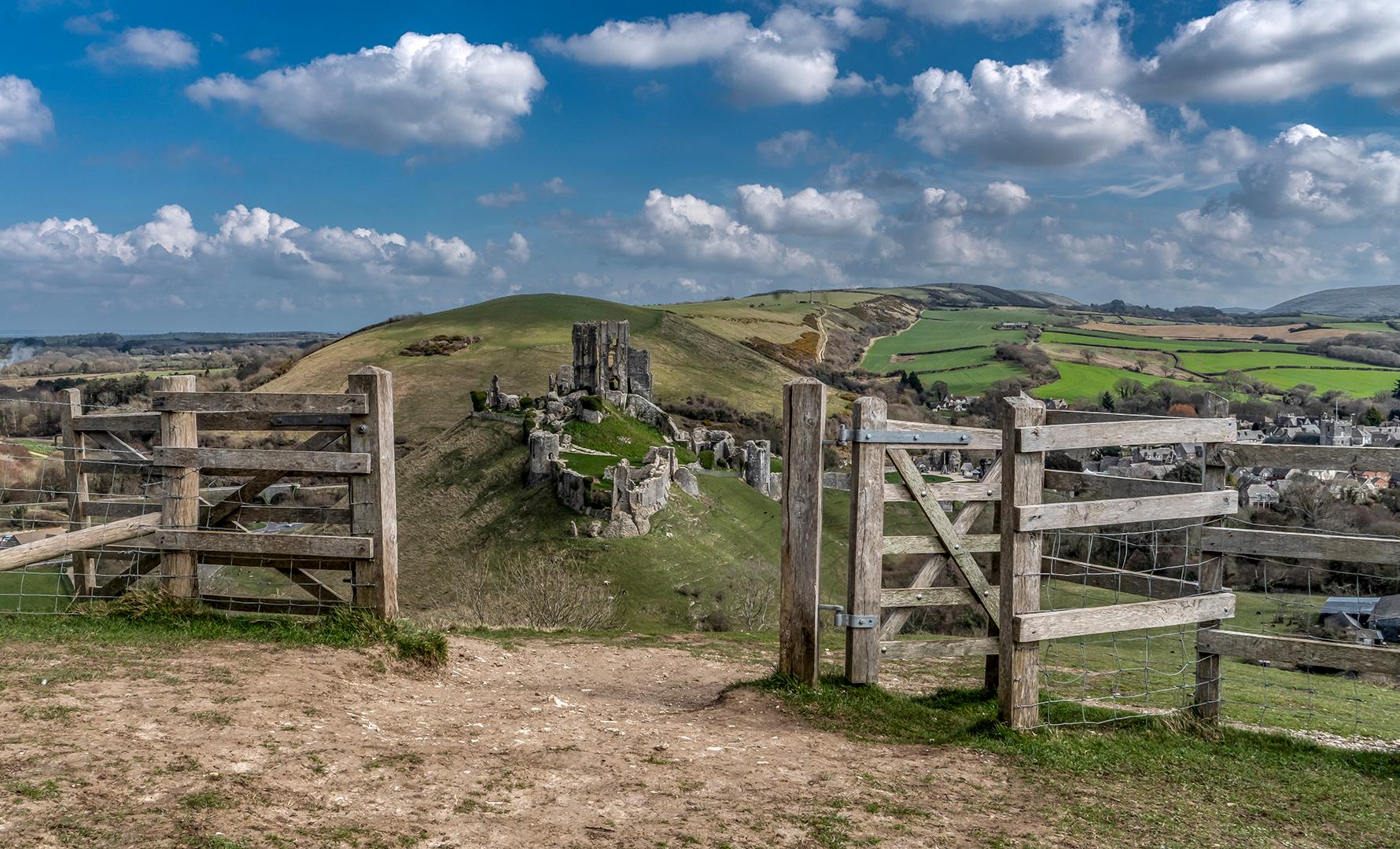
Joint 2nd Place - Corfe Castle by Kathryn Rynor ARPS 14 votes
There were 20 entrants 21 voters 63 votes total
This image was taken in the morning at the hill station of Valparai, south India, A somewhat remote small town known for its tea estates...Shot on a Fuji XE3 with a 10~24mm Fuji lens. Exposure was 1/500 - f4 at ISO 400.
The original image, looked interesting but I wanted to take it to a higher level with some creative post processing. After RAW conversion in Affinity photo the image was further processed in Topaz Studio 2. I used the preset "Swirly strokes" to create the flowing lines. By adjusting the slider as also the brightness and contrast I could get the look I wanted.
One of our members, Ashok Viswanathan has an Exhibition opening very soon in London.
"A journey through India" shows 55 large Colour & Monochrome prints at Gallery 1885, London. The exhibition will be on display for a month from September 12th and closes on 8th October, so if you are close to the capital do make a visit to Gallery 1885.
This is Ashok’s first ever exhibition, and it represents 50 years of his photography starting from the analogue era of the early 70s. Ashok, from Chennai India, has written articles for DI ONLINE and is a great supporter of our monthly competitions and he actually won the top spot in June’s entry displayed on page 7
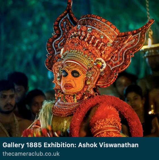
Also visit Ashok’s website HERE
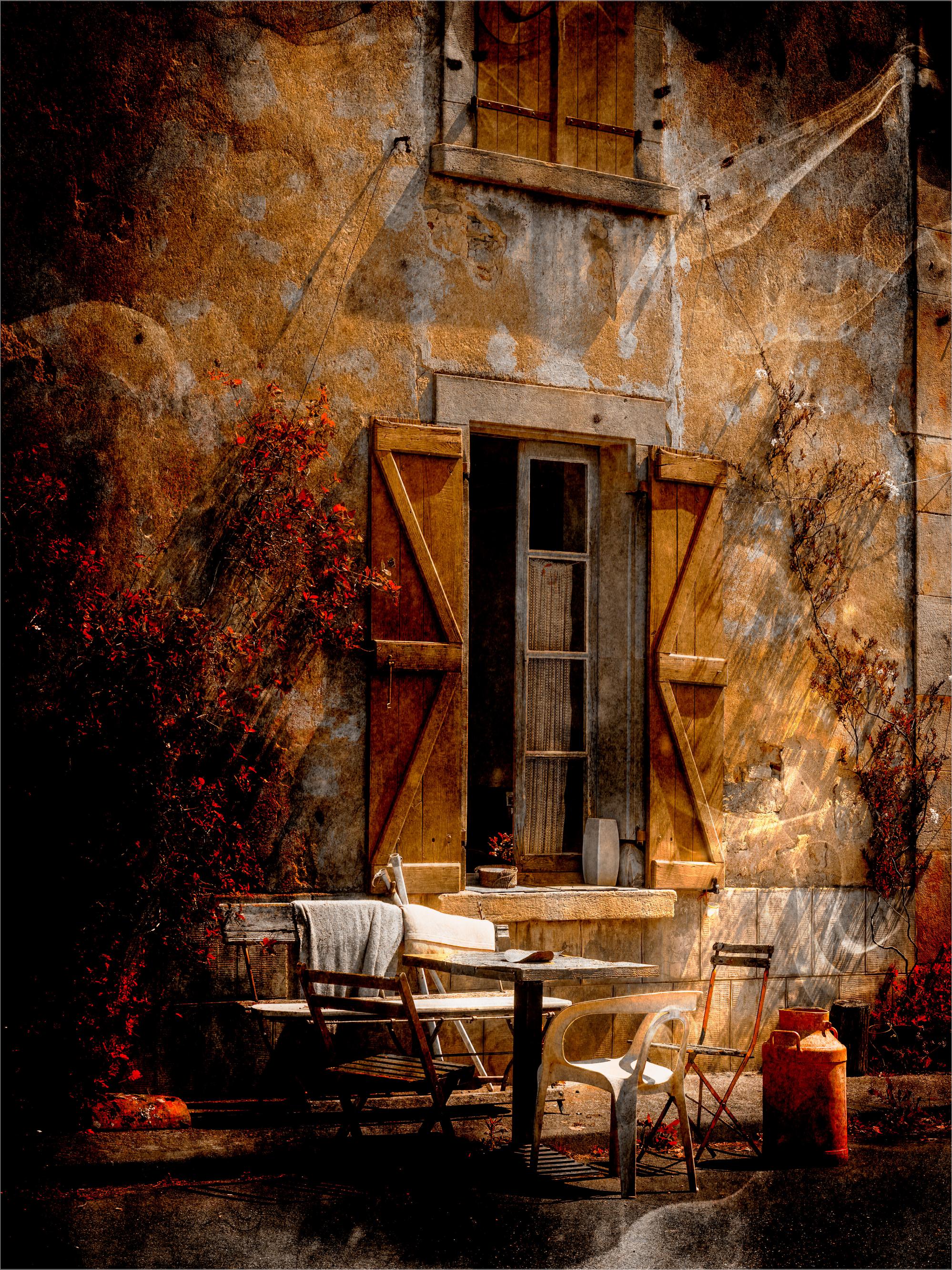
1st Place - L’Art de Vivre by Sue Lambert 16 votes
2nd Place - The Geometry of Grace by Roger Newark ARPS 12 votes
3rd Place - Liverpool Cathedral by Morag Forbes LRPS 11 votes
There were - 24 entrants
- 21 voters - 63 votes total
My winning image came about when our camera club was challenged to a ‘fun competition’ by SCPF judge Paul O’Toole. Paul would endeavour to match each of our competition images with one from his archives of a similar genre. The club members would then vote blind for their favourite from the two images presented. So the idea was to produce something that neither Paul or club members had seen before.
I felt I needed to enter something ‘different’ or ‘unusual’ and I chose this image which I had photographed in the back streets of Montesquieu Volvestre in South West France where I had been to see the weekly market in the town square. I was attracted to the rustic windows, the table and chairs placed outside on the street. I thought the foliage growing up the walls formed a natural framing.
Having attended many of Celia Henderson’s online tutorials I had a play in Photoshop with brushes, textures, an orange colour layer and blending Modes. Sadly I don’t have the layered psd file so I can’t say exactly what I did and in what order – now that’s a lesson for me never to throw away my working file.
I am pleased to report this image won the club that particular round against the judge! It was a fun night and one everyone really enjoyed.
Camera Settings
Olympus EM1 MII, Olympus Lens 12-40mm @ 32mm (=64mm FF)
Native ISO 200, f/11, 1/250th 0-7EV
Sue
My two Lightroom Classic Step by Step books have been a 3 year project, with many periods where the task just seemed overwhelming. I had been gathering bits as I delivered various Lightroom courses and talks, and the challenge was how to cover everything in a meaningful way.
The real unblocking for me occurred at the start of this summer when I realised that I needed to structure the books in 2 ways rather than 1. So, one set of chapters is based around the screen layout of the different modules, but then I also added another set of chapters going through all of the drop-down menus in order.
No doubt this led to a bit of duplication, but it means that however you try to get to something, there should be a logical route to what you need to know. Adding in a detailed table of contents and a comprehensive index hopefully makes finding what you are looking for achievable - sometimes it feels like finding a needle in a haystack - there's so much in Lightroom to find...
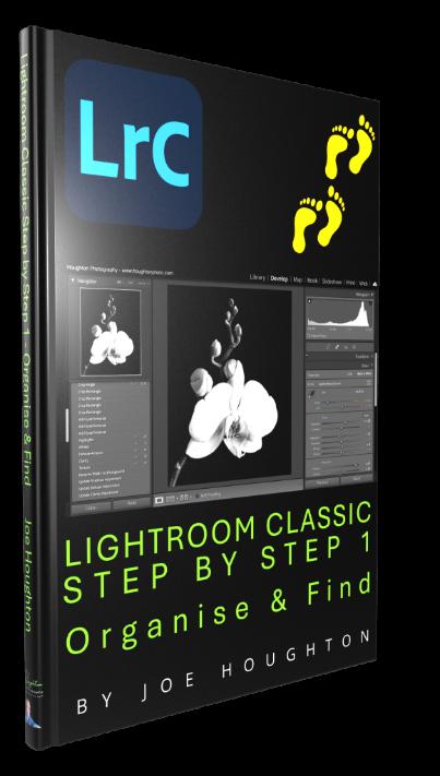
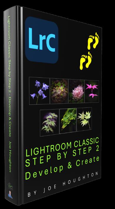
2 volumes was also not in the original plan, but when the manuscript reached 550 pages Word just started to groan, even on my super-doopa new MacBook Pro, so the decision to split the book into 2 was really made for me. Such is the journey when writing books - they always develop a life of their own, So, book 1"Organise and Find - Amazon link- covers importing, the Library module and collections, and book 2 - "Develop & Create” - Amazon link - covers the Develop module, exporting and the other modules.
The large 8.5" x 11" format seemed more suitable for these books as I envisage them to be laid on the desk next to the computer as you explore Lightroom. I must confess to really loving the hardback versions which have a solidity and heft that is - to me anyway - very pleasurable.
One thing I was concerned about was the pricing, but going to large format and in colour means that all but about a fiver is what Amazon charge to produce each volume, so unless we can persuade every member of the RPS to invest in them, I don't think I'll be buying that island in the sun any time soon. Ink and paper are crazy expensive these days, but isn't it amazing that we can create books like this ourselves these daysour Books and Zines project has been a constant revelation to me seeing the amazing creativity and tangible outputs producedfabulous!

Never one to sit back and be bored, I'm now hard at work on my next series "Let's Shoot and Edit" - this set is in the 6" x 9" format I've used for my earlier books.
Vol 1 (already out on Amazon - covers the Let's Edit sessions we ran last year, and 2 further volumes will cover the Let's Edit: Composition series starting Sept 13th and also the sessions we are running on Fine Art Editing in Lightroom starting Feb 2026.
To see more and register interest in being notified when these release visit my book webpage at: https://www.houghtonphoto.com/letsshootandedit
The Australian Chapter is the oldest of all the RPS Chapters. Back in 1986, nearly forty years ago, the RPS Council established separate Chapters in four of the Australian States – Queensland, New South Wales, Victoria and South Australia – and these were subsequently consolidated into a single Australian Chapter.
We have about eighty members scattered widely across the huge continent. Members on one side of the country live more than 3,000 km from those on the other, so this presents special issues for running an RPS Chapter. But despite the tyranny of distance, we’ve continued to be the local face of RPS to Australian members – however widely scattered they are – for all these years.
The Chapter produces a monthly Newsletter, to which all members are encouraged to contribute articles and images, news and views. And our online Chapter meetings are the other main way we keep in touch with each other and share our photographic enthusiasms.
Quite a few of our Australian members also belong to the Digital Imaging Group, but that’s not the only connection we share with DIG. Janet Haines ARPS, the current DIG Chair, has given us huge support over many years, not only to our DIG members but – even more importantly – to the Australian Chapter as a whole. We’ve all benefitted enormously.
Janet has supported our online Chapter presentations and gave us much encouragement during the dark days of Covid. Some of her help has been evident to all our members but there’s been much behind the scenes as well.
She’s told us about her photography in Zoom presentations and in the Chapter Newsletter. She’s joined in many of our other Zoom presentations and subsequent discussions. And she even initiated and helped organise an online 99th birthday celebration (complete with digital candles!) for one of our most distinguished members, Alan Elliott OAM ARPS, back in 2021.
Janet has been a tower of strength – and wisdom – in supporting RPS international members everywhere. Her efforts several years ago resulted in webpages being set up for the Chapters and also for international members as a whole. This led to several online International Members’ Exhibitions, then more recently her mentoring of the newly appointed International Members’ Representative. And we in Australia - as international members - have benefitted from all that hard work too.
So in recognition of her great support, the Australian Chapter has been delighted to invite Janet to become an Honorary Member of the Australian Chapter. She joins just three other Honorary Members of the Chapter – a select few over forty years of the Chapter’s existence.
Welcome to our ranks, Janet. It’s lovely to have you as ‘one of us’ and we know there will be lots more happy collaboration into the future.
In January a fourth group of Creative Development recruits embarked on their expedition.The aim for these one-year long experiences is to put meaning behind images.By this I mean don’t take images for the sake of using your camera.Images that have a purpose often have more value to you.I’m the first to agree they may also be the ones that are less competitive if you are one of those that sees photography as a competition.
The first step in creativity is to photograph emotion and to have any chance of doing that you must first feel it, or as a minimum think about how it could feel.Engaging in emotions may be the first step and you many fear the leap to then put that into pixels.People can do this easier than they think and come up with some surprising results.Images they never thought that they would capture and Images they never thought would be attractive to them now can be and are.I believe this is a photographer connecting with their photography output.Photographs are now being captured to communicate in a different way than before.Often working along themes provides a direction and images support each other in a “story telling” way when presented in sets.
A hurdle many people arrive at in this adventure is the discovery that they need new camera skills and processing techniques.In year one we cover some of those gaps by exploring ICM, Multiple Exposure and simple approaches in Photoshop.
We also have a group about to close year 2.Collaboration in creativity has been a feature with projects to create large pieces of work involving 10 photographers.We have spent much more time in critique and creative consideration.This group are soon to start Year 3 with increased focus on long term projects and abstract.Creativity – It’s endless, frees the mind and has no rules.
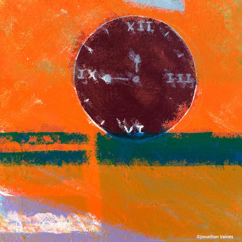
Jonathan Vaines
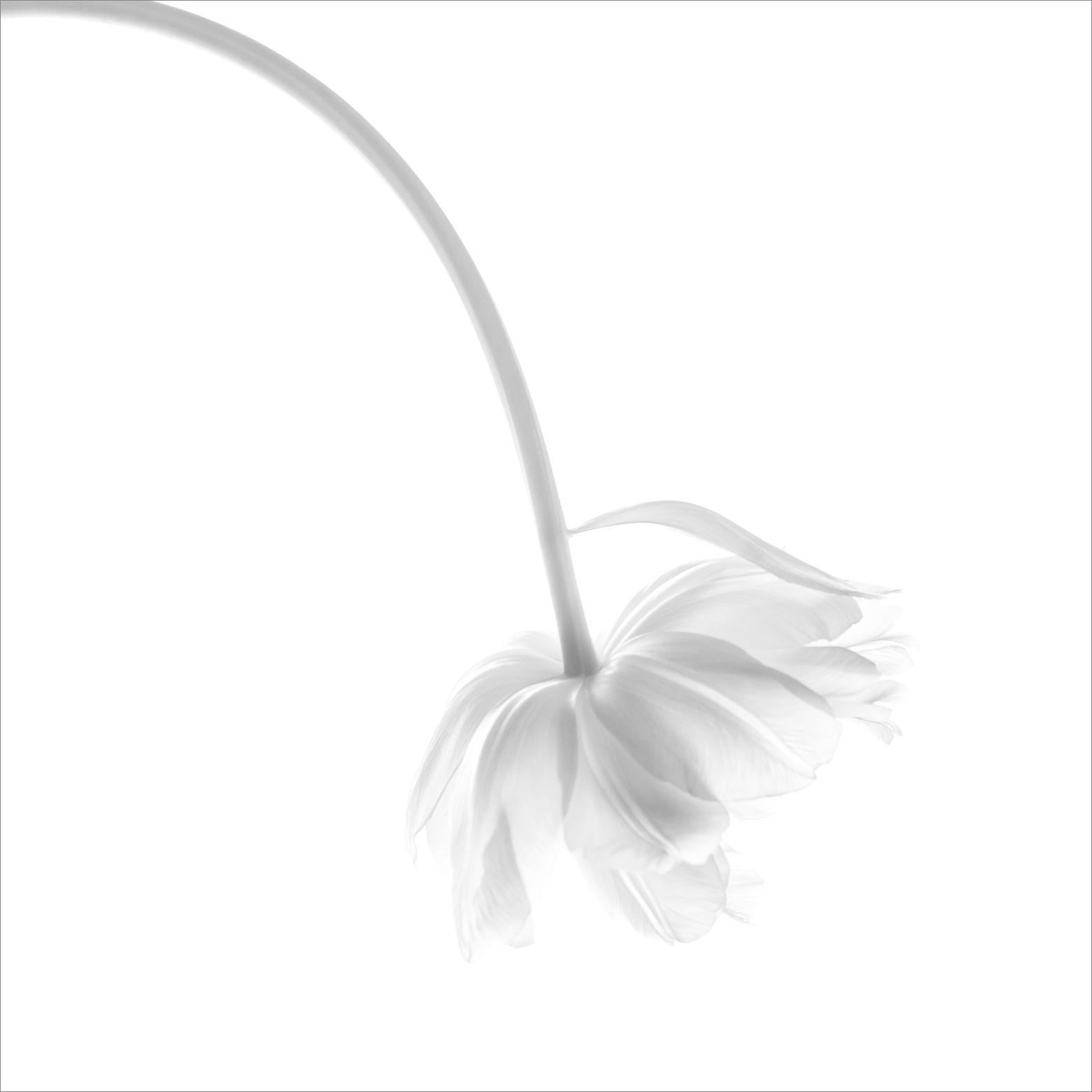
I signed up to Jonathan’s year long Creative Development Course offered by the DI Group, perhaps not realising what a different approach to my photography would be needed over the coming months. Taking my floral photography as an example, I am comfortable creating my own backgrounds and textures before masking and digitally cutting out all the chosen, pre-selected, component parts, blending the colour tones and matching the lighting in the finished image to make a pleasing composite.
I had considered myself as being ‘creative’ coming from quite an art-based background, but this was to prove a very different way of looking at things! Working towards a set brief, meant having to pre-visualise and think about a subject, asking myself ‘how can I portray that emotion and feeling in an image without it being a literal interpretation’ before I even took the photo. This is quite the reverse to my normal approach where I am first drawn to the light, a subject or scene which as I enjoy playing in Photoshop, I may then choose to develop into something more later.
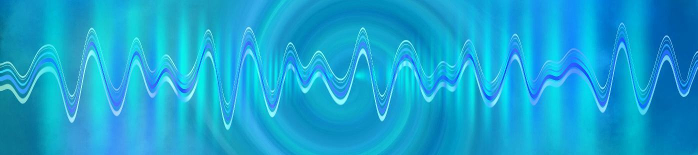
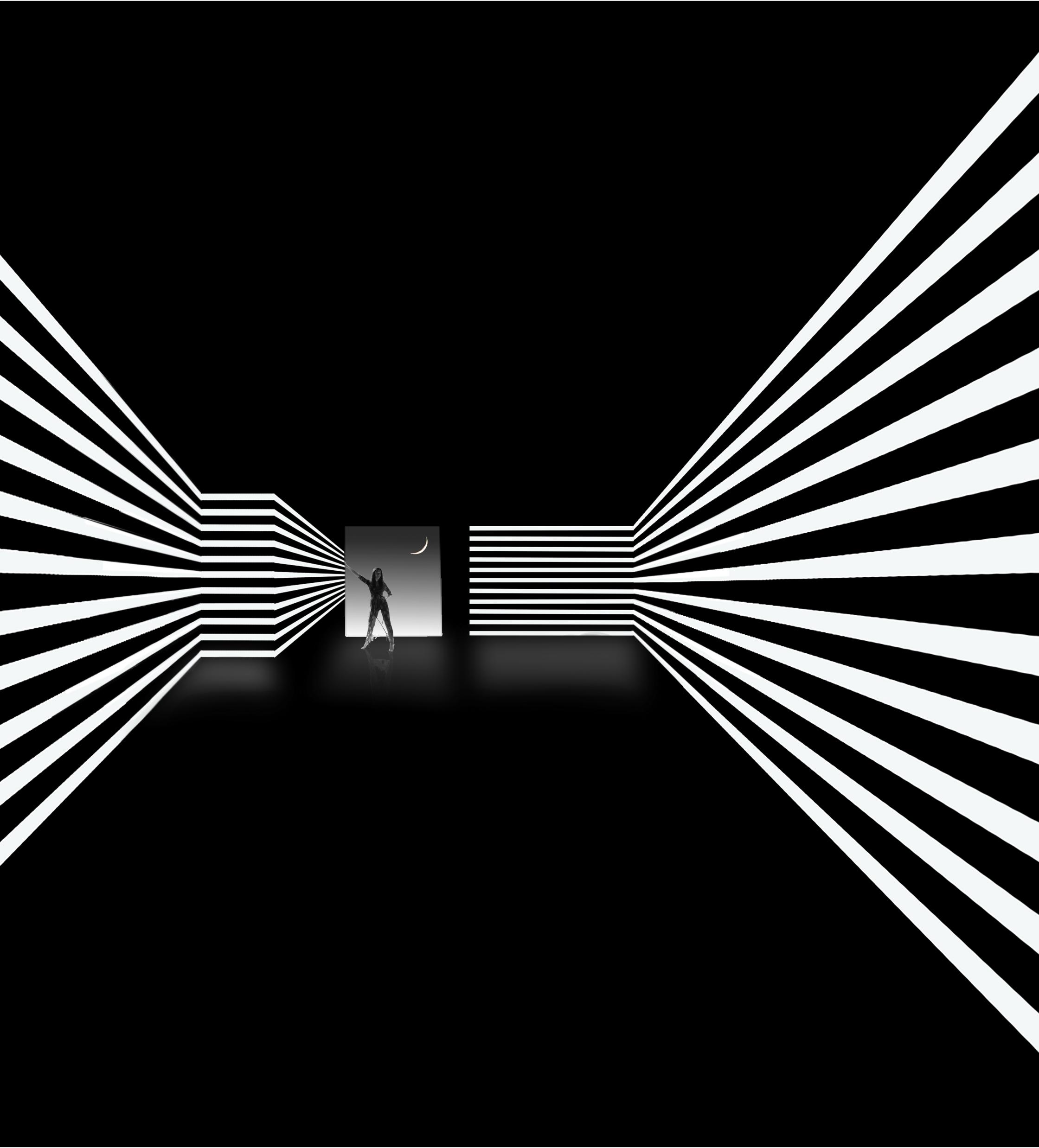
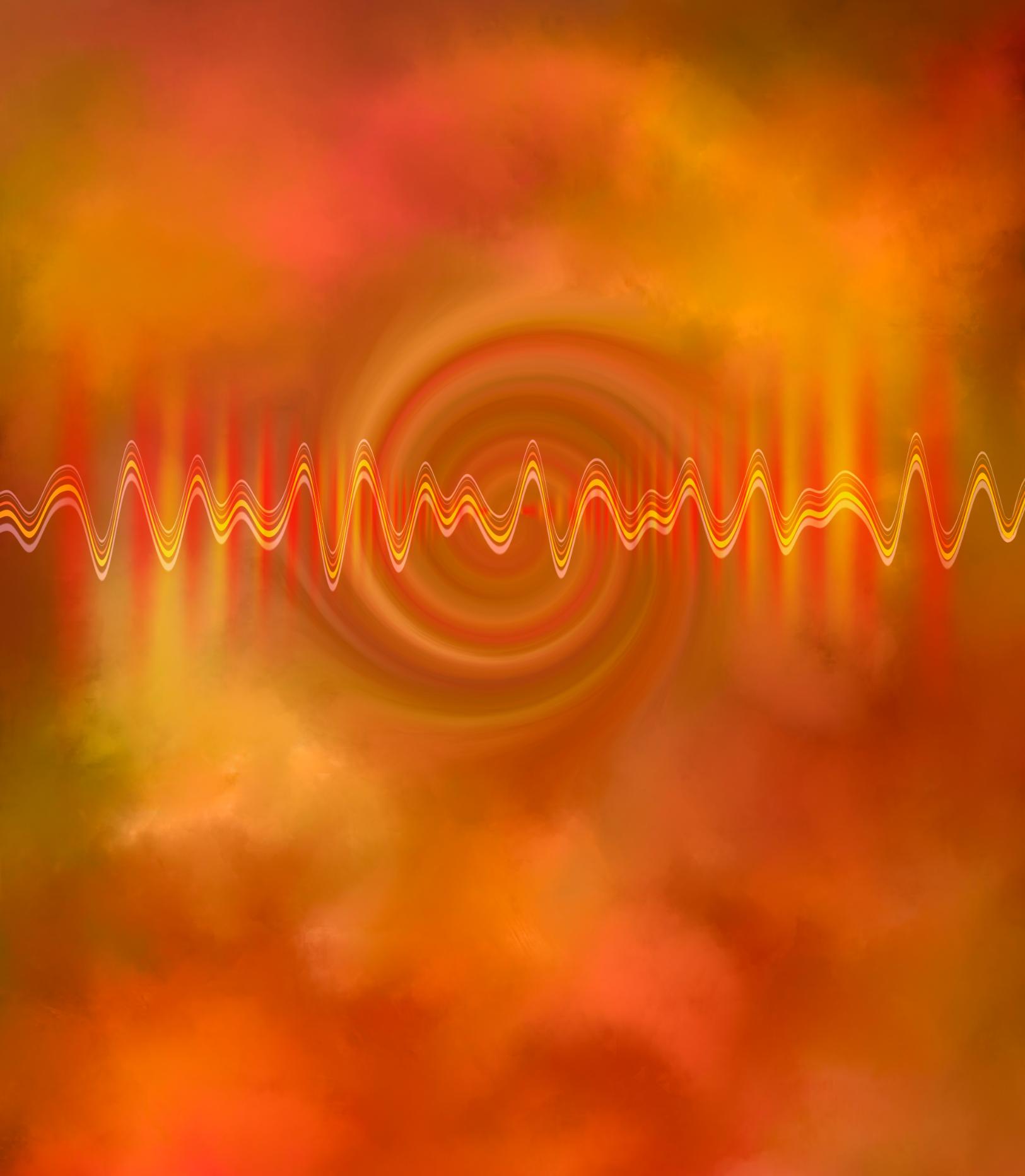
Our first challenge was to be a single image, the subject being ‘Sound’. After getting lost down several rabbit holes, I decided to centre my thinking around sound waves.
Feeling comfortable using a background texture I had made from some bright parrot tulips I set about adding a circular radiating ripple with some solid bars at the sides to represent sound coming from a loudspeaker, feeling it needed more, I created something that I thought represented a sound wave from what was, a set of straight lines. I then produced a set of these images in different colours to see which I preferred.
Melanie, our hard-working Workshops and DI online Editor spotted my image and asked if she could use a part of it as a header for a publication, she was keen to put together advertising forthcoming DI Events. The title of the publication was to be ‘Pulse’ I am sure some of you have now seen this because I proudly answered, ‘yes of course’!
I joined the Creative Development workshop to push myself beyond making representational images and discover a more personal, expressive voice in my photography. Throughout the year, our group has been working to a series of briefs designed to spark creativity. These exercises have challenged me to move away from a purely representational mindset and instead focus on intention:whyam I making this image?Whatdo I want it to say? How does it make me feel? Planning with intent has been rewarding. By deliberately exploring contrasting ideas, I’ve found unexpected freedom in my thought process. Once a plan is sketched out, I begin to see numerous possibilities in patterns, shadows and shapes. Equally important has been the community I am part of. Our small group shares images, techniques, and encouragement through a WhatsApp forum and this supportive environment has made it easier to experiment and take risks. Working closely with like-minded creatives has been liberating, helping each of us to move beyond safe choices and embrace more personal, expressive styles. My journey is as much about self-discovery as it is about image-making. I am becoming more
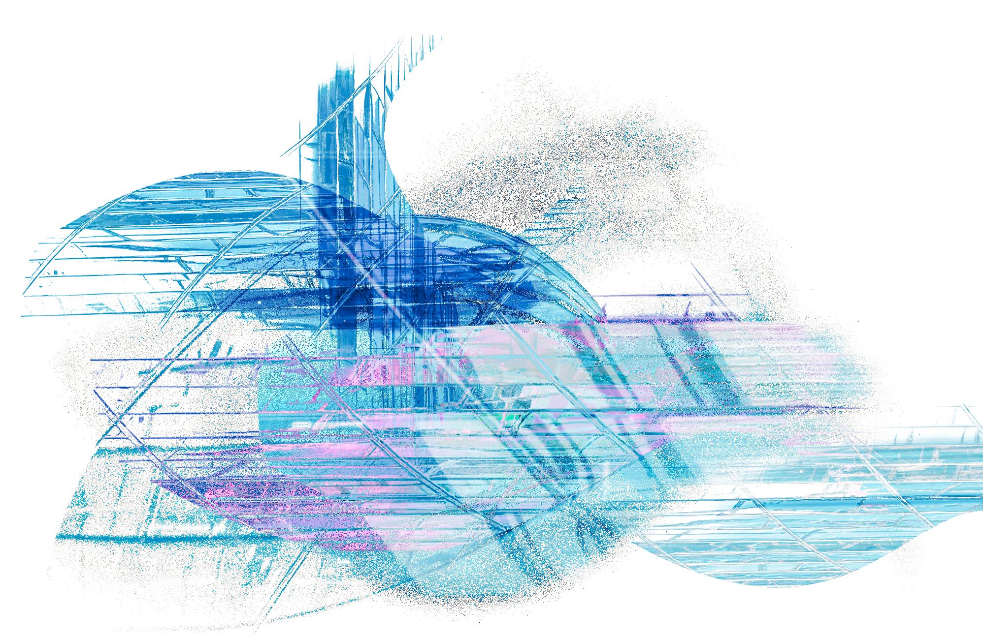
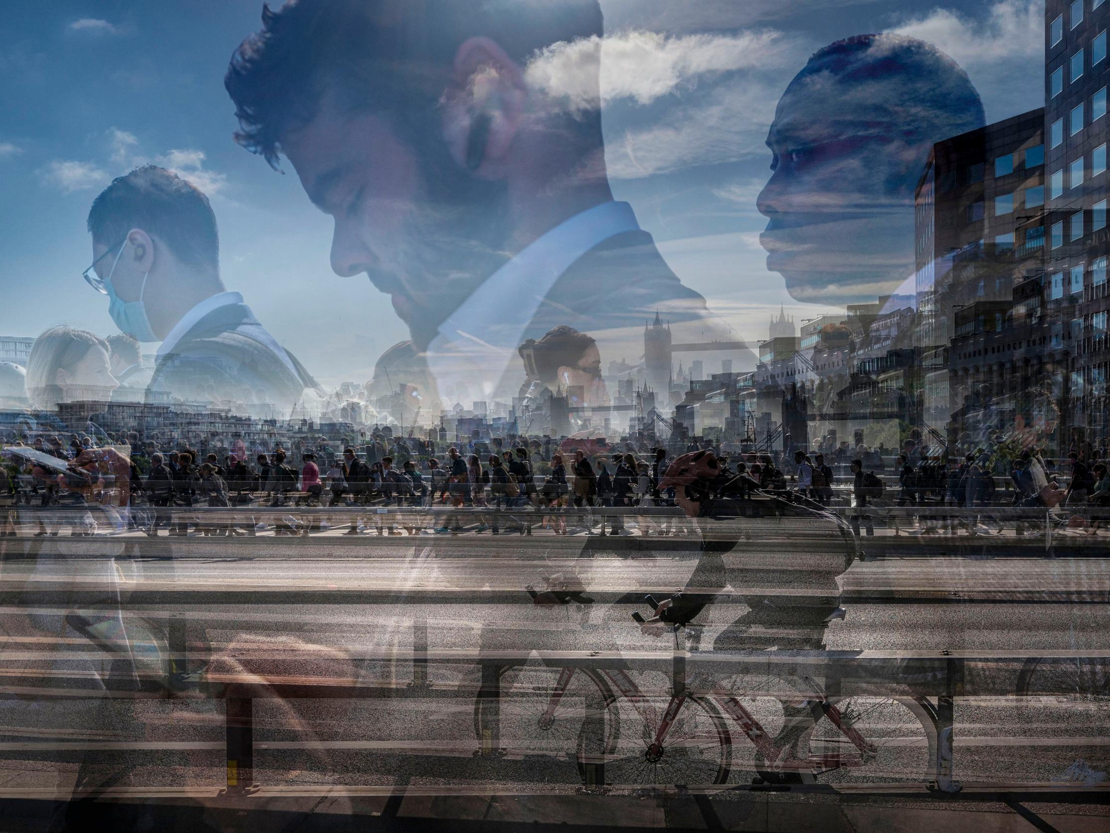
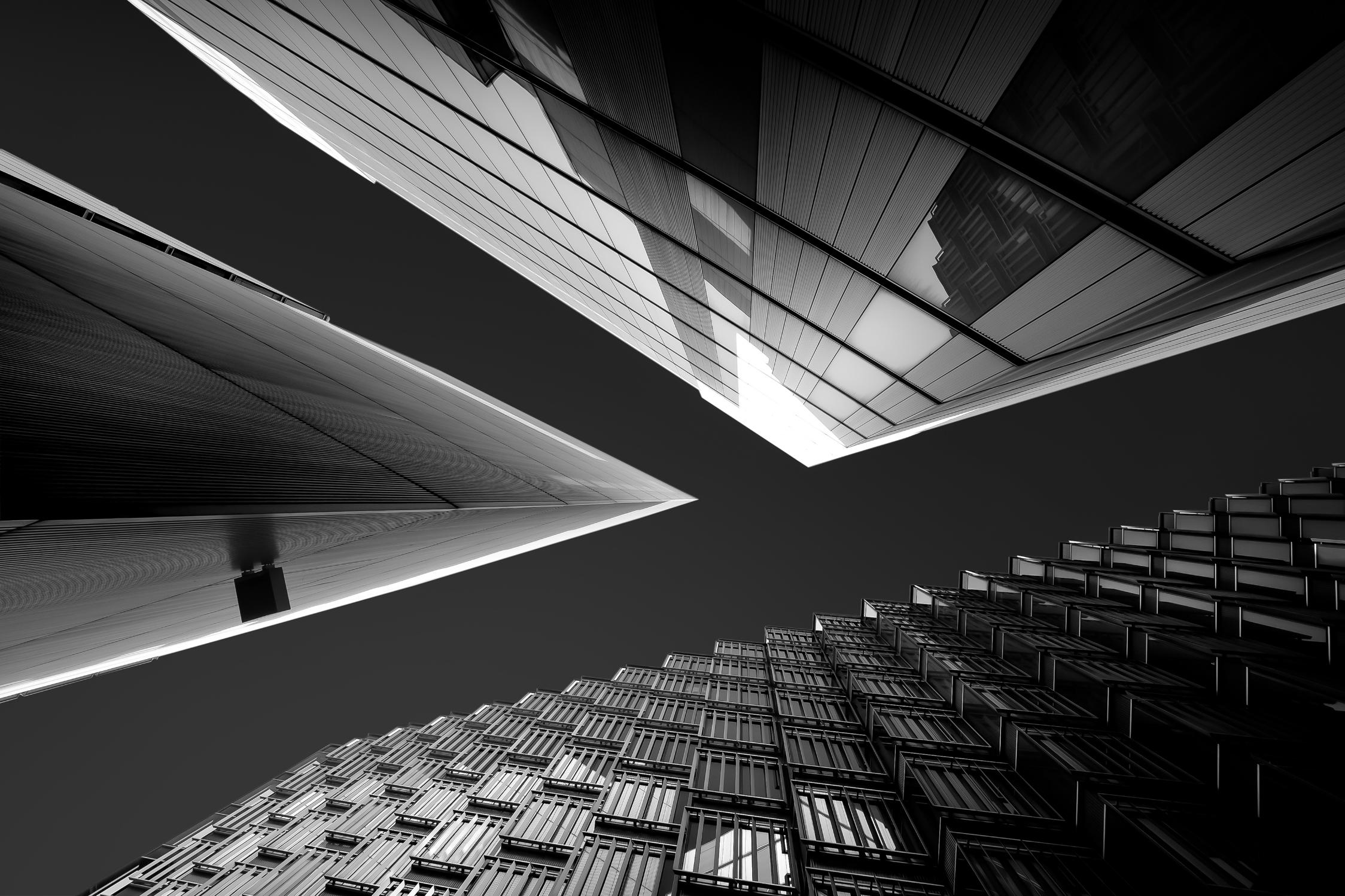
aware of my style, placing more confidence in my vision, and more excited about future projects. It is providing me with a great framework to push my experimentation further. ‘Vessel of Power’ was imagined for the “City” project. I began by making multiple exposure images of tall glass buildings in the financial district. London has been at the centre of commerce for nearly two thousand years, and I wanted to convey it metaphorically as a vessel of power. I initially photographed the tall glass structures, overlaying shapes, reflections and textures in-camera. Applying multiple exposure techniques, these glass and steel structures converge into a structure that is both fragile and commanding as it navigates the tension between chaos and the need to stay in control. Through further refinement in Photoshop, I have created a loose interpretation of the great vessel I previsualised as it sails along the River Thames. Turbulent yet resilient, standing tall amid chaos, with its gaze fixed on the horizon. The piece is both my personal response to the urban landscape and a metaphor for the power and responsibility of governments and corporate leaders today.
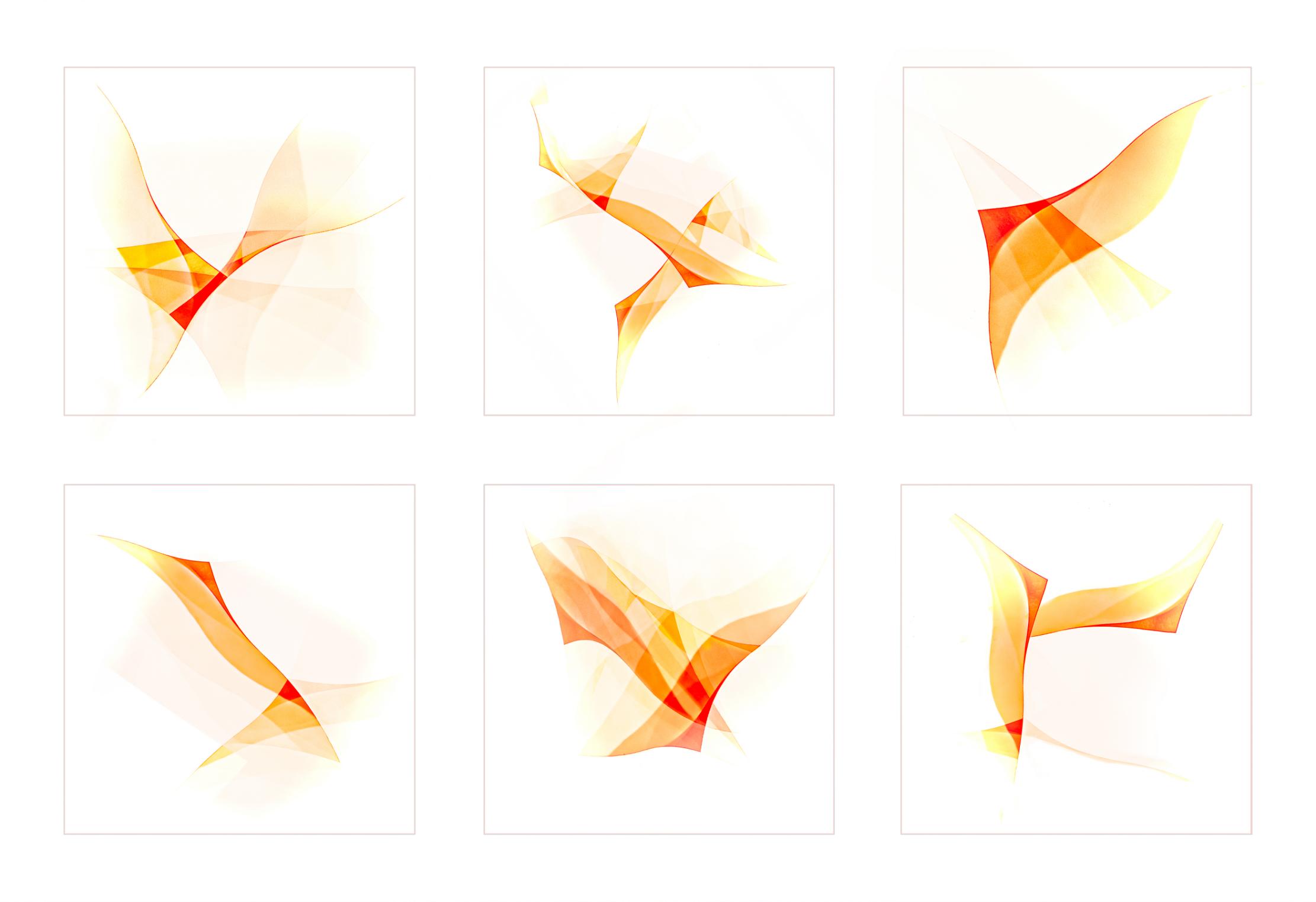
This series began as an experiment with in-camera multiple exposures of bottles crossing each other. The result was flowing, translucent shapes in warm tones that feel light and full of movement—almost like fabric or wings drifting in the wind. That sense of motion made them a natural fit for the movement theme.
When I shared the images with my team, everyone saw something different. That really struck me, because it reminded me of what freedom is all about: the space to see things in your own way, to feel your own emotions, and to create your own meaning. There’s no single answer—just an open invitation to connect with the series however you choose.
I also chose the title Freedom because of what this project has given me personally: the freedom to play, to experiment, and to explore new ways of creating and interpreting photography.
Creative Photography begins with an idea. It is only after developing that idea, thinking and planning that images are created. The creative photographer works to convey feelings and emotions rather than producing visual records of what has been seen. Their work is often described as artistic rather than documentary. As Jonathan Vaines has said, the development of a creative approach to photography is not easy but the potential rewards are high.
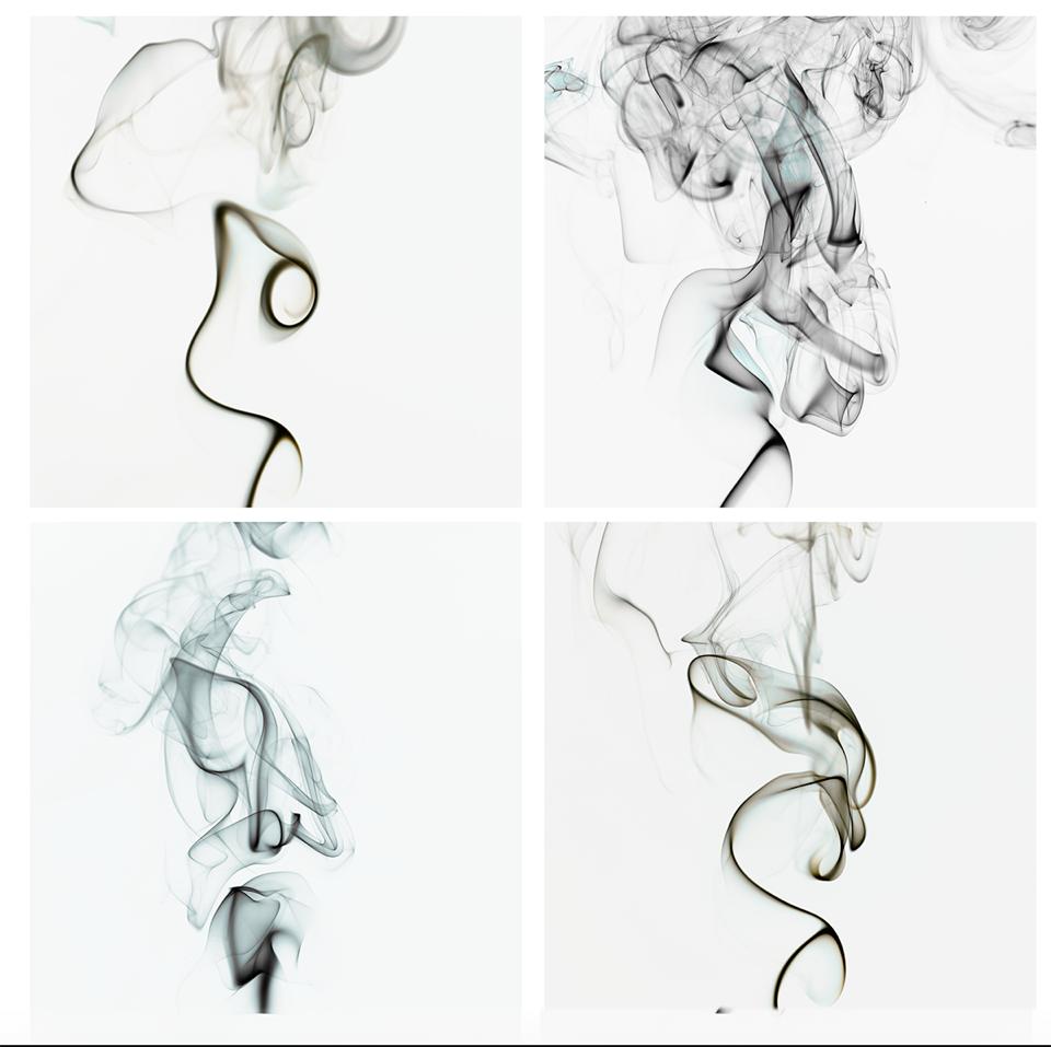
Tasked with the theme of movement I decided to explore the use of candle smoke to develop a set of images. The unpredictable, and likely unrepeatable, trail of smoke briefly generated when a candle flame is extinguished gives me the feeling of free and ever-expanding movement. Its brief existence, at least in terms of visibility, gives it a particularly interesting dimension. Photographing the smoke produced as a candle flame is snuffed out proved more difficult than I had expected and my initial images were somewhat disappointing. When I shared my frustrations with the Creative Photography group it was suggested that I should use a joss stick to produce a steady stream of smoke rather than trying to photograph that produced by a candle.
After further experimentation I established a more successful technique using a joss stick, macro lens and off-camera flash. The feedback from the group when I shared a set of my smoke images was positive and I was encouraged to explore further possibilities including combining two or more images and the subtle use of colour
Although the results were pleasing I took greater satisfaction from the process of developing them. An important part of this was the encouragement, thoughts, ideas and suggestions made by members of the group.
Jonathan often describes himself as an artist and his techniques as painterly. Working with him on creative photography strongly underlines this. The monthly Zoom sessions led by Jonathan not only provide opportunities to learn how to use a variety of tools to develop ideas in Photoshop and Camera Raw but also to look over the metaphorical shoulder of a talented artist as he works.
I joined the Creative Development group to push myself in a new direction in my photography. Stepping away from familiar routines and favourite subjects requires effort. Training the mind to see differently means slowing down, planning with intention, and engaging with the structured projects or prompts we are given. Yet it is easy to slip back into what feels comfortable. True growth, however, happens when we experiment with new techniques and embrace fresh perspectives. I believe personality plays a central role in how each of us approaches these creative challenges. Some thrive on routines, detailed plans, or storyboards. My own way is more instinctive: I dive straight in, experiment freely, and allow my images to evolve through the process—often resulting in work that is experimental, unique, and impossible to replicate . I enjoy creating digital art using apps on my phone and iPad.
The Creative Development experience has however taught me new processing techniques, ways to use colour, and how to thoughtfully critique others’ images. I’ve really enjoyed heading out with my camera, shooting with more intention, though I’m still working on shifting my creative mindset, and changing my personality!
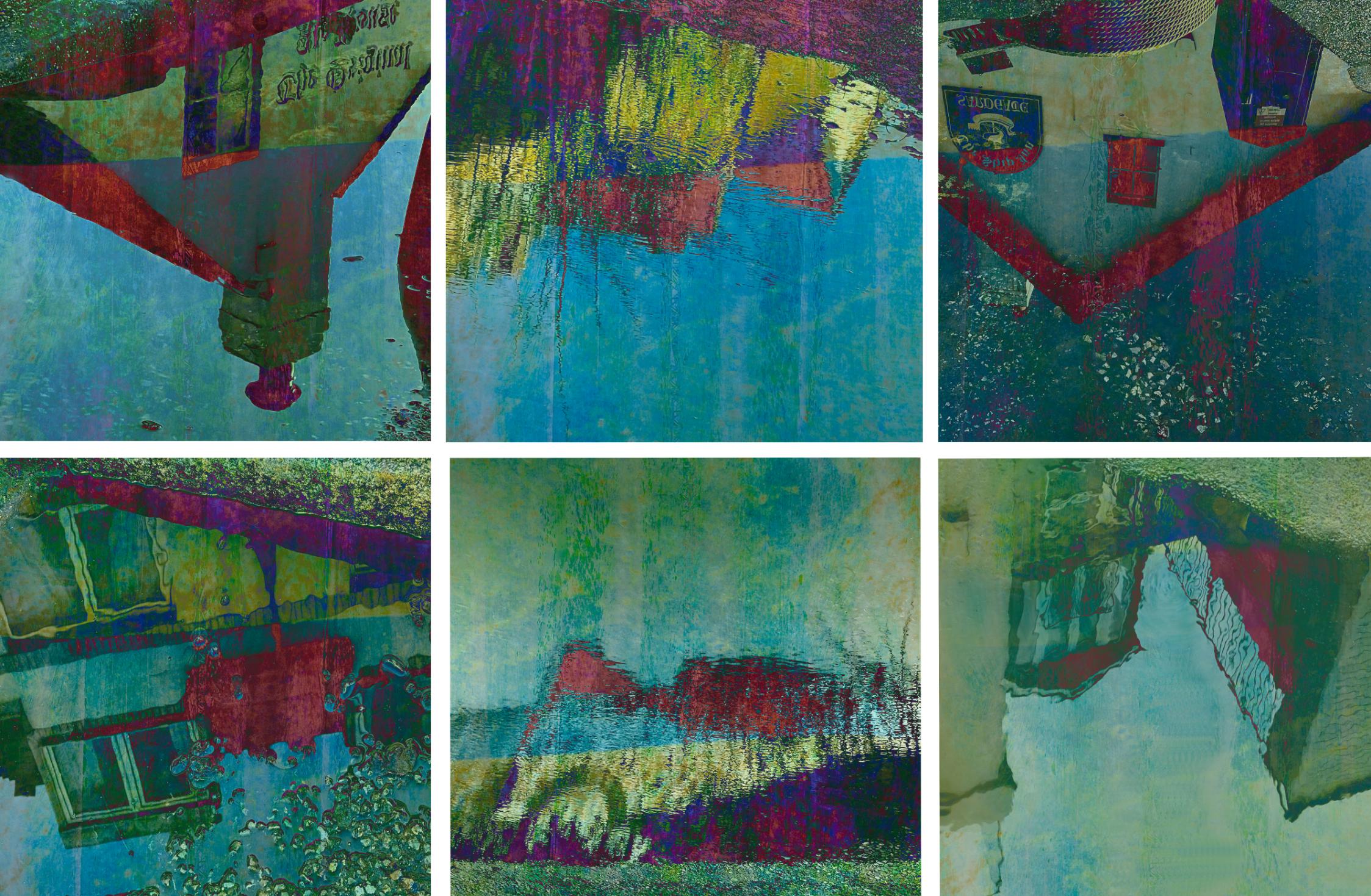
One of the first assignments from Jonathan was to build a ‘Set ‘around “Scapes”—but intentionally not land, sea, or urban scenes. Through exploration, I tried ‘stonescapes’ and weathered ‘woodscapes’, but my most successful was ‘Puddlescapes’: photographs of local puddles taken on my daily rainy Winter walks, in late January and February, then later blended and recoloured in Photoshop.
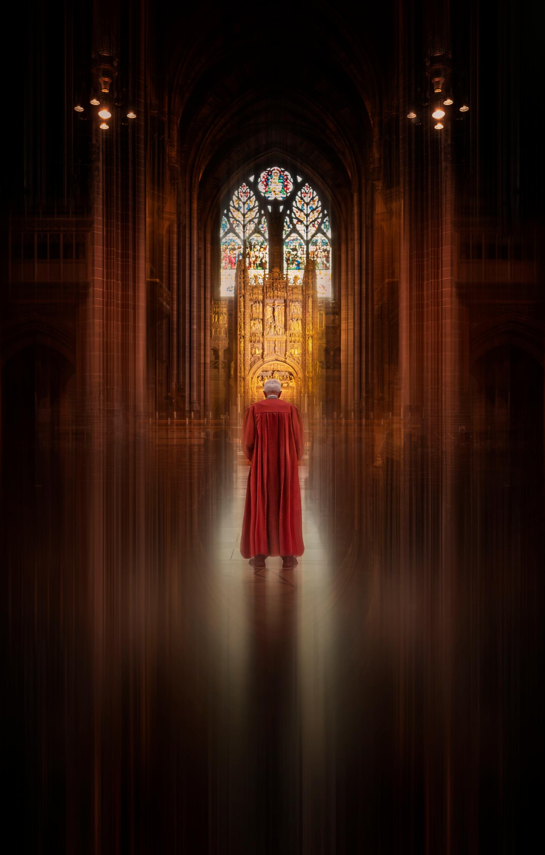
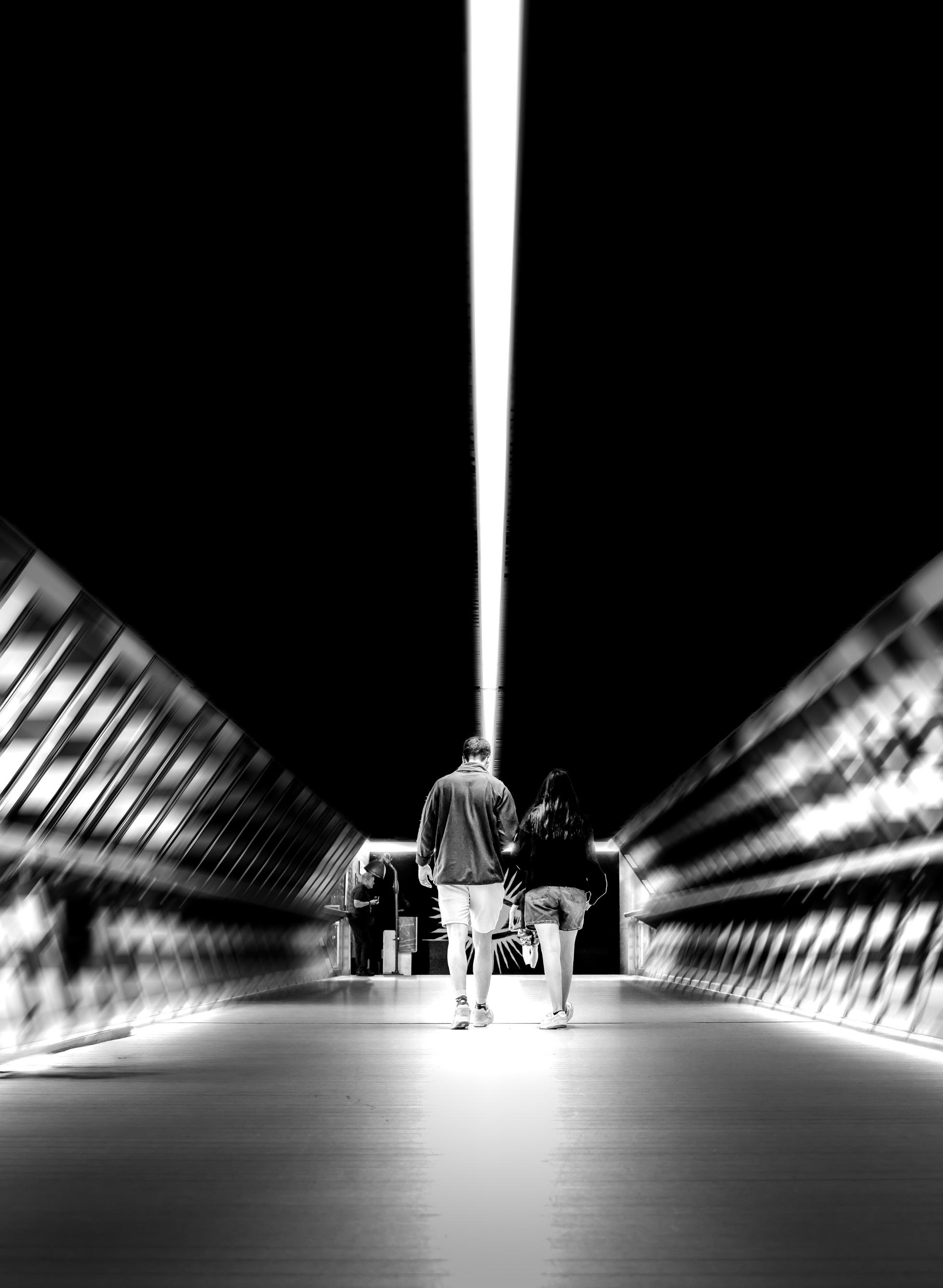
In this article, I share my ongoing attempts to create more expressive, unconventional portraits, favouring creativity over technical perfection. I look at some early experiments that missed the mark, describe the challenges of shooting at a model day, and explore how I was inspired by a DI workshop series to use Photoshop to push portraits toward a more evocative style.
II’ve been interested in portraiture since I started photography, but I quickly found that I don’t enjoy taking ‘straight’ studio portraits. I’m far more drawn to the kind of expressive portraits made by photographers like Sarah Moon, Francesca Woodman and Victor Skrebneski, where the subject is blurred and the viewer is left to do some work interpreting the image. (I especially like Victor Skrebneski’s portrait of Dennis Hopper).
I think I’m drawn to this style because it’s an antidote to how I usually work. My normal approach is precise, controlled, even a little… buttoned-up. My horizons are always level. My focus is razor sharp. My exposure captures the full dynamic range. The problem with this way of working is that it tends to prioritise technical perfection over creative risk. I feel like a cook who carefully follows the recipe and weighs every ingredient. Sometimes, I just want to ignore the recipe, trust my instincts, and see what happens when I chuck it all in the pan.
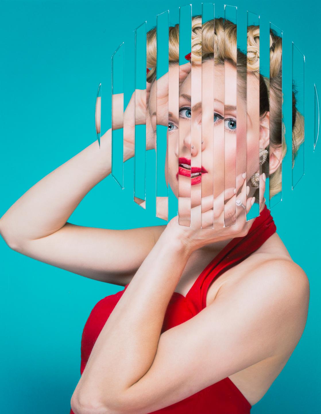
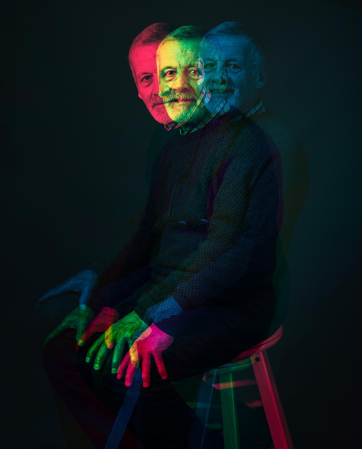
I’ve played with expressionist portraiture before. I’ve created 360-degree portraits by blending a series of shots taken as the subject and I moved in a circle. I’ve distressed printed portraits by re-photographing them through water, and I’ve cut up printed portraits into strips and woven them together. I’ve also explored alternative printing processes, like cyanotypes. This isn’t a passing interest but something I keep returning to. Here are three early experiments that didn’t quite work, but got me thinking differently.
Woven Portrait: This is a photograph of a photograph. I printed out two copies of the image, then cut some strips from one of them. I placed the other copy of the image below and angled it to create this effect.
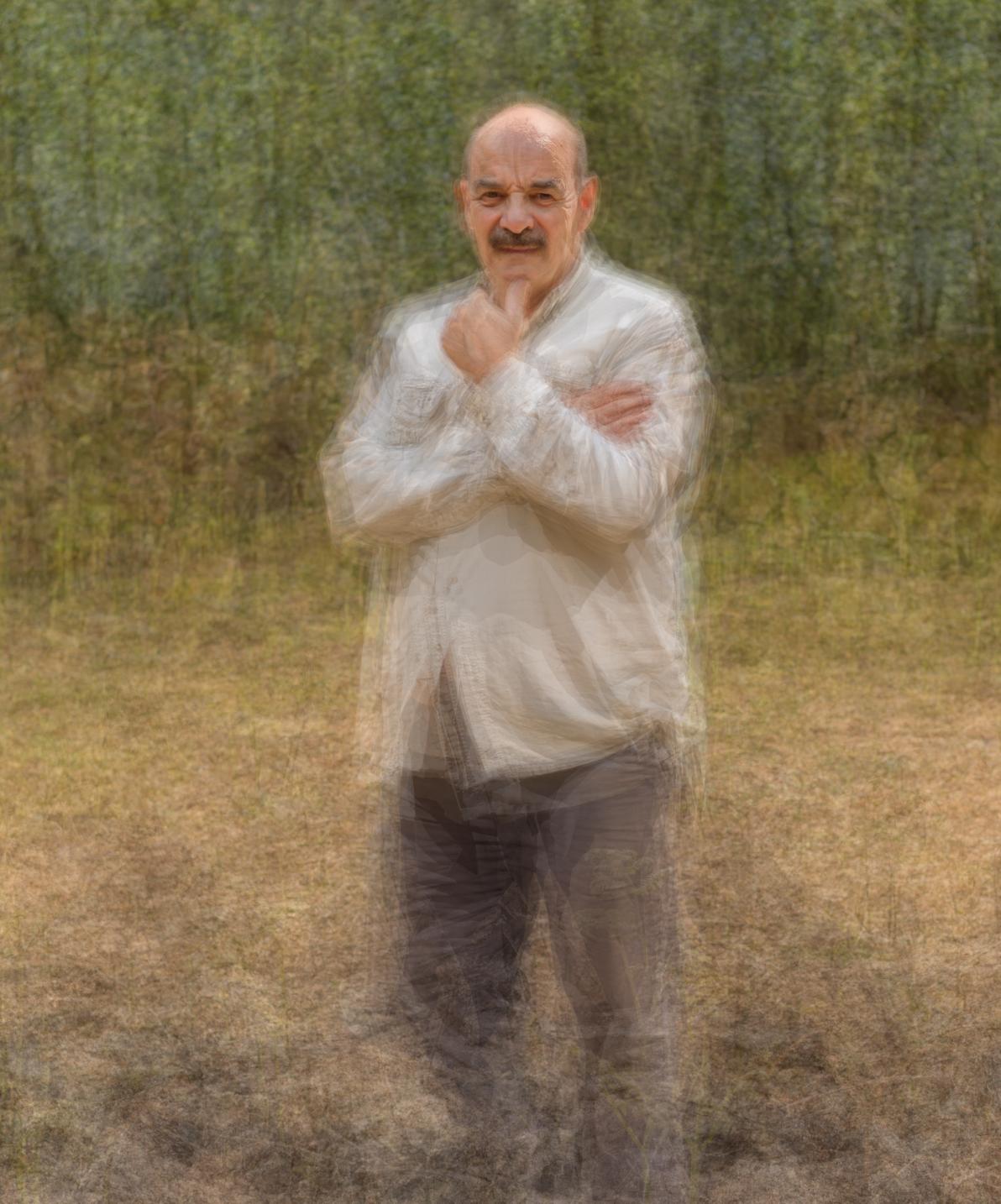
Martin in 360. This image is a multiple exposure (created in Photoshop) of around 10 images. I asked Martin to imagine he was on a turntable and to continue to face me as I walked around him through 360-degrees.
Anaglyph. I created this anaglyph experimental portrait by combining three images of the model in Photoshop.
Taking portraits is hard when you don’t have easy access to models. I know you can hire a model, but I thought it would be easier to attend a model-day event. These events typically give you access to three models over two hours. I figured this would give me a chance to try some of the expressive ideas I’ve been noodling with.
I knew that over the course of the day, another 26 photographers would be photographing the same models, under the same lighting, with the same props. This meant the odds were slim that I would leave with something original. I would end up with the organisers’ view of what ‘good’ looks like: well lit, competition-ready pictures — but not what I was after.
So I planned a different approach. I brought a Lensbaby to allow me to introduce blur in parts of the image. I hoped to try some unusual crops and shoot just parts of the body instead of full-length portraits. I brought a prism to hold in front of the lens to emulate light leaks. But I ran into problems immediately. I liked the way the Lensbaby and the prism both added randomness to the image making process, but nine out of ten shots were unusable. The Lensbaby is tricky to focus, and the prism is fiddly as you need to hold it just-so in front of the lens. This would have been fine if I’d had time to experiment, reflect, and refine. But I was under time pressure. In my session, there were nine photographers split into groups of three, with each group assigned one model for about 45 minutes. Then each group moves onto the next model. Because we had to take turns, I only had about 15 minutes with each model. I needed more time to play. I wanted to shoot an image that was almost what I had in mind, then tweak the lighting, then adjust the framing, then build on that idea and try something different. But the clock was ticking. Here are two images from the day that hint at what I was after. I’m sharing them here knowing that they aren’t good enough. “Well done for trying something different,” would be a generous, if patronising, comment.
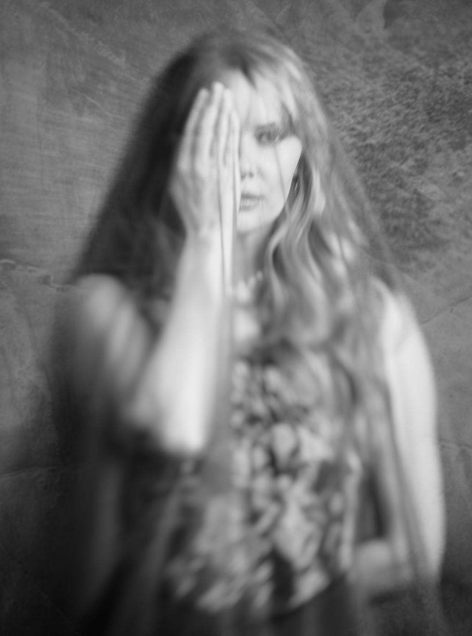
Carla.
There’s a quotation from Nadav Kander that I like. He says, “The figure turned away holds more nourishment for the viewer”. There’s some mystery involved when part of the subject is hidden, which is why I asked Carla to adopt this pose. The blur here is from the Lensbaby (one of the few where I managed to get at least some of the image sharp!).
However, I think this image is trying too hard to be evocative. It feels contrived.
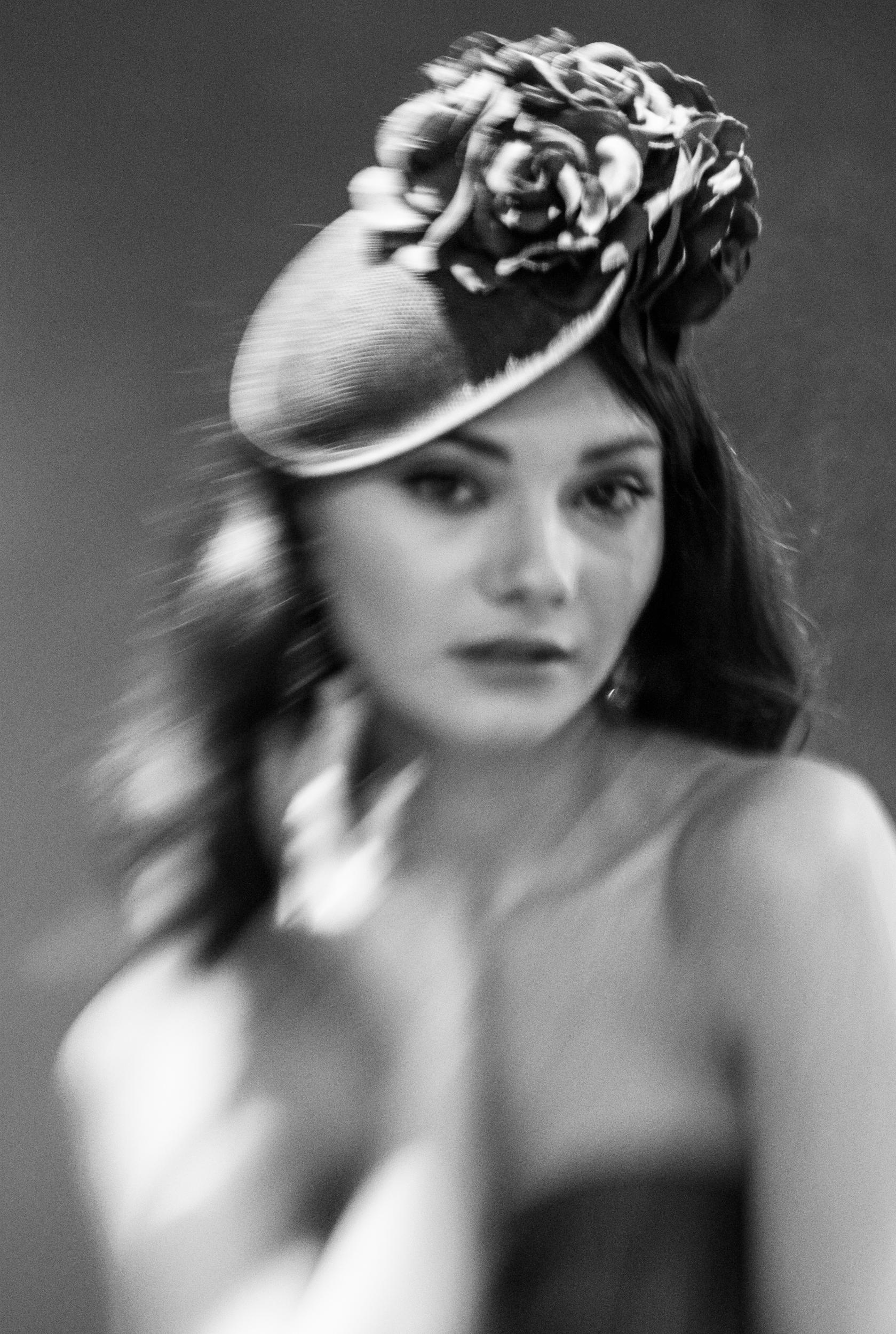
Elle.
This was taken with the Lensbaby under the fluorescent lights of the room. I had run out of my allocated time with the studio lights so the lighting is poor. I like the pose here and it has a hint of the evocative but I think the lighting makes it unusable.
The model day hadn’t been a success for me so, like all photographers when their images don’t work, I decided to fix things in Photoshop. Fresh in my mind was a series of DI workshops I’d attended on the theme of “An Alternative View”. Presenters included Celia Henderson, Charlotte Bellamy, Judy Hancock Holland, Jan Beesley and Jonathan Vaines. Each of these presenters gave me some new ideas I could try, and for this project I decided to try an ICM technique Celia Henderson talked about. In her workshop, Celia showed how she created ICM images in Photoshop rather than in camera using Photoshop’s Path Blur filter. Celia demonstrated the effect on flowers but I wondered how this technique would work with portraits. So I selected a couple of the conventional portraits I’d made at the model day along with some others I’d taken in the past. I then distorted them using Photoshop’s Path Blur filter to see if I could get closer to the look I was after. It took me a while to understand how I could twist Photoshop’s arm and get the expressionist feel I was after. But ultimately I ended up with a set of six images that I was happy with.
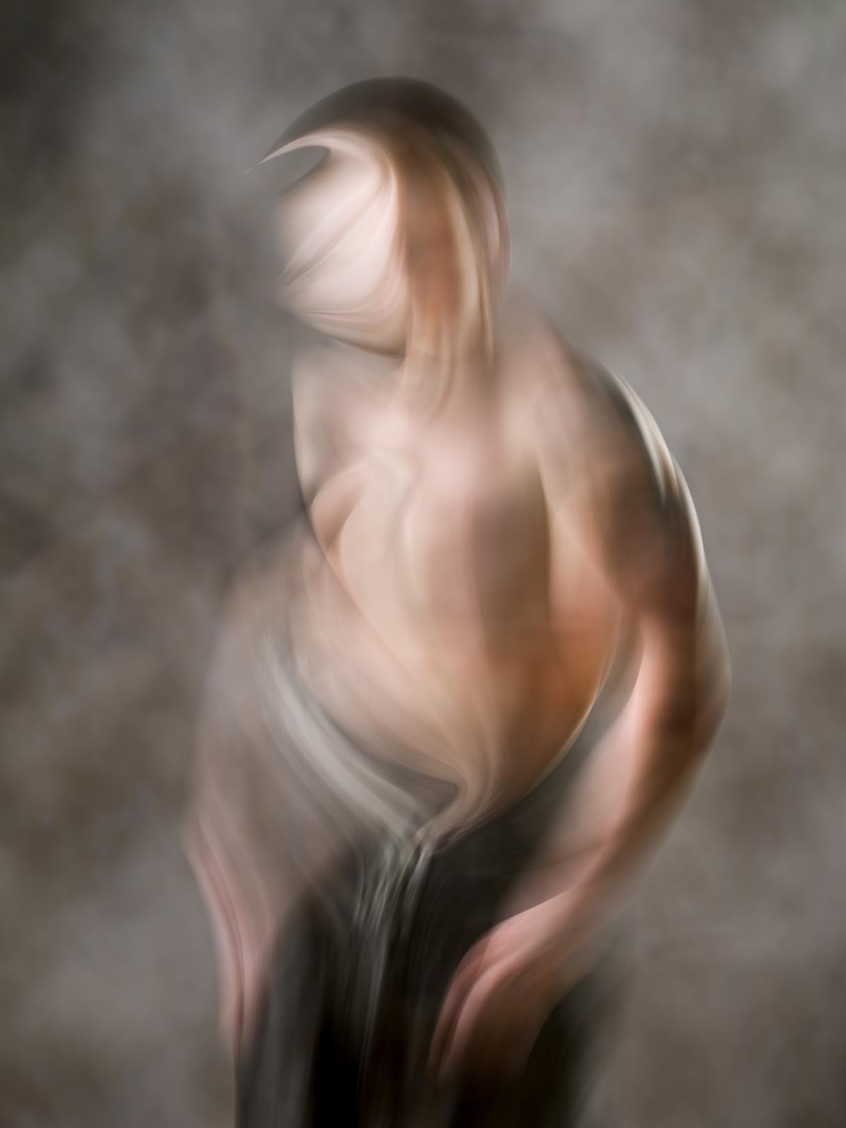
Figure Study 1.
This was my first attempt using the Path Blur filter and it’s the one that made me think the approach had some merit. It's actually a picture of a boxer and not a professional model at all. I really like the nod to Francis Bacon in the curve of the figure.
Figure Study 2.
I’ve added a texture to each of the images to try to unify them and in this image in particular I think it creates a painterly feel..
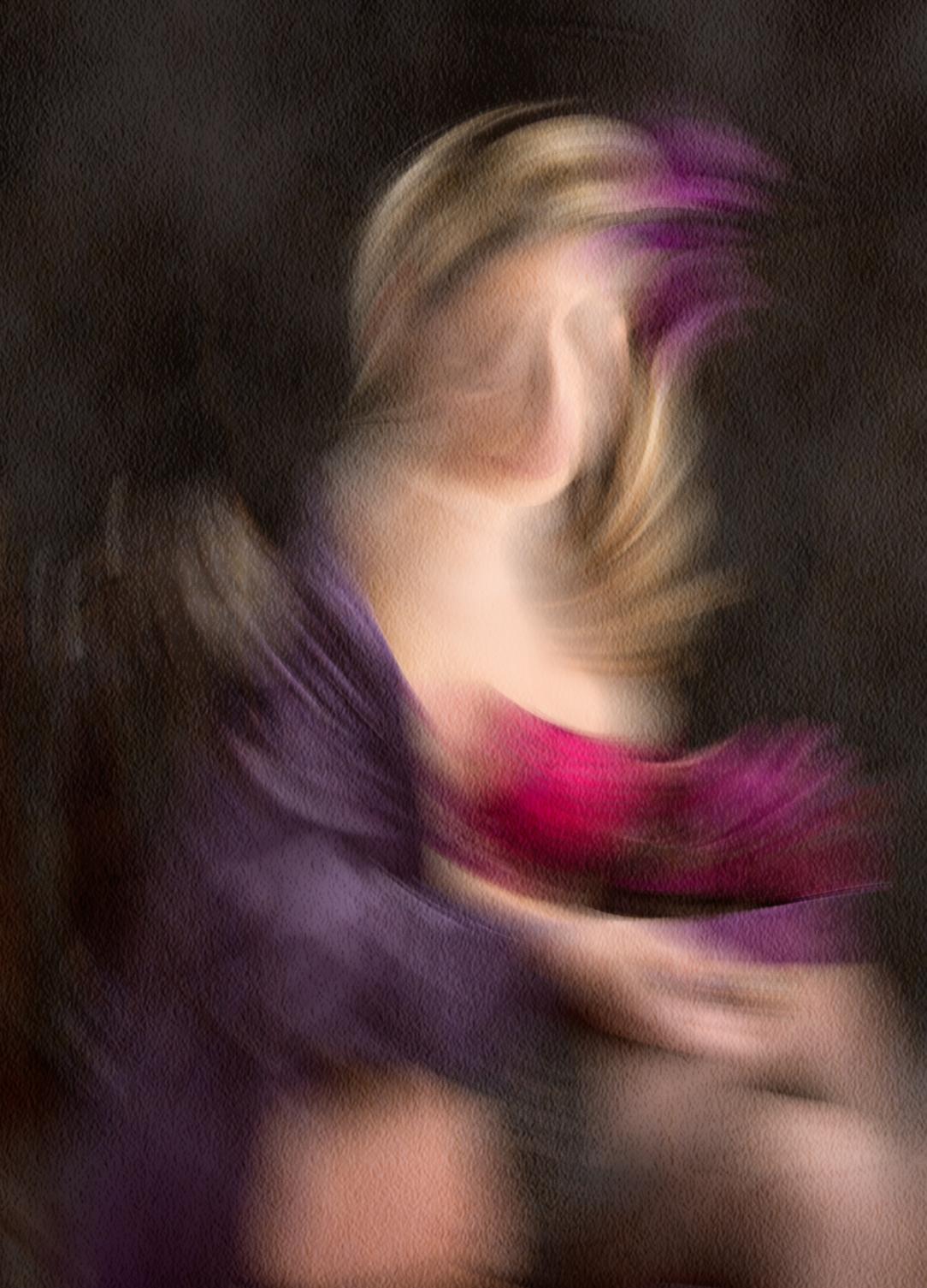
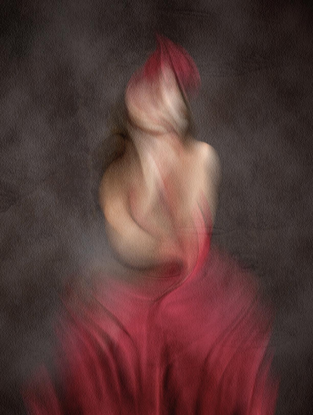
Figure Study 3.
This is Elle, the same model shown previously. But for me, this is so much more expressive than my Lensbaby attempt.
Figure Study 4.
Most of the time, this technique totally destroys the face but I liked the hint of facial features left behind in this version.
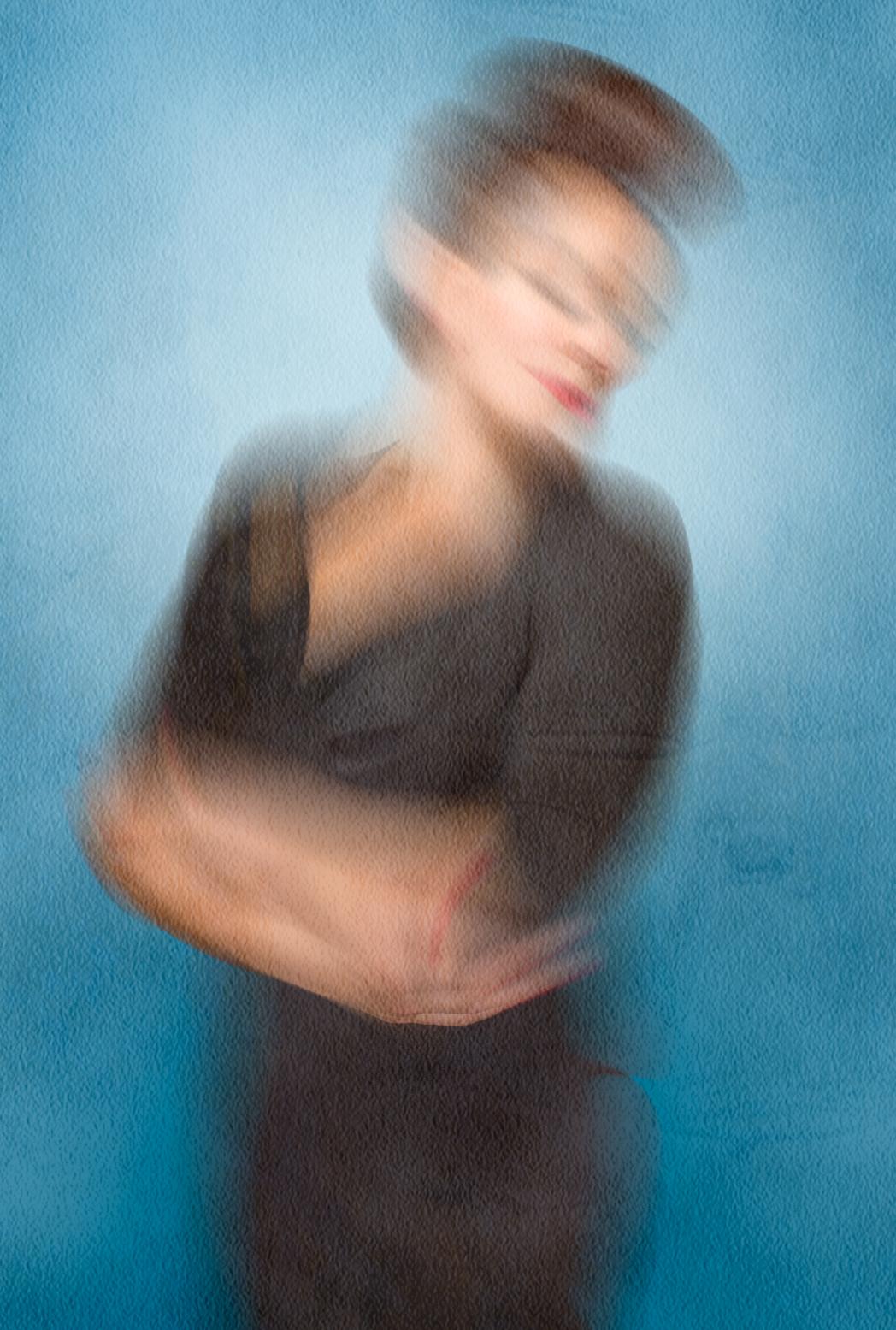
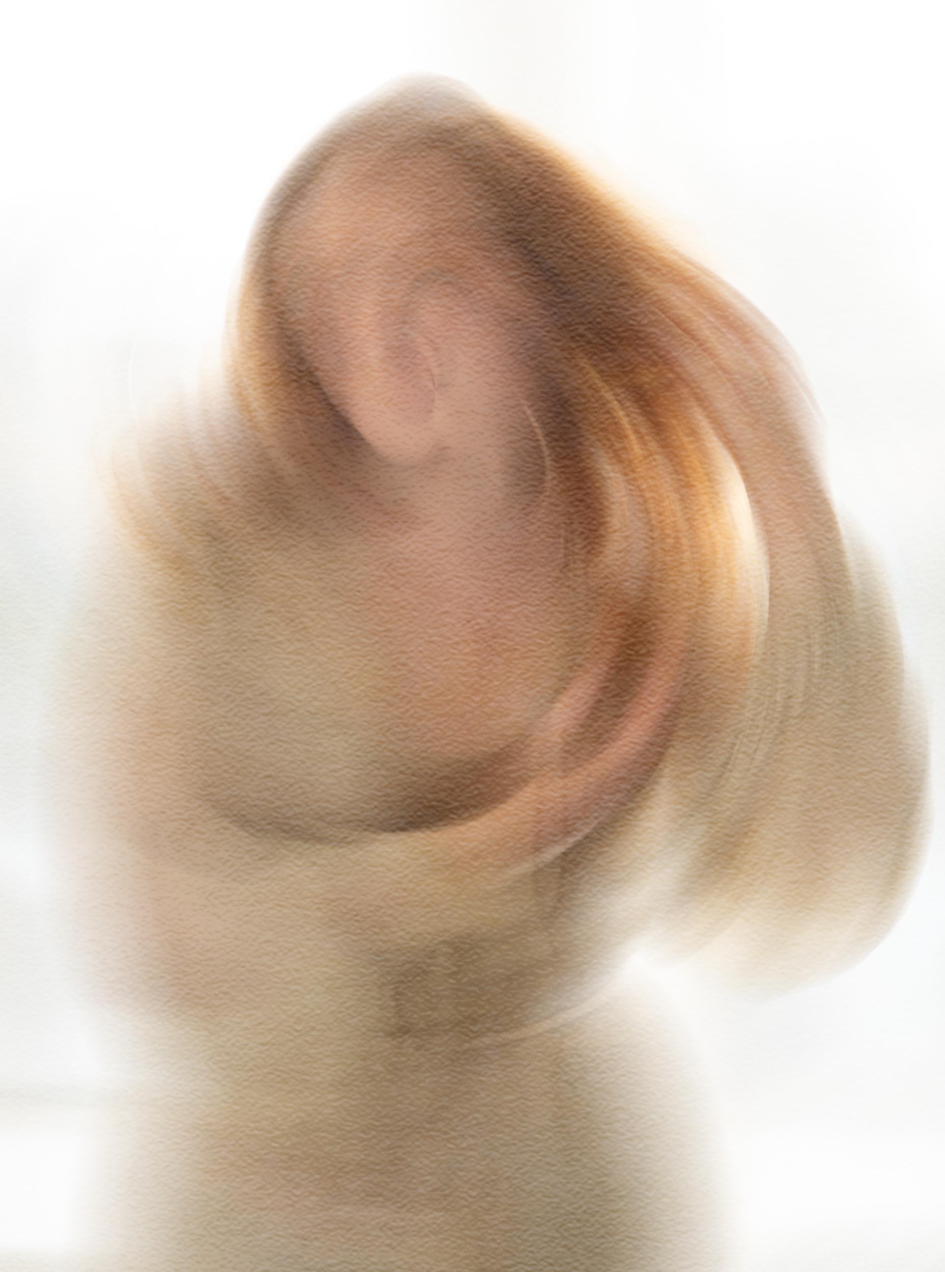
Figure Study 5.
I found that the technique worked best when I tried to identify the angles and the ‘energy’ in the pose and then use the filter to emphasise those energy lines. This is a good example of that.
What surprised me about using Photoshop to create these portraits is that it introduced some randomness into the creative process. Each portrait reacted differently to the treatment. It’s a little like in-camera movement or creating double exposures. And at the same time the process allowed the buttoned-up version of me to take time, experiment and make it a bit more… perfectly imperfect. These six portraits aren’t the final word, but they’re a step forward. It’s a project I will keep returning to: messy, imperfect, and still evolving.
David
David’s website
Have you booked your walk yet? Do take a look, some are fully booked but still places available on others. Visit the Webpage.
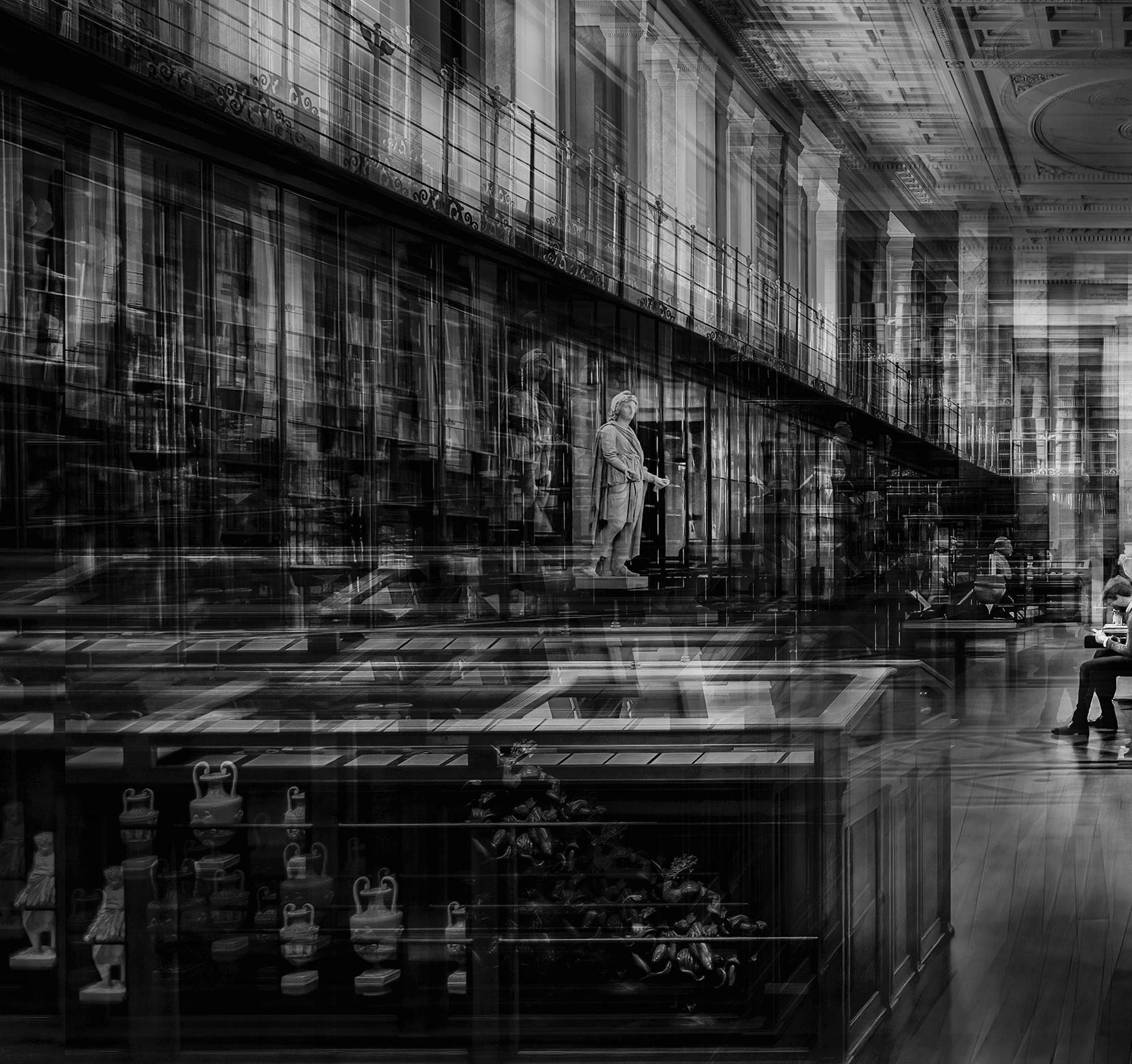
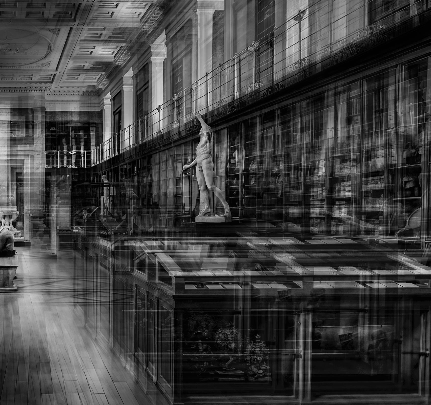
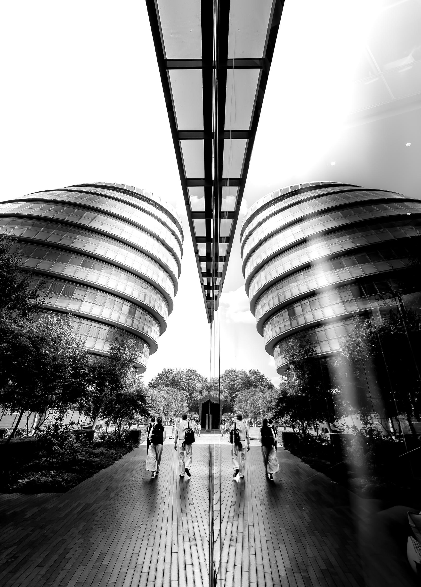
My photography falls into two equally enjoyable processes: the taking, and the making. I love the freedom of wandering through a city with my camera. Exploring somewhere new—on foot or by subway—is when I feel most alive. There’s a real thrill in stumbling upon a place I never knew existed, or finally visiting somewhere I’d only dreamed of. These moments bring a kind of clarity I chase with my lens.
I can be stopped in my tracks by a piece of street art, a tunnel, a bridge, or a panoramic view high above the city. I have to pause and stop, and think: It’s so beautiful.
My favourite time to photograph is early morning. Cities all seem to share the same rhythm as they wake. First, it’s just me — and maybe a few stragglers from the night before, still deep in conversation, making their way home. Then the runners emerge, seizing the day before work calls them back to their desks. After that, commuters flood the streets, business suits paired with trainers, navigating from stations to offices. Finally, the tourists arrive, and the city’s museums, shops, restaurants, and galleries come alive. That’s usually when I put the camera away and become a tourist myself—at least until later in the day, when the light softens and then finally darkens, the streets change tempo once again, and I return to exploring.
Most of my images are crafted in post-production. I will usually blend photographs taken at the same place and time—this helps maintain colour harmony and creates a sort of visual memoryscape of how the scene felt to me. Post-production gives me control over the composition: I make deliberate choices about what to reveal, what to conceal, and where I want the viewer's attention to land. From there, I fine-tune colour, light, and shade. It’s a lot of fun to see it come together, knowing the final image is something entirely unique.
Last year, I worked on a panel for The Guild of Photographers, which was awarded Master Craftsman. This year, I plan to submit an ARPS panel—another exciting, if challenging, process for images like mine. It’s still a work in progress!
Morag
You can see more of my work at: www.moragforbesphotography.com
Roman Timescape
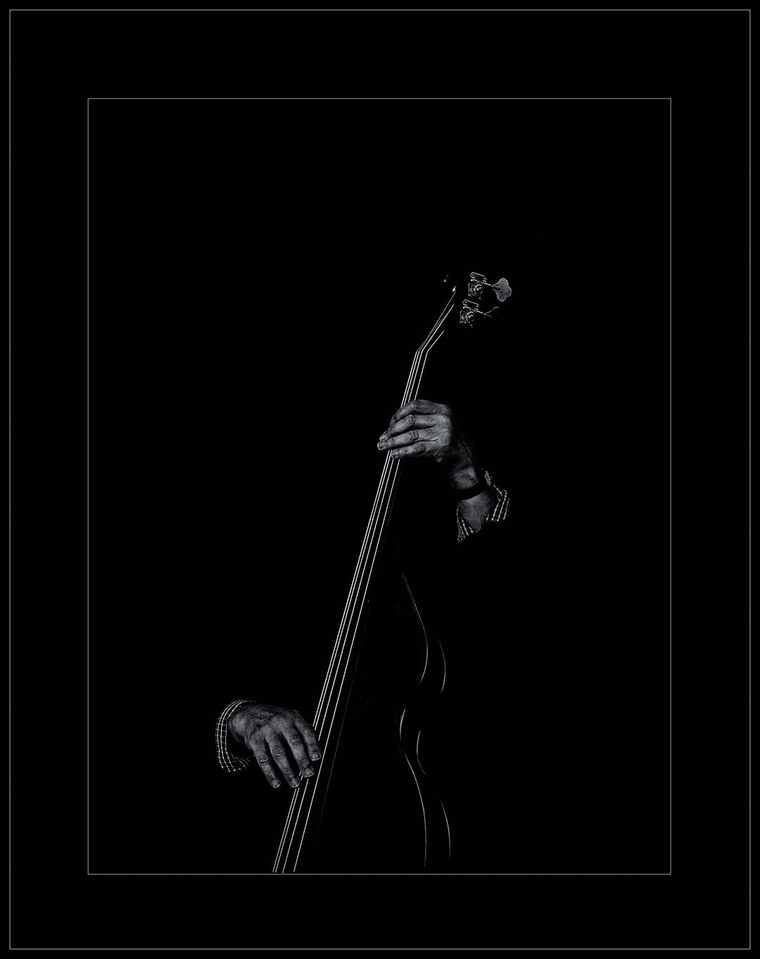
”WHAT EYE SEE” BY ADURAGBEMI OKEYEMI
The essence of these images is to project the true value of black and white photography as the true fine art in my own opinion. I strongly believe that black and white photos hold a deeper sense of creativity compared to coloured photography. As photographers or graphic designers, no matter how much of retouching, colour grading and manipulation done on a coloured image it still remains a shared version of what the world sees and recognises; just the way it is. Black and White photography on the other hand, strips away the very familiar to reveal something much more retrospective and emotional, expressing the truth beyond what's been seen, the absence of colour and the intentional emphasis on light, shadows and contrast suggests timelessness and that to me is the true Fine Arts.
This is not intended to undermine the values of coloured images and other type of photography, the whole idea just spawned from my recent project while shooting landscapes and architectural spaces in London where i started to see things differently from how i've been doing photography for a while now and that's why i titled this publication "What Eye See"
“What Eye See” is a way of expressing my view (what i see and how i see) of black and white photography as far as this project is concerned. Away from the usual "What I See", I'm using the "Eye" in place of "I" to further express how personal black and white photography feels to the creator of an image than to what the audience sees.
Also, I believe this publication to be a way of correcting some general notion that black and white images are results of images that didn't come out great while shooting so rather than the photographer trashing the image they just simply convert to black and white to save it.
In the end, “What Eye See” is less about removing colour and more about uncovering the layers of meaning, emotion, and timelessness that I think only black and white photography can truly reveal. Adura’s Instagram page
This Mono selection completes the third and last part in the DI Digital Image Competition. Now we prepare for the ‘Best of the Best ‘ final selection next month. For the Mono entry, against my pre comp thoughts, we had a larger entry than the Colour and Altered Reality entries. Thanks to all those that made the effort to enter.
The Process
In this round we had an entry of 247 images from 86 authors. Once we hit the end of the entry period our judges were asked to score each image on a 1 to 5 scale. The average score for an image was 9.4 out of 15.
On the next stage we selected all images that had scored a high 10 or above. This equated to 71 images giving 10.1% of the total entry.
We got the judges together online to run through the 71 images and reduce this to our final 10. Credit must be given to the judges, Jo Shepherd, Doug Berndt and our late ‘stand in’ Hugh Rooney for their professionalism in this selection. It wasn’t an easy task at any stage as the quality of the entries was exceedingly high and all would have challenged in any other competition.
The DIG team of Janet Haines and Neill Taylor ran the show with consummate professionalism, and I hope I helped a bit. Much appreciation and thanks to all involved.
The Verdict
As you will see in the images over the next few pages, there is a real individual feel to these entries. Widely different in style and subject matter but showing the breadth of talent across our Digital Imaging group. Our three judges have added a little ‘icing on the cake’ with a few comments on a particular image they selected and that is worth taking note of.
Thanks to everyone who entered and supported this competition and the group. We hope we’ve done a good job and look forward to the 2025 final.
Final Round
Make a note in your diary for the evening of October 9th 2025 at 19:00 when the Final presentation will be held. This will the awards presentation for our top selected images with the top image receiving the Raymond Wallace Trophy with other top images receiving awards from the selectors
Robin Price
DI Competition secretary digcompsec@rps.org
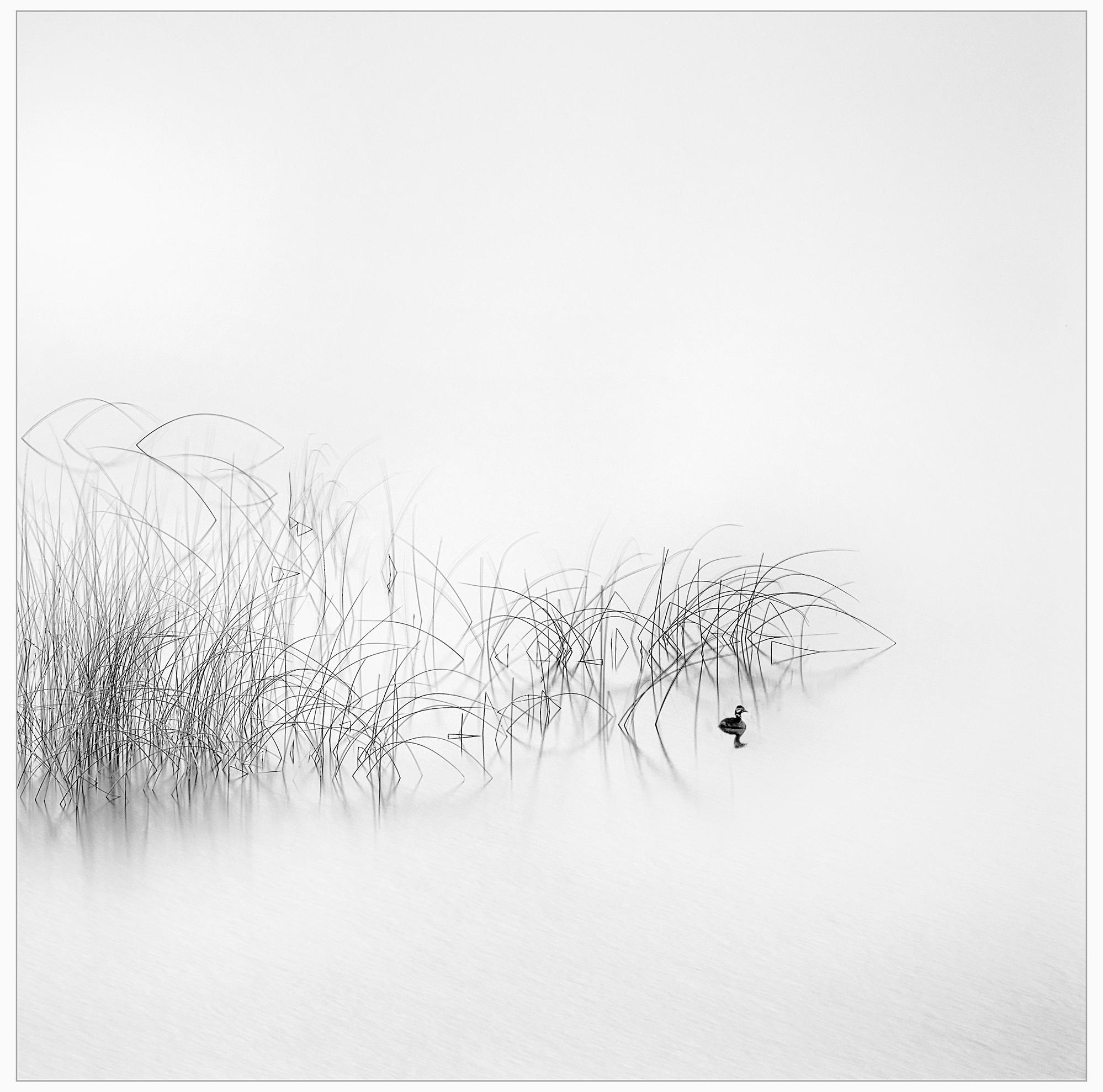
’Reeds’
This image entitled ‘Reeds’ caught my attention immediately. It is a very minimalist image, with lots of so called negative space. The detail in the reeds is superb, containing many interesting shapes, such as arches and triangles. The bird is an important component of the image, and while it is very small in the frame, it gives the image an important centre of interest. The image is high key, with lovely tones that emphasise the minimalist feel. The only true black is on the bird, which also helps focus the viewers attention on the main subject. Overall an excellent image.
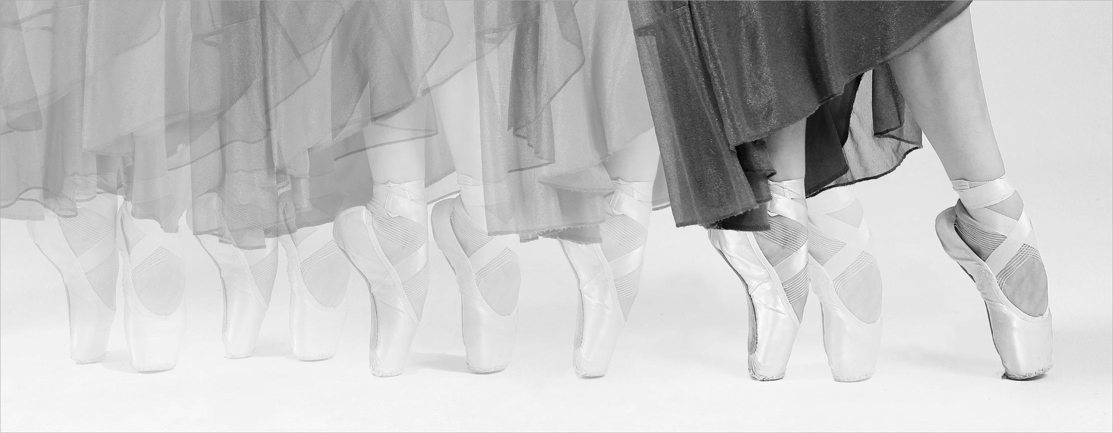
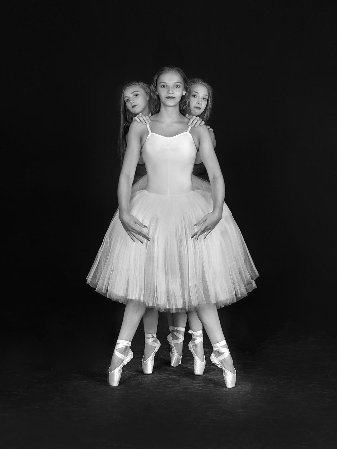
’Little Steps en pointe’
I was immediately drawn to this superbly constructed image! Each element is sharp. There are subtle differences in the dress fabric and position of the feet that lead me to believe that the image is constructed from successive frames. The mono treatment is very well considered. The author has used tonal recession from the strong well-toned right to the left which gives the viewer an increased sense of movement. Further, the letter-box aspect ratio and concentration on the ballerina’s feet emphasises the distance travelled as the ballerina moves across the floor. Super job!
SELECTOR JO SHEPHERD’S COMMENT
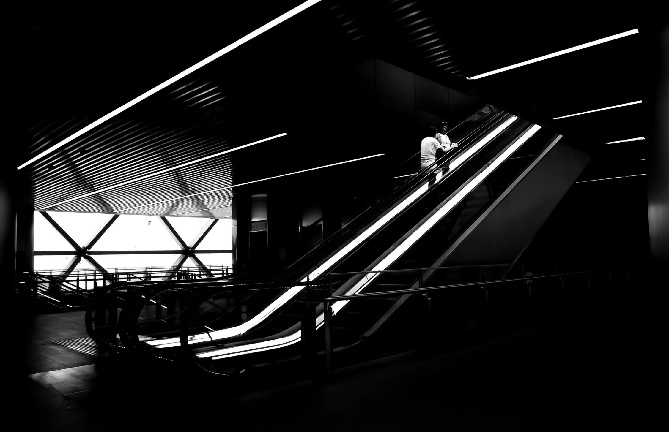
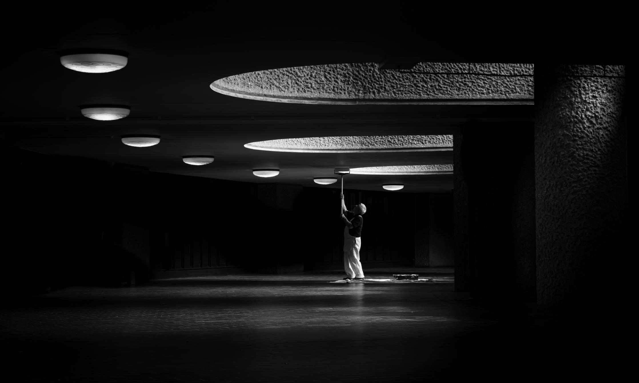
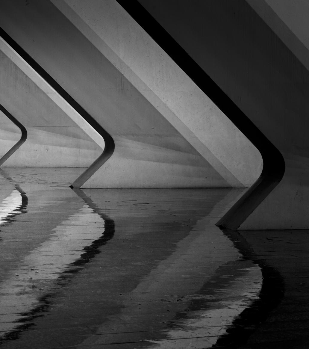
’Light Painting’
This image contains many of the ingredients for a successful monochrome picture; a wide range of tones and textures and a balanced, graphic composition. The light and shade give a depth to the image, evoking an atmosphere of quietly authentic otherness.
The curve of lights draw you through the space to the small zone of activity surrounded by a wider, darker, shadowy expanse. There is an appreciation by the photographer of the light available and consideration as to what should be included within the frame. There is timing too; the workman with his hair lit, face in shadow, mid roll, his hands, perfectly placed on the handle with the tools of his trade about him; roller, paint tray and drop cloth. The title aptly reflects both the subject and the photographer’s achievement. Well done.

World Photography Day was on 19 August 2025. Members joined in the fun and participated in creating DIG's WPD online Gallery.
Capture Date: All images submitted to this gallery were captured on World Photography Day (19-August-2025) WPD ONLINE GALLERY