WELCOME to the Creative Eye Magazine, May 2025 Issue No. 97. We have an excellent mixture of articles for you to enjoy in this issue.
Fine Art Photographer Roxanne Bouché Overton is renowned for her atmospheric images and explains the key elements on how to achieve successful ICM; retired architect, writer and photographer Patricia Tutt shares an excerpt from her embryonic book covering sixty years of architectural photography; master of light painting David Gilliver tells us of his journey exploring this magical art and encourages us to ‘give it a go.’ His book on the subject is available through his website; underwater photographer Matt Jacobs describes how he must get close to his subjects to get the image he wants, often eyeball-to-eyeball with sharks; with a fascination for light and movement, Martin Knight aims to create images that evoke emotional connections.
COMMITTEE
Chair
Clive Watkins ARPS creativecomms@rps.org
Secretary Graham Lingley LRPS creativesecretary@rps.org
I hope you enjoy this edition of the magazine. Once again Moira and the team have surpassed themselves in the quality of articles they have put together for you! New ideas are always welcome, so do contact Moira if you have anything that may be of interest to members.
This year’s Creative Eye Digital Exhibition will be upon us soon. Do start thinking about the images you would like to submit. David Rutter FRPS will be providing details of how you can take part very soon, possibly before you receive this edition of Creative Eye. The dates are given in the box below.
I have distributed a short questionnaire to see if there is enough interest for us to run an online ‘Introduction to Distinctions’ Zoom meeting. Depending on the response, there is also a possibility that we will have an online Advisory Day for those of you who are working towards a Visual Arts distinction.
We will be running our hugely popular Members’ Day again in November. The exact date has not yet been decided but we are already looking for some of our talented members to come forward and be prepared to do a short talk on the day. It can be anything photography-related that you have been working on or have an interest in.
The Creative Eye 2025 Annual General Meeting was held in March. The committee remains unchanged, so the Group retains a consistency that is vital to our continued efficient and effective management. Having said that, it is clear that we do need to bring new blood into the Group over the coming years. Please contact us if you would like to take part.
With this in mind, over the next 12 months, I will be reaching out to you, our Creative Eye members, to encourage you to get more involved with the Creative Eye through your local Regions (UK), and Chapters (Internationa l). By engaging in what is happening in these Creative Eye groups (and other Sp ecial Interest Groups), you will meet more like-minded creative photographers who live in your vicinity. You will also become more connected with the RPS in general. Whether you are working towards a distinction, or you simply want to discuss your photographic journey with others, I can guarantee there will be opportunities to do so.
Enjoy the light,
RPS Creative Eye Group
Members’ Digital Exhibition 2025
Selection Day: Sunday 20 July 2025
Open for entries: From Sunday 29 June to Friday 18 July
Organiser: David Rutter FRPS creativeimage@rps.org www.rps.org/groups/creative-eye/documents
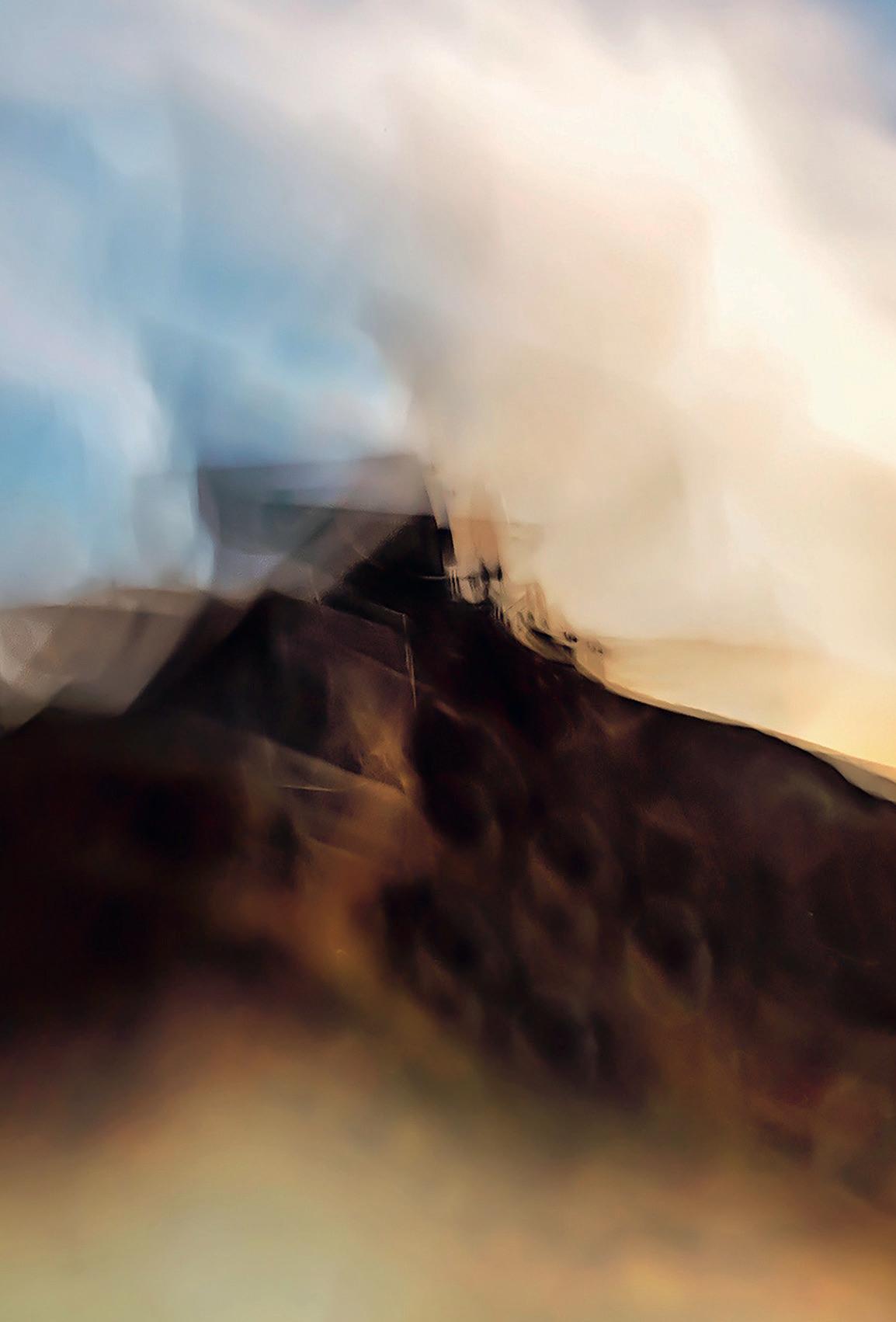
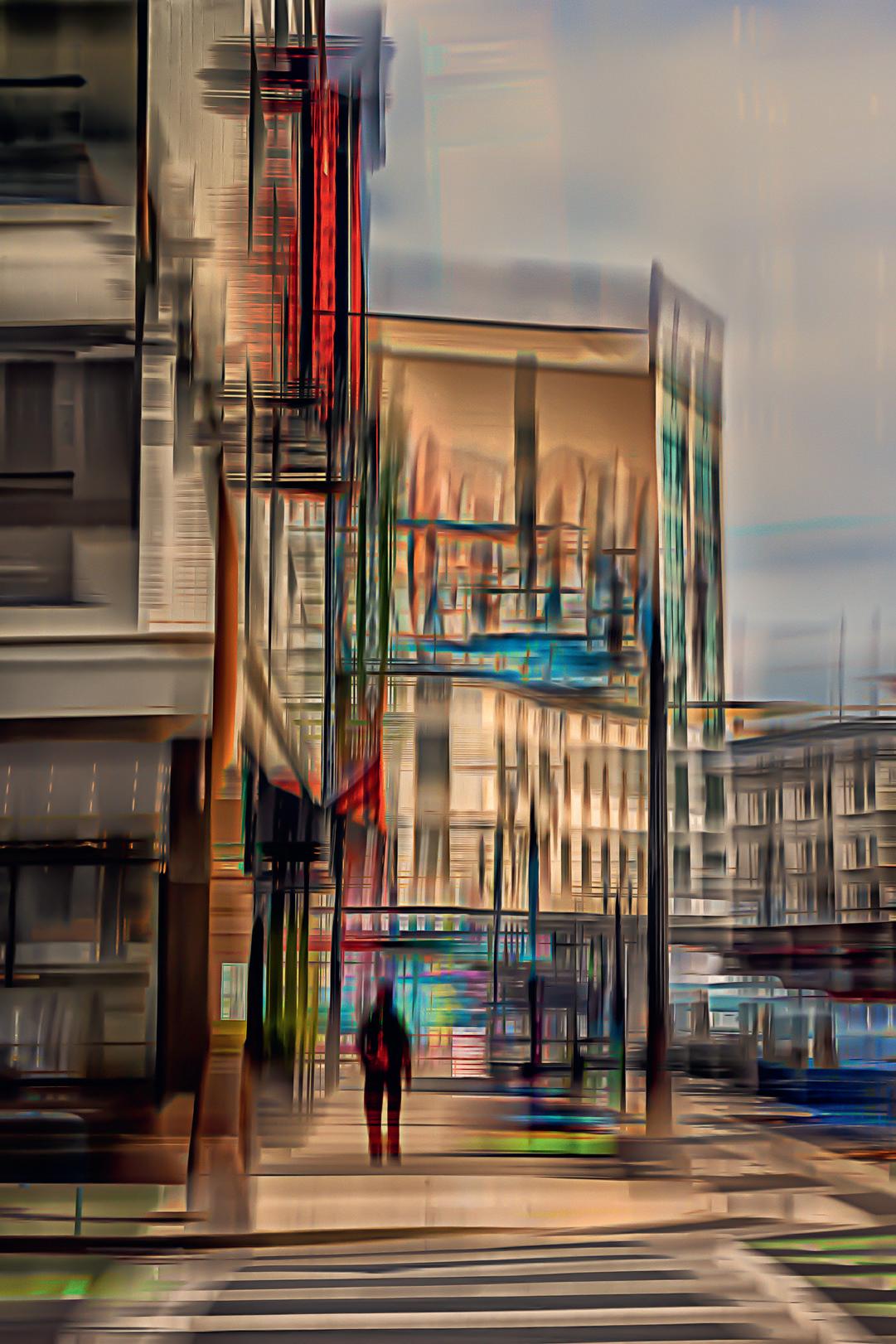
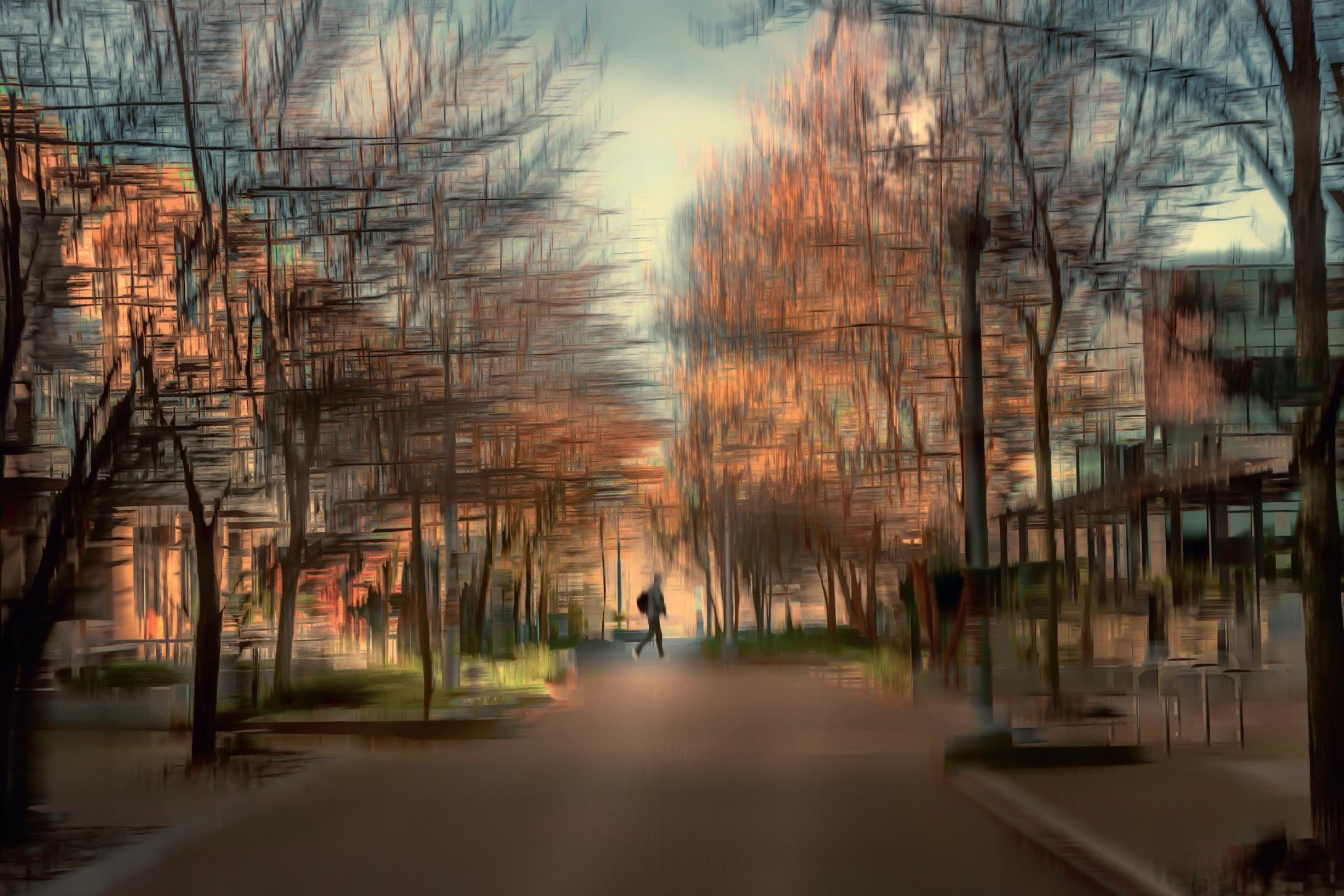
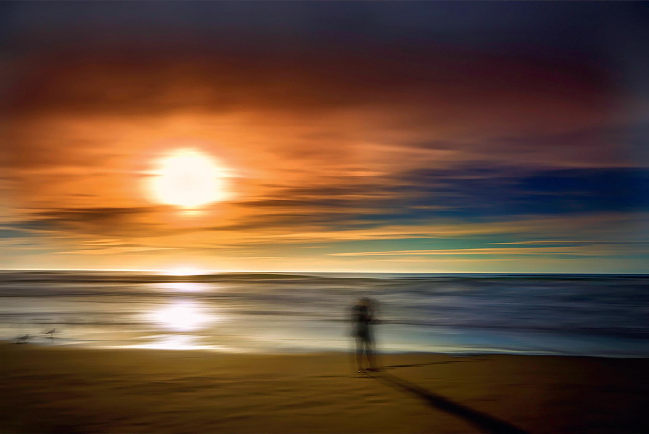
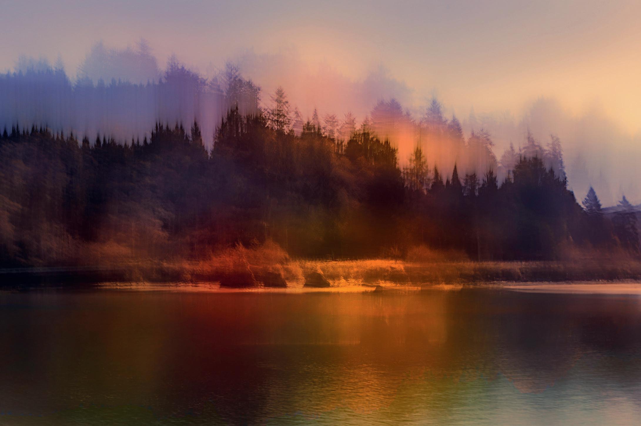
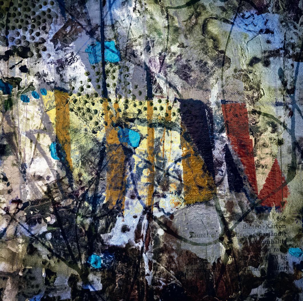
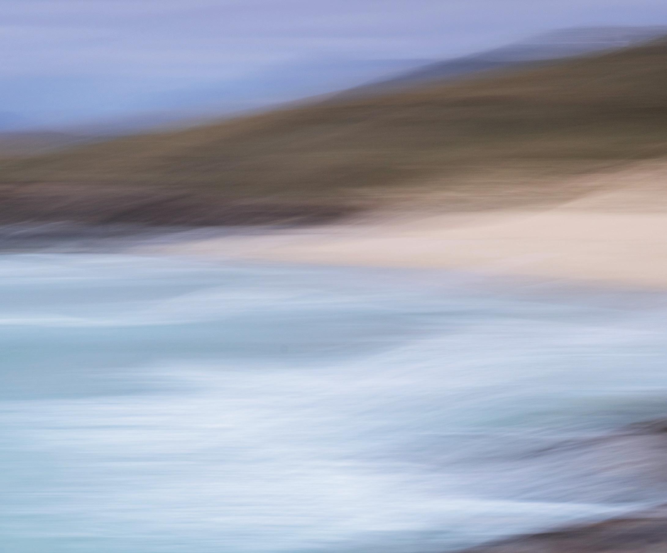
THE ART OF INTENTIONAL BLUR
BUILDING ICM ON A SOLID FOUNDATION
ROXANNE BOUCHÉ OVERTON
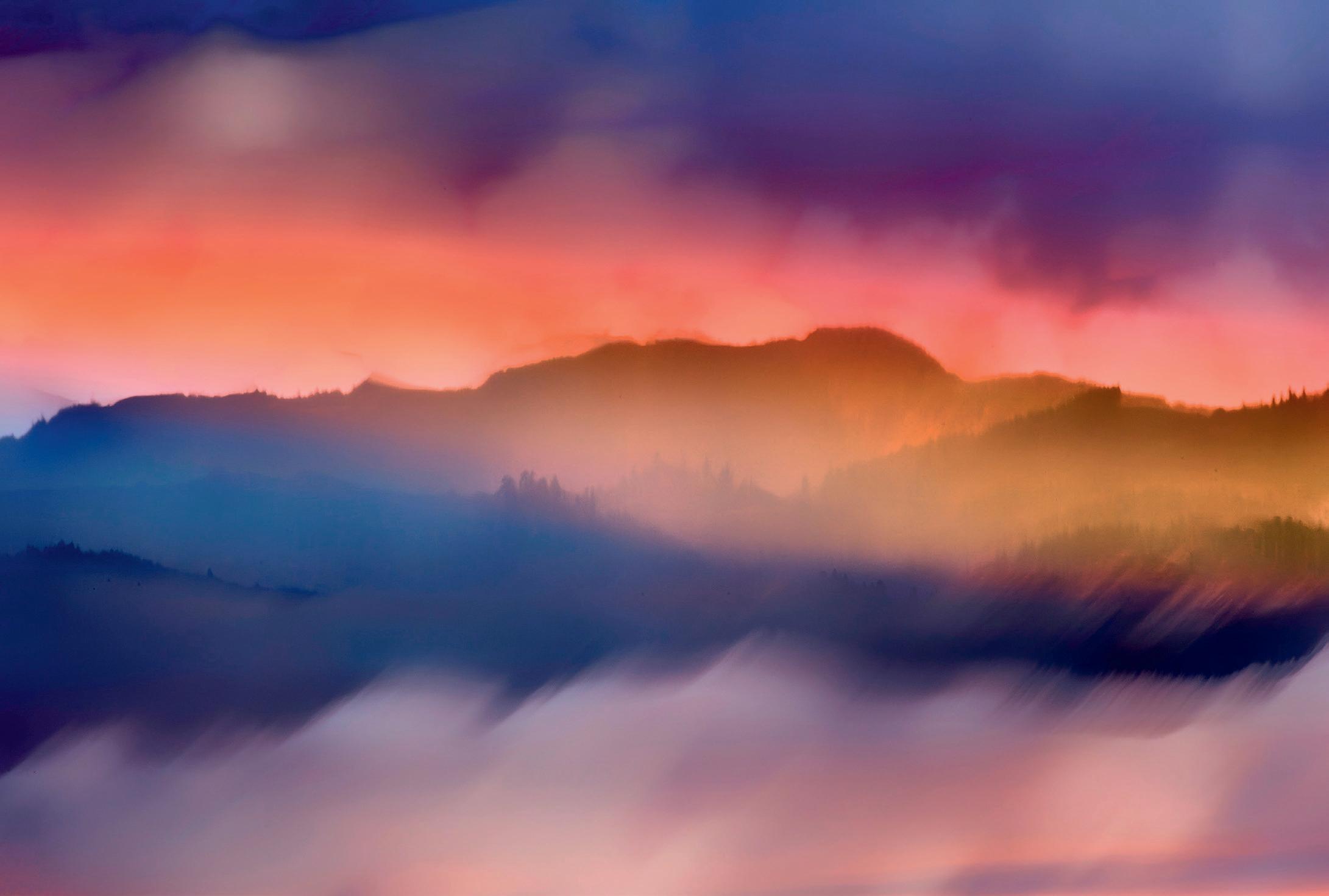
Intentional Camera Movement (ICM) photography is a dance between control and creativity, where deliberate motion transforms the ordinary into the abstract. But while ICM relies on movement to craft its unique visual language, its foundation must remain rooted in strong photographic principles. Without a solid starting point, the resulting image risks being disorienting rather than evocative.
At the heart of ICM lies the paradox: blurring an image removes the one thing the human eye instinctively seeks - sharpness. To compensate, the base photograph must excel in composition and subject awareness. These elements act as anchors in the abstract.
A lot of photographers look at ICM and think that they can go out and move their cameras around and come home with a good ICM image. They
don’t realize that at the heart of every wonderful ICM image there is a good photograph. Instead of being easier, ICM presents more challenges. You not only need that strong frame but you also need to add the controls and techniques of ICM to get the final image.
Let’s examine the key components. Experienced photographers will likely recognize them, but reviewing these elements will emphasize their critical role in achieving successful ICM.
A compelling ICM image starts with intentional framing. Whether employing the rule of thirds, leading lines, or symmetry, composition guides the viewer’s gaze. Incorporating a clear path - such as a leading line - ensures that even in abstraction, the viewer’s eye can navigate the image effortlessly.
Light is the soul of any photograph, and here, ICM can be an exception.
The direction, quality, and intensity of light shape the mood. Soft, diffused light can create dreamy textures, while dramatic lighting can enhance contrast and drama in the movement. But ICM also translates well to very flat light because the camera motion will make new lines and morph shapes often adding depth to an image that otherwise wouldn’t have it.
Colors are particularly expressive in ICM. Those that sit opposite each other on the color wheel create a bold and striking contrast, adding energy and vibrancy to an image. Colors that sit next to each other on the color wheel create a harmonious and unified look. I often compose with color using it to add balance and weight to the frame. Contrast adds depth, making the blurred elements feel dynamic rather than muddy.
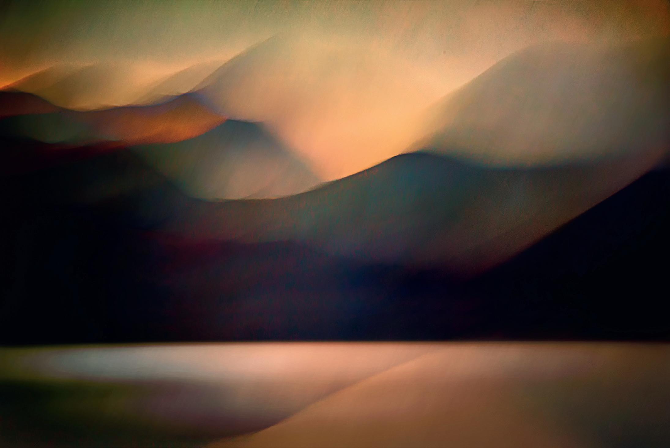
I like to include a single point of sharpness amidst the blur. It serves
Mountains High
as a visual anchor, allowing the eye to pause before exploring the rest of the image. This focal point, even just a snippet of a clear line, grounds the abstraction in a relatable reality. It’s how the human eye perceives the world, so by introducing a touch of sharpness, we offer a sense of visual familiarity.
An ICM photograph thrives on clarity of intent. Simplify the composition by eliminating unnecessary distractions. The fewer elements competing for attention, the more powerful the motion becomes.
One huge difference between subjects within an ICM image versus a conventional photograph can come down to shapes. Sometimes something unsightly, like a light post, fuel pump or signs, that would intrude in a conventional image, add shape, color and interest with ICM as they morph into something unrecognizable but often lovely.
Even in its abstract form, ICM has the power to evoke emotion and tell a story. Whether it’s the movement of wind through a forest or the chaos of a bustling city street, the photographer’s vision should shine through the abstraction.
By refining your visual awareness and mastering the foundational elements of photography, you can elevate your ICM images from mere experiments to compelling works of art.
I decide how to move my camera and how long to expose depending on my subject and my intent for the final image. Unlike classic photography, where following a few simple rules will get you a good photograph, ICM is different. It takes time, trial and error, to learn what happens when you move the camera. You must be playful, adventurous and willing to try everything.
Start with a door or window with nice contrasting trim. Set your shutter at 1/15th sec. Move your camera in line with the vertical edge. Try moving slowly. Then move at a medium speed. Finally, move fast. Then switch to horizontal movement and do the same thing. Now change your shutter speed and try it at 1/8th second. Do the same thing. Keeping lines straight is harder the slower your shutter. Then try something slower yet.
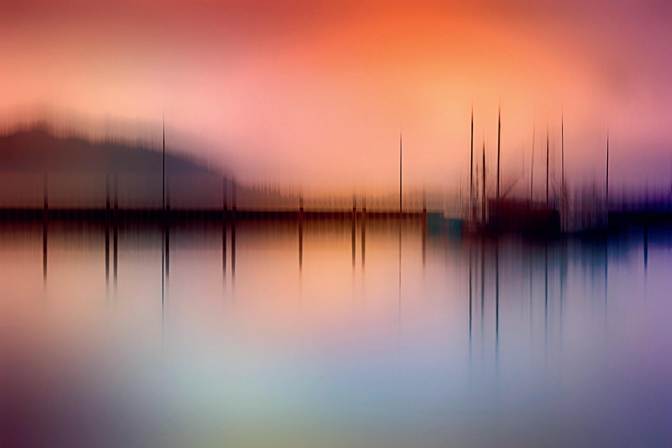
Winter Light
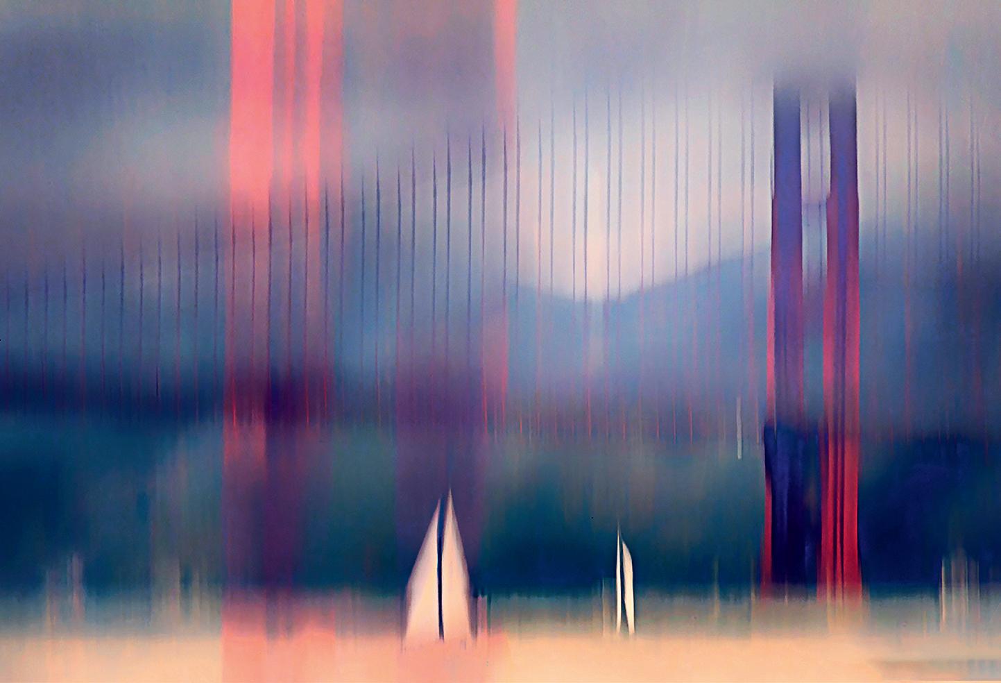
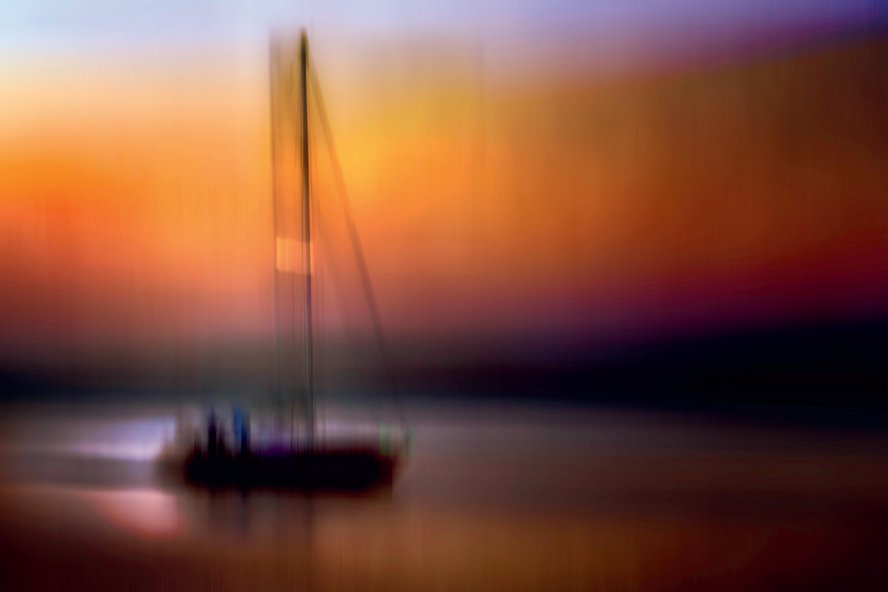
Sailing the Gate
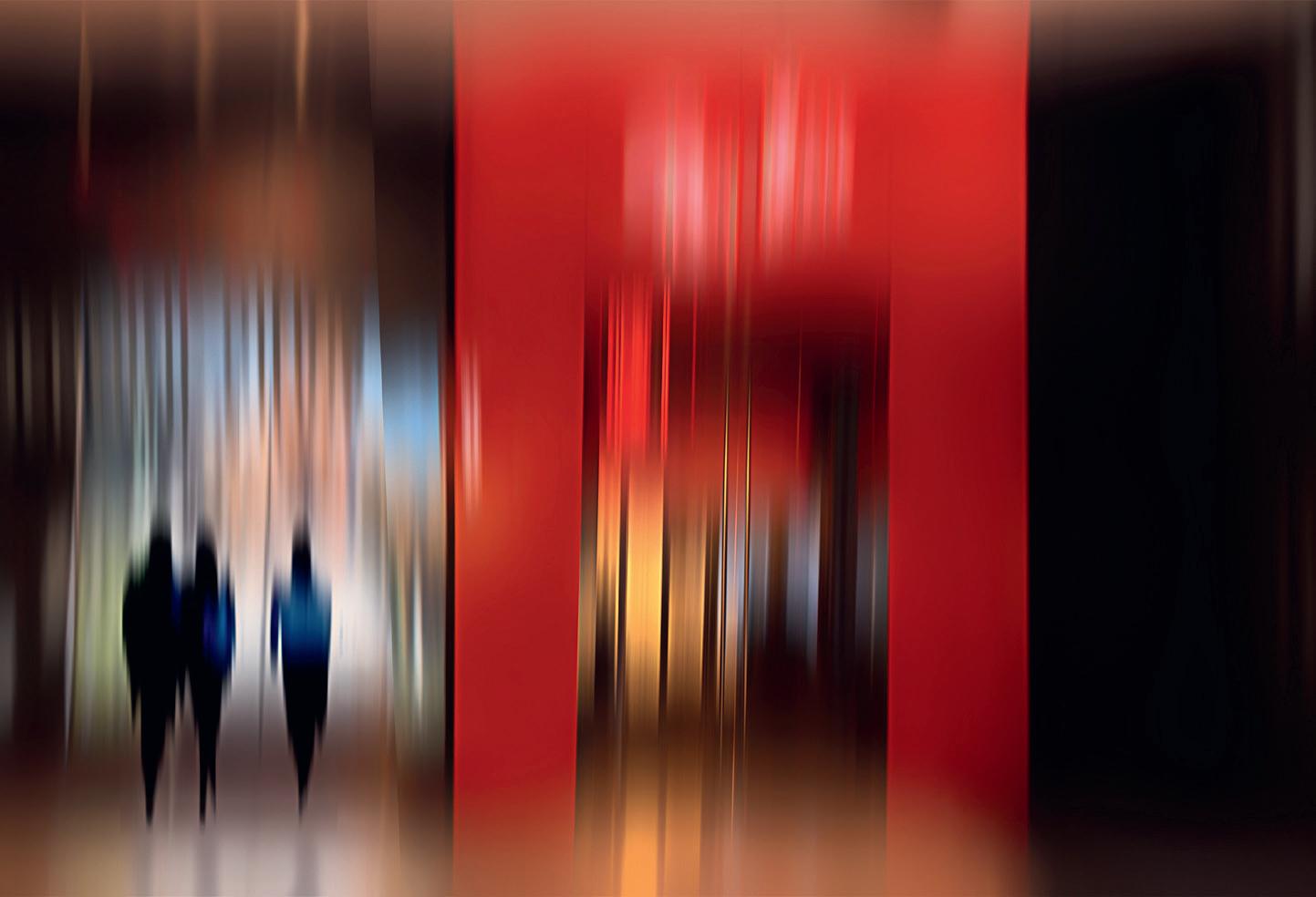
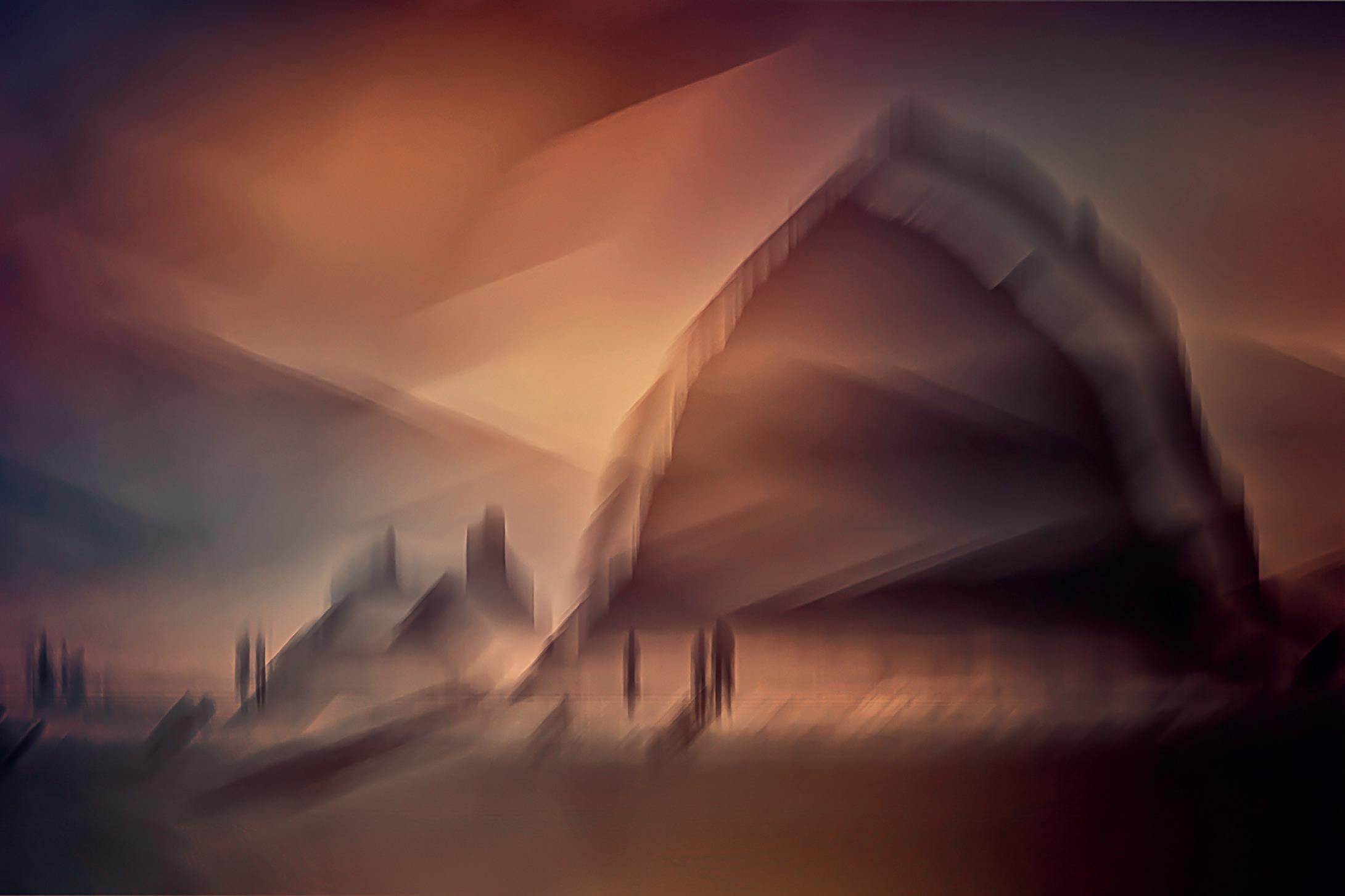
Red Portal
You are not only training your body to sync with the camera; the results you get and review after each shot, are feeding your brain. Practice and shoot enough and it will all become instinctual.
Without a well-composed base, the image can feel like noise rather than music. Success in ICM isn’t about randomly moving the camera; it’s about moving it with purpose. It’s gaining experience and refining skills. It takes work and patience and it’s the reason so many people give up. They want an easy formula. But for those of us who stick with it – the rewards are infinite.
Think of ICM as a symphony. The motion is the melody, but the photograph beneath it is the harmony that holds it all together. And the photographer is the conductor producing superb results.
ICM invites you to explore the art of movement. Embrace the journey, and watch your blurred experiments transform into intentional masterpieces.
I have free blogs on my website as well as the list of books I’ve written to help people accelerate their photographic journey. You will also find information about my Zoom and onlocation workshops.
Portland Stroll
The Headlands
At Water’s Edge
Heading Home
Dawn Light Haystack Rock
ARCHITECTURAL PHOTOGRAPHY CATCHING THE MOOD
PATRICIA TUTT RIBA ARPS
This is an excerpt from a book on architectural photography that I am working on – and have yet to put before a publisher. Who knows if it will see the light of day other than as a hefty pdf on my website… As it will cover my sixty years of photographing architecture, I have dated each image. I’d hate for people to turn up to re-photograph one of these buildings, only to find it long since gone.
One way to approach architectural subjects is to try to match the style, mood or character of a building in your photography. If photographing historical architecture, can you simulate an appropriate artistic style –formal Classicism, florid Baroque, lofty Gothic - and try to avoid constructing a Gothic cliché with the likes of a fakedup night shot of Whitby Abbey.
If photographing new architecture, does your photography catch the zeitgeist? Think functional Modernism, clunky Post-Modernism, aggressive Brutalism, elegant Minimalism, edgy Deconstructivism…
I was prompted in this thought by remembering how professional architectural photography briefly departed from the static large-format model that has been the norm from
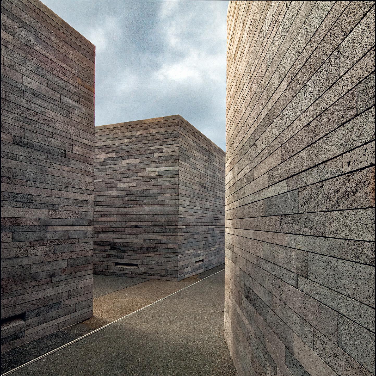
Casa das Mudas, Calheta, Madeira, 2010 [Paulo David, 2004]
I fell in love with the Minimalist architectonic qualities of this building, perched on a precipice, with its blocks of tightly layered local basalt, but unfortunately, the people I was travelling with didn’t want to linger, or visit the very tempting Man Ray Exhibition inside. I call this The Maze.
the early days of the medium. In the ‘sixties, some of the most innovative architectural photographers adopted the SLR and used what we would now consider to be a ‘street’ approach to photographing architecture. Their images were gritty, dynamic, and taken in all types of weather – and perfectly matched the equally grungy appearance of much of the Late Modernism and heavy Brutalism then in vogue. They also did the unthinkable, and included people.
Names such as Eric de Maré, John Donat, Tony Ray-Jones, Henk Snoek and Richard Einzig come to mind, although the latter two mostly worked large format. Before them, Dell and Wainwright were the star photographers of the Architectural Press, producing photographs on glass plates that perfectly caught the
aesthetic of ‘thirties Modernism. It was widely alleged that architects designed their buildings to look good in Dell and Wainwright’s photographs – and we all designed in black and white because we only saw the new architecture represented in that medium. These photographers all worked before the digital age, so their work can be hard to find online. Visit the RIBA library in Portland Place, or ribapix.com online to see some of their work. Those names from the ‘sixties and ‘seventies deserve to be better known. They are casualties, as so many other British photographers are, of the American bias in the historiography of photography. This is now being addressed, to a small degree, but it remains difficult when so many brilliant images are not in the public domain.
Royal Insurance Building, Liverpool, now known as The Capital [Tripe and Wakeham Partnership, 1976] Local wags refer to it as ‘The Sandcastle.’ Photographed in the late ‘seventies. I was working for the architect at the time, and was trying to capture the Brutalist form with the dynamic composition.
Cultural
This is typical of my style in the 1980s – working on film and letting the shadows go, using them, here, to express the form of the building – simple barrel vaults dressed into box
This architect’s work was always photogenic if not particularly user-friendly.
French
Centre, Malawi, 1981 [Peter Palmer]
gutters.
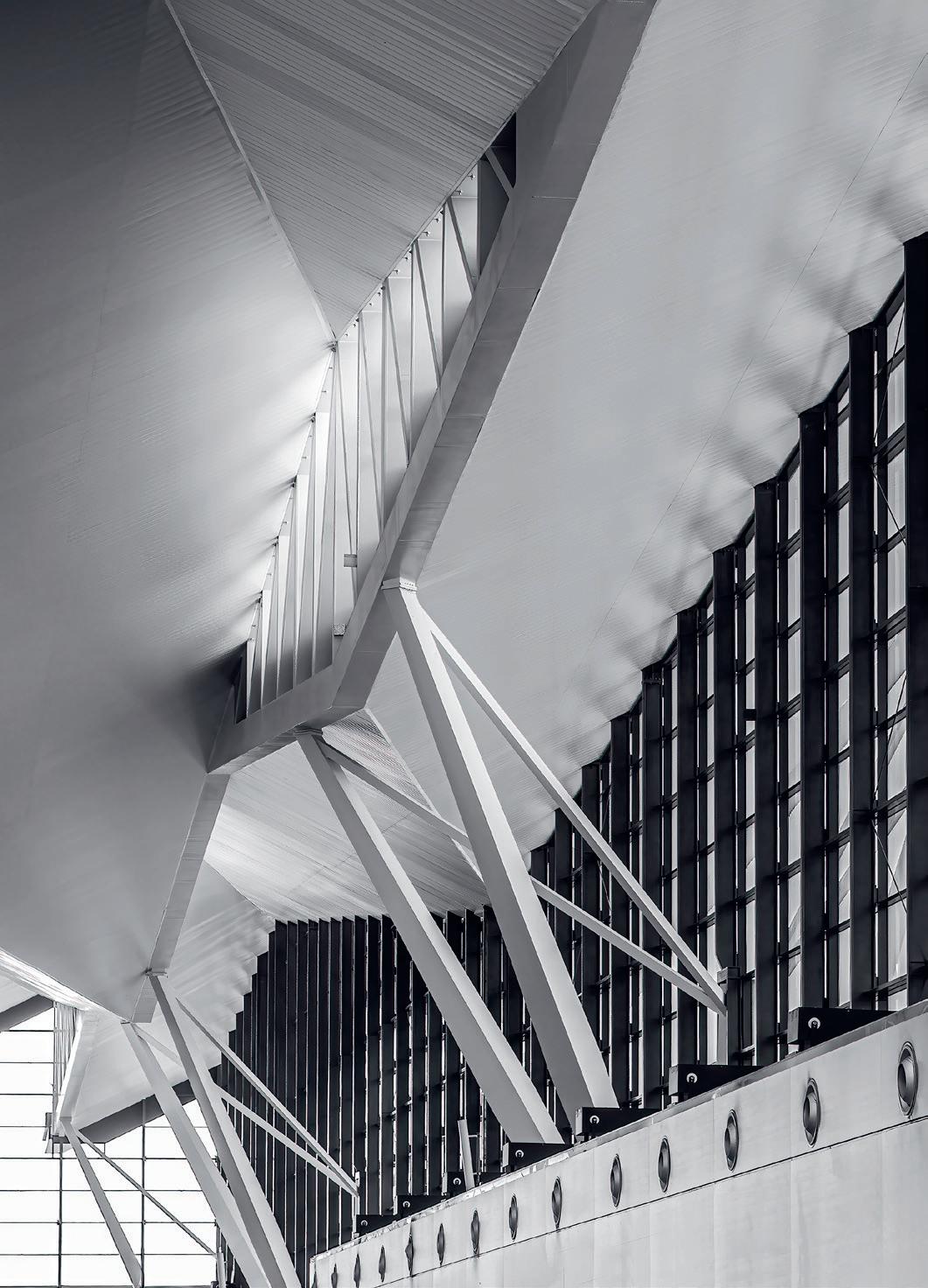
Departure Hall, Terminal 2, Gdańsk Lech Wałęsa Airport, 2015 [J.S.K. Architekci Sp. z o. o 2012]
In a section of my book on photographic strategies, I discuss using visual metaphor, and this view with its allusion to flight illustrates that. Sometimes, interiors have more to say than exteriors.
It can be remarkably difficult to track down interesting contemporary architecture outside the big cities.
I realised, somewhat late in the day, that universities can be great places to find innovative and creative contemporary architecture. It lures rich donors and culture-hungry students and provides fresh material for architectural photographers, few of whom seem to have realised their potential. One architecture-savvy campus procurement model can offer a microcosm of British architecture. I, for one, am tired of seeing the same tired old shots recycled by a neverending stream of mimics. There’s fresh material out there, well away from the usual stomping grounds of photography tour leaders, and it presents the opportunity to explore styles, periods and functions.
These days, I often prefer to put together sets or series. This encourages me to more fully explore the potential in a building or related group of buildings, which I can assemble as composites, sets, zines, or exhibitions: much more fun than single shots.
patriciatutt.com
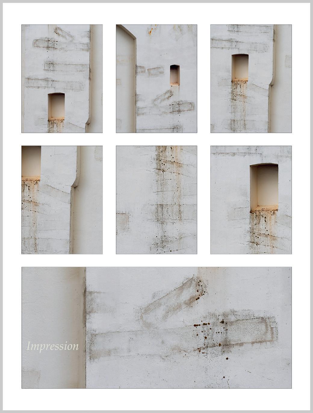
Opposite (below left)
Impressions, Ramsey, Isle of Man, 2024
Shall I tell what this is, or leave it to you to guess? These are straight shots, taken through my car window.
Opposite (below right)
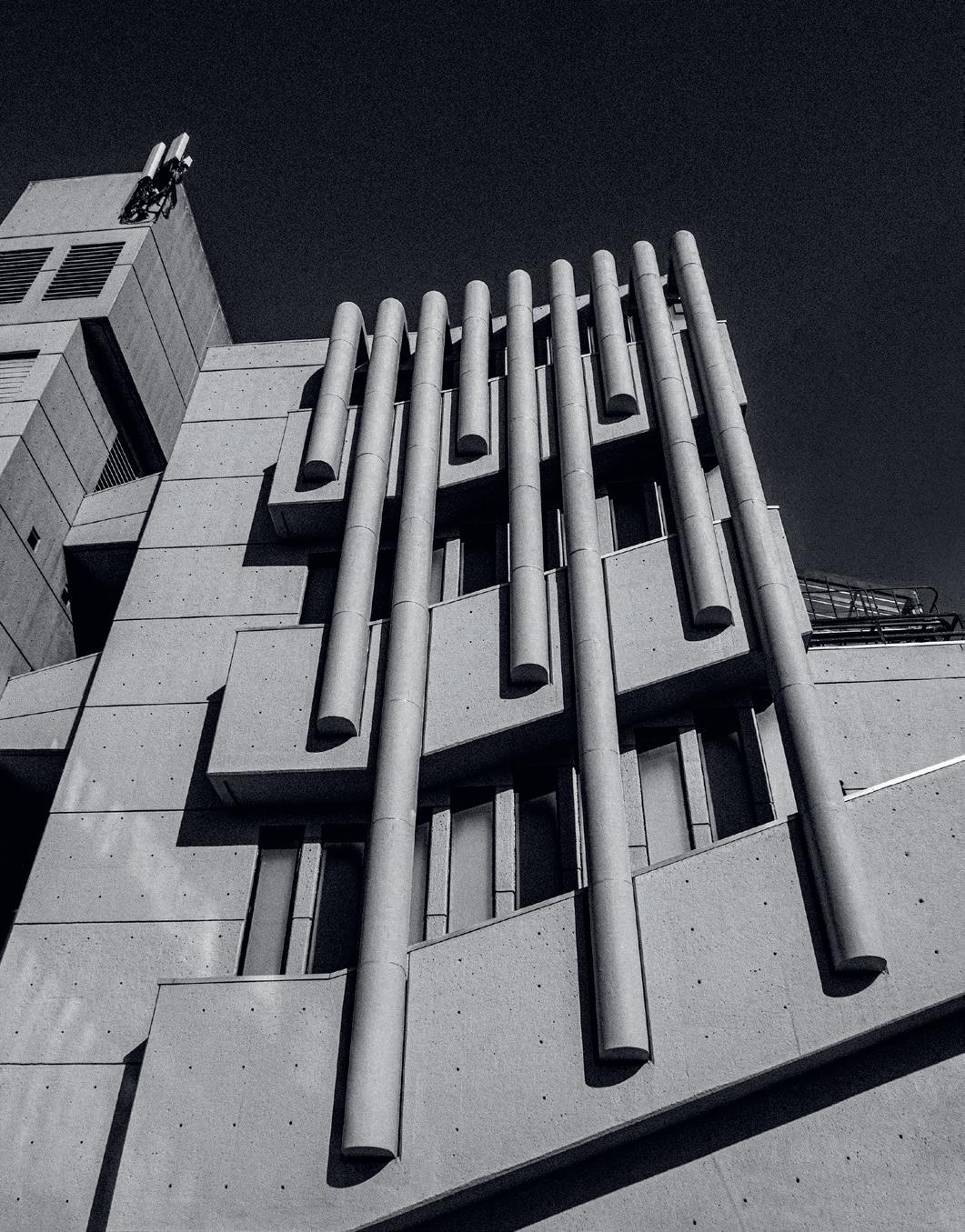
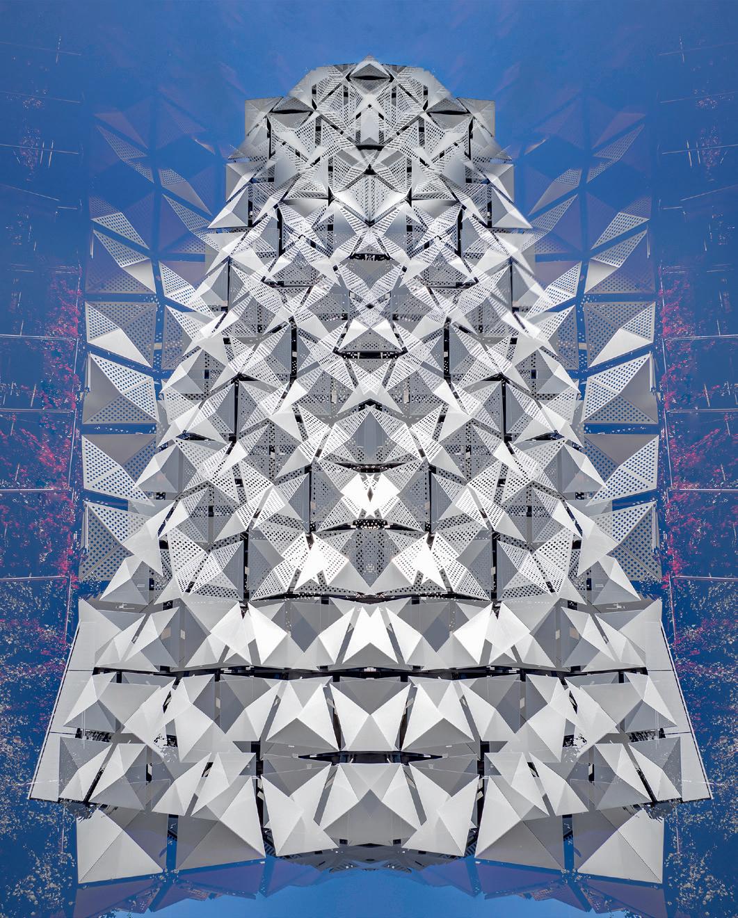
Faceted façade, University of Leeds car park, 2024 [Carey Jones Chapman Tolcher, 2016]
In the ‘seventies, architects resorted to Brutalist concrete panels to screen vehicles in multi-storey car parks. Not so now. There are many more options to choose from. This building is clad with asymmetrical four-sided pyramidal panels, pierced on three of the planes. It shimmers in the light, and I have tried to reflect that in my blended abstracted image.
Right
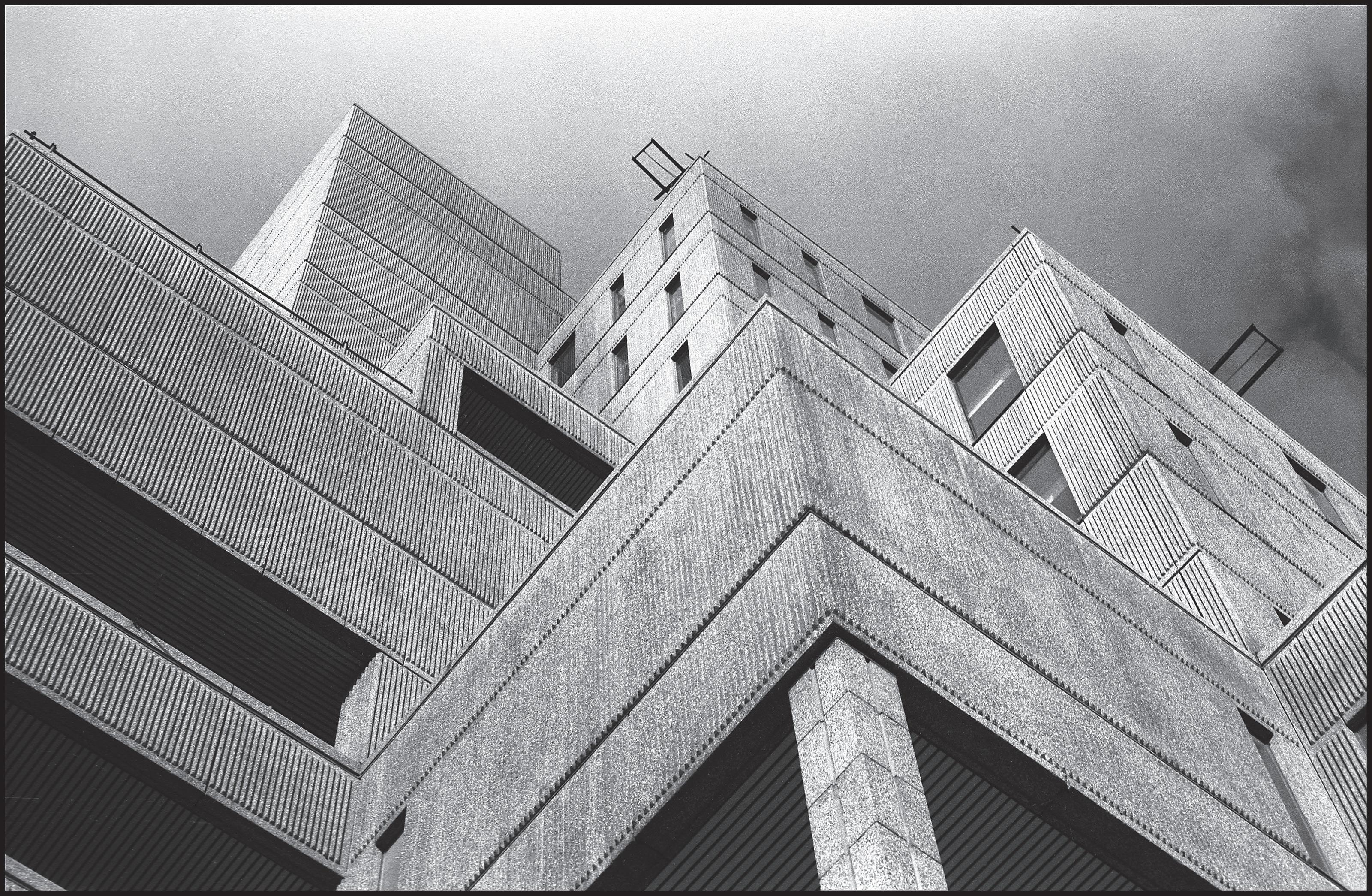
Roger Stevens Building, University of Leeds, 2022 [Chamberlin, Powell and Bon, 1970, Grade II* listed]
A Brutalist angle on a Brutalist building (mono, punchy, and a crisp, aggressive composition). Universities were expanding in the 1970s to cope with larger student numbers, often with a preponderance of Brutalist architecture. Not all of it has survived well. This lecture theatre building still looks good, but catch others before they are gone. The angled reflections on the wall come from the pool in the landscaped area below.
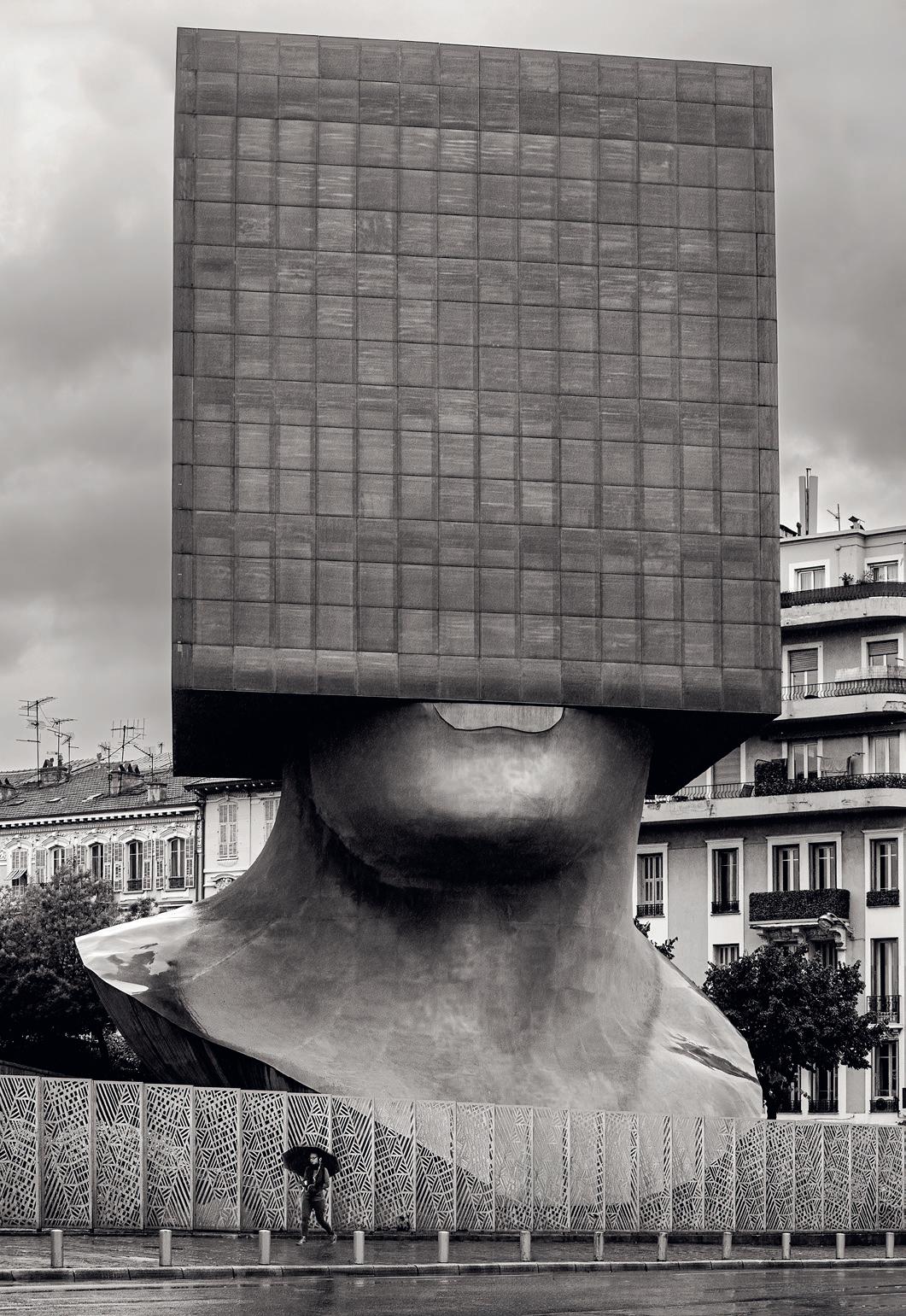
Square Head, Nice, 2016
This extraordinary office building was photographed in heavy rain, which complements the moody vibe. It’s a collaboration between sculptor Sacha Sosno and architect Yves Bayard and was opened in 2002. I have toned it slightly – and wiped the dribble off his chin.
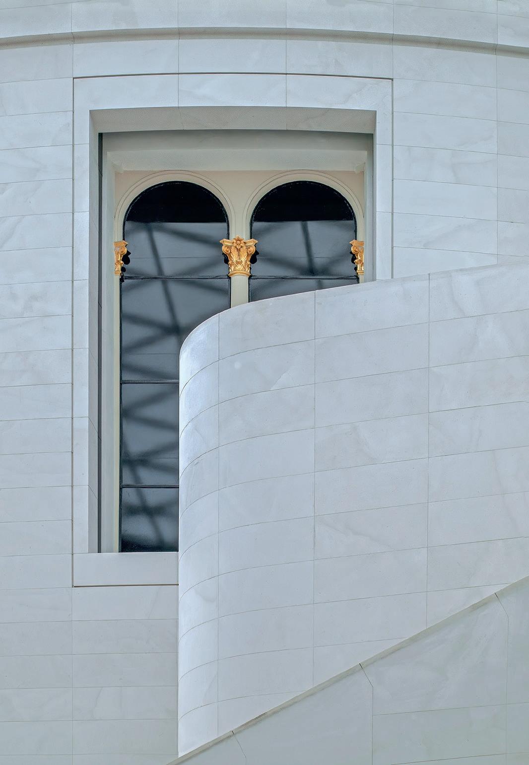
Great Court, British Museum, 2011 [Foster + Partners, 1999]
This view matches the serenity of the almost Minimalist late Modernism. I have retained the cyan cast to the stone, coming from the tint of the glazed roof, but have slightly punched up the gold of the capitals. Soft light has meant that the shadow of the roof structure does not intrude on the stone in this shot.
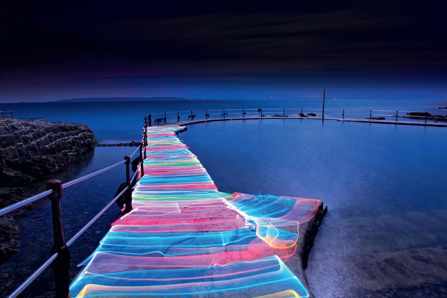
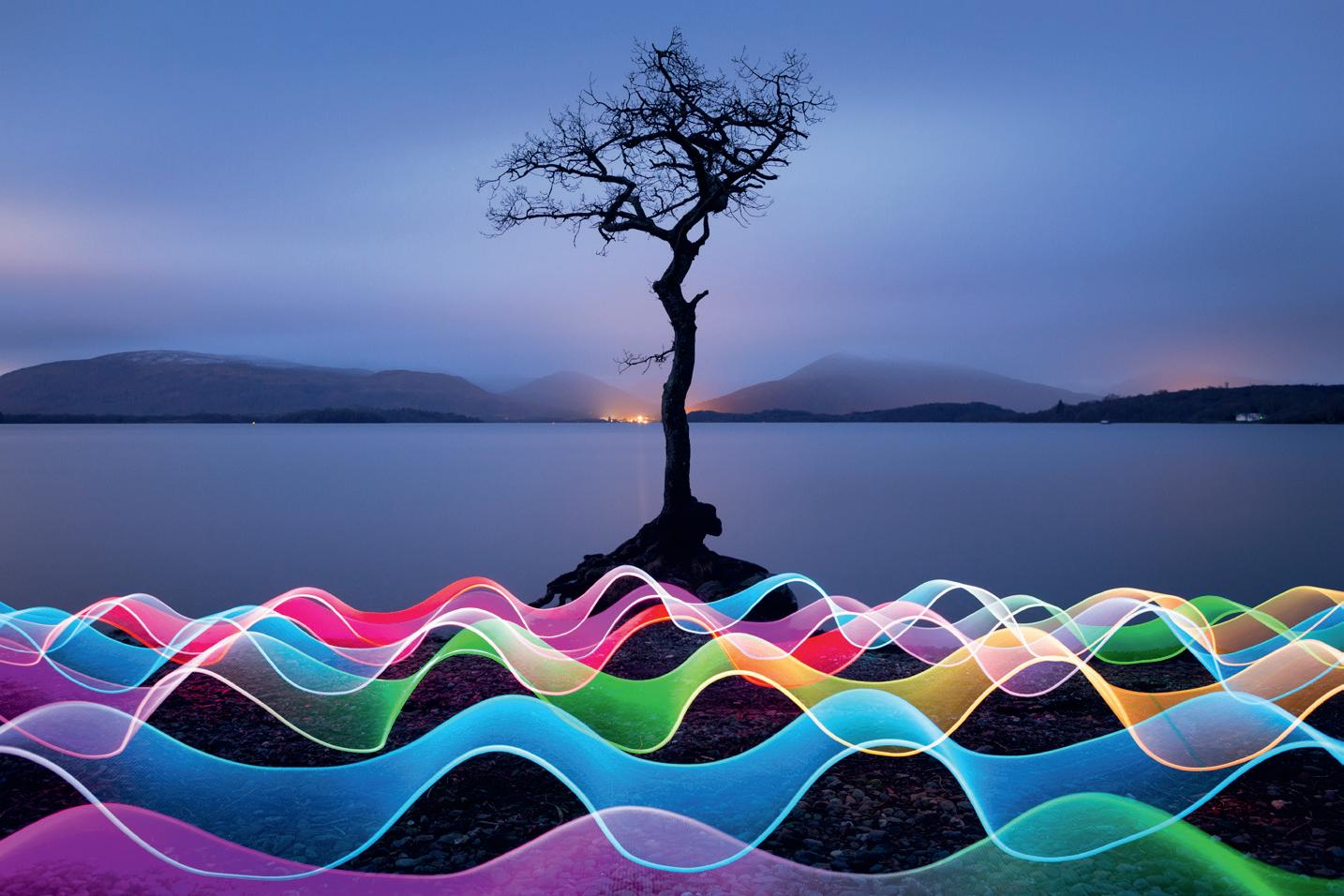
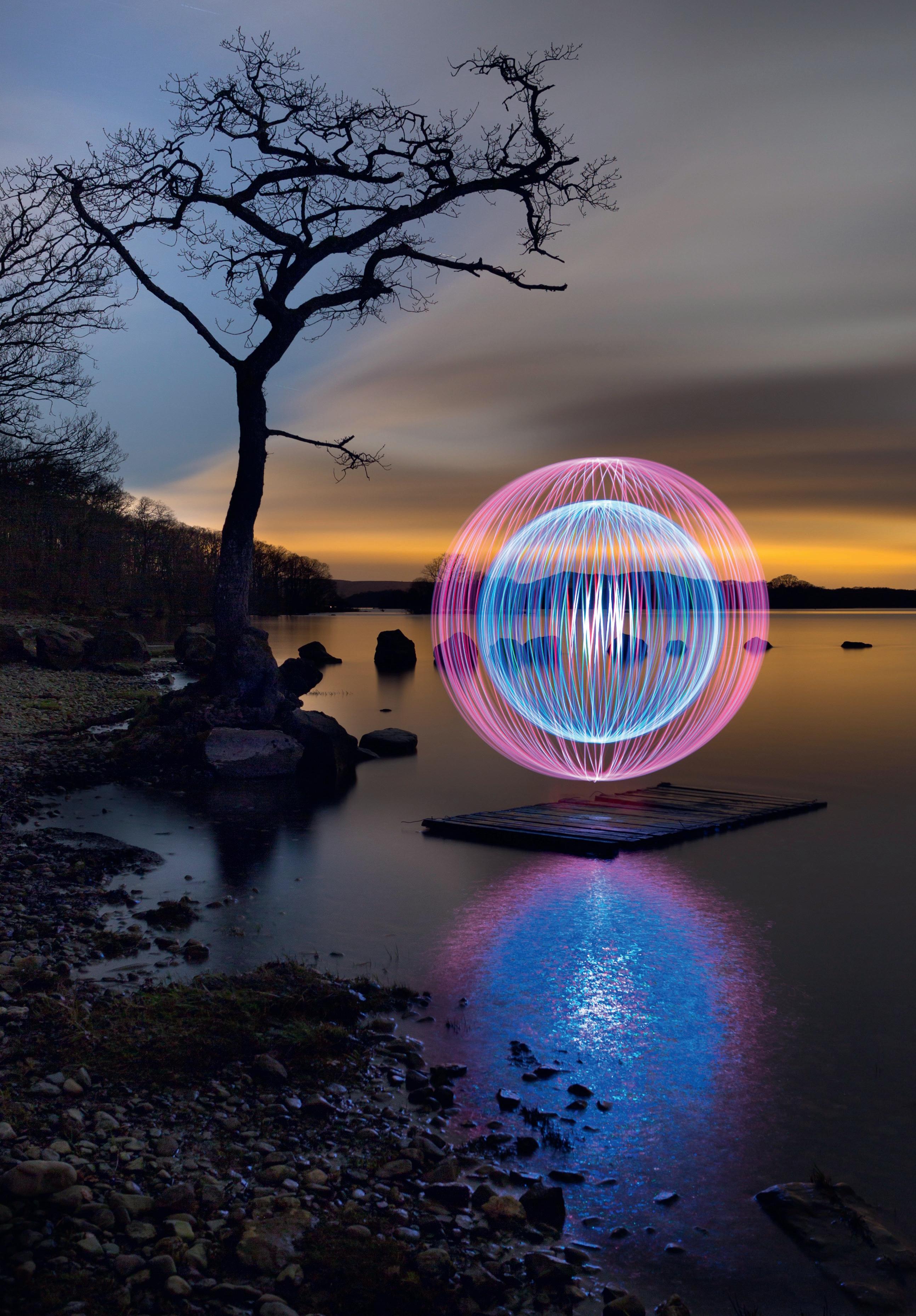
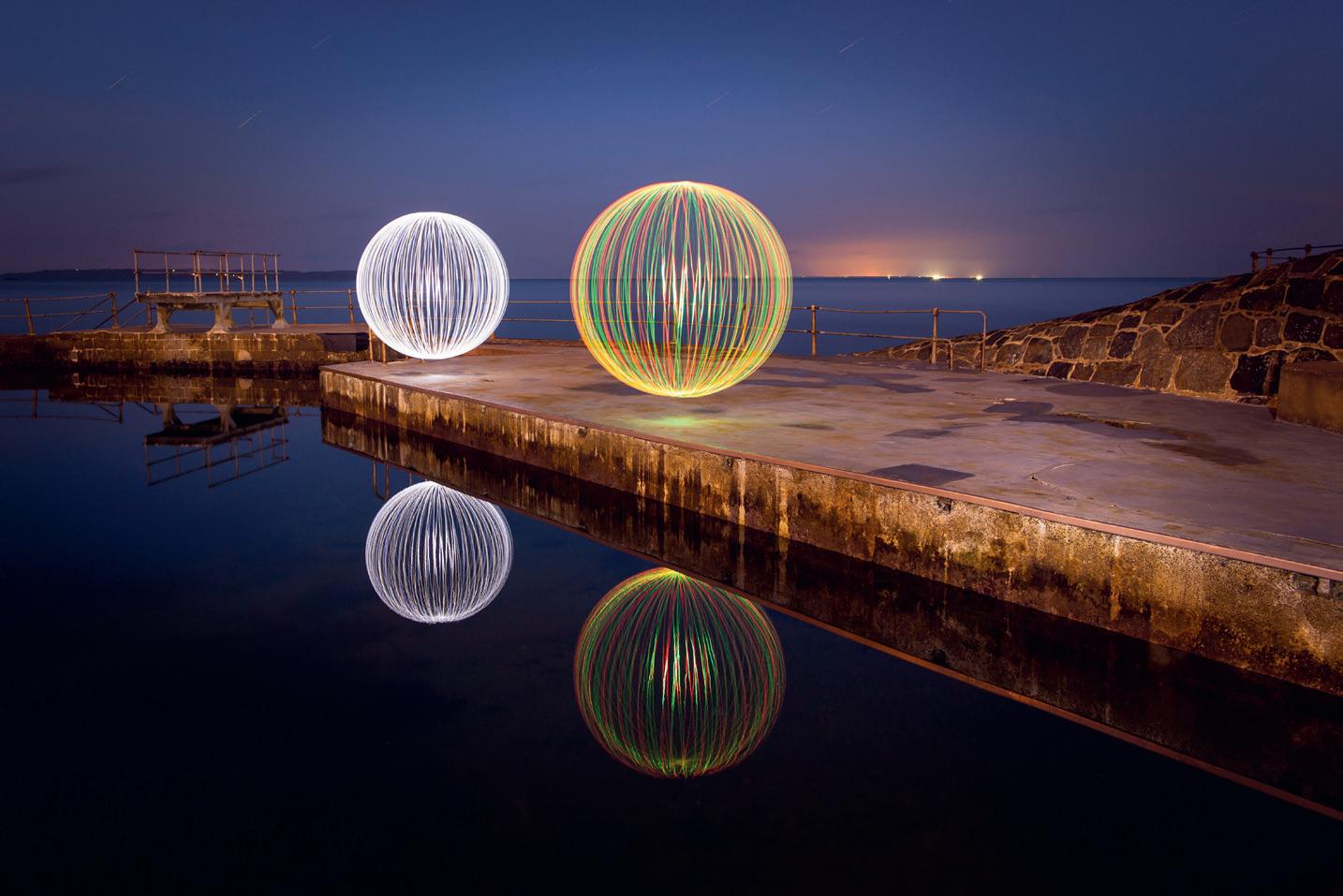
THE MAGICAL ART OF LIGHT PAINTING
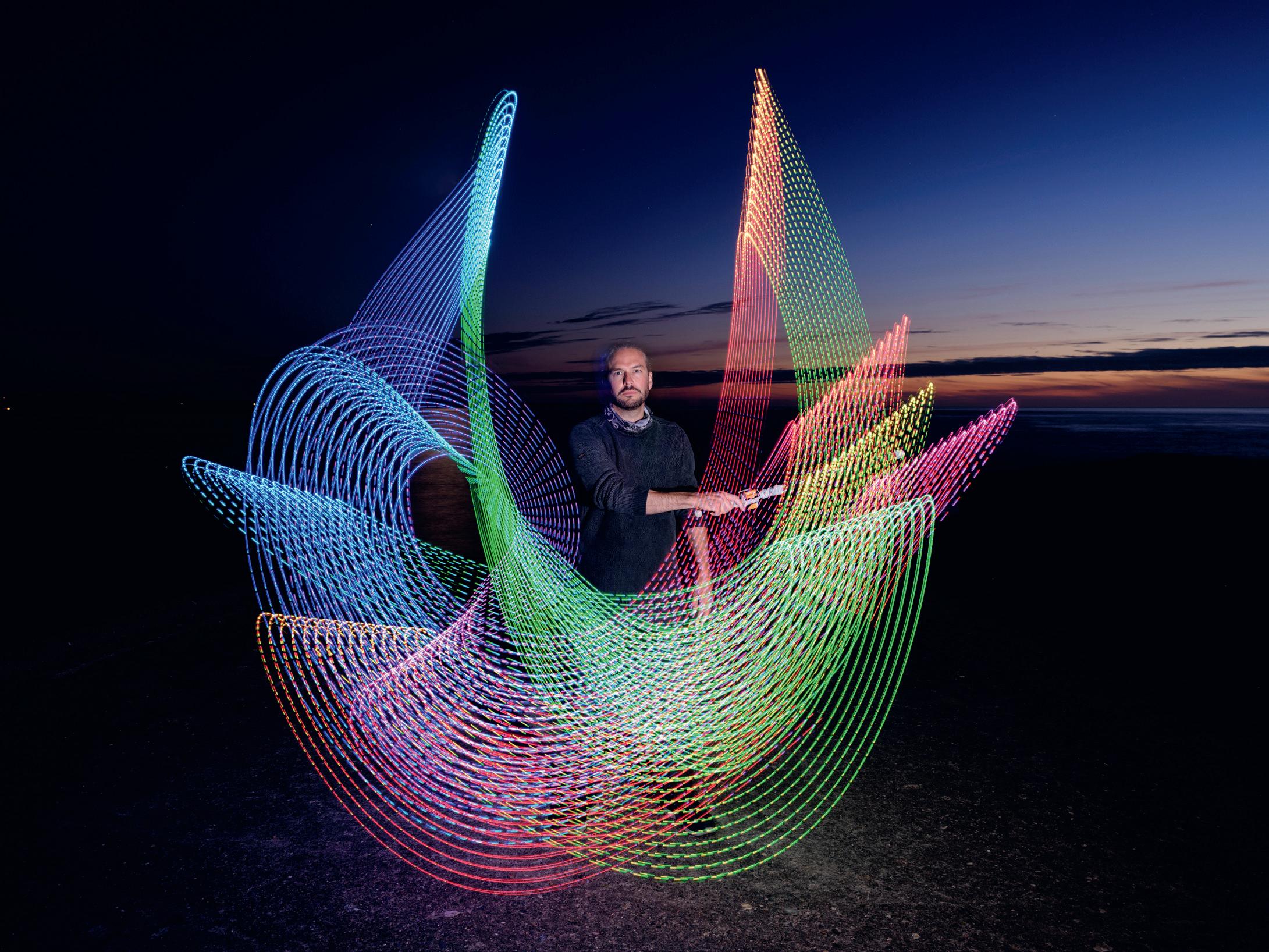
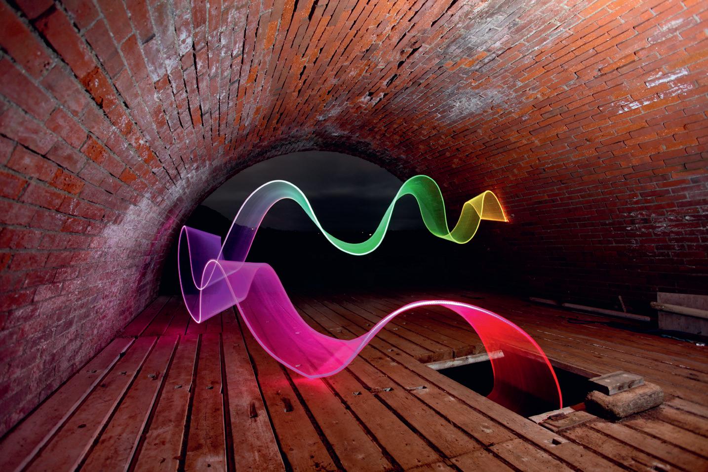
DAVID GILLIVER
What makes these images so special is that they are all created using a very long exposure time and are created at night when it is very dark. The long exposure allows me time to walk into the shot while it is being photographed. I then move around portable light devices to create the colours and shapes frozen into each image. So long as I keep moving around during each exposure and avoiding illuminating myself, I remain invisible in the resulting photograph.
Iam a full-time Photographer/Artist and have been making photographs for over 25 years, having initially studied Fine Art Photography at the Glasgow School of Art in the late 90s. I specialise in two rather niche areas of photography: Macro Photography (my ‘Little People’ series) and Light Painting. I have been in love with macro photography since my time at art school, but my passion for Light
Painting arrived a little later when I started experimenting with this magical artform in 2008. This article is going to focus on what I believe to be the most immersive and magical of all photographic styles and techniques: The Art of Light Painting.
Before I took the plunge and became a full-time Photographer/ Artist I spent 14 years working in the Offshore Finance sector on Guernsey
in the Channel Islands. After my degree I (rather shamefully) didn’t pick up a camera for several years. This was, in part, because during this time the digital era was arriving, and I initially felt some resistance towards digital cameras. In all honesty, this was more to do with feeling like I’d have to begin my educational journey back to photography from scratch, which was daunting at the time. However, in
2007/2008, I was gifted my first digital camera (a Canon 1000D) by my sister which encouraged me to pick up a camera once again.
During my time working in an office, I spent many hours staring at the photographs that adorned the walls in our meeting rooms and board room - I felt they were almost taunting me at times because I had momentarily turned my back on my own photography practice. Eventually the creative itch grew too strong, and I decided it was time to familiarise myself with my new camera and so I used the many land and seascape images I was surrounded by as my initial inspiration. They represented the work of several very competent Guernsey photographers who were all using digital cameras, and so began my journey back to photography.
Having been trained as a Fine Art Photographer, it was never going to be enough for me to merely capture the island in a technically sound (and typical) way similar to the work I was already seeing, and so I decided to focus mainly on documenting the island at nighttime which no-one else seemed to be doing at the time. I strove to capture landscapes that had already been documented countless times by other photographers, but in a way that felt fresh and visually challenging. Light Painting would eventually offer me the mechanism through which I could do this.
I spent the next seven years exploring the island of Guernsey under the cover of darkness, and when I returned to Scotland with my family in 2014, I continued my light painting journey, venturing out to some pretty dramatic and grandiose landscapes at nighttime.
Loch Lomond Light II, Scotland 24mm, ISO 250, 150sec at f4.5
Where Rainbows Sleep - Created on Guernsey 17mm, ISO 200, 32sec at f4.5
Rainbow Road - Outdoor Bathing Pools, Guernsey 24mm, ISO 200, 209sec at f7.1
Loch Lomond Light, Scotland
24mm, ISO 100, 360sec at f6.3
Over the years I have had countless other photographers ask me if I can also teach them about this magical artform, and I now run regular workshops out of a studio at the Summerlee Museum in Coatbridge. I have discovered that one of my favourite things to do is share my passion for Light Painting and Macro Photography, and my workshops mean that I get to travel the length and breadth of the UK delivering my workshops to schools, colleges, camera clubs and societies. Do feel free to contact me via my website if you would like to make a booking.
I very much view my outdoor Light Painting photography as an extension of landscape photography, and I implore anyone out there who has not yet been on an outdoor light painting shoot to give it a go. It is such an experimental form of photography, and you will make plenty of mistakes along the way (I know I have - and I continue to do so regularly) but I promise you will have fun making those mistakes. Afterall, isn’t that the best way to learn any new technique? One of the many benefits of Light Painting is that even the mistakes can yield some seriously fascinating results.
I hope this short summary of my journey into discovering Light Painting inspires you to give it a go. I promise that with just a little guidance and the right tools, it will open an entirely new creative way of thinking for you as a photographer. Out of the thousands of people I have taught over the years I have yet to meet anyone who hasn’t been blown away by the creative possibilities that lie in wait…’
Time to Reflect 24mm, ISO 200, 338sec at f5
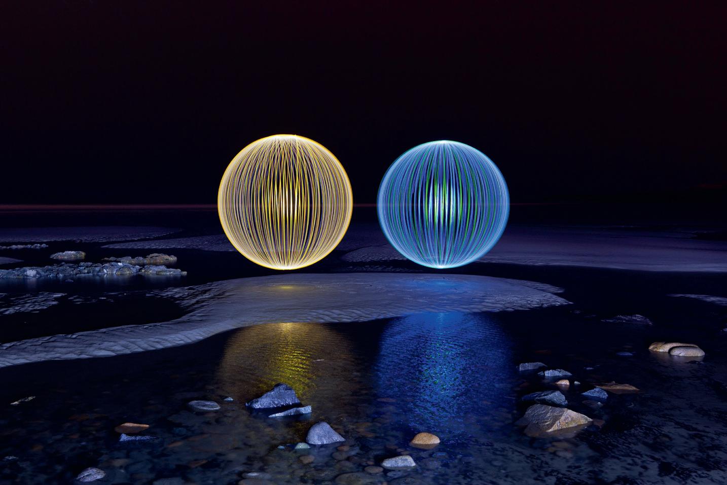
Twins
24mm, ISO 200, 359sec at f5
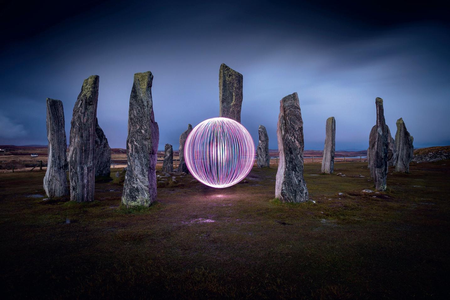
The Standing Stones of Callanish, Scotland
24mm, ISO 200, 30sec at f5
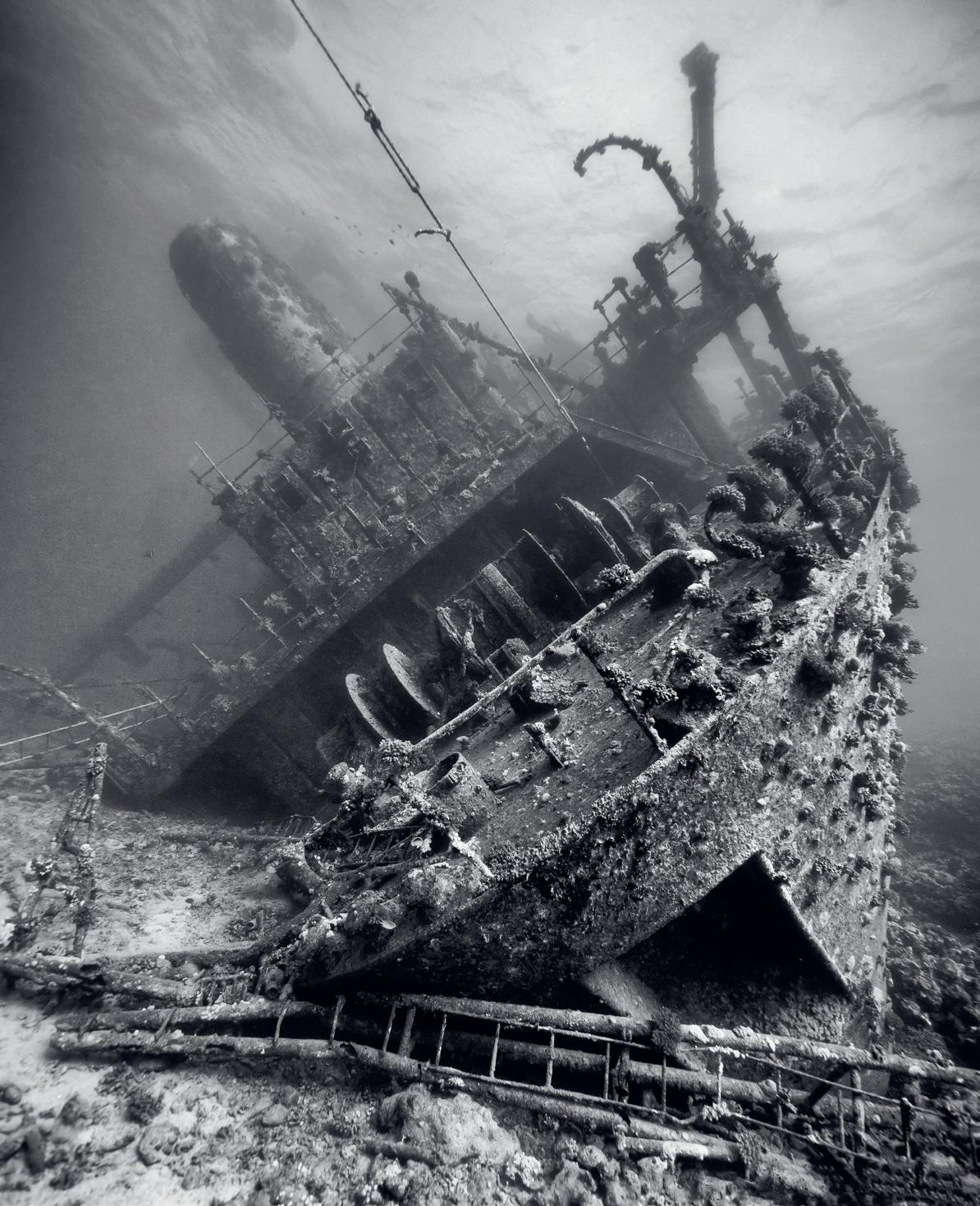
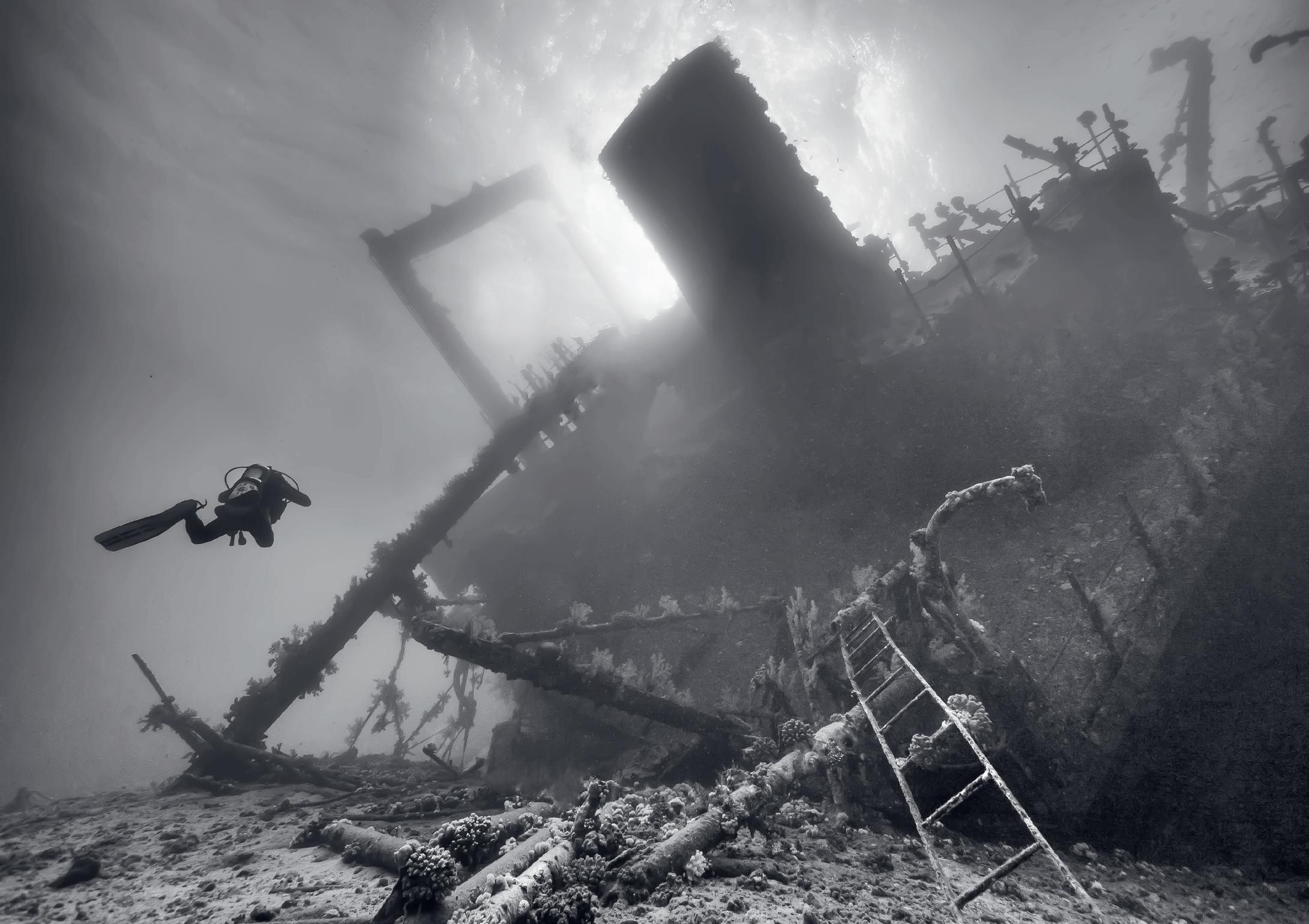
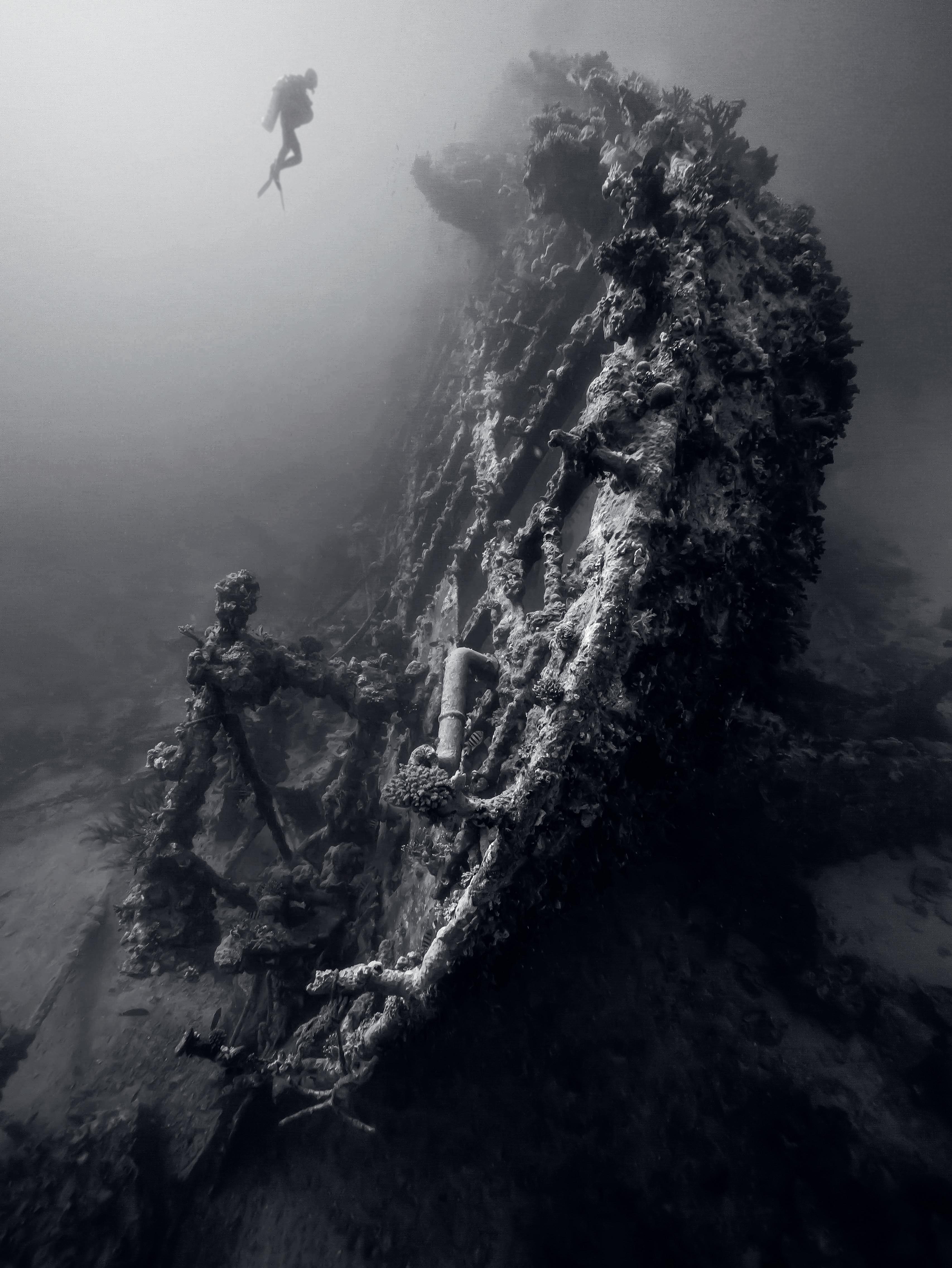
THE MONOCHROME SEA
MATT JACOBS MSc. FRPS
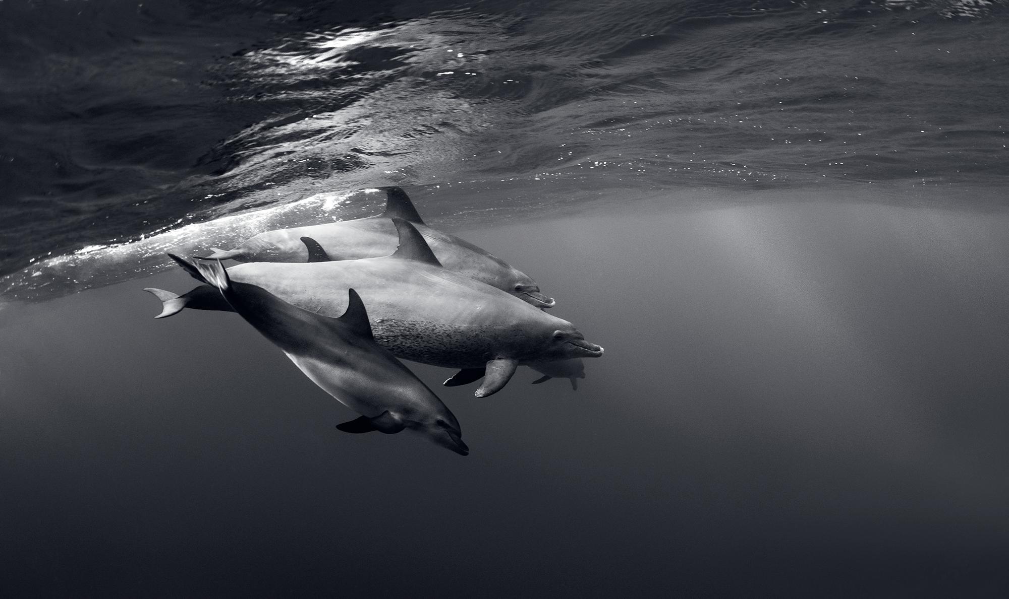
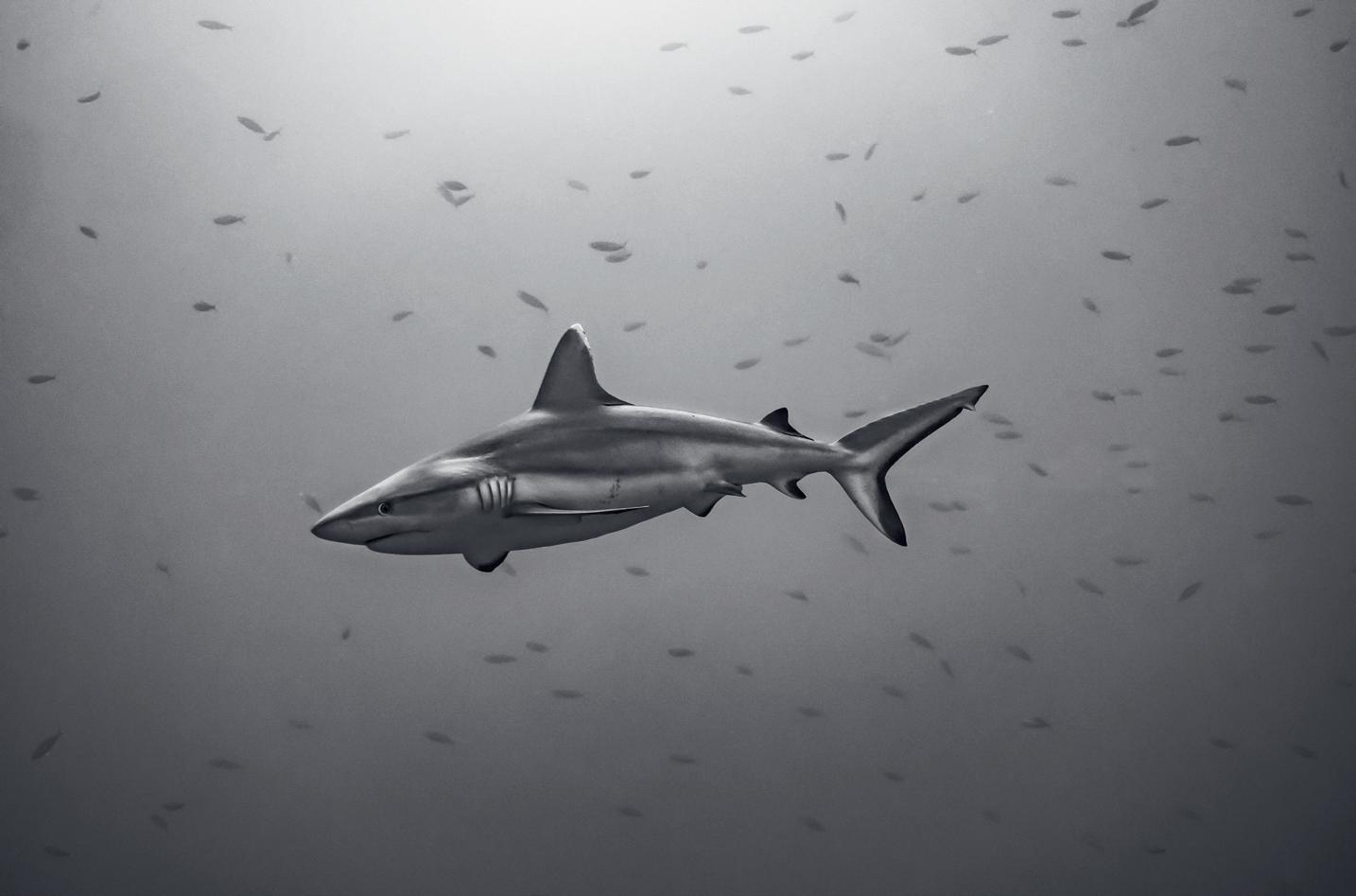
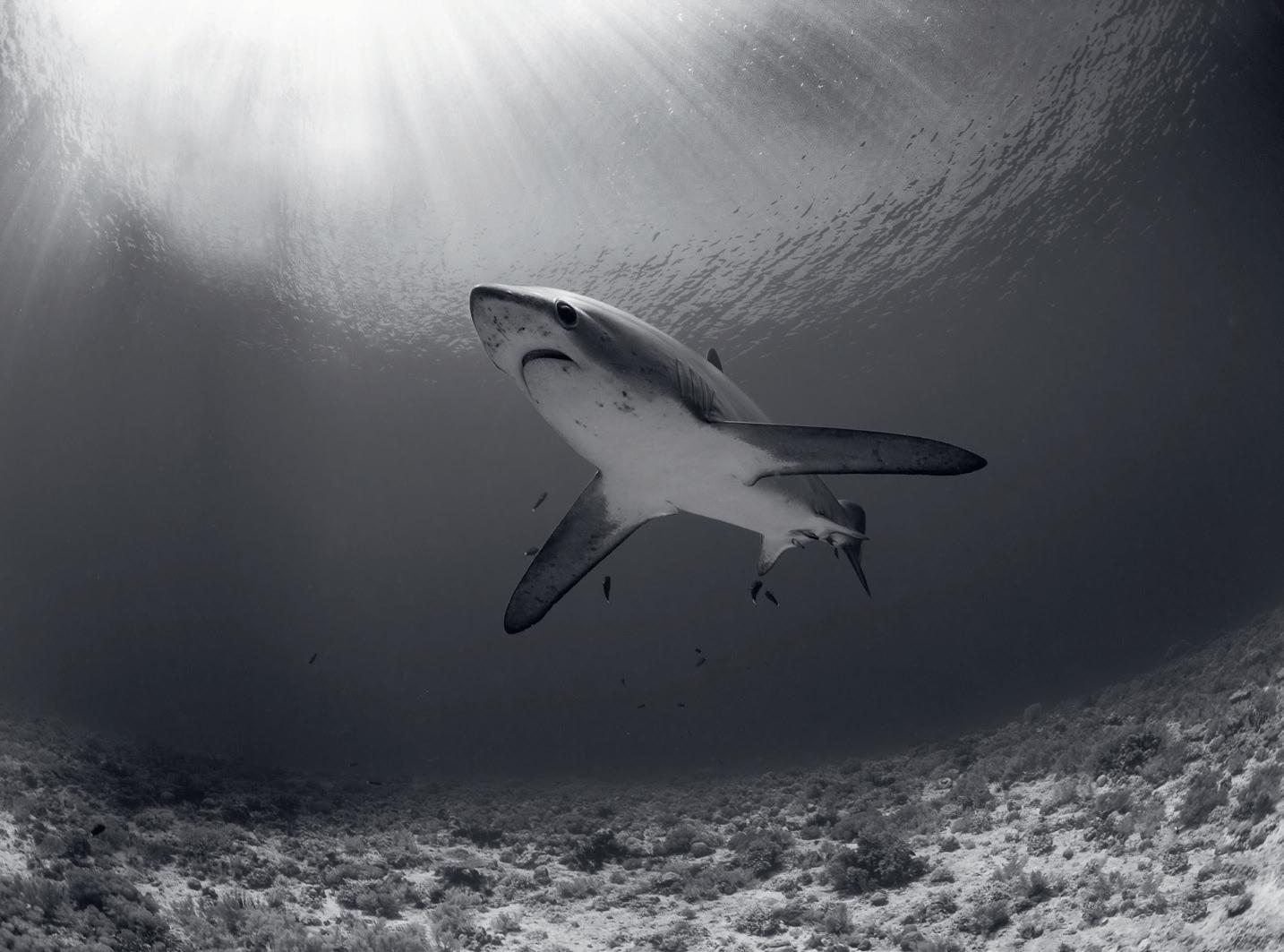
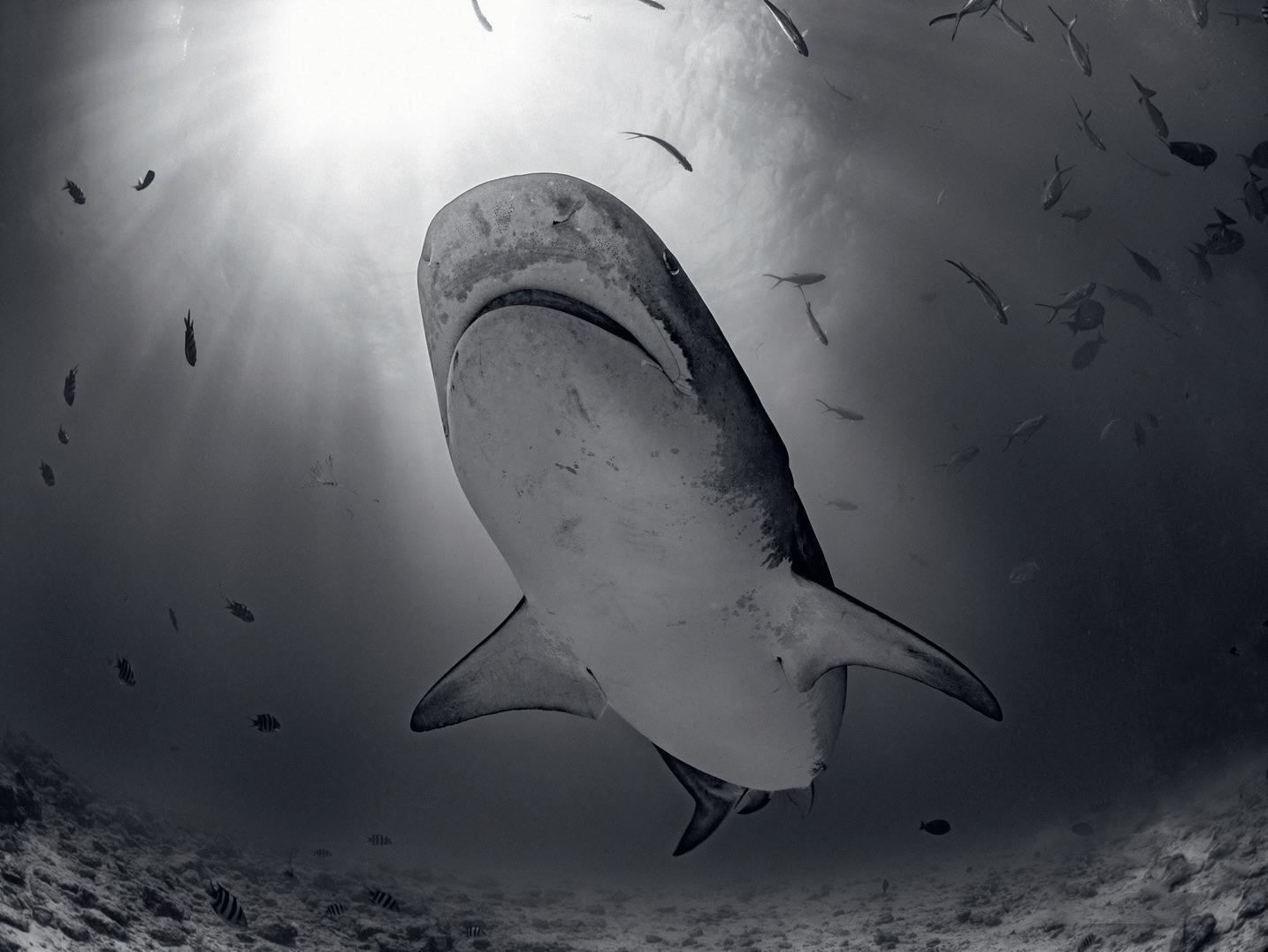
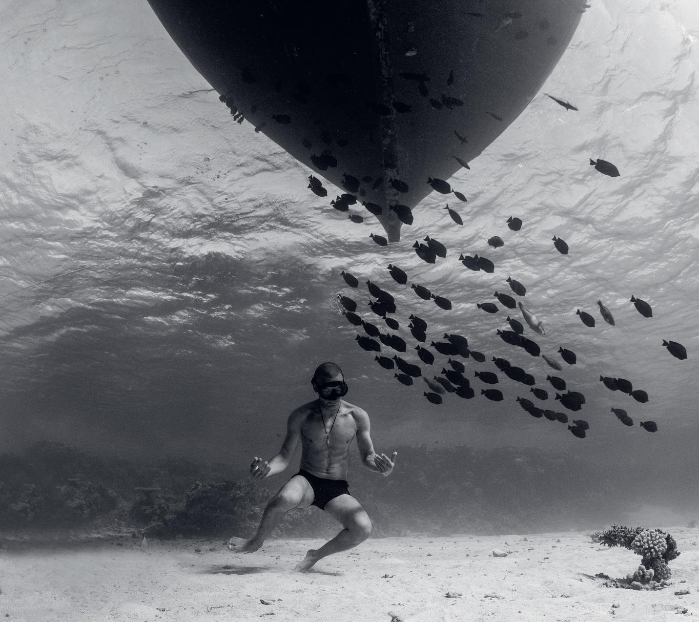
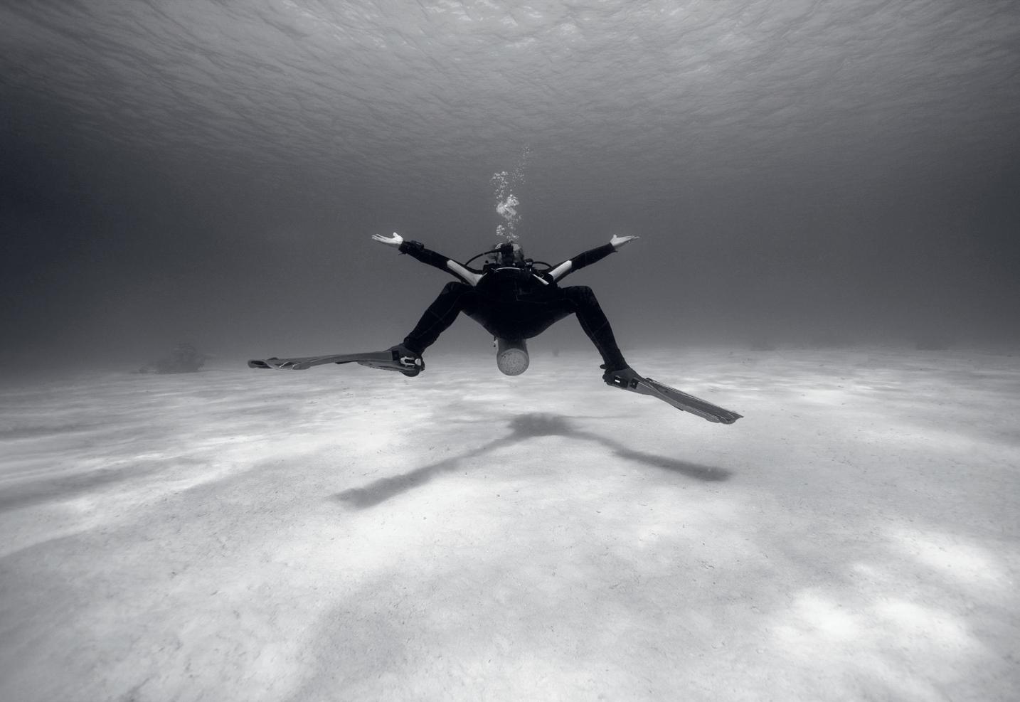
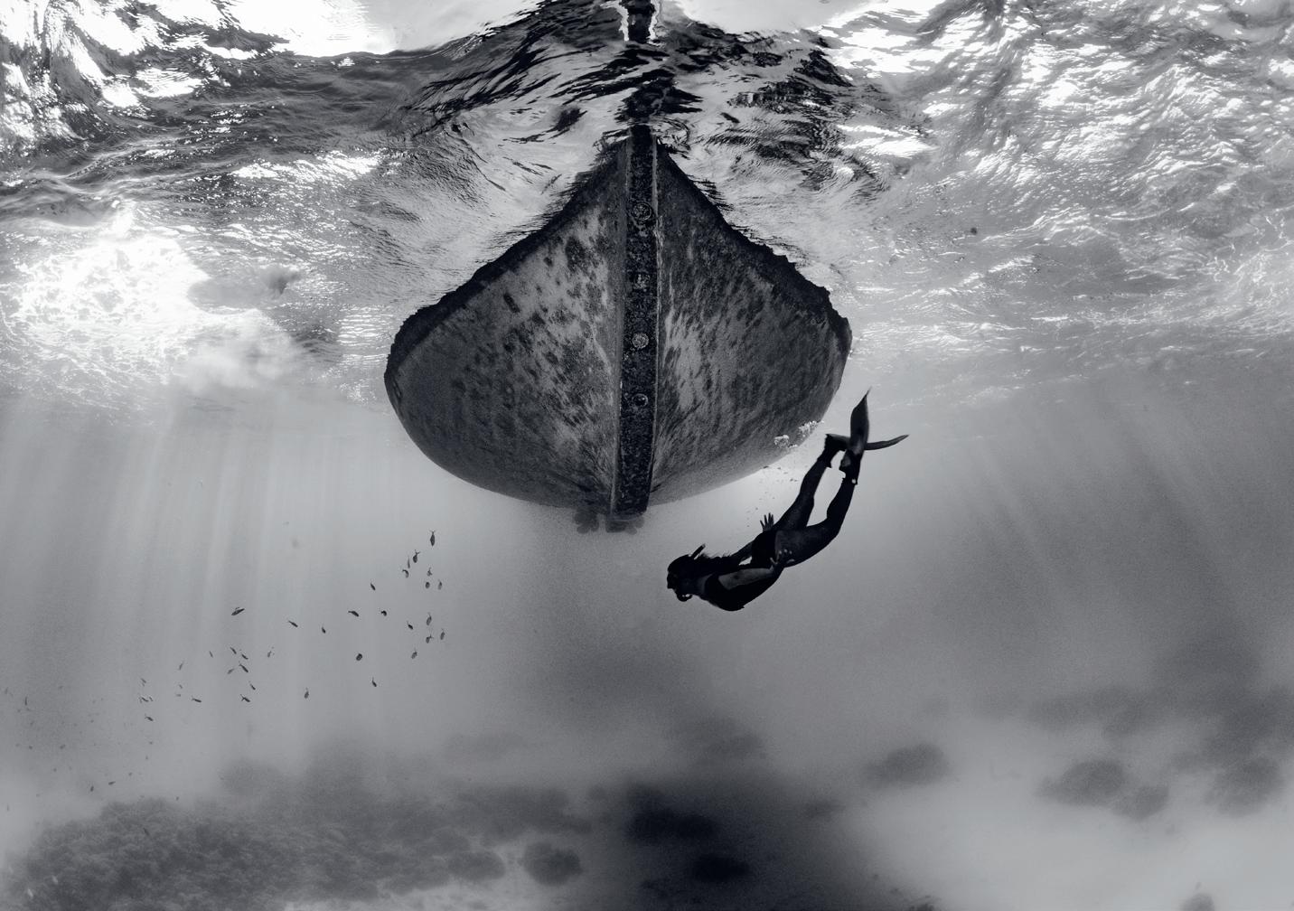
My approach in creating my underwater images is to reveal the art of the ocean and its wonders within. I’m not interested in creating wh at I call ‘fish identification’ images. I see many images that are perfectly exp osed and framed, and technically perfect but to me they are soulless. I want shadows, I want movement, behaviour, I want the ballet of the reef captured on my monitor.
Underwater photography is different from topside photography. It is fraught with challenges, limitations and dangers. Recognising and navigating these obstacles is the key to creating engaging images. One is often at the mercy of what the ocean decides she is willing to reveal to you on any given day so being fluid and flexible in your approach is vital, as one can be frustrated if animals do not appear on cue or visibility is not as expected. The luxury of instantly changing lenses to suit the subject is obviously not one afforded to the underwater photographer and so choosing the correct lens before the dive must be carefully considered. Generally, with underwater images you are limited to two focal lengths, ultra-wide or macro. This is because you need to limit the
amount of water you shoot though. Even the clearest seawater will have tiny particles in it and the more water you shoot though, the less clarity and punch your photos will have. This technique means getting as close as you possibly can to your subject. And when you think you’re close enough, get closer. Because I favour an Olympus 8mm 1.8 micro four third lens, I have to get ultra close or my subject will be a speck in the distance. As a consequence, I’m often eyeball-toeyeball with sharks to get the image I want.
People often ask why I favour mono for my underwater images and stripping one of the most colourful environments on earth of its colour may, on first impression, seem perverse. My position however is that in presenting the underwater
world in black and white, an element is added rather than taken away. Shipwrecks take on an ethereal, ghostly presence as if time is standing still for them; a warship stands by in eerie readiness, even though its back lies broken. Dolphins and sharks take on a muscular beauty with the highlights and shadows accentuating their effortless presence and grace. Silhouettes, shafts of light and shimmering bubbles are revealed once the veil of colour is lifted.
I’m a rare breed in the fact the I never use strobes underwater, and this means I’m at the mercy of what the sun is doing and need to be aware at all times of where it is. This technique can provide me with dramatic silhouettes if I shoot into the sun but can provide extreme challenges as well if the subject is fast moving. For
example, if a shark is coming out of the sun and I want her backlit but not in shadow, I will quickly change to spot metering and then stop the lens down to expose for the body of the shark. If I want her in silhouette, I will change to multi-metering. In this scenario I need to quickly and instinctively change settings on the fly without looking at the myriad of buttons on my housing. I’m an ambassador for Ikelite Underwater Systems and exclusively use their housings. They afford me the luxury of knowing where all the buttons fall under my fingers. If I shoot colour underwater, then I need to adjust white balance manually every time I change depth by five metres or so. This gives an incredible vibrancy, saturation and punch to my images. I use many things to set the white balance. Coral sand is
particularly good, but it depends on the depth. Often, I will swim behind someone and white balance on their grey SCUBA tank. If I’m in deep blue water with nothing and nobody around I will resort to using my hand in front of the camera.
I fix a red filter gel to the back of my lens Heath Robinson-fashion with Sellotape. People often laugh when they see this, but it works. This is not to put the red back (the red part of the spectrum is all gone at around ten metres down) but to neutralise the blue. Often people will show me their photos and ask why theirs are all blue. They are under the illusion that they can pull colour back in post, not realising that it’s all but impossible to reinstate the colours and vibrancy that are not there in the first place when shooting with only ambient light.
I’m known for my mono underwater images and in these I aim to show the underwater world in a dimension that is otherwise hidden by colour. I’m not interested in portraying reality, and black and white is far more interesting. As Henri Matisse once said: “I’ve been forty years discovering that the queen of all colours is black…”
narcosispictures.com
instagram.com/narcosispictures
A NEW BEGINNING
DISCOVERING MY CREATIVE VOICE THROUGH PHOTOGRAPHY MARTIN KNIGHT
JM.W. Turner once said “Painting is a strange business,” and I’d say the same about photography. I still recall visiting the Tate Gallery, where Turner’s ethereal landscapes mesmerised me. His ability to capture light and emotion left a lasting impression. That fascination with light and movement drives my photography. I aim to create photos that evoke emotional connections, blending traditional and experimental approaches. My work often sparks strong reactions - people seem to either love it or hate it.
Photography has always been part of my life. I’ve had a camera for as long as I can remember, but for many years, it remained a hobby. I fell in love with street photography, capturing spontaneous moments in urban settings. I also experimented with landscapes and wildlife, although my creative side often took a backseat to my career. That changed when I discovered Roxanne Bouché-Overton’s
work. A gift of one of her books introduced me to Intentional Camera Movement (ICM) photography, which deeply moved me with its dreamlike quality. Her images inspired me to experiment with ICM, a new way of seeing and capturing the world.
Around the same time, I encountered the work of Andrew S. Gray, who uses ICM and multiple exposures to photograph the landscapes of Northumberland. His painterly images fuelled my creativity even more. After retiring from my office job of 30 years, I decided to dedicate more time to photography. I took a one-on-one workshop with Andrew in Northumberland, where I learned new techniques while enjoying breathtaking scenery. This experience solidified my love for ICM and gave me the confidence to explore it further.
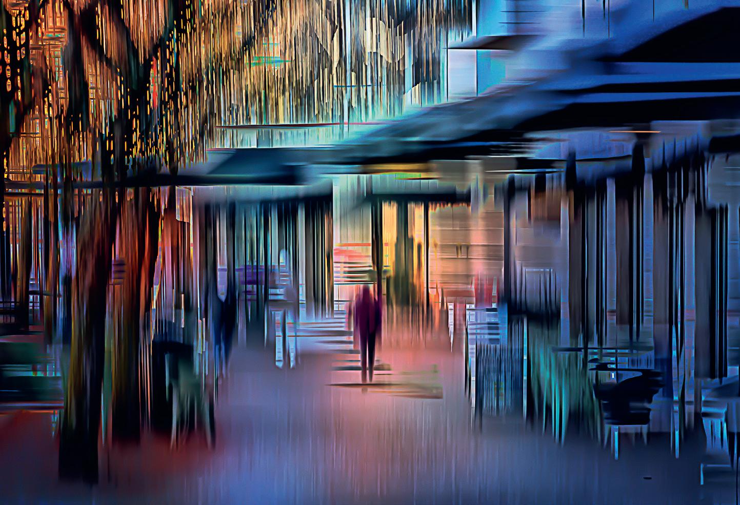
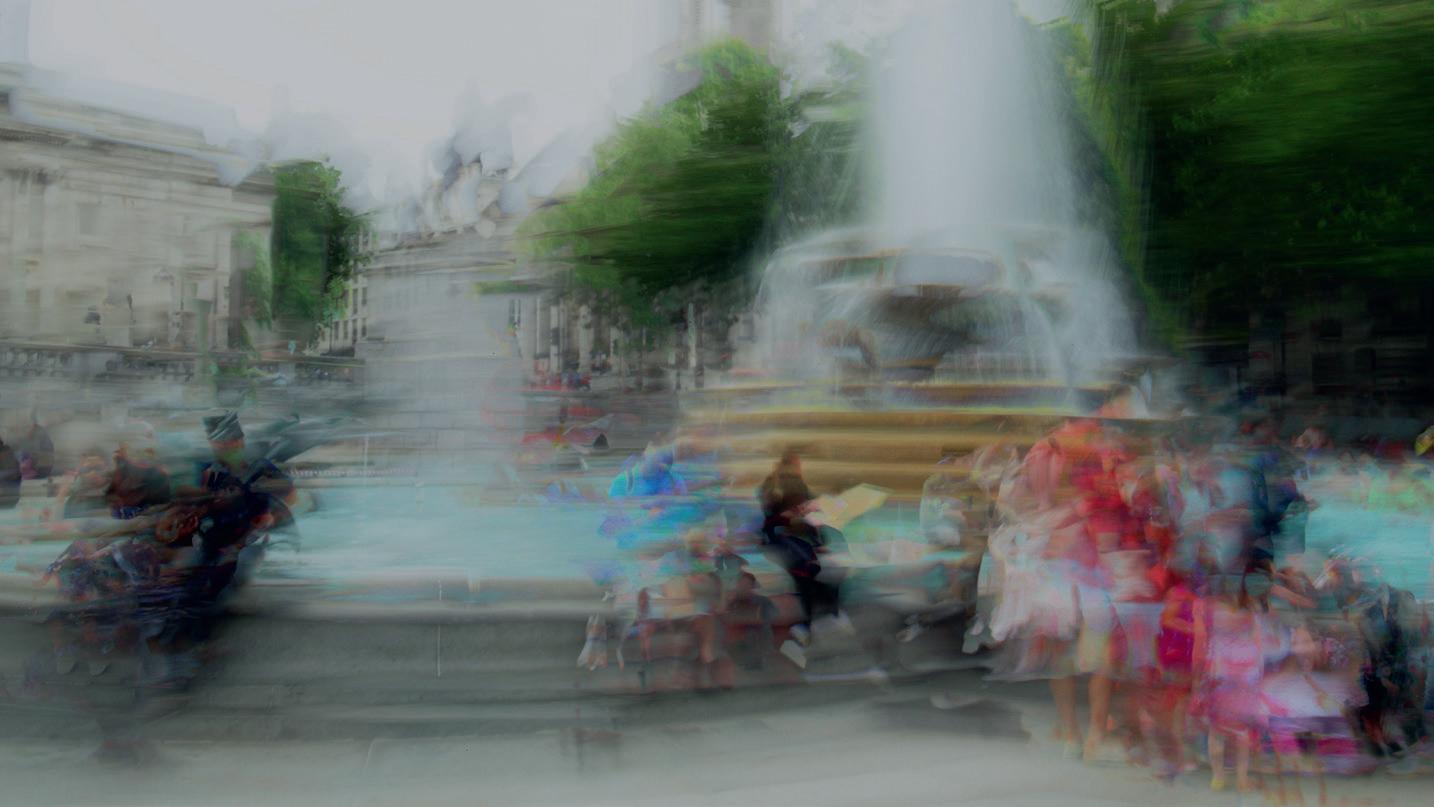
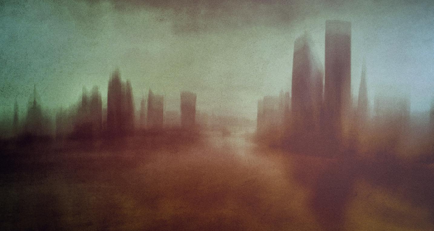
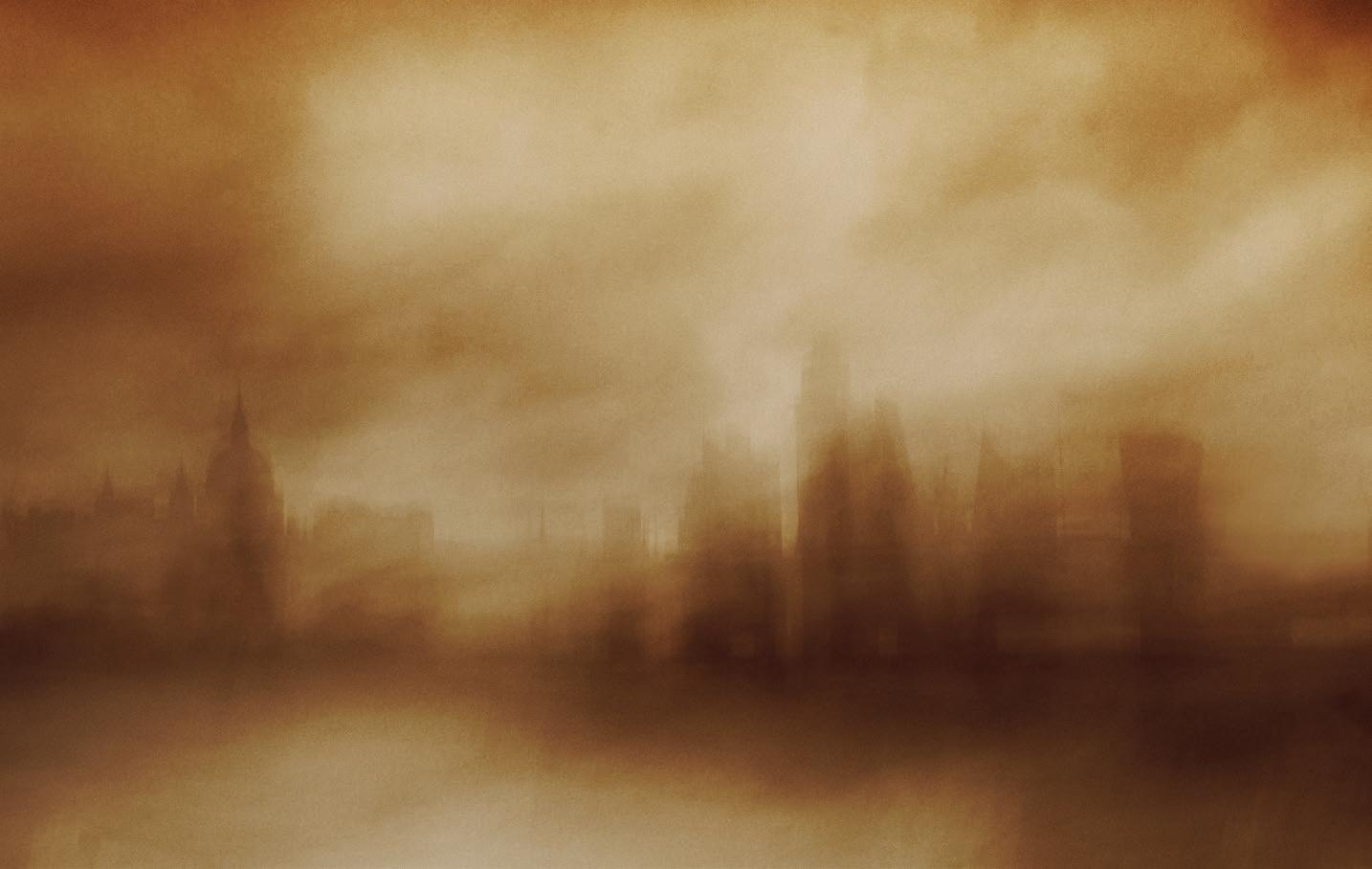
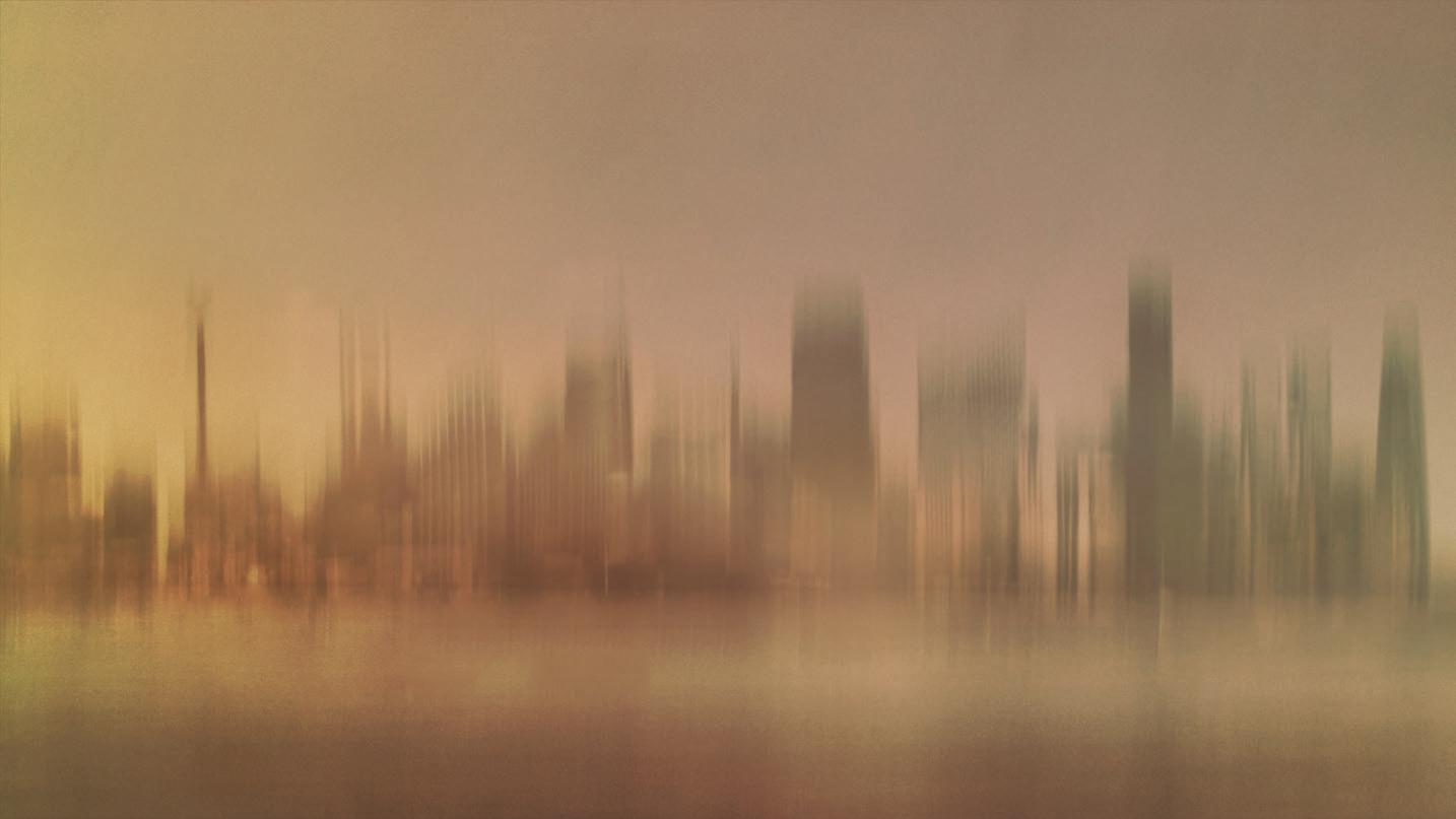
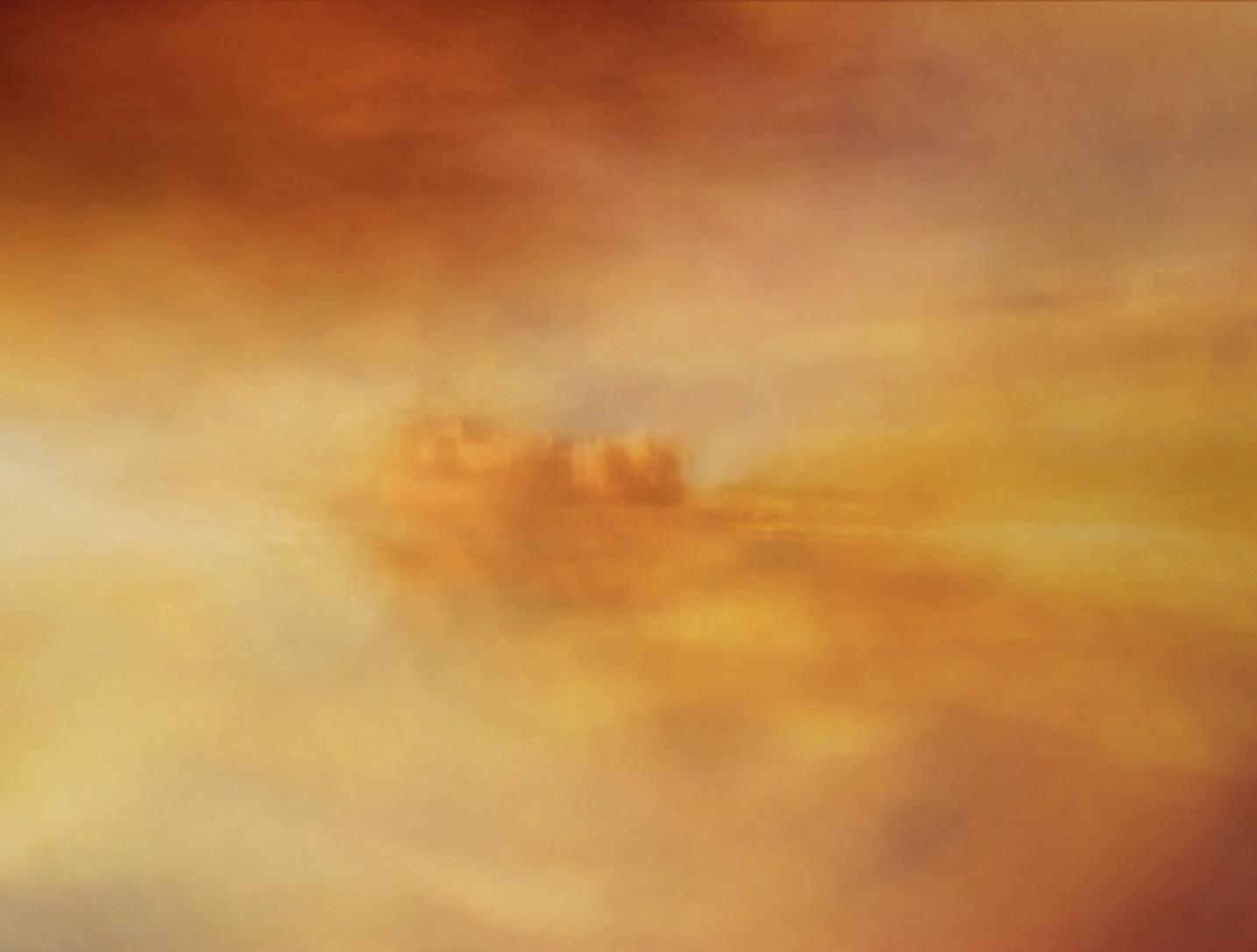
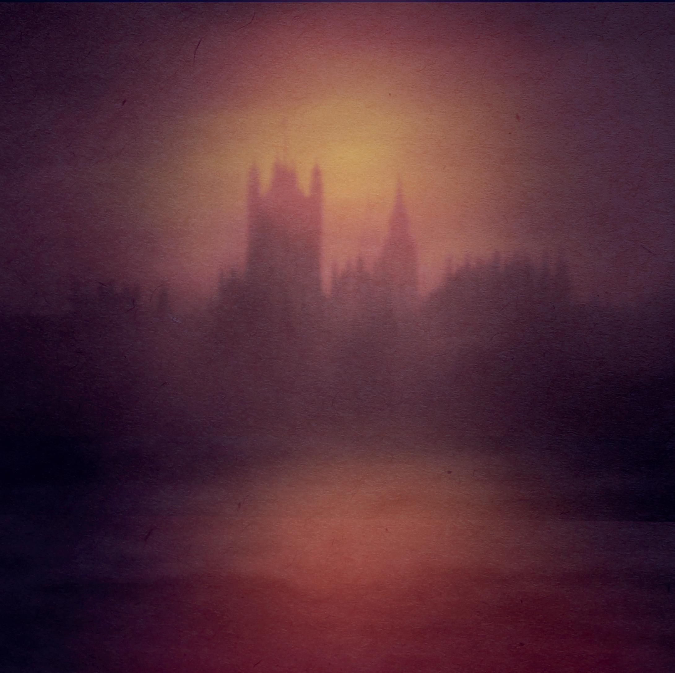
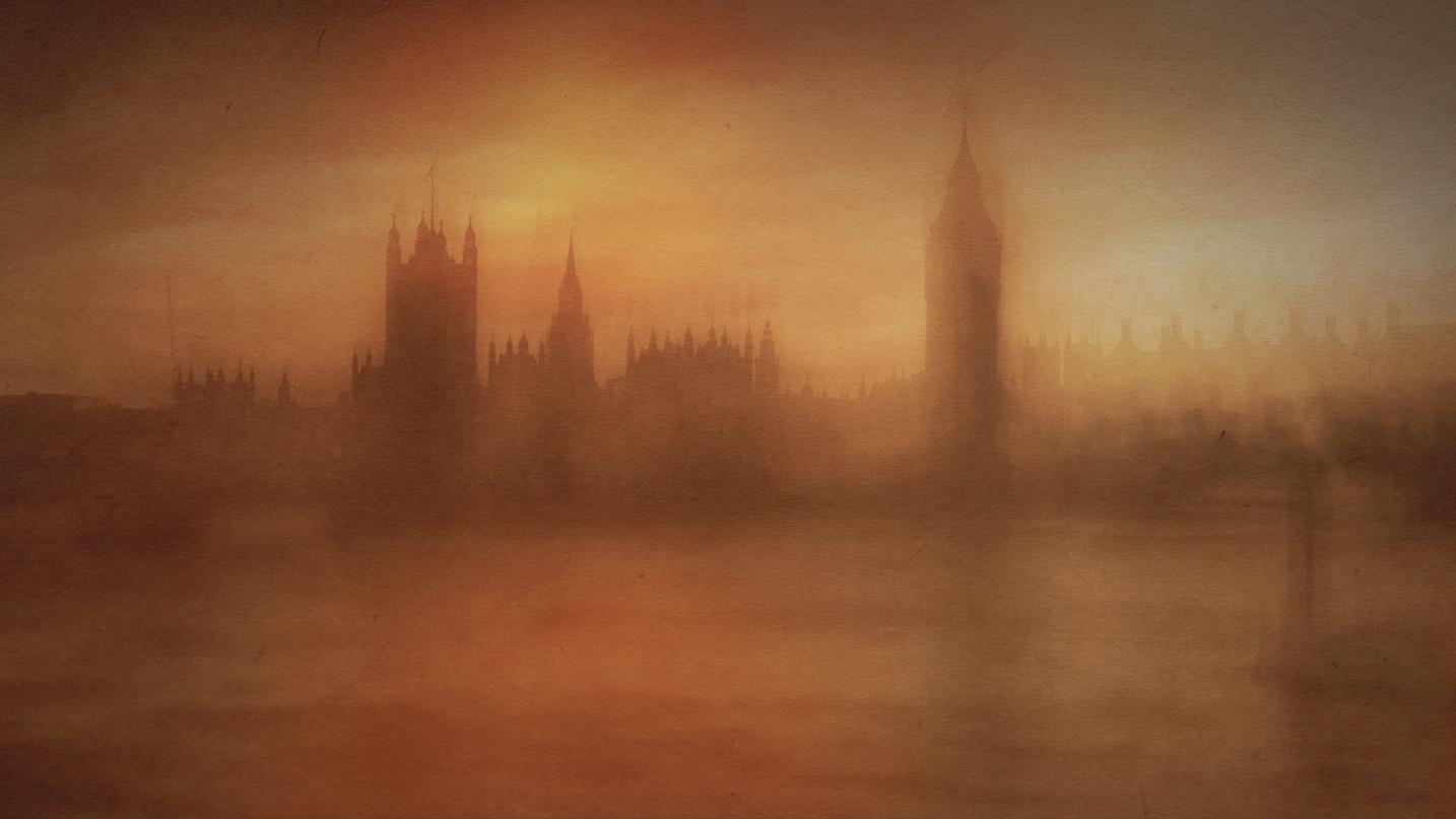
Since then, I’ve focused on developing my own unique style loosely based on Impressionism, in which I’ve created ICM cityscapes, with
London being a particular favourite. The dynamic architecture of landmarks like St Paul’s Cathedral and the Shard, combined with the vibrant energy of the Thames, provides endless inspiration. I often photograph these scenes blending natural and artificial light to create soft, dreamlike effects. Each image I create aims to capture the city’s visual beauty but also its unique atmosphere and rhythm. Most recently I’ve travelled to Australia, where I used this technique to photograph cityscapes, expanding my creative horizons even more.
For me, photography isn’t just about capturing a scene - it’s about creating emotion and telling a story. ICM allows me to blur the lines between photography and painting, offering a deeply personal yet universally relatable way of seeing the world. I strive to create images that evoke emotion.
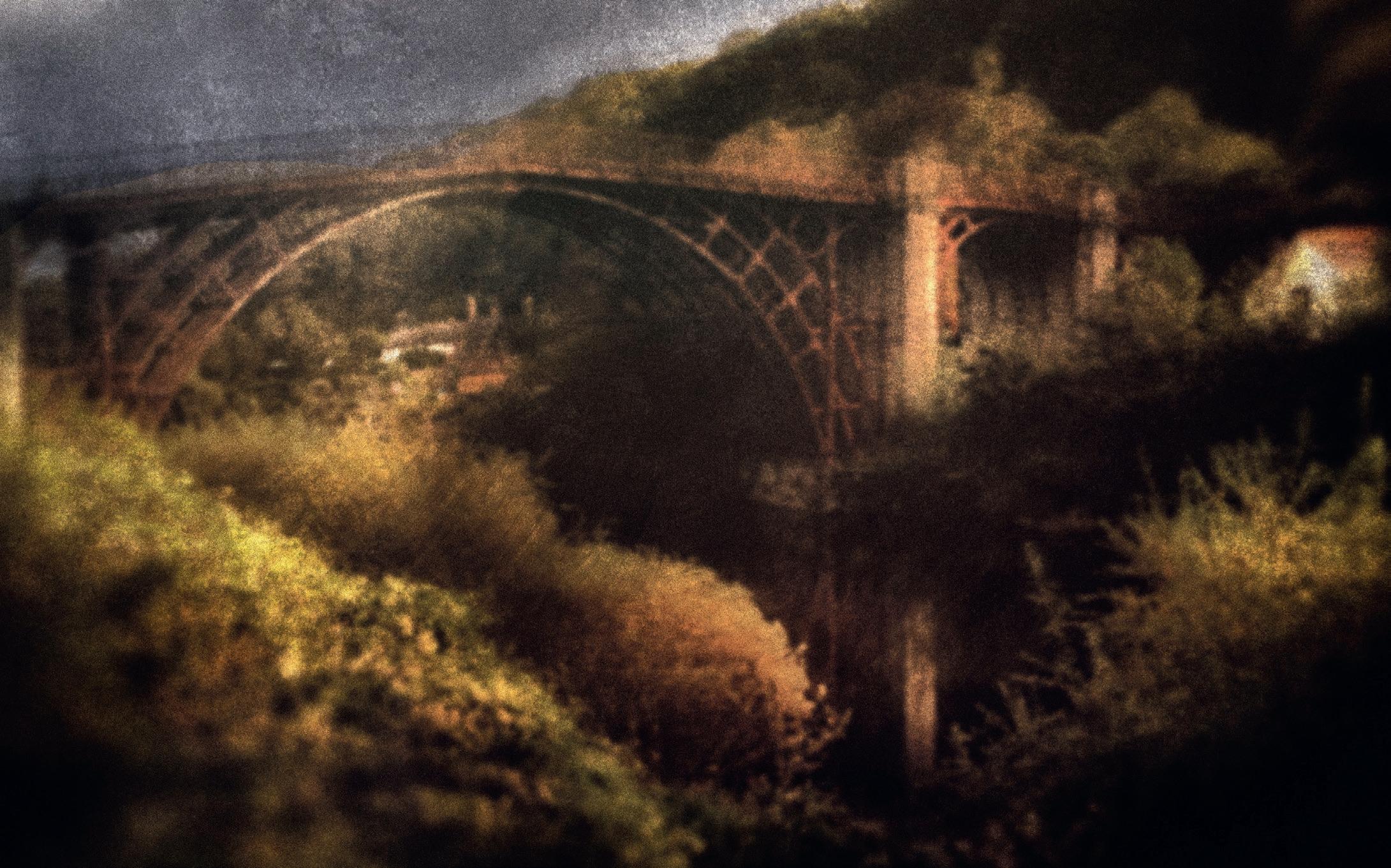
Ironbridge
Semi-retirement has given me the chance to immerse myself more in my passion. It’s an opportunity to promote my work through competitions, presentations, and social media. Through events, online forums, and workshops, I’ve connected with fellow photographers and art enthusiasts, sharing ideas and gaining valuable feedback. These interactions help refine my style and inspire me to push the boundaries of my work. While learning from artists like BouchéOverton and Gray has been invaluable, I believe finding your own voice is essential. Authenticity is what makes art resonate, drawing people to your work.
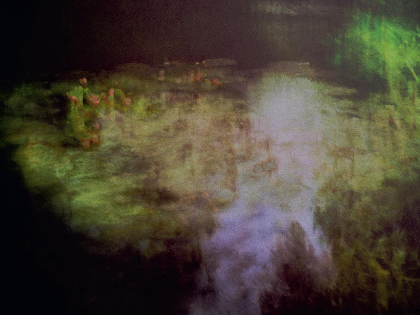
Water Lilies
Early ICM
Impressionist London
Being a member of Stafford Camera Club has also been a significant source of inspiration. I’ve enjoyed entering competitions, learning from guest speakers, and experimenting with new techniques. Competitions remind me of the ‘marmite’ nature of my workjudges either love it or don’t connect with it. But I’ve learned to stay true to my passion. My advice to anyone pursuing photography or any creative field is simple: do what makes you happy.
Joining the Royal Photographic Society (RPS) and its Creative Eye Group has also been a vital step. In just over a year, I’ve been inspired by the incredible work of its members, pushing me to continue to refine my craft and approach. The RPS community has shown me how limitless photography can be.
One valuable lesson I’ve learned is to embrace imperfections. During my workshop with Andrew, I realised that the creative process is as important as the final image. Photography is about experimentation and discovery, as much as it is about technical skill.
Looking ahead, I’m excited to continue refining my style and sharing my work with a wider audience. Through exhibitions, competitions, and collaborations, I look to connect with others who share my love for photography and the arts. Semiretirement has given me the freedom to explore this passion, and I’m grateful for the journey so far.
To anyone reading this - whether you’re an aspiring photographer or someone with a creative dream - I encourage you to take the leap. It’s never too late to start, to learn, and to grow. The journey itself is as rewarding as the destination. And along the way, you may find your own unique voice.
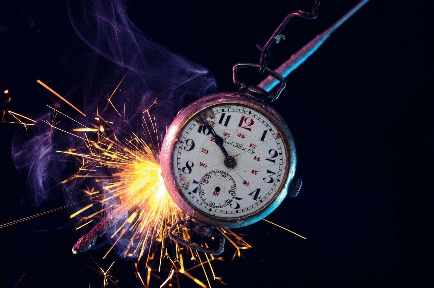
CREATING A PHOTO INSPIRED BY THE FEAR OF RUNNING OUT OF TIME
IRINA PETROVA ADAMATZKY
Creating a photograph inspired by the fear of running out of time was one of the most challenging and personal projects I’ve undertaken. Despite being someone who always completes work on time, I’m constantly gripped by a panicky feeling that everything is falling apart. This image was born out of those anxieties and my desire to push myself creatively - to craft something unique and win a camera in the SONY European community photo contest. At the time, I owned an ageing Sony Alpha NEX-6 and felt it was time to upgrade to a full-frame model. Having won an action camera in a previous contest, I held onto the hope that I could achieve another victory.
Unlike my usual process, where I skip sketches and rely on mental images, this time I decided to plan carefully. The competition task
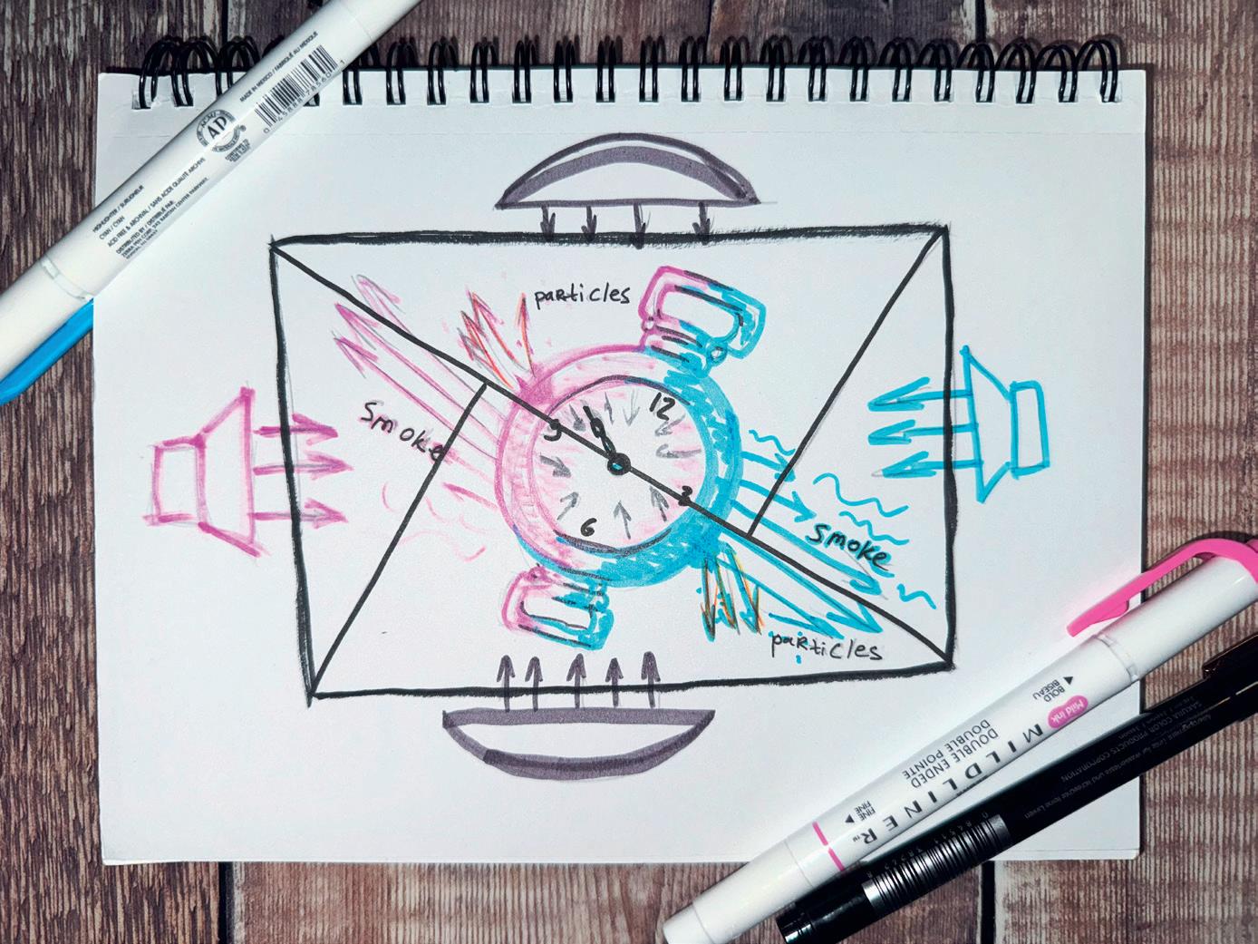
demanded a conceptual approach, so I infused the idea with a personal touch: my grandfather’s pocket watch, a cherished family heirloom. The watch became the centrepiece, representing the passage of time slipping away.
To create the illusion of a levitating watch, I improvised. Without professional equipment, I used books from my dad’s library to build two columns and placed a telescopic mop handle between them as a bridge. I suspended the watch on thick wire, making it appear as though it was floating in mid-air.
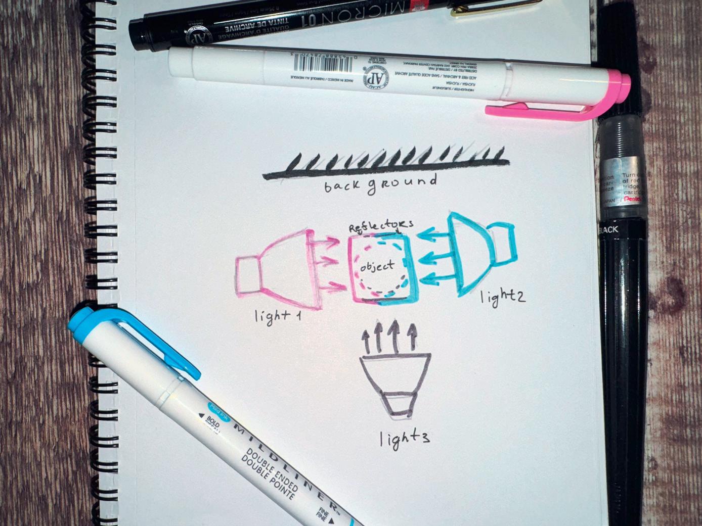
For the atmosphere, I envisioned vibrant, magical smoke surrounding the watch. I chose blue and purple as dominant colours to evoke a sense of mystery and magic. To achieve this, I used two Godox TT600 speedlights with softboxes and translucent plastic filters - a blue one on one side and a
red one on the other, which blended to create the desired purple hue. To make these filters, I cut translucent plastic punch pockets into sheets and fixed them over the speedlight heads using rubber bands. A third speedlight served as a fill light from the front, while makeshift reflectors fashioned from foil baking trays added subtle illumination from the top and bottom. The trays’ curvature made them more effective than plain foil.
The background had to be simple and unobtrusive, so I used an old matte XXL t-shirt as a black backdrop. To convey the dynamic tension of time running out, I opted for a diagonal composition, incorporating the golden triangles rule. This made the scene feel unstable, as though time itself was breaking apart, never to return.
All out of time, original image
Creating the smoke effect required ingenuity. I used aromatic sticks, which were easier to handle than cones, and a remote control to operate the camera while manipulating the smoke. For the lens, I chose a retro Zenitar-M 1.7/50mm from my collection. Its focal length perfectly suited the composition, and I set the aperture to f/8 to ensure sharpness throughout. A shutter speed of 1/125s captured the smoke’s movement without overwhelming the image.
The shooting process was meticulous. I took 349 shots that day, experimenting with different smoke patterns and even adding sparklers for an explosive effect. I also captured separate images of smoke and sparkles to have more flexibility during editing. When reviewing the shots, I narrowed them down to 30 promising images.
Rough sketch
Light scheme
In Photoshop, I used the File -> Scripts -> Load Files into Stack script to combine the selected shots into a single layered document. This approach preserved the file names as layer titles, making it easier to manage. I blended elements from various shots using layer masks and transparency modes, enhancing the watch with added “damage” and particles. Using artistic brushes customised with textures sourced from the watch itself, I added intricate details to the composition. Ultimately, I created three distinct versions of the final image: one with minimal smoke and a starry night background, another featuring a dramatic explosion effect, and a third with intense particles. It was the third version, with its dynamic and vivid energy, that became the main image.
Though I didn’t win the camera with this photograph, it turned out to be a significant success in other ways. It was featured in numerous magazines, blogs, and books, including the 2025 book Post-Apocalyptic Computing by World Scientific. This project taught me that even when faced with doubt and fear, perseverance and creativity can lead to unexpected achievements.
Version with sparkles
Version with starry sky
Work in progress - sparkles
All out of time. Expanded by Firefly AI Photoshop
P.S. Sometimes it’s good to revisit your old photos with a fresh perspective. A few days ago, I wondered how the image would look if I had been able to shoot it with a wideangle lens - something I didn’t have at the time. To explore this idea, I used Photoshop Firefly AI to expand the background, and I truly love the second version of my All Out of Time image. So don’t be afraid to experiment and play around - creativity has no limits!
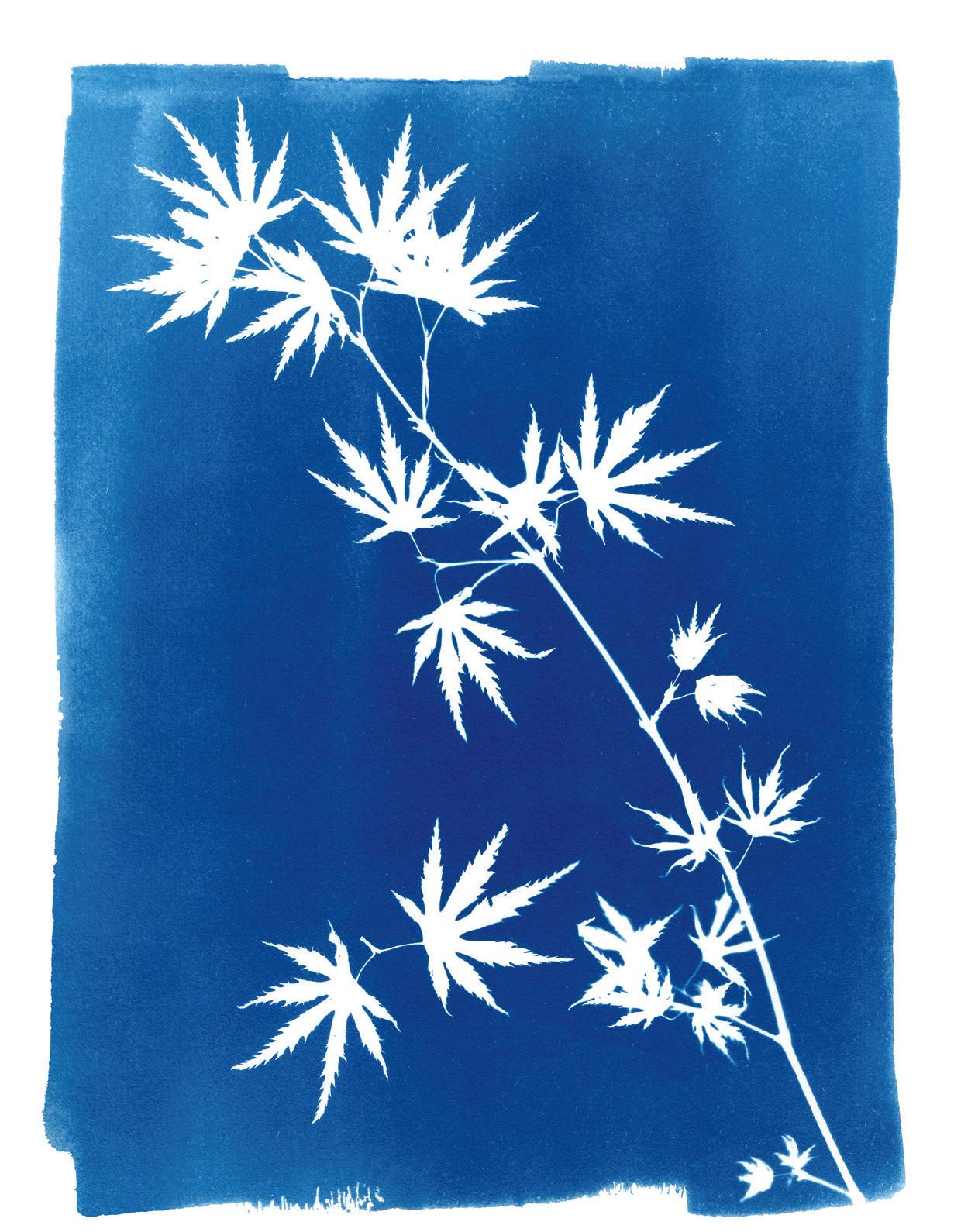
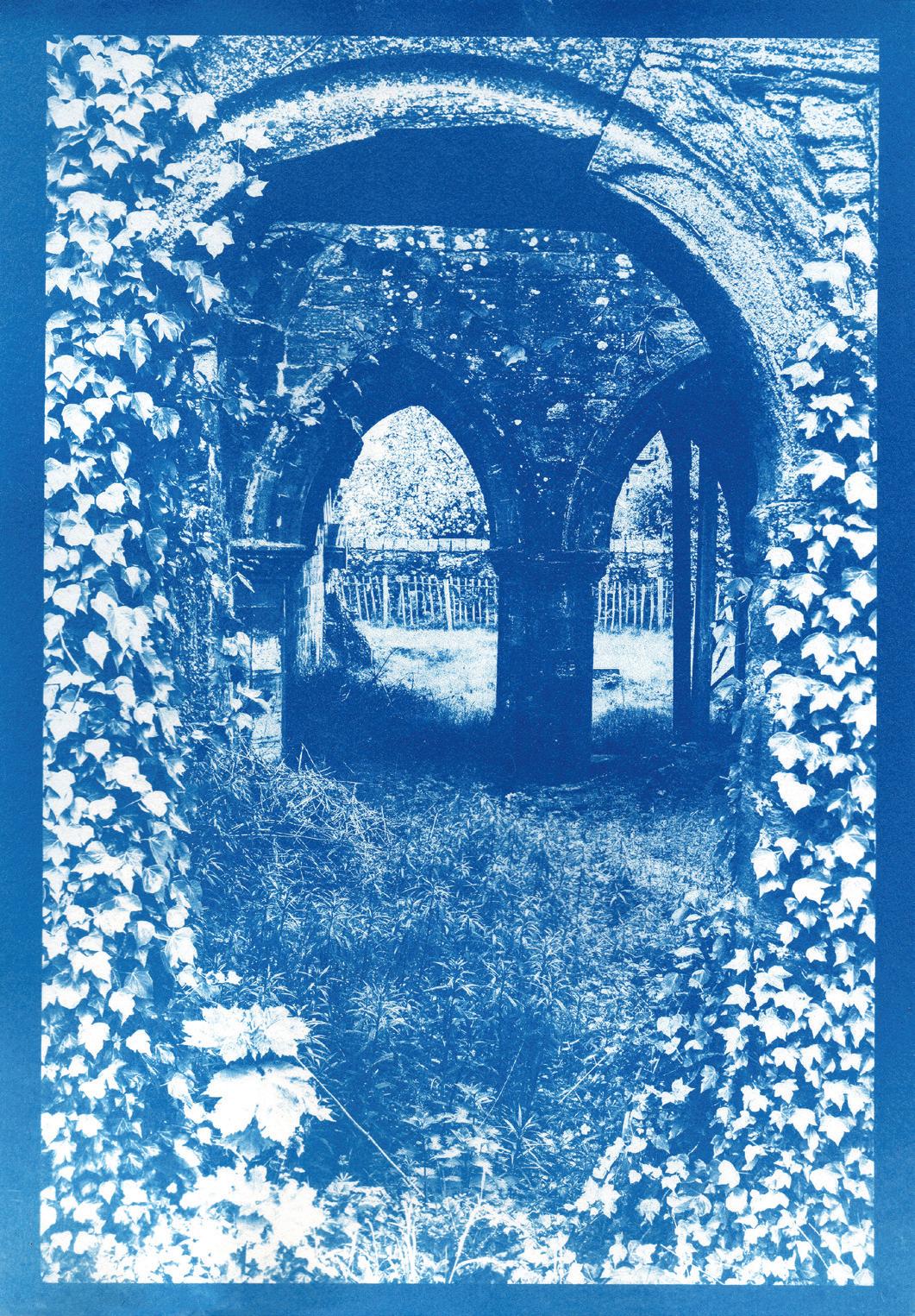
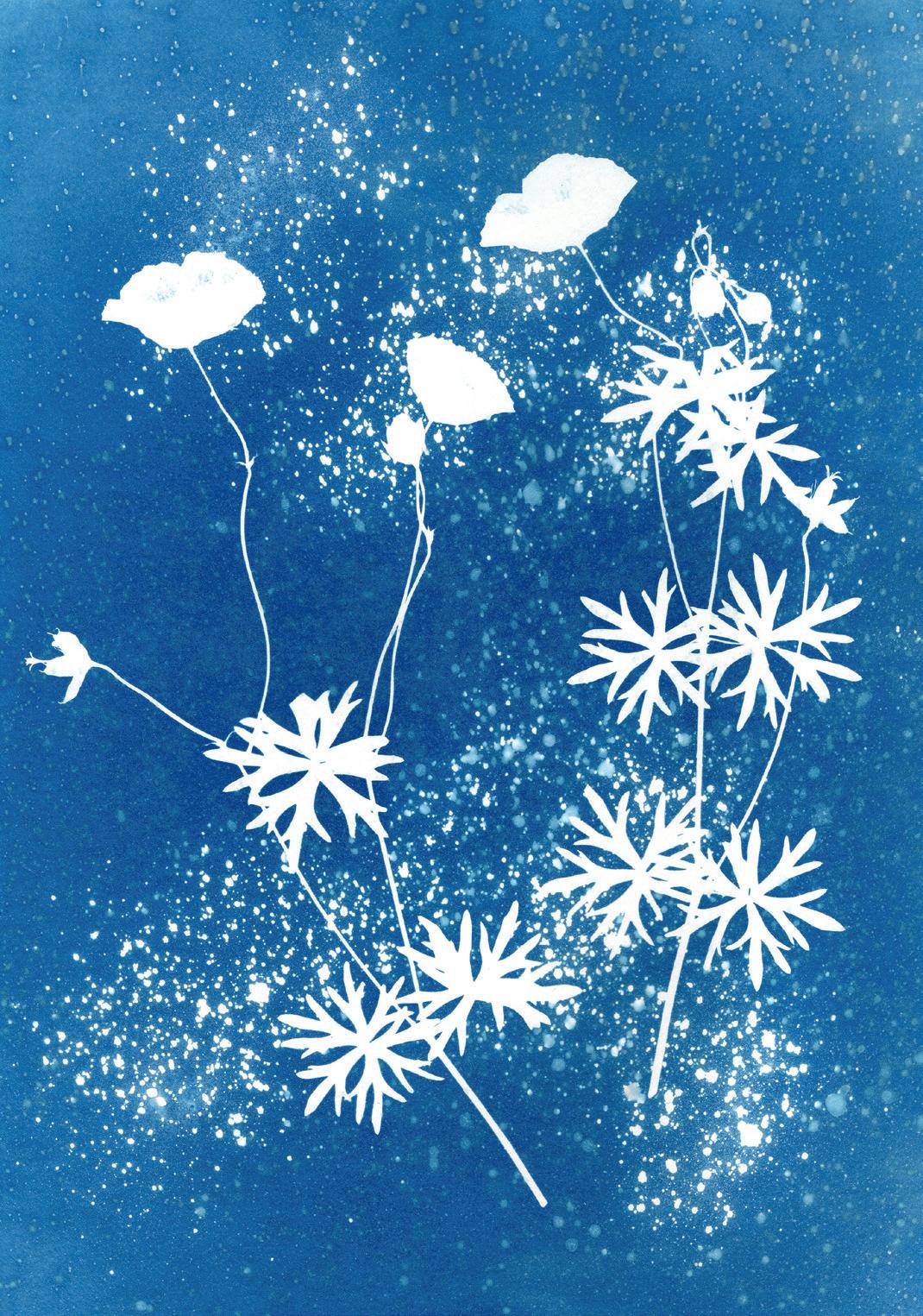
I took my first photo aged 10 with a Box Brownie camera. I’m now 81, living with cancer and, though not able to do so much now, I am still enjoying my photography. The Cyanotype Project has been fun and very interesting and has been a complete change from my usual kind of photography. I hope my story might encourage others to try it too.
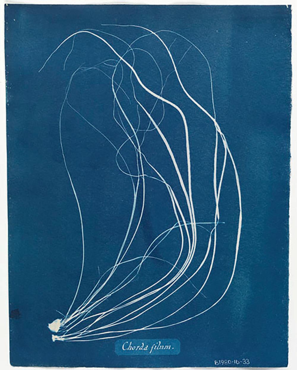
Many years ago, Kelvingrove Museum and Art Gallery in Glasgow exhibited some of Anna Atkins’ beautiful cyanotype prints. I was intrigued by the delicate blue and white prints of ferns, plants and seaweed. (top right)
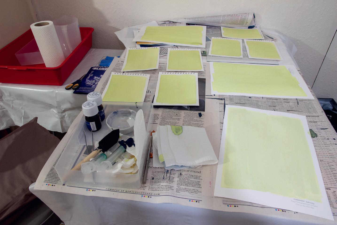
Some years later I bought a small packet of Sunpapers and tried to produce some images. Only a few were successful; ferns being flat, were best. I learned that to get a fairly sharp image, the Sunpaper had to be at right angles to the sun with the subject pressed flat under glass and placed on a supportive backing, otherwise only one side was sharp. And, of course, there needed to be sun. I gave up trying for a few years. Then, this year, I discovered that I could buy a UV lamp and so was no longer dependant on a fleeting sun. I bought a starter cyanotype kit containing the chemicals potassium ferrocyanide and ferric ammonium citrate, a mixing bowl and sponge to apply the solution and small pieces of art paper. I also used the backs of some of my old prints to print on. (right)
Layout with prepared paper
Chorda filum, Glasgow Museums collections
I first prepared the paper with a solution of equal quantities of each chemical mixed together. This has to be done away from daylight, but a room light is safe. The papers were put in the dark to dry.
Then, starting with small leaves and flowers from my garden, I laid them on the prepared paper, put a sheet of glass over to hold everything in position and switched on the UV light. I tried different time exposures, but did not reach a conclusion as to how long was best. After switching the light off, I rinsed the paper thoroughly in running water which washed off the remaining solution, revealing a blueprint with the leaf in white.
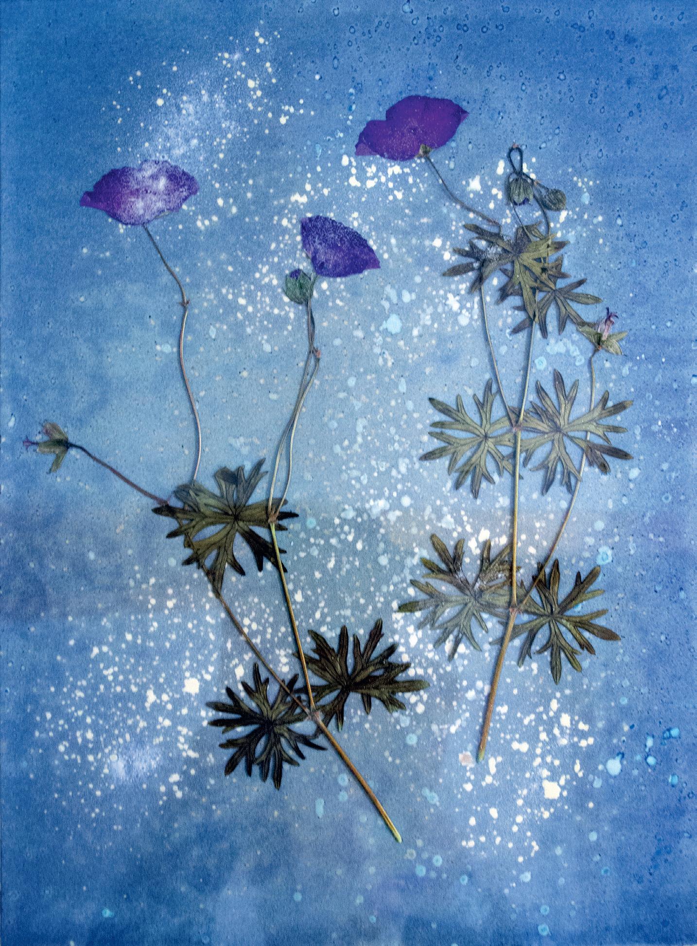
I made lots of small experiments, realising that what looked good as a photograph would not always work as a cyanotype, as it relies only on the shape and outline of the subject. I found that Acer ‘keys’ worked well.
Next, I used A4 paper which I had prepared with the cyanotype solution, this time trying to lay out flowers and leaves to form a picture. Some I sprayed lightly with vinegar. I also tried spraying plain paper with vinegar, tea and coffee and found I could use this texture print as an overlay on the other images using Photoshop. It is impossible to predict the result, and no two images turn out the same, (above right) but I found that poppies were a good subject. (overleaf)
Acer leaves
Geranium layout
After each image was exposed to the UV light for about 15 minutes, it was rinsed thoroughly then propped up vertically to dry in order to avoid pools of water which mark the surface. When the paper was dry, I scanned each image into my cyanotype folder.
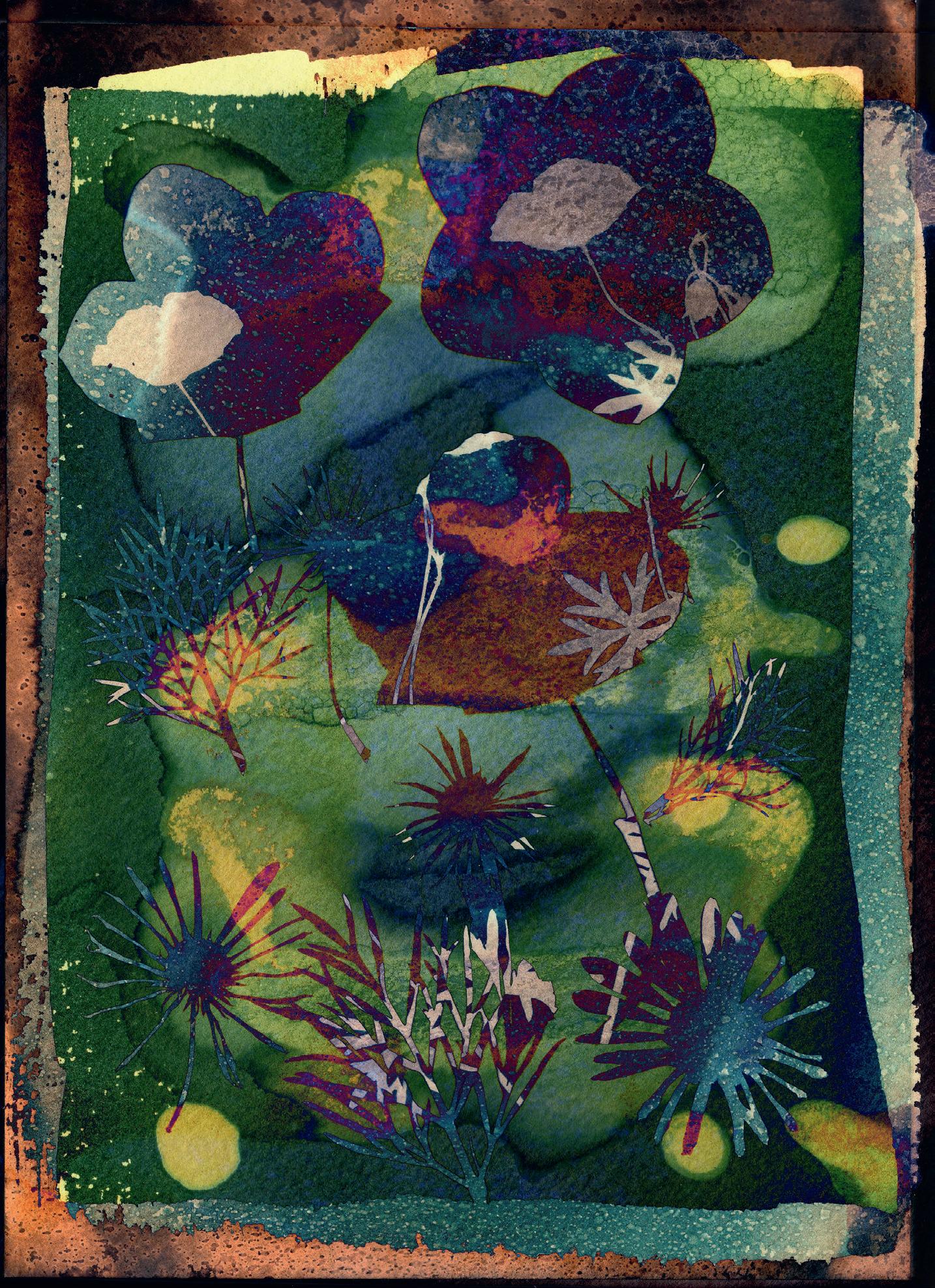
Experimenting with the images in Photoshop, I inverted the colour and Layer Blended, producing an aged effect. I also tried moving the flowers halfway through the exposure. This gives a shadow effect. With others I combined several images and layer blended them together. (below)
Poppies in the Rain
Colours achieved through layering and blending
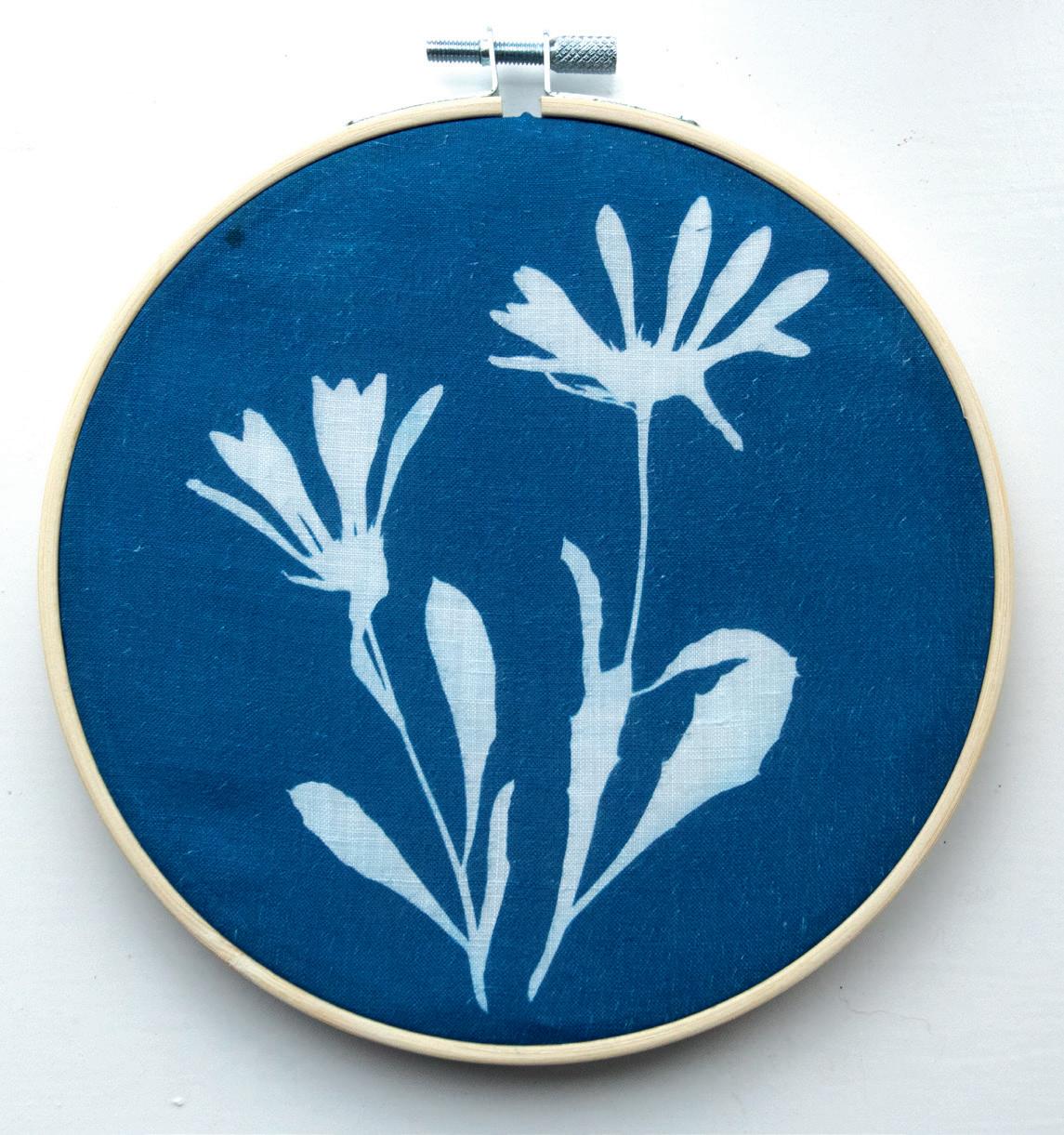
My next experiment was printing on cotton, using old handkerchiefs. The results were good enough to use as an exhibit for our Guild of Weavers, Spinners and Dyers exhibition. (right)
In pre-digital days, blueprints were used to copy technical drawings. In the same way a negative printed onto clear celluloid when exposed to UV light produces a positive blue and white print. (above left) I have yet to try printing on other things such as stones, eggshells, glass etc. My next experiments will be to use the cyanotype paper when the solution has just been applied and it is wet, adding more sprays, soap bubbles and colours to see what happens in this fascinating and unpredictable craft.
I have enjoyed learning about the cyanotype process, and I am building up a collection of leaves, flowers, feathers etc. to use in the future. The UV lamp has made such a difference: no more waiting for a sunny day.
For World Cyanotype Day on 28th September 2024, the theme was ‘Enchantment.’ I submitted my image called Flowers and Fairy Dust. (above right) There were submissions from many countries.
The slide show of all the images can be seen here: alternativephotography.com/world-cyanotype-day-2024
Balmerino Abbey Flowers and Fairy Dust
Circular image on old handkerchief
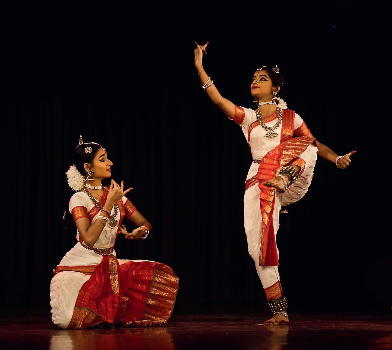
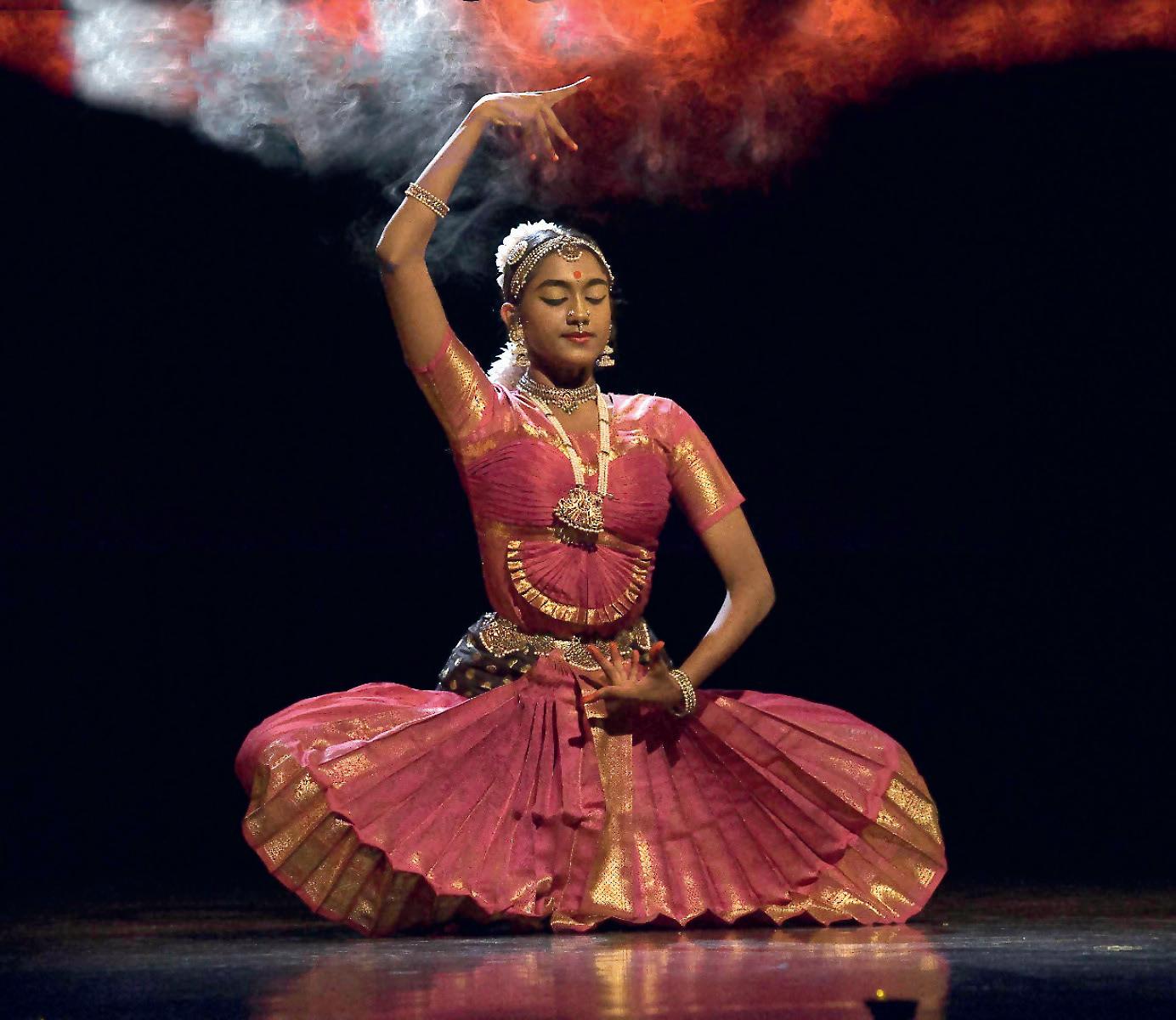
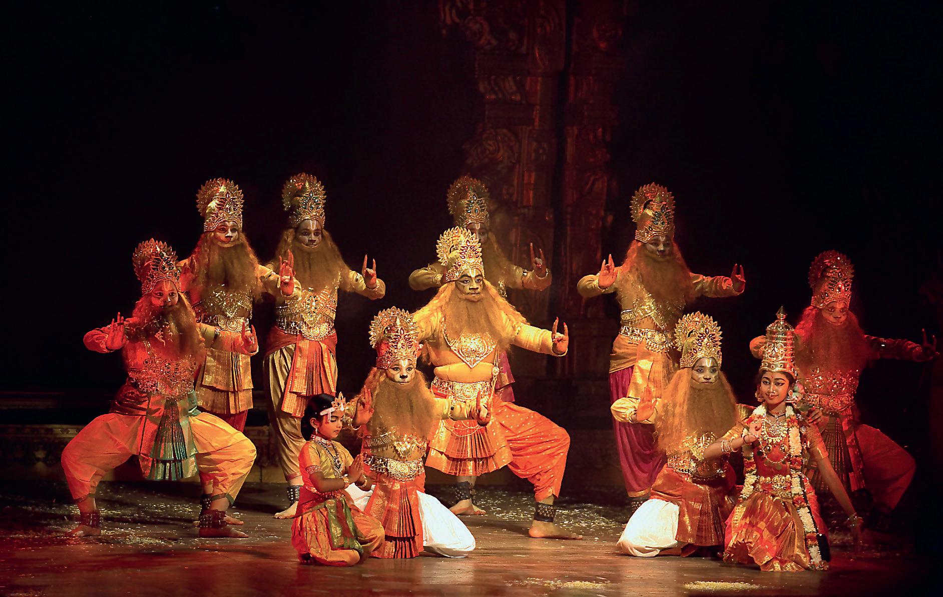
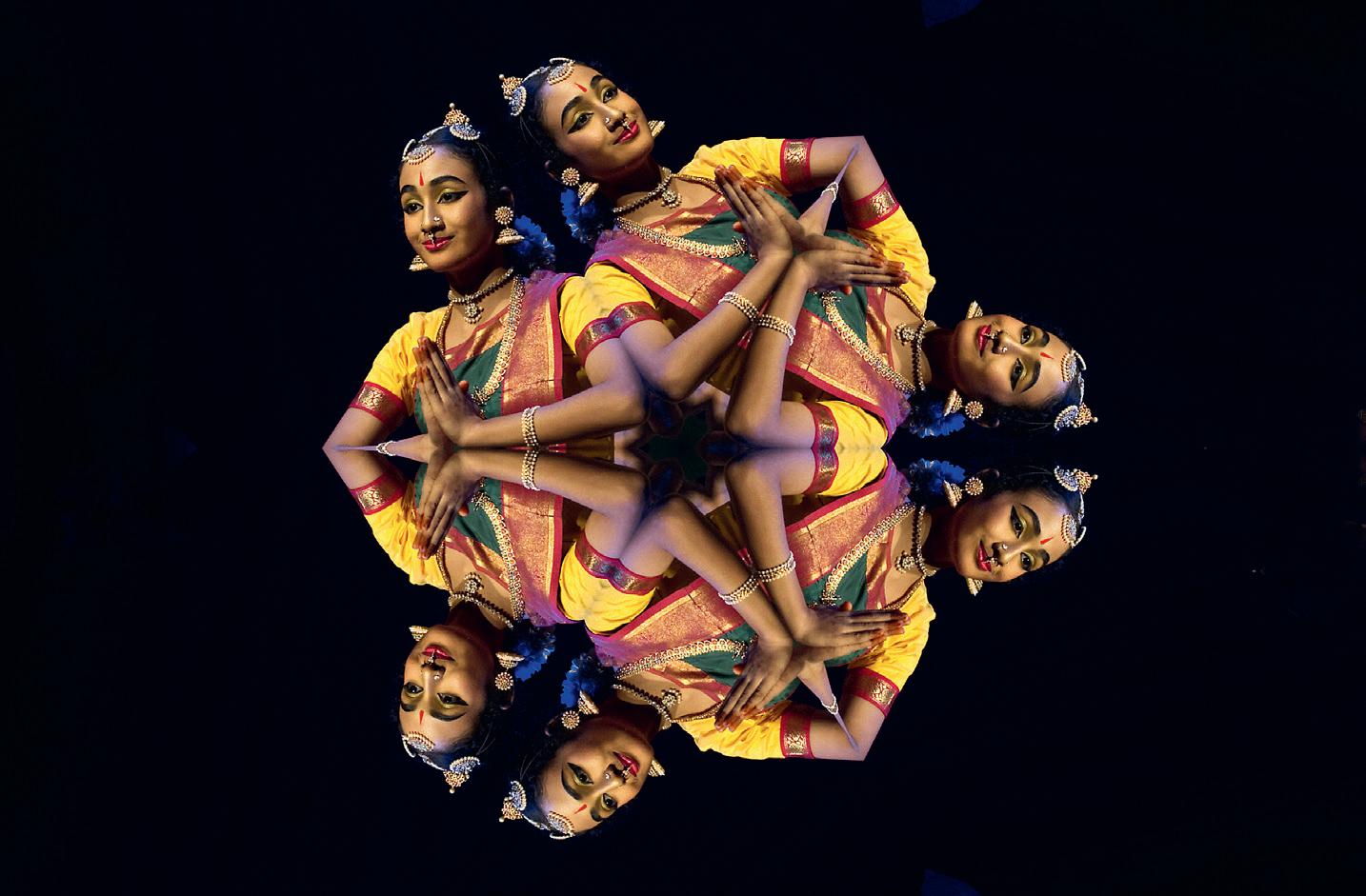
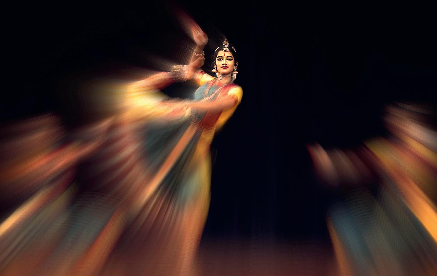
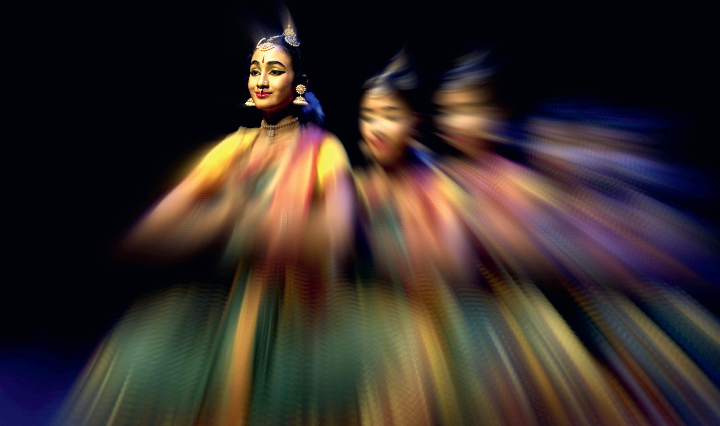
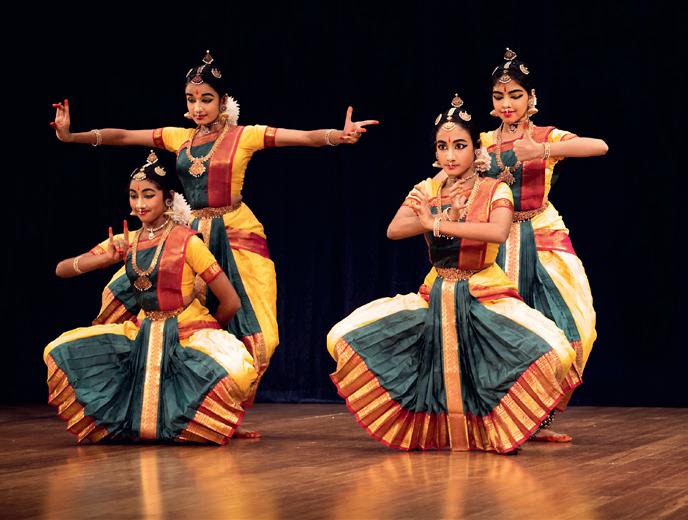
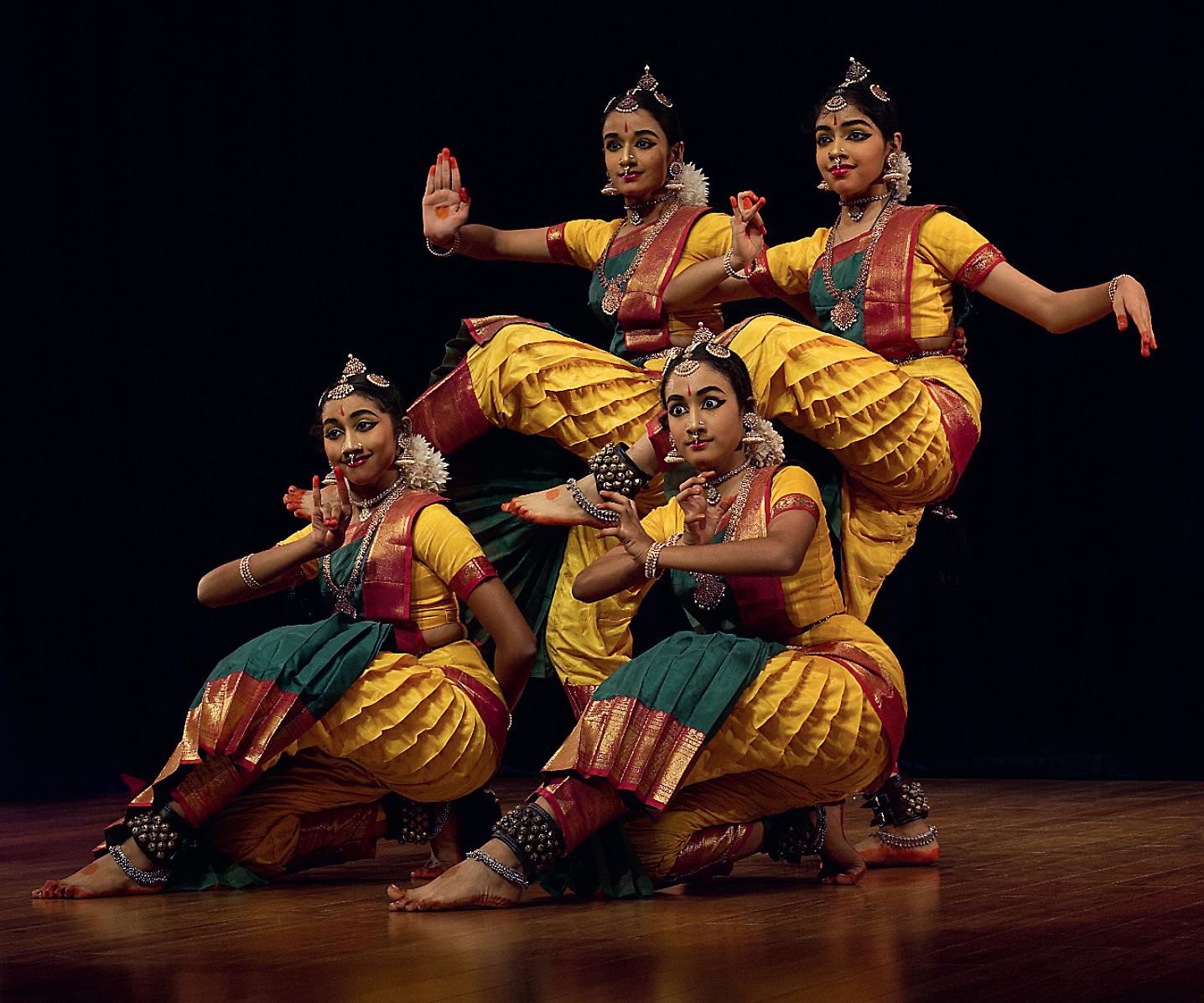
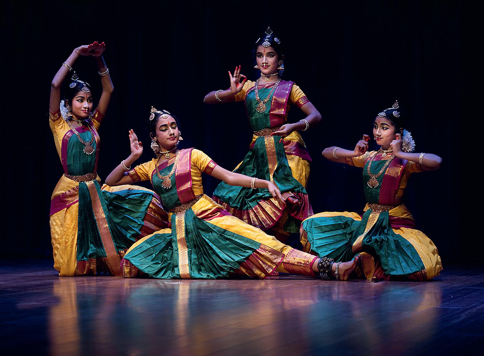
EVENING AT THE DANCE THEATRE
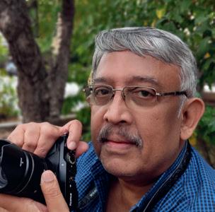
ASHOK VISWANATHAN
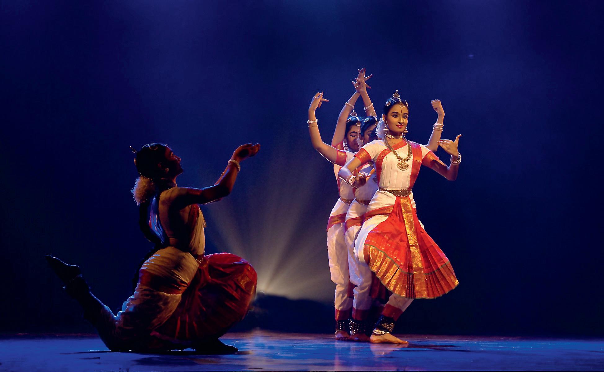
Ihave always wanted to photograph dance. Both traditional Indian classical dance as well as western ballet. Living in Chennai in South India, it is fairly easy to get opportunities to see seasonal classical dance shows of Bharatanatyam, Kuchipudi and Katak in the winter months of October to January each year. These are held at what is known as ‘Sabahs,’ the local theatre for fine art performances and the shows usually have some sort of sponsorship to help meet costs.
Classical dance dates back to the 5th century and rock sculptures depicting it can be seen in ancient temples. It has evolved over centuries and survived through various dynasties that ruled India, including the East India Company that did not approve of this art form. Historically the dance was performed in temples, with the style varying depending on the ‘school of dance’ and the ‘guru’ under which the pupil studied. Each dance recital involves a huge amount of co-ordination with
the venue, lighting director, musicians, costumes and of course the dancers themselves. A traditional dance performance involves years of training under a master before the student is ready for a stage performance. Usually, traditional south Indian families encourage their children as young as five to start learning so that they will be ready in ten to fifteen years’ time. The musicians and singer are equally talented with many of the leading musicians having a Doctorate in classical music. The dance itself is storytelling with music, using hand, foot and eye gestures to convey emotion. It involves lots of fast movements, very precise steps and timing as well as calling for a high fitness level.
Classical dance is a popular subject for local photographers. Photography is usually permitted but no tripods or flash and you remain seated in the audience. The lighting can go from low key to very bright and sometimes
coloured gel is used, casting changing coloured lights on the dancer. The backgrounds are usually black thereby separating the dancer from the background. This requires the use of spot metering so that the matrix metering does not compensate for the large black areas with no detail. My camera is the small mirrorless Fuji XE3 set at either a floating ISO of 400-1600 or a fixed ISO of 1600 or 3200 and with a 50-140 mm f2.8 lens set for manual exposure. Typically the exposure is usually around 1/250 at f5.6 which is a good place to start. Shooting in burst mode of 3-6 fps captures the peak moments. However, over the years I have learnt to anticipate the movement and now tend to use single shots fairly successfully. Capturing the peak moment also ensures the images are sharp as the dancer momentarily pauses. Traditional dance can also have multiple dancers on stage which can give some very nice compositions.
While dance itself can be an interesting storytelling experience, digital imaging takes it further in the post processing. It’s entirely up to the photographer how far you want to go. Dance is about movement captured in a still image. I use techniques like ‘mirroring’ and ‘motion blur’ to create selective blur of the hands or feet. It’s possible to create an image using layers where the principal dancer is sharp while the surrounding dancers are a blur. A slow shutter speed results in partial blur, usually the hands or feet that can enhance the image. It is a hit or miss approach. If you get an opportunity, Classical Indian dance is a subject to try your hand at. You will come away with some lovely images.
My RAW conversion is done on an ageing MacBook Air running Affinity Photo and using a profiled EIZO 24 inch monitor. Images are backed up twice to Seagate high-capacity external drives and saved in labelled folders.
Biography: I am a retired company executive with a passion for travel, landscape and portraits. I was a dedicated Nikon user from the early 70s and have now gone mirrorless with two Fuji XE3 bodies and four lenses. However, I still shoot in film, mainly FP4 and HP5 on a Rolleiflex and Hasselblad 500 CM systems. I am an enthusiastic exhibitor with several awards and considerable published works in print and on the web. I am also interested in alternative techniques of Cyanotypes, Bromoil, Van Dyke etc, using large format internegatives.
pbase.com/ashok_viswanathan
ALTERNATIVE DIMENSIONS
SANDY COWIE ARPS
Photography has been part of my life for many years, having started using a camera at the age of fourteen. I bought a Boots Beirette 35mm camera with birthday moneyand was immediately hooked. I became interested in printing images several years later when I joined a camera club in Aberdeen and had the loft converted to include a proper darkroom for the
processing of negatives and colour prints. I am still an enthusiastic printer, currently printing on a Canon Image PRO-300. I use Hahnemühle Fine Art paper and Brilliant White paper from Wex. The photographic print is the ultimate aspect of photography creating an everlasting statement and a great sense of achievement for the photographer.
What will happen to the millions of images stored on computers, hard drives and phones? I expect most will vanish into the ether. To counteract this, I have photo books printed on a regular basis and make audio visual programmes to be enjoyed now.
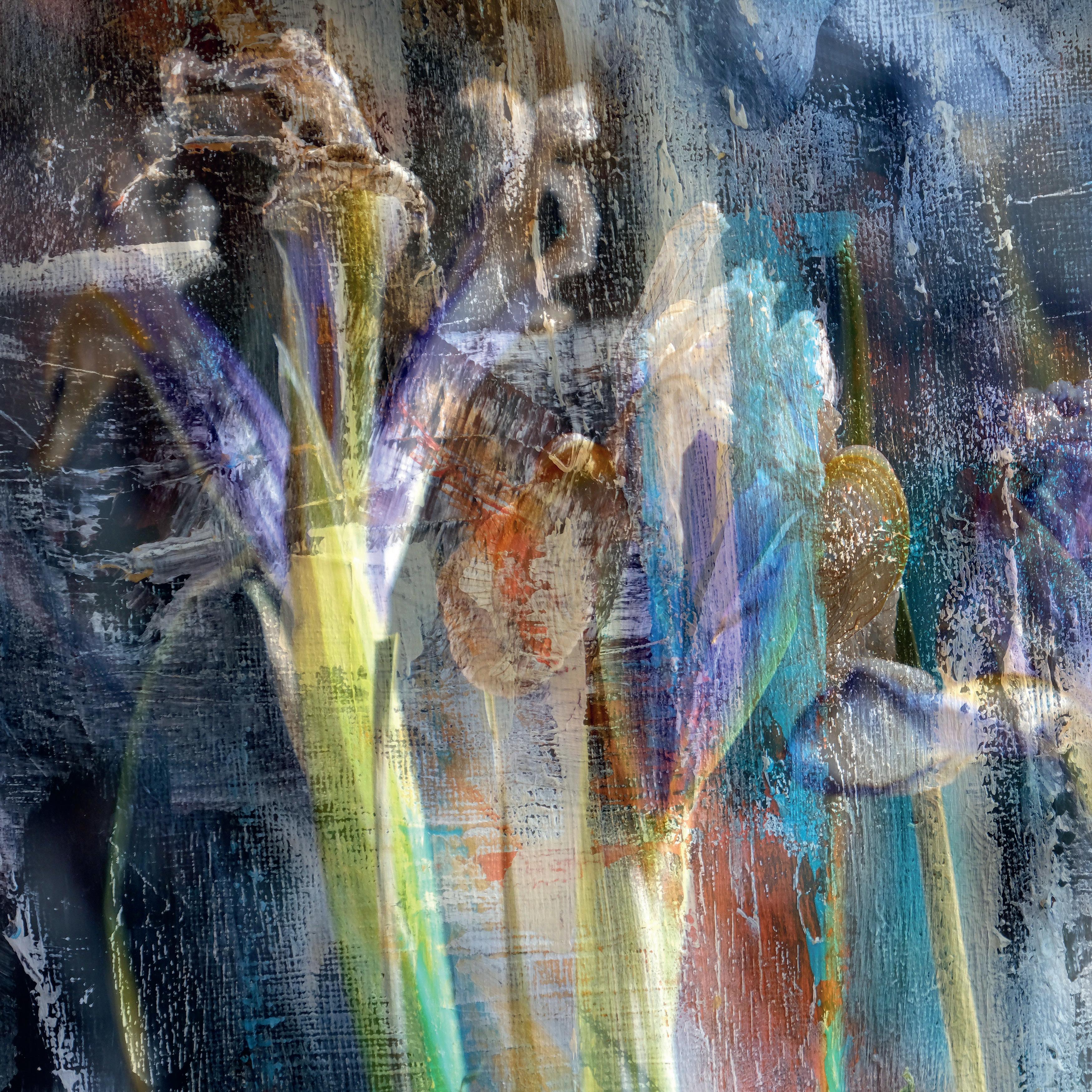
Irises
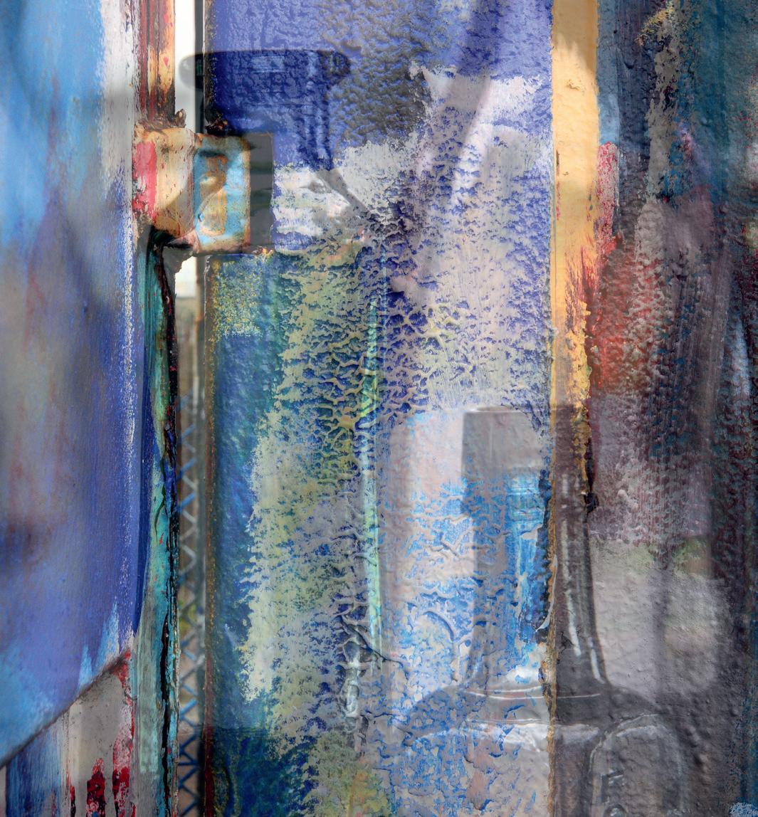
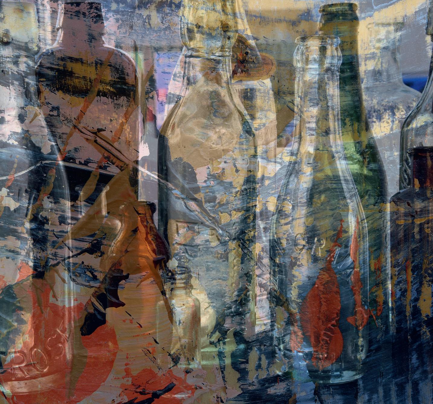
I live in rural Aberdeenshire and have easy access to the coast where beaches, rocks, cliffs and ruins are to be found. Donside, Royal Deeside and a host of National Trust properties including elegant mansions, castles and gardens are in abundance with numerous opportunities for photography. I love vibrant colour, and for my abstracts I paint my own textures on canvas, board and wooden blocks, sometimes mimicking Jackson Pollock! These are photographed and merged with objects such as bottles of all shapes and sizes to produce unique combinations and shapes.
In the early 1970s I attended a presentation by Charlie Waite at the Edinburgh Photographic Society. His images were square format landscapes and from then on, I’ve had a passion for a 1:1 aspect ratio image.
I achieved my LRPS in 1989 and 29 years later my ARPS. My intention was to use images from the underside of yachts which were wintered out of the water, and I found Lossiemouth the best location for this project.
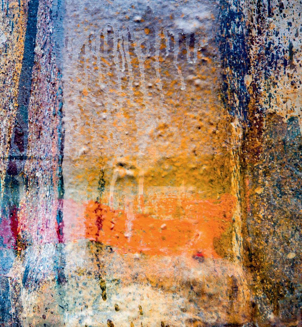
Multiple Bottles - Bottles merged
Sunny Bottles Blue - Bottles merged with container
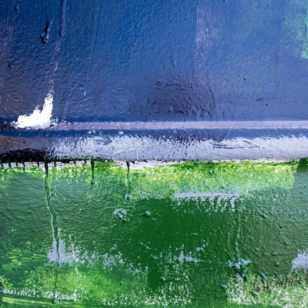
I presented six images at an RPS advisory day and was encouraged to continue with the concept. However, after numerous three hour round trips I decided to look for a different subject as my imagination couldn’t extend to the required fifteen images. I changed my interest to the paint marks on boat painter’s premises where the painters would unknowingly create their own art when cleaning brushes and rollers on the walls. I visited the boat yards at Macduff and Fraserburgh and over time accumulated enough images for my submission. I still enjoy this subject, though in creating these images one must be selective from the colour combinations and compositional perspectives.
I am a regular visitor to Aberdeen Art Gallery where one is surrounded by beautiful exhibits and architecture. A few years’ ago, I visited the Zandra Rhodes Exhibition and recently the Picasso to Warhol Exhibition. I also have an admiration for the work and achievements of Andy Hall from Stonehaven. Andy has written several books including Decisive Moments: A Guide to the Art of Photography I have also found great inspiration in Ian Lawson’s book From the Land Comes the Cloth, a book depicting the people and landscapes of Harris and the production of Harris Tweed. The Pier Gallery in Stromness, Orkney, is also an inspiring and wonderful art space where I discovered the abstract work of Ben Nicholson and became a fan of Wilhelmina Barnes-Graham, an artist of abstraction, line and form who was quite a predominant artist belonging to the St Ives Art Group after the Second World War.
My wife and I enjoy visiting Skye and the Outer Hebrides where stunning landscapes and beautiful everchanging light is in abundance. The way of life is very different to the mainland and the people are lovely. I find these islands to be so inspirational and spiritual and my only disappointment is that I discovered them late in life.
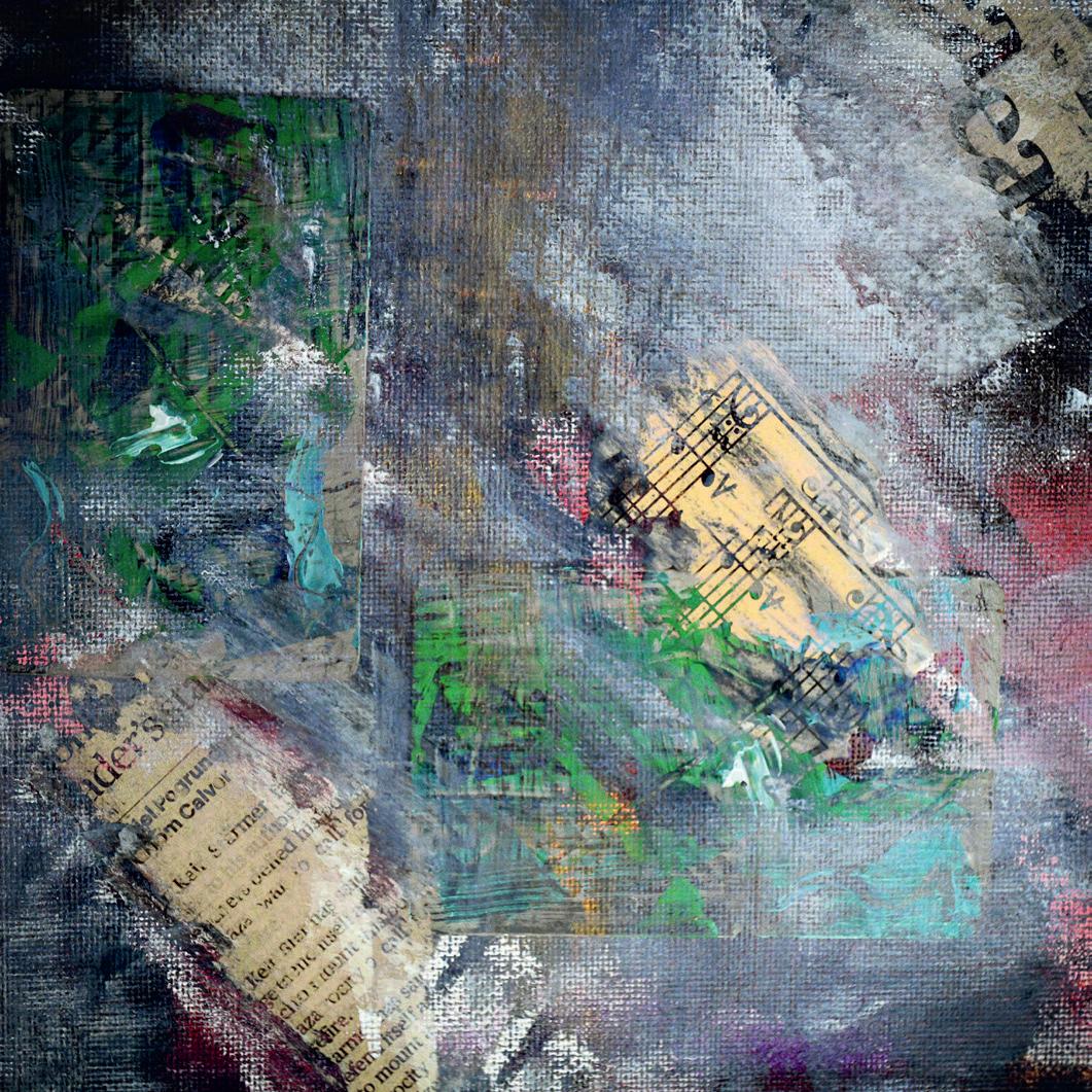
Last summer I spent some time photographing lupins in National Trust gardens having found them to be highly colourful and photogenic. I like to find new ideas for my photography and tend to always look around for subject matter and themes. Areas I go back to are corrugated iron, windows and curtains, landscapes, gardens, architecture, abstracts, close ups, interiors and textures.
Musical
On the Horizon
My current work includes landscapes using ICM and multiple exposures for soft and ethereal images, and for landscape inspiration I follow Shona Perkins and Bill Ward. My compositional preference is for big skies or big foregrounds. Photography has limitless opportunities, and these are all around us, sometimes near and sometimes in far-off places. We need to look, comprehend and look for originality. My eyes were opened many years ago and I’m still searching.