A MODERN DAY BRENDAN
JOHN MISKELLY FRPS
There are stories that an Irish monastic saint, called Brendan ‘the navigator’, is said to have visited Iceland in the 6th century, long before the Norse settlers arrived in that country. Whether this is true or not is open to debate, but in 2022, I had decided it was time for me to finally explore this most amazing country.
Over the years, I have seen endless images from Iceland, many from the so called ‘honey pot’ locations
around the coast, but I never felt the urge to travel there to do something that’s been done so often before, hence the reason that I had never visited Iceland.
So, what changed my mind? Well, it was simply the possibility of creating something a little bit different, albeit there’s very little that’s totally unique in the world today.
Back in 2021, I had purchased a
drone and I had been using it ever since to produce abstract landscape images from around the UK, so I thought that this would be the perfect tool to capture a slightly different perspective of the land of ice and fire.

In the months before travelling to Iceland, I spent many an evening planning precisely where I wanted to go. Using a mixture of paper maps, Google Earth and descriptions of the terrain, not

DIGIT Magazine 2023 Issue 1 5
A country with a population of just 380,000, Iceland boasts a wealth of unique sights and photographic opportunities. John Miskelly describes a recent visit with a camera and a drone.
A MODERN DAY BRENDAN
to mention ‘normal’ photos of potential areas, I identified around 20 locations I hoped to be able to visit.
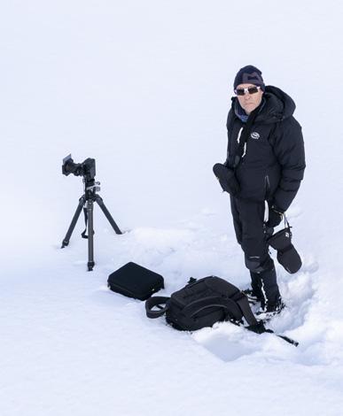
To make life even more challenging, I made the decision to visit the Icelandic interior using a 4x4 Jeep and ‘wild camping’ in a roof tent. This allowed me to travel along what are called ‘F’ roads, effectively unpaved gravel tracks, that criss-cross the mountainous central region of Iceland called the Highlands - the ‘F’ comes from fjall which means mountain in Icelandic. And so the adventure began in late September 2022, with a 10 day trip and over 50kg of camping, camera and drone gear to enable me to stay ‘off grid’ for most of my time there.
Each day I would drive for often three or four hours on the gravel roads, launch the drone and capture something I hoped was a little bit different.
Being self-sufficient, I had to ensure that my camping locations, my
food and fuel requirements were all very carefully planned, as there are virtually no fuel stations or shops once you leave the main road, Route One, which effectively follows the coast for over 800 miles, around Iceland.
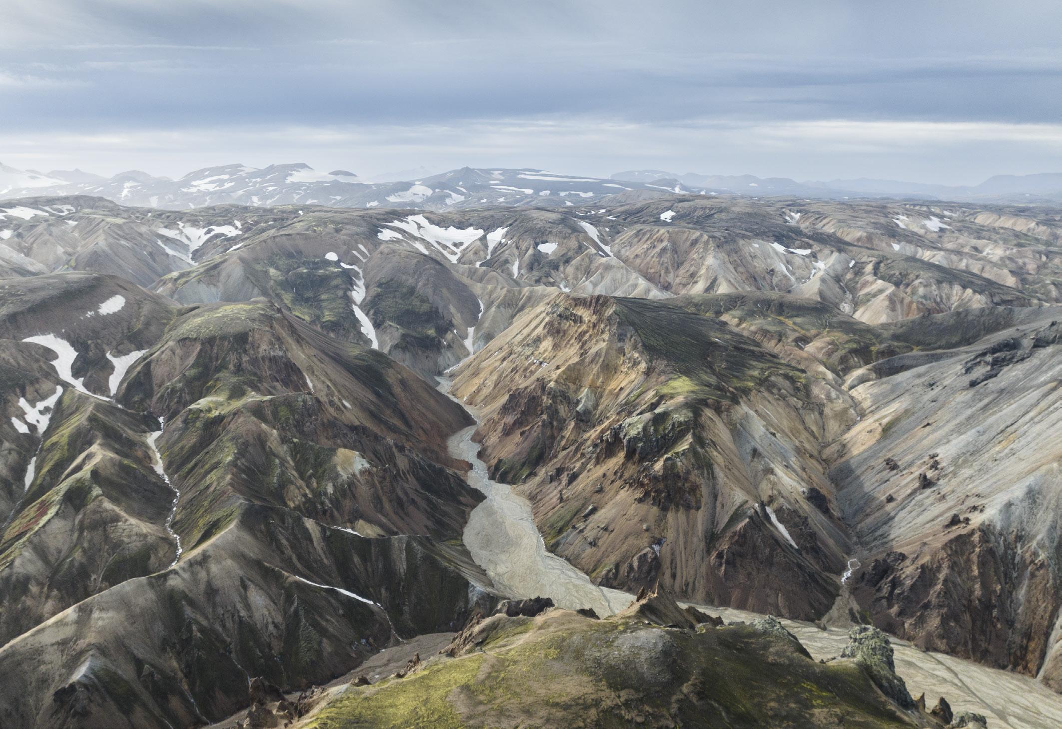
One of the locations I planned to photograph was the Landmannalaugar area (above), which contains an endless variety of geological formations, hot springs, rivers, gullies, ravines, canyons, and the famous Rhyolite mountains that can change colour from one hour to the next depending on the light.

Of course, the big scenic view is wonderful, but I wanted that abstract sense of the beauty of this amazing place, so launched my drone (a DJI Mavic 3 for those who are interested) to look for suitable images.
The thing to remember about drones, is that they are not a toy. I’m a qualified drone pilot and its essential to comply with the rules in whatever country we
intend to fly. The rules in Iceland are much the same as those in the rest of the world, plus the Icelandic Environment Agency has designated several sites as ‘dronefree’, where you’re not allowed to fly without permission.
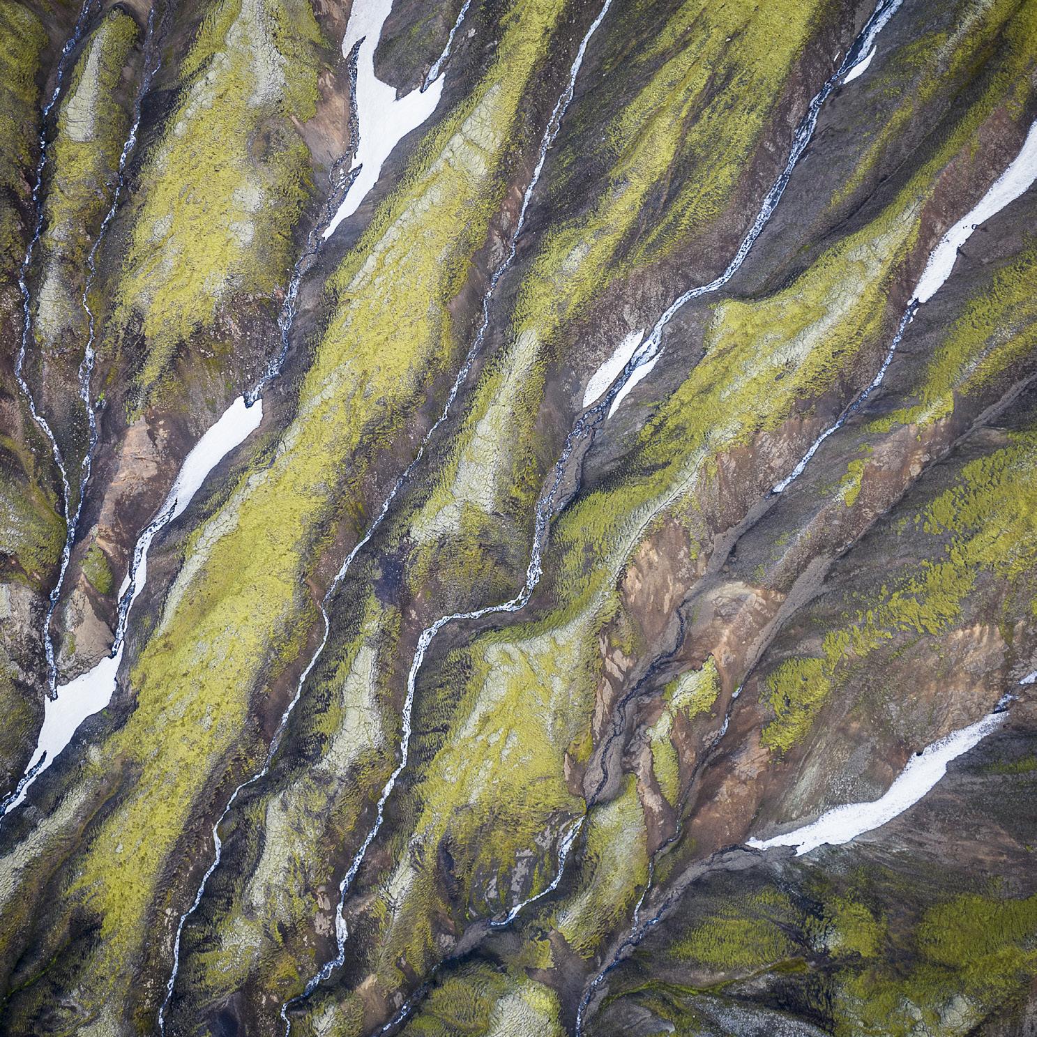
With the drone, I was able to see these mountains in quite a different way, capturing abstracts of the shapes, colours and textures by looking directly down on this amazing landscape.
A lovely day with diffused sunlight, which is perfect for my abstracts, I managed to get several images, with a typical example shown in Landmannalaugar Rhyolite (right top, next page).
The drone rules restrict my height to a maximum altitude of 120m, so I went to a height of around 80m to capture this image, where you can see a small stream, a pocket of winter snow, along with the wonderful colours and shapes of the rocks below.
Then, whilst I was driving back from
DIGIT Magazine 2023 Issue 1 6
A MODERN DAY BRENDAN
Landmannalaugar area
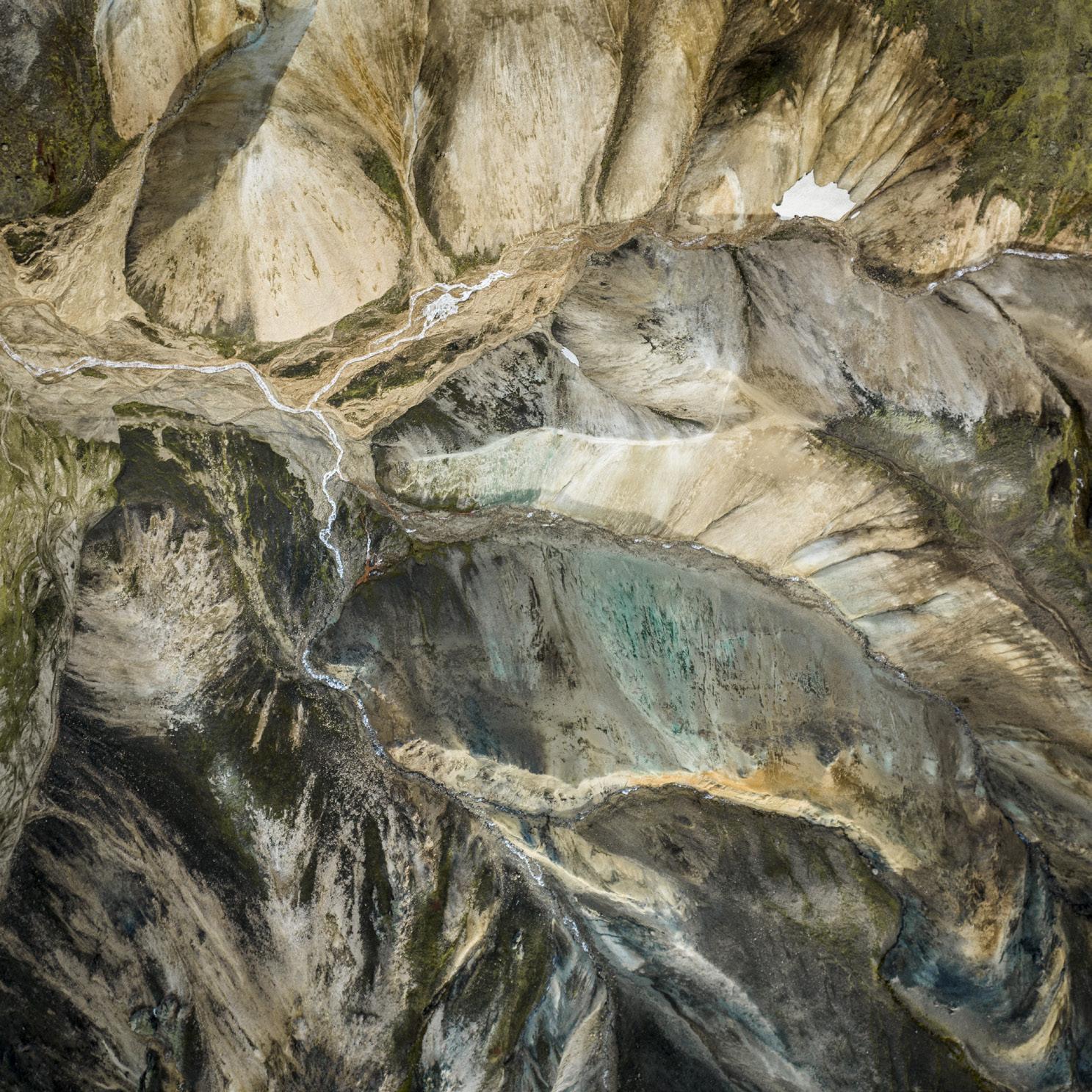
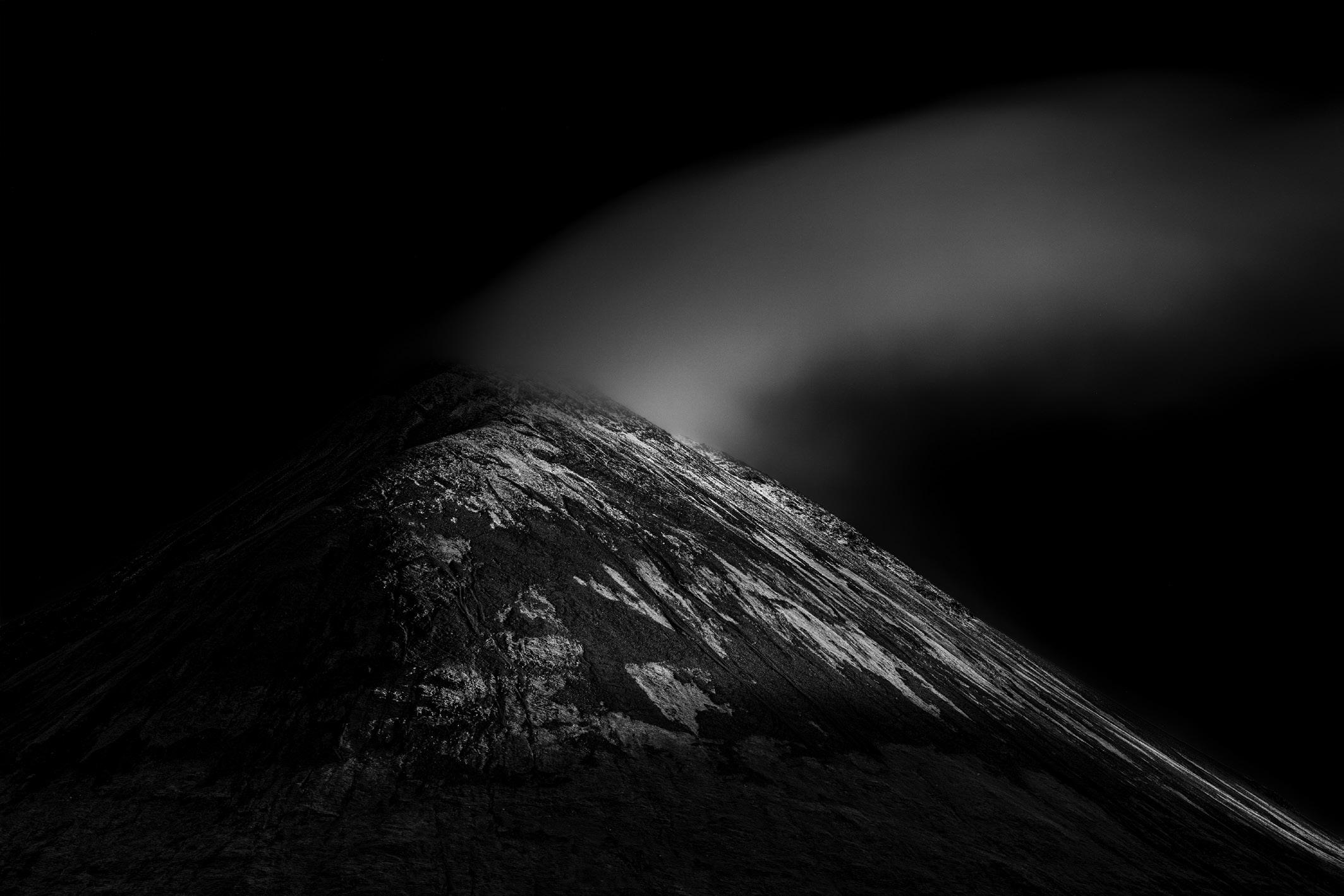
Landmannalaugar on the F225, complete with a number of river crossings, I turned a bend on the Landmannaleið road and suddenly saw the potential for an image in the mountains, which were back about a mile from the road. There were still traces of last winter’s snow in the cracks and fissures of the volcanic rock, which when set against the green moss, gave this abstract image some very strong compositional lines as shown in Landmannaleið (right bottom).


Of course, whilst travelling around Iceland, I couldn’t miss the opportunity to visit some of the very well-known locations such as Vesturhorn and the beach at Jökulsárlón Glacier Lagoon (often known as Diamond Beach).
Whilst I was at Vesturhorn, the famous Icelandic weather closed in, with some seriously strong winds. The weather actually turned out to be much worse than I was expecting, with the result that a 200 mile stretch of the main road (Route One) was officially closed for almost two days. That meant I was trapped at Vesturhorn and unable to go either north or south on the closed roads. After about 36 hours there, I made a ‘bid for freedom’ during the night, travelling about an hour south to Jökulsárlón, which was a pretty challenging journey in the gale force winds. Arriving safely at Diamond Beach, I spent a second night having to sleep inside the back of the car, as it was unsafe to try and use the roof tent. When I emerged the next morning, it was to the most wonderful sunrise (albeit, still extremely windy!) but with nobody else on the beach. From talking to other photographers, this beach can have as many as 200 photographers there
DIGIT Magazine 2023 Issue 1 7
A MODERN DAY BRENDAN
Landmannalaugar Rhyolite
Landmannaleið
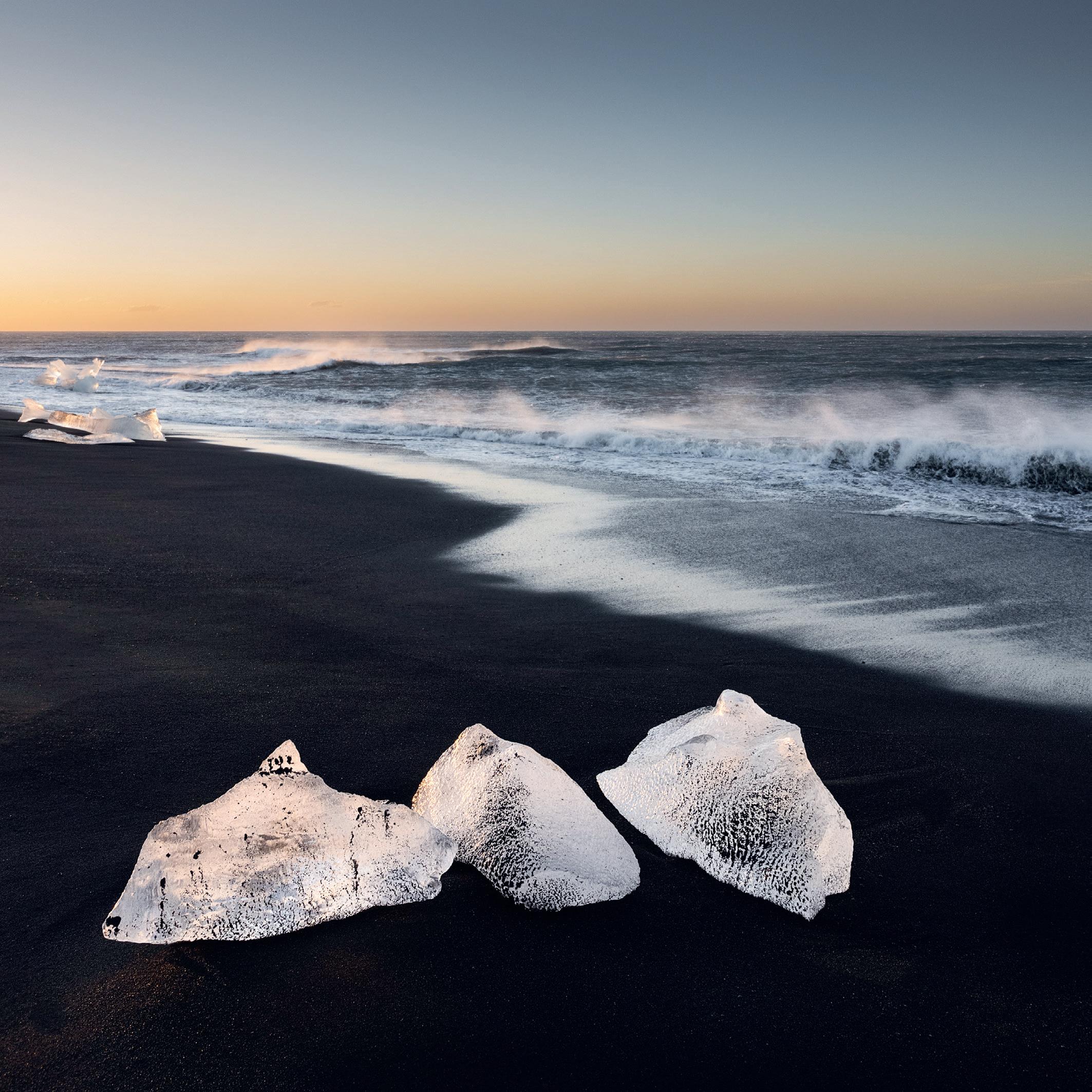
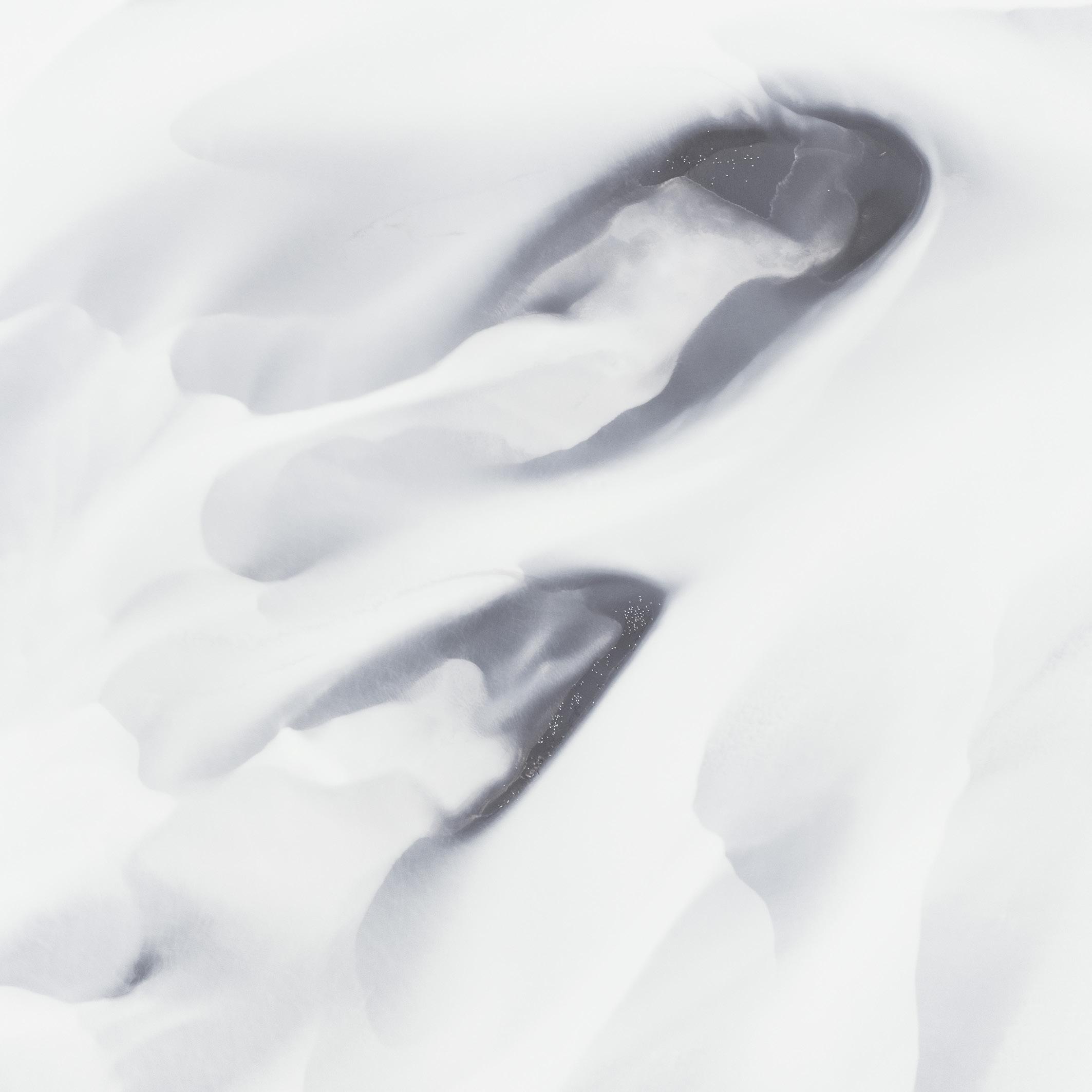
at any one time, so being alone was a huge privilege. And even better when I was able to get some amazing images of the lumps of ice that break off the Jökulsárlón glacier and end up on the black sand of the beach as seen in Diamond Beach Ice (above).

Much to my regret, there were no active volcanic eruptions whilst I was there (the Fagradalsfjall volcano eruption had ended just a couple of weeks before I arrived), there is obviously a lot of evidence of the volcanic origins of this part of the world. Iceland sits directly over the
Mid-Atlantic Ridge tectonic plate boundary, which separates the Eurasian and the North American plates.
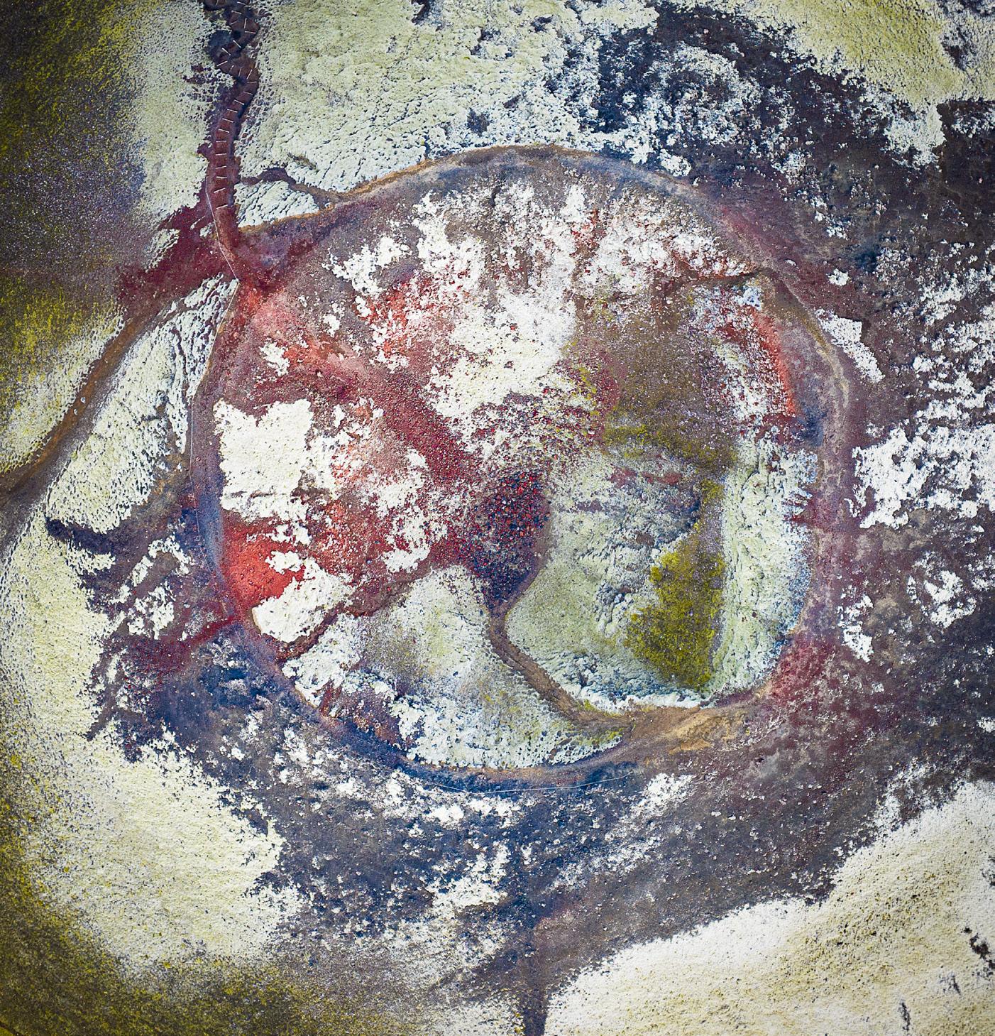
So instead of seeing an active volcano, I did travel to the Stútur crater, one of the smaller volcanic craters dotted around Iceland. Launching my drone to get an aerial view of the crater, the oxidised iron gives a wonderful red colour in the rock, along with the textures and patterns of the rock. Again, I was trying to show a different perspective of this most amazing place and create something more
in the vein of fine art rather than a recognisable representation of the area and actually think this image, Stútur crater (left top, next page), looks more like an eyeball than a volcanic crater.
After crisscrossing Iceland for over a week, I came across what became one of my favourite locations, with the irony being that it was only a 20 minute drive from the town of Selfoss, and accessed via a ‘normal’ road!
I had been looking for interesting shapes and colours from the many rivers I came across in Iceland,
DIGIT Magazine 2023 Issue 1 8 A MODERN DAY BRENDAN
Diamond Beach Ice
Diamond Beach Ice
but despite several attempts to capture something I liked, it hadn’t produced anything that I was happy with. So, it was with low expectations that I drove to the Olfusa River, south of the town of Selfoss. There had been a lot of rain, so the river was flowing fast, carrying large amounts of water from the mountains into the sea. I found somewhere that provided a good launch place for the drone to explore this area and see what might be there.
And to prove the point, the place I least expected to capture anything good, was the place where I got something very different and exactly the sort of image I had envisaged before I headed to Iceland.

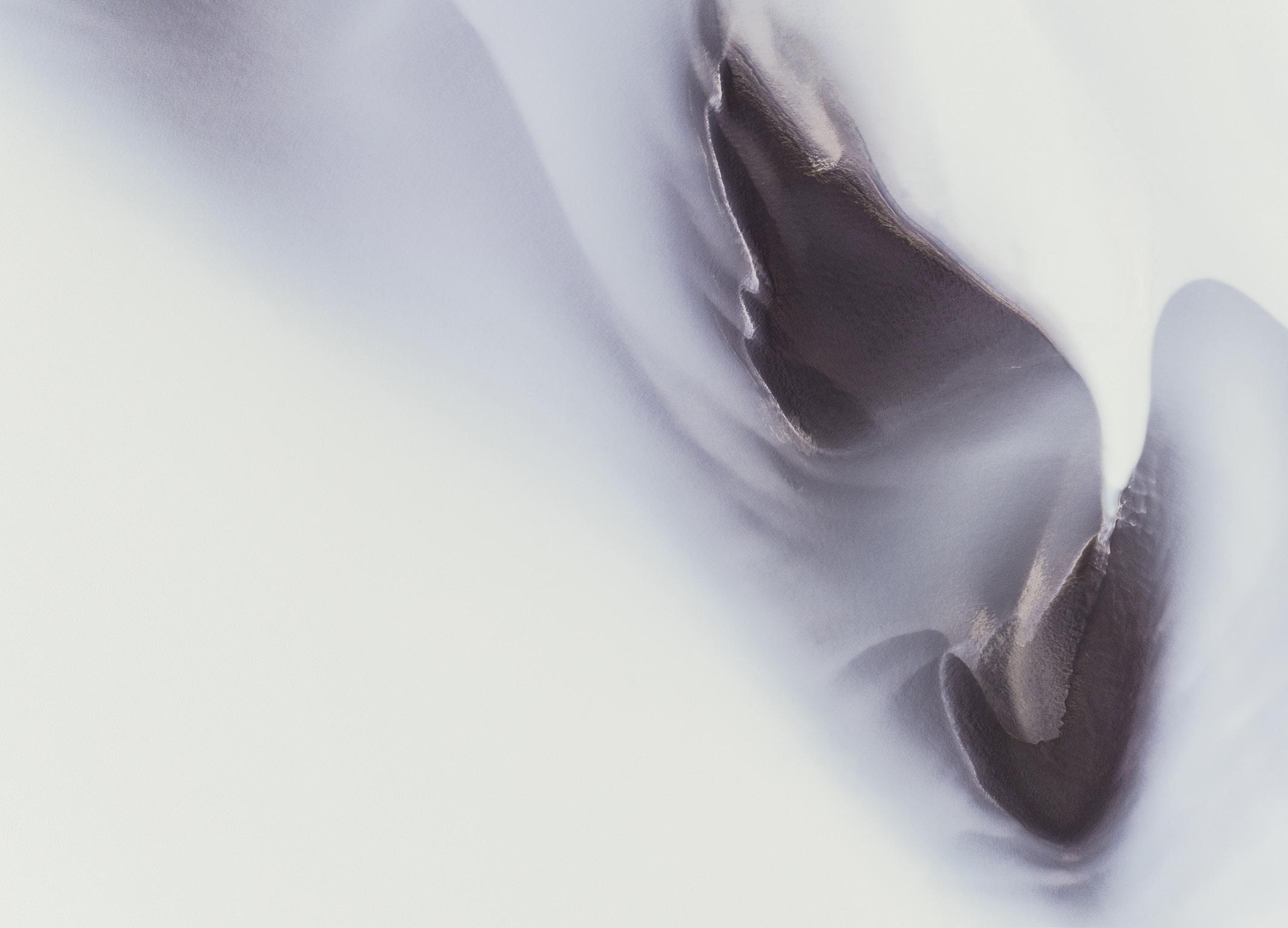
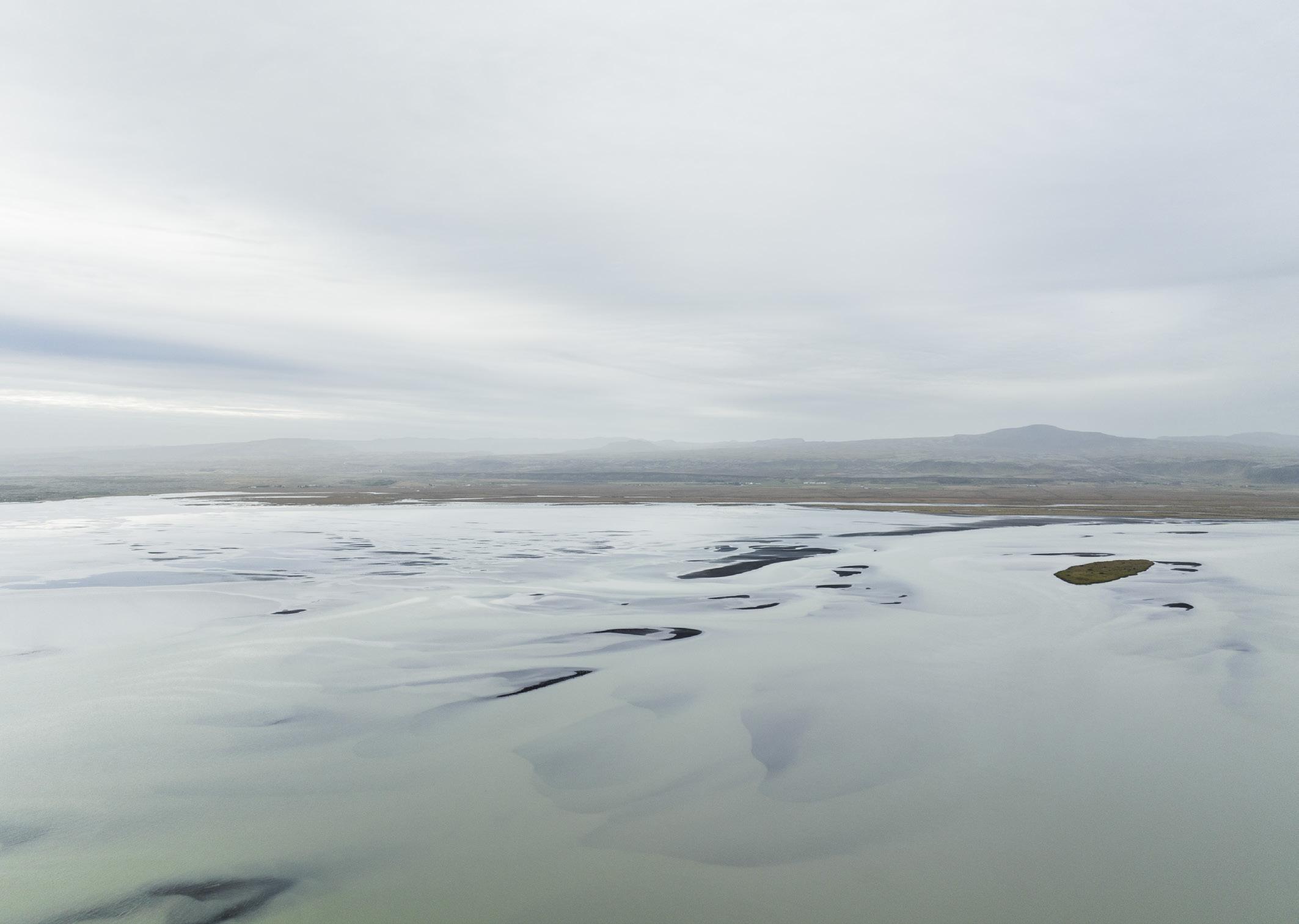
As I flew the drone over the river, I sensed there were some great abstract shapes and patterns to be captured as shown in Olfusa River (below).
It only took a short 20 minute

DIGIT Magazine 2023 Issue 1 9 A MODERN DAY BRENDAN
Stútur crater
Olfusa River
River
flight to capture a series of images, showing the flowing water, which looks like white silk, with the patches of black sand showing through. The reason for the white colour of the water is due to very fine-grained, silt-sized particles of rock, which are generated by the grinding of bedrock through glacial erosion. Because the material is so small, it becomes suspended in the flowing river, making the water appear cloudy. Silken River (above) is an example from this series, where birds can also be seen as white dots on the black sand. l
This article has hopefully made us all think a little bit about what we take and why we take it, photographically speaking.
So, what was my own key ‘takeaway’ from Iceland as a modern day Brendan the navigator? I suppose it can best be summed up by what Albert Einstein once said, “the most beautiful thing we can experience is the mystery” and I hope, in my own small way, to have experienced even just a little, the mystery of Iceland. I think its fair to say, I’ll be back

DIGIT Magazine 2023 Issue 1 10
Silken
A MODERN DAY BRENDAN
THOUGHTS ON MY ‘A’ PANEL
DR SESHI MIDDELA ARPS
My panel was recommended for ‘A’ in April last year. Following that success, I was asked to share my panel with the Accolade magazine, which made me feel privileged, but a part of me wanted to share more than just the panel and my favourite image. I read somewhere that success and accolades are just the tip of the iceberg, just ask the Lionesses who won the Euros not long ago. Behind their Euros success is the hard work and travails of every team member including the unseen support staff. As the common motivational poster hanging on many office walls
illustrates, accolades and success are just the tip of the iceberg beneath which lies a huge, often unrecognised amout of work and effort.
This writing is about the importance of the photographic journey, especially the concept of a particular ‘time and context’ of your own journey. Some may choose not to describe the distinction process as a journey, but for me like many of us it’s a journey. If I have to say that my ‘circumstances’ in reaching this accolade of distinction is all relative to time and the context, you will be hardly surprised. Every event in

history is relative to time, as many of you will agree.
Photography is not something I’ve picked up as a hobby. I used to photograph the post-operative specimens during my medical school training using early Minolta point-and-shoot cameras during the late nineties. They were made into slides and used for educational purposes. You can say that my journey actually started at this point but the context of my photographic origins is different.
The travails of life take over and it’s not until 16 years later

DIGIT Magazine 2023 Issue 1 11
Seshi has recently been awarded his Associateship of the Society. He shares with us the journey that led to this distinction.
THOUGHTS ON MY ‘A’ PANEL
An image, part of the series taken for the panel, which is a particular favourite of the photographer that didn’t make the cut
you pick up the camera with an intent, a specific intent to go out and photograph rather than just photographing your family and holidays. Intentional photography at first was very foolishly addictive. The inner child in me made me photograph everything around me. I was excited, enthusiastic and basically every shot taken was an unintentional mistake. There was a perennial sense of disappointment and despair with an occasional sense of joy and relief with a serendipitous ‘beautiful’ picture. My inner child wanted to show my pictures, wanted to be appreciated and validated. That primary school child led me to my ‘L’ which was awarded in 2012. It was many autumns ago, and when I see the present L panels there has been an exponential increase in the standards. Again, in the context of my journey made at that time, I wonder whether my ‘L’ panel would have been recommended during the present times.
The child’s need to be constantly recognised petered out quickly
but the learning activity persisted. I was still photographing landscapes though limited to weekends, weather permitting mainly to get out. I have now grown up and found my genre, landscapes in which to specialise. Its intriguing that we start off as a child and find our own genres to specialise subconsciously. Why landscapes in the first instance? The answer lies in ‘why photography’ in the first instance. I wanted tranquillity and beauty in my memory which is in fact a kind of escapism from my hectic normal day.
At this point, I have realised the most important phase of my photographic journey. I had this everlasting urge to get out away from the crowds, spend time in solitude. We are talking more about mental health issues now, but I have realised sometime ago that after being surrounded by people every day as a health care professional, I needed to be myself. It is now an incurable addiction. I hold two jobs, a surgeon and a photographer, which complement each other very

well. I was becoming a hoarder, just venturing out and photographing for myself filling up the hard drives keeping Amazon services busy. The pandemic lockdown happened and I am sure like me, everyone’s life turned upside down in the following turmoil. On my wife’s encouragement, or rather insistence, coupled with space created by my children’s absence (we are both medical frontline workers and decided to send the kids away to my friends for three months), I applied for ARPS assessment in landscape genre to be taken in August 2020. In the context of time, would I have started the journey if It was not for the pandemic.
Why RPS? It is professional body helping to maintain the standards. I am not a person who is socially visible or competitively oriented but being a member of the RPS, made me think about ARPS.
I went through the assessment process on the RPS website numerous times. But, I was not
DIGIT Magazine 2023 Issue 1 12 THOUGHTS ON MY ‘A’ PANEL
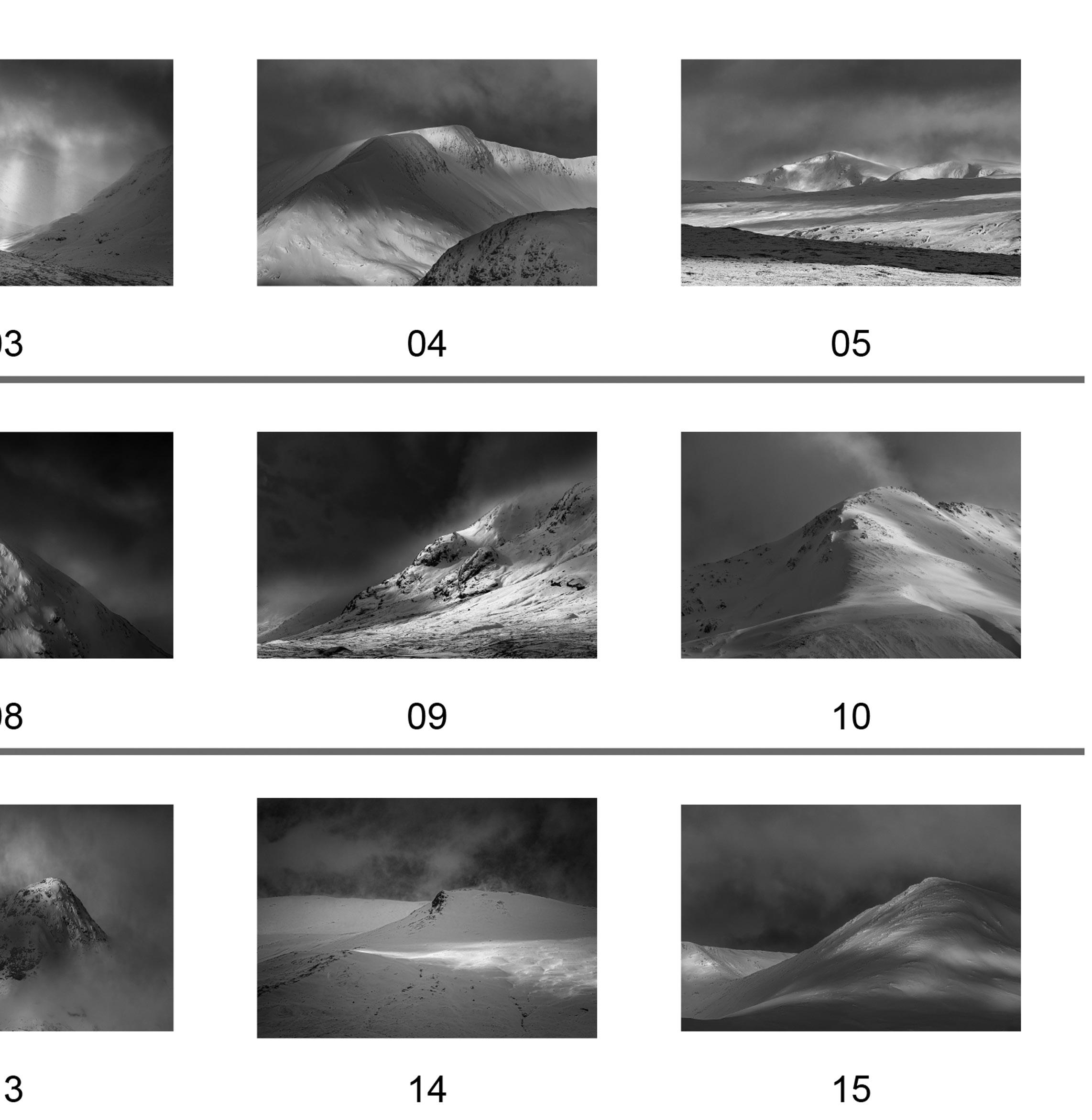
From the series Snow and Rock - the photographer’s personal favourite from the failed panel
ready due to the lack of time to focus due to pandemic workload yet there was general feeling of being quietly confident about the process because I thought I could piece together 15 images and a ‘Statement of intent’ (SOI). I had to postpone it for next time, April 2021.
The ‘why photography’ part of my life came in handy for composing my SOI. I wrote my SOI first but the difficult part was choosing fifteen images to match my SOI. The impossible part was choosing the order of your images. I struggled to put 15 pictures together delving amongst the hundreds on my drive.

I booked an one-to-one which was to be in December 2021 with Tim Rudman, the man himself. I had not heard of him until the email arrived from him. Forgive my naivety and ignorance, mainly due to the lack of research and understanding of the principles of the Distinction process even at this point. How hard can it be? I constantly use evidence based on research to treat my patients. I have been indoctrinated to do so.
Unfortunately, just before the oneto-one my mother was in ICU and my frame of mind was broken hence
it was cancelled.
Time went by, things improved both on personal and the weather front. The crisp sunshine still in the middle of a lockdown created a dilemma. I had to go for the assessment this time in May 2022 (you cannot postpone it twice). I was feeling smug (but it was unjustified, as I found out later) yet anxious because I had no help with the panel. The assessment went ahead which I could not attend due to work commitments. The email from the RPS, arrived very early on the day with the news about my panel being unsuccessful; it was not recommended. My heart sank from the disappointment. My confidence lay shattered exposing my deficits in preparation, which was to be discovered later during the journey. My work simply was not up to their expectations.
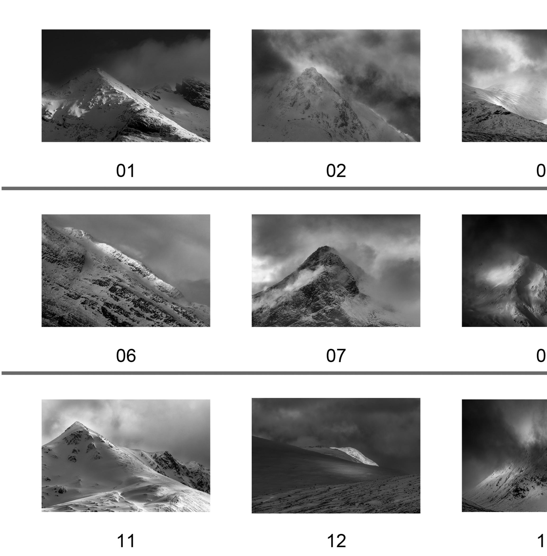
My unsuccessful panel is shown below.
I was still in denial when written comments came a month later. The comment on halos reflected my lack of processing skills. Some of the pictures were darker than the rest and were out of place not fitting in with rest. I was angry about
that comment at that time because they were my style, more or less my favourites. They also reported repetition especially about the mountain tops, but you could argue about that because the panel is about Scottish mountains. There was cohesion but lacked uniformity. Overall, it was full of imperfections which made me really uneasy. There were disagreements between the panel members’ comments and my head when processing the loss, but reconciled during the later stages, understanding the fact that it’s their house and have to abide by their rules. The preparation was not confluent, so their decision was right.
I went through the email report whilst in denial, decided to compartmentalise my loss, pressed ahead with my life and photography. I retreated into my shell like a typical Cancerian and overcompensated by extreme photography, which I missed in the‘enforced’ lockdown for two years, losing sight of what was needed to achieve my Distinction. It was like an addiction withdrawal. The Distinction was not important at this time, but photography was. As a consequence, I missed the October
DIGIT Magazine 2023 Issue 1 13
THOUGHTS ON MY ‘A’ PANEL
2021 assessment date.
I sort of pulled myself together down the time line, became sober and accepted my loss. I rebooked the one-to-one and sat down with Tim. He spotted my complacency straight away and very subtlety made a point about it, asking me to focus, which was a wakeup call. My SOI was poetic, very flowery and a suggestion of third party opinion was needed.
I felt that the repetition issues were not suiting my SOI, hence I had to change the panel. Remember,
you can have a whole panel of mountain tops but that should match your intent. Also, you can have a complete set of dark images but it should suit the SOI but there is a catch. Technicality is very important, the relevance on not having blown-out highlights and loss of details in the shadows…the perfect histogram still exists. I had to improvise, evolve and overcome. At the same time, I came across an ARPS mentoring group run by Mike Psyllides of RPS London Branch. I shared my failed panel and my SOI

for critique, which they commended as being brave for sharing. This group was very helpful, especially with SOI. I realised that there is a poetic, William Wordsworth way and also a newspaper editorial way of writing the SOI. I changed my SOI and revamped my panel carefully trying to avoid the technical mistakes made earlier. I booked myself for an assessment in April 2022, nearly two years after starting the ‘A’ project.
I requested another one-to-one (you are allowed two for the same
DIGIT Magazine 2023 Issue 1 14
THOUGHTS ON MY ‘A’ PANEL
panel) and this time it was an invite from another great man, Paul Mitchell. I have heard Paul lectures on zoom during the Covid times but never realised that he was on the panel. Paul helped me with refining my panel, especially pointing to the ones lacking visual awareness, which meant that it was not befitting of the panel and SOI. Finally, with Tim metaphorically kicking me to take things seriously, the ARPS group help and Paul’s overall help in refining the panel, I submitted my panel for assessment
last April.
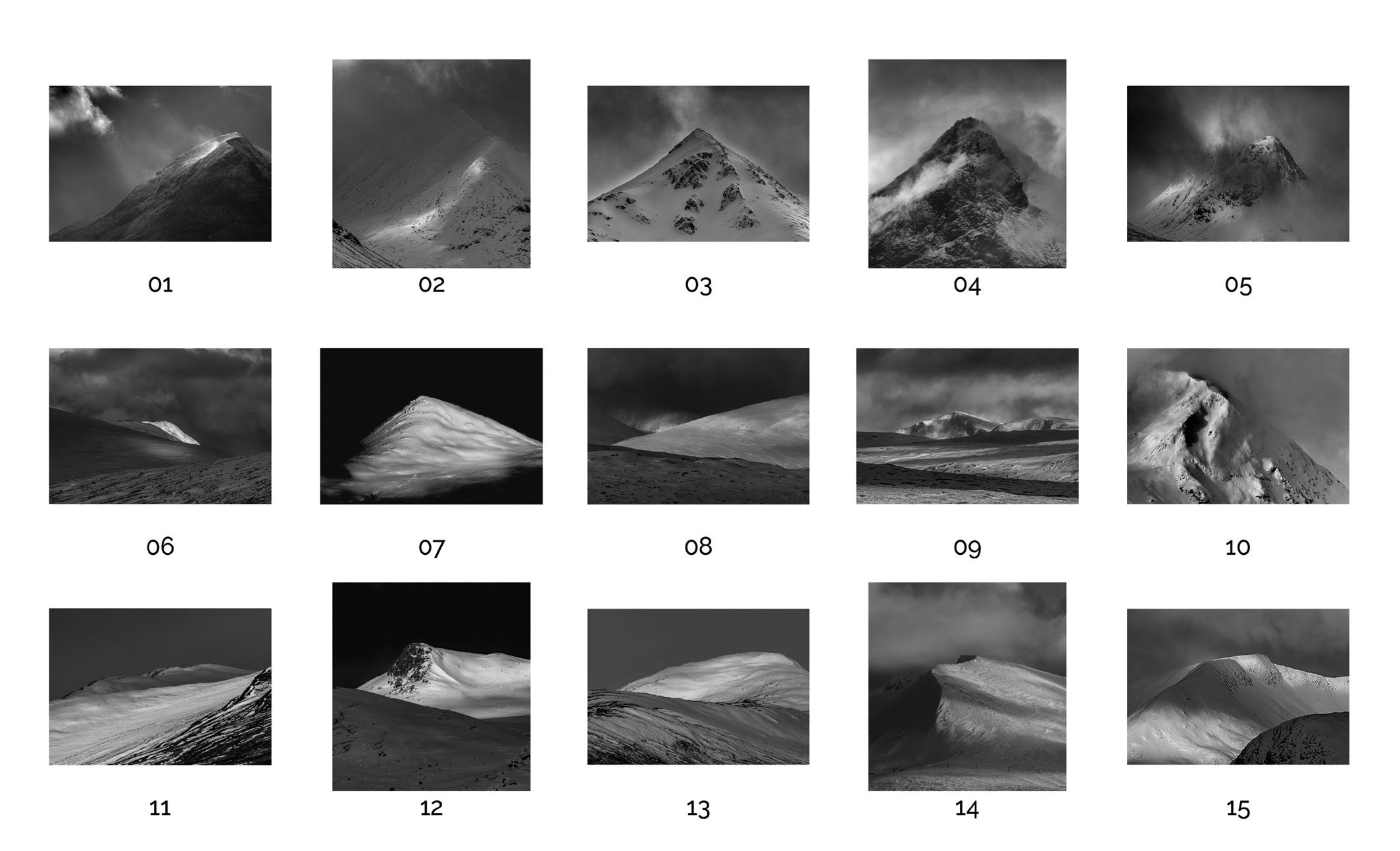
You can see my successful panel below.
My final SOI is below: I like to photograph the breath taking Scottish mountains for their shapes and forms, especially when they are covered in snow which enhances their geographical features. The dark barren rocks devoid of snow amplify the ruggedness. The directional light cast a multitude of shadows creating contrast and
revealing the depth. The fleeting light enhances the textures and patterns of the mountain surfaces. They have been my source of my sanity for the last few years and gives me immense pleasure photographing them.
So, after numerous iterations to the panel and the SOI, it was put in front of the assessment panel. This time, I sat down to watch it on zoom (thanks to Covid), with a blank mind with no expectations, which I vividly remember. The panel’s comments were very friendly and

DIGIT Magazine 2023 Issue 1 15 THOUGHTS ON MY ‘A’ PANEL
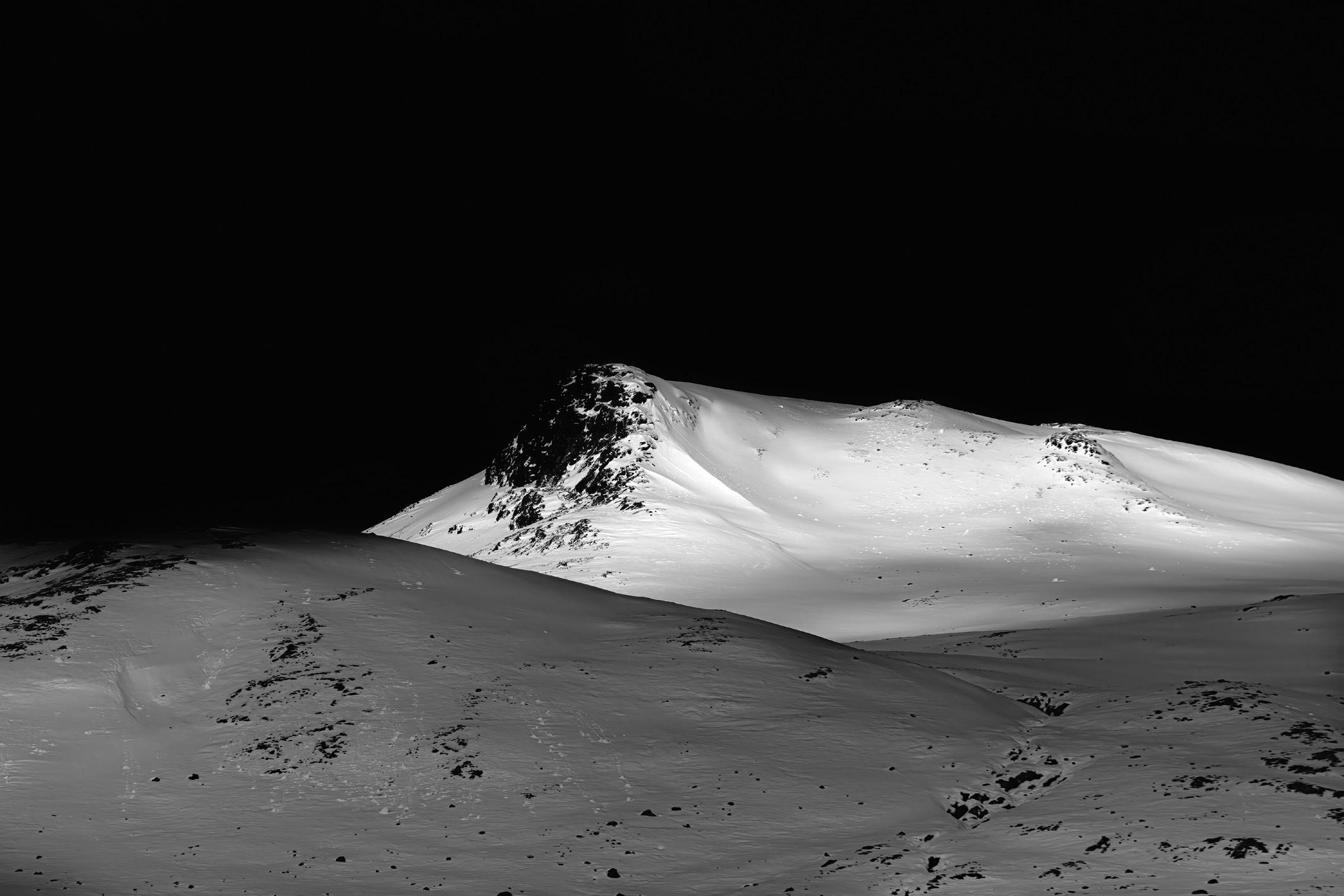
they recommendation my panel for ‘A’. One of the comments from the chair, Joe Cornish, was about the SOI not mentioning the emotional impact on the photographer. Point taken, sir. I did not feel anything on being successful, just numb, and even today I am struggling to feel any emotion except that I was relieved that this journey has now finished. My wife was ecstatic, because she was one who kept pushing me and finally had the last word, “I told you so”.
One image, from my series called ‘Snow and Rock’ (see page 12) which did not make the panel, is pure snow on the rock showing the raw beauty of the play of snow on the barren rock.
However, the panel reckoned it’s too dark and stood out amongst the others, which I agree. If I had put 15 of these similar images and changed my SOI it would probably work, or would it be repetition?
Another picture (see page 11), part of the same series, which is a particular favourite of mine which never made the cut.
In the context of RPS Distinctions, I have made a few mistakes. RPS is a society and you have to play by its rules, which means that sometimes you have to curb your own instincts. My unsuccessful panel had a few of my favourite creative images, nevertheless it did not fit in harmoniously with my initial arrangement. I understood the importance of the Statement of Intent, but merely felt that it should describe the panel, which is true, to an extent. The language however was not descriptive but poetic. This is a reflective realisation after my initial failure.
It was like a jigsaw puzzle, piecing 15 images, making it look like 16th image, and finally piecing the SOI to sing about it. It’s the technical perfection, the visual coherence, the visual style of the pictures along with the SOI which will provide a personal understanding of our personal expression. Some may choose to call it ‘picky’ but
I will refer to those standards as ‘particular’. It does take time, focus and dedication.
Reflectively, I should have made a serious effort to organise a one-toone prior to the assessment and also attend the zoom assessment because the comments made by the assessors would have helped constructively. Of course, we are wise after the event, but a wise man learns from others’ failures. Always seek help, in time or work hard learning from your mistakes.
The whole journey is important in the context of time. What is my starting point of my journey to ARPS? Is it the time when I first held the camera? Is it the time I actively and ventured to take photos of the landscapes? Is it the time when I started to think what to make? Is it the time when my wife pushed me apply for ARPS assessment? The answer to the question is whether ARPS is my final destination? Certainly it is not.
When I delved into photography, ARPS was not certainly my journey. If it was not the pandemic, I would just have continued to photograph and hoard the pictures. The panel submitted is in the context of the RPS Distinctions. However, will it hold good for other societies? If I submit the same panel in twentyyears’, will it stand the test of time? Every step of the evolution in my photographic practice has been specific to time. Will I take my Fellowship? Time is the answer.
Most importantly, what began as a photographic journey of about ten years has now merged with my life journey and has become part and parcel of my life. I have subconsciously made photography a part of my life, intertwined with my main job. I am an amateur by definition, because I am not making money. But at the same time, it’s not my hobby. It is integral to my life hence, I consider these two years working for my distinction as a journey whose memories will be cherished for a long time. You may be reading about this
concept for the first time here in the DIGIT magazine. I am a Surgeon Photographer.
As I write this, it has been nearly six months since I gained my ARPS. I am yet to experience any palpable emotion but just have feeling bordering on ‘chrysalism’. I have enjoyed the journey undertaken through the last two years, bizarrely starting and ending with the pandemic lockdown.
The evocations of this journey will continue to be in memory and the final panel, a result of numerous iterations and tribulations undertaken, will be my memorable picture.
“We tend to think of landscapes as affecting us most strongly when we are in them or on them, when they offer us the primary sensations of touch and sight. But there are also the landscapes we bear with us in absentia, those places that live on in memory long after they have withdrawn in actuality, and such places -- retreated to most often when we are most remote from them -- are among the most important landscapes we possess.”
Robert Macfarlane, The Old Ways: A Journey on Foot
What I have learnt from this short segment of my journey of ARPS is that when the time is right, the dice rolls your way. In a population of eight billion, someone became my wife, persuaded me to do the ARPS, the right people provided me with the right advice and the right people recommended my panel. After all, it proved that given the status of our present world today, the world is not cynical. With hope and optimism, my photographic journey continues.
As I put the finishing touches to this article, I have heard that Tim has now retired from the RPS panel. It made me wonder why only a few photographers’ work becomes noticed. He is really an unsung hero. His work is characteristic, and he has worked tirelessly with the RPS helping novices like me. Thanks Tim l
DIGIT Magazine 2023 Issue 1 16 THOUGHTS ON MY ‘A’ PANEL
WHAT IS CONTEMPORARY PHOTOGRAPHY?
ALEXANDRA PRESCOTT FRPS
The definitions of and boundaries between different photographic genres can be rather grey areas and often the source of much debate. Alexandra Prescott explains what constitutes Contemporary photography.

This article will not give the definitive answer to this question, just my conceptual thoughts on what identifies a photograph of the RPS genre ‘Contemporary’. There is an excellent interpretation of the genre on the Contemporary microsite at rps.org/news/groups/ contemporary/2022/march/ understanding-contemporaryphotography/.
But I also hope this article will take the reader down a rabbit hole, an exploratory path that is long and winding with tangents and connections and that the article will act as a catalyst for debate, discussion and opinion. This is what successful Contemporary photography provokes.
The RPS lists Contemporary photography as one of eight ‘genres’ and defines it as : Photography that communicates a visual realisation of a stated argument, idea or concept.
Contrariwise Contemporary photography also cuts across all genres - from Visual Art to Portraiture. It can be beautiful or ugly, very personal or state influencing. Successful images in this genre create sentiments other than the appreciation of great aesthetics (although this can be one of the hoped-for reactions). Often there is a deliberate intention to ignore the aesthetics but it is not about the style in which the images are presented or even specific
1 RPS Distinctions welcome fresh personal explorations with no boundaries of subject matter or methods but there does have to be a consideration of the technical aspect of the images. The Assessing Panel does have to be able to recognise the basic RPS criteria necessary for a successful application be it ARPS or FRPS.
agreed subjects.
A quick web search will also reveal numerous definitions. They include the thought that contemporary photographs are not always made with a camera. Joan Fontcuberta’s series Constellations “the images of the cosmos are strewn with a fine stardust” were assumed to be genuine images of the cosmos. His joke was that they were created by attaching photographic paper to a car windscreen, the dust and insect splatters became permanent when the papers were developed. Constellations is a Contemporary challenge to the truth of photography - the old adage that the camera never lies. Constellations is presented as a collection.
It is also inevitable that technology has, and will continue to play, a big part in the creation of Contemporary photography: Software packages allowing pixel manipulation (breaking away from and denial that the camera never lies) and AI created images. It is widely accepted that rules are frequently broken in this genre1, from Intentional Camera Movement (ICM) to created tension with subject placement, there is freedom of expression and/or a disregard for the conventional.
Appropriation of previous works as a building block is another common facet: Tom Forsythe of Walking Mt.. Productions photographed Barbie dolls in a series of poses with food and/or vintage kitchen appliances. The collection of images Food Chain Barbie was taken as a comment on Barbie’s role in creating a culture that objectified women. (The toy company Mattel
later sued for copyright and trademark infringement - they lost.)
Another path, the use of found objects, a natural or man-made object, or fragment of an object, found or acquired by the photographer and used as the photographic subject because of its connection to a point of view, an individual’s or often societal.

Stuart Haygarth specialises in work based on found objects. The collections and book by the same name, Strand, represent an emotional explosion - his University College Hospital Macmillan Cancer Centre commissioned intent.
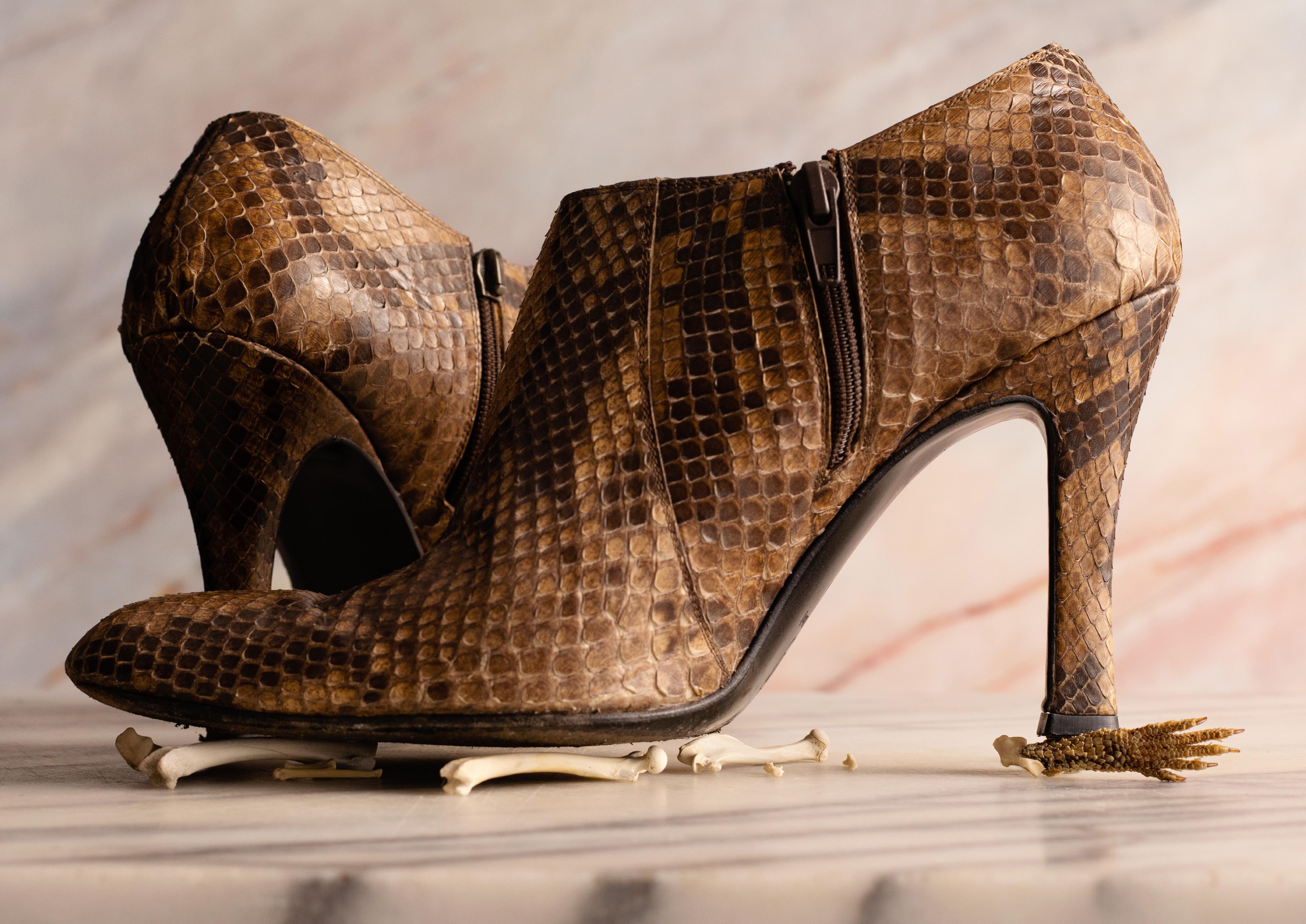
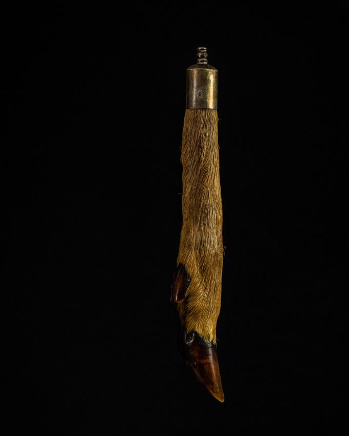
My final Project Trophies for my MA was based on Found Objectsitems of natural history ephemera inherited or acquired which presented the view that animals were not sentient creatures - their value was as a commodity or a trophy (see figure 1).
DIGIT Magazine 2022 Issue 4 17 WHAT IS CONTEMPORARY PHOTOGRAPHY?
Figure 1
Trophies 14 - ‘We have taken all the things we admire, and made them into something we can have at hand’ Alexandra Prescott FRPS
In its simplest form, the dictionary definition of Contemporary suggests that a photograph which encompasses a subject of the time is a contemporary photograph. Art history suggests that it is photography created after the 1960s when the period labelled

‘modern photography’ ended. These are two facets that everyone can identify with, but Contemporary as a genre also emphasises the ‘about’ of the ‘of’ which can be harder to define.
There is always an ‘of’ in an image but the ‘about’ is harder to pin
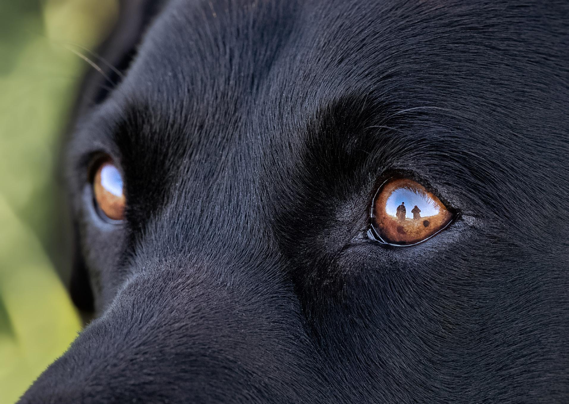
down. Is a photograph of a dog about the dog or is it about what the dog represents, independence in the case of a guide dog or the protection provided by a guard dog. The ‘about’ can be interpreted as the message or a capture of emotion or inherent readable


DIGIT Magazine 2023 Issue 1 18 WHAT IS CONTEMPORARY PHOTOGRAPHY?
Figure 2
Image 21 of 21 - ‘This panel shows how I live life vicariously through my dogs, Pippa and Penny’
Holly Stranks FRPS
Figure 3
Image 11 of 21 - ‘Using photography to convey my anxieties through visual metaphors has encouraged me to work mindfully, valuing every moment, and to use silence and time positively’
Ken Holland FRPS
Figure 4
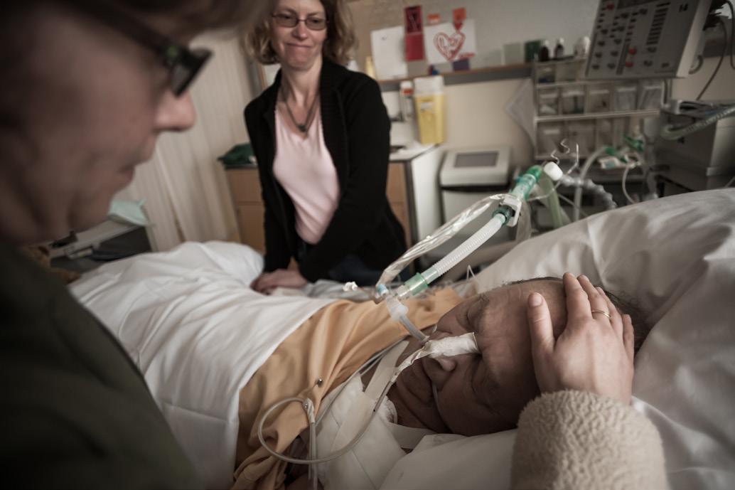
Image 4 of 20 - ‘Watching someone very dear to you struggle to live, get all the medical assistance available to him and then realise he is losing the battle is extremely difficult’
Carol Olerud FRPS
opinions (see figure 2).
Contemporary photography promotes the photographers interpretation of the ‘about’ of the ‘of’. Tessa Mills FRPS, Chair of the Contemporary Distinction’s Panel, suggests “Most genres tell you about something. Contemporary tells you about the photographer.”. I have heard several people use the word ‘metaphor’: a figure of speech or an implied comparison between the image and an opinion or train of thought. My own choice of word is ‘allegory’: a symbolical story. ‘Allegory, from the Latin, meaning ‘speaking otherwise than one seems to speak’. These definitions can all be connected and all applied to give a skeletal outline of what constitutes Contemporary photography.
As studying a photograph can help us see more and/or see differently, photography (as is art) is often used for social change, cultural statements, identity, etc. Photographs telling stories about the photographers’ thoughts/opinions, values/ ethics or portraying self-reflection are hallmarks of the Contemporary
photographer (see figure 3). They also present pointers to a broader contextual framework of the world, cultural backgrounds, family and human heritage, society and community systems (see figure 4). My personal understanding of the ‘about’ of the ‘of’ characteristic which underpins Contemporary photography and how to present it grew clearer and more personally representational when I became interested in vanitas art, a style of still life painting from the early 1600s, mostly prevalent in the Calvinistic Netherlands. The compositions include, or are based on collections of objects that symbolise death, transience of life and the seven deadly sins. Iconography using objects as symbols for specific meanings. A skull or skeletons symbolise memento mori - the Latin for ‘you must die’. Hourglasses or clocks, extinguished or guttering candles, fruit, flowers and bubbles may also depict the same sombre message. Seashells are the remains of a onceliving animal, implying death and frailty. Ivy represents immortality. They can also be understood as allegories - by placing a skull with
ivy there is an allegorical reference to life and death, opposite sides of being for all creatures.
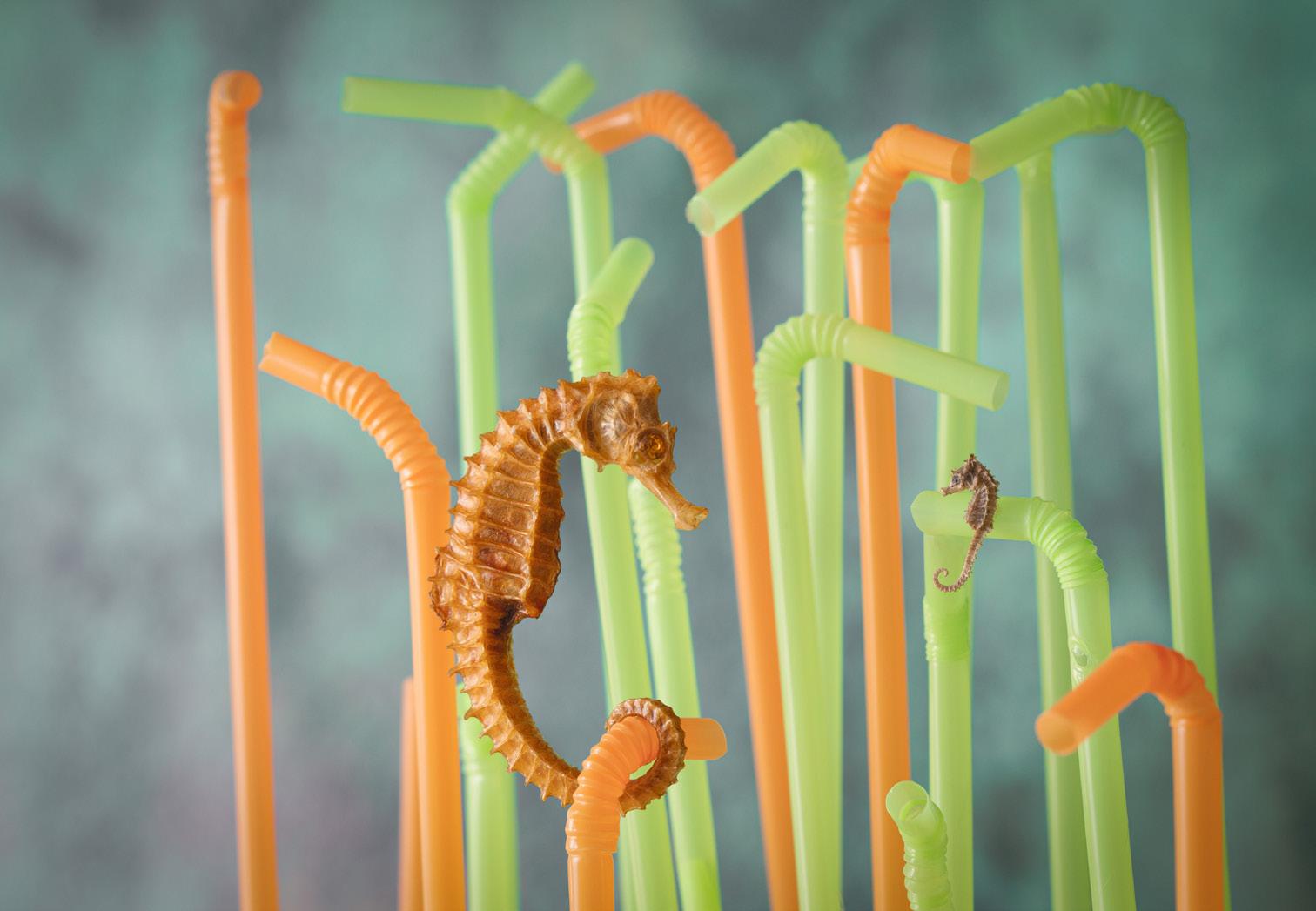
The idea of the great masters creating pieces of work offering the visual thrill of composition, colours and brush stroke expertise to look at, with a message that wouldn’t always be seen or valued as much as the physical painting, personifies Ecclesiastes - “vanity of vanities, all is vanity” - an allegorical statement referring to society’s reverence for the pursuit of wealth and worldly possessions. A painting speaking otherwise than one seems to speak. As I choose a subject for Contemporary genre images, the word ‘parable’ is also another favourite principle - a short allegorical story designed to illustrate or teach some truth principle or a moral lesson. The parable is the vision behind Universal Truths a collection of images for a successful Contemporary Fellowship panel in 2021. As a keen conservationist I wanted the viewer to think about how human interactions with wildlife have seen/unforeseen outcomes (see figure 5).

DIGIT Magazine 2023 Issue 1 19 WHAT IS CONTEMPORARY PHOTOGRAPHY?
Figure 5
Image 18 of 21 - ‘If you don’t know or understand the consequence of humankind’s behaviour then you can’t care or make changes‘
Alexandra Prescott FRPS
To be successful, the ‘about ’of the ‘of ’, should present a story which is recognised/understood by the viewer. Art (as in human creative skill and imagination producing works to be appreciated primarily for their beauty or emotional power) history suggests that Contemporary photography has, as a characteristic, the fact that it was created after the 1960s. Memory and/or knowledge of past and current events since the 1960s hinted at by the image may also play a part in a contemporary representation/interpretation.
In the HOG Parade (see figure 6) the national colours of Ukraine are widely recognised and the Ukraine crisis is internationally understood. The skull is a universal symbol for danger and death (and ironically also wisdom!!!) The skull asks ‘Why?’

Fine art photographs, characterised by evidence of the personal vision and style of the photographer, illustrate a photographers’ unique
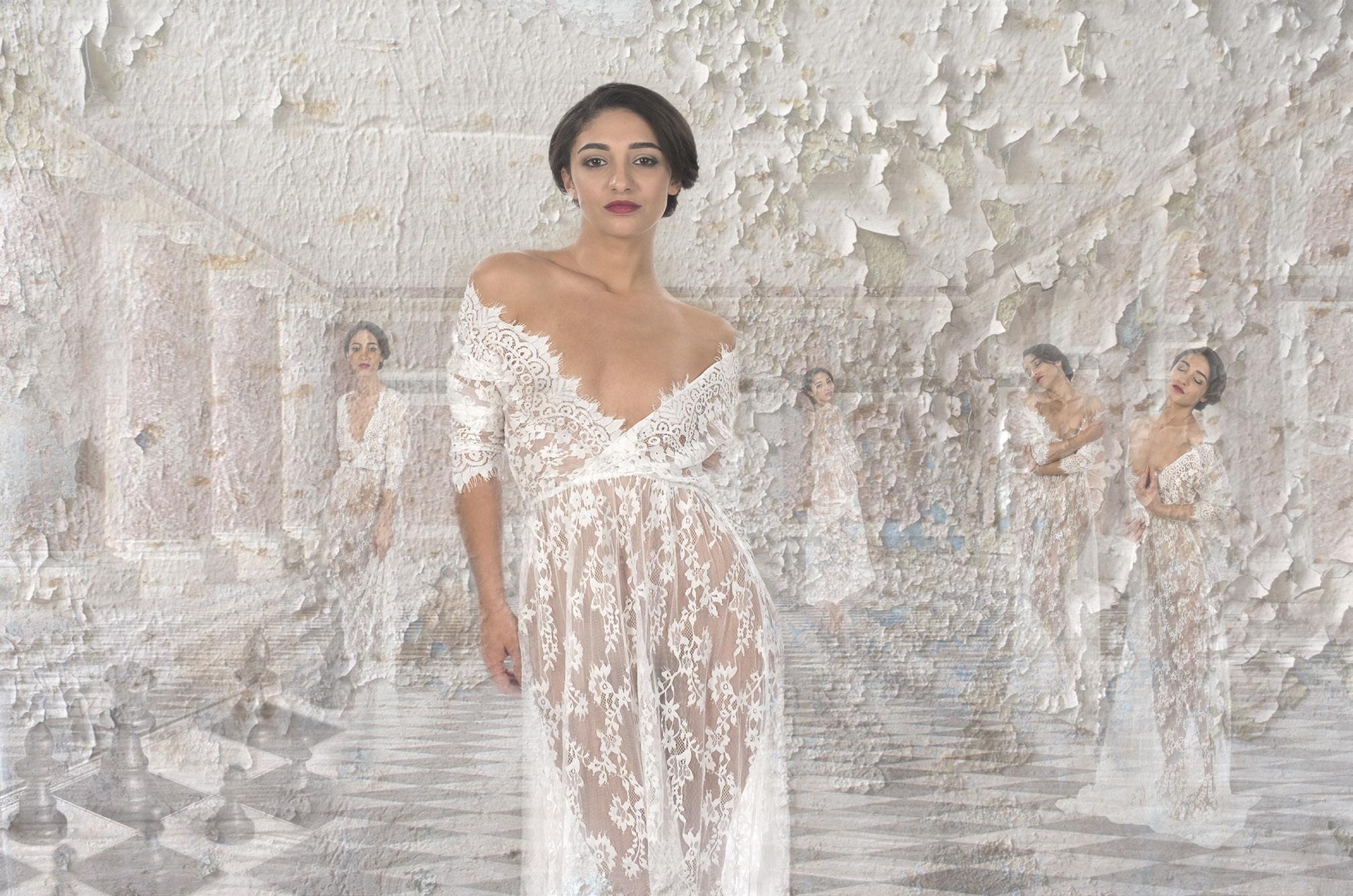
message, emotion or idea. Perhaps the fine art image (see figure 7) by Janet Haines suggests the Musical Chess (1986), the story of a love triangle between two Grandmasters, Soviet and American, and the female manager of one of the Grandmasters.
An alternative Contemporary interpretation could be based on the ongoing equality battle between the sexes: the chessboard is a symbolic battlefield. The women are progressing up the chessboard to become Queens or even Bishops, and Knightshistorically male posts (if the Pawn reaches the opposite side of the chessboard, it has the unique ability to promote itself to another piece.) The latter interpretation relates to current issues - the former may illustrate an emotion.
Imagine a travel photograph of a street with several parked cars. A passer-by is holding a mobile phone to their ear. There is a hoarding in the background: ‘Al Rihla’ - the
new Official Match Ball of the FIFA World Cup 2022’.
At first glance it is a scene, in 2022, that could be seen anywhere in the world. With appropriate local characteristics i.e., Asian architecture, Japanese cars, etc it becomes a generic presentation with no story other than that of the World Cup.
Now imagine the same street with a big, colourful, old American car, a Cadillac from the 1950s in the foreground. There are several similar aged cars in the background. A passer-by is holding an old Nokia mobile phone to their ear. There is a hoarding in the back ground : ‘Al Rihla’ - the new Official Match Ball of the FIFA World Cup 2022.‘
The ‘about’ i.e., the complete story of the scene relies on the desire of the viewer to see and to think/ draw on the their knowledge and understanding of the situation presented. In the 1950s, Cuba thrived on American tourists and
DIGIT Magazine 2023 Issue 1 20 WHAT IS CONTEMPORARY PHOTOGRAPHY?
Figure 6
Thunder in the Glens. Harley Davidson Owners Group Annual HOG Parade - 2022 Alexandra Prescott FRPS
American imports. In 1959, after the revolution, Fidel Castro ended the relationship. America retaliated with a total trade embargo. Cuba’s economy shrank and it was a case of make-do and mend for car owners. Additionally, technology passed by Cuba. In 2008 Raul Castro allowed Cubans to use and import/buy mobile phones, but with limitations and regulations. This general knowledge that Cuba suffered from a lack of economic and technical development from the 1960s to the early part of this century is a salient point in the understanding of the ‘about’. In 2022, in a country where the economy is managed with state intervention, there is also a moral/ economic dichotomy between the aging cars, an old in-use Nokia phone, and an advert for a luxury football. The photograph would be relevant for most Cuban citizens living with the regime, football fans or not. Also, to those who have visited, been made aware of the history, etc.
This image, were it to have been taken as it naturally happened, could be filed under Documentary or Contemporary (they are opposite ends of a long pole) but, if it had been deliberately created as a piece of performance art or a concept, it would then be filed under Contemporary.
Duchamp’s work The Fountain (1917) is considered to be the first conceptual artwork. Duchamp bought a porcelain urinal, turned it on to its back and added the nom de guerre ‘R. Mutt’ with the year ‘1917’. He took a standard object, placed it in an unfamiliar orientation, gave it a title and submitted it as a piece of art to the Society of Independent Artists’ exhibition. Duchamp presented a new concept - that art need not be physically created by the hands of the artist but an object(s) representing the artists thoughts could become art. Conceptual art finally emerged as a movement in the 1960s, with artists expressing
and presenting their ideas, opinions, feelings in whatever form they felt to be appropriate. The Contemporary genre used to be known as the Conceptual and Contemporary genre.
Contemporary images do not depend on the ‘of’ for understanding/meaning (as a sculpture or a painting may depend on its subject), but on the indication (the about) of the ideas/feelings/ opinions which the photographer wants to express
l

DIGIT Magazine 2023 Issue 1 21 WHAT IS CONTEMPORARY PHOTOGRAPHY?
Figure 7
Search for the Hero Janet Haines ARPS
HOW MUCH DOES A BABY AFRICAN BUSH ELEPHANT WEIGH?

PAUL MORGAN

Protection of the environment is, rightly, recognised as one of the most pressing challenges that we face today. Sustainability and reducing the impacts that we each have on our planet is everybody’s responsibility, but sometimes assessing that impact of a particular activity is not easy. Paul Morgan considers the impact that this magazine has.
Did you know the birth weight of an African Bush Elephant is around 92 kg? What has that got to do with this edition of DIGIT? That’s a good question so please bear with me.
Photography is a contradictory pursuit - it seeks to capture the magic or the spectacle of the subject and in doing so protect that moment through embedding it on a
negative or through pixels. Yet, like so many other pursuits the process is not without its negative impacts which can affect that subject or the wider environment. These impacts
DIGIT Magazine 2023 Issue 1 22 HOW MUCH DOES A BABY AFRICAN BUSH ELEPHANT WEIGH?
don’t start and end with pressing the shutter - they begin far earlier, and perhaps never really come to an end.
One of those environmental impacts is currently resting in your hands. The Digital Imaging Group prints great magazines containing your stunning imagery. So here comes the relevance of infant pachyderms. With its print runs of the quarterly DIGIT plus the two catalogues each year, DIG posts through your letter boxes the equivalent of 19 African Bush Elephant calves in paper alone - just under 1.8 tonnes each year.
I have gone out of my way to use a completely unnecessary metaphor to demonstrate that just one corner of the photographic community is not without its impacts and using elephants seemed quite a graphic way of doing that. Has printed media had its time? Can we afford to continue to publish magazines?
The pulp, paper, printing and publishing sectors are big business. As a reflection of their scales, the pulp and paper sector is calculated to be the second most energy intensive sector in Europe and the fourth globally. In the UK, printing and publishing is the seventh largest energy consumer. So, when energy supplies are potentially under threat, or at the very least costly, the economics of producing printed media swing significantly. So, does the printed copy of the magazine you are holding carry any more or less environmental baggage than its digital equivalent?
The environmental impacts of a printed magazine versus a digital one are much debated. A few articles have been published but, as you’d expect, some contain biases depending on the source. So let’s try to strip it back to basics…

Keeping it simple, the design process is pretty much the same irrespective of whether the magazine is going to be posted or downloaded. It is completed on a computer of some description powered by electricity in a room lit
by electricity. The images placed within the template will have been transferred electronically between parties and the final product saved somewhere, probably, on ‘the cloud’.
Some predictions estimate that by 2025, the technology sector will consume 20% of the world’s total electricity alongside our continued and growing energy demands for the mundane (the washing machine, cooker, fridge…). It is clearly very unsafe to store the final DIGIT digital file on a single personal
made accessible for the electronic distribution. Let’s go down the printed route to start with.
Before any ink can be laid on the paper - you need the paper. This is not a straightforward choice as any photographer knows, but whatever the DIG selects, it’s 19 baby elephants a year of virgin pulp or something recycled. The latter has better environmental credentials and will always be preferable from that perspective, but without repeating myself too often, that’s a lot of paper.
computer - it will be stored in the cloud and probably duplicated.
‘The cloud’ is effectively just someone else’s computer (in reality a big warehouse called a data centre). Data centres are very energy hungry beasts and their global power consumption is said to far outstrip that of the UK in its entirety. Yes, efforts are being made by some to power the centres using renewable energy but too many operators try to offset their carbon emissions rather than eliminate them. Add to that, many centres are also water cooled and a medium sized facility can drink as much water as three average sized hospitals.
So, all in all, cloud storage of the DIGIT file has its own carbon contribution and that cannot be discounted.
Following our DIGIT production roadmap, once the designer/author is happy with the digital version it’ll either be sent to a printer or
I gave some facts earlier related to the energy consumption of the paper/pulp and printing/publishing sectors but the WWF reports that some 405 million tonnes of paper and paperboard are produced annually - 13 to 15% of total wood consumption. Paradoxically, in this digital age the demand for paper products is increasing which means we need to plant more trees if we want to rely on virgin pulp. Sounds like a good environmental balance to strike, but often the trees planted are the wrong trees for the ecosystem in that location and can drive deforestation of native species to make way for more lucrative ‘pulp trees’.
Using recycled pulp’s the answer then? Well only partially. If you’re anything like me you probably won’t recycle the magazines you really value (such as DIGIT or the RPS Journal). But you will, I hope, dump your envelopes, newspapers, less valued magazines into your council
DIGIT Magazine 2023 Issue 1 23 HOW MUCH DOES A BABY AFRICAN BUSH ELEPHANT WEIGH?
recycling bin, box or bag, but that paper can only go so far. Each time paper is recycled the cellulose fibres shorten then after around five to seven recycling cycles they are just too short to bind into a sheet. To keep the cycle going virgin material has to be introduced into the pot with recycled pulp thereby perpetuating the environmental impacts. Although an unclear picture, what we do know is that recycled paper consumes 70% less energy and water than its virgin counterpart so has to be part of any printed media solution.
So we’ve got the paper (whether its virgin or recycled) so now we need some magic to turn the digital image into a printed one. Depending on the size of the print run there are two technologies available. Digital printing is good for smaller print runs but offset lithography is better for large runs and is considered higher quality.
There are some impacts that the two printing methods share - they are both consumers of power and they both rely on the application of ink to paper, albeit by distinctly different means. Inks can be oilbased and include chemicals some of which are known to be harmful to human health and the environment during manufacture, use and disposal. These inks are being replaced by, for example, vegetable-based inks but these are not without their problems either. Elsewhere in the printing process varnishes and lacquers can be applied to pages to add some gloss.
At the point of use digital printing is said to produce less waste and be cleaner, it doesn’t rely on the use of printing plates made specifically for the publication but at higher print runs is less efficient. Litho-printing has a long history of using a lot of water in its process - there is a drive to waterless printing which, ironically, may improve quality further as well as speed the process up, alongside many other reported benefits.
The developing environmental benefits of modern printing only go a little way to offset the downsides. But, again, it is still a significant consumer of energy and resources, generating waste and emissions at every stage of the process.

The printing, of course, is not the end of the process. That pallet of DIGITs has now got to get from the printers to the distributors and then to your letter box. That process will require materials for wrappings and envelopes. It will have all the inputs and outputs arising from haulage and logistics before arriving (usually) under human power via the postie. You then savour the content, file or recycle and wait for that cycle to start all over again.
Okay, that’s the very simplified end to end journey of the physical DIGIT but even at this simplistic level the consumption of solid and liquid resources and energy is somewhat overwhelming. So, what if you wanted a digital copy to read on the go on your phone, tablet or laptop or even to browse at scale of your TV? That surely can’t have that much of an impact?
The first step to you accessing your digital DIGIT will be the circulation of a notification email to the readership. The Carbon Literacy Trust has researched how much carbon (or carbon equivalents) emails are responsible for. If the DIG sends a relatively short email with an embedded link to a cloudbased document that you can download, that message may emit 0.3 grams of CO2 equivalent. A tiny amount but presumably there might be as many as 10,000 emails to announce publication, so that’s 3 kg of carbon emitted. Again, so what?
Expert on carbon emissions, Mike Berners-Lee, estimates emails were responsible for 150 million tonnes of carbon in 2019. He calculates that average email usage is the equivalent to driving a small petrol car for around 128 miles. It’d be wise not to attach the digital DIGIT to that notification email or we’ll all be notionally driving a lot further.
So after all that, side by side, which version of a magazine has the least negative environmental impacts? I know I have massively over-simplified the production and comparison process. There are a
DIGIT Magazine 2023 Issue 1 24
HOW MUCH DOES A BABY AFRICAN BUSH ELEPHANT WEIGH?
great many learned and not-solearned articles online discussing the environmental pros and cons of electronic and hardcopy publications, but full lifecycle analyses are few and far between.
If we assume the magazine design process up to clicking save for the final time and the long-term cloud storage is the same for digital and physical editions then those impacts effectively cancel each other out in the comparison (but that’s not to say they should be ignored). It’s the physical printing process where the gulf opens and the greatest impacts are. Even with more recent process improvements the consumption of water, chemicals and energy is significant. The generation of solid wastes from paper trimming, the liquids (containing heavy metals and hazardous compounds) and the gaseous emissions - volatile organic compounds form fumes and the carbon dioxide and its equivalents emitted directly and indirectly from printing is massive.
Then getting the magazine into your hands although relatively small, letting you know your
DIGIT is ready to be accessed from the cloud comes at a carbon cost but less so than that from the magazine’s transfer from the printers to the distributor to the postal system to your door.
Comparing both routes to the reader, it is a simple fact - a physical magazine places a heavy burden on our environment, climate and natural resources. So you do have to question how a hardcopy magazine can be justified.

Photography is a visual medium and printing images is as old as making them. Re-evaluating all impacts of any medium is a constant cyclewhat was an acceptable process fifty years ago is not so acceptable now based on developing knowledge and experience. Holding a magnifying glass up to the wider environmental and carbon implications of photography is as important as thinking again about social and behavioural impacts.
Nothing can be exempt from our drive to reduce carbon emissions, even photography. How we consume our imagery is one aspect of photography that has to be questioned. Tackling climate change and environmental degradation is an existential challenge and one that may at times appear too large for us as individuals to address. However, when a problem appears large it can be compared to eating an elephant. And the best way to eat an elephant is in small bites l
On a related note
About the author
Paul is the interim Chair of the Society’s Environmental and Social Responsibility Committee. He has been a member of it since its creation (when it started as the Climate Change Working Group) in response to an AGM motion in 2019. The committee’s purpose is to comment, advise and make recommendations to Trustees on matters relevant to the environment and social responsibility. If you believe you have something to contribute to the work of the committee, please get in touch via esrc@rps. org.
Professionally, Paul has nearly 30 years’ experience in the waste and resource management sector and is a Fellow of the Chartered Institution of Wastes Management. He is currently working with the UK’s largest waste disposal authority as it strives to recycle more and destroy less of our planet’s resources.
If you received a physical copy of DIGIT by post, you may have noticed that it came packaged in a polythene bag rather than the compostable wrapping that has been used for the last few issues. Whilst this may appear to be a retrograde step, the compostable material itself potentially presents a number of adverse impacts.
It appears that the compostable material can create difficulties for recycling if it becomes mixed with true plastics, and it may not decompose as quickly as expected. For this reason, polythene bags are again being used whilst other mailing materials are investigated. And if you read a printed copy of DIGIT, be assured that the trees used to make the paper are sourced in a way that ensures trees are harvested responsibly so there is no net loss of forest over time.
DIGIT Magazine 2023 Issue 1 25 HOW MUCH DOES A BABY AFRICAN BUSH ELEPHANT WEIGH?
IPAD COMPOSITES - AN OPEN WINDOW FOR SERENDIPITY ATHENA
CAREY
Athena Carey explains how a surreal image can be constructed using simple tools and some free, or inexpensive, apps......oh, and a lot of creativity.

Photography has been many things for me. When I was a child, it was a hobby. I enjoyed capturing moments to keep, share, and cherish. It was like magic - completely creative and freeing. Later it became my education path through to a Masters of Fine Art and my career. I have been a portrait photographer, a landscape photographer, a fine art photographer, a workshop and tour leader, and a university professor.
Once something becomes your career, your relationship with it changes and for me that meant working with intention. Photos were heavily planned to meet specific expectations. The light hearted joy I had experienced with photography as a child evolved into concept driven projects. There was still magic, but it was very directed.
Recently I am trying to loosen those constraints, to enjoy photography the way I did before I became so focused, before it was my job. I am working on personal projects with no pressure to make what anyone else wants or needs. It is refreshing. And this year, I have set a goal for myself to lighten my photography practice even further by making whimsical composites with my mobile devices.
I am currently using an iPhone 14 Pro Max and iPad Mini along with an Apple Pencil. I like to use photos I have taken with the phone but occasionally I do use ones that I have made with my ‘real’ cameras. The reasons for this are simplicity and pleasure. I enjoy scrolling through the mass of photos on my iPhone browsing for material to recycle into art. It’s quite relaxing and feels more random and less structured than searching in my archives. I am enjoying that sense of freedom. I never really know what photos I will use and that leaves available an element of surprise. What a delightful gift!
There are many apps one can use to make composites with phones and tablets. Some of them are even free. Some to try are PhotoDirector, Affinity Photo 2, Superimpose, Juxtaposer and Procreate.


The first step to piecing together a fanciful composite
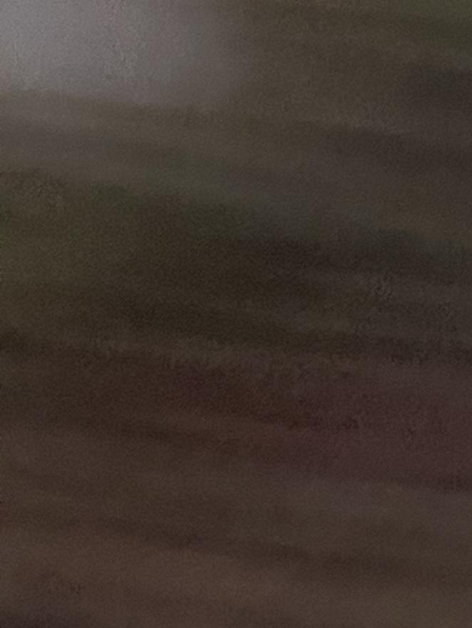
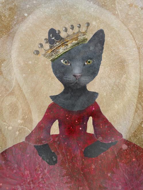
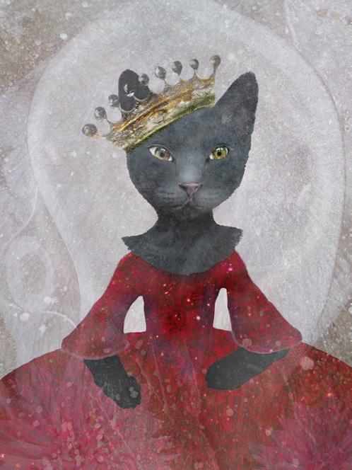
is to make a background. This may sound rather boring but it is very necessary and actually fun. There is very little pressure to create a masterpiece and the simplicity of it is soothing. Neutral backgrounds make the best starting points. I make them from mundane photos of things like walls or tiles or even the palm of my hand. The photos that were used to make the background are shown on page 30. They have been blurred, rotated, blended, and lightened to achieve a very smooth, neutral color with varying tonal densities. Once you have a background, you can use further layers to add all your other elements.
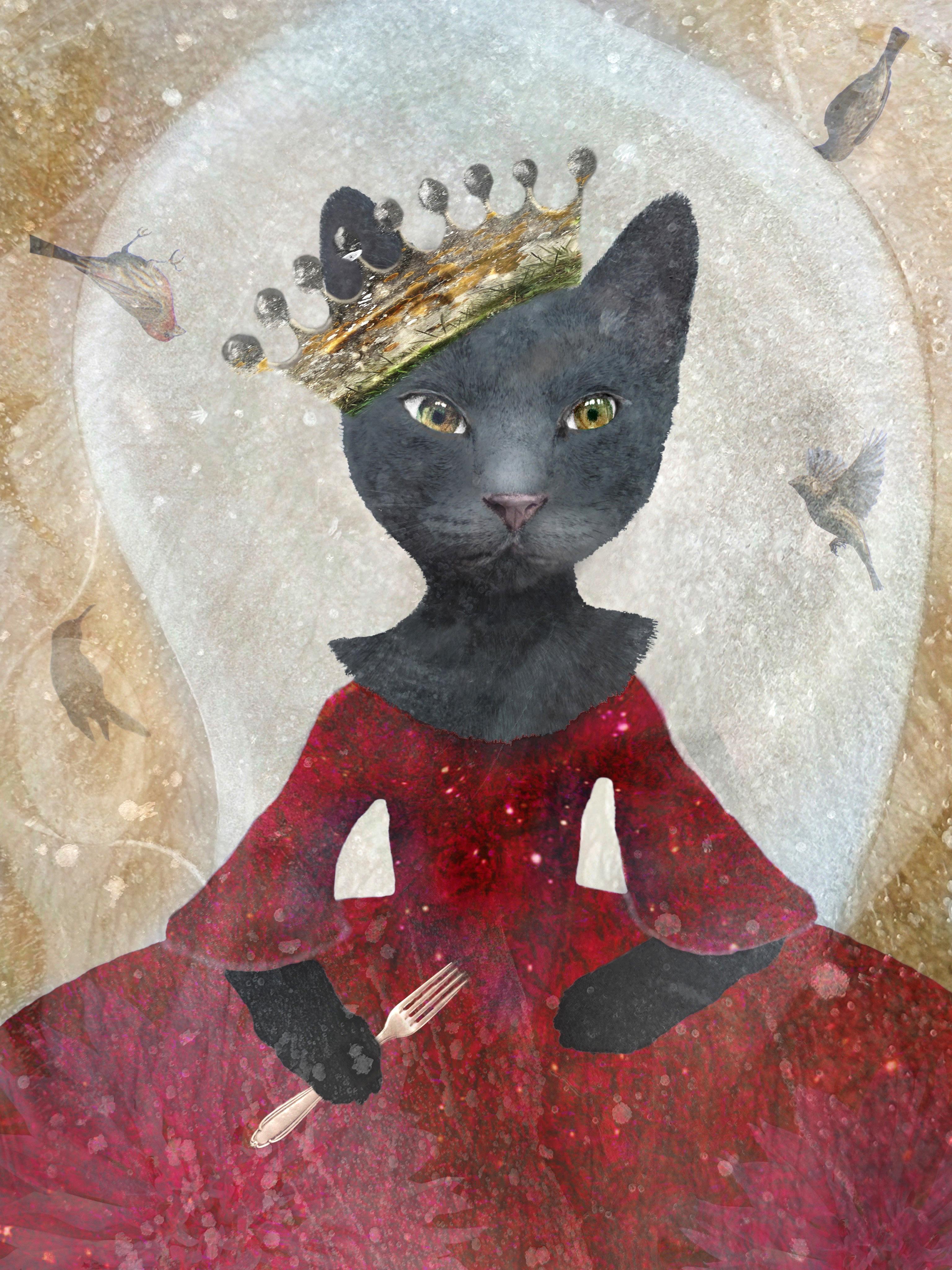
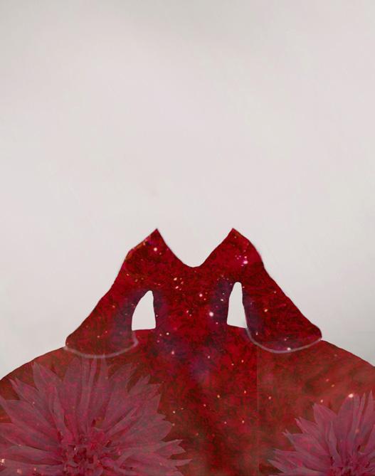
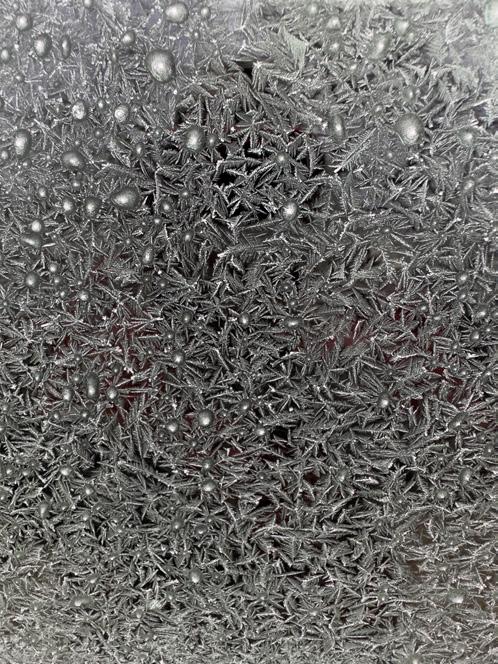
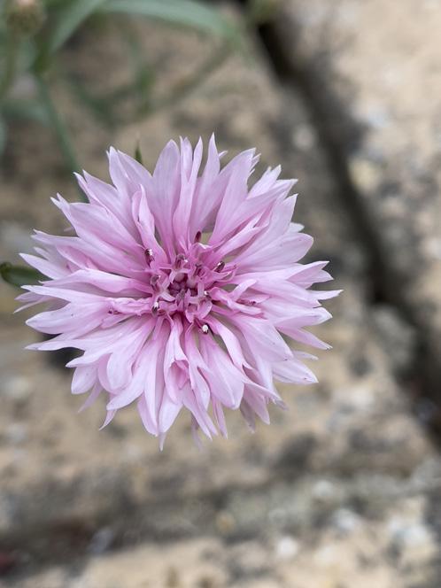
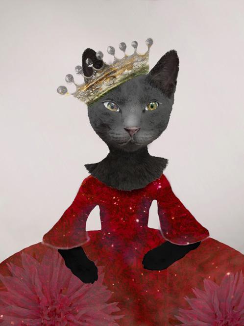
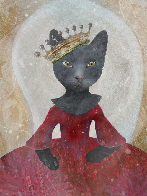
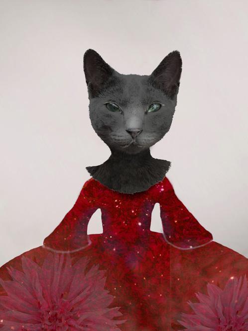
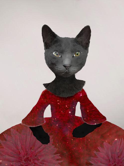
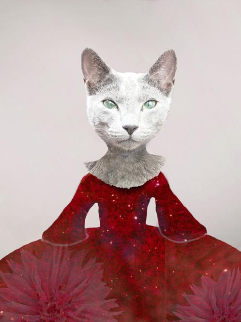
For this image, I knew that I wanted to make a large character in a puffy dress. I have been looking at old fashion photos and that style was stuck in my head. To make mine, I chose a photo of the recent frost on my car for the ‘fabric’ pattern and proceeded to mask out a dress shape, to which I added a red color (Color blend mode). For some added interest, I also included two copies of a flower using the Overlay blend mode and a low opacity. Again, you can see the components of the dress on page 30.
Happy with the dress, I then needed to figure out what kind of character this would be. I went through a few tries - a sheep, a cow, even a giraffe! Finally I decided
28 DIGIT Magazine 2023 Issue 1 IPAD COMPOSITES - AN OPEN WINDOW FOR SERENDIPITY
PhotoDirector Affinity Photo 2 Superimpose
u
Juxtaposer Procreate

29 DIGIT Magazine 2023 Issue 1 IPAD COMPOSITES - AN OPEN WINDOW FOR SERENDIPITY
The final image
on my own cat, Jeremy, who is black and majestic. I tried and tried to get the look I wanted with Jeremy, but I couldn’t quite get there. Everything looked too cartoonish. It was becoming frustrating, so I put it down for the day. My interest in making these is not just the end product. I want to enjoy the process too, so when it becomes less than enjoyable, I stop and do something else for a while. I find the break gives my creative self the space I need to quietly figure things out. When I return, things flow well again.
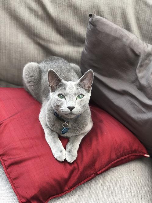
The next day, I decided to search my iPhone for photos of other cats. I felt bad about abandoning Jeremy, but reminded myself that I need to keep an open mind. I don’t want to become overly fixated on set ideas or outcomes. Deep in my phone, I found a beautiful photo of my neighbor’s cat, Buddy. He is a light grey, Russian Blue. His face and expression are perfect, but I did want a dark cat, so after I masked around his face, I duplicated the layer and changed the blend mode to Difference to darken him. On this darkening layer, I masked a bit more away from his face to add a sense of dimension. Collage work can look a rather flat if you don’t add ‘light’ to give the impression of volume. Initially, I had masked Buddy’s decolletage to the limit

of the dress, but I decided that using his fur as a ruffle was more fun.

Looking at the evolving character, I realized that she needed different eyes. Cats have beautiful eyes, but adding non-cat eyes pushes the image further into the surreal, which is what I wanted. Surreal art is a form of escapism in itself, and that matches my desire to escape the restrictions that I have had around my photography practice. So I found a recent selfie of myself and took my own eyes for the cat. The difference was profound. After the eyes, I went back to the photo of Buddy for his paws. On the next page, you can see the evolution from the original photo, the head masked and then the head duplicated and the layer set to Difference blend mode to darken it. Then the eyes changed and paws added. To finish off the costume, I went back into my photos looking for anything interesting. I found a photo of a crest that included a crown. That seemed quite fitting. I layered it with a photo of grass in Hard Light blend mode to give it a more interesting texture. I also wanted to soften our kitty up a bit, so I added a colour layer to add a pink tint to her nose.
Focusing again on the background, I felt it needed


30 30 DIGIT Magazine 2023 Issue 1 IPAD COMPOSITES - AN OPEN WINDOW FOR SERENDIPITY
The backgrounds used for the final image
Frost on the car
The colour
The flower pattern
The final dress cut-out The components of the dress
some shapes and texture so I added a tree (Soft Light blend mode) and some photos of ice that I took in the fields behind my house (Luminosity blend mode). I also wanted to add a touch of color, so I made two colour layers, one yellow (Multiply blend mode) and one blue (Hard Light blend mode) and masked them into different portions of the background (see above).
At this point the character was mostly finished, so I began to think of her story. What could be happening here? Scrolling through my photos with an open mind, I found several birds and so tossed them onto the background. The very last element added was a fork to make very clear this kitty’s intentions and the last step was a levels adjustment to increase contrast


31
IPAD COMPOSITES - AN OPEN WINDOW FOR SERENDIPITY l
The evolution of the cat
The cat (Buddy) from next door The cat and the dress
After darkening the cat After adding the surreal eyes
The basic composite With the tree added The final touches to the background
DIGIT Magazine 2023 Issue 1
With the yellow colour layer And the masked blue colour layer
FLAT LAY, CLOSE UP PHOTOGRAPHY
DAVID

SCRIVENER LRPS
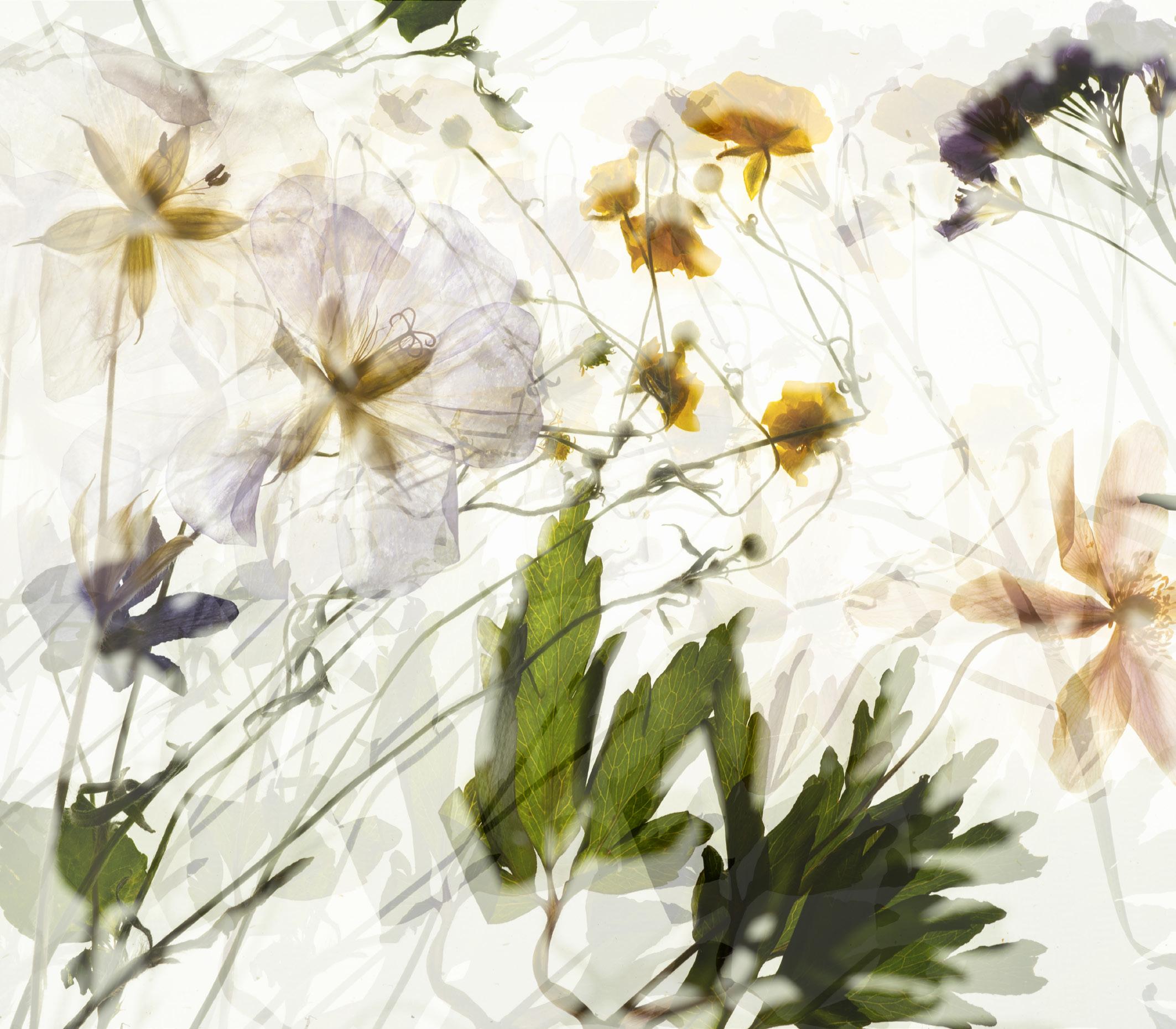
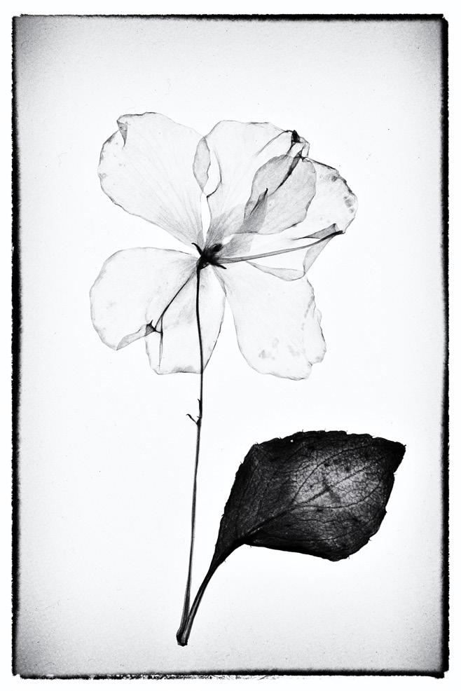
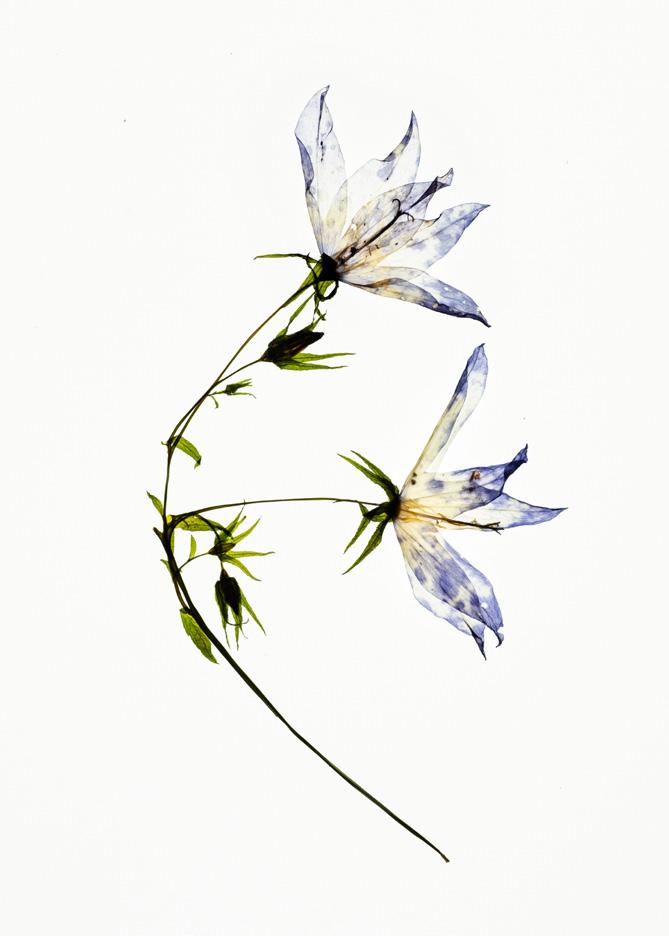
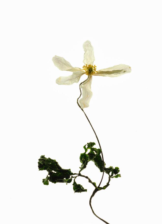
I am an enthusiastic, hobby photographer and I had been lucky enough to be awarded 7th place in the ‘Close Up’ round of Amateur Photographer of The Year 2022 with the image above. The picture is a flower arrangement that has

been pressed and dried. Another image was ‘expert short listed’. I liked my pictures but didn’t think they would get anywhere, so I encourage everybody to have a go at competitions.
The image that was featured in
Amateur Photographer is made up from a combination of techniques. Intentional subject movement (ISM), defocus and in-camera multiple exposure, all back lit on a light panel.
Firstly, the flowers were chosen
DIGIT Magazine 2023 Issue 1 32 FLAT LAY, CLOSE UP PHOTOGRAPHY
David Scrivener explains how he creates fascinating images on the table-top with little more than a home-made light panel, camera and tripod.
David’s successful image in the AP Amateur Photographer of The Year 2022 competition
from a selection of pre-pressed flowers. These were laid onto the light panel and several test shots taken in manual to get the exposure I wanted. I needed to retain the colour in the petals without losing the white background to grey. Next, the composition was refined to provide the first image. Once happy with that, the actual image can be attempted. I set the camera to manual focus and set the multiple exposure function for three images. The combined exposure function set to ‘average’ so that where concentration of colour overlapped it would not block out entirely. Next, I shuffled the tripod to give me a composition that I was happy with.
The first frame was the basic straight shot. The second frame was the same subject, with the camera moved about 15 degrees axially but also a slight movement of the subject to ‘confuse’ the composition, otherwise you just achieve a ‘shadow’ over the first image. The final frame is the same as the second but the lens is defocused to provide edge blur and the exposure increased by about ½ stop.
These three frames then combine automatically in camera. The picture was then cropped and minor adjustments made in Photoshop Elements. This sounds very much as though it was a planned image but honestly this was one of a dozen images taken in this session. I picked this particular shot simply because I liked it the most out of the group.
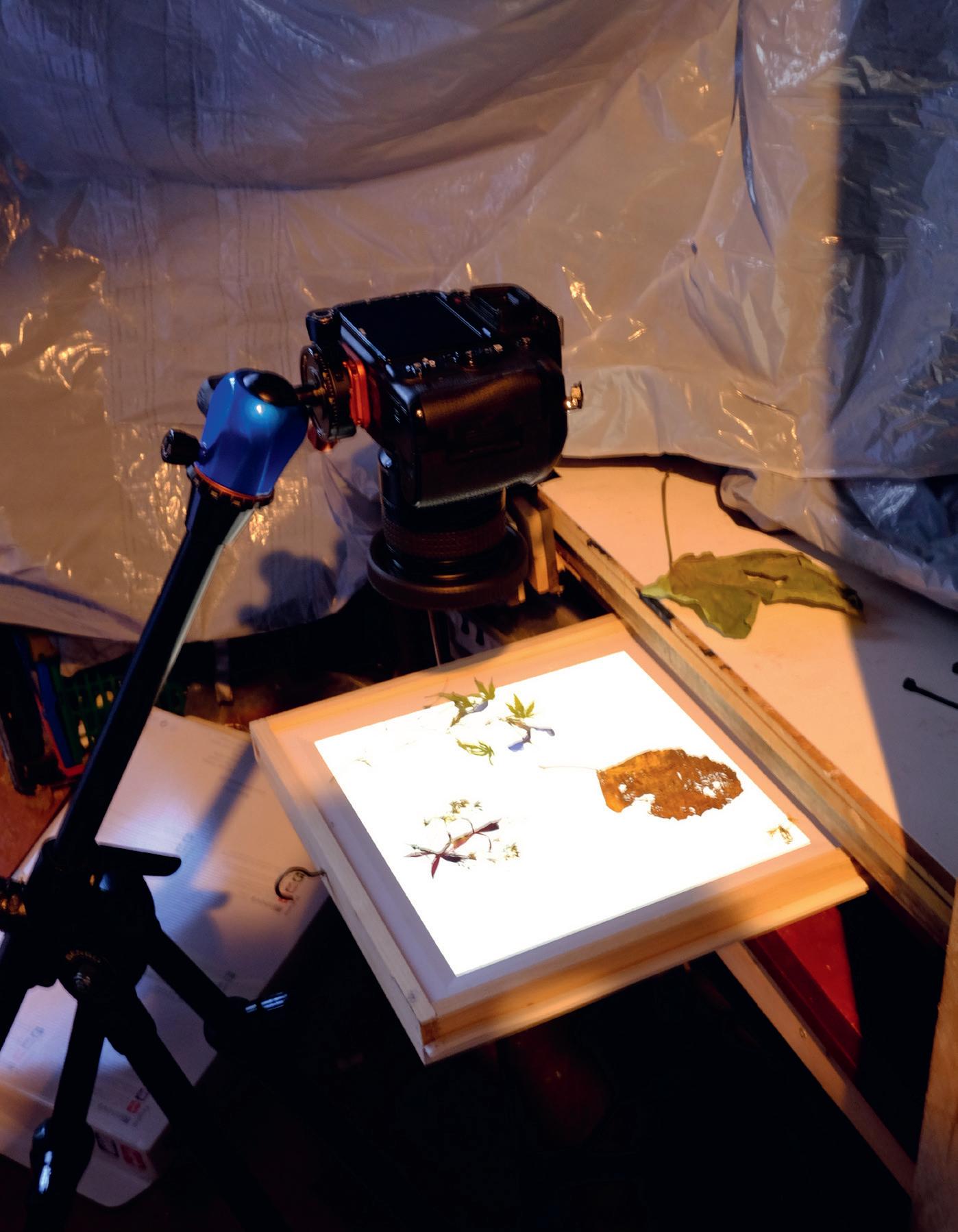
My attempts at flat lay photography have been developed over a few years, and I have returned to this method on various different occasions to try different techniques and ideas. Most of my flat lay is back-lit but you can try this with a simple display on a background and photograph from above. I started with a wooden box lined with kitchen foil. This was fitted with a couple of small fluorescent tubes covered by some tracing paper and a Perspex lid. The fluorescent
lighting affected the colour balance of the digital negative and so I played with the different WB presets on the camera to warm or cool the photograph. For a more controlled approach you can use the colour temperature settings that are available on more advanced cameras.
My current set up comprises my most recent camera, with a short macro lens, mounted on a tripod to shoot down onto the light box. I normally use the camera timer and mirror lift if the shutter speed drops below 1/100th sec. ISO is set to the cameras native setting to maximise definition and reduce noise. I tend to use the optimum aperture setting on the lens, so generally for mine it is around f/5.6 - f/11. As the subject is flat, depth of field is not so much
of a problem. A small aperture, of say f/32, can yield some annoying manifestations on high contrast edges.
I looked at the cost of some photographic LED light panels and decided that my interest did not extend to spending that amount of money. I went to a local DIY store and obtained a small LED ceiling tile, which had dimmer switch properties. Being a bit handy, I made a frame and wired up a switch to make a homemade light panel. It works a treat. You can buy bespoke light panels or obtain an app for a tablet, but I like the power you can get from the ceiling light panel. You can also use off-camera flash through a glass panel, and I did for a while, but it was a fiddle to get the exposure just how I wanted it. So,

DIGIT Magazine 2023 Issue 1 33 FLAT LAY, CLOSE UP PHOTOGRAPHY
The set-up David uses to capture flat lay images
a constant light source is easier for me.
Suitable subjects are put in a flower press for flattening and drying. I have a small plastic press that I bought cheaply from the local hobby shop which can be used in a microwave to help dry out the flowers. Sometimes (especially if I forget), I’ll leave the flowers in the press for a few days in a cool dry place before opening. Peeling the flattened subjects off the linen or paper is a delicate job and I use a flat bladed tweezer to assist with this.
After recording various flower and leaves my next steps were exploring various camera techniques, for example, multiple exposure with defocus, intentional camera movement (ICM), ISM, under- and over-exposure and, on occasion, combining layers in Photoshop. The most important element is of course the subject. My source for finding flowers and leaves are the garden or nearby hedgerows. I haven’t yet resorted to flower shops or garden centres but the more exotic species are definitely of interest. When photographing, I tend to leave space around the subject so that I can crop the composition which I find easier to do in post rather than trying to get the camera into the correct position whilst mounted on a tripod. Albeit, I do try to get things right in-camera first and I could take a dozen images of the same subject with just very minor adjustments before I get the final picture.


Arranging a picture is obviously subjective and achieving an aesthetically pleasing layout is down to personal taste. However, you may wish to apply the standard ‘rules’ of composition to enhance the picture. I like to choose a focal point or a point of interest which may just be an intersection of stems/ leaves or perhaps a concentration of colour. When moving the camera this can be a pivotal point. A single flower or leaf can be a simple pleasing subject. Colour and
tonal range is the most powerful influencer for me. Not having any formal art or photography education, I purchased a simple ‘colour wheel’ which gives a guide to complementary colours and is a really useful back up to the instinctive process when making compositions. Finally we have the texture of the subject. Carefully lit subjects can reveal wonderful natural lattices and veins within petals and leaves. This may also be enhanced in post by tweaking contrast and saturation very slightly. Not all lay flat images are necessarily composites, the technique can be helpful when making single shot images as illustrated by the images to the right.
My Photoshop skills are very basic so I’m sure others could utilise this resource far better than I can.
The cost of taking a digital image is so small and the combination of techniques is infinite. My advice, for what it’s worth, is to experiment and combine different techniques. I have only scratched at the surface and looking at images created by others I can see that I still have lots to learn
l
DIGIT Magazine 2023 Issue 1 34 FLAT LAY, CLOSE UP PHOTOGRAPHY
White flower
Morning Glory mono
Morning Glory 2
See more of David’s work dmsphoto.co.uk
All


10

15
19

23
27
29
31
33

IN PREVIOUS ISSUES
previous issues are available from the DIGIT Archive at rps.org/di/digit-archive/. 2 Group Events 3 Contacts 4 From the Chair 4 Editorial 5 Flower bathing Jocelyn Horsfall ARPS 10 That barn at Sixpenny Handley - The evolution of a photo Meyrick Griffith-Jones 15 eCircles - what are they and why should you care? Jean Robson 19 iPhone sketching Paul Sanders 21 What photographers can do to support environmental initiatives Nigella Hillgarth 25 The other world of infrared photography Tony Sweet 31 DIGIT Challenge: Temptation John Cuthbert ARPS 33 DIGIT Challenge: Romanesco Broccoli Steve Varman LRPS 35 In previous Issues DIGIT 94 2022 Issue 3 THE MAGAZINE OF THE ROYAL PHOTOGRAPHIC SOCIETY DIGITAL IMAGING GROUP DIGIT 2 Group Events 3 Contacts
From the chair
Editorial
Creative motivation Jonathan Vaines
4
4
5
Droning on Sean Goodhart ARPS
I’ll start with a ‘Thank You’
Edmunds ARPS
Glyn
Liminality
Simon J G Ciappara FRPS
Evolution of thought process
Brown
Sue
FRPS
The void Roger Newark
Saving Face
Healy
Tony
ARPS
DIGIT Challenge:
merciless
Milne
Milne the
Neil
ARPS
DIGIT Challenge:
is
exit
Mann FRPS
In previous issues DIGIT 95 2022 Issue 4 2 Group events 3 Contents 4 From the Chair 4 Editorial 5 When the soul is at play Annemarie Hoogwoud 11 Is there art in the selfie? Chris Hilton LRPS 15 Clinical precision Professor Afzal Ansary ASIS FRPS 20 Critiquing critiques: Some thoughts on giving and receiving feedback Brooks Jensen 24 Panels and process - not just for distinctions…. Joe Houghton 31 Affinity vs. Photoshop Celia Henderson LRPS 35 DIGIT Challenge: Double smoke Claude Trew LRPS 37 DIGIT Challenge: Hardware city Eddie Lord 39 In previous issues DIGIT 93 2022 Issue 2 33 DIGIT Magazine 2023 Issue 1
Where
the
Paul
35
