

CREATIVE EYE


EDITOR
WELCOME to the Creative Eye magazine, May 2024 issue No. 95. We have an especially wide range of articles for you to enjoy in this edition.
Artist, Giulia Grillo highlights her surreal performance-based photography with thoughtprovoking images.
Taking time for reflection, Susan Brown creates new work after coming to the end of a large project curating an exhibition.
Feel the personal emotion in Sally Stone’s exquisite compositions made from nature and of objects from her childhood.
See the creative beauty in Ashok Viswanathan’s painted body studies.
David Townshend’s project, concentrating on a stretch of England’s vulnerable coastline, reminds us of our fast-changing climate.
Master of atmospheric photography, Simon Street, shows a sample from each of his ten Fellowship projects.
Fine Art photographer of heritage architecture, James Kerwin, demonstrates in his images the beauty and grandeur of abandoned palaces and decaying buildings.
Renowned flower photographer, Carol Sharp, encourages us to take a step closer to a relationship and a connection with a plant.
Jason Au shares his stunning black and white photo project, captured in Hong Kong, which gained him a Fellowship.
Award winning landscape photographer, Paul Mitchell, explores details and textures found in nature and man-made objects.
An unexpected call to Michael Pritchard from the son of a past president of the RPS and respected commercial photographer, Bertram Sinkinson HonFRPS, led to obtaining a collection of prints.

CONTENTS
4 BEYOND THE EXPECTED Giulia Grillo
8 TIME TO REFLECT Susan Brown FRPS
12 STILL LIFE RE-IMAGINED Sally Ann Stone ARPS
16 PAINTED BODIES Ashok Viswanathan
20 THE SEA GIVETH AND THE SEA TAKETH AWAY David Townshend FRPS
24 CREATIVITY CATCH-UP Simon Street FRPS
28 TEN YEARS BEHIND THE CAMERA James Kerwin
32 CURING PLANT BLINDNESS Carol Sharp
36 HONG KONG LINES AND PATTERNS Jason Au FRPS
40 FORM AND TEXTURE Paul Mitchell FRPS
44 BERTRAM SINKINSON HonFRPS Dr Michael Pritchard FRPS
48 IMAGE TO ABSTRACT Rob Kershaw ARPS
51 DIARY

COMMITTEE
Chair
Clive Watkins LRPS creativecomms@rps.org
Secretary Graham Lingley LRPS cegsecretary@gmail.com
Treasurer Nigel Rea ARPS creative.treasurer@rps.org
Digital Exhibition Coordinator
David Rutter FRPS creativeimage@rps.org
Membership & Communications Coordinator
Clive Watkins LRPS creativecomms@rps.org
Webmaster
Steve Varman LRPS creative.publications@rps.org
Editor (co-opted) Moira Ellice ARPS moiraellice1@gmail.com
CREDITS
The Creative Eye magazine inspires Rob Kershaw to experiment using mirror techniques together with Polar Coordinates, transforming his photographs of buildings into striking images. © 2024 All rights reserved. Apart from storage and viewing in its entirety for personal reference, no part of this publication may be reproduced, stored in a retrieval system or transmitted in any form without prior permission of the copyright holder. The Royal Photographic Society, The Creative Eye Group and the Editor accept no liability for the misuse of any content or for any breach of copyright by a contributor. The views expressed in this magazine do not necessarily reflect the policies of The Royal Photographic Society or The Creative Eye Group. Unless otherwise indicated, all images are copyright of the photographers.
Cover The Ugly Duckling by Giulia Grillo
Design Steve Varman LRPS
Editorial Assistant Dr Patricia Tutt ARPS
Printed by PFP Print Elder House, The Street, Chattisham Ipswich, Suffolk IP8 3QE
CONTACT
facebook.com/groups/rpscg
Flickr flickr.com/groups/3510780@N20/pool
Website rps.org/ceg

The Royal Photographic Society, RPS House, 337 Paintworks, Arnos Vale, Bristol BS4 3AR, UK +44 (0)117 3164450 www.rps.org VAT Registration No. GB 753 305741 Registered Charity No. 1107831
FROM THE CHAIR

Hello fellow creative photography enthusiasts. I hope this edition of the magazine finds you well and creatively inspired!
In February, Simon Street FRPS gave an excellent presentation, taking us through a tour of how he created and processed people, travel, landscape, abstract and macro images in monochrome. You can view the recording, including his ‘60 Photographic Rules’ and ‘How to Process Better B&W Images’ on our website at rps.org/groups/creative-eye/videos.
We recently held our Annual General Meeting, which was a fantastic opportunity to connect with members, looking back on the previous year and discussing the exciting year ahead for the Creative Eye Group.
Following the AGM, we were treated to a truly insightful, and sometimes scary, talk ‘Photography in an AI World’ with Joe Houghton. Joe’s exploration of the intersection of technology and artistry sparked lively discussions and challenged our perspectives. If you missed the talk or would like to see it again you can find the recording, including a document relating to the talk, on our website under ‘Video Presentations.’
Looking forward, we have two exciting events on the horizon. In June, we will be hosting a photo walk ‘Ipswich – Industrial to Leisure’ led by Graham Lingley LRPS. This will be a fantastic opportunity to explore the diverse landscapes of Ipswich and capture some truly unique images. Please email Graham for details at cegsecretary@gmail.com
Also in June, Vanda Ralevska will be presenting a talk ‘Looking Beyond a Single Image.’ Vanda’s expertise in storytelling through photography promises to be both informative and inspiring. Tickets, which are free to Creative Eye members, are available by booking on our website.
David Rutter FRPS will be reaching out shortly with a call for submissions for our highly anticipated Digital Exhibition 2024. Sharpen your skills and get those creative juices flowing – you won’t want to miss this chance to showcase your work!
Finally, as we continue to strive to offer the best possible experience for our members, we are actively seeking enthusiastic volunteers from each region and chapter. If you are passionate about photography and eager to contribute to our vibrant community, please get in touch – we’d love to have you on board!
For more information on upcoming events or volunteering opportunities, please visit our website or reach out to me at creativecomms@rps.org
This magazine is packed with inspiring work from our talented members and other top photographers. Dive in, explore, and get ready to be creatively invigorated!
Enjoy the light!


BEYOND THE EXPECTED WHEN PHOTOGRAPHY MEETS SURREALISM
GIULIA GRILLO

Ihave always been a creative person for as long as I can remember. My curiosity has consistently driven me to experiment since childhood, when I used to create things using polymer clays, paper, and plaster, finding joy in combining different objects to craft something unique. When I desired something that only existed in my imagination, I simply created it myself. I believe this instinct still guides me in my artistic journey today.
The use of photography as a means of artistic expression was a rather casual yet essential step for me. Despite always being creative, I struggled to channel it into something tangible. Contrary to expectations for an artist, I never had a particular passion for drawing or painting. Perhaps this lack of connection with traditional techniques made it challenging for me to immediately understand my artistic direction.
During my university studies I discovered photography, and it captured my interest from the beginning. At the same time, as I delved into art history, I immersed myself in the depths of Surrealism. This dual interest inspired a desire in me to capture images, not as documentation of moments, but as an opportunity to meticulously create unique scenarios, integrating unconventional objects and giving life to my imagination.
Merging photography and Surrealism is a paradox itself. Photography, by its nature, objectively represents reality, while Surrealism seeks to explore the unconscious, dreams, and irrational associations. Over time, I realised that the core of my work is based on this concept of contradiction. What attracts me is the unusual - I am always in search of unexpected combinations of elements to create something never seen before. Something that attracts and repels at the same time - it is my way to express the intrinsic duality of life. Every day’s reality is often full of contradictions and conflicts - I look for the perfect harmony among contrasting aspects, in order to reflect the complexity of our existence, where beauty and sadness, dreams and reality, delicacy and brutality, coexist in an intricate balance.
I am the subject of my photographs, which initially was more of a practical choice, but over time, it became a distinctive and fundamental aspect of my work. Through self-portraiture I deeply immerse myself in the characters I create, fostering a more intimate connection with my visual


99% Cotton 1% Soul


narratives. My body becomes an instrument through which I explore and express vulnerability, anxiety, unconventional beauty, and identity. I think that alienating myself from reality during my artistic process is the most authentic way to be fully present in the creative moment, embracing my more performative side.
Another paradoxical element of my work is the use of real objects to create something surreal. Often viewers are inclined to think that my works are digital artifacts, perhaps created with Photoshop. However, I want to emphasise that the use of tangible objects is essential to me, as it gives a sense of materiality that cannot be achieved digitally. The creation of my props, sculptures, and sets is an integral part of my creative process, an aspect often uncelebrated in favour of the final result. Over the years, I have also cultivated significant collaborations with artists from various parts of the world, each contributing to my projects with the creation of unique pieces. This collaborative aspect is extremely fascinating and motivating as an artist - merging diverse artistic visions often opens unexpected
Raining Hearts
The Seasonal Fruit

perspectives and possibilities. I often incorporate objects in my photos that capture my curiosity, such as childhood memories or eye-catching, inviting foods. Then I juxtapose more disturbing elements with them, like realistic replicas of organs, or monstrous and unusual animal creatures. Imagine a large slice of watermelon with teeth instead of seeds. Red, vivid, and juicy, yet so disturbing, right? This is my way of evoking contrasting emotions and observing how the viewer deals with them. Sometimes people can see a lot more than I can say about my work and I think this is the effect of Surrealism that creates different responses based on what associations your mind creates. It is true that my work is full of symbolism and metaphors, but still my intention is to leave room for individual interpretation. I believe that each person perceives images uniquely, shaped by their subjective experiences and emotional responses. My aim is to lead viewers to confront the deepest part of their own mind. I find inspiration in the words of Cesar A. Cruz: “Art should comfort the disturbed and disturb the comfortable.”


Heartquake
Morning at the Park

TIME TO REFLECT SUSAN BROWN FRPS

Have you had times when creativity evades you and confidence seems to be diminishing with age? In ‘Time to Reflect,’ I treat these crises as an opportunity, learn to move on and welcome new challenges.
In November 2023 I came to the end of a huge project curating an exhibition for MAKE Southwest, with a full programme of events covering
six weeks. Inevitably this took an enormous amount of time (over eighteen months). Consequently, I had little time for my own photography.
During the exhibition I joined a workshop being run by Valda Bailey, known for her beautiful multiple exposures in-camera (ME). Unsurprisingly the workshop was full, so I listened to her talk and then went off to try out some ME for myself. One
comment Valda made that resonated was “every image is unique; it cannot be replicated.”
As a landscape photographer I love to be outside, but the ongoing question is how to find a fresh and individual approach that still reflects my personality. When trying something new, I tend to be focused and stick relentlessly to the exclusion of all else. I persevere and experiment with


enthusiasm until I feel I have mastered a technique to the best of my ability. I relish the challenge of experimenting to see what works and, crucially, what doesn’t.
The request to write this article inspired me to move on. I had broken my arm and couldn’t manage heavy gear until it had healed. ME incamera is liberating; there is freedom to move around easily, no tripod to wrestle with, one camera, one zoom lens. Along with creative cul-de-sacs there are eureka moments when something visually inspires. The enjoyment is paramount. I feel no pressure to compete, only to make something that satisfies me. If others enjoy the work too that is a bonus. The end-result seems quite serendipitous at the time, but results should eventually become more consistent.
Thinking of a title for this article was no easy task. But visiting ‘Sculptures by the Lakes’ near Dorchester, a wonderful venue, I saw a phrase reflected in a lake, ‘Time for Reflection.’ Another eureka moment!
ME is a totally a new direction and while there is a lot to learn I have made a start. Previously I favoured subtle colours, ethereal long exposure images, and shallow depth of field. Now, these have gone out of the window. My new colour range has become more vibrant, and while there is only one Valda Bailey, her images have inspired a new sense of freedom in me.
There is so much to learn about colour, tonal combinations and composition in this divergent genre. There is a constant question about the main subject of the image showing through the layers. Three to five exposures are usually enough, with fewer often being preferable. Having previously managed colour temperature in postproduction, mastering it incamera is tricky. I have always loved blues, cyans and gold together so that is a natural place to start.
Equipment-wise I have been a long-term Canon DSLR user

but changed to the mirrorless Fujifilm X-T5, and learning a new camera system alongside has not been easy. The Fuji has several blend modes, (as did the Canon). So far, light mode works best for me, but I will explore others in due course. The Fuji has each individual image as a RAW file, but the final compilation is a JPEG. This seemed strange but there is a logic as the files are huge. I usually save the final images as uncompressed PSD or TIFF files to preserve the best image quality.
The joy of photography? There is always so much to learn!
I hope you enjoy the images presented here. I regard it as work in progress, and as the saying goes, Rome wasn’t built in a day. All this work has been done in the last four months.
Thank you, ‘Creative Eye,’ for the opportunity to share my latest work.
susanbrownphotography.co.uk


STILL LIFE RE-IMAGINED
SALLY ANN STONE ARPS

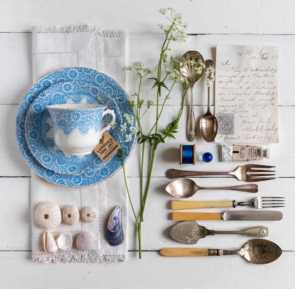
My photographic journey began a long time ago as a young photographic assistant sitting in the back of the family car, when I would travel through the Devon countryside on the old ‘post roads’ hunting for milestones or stopping at village post offices which my father would then photograph as part of his writing on ‘Postmarkings of Devon’. On finding the milestone at the side of the road, aided by myself and younger brother, we would hold strategic mirrors as
reflectors to light the stones to best effect or take it in turns to hold the all important camera bag whilst the photograph was taken. My father’s keen interest in stamp collecting and post office markings developed over many years, before escalating into him researching full-time into Devon Postal History from 1570 to 1860s in four volumes. Exhibiting his research at prestigious worldwide philatelic exhibitions he was recognised as an eminent postal historian in his own
right. This time spent as being part of such a large project developed my own interest in taking photographs, but not of milestones, when as a teenager I was given one of Dad’s old cameras which I still own, and which may feature in my current work.
Admittedly, my own interest in collecting stamps was short lived but it’s the memories of a childhood home being full of boxes with philately ephemera collected at stamp fairs or bought in antique shops, auctions
and house clearance sales as a family outing. For me, the memory of my father continues within the contents of numerous old Xerox paper boxes, which he filled with certain objects ‘to keep.’ Now in my possession, there are two of these handwritten labelled boxes titled ‘Pens, Pencils, Nibs’ and ‘Philatelic Tools’ whose contents I initially photographed on a plain white background as a way of ‘cataloguing’ the objects, just as my father catalogued his stamp collection. Some may say that this style of photography is very minimalist, unemotional, or too objective. However, for me this is the complete opposite and just as the New Objectivity photographer Albert Renger-Patzsch photographed ordinary objects, machinery etc. at close-up, the camera was used as a way of seeing and to represent the intrinsic ‘beauty’ and worth of each object. For the first-time viewer of my images, the response may be one of curiosity; for me however, the objects still evoke an emotional narrative of a very detailed life.

By its very nature, photography and memory go hand in hand. In my most recent work, I frequently juxtapose my father’s useful philatelic tools with my interests in collecting items from nature or with man-made objects of interest such as vintage cutlery, items found in antique shops etc. as I am attuned to visiting these and probably always will be.
To create my images, the natural material is collected spontaneously whilst out and about, at home or on holiday. I frequently walk along the coastline, lanes, through forests, and over fields with family and friends. There are no rules for what type of objects I collect, whether garden flowers, wild weeds, seedheads, twigs, leaves, feathers, shells, pebbles and more recently seaweed. For me, nature is constantly providing the material and inspiration for a new image. Once again, I select a plain background so as not to distract from the subject matter. When curating the photograph, my technique is to lay the objects onto a flat surface giving the viewer a top-down perspective or ‘bird’s eye view’ which is currently referred to as ‘flat lay’ photography. This technique


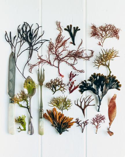
has its origins in one of the earliest forms of photography by which W.H. Fox Talbot constructed his initial photograms in the 1840s by laying objects directly onto a sheet of photographic paper and exposing them in direct sunlight. Later, in the 1920s darkroom, the surrealist Man Ray created his ‘Rayographs’ of objects placed directly onto the flat surface of photographic paper.
Today, each composition I create is taken with a camera directly overhead and, using the flat lay technique, is built around a story of the objects. Often, the collected objects from the garden or the countryside will decide this narrative. What’s important is that one item or a group of items will become the main focal point. Around this I begin to compose the image, which is the part I enjoy the most. Objects are added, removed, added again until everything looks right. Time is never measured but when I am happy with the composition and the light is good, the shutter can be finally pressed…
sallystonephotography.com

APAINTED BODIES
ASHOK VISWANATHAN FFIP EFIAP PPSA
s a school student in the early ‘seventies, I joined the Photographic Society of Madras, India, founded in 1857 and one of the oldest clubs in the country, with a somewhat small membership at that time. Monthly meetings were occasions to display one’s work to the members and that’s where I was introduced to shooting nudes. The President of the Club would sometimes display his monochrome work shot with a Hasselblad 500c. The images and print quality were amazing. I was hooked not only on nudes but also monochrome. I had to find a model and a friendly member to help shoot my first images. Not an easy task in conservative India.
In early 2000, I went digital with a Nikon D100 and a kit of 3 lenses that was used extensively until I upgraded in 2012 to a Fuji system, currently two XE3 bodies with 10-24mm, 1855mm and the 50-140mm f/2.8 lens. A thirty-year-old manual Nikon 105mm f/4 Macro was added with a Metabones adaptor. RAW conversion is done on a MacBook Air using a profiled EIZO 24-inch monitor. Going digital provided not only instant gratification, but also did away with having to deal with erratic lab processing, dust and scratches, as well as associated costs.
I finally did my first shoot in Mumbai some years ago with mixed results. I realised it was not as easy as it looks and there is a lot of planning that goes into it if you want to walk away with good results. The nude is a subject that offers every possible shape and is a challenge to

photograph. Having previously done several successful shoots I was looking for new ideas. At this time, body painting was being practised in Europe and the images were very interesting. I needed to try this.
It’s hard enough to find a model in India, but to find one that was willing to be used as a canvas and painted by a body artist was
almost impossible. A few years ago, I met with an artist in Kolkata who was exploring body painting and did a few images, which you see here. Body painting is a messy, time-consuming process. At best you can only do two or three patterns on a model in a day’s shoot. Projecting a pattern on to a model has been done before and requires
Hand Painted Nude

a slide projector and a dark studio. These days both slide film and projector are rare commodities. There had to be an easier way to make such images that offered flexibility.
I found that textures blended with colour images can give lovely results. It’s not the same thing as body painting and a close look will show the difference. However, it is close enough and the results are adjustable and pleasing. The end result is unpredictable, as it depends on the background, the texture and the blending mode. I have built up a collection of images that I use as textures. It’s a good idea to collect textures of interesting things you see such as flowers, patterns, clouds, leaves, glass, paint, rust, textured walls, etc. The same image could be used with different textures, giving very different results, or even blending multiple textures with a single image. The same texture

Textured Nude
Stone Texture

also gives different results when blended with different images. Lots of people have used textures before, mainly for backgrounds. Using it on a model is a little more difficult as it needs to complement the pose. It’s best to save the file as a PSD with the layers so you can always come back and make changes any time. I have found that lighter backgrounds seem to work better, whilst a black background will give a texture only on the model. Using blending modes and opacity, combined with contrast,


Theyyam hand painting the face
Textured Nude
Textured Nude
Sketch with texture overlay
levels and other Photoshop adjustments, can all be used to fine-tune the image to your liking. Any excess areas showing unwanted texture can be deleted using the paint brush or with the dodge tool on lighten. Monochrome can also give some visually strong images. The advantage of this method is that you do not need to plan the final result but can try different options later.
Using this technique, you do not need to actually paint the model and, when inspired, can work on your images to add texture to the model herself, or to the overall image. Another option is to project or blend patterns on to the model which can be altered to give shapes and curves. About two years ago I created a few images on a nude model by using the leaves of a plant lit from behind by a Elinchrom flash held several feet away. It cast a patterned shadow on the model. Getting the angle of the leaf right necessitated test exposures and adjustments to obtain the best histogram. The images made using these techniques have been very successful in several international exhibitions.


Leaf Shadow
THE SEA GIVETH AND THE SEA TAKETH AWAY
DAVID TOWNSHEND FRPS

The north Norfolk coast is rich in natural habitats – sand dunes and saltmarshes, mudflats and beaches – and it is a great escape from the pressures of town and city life. But it is not without danger and threat, particularly with little defence against North Sea storms and tidal surges. It can be elemental here, as in Happisburgh (p23). One can feel at one with nature and yet at times in awe of its power.
And I have a very personal connection with the power of the sea. The Great Flood of 1953 led to the deaths of 300 people in England (and, indeed, 1800 in the Netherlands). My mother and one-year old sister were rescued from their house at Heacham on

Wild
Fire and Brimstone
the Norfolk coast as that storm broke through the sea banks and the waters rose. I was born a year later in 1954. Without that rescue, I wouldn’t be here now...
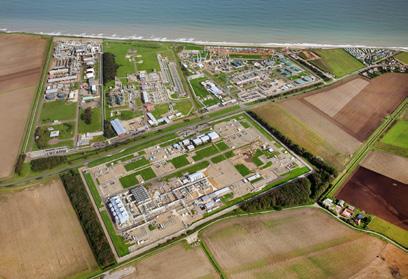
There is no heavy industry along the north Norfolk coastline – except at Bacton, south east of Cromer. Here, the Bacton Gas Terminal is perched on the cliff top with its stacks, lights and fences defining the skyline. It is the landfall for North Sea gas and provides up to a third of the UK’s needs. This is a naturally eroding coastline of low, soft, periglacial cliffs. With rising sea levels and more extreme storms the rate of erosion is increasing. When opened in 1968 the terminal was a hundred metres from the cliff edge; now it is just ten metres.
The rising sea level and increased storminess are of course due to climate warming. And climate warming is primarily due to fossil fuel consumption. So we have the huge irony of a major fossil fuel installation threatened by the effects of burning fossil fuels!
The sea giveth (gas) and the sea taketh away (land)
In my images I want to convey my emotions about this conflict between man and nature, and do so in a different way than just pictures of stormy seas.
To slow down erosion of the one kilometre cliff top frontage of the terminal, a succession of major sea defences of varying sorts has been erected. There are breakwaters, timber groynes, rock armouring and steel sheet pilings. And, latterly, 1.8 million cubic metres of sand has been deposited at the foot of the cliffs, at a cost of £20m. In images Timber Layers and Bolted I wanted to convey the varied materials and structures - sand, wood, metal bolts, revetments - and the layers of defences. In Wild the timber revetments conveys the chaos of a raging storm on Bacton beach.
In Fire and Brimstone I have used yellow to represent the heat from burning the North Sea gas – heating both our houses and our climate.


Bacton Gas Terminal
By Courtesy of Mike Page Aerial Photography
Timber Layers
Bolted
The nationally important gas terminal has one thing in common with the little bungalows and caravans of the adjacent coastal villages, which I have represented in Crashing Down by the chalets perched at the cliff edge. They are all under continuing threat from the stormy North Sea. I have chosen colours to stress the danger to human life and property.
In Atmospheric the layers of defences contrast starkly with the terminal’s skyline, whilst the colour of the sky refers to the pollution of our atmosphere from burning gas.
In Lowry by the Sea we seem to have been briefly transported to Salford, with LS Lowry figures


Lowry by the Sea
Atmospheric
Crashing Down
on the far left of the image trying to keep hold of their brollies in the storm.
The chaotic and desperate defence efforts to hold back the sea, with groynes, piling and bolts set against the terminal’s skyline are highlighted in Chaotic Defence, whilst the final image, Unstoppable, suggests the irresistible storm tide surging across the beach and into the terminal.
In this project I have tried to expose the conflicting local, national and global objectives and threats relating to fossil fuels, all crashing together on a Norfolk beach.
It would be nice to have a happy ending to this tale, but I fear there is none. Indeed I hope my images convey that very point. The number and scale of defences employed at Bacton give a sense of chaos and desperation, perhaps even futility, in attempting to defend the coast against a threat that will only increase in frequency, power and impact. It certainly feels a very long way from a harmonious coexistence with the natural world that much of the Norfolk coast might suggest.
davidtownshend.com


Chaotic Defence
Happisburgh

TCREATIVITY CATCH-UP
SIMON STREET FRPS
he truth is, I do not feel like a creative person. As an engineer, then consultant, I can claim no obvious creative track record. Nor can I claim to have a long photographic CV: I got my first digital camera in 2016, so you may ask, how did I acquire a few Fellowships? Well, I thought I would share what little I know about my own creative process in case some of it might resonate with you. On the way, I will share ten images from ten different projects across abstracts, people, landscape, and travel to illustrate how creative ideas evolve. Let me bore you with the creative details in calendar order:

I love the shapes, texture, and tones
A strange place to start! Until I tell you I was under ‘house arrest’ during lock down. An accidental breakage of a glass resulted in a cut finger and realisation of how beautiful glass looked. I tried to use a zoom to photograph it – no good. I bought a second-hand macro – still no good. I bought extension tubes – getting better, but still no better than my eyesight. I trialled stacking software – promising at last! So, 5% creative idea, 95% trial and error.

Look at the gesture made by the old lady
The Two Metre Rule imposed a creative challenge to photographing people: distance and open air. One morning I hit upon the ‘bright idea’ to photograph the owners of beach huts. I could keep my distance and be in the open air. Photographers had done the colourful row of beach huts to death. I needed more differentiation. I decided I would go for owners AND unusual body language. I began to have engaging conversations about their views on Covid and Brexit. The pictures became animated!
Broken Glass
Beach Hutters
Covid Experience Imprisoned
The misery of experiencing Covid before we had jabs came next. The idea materialised as I dozed in bed and felt imprisoned in my own house. In my image you see the shadows of the windows looking like prison bars. I wanted to also convey the mental distortion felt in times of high fevers. Many creative tests followed but I liked the joy of distorting in Photoshop using the Liquify filter.

Social Hierarchy at the Races
racing people
The best ideas are sometimes under your feet. I live half a mile from a racecourse. I have no interest in horses – just people. The creative spark came after seeing road signs for Owners and Premier ticket holders. It all felt a little too like our old social hierarchy. It took months to get permission to take images with a pass. I was once asked for directions to the Royal Box! But the frequency of visits (perhaps 30 events) slowly delivered fascinating social and pictorial images such as my example here.
Horse


Downs and Estuaries
The flowing contours and bold skies
Look at the drama of the rain curtains
These two separate projects are best described together. I found many landscape images a little too traditional and fussy for me. They sometimes seemed to lack the panoramic experience of the real thing. I started to dabble in stitching panoramas together – first in camera – then using Merge in Lightroom. I hit upon the idea of the Downs from my love of their flowing contours and the bold skies above them, as shown here. The Estuary project soon followed – this time I wanted to ‘push the creative boat out’ (good pun, eh?) by increasing the aspect ratio to encompass about 150 degrees of view. I found the real drama of Estuaries were during storms. ‘Estuary English’ became a Photobook to best benefit from a double page spread.

An image that tells both a human story and a coastal vista
My first attempt at a Travel project was the Trans-Siberian Express – 8000 km - in Winter. Bad idea. Yes, it was cold. But I managed just a handful of useful images and could not go back for budget reasons. The key creative lesson: stay closer to home and find the new amongst the everyday. Portsea is an Island lost in plain sight. It surrounds Portsmouth and is one hour from my door. Here I used my panorama experience, but pushed the creativity to include people.
Portsea Island


Micro Flora
Textures and chiaroscuro
Back to the abstract world using macro. My local garden centre sells baby cacti and succulents for £5 a go. The shapes, prongs and textures look amazing under magnification. I had learned the basics from my Broken Glass work. This time I wanted to get in closer and explore the hidden world. My image illustrates the textures and the transition from the darkness I wanted.
Austerity
The onset of decline
Inflation was awful in 2022 and Putin made it far worse. I wanted to get into the shoes of someone living through it. I created ‘Jo’ to tell his story of declining ability to pay for things and the social, economic and health consequences upon him. These images used a lot of techniques to communicate mental health issues. In the image shown here, I tried to communicate the onset of hunger and mental decline.
Worthing
Let them eat cake…
Finally, a Documentary project. My initial idea was to pick a town to track how it was bearing up under the recent economic pressures. I wanted to look for both the satire and the hardship. I have shown the first image in the sequence – I choose it because it seemed to communicate the old saying, ‘Let them eat cake.’ These environmental portraits and candid shots were slow in coming – perhaps one image every second visit.
Well, that is my creative path so far. I have filled my creative boots. I hope that gives you a little inspiration that there are creative ideas all around us. In our minds. In our homes. In our towns. In our land…even in our garden centre!
simon-street-photos.com

TEN YEARS BEHIND THE CAMERA
JAMES KERWIN

Ihave spent more than ten years exploring hidden, forgotten, and abandoned structures as an artist and creator. My goal - to use complex lines, vibrant colours, and contemporary processing methods to capture and enhance interiors.
Currently situated in Istanbul, my travels have led me to discover obscure nooks and distinctive sections of cities across the globe. With my first series of images, Decadence, I started looking into abandoned buildings. Since then, I have travelled to some of the most fascinating countries on earth, including Namibia, Taiwan, and Lebanon.
Travel plays a significant role in my photographic storytelling. Travelling to new places is inspired by my curiosity about different cuisines, textures, colours, and cultures. My love of travel and photography motivates me to plan ahead and carry out extensive research in order to set up all the logistics and take my camera to some genuinely unique locations.
Since I first picked up a camera, I have travelled countless miles in search of these new experiences. Consequently,


I made the decision to relocate permanently outside of the UK in 2019 and launched a photography adventure tour company, initially based in Tbilisi, Georgia (including during the pandemic). However, as I expanded it, I moved to Istanbul, Türkiye in order to continue my artistic goals.
But allow me to transport you back to late 2013, when I visited factories, and abandoned churches with interesting facades across the United Kingdom. However, it didn't take me long to go around Europe in various groups of people. One of the highlights was the trip I took in 2015 to photograph Poland's crumbling palaces. The palaces had been taken from the people during the Soviet era, but the owners had either moved away, passed away, or made a reference to the state of neglect when the state tried to hand the buildings back, after the collapse of the union.
After assessing each palace, the state gave the larger or better-kept buildings a

permanent caretaker (until investment could be found), so they could effectively be watched over. I spent 10 days driving around, trying to locate each of these carers and used a bottle of vodka and some euros to gain access.
Back in March 2018, I stepped outside of my comfort zone further, with the aim to showcase former soviet architecture in the nation of Georgia and the war-torn region of Abhkazia, a disputed territory on the Black Sea sandwiched between Georgia and Russia. With only 340,000 people living there, Abkhazia is a place that may not be for everyone. But, to me, it was like a paradise, free of the typical tourist craziness, and it promised thousands of dilapidated and abandoned buildings, including mansions, hotels, and sanatoriums, all rich in history.
But first, I looked at Tskaltubo, a former spa town that was abandoned following the collapse of the Soviet Union - located in Central Georgia. Approximately thirty years later, many people still live in these former spa hotels and sanatoriums that were once home to displaced people or war refugees. When it was at its peak, a sizable park with several water features and hot springs would be surrounded by nineteen magnificent buildings.
I had no idea that when I left the UK later that year, that Georgia would end up becoming my second home. Tbilisi would serve as my base of operations for 8 months of 2019 while I launched my urban-focused, off-the-beaten-path photography workshops and tours. In early 2020, I raced back there in search of lower overheads as the world started shutting down.
In 2019, I began photographing a new series called Uninhabited, assuming, naturally, that the pandemic would not get in the way that it did. I was to visit ghost towns all over the world, including those in mountains, deserts, and outback regions. The first destination was Kolmanskop, Namibia; later that year, I would also produce images in Al Madam, United Arab Emirates.


Originally, I intended to release something completely different as late as 2024. With the goal of producing a final series in which one outstanding photo from each location would be added to the collection. The decision to launch these images early was made considering both the pandemic and the publication of Fabrica, my first book, which includes a feature section – which included these photographs.
I would consider A Paradise Lost, to be my most successful series to date. Captured in Lebanon and Beirut between 2019 and 2022, this now massive collection on my website has also been published as a book by Jonglez Publishing. It was released in the autumn of 2021. I am immensely proud of my project in Lebanon because the world has a very erroneous impression of the country due to all the negative press it receives. My absolute favourite city in the world is Beirut; the people, food, and architecture all combine to make it a unique destination.
Finally, my most recent series release was shot right across Türkiye. Tucked away from the main travel routes are remote, very unexplored villages. In the last 20 years these villages have changed, first with the older, crumbling mosques being replaced with new and often much larger religious spaces. Then, as the economy began to falter, villagers started migrating to larger cities, in pursuit of employment. Many of the older mosques still reside nearby –usually these are over 100 years old, entirely constructed of wood and many are beautifully painted.
I’m constantly pushing myself to capture stunning imagery - It hasn’t been an easy journey of course, but it’s been incredibly enriching. I find inspiration in the beauty of unexpected places, and I aim to share that inspiration through my works – I hope that you enjoy them too. I look forward to the next ten years!
jameskerwinphotographic.com


CURING PLANT BLINDNESS
CAROL SHARP
Plant blindness. Wow.
As a visual artist who loves plants, when I heard that most humans are afflicted by this condition, I knew it was going to be my life’s work to mend that separation as best I could. When people are shown an image of a deer grazing near some plants and trees and asked what they see, they say ‘A deer.’ Anything else? The researcher asks. Nine times out of ten they say ‘No.’ This is plant blindness. People objectify plants to the extent that they are just a backdrop and not given any agency. Their lives have no value to
humans except as resources. A felled tree is worth more than a living tree.
My commercial food photography practice also objectified plants, abusing them to fit the aims of my commissions, as they were being used to sell stuff like teas and shampoos. I knew how to use light and composition to make them look great though. At least people would see the flower or leaf of the plant that provided the fruit in their product and learn something by default.
But as I found out more about plants and their lives, I started to really ‘see’
and began to promote plants rights whenever I could. I even started a company called Greener Image, giving a percentage of earnings from the featured plants back to education about their world. After all, any other model would receive payment for being in a commercial image.
The first personal images I made were called Plant Portraits, as I strove to reveal what Goethe called the ‘gesture’ of each plant, in the same way a portrait artist will try to reveal the character of their sitter. The way plants express themselves spatially reveals


a way of being in the world that could be described as personality. To find this I would observe and study plants, to better know their intrinsic character. Light is the paint of the photographer, and much can be achieved by the angle at which you look and the parts you accentuate.
By re-presenting them as having personality I hope to take people a step closer to a relationship and a connection with a plant, because we are less likely to harm or destroy something we care about. I found people became more engaged when the plants expressed a human concept. I’ve been obsessed by the allium shapes that declare connectivity, reaching out from a central hub, often with more fractal hubs. This shape implies communication to the outer world which we know plants do in many forms, they are not passive at all!
I looked at control, which is something people seem to regard ‘gardening’ as. I too thought this and tried yearly to remove seedheads from thistles in my meadow before they turned into fluff and spread seeds everywhere. One year I was too busy and missed the window, I went into the meadow and the initial shock of the mass of thistledown turned into wonder as I photographed the series I now call ‘Release.’ I had let go of control of nature. The thistles have since naturally found a balance in the meadow ecosystem.
The series became about the moment the plant releases its seed, letting go of the old while the new is born, and the juxtaposition of birth and death in the same image. This is also an expanded way of seeing plants, rather than just valuing the flower. The seed is a metaphor and is the beginning and end for a plant. I’ve found collage is a route where you can show a plant in all its life stages and imbue meaning into the image too, as I did with Acorn, which depicts the tree and the leaf encapsulated in the acorn. Aristotle said that a tree or plant has the blueprint of its final formits purpose, in the seed.
Transition zones illustrates parts Darwin discovered and named,


Systems V - Transition Zones
Release XVIl

found at the tip of every root, which have high electrical activity and we now think are tiny hubs where information is passed throughout the plant and along the fungal threads that connect the roots.
Recent science finds plants communicate in many more ways than we realized and exist as communities, working in collaboration, not purely competition. I have studied plant intelligence and there seems no reason for not considering plant consciousness.
I hope the images help us to ‘open our eyes’ and see plants in a less anthropocentric way. A less western way, because indigenous peoples have never seen plants as just a resource to be plundered. They show respect and even gratitude – choosing to recognise how plants gift to us in so many ways. Through images and writing I continue to advocate for plants, as I re-present and bring the world of these remarkable beings into focus.

Acorn

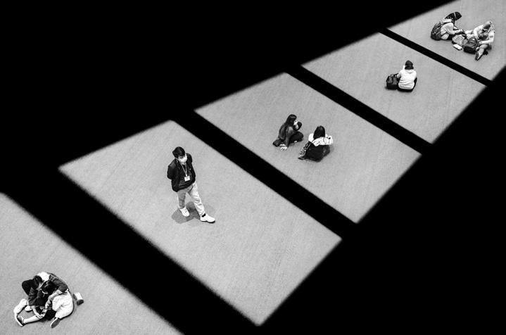
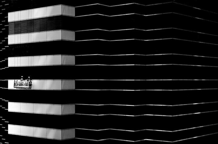
HONG KONG LINES AND PATTERNS
CAPTURING CITY GEOMETRIES AND FLEETING MOMENTS IN BLACK AND WHITE
JASON AU FRPS

In this article, I would like to share my photo project titled ‘Hong Kong Lines and Patterns,’ which granted me the distinction of Fellowship in Visual Art in 2022. Furthermore, I will delve into the art of black and white photography, composition, and capturing moments in street photography. These elements serve as the fundamentals of my photography.
Hong Kong Lines and Patterns
‘Hong Kong Lines and Patterns’ is a street photography series depicting my creative vision on my hometown. It embodies a fine art aesthetic and a compositional approach that isolates urban subjects, and geometric elements and forms
Obsession
Tunnel Vision
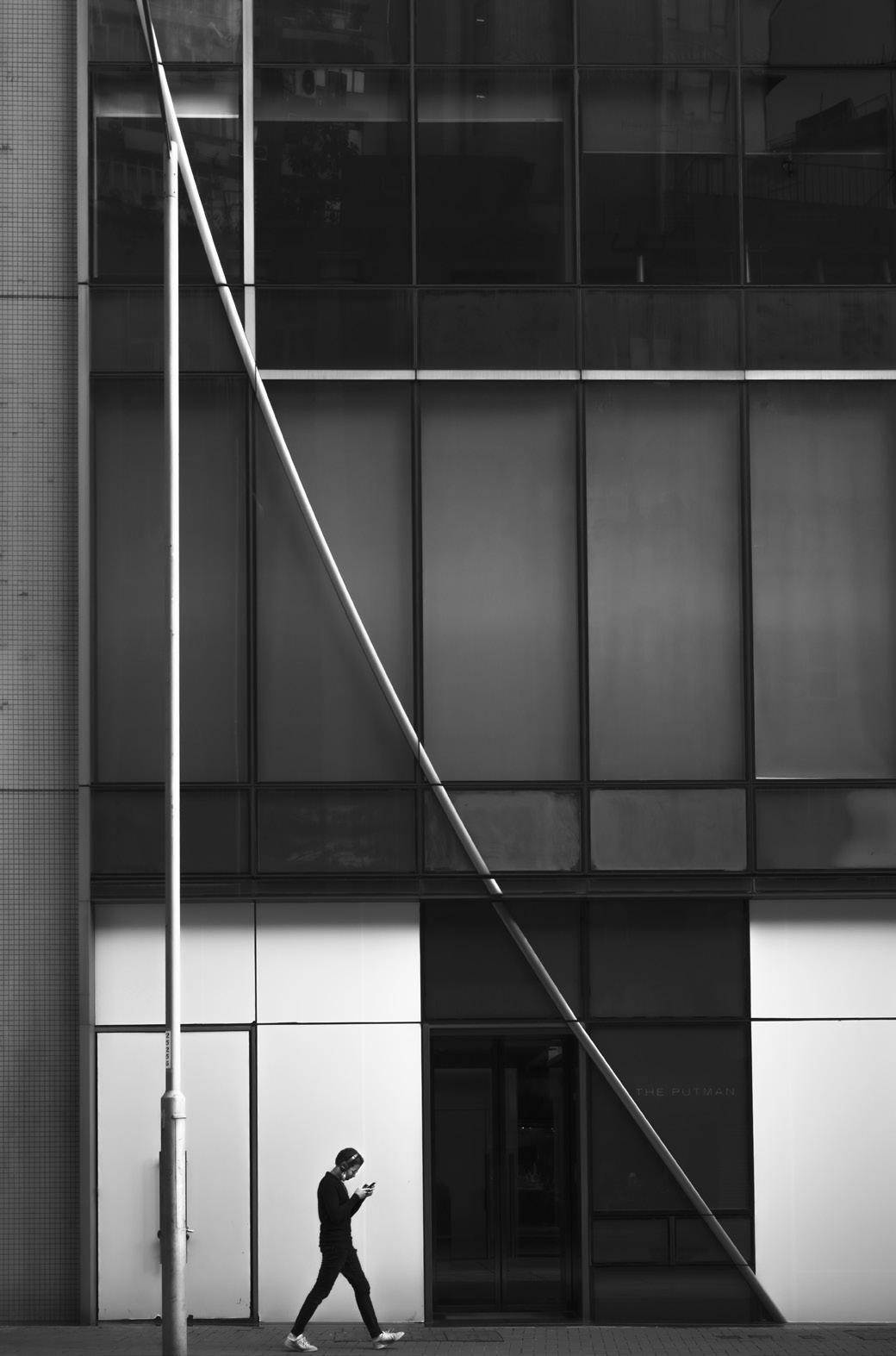

from the chaotic urban environment of Hong Kong.
Through capturing fleeting moments from mundane everyday scenes, this series portrays different urban characters within the context of their surrounding geometric environment. However, the subjects appear trapped and lost in an artificial geometric maze without realising it. The urban structure seems to confine and enclose them in small boxes with no escape, symbolising the modern condition of how we succumb to the allure of the urban landscape that we have created. This perspective offers a metaphorical interpretation of urban living, hinting at the hectic and bustling nature of modern city life in a metropolis like Hong Kong.
Seeing in Monochrome
Black and white is my preferred photographic medium of expression. By stripping away the familiar colours of our daily lives, black and white photography gives a sense of detachment from reality, enabling the form, essence, and soul of the photo's subject to take centre stage. This absence of colour fosters a more direct and powerful emotional connection between the viewer and the subject.

When working in black and white, I enjoy accentuating the geometric lines, shapes, and textures of the surrounding environment, as well as emphasising the contrast between light and shadow. This photographic approach will intensify the drama of the scene, resulting in the creation of more evocative black and white images.
The Essence of Street Photography
While the environments and objects that surround our daily lives may seem insignificant, street photographers, and I believe all photographers, should learn to discover beauty in the mundane and possess the ability to transform these ordinary elements into extraordinary and captivating representations through careful selection and arrangement of the visual elements within the frame. This skill allows them to immortalize those beautiful moments that occur fleetingly.
Seizing Moments on the Streets
For me, the essence of street photography lies in the pursuit and capture of those ‘decisive moments’ on the streets, a term coined by
Henri Cartier-Bresson. These decisive moments encompass limitless possibilities: a person's quirky gesture, a solemn expression, a sense of scale, or an interesting juxtaposition of the subject with the surrounding environment. When photographing out there, keep asking yourself questions. Which elements in the surroundings attract me and why? This kind of questioning will ultimately shape your photographic vision.
Indeed, to capture these transient moments, we must first learn to observe, train our eyes to perceive and anticipate these unusual moments, and be attentive to every happening on the streets. Timing when to release the shutter is also a crucial aspect of street photography. The orderly and transcendent moments only appear fleetingly amidst the chaos of the streets. Therefore, photographers must know how to position themselves in the right place, set up their cameras, aperture, and shutter speed in advance, frame the shot, and decisively press the shutter when the moment and scene align.
I tend to employ a street photography approach known as the ‘fishermen approach.’ This involves finding a strategic location with good
By the Window
Wandering in Light
composition and interesting elements as the backdrop, anticipating a good subject entering the frame, and releasing the shutter when the right subject arrives at the right spot within the frame. It requires observation, pre-visualisation and framing before the moment unfolds. In contrast, the opposite approach, the ‘hunter approach’ in street photography, involves constantly moving and actively seeking subjects to capture. However, this makes it difficult to control the visual elements within the composition as you have less time to react. Most of the images in my Hong Kong Lines and Patterns series were captured using the ‘fishermen approach.’
The Significance of Composition
Composition is vital in every genre of photography. It entails finding balance and proportional relationships between all visual elements within the frame, including shapes, lines, colours, light and shadow, textures, patterns, and negative space. When all these visual elements are harmoniously arranged, the image will naturally exhibit appealing visual aesthetics. Photography is a visual art form that shares commonalities with other visual mediums such as fine art painting, printmaking, sculpture, and architecture. These art forms have a longer and richer history with past masters who have attained the pinnacle of their craft. Therefore, photographers should cultivate a broad understanding of both the past and present, analyse works from other art mediums, and learn the composition and visual techniques employed by past masters and photographers.
Fan Ho FRPS, a legendary photographer known for his evocative black and white street photography of Hong Kong in the 1950s-60s, once stated, "Composition is the imperative means to achieve vitality, expressiveness, and cohesiveness in a photograph." Henri Cartier-Bresson, the giant and pioneer of street photography, also wrote, ‘Photography is the simultaneous recognition, in a fraction of a second, of the significance of an event as well as of a precise organisation of forms which gave that event its proper expression.’ To me, mastering composition is crucial for creating captivating and thoughtprovoking works of photography. jasonaucs.com

Midfielder
Social Distancing

FORM AND TEXTURE
PAUL MITCHELL FRPS

It may help to understand my thought processes if I say that I am totally absorbed in the world of visual and creative arts. For over forty-five years I was a full-time graphic designer. Art was my favourite subject while at school and it will come as no surprise that I continued my further education at art college. Those were the days when you were taught life drawing, calligraphy, typesetting and printing
by hand - basically handcrafting everything you did. Obviously as technology advances then one must adapt, hence I am now typing this article on a computer as opposed to handwriting it. What is ingrained in me though, is the innate preference (and ability) to pick up a pen, pencil or paintbrush and create something - sadly an activity I see less of in the young as each year passes.
The above also applies to my photography. Whilst at art college I was taught how to correctly expose a roll of film, process it, and create a print in the darkroom. Indeed, I still use film on a regular basis (see my pinhole work), but again, as technology has progressed, I have adapted, and digital capture is now my preferred method.
There has always been a strong synergy between graphic design and
photography. I wanted to become a professional photographer after leaving art college, alas having a mortgage to pay and a family to raise put paid to that! The creative principles are very similar though. As a designer, I always start off with a blank piece of paper which I populate with ideas. When I revert to photography mode, I treat the viewfinder as my blank page.
Deep down I am a landscape photographer, but I often get asked about my form and texture series and the influence behind them. To put it simply, I capture what I see! From my point of view the overriding message I want these images to convey is 'look closer and deeper into both the natural and manufactured world.’ I often refer to these images as my inner landscapes. I have been making this type of image for as long as I can remember, even when I was still using film. With the advent of digital though, I do find myself experimenting quite a lot more and exploring more subjects. I even try a little ICM from time to time.
I personally don't see this type of photography as being difficult, as I can often find images in the most


unlikely of places. The reason why most people might find it difficult is that they often walk past something without even thinking there may be an image there. When down at the coast look for textures in the rocks, sand patterns, seaweed, old boats etc. When in the city look for textures in the pavement, street furniture, parks and ponds etc.
After I have found a potential image, I can record it in a couple of different ways. An iPhone is ideal if I come across something that appeals to me and I don't have anything else. If I'm out and about specifically looking for detail images I usually have my small compact camera with me. It is small, light and relatively inconspicuous. Even though it has an integrated viewfinder I always use the live view to compose. I find using a large DSLR too cumbersome and you are more likely to draw attention to yourself… especially in urban areas!
Try also to break away from the usual 2:3 aspect ratio. I find that 2:3 works well for straight landscape images but don’t discount 16:9 for a slightly wider, panoramic feel. I sometimes use a micro four thirds camera which has a 4:3 ratio which is perfect for portrait orientated images. The square or 1:1 ratio is ideal for bold graphic images that include centrally placed elements.
I find all textures interesting, whether from the natural world or something that has been the result of human endeavour, such as peeling paint, or rust. Saying that, not everything works: the more complicated the image the less impact it has. Keep it simple is my motto!
The best advice I could give to any photographer is, look and study the world around you. As you progress in years (like me!) always keep a sense of childlike wonderment in what you see and experience.
Paul has had numerous exhibitions in London and the South-East and has had articles and images published in many photographic magazines. He is a Fellow of the Royal Photographic Society and is the current Chair of the Landscape Distinctions panel. He also serves on the Visual Art and PhotoBook panels. Paul is also a well-respected photographic judge and lecturer.
www.paulmitchellphotography.co.uk


ABERTRAM SINKINSON HonFRPS
PICTORIALIST AND COMMERCIAL PHOTOGRAPHER
DR MICHAEL PRITCHARD FRPS
cold call from the son of a former RPS President in the summer 2023 asking if the RPS would be interested in taking his father’s photography before a house move, led me on a drive to a remote cottage near Stratford on Avon. Robert Sinkinson was in the midst of preparing to move to a smaller home and he had laid out his father’s photographs on a table for inspection.
The photography was distinctive. It was reflective of its period of course, but the plethora of exhibition and salon labels on the reverse of many showed that the pictures had been widely exhibited and respected at the time. The photographs were the work of Bertram C Sinkinson, Robert’s father, and a former RPS President. They were a mix of his commercial and personal work from the start of his career as an art student in the late 1920s up to the 1980s, together with some examples of his artwork and a small number of photographs from some of his contemporaries.
I viewed the photographs and Robert spoke about his father and relayed the stories behind some of the images. As a boy Robert had often been encouraged, or enticed, to accompany his father and help carry tripods and equipment into the countryside.
It was clear that the prints warranted adding to the collection in Bristol. The RPS has a small collection in Bristol which is mainly focused on significant former members, as space is at a premium. In Bristol the RPS is developing a new collection as the President outlined in the April/June RPS Journal. The RPS’s original Collection of photographs which was known as the Permanent Collection is now housed at the V&A Museum, in London, and includes a small number of Sinkinson’s photographs.
Bertram Sinkinson
Bertram Sinkinson was born in 1909. He was artistically inclined and attended art school before training in photography with the longestablished Birmingham studio of Whitlock which had its antecedents back to 1842. Such an experience provided him with a range of skills in lighting and posing for portraiture, and darkroom work that would stand him in good stead for his own photography, especially as portraiture which was the mainstay of the high street studio. After the second world war Sinkinson set up his own studio in Stafford, where he, too, specialised in portraiture.
Sinkinson joined the RPS in 1930 and gained his Associate in 1931 by which time


Innocence, 1932 Inv: RPS-2023-20-031
Abigale, not dated, hand-coloured print. Exhibited by invitation at Chester 1970. Inv: RPS-2023-20-141
he was already an established photographer and exhibitor. He was awarded his Fellowship in 1932. At the same time, he was also active in the Institute of British Photographers (IBP), now the British Institute of Professional Photography (BIPP), where he served as President in 1948. He became the RPS’s President 1953-1955.
Sinkinson’s commercial studio was successful, and he photographed a range of celebrities of the period as well as civic dignitaries in Stafford, politicians, and society figures. Amongst those he photographed were Sir Malcolm Sargent, George Bernard Shaw, the actor Robert Donat, who played William Friese Greene, the Duke of York, later King George VI, and Patrick, Lord Lichfield, who was later a photographer in his own right and who’s ancestral home was close by.
He was awarded an OBE in 1957 for public service –he was active in Rotary and Freemasonry - and became Mayor of Stafford in 1959.
Sinkinson retired from business and moved to Eastbourne where he continued his own landscape photography. He died in 1985.
Pictorialism
Away from his successful business Sinkinson was an accomplished pictorial photographer and regularly photographed in the Sussex landscape, with its rolling hills and large skies. He was elected a member of the London Salon of Photography in 1952 and exhibited in its exhibitions through to the 1980s. He served as its chair from 1959-1964. He was also President of the Photographic Convention, a gathering of photographers that had been formed in 1886 and met annually. He became its President in 1957 and 1958.
Sinkinson also exhibited his portraits and landscapes in the RPS annual print exhibition from 1931.


Lady Diana Cooper as the Madonna, 1934. Inv: RPS-2023-20-060
P G Hopcroft FRPS. c.1931. Exhibited at the RPS Annual Exhibition, 1931 and numerous other exhibitions. Inv: RPS-2023-20-028
Rear of P G Hopcroft FRPS. c.1931. Exhibited at the RPS Annual Exhibition, 1931 and numerous other exhibitions. Inv: RPS-2023-20-028

It was not just in the RPS and Salon exhibitions (Britain’s most prestigious photography exhibitions) that many amateurs aspired to. Like many commercial photographers Sinkinson was involved with his local club, the Stafford Photographic Society, and showed his work in its exhibitions. He also showed his work widely in other salons and exhibitions across Britain, America and Europe.
Looking through the 184 photographs one is struck by Sinkinson’s mastery of lighting in his portraits, not unexpected perhaps, as this was what his living was based on. His pictorial work is very much of its period but some of his views show an ability to capture the picturesque. Pictorialism was the dominant genre within photographic societies and clubs for much of the twentieth century and it is still with us today.

This England of Ours, 1928. Bromoil print. Inv: RPS-2023-20-091
Harvest, not dated. Inv: RPS-2023-20-162
What is unexpected is that Sinkinson did not seem to do any experimental work (or if he did, then it has not survived). Early on he made some Bromoil prints, perhaps reflecting his art training, but his regular black and white chloro-bromide, bromide, and colour work does not stray far from the norms of the period.
On his death in 1985 the RPS’s Photographic Journal (July 1985, 322-327) carried a selection of his photographs with a short obituary. I will leave the final words to Sinkinson’s successor as President, R H Mason, who wrote that he will be remembered ‘mostly for genial character, kindly manner, and sincerity in all his undertakings. He…did much for photography and young photographers in his active years.’

Dr Michael Pritchard FRPS joined the RPS in 1979. He was its Director-General from 2011-2018 and Director of Programmes from 2018-2023. He now consults on photography and its history. He is a photo-historian and edits the RPS Historical Group’s The PhotoHistorian. He is currently writing a history of the RPS. He can be reached via his website.
mpritchard.com

RPS-2023-20-094

Where Earth meets Sky, not dated. Exhibited at the London Salon of Photography, 1979. Inv: RPS-2023-20-002
Bertram Sinkinson, self-portrait with reflex camera. Inv:
The Silent Pool. Exhibited at the London Salon of Photography, 1955. Inv: RPS-2023-20-153

MIMAGE TO ABSTRACT
ROB KERSHAW ARPS
y project was prompted by a mention of the Polar Coordinates tool in Photoshop during a Portfolio Zoom meeting organised by Jan Harris. I have worked with ICM, multiple exposure and mirror imaging for a number of years, but Polar Coordinates piqued my interest to try something different.
What inspired me to prepare this article was the piece in the Creative Eye magazine, issue 93 by John Humphrey FRPS and, in particular, the suggestion to ignore any comments that “it’s not photography.” So, a completely different set of images from my article in the previous edition ensued.
It all began with City Time. A view looking up amongst the skyscrapers in the City of London was made into a mirror image. This was then distorted with the Polar Coordinates tool followed by another mirror image procedure to give the final result.


Fig 1. is a History panel screen grab of the process. A key to using Polar Coordinates is in having symmetrical images on which to apply it. The other images presented basically went through a similar process. However, whilst investigating the Distort tool I found Spherize and this soon became another option to be creative.
The choice of start images is open. Structured and colourful images seem to work well and a number of mirror images and distortions can be applied.
Fig 1
City Time
Welcome to Metallica originated as a multiple image of the Lloyds Building in London. It’s a spherized mirror image.
Floating in the Blue started life as a double exposure of an R&D building in Basle and has gone through quite a bit of distortion and mirror image processing.
Into the Mother Ship was originally a close view of glass and metal on the outside of buildings in Hong Kong. It’s a simple mirror image with Polar Coordinates applied.
Eye of the Tower has been treated slightly differently, as the original was first distorted with Spherize before mirror imaging and further application of Spherize.
The images so far represent one of my main interests which is architecture, but going on walkabout provides a wealth of prospective subjects.
Alien Life comes from a double exposure shot of a piece of wall art, whilst Benchwork was detail from part of a multicoloured bench.


Into the Mother Ship
Eye of the Tower
Welcome to Metallica
Floating in the Blue
Alien Life

Cocoon was originally an outside artwork comprised of a series of colourful pieces of wood mirror-imaged and treated with Polar Coordinates.
Natural subjects can also work with this treatment. Iris Extravaganza comes from a multiple exposure of iris flowers and was mirrored and subject to Polar Coordinates. However, using this tool often produces a radial pattern around the edges, (see Benchwork and Out of the Forest) which I did not like in this case, so this image is a cropped section from the middle. Out of the Forest originated as an ICM shot taken in a local forest. I am just at the beginning of this project and further experimentation will follow to refine the process. There are many possibilities and it becomes quite addictive. For example, the way you orientate the mirror images will give quite different results. Plus or minus 100% in Spherize each give a different effect. Then of course you could take one of the altered images and run through the process again or add textures or painterly effects and so on...
robckershawphotography.com


Cocoon
Iris Extravaganza
Benchwork
DIARY

Creative and Experimental Photography with John Humphrey FRPS
Online Workshop
In this workshop John explores ways to reawaken visual creativity and demonstrates techniques for producing striking and distinctive pictures.
When: Friday 31 May 2024
Time: 10:00 to 16:30 (BST)
Cost: From £68
Booking: www.rps.org/rpsworkshops
Where: Online
Upcoming Online Workshops
Photography and Happiness: Friday 5 July ‘24
New Angles on Flowers: Friday 30 Aug ‘24
Creative & Experimental Photography: Friday 27 Sept ‘24
Ipswich – Industrial to Leisure
Photowalk
A walk around, and adjacent to, what was once a working wet dock and is now mainly a leisure area known as The Waterfront. Plenty of photographic opportunities with buildings both old and new, plus people pictures.
When: Saturday 15 June 2024
Time: 14:00
Cost: Free
Booking: www.rps.org/groups/creative-eye
Organiser: Graham Lingley LRPS cegsecretary@gmail.com

Looking Beyond a Single Image with Vanda Ralevska
Online Talk
Vanda explores how project-based approaches, from single images to long-term undertakings, help overcome creative blocks, discover personal vision, and infuse photography with fresh, exciting ideas.
When: Monday 24 June 2024
Time: 19:00 (BST)
Cost: From free
Booking: www.rps.org/groups/creative-eye
Where: Online
RPS Creative Eye Group Digital Exhibition 2024
Closed Selection Day: 4 August 2024
Selectors
Richard Brayshaw FRPS, Simon Ciappara FRPS and Laura Shimili
Open for entries Saturday 13 July to Wednesday 31 July 2024
Organisor: David Rutter FRPS creativeimage@rps.org
David Townshend FRPS
Exhibition: Colour and Shape – Abstracts from the Norfolk Coast
An exhibition of new work by David, exploring impressionist coastal landscapes through multiple exposure photography.
When: 14 August to 28 September 2024
Time: Tuesdays to Saturdays 10:30 to 16:00
Where: Gallery 6, 6 Stodman Street, Newark on Trent, Nottinghamshire NG24 1AN, UK
Info: www.gallery6newark.co.uk www.davidtownshend.com


