University Logo The Rogers State University logo is the primary representation of the university, our reputation and our mission. Consistent use and proper implementation of this logo is crucial to maintaining effective brand standards of the institution. This section of the brand guidelines will detail how and when to use the university logo as well as all other acceptable variations and proper usage.
Elements of the University Logo
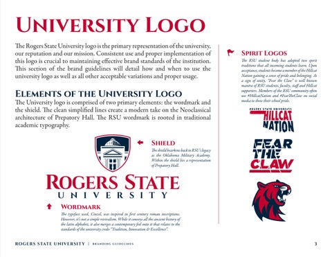
The University logo is comprised of two primary elements: the wordmark and the shield. The clean simplified lines create a modern take on the Neoclassical architecture of Prepatory Hall. The RSU wordmark is rooted in traditional academic typography.
Spirit Logos
The RSU student body has adopted two spirit traditions that all incoming students learn. Upon acceptance, students become a member of the Hillcat Nation gaining a sense of pride and belonging. As a sign of unity, “Fear the Claw” is well known mantra of RSU students, faculty, staff and Hillcat supporters. Members of the RSU community often use #HillcatNation and #FearTheClaw on social media to show their school pride.
Shield
The shield hearkens back to RSU’s legacy as the Oklahoma Military Academy. Within the shield lies a representation of Prepatory Hall.
Wordmark
The typeface used, Cinzel, was inspired in first century roman inscriptions. However, it’s not a simple revivalism. While it conveys all the ancient history of the latin alphabet, it also merges a contemporary feel onto it that relates to the standards of the university credo “Tradition, Innovation & Excellence”. RO GERS STATE UNIVERSIT Y |
BRANDING GUIDELINES
3