1 minute read
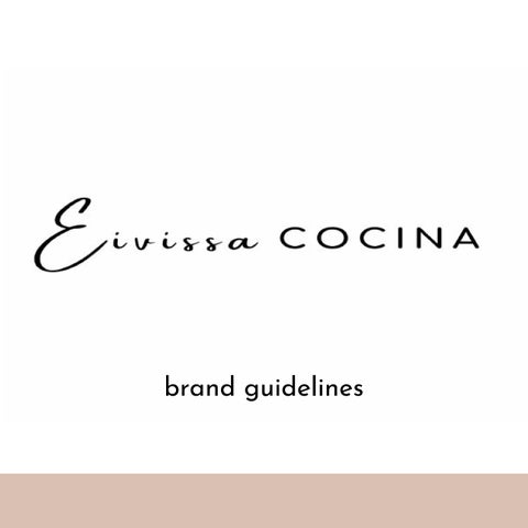
The logo


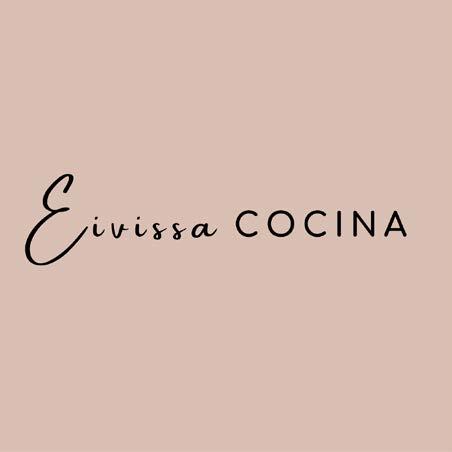
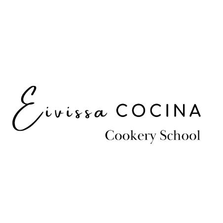
The logo is clean & simple to represent the sleek aesthetic of Eivissa Cocina. Meaning Ibiza kitchen, the Eivissa in font Amsterdam one is a loose, almost hand-written style in a nod to the Bohemian nature of the island. Cocina, in font Comfortaa bold, mean crisp clean & simple to represent the business side of the company. The logo comes in two colourways - black on white as the main logo version as seen opposite, & black on peach. The overall aesthetic is uncluttered but elegant. There are four additional logo representations, applicable as to which part of the business they represent: cookery school, restaurant, bar & house - created in font Baskerville, but only come in the black on white version.
Please do not use or adapt this logo in size, scale, shape or colour, other than what is displayed hereversions are available to download here: main text logo secondary logo cookery school logo restaurant logo bar logo house logo
Advertisement
Colour P: 19-0303 TCX
Colour C: 0 0 0 100
Colour R: 0 0 0
Colour H: #2b2926
C olour palette
Colour P: 11-0601 TPG
Colour C: 0 0 0 0
Colour R: 255 255 255
Colour H: #FFFFFF
Colour P: 141
Colour C: 15 20
Colour R: 218
Colour H: #dac17c
Colour P: 803 C
Colour C: 8 0 96 0
Colour R: 249 255 23
Colour H: #f9ff1d7
Colour P: 196 C
Colour C: 15 24 26 0
Colour R: 217 192 179
The primary colour palette is constant throughout all communications. A colour hierarchy has been implemented, ranging from black & white being the most important to cream being the least used. Where possible Pantone colours should be used. For extra impact, special print techniques such as debossing can also be applied. C 20 61 0 193 124 #dac17c
Colour H: #d9c0b3
Typography
Baskerville & Josefin Sans are the brand’s typeface. They should be used in relevant at all times. In line with the whole brand aesthetic, they are clean & legible - one serif & one sans serif that complement each other. Please adhere to the tracking & text arrangement when using these fonts as Eivissa Cocina, that are specified in this document to achieve brand consistency throughout.

Baskerville is the title typeface, it should be used in all title text where typography is required. It can be downloaded here.