Symbolic Meaning
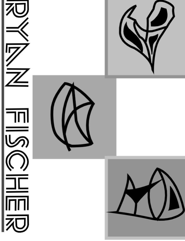
My symbols were inspired a lot by the shapes and designs of the ancient Greek alphabet. First, I drew my designs in photoshop before tracing them in Illustrator. After that, I selected a cool font for my name and repeated the same steps that I took with the symbols. Lastly, I rearranged my name to fit vertically on the page before making boxes to put each of the symbols in.
Hieroglyphic Exercise
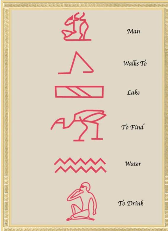
For my hieroglyphics, I wanted to challenge myself by tracing/using some of the more intricate designs that I saw on the sheet. At the same time, I wanted to make sure I was able to tell a cohesive story using under 10 hieroglyphs. First I traced them in photoshop before moving over to illustrator, where I retraced and colored them. After that, I went about creating the border, before adding in the background of the hieroglyphs to finish the design off.
Lettering During Roman Empire/Middle Ages
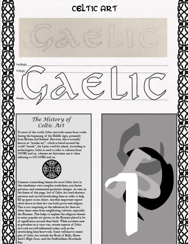
As mentioned in class, I thought it would be cool to focus on something related to my heritage. I found the writing system and traced it before adding in the headings and boxes on the page. Then I did some research on Celtic Artwork and added that (as well as a different type of knotwork) to the page. For the frame, I found a cool Celtic knot design and traced that to add to my page. Lastly, I created my abstract piece by using the G,L,A, and C.
Renaissannce Typography and Printing

For this assignment, I wanted to try an arrangement where the text (including the abstract art) played a larger role than the photos (specifically the vector image). I did this by wrapping the text around my abstract art and by making making the word I choose (Serif) bigger as well. I also implemented the smoothing tool for a few different shapes, mainly the boxes surrounding the text on the bottom and the original word design.
Typography During Colonization/Industrialization
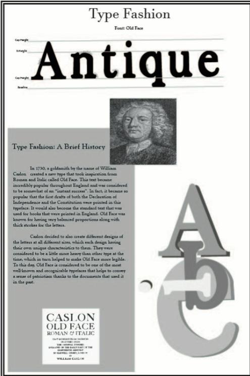
For this assignment, I took a lot of inspiration from the text design and what it was used for. My borders are meant to resemble that of a book, as Old Face was used primarily in books/documents at the time. With the abstract art, I wanted to play around with drop-shadows and create something much different than my past assignments, which I think I accomplished.
Early Twentieth Cnetury Typography

For this assignment, I wanted to make this page design look as similar to a newspaper from the 20th century as possible. I image traced an aged background and used illustrator effects to make the border look rough/ aged. From there, I created two vectors and found ways to incorporate them on my page. Lastly, I did my research and added in the word based on my topic.
Swiss Design Style/International Typographic Style
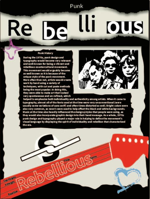
For this assignment, i really wanted to play into the rough looking aesthetic that punk had in the 1970’s. I made the border and header look like they had been torn used a drop shadow to make it look more realistic. At the bottom of the page, I made a guitar, as it was a very popular instrument for punk bands to play. Lastly, I drew two other symbols in bright colors on the page, as artists in the 70’s would often use neons to offset the black and white coloring.
Contemporary Typography and Digital Technology
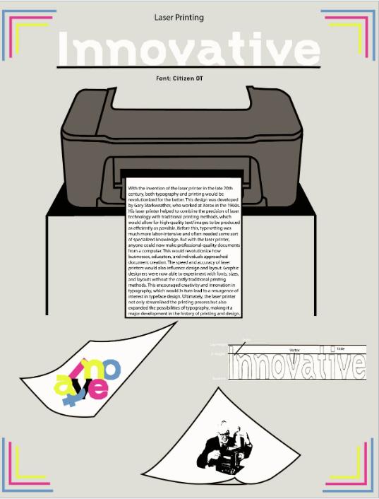
For this assignment, I wanted to base the design around a printer, and so I made sure that each of the different elements that I implemented tied into that concept. I started by sketching a printer and different pieces of paper. From there, I sketched my word and figured out the page hierarchy. Lastly, I decided on the color palette that I wanted to use (a monotone background, with pops of color).
Typeface’s Anatomical Details, Width, and Weight
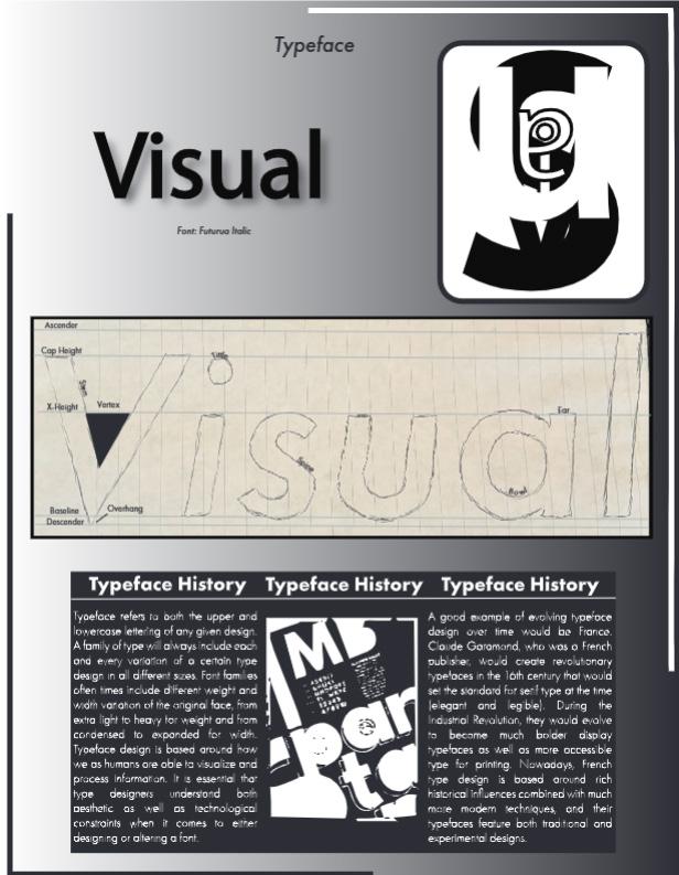
For this assignment, I wanted to explore not only the anatomy of typefaces but also play off of the word that I chose to use in my page design (visual). I added a drop shadow behind the word, a gradient to my background, and contrasting borders to help make the page pop. In the written section, I discussed what a typeface is and specifically mentioned how French typefaces have evolved.
Type Identification and Classification

For this assignment, I decided to play into the playful and artistic feel of the typeface that I selected. I created an animation-inspired page layout, using a burned film overlay that I vectorized as the background, as well as film and film reels that I made myself for the background and borders. For the abstract art, I made sure to use bright neon colors to really make the font pop too
Value, Color, and Contrast
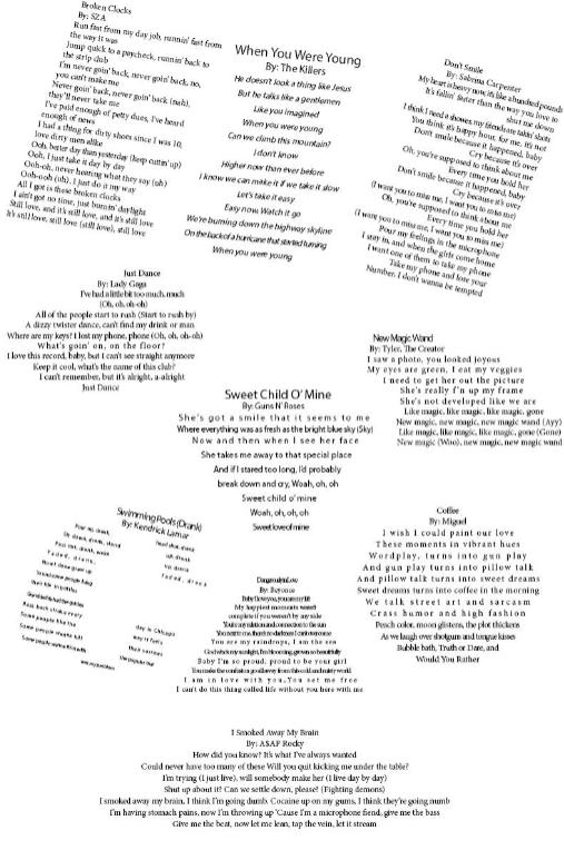
For this assignment, I wanted to try and use a wide variety of different shapes and fonts to create a unique looking page design. While some of the lyrics are in simple shapes, others are in hand drawn ones to create contrast.
Selecting and Combining Fonts Creatively
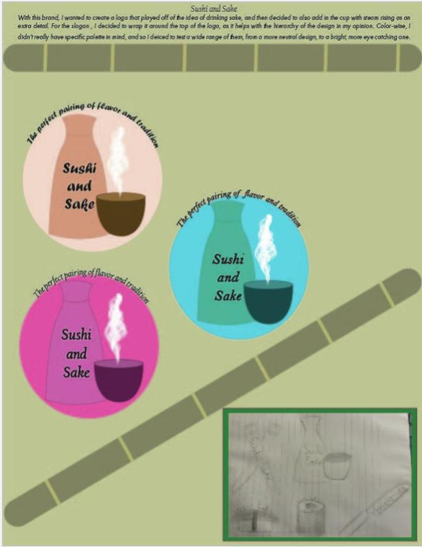
For this assignment, I wanted to make sure that not only did I focus a lot on the type aspect of my designs, but also making sure that the visuals helped enhance it too. I tried to use a wide range of fonts in my designs to push myself creatively and to try using new things.
Organizing Typographic Compositions (Traditional)
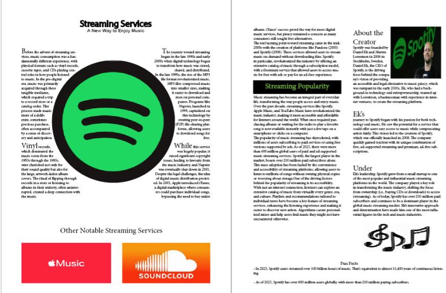
For this assignment, I chose to do my topic on the rise of music streaming services (focusing specifically on Spotify). With the left page, I decided to have my text on both sides wrap around the Spotify logo. On the right page, I included a biography of the creator of Spotify.
Organizing Typographic Compositions (Modern)
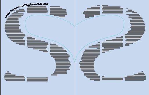
For this assignment, I wanted to play around with the idea of having one central object/shape in my compoisition and then building around that. After selecting the letters that I wanted to use, I then added another element in the middle (the heart) so that I could make sure to keep the readers attention while also using up as much space as possible. After doing this, I actually decided to add miultiple columns to both letters, as this would allow me to remove the lining and have the words themselves make up the shape.
