A Different Lense
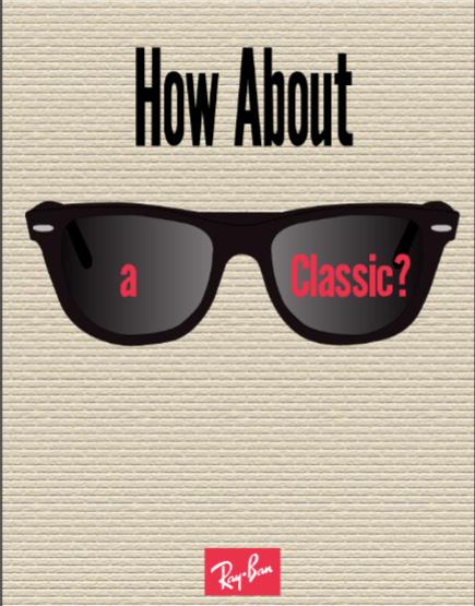
With my redo of this Rayban ad, I wanted to make sure that I kept the simplistically of the original. First, I created the background, which was done by going into texture, selecting the grain option and then color matching it to the background of the original ad. From there, I drew the sunglasses and added a gradient with a lower opacity to the lenses to make them see-through. Lastly, I traced the text and decided to move part of it onto the shades and make it red to really pop. I feel like I stayed true to the original ad’s simplistic design, while still making it my own.
Campaign Sketch and Moodboard

For my moodboard for this assignment, I really wanted to try and collect/use photos that I believed help to best describe Laced Up as a brand as well as its aesthetic. I started by collecting color samples (mainly reds/black) for my color palette, and from there I found photos that I would be able to use as some sort of inspiration for my later designs
Campaign Branding Phase 1

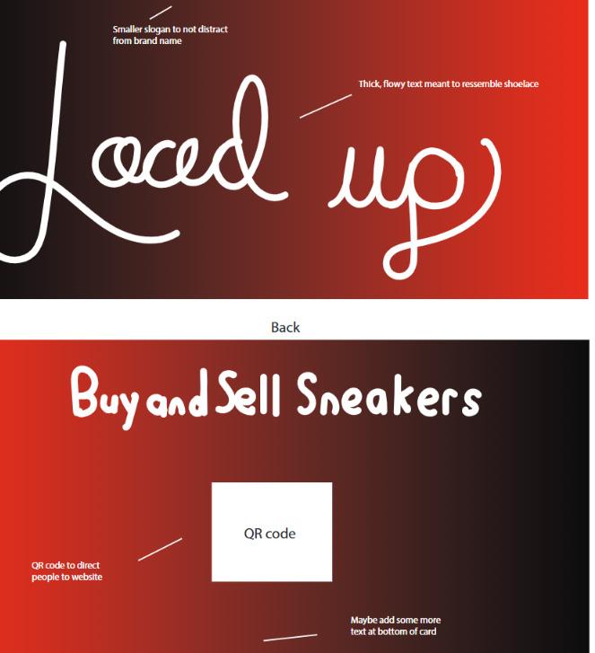
For my first two ads, I chose to do a billboard and a business card. With the billboard, I wanted to place more emphasis on the sneaker, and used the shoelace to display the brandname. For the business card, I decided to keep things pretty simple and focus more on the text, making a thick, flowy script to resemble shoelaces to spell out the brandname.
Campaign Branding Phase 2

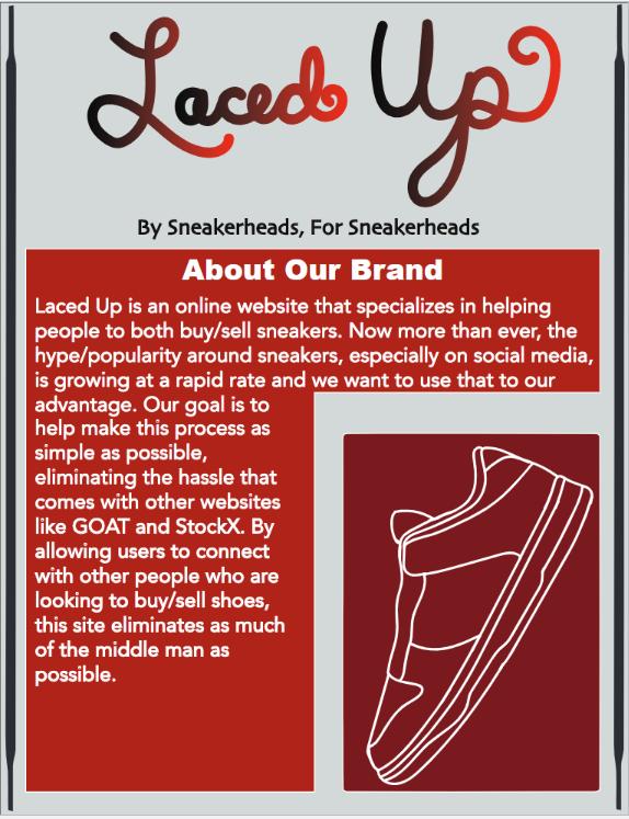
For my next two ads, I created a social media ad and a newsletter ad. With both, I wanted to try using different tools and techniques then I did on my first two. On the social media ad, I added a texture to the laces to add some extra detail. For the newsletter, I took inspiration from the typography class with my design.
Campaign Phase 3 (Portfolio/Mockup)


With this assignment, I wanted to make the last two ads as professional/realistic looking as possible. I tried to incorporate the uses of different textures/shadows to do so. Outside of that, for the portfolio I wanted to continue to play into the same solo scheme/logo.
Research and Develop Idea (Moodboard)

For this moodboard, I sketched out a rough concept of what my mailer might look like. I mainly used the line and brush tools as well as the perspective tool (to make parts look 3D). Once I sketched that, I added a few bullets about my concepts and how they apply to this design as well as explaining my target audience.
Blueprint and Basic Design Structure

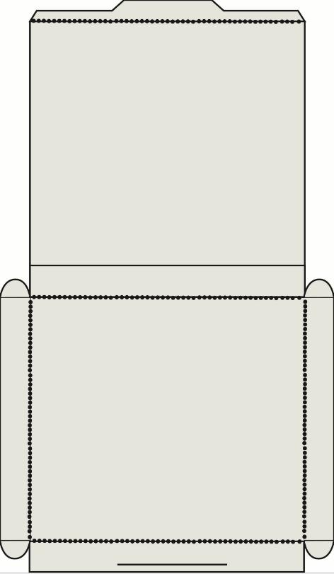
With this first blueprint/design, I wanted to make sure that I focused on creating a pop-out mailer that was both function and still unique. I started by creating a simple package design that would allow for me to later add in the pop-uot element. From there, I printed and assembled my package, as seen in the photo above.
Test Print and Assembly
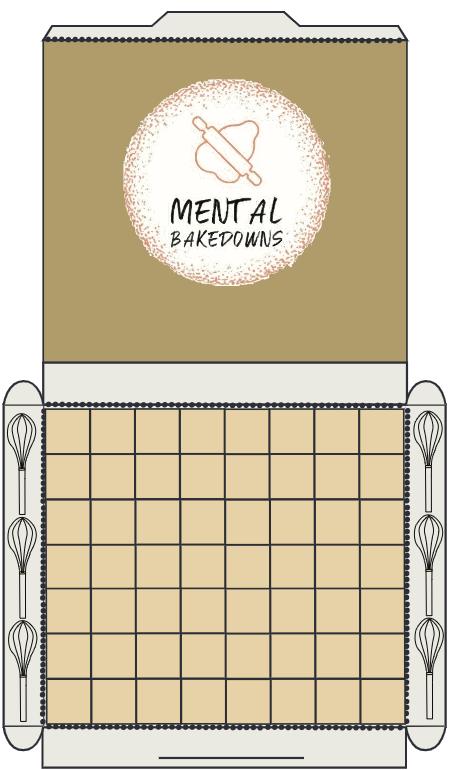
I began to add the design elements that I wanted to implement in my package design. I started by figuring out what colors I wanted to use as well as where I wanted to place my logo. From there, I began to design the “floor” of the package and add whisks along the sides. I wasn’t able to print this updated version out sadly. My next step is to begin the pop-out elements.
Package Design Details

With this step in the assignment, I focused on making sure that my color palette fit into the requirements for this project. After that, I went on to create the table for my pop out element and then printed the updated design out and began to assemble it.
Finished Package Design

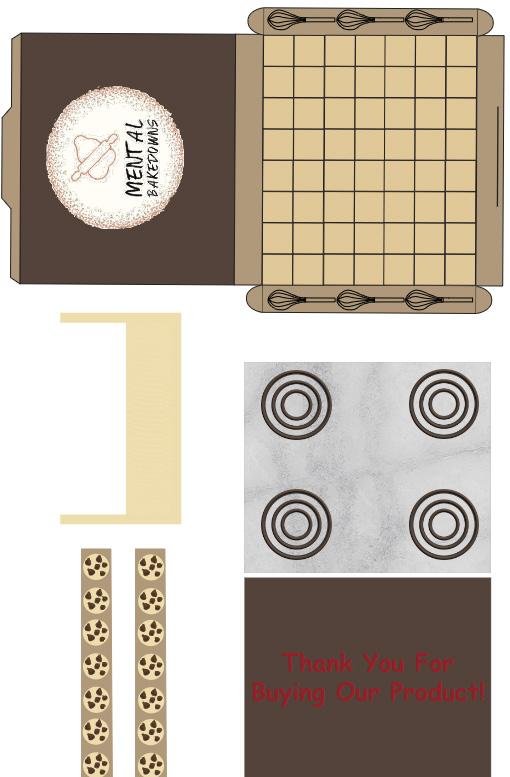
When I went about creating packaging for Mental Bakedowns, I wanted to do it in a way that allowed me to make something meaningful and interactive. It was important to me that I brought the idea of Mental Bakedowns to life in a way that made it just as memorable for customers as it has been for me and my sister. I implemented a color palette that consisted mainly of warmer colors, specifically different shades of brown and beige, with occasional white and black highlights mixed in. The target audience for this is people who love to bake, focusing a little more on teenagers/adults, and we hope to connect with them by playing into the fun and messy side of baking. The key technical feature of my package is the pop-up element that I made, as it helps to bring the scene of a kitchen to life. Other notable features include the top of the packaging resembling a stove, the outer borders being lined with chocolate chip cookies, and the inner borders having whisks on them. I hope that you are interested in the brand/packaging I’ve created and are able to get just as much enjoyment out of it as Grace and I have over the years!
Multi-Page Publication With Content

For my publication, I decided to create a ports magazine called The Athlete, which will foucs on a variety of topic related to certain popular college sports. Each section will be based around a sport, talk about major matches, contain player intervviews, and even recommend some amazing gear and equipment to buy

Publication Parent Pages
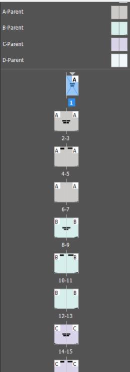
For my parent pages, I started envisioning how I wanted the structure of each of my sections to look. I mainly used a light, almost pastel color palette for the parent pages, and also started planning out where to put certain information. Each parent contains similar headings (such as the popular matches, player interviews, and popular equipment) , but also have their own unique characteristics as well. I wanted everything to be cohesive while at the same time not feeeling too repetitive.
Publication Styles and Typography

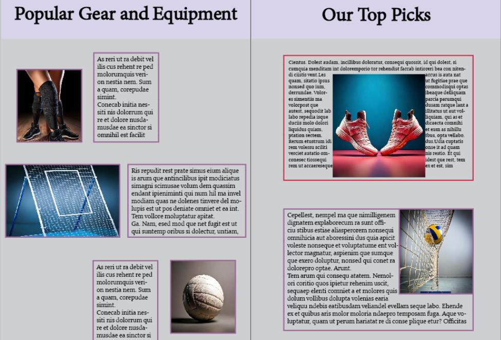
For this assignment, I really wanted to start figuring out the different page layouts for my sections (focused on the volleyball section for this assignment) as well as the text that pairs with it. I wanted to make sure that everything from the section headers down to the body text fit into the aesthetic that I was trying to achieve with this magazine (informative, yet still fun/entertaining). With the page layouts, I really tried to combine both traditional and modern concepts, as I believed that this would help me to best hold readers’ attention.
Finished Publication

For this assignment, I really wanted to create something that reminded me of my love for sports throughout the years. I selected sports that have a lot of personal meaning to me and are popular as well. From there, I went about designing each section in a unique and eye-catching way that ties back into the sport being discussed.

