DESIGN


DESIGN
DESIGN vibes
8 PREPARE FOR THE UNKNOWN
These five home-hardening techniques can protect against natural disasters.

DESIGN vibes
10 A MODERN EXTERIOR REVIVAL
A south Texas home demonstrates why investing in home renovations is a good choice amid a changing market.

14

INSIDE/OUTSIDE rehab
14 PERUSE INNOVATIVE HOME-RENOVATION PROJECTS FROM ACROSS THE U.S.:
• Prudent Deck Material Selection, Jupiter Island, Fla.
• Weather-resistant Re-siding Project, Quincy, Mass.
• Traditional Ranch Receives Dynamic Façade, Walnut Creek, Calif.
• Familial Expansion, Austin, Texas
• Outdoor Patio Becomes an Allseasons Porch, Johns Creek, Ga.
MODERNIST house
20 THE RIGHT ANGLES
Japanese detailing lends new sophistication to a Modernist home in Durham, N.C.
MID-CENTURY house
26 THE BUTTERFLY RESIDENCE
A renovation and expansion bridges Mid-Century Modern and contemporary design in Austin, Texas.
MULTI family
32
HISTORIC JEWEL
A French Baroque office building in Kansas City, Mo., is converted to workforce housing.
ROOM reveal
42
DOPAMINE-BOOSTING BATHROOM
Give a bathroom “wow” factor with daring décor.


My house looks a little like a paint testing laboratory right now. I currently have 10 sample-sized paint jars on my kitchen counter with rinsed brushes drying around my sink. My walls upstairs and downstairs host numerous strokes of paint—adjacent to fireplace stone, near upholstery, opposite windows and alongside windows. I have been viewing the paint swatches throughout the day and with electric lighting and, unfortunately, am becoming more confused. The color I was positive would adorn the walls of our stairwell, leading into our finished basement and extending to the basement living area, is pulling way too much pink in the light of day. I was striving for a light cocoa mauve—more cocoa with a hint of mauve, not pink with a hint of cocoa.
When this issue reaches you, my family and I will be celebrating two years in our house. I hadn’t found immediate inspiration for paint colors when we moved in and welcomed the idea of living in the house for a while, so I could “feel” the right colors before painting. I would not have chosen the colors the builder painted, but I like them. In fact, the Urbane Bronze on either side of our main-floor fireplace has inspired me to not only introduce more browns and greens, but also to be bold. I’ve already painted my office a deep peacock shade, and it is gorgeous! Our ranch-style house features floor-to-ceiling windows on both levels and receives significant sun throughout the day, so it certainly can handle bold, dark colors. However, this stairwell color conundrum is making me think I need to call in backup to help me capture my vision.
It reminds me of our “Modernist House” story. Homeowner Seth Rumsey travels to Japan frequently for work and is fond of certain Japanese design elements. “I find efficiency of space and geometric decoration very beautiful and calming,” Rumsey explains in the article.
Wanting to bring these guiding principles to a remodel of his Durham, N.C., home, Rumsey hired architect Ellen Cassilly, FAIA, LEED AP, principal at Ellen Cassilly Architects. Although the original vision was beyond budget, Cassilly was able to achieve Rumsey’s requirements with precise design solutions while welcoming Rumsey’s creativity with color and tile choices. Read about the complementary partnership on page 20.
Meanwhile, if any of you know of a lovely light-cocoa-with-a-hint-of-mauve shade for my stairwell/basement, please share it with me (christina@retrofitmagazine.com). I’m willing to purchase a few more paint samples in the hunt for the perfect color!

CHRISTINA KOCH Associate Publisher/ Editorial Director
FOLLOW US


Create the perfect outdoor sanctuary with MSI's Arterra® Porcelain Pavers and Natural Stone countertops, offering an array of colors, sizes, and textures to elevate any space. Explore our premium collections for worry-free, long-lasting beauty that transforms your alfresco dreams into reality.

https://www.msisurfaces.com/porcelain/arterra-pavers/benefits/?video=true

Chris Hock is founder and owner of Earth Saving Solutions, a Denver-based licensed general contractor, specializing in construction, remodeling and restoration. Hock shares his more than 20 years’ experience in “DesignVibes”, page 8, with five home-hardening techniques to withstand Mother Nature.

Kris Feldmann, AIA, NCARB, LEED AP, is design principal at CREO Architecture, focusing on firm vision, new clients and early design direction for projects. He writes in “DesignVibes” about one of the firm’s complex projects, which modernized a south Texas home into a contemporary Spanish style. The exterior upgrades are showcased on page 10.

KJ Fields, a Portland, Ore.-based retrofit home contributor, expertly writes about how a homeowner worked alongside Ellen Cassilly Architects to integrate Japanese simplicity into his 1955 split-level brick home in Durham, N.C. See the results in “Modernist House”, page 20.

Ed Richardson, AIA, LEED AP, is co-founder of Clark Richardson Architects, a firm that approaches each project with a fresh eye, understanding clients’ needs and vision, and molding their ideas into elegant solutions. The firm’s work is demonstrated in “Mid-century House”, page 26. The Butterfly Residence in Austin, Texas, unfolds into two distinct yet complementary living zones.

Doug Stockman, AIA, is director of Architecture and a principal at Helix Architecture + Design. He has three decades of preservation and multifamily design experience, specializing in projects that enhance the urban core. One such project—the former Midland Office Building in the Power + Light District of Kansas City, Mo.—now features 135 apartments. Read about it in “Multifamily”, page 32.

Rachel Verney, known online as @the_ shoestring_home, is an interiors expert and content creator. She is passionate about the power of dopamine décor and the transformative and positive impact it can have on lives. In “Room Reveal”, page 42, she showcases her bold bathroom, which is featured in Dopamine Home, Verney’s first book.

SUMMER 2025 // VOL 5 // ISSUE 2
PUBLISHER
JOHN RIESTER john@retrofitmagazine.com
ASSOCIATE PUBLISHER/EDITORIAL DIRECTOR
CHRISTINA KOCH christina@retrofitmagazine.com
DIRECTOR OF OPERATIONS
BECKY RIESTER becky@retrofitmagazine.com
CONTRIBUTING EDITOR
JIM SCHNEIDER
ART DIRECTOR/DIGITAL DESIGN DIRECTOR
ERIKA NYGAARD
CIRCULATION MANAGER LYN URE lyn@retrofitmagazine.com
WEB ENGINEER DEREK LEEDS
SOCIAL MEDIA MAVEN
ROBIN GRABER
ADVERTISING SALES
JOHN RIESTER john@retrofitmagazine.com (919) 641-6321
BETH EMERICH beth@retrofitmagazine.com (781) 710-4745
BARRETT HAHN barrett.hahn@gmail.com (919) 593-5318
MIKE GILBERT treblig2023@gmail.com (847) 867-9615
EDITORIAL ADVISORY BOARD
NATHAN M. GILLETTE AIA, LEED AP, REALTOR Director, Natura Architectural Consulting LLC, Grand Rapids, Mich.
JOHN J. NOONAN Facilities Management Consultant, Durham, N.C
WILLIAM E. HOLLOWAY AIA, LEED AP Principal, BERNARDON, Wilmington, Del.
MICHAEL P. WASHBURN, Ph.D. Principal, Washburn Consulting, Scottsdale, Ariz.
RETROFIThome // Vol. 5 // No. 2 is published quarterly by Fisher Media LLC, 98 Booth Meadow Lane, Durham, NC 27713, (919) 641-6321. POSTMASTER: Send address changes to retrofit, 2409 High Point Drive, Lindenhurst, IL 60046. TO SUBSCRIBE or make subscription changes, visit www.retrofitmagazine.com, and click on the “Subscribe” button, or email lyn@retrofitmagazine.com.


By Chris Hock
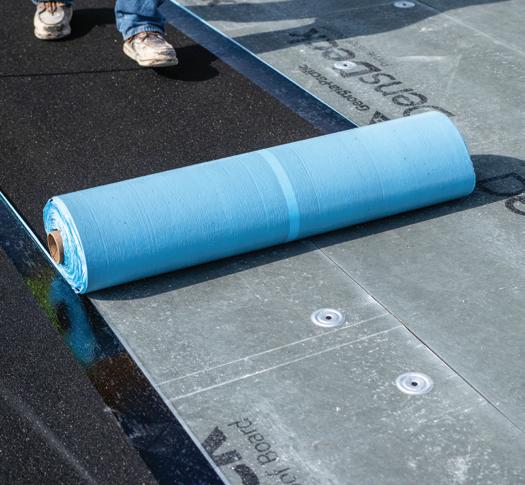
The homes we remodel must be prepared for unexpected natural disasters. As residential professionals, we must ensure our customers’ sanctuaries withstand the tests of time and Mother Nature. When remodeling, we can implement various hardening techniques to reduce the risk of homes succumbing to damage from wildfires, hurricanes, floods and more.
Here are the top five home-hardening techniques to use on your next remodeling project:
Creating a landscape free of combustible materials is essential for protecting homes against multiple threats. Using fire-resistant vegetation or stone, replacing wood fencing with vinyl, and maintaining proper spacing between trees and shrubs create an effective defense perimeter. Proper landscaping also significantly improves drainage, mitigating the risk of flooding.
When a roof contains ignitable materials, has gaps between materials or has started to deteriorate, it creates significant vulnerability during fire events. To properly protect our customers’ homes from potential disasters, replacing these high-risk roofing systems during the remodeling process is essential.
Class A-rated roofing materials are not only fire-resistant but also durable and resistant to intense winds from hurricanes and impact from hail. Additionally, when installed with proper ice and water shields, they provide superior protection against leaks and snow damage.
For maximum protection in severe weather regions, upgrading to Class 4 impact-resistant shingles or metal roofing offers exceptional hail protection, significantly reducing the likelihood of damage during extreme weather events. This rating represents the highest level of impact resistance available for residential roofing materials.
One of the most effective yet often overlooked hardening techniques is the application of fire-retardant coatings. These products provide an invisible layer of protection for wooden surfaces while maintaining their natural appearance and beauty.


Apply the coatings to existing wood structures, fabrics and other materials during remodeling projects. It’s particularly valuable for exposed wooden beams, decorative elements and historic structures where preserving the original appearance is crucial. Combine fire-resistant structural materials with surface treatments for maximum protection as part of a comprehensive fire-prevention strategy.
In contrast to typical single-pane windows with basic frames, impact-resistant windows are designed to endure severe high winds, flying debris and extreme weather conditions. These specialized windows feature laminated glass and reinforced frames, making them significantly less likely to break during storms. They’re also more energy-efficient, saving homeowners money on utility bills.


When a roof contains ignitable materials, has gaps between materials or has started to deteriorate, it creates significant vulnerability during fire events.
In areas prone to hurricanes or tornadoes, impact-resistant window replacement should be top of mind when discussing remodeling options with homeowners. While the upfront cost may be higher, the long-term savings are substantial: Replacing windows once rather than potentially every year
When remodeling, we can implement various hardening techniques to reduce the risk of homes succumbing to damage from wildfires, hurricanes, floods and more.
during hurricane season represents significant value. More importantly, these windows prevent debris from entering the home, mitigating injuries during terrifying storm events.
Flooding ranks among the most destructive natural disasters for homes and is typically a primary concern for homeowners regardless of location. In flood-prone areas, there’s an established expected flood level. Elevating a home above this threshold ensures water won’t penetrate the house and damage living spaces.
Installing flood barriers around the property perimeter adds another crucial layer of protection for the home and its inhabitants. These barriers can effectively redirect waterflow away from the structure and provide critical defense during severe weather events.
As industry professionals, we’ve all witnessed homes enduring heavy rain, rising waters, hurricanes and more. Incorporating flood-protection measures during a remodel can prevent expensive repairs and rebuilds that often follow these highly damaging conditions. Preventative measures ensure structural stability and provide invaluable peace of mind for homeowners.
Although the previous hardening techniques benefit homes in any region, ensuring proper seismic bracing in earthquake-prone areas is arguably the most critical safety measure. Adding steel braces or structural reinforcements to the foundation ensures that an earthquake’s vibrations and catastrophic tremors don’t easily compromise a home’s integrity. The older the house, the more crucial this support becomes. These added reinforcements dramatically reduce the risk of collapse that could trap homeowners in rubble during seismic events. In regions with higher earthquake risks, discussing the addition of seismic bracing during remodels isn’t just about property protection, it can be life-changing and, more importantly, life-saving.
Regardless of where you live or your region’s specific risks, one thing is clear: Our communities must be resilient and ready for anything. As building professionals, our mission should be to prioritize the safety and comfort of the people we serve. By adopting these five hardening techniques in your remodeling projects, you can protect your clients and those around them. After all, it’s not just about the job; it’s about the people.

Impact-resistant windows are designed to endure severe weather

Investing in
Is a Good Choice Amid a Changing
By Kris Feldmann, AIA, NCARB, LEED AP
ith the state of today’s real-estate market, including rising mortgage rates and historic lows on housing inventory, many homeowners are opting to renovate rather than relocate. By investing in strategic upgrades, they’re not just modernizing their homes—they’re enhancing livability, increasing property value and future-proofing their spaces to meet evolving needs. The Canterbury Residence in south Texas is a prime example of this trend, illustrating how careful architectural intervention can breathe life into an existing home while staying true to its character.
Tasked with the challenge of modernizing the residence, CREO Architecture led a thoughtful transformation that redefined the home’s exterior presence while collaborating with the homeowner Brandi Sutherland on interior design elements. The goal was to introduce a contemporary Spanish style while addressing key functional priorities, including maximizing nat-
ural light, improving space efficiency, and creating a stronger connection between indoor and outdoor areas.
Through a series of strategic updates, which included a reimagined façade, a seamless indoor-outdoor transition and newly defined living spaces, the Canterbury Residence now features a refined yet welcoming aesthetic that balances modern sensibilities with timeless design elements.
The most striking aspect of the renovation is its exterior transformation. Before the redesign, the home’s façade appeared dated and uninspired, lacking the presence and warmth the homeowners envisioned. CREO Architecture’s approach to remedy this was twofold: expand the front of the home to improve its aesthetic appeal and functionality, as well as introduce materials that would elevate its overall character.

A small front addition became the key to this transformation. Although modest in scale, this architectural intervention had a substantial impact—allowing for an expanded interior footprint while redefining the exterior’s visual identity. Large steel and glass windows became a signature feature of the new design, introducing an element of contrast against the home’s crisp white façade. These windows not only enhance curb appeal, but also play a crucial role in maximizing natural light in the interiors, helping to create an airy, welcoming atmosphere.
The material selection further reinforced the home’s aesthetic evolution. A Spanish tile roof, carefully chosen for its warmth and textural richness, adds an element of timelessness while staying true to the contemporary Spanish design direction. However, integrating this roofing style presented structural challenges. The team conducted a structural analysis of the existing roof framing to ensure it could support the added load, a crucial step in preserving safety and longevity.
Navigating zoning and permitting considerations was another key aspect of the process. To streamline approvals and maintain the project timeline, CREO Architecture ensured all additions remained within existing setbacks and complied with local zoning regulations. This thoughtful approach
A small front addition had a substantial impact—allowing for an expanded interior footprint while redefining the exterior’s visual identity.


helped avoid delays that can sometimes arise from variance requests, keeping the project moving efficiently.
The final touches to the exterior included a new wood trellis and a steel-and-glass railing over the main entry, which add subtle yet impactful layers to the space. These elements work in tandem to further refine the home’s aesthetic, reinforcing a balance between traditional inspiration and modern execution.
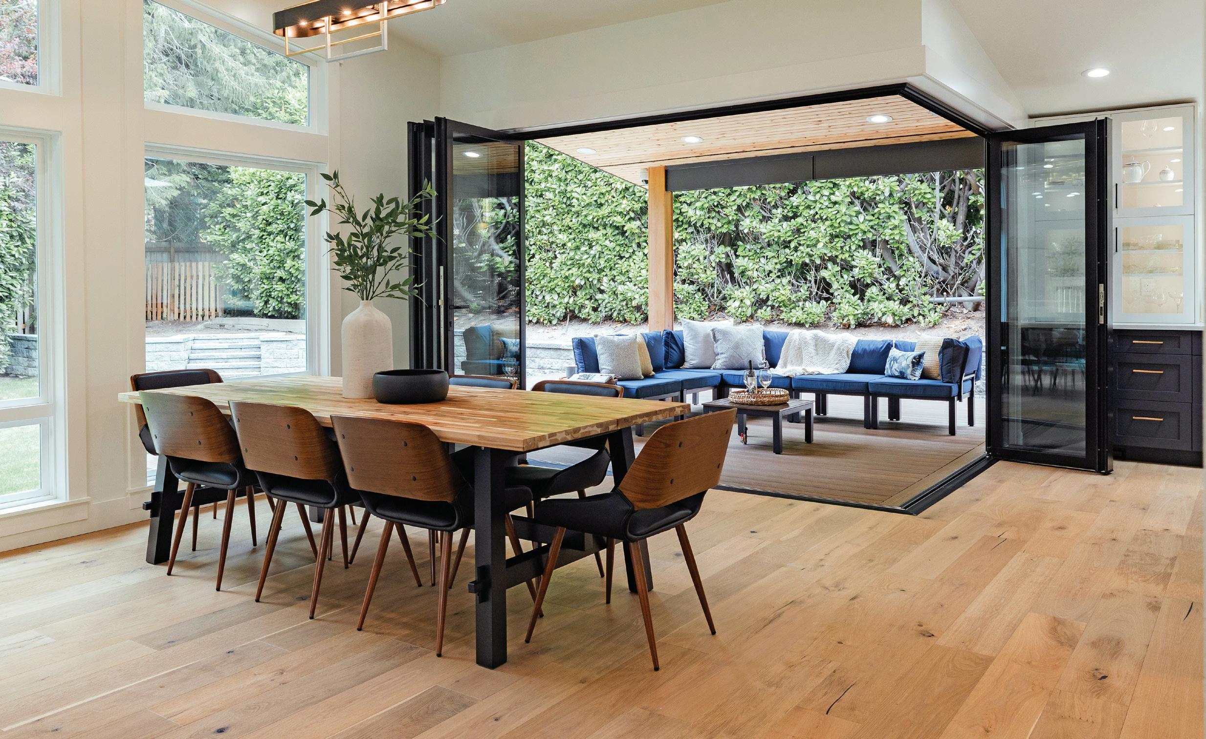
Beyond the façade, one of the most transformative aspects of the Canterbury Residence renovation was its enhanced connection between indoor and outdoor spaces. The homeowners sought to maximize natural light and create a seamless flow between their living areas and the backyard—a goal achieved through a continuous steel and glass window wall at the rear of the home.
This expansive glazing solution serves multiple functions. Visually, it blurs the line between interior and exterior, making the home feel more expansive and integrated with its surroundings. Functionally, it creates an effortless transition to the pool area, allowing the homeowners to enjoy a more immersive indoor-outdoor experience at home.
Given south Texas’ climate, thoughtful considerations were made to mitigate heat gain while maximizing natural light. The steel-framed windows were chosen for their high quality and cost-effectiveness. To enhance energy efficiency, insulated glazing units with Low-E coatings were incorporated, helping to reduce heat transfer while maintaining optimal light levels. Additionally, new exterior walls were insulated per current

The Canterbury Residence stands as an example of the power of thoughtful architectural intervention, demonstrating how strategic exterior updates can enhance curb appeal, improve livability and increase property value.

High-performance glazing, upgraded insulation, and a carefully planned spatial layout all contribute to a home that is not only beautiful, but also better suited to the family’s evolving needs.
blending contemporary Spanish influences with carefully selected materials, CREO Architecture brought new life to a once-tired façade, creating a home that feels modern and timeless.
Beyond aesthetics, the renovation reflects a deeper commitment to functionality and energy efficiency. From structural reinforcements to seamlessly integrated indoor-outdoor connections, every design decision was made with long-term performance and homeowner comfort in mind. High-performance glazing, upgraded insulation, and a carefully planned spatial layout all contribute to a home that is not only beautiful, but also better suited to the family’s evolving needs.
code, and all window and door openings were sealed properly to create a tighter, more efficient building envelope.
The combination of these elements not only improved thermal performance and daylighting but also contributed to the home’s overall sense of openness—creating a space that feels bright, welcoming and seamlessly connected to the outdoors.
Overall, the Canterbury Residence stands as an example of the power of thoughtful architectural intervention, demonstrating how strategic exterior updates can enhance curb appeal, improve livability and increase property value. By
For CREO Architecture, this project is just one example of how to approach home transformations with a balance of preservation and innovation. By respecting the essence of a structure while introducing modern solutions tailored to the homeowners’ vision, the design team proved that sometimes staying in place is the best option in tumultuous markets.
Architect: CREO Architecture, www.creoarc.com
• Kris Feldmann
• Maurice Flores
Interior Designer: Studio Sutherland, (210) 232-8733
Structural Engineer: 13th Lv Structural Engineers, (210) 241-8164
General Contractor: Grotte Built LLC, (210) 381-3393

JUPITER ISLAND, FLA.
Retrofit Team
Remodeler: B&D Builders, banddbuilders.com
The Retrofit
B&D Builders used ipe, a South American hardwood, to craft a 5,000-square-foot deck around an island-inspired, Mid-century home. “The home’s outdoor space had become worn and no longer met the area’s strict hurricane codes,” recalls Daniel Glick, co-founder of B&D Builders.
B&D Builders selected ipe for its ability to weather the region’s extreme heat, moisture and salt air. The wood was installed in its raw form to complement the home’s Old Florida charm. To enhance the island landscape, the homeowners planted native palm trees that were integrated into the deck’s design, doubling as natural shade elements. Adhering to local building requirements, which would not allow a pergola or other structure, B&D Builders created a unique sunshade using
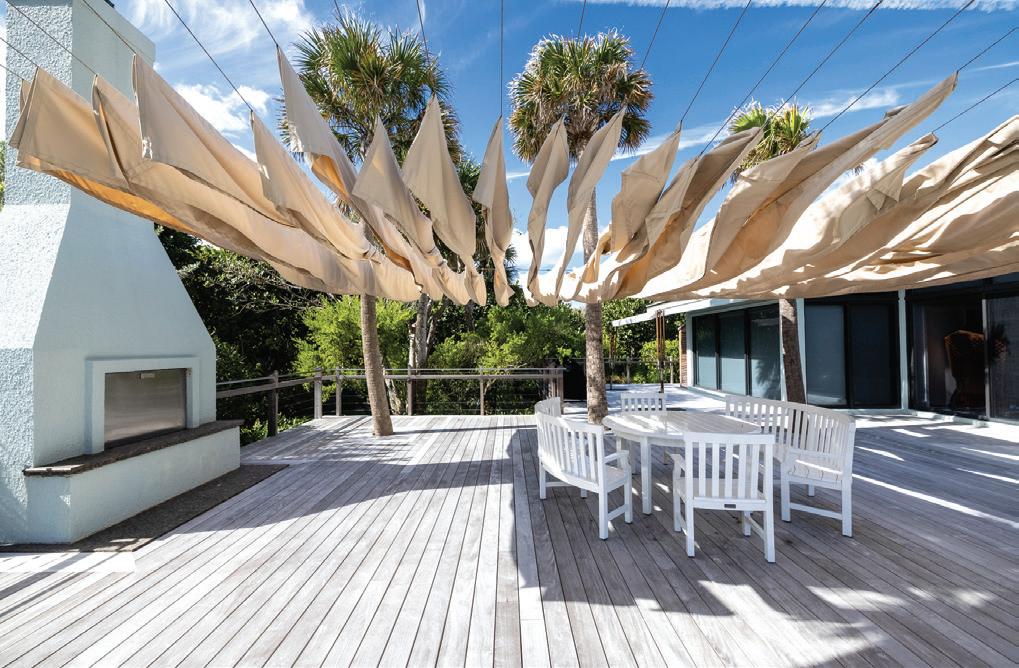
swaths of heavy fabric suspended by four of the palms. The lightweight design provides additional protection from the sun and defines the outdoor dining space.
Thoughtful details were added throughout the design of the outdoor living space, balancing stringent building-code requirements with comfort and style. A series of built-in cabinets provide outdoor storage. Louvered walls allow adequate airflow to ensure the cabinets and their contents remain free of mold and other organic growth. A fenced doggy yard provides room for the family pup to play while artificial turf simplifies maintenance.

QUINCY, MASS.
Retrofit Team
Architect: Elkus Manfredi, www.elkus-manfredi.com
Fiber-cement Installer: Classic Exterior LLC, classicexteriorllc.com
Materials
Meriel Marina Bay features more than 350 apartment units across north and south buildings with upscale amenities and scenic views of Massachusetts Bay and the Boston skyline. The luxury residences were substantially completed in 2018 but during their first winter, tenants noticed signs of water damage throughout the buildings. Although Mother Nature can be a formidable foe in New England, even strong Nor’easters and ocean storms should not have created such damage so quickly.
After crews made unsuccessful repairs to the original siding, the building owners replaced the cladding with the same brand of fiber-cement siding, albeit new material. The problems persisted.
Classic Exterior recommended Nichiha fiber cement as exterior cladding that was more resistant to harsh weather, impact and wear—all necessities for the third installation. Elkus Manfredi decided upon Nichiha’s Illumination Architectural Wall Panels (AWP) in Marina Bay Grey and Navajo Beige for the façade’s rejuvenation.
AWP is a rainscreen cladding system; any water that penetrates behind the cladding drains to the base of the wall and to the exterior of the building. Nichiha panels are between 16and 21-millimeters thick and attach via the brand’s Ultimate Clip System.
Nichiha AWP is approved as a cladding product for use in Florida’s Miami-Dade County checklist for High Velocity Hurricane Zones.
The siding replacement at Meriel Marina Bay was completed in Fall 2024.
Fiber-cement Cladding: Illumination Architectural Wall Panels from Nichiha, www.nichiha.com/product/illumination

Retrofit Team
Architect: Design Draw Build, www.designdrawbuild.com
Interior Designer: Destination Eichler, www.destinationeichler.com
Structural Engineer: Ashley & Vance Engineering, ashleyvance.com
Materials
The following is a sampling of materials used in the project:
Siding: Horizontal Fijian Mahogany
Windows and Doors: Ultimate Series and Essential Series from Marvin, www.marvin.com
Lighting: Cedar & Moss, cedarandmoss.com; Dutton Brown, www.duttonbrown.com; Lightology, www.lightology.com; and Lamps Plus, www.lampsplus.com
Tile: Revalia Remix and Retro Rounds from Daltile, www. daltile.com, and Color Story Wall from American Olean, www.americanolean.com
Radiant Subfloor: Ditra-Heat from Schluter Systems, www.schluter.com
Paint: Benjamin Moore, www.benjaminmoore.com
Greywater System (Laundry to Landscape) with Buried Water Cistern: WaterSprout, www.watersprout.org

When the homeowners of this traditional ranch-style property tapped Design Draw Build to renovate their newly inherited— and long neglected—childhood home, the design team created a warm modern aesthetic with sustainable upgrades that enhance the home’s connection to its landscape, cater to the clients’ lifestyle and will nurture the family’s next generation.
Warmer finished materials were added while preserving the height and overall structure. The addition of Mid-century motifs makes the home stand out while harmonizing with its neighbors. Upon arrival, a sandy concrete path lined with drought-tolerant shrubbery leads to the sheltered entryway equipped with a concrete bench and expansive windows to maximize natural light. Painted wooden slats provide shade while allowing an interesting interplay of light and shadows.
The entryway, which also was upgraded to reflect the Mid-century Modern aesthetic, seamlessly flows into an open-concept living area that encompasses the dining area, family room and kitchen. The kitchen radiates vibrancy and light, featuring playful red accents, expansive windows and a skylight that fills the space with warmth.
Designed with the clients’ love for outdoor living in mind, the layout envelops the outdoor pool area with numerous


glass entrances, transforming it into secondary outdoor living and dining spaces. This outdoor oasis features droughtresistant landscaping, a pergola, hot tub and unique limabean-shaped pool complemented by tranquil water features to create a harmonious retreat.


Architect and Interior Designer: Narrative Architecture, narrativearchitecture.com
Builder: Texas Construction Company, txconstruct.com
The clients’ desire was to expand the house to build multiple areas for usage by a family with teenage children. An existing carport and single-story addition were converted into a 2-story addition with two bedrooms, two bathrooms and a TV room above and another TV room with fireplace, laundry and garage used as a home gym on the lower level. The connection to the addition was made by modifying the roof structure of the living room to open into the addition.
The property, which is in the floodplain along Shoal Creek, made expanding the footprint difficult. It became clear the best approach would be to use the existing later addition at the rear of the structure as the basis for the new addition. This had the dual benefit of allowing the team to renovate the old, tired addition and keep the new second-story massing set back from the street façade, maintaining the scale of the ranch-style homes that dominate the neighborhood.
Because the backyard is on Shoal Creek, views were opened across the verdant landscape. Ceiling heights were raised in the existing living space while incorporating a new stair to the second floor, which allows natural light to filter throughout the addition’s new glazing.
As work progressed, there were issues found with some aspects of the existing structure, particularly where later additions and “improvements” were made. This prompted the client to extend the scope of the renovation to encompass the majority of the home with new kitchen, dining, guest bedrooms, and bathroom fixtures and finishes.
Narrative Architecture’s approach to the interiors was to reflect the personality of the family while maintaining the low-slung, ranch look at the street but opening to and enjoying the light and landscape at the back.

JOHNS CREEK, GA.
Retrofit Team
Designer: Barbara Dawes Designs LLC, www.barbaradawesdesigns.com
Materials
This project transformed the homeowner’s favorite weekend spot for football watching and relaxation into an all-season space, complete with a new fireplace and energy-efficient folding glass doors to accommodate Georgia’s varied weather.
To achieve a continuous living space between the home’s interior and updated porch, the renovation replaced two sets of double windows and double doors with a folding glass system. The expansive opening maximized the connection to the outdoors, inviting fresh air and natural light into the space and allowing for easy access to the porch. The six-panel system was specified with three panels opening to the left and three to the right to mimic the opening of the existing French doors. The system was customized to the homeowner’s needs,

from the frame’s powder-coated color to the locking system design. The new porch includes roll-up screens for warm-weather airflow and plastic coverings for colder months, ensuring uninterrupted views regardless of season. In addition, the space offers flexibility, whether the homeowner is enjoying the open air on a bright summer day or cozying up by the fire in colder months.
Folding Patio Doors: NW Aluminum 640 from NanaWall, www.nanawall.com/glass-walls/folding/nw-aluminum-640

By KJ Fields


Modified spruce siding with a black stain mimics the appearance of Shou Sugi Ban, a Japanese technique that chars wooden surfaces and finishes them in oil for weatherproofing.

Visual harmony, clean lines and connections to nature are traditional Japanese design elements that greatly influenced Modernist architecture. In Durham, N.C., homeowners of a 1955 split-level brick home hold deep respect for Japanese simplicity. Owner Seth Rumsey travels to Japan frequently for work and grew increasingly fond of certain design elements he saw there.
“I find efficiency of space and geometric decoration very beautiful and calming,” Rumsey explains. “There’s something meditative about tiles and gardens where the organization of views is interrupted by something unexpected.”
The owners brought these guiding principles to an addition on their home and hired architect Ellen Cassilly, FAIA, LEED AP, principal at Ellen Cassilly Architects in Durham, to achieve their vision.
The homeowners’ initial concept was to create a third floor on the 2,262-square-foot house, but budget constraints became a real concern.

“The first design was very vast,” Cassilly says. “We regrouped and asked, ‘What’s really important here?’ The owners’ priorities were to remodel the kitchen into a great place to cook, make connections with their lovely gardens outside, and add a workshop/garage.”
Cassilly realized she could meet the homeowners’ needs with precise design solutions.
The new concept situated a standalone 355-square-foot workshop/garage on a small side yard north of the house to create a passageway for easy access between the front and back yards.

During design, Cassilly discovered that the city took issue with the pathway, so she drove through the neighborhood and documented similar walkways between homes and adjacent structures to prove this layout had already received approval. Because the home and side yard were placed at an odd angle to the street, city code also dictated that building
“I find efficiency of space and geometric decoration very beautiful and calming.”
—Seth Rumsey, homeowner
columns for the new independent workshop/garage be farther back from the street than planned. On this point, city officials would not waiver.
“It was like arm wrestling with the city,” Cassilly recalls. “They were caught up in the letter of the law rather than the spirit of the law.”
Cassilly got creative. She continued the roof of the house across to the workshop/garage to make the space an “addition” in the eyes of the building department. Although the new structure still needed a further setback from the street, there were no code restrictions on an overhang. Cassilly moved the building portion back, added a 275-square-foot concrete pad outside the garage door and set steel columns at its far corners for support. Then she cantilevered the workshop’s roof out and over the columns.
“I love cantilevers and use them often in my designs,” Cassilly says. “Here, the cantilever created a lovely outdoor
The homeowners did not shy away from color. They chose a green-gray color for a wall of shallow cabinets in the kitchen, as well as lower cabinets. Yellow graces the upper cabinets.
carport/workspace where the owner can work on projects in the shade on hot summer days.”
During construction, the builder had to be incredibly careful not to disturb the existing gardens and to preserve an enormous pine tree in front of the carport. Code also required a certain amount of permeable surface area, so the concrete pad is separated from the driveway with landscaping to absorb rainfall.

On the southwest corner of the house, the original 167-squarefoot kitchen was expanded by 108 square feet. Openly visible from the dining room, it was imperative the new kitchen blended seamlessly with the dining area.
At the far end of the kitchen, a wall of shallow cabinets just under 12-inches deep became a hidden bar, where shelves are stocked with beverages and glassware. The cabinets’ greengray color repeats on the kitchen’s lower cabinet faces.
The homeowners elected to paint the upper cabinets yellow. For Rumsey, the color separation represents the horizon, with the earthy color below and band of sun above. The yellow also served as the perfect accent to the grain in the exposed Douglas fir wood that clads the refrigerator door and deep cabinets along the western wall.
“It was delightful to work with homeowners that were more experimental with color,” Cassilly remarks. “So often, people shy away from using more than one color, but it provides visual interest.”
A long cabinet above the island in the kitchen served a surprise purpose. Along with pots and bowls, the storage area became a display case for fun Japanese collectibles. From his travels, Rumsey brings back Kaiju action figures—superheroes


Retrofit Team
Architect: Ellen Cassilly Architects, ellencassillyarchitect.com
Builder: Trinity Design/Build, www.trinitydesignbuild.com
Structural Engineer: Scalene Design, www.scalene-design.com
Materials
Siding: T+G 1x6 Ignite Spruce Cladding from Thermory, thermoryusa.com/rebel-series-ignite
Kitchen Floor Tile: 24x24 Baltimore Gris from Happy Floors, www.happy-floors.com/product/baltimore
Kitchen Backsplash: Yuki Border from INAX, inaxtile.com
Knee-wall Tile: Izumo from INAX, inaxtile.com
Refrigerator: Dacor, www.dacor.com
Beverage Refrigerator: Zephyr, zephyronline.com
Cabinets: Piedmont Joinery, www.piedmontjoinery.com
Light Fixture above Kitchen Peninsula: Thin Line LED from Sonneman, sonnemanlight.com
Kitchen Countertops: Coast from HanStone, www.hanstone.com
Kitchen Windows and Door, Transom in Dining: Essential from Marvin, www.marvin.com
Garage Door: Overhead Door, www.overheaddoor.com
Entry Door: Rogue Valley Door, www.roguevalleydoor.com
Kitchen Door: Fir from Simpson Door Company, www.simpsondoor.com
and monsters—and these souvenirs peer out from behind the glass doors.
The wood in the kitchen complements the dining room’s flooring and southern wooden wall. The countertops are white granite, and Japanese ceramic tiles became the kitchen’s focal point.
Originally, decorative tiles were only intended as backsplash behind the oven, but Rumsey decided tiles should envelop the space and he worked with the installer to map it out.
“The tile was simple and beautiful, and it had textural elements,” Rumsey says. “At first we talked about laying it horizontally because of the angled ceiling, but we decided to go vertically to enhance the height.”
He credits the installer for meticulous returns at the windows and impeccable ceiling terminations.
To maintain visual harmony, the island received tile treatment on its lower wall facing the dining room. The theme extends to the knee wall at the half-stair leaving the dining area, but different Japanese concave scalloped tiles approximately 12-inches tall appear here.
Cassilly added a transom window over the dining room’s French doors to usher in more light. In the kitchen, one new window over the sink looks out to the garden and another new 2- by 5-foot window balances the transom window’s height.
Cassilly extended the roof and added new cypress soffits with inset lighting around the house and the carport’s cantilever. Originally, the owners wanted the exterior treatment to be Shou Sugi Ban, a Japanese technique that chars wooden surfaces and finishes them in oil for weatherproofing, but the complexity of the materials’ sourcing and the process prevented this application.
“Instead, we chose modified spruce siding with a black stain that mimics the appearance of Shou Sugi Ban,” Cassilly notes. “It conveys the rich palette the homeowners wanted and beautifully offsets the terra-cotta brick and the honey-colored cypress soffits.”
How should the story of your client’s home begin?


By Ed Richardson, AIA, LEED AP

The Butterfly Residence is a thoughtfully crafted renovation and expansion of a cherished Mid-century Modern home in Austin, Texas. With a deep respect for the home’s architectural roots, the design unfolds into two distinct yet complementary living zones. The first centers around a restored formal living area, anchored by a grand piano and a sunken seating area with custom wraparound couches. Flowing seamlessly into a light-filled library, this space creates a warm, welcoming atmosphere upon entry.
In contrast, a private addition to the north houses the media room, dining area and kitchen. This new volume harmonizes with the original home through its beamless vaulted ceiling and matching hemlock wood cladding. Although the original space utilized clerestory windows for light, the addition maximizes transparency through a striking floor-to-ceiling glass wall, framing expansive views of the landscape and flooding the interior with natural light.
A key feature at the rear of the home is a cedar and hemlock-clad carport, where visitors are guided through a sequence of floating roof forms toward the rear entry. Here, the butterfly roof shape emerges as a defining design element and a functional feature, channeling rainwater through a custom steel and aluminum scupper. The water cascades down a rain chain into a concealed drainage system, supporting sustainable landscaping practices.


The design also incorporates two dedicated work-fromhome spaces. One is discreetly placed within a spacious pantry adjacent to the kitchen while the second transforms a converted bedroom into a versatile office and guest room with an en suite bathroom. This dual functionality reflects the owners’ need for adaptable space within the home.
The renovation was grounded in preserving and enhancing the best elements of the 1950s home while addressing less successful later additions. The original structure featured ledgestone sandstone masonry that wrapped the front façade and extended along the side elevations. A distinctive detail of the living room was the cantilevered ledgestone shelves, which extended from the exterior masonry through the interior walls to form built-in storage. Clark Richardson Architects’ design approach preserved these elements while modernizing the space.
The living room also contained two iconic Mid-century Modern features that inspired the renovation. The first was the sunken living room area that, in its original form, was connected to the rest of the home by a steep, non-code-compliant stair. The second was an interior planter lit from above by a skylight, which had become largely non-functional and had most recently served as a gravel-filled fountain. The design team’s approach reimagined the planter as a cozy pocket library, retaining the natural light from the skylight while providing built-in shelving for the owners’ extensive music book collection.
The transition from the entry to the sunken living room was redesigned with a more generous and accessible stair, integrated into custom wall-to-wall millwork seating crafted from rift-sawn white oak by local artisan Richard McDonald. At the ceiling above, the original exposed wood framing and sitebuilt windows were restored with the dark-stained elements contrasting against a newly installed stained and sealed
hemlock ceiling. This ceiling cladding was extended into the new addition, subtly linking old and new spaces.
The mechanical design and its integration into the renovation became a key element of the project’s overall aesthetic. In the original living room, a large, awkwardly placed supply register disrupted the clean lines of the space. The renovation resolved this by introducing discreet slot diffusers along the back wall, allowing air to circulate without compromising the design. In the new family room, the slot diffusers were seamlessly integrated into the hemlock ceiling with custom-routed frames that preserve the ceiling’s crisp, uninterrupted appearance. This careful attention to detail ensured that the mechanical systems complemented rather than detracted from the architectural vision.
The living room contained two iconic Mid-century Modern features that inspired the renovation.
A significant challenge in the renovation was addressing a poorly constructed 1980s addition at the rear of the home. This addition, which included a garage and second-floor primary suite, was built on a substandard foundation, resulting in structural deflections of more than 3 inches in some areas. The first-floor garage ceiling was notably low at just 7 feet, preventing the owners from fully opening the hatchbacks of their cars when parked inside.
Clark Richardson Architects’ solution was to completely demolish the 1980s addition, preserving the more appealing 1950s core. In its place, the team designed a modern addition that prioritized natural light, spatial clarity and architectural cohesion. The new primary suite, accessed via a private hallway, overlooks
an expanded backyard made possible through the acquisition of adjacent land. The addition’s design complements the original home through consistent materiality, featuring hemlock cladding and a vaulted ceiling but reinterprets the space with contemporary functionality.
The addition’s expansive glass wall brings the outdoors in, framing views of mature trees and native landscaping. This transparency contrasts with the original home’s solid masonry façade, offering a fresh but complementary interpretation of Mid-century Modern design principles.


The primary suite overlooks an expanded backyard made possible through the acquisition of adjacent land.
A central guiding principle of the renovation was to create a seamless relationship between architecture and the homeowners’ art collection. Early in the design process, the existing collection was carefully measured and considered in the spatial layout. This approach resulted in curated moments where architecture and art converge, such as the dining area
Architect and Interior Designer: Clark Richardson Architects, www.clarkrichardson.com
• Ed Richardson and April Clark, design principals
• Antonio Media
Structural Engineer: Duffy Engineering, duffyengineering.com
• John Maggio, P.E.
Materials
Windows and Doors: Contemporary Architect’s Reserve from Pella, www.pella.com
Kitchen Backsplash: Glazed Stacked Mosaic from Nemo Tile + Stone, nemotile.com/glazed-stack-mosaic.html
Bath Walls and Shower: Anthologhia Muscari Mosaic from Nemo Tile + Stone, nemotile.com/products/all-collections/anthologhia. html
Bath Floor: 2x8 Cement Tile, Ash, from Zia Tile, www.ziatile.com/ products/ash-2x8
where a large cast-aluminum sculpture by Santa Fe Artist Kevin Box anchors the vertical composition. Positioned against the new floor-to-ceiling glass, the artwork interacts dynamically with the changing light throughout the day.
The Butterfly Residence stands as a thoughtful conversation between past and present. By preserving and enhancing the most compelling features of the original Mid-century Modern design while seamlessly introducing contemporary functionality, the home honors its architectural heritage. The balance of restored and newly constructed elements reflects the homeowners’ desire for a modern living space that remains deeply connected to its Mid-century roots.
For Clark Richardson Architects, the project underscores the importance of listening to a building’s history and responding with a design that amplifies its inherent strengths. The Butterfly Residence now stands as a timeless architectural expression, celebrating the past while embracing the future. In doing so, it reaffirms the belief that successful design emerges from a deep understanding of context and client.
Bath Fixtures: Incanto from Graff, www.graff-designs.com/en/ products/bathroom/86/incanto
Soaking Tub: Mozzano from Victoria + Albert, vandabaths.com/ en-gb/our-range/freestanding-baths/mozzano
Appliances: Wolf and Sub-Zero, www.subzero-wolf.com
Countertops: Dekton Soke from Cosentino, www.cosentino.com/ usa/colors/dekton/soke
Decorative Lighting: Moooi, www.moooi.com/us; Revelite Fine Art
Lighting, revelite.com; Sonneman, sonnemanlight.com; and Modern Forms, www.modernforms.com
Exterior Pavers: Dublin Cobble Paver from Belgard, www.belgard. com/products/pavers/dublin-cobble
Exterior Siding: JamesHardie, www.jameshardie.com; Tru-Exterior Shiplap Siding, truexterior.com/product/shiplap-siding; and Primeline Hemlock Siding from US Lumber Brokers, www.uslumber brokers.com/products/primeline-softwoods


By Doug Stockman, AIA
The Midland Theatre in Kansas City, Mo., is one of the Midwest’s most enduring and beloved live performance venues. Designed by architect Thomas White Lamb for Loews Theater scion Marcus Loew and built for $4.5 million, the 81,500-square-foot Midland Theatre and attached 12-story Midland Office Building opened in 1927. Showing silent films and hosting stage performances, the theater was the third largest of its kind in the country when built, seating 4,000. It also was the country’s first theater with a fully integrated HVAC system.
The Midland Theatre and Midland Office Building feature distinctive French Baroque architecture. The L-shaped complex was added to the National Register of Historic Places in 1977, commemorating its 50th anniversary.
Several years ago, The Cordish Companies added the Midland property to its Kansas City real-estate portfolio. The developer commissioned Helix Architecture + Design to do a major restoration and modernization to the 6-story theater, which reopened in its current iteration in 2008.
The adjoining Midland Office Building was a different matter. Over the years, it served as the corporate headquarters for several notable companies, including AMC Theatres (operators of the Midland Theatre at one point), Russell Stover Chocolates and the National Collegiate Athletic Association (NCAA). However, before The Cordish Companies contacted Helix Architecture + Design about the Midland Office Building, the structure had sat vacant for more than 20 years.


Energy-efficient updates include modern doors, windows and lighting, all inspired by period-correct styling. A pool table and library with indoor fire pit expand residents’ options for socializing and relaxing.


Opened in 1927, the historic Midland Theatre and attached Midland Office Building are Kansas City landmarks, added to the National Register in 1977. Helix Architecture + Design led an extensive refresh of the theater in 2008 and adaptively repurposed the rest of the complex as Midland Lofts, which opened in August 2024.
The Cordish Companies considered the office building an underutilized historic jewel in an ongoing revival of the downtown Power & Light District. The current market favors housing over office space, prompting Helix Architecture + Design and The Cordish Companies to research local multifamily needs. A lack of workforce-attainable apartments—

combined with increased interest in downtown living options—guided the project. The adaptive reuse project aligned with Helix Architecture + Design’s commitment to the urban core and the firm’s passion for revitalizing historic buildings and designing in-demand living spaces for its Kansas City hometown.

meeting or coworking space (left) is separated from the lobby kitchen with vintage-look slump glass. Marble, brass and other original materials were meticulously preserved, as shown in the elevator lobby

Apartment units feature Scandinavian-influenced design. High ceilings offer overhead storage opportunities, and studio units include kitchen counters that double as workspaces. The building features large windows in every unit.
Tasked with modernizing the 88,500-square-foot building to accommodate at least 100 units, Helix Architecture + Design initially designed 117 primarily one-bedroom apartments, many combining former office suites. Upon further study, the design team reassessed space allocation, ultimately configuring the rechristened Midland Lofts with 135 apartments. Helix Architecture + Design accomplished this by planning for 94 studios, ranging between 300 and 486 square feet. The studios fulfilled the development goal of offering workforceaffordable monthly rents, starting at less than $1,000, to appeal to local residents earning up to 80 percent of the local median family income. Forty-one one-bedroom units, ranging from 478 to 975 square feet, round out the apartment roster. Even the smaller studio units feel bigger than their square footage implies thanks to an abundance of natural light. The building’s historic shell is largely glass. Combined with tall


ceilings, this allowed Helix Architecture + Design to imbue an expansive feeling into all apartments, amplified in bathrooms by oversized mirrors. Interior palettes were purposely designed with light finishes and woods to give a Scandinavian aura that embraces the natural daylight.
High-quality furnishings and amenities include quartz countertops, energy-efficient stainless-steel appliances, custom closet organizers, porcelain tile bathroom floors, in-unit washers/dryers, and generous overhead storage space. Studio units flexibly optimize space with adaptable kitchen counters that can double as workstations. One-bedroom units feature sliding-glass doors that isolate or open the sleeping area.
One of Helix Architecture + Design’s primary design challenges was fitting rectangular apartments into a historic building containing several oddshaped nooks … .


Odd-shaped spaces, especially those near elevator lobbies, became community amenity spaces. A fitness center is one of Midland Lofts’ more popular rooms. A yoga studio/meditation room is another creative use for an odd-shaped space.
One of Helix Architecture + Design’s primary design challenges was fitting rectangular apartments into a historic building containing several odd-shaped nooks, especially near elevator lobbies. The design team designated these as amenity spaces, which act as extensions of the apartment living areas. Together with interior design firm RD Jones + Associates, the team created an impressive suite of community conveniences. These include a coffee bar, commercial entertainment kitchen, fitness center, coworking and conference rooms, business center with computers and printers, game room, lounge, meditation room and large rooftop deck. Upon entry from the street, Midland Lofts boasts a luxurious lobby with large windows naturally spotlighting multiple seating areas for conversation and entertainment.
Throughout the building, Midland Lofts features a curated collection of art that was commissioned to celebrate the art-
ists who performed in the adjacent Midland Theatre from its glamorous history, spanning Hollywood’s Golden Age through the 1950s jazz era. Because Midland Lofts is connected to this popular live-performance venue, the project team paid special attention to acoustics, prioritizing common spaces for areas that share walls with the theater’s stage.
Shortly after opening in August 2024, all Midland Lofts’ apartments were rented—with more than 50 percent of the tenants coming from outside the Kansas City metropolitan area. The multifamily community’s popularity is a testament to the development and design team’s research and vision, successfully positioning the former Midland Office Building for the next 100 years.
Retrofit Team
Architect and Interior Designer: Helix Architecture + Design, www.helixus.com
Amenity Spaces Interior Designer: RD Jones + Associates, www.rdjones.com
Owner: The Cordish Companies, www.cordish.com/portfolio/ midland-lofts
Historic Consultant: Rosin Preservation/Heritage Consulting Group, heritage-consulting.com
General Contractor: Crossland Construction, www.crossland.com
Structural Engineer: Leigh & O’Kane, leok.com
MEP Engineer: Taliaferro & Browne Inc., tb-engr.com
Code Consultant: FSC, fsc-inc.com
Materials
Windows: Manko Window Systems, mankowindowsystems.com
Quartz Countertops: SCI Surfaces, www.sci-surfaces.com
Refrigerators, Microwaves, Dishwashers, and Washer/Dryers: GE, www.geappliances.com
Induction Cooktops: Empava, empava.com
Ranges: Frigidaire, www.frigidaire.com
Porcelain-tile Bathroom Floors: American Wonder Porcelain, wonderporcelain.com
Unit Flooring: Interface, www.interface.com
Fire Pit: Acucraft, www.acucraft.com
Amenity Spaces’ Glass Walls: Metal Frame from Metal One, www.metal1kc.com, and Glass from GGI, www.generalglass.com
Amenity Spaces’ Flooring: Atlas Concorde, www.atlasconcorde.com
Amenity Spaces’ Pendant Lighting: Sapphire, www.sapphiremfg.com

Millesime Modern Cellars has introduced its GrandCellar Collection for the highend wine enthusiast and design marketplace. The GrandCellar Collection is an innovative wood wine storage system designed to provide wine enthusiasts with full-depth storage at 13 1/2 inches. The modular, customizable system allows for versatile modern shelving options and racking for displaying and storing prized wine collections without compromising on style or space. Within the GrandCellar Collection, there are many curated wine displays available to spark design imaginations, including the Twin Arches Vignette, Vino Xclusive Vignette, Chevron Cove Vignette, Alcove Vignette, Label Vista Vignette, Diamond Display Vignette, Modern Reserve Vignette, Classic Vignette and Herringbone Haven. moderncellars.com

RISE Siding and Trim products from CertainTeed are designed for demanding jobs. Quality synthetic fibers, such as polyester, nylon and fiberglass, are core ingredients that result in affordable, durable, and long-lasting siding and trim options. These fibers come from post-consumer and postindustrial recycling and waste streams. RISE mimics the simplicity and flexibility of natural wood without the associated cost and maintenance. Cut, install and handle RISE siding and trim like traditional wood without the need for special tools. RISE is available in 13-foot, 4-inch lengths, suited for 16-inch on-center stud spacing. It comes in smooth and wood-grain finishes and is backed by a 30-year warranty. www.certainteed.com/rise-siding-and-trim-certainteed
The Copper Shower Company offers handcrafted copper shower kits for indoor and outdoor use. Made of 99.9 percent pure copper, the tubs and showers have antimicrobial properties. The copper trim pieces and panels are custom-made to ensure a perfect fit. The 100 percent recyclable tub and shower enclosures are easy to install, remove and relocate. The kits also can be crafted from recycled copper, further reducing their environmental impact. The kits can fit over existing enclosures to save time and money on demolition. www.thecoppershowercompany.com


For a clean, seamless look to accommodate high-airflow requirements, Invi Air offers frameless mud-in grilles. Fully customized, Invi Air can retrofit existing duct openings or correctly size a grille to meet airflow needs. The bar grilles are crafted from Invi Air’s diffuser material, engineered to minimize condensation, static and dust buildup. The material enables versatile use for supply and return applications, delivering a seamless, flush finish that blends with a wall or ceiling and is easy to paint. The design also allows for a quick and simple installation. The grilles are compatible with various ceiling types, including gypsum, acoustical, tile or custom systems. The design, which meets lower-noise criteria, is ASTM E 84 Class A-rated and complies with CARB Phase II standards. inviair.com
Häcker Kitchens has introduced the Rattan cabinet front, an artful fusion of heritage craftsmanship and contemporary innovation. Drawing inspiration from the timeless appeal of woven materials, this detailed door style is available in three finishes—Elegant Oak, Elegant Walnut and Black Oak. The Rattan front features a multi-layer wood veneer, pressed to achieve its distinct woven relief. The wood-based panels feature real wood edge-banding veneer on all four sides, ensuring a seamless and durable composition. Softly rounded edges further enhance the design. www.hackerkitchens.us

Hempitecture’s Hempcrete, or Hemp + Lime, is an eco-friendly building material. It blends the inner core of industrial hemp with a limebased binder, creating a bio-composite. Although not a structural element, Hempcrete serves as insulation between frame members, reducing racking while internal framing supports structural loads. The product can be applied to walls, flooring and roofing in residential and commercial insulation applications. Hempitecture had its hemp/lime formulation tested to ASTM E84, ensuring it is 100 percent fire-resistant and suitable for high-risk wildfire regions or for any homeowners/building owners looking to increase safety in the built environment. Hempcrete also helps cut energy costs in completed projects by eliminating all thermal bridging in the envelope, lowering the amount of energy needed to heat and cool interiors. www.hempitecture.com/hempcrete


Silvermine Stone, a brand of mortarless stone, has released its Modern Collection, which pays homage to the Mid-century Modern design style with sleek lines and geometric shapes. The monochromatic coloring and long, wide stone orientation complements popular home design styles and color palettes. Designed for accent walls and other decorative features, the Modern Collection is available in two colors—Graphite, a medium gray, and Rainier, a soft limestone with natural tan and gray undertones. The manufacturing process using dyed concrete ensures the Modern Collection offers subtle color variation, replicating the hues of natural stone. Silvermine Stone’s patented hanging system enables anyone with a saw, drill and level to install the product in less time than traditional mortar-applied stone products. www.silverminestone.com

The GAF TimberSteel premium metal roof system is designed for application by an asphalt crew and can be installed in approximately half the time of a traditional rollformed standing-seam metal roof system with its easy interlocking and nail-gunnable design. Fabricated from GALVALUME steel, the product offers strength and corrosion resistance, and the metal field shingles are UL2218 Class 4 for impact resistance. The roofing product is available in eight colors: Charcoal Gray, Dark Bronze, Evergreen, Mariner Blue, Obsidian Black, Platinum Gray, Rustic Red and Terra Bronze. In addition, the GAF TimberSteel system is backed by 30year workmanship coverage when installed by a GAF Metal Certified Contractor and purchased with a TimberSteel ArmorPledge Limited Warranty. www.gaf.com/timbersteel


Hettich has launched FurnSpin in the U.S. FurnSpin redefines traditional cabinet design with its translatory rotational movement, allowing cabinets to swivel and rotate 180 degrees. With a simple twist, the entire cabinet body rotates to reveal open shelving, transforming storage into a design statement. FurnSpin eliminates the limitations of traditional sliding, folding or hinged doors. Instead, its synchronized swivel and rotational movements optimize space, making it suitable for compact areas or unique furniture designs. The hardware’s torque is precisely calibrated, ensuring stability even for delicate items, like glassware. With no visible hinges or handles unless desired, FurnSpin seamlessly integrates into sleek designs. Each FurnSpin set includes top and bottom fittings with the option for clockwise or counter-clockwise spin configurations. It is available in three sizes to accommodate various cabinet dimensions and applications. www.hettich.com

Kallista has introduced Bezel, which features an Art Deco-inspired silhouette, elevated natural stone adornments and a precision-cut contour. Luxurious and versatile, Bezel is designed to endure the test of time. The collection includes Kallista’s first floor-mounted sink faucet, a single-control freestanding faucet that nods to European design in brassware. Beveled solid-stone upgrades are precisely faceted for an exact match to the lines of the brassware. Kallista expanded the collection to offer a matte black option for a dramatic, contemporary take. www.kallista.com


Six3Tile has launched its Shower Tile Panels, which are designed to revolutionize bathroom renovations. These panels offer a grout-finished tile look without the mess, time or complexity of traditional tile installation. The panels are available in three tile patterns—3x6 Running Bond, a traditional subway tile pattern; 4x16 Running Bond, a contemporary elongated subway tile; and 12x24 Running Bond, a large-format tile option. Each pattern is available in three colors, carefully selected from Sherwin-Williams’ most sought-after neutrals—High Reflective White (SW 7757); Passive (SW 7064), a soft gray; and Drift of Mist (SW 9166), a warm, subtle neutral. Shower Tile Panels are offered in gloss and matte finishes. www.six3tile.com
Villa Lagoon Tile, in collaboration with designer Stu Neyland of Neyland Design, has launched N-FINITY Tiles, which introduce a unique “exit point” concept, allowing colors and patterns to flow seamlessly and connect in any direction. Available in more than 100 designs, N-FINITY Tiles offer a variety of geometric, linear and curvilinear designs that can be rotated in any way to craft stunning patterns from floral looks to bold graphic statements. Designers also can use the Villa Lagoon Tile Design Tool to create custom color palettes and patterns. The tiles are available in square, hexagonal and triangular shapes. Like natural stone, each cement tile is unique with slight color variations, the sign of an artisan-made product. www.villalagoontile.com/cement-tile/series/neyland
Be recognized by retrofit magazine for your outstanding work retrofitting commercial, industrial, institutional and residential buildings!
Submissions now are being accepted to enter our seventh-annual Metamorphosis Awards, honoring architects, designers and contractors for excellence in renovation, retrofits and more.
CATEGORIES
• Whole Building
• Historic
• Exterior
• Interior
• Residential
• Mixed Use
• Multifamily
• Adaptive Reuse

• Addition
• Wild Card: A creative improvement to an existing space/feature that doesn’t fit in the other categories.
Learn more at www.retrofitmagazine.com/metamorphosis-awards
VIEW THE 2024 WINNERS AT www.retrofitmagazine.com/category/2024-awards.
By Rachel Verney
athrooms are often thought of as functional space, and bold, mood-boosting design ideas can be overlooked.
My bathroom started life as a separate toilet room and bathroom that hadn’t been decorated since the 1980s. It was a delightfully dated mix of brown paneling with clashing pink and green. Not only was it ugly, it was impractical.
I made the decision to knock through and create one room to provide additional space and functionality. My budget was tight, and I had to settle for a very basic tub, toilet and sink, so my attention turned to using color and pattern to elevate the space.
I chose ceramic filigree Victorian-inspired floor tiles and eye-catching wallpaper with a jungle theme, paired with simple white metro tiles on the walls. A dark-forest-green ceiling with plenty of hanging plants on open shelves completes the look. Bright towels, quirky bathmats and vases add interest. There is so much to look at, you forget how small the space is.


I also found fun ways to make every inch count by using clever space-saving storage, such as over-the-door hangers, slim bathroom caddies and pretty shower baskets. I couldn’t be happier with how this unloved space has been transformed into a vibrant Maximalist bathroom sanctuary.