Index!


Reichel Llana
I am a Graphic Designer and Digital Illustrator who studied in CETYS University, Mexicali Campus. I consider myself reliable, adaptable, and hardworking. I strive to create clean, interesting, quality work not only for clients my employers, but for personal projects as well, which will all be showcased within this portfolio.

SKILLS
EXPERIENCE
Uniformes Marjo
Assistant Graphic Designer
January 2024 - present
Institute of Sustainable Studies (ISS)
Graphic Design Intern
January 2023 - July 2023
Render Symposium (2023 & 2024)
SOFTWARE SKILLS


May 2023 - May 2023 & April 2024 - April 2024
Infrastructure Coordinator Trascendencias Symposium
Graphic Design branch team member
May 2023 - October 2023
Zabbis Fruit Teas
Graphic Designer
January 2023 - April 2023
LANGUAGES
Native speaker & writer
Native speaker & writer
Branding
01Zabbis Fruit Teas

Branding
& Visual Identity
Graphic Design work
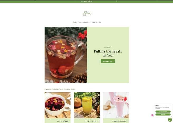
Zabbis is an upcoming small business looking to create a visual identity. The business sell sell Tisanas or fruit teas. They requested a natural, but classy look for the brand. The color scheme is chosen to give a more organic and lively feeling towards the brand.




02 Pitpals Rescue & adoption
Branding & Visual Identity
Class Project Junior Year
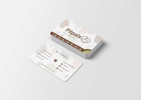
The Pitpals is nonexistent nonprofit rescue & adoption organizaiton that was designed with the mission goal of rescuing and rehoming pit bull dogs. The visual identity of this nonprofit organization is to be approachable and friendly towards outsiders and encourage them to destigmatize their view on these and other “bully” breeds, as well as possibly adopt. It looks to educate through kindness and compassion, which is why the color schemes are much softer and have a cute, but professional style.



for full visual manual
03Institute of Sustainable Studies
Brand logos & Advertisement
Graphic Design work (Intern) Ongoing Project
The Institute of Sustainable Studies (ISS) is set on creating and promoting sustainable projects to the public, especially young adults and teenagers. The institute has granted me the task of creating logos for their projects and some paper advertisements for their upcoming internships. They requested mostly maintaining a fresh and trend style, which I decided to make a more modern and not too bulky in lineart or bright colors.


04Trascendencias
Design & Visual Identity
Graphic Designer Junior Year
Worked with the design team to create visual identity for the symposium, have a rough, papet-cutout style, distinct typography and color palette. Worked to develop the shirt design, schedule display, pin designs, and display screens for the event. During the event made all the diploma design that would be given to speakers and workshops .


05Uniformes Marjo
Branding & Promotional Material
Graphic Design Assistant
While working at Uniformes Marjo, I was tasked with creating posts for upcoming sales, to advertise their services, and to let the public know about their locations.


06Emo-Mania
Branding & Visual Identity
Class Project Junior Year
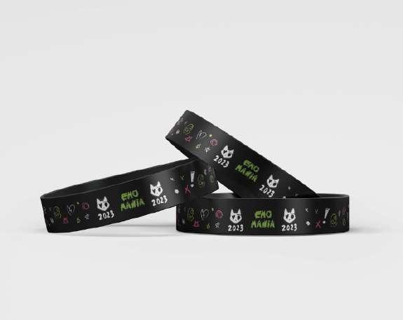
A made up rock from the early 2000s music festival, with a more scene/ emo twist. Contrary to popular belief, Emo and scene subcultures enjoy bright accent colors over black, such as bright greens and pinks, as well as white. Patterns are also a notable element. The style is messy and wild, as well as fun


Packaging
07Michito, CrayonKits & Flower-I
Brand logos & Packaging
Class Project Junior Year
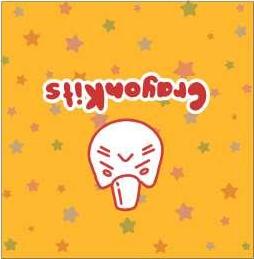
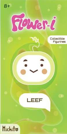
Michito is the parent toy company of two toy lines: CrayonKits and Flower-I, CrayonKits is directed torwards young children while Flower-I leans more for tweens and teenagers due to it being a figurine instead of a toy yo actively play with. This project includes a mascot as well for a bigger connection to emotional branding.






3D Modeling & Animation


Bouncing ball
Junior year
The bouncing ball was the first animation of the semester, it is to showcase the override of the squash and stretch control features in Autodesk Maya, as well as the usage of camera aims and motionpaths.

Platform 360
Junior year
The platform is a solo project done with a double-function control (button) so as it is pressed, the platform extends upwards and rotates simultaneously. This is demonstrated with the use of camera mounted on a motionpath track to show the platform in a 360 manner and how it is performing its functions.
Four objects animation
Junior year
Using models from classmates; BRIDGE by Isabella Davis, DOORS by Gael Lugo, TOASTER by Sofia Celaya, and ARCHIVER by Andrea Urriza, the animation consists of passing a bouncing ball through and have it interact with each one of the object, to demonstrate the use of controls for each object.
Claw and Cube
Junior year
The claw is to demonstrate the new controls that were implemented both on the claw and the cube, the Blend Parent control is the one holding the cube in place so it can transport it from point A to point B.


Personal Illustrations
There are different things I worked on during my own free time.


Fanzines
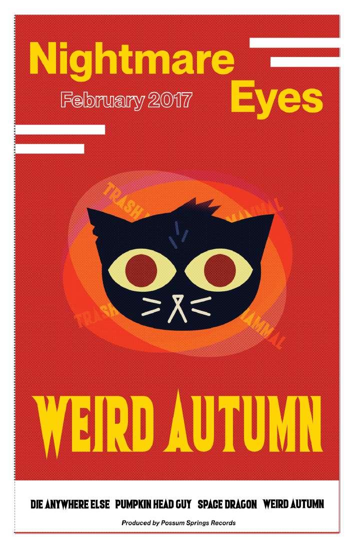
A lot of my illustration work is done out of passion and love for something. Whether it would be a certain book, a phenomena, or music itself, I have been drawn to illustrating and compiling these into fan magazines- or most commonly known as fanzines.


08Crossing the street (2D Animation)
Storyboarding, Background & Character Concepts
Class Project Freshman Year
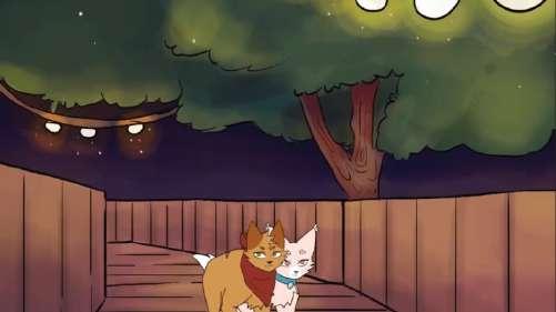
In a team composed of character designer and director Socorro Naví Medrano, script writer Diosty Carrillo, and I, we had to do a 2D animation project that we had come to be about two cats, one is a homebody and the other a wild cat that become unlikely friends. I was in charge of the character storyboards and background designs, I created several different scene backgorunds so that they seemed more alive and to actually like the outside more than the inside of their homes.


Concept art for Laia (top) and Paloma (bottom) I wanted to make them recognizable from one another not only through colors, but through their shapes. These designs were not used and instead Socorro Naví Medrano’s and I’s blend designs were utilized (designs at the
Neighbor / Paloma’s owner design
The model design concept for the neighbor across the street who had Paloma, the wild cat. I chose a cool color scheme to contrast Paloma’s color palette to show they were not a good fit for each other.
Laia’s owner design (Reichel Llana)
For Laia’s owner we chose cleaner, I chose more neutral colors aside from the skirt to show that she was more about a proper and clean appearanc, which reflects onto Laia (protagonist) and her own color palette . Sadly this concept was scraped due to time concerns.
Final Laia & Paloma designs (Socorro Medrano & Reichel Llana)
Final
From storyboard to background
Backgrounds can be tricky for certain things, essentially when considering that the art style from one person can be totally different from the another artist. That was one of the mistakes we as a team did, but further down other projects there was much better timing for discussions and communication amongst those working on projects, whether it was together or with other classmates. However, making backgrounds were to make the characters be in new places outside, to bring Laia (The protagonist) out of her comfort zone.


