FIRST ANNUAL AWARD WINNERS




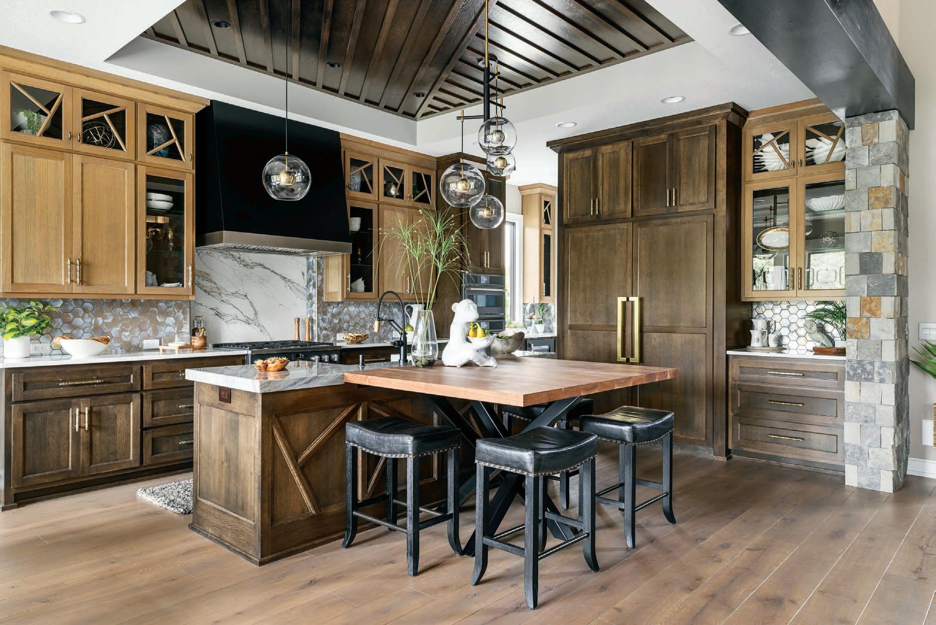
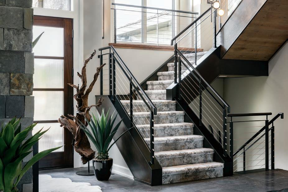
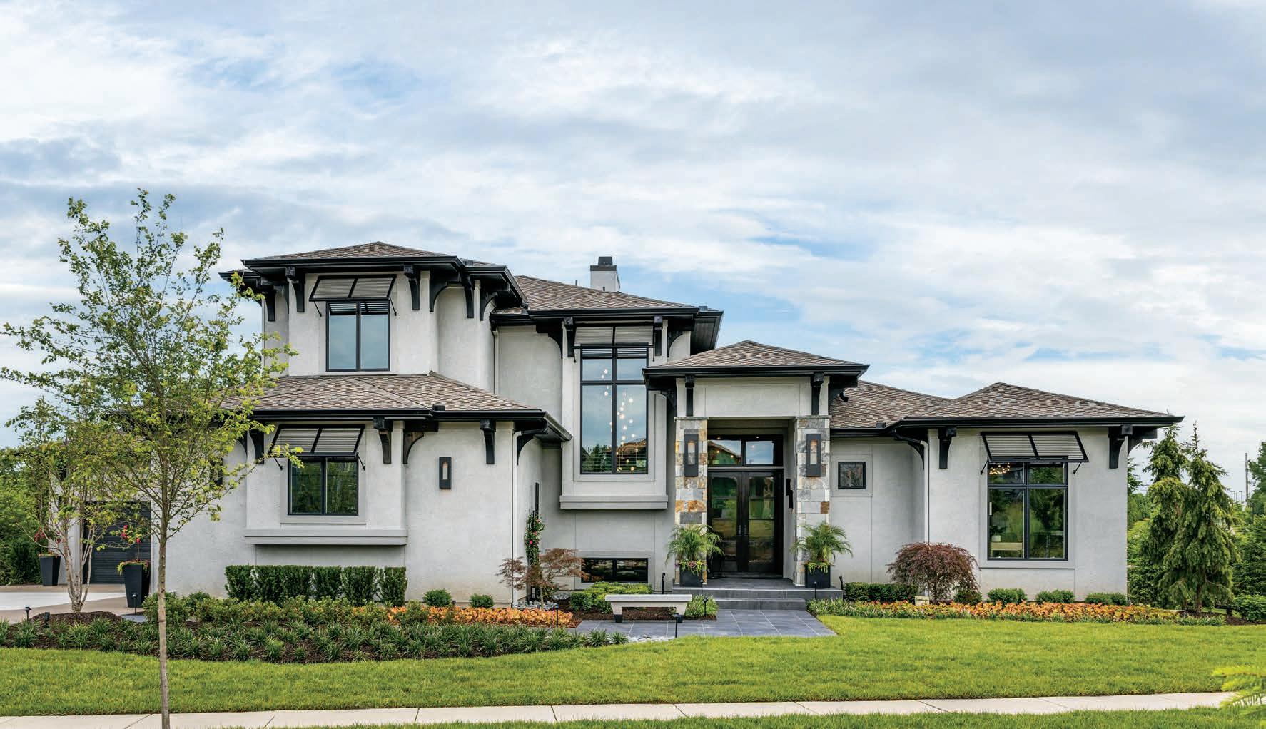

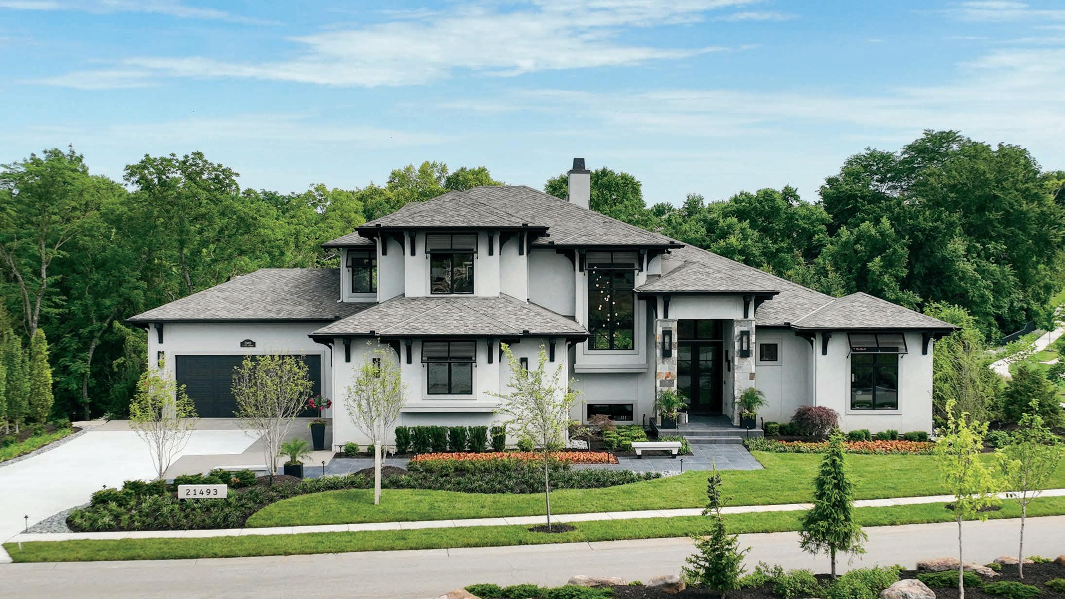





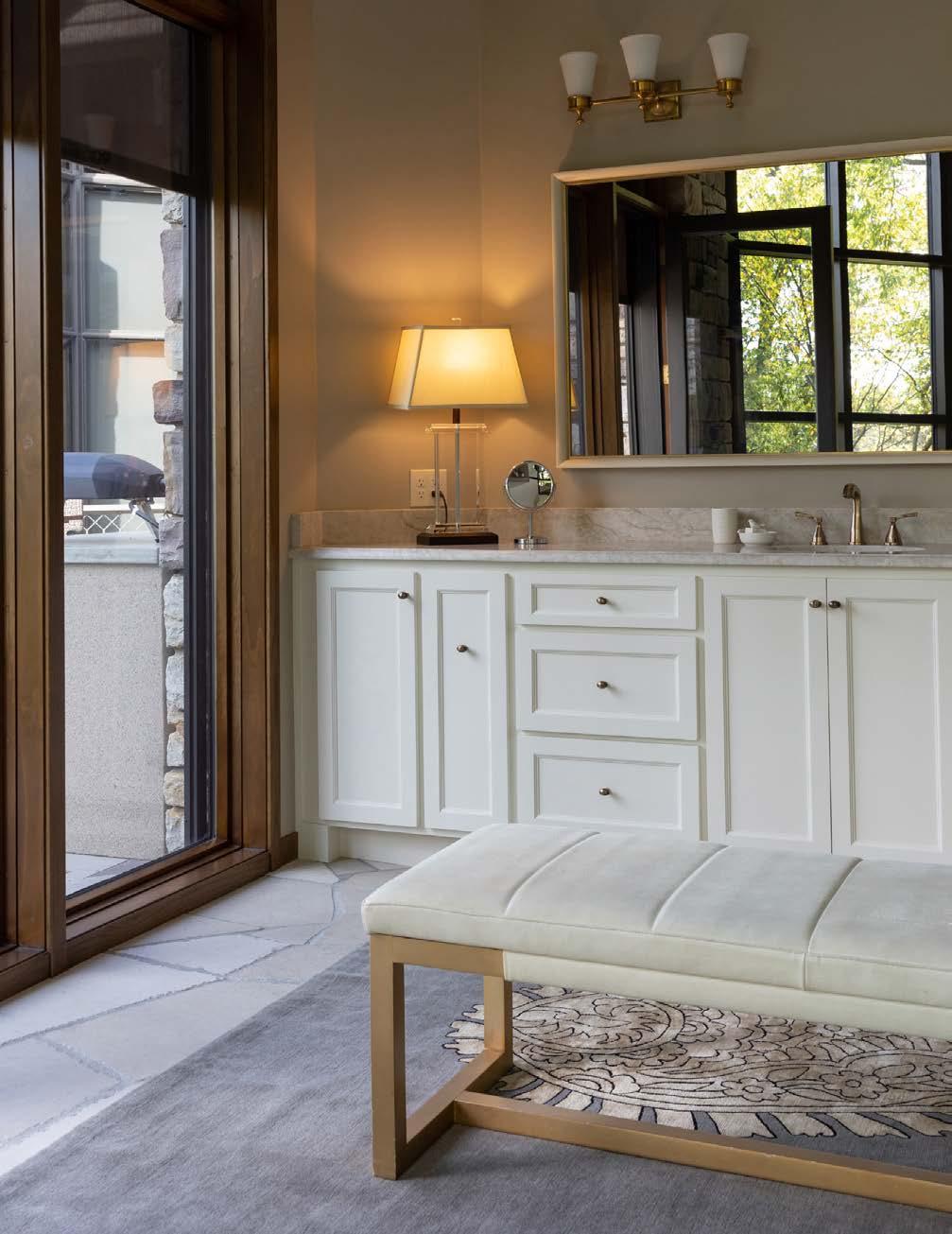





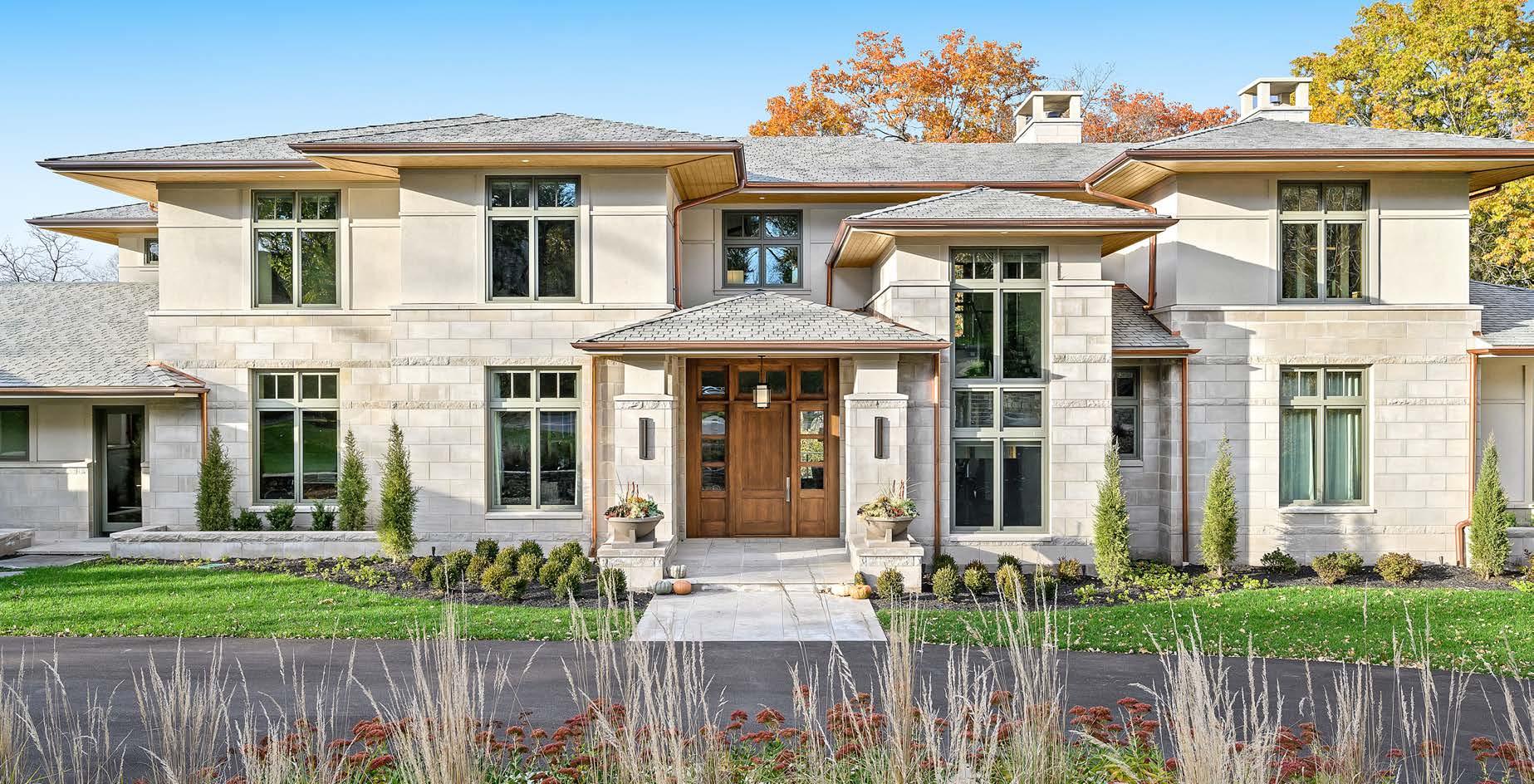
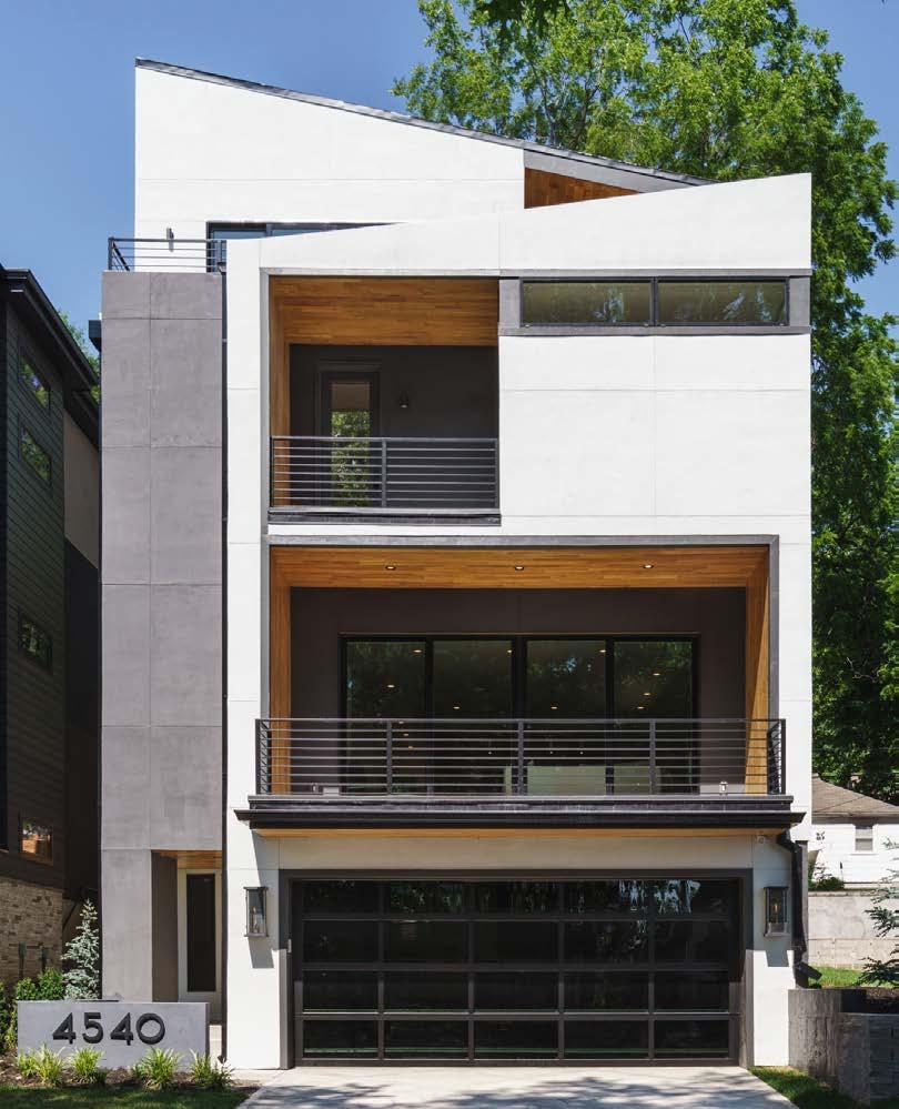
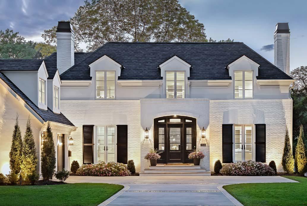
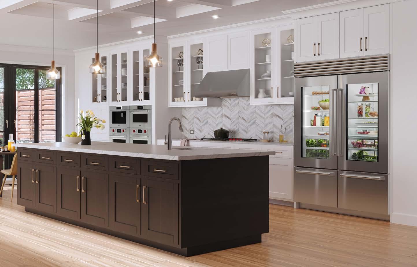
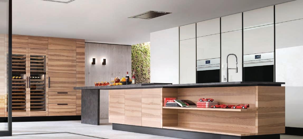

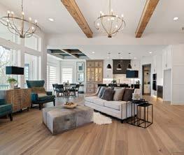
Building a house isn’t just about having a place to live — it’s about creating a space where you truly belong and can celebrate life with family and friends. J.S. Robinson helps you create a home that is a perfect fit for your life; a place that not only meets your needs, but supports your aspirations; whether it is designing your own custom plans, re-building on an existing lot or simply modifying one of our many plans, we have the expertise to deliver exceptional, high-quality results.
Now, joined by his two sons, The Robinson Team continues to stand behind their mission to deliver lasting value, innovative plan designs and an outstanding customer experience. Our flexible and creative floor plans can be customized to make your home distinctly yours
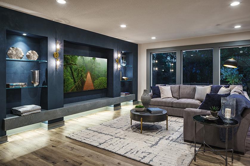
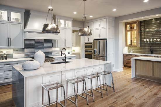
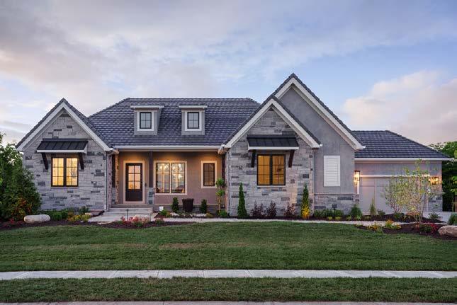
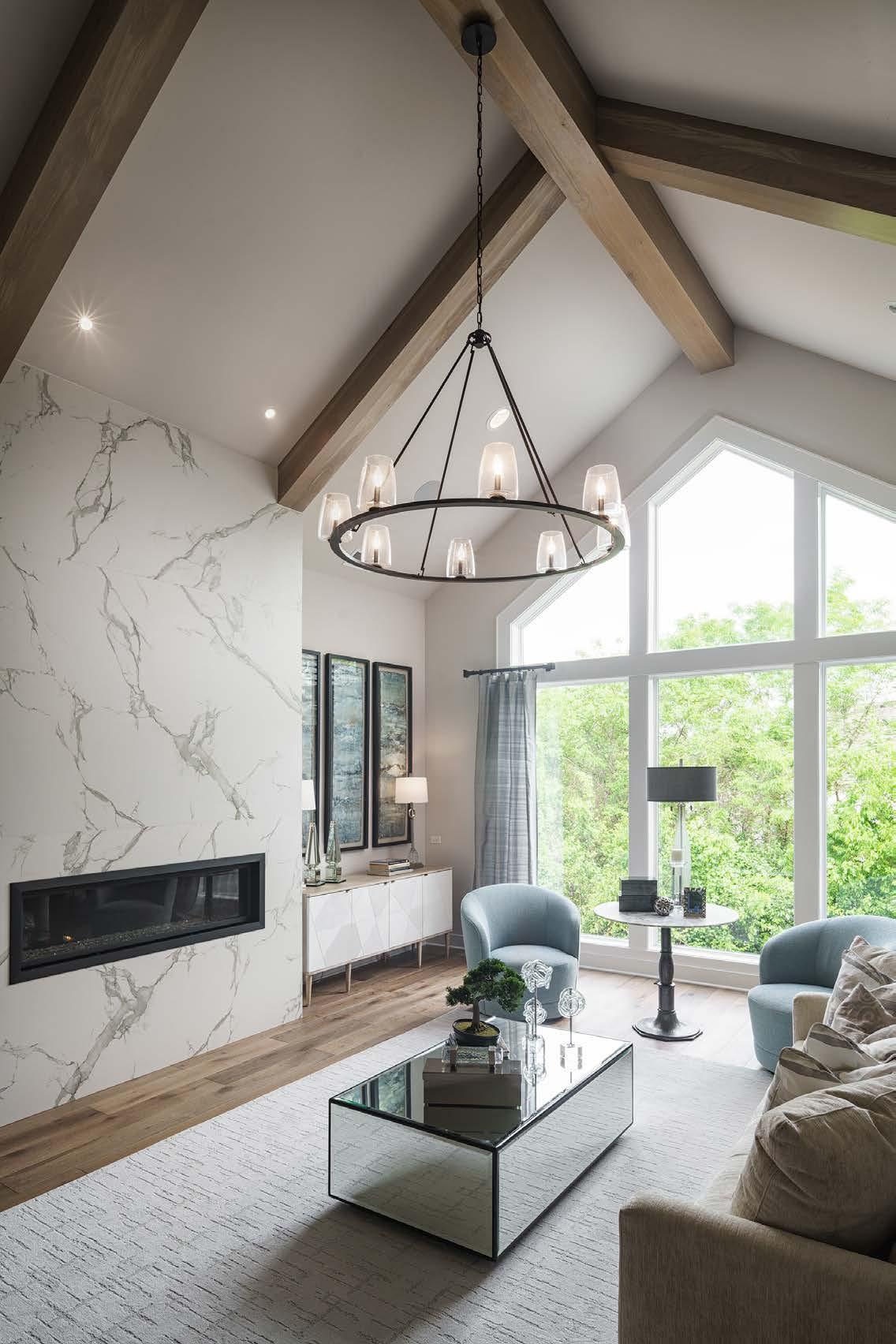
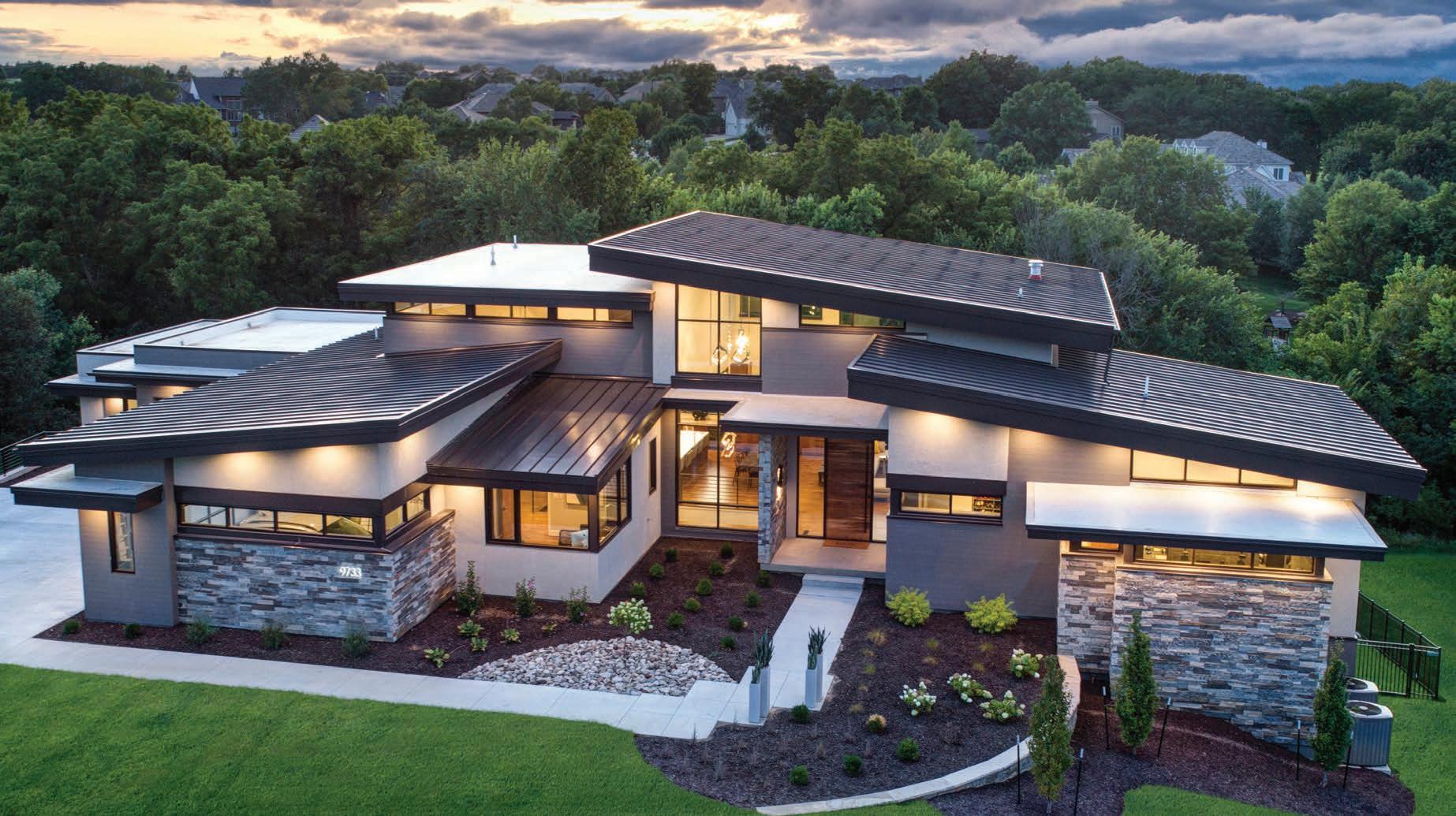





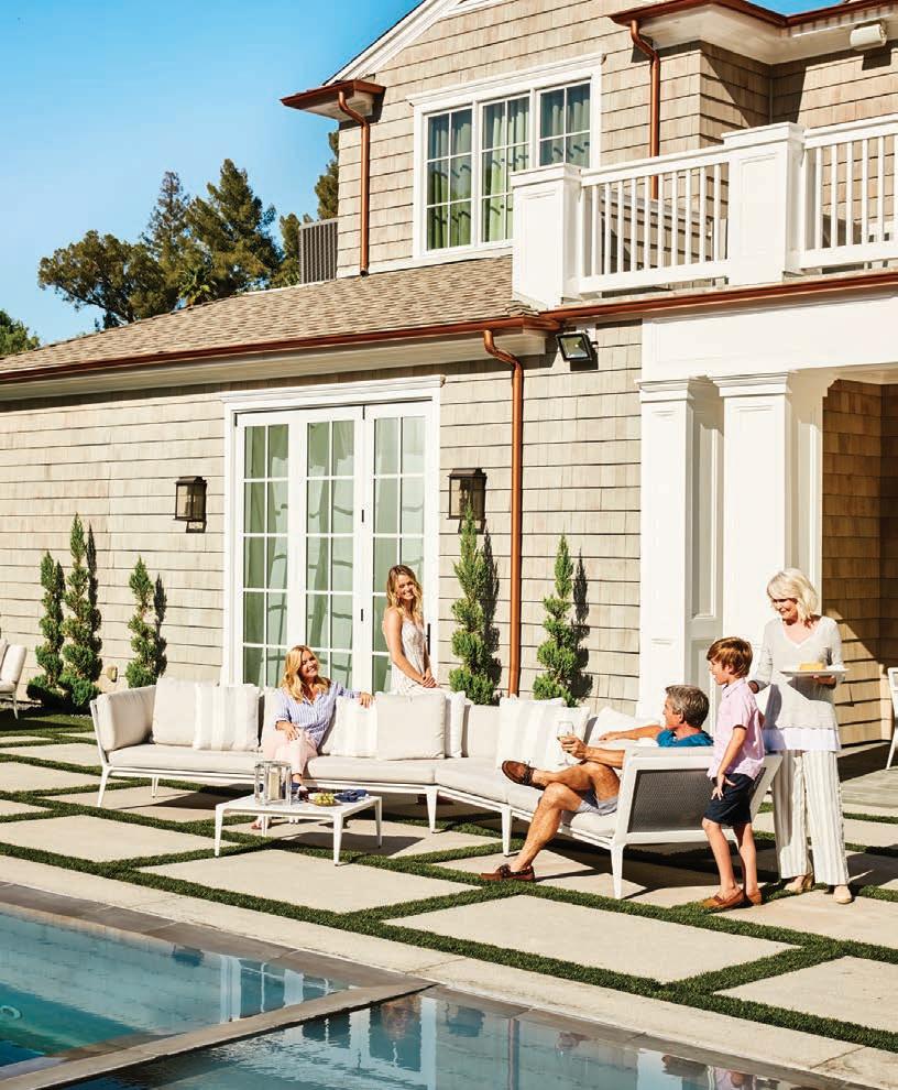









At Noble Designs, our passion is designing homes and spaces for our clients that re ect their needs in a style that lasts. We are a full service interior design rm ready to help with your new build, renovation or just simple updates to make your home beautiful.

















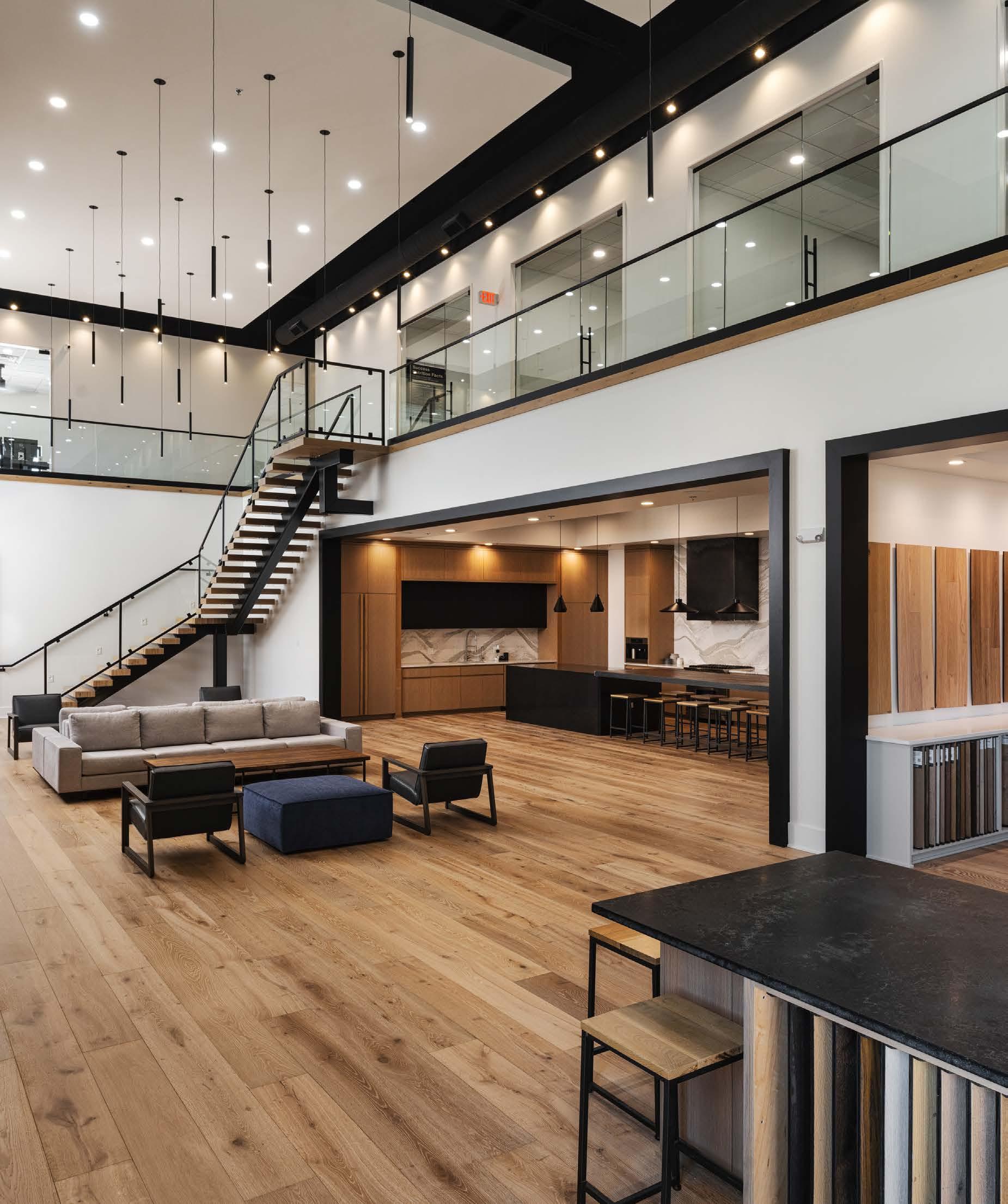



Contributing Photographers
Editorial Submissions
Designers, architects, builders and homeowners are invited to submit projects. Email andrea@mydesignkc.com with photos and description.
Advertising
Keith Sauro, Publisher keith@mydesignkc.com 913-908-2393
Subscribe mydesignkc.com/subscriptions

$20 for 1 year (5 issues)
$35 for 2 years (10 issues)
For subscription questions, lost issues, or to cancel a subscription: circulation@mydesignkc.com
Online + Digital mydesignkc.com mydesignkc.com/digital-issue
Find your

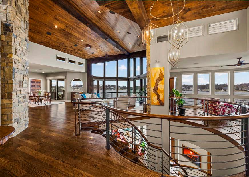
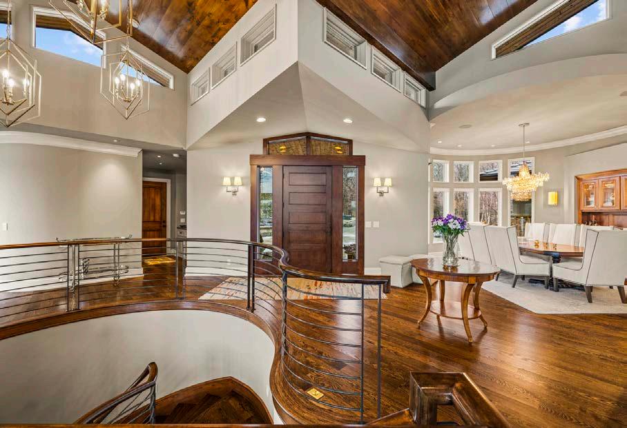
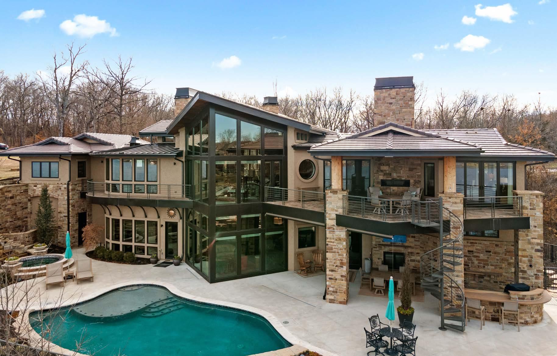


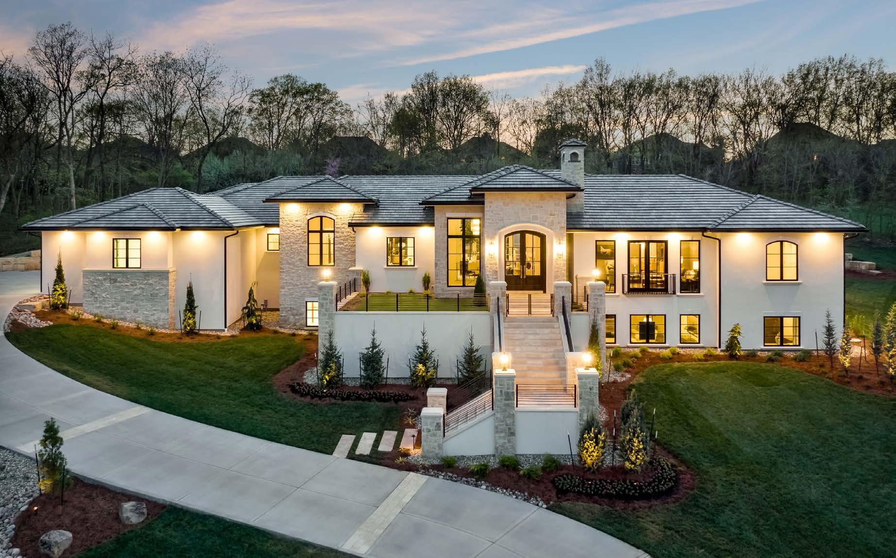
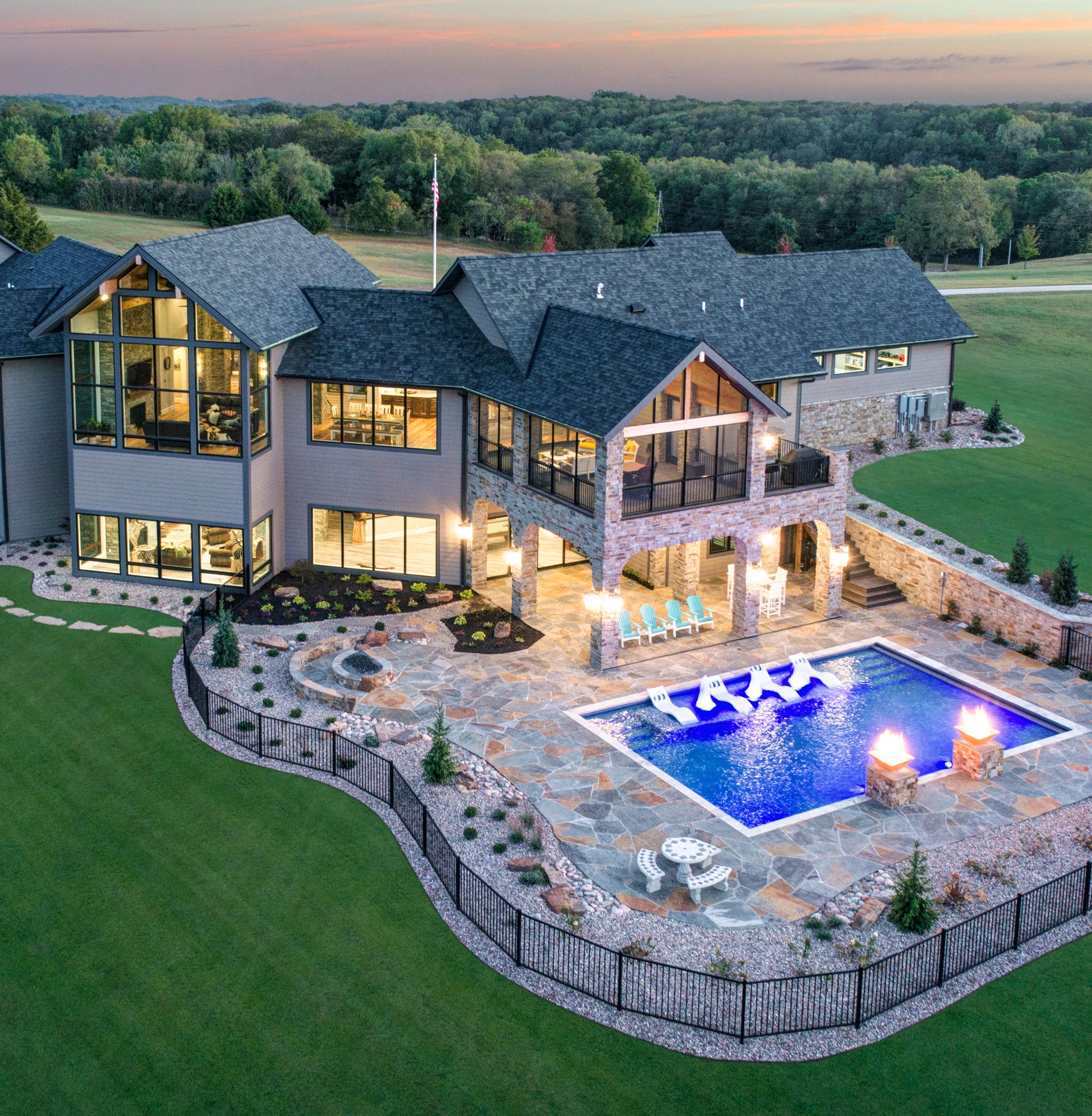
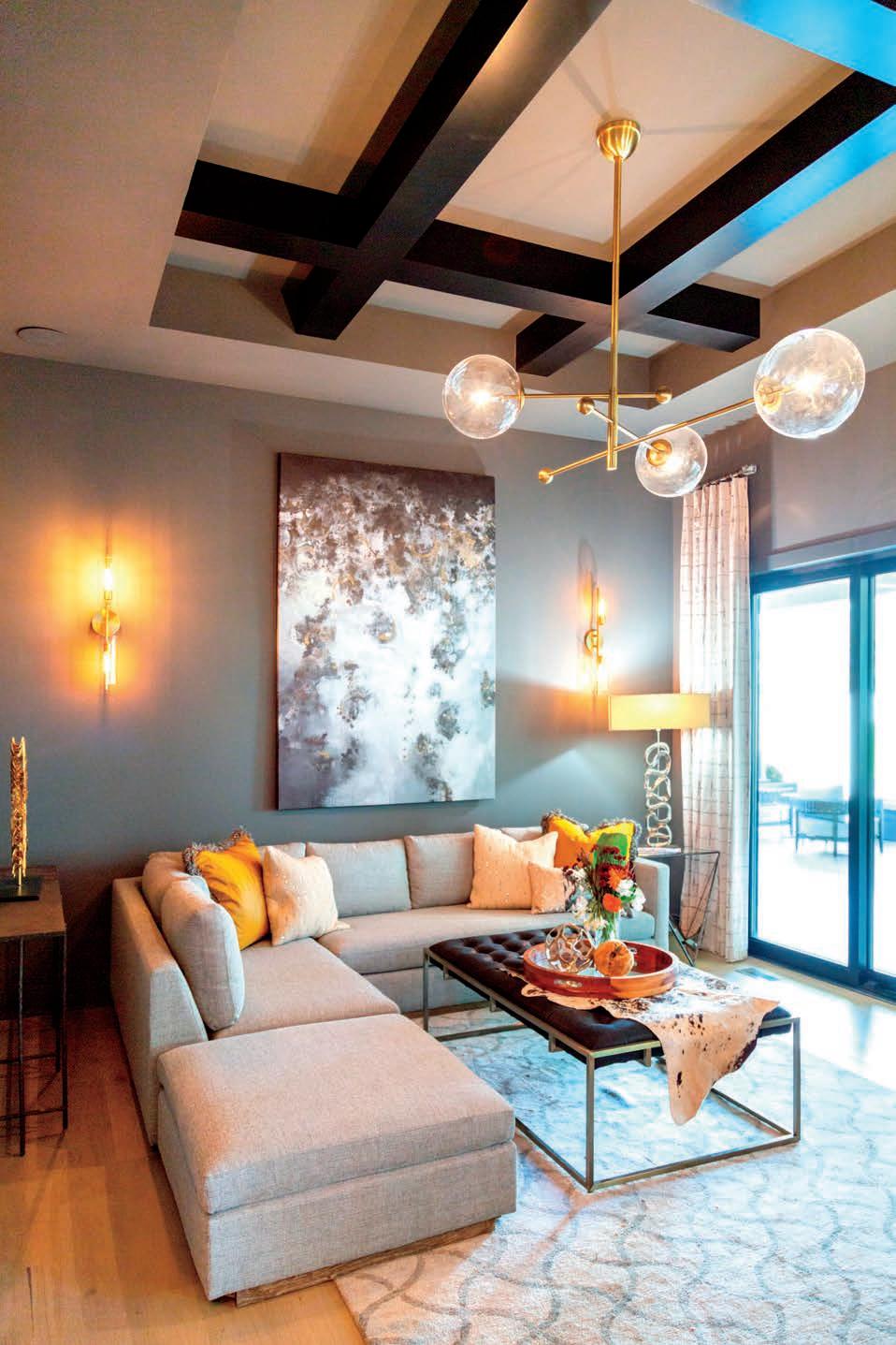
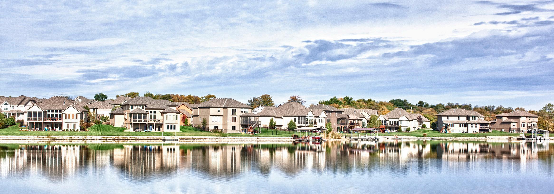
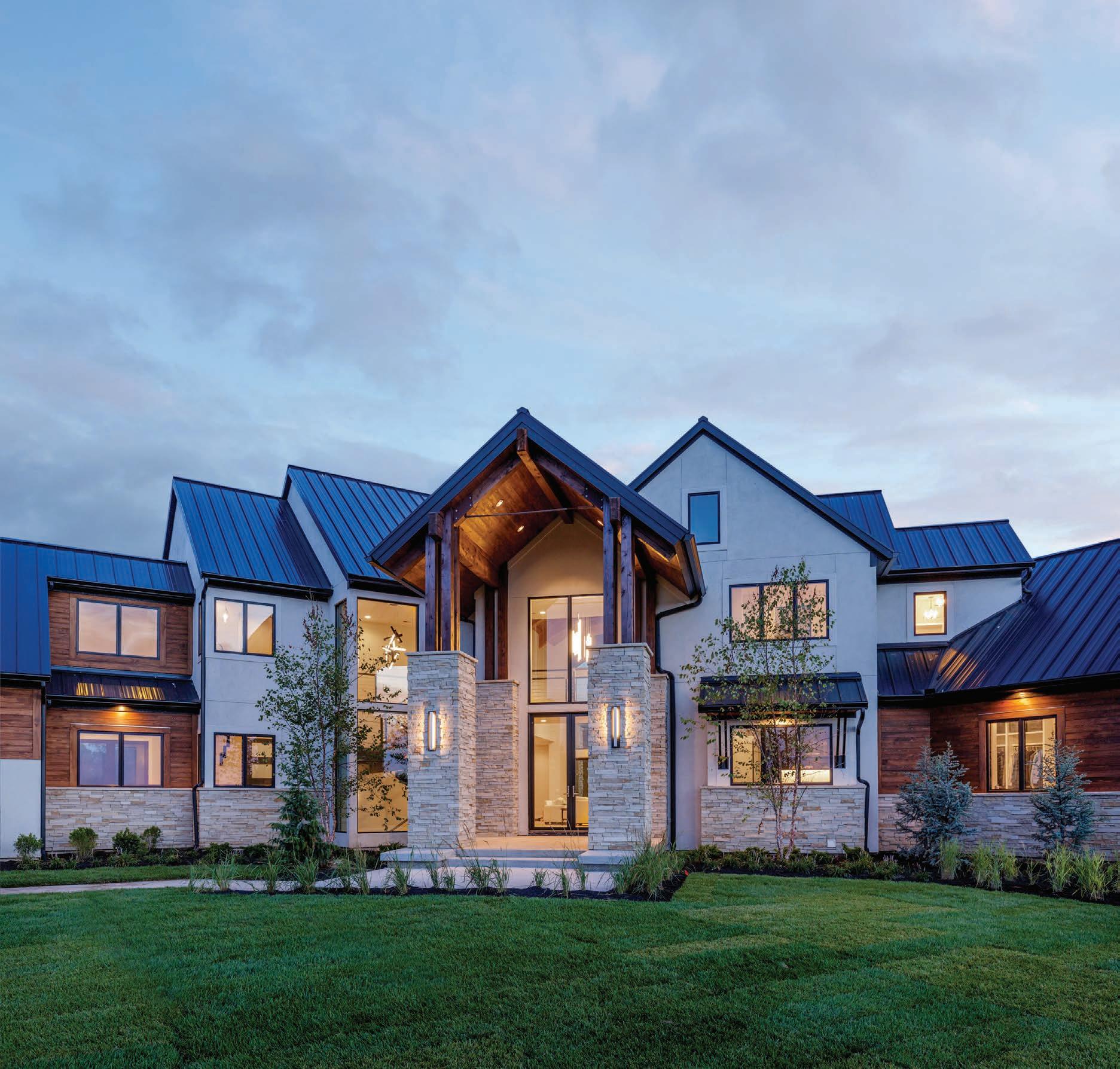
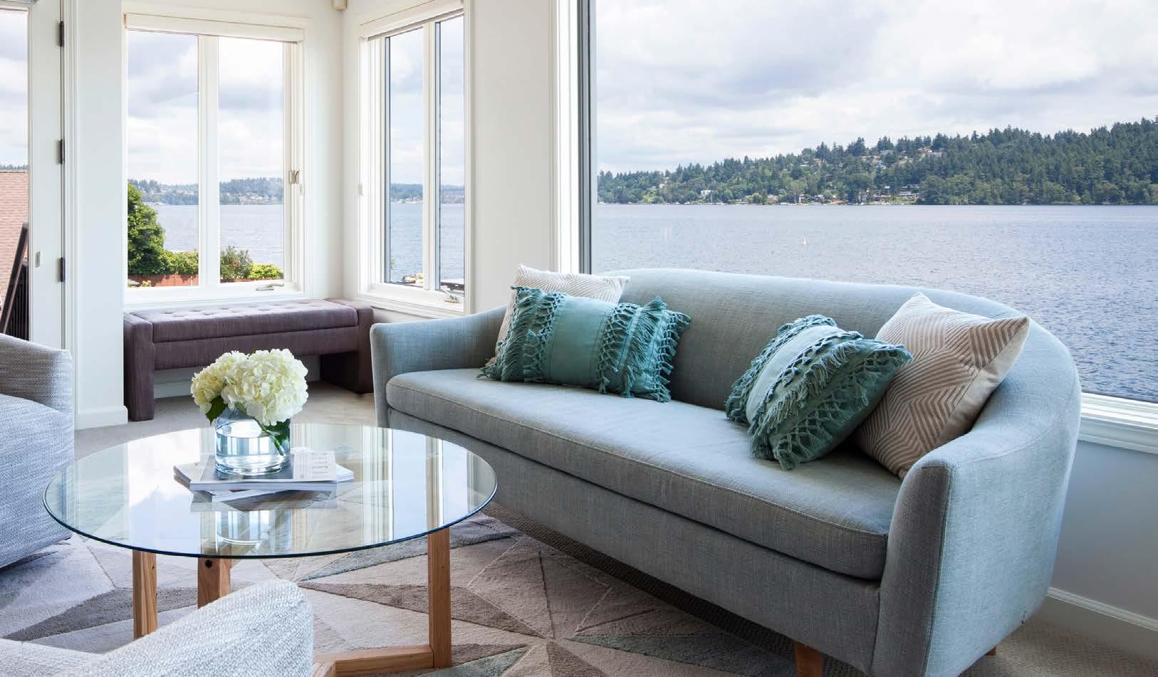
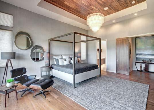
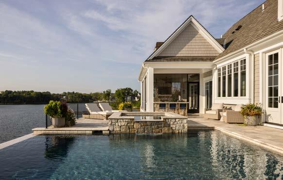
This stunning dream home, located on one of few coveted lots, overlooks breathtaking views of the 405-acre Lake Winnebago.
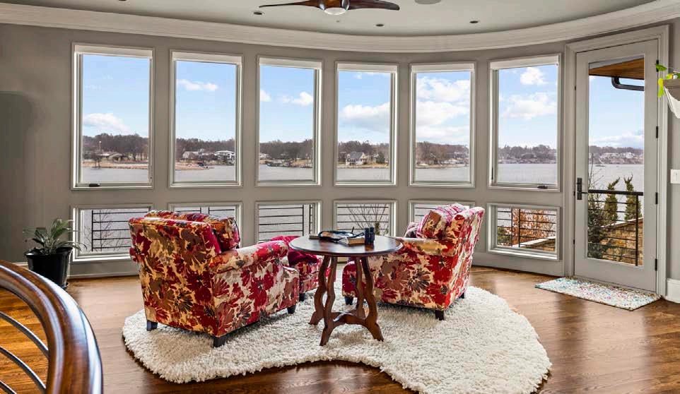
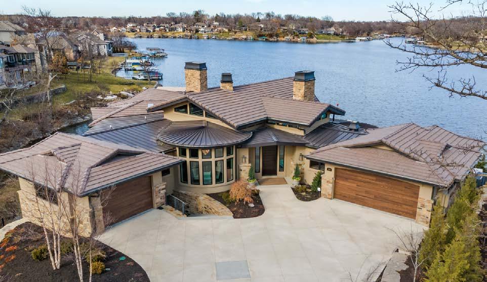

Designed for entertaining and enjoyment of waterfront access, this home is a collaboration built by B.L. Rieke assisted by architect Tom McDonough and designer Jennifer Quinn.

Attention to detail is incorporated in every decision to accommodate an e ortless experience. Hosting lavish gatherings or spending quiet moments, this home is created to delight in the unexpected.
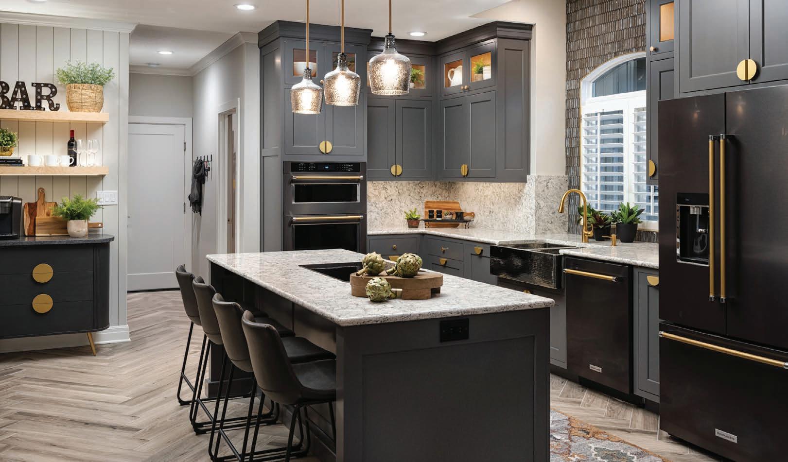
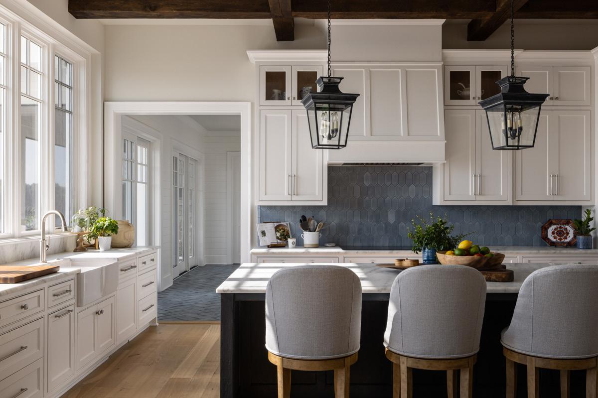
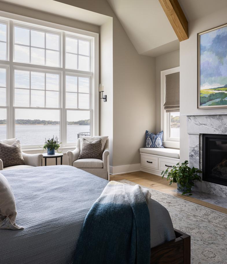
Intentional design details include 22’ windows with motorized shades, hardwood oors, Wolf and Sub-Zero appliances, Patagonia Quartzite, elevator, primary suite with panoramic lake view, beautiful heated tile oors, expansive closets and laundry mud room. His and hers garages with separate entries.
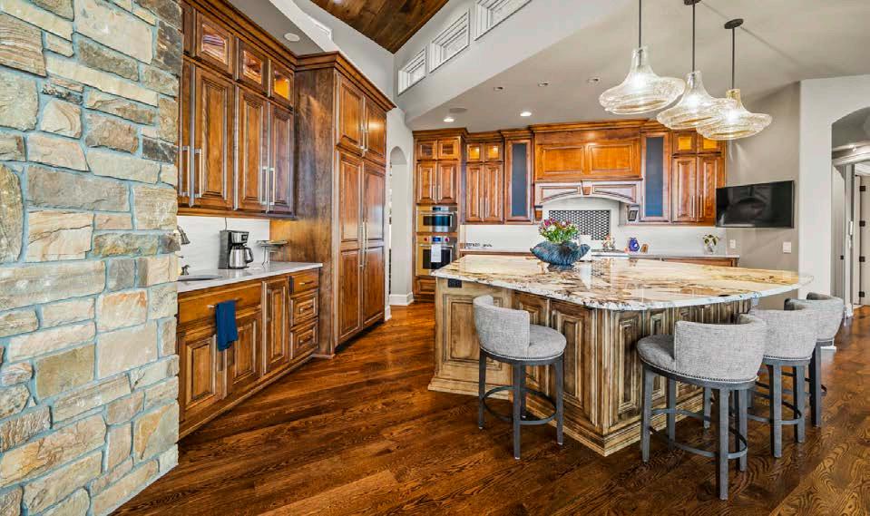

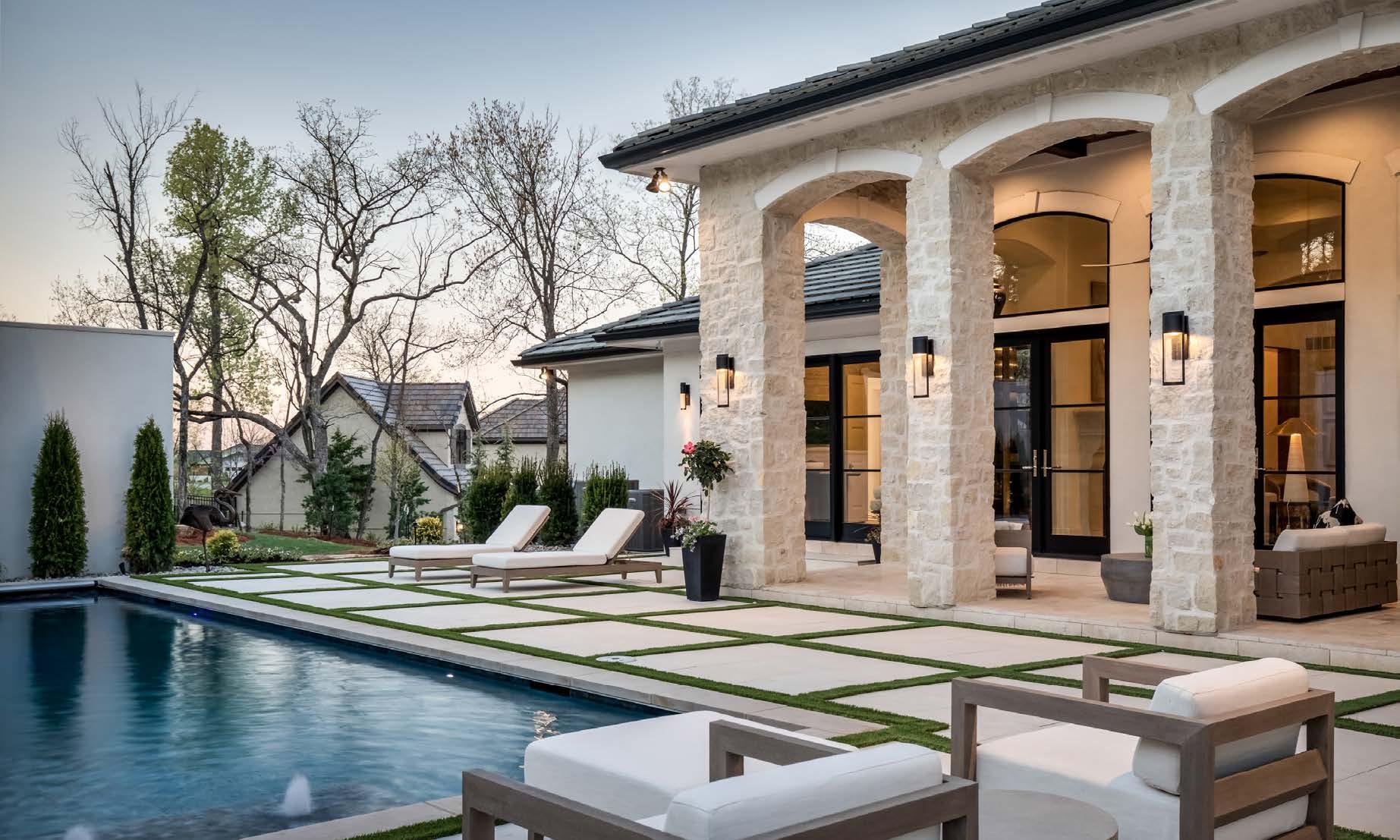
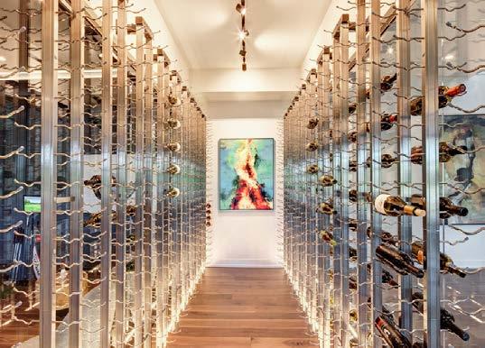
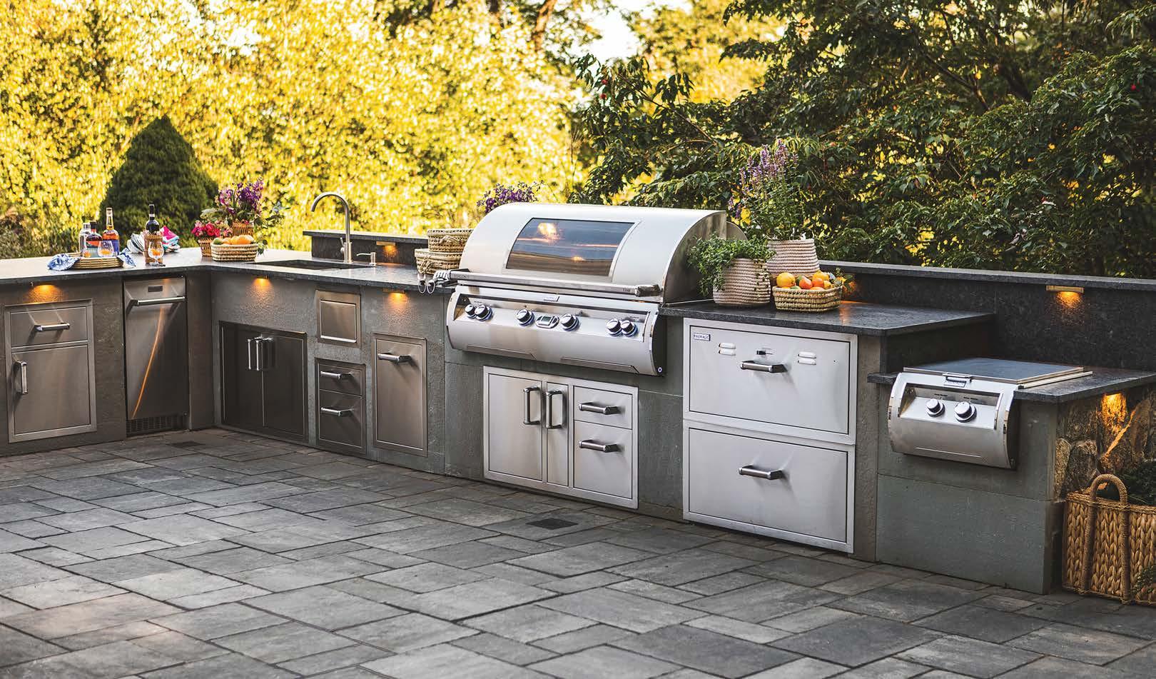
Three replaces, a hidden wine cellar, spectacular pool with spa and waterfall, large lower level bar and library, two o ces and two bedrooms extend to an elaborate outdoor kitchen with motorized solar shades, includes solar paneled dock and lift with lake irrigation.
The homeowners’ desire to create a vacation home for primary residency and prioritize each room with a wide angle view is a speechless experience.
This is not just a home, it is a way of life.
Contact Julie Gadwood, Broker/Owner of NextHome Gadwood Group at 913.206.4228 for more information or to schedule a private showing.
SHAWNEE, KS
11212 Johnson Dr, Shawnee KS 913.481.0334
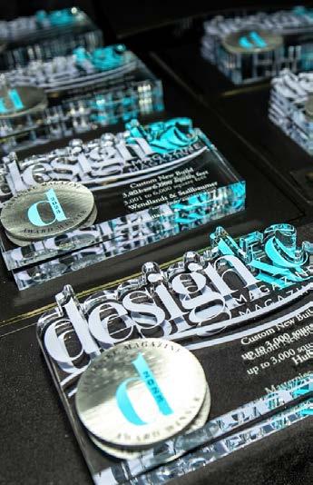
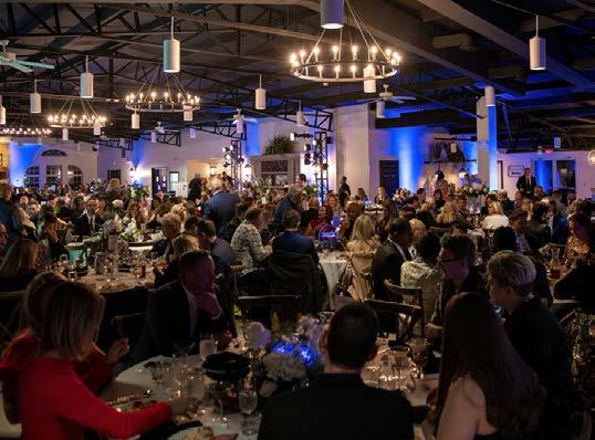
For the last two years, this publication has shown our readers the unbounded talent of our design community. We have seen the creativity and the quality expressed by architects, designers, builders, remodelers, landscapers, artisans and tradespeople and have known that they deserved even more recognition.
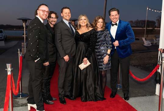

The idea of a true, third-party juried awards program for the local, professional design community has been a part of our vision since inception. It is a major part of our brand mission— to connect. DesignKC has always promoted a connection among the trades, as well as among readers who wish to become clients of the trades. Our awards program was designed to take it a step further by honoring outstanding work with trophies, a gala event, decals for winnersʼ use, online and social media coverage—and this bonus print issue.
In November 2022, we finally launched this program—now an annual component of designKC. We opened an online portal, inviting professionals to enter their projects, including an essay comprising

the project goals, challenges and solutions; floor plans and elevations; before and after photos; and project resources.
We allowed a wide window of five years to capture projects. We also accepted projects across the metro and a generalized boundary where second homes of local residents could be considered.
The key to the programʼs success was securing an unbiased panel of qualified judges. We collaborated with designers, builders, influencers and tradespeople from across the country to review the entries. Judging teams reviewed individually and discussed collectively. They were

given instructions to be discerning but not militant and to avoid ranking entries against each other but rather to evaluate each on its own merit. Winners were determined if they met a point threshold; honorable mentions were given if they just missed the threshold.
We are proud of these results and we are excited to bring you this special issue that showcases outstanding achievements in home design and construction. These winners are the first—but certainly not the last! Our 2024 designKC Awards portal will reopen this fall, so begin preparing those entries now!
WE HAVE A SOLUTION FOR THAT.











 Amy Herman Designer Design & Detail St. Louis @designanddetailstl
Ted Scott Builder + Founder Medallion Custom Homes @medallioncustomhomes
Jenna Talbott Editor-in-Chief New England Home @nehomemagazine
Laurie Laizure Founder Interior Design Community @interiordesigncommunity
John LeFevre Builder Medallion Custom Homes @medallioncustomhomes
Patrick Madden Independent Manufacturers Representative @pjmadden
Krista Howard Owner of KH Interiors ASID Missouri East Chapter President-Elect @khinteriorsllc









 Michael Gekas 2023 AIA KC President Virtual Design & Construction Director McCownGordon Construction @aiakc @mccowngordon
Kelly Kole Designer and Podcaster Inside Design with Kandrac & Kole @kandrackole
Cheminne Taylor-Smith Creative Thinker + Idea Generator @cheminnets
Alvin Wayne Designer Alvin Wayne Interiors @alvinwayne
Beth McCabe Showroom Manager Designerʼs Library @designerslibrary
Tom Price Director of Sales Custom Wood Products @tom.price_88
Joann Kandrac Designer and Podcaster Inside Design with Kandrac & Kole @kandrackole
Courtney Klamm, CKBD Senior Designer, CKF in Omaha Communications Chair on the Nebraska-Kansas Chapter NKBA Board @ckfco @nkba_ne_ks
Scott Bickford Architect Bickford & Company @bickymon


CONGRATULATIONS TO ALL THE WINNERS!


COMMERCIAL SPACE
Helix
DETACHED
REDESIGNED RESIDENCE 3,001-6,000 SQUARE FEET
88
111 MEADOWBROOK PARK RESIDENCE
Wendlandt + Stallbaumer
Tom French Construction
112 LAKE WINNEBAGO
VACATION HOME
89 DELMAR VIEWS
90
91
OUTDOOR
92
96
SQUARE FEET
Elswood Smith Carlson Architects
Ambassador Homes
Madden McFarland
113 HEARTH HOME
Clockwork Architecture + Design
Kala Performance Homes
114 WOOD INSPIRED
Wolfgang Trost Architects
Kristen Ridler Interior Design
Madi Mali Homes
115 HARMONIOUS HOME
NSPJ Architects
Noblit Didier Design + Build
CUSTOM NEW BUILD 6,001-10,000 SQUARE FEET
118 HOTEL-LIKE LUXURY NSPJ Architects
M. Sudermann Interior Design
RM Standard Construction
119 ART HOUSE
Forward Design Architecture Centric
Alan Karlin Design
120 HEARTH + STONE
Elswood Smith Carlson Architects
Ambassador Construction
Lisa Schmitz Interior Design
121 PRIVATE VIEWS
Bickford & Company
Kristen Ridler Interior Design
Homoly Construction
CUSTOM NEW BUILD OVER 10,000 SQUARE FEET
124 DARING PRAIRIE
Wolfgang Trost Architects Noble Designs Cecil & Ray Homes
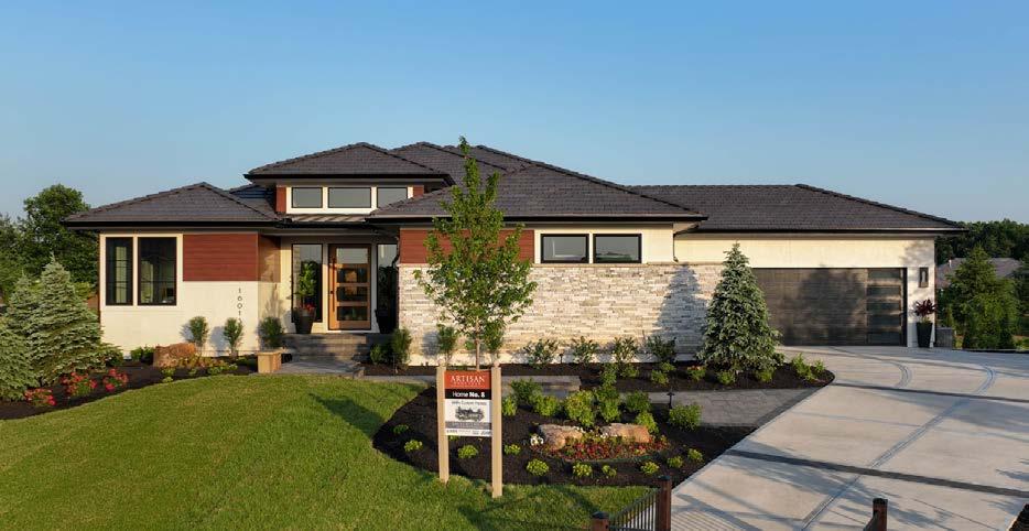
126 THE 2020 ARTISAN HOME
Castrop Design Group Starr Homes Dwell Interiors


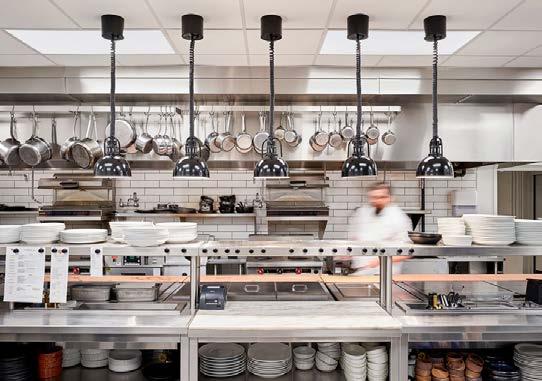
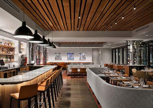
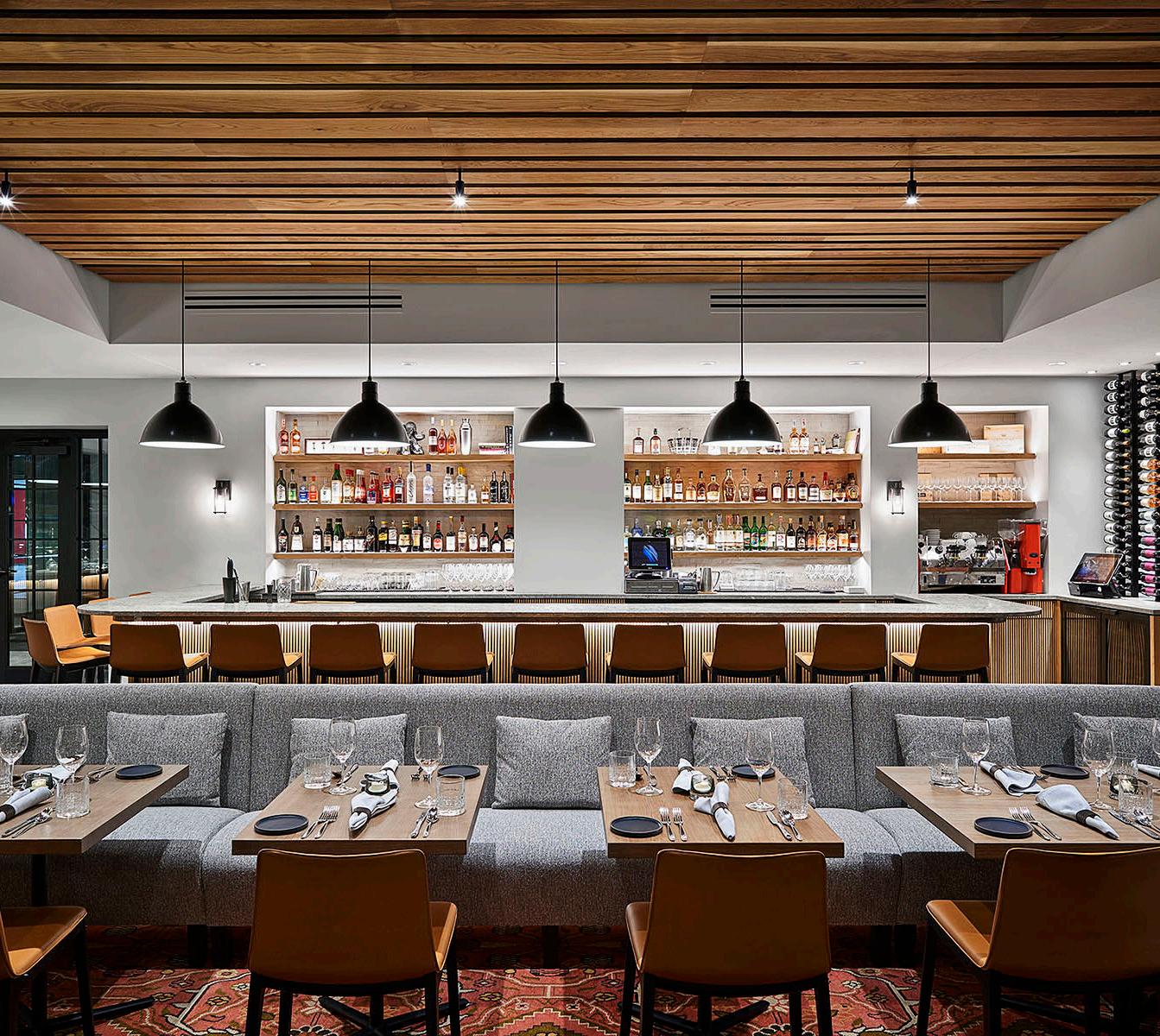
James Beard Award-winning Chef Michael Smith is a renowned figure in the local and national culinary arts community. His vision for Farina was a space where patrons felt surrounded by food as though they were at an Italian family dinner. Chef Smithʼs patrons are used to a certain elegance in his restaurants. Not only did Farina need to be raw and chic, but it also needed to be an intimate setting in an urban core. To passers-by, Farina is bustling with chefs, bartenders and patrons while the restaurant exudes an inviting glow. The warm tones in the leather upholstery, locally made millwork, stacked stone and custom rugs capture elements of Tuscany and Umbria, and the floor plan allows Chef Smith to stroll through the restaurant with his handmade bar cart. Pasta and wood-fired entrees are celebrated in locally made millwork that adorns the two bars. Slats of white oak are stretched across the ceiling in varying widths, mimicking pasta that has been laid out to dry. The color and material palettes were also inspired by the warmth and texture of Italian food—bringing Tuscany and Umbria to the heart of Kansas City. To pay homage to the buildingʼs history as the birthplace of First Fridays in the Crossroads Arts District, Farinaʼs pristine white walls in the dining area are backdrops for rotating pieces of curated art.
ARCHITECT/INTERIOR DESIGNER


Helix Architecture + Design
CONTRACTOR
McCownGordon Construction
PHOTOS BY Michael Robinson
View full project details.
RESOURCES
Engineers: Langford Fendler + Associates; Stand Structural Engineers; SK Design Group Appliances: TriMark Hockenbergs Millwork: Designed by Helix Architecture + Design; Fabricator: Joe Munson Countertops: Bar-Caesarstone; other-Daltile Flooring: Carlisle wide plank floors; American Olean Rugs: The Rug Studio: Furnishings: Booth FabricationElite Booth; Booth Leather-Moore & Giles; Booth/Banquette Fabric-HBF Textiles; Furniture-Andreu World; Furniture Dealership-Encompas; Private Dining Tables-Square One Studio Lighting Fixtures: Rejuvenation; Juniper Window Coverings: Mecoshades
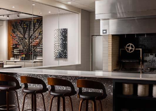
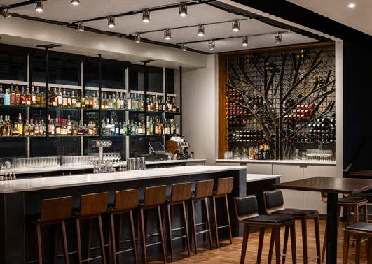
The concept of the restaurant is to feature Midwestern cuisine prepared over a wood-burning hearth. The challenge was turning a British pub-themed restaurant in a strip mall into an elevated dining experience. Because the hearth is the focal point of the restaurant, the designers organized the entire space around it. This took a complete reorganization of the kitchen, bar and mechanical systems. When in use, the hearth provides the visual warmth of a fireplace and serves as the heart of the restaurant. Since fire and wood are the essence of how the food is prepared, wood as a material helped formulate the idea of a tree as a design feature.
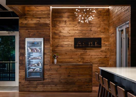
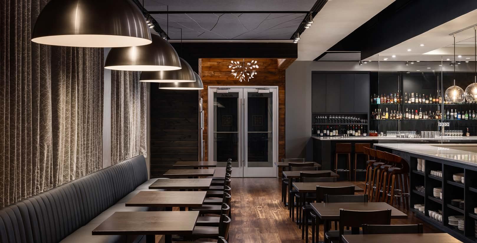
Herron + partners conceptualized eating in the Midwest as a picnic and seeking shade from the sun. They used this idea for the dining area ceiling design by carving the acoustical panels with an abstract pattern of tree limbs to provide texture and layering of detail. A similar pattern is used for the wine display, where steel plate limbs are accented by colored tips of wine bottles that appear as colored leaves. Also, they conceptualized the need for wood as a material. The warmth and color of the wood provide visual comfort and texture. In the reception area, a carved cube contains warm brown-stained wood on the inside while the outside has a charred black stain linking back to the wood burning in the hearth. Wood tables and chairs and wood-like LVP flooring were used to create a natural material palette.
ARCHITECT/INTERIOR DESIGNER herron + partners

CONTRACTOR ARC General Contracting
PHOTOS BY Nate Sheets
View full project details.



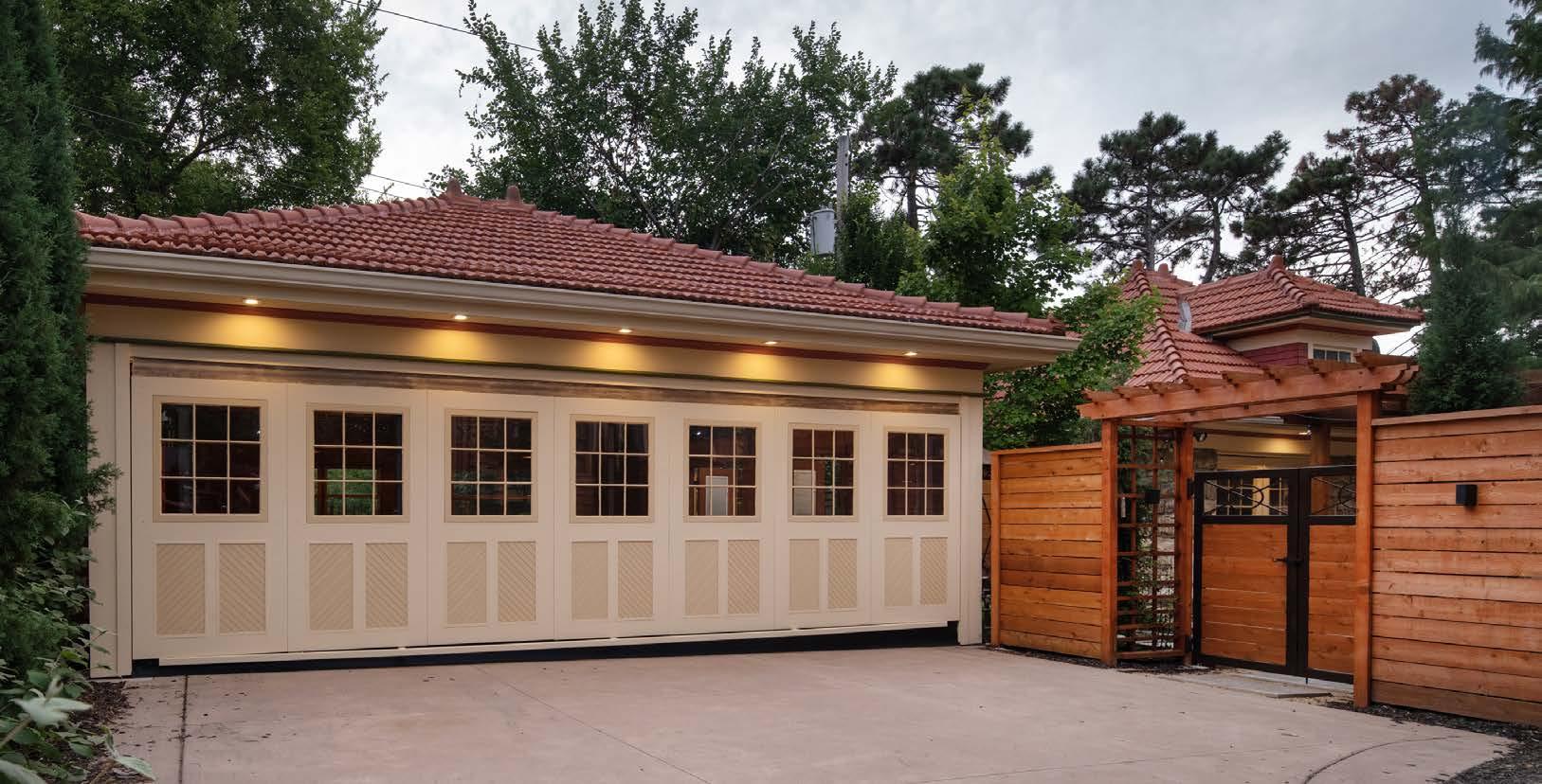
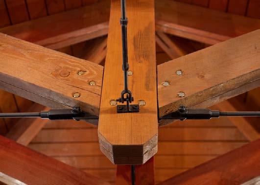
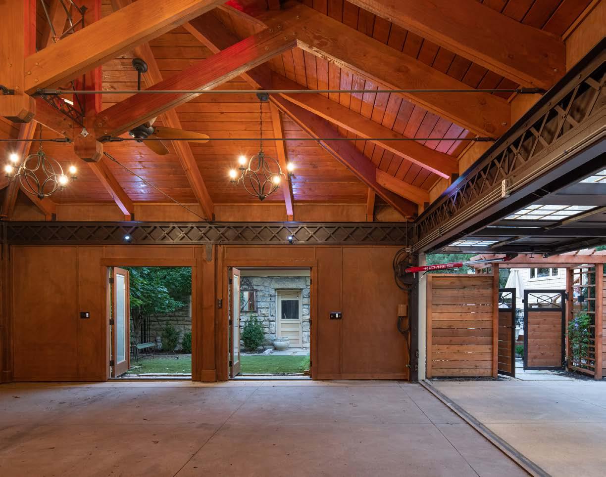
The original carriage house behind this 1906 Foursquare Craft sman-style home was inadequate for todayʼs vehicles. The challenge was to build a period-appropriate carport that complemented the carriage house and the home. The design team needed to make the structure noteworthy while allowing function. The front side had to span almost 30 feet to accommodate three cars without a support post. Using an I-beam was not an option, so they looked at structural engineering used in the early 1900s. Many bridges built in that era used a lattice truss design, allowing for long spans and decreasing the weight of the beam. The Eiffel Tower uses the same structural design. It was an opportunity for the structural elements to make a visual impact.
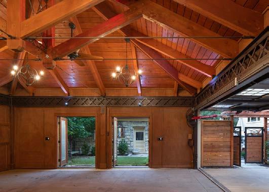
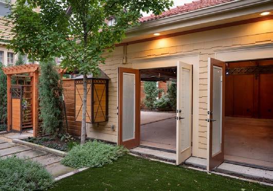
The need for firewalls was another challenge. Adding a wall on the third side gave them the opportunity to install two double French doors that open directly into the backyard. This created a great space for entertaining, and leaving the garage door down helps keep the heat in. The solution to the extra-wide door was to use an airplane hangar door. It articulates from the top of the door, creating an awning over the entrance when opened. They sourced the door frame and hydraulic mechanism, allowing them to create their own door design, then replicated a series of door panels to look like the existing carriage house doors.
Architectural Craftsmen

View full project details.
 DESIGNER/CONTRACTOR
PHOTOS BY Matt Kocourek






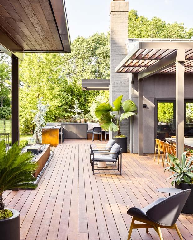
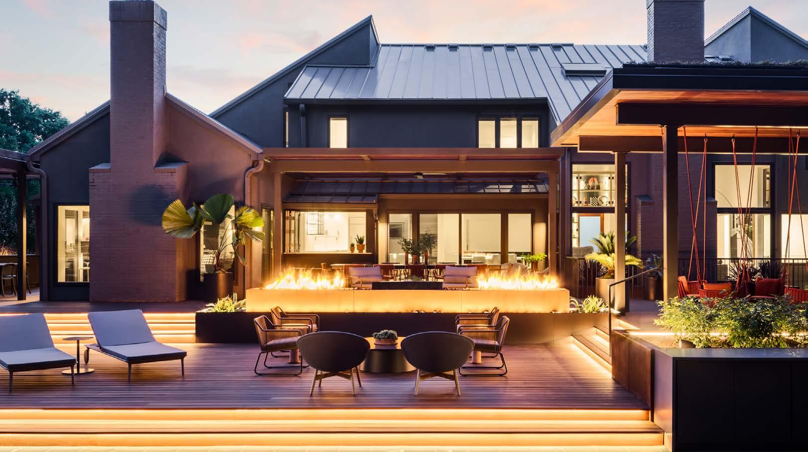
The Oasis is a renovation and addition for a couple who entertains extensively throughout the year. Their home is the hub of activity for a large, multigenerational family. The previous outdoor area featured small, disparate areas that created pockets of hard-to-use space. The designers reimagined how the spaces could work better together while providing additional functionality, making the outdoor area usable year-round. Additionally, a portion of the interior spaces needed to be more connected to the new exterior spaces, making the connection between indoors and out seamless.
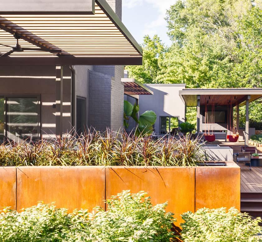
The primary challenge was to address the homeʼs storm drainage issue. Years of erosion had created a significant risk of water infiltration into the homeʼs finished basement.
The design solution offers several individual spaces for dining, fireside chats, shaded happy hours or watching the grandkids play on the sports court. Each separate space flows organically into the next for connection between activities. Tying these spaces together is a central, custom-designed and fabricated 20-foot linear fire pit. This central focal point features both fire and water elements.
Atop the covered lounge pavilion sits a tray greenroof system that captures and controls rainwater, preventing storm drainage from becoming inundated during heavy downfalls. Inside, the focus was to connect every space to the newly imagined exterior. The design team updated the clientʼs office with a large picture window to frame the view of this new outdoor oasis. The fresh, light-filled space compelled the team to introduce sleek custom cabinets, slender metal floating shelves and intentionally placed lighting. Function meets form in these interior spaces, drawing the homeownerʼs eye to the stunning view.
An interior lounge also found new purpose with a redesign that better connects to the outdoor spaces. The design team combined a small TV parlor with a rarely used exercise room to create a larger gathering space visible from multiple points around the house. As with other spaces inside, floor-to-ceiling windows blur the line between inside and outside.
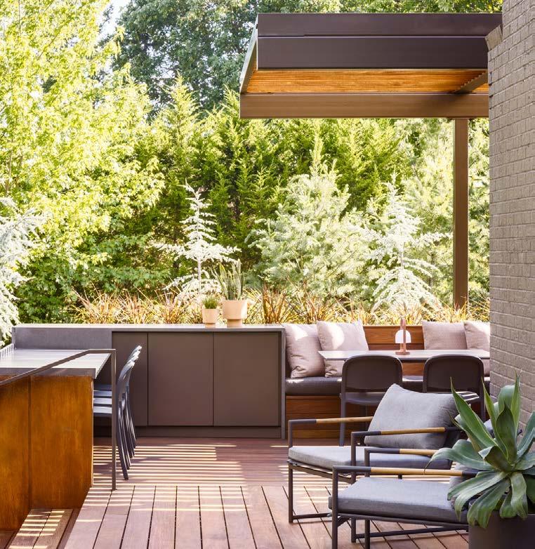
Every detail of The Oasis was designed with connection in mind. Nothing can be taken away without affecting the overall function of the space. Each newly designed detail is cohesive with the overall home, yet unique in its own way.
ARCHITECT
SixTwentyOne
INTERIOR DESIGNER


Lisa Schmitz Interior Design
CONTRACTOR
Ambassador Construction
LANDSCAPER
Aesthetic Outdoor Design
PHOTOS BY Nate Sheets View full project details.
“
Great design is a about connecting and the Oasis project achieves this at every level.
~ judge’s comment
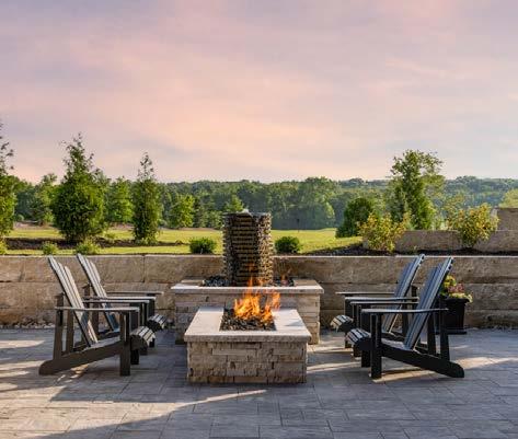
The Captiva model home in Lenexa features an outdoor oasis carved from the natural planes of the wooded lot. The team was challenged to use landscaping features to enhance outdoor living and privacy without disturbing the natural scenery. All mature trees were to be preserved and incorporated into the design.
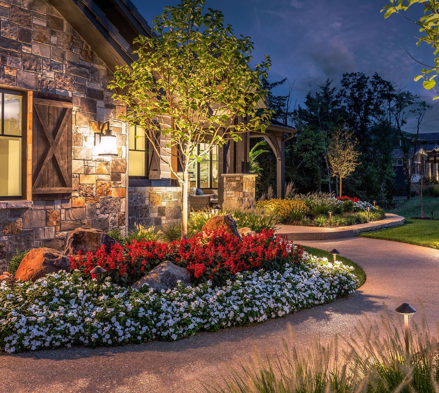
In the front yard, luxurious curb appeal was created by custom-designing an address monument with a hanging light fixture, raising the landscape beds and designing a natural-looking sweeping walkway and stone retaining walls. To boost visual interest and function here, a natural stone floating bench added at the edge of the walkway allows visitors to sit and take in the landscaping and view.
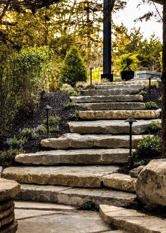
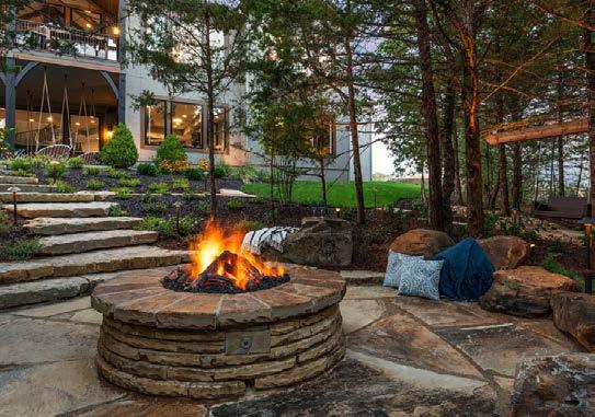
The backyard offers a relaxed, casual feel with a custom-built and installed hanging daybed under the lanai, as well as a hanging swing nestled in the adjacent cedar trees to add more seating and ambiance. A fire pit is strategically positioned among mature cedar trees, with limestone boulders randomly placed around the fire pit to provide seating. A natural stepping stone walkway and stair accesses the lower patio.
ARCHITECT
KC Architecture
CONTRACTOR/DESIGNER
B.L. Rieke Custom Homes
LANDSCAPE ARCHITECT

EPIC Landscape Productions
PHOTOS BY Josie Henderson
View full project details.
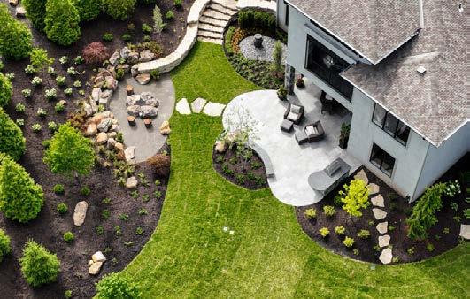
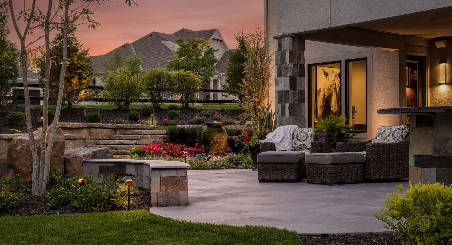
The perfect complement to the homeʼs elegant, “refined coastal” style, the Pensacola model homeʼs ultra-luxe outdoor spaces were designed for everything from casual day-to-day relaxation to fanciful weekend entertaining. Envisioned as the ultimate outdoor escape, this contemporary corner lot features an outdoor kitchen and sitting area, an extended patio, a covered lanai, an herb garden (cheekily called the Garden of Eatinʼ) and an ambient fire pit surrounded by mountain boulders.
The team was challenged to incorporate style and design elements from the home into the landscape and make it feel secluded from the street. They created privacy with carefully selected landscaping elements like precision-placed trees, including a row of columnar
RESOURCES
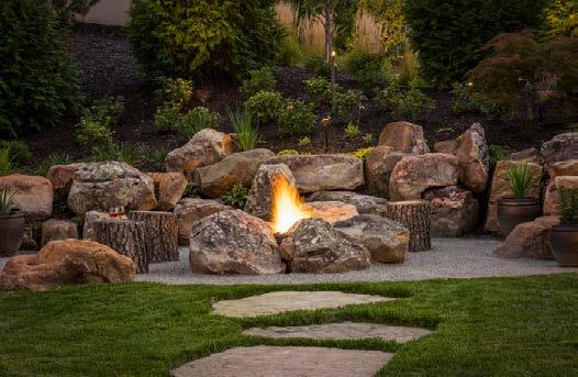
evergreens and shrubbery that act as a screen against the street and sidewalk. A fire pit area is tucked into the sloping hillside. The pit is designed to look like naturally falling boulders; the seating is a circle of wood logs.
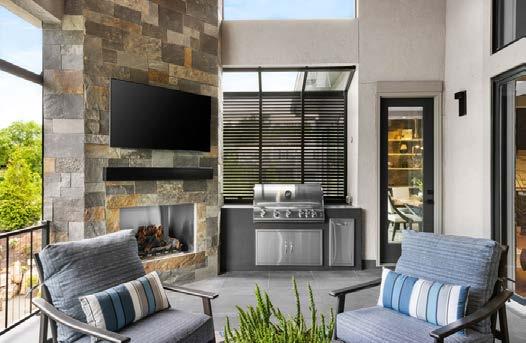
To complement the homeʼs design and add more texture and color, they installed black porcelain pavers on the lower-level extended patio. Stacked-stone curved steps on both side yards provide easier access to the back entertaining space. For utility, they added a stonefaced second grilling area with an extended granite countertop on the lower-level patio. For entertainment and relaxation, a covered lanai includes an outdoor TV area with lots of seating.
ARCHITECT
KC Architecture
CONTRACTOR/DESIGNER
B.L. Rieke Custom Homes
LANDSCAPE ARCHITECT
EPIC Landscape Productions



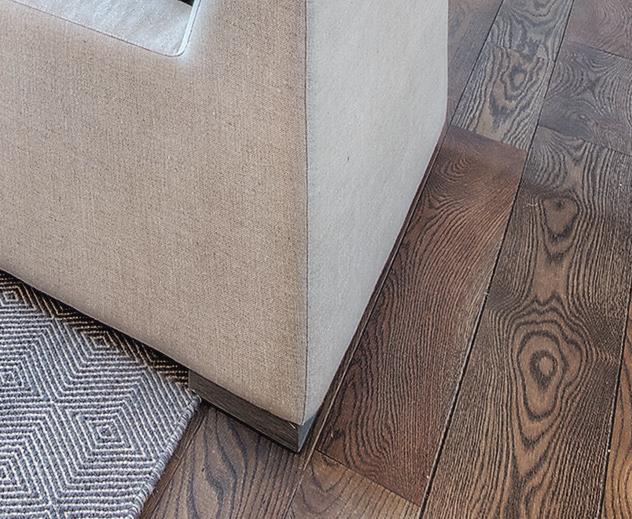
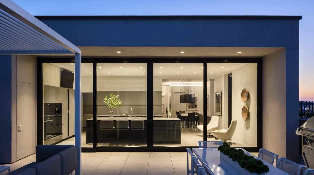



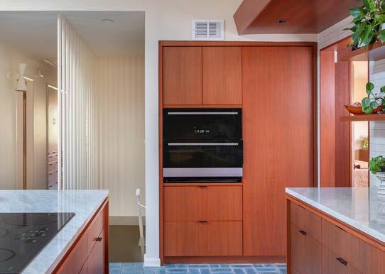
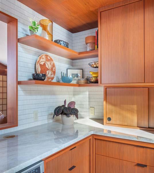
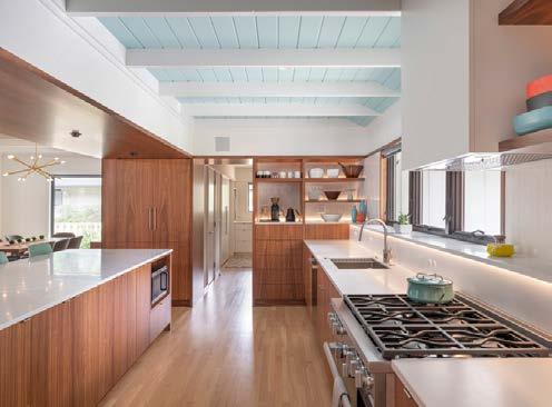
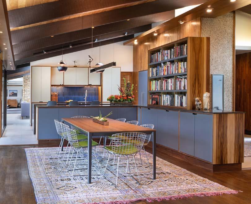
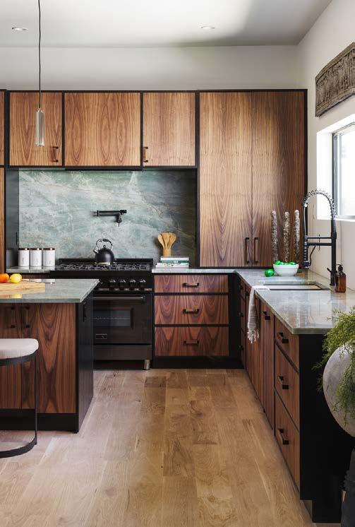
The design team was tasked with updating this mid-century modern classic, while keeping the original integrity of the house as well as the existing materials. The architects worked closely with the owner to design a room that opened up to the other living and dining areas of the house. The existing kitchen had low ceilings, aging cabinetry and inadequate natural lighting.
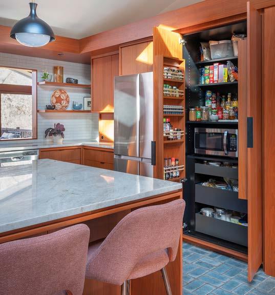
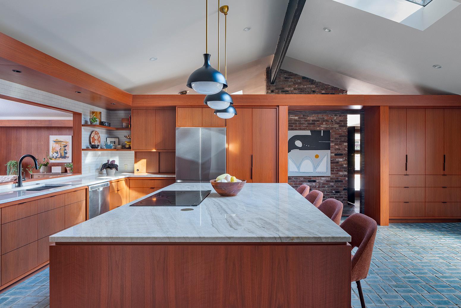
Matching new walnut to the vintage walnut paneling in the adjacent room was a challenge. They explored vaulting the existing kitchen ceiling and cutting new openings into the living room. It was a priority of the owners to keep the existing blue tiling and walnut paneling in the living room. Grainmatched walnut was used throughout the kitchen with a stain to match the original paneling in other rooms. Quartzite counters and mosaic tiles were used as a nod to mid-century design. Clean modern lines were designed into the new casework to bring the kitchen up-to-date. New soff its wrapped in walnut were used to uplight the vaulted ceiling.
ARCHITECT
Studio Build
CONTRACTOR
Form and Function
PHOTOS BY Bob Greenspan
View full project details. Engineer:

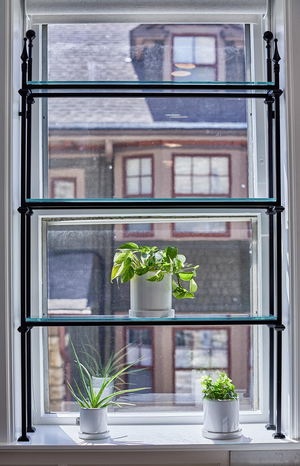
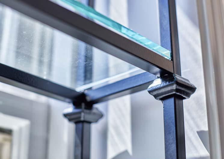
The large windows in this kitchen were a major focal point, and the design team didnʼt want to miss an opportunity to make a statement. They also wanted the design to feel like it belonged in this century-old home.
Their design needed to be easily constructed at a reasonable price point. It was challenging to do this while giving the space an old and original feel. They also knew they needed to leave space for a simple window shade as these windows face west and the afternoon sun can be overwhelming.
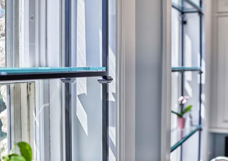
They designed a wrought iron structure with glass shelving. To give it a unique and older feel, they utilized standard iron collars and finials. Once fabricated, they were painted in a black finish and installed. The shelves are the perfect place for plants and herbs, as well as a showcase of the kidsʼ latest creations.
PHOTOS BY Ryan Hill/8183 Productions
View full project details.

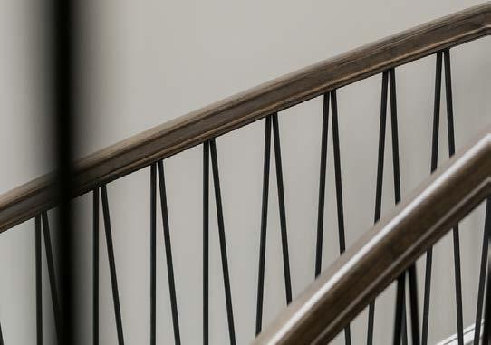
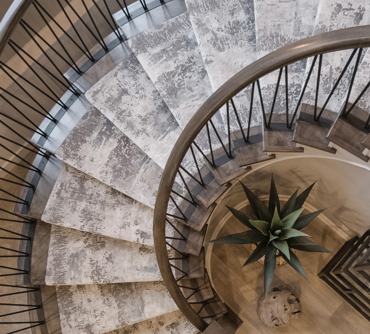
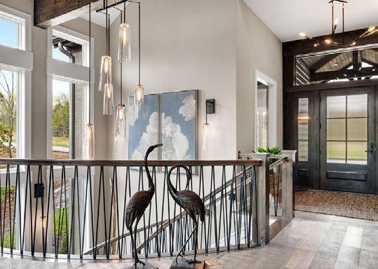
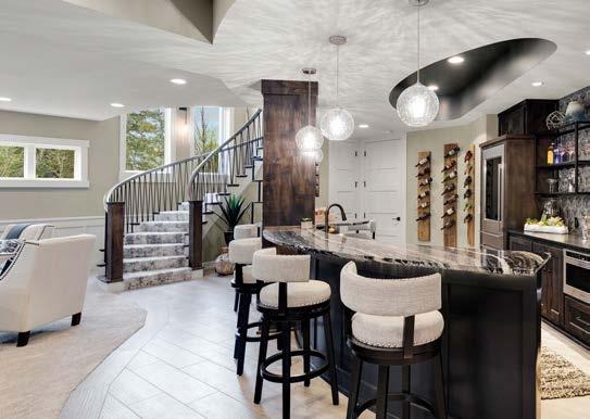
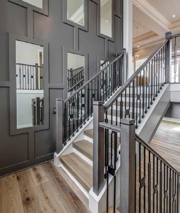
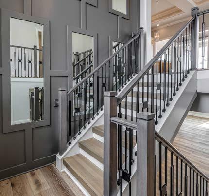
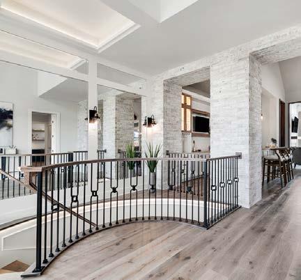
Delicately detailed and beautifully handcrafted, the Captiva model homeʼs dramatic curved staircase gracefully blends wood and iron with grand sweeping curves and free-flowing architecture. A one-ofa-kind, spare-no-expense design, this elegant stairway is further accented by a custom-made iron and hand-blown glass light fixture and sconces.
The teamʼs biggest challenge when designing and building this custom project was having to rebuild the entire staircase to fit the “flow and curve” from the main level to the lower level. They solved this issue by rebuilding the space twice to get the perfect location and curve for the staircase and stairwell. The stairs needed to land and enter into the lower level between the family room and the bar for the ideal walkway.
They also had to figure out how to match the curve of the staircase with a custom iron rail pattern that matches the style of the home. To further accent the style, they finished the stairs with wood end caps and beautiful sculptured carpet that connects the upper and lower floors.
ARCHITECT
KC Architecture
CONTRACTOR/INTERIOR DESIGNER

B.L. Rieke Custom Homes
PHOTOS BY Josie Henderson
View full project details.
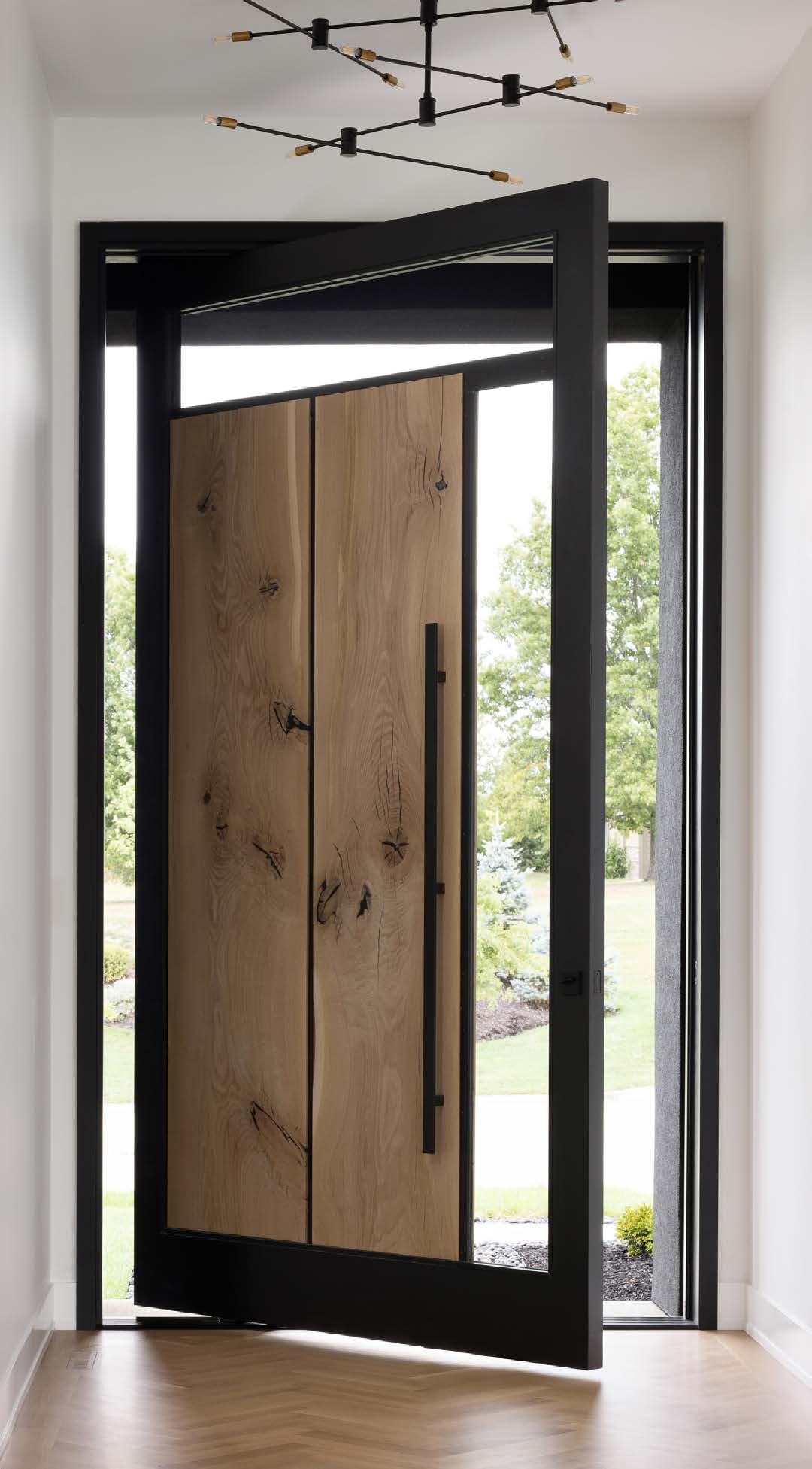
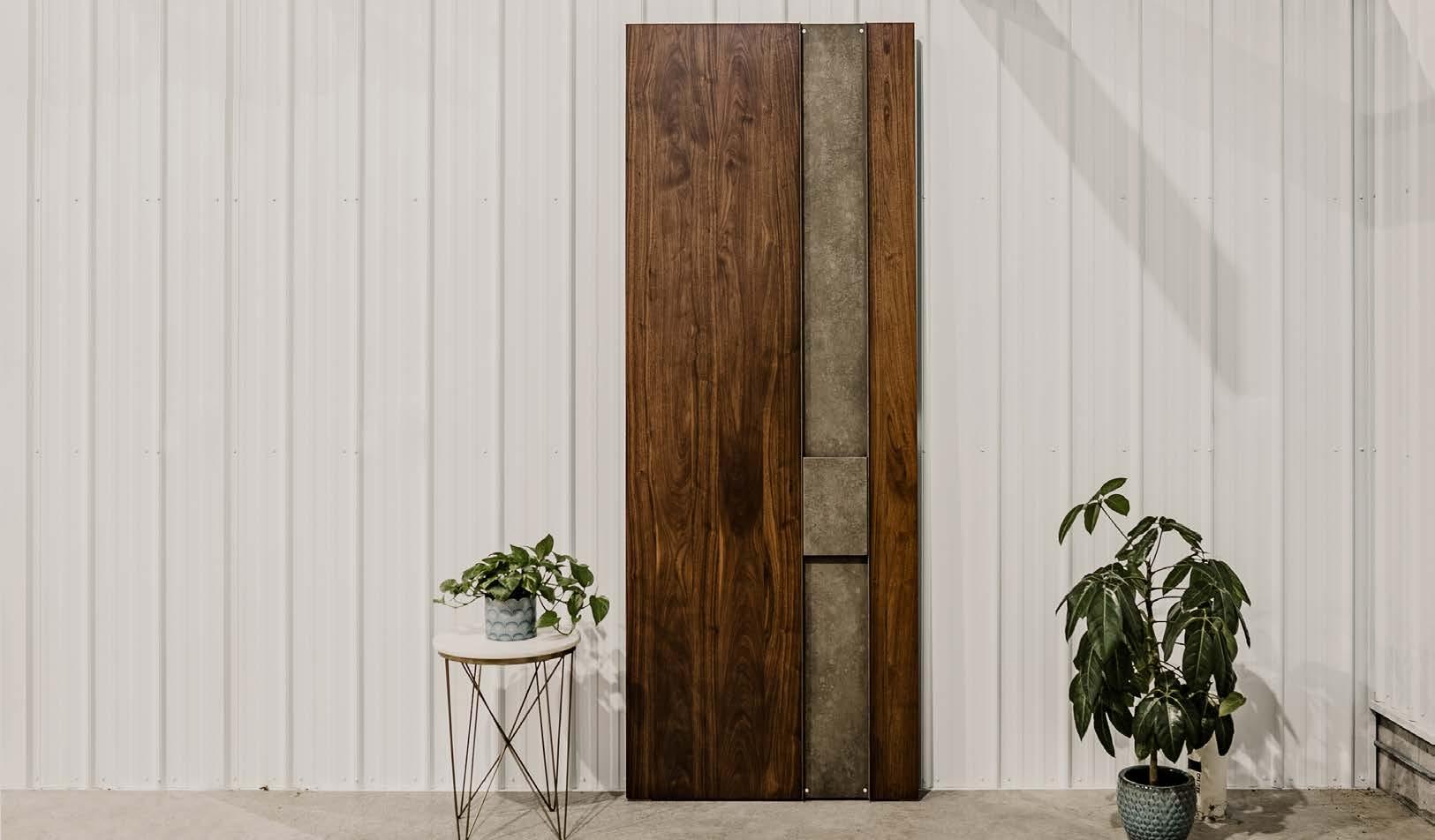
The goal when envisioning this new home was for it to be functional and aesthetically clean with modern details. A unique, solid wood front door became a focal point. Weather in Kansas City demands that it be functional in the heat, rain and snow, but the ownerʼs desire was to have an offset pivoting wood door typically seen in more moderate climates.
The designerʼs initial thought was to build a smaller door with standard hinging, a glass sidelight and a transom, but they were able to source heavy-duty pivoting hardware that allowed them to make one large door the entire size of the opening and handle 600 pounds of weight. They engineered the entire door as one unit with an internal metal substructure that provided stability. They sourced two book-matched white oak slabs knowing they would expand and contract with the elements. The solution was to have those two slabs “float” inside that metal framework to allow for movement. The metal framework was clad in wood, with integrated glass to provide natural light at the entry. They used an automatic door bottom seal and weather stripping to tighten up the door at the perimeter. The end solution is really the first thing people see as they enter the home and has certainly become a wow-factor.

View full project details.
RESOURCES
Architect: Wolfgang Trost
Interior Designer: Kristen Ridler
Interior Design Contractor: Madi Mali Homes New Home
Community: Southern Lakes Real Estate Agent: Doug Mitts
Flooring: Acme Floor Lighting Fixtures: Wilson Lighting
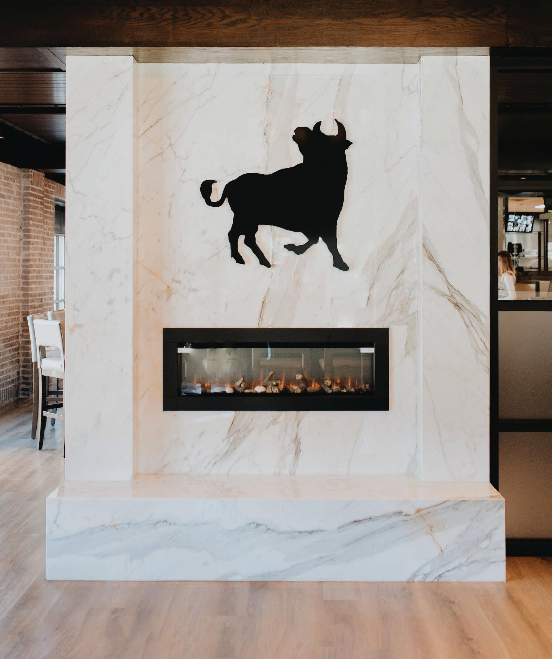
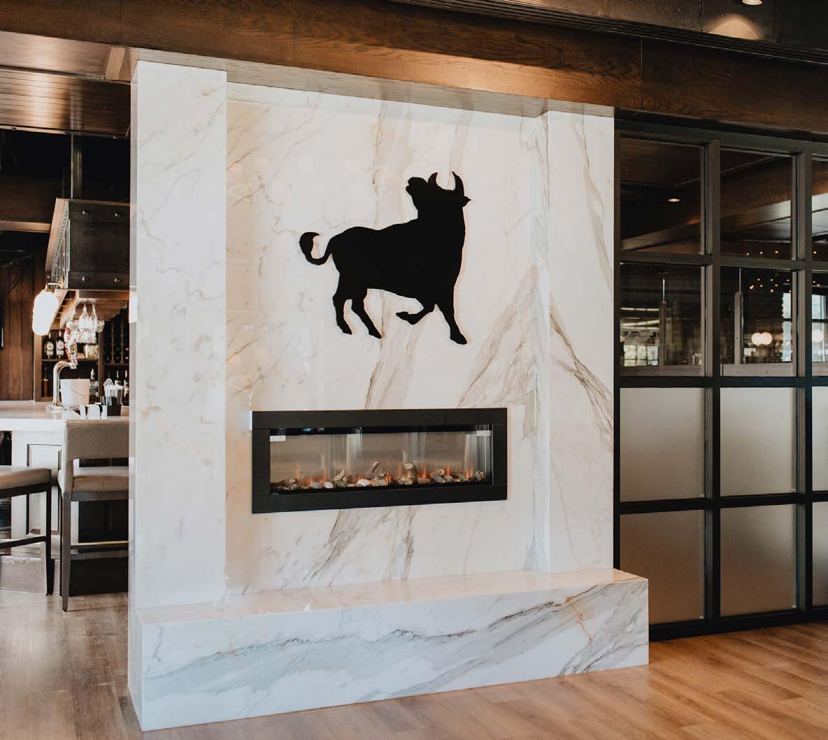
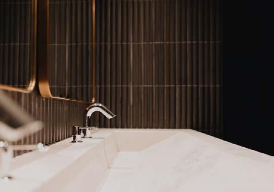
The owner of Jack Stack Barbecue wanted to update his Country Club Plaza restaurantʼs classic ambiance with modern elements. The renovations included a new bar, bathrooms and the grand entryway—all to be installed in one week!
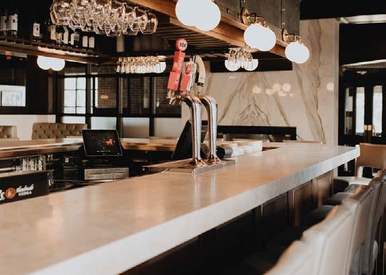
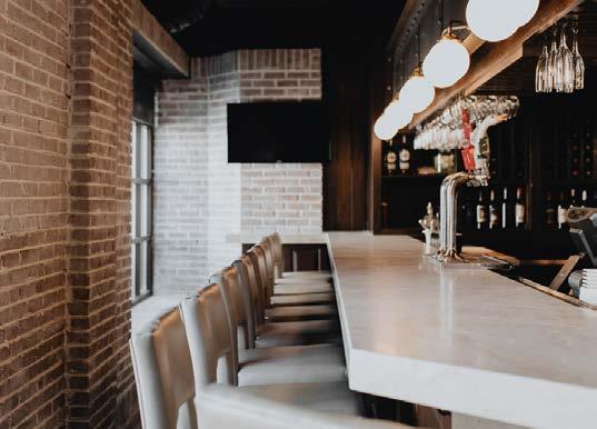
Working with stone brought additional challenges. The minor issues consisted of having wall-to-wall floating vanities with handcrafted integral sinks in each bathroom. Fitting that just right with proper support can be diff icult. The bar top has a beautiful custom mitered edge and several seams because of the enormity of its size. Executing tight seams and aligning vein flow takes time and skill.
The major challenges centered around the fireplace. Calacatta Macchia Vecchia marble that was hand-selected by the designer arrived cracked from the supplierʼs warehouse, leaving little time to find new material.
This marble has beautiful veining in a floor-to-ceiling installation that wraps around the two-sided fireplace. The veins were carefully book-matched on each side as much as possible, given the layout and slab size. They were able to pull this off with only one section sacrificed, and that section is hidden from view.
DESIGNER

McCroskey Interiors
CONTRACTOR
Goebel Mitts Construction
SUBCONTRACTOR
Rocktops
PHOTOS BY Taylor Douglas
View full project details.
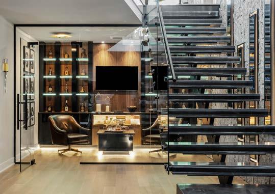
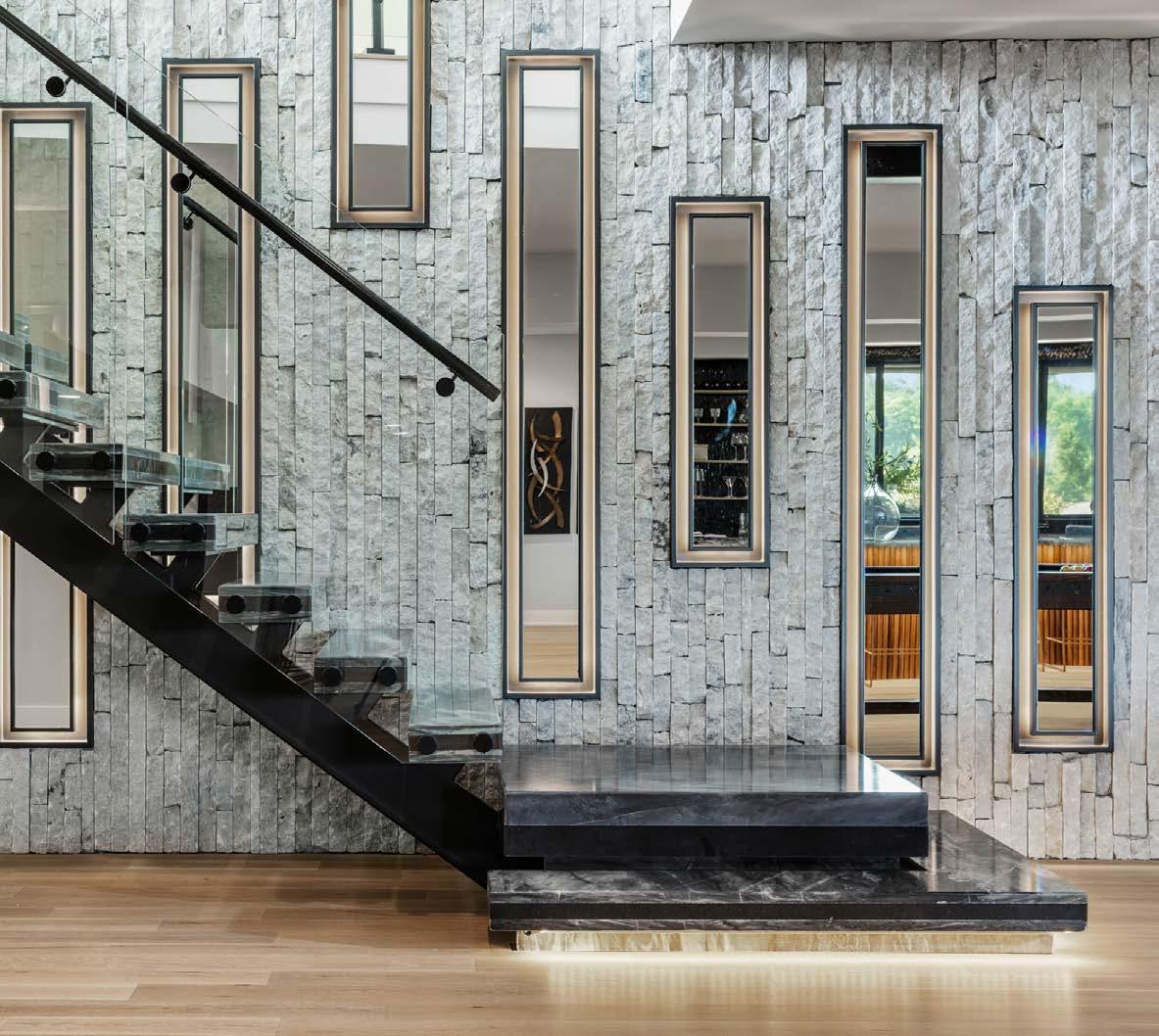
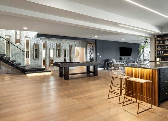
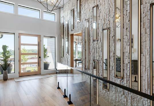
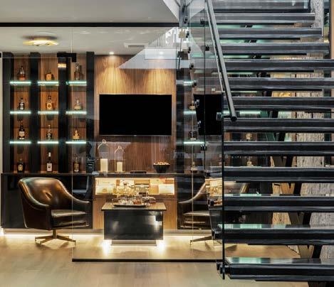
The floating steel-supporting staircase is a feat of engineering and a work of art. Quartzite treads “float,” while the glass handrail provides safety without detracting from the open feel. White marble ledge stone adds natural texture to the feature wall that continues up to the entry. Mirrored shadow boxes set at random heights bounce the light to brighten the lower level and add to its playful sophistication. The teamʼs challenge was to marry two floors of the home by creating a staircase that is elegant but so open and approachable that you are drawn to explore the lower level. They had the vision to create a self-supporting steel and glass staircase that matches the contemporary industrial style of the home. The team collaborated with design engineers, structural engineers, and steel, glass and quartzite fabricators to create this central design feature. The design team imported black quartzite stair treads to coordinate with the stairwayʼs black steel support structure. The treads were specially chosen for their subtle white swirls that coordinate with the adjacent white marble two-story ledge stone wall. The embedded backlit mirrors light the passageway and reflect the beauty of the stairwayʼs incredible design. The selfsupporting stair system allows a full view of the mirrored and marbled wall and the glass-walled bourbon room. The two-story marble ledge stone wall even pours into the bourbon room located behind the stairs.
ARCHITECT
Bickford & Company
CONTRACTOR
Willis Custom Homes
INTERIOR DESIGNER
Judd Designs

PHOTOS BY Josie Henderson
View full project details.
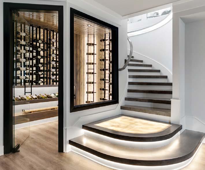
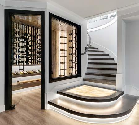
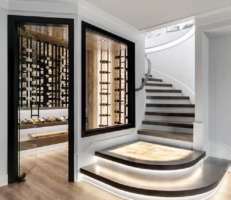
Tucked under The Pensacola model homeʼs floating staircase is a gem—literally. A glass-enclosed wine storage and display space features a suspended agate slab backlit with LED pixel panels. To ensure the spaceʼs longevity and utility, the team cleverly designed the LED pixel panels to be easily accessed and removable via an open channel located behind the permanent vertical agate slab.

The space includes a custom wine bottle rack backed by white oak planks, a floating live-edge walnut slab table top and an industrial-style steel tube frame structure.
Given the complexity of location and compact size under a floating staircase, the team innovated several solutions. They carefully designed and installed the backlit wood planks behind the wine display rack without obstructing the function of the LED channels, maximized space by installing a suspended walnut slab table top inside the wine room and installed cabinet doors underneath the slab for extra under-stair storage. Finally, they familiarized their team with the new LED pixel panel technology and worked closely with the electrician on its installation and function.
ARCHITECT
KC Architecture
CONTRACTOR/INTERIOR DESIGNER

B.L. Rieke Custom Homes
PHOTOS BY Josie Henderson
View full project details.
RESOURCES
Engineer: Apex Engineers New Home Community: Timber Rock Development Real Estate Agent: Weichert Realtors, Welch and Company Cabinets: Miller’s Custom Cabinets Countertops: SCI Surfaces Electrical: Elite One Electric Flooring: SVB Flooring Fabrication Company: Custom Products (Staircase Structure & Custom Ironwork), Architectural Surfaces (Agate Slabs), Buildermaker (Trimwork) Hardware: Locks & Pulls Lighting Fixtures: Rensen House of Lights Paint: Millennium Painting Company Glass Panels: Fountain Glass
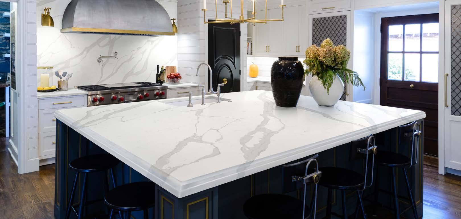



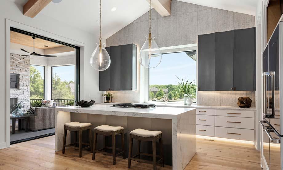
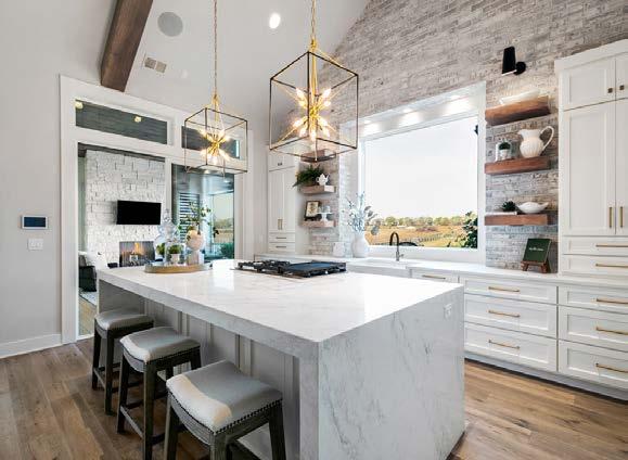



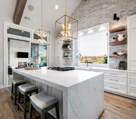







The clients wanted a large, modern kitchen with a large island, as well as French doors to their backyard for al fresco dining. The redesign also needed to capture a vintage feel, inspired by the homeʼs mid-century construction. An old addition on the back of the home did not feel cohesive, so they designed a new 242-square-foot addition, removed the exterior wall and combined the existing kitchen with a portion of the expansion.
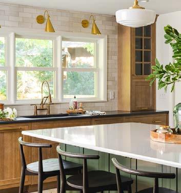
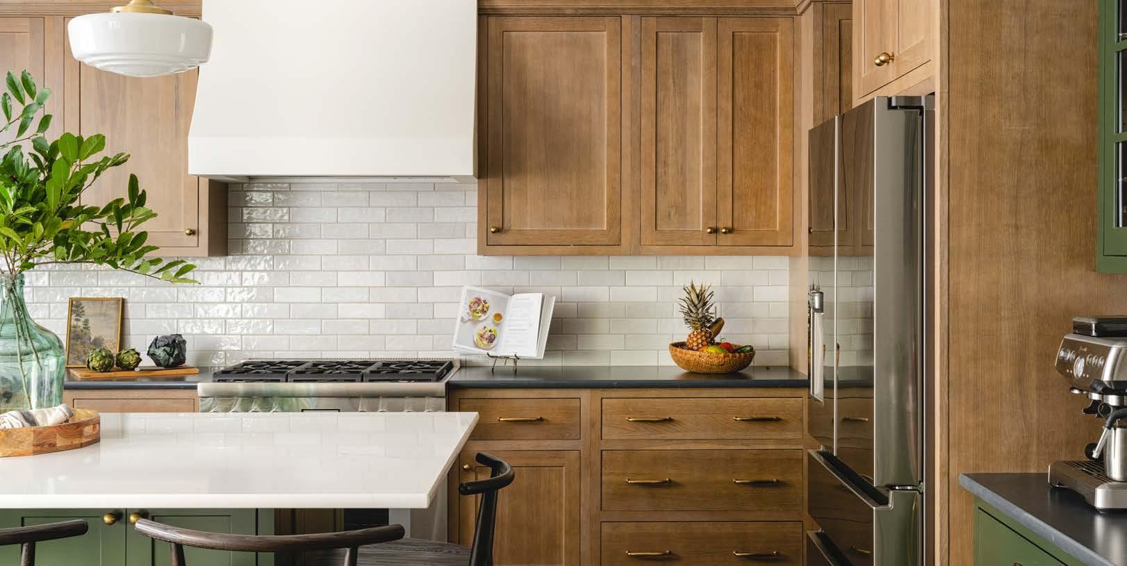
Once framing was completed, the team faced a challenge: the floors had three different heights. They used different thicknesses of subfloors and self-leveling compounds to level it off.
They ran into another challenge with the range wall; the new and old framing connection point caused a slight bow in the wall, which they didnʼt discover until the drywall phase. They removed the drywall and furred the wood to level the wall—not once but twice.
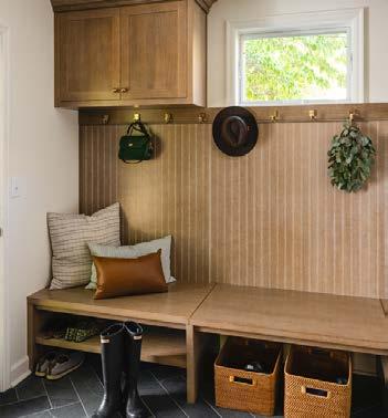
The addition doubled the kitchenʼs size and allowed the addition of a large island with seating for six. A new mudroom comprised the other section of the addition, and they changed the garage entry into the home to flow through the mudroom, which can be closed off using a pocket door.
DESIGNER/CONTRACTOR Schloegel Design Remodel

 PHOTOS BY Matthew Anderson
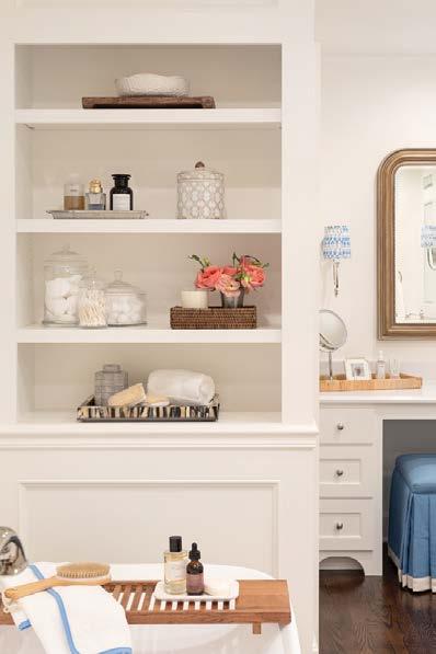
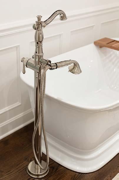

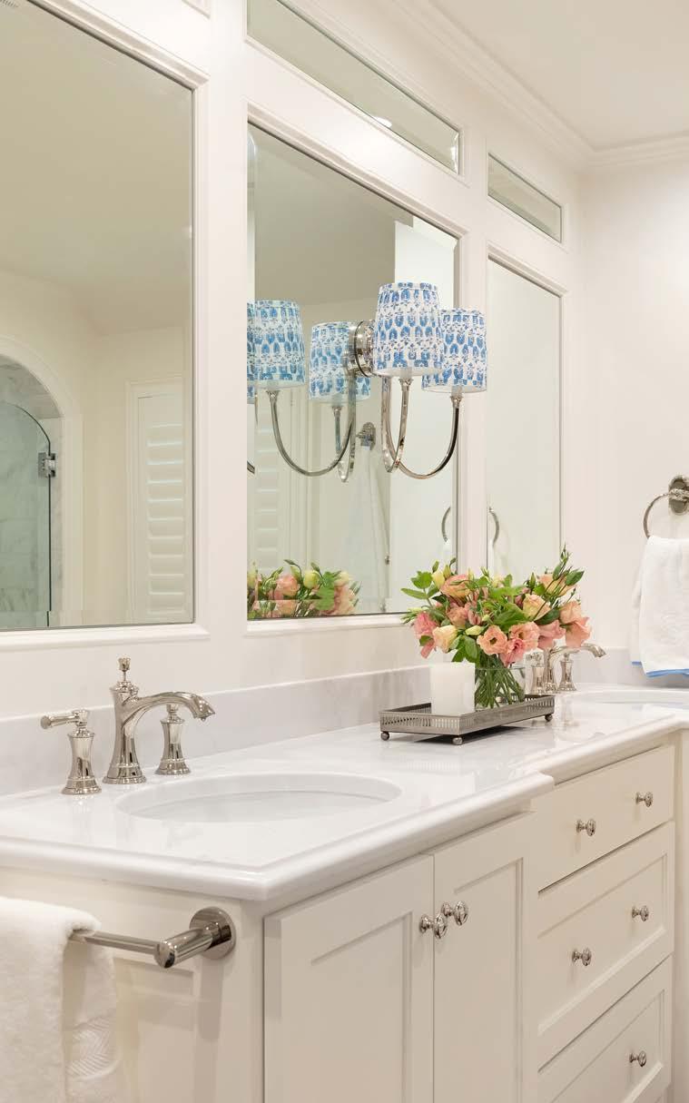
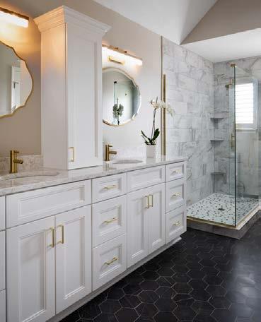
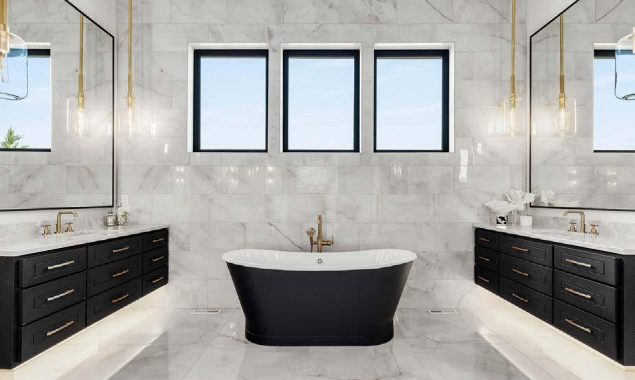
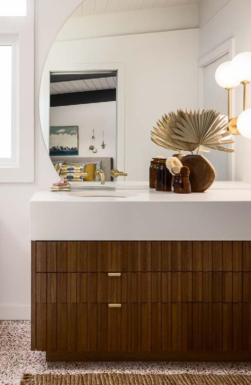
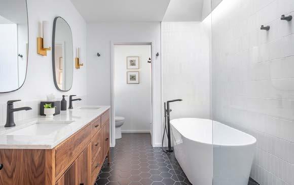
This primary bath redesign presented several challenges for the team. The ceiling was more than 1½ inches out of level, so furring strips were installed prior to drywall to compensate. One wall contained unexpected mechanicals, so they furred out the rest of the vanity wall to make the design more intentional. To achieve the elevated look of the arched shower entry, the millwork was custommade and installed prior to the tile work. The existing HVAC system did not have enough capacity to serve the new area over the garage; by installing a new mini-split system for the expanded closet, they ensured that it would have adequate heating and cooling. Aesthetics and fixtures were updated throughout. The shower entry was pulled flush with the existing wall, adding approximately six square feet to the shower and allowing room for a floating shower bench. A water closet was added for privacy. The double vanity features soft-close drawers with outlets that hide hot tools. The 4-inch splash protects water from affecting the custom-built millwork wrapping the beveled mirrors. A new makeup vanity was added, featuring overhead and sconce lighting and two drawer stacks dedicated to makeup storage. Several other storage solutions were added to the bathroom, including a full-height closed storage cabinet with an integrated laundry hamper, a shower niche and a custom bookcase at the end of the freestanding tub. Finally, red oak hardwood flooring brought warmth to the room.
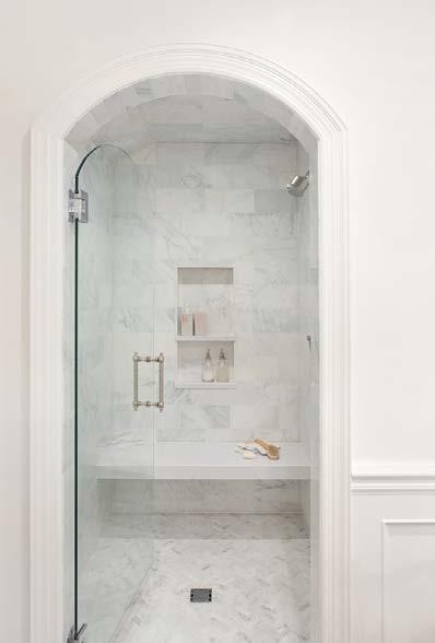
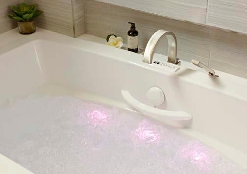
The clients wanted to create the primary bathroom of their dreams. The goal for this ensuite was to create a relaxing retreat offering restorative benefits and a place for the homeowners to reconnect.
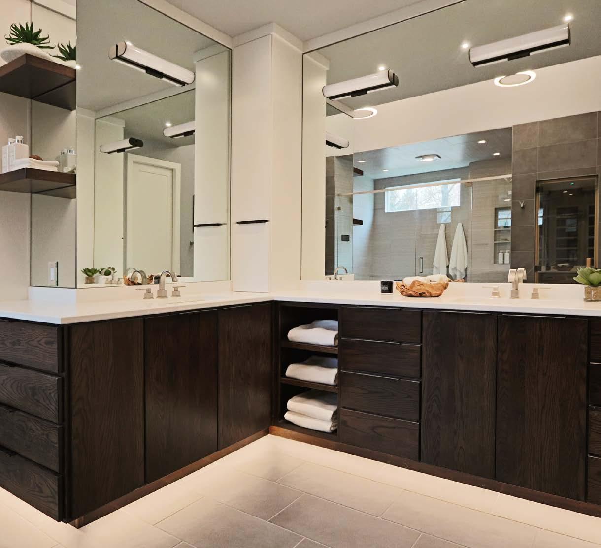
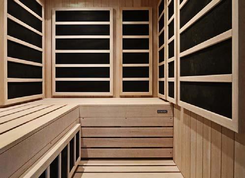
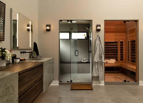
One of the design teamʼs challenges was space versus needs. The clients wanted to add a two-person infrared sauna and increase the size of their bathtub without giving up a two-person shower, linen closet and separate vanities. The bathroom also lacked storage and was cluttered.
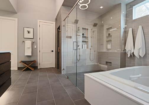
The greatest challenge was discovering a TGI floor joist. This was problematic for the zero-entry shower. The homeowners were committed to the plan as designed and chose to raise the flooring in the bathroom and adjoining closet. The height discrepancy between the bath and bedroom was resolved by using ADA accessibility methods to create a gentle, unnoticeable decline from the bathroom floor under the carpeted bedroom.
The design solution for the plumbing fixtures included a custom sauna and combining the shower and hydrotherapy tub in a glass enclosure. To maintain privacy in this area and still allow in natural light, one window was replaced with a shorter window installed closer to the ceiling.
DESIGNER

Amy Krause Design
CONTRACTOR
Damon Rau Construction
PHOTOS BY Laurie Kilgore
View full project details.
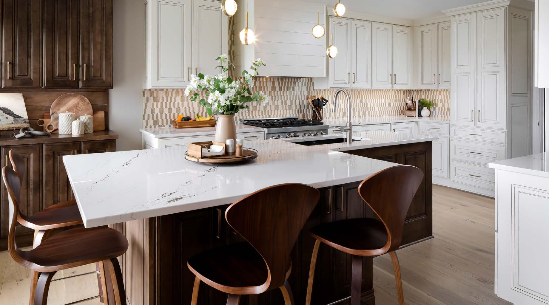
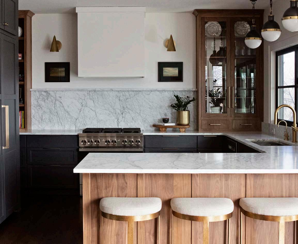
The vision for this project was a light, warm and inviting contemporary space that blends white high-gloss cabinetry with other muted warm tones throughout the home. The goal was to have an open space conducive to entertaining and family gatherings, helping with homework and as a home off ice area. A desire for unique design details and materials and high functionality were important to the project.
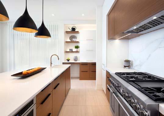
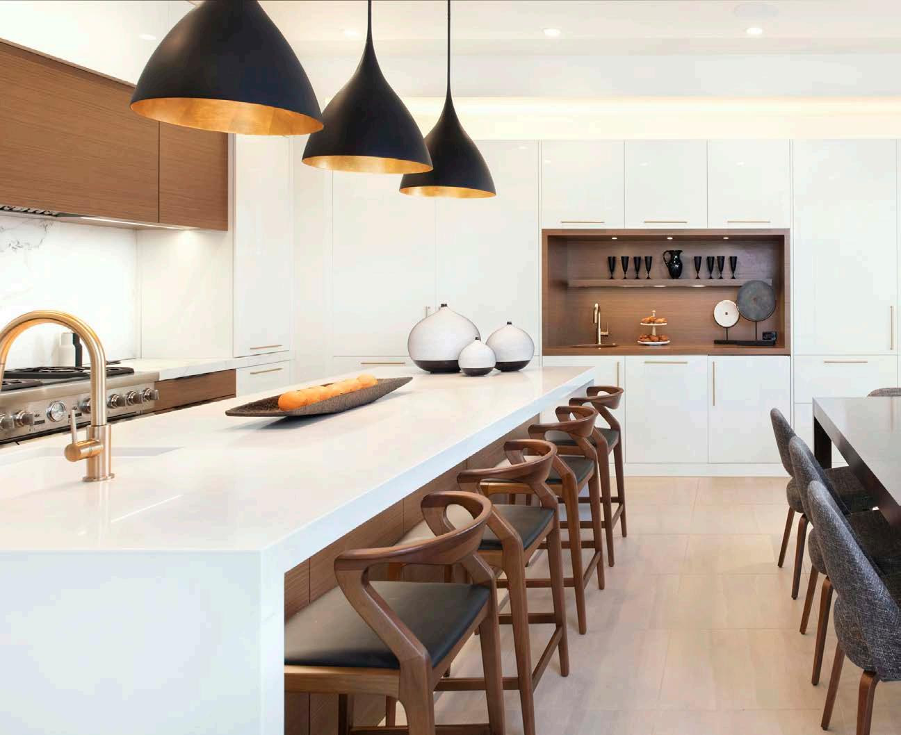
The design teamʼs main challenge was to redesign a space that fit the clientsʼ lifestyle within the space allotted. The redesign eliminated the butlerʼs pantry to allow for a larger, more open kitchen. A sliding backsplash storage unit was designed behind the range, capturing needed storage space with marble sliding panels for closure. An engineered walnut veneer added
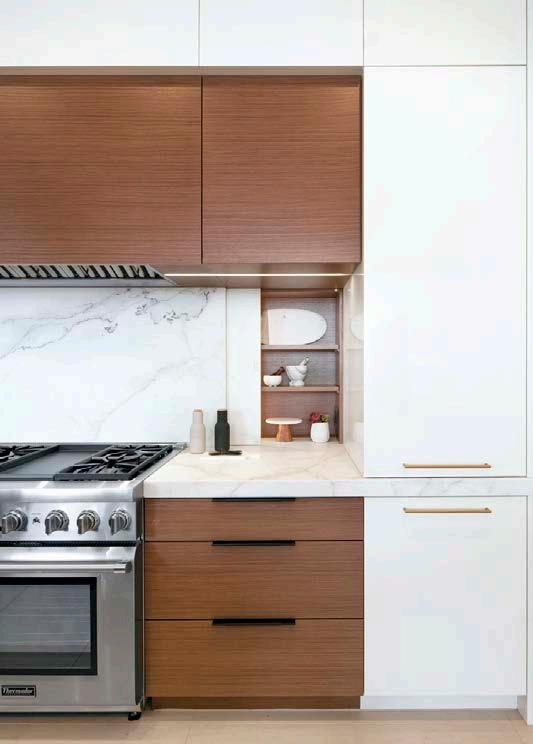
warmth and visual texture. On the island, a “social sink” was placed at one end to allow for multiple users, thus expanding the countertop work area. In the home off ice area, file drawers were added, and a lift-up wall cabinet keeps everyone organized and devices charged.
Calacatta Lincoln marble in the range area provides a unique focal point as the main design detail in the kitchen. The designers chose a flat grain rift-cut white oak for the wet bar countertop, custom-stained to match the engineered walnut cabinetry panels. This top has a permanent finish that is impervious to water and stains. Built-in refrigeration with cabinetry panels mirrors the large pantry cabinetry. The mixing of stainless, brass and black finishes adds to the feeling of warmth and ties in with other finishes throughout the home.
KITCHEN DESIGNER Kitchen Studio: Kansas City
INTERIOR DESIGNER Taylor Interior Design

The goal for the Long Island project was a complete upgrade to give the clients a larger and more functional kitchen. The design team needed to provide better prep space, extra storage and room to entertain, while also giving the kids a place to do their homework. Another goal was to allow the clients to walk from the garage into a mudroom instead of straight into the kitchen.
A few challenges they faced were working within the existing footprint and finding space to work in a mudroom. They reframed the kitchenʼs exterior wall in order to move windows and doors.
For flow and function, Cicada wanted the kitchen to remain open to the living room but needed to separate the two spaces. They accomplished that by adding beams to the kitchen ceiling and soff its for the beams. Built-in shelves were added to the custom hood for easy access to spices and oils. A custom table connects to the island as an extension.
To create a mudroom, they reclaimed part of a deeper third-bay garage and used it to create a landing space. A pocket door to the kitchen allows them to close off the space should it descend into disarray.
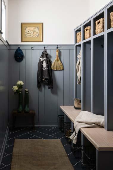
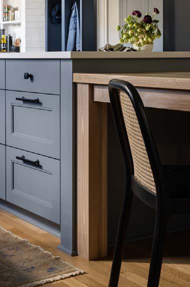
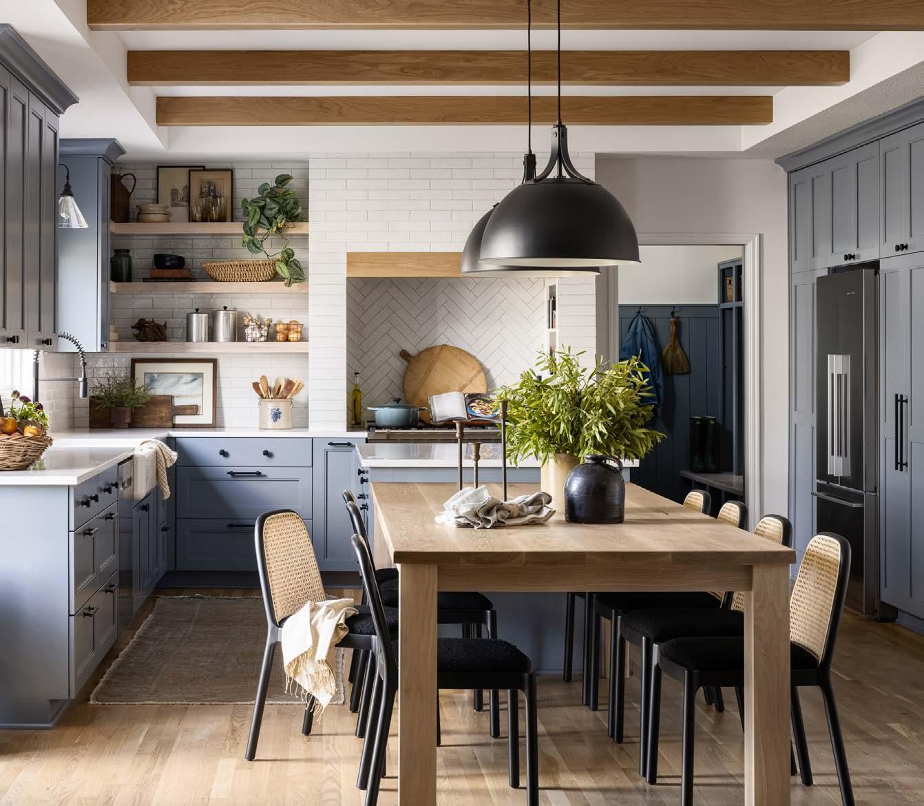
Cicadaʼs entertainment-friendly redesign provided the clients with casual dining, doubled storage and organization aids for their family of four.
Appliances: Ferguson Antiques: Cicada Co. Cabinets: Millard Lumber Countertops and Flooring: Kenny’s Tile and Floor Covering

Furnishings: CB2 Hardware: Emtek Plumbing Fixtures: Moen Lighting Fixtures: Generation Lighting, Rejuvenation Windows: Andersen
View full project details.
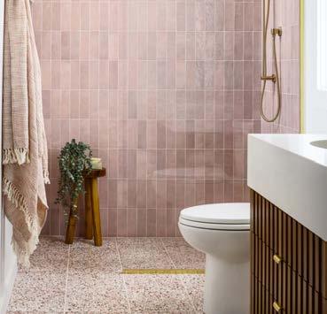

The design team was excited to overhaul a 1980s renovation gone bad. They loved working with clients who werenʼt afraid of color and were open to an alternative layout. The goals were to bring color and atomic-age mid-century modern (MCM) vibes into the design. They also aimed to let in as much natural light as possible and create a layout for entertaining large groups.
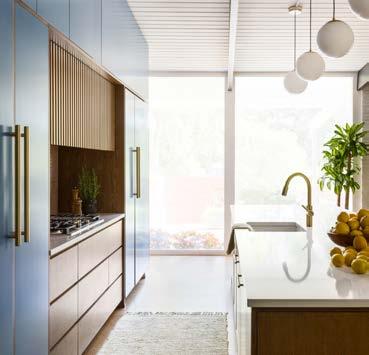
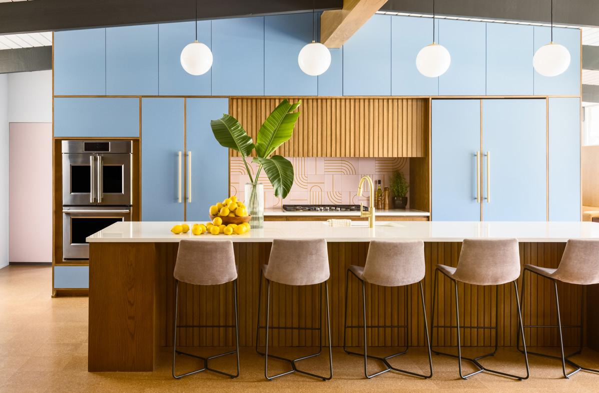
Some of the greatest challenges they faced were because of the way the home was originally constructed. The ceilings were solid wood and didnʼt allow space for rough-in junction boxes, so all new electrical work would have had exposed junction boxes. The existing floor-to-ceiling doors and windows were single-pane and needed to be completely replaced. It was also diff icult to create more storage solutions throughout the home.
The redesign provided floor-to-ceiling storage, a pantry, an integrated refrigerator and hidden cabinets within the slatted wooden hood surround and island. They added a bar area to the side of the cabinets for easy access to the lounge room. All existing doors and windows were replaced with double-pane glazing and custom trim surrounds to maximize the natural light. To add lighting, they furred out the main beam in the common area and added integrated LEDs for overhead lighting. In the primary bathroom, they expanded the footprint by moving the existing electrical panel and taking over a bedroom closet. By doubling the footprint, they were able to provide a large vanity, zero-entry shower and heated floor system.
View full project details.

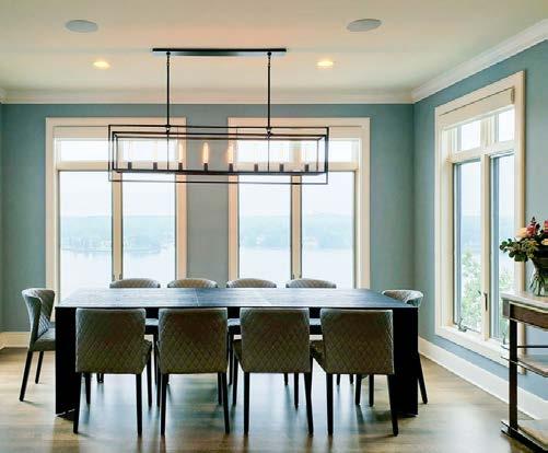
The homeowners, who host frequent gatherings with their large family, needed an eff icient working kitchen that was comfortable for entertaining. Annexing under-utilized separate rooms to create a single open floor plan was the goal. Their vision was functionality for multiple cooks, open communal dining spaces, a beverage center, great lake views and color.
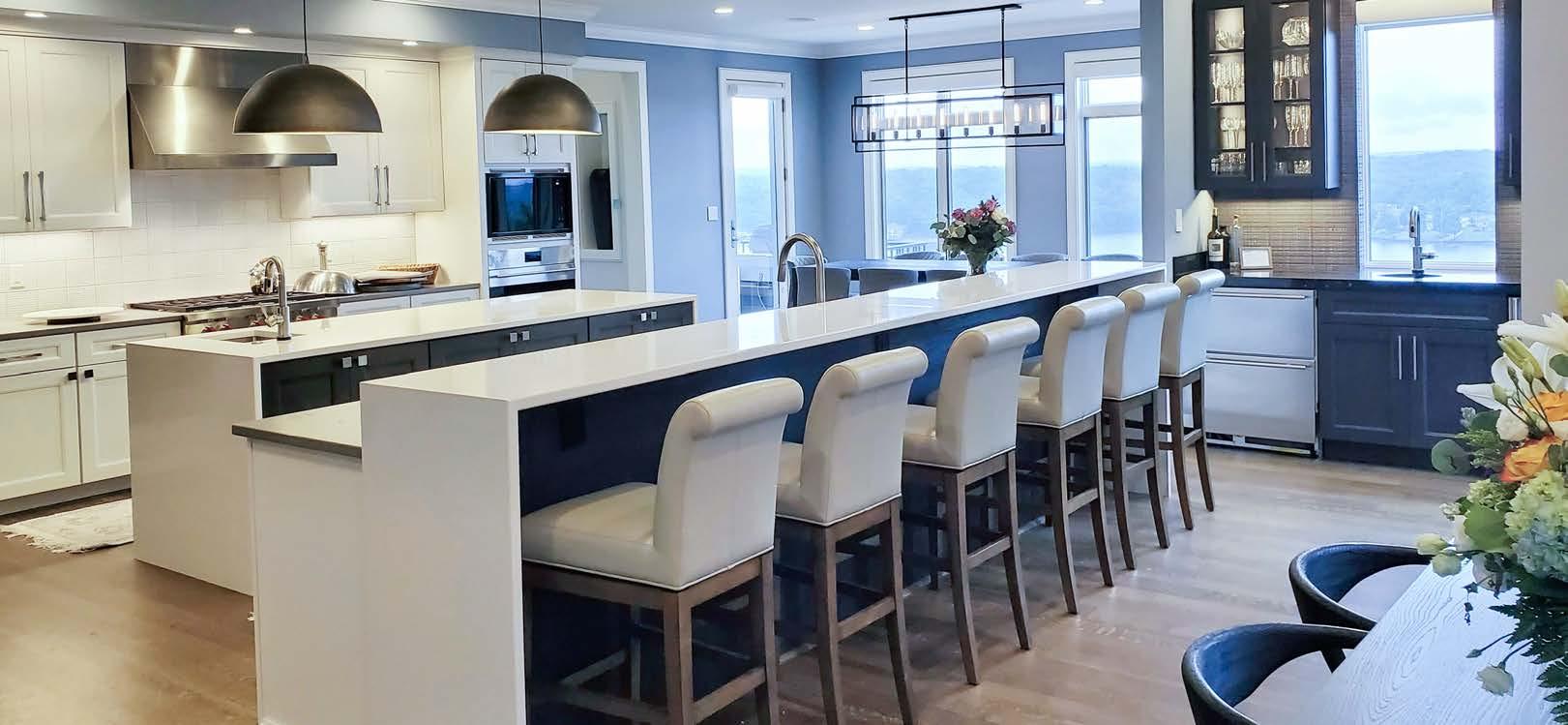
The designer started with structural challenges. To remove the load-bearing wall in order to open up the space, she needed to place a large steel beam underneath, as well as a large engineered wood beam above the opening. This process required some lower-level demolition and structural support framing for the first-floor roof load—extending the remodel beyond the kitchen walls.
After resolving that, she opened up the media room and off ice to create better flow and function. Plus, removing the

walls provided views of the lake from anywhere in the kitchen and dining areas.
The kitchen was redesigned with a functional work zone and center island, relocating the cooking appliances into the heart of the kitchen and moving refrigeration and pantry storage to the end wall. The plan can seat up to 30 people in the kitchen/dining areas.
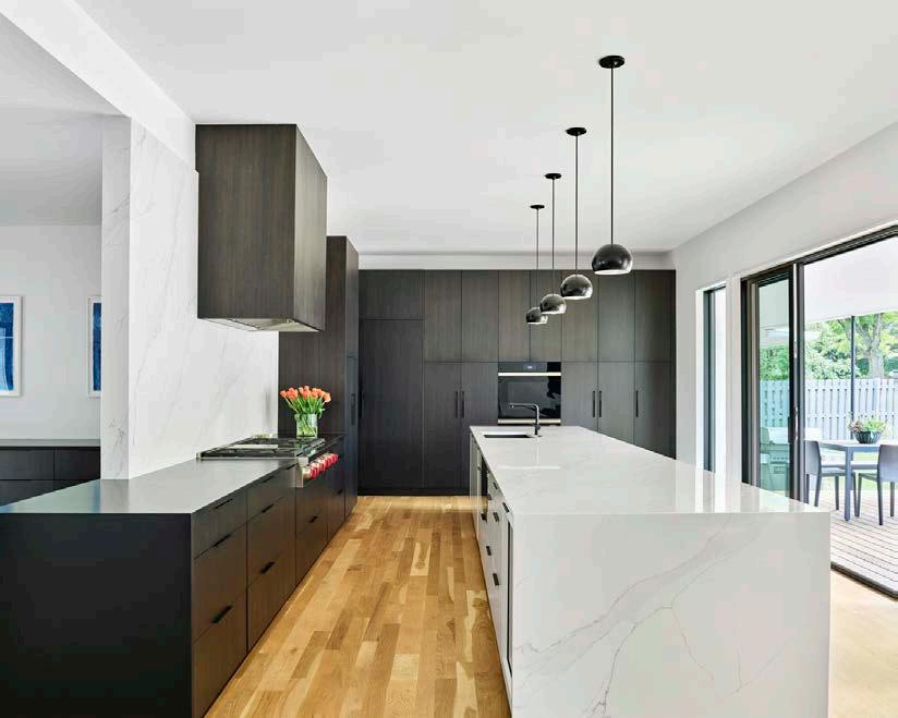
This kitchen features a mixture of finishes, materials and textures. The Snowbound White cabinets are paired with Cambria Carrick quartz in a matte finish. The center island, refrigerator wall and beverage center cabinets are maple with a semi-sheer warm black stain called Carbon. The center island features a waterfall countertop in Silestone Statuario quartz. This same material is repeated on the raised lunch counter, also with waterfall ends.
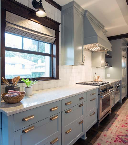
The client had recently moved into this charming Brookside home with a recently renovated kitchen. Unfortunately, as they used the space to entertain, they found it to be dysfunctional. The existing space had little unobstructed wall space and it served as a high-traff ic area from the back door to the rest of the living spaces. The dining room—although stunning—was too large and felt unwelcoming, while the living room was separated from the kitchen by the dining space and felt disconnected. They also needed a mudroom at the back entrance to hang coats and stash shoes.
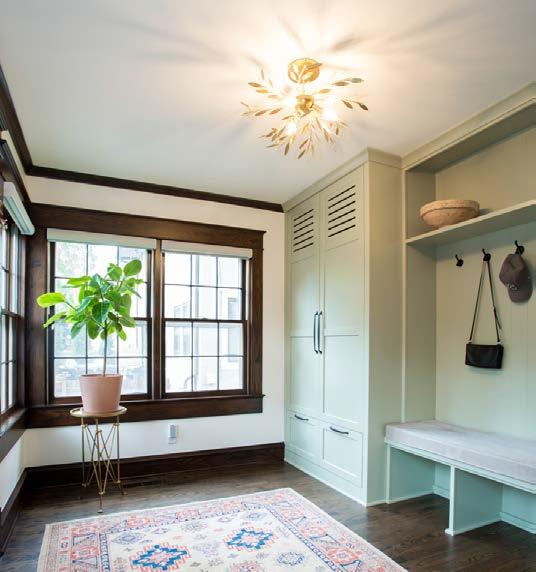
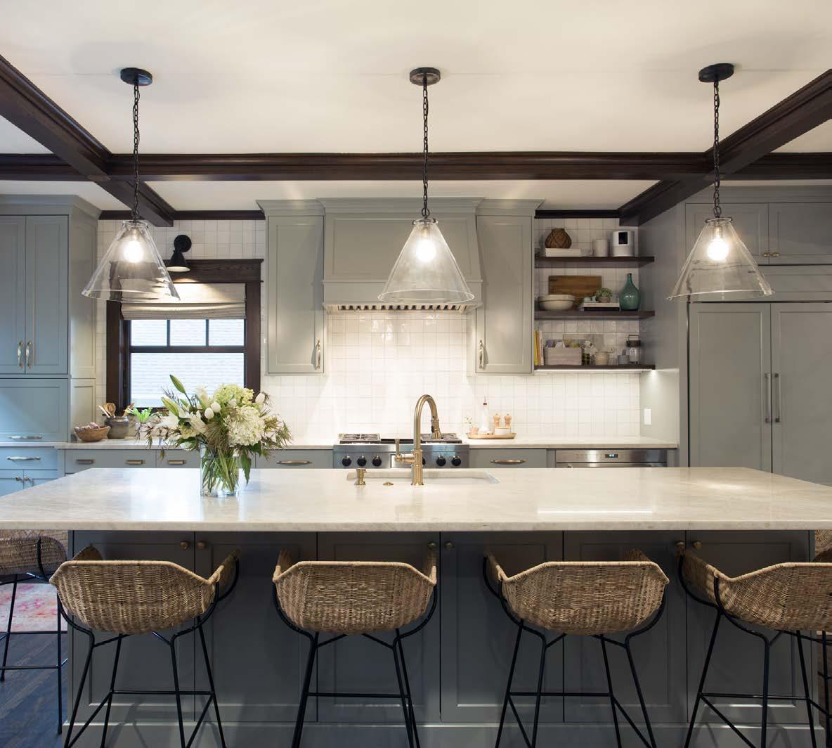
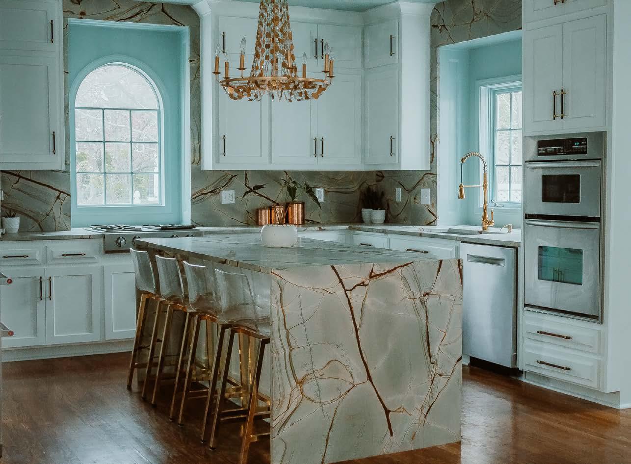
The designers determined the best solution was to swap spaces. By moving the kitchen to the dining room, the design gained the space needed to incorporate a large island that houses the sink and dishwasher and accommodates five counter stools. The mudroom solution needed minor modifications. They added a wall to hide any disarray from the rest of the first floor, which gave them a wall area to add a closet cabinet and bench. With the perfect new layout, they had to nail the finishes. A Wolf range serves as the centerpiece of the kitchen, and a large Sub-Zero refrigerator was paneled to disappear into the cabinetry. The cabinets were painted a stunning blue-green in the kitchen and a deeper green in the mudroom; the countertops are a warm Taj Mahal quartzite. The existing hardwoods were retained throughout the spaces, and when new millwork was needed, special care was taken to match the original trim details throughout the home.
DESIGNER

Orion Design
CONTRACTOR
MSC Enterprises
PHOTOS BY Jennifer Wetzel
View full project details.



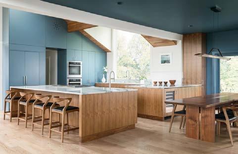






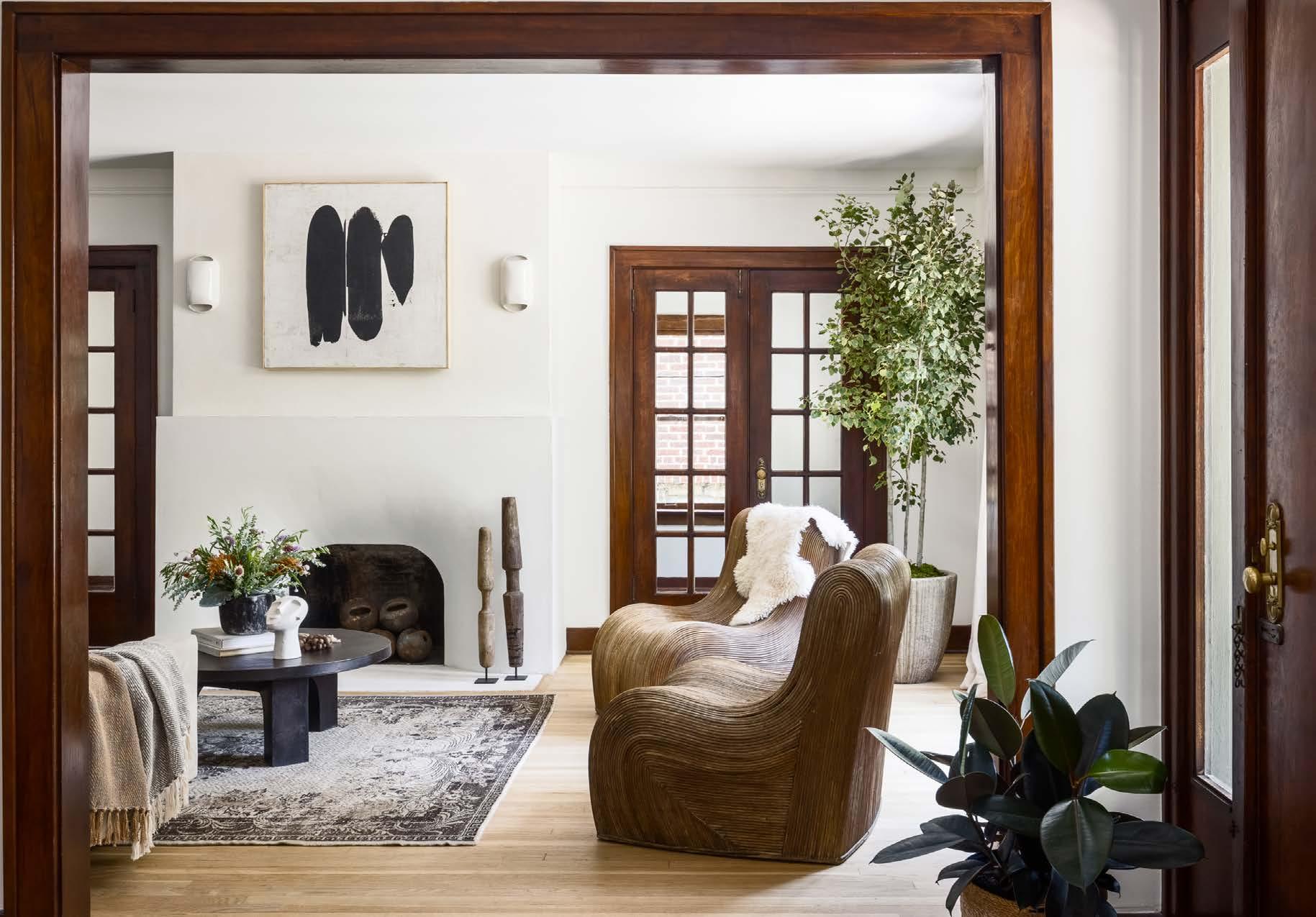
Keeping the integrity and character of this century-old home while making it more functional and unique—all within the homeʼs original footprint—was paramount to this project. The design team needed to change the floor plan to make the kitchen, dining room and upstairs bathrooms more useful for the family. The vision was to mix eclectic, organic and modern design with touches of the original characteristics—new and old, aging beautifully together.
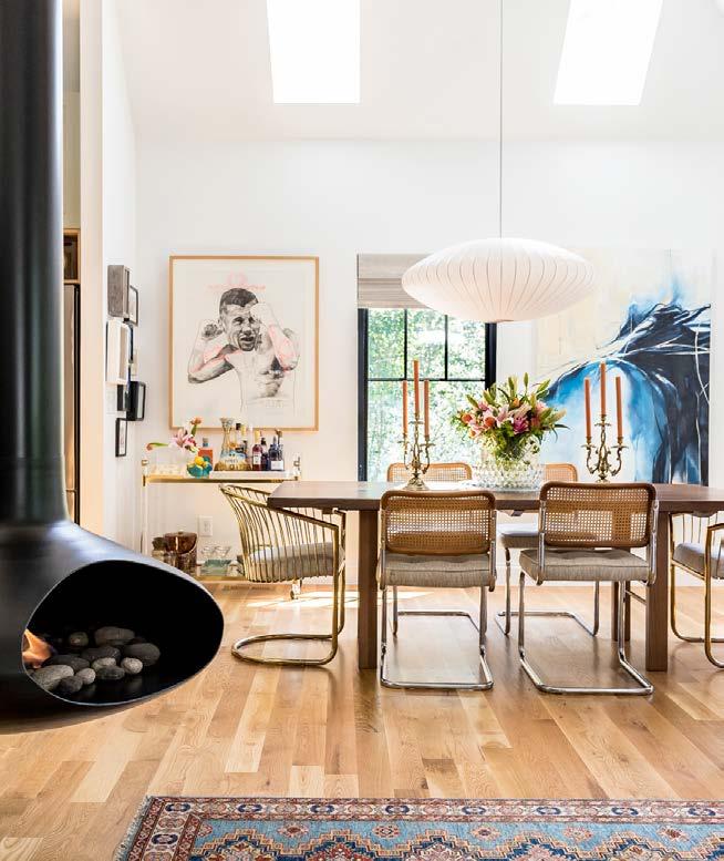
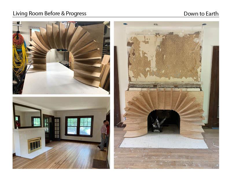
They utilized the homeʼs existing woodwork and antique hardware, and mixed wood stains helped to provide a unique, warm contrast throughout the home. A sculpturallike fireplace became the central feature of the living room, surrounded by carefully curated fixtures and furnishings.
Many of the challenges they faced were simply because of the age of the home. The second floor didnʼt have enough bathrooms, and the kitchen was very small.
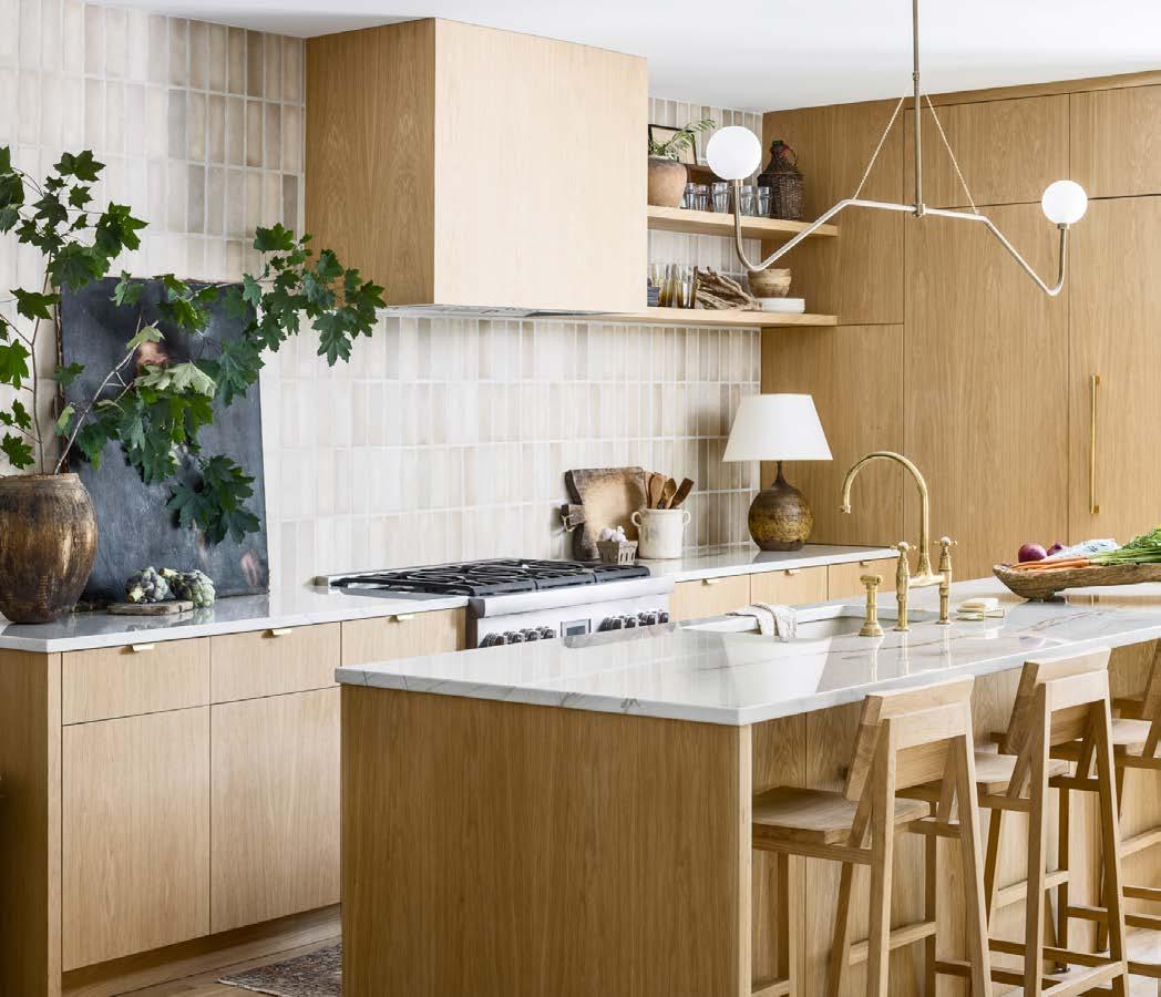
They modified the floor plan to enlarge the kitchen and provide access to the backyard. This required removing a
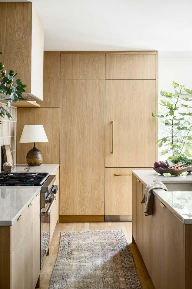
wall and turning the hallway into a pantry and powder bathroom. They used natural materials including white oak, quartzite and unlacquered brass, and all the accessories lend character and give the space a “lived-in” feel.
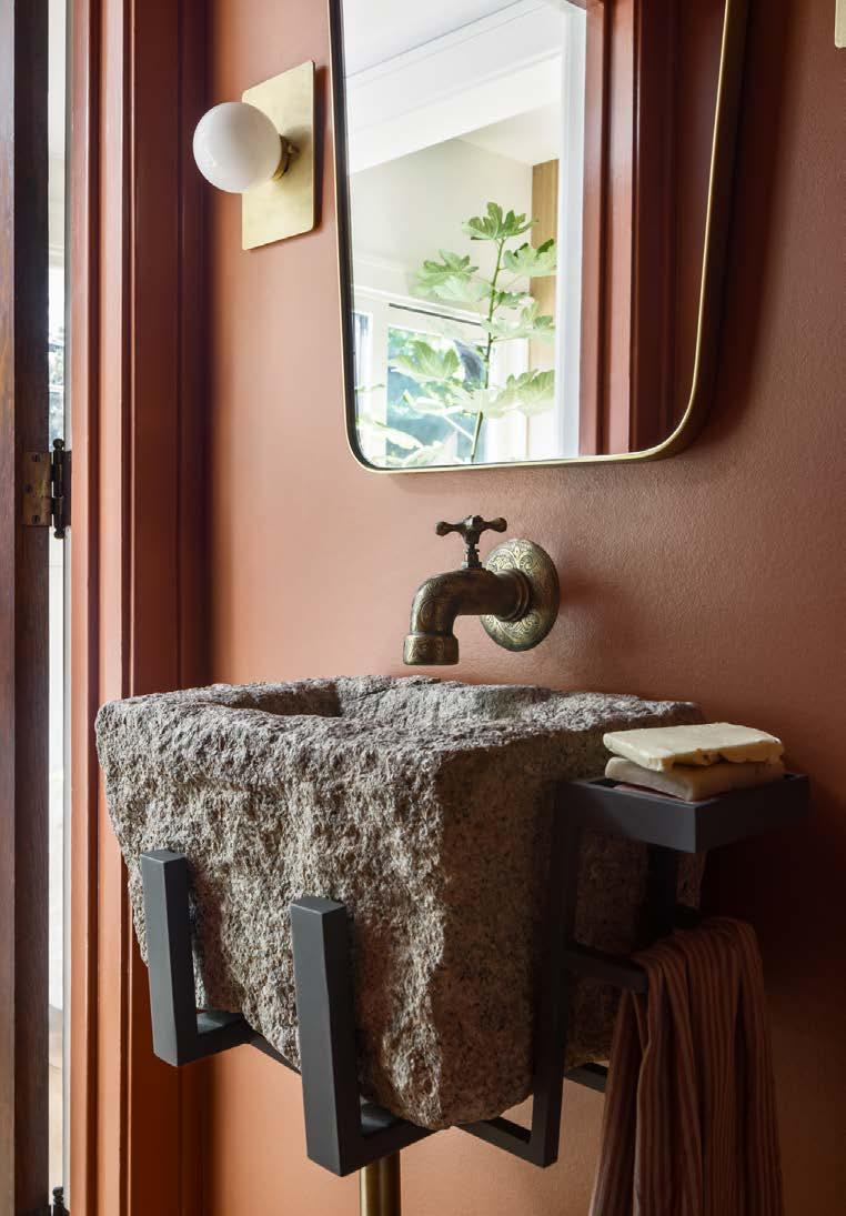
For the powder bath, they sourced a perfectly sized garden trough and designed a custom metal bracket to house the 200-pound stone. The brass faucet was originally just a garden hose spigot; Cicada installed plumbing in the wall to warm the water for hand washing.
To make the floor plan work better for the clients, Cicada also added a Jack-and-Jill bathroom to the second floor. Because the home was more than 100 years old, they also updated all the plumbing and electrical to be as functional and efficient as possible.

View full project details.
Art: PrizeKC, Cicada Co. Antiques: PrizeKC, Cicada Co. Cabinets: Halverson Carpentry Countertops: Kenny’s Tile & Floor Covering Furnishings: Ethnicraft, Four Hands, PriceKC Hardware: Emtek, Rejuvenation Plumbing Fixtures: Perrin and Rowe Lighting Fixtures: Lucent Lightshop, Triple Seven Home
 PHOTOS BY Nate Sheets
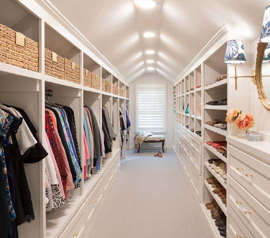
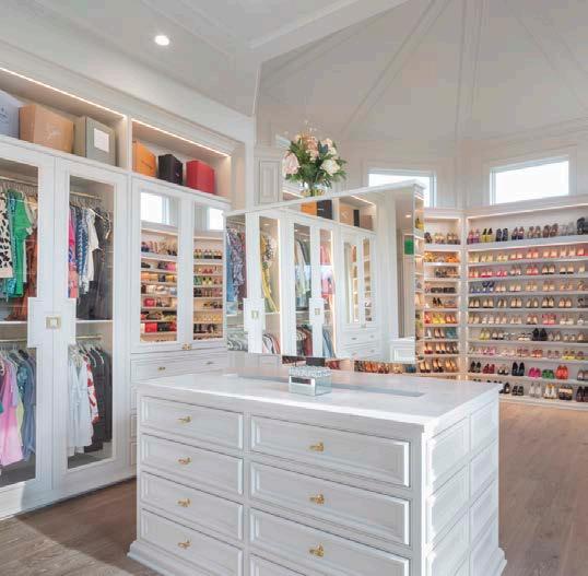
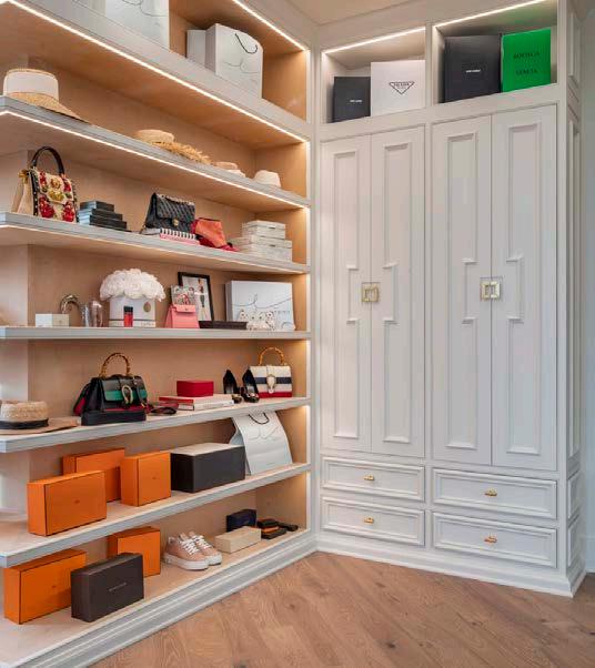
The vision for this project was to create a residential environment to rival the best fashion houses of Europe. This addition would blend seamlessly with the existing home and befit an influential member of the fashion community. It would be the backdrop for countless videos, seen daily by more than half a million followers on multiple social media platforms. The requirements included creating a jaw-dropping display for the clientʼs luxury shoe collection, display space for designer purses, and extensive storage for clothing and accessories. The design team aimed to incorporate luxury finishes with elegant, timeless elements.
The most pressing challenge was lighting. With the clientʼs high visibility on online platforms, taking videos and images easily in the space was crucial. Stylistically, the design team followed the elegant presence established by her fashion empire. The space is an extension of the clientʼs brand and must illuminate and elevate her designs.
The team created an architecturally stunning ceiling that soars and an immense amount of shelving solutions. Built-in lighting illuminates every shelf, cubby and enclosure. They also managed the way natural light interacts with space to accommodate photography throughout the day, and used a subdued color palette to create a neutral backdrop. The design features two Calacatta Valentin quartz-topped islands, filled with uniquely designed storage complete with a telescoping mirror that appears to levitate out of the island with the push of a button.

ARCHITECT
Bickford & Company
CONTRACTOR
Ashner Construction Co.
INTERIOR DESIGNER

Groover Interior Design
PHOTOS BY Bob Greenspan
View full project details.
RESOURCES
Engineer: Phelps Engineering Landscaper: Natural Creations Inc. New Home Community: Garnett Hills Cabinets: Miller’s Custom Cabinets Closet: Ashner Construction
Countertops: Carthage Stoneworks LLC Electronics: Simplifi LLC Flooring Material: ProSource Flooring Installation: Express Hardwood Floors Fabrication Company: Carthage Stoneworks LLC Furnishings: Groover Interior Design Hardware: Locks and Pulls Lighting Fixtures: Wilson Lighting Paint: P&JP Painting Construction Roofing: Imperial Roofing
Windows: Pella
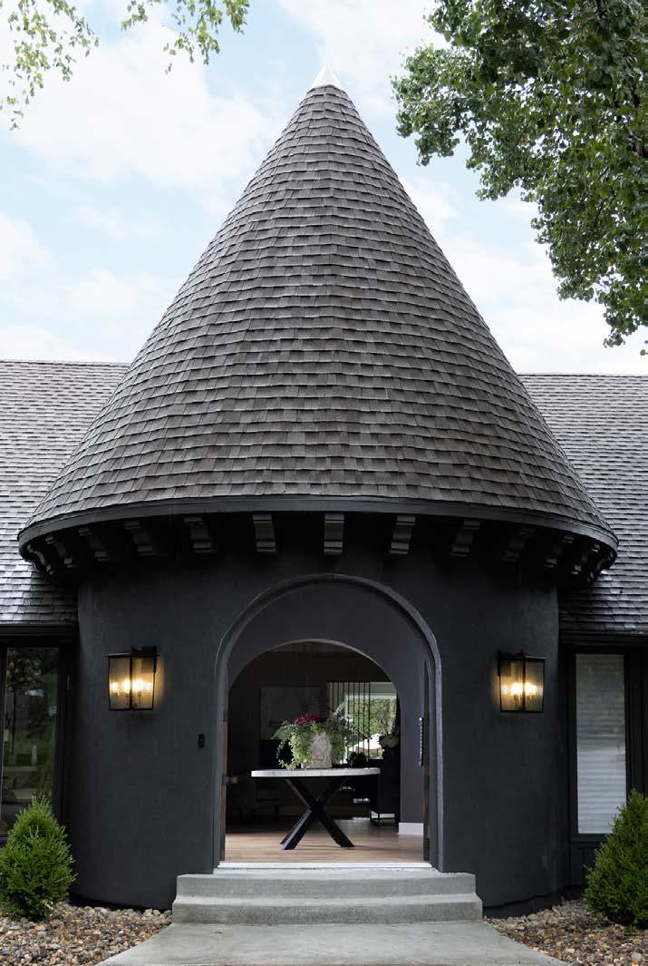
The flow and style of this house were desperately dated and stuck in the 1960s. It had a Palm Springs vibe mixed with mid-century modern and medieval—very confusing! It did have truly unique architecture. The design teamʼs goal was to update the space, and they wanted the entry to be the focal point of this one-of-a-kind design.

Incorporating the original architecture was a big challenge with this project. The amazing turret was originally half inside and half outside, hiding the gorgeous front doors behind a gate. They wanted to turn the turret into a proper entryway and were challenged to find a light fixture substantial enough for the massive space.
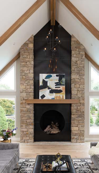
The fireplace in the living room was an added challenge. They wanted to keep the beautiful limestone sides and update the mantel and tile surrounding it. To keep the limestone, they had to be extremely precise and careful.
They created a true entryway in the turret, bringing the original front doors to the exterior and opening up the ceiling. A custom light installation was created to fit the massive space.
To update the fireplace, they used hot rolled steel and a precision laser to cut around every rock. The steel creates a unique iridescent metallic effect going up the entire wall.
CONTRACTOR Centric
DESIGNER
Tamara Day Design




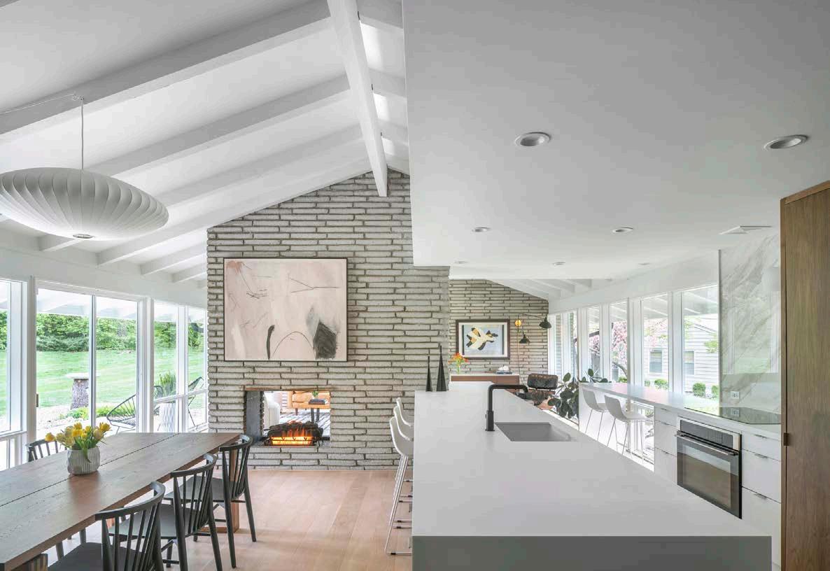
Originally built in 1954, this mid-century home was revolutionary at the time for its T-shaped split-level plan, which allowed for a more spacious, two-story bedroom wing. The home was originally designed by the architecture firm Linscott, Kiene & Haylett, whose work can still be seen in many Kansas City area civic, business, religious and educational structures. The Mid-Western was chosen by the Kansas City Star as the most popular house in the 1954 Parade of Homes, and both the architecture firm and the builder, Jed K. Giles, were honored in 1956 by House and Home magazine for the Mid-Westernʼs contribution to housing progress.
The current owner wanted to both honor the history of the house and to open up the main spaces with a larger, more gracious feel—and more in line with 21st-century living.
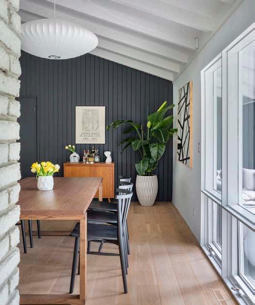
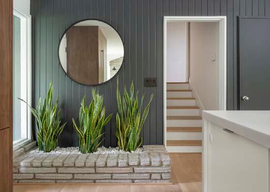
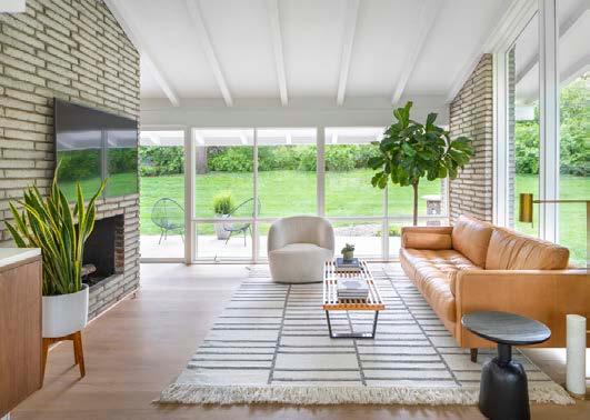
The biggest design challenge for this historic renovation was how to design one open space that could provide functionality for different aspects of daily life. By using the existing brick double-sided fireplace as a centering element, defined overhead planes, cabinetry and a kitchen island to articulate defined “rooms,” the designer provided a sense of separation without sacrificing an open flow or abundant natural light from the floor-to-ceiling windows.
 ARCHITECT
PHOTOS BY Bob Greenspan
The project was a complete remodel and addition to an existing small, two-bedroom mid-century ranch. The client desired an additional bedroom, family room, screened-in porch, mudroom and entry as additional program elements. Considering that four additions were added, the design team was challenged to maintain the overall scale and aesthetic of the original house.

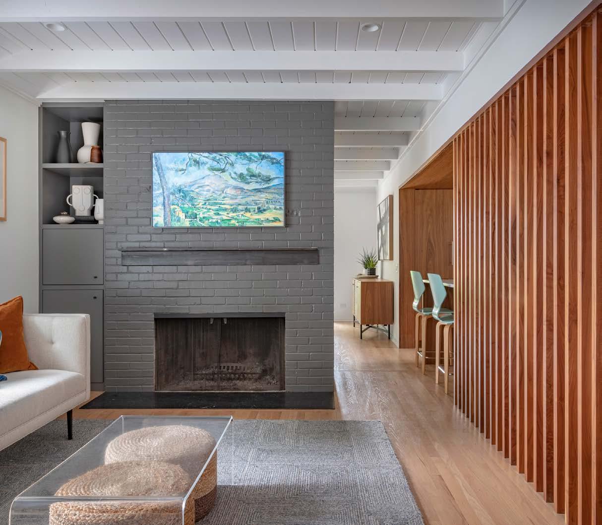
The first addition was to the front of the home, creating an entry vestibule and covered porch. One small addition on the rear created a mudroom pantry within the existing roofline. Another addition to the rear created the primary bedroom and family room, and the final rear addition created the screened-in porch.
The interior of the home was reworked to accommodate circulation between areas and the new lower-level walk-out family room. The new stair to the lower level family room was added in the primary living area of the house, connecting it to these spaces as a public space. The kitchen was fully reworked as a more functional space open to the living and dining areas via a cased opening louvered wall. In the primary bedroom, the ceiling was hipped to create volume and define the space. The bath suite has a skylit wet zone with a shower and a tub.
ARCHITECT
Forward Design Architecture

CONTRACTOR
Hurst Construction
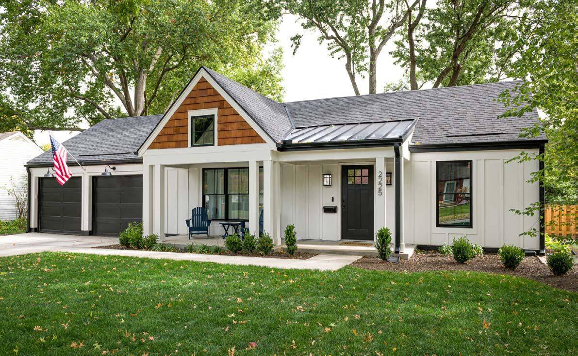
The goal was to take a minimal structure and turn it into a spectacular environment for first-time homeowners. The existing home had a dark, oppressive interior with little flow, a tiny, isolated kitchen and no basement space for mechanical systems or basic storage. From a mere 1,033 boxy square feet, the design team created an environment that is inviting, lives large and has pleasing aesthetics.
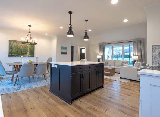
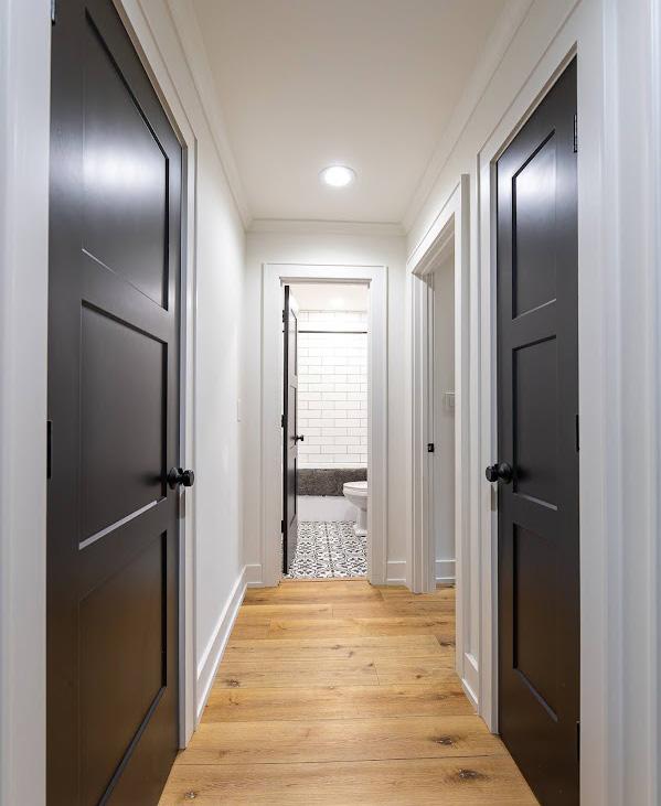
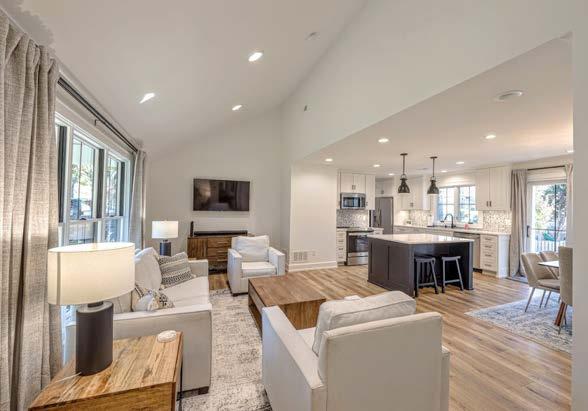
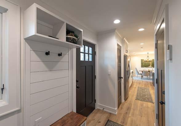
They enlarged the foyer, which provided an art wall. It retains the hallway, which provides privacy to the bedrooms and bathrooms. The existing living room, dining room and kitchen were all opened up, and a vaulted ceiling in the living room now additionally provides vertical space. The kitchen design is clearly upgraded, and service to the dining room is now convenient. Despite the open plan, the living room is defined by the 15-footwide, deep-jambed portal that separates it from the other rooms. The open plan is inviting and full of natural light, with views to the front and back yards.
The portico addition to the front of the home provides a welcoming entry point, as well as coverage over an outdoor sitting area. The exterior was re-sided and all the windows were replaced. Enhancing the curb appeal is a dark roof and standing seam metal roof accent.
ARCHITECT

Wendlandt + Stallbaumer
CONTRACTOR
JW Build
PHOTOS BY Keith KreegerThe design team wanted to create a clean, simple, current and modern home for a young family out of a home that was dated and dark. Plus, it had to be flexible for many types of functions, age groups and purposes. The design teamʼs solution added a one-car garage so that an existing space could be utilized as a casual family room, laundry/mudroom and homework/craft room. A small addition to the front of the home added an off ice, and another in the back created breakfast/dining space. These two additions incorporated a flat roof extension, which also covered the front and back patio areas for additional outdoor living space. A powder bath was added to the main level near the off ice. A prep kitchen space tucks into a walk-in pantry area, and multiple skylights allow more natural light to filter into the main space. Unused attic space provides a private hangout nook for the clientʼs children, accessible via a ladder in their bedroom.

ARCHITECT ICON Architecture
DESIGNER

Kara Kersten Design
PHOTOS BY Nate Sheets
View full project details.




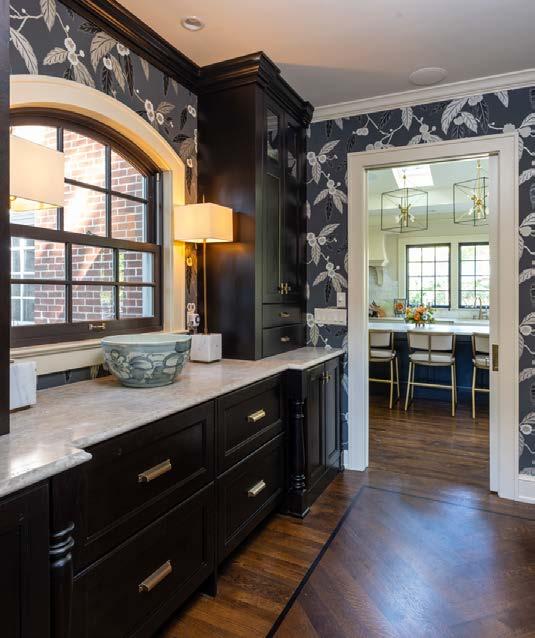
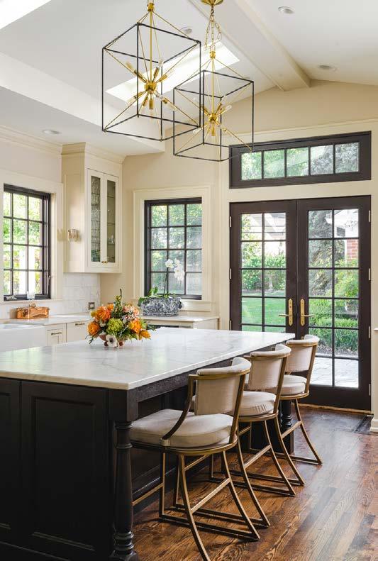
Touching every surface, the designerʼs goal was to make it functional and modernize the aesthetic while maintaining its historical integrity and architectural details.
The design teamʼs most significant challenge was managing scope as the clients added more and more to the project. They worked hard to strike the right balance between the homeʼs traditional architectural character and new contemporary elements. This was especially true in updating the homeʼs heating system. It required matching millwork and hardwoods throughout the home.
They combined several rooms on the second floor to make a primary ensuite and a guest suite. Moving plumbing supply lines from the second story is always challenging in a home of this age.
The clients wanted a sizable primary bathroom and a boutique-style closet. Merging the primary
bath, hall bath and bedroom provided them with the space to deliver the primary suite.
They combined the sleeping porch on the second-floor guest suite with the second bedroom. The existing closet and part of the bedroom were used to add a full ensuite bathroom for guests.
In the kitchen, they patch-painted the cabinets, replaced the doors and drawer fronts, and put on new hardware. A new sink and faucet give the space an updated look and more space for dishes. A new island provides additional seating and in-drawer accessories.
They revamped the mudroom into a butlerʼs pantry and updated the laundry room and powder bathroom at the homeʼs back entry. The cabinets are walnut with a Guinness finish, and the base cabinetry has newels that match the kitchen island.

Engineer: Bob D. Campbell & Co. Cabinets: Crown Cabinetry, Crestwood Flooring: Hardwoods - Kimminau Fabrication Company: Dimensional Stoneworks, CKF
To the trade Showrooms: Neenan Hardware: Locks & Pulls Plumbing Fixtures: Primary Bath - Delta; Powder Baths - Brizo Lighting Fixtures: Rensen House of Lights
Paint: R & S Painting Roofing: Vaught Roofing & Fidler on the Roof KC Windows: Marvin Wallpaper and furnishings/design in progress: Madden McFarland
The design team worked with the clients to produce a major renovation that included intense structural modifications and a completely new floor plan. The biggest goal was to allow the family of five to grow in this home. The clients have three small children and love hosting large gatherings, so making the home as functional as possible was critical. The team wanted to ensure that the design would have a lasting impression without being trendy and would allow in as much natural light as possible.
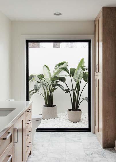
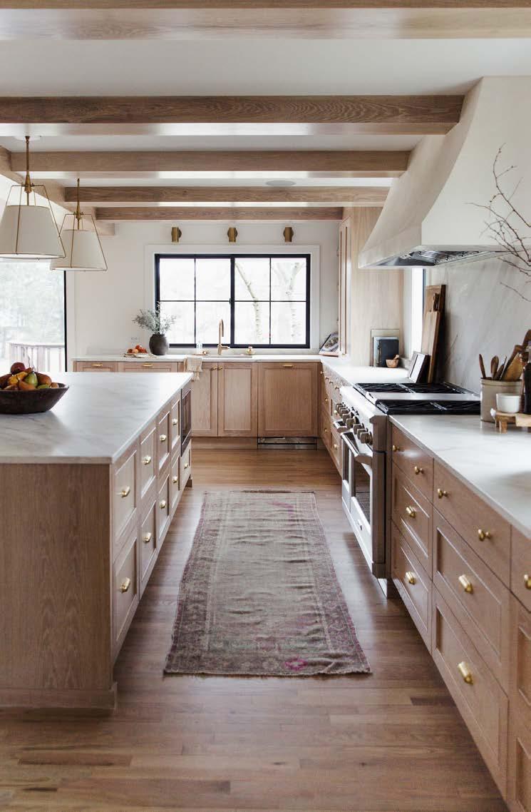
One challenge involved major structural work, which resulted in moving a three-story masonry fireplace and staircase. Another was adding enough second-level bedrooms for the family.


They spent months designing new floor plans to give the clients an open, large kitchen, pantry, main living area and dining room. It can accommodate more than 20 people while still being cozy enough for the immediate family. They also created a new primary suite with separate access, a home gym on the main floor, additional bedrooms on the second floor and a private home office.
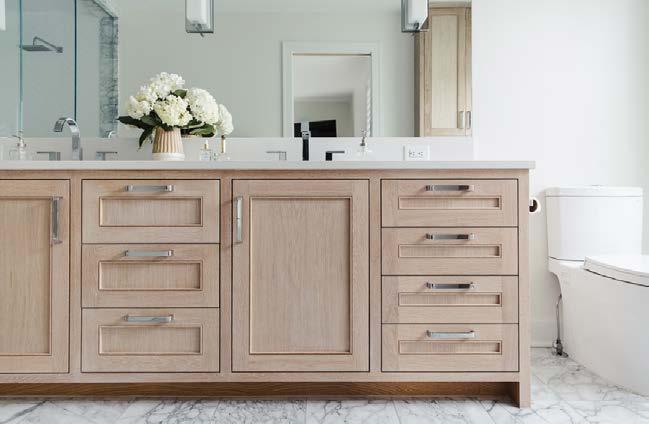
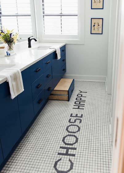
To make the home timeless, the design team used white oak custom cabinets, beams, marble countertops and stunning fixtures and finishes throughout. Windows and doors were relocated to let in the most amount of natural light. They added fun pops of color and tile for the kidsʼ bathroom, while keeping it extremely functional with integrated pull-out step stools into the vanity to allow them to grow with the home.
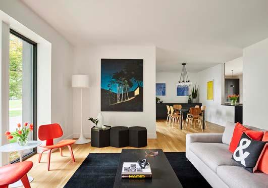
This home is an expansive mid-century modern ranch. The design team was tasked with creating a bright modern space that fit the familyʼs active lifestyle but still embraced the charming original character of the home.
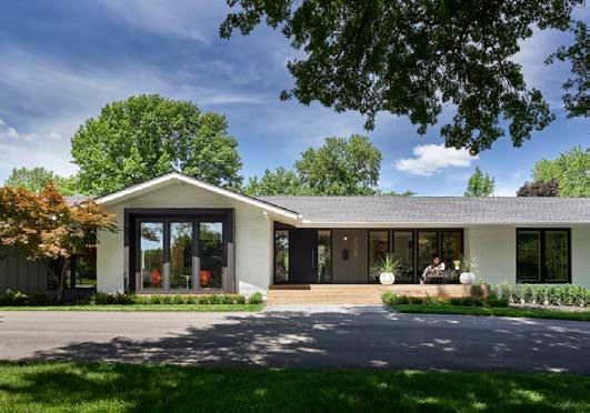
The primary challenge was the state of the home. The basement collected standing water during heavy rain. Many of the homeʼs exterior details were water damaged from more than 50 years of harsh Midwestern weather. A connection to natural daylight proved to be one of the biggest challenges.
An old, failing bay window at the front of the home was replaced by enlarging the window and bounding the composition in bold black steel. Inside, the redesign is filled with daylight. The previously dark, closed-off kitchen now opens onto an expansive outdoor patio, and the 8-foot sliding door between
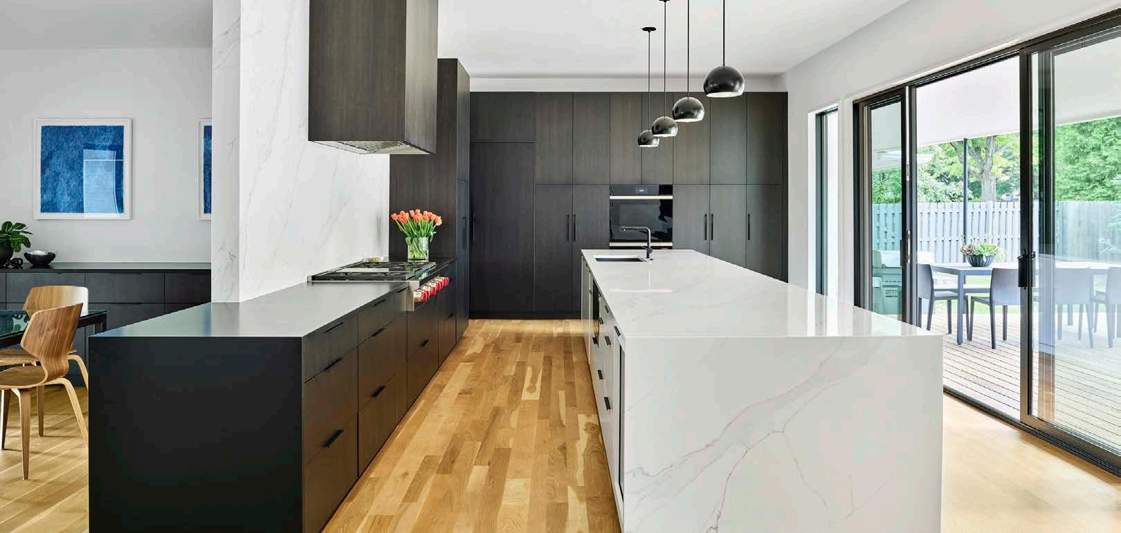
the spaces can be fully pulled back to blend the boundary between indoors and out.
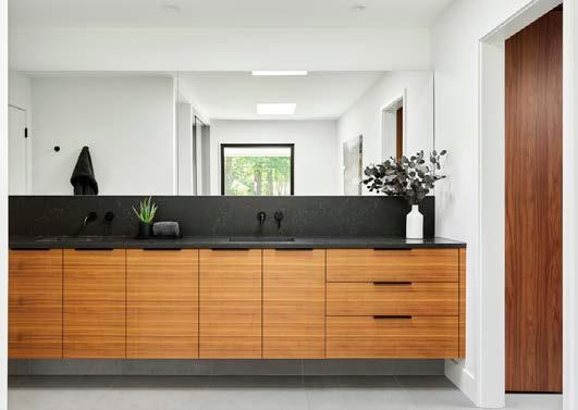
The kitchen, main living space, entry hall and primary suite were reoriented to open onto a reimagined back patio with a custom fire feature. Kitchen ceilings were raised to create space and allow more daylight into the homeʼs primary living spaces. Access to daylight was prioritized in the primary suite, where skylights were added to the primary bath and closet to minimize the need for artificial lighting during daylight hours. They used a palette that would be minimal, but warm and timeless. Walnut was selected as a base material for cabinets and treated in a variety of stains to maximize the character achievable with the native material. Natural stone was selected for its visual impact and longevity.
ARCHITECT/DESIGNER SixTwentyOne

CONTRACTOR Faust Construction
PHOTOS BY Michael Robinson
View full project details.
RESOURCES
Appliances: Wolf/Sub-Zero
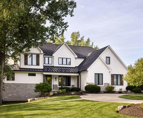
With five kids, the homeowners needed room for their large family and space to homeschool. A huge renovation was necessary for them to function and add their personal style. The design team completely overhauled the entire house, replaced all windows, replaced siding with stucco, and changed the aesthetic of the exterior. They remodeled every square inch of the interior. The whole home had to be extensively touched, so keeping the budget intact while checking all the boxes while utilizing the existing footprint was the primary goal.
The design teamʼs challenge was to transform this four-bedroom home into a seven-bedroom home, giving each child their own room, along with a primary bedroom and guest bedroom, plus home-schooling space. They repurposed the formal living room and off ice on the main floor to bring the primary suite to the main level. A small addition over a covered basement porch provided space for the primary closet. The basement was completely overhauled to add a guest bedroom/off ice with egress, a full bath, a workout room, a TV watching and bar area, and a large playroom. They divided the second level to incorporate an open loft and another bedroom upstairs.
DESIGNER Kara Kersten Design

PHOTOS BY Nate Sheets
View full project details.
RESOURCES
Engineer: Foundation Engineering Specialists - Erik Messner Hardware: Kwikset, Emtek Plumbing Fixtures: Delta, Moen
Wall Coverings: Schumacher, Phillip Jeffries Paint: Sherwin Williams
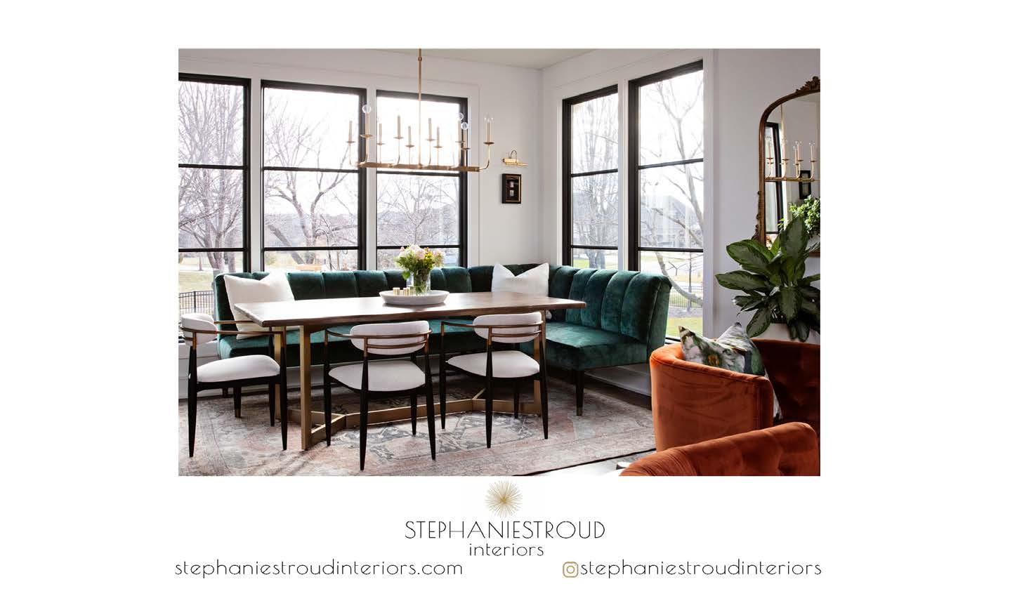
This modest mid-century ranch needed a complete overhaul. Almost everything in this 1955 home needed to be addressed to bring it up to code. The design team needed to see beyond the current walls and floor plan to reimagine the spaces.
The challenge was to modernize, open and rework the living spaces and create a primary retreat, which was to include a large bath, with a special area for daily baths, an expansive closet and a laundry room. A space for the couplesʼ two large dogs was a must, as well.
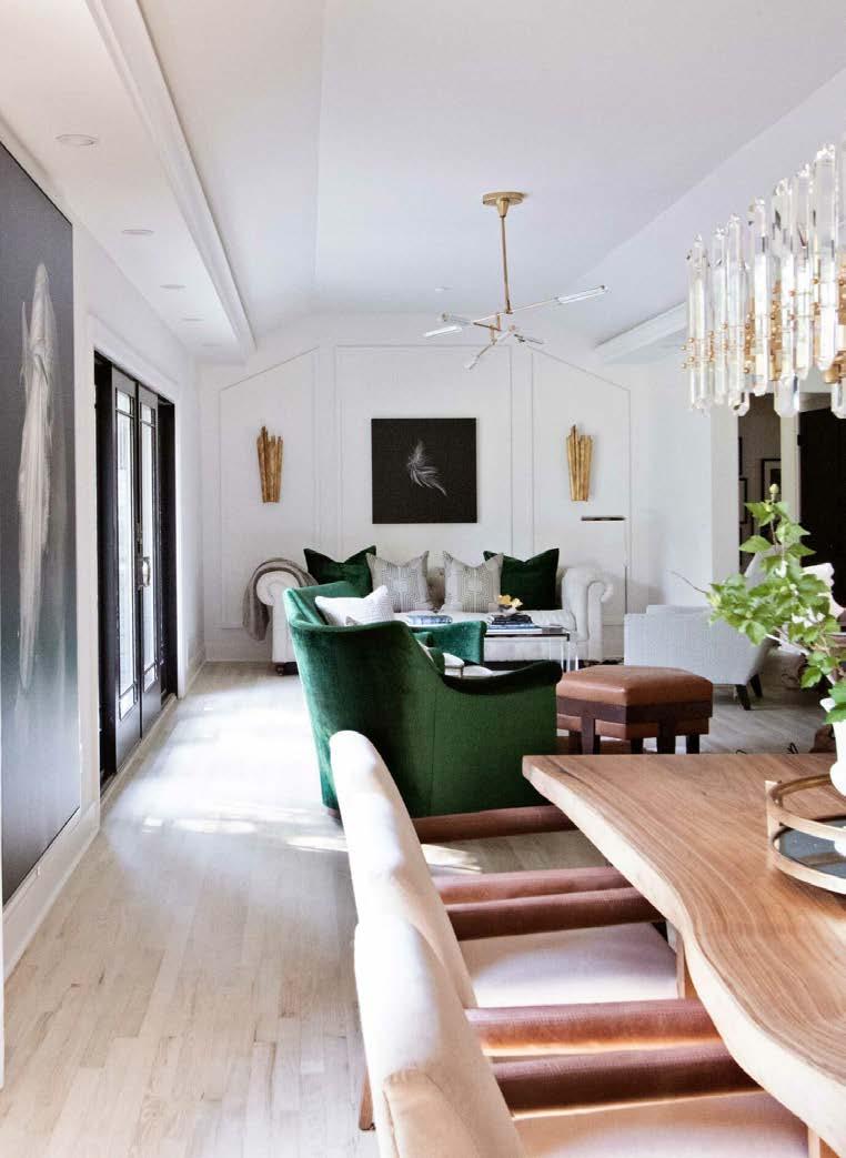
Ceilings were raised, and a hidden staircase to the attic was removed. They widened halls and reconfigured baths and walkways to create a one-of-a-kind floor plan. To make the living spaces feel bigger, they bleached the red oak flooring to its natural color, walls were painted soft white, and new, larger windows were added. The primary suite features a pass-through wet bar on the way to a large primary bath where the homeowners can soak in the freestanding tub overlooking the rose garden.
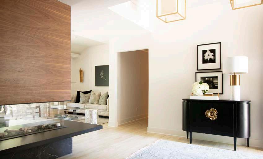
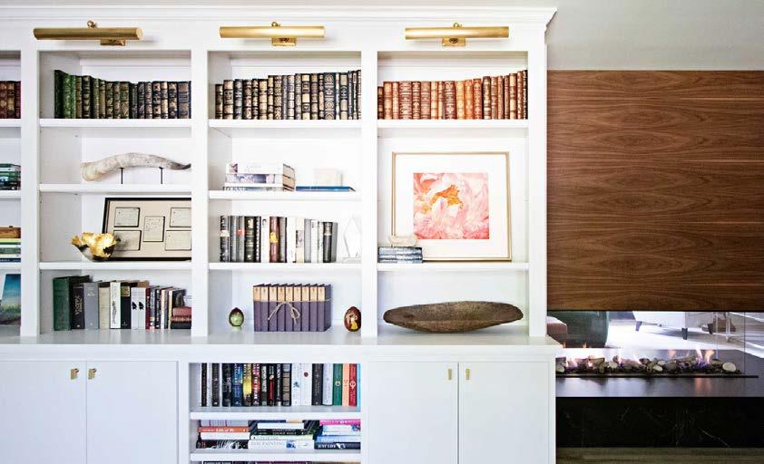
The team created an “open library” for the coupleʼs extensive collectibles and books at the homeʼs entrance by the fireplace. Clad in warm tones, the fireplace mirrors the walnut custom front door that is juxtaposed nicely against the bleached oak floor. They selected velvets and linens to offer a level of sophistication to the antiques and collections. Modern and traditional pieces were mixed to balance the homeownersʼ styles as well as the feel of the home.
CONTRACTOR
Koehler Building Company
DESIGNER

Stephanie Stroud Interiors
PHOTOS BY Laurie Kilgore
View full project details.








At PCDI Homes, we believe that a custom home should be designed for the family living in it. From big ideas to small details, it all matters.
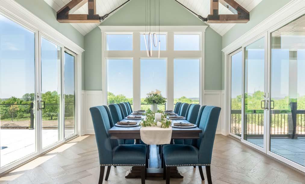
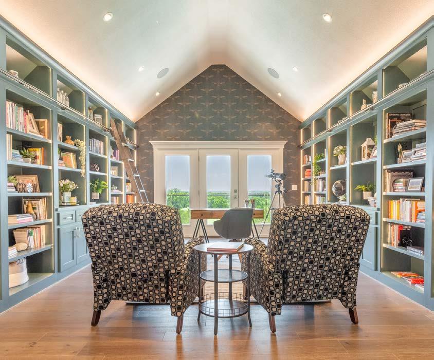
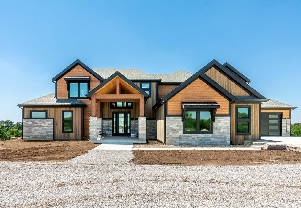
Beginning with our in-house plan design service and curated selection center we combine all the details together in a beautiful and cohesive design. Working with our team of trusted and skilled trade partners, we then bring that design to life. We approach each home with a personalized experience and deliver a quality custom home that us, our trade partners, and most importantly, our homeowners are proud of.

The owners of this reverse-story-and-a-half wanted to stun visitors upon entering. Built to showcase modern mountain design and custom materials, the goal was to combine luxury materials in unexpected ways while maintaining the cozy, relaxing feel of a home surrounded by trees in the mountains.

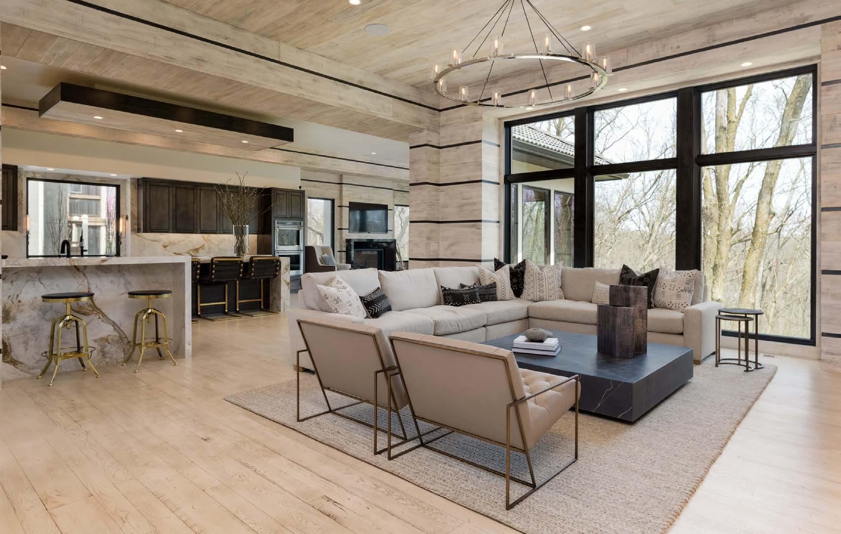
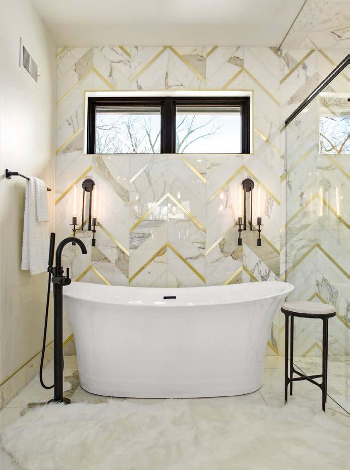
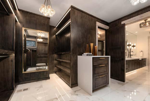
This projectʼs challenge was to incorporate dramatic features while not letting any one detail detract from the overall harmony of the home. Beautiful slabs of quartzite and large pieces of stone are worked seamlessly into the design.

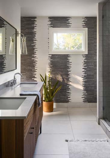
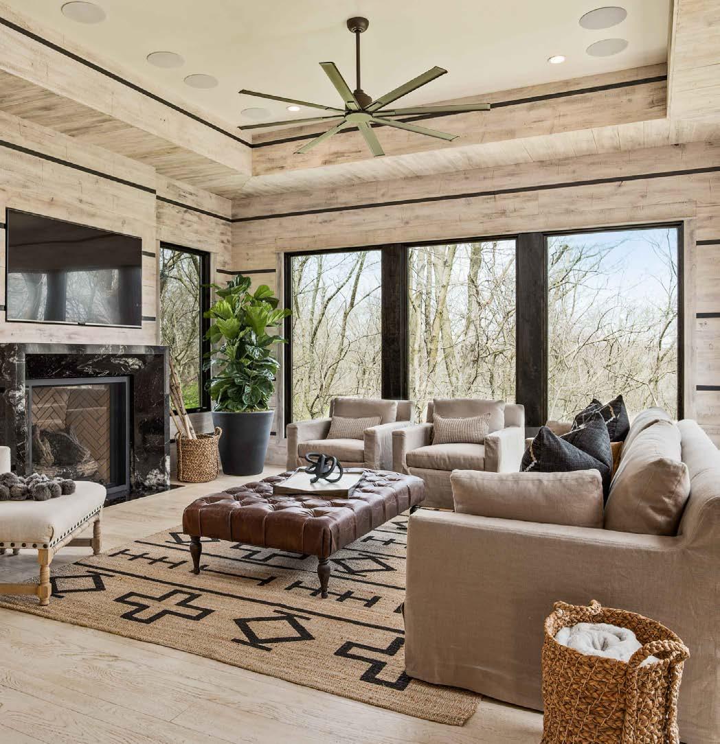
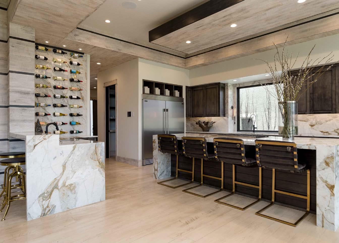
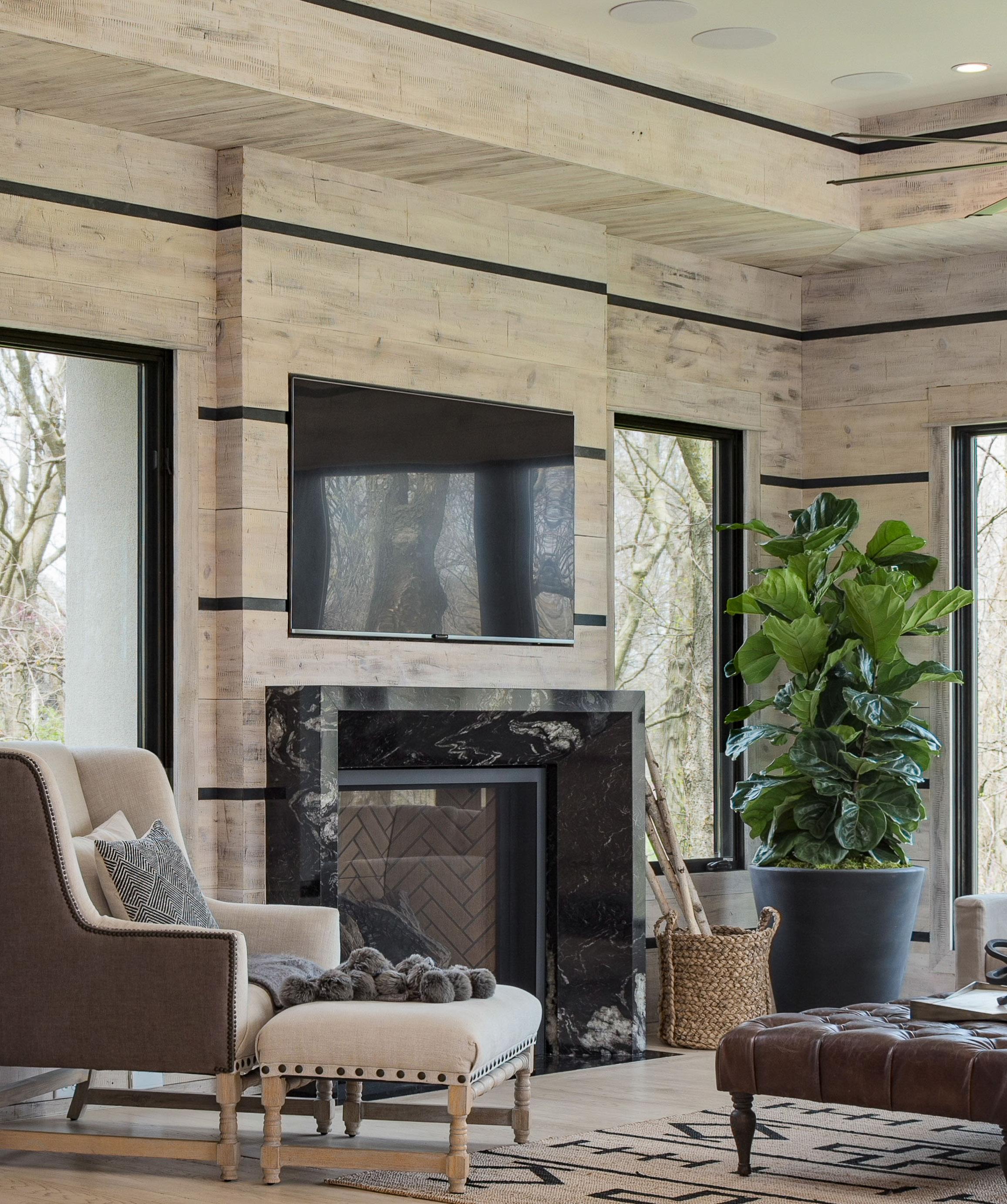
Two large eight-foot statues flank a mirror at the end of the dining room, visible from the open entry. The walls lined with horizontal stripes of light-stained wood and dark metal provide a restful vibe. The living area is open with neutral tones to complement the custom metal tone fireplace and interior stone. The L-shaped kitchen has a center island thatʼs perfect for the cook to function and dramatic enough to wow guests. The island was topped with heavily veined quartz flowing over with a waterfall edge. All cabinets are richly stained dark wood that mimics the heavily treed landscape visible from the windows lining the back of the house.
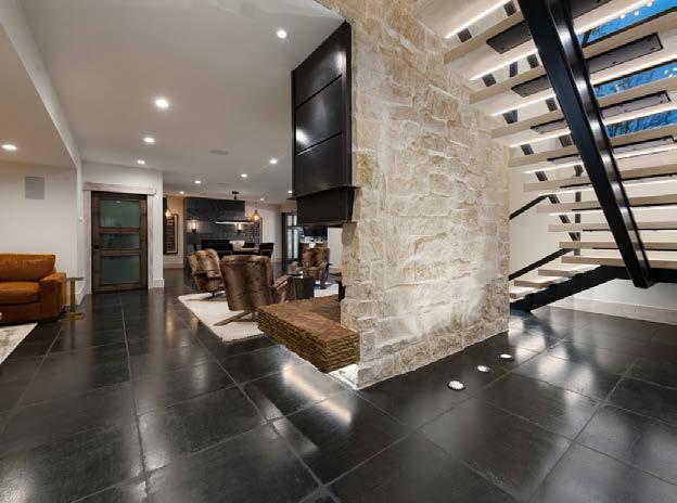
Custom chandeliers act as art leading to the lower level. More large windows drench the lower level in natural light. The lower level bar boasts a four-screen television system on the back wall with extensive seating. Above the island is a mirrored, coffered ceiling that adds a dramatic impact. Multiple seating areas are designed for comfort, conversation and relaxation.
INTERIOR DESIGNER
Kristen Ridler Interior Design
CONTRACTOR
Cecil & Ray Homes
BY Samantha Ward
View full project details.
RESOURCES
New Home Community: Loch Lloyd
Countertops, Flooring & Fabrication: Kenny’s Tile & Floor Covering
PHOTOS“
The use of exquisite materials combined with a neutral color pale e and natural design elements create a surprisingly warm, inviting environment.
~ judge’s comment
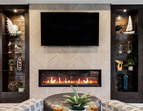
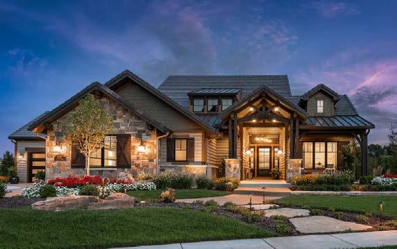
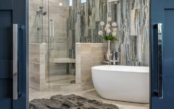
Modern sophistication meets rustic coastal comfort in this 4,140-square-foot floor plan. Its ultra-functional space features a resort-style bedroom suite, finished walkout lower level, scenic deck and patio areas, additional storage areas and many customization opportunities.
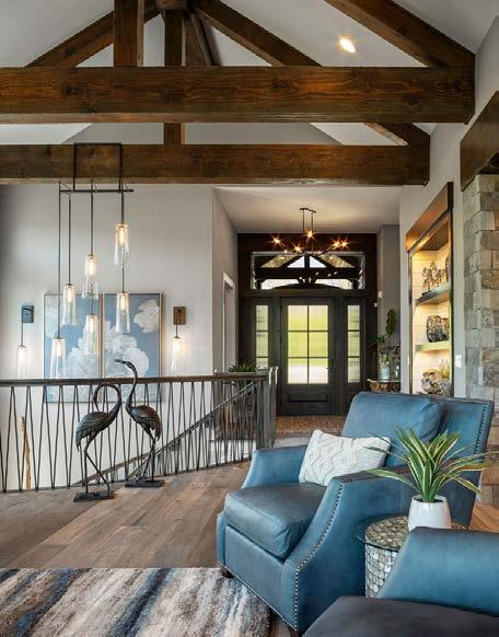
Architectural features include colossal wood beams, unique vaulted ceilings, a dramatic curved staircase, a creatively contoured lower-level bar, a private outdoor lanai, a suspended-slab garage and an extraordinary backyard.
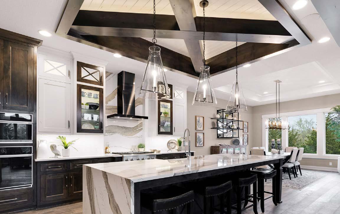
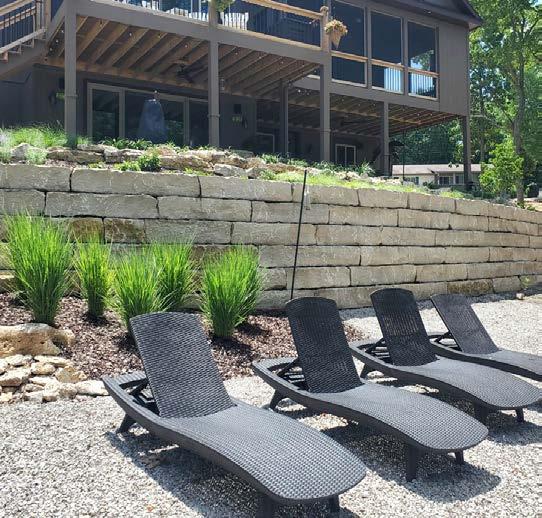
The challenges in building this home included designing a curved staircase and railing to suit the style of the home. They rebuilt the space to get the perfect location and curve for the staircase and stairwell, and a metal railing was custom-designed and fabricated. They also custom-designed a light fixture to accent and fill the space. For the outdoor living area, they brought in special equipment to boom large boulders in place without removing any existing trees in order to preserve the natural ambiance. They added a fire pit, swings, a swinging bed, rock steps, luxurious landscaping and more to further capitalize on the beauty of nature.
ARCHITECT
KC Architecture
CONTRACTOR/DESIGNER

B.L. Rieke Custom Homes
PHOTOS BY Josie Henderson
View full project details.
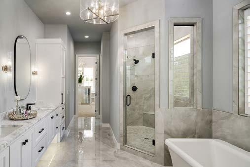

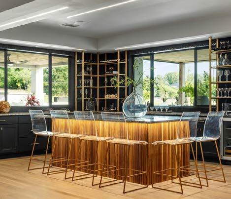
In the early concepts of the Oakmont, the design team focused on creating expansive common living areas with modern connectivity from one room to another. The plan uses subtle ceiling treatments and a large central vault to define the main-floor living room, kitchen and dining space. The Oakmont also nods to the modern entertainer with a walk-behind bar off the kitchen that doubles as a prep kitchen. Throughout the plan design process, they emphasized the key living areas while keeping secondary rooms eff icient to stay on budget and deliver maximum effect.
Planning was a challenge during the COVID-19 pandemic. After various delays in the start-up process, they finally broke ground in early July 2021. They had only 10 months for the build. With supply shortages and backorders, the design team stayed on call to make decisions at a momentʼs notice. The home is truly a product of its environment. Amid the uncertainty, the team grew much closer, finding a collaborative approach to keep progress on track. Despite multiple site changes and substitutions, the team was able to achieve their vision of the home and deliver it on time for the 2022 Artisan Home Tour.
ARCHITECT
Foster Technical Services
CONTRACTOR
JS Robinson Fine Homes
INTERIOR DESIGNER

Blue Nest Design
PHOTOS BY Matthew
AndersonView full project details.
RESOURCES
Real Estate Agent: Angela Fitzgerald and Michelle Capek Appliances: GE Café Appliances from Factory Direct Appliances Art: Uttermost, Wayfair Cabinets: Harris Wood Products Closet: Phase 2 Construction LLC Countertops: Stone Surfaces Electronics: Integrated ELAN Whole Home Automation System, Whole Home Audio, Lighting & Security by Naturally Wired Flooring: Kenny’s Tile, ProSource Rugs: Wayfair, West Elm Furnishings: Uttermost, Crate & Barrel, Pottery Barn, Wayfair, West Elm To the trade Showrooms: KDR and Designer’s Library Accessories: Uttermost, Crate & Barrel, Pottery Barn, Wayfair, West Elm, HomeGoods, At Home Hardware: Wilson Lighting Plumbing Fixtures: Delta and Brizo provided by Neenan Supply Lighting Fixtures: Wilson Lighting Wall Coverings: Phillip Jeffries Paint: Sherwin Williams Accent Wall Faux Painting: Mary Walker Stucco: R. Carreon Stucco & Stone Roofing: Stoneworth Concrete Roof by Century Roofing Windows: Windsor Window & Doors


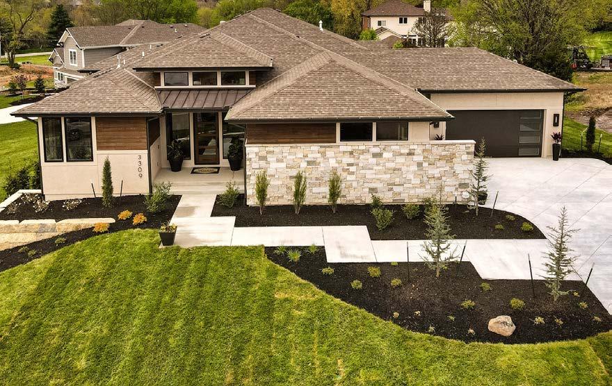
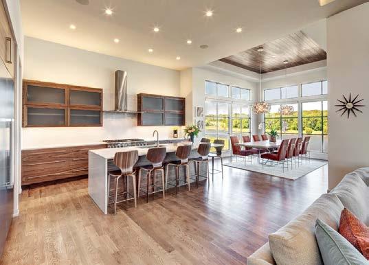
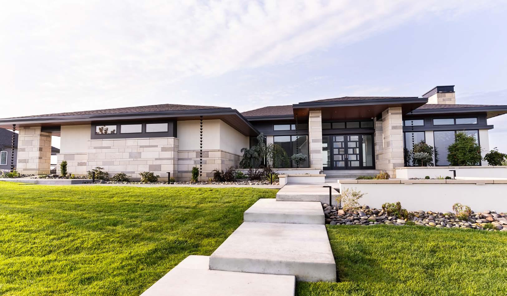
The vision for this project was to create a sprawling contemporary design that takes advantage of the view—including a lake and three holes at a Tom Watson golf course. This meant incorporating plenty of large windows along the back of the house. A lanai stretches almost the entire back façade, extending living space outdoors as well as protecting interior spaces from the western sun. At the front of the house, opposing garages and an impressive entryway with a clerestory catch the eye.
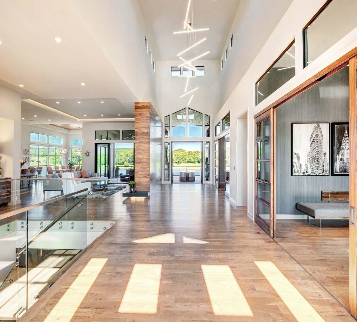
The lot was a challenge for this project. While it had stunning views, it was narrow for the opposing garages. Because of the elevation taper toward the back of the lot, the design team had to step down the foundation each time it intersected with a side setback to ensure the house fit perfectly. The stunning view meant many major rooms needed to be at the back of the house.
Originally designed near the primary suite, the laundry room was moved near the mudroom to allow more width for other areas of the home. And to maximize the view, a long foyer was designed to capture a line of vision from the front door to the back of the home. Plenty of sketching from the design team resulted in a model that checked all the boxes.
ARCHITECT
Castrop Design Group

CONTRACTOR
Starr Homes
INTERIOR DESIGNER
Dwell Interiors
PHOTOS BY James Maidhof
View full project details.







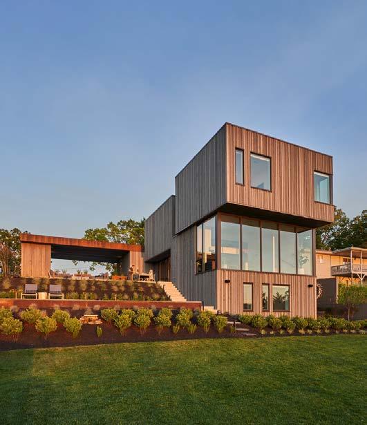
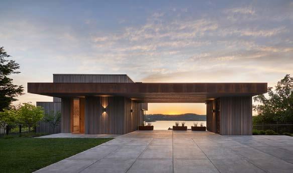
Terraced House is a natural retreat with million-dollar views. Perched proudly over Table Rock Lake, it takes full advantage of its vista and natural surroundings—and gets an active family out into nature.
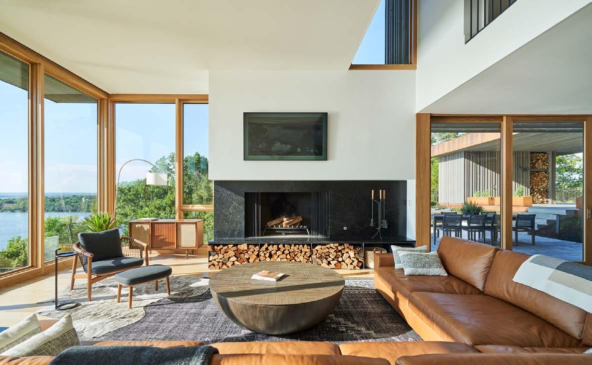
To navigate the challenge of an incredibly steep site, the home is conceptualized as terraced sections, with each terrace serving a different core function of the home. Because Terraced House is a second home intended to host family and friends, its owners wanted to focus on gathering spaces.
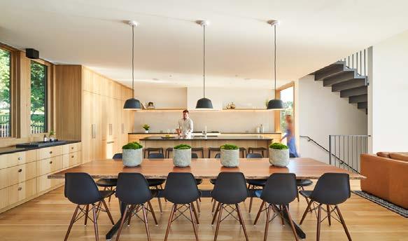
The main “terrace” holds the primary gathering spaces. A large exterior patio spills off the main living area, extending the interior and blurring the boundary between indoor and outdoor living. The design team created an expansive dining table from a locally sourced book-matched slab of
air-dried black walnut, which rests on a sturdy powdercoated steel base.

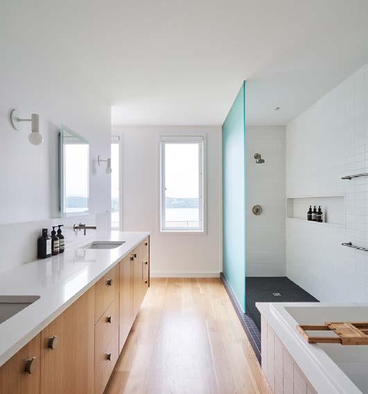
The primary suite comprises the lower, with multiple guest rooms, a childrenʼs room with built-in bunk beds, and a laundry room. The interior maximizes views of the lake and is intentionally minimal, with a warm, neutral color palette. With floor-to-ceiling windows in most areas of the home, natural light fills the space, even on overcast days.
Exterior materials, interior finishes and furnishings were selected to feel sturdy and lived-in. The Corten steel, beginning to weather, gives a sense of this as well. Terraced House feels at home on its inclined site. Generations of family members and friends will enjoy varied access to the siteʼs seemingly unlimited views.
View full project details.





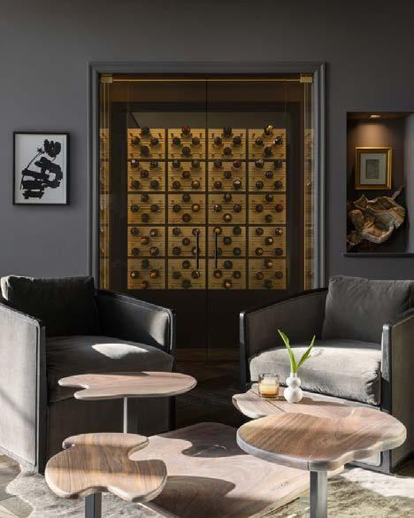
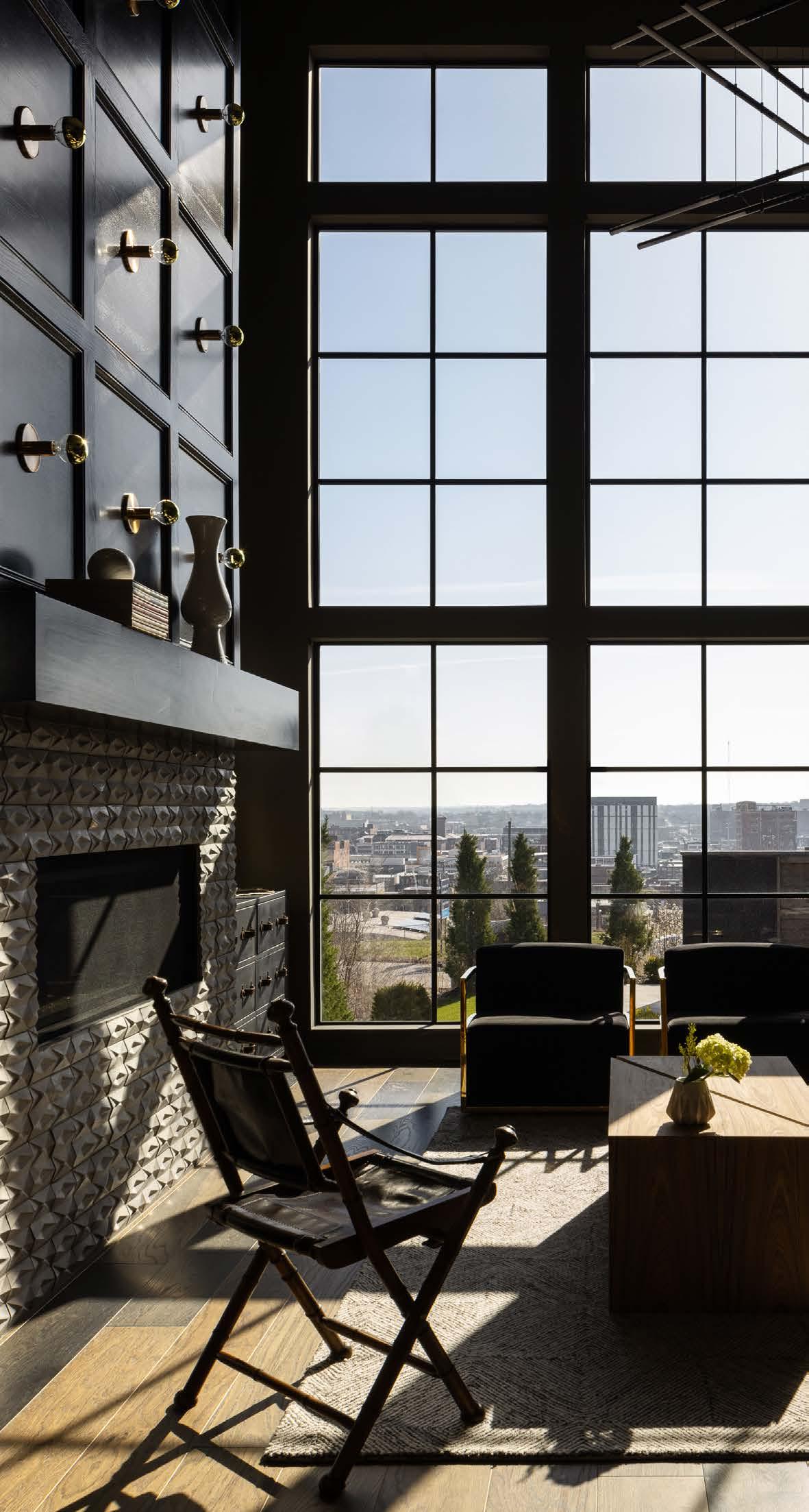
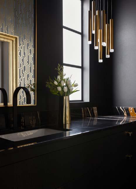
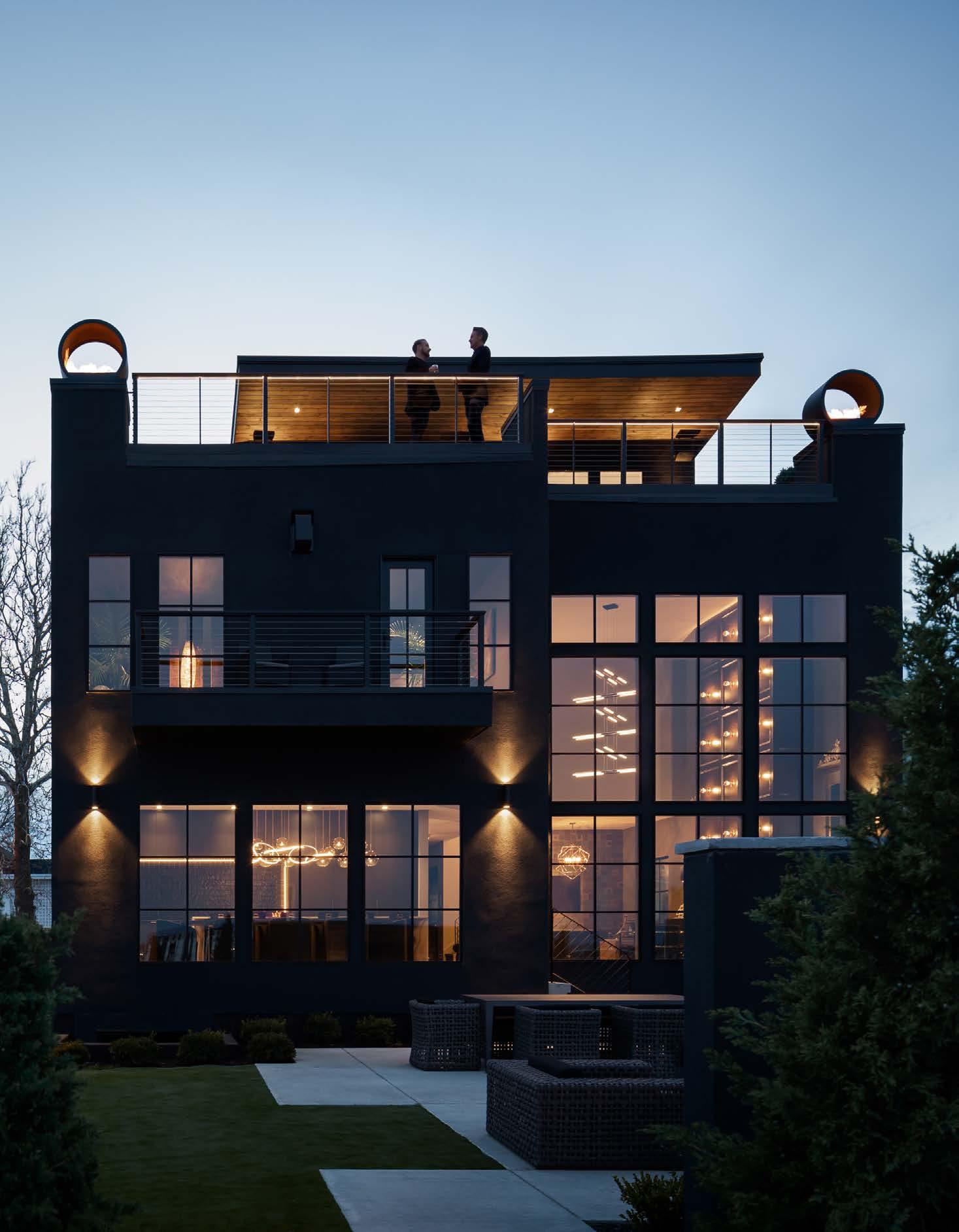
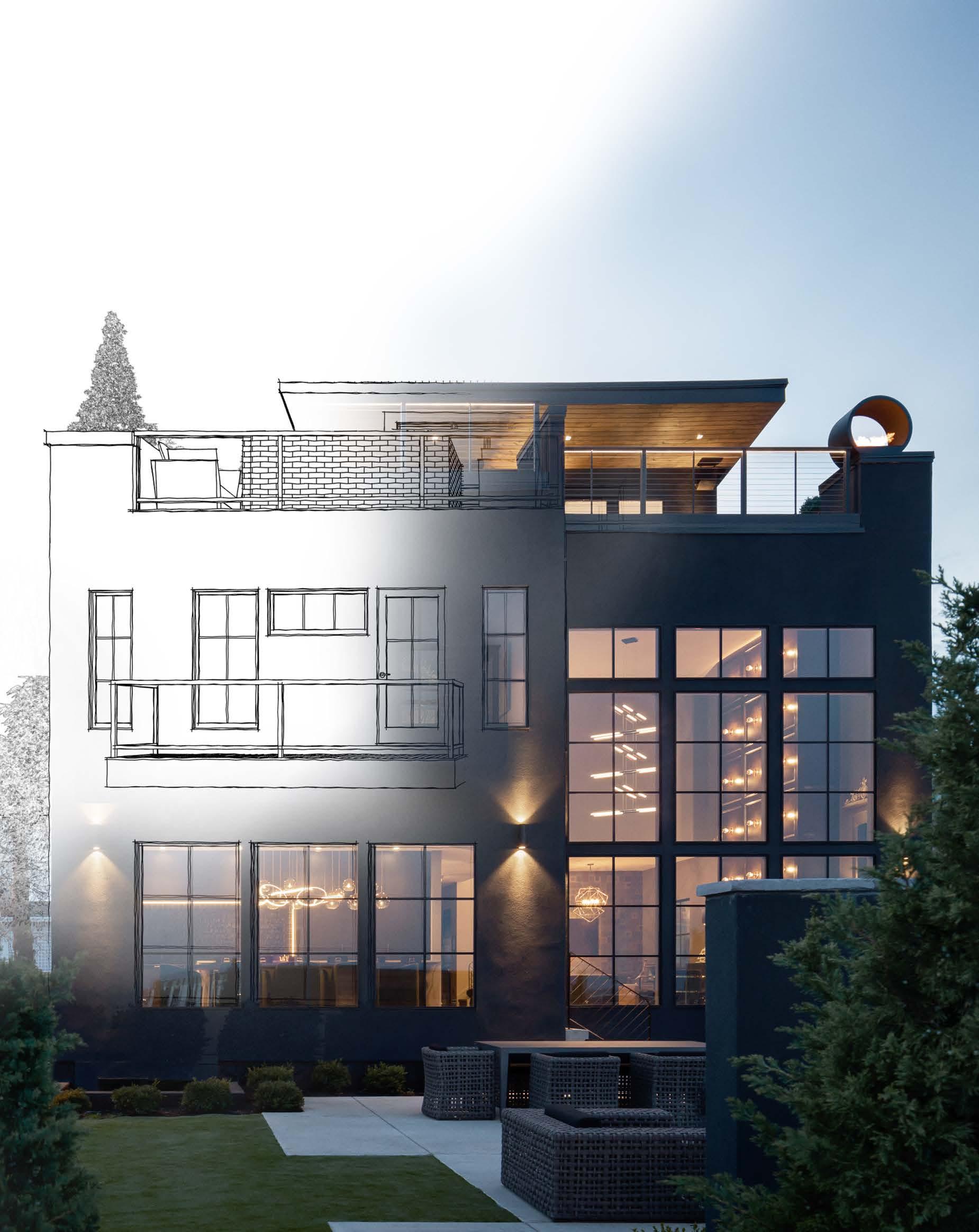
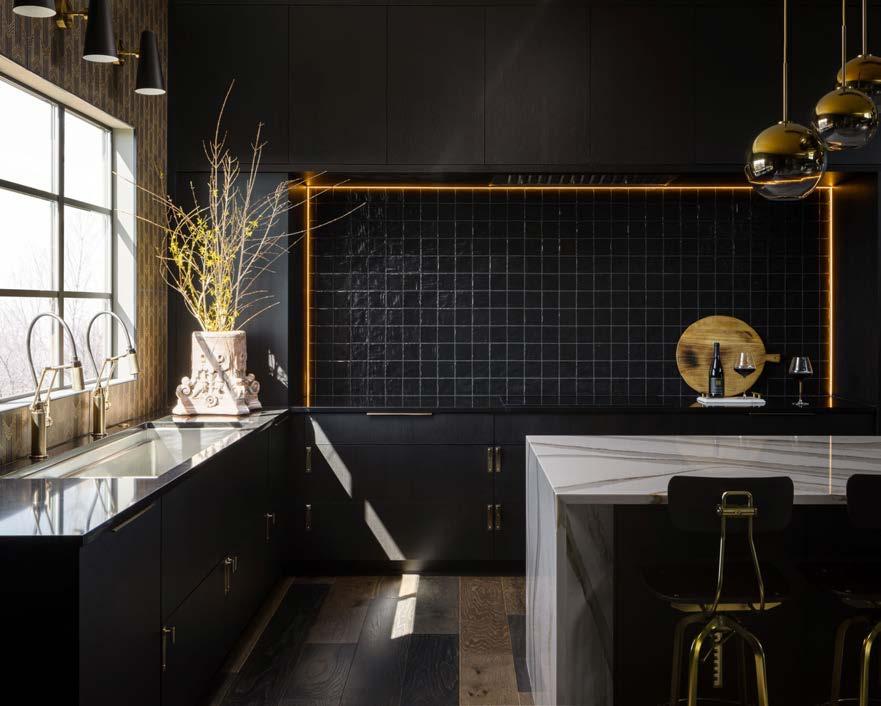
The homeowners envisioned creating an inspirational, signature home perched high on the hill of KCʼs kitschy Westside overlooking the downtown skyline. They wanted striking interior details, featuring cutting-edge technology that would complement traditional architectural elements to ensure that this iconic homeʼs position would sit as an awe-inspiring symbol for years to come. They planned for this four-level contemporary home wrapped in matte black and dressed with phantom black interiors to function as their private residence and home office.
Wanting something completely original for the 37-foot-tall mural installation spanning all four floors, they posted an art contest on social media encouraging artists and designers to contribute ideas. Artists were asked to incorporate local themes with a specific color palette. Nationwide submittals resulted in a dramatic piece showcased as one traverses from the lower level to the sky bar.
The homeowners wanted a place where they could entertain and offer their unique views to others. They envisioned their guests feeling welcome, but also special and pampered. Their companyʼs design studio is situated on the lower level, while the remaining three floors provide areas designed to live, entertain and celebrate the city. All this while still keeping the historic integrity of the neighborhood.
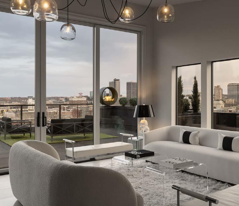
As designers, they embraced the historic value of Westside, while longing to create something new and exciting. Taking the freedom to explore, experiment and challenge design norms, nearly every inch of the property inspires. Although dark and moody on the first few floors, the rooftop sky bar—in stark white—highlights the incredible 270-degree views from every angle, while allowing the city lights and landscape to become the color that dominates the eye.
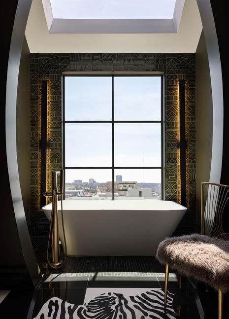
Building up allowed each level to have a specific function and feel, and reached higher for those outstanding multilevel city views. First-floor rooms include a study, powder room, lounge, wine cellar, kitchen/dining and great room with soaring 21-foot ceilings. The private second floor contains two guest bedrooms and the primary bedroom/ bath with a steam shower, his/her closets and a freestanding tub with a large skylight overhead. On the third floor, the city comes to life, highlighting vaulted ceilings, a bar, a powder bath, a lounge and two separate rooftop decks. The west deck is for more intimate conversations, while the east deck features seating areas, custom-fabricated fire pits, and enough room to dance against the backdrop of city lights.
CONTRACTOR/DESIGNER Madi Mali Homes


PHOTOS BY Nate Sheets View full project details.
Engineer: Ken Sidorowicz Landscaper: Lawn & Landscape Solutions Appliances: Feguson - Miele, Sub-Zero, Wolf, Cove Cabinets: Gillpatrick Woodworks Closet: Gillpatrick Woodworks
Countertops: Carthage Stoneworks Electronics: Nebraska Furniture Mart Flooring: Carpet Direct Fabrication Company: Lost Path Iron / Dane Fabrication Rugs: Jaipur Living Furnishings: RH, MMH custom-designed pieces, etc. Accessories: Brent Thompson - Noble Designs Hardware: Locks and Pulls Plumbing Fixtures: Kohler, Ferguson Lighting Fixtures: Wilson Lighting, Rensen House of Lights, Regina Andrew, Barbara Cosgrove Wall Coverings: Phillip Jeffries; custom Paint: Millennium Painting Siding: Specialty Contracting Roofing: Aspen Roofing Windows: Milgard Windows, Pella Products of KC Window Coverings: J Gieger
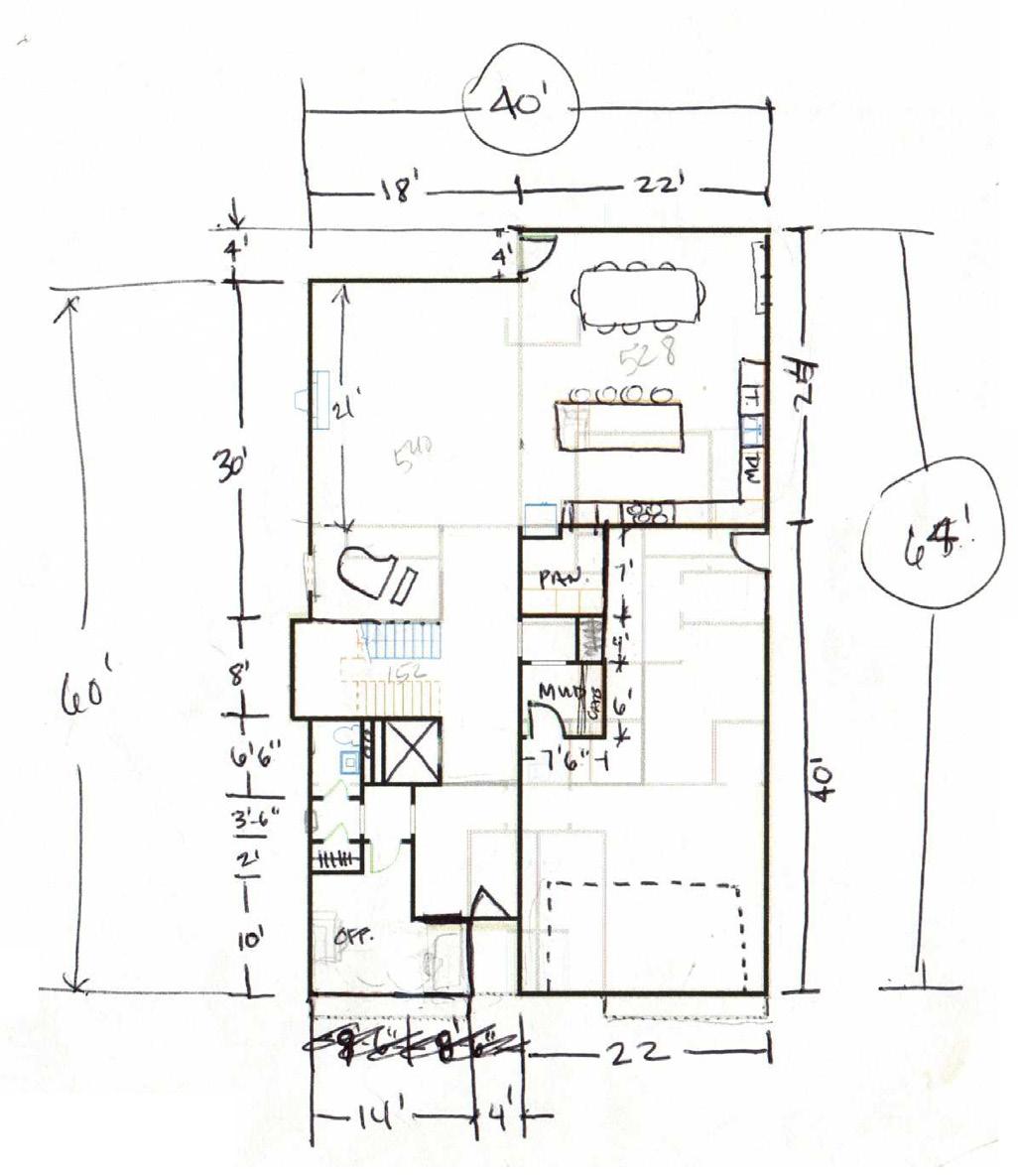
As one of a pair of contemporary West Plaza homes, this home was developed by a visionary who purchased the property to bring a new style of housing to Kansas City. The goal was to maximize and utilize the site with elemental design, clean forms and amazing views of the Country Club Plaza skyline, all while providing elegant and unique interior spaces.
The teamʼs greatest challenge was that they had two sloping lots and very little land on which to build. Though sparse, the lots allowed for a spacious basement with a three-car garage and mudroom, which is uncommon on narrow lots like these.
A three-story open steel staircase ascends through an open-concept, double-height dining space, modern kitchen and living room, with an impressive balcony for entertaining. The third floor has an uninterrupted layout, flowing around a two-way fireplace connecting the primary bedroom and bath with an incredible walk-in shower lined with clerestory windows.
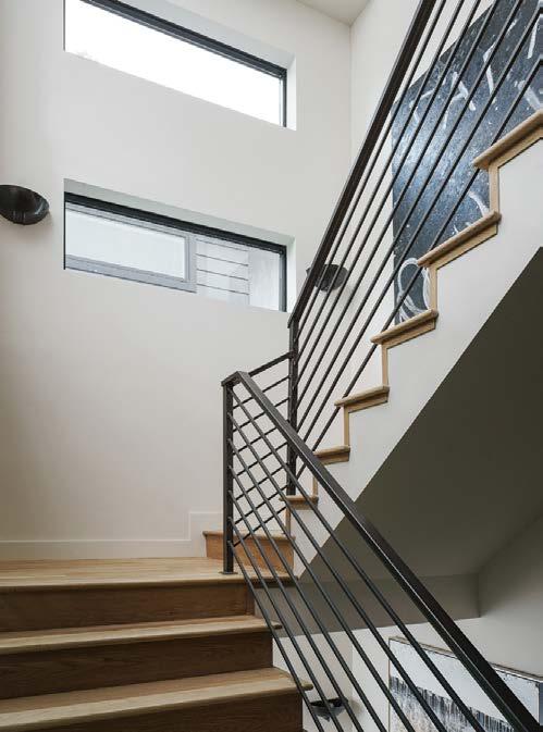
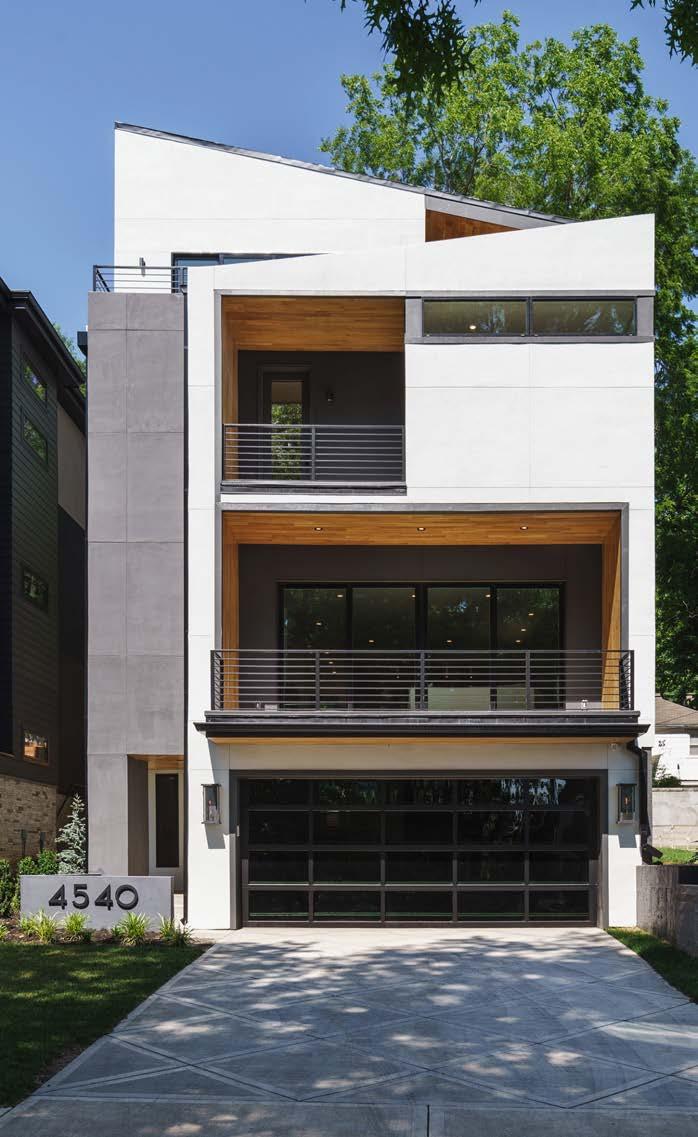
The exterior is just as impressive as the interior, and the top level was designed with a rooftop bar, a game room and a terrace. An elevator links all four floors of living for ease of accessibility.
ARCHITECT
NSPJ Architects
CONTRACTOR
Hickok Homes

PHOTOS BY Matthew Anderson
RESOURCES
Engineer: Darius Viet

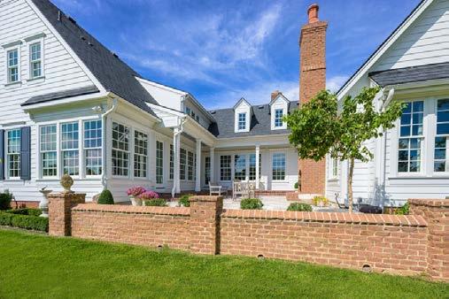
A repeat client reached out to the architect to create another period-correct Williamsburg home. They desired the charm of an older home with an interior rich in detail and some open living spaces typical of a newer home, without displacing old-home charm.
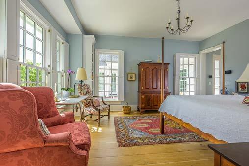
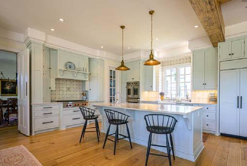
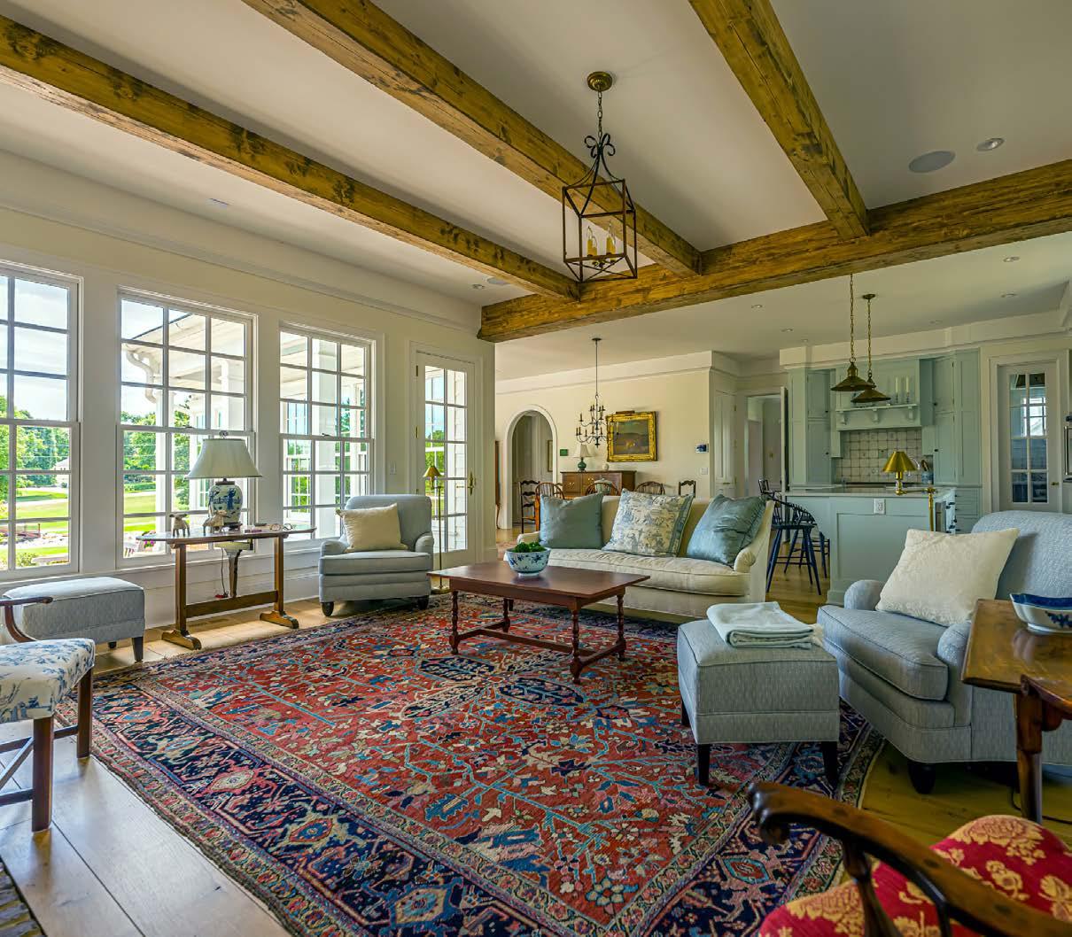
Creating privacy with respect to the very closely adjacent home to the north was a challenge, along with creating openness to the community green space to the south. To solve this, interior functions along the north side of the home comprise the pantry, anchor wall of the kitchen, planning desk, utility bath, service entrance and garage. The patio/courtyard allows direct light to drench the interior and views from the sunroom, breakfast/ sitting, kitchen and hearth room to the southern green space.
The front of the home presents a traditional five-bay center hall mass at the west property line. The formal dining room and den/off ice occupy the front of the home. While the primary suite is privately separated from the interior public spaces, it benefits from the same interior/exterior relationship as the major public spaces with views to the green space. The patio/courtyard with fireplace is defined by three sides of an exquisite architectural backdrop, with the fourth side open to nature beyond.
The lapped siding, brick and millwork exterior detailing is traditional Williamsburg; inside, the floor plan retains the boxy room characteristics of a typical Williamsburg plan. The breakfast/sitting, kitchen and hearth room— while more open in nature—still retain their respective sense of space, in keeping with an older design.
ARCHITECT
Wendlandt + Stallbaumer
CONTRACTOR
Tom French Construction
PHOTOS BY Keith Kreeger View
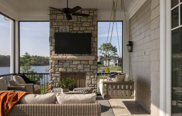
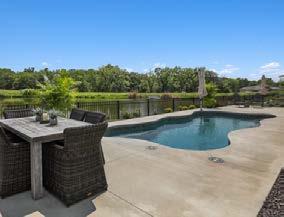
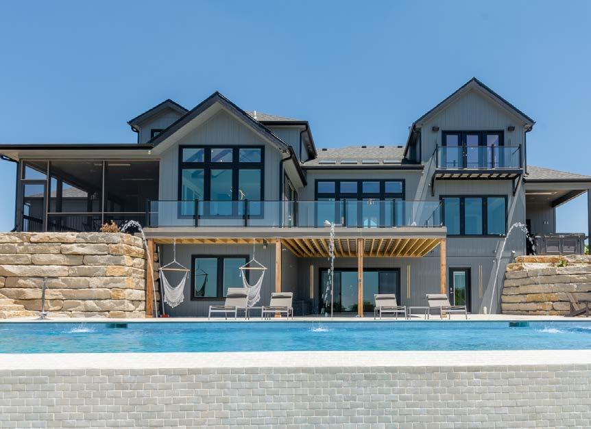
This project began with a clientʼs vision of building a second home where her children and grandchildren would gather and relax for an evening, a weekend or all week long. It had to be an in-town lake home; staying close to Kansas City allows her busy family members to drive to the lake house and head back into town if they have other obligations, making the visits more frequent and enjoyable for everyone. Building a custom home reduces the number of challenges that often come with a major remodeling project. The placement of the swimming pool on the same level as the main living area was a challenge that ended with an engineering and design accomplishment. The infinity pool required the architect, engineers and pool designer to build up/support the patio and pool from below while maintaining the aesthetic integrity of the back of the home. The design team was able to deliver the client her main-floor infinity pool in a way that enhances the lake house.
ARCHITECT
Elswood Smith Carlson Architects
CONTRACTOR
Ambassador Homes
INTERIOR DESIGNER

Madden McFarland
PHOTOS BY Nate Sheets
View full project details.
RESOURCES
Landscaper: Land Art Pool Designer: Midwest Pools New Home Community: Lake Winnebago Appliances: Ferguson Cabinets: Profile Cabinet
Countertops: Carthage Marble Electronics: Cineplex Flooring: Acme Floor Co. Rugs: Abrash Rugs Furnishings: Madden McFarland Accessories: Madden McFarland
Plumbing Fixtures: Ferguson Lighting Fixtures: Wilson Lighting Wall Coverings: Madden McFarland Windows: Marvin Window Coverings: Madden McFarland
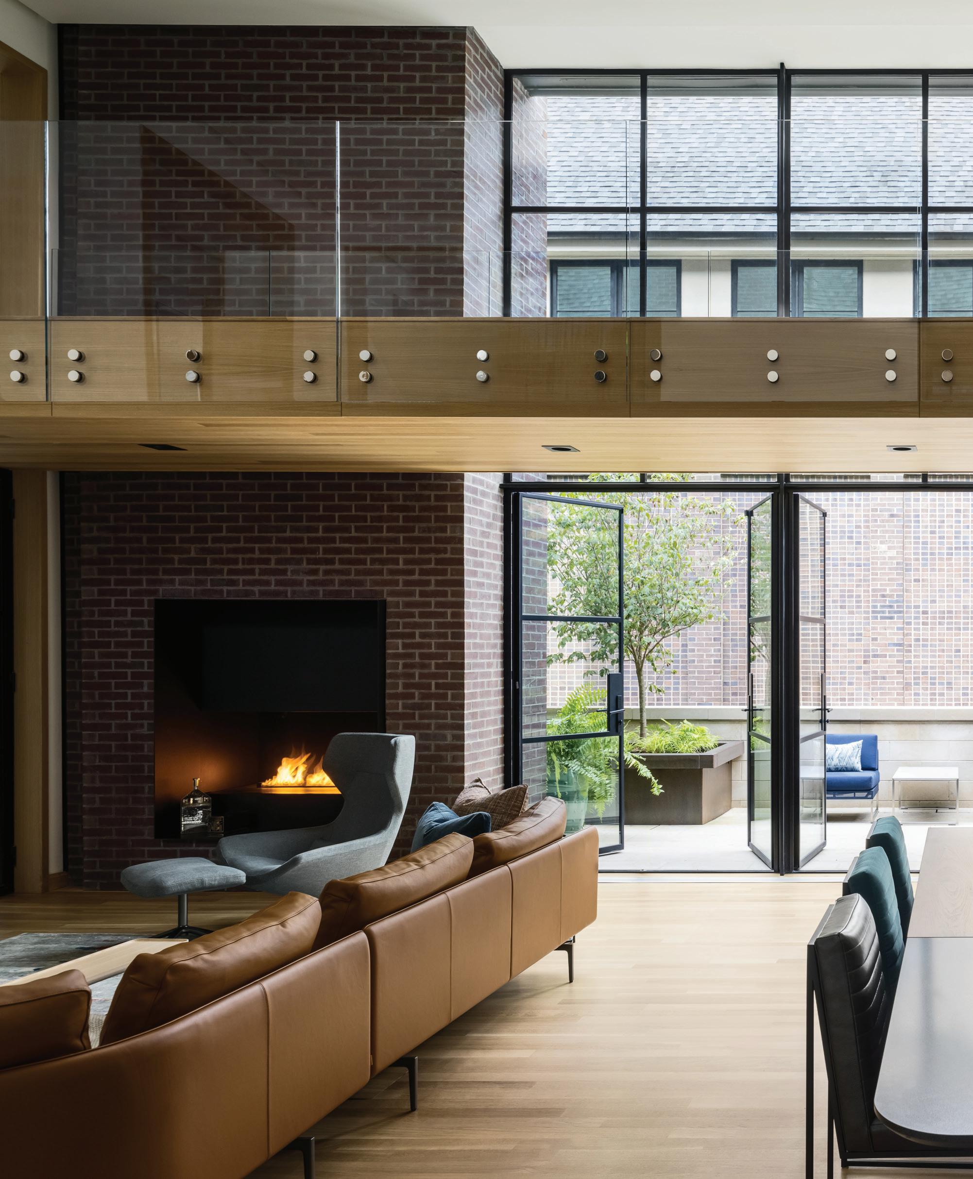
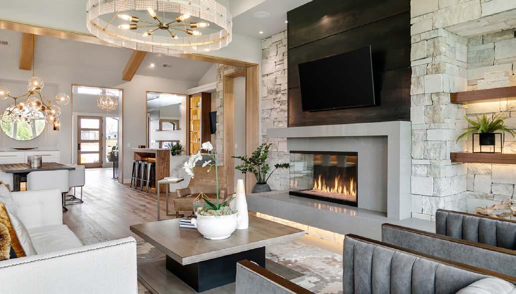
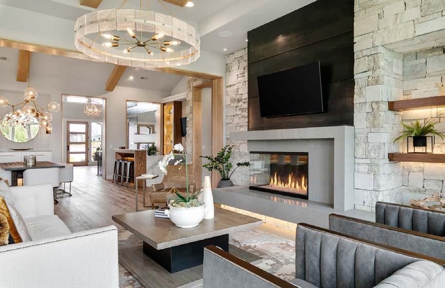
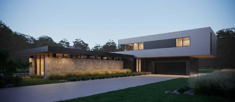
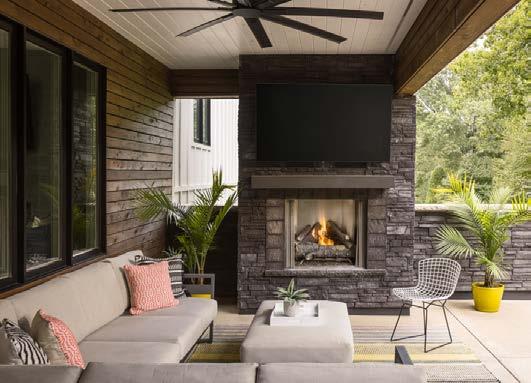
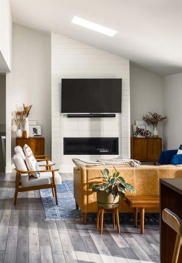
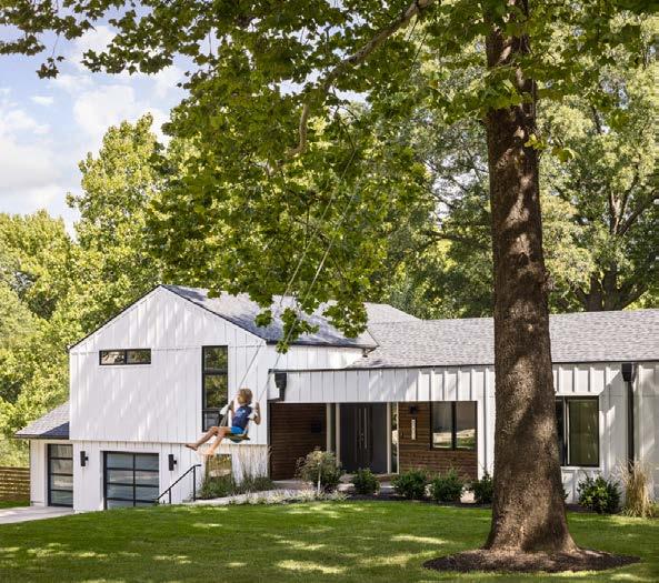
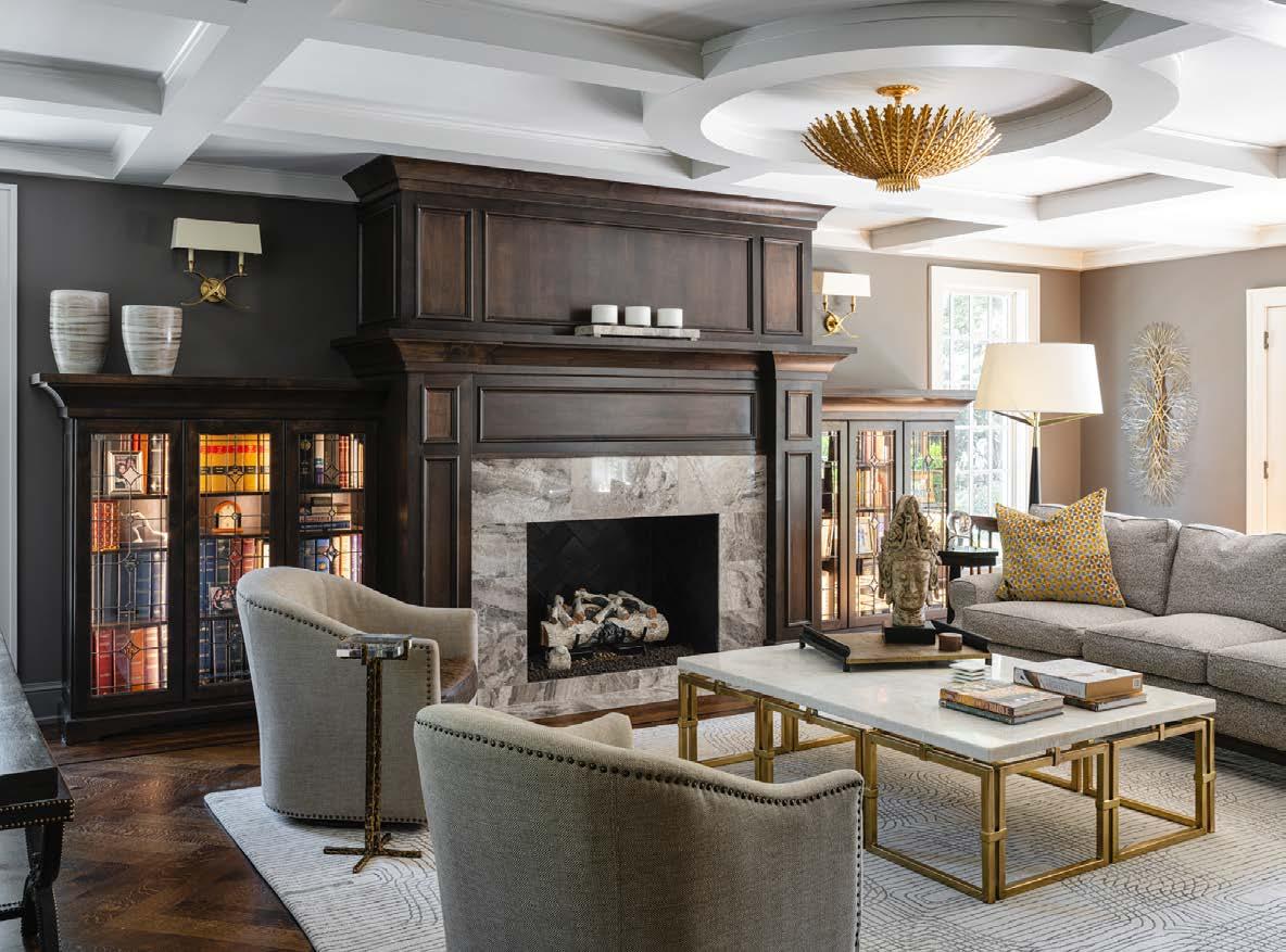
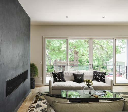
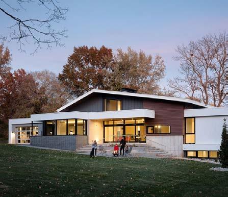
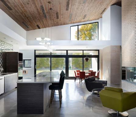
Designed for a family of five, the homeʼs layout is organized around a central hearth where the family gathers. As a focal point to this space, a three-sided glass fireplace and suspended brick chimney add function and visual weight. The homeʼs mid-century modern aesthetic highlights simple yet dynamic architectural forms. Classic materials— brick, stucco and glass—are highlighted with recycled-content synthetic-wood cladding and exposed concrete. With any new custom residence, translating an ownerʼs thoughts, tastes, preferences and lifestyle into a welldesigned home can be challenging. The home must also perform in a climate that presents the best and worst of seasonal changes.
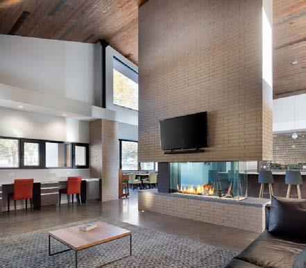
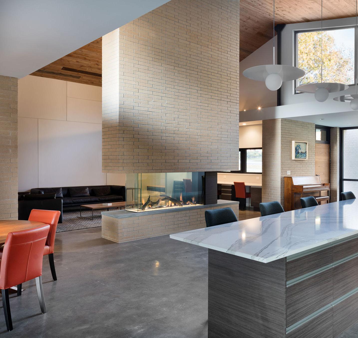
This newly constructed residence utilizes energy-eff icient glazing, hydronic slab heating and energy recovery systems. Some of the key features of this passive house design include radiant floor hydronic heating and zoned heating, cooling gas-fired tankless hot water heating system, and triple-pane passive house-certified windows. To achieve optimal energy, durability and comfort performance, the home has a continuous air barrier and continuous super insulation.
RESOURCES
ARCHITECT/DESIGNER

Clockwork Architecture + Design
CONTRACTOR
Kala Performance Homes
PHOTOS BY Tony ThompsonThe homeowners used their love of wood and natural elements to source unique wood materials for this home, using it throughout to showcase their design ideas. The goal was to create a show-stopping home that the homeowners could use as a personal showcase for their clients.
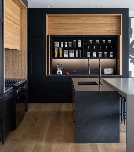

The design teamʼs biggest challenge was incorporating all the different wood types and materials so that the home still felt cohesive. They had walnut cut in multiple ways, eucalyptus and other exotic woods. Together they fought for dominance, so it was a challenge to use all the different types of wood the owners loved and still create a sense of harmony.
The solution was to closely study the materials and work to let some shine while others stayed in the background. Continuous use of the black base color really helped to achieve this.
ARCHITECT
Wolfgang Trost Architects
INTERIOR DESIGNER

Kristen Ridler Interior Design
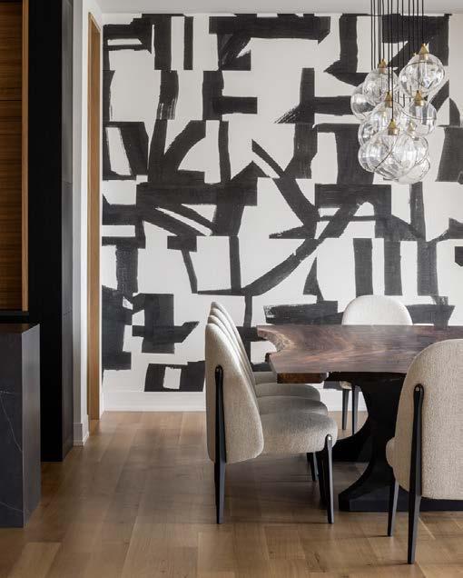
CONTRACTOR
Madi Mali Homes
PHOTOS BY Nate Sheets
View full project details.
With an eye for design, the client collected inspirational images for use in his home, challenging the architect to create a unique fit for the homeownerʼs lifestyle.
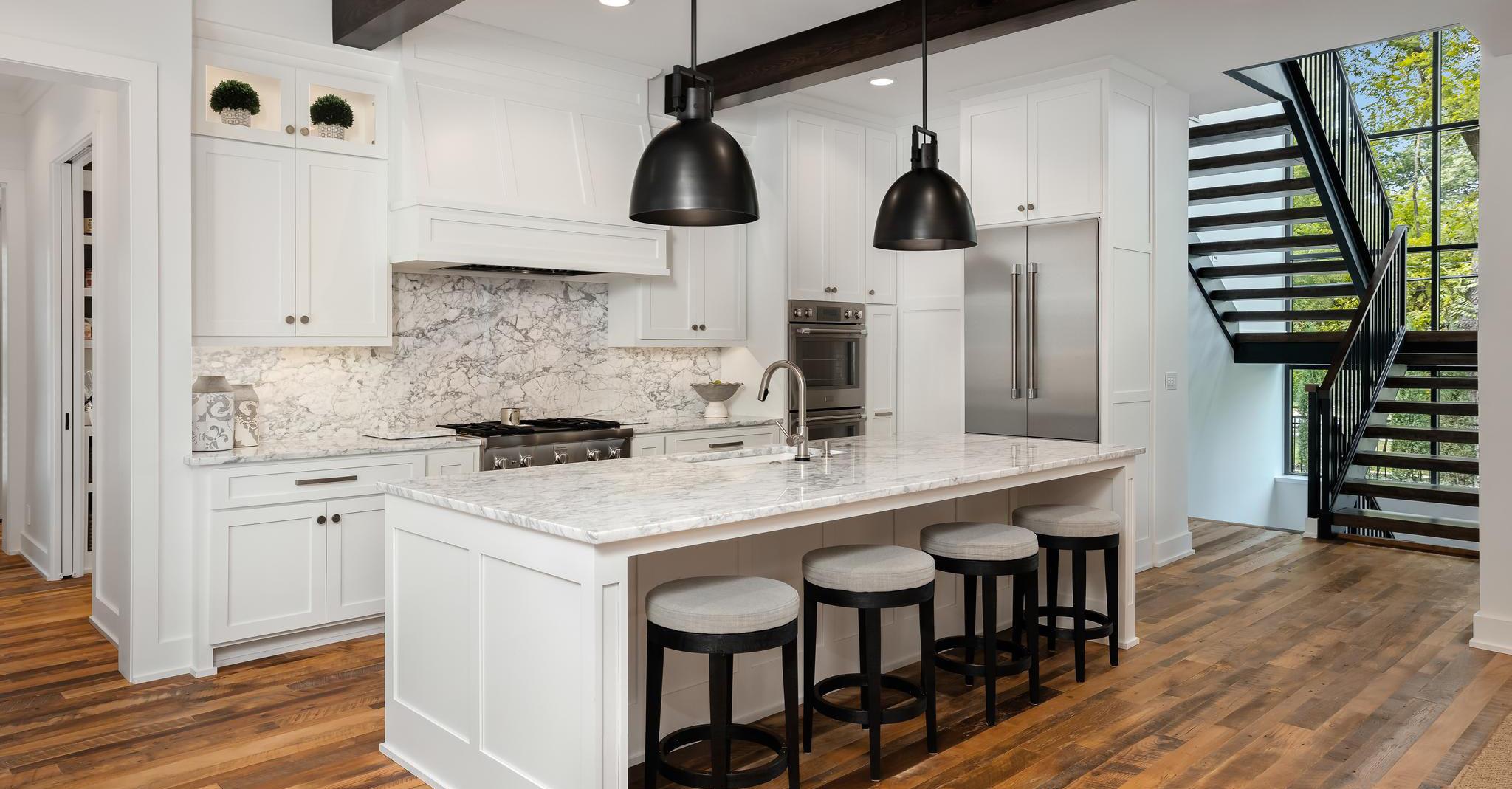
A French-influenced exterior adds a special touch and a reminder of other homes the client once lived in. To complement the modest height of the surrounding Cape Cod homes in the neighborhood, the homeʼs two-story portion was pushed farther from the street than its neighbors to diminish its scale. The architects incorporated a single-story garage into the front of the house, where its scale aligned with the adjacent neighbors.
Artistic touches throughout the project resulted from the synergy between the homeowner and the architect. Much of the exterior of the home is covered in white brick, with an intimate covered patio facing the backyard, complete with an outdoor fireplace for cozy spring and fall evenings.
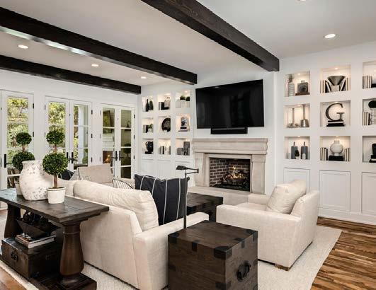
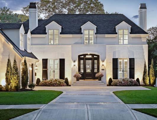
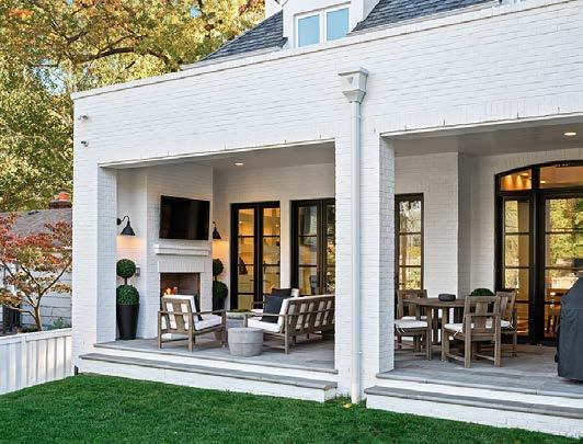
RESOURCES
ARCHITECT
NSPJ Architects

CONTRACTOR
Noblit Didier Design + Build
PHOTOS BY Brian Pierce, Sherpa Media
View full project details.
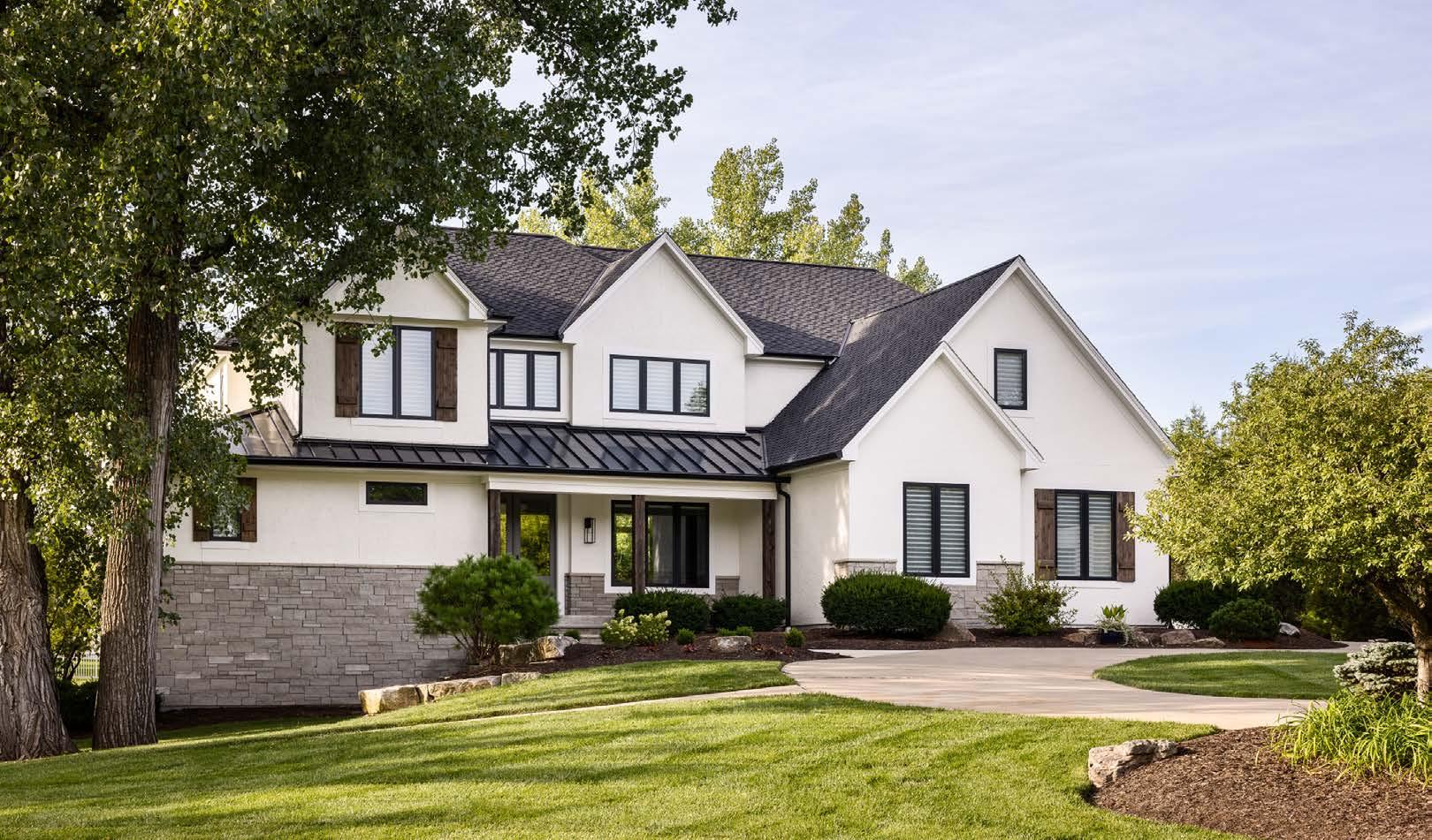



The overall goal for this custom home was to bring a sense of modern Prairie style, instilling a feeling of the past with common sense for the future. The homeowner emphasized the concept of a modern luxury hotel—warm and inviting with clean lines. The design team chose limestone and rift oak throughout the home to contrast each other in a warm, earthtone feeling.

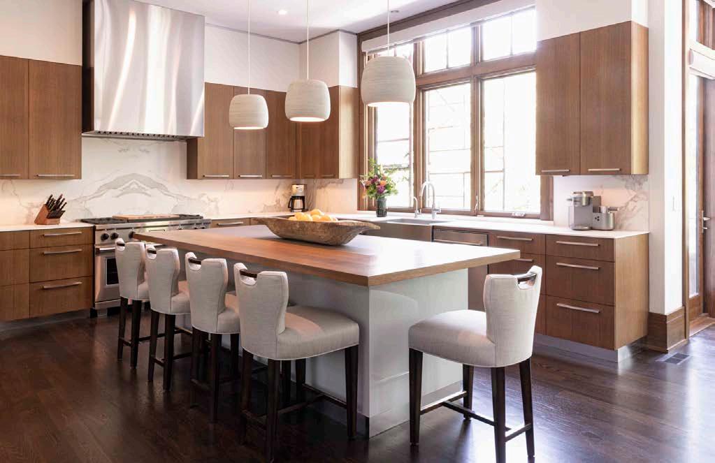
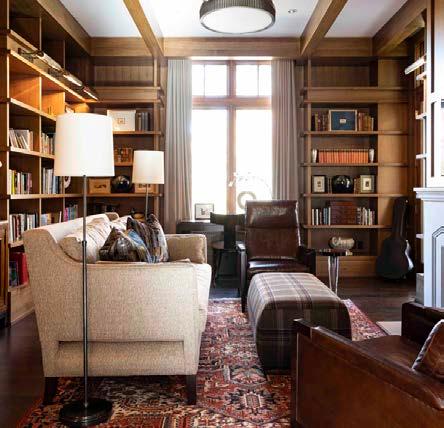
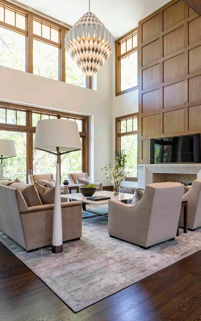
Balance and scale are always a challenge with this size of home. The grand scale of the architecture needed to feel appropriate with the lot setting. Inside, the large rooms needed to feel inviting and usable. To help with the scale, they designed taller, modern moldings that incorporated the rift oak and a recessed metal channel that supported the homeʼs clean, modern-yet-classic sensibility.
RESOURCES
Cabinets: Profile Cabinet Showrooms: SID & Company
Finding furniture to fit the scale of the home presented a challenge as well. To establish the feeling of a luxury hotel, they brought uniformity to the project, instilling each room with a sense of balance and symmetry with selections that included matching nightstands in every bedroom, benches at the foot of every bed in a similar fabric, and pairs of lamps. The concept required calmness and luxury—nothing too chaotic or eclectic. All the woodwork has the same finish throughout, and only two paint colors were used in the home—two shades of white. Oversized floor lamps, coffee tables and a grand, modern chandelier fill the space without overpowering it.
ARCHITECT
NSPJ Architects
CONTRACTOR
RM Standard Construction
INTERIOR DESIGNER

M. Sudermann Interior Design
PHOTOS BY Aaron Leimkuehler View full project details.
Located just south of the Kansas City Country Club Plaza, this five-bedroom, four-and-a-half-bath singlefamily row house was conceived as a brick monolith on a limestone plinth. The carved areas within the monolith are expressed in ceramic tile.
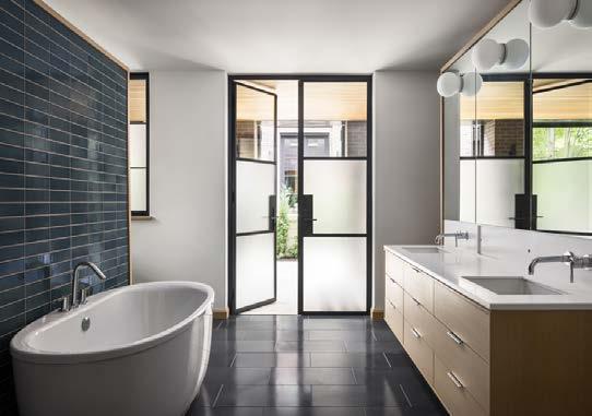
The interior of the house was developed around a double-height living/dining room on the main floor, surrounded by a U-shaped second-floor gallery for the ownersʼ art collection. A delicate bridge crosses the living room, providing scale at the patio doors and completing the gallery circulation.
The site faces a central park in a historic overlay district. The clients wanted a more contemporary house than would be allowed. The design teamʼs first challenge was mediating the desire for a contemporary home while
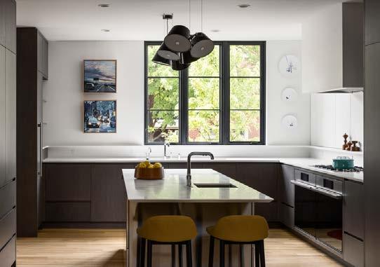
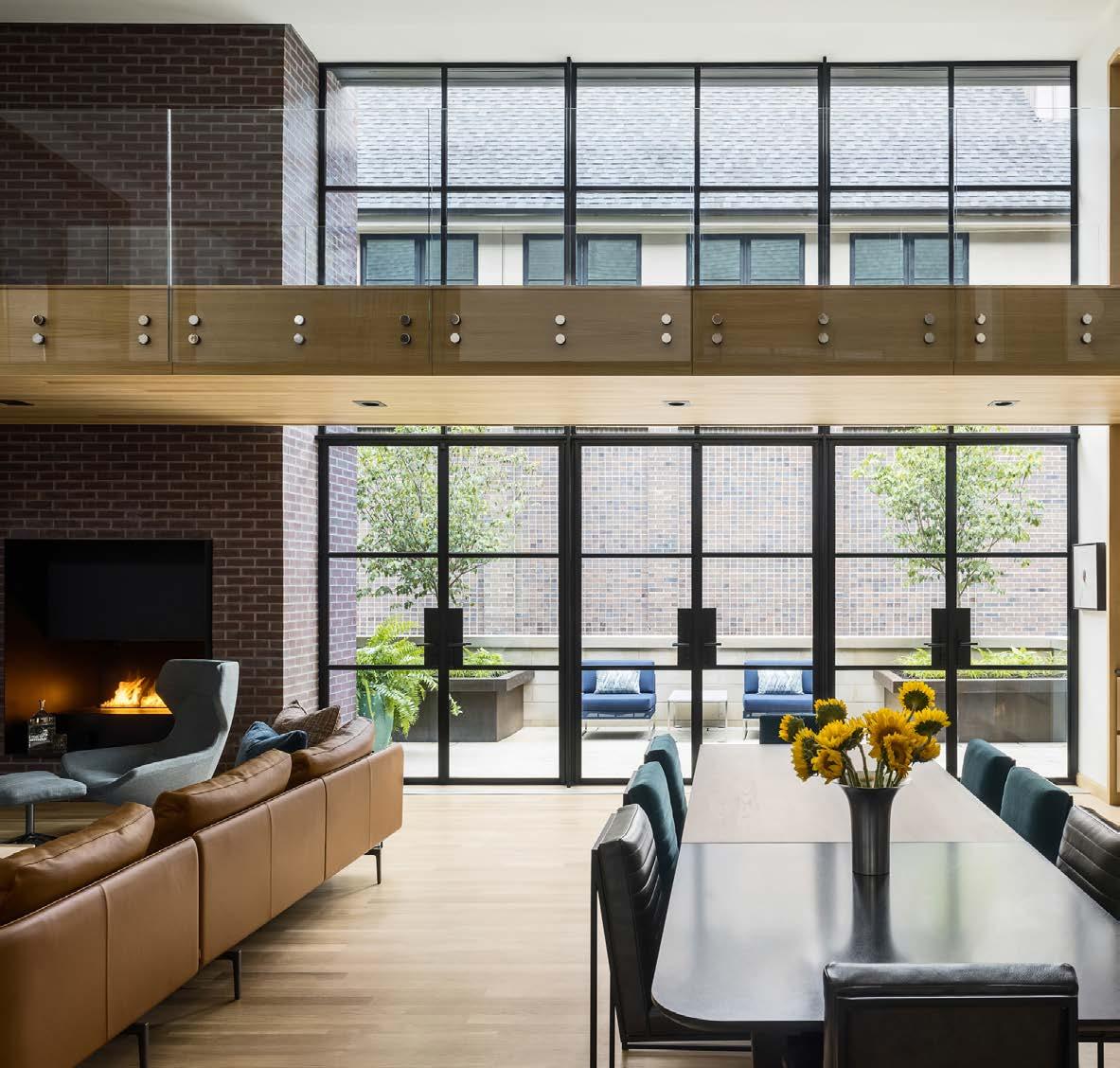
adhering to the historic overlay rules. Another challenge was to create a range of exterior spaces, so they needed to figure out how to achieve this with an urban row house.
On the west side of the house, a screened-in porch is carved into the brick mass, adjacent to a developed limestone patio that is elevated from the park for privacy. On the northeast corner are two stacked exterior porches. The “birdcage,” as they call it, contains a grill and breakfast area on the main floor adjacent to the kitchen.
On the second floor, itʼs an exterior living room adjacent to the gallery.
This space utilizes the brick wall of the adjacent house to maintain a courtyard-like feel. A sunken mechanical space adjacent to it hides the mechanical systems.
ARCHITECT Forward Design Architecture CONTRACTOR

INTERIOR DESIGNER Alan Karlin Design
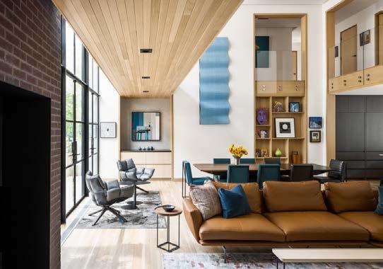
As empty-nesters, the clients wanted a warm and elegant, lock-and-leave home. It needed to feel like a sanctuary and a place to easily entertain. Inspired by their international jewelry business, this new construction feels like jewelry on a large scale—with textures and patterns imagined as beautiful gemstones mounted against a simple, clean setting.
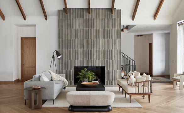
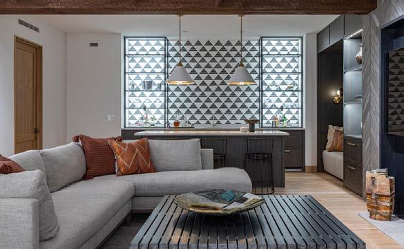

The open floor plan meant that the kitchen was visible from the front entry, so it was important to create a seamless visual to the living areas. Rather than choosing a traditional treatment that showcases the stove hood and kitchen tools, the design team recessed the ventilation into the counter. Appliances are also hidden from view. The staircase was designed to float from the side walls, pulling the eye to three continuous
RESOURCES
stories clad in handmade Italian terra cotta tile. They designed front windows for the clientsʼ French antique shutters, then added warmth with reclaimed brick and concrete floor tiles. In the primary bedroom, soft textures and monochromatic hues create a luxurious oasis. Grasscloth wallpaper, a warm wood ceiling and a plush wool rug mute outside distractions. Jute nightstands, soft textiles and handdyed hemp pillows elaborate on the textural theme. In the primary bath, custom marble mosaic floors were specially patterned to fit into the toilet room, shower and tub niche and to run along the ribbed vanity face. The custom over-scale steel medicine cabinets are enormous, with backlighting to add dramatic mood.
ARCHITECT
Elswood Smith Carlson Architects
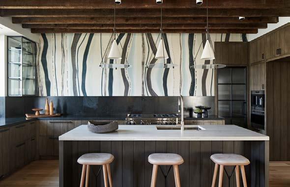
CONTRACTOR
Ambassador Construction
INTERIOR DESIGNER

Lisa Schmitz Interior Design
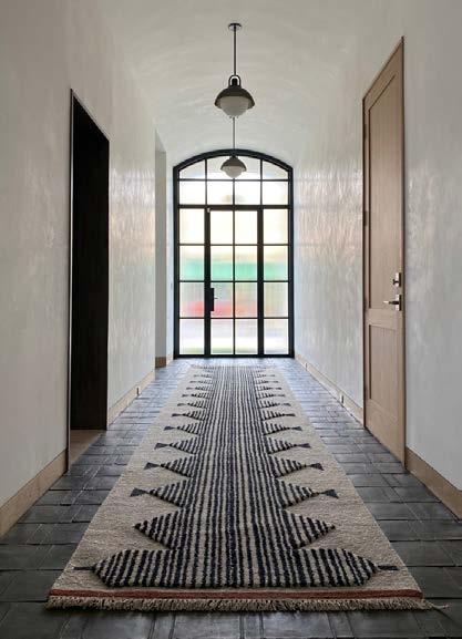
PHOTOS BY Nate Sheets
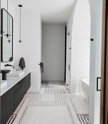
The clients wanted a modern look with warmth and a connection to nature. One primary objective was to capture the dramatic view behind the property and maintain privacy from the city street in front.
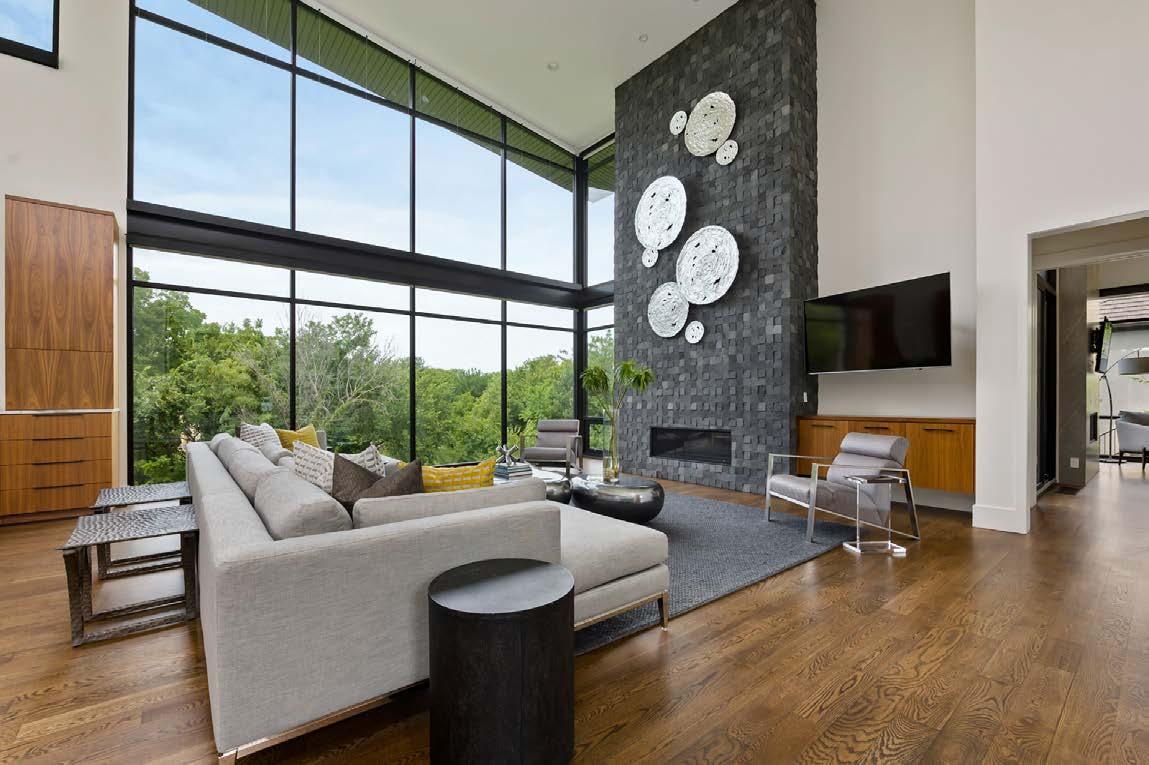
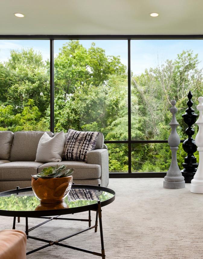
The property was steep; its slope, along with questionable soil conditions, presented both design and engineering challenges. But the challenging lot allowed the design team to capture breathtaking views on every level. To maximize this, they used a commercial glass curtain wall to create a thin veil between the interior and exterior. Large glass on the front of the home creates a transparent feel and allows light to spill down the staircase to the lower level.
The living, dining space and large kitchen form the core of the home. Taking a few steps into the home yields
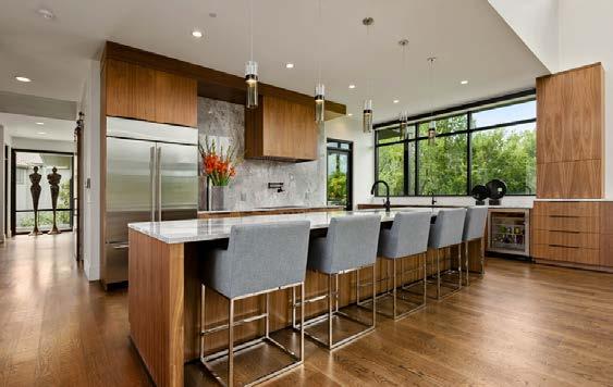
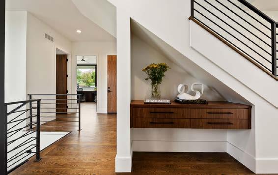
exterior views in every direction. The primary outdoor living space is large enough to include seating, dining and an outdoor kitchen.
The spacious primary bedroom connects with nature via expansive windows on the back wall. The glass is briefly interrupted by a see-through fireplace that also can be enjoyed from the private deck. The bath has his-and-her entrances convenient to either side of the bed.
Three additional suites for guests and the kids are positioned to create privacy. On the lower level, two suites are in different wings separated by a central living space. The third space is on the second floor with its own private loft. Each child has a room catered to their personality on separate floors.
ARCHITECT Bickford & Company
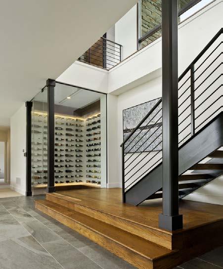
CONTRACTOR
Homoly Construction
INTERIOR DESIGNER Kristen Ridler Interior Design

PHOTOS BY Samantha
Ward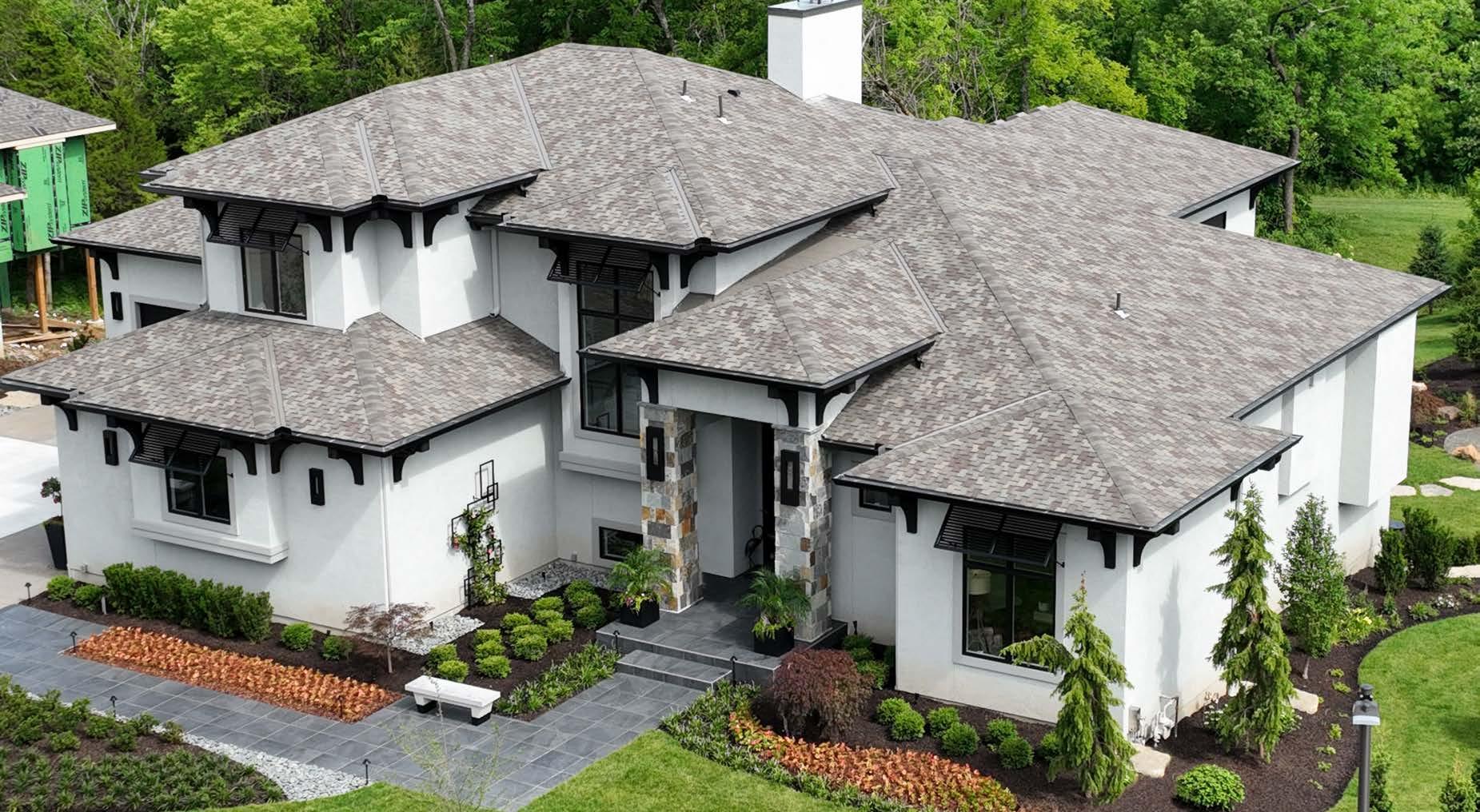

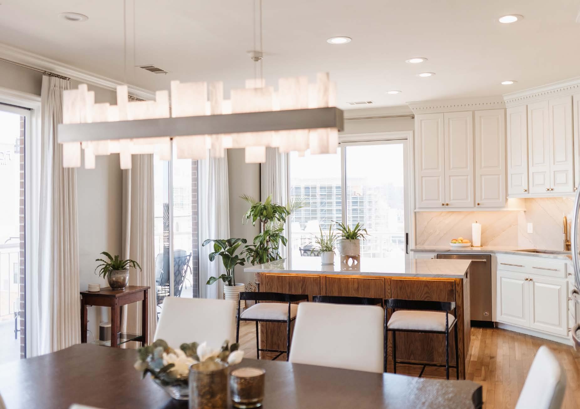
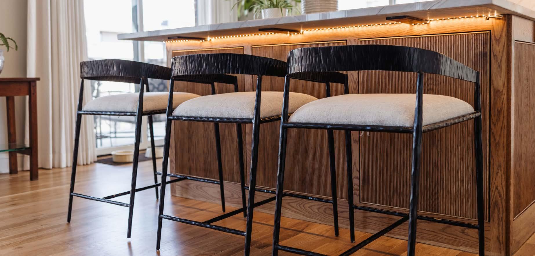
ARCHITECT
Wolfgang Trost Architects
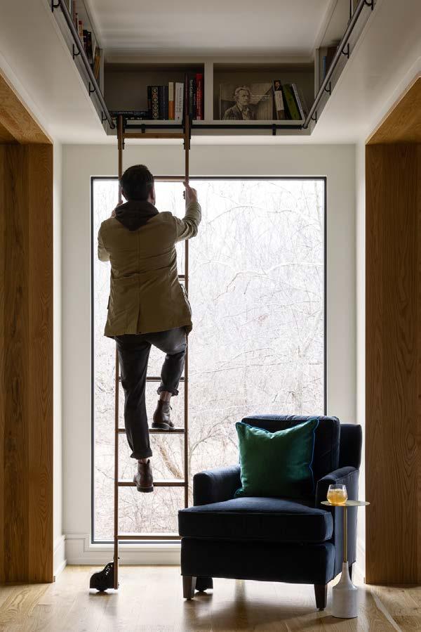
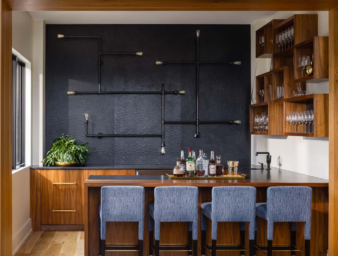
CONTRACTOR
Cecil & Ray Homes
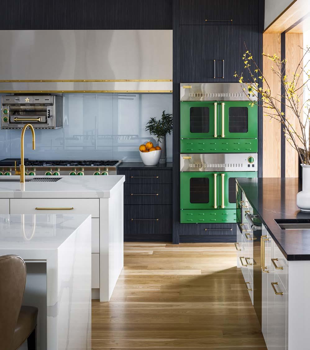
DESIGNER
Noble Designs
PHOTOS BY Nate SheetsA true labor of love. The clients had been planning this home on private property for seven years when the design team was brought onboard. Taking their time to get the vision and budget right, they wanted to create a modern home that was not sterile and felt like a family home.
Plans were created long before the interiors were determined, so it was fun and a challenge to get everything into a layout that was unique. The staircases and windows required large-scale lighting. Besides needing a gathering space for family and friends, the owners entertain large groups for fundraisers and required space for this.
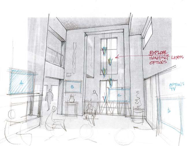
Custom light fixtures were designed for the large spaces in the home, along with a custom table that seats 18 in the basement level. A catering kitchen was created just off this entertaining space, and the elevator is situated to give chefs the best access to create their meals. An indoor pool was built for family fun and entertainment. Every detail was considered with the clients in mind. The result is an aesthetic that feels modern and cozy and accommodates the familyʼs hobbies of cooking, wine collecting and beekeeping.
RESOURCES
Real Estate Agent: Cami Jones - Reese Nichols Appliances: Blue Star Cabinets: Gillpatrick Woodworks

Furnishings: Noble Designs To the trade Showrooms: KDR Plumbing Fixtures: Briggs


Lighting Fixtures: Wilson Lighting, Hubbarton Forge, Rock Cottage Glassworks
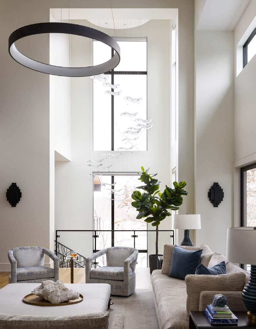
Wall Coverings: Porter Teleo Window Coverings: J Geiger
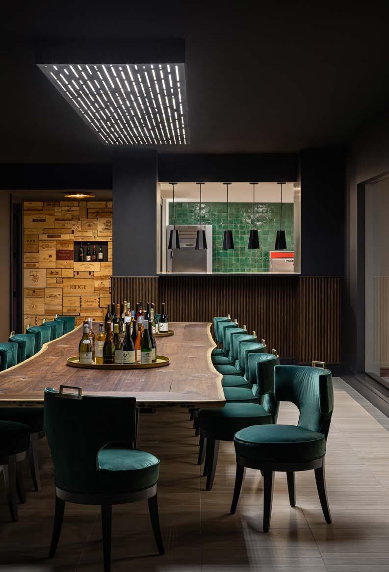
For this project, the clients wanted to take advantage of the incredible views and create a floor plan with plenty of spacious entertaining areas. They also wanted a grand entryway and natural light flowing into every room. For their basement, they wanted a sports space equipped with a half basketball court, a bowling alley and a large bar. This project came with many challenges. It took several months to break through rock and pour piers to support the house. The lot required a special orientation for the home. The lake on the property offered incredible views, but it was perpendicular to the street. The homeʼs large floor plan made it challenging to create a space that felt comfortable and incorporated ease of flow between rooms.
The Artisan Home was designed to sit “sideways” relative to the street. This created a more private driveway and gave the best views. This orientation also allowed the house to sprawl in different directions, making enough room for all the spaces on the clientʼs wish list. The home was designed to wrap around the pool to emphasize the importance of the view and outdoor space. The combination of the homeʼs size and terrain challenges required special engineering systems to hold up the massive suspended garage and sports court. After several months of designing, breaking rock and constructing, all the challenges were worth it—they managed to incorporate all the items on the clientsʼ wish list.

CONTRACTOR
Starr Homes
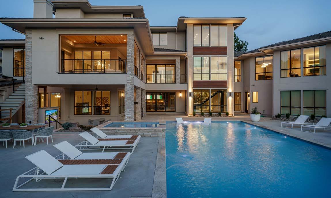

INTERIOR DESIGNER
Dwell Interiors
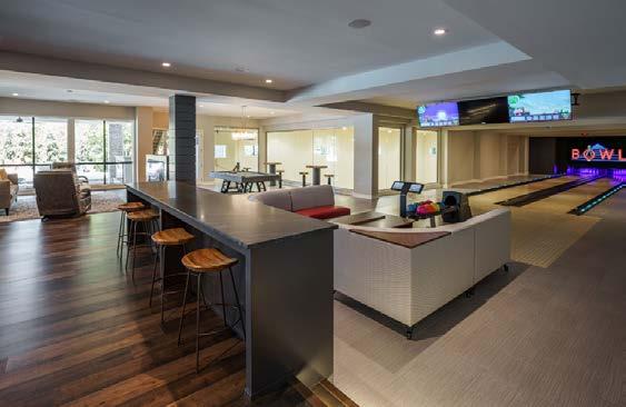
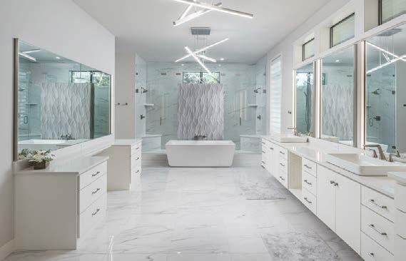
PHOTOS BY Matthew Anderson View full project details.

After reinventing the indoor kitchen, Hestan’s engineers have now redefined outdoor cooking. Hestan Outdoor products deliver award-winning performance, innovative features and the options to build the oasis of your dreams. This beautiful outdoor kitchen includes components accented in Hestan’s Bora Bora Turquoise color (one of eleven color options). Included are a 30” wide Refreshment Center, a 42” Built-In Gas Grill, 12” Dual Side Burners, a 36” Double Drawer/Storage Door Combination, a 24” Refrigerator/Wine Cooler, a 24” double tap Beer Dispenser and a 24” Drop-In Cooler. VISIT
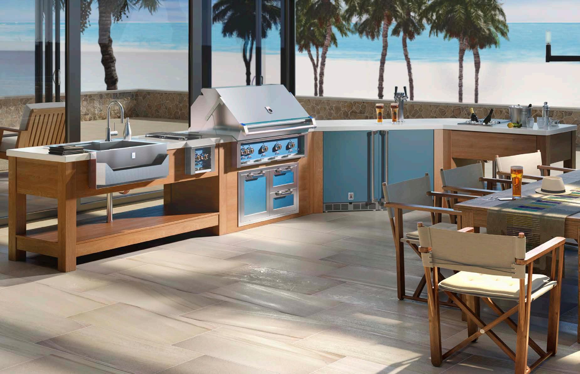
14105 Marshall Dr. Lenexa, KS 66215

