1 Rachel
Twist + Turret Contents 2 6 9 Jesse Owens North Flat-Out Vitra Warehouse 12 Palace of Comfort 15 OSU PORTFOLIO UG ARCH 2023
Kuepers

Completed with Elizabeth Sill
Instructor Bart Overly Spring 2022
Twist and Turret is a coworking tower composed of two towers that begin to overlap. The tower on the left is the turret which is organized by typical office space. The tower on the right is the twist which houses coworking space and is divided into five different neighborhoods. The neighborhoods are characterized by themes: playful, creative, mindful, formal, and adventurous. The neighborhoods are each centered around a certain amenity and a secondary mode of vertical circulation. For example, the playful neighborhood has ‘chutes and ladders’ as its secondary vertical circulation and a playground as its amenity. The bottom four levels act as an extension of the two towers and the park. They house a market, cafe, gallery, and daycare and have large doors which open directly towards the park in warmer months.


Fall 2021
This project explores what future gym culture could be like and how it can begin to influence the architecture of a gym. I applied those ideas to design a new gym for the Ohio State University campus. I decided to design a gym which would act like a supplement to the university. I did this by designing pods which can be used as independent exercise spaces but also for things like eating, sleeping, meditating, and working on homework. The building is also designed around a large, central pool room. There are terraces with workout equipment as well as courts for various sports looking out over the pool to create a very social space juxtaposing the more independent program of the pods. Some of the pods also become saunas and pools of various temperatures to create the experience of Turkish baths moving from the locker rooms to the pool.


The goal of this project was to design a pavilion which would sit on the Vitra Campus and house a single chair from the Vitra Collection. It developed from flattening a container and refolding and reconfiguring the flattened surface into a three-dimensional pavilion. The flattened box was also projected onto the surface of the pavilion to create a pattern which informed apertures. I utilized a Target box covered in packing tape which I translated into the stripes that appear on the pavilion’s surface. Because the tape is both transparent and acting as a binding agent, the stripes do the same for the pavilion. There are stripes cut out to allow light into the pavilion as well as to interlock pieces of the pavilion to create a unified form.

The image is of the original Target box previous to it being flattened and refolded into the final pavilion.
The image is of the unrolled Target box which was projected onto the surface of the pavilion as a pattern which influenced apertures.
The image shows the model developed from the original Target box after it had been flattened and reworked.


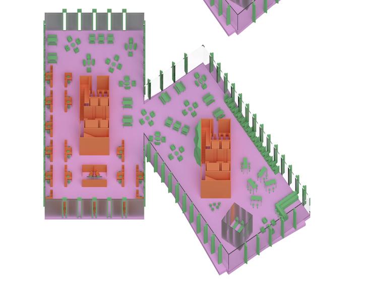
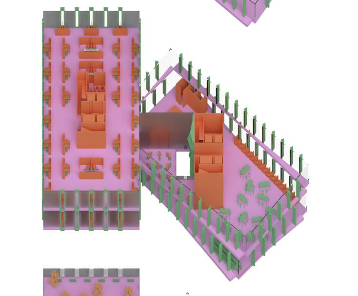
This project sought to produce a warehouse space through the implementation of a field condition within the Vitra Campus in Germany where infamous furniture is produced. My strategy revolved around the use of organic forms to produce the field condition which were defined in the building through grids of different scales. These grids are made up of columns and furniture within the different spaces. Some of the columns become large enough to act as podiums to diplay the chairs of the Vitra Collection or to house restrooms. Though most of the building is open to the public, there are private spaces defined by thick walls, but to make sure light is able to reach them, there are clerestory windows as well as curtains wrapping around the spaces.


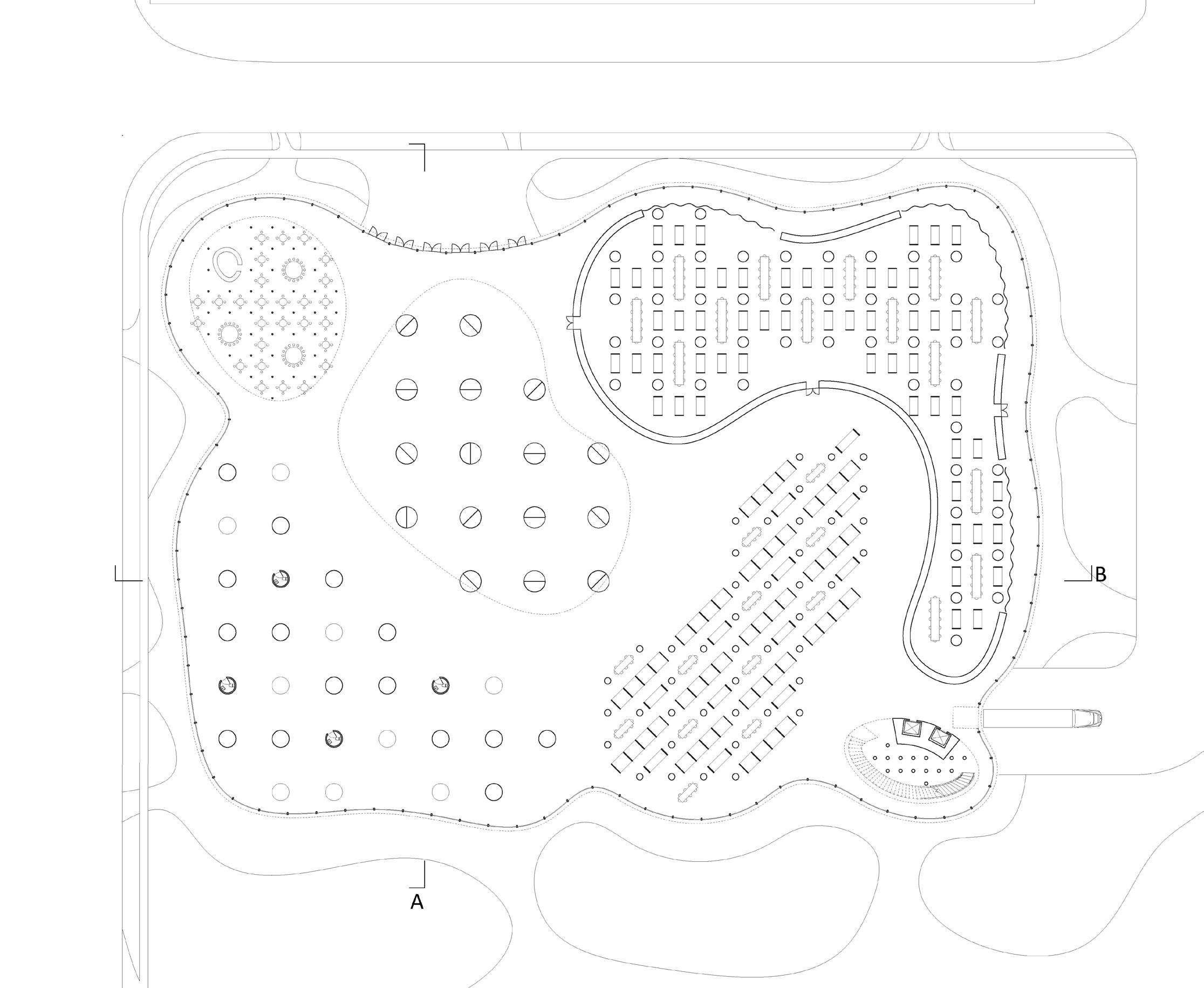

The Palace of Comfort is a place for people to come relieve their stress after a long work week. It looks to understand how comfort food can become architectural. Each major program suits different ideals of comfort. The amphitheater has spaces where live music can be enjoyed in a crowd, but it also creates spaces where live music can be enjoyed in a more secluded environment. The cafe provides various seating options to accomodate the fact that some people find more comfort in eating alone whereas others enjoy eating amongst friends. The project acknowledges that comfort is a spectrum, but that there are also certain aspects of comfort which are agreed upon by many people. There are even pools at different depths as some people would rather dip their feet in whereas others would rather be fully submerged. The hotel also has three different floors where the lowest floor is the most social and the top floor is the most secluded.

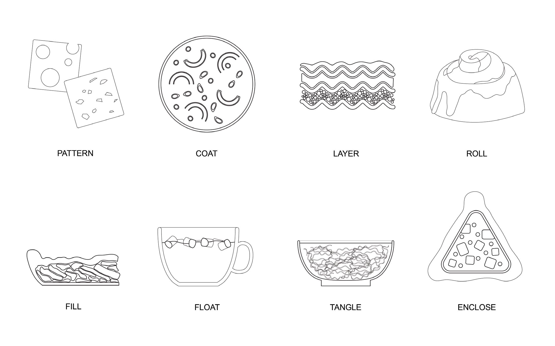
The Palace of Comfort looks at how comfort food can become comfortable archiecturally. We took a poll amongst our peers to determine which foods they felt were most comforting. Once they were decided on, we began to diagram them to try to understand what makes each one so comforting. The foods then took on different programs while still exemplifying their comforting properties. Mac and cheese became a seating area, and apple pie became a cafe. A samosa was turned into a library, a cinnamon roll converted into an amphitheater, and lasagna became the hotel.


Completed by HG
Completed by HG
The section highlights the library, hotel, and cafe programs.


Completed by HG


The first three images are study models looking at how food can become architectural, and the last image is of our final model.


Our final model looks at the material qualities of the individual pieces and how they all relate to one another.


