up!a social campaign

to give the moments of in betweens their value of a break back.
02
keywords pink | rabbit
Our project development started with the two keywords pink and rabbit.
Brainstorming
When brainstorming we tried to discover and cover all aspects where the words pink and rabbit can be found. In some cases it was more obvious, sometimes however, the indirect meaning seemed to be more hidden.
Nevertheless, both words when looked at them closely turned out to have a more diverse meaning than the first look let us guess.

In between
For us the main connector of both words was the “the relationship of the in-between“. To all things there are always two extremes what we were interested in was the place, the space in between those extremes.
Connecting the thought of the in-bet ween to the colour of pink, we sud dendly had a variety of pink shades to work with: all between a very soft and pale one on the one side and a very bright and strong pink on the other side.
Looking at the word of the rabbit more closely, it also shows that the rabbit has many sides to himself when being represented in stories and movies. His characteristics are very diverse and reach from the cute looking furry ani mal to the eval and insidious one quite often shown in cartoons and movies.

The shades in between: in between the two extremes both of our keywords were representing. the in-between in our daily lives
The part we were interested in were the moments of “in between“ on a smaller day to day scale: the time when waiting for a friend or the next bus or subway to come, when going from one place to another, the time between meetings or even the time when wai ting for the light to turn green at the crosswalk.
Generally spoken: the small moments and times of the in-between: in bet ween moments, places, people and tasks we so often fill with looking at our screens – in order to close the gap of not doing anything, of not being multitasking, of not being productive.
Looking around us, it was obvious most people would fill those short in between moments with a look on their technical devices.
campaign brief a social campaign to remind you of the breaks in between
The social campaign Look up! is here to remind you to take a short break. A short break in the moments of inbetween: in between train rides, in between the places you are going, in between the things you have to get done, in between the people you are meeting.
Through nudges we will give you re minders to take your attention away from your screen: to look around and give your mind, yourself a short mo ment to breath – while being in the moment of the in between.
The target audiences the campaign is reaching out to is the hustle society who isfound in every age range, espe cially in a megacity like Seoul.
visuals
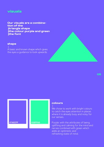
Our visuals are a combination of the |triangle shape |the colour purple and green |the font shape |


A basic and known shape which gives the eyes a guidance to look upwards.
colours
|
We chose to work with bright colours to catch the eyes attention in places where it is already busy and noisy for our senses.
Purple: with the attributes of being uplifting and calming for the mind and nerves combined with green which adds an optimistic and refreshing state of mind.
Touchpoints
bus stop
Here the social campaign is subdevi ded into a combination of two posters which are interacting with each other.
The first poster is located on the ground where it is catching the tar get‘s people attention while their gaze is focused on their screens and with that towards the ground as well.


The seconds poster is placed at anot her point of the bus stop in order to play along with nudge the target peo ple are getting from poster number one.
The time in between the nudge given on the poster placed on the ground and the “finding of the missing piece“ is what we are aiming for: the moment of looking up, looking around you and with that giving your mind already a small break.

08
Public eating area
The stickers which can be found in public eating areas are here as a re minder to take an actual break. Eating usually comes together with looking at a screen, but is that really the way to spend a break?


Stickers
The stickers can be put on any digital device which is used for work to re mind us to look up from time to time: to give ourselves a moment for some deep breaths.


Mobile app

The mobile app functions as a remin der for the user to look away from their screen for 20 seconds, which we call “screen break“. During those 20 seconds, the screen will go blank and a timer will show. After that, the phone will vibrate letting the user know that 20 seconds are up. The frequency of the screen break can be adjusted to the user liking, starting from every 20 minutes.

Screen Break Animation


Notifications
|Once the 20 second timer is over and you had looked away from your screen there will be different notifications emphasizing the importance of such short breaks in the day to day life.


Settings
Learn more
Scroll up to learn more how constantly being on the screen can affect your physical and mental well being.


