PAULA TORANZO
B.A. ARCHITECTURE 2025
SELECTED WORKS
ADDRESSING HEAT ISLANDS
PAULA TORANZO IN COLLABORATION WITH JAZZ HENRY, SUSTAINABILITY
LA28 OLYMPICS AND PARALYMPICS: GAMES DELIVERY AND PLANNING
SUMMER 2023
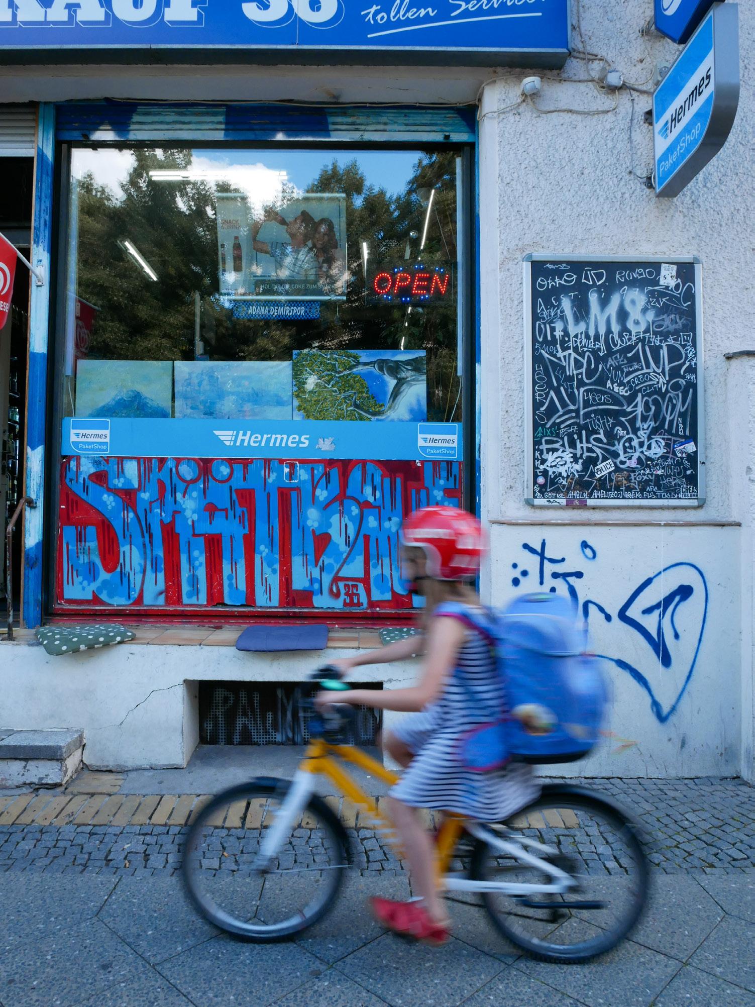
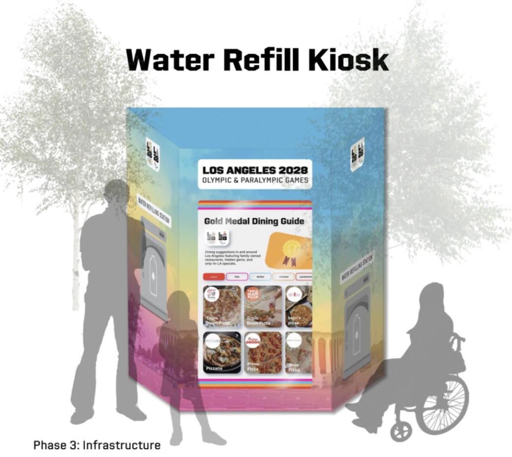
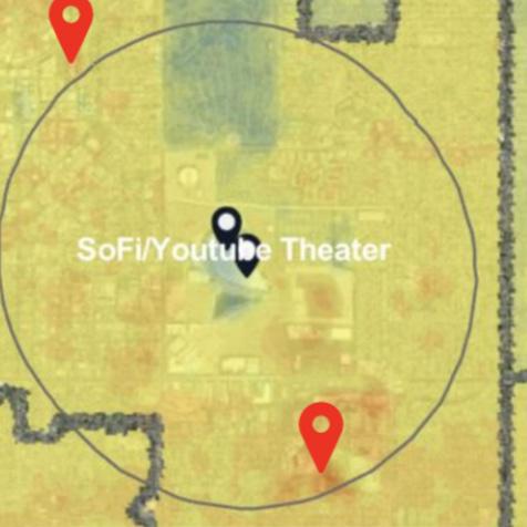
As part of our LA28 Summer Intern Cohort’s capstone presentation, we were challenged to address the 20% of Angelenos who believe that the 2028 games will leave a negative impact on the city. In collaboration with the Sustainability team and representing the Games Planning and Delivery department, we decided to address concerns for gentrifcation and potential impact onsmall business owners and street vendors. We used GIS to create a heat island map focusing on areas around Gamestime stadiums, identifying empty lots or public spaces to create impactful interventions. We took inspiration from heat resilience centers to propose a water refll station that can also serve as free advertising for small businesses impacted by Gamestime infrastructure and security, sponsored by LA28. Our team presented this to our co-workers including the C-suite.
GIS heat map to identify heat islands and potential sites
THE PARALYMPIAN EXPERIENCE
PAULA TORANZO IN COLLABORATION WITH ILLEANA RODRIGUEZ PLY, ACCESSIBILITY AND DESIGN CONSULTANT @ IPC
LA28 OLYMPICS AND PARALYMPICS: GAMES DELIVERY AND PLANNING SUMMER 2023
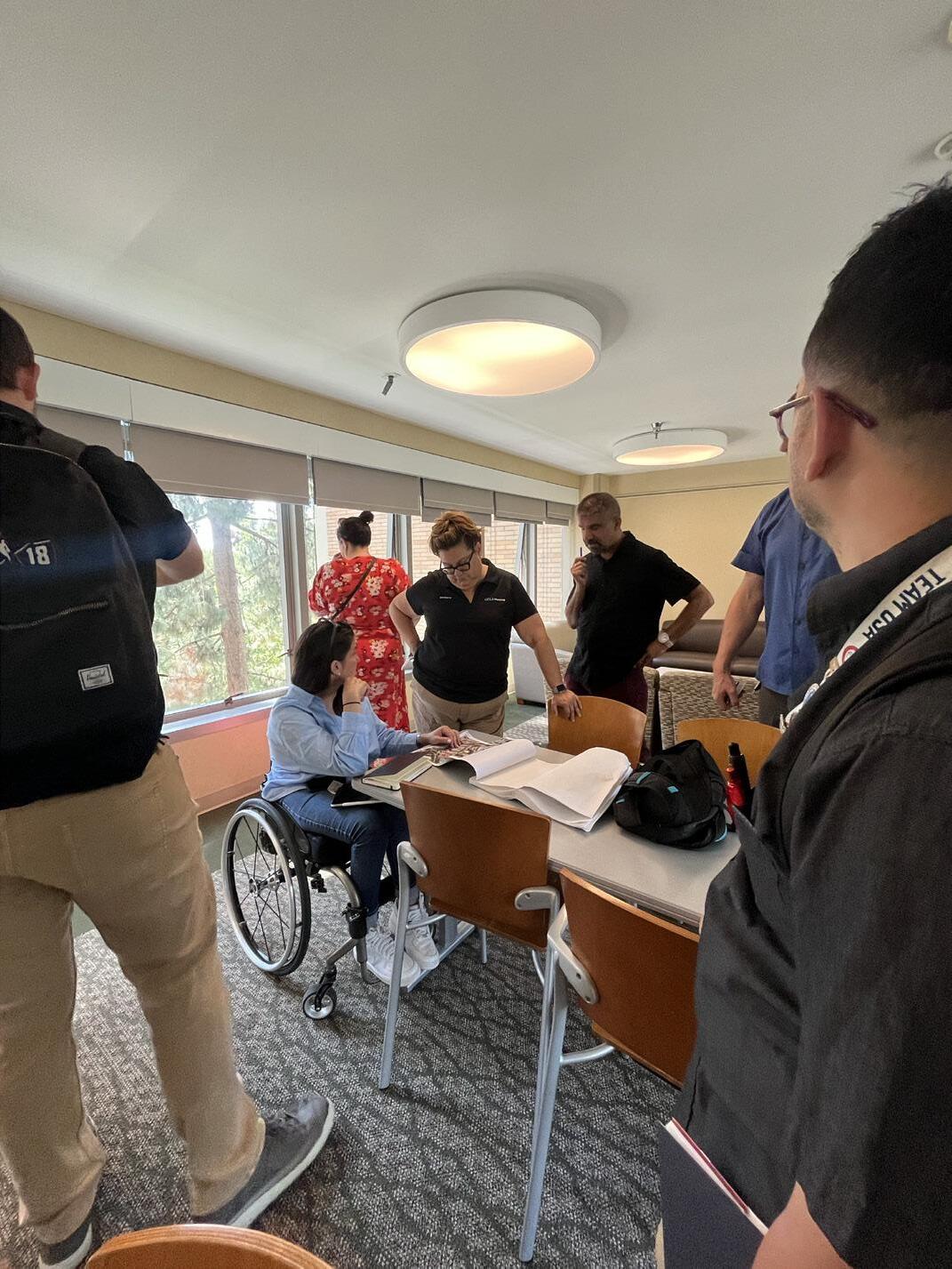
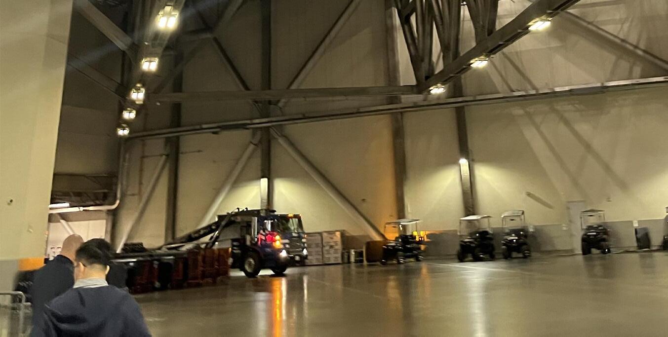
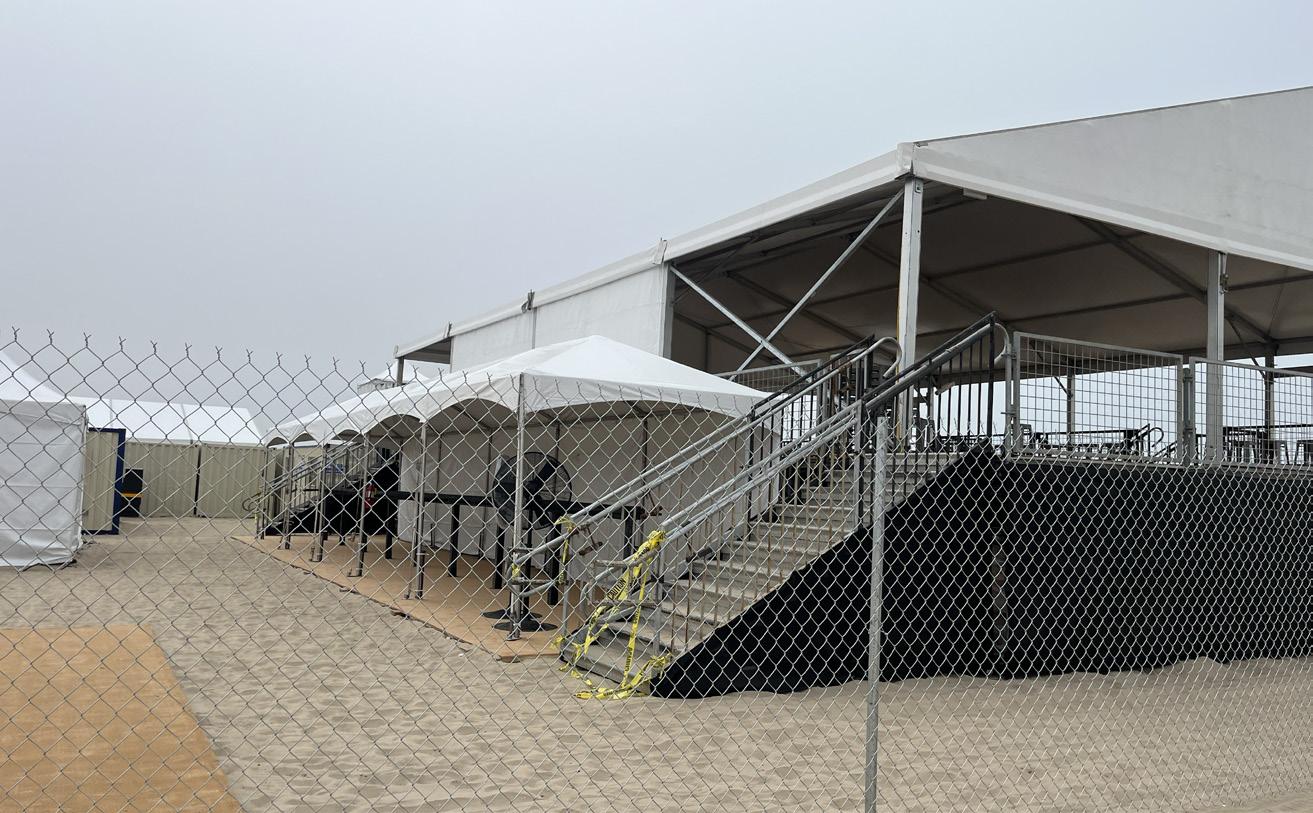
This project extended beyond basic fan accessibility, placing the Paralympian experience at the forefront across all key venues—the Opening Ceremony, Athlete Village, and transportation systems. In collaboration with former Paralympian Ileana Rodriguez, I conducted comprehensive site visits, meeting with house managers and operators to ensure equitable access and experience throughout the Games. I compiled visual research reports based on Ileana’s insights, pushing my understanding, as a designer, beyond physical accessibility to create an equally immersive and inspiring experience for Paralympians—whether it was standing in the Athlete Village with the same view, huddling in locker rooms, walking the tunnels at the Closing Ceremony, or standing proudly on the podium.
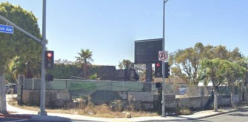
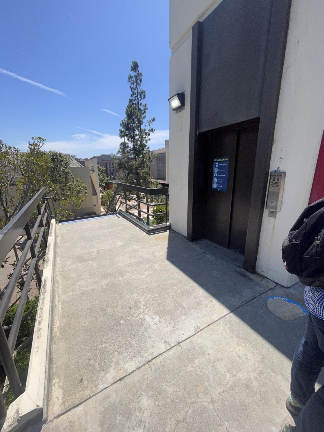
Capturing UCLA steep and topography and poor pedestrian fow
Initial walk-through of closing ceremony route
FINDING COMMUNITY IN OUR CONVENIENCE
SUMMER 2024 PAULA TORANZO FUNDED BY HARVEY GEIGER AND LEWIS P. CURTIS SUMMER FELLOWSHIP
INDEPENDENT RESEARCH
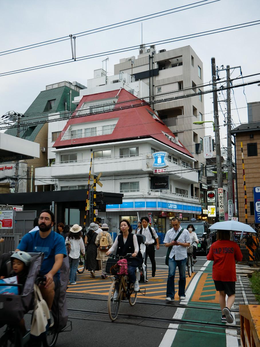
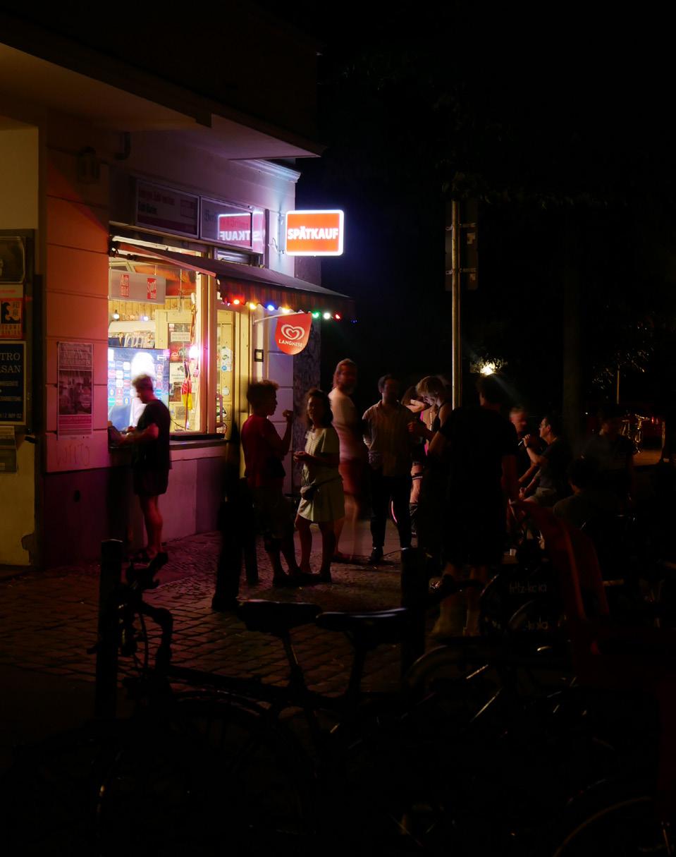
Over the course of three months, I traveled to four countries—New Zealand, Japan, the UK, and Germany—documenting the social and physical presence of convenience stores through observation, interviews, and photography. Often overlooked, the transient nature of these stores appealed to my interest in urban regeneration. This project aimed to fll the gap in visual documentation and legitimize the convenience store, regardless of its scale, as a vital community asset.
By intentionally selecting countries with diverse socialization patterns, streetscapes, and urban grids, I explored how these stores foster in-person connection and serve as neighborhood anchors in an increasingly isolated world. This research also pushed me to initiate hundreds of conversations with locals, transforming initial perceptions of convenience stores as insignifcant into deeper refections on their role in daily life, evoking personal memories and emphasizing their value as spaces of community. (post-travel report issuu link)
Japanese konbini centered at a multimodal hub
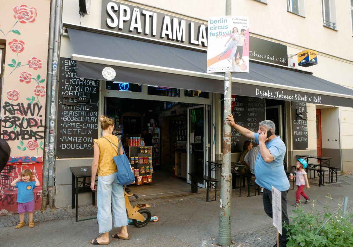
Berlin spati post-Eurocup watch party on the street
Finding potential in the geographical position of London corner shops
Berlin spati after-school rush hosting families and friends
COUNTERING ‘FOOD DESERTS’
PAULA TORANZO IN COLLABORATION WITH SARAH KATZ AND FELIX BRIDGERMAN
DIFFERENCE AND THE CITY WITH JUSTIN MOORE
IN PROGRESS FALL 2024
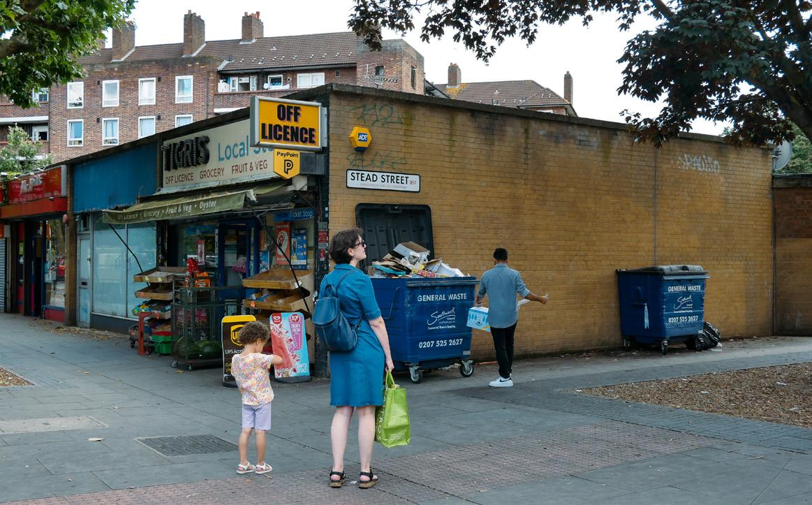
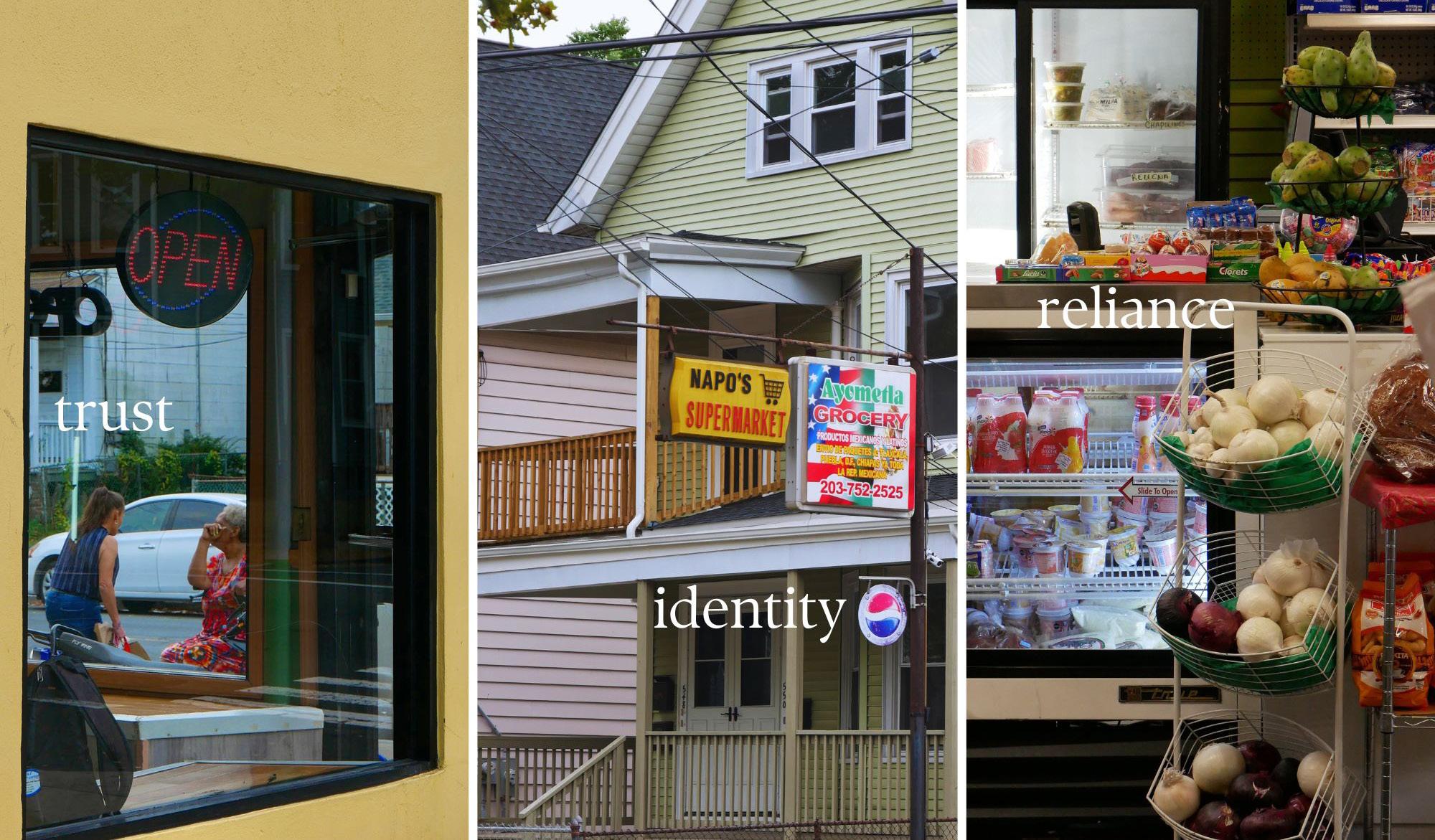
This ongoing research project critiques the conventional narrative of food deserts by researching and narrating a counter story that highlights the complexities of food accessibility in urban environments. Focusing on a block in Fair Haven, we examine two mini markets that serve Black and Latino communities, as vital components of the local food landscape, countering the effects of food apartheid.
Through community engagement, we reveal how these markets operate as cultural infrastructure, fostering community ties and providing access to culturally relevant foods. We emphasize the critical role of community trust, through reliable crediting and support from dedicated shop owners. By prioritizing local voices, we aim to advocate for a deeper understanding of food accessibility that values local networks and the essential role of smaller markets in creating equitable foodscapes.
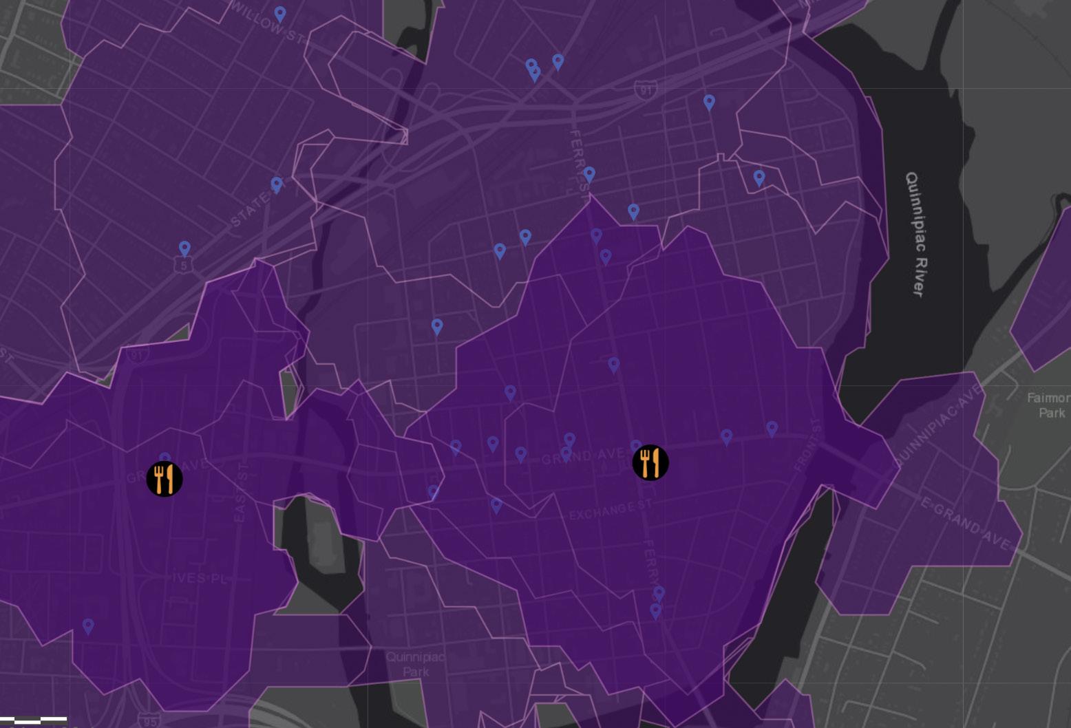
Initial spatial analysis of accessible (.5 mile) supermarket radius versus mini market radius
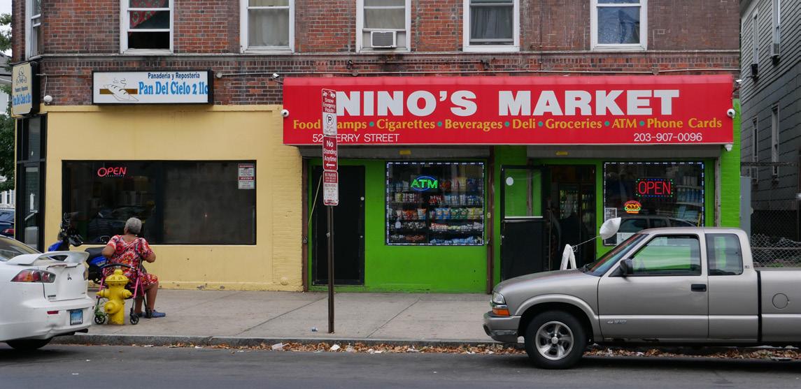
Nino’s market is a community hub built on trust
Themes emerging from initial community engagement on mini-market presence
TERRA OPRIMI
PAULA TORANZO
ADVANCED TYPOGRAPHY WITH HENK VAN ASSEN
SPRING 2023
When I frst discovered mines, from an aerial standpoint, it looked like a beautiful national park, carved by rare erosion that I’d never seen before. Zooming in, the unfortunate reality began to settle in and I realised it was a manufactured landscape. Terra oprimi’s purpose is to educate. To intrigue the general public with an unsettling colour palette, beautiful imagery, and a strong message that does not shame but rather informs. Compositionally, Terra Oprimi challenged me to fnd a hierarchy that highlights the message frst, easing the reader with topographical lines, and eventually sharing a resource, in coordinate form, that is readily accessible for any viewer who wants to take action.
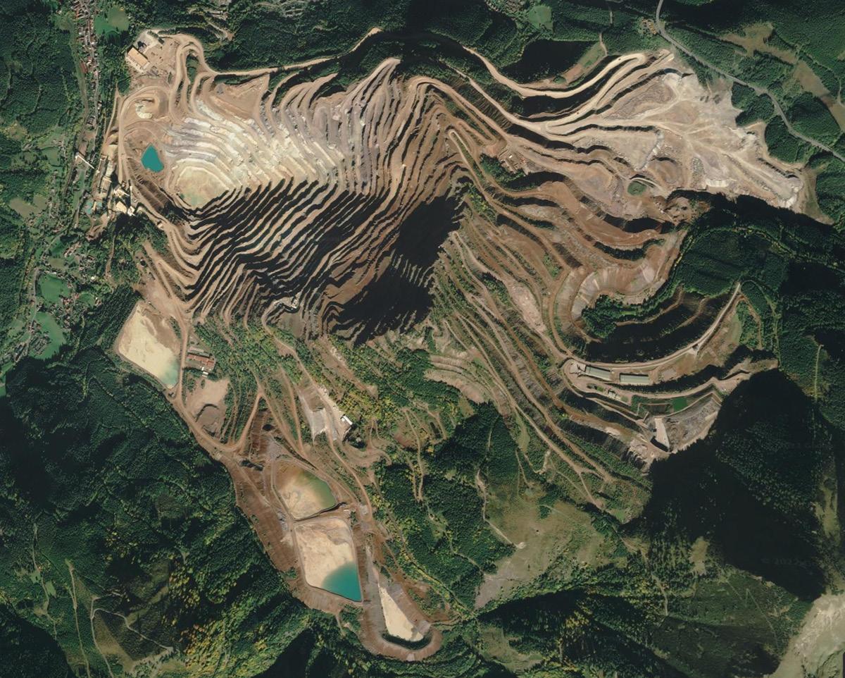
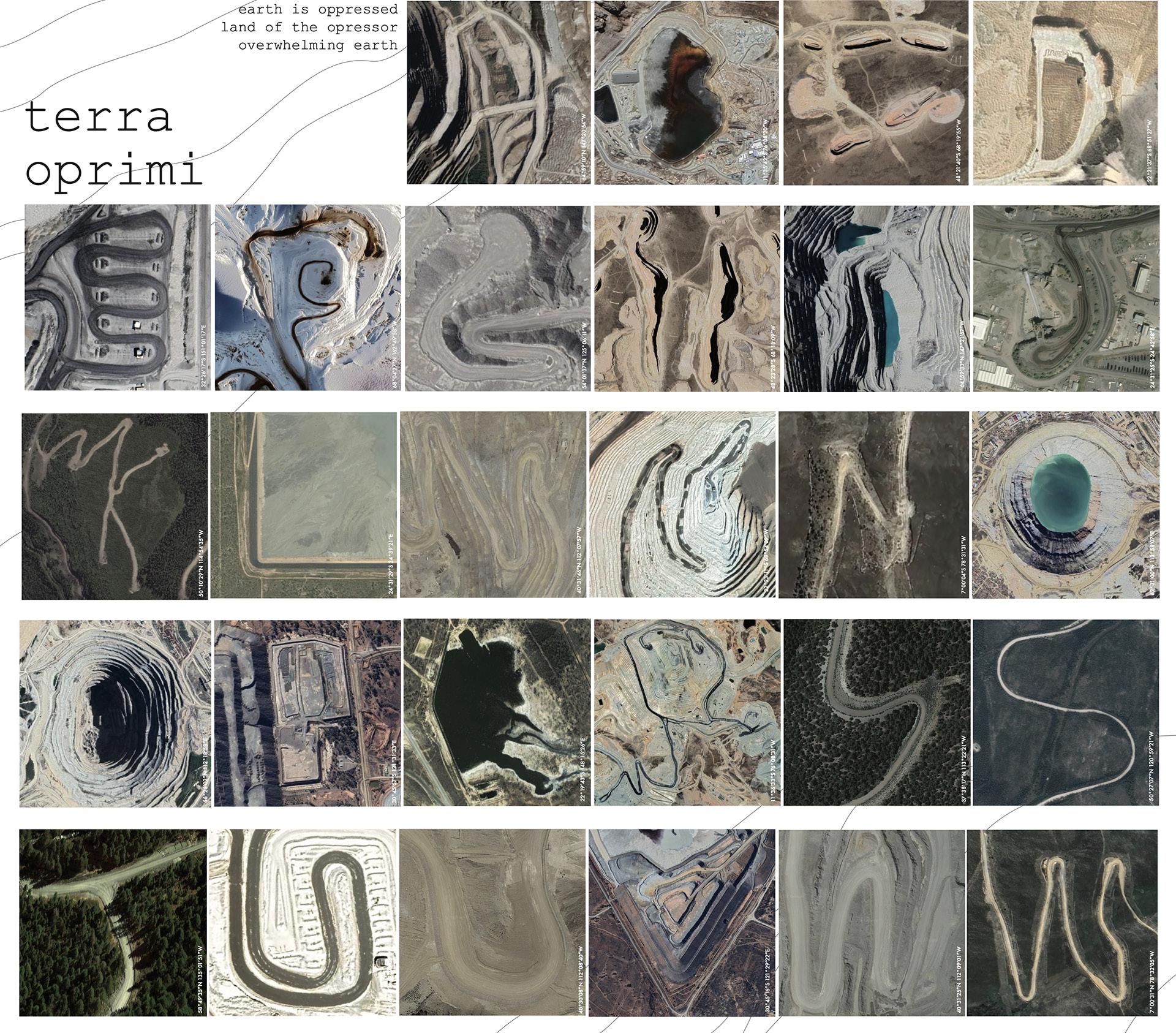
austrian mine, frst inspiration
portion of type specimen sheet for custom font, terra oprimi
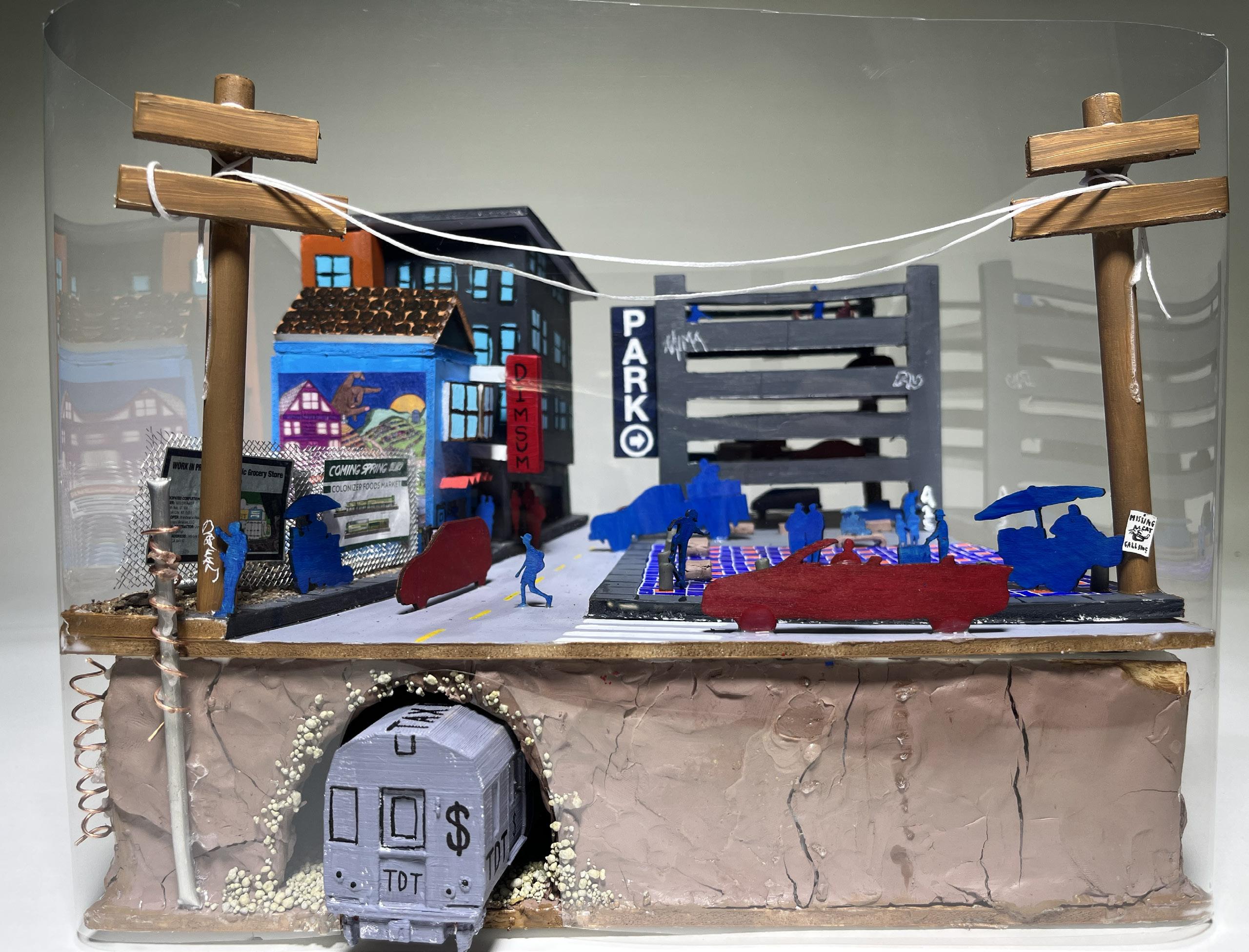
(RE)CLAIMING
PAULA TORANZO IN COLLABORATION WITH NAIMA BLANCO-NORBERG
SCALES OF DESIGN WITH BIMAL MENDIS SUMMER 2023
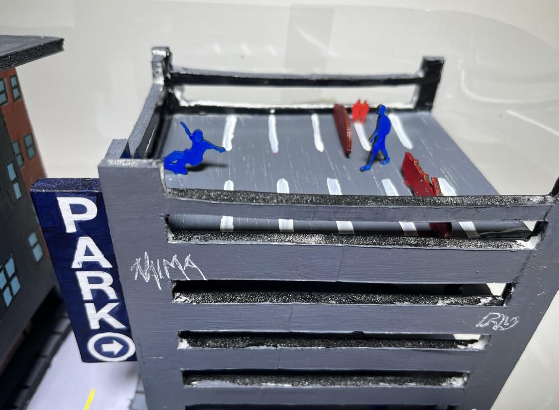
This project captures the impact of gentrifcation over a 5-year period in our communities. We spotlight the invasion of trendy businesses displacing local gems, symbolized by gentrifying entities like “Colonizer Foods Market.” Through satire and visual elements, we challenge the notion of a smooth gentrifcation process, emphasizing the resilience of existing communities against franchise giants. The blue-painted existing community contrasts with the red-painted gentrifers, highlighting the stark separation between lives and intentions. Our work seeks to question and (re)claim community spaces in the face of increasing commercialization and urban transformation.
10 x 15 x 8.5 in foamcore, terracota, and bass wood, (re)claiming our cities
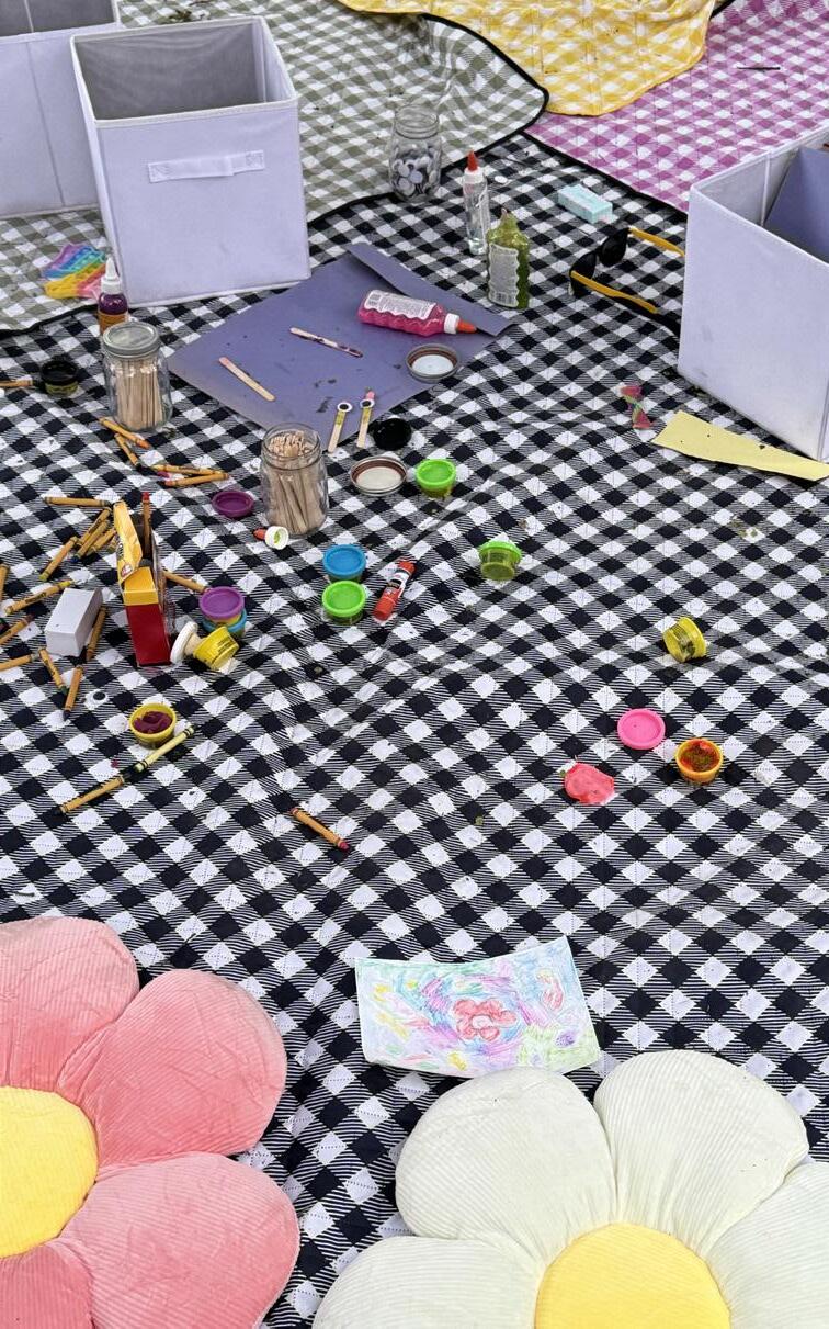
COOL DOWN CORNER: FESTIVAL ACCESSIBILITY
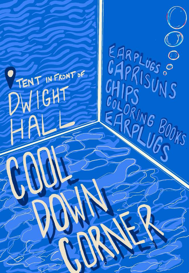
PAULA TORANZO AS PRODUCTION + OPERATIONS CHAIR
YALE SPRING FLING COMMITTEE
B+W PHOTO BY COURTNEY CHENN SPRING 2023
This project intersected my operational, showrunner, and marketing roles for Spring Fling, where I sought to push beyond the traditional festival format to increase student attendance by prioritizing accessibility. Beyond typical accommodations like reserved seating and ASL translation, I addressed oversensory concerns from loud music and dense crowds. I secured a sponsor and designed a designated space where attendees could step back, access earplugs, refuel with food and activities, and engage with Graduate Wellness Offcers. This initiative enhanced early turnout and crowd management, transforming Spring Fling into a more inclusive, all-day experience for everyone.
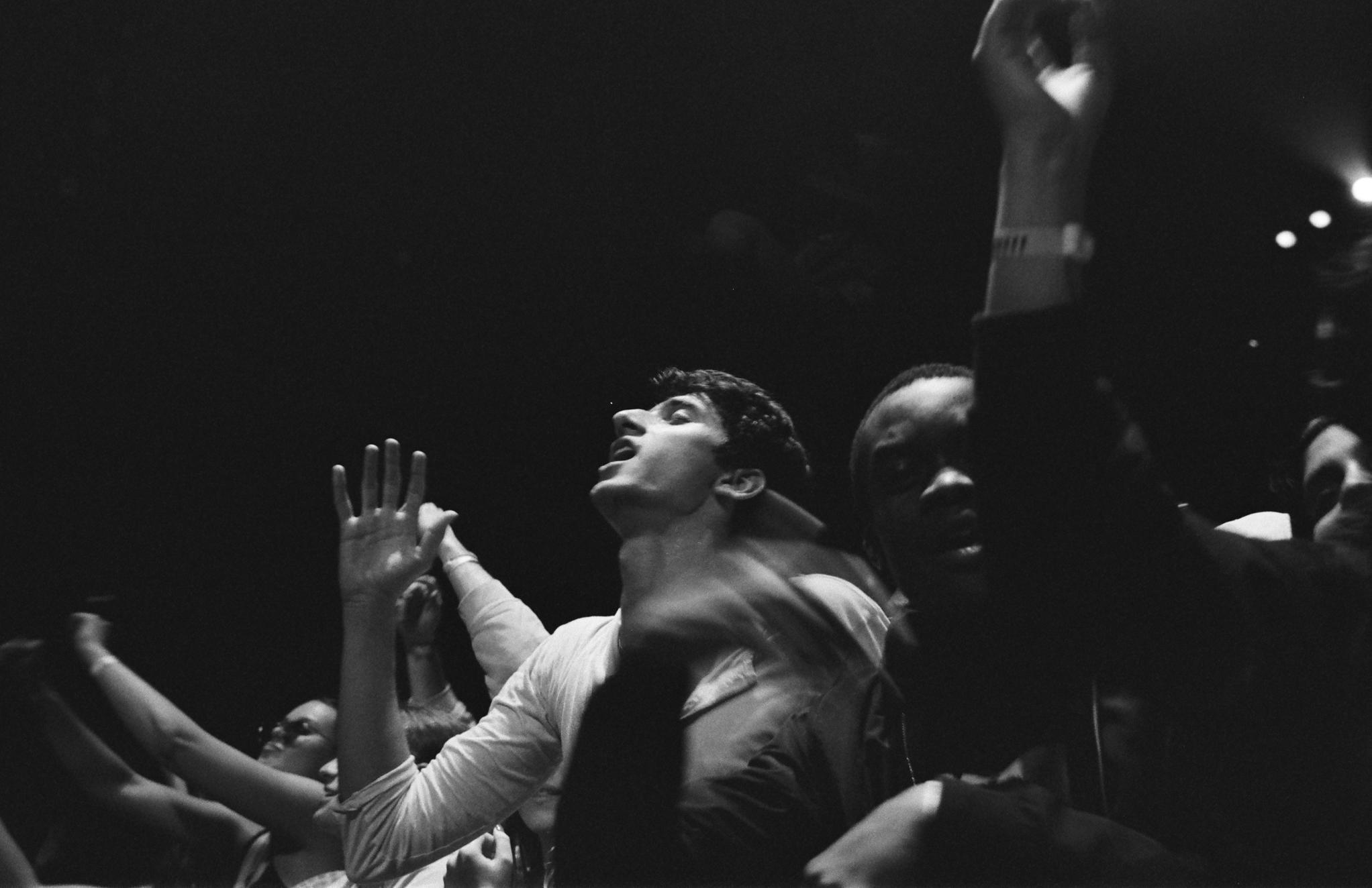
2023 Cool Down Corner with crafts and earbuds 2022 fyer outlining all amenities