Band App + Website using Figma and Adobe XD
Prachi Ijner
The product:
Metalsink is a rock metal band from Italy. The band regularly hosts tours as it has a growing fanbase internationally. The app is launched to let the lisners connect with the community through merch and other resourches on the app.


Project duration: September - November 2022

The problem:
As the band is growing, it needs a common platform to connect with their listeners internationally. The app will help listeners connect with the band by purchasing merch, and getting tour and event updates on the app.
The goal:
To make a single platform that provides all services related to the band.
My role: UX designer and UX researcher Responsibilities:
Designing, user research, wireframing, prototyping, creating mockups and final designs.
● User research ● Personas ● Problem statements ● User journey maps
User interviews and created empathy maps are conducted to understand the users. A primary user group identified through research was active listeners of the band. The user group selected confirmed initial assumptions that the active listeners would use the app frequently, but the research also revealed that the people who gift the merch to their friends and family will also use the app.
Time and accessiblity
Options
Most users don’t have the time or physical ability to visit stores and wait in lines to purchase new merch.
Stores run out of certain merch options very quickly, and the customers have to wait until they restock it.
Location
Stores are only located in certain cities. Listiners who live in different locations are unable to purchase merch from stores.
1 2 3
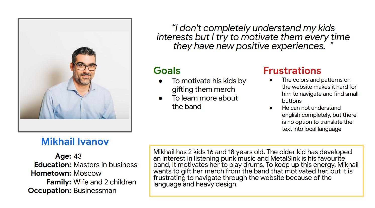
Problem statement: Mikhail is a Businessman who needs a way to support his kids in developing their interests because he wants to motivate his kids to develop their creative individual personalities.

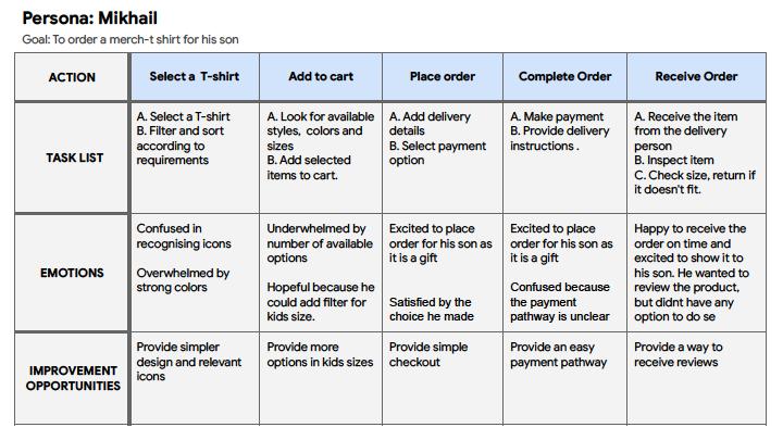
Mappoing Mikhail’s user journer revealed how helpgil would it be to provide an app with simple design with easy navigations.

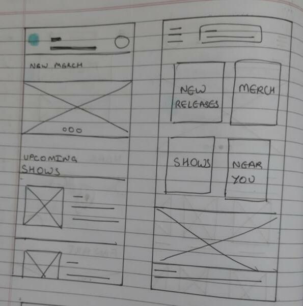
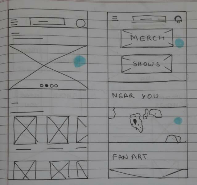
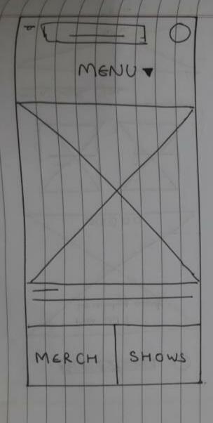
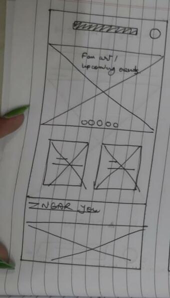
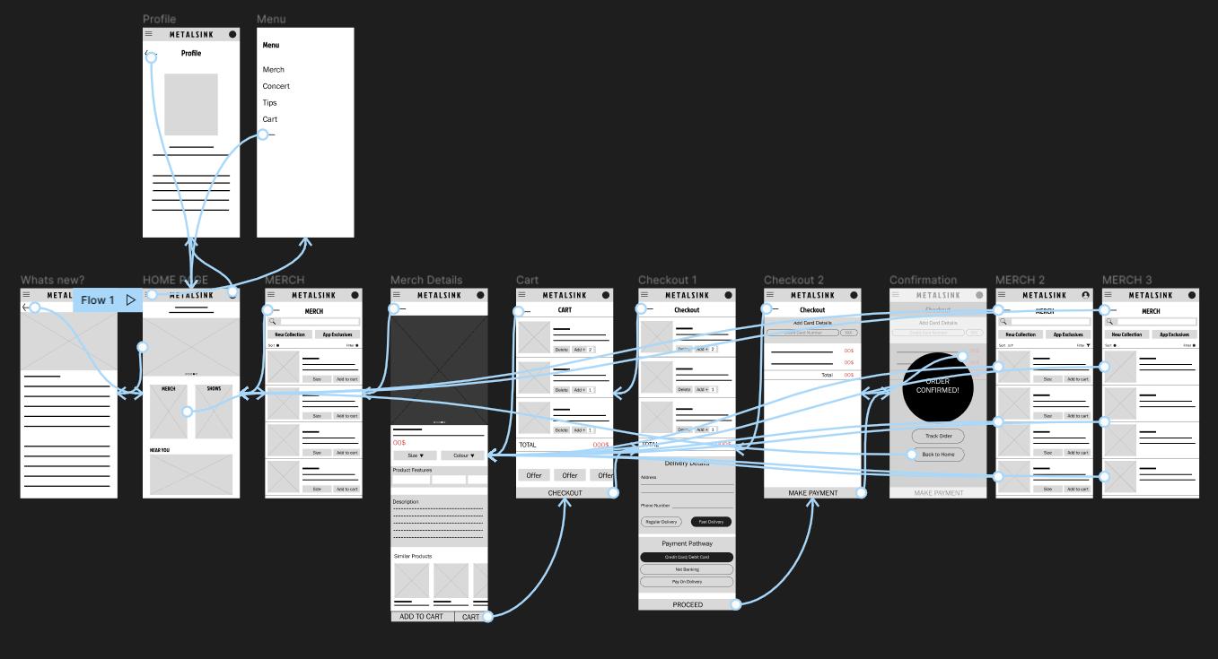
● Paper wireframes ● Digital wireframes ● Low-fidelity prototype ● Usability studies


of
pages were designed to come up with the
page I prioritized main actions like merch and concert ticket buying options. Refined
Multiple iterations
all
best layouts for users. For home
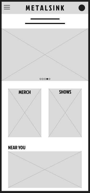
Wireframe
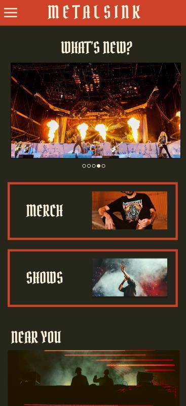
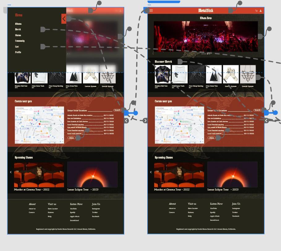
The home page focusses on the primary purposes of the app,

All the information is laid out as per priority.
A cariousel of whats hapenning recently to quickly give the information to the user.
This feature provides a quick way to go directly to most used pages
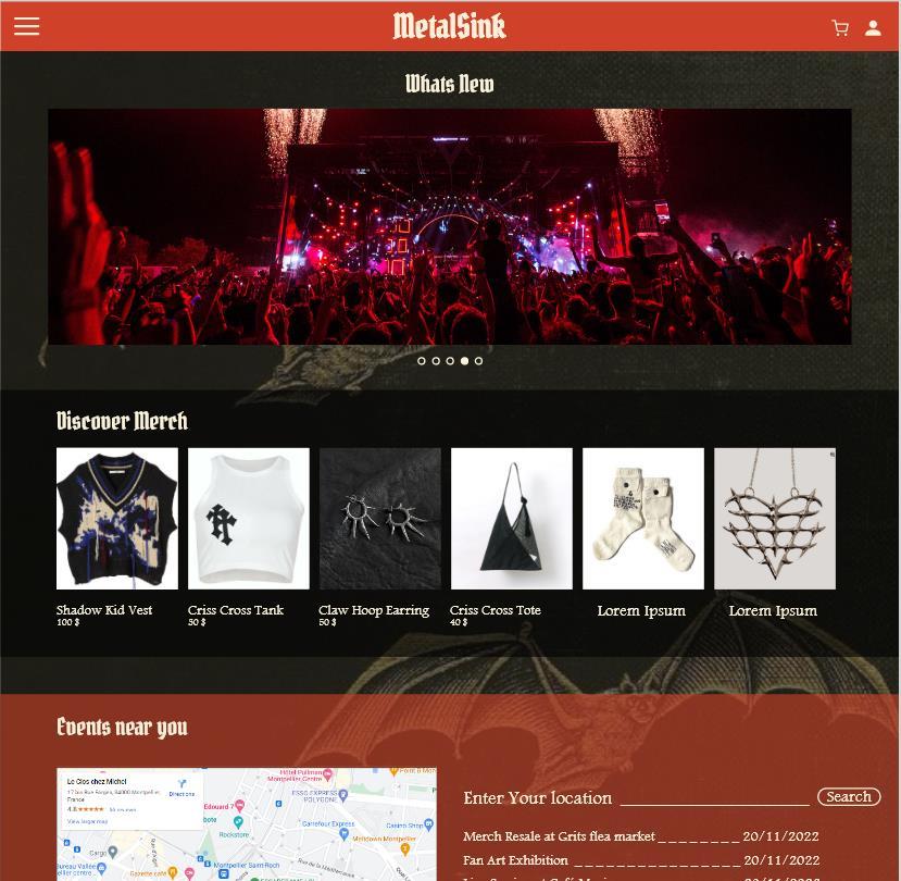
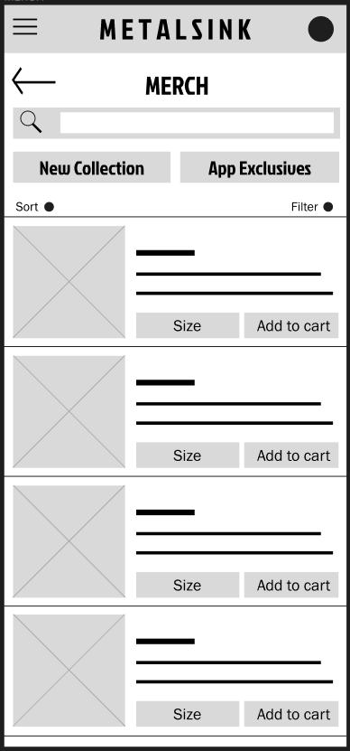
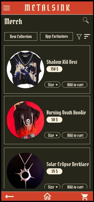
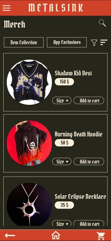
Sort and filter options for ease of browsing

The design is focussed on making browsing easy. Add to cart option is provided up front for easy navigation.
Up front option to add product to cart
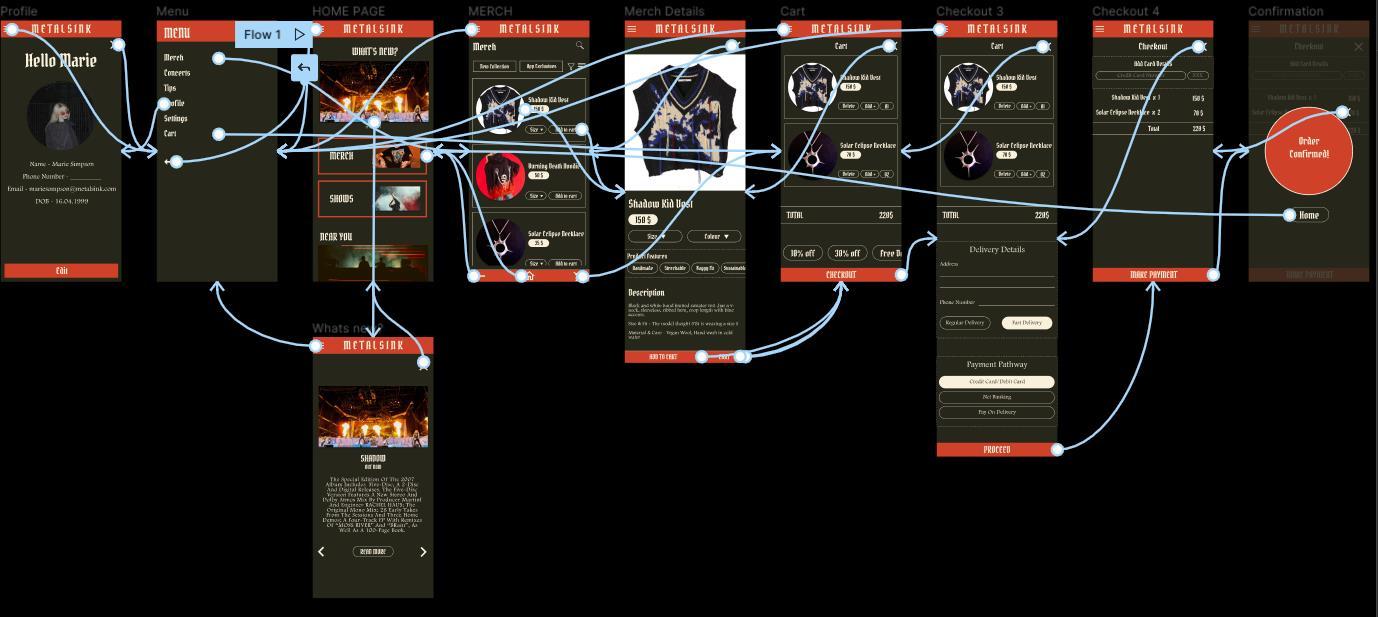
https://www.figma.com/proto/L53kts58n3Hv1NbHsx2tNq/Band-App?nodeid=2%3A5&scaling=scale-down&page-id=0%3A1&starting-point-node-id=2%3A5

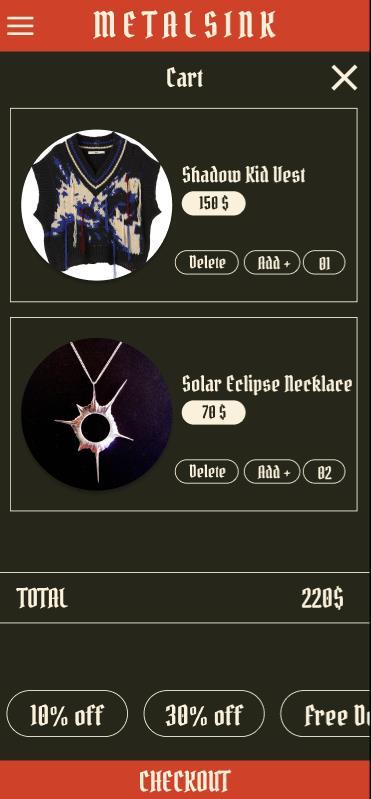
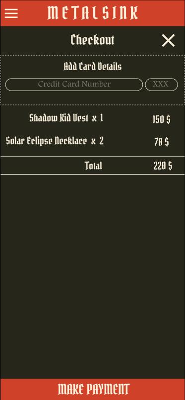
Round 1 findings User want a simpler colour scheme that’s easy on the eyes 1 Users want way to find buttons 2 Round 2 findings Insert finding 3 Users want easily recognizable icons 1 Users want quick checkout 2 Users want an option to pickup products instore 3
● Mockups ● High-fidelity prototype ● Accessibility
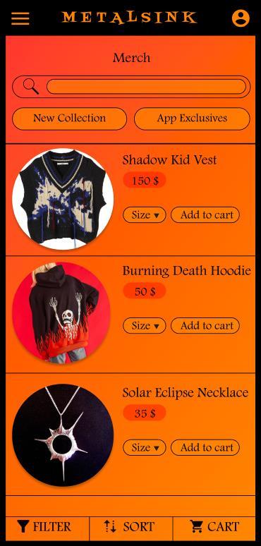
The app is designed as per user needs.

Before usability study After usability study

Before usability study
After usability study
The design is refined as per user reviews.


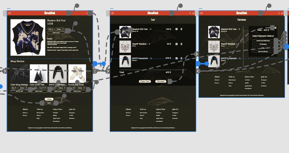
https://www.figma.com/proto/L53kts58n3Hv1NbHsx2tNq/Band-App?nodeid=155%3A123&scaling=min-zoom&page-id=155%3A3&starting-point-node-id=155%3A123

https://xd.adobe.com/view/ba4af145-67ae-4dc3-8fe1-371a9a76dabd-ef19/


Used a color scheme that is easily percivable to users with visual weaknesses.
Alt text for users who are unable to read.
Large buttons for ease of use for people with physical weakness.
1 2 3
● Takeaways ● Next steps
Impact:
The app lets users use all the services provided by the band on a single platform.
What I learned:
A quote from peer feedback : “I really love that the app gives options to explore the band in multiple ways. I love the look of the app, it’s on theme.”
Throughout the process, I learned that feedback is extremely necessary in building good designs. It is interesting to study how different users percieve the designs and the overall experience.
Conduct another round od usability studies to check if the pain points have been addressed.
Update design based on reviews of real users.
Add more features if necessary
1 2 3
Thank you for reviewing my work. If you want to see my other works or get in touch, feel free to use the links below.
Email: prachiijner16@gmail.com | Portfolio: https://issuu.com/prachiijner
