MAKE A HOUSE YOUR WITH

Colour Trends of 2025


Navigating paint and colour selection for your home can be overwhelming and confusing – and Taubmans are always here to help. Taubmans’ 2025 Colour Trends is here to demystify paint and colour choices, giving you the confidence to make your house a sanctuary which will bring comfort and pride for years to come.
The wide range of interior and exterior colour palettes in this Colour Trends have been curated by Taubmans® Colour Specialist, Fiona Dawson. The colour schemes bring local and global trends together, as well as providing options which will not date quickly.
Taubmans 2025 Colour Trends are all about giving you creative confidence with on-trend colours, whilst also offering colour schemes which will stand the test of time.
Make a house your home with Taubmans 2025 Colour Trends.
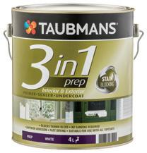
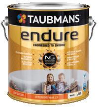
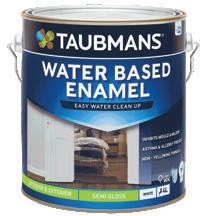
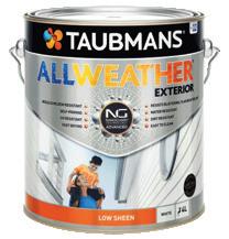
To simplify colour placement and product recommendations, we’ve created a comprehensive product and usage guide. Each colour in our Colour Trends is referenced, with each letter corresponding to a specific area within both interior and exterior application. For instance, colours marked with a ‘W’ are suitable for interior walls. Our guide includes images of appropriate products for these areas, making it easy for you to bring your project to life.

Need help with how much paint you will need to complete your project, scan the QR code

A collection of alluring whites that can be used together or as one throughout to transform your ‘Home’.
Whether you’re painting an entire room or just adding accents, choosing the right white can make a significant difference in the overall feel of a room. Here’s a breakdown of each shade:
Crisp White – Is simply the perfect white! It’s versatile and works well on all surfaces. It’s perfect for colour drenching, especially in smaller spaces where you want to create the illusion of openness.
Alpine Snow – A delicate, soft neutral white that complements most interiors. Use it as a consistent colour throughout your home or pair it with Brilliant White for subtle contrast.
Gazebo White – Offering a touch of saturation, Gazebo White adds depth to a space. Consider using it consistently for a more layered look.
Aria Ivory – A slightly warmer white that infuses soft warmth into a space. It pairs beautifully with earth tones. Consider combining Princess Bling if you are wanting a contrast with your doors and trims.
Grey Fog – A warmer neutral that harmonises with many trends colours. Slightly more saturated and works wonderfully alongside Crisp White or Brilliant White for contrast.
Princess Bling – A delicately toned white which adds subtle warmth to any room. It’s an excellent choice for framing other colours.
Tundra Mist – A soft cooler style white that pairs beautifully with Brilliant White. It complements the soft muted pinks and purple tones of the season.
Zurich White – A cooler white giving a subtle mauve undertone to a space. It works well in all areas and looks stunning when paired with Brilliant White trims.
Brilliant White – The ultimate clean, fresh, and bright white. It’s suitable for all applications and pairs effortlessly with any colour scheme.
WHOLE HOUSE - WARM
Where flavour meets conversation.
Step into the heart of your home, where we do more than cook, we connect, converse and create memories. It’s where laughter seasons our meals, and the clink of cutlery becomes our shared rhythm. So what is the secret ingredient that ties it all together? It is colour, the palette that nourishes not only our eyes but also our souls. From our carefully curated ‘Home’ Colour Trends collection we present schemes to suit every kitchen style. Whatever your taste, these colour combinations will bring your space to life.
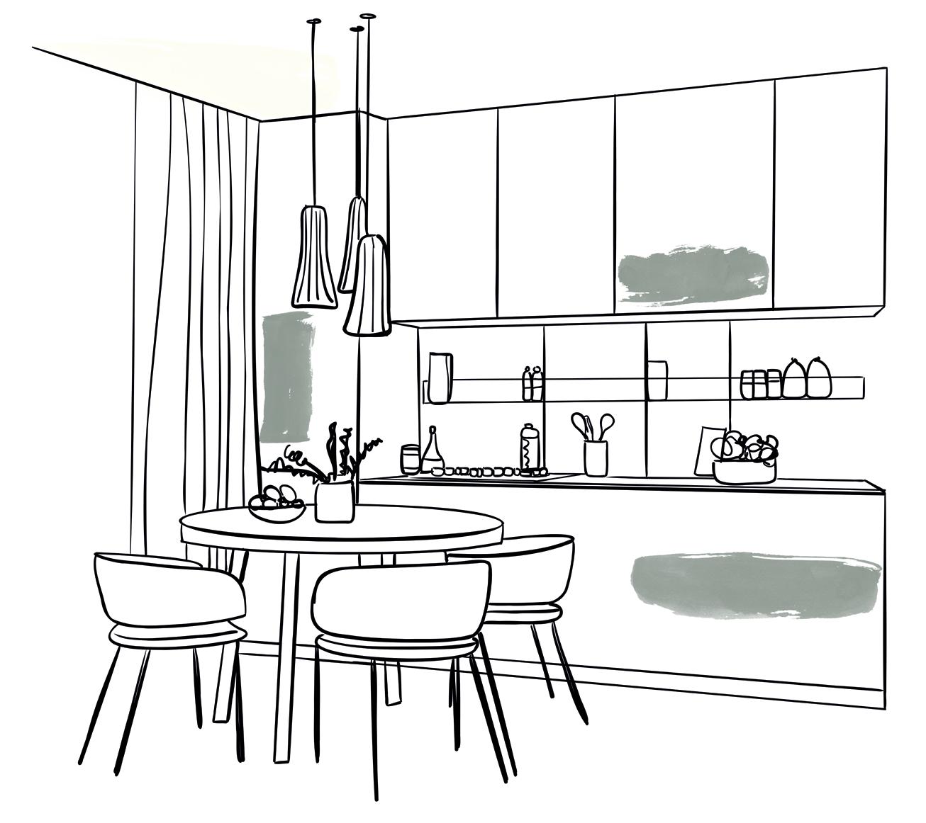
PRINCESS BLING
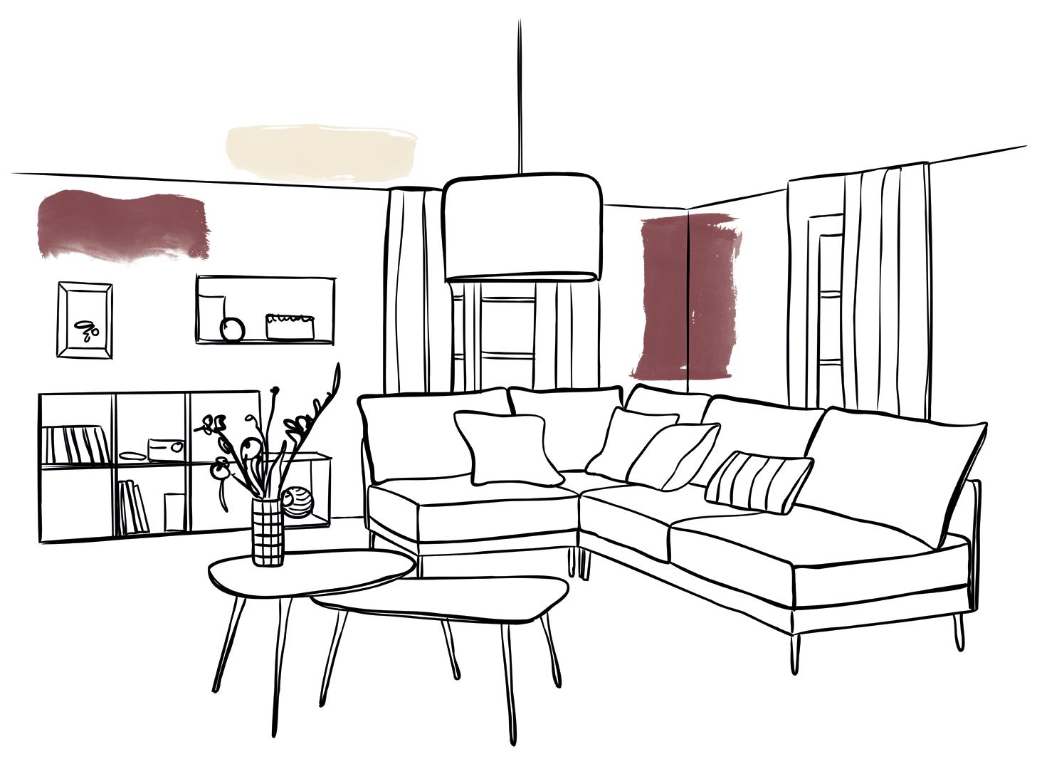
The cosy retreat.
A sanctuary where time slows down and the outside world fades away. Here, we shed our daily hustle and wrap ourselves in comfort, and what better way to cocoon ourselves than with carefully chosen colours. Envelop yourself in deep burgundy and evoke tranquility with dusky purples. From our Colour Trends palette, we have handpicked colours that whisper relaxation, laughter and quiet joy. Let your living and theatre space be more than walls, make your house your home.
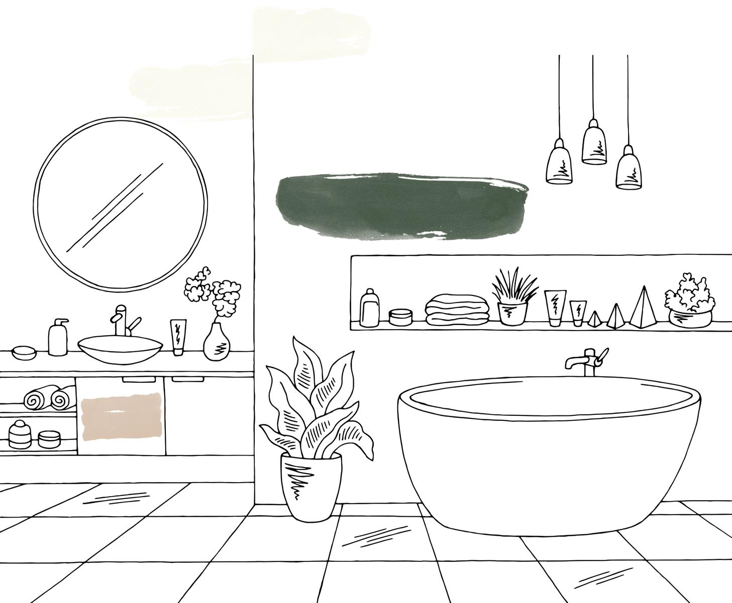
A sanctuary to escape the hustle and bustle - unwind and recharge.
Here colour plays a vital role in setting the mood. The tranquility of green, calmness of blue or the serenity of muted pink. Together, these tones weave a tapestry of relaxation, inviting you to unwind, escape and rejuvenate.
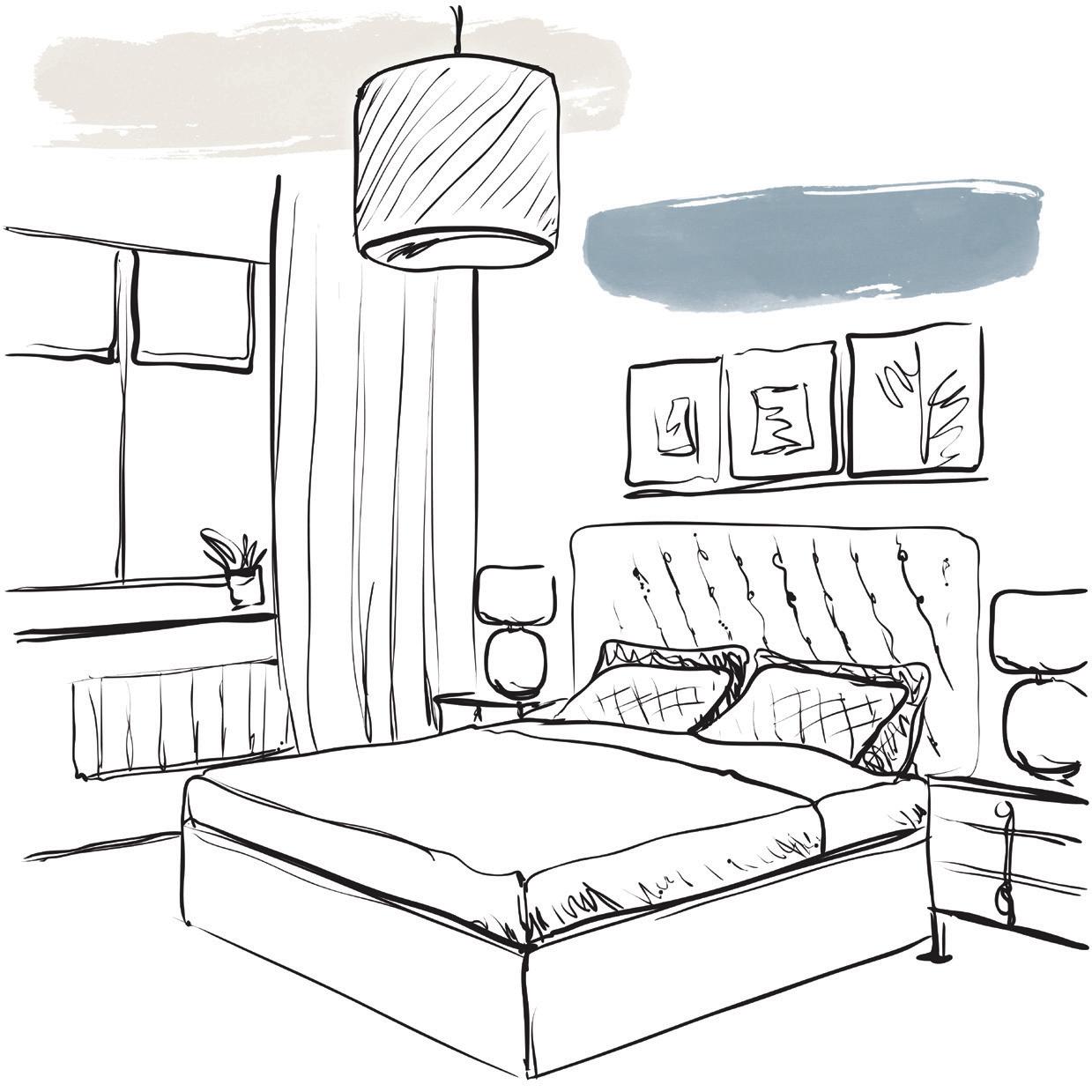
A haven for rest and renewal.
Create your own sanctuary, a place to unwind, dream, sleep and rejuvenate by thoughtfully infusing colour into your space. From tranquil tones, to whispers of nature, dreamy whites and nightfall magic, we have carefully selected colours designed to help you create the perfect haven for rest.
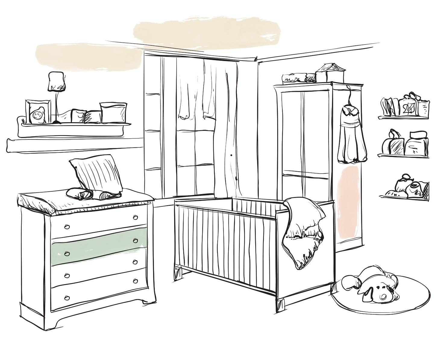
Where calm meets play.
A room that cradles both tiny beginnings and boundless imagination. A space to nurture, embrace and play. A room that embraces the wonder of sleepy yawns and tiny leaps. A room that nurtures, created with ease using colours from our 2025 Colour Trends.
Where creativity and clarity meet.
This space is very much a multi-functional room, and depending on your needs colour can help shape your space. This space adapts to your rhythm. If you need focus, inject blue. If you’re creative and wish to create an upbeat space inject yellow and if looking to infuse life into your work opt for green. An office has no boundaries, choose colours from our Colour Trends that make you feel centred and productive.

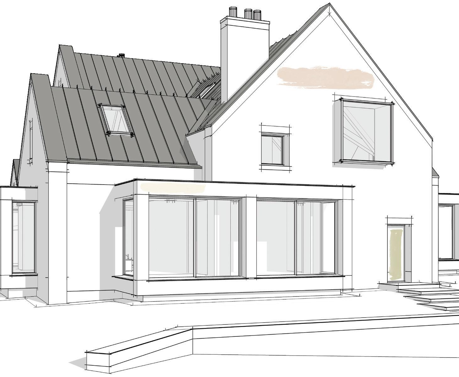
Harmonious hues for every environment.
The façade that greets the world, the trims that define, and the statement fence that frames your home - all exterior areas where colour can tell the story. No matter where you reside— be it by crashing waves, city lights or rolling hills, we’ve curated colour schemes to help you create street appeal you can be proud of.
We recommend Colorbond® Bluegum® or Dover White™ for Roof, Guttering and Garage Door
We recommend Colorbond® Monument® or Wallaby® for Roof, Guttering and Garage Door
We recommend Colorbond® Dune® or Surfmist® for Roof, Guttering and Garage Door
We recommend Colorbond® Dover White™ or Southerly® for Roof, Guttering and
Our “White with Envy” collection will inspire you to create a façade your neighbours will envy!
Each of these whites appear differently when placed outside. They flirt with sunlight, converse with shadows, and change as the day unfolds. Morning whispers, noonday confidence, and twilight’s soft embrace—they wear it all.
We understand the adoration for white homes, but choosing the wrong white can create a jarring glare which can detract from the exterior’s beauty. Gazebo white, Tundra Mist and Zurich White are perfect for creating a façade that leaves your friends wide-eyed and envious, and pair exceptionally well with Alpine Snow, Brilliant White and Crisp White for framing and shaping with trims.
Add some personality to your home by having fun with colour on your front door. The front door isn’t just an entrance it’s an invitation and sets the tone, a prelude to what your home offers. Some of our favourite colours from our ‘Home’ Colour Trends will allow you to create a fun filled entrance to your home.