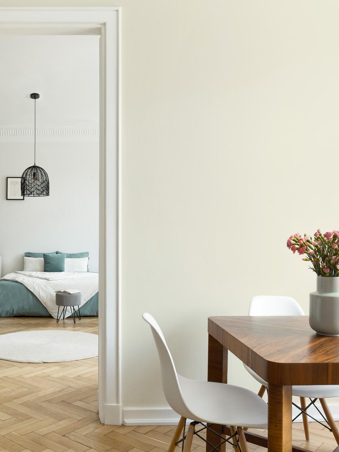
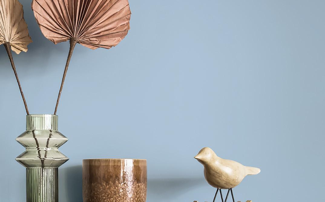
COLOUR
COMMUNITY STORIES OF COLOUR
INSPIRATION FROM AROUND THE WORLD
COLOUR PALETTES - FROM DESIGNERS
HOW TO PREPARE YOUR SURFACES FOR PAINTING
TOGETHER FREE MAGAZINE
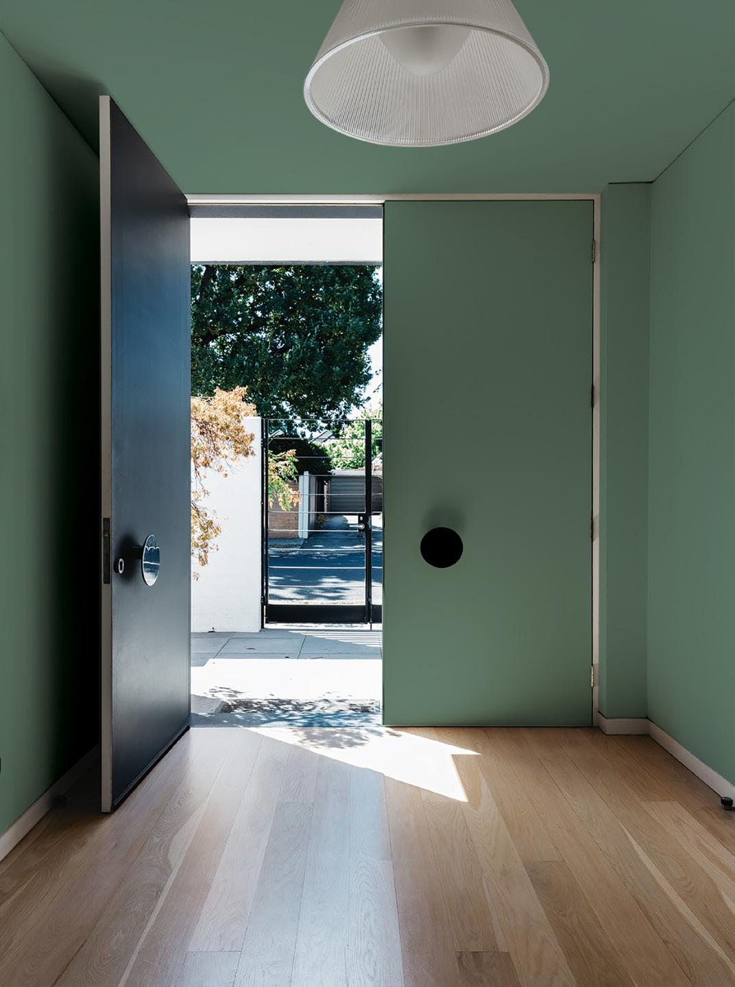
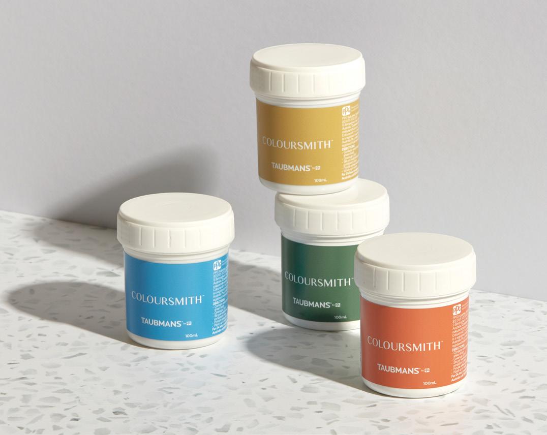
Create your bespoke paint colour and bring your project to life using the Coloursmith® app.


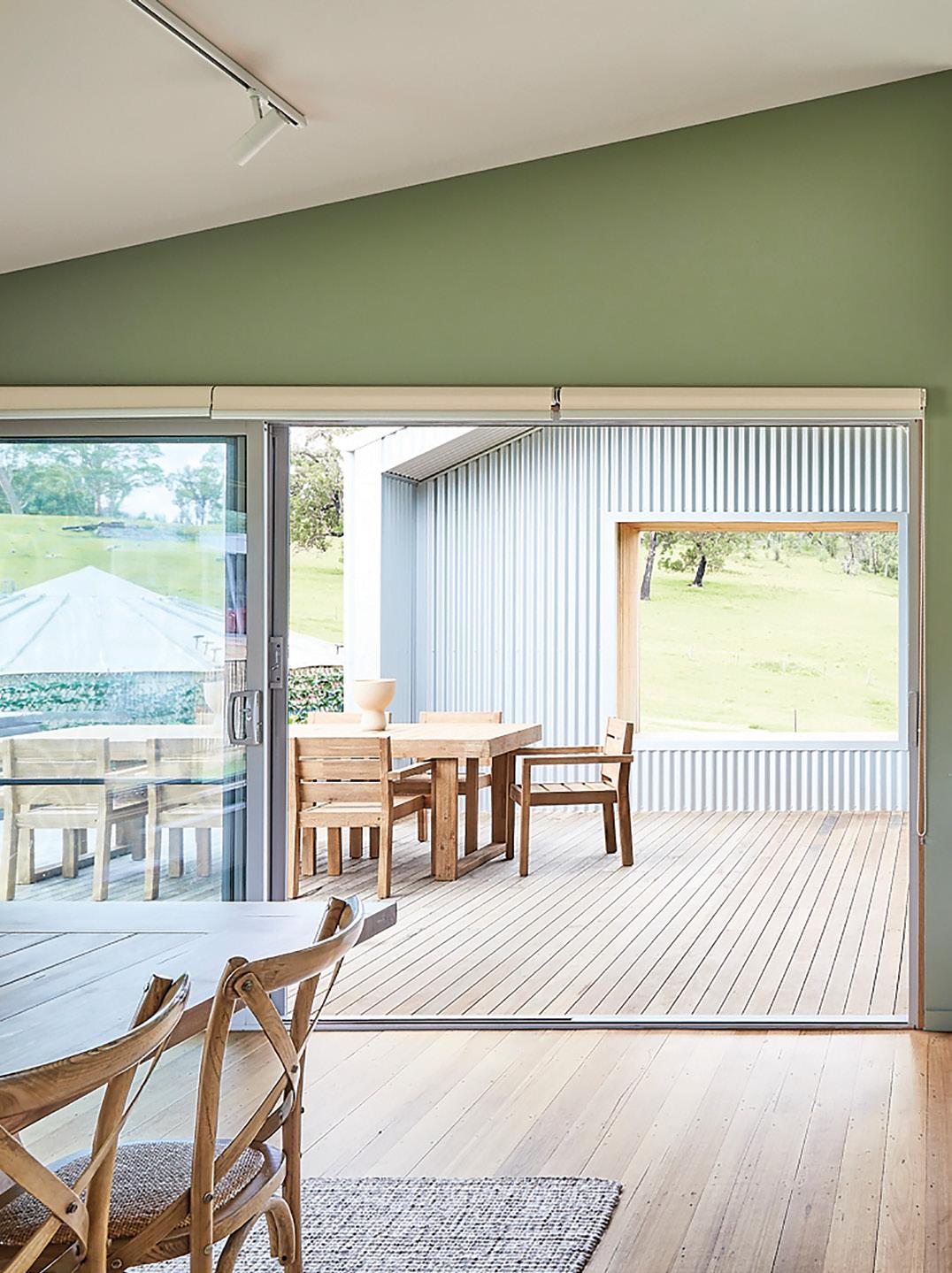
Using Coloursmith, Breathe Architecture created ‘Barbara’s Green’, for client Barbara Rugendyke, inspired by the area’s abundant Eucalyptus population.

@coloursmithanz
Scan to download the Coloursmith app to create customised paint colour.
coloursmith.com.au
Colour Code: PPG ANZ 12720
Welcome to the first issue of Taubmans Colour Together magazine! Here we showcase design stories, colour palettes and painting advice to inspire your next home project.
In this issue we celebrate our partnership with Museums Victoria and their Triceratops: Fate of the Dinosaurs exhibition with “Colours of the Cretaceous” – a collection of Coloursmith created colours inspired by the period Triceratops roamed.
Be inspired as we take a look at stylist Megan Morton’s home make over in Byron Bay, as well as the beautiful bespoke colour Kyal and Kara created as a feature of their Queensland home.
You’ll also find a curated palette of 24 new colours divided into the Scandi, Contemporary, Bold and Hamptons trends to guide and support your paint colour selection.

We also share a couple of our favourite community stories. The Cobargo Santa Project and Calamvale Football Club stories hero our valued local community members and their work, here a coat of paint, a splash of colour and some lending hands make all the difference!
There’s also some tips and tricks on how to prepare a wall for painting, how to paint a door, tips for painting a nursery and more!
Enjoy, and chat with the friendly team at the paint counter or visit www.taubmans.com.au for more information about Taubmans’ product and colour range.
Happy Painting!
The Taubmans Team
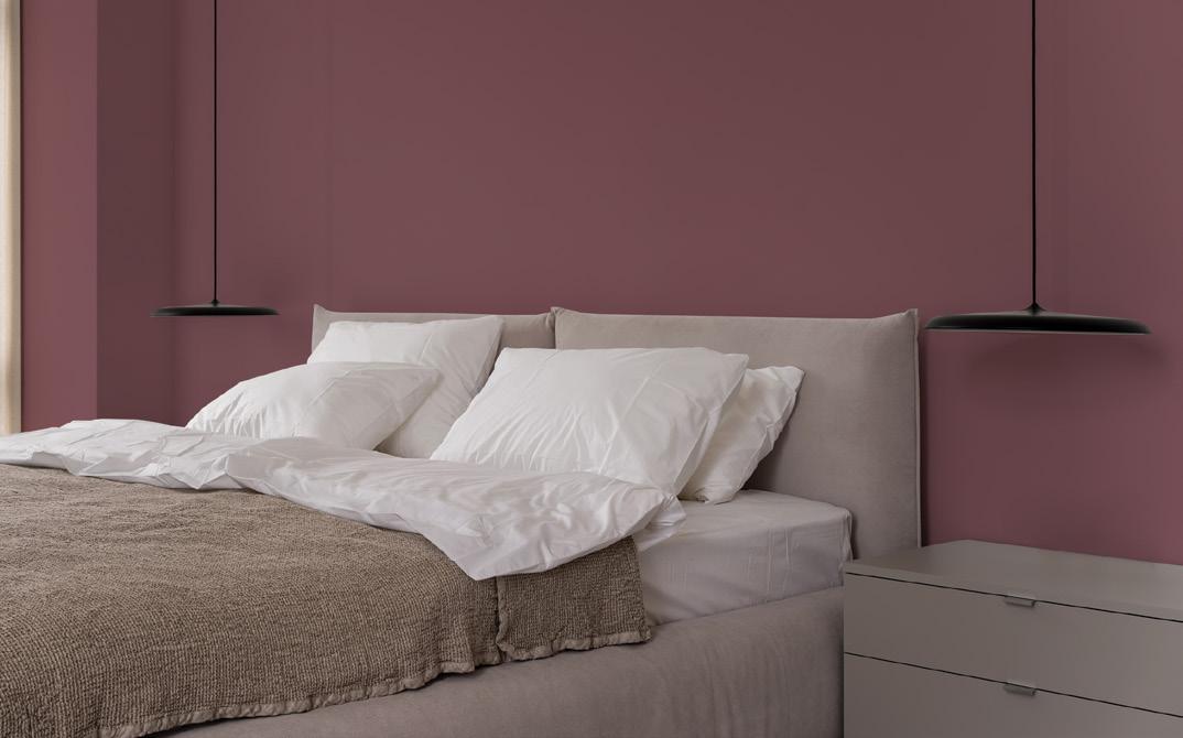
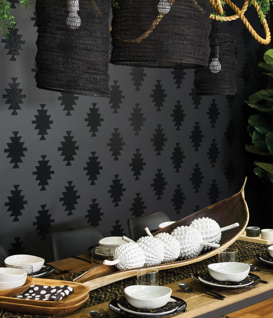
SHADOWS DEEP – CJ11
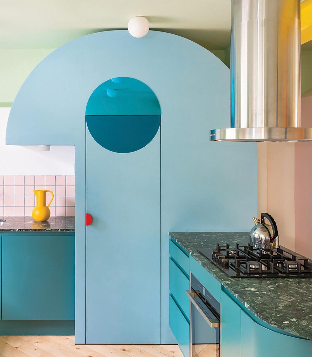
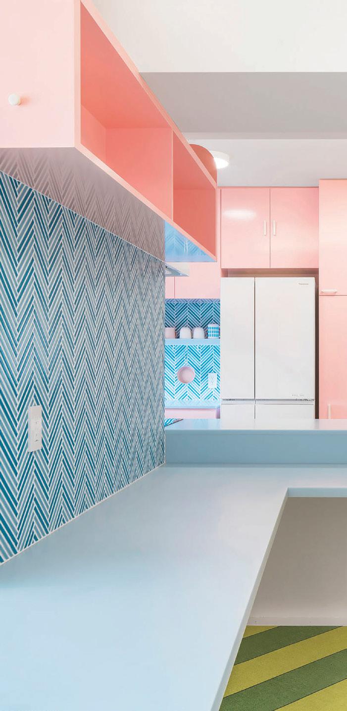
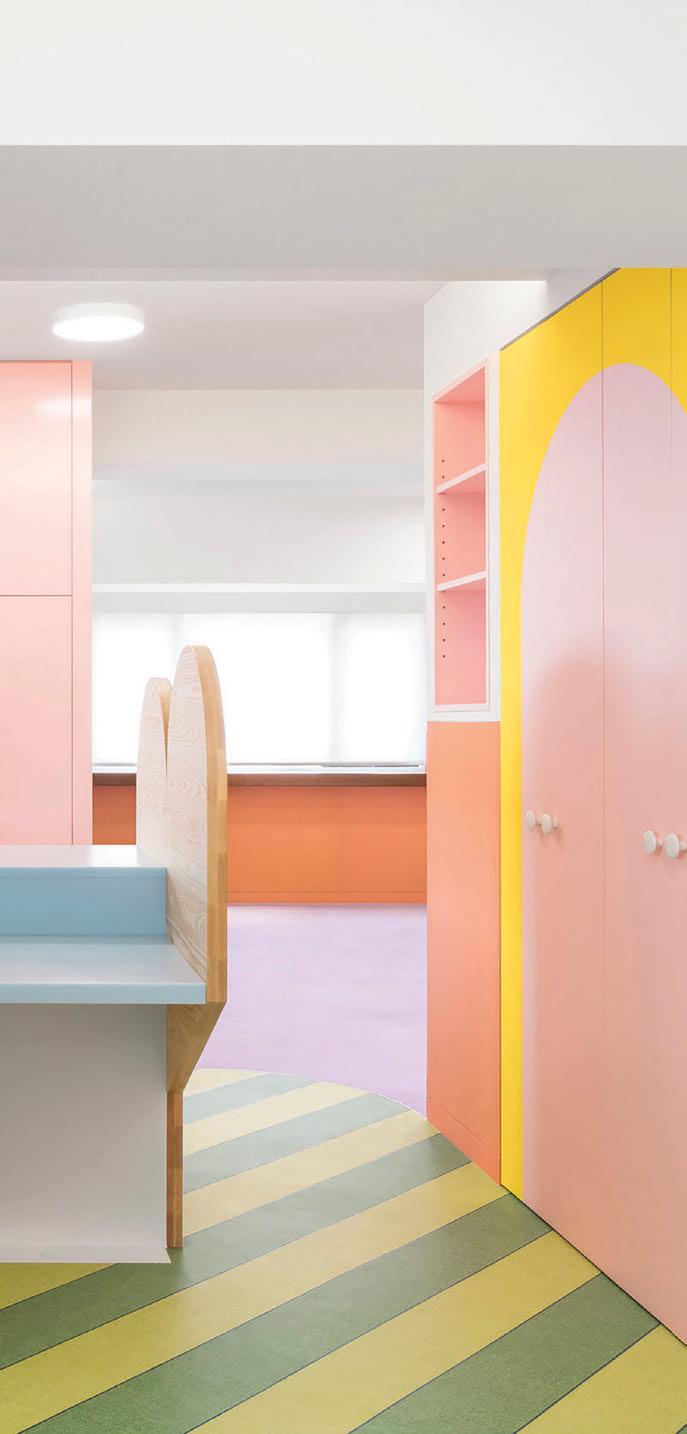
COBARGO SANTA PROJECT
Dave and Barb’s story is one which highlights the ongoing devastation these events had on the town, but also the hope which comes from coming together to support rebuilding efforts. This project is one Taubmans are proud to have supported. David and Barbara have dedicated their life to supporting their community. After living in Canberra they moved to the regional NSW town of Cobargo 10 years ago. They are active foster parents, Dave is an RFS Volunteer Firefighter and the local Santa! He dresses up every Christmas and takes his sleigh out, bringing joy to local kids.
They sadly lost their home in the bushfires which struck the town on New Year’s Day 2020. The impacts on their family were felt deeply, but
with generous support from Madeline and Jeremy at Breathe Architecture there was hope – as the team supported them to design and build their new home.
The new build is a modest, sustainable, carbon neutral house, where colour has been harnessed to personalise the family’s interior spaces and bring the home to life. Rachel Lacy, Taubmans Chief Coloursmith, collaborated with Dave, Barb and their children to create a total of fifteen unique paint colours for their home using Coloursmith.
The colours in the home tell a family story, and will be enjoyed for years to come.
The bushfires which took hold over late 2019 and early 2020 have had a lasting impact on families and townships.
PAPERBARK COBARGO – TM 22.01
FOR BARBARA - TM 22.02
SARAH’S PEPPERBERRY COBARGO – TM 22.03
“COLOUR HAS BEEN HARNESSED TO PERSONALISE THE FAMILY’S INTERIOR SPACES AND BRING THE HOME TO LIFE”
COBARGO HOME - TM 22.04
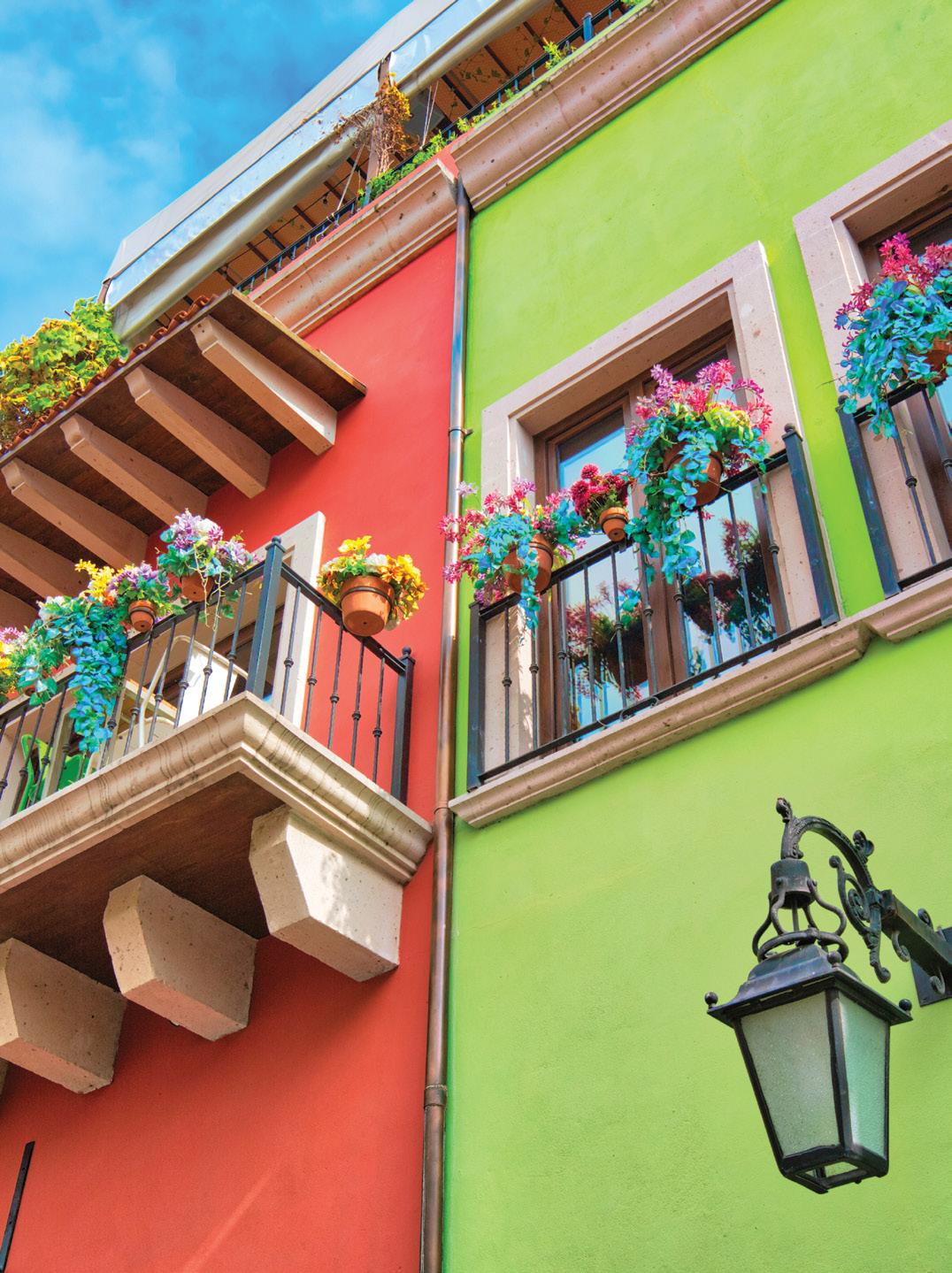
COLOUR IN MEXICO
Jesús Pena Canton is the Colour Marketing Manager at PPG Australia and New Zealand. Jesús is originally from Mexico, starting and building his career with PPG Comex before making his way to Australia. As told to Rachel Lacy, Jesús shares his insights on how colour in Mexico has evolved from a rich cultural history, and how we can bring Mexican colour inspiration to our own homes.
Mexico is surrounded by such vivid colour, everywhere you look it’s joyous and bright! Why do you think that is?
I think there are two key reasons for this. First is the Mexican personality, like most Latin American countries fiesta is a big thing! We love to laugh, dance, eat and celebrate pretty much everything we can. Whether it’s a birthday, graduation, our local team winning a championship, our national team almost getting a championship (haha!), getting a promotion, getting engaged – we even view death as a celebration of a person’s life. Our ancestors did the same.
The second and most important reason is because of Mexico’s geographical location, there is a large amount of biodiversity (I think Mexico has close to
10-12% of the world’s biodiversity). This has an effect on the food we eat (extremely colourful) as well as the pigments that were available to us to enable the creation of clothes, house paint and accessories.
Because of this we developed a great relationship with nature, if you go back to most of the pre-Hispanic civilizations established in Mexico you will find they adored and praised nature. Some of our ancestral gods are elements like animals, rain, volcanoes and mountains. When you’re surrounded by such an explosion of beautiful colours, you’re never afraid of using them everywhere to bring nature into our cities, our homes and our lives.
You joined PPG Australia from PPG Comex, the leading paint brand in Mexico, what do you think is the main difference between the Mexican and Australian homeowner when it comes to colour selection?
I believe the Mexican market is less afraid of using colour, if you walk around Mexico you will discover many green, pink and orange houses. I believe in Mexico we even use colour to make our houses stand out from those with more conservative colours. It may even relate to weather! When you live in a country with a warm climate you wouldn’t like to paint your house in dark shades, as we know black retains heat – making houses warmer on the inside.
Can colour travel across cultures and geographies?
It definitely can, obviously I love Mexico and I would advise anyone to go and visit. While you are there I would also recommend travelling to surrounding countries to experience the influence from ancient civilizations. Guatemala is a beautiful country that shares a lot of colours with Mexico, The Mayans were established in the southern part of Mexico and in Guatemala. You can also see how these areas had an influence in the southern part of the United States, where they have a high concentration of Mexicans, but were also part of the Mexican territory. New Mexico, Arizona and California are great examples of cities where there is a vast Mexican influence.

How can we bring some Mexican colour inspiration into our homes?

I would suggest looking to Luis Barragan, a great Mexican architect or Frida Kahlo who needs no introduction. I don’t have the words to describe their use of colour and I always use them as inspiration. But mainly I would suggest using mother nature as a guide, I think the colour combinations you find out there are always right and work to perfection in any space. I would also get rid of the belief that houses can be colourful only by using furniture and other accessories. In my opinion, it’s easier to re-paint walls if the
colour is no longer your cup of tea than it is to get rid of your furniture. All colours are great, especially if they bring you joy.
What do you miss most about home?
My family is the number one thing I miss about home, but I would also say that Australia has made it very easy for me to adapt. It’s a country with amazing, warm and relaxed people, with an incredible amount of places to visit and appreciate.
WHICH WHITE?
A pure white has no base colours and is rarely used. Considering the huge selection of whites with undertones of yellow, stone and grey, you need to look at the tints that make up the different “whites”. To reveal the different tints in your white paints, our advice is to paint a test swatch and then hold it against a piece of pure white paper.
Hot or cold
There is fine line between a white palette in the home that's fresh and relaxing and one that feels sterile and cold. Ultimately, your surroundings will determine what the best shade of white is for you. Test Taubmans Crisp White for a classic cool white or Taubmans Milk Cloud for a softer look and feel.
New or old
Our modern interiors lean towards brilliant whites and greys, so use this as your guide to selecting whites and the colours that work with it.
Globe-trotting
Your light globe can completely affect the look of white so be aware of a warm or cool globe in your light fittings. Even the temperature of a light globe can impact the colour reflected in the room. If you are going for a brilliant white, a cool globe can make the interior very clinical so experiment by swapping a couple of globes to get the right effect.
White on white
A simple palette of white on white can look fantastic on the walls, trims and doors. There are two ways you can go. For layering of white, use a pure white on the trims and contrast with a white with a very slight grey tint so the room doesn’t feel flat. Another option is using a high gloss on the trims, which adds that extra layer of depth and difference, rather than being ‘flat’ and clinical.
Preparation, preparation, preparation
Ultimately, take the time to research which white is right for your home. The preparation and due diligence you invest will be worth it once you are rewarded with a beautiful space that you love spending time in.
 SNOW DROP - WD 4
INTERIOR WALL - CRISP WHITE - T15 3.1
EXTERIOR WALL - COTTON BALL - T15 1.1
CHROMATIC JOY
Welcome to the 2022 - 2024 Taubmans Colour Report - a celebration of bright, bold colours at a time when their positive influence is needed most. At Taubmans, we started out 2020 with an entirely different colour forecast in mind. We looked to international colour and design trends and started to build a palette and narrative. Then COVID-19 changed everything.
Our colour work seemed irrelevant and felt disingenuous. So we stopped and took the time to think about the most useful thing we could do as a paint company in these challenging times.
Historically, economic factors have influenced design trends - from the Great Depression, when designers responded to weak discretionary spending with brighter, more colourful products to catch the eye, through to the 2007-08 recession, which gave us ‘start-up minimalism’. Pinterest, Instagram, Uber, Warby Parker, We Work and Airbnb, to name a few, all grew out of this recession.
These start-ups that came into the market needed to demonstrate to corporate America wary consumers that their value lay in their products and not in heavily styled marketing campaigns, which concealed a thin reality– that they were transparent, their costs were as minimal as they could be. Simplistic start-up styling became popular in interiors for hospitality and commercial settings, with white walls, reclaimed timber tables, hanging Edison bulbs and very little ornamentation.
The result was a mix of rustic Scandinavia and Industrial that made the transition from a We Work space to a cafe a seamless experience, but a disheartening journey through spaces that provided little nourishment to our senses. It’s curious to note that this look became so ubiquitous; it may as well have been a style guide for all those fiercely individualistic start-ups. The trickle-down to domestic interiors of pared back spaces, bright white walls and timber are still evident today.
Maybe as a foil against this reductive aesthetic of the post-recession period, we went swinging the other way to rich, deep wall colours and jeweltoned furniture, which were frequent guests in many interior design magazines and blogs. I loved seeing colour used, but felt it was potentially intimidating to think about painting your entire living room dark teal and that painting every element in the room the same colour - from ceilings to skirting boards - was an affront to any architectural detailing, which got completely lost in the process.
The Taubmans Chromatic Joy colour collection boasts 32 entirely new, home-grown paint colours created using the Taubmans Coloursmith Reader. Chromatic Joy espouses the positivity of bright, bold colours while being anchored in lightness, making it easy to incorporate into any setting to imbue a sense of joy and a comforting containment.
In homage to the late Derek Mahon (1941-2020), whose poem ‘Everything is Going to be All Right’
Welcome to the 2022-2024 Taubmans Colour Report - a celebration of bright, bold colours at a time when their positive influence is needed most.
(1979) has found fresh prominence during the COVID-19 pandemic, the Chromatic Joy hues were named from verses of the poem using the cut-up technique, in addition to the poems ‘Lives’ (Mahon 1972) and ‘When You Are Old’ (Yeats 1891).
These times are unprecedented in modern history with such loss of life, of livelihoods and immense personal sacrifice. Australia has endured so much, from the catastrophic bushfires that saw in the New Year to the global pandemic that followed. In Australia and New Zealand, communities have banded together to support those in need and care for one another. In the ongoing Covid-19
pandemic, we continue to work together to keep our families, our colleagues and our communities safe. In the face of crisis we have learnt to put ‘we’ above ‘me’ and to value the collective good before individualism. As we continue to traverse strict social restrictions and face a changing world, the need for air, for joy, for lightness, for happiness and for social connection has never been so pressing.
Looking ahead, we see these themes emerging in global design trends like New London Fabulous, with nods to the Memphis Design Group and the bright, boldly patterned and eccentrically shaped
SHADOWS DEEP – CJ11
HIDDEN SOURCE – CJ07
“CHROMATIC JOY IS THE DELIGHT WE TAKE IN COLOUR CONSCIOUSLY OR SUBCONSCIOUSLY.”
designs of the 1980s. In Australia and New Zealand, the pared-back, bright white spaces of minimalist design make way for comforting and joyful colour, creating emotionally nourishing environments. We see the deliberate infusion of colour evolving to promote and sustain a sense of wellness within the built environment. White is not the absence of colour - a shaft of sunlight contains all the colours of the spectrum. Combined, we see white light. The ‘White Light’ palette of carefully curated whites ideally complements any combination of the colours of Chromatic Joy, providing balance and harmony in equal measure.
You may be familiar with the sensation of returning to Australia or New Zealand from the Northern Hemisphere and being struck by a light of shimmering clarity and brightness. In this change of light there is an enhanced awareness of colour. There is no pure white colour in nature. The White Light whites are all tinted with a mix of pigments adjusted to give either a cool, warm or neutral effect; inorganic pigments provide coverage and soften the colour, while the more transparent organic pigments provide luminosity and a multicoloured dimension to the surface.
We could not imagine a world without colour. Colour is not the inherent property of light or physical objects; it is our individual, subjective interpretation of wavelengths of light that determine the colours we see. Colour is an integral element of our world and plays a vital role in our well-being. The relationship between how we think about colour and how we physically react to colour is a new science. Neuroaesthetics is a fascinating new field of scientific study, which aims to investigate the “perception, production, and response to art, as well as interactions with objects and scenes that evoke an intense feeling, often of
delight.” It is our subtle responses to colour that make us human.
At last year’s Salone del Mobile, Google partnered with John Hopkins University’s Arts + Mind Lab to put the theory of neuroaesthetics to the test. ‘A Space for Being’ was a multi-room experience; visitors were fitted with a band that measured their physiological responses as they moved through three spaces, ‘Essential’, ‘Vital’ and ‘Transformative’. One of the interesting findings was a disconnect between how a visitor claimed to feel in a certain room versus what the data revealed they were feeling. Ivy Ross, VP of Product Design at Google, who led the project said “We’ve been optimising our environments too much for our cognitive mind in recent years, and we need to ignite our senses and bring more awareness to what feels good rather than what we think.” Perhaps we need more joy, more playfulness in our spaces. Ingrid Fetell Lee’s Ted Talk, ‘The Aesthetics of Joy’ is a persuasive argument for the use of colour in the built environment.
Chromatic is any colour in which one particular wavelength or hue predominates. For example, blue and green are chromatic colours. White, grey and black are achromatic colours that have no dominant hue (all wavelengths are present in equal amounts within these colours).
Joy is the emotion of great delight or happiness caused by something exceptionally good or satisfying; keen pleasure; elation. Chromatic Joy is the delight we take in colour consciously or subconsciously.
Rachel Lacy Chief Coloursmith Taubmans PPG Australia
SAIL AWAY CJ03 CROWD OF STARS CJ22 CONTEMPLATE CJ21 PALE CREAM CJ26 PILGRIM SOUL CJ04 OYSTER CJ32 WET CHALK CJ28 CLIFFS OF DOVER CJ27
MID CENTURY WHITE CJ25
WARM GREY WHITE CJ31
INHERENT CJ30
INHERENT HALF CJ29
ITHICA CJ20
COOL GREY CJ24
HIGH TIDE CJ02
CLOUDS FLYING CJ01
DISLCAIMER:
Colours shown are as close as possible to actual paint colours. Recommend purchasing a Taubmans sample pot for colour accuracy.
GLAD GRACE CJ13 UNBIDDEN CJ14 BEAUTIFUL AND BRIGHT CJ17 DREAMING CJ23 HIDDEN SOURCE CJ07 EARLY LEAF CJ08 DAYBREAK CJ05 SOFTLOOK CJ06
WATCHFUL HEART
CJ09
BUMP OF CLAY
EVERYTHING IS GOING TO BE ALRIGHT
SHADOWS DEEP
CJ11
MAKER
CJ15
CJ12
RIOT OF SUNLIGHT
CJ10 DISLCAIMER:
TORC OF GOLD
CJ16
CJ18
GLOWING BARS
CJ19
Colours shown are as close as possible to actual paint colours. Recommend purchasing a Taubmans sample pot for colour accuracy.
INHERENT HALF
WET CHALK
CLIFFS OF DOVER
WARM GREY WHITE
INHERENT OYSTER
MID CENTURY WHITE
PALE CREAM
DISLCAIMER: Colours shown are as close as possible to actual paint colours. Recommend purchasing a Taubmans sample pot for colour accuracy.
CONTEMPLATE
CLOUDS FLYING
COOL GREY SAIL AWAY
CROWD OF STARS
HIGH TIDE
ITHACA
PILGRIM SOUL
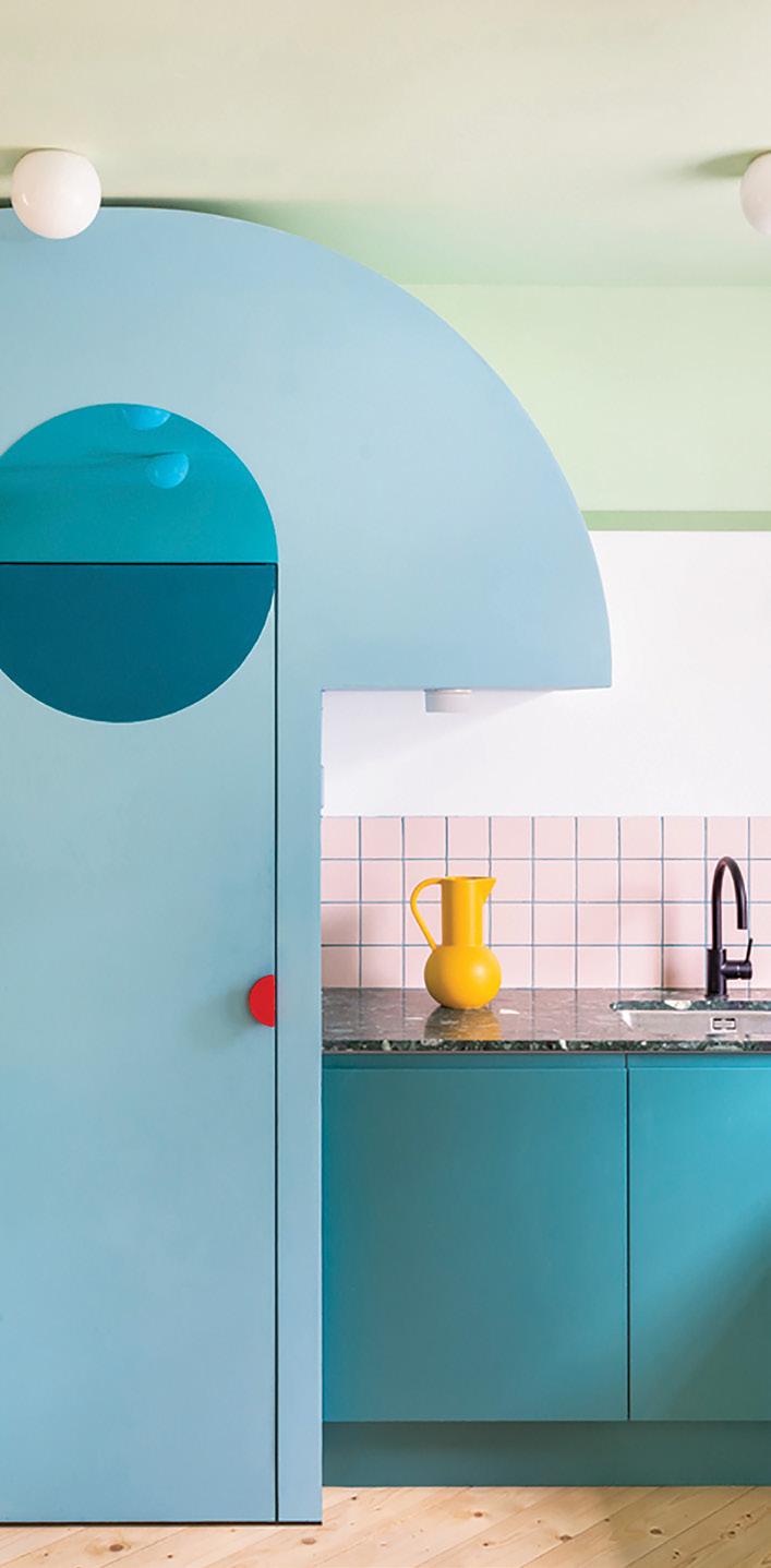
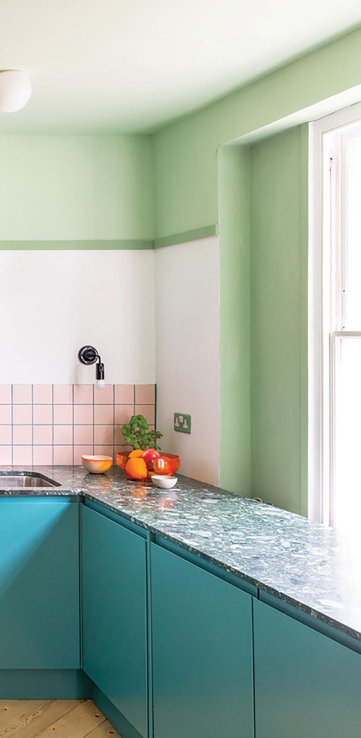
Project: Office S&M
DISLCAIMER: Colours shown are as close as possible to actual paint colours. Recommend purchasing a Taubmans sample pot for colour accuracy.
Photo: French + Tye
DAYBREAK
HIDDEN SOURCE
BEAUTIFUL AND BRIGHT
RIOT OF SUNLIGHT
SOFT LOOK
EARLY LEAF
GLOWING BARS
DREAMING
DISLCAIMER: Colours shown are as close as possible to actual paint colours. Recommend purchasing a Taubmans sample pot for colour accuracy.
 Photographer: Jan Vranovsky
UNBIDDEN
EVERYTHING IS GOING TO BE ALRIGHT
 TORC OF GOLD
BUMP OF CLAY
TORC OF GOLD
BUMP OF CLAY
MAKER
GLAD GRACE
SHADOWS DEEP
WATCHFUL HEART
DISLCAIMER: Colours shown are as close as possible to actual paint colours. Recommend purchasing a Taubmans sample pot for colour accuracy.
COLOURSMITH REVOLUTIONISES THE PAINT SAMPLING PROCESS
Coloursmith has redefined the paint sampling process, creating a new way of selecting colours. By bringing together the integration of digital tools and colour matching, users are able to create their own colour, by being inspired through a visual or physical source.
Signifying a shift into the digital space, Coloursmith empowers consumers to interact and personalise their colours, to be then ordered instantly and tested within their own space. Through a sustainability lens, Coloursmith is establishing its presence, with developments in technology that play a role in reducing negative impacts.
As all manufacturing occurs in Australia, it finds the balance between producing an efficient service in delivering colour samples, whilst operating sustainably. Particularly, by transforming and enhancing processes, unwanted paint waste can be decreased. This is seen in the production of smaller paint pots that consumers order and sample. Rather than the traditional larger sizes which saw consumers then having to go into the store to buy the full size, the excess paint that is produced with this can be decreased. Along with this, smaller shakers were designed specifically for this reduced size, and placed conveniently across Bunnings stores and Taubmans Professional Paint Stores. With the new sample pot machine, the error or miss tints in the
paint base has been eliminated. What was once a manual operation to select the right base, is now selected by the machine to ensure total accuracy in colours. Paints that had been previously tinted incorrectly and unable to be sold are now avoided. The idea that Coloursmith encapsulates through its processes, is that when a colour is ordered, the paint that is made is aligned with how much is needed for the consumer to try in their own space. In this way, consumers are receiving and using only what they need, ultimately resulting in less waste being produced.
As the paint industry moves towards digital solutions, there will be less of a reliance on colour chips and printed materials. Coloursmith gives consumers the ability to create their own, personalised colours that are tinted in a smaller sized sample pot, rather than selecting multiple coloured print materials. As a result, both the costs and impact of colour paint chips and printed materials waste is reduced. Coloursmith is a convenient channel for homeowners to sample, purchase and be confident about their colours.


MUSEUM DESIGN AND COLOUR
In celebration of the Coloursmith by Taubmans partnership with Museums Victoria, we asked Museum Victoria’s Visual Design Manager, Jo Pritchard about the value and importance of colour in exhibition spaces. Jo talks about how colour is strategically chosen to guide the audience and tell stories, and how specific elements of colour selection for the museum can inspire how homeowners explore colour for their own spaces.
What is the difference between choosing colour for a home and choosing colour for a museum space?
In a museum context, colour is used to express and support the themes and narratives of an exhibition. Colour selection is not random – it happens through a thoughtful design process and is not necessarily reflective of the designer’s taste. Colour decisions are based on many considerations including audience, content, spatial form, lighting and narrative. For a home, you also need to employ a design process and consider similar elements, such as the intended function of spaces, light levels and built form.
A key difference between the two environments, is the amount of time one spends in an exhibition versus their home. Very bold and dramatic colour combinations can be more appropriate for an exhibition space, where people visit for limited time periods. As you spend a lot of time in the rooms of your home, you need to ensure that you will enjoy the colours that surround you daily.
Another point of difference between home and museum spaces is the light. In order to protect the (often fragile) objects on display, we usually don’t allow natural light inside galleries. This enables us to totally control the lighting within spaces. We can orchestrate the levels, the temperature and the direction of the light within. Because of these lower light levels we often use bolder, more saturated colours than might be used within a domestic setting.
Finally, whereas a designer’s personal preferences may influence colour choice within a museum context, in the home, personal taste is of primary importance.
Are there any similarities we can use from the Museum design process to inspire our own personal colour choice?
You can consider the different spaces within your home in a similar way to that of a museum. The colours should respond to the built environment and work with your furniture, fixtures and decor.
Just like an object may drive a colour choice within an exhibition, a beloved family heirloom or recent furniture piece might inspire a paint colour inside the home.
As with an exhibition, your colour choices can help to define different areas of your home and create ambience and atmosphere. Do you want the entrance to be bright and welcoming? Do you want your bedroom to be muted or colourful?
If the colours you see within an exhibition space inspire you to make bolder choices than you might normally make, maybe select tints of the colours for your own home. Alternatively, be judicious about where you employ the more audacious colour choices. Whether bold, bright, dark, muted, light or subtle, colour can transform any space, and just like a museum, it will help to tell your story.
What are the pre-requisites for choosing colour for museums spaces – what guides the choices?

Colour selection is a critical part of the exhibition design process. There are many factors that are considered when making colour selections. First and foremost is audience – who are we designing the exhibition for? Is the experience meant to engage young children, is it targeting young adults, or older visitors?
Each exhibition is unique and colour is a major component of the overall experience.
Colours should reflect and respond to the themes and narratives of the exhibition. The finish or texture of the paint is also a consideration when creating an experience. Should the walls be satin, gloss or matt, or a combination to achieve a particular effect? If we are encouraging little hands to touch the walls within a space, we need to specify a more cleanable finish!
How important is colour to transporting visitors to a certain time period to enhance the experience within the museum?
Exhibitions are like theatre sets with colour being an integral element in the creation of ‘worlds’ into which our visitors step. Colours by their association can help transport a visitor to a different place or era. Sometimes colour plays the supporting role – it is there to enhance, accentuate or harmonise with objects that are on display. In some instances, the colour may not be clearly discernible or overt, but it is still working on a more subliminal level to enhance the experience. Sometimes colour is clearly the main character – used to define spaces or themes within an exhibition, or as the hero moment by itself. It may be used as a tool to guide visitors through a space, or it may be used to evoke an emotional response from the audience. Colour can engage, challenge, shock, soothe, excite, delight, orientate or even disorientate the visitor.
COLOURS OF THE CRETACEOUS
Telling historical stories through colour. Coloursmith by Taubmans has recently been announced as Museum Victoria’s Colour Partner for 2022. Colour lives at the heart of this partnership to share creativity, inspiration and joy through colour across all Museum spaces.
In celebration of our partnership and the Triceratops Gallery at Melbourne Museum opening from March 2022, we have created a special edition collection of colours with Coloursmith – the Colours of the Cretaceous.
Dr Erich Fitzgerald, Senior Curator Vertebrae Palaeontology, shares insights about how colour plays a role in understanding the environment of the period, as it helps convey stories in a way which creates a perspective of the Triceratops surroundings and lived experience.
How important is colour to being able to bring a specific prehistoric period to life?
Colour plays a big part in how we understand any environment. The quality of light depends on how far it is from the equator, the season and if it is inland, on the coast, mountain or plain, forest or desert. The same is true for environments in the past, with the added interest of animals and plants
that are no longer around today. If we travelled back to the Cretaceous, we would be amazed by dinosaurs such as Triceratops. We know some dinosaurs were camouflaged and others had glossy black feathers, but the colour of Triceratops is up for debate.
When creating museum spaces which tell stories of a time where there is minimal visual reference, where do you get your inspiration?
Museums Victoria’s palaeontologists recreate past environments based on research with fossil leaves, pollen, and fruits. The fossils provide a lot of information, but there are always gaps that must be filled in with imagination and by using our knowledge of environments today. Scientific artists work closely with palaeontologists to develop visual re-creations that are true to the science.
There is an educational aspect to museum spaces – how important is using colour within the spaces to create an immersive experience to support learning?
Colour is significant in re-creating past environments and in storytelling. Exhibition designers of the Triceratops: Fate of the Dinosaurs exhibition at Melbourne Museum use colour as a key aspect of their work. Colours help create evocative experiences and engage visitors emotions which is an important component in learning.
How do you think the Colours of the Cretaceous support the storytelling of the specific Triceratops experience?
Because living crocodiles and birds have colour vision, scientists are almost certain that non-bird dinosaurs like Triceratops saw the world in full colour. So, when visitors to the exhibition see the Cretaceous environment in full colour they are
almost certainly seeing it just as Triceratops would have, just 67 million years later!
We hope that visitors to the Triceratops exhibition will renew their appreciation of the amazing world we live in and its web of life over time. Colours of the Cretaceous is one way that they can carry that enthusiasm for dinosaurs and our living world, back home.
Triceratops: Fate of the Dinosaurs will open at Melbourne Museum on 12 March 2022. You can visit museumsvictoria.com.au/ melbournemuseum/triceratops/ for more details.

COLOURSMITH & MELBOURNE MUSEUM
CRETACEOUS FLOWERS MV005
TETHYS SEA MV007
TRIO OF HORNS MV008
CRETA WHITE MV001
ANGIOSPERM LEAVES MV004 CONIFER GREEN MV006
EPOCCIPITAL BONES MV002 LAURASIA MV003
DISLCAIMER: Colours shown are as close as possible to actual paint colours. Recommend purchasing a Taubmans sample pot for colour accuracy.
USING WHAT SURROUNDS US TO INSPIRE US TO PERFECTLY CURATE COLOUR PALETTES AND HELP TELL A STORY FROM PREHISTORIC TIMES
CONIFER GREEN

At the start of the Cretaceous period, gymnosperms, plants with cones, such as conifer, were the dominant plants.
LAURASIA

During the Cretaceous period when the Triceratops was alive, North America was a part of the super continent Laurasia.
CRETACEOUS FLOWERS
One of the most profound evolutions in the Cretaceous period was that of flowering plants - angiosperms. Although it is thought insects and bees had already evolved, their existence was increased with these plants.
ANGIOSPERM LEAVES
It is believed that angiosperms, flowering plants, became dominant in the Cretaceous period. The earliest dated and accepted angiosperms are from this period.
purchasing a Taubmans sample pot for colour accuracy.
DISLCAIMER: Colours shown are as close as possible to actual paint colours. Recommend
CRETA WHITE


The name Cretaceous, given to the time period from 145 to 165 million years ago, is derived from the latin word ‘creta’ meaning chalk. Most of the world’s chalk, a type of white-grey limestone, was deposited at this period in time.
TETHYS SEA
Tethys ocean or sea, ran east to west & separated the super continents during the early stages of the Cretaceous period. This body of salt water sat between Laurasia in the north and Gondwana land in the south.
TRIO OF HORNS
The word Triceratops in Greek means three horned face. The name is a combination of the greek syllables tri meaning three, keras meaning horn and ops meaning face. The distinctiveness of the horns makes the Triceratops one of the most recognisable dinosaurs.
EPOCCIPITAL BONES
Epoccipitals is the name given to triangular bones on the edge of ceratops frills. These bones give the frill their distinctive uneasiness.
DISLCAIMER: Colours shown are as close as possible to actual paint colours. Recommend purchasing a Taubmans sample pot for colour accuracy.
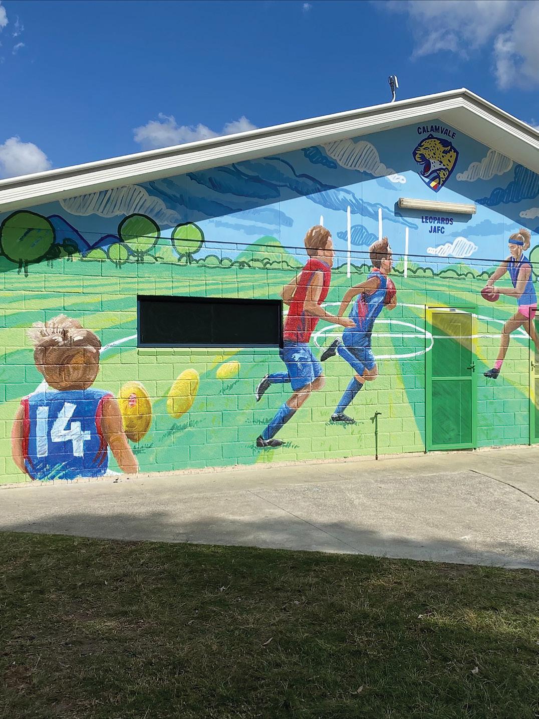
CALAMVALE LEOPARDS JUNIOR AFL FOOTBALL CLUB
Standing at the gates looking at the mountainous scenery I notice that the view appears to be a seamless extension of the new brightly coloured mural beautifying the front of the club house, I can’t help but feel a sense of pride.
Darren Tsimpikas, the Calamvale Leopards Club President, walks over to greet me with a beaming smile and proudly directs me toward the front of the freshly painted building.
The club sits in what can be described as a multicultural electorate, so football represents much more to the community than just the game. Darren proudly said, “We have the ability to impact these kids in such a positive way, it’s not just kicking a ball. As a coach and even the club president it’s about teaching kids discipline, accountability, team work, consequences, great hand and eye coordination and how to lose. Having our kids’ walk off the field knowing they’ve given their all, that’s true sportsmanship and something we value for our players. We have 169 players, 60 Auskick and 20 Superstars, it’s a growing club, one that we are proud of.” When Darren first wrote a proposal for the
project, he knew that colour selection would be an arduous task, as many personalities resonate with different colours and everyone has an opinion. Colour being so personal meant that we had to find a way to appeal to the masses. This was made easy by drawing inspiration from the club jersey and creating bespoke colours unique to the club using Coloursmith. When presenting to the committee it was a unanimous decision.
For me colour is everything, and for Darren and the club it would be fair to say colour now has a place very close to all of their hearts. Darren said, “There is a sense of pride and accomplishment in the community that stems from this refurbishment. The response from the players has been incredible.” Darren repeated on multiple occasions that, “this has been an honour and an experience that I will never forget. Painting the mural at the front of our building truly represents
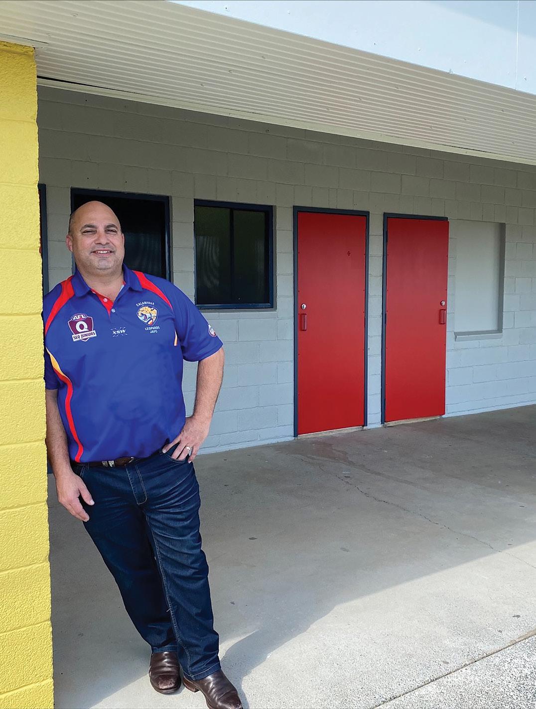
the club for what it really is. Having Brisbane Lions FC coming to assist was a memorable and honourable experience that is cemented within our community.”
As we make our way to the canteen to view the bold blue wall, Darren tells me about the filming of the ‘In It Together’ TV advertisement. “It was a very proud moment and it represents what we are as a club. I think that now when I go to buy a can of paint it means so much more to me, it’s not just
a can of paint, it’s the friendships we have made throughout this project and I truly want to thank Taubmans for that, we truly are in it together!”
 Fiona Dawson PPG Territory Manager & Colour Specialist
“IT WAS SUCH A SATISFYING MOMENT STANDING WITH DARREN AND LISTENING TO HIS STORY OF THE INCEPTION OF THE CLUB.”
Mad Men does something additional with its colour palette, elevating the look and feel of its environment with a classy, subtle and distinctive blend of classic hues that may have been out of vogue for decades, but somehow look brilliant.
TV SHOWS AND MOVIES TO INSPIRE YOUR HOME COLOUR
This “old is new” remix approach gives the series a unique aesthetic, like a time capsule preserving the crisp freshness of colours we’ve previously only seen faded and peeling in the real world.
Go neo-retro: With Coloursmith you can create your own unique colours using old photos as the reference palette for a fresh coat of paint.
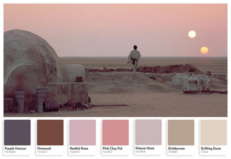
Star Wars
Star Wars has a lot happening both onscreen and off. It was held up as an example of filmmaking for its use of special effects and storytelling, defining its genre with a string of sequels and spinoffs.
amidst all the lasers and robots is the craftsmanship that went into its cinematography. It is driven by a carefully chosen colour palette of purples that fade to red and blue at the edges, interrupted often by strobing splashes of neon colour in dimly-lit spaces. Glowing blue and grey spaceship interiors are nicely juxtaposed with the warmer, sandier colours and atmospheric reds, blues and purples of Luke Skywalker’s desert planet. Hero’s Journey: Even space knights need the right paint for the job. With two suns beating down all day, any desert moisture farm exposed to the elements should have a coat of Taubmans All Weather® Exterior.
PURPLE HONOR T12 34.H12 FIREWOOD T15 113.7 RESTFUL ROSE T15 207.3 PINK CLAY POT T15 202.3 MAUVE HAZE T15 124.4 BRISTLECONE T10 16K-1
cinematography. It is driven by a carefully chosen colour palette fade to red and blue at the edges, interrupted often by strobing colour in dimly- lit spaces.
and grey spaceship interiors are nicely juxtaposed with the colours and atmospheric reds, blues and purples of Luke desert planet.
Even space knights need the right paint for the job. With two down all day, any desert moisture farm exposed to the elements coat of Taubmans All Weather Exterior. 24
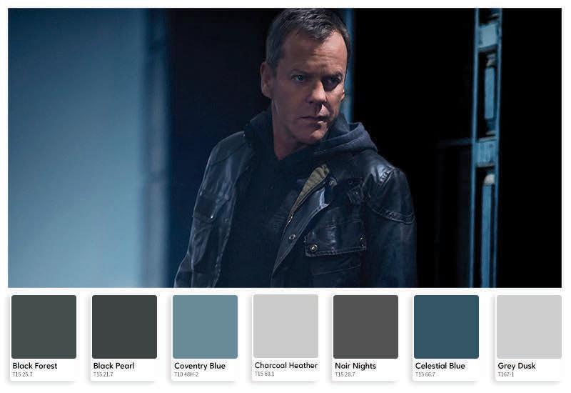
We spend a lot of time trying to find ways to make our living environment tranquil, pleasant to be in, and a place where we can relax. But maybe that’s not what you’re looking for. Perhaps your work or lifestyle demands that you have cat-like reflexes and sleep with one eye open, always remaining both alarmed and alert. Well, there’s a TV show-inspired palette for that too. In the long-running TV series 24, set designers went with a gradient of Black Forest, Black Elegance, Black Pearl, Canyon Black, Black Night, and All Black. Accenting this inky atmospheric spread are Charcoal Heather, Grey Dusk, and Noir Nights—layered with alternating textures of carbon fibre sheeting, black iron grating and chrome railing to telegraph a foreboding sense of impenetrable security.
overlooked amidst all the lasers and robots is the craftsmanship that
BLACK FOREST T15 25.7
BLACK PEARL T15 21.7
COVENTRY BLUE T10 48H-2
CHARCOAL HEATHER T15 60.1
NOIR NIGHTS T15 28.7
DISLCAIMER: Colours shown are as close as possible to actual paint colours. Recommend purchasing a Taubmans sample pot for colour accuracy.
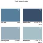
CELESTIAL BLUE T15 66.7
KYAL AND KARA’S BLUE LAGOON DREAM HOME
Kyal and Kara’s Blue Lagoon build is a coastal dream, with a beautiful and calm aesthetic.
Upon completing the home, Kara did a walk through to check the final use of colour throughout the spaces. One of the centrepieces of this home is a stunning spiral staircase, but she found the staircase was getting lost against the white wall at the back of the home and needed some warm tones to provide some depth and contrast.
Kara said, “Because this is such an open plan design you can see this wall from the very entry to the home, and the spiral staircase is the real feature in the middle. I’ve noticed that the wall was quite white and stark, and the stairs were getting lost in front of it.”
Kara used a vintage tapestry wall hanging to inspire her colour for this wall. She used the Coloursmith app and reader to match the perfect colour from this wall hanging, which also suggested similar colours which may work in the space.
The end result is an added warmth to the space, where the spiral staircase is really celebrated and embraced as part of the open plan design. Kara was incredibly happy with the end result created by her own colour called, ‘Vintage Feather’, and brought to life on the wall using Taubmans Endure.
Kara said, “I am so happy with the colour I created, it creates a beautiful warmth and backdrop for the staircase.”
Find out more about the Blue Lagoon Build and Kyal and Kara by visiting www.kyalandkara.com or @kyalandkara on Instagram.
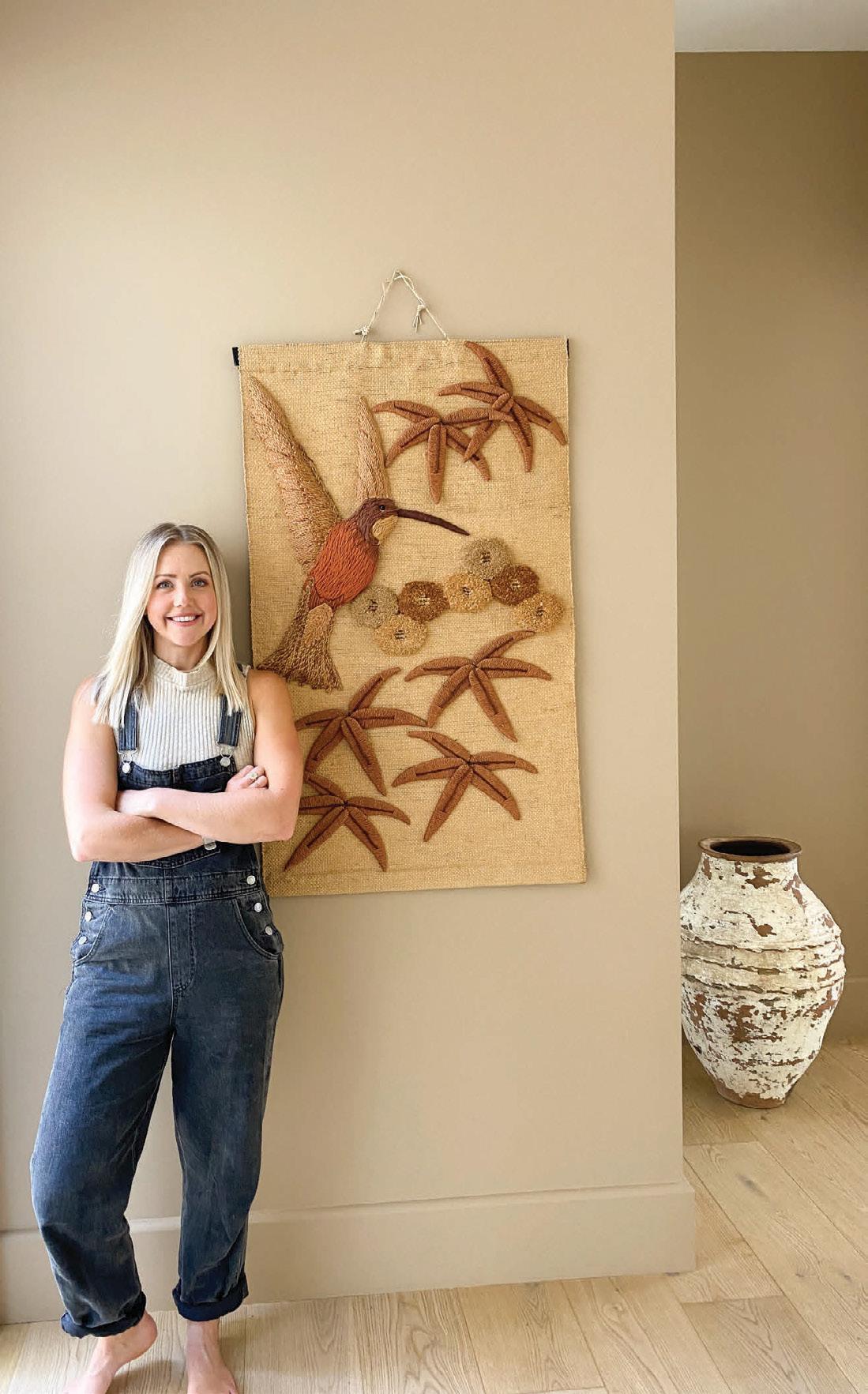 VINTAGE FEATHER BY KARA – TM 22.05
MEGANS RETREAT BASKED IN COLOUR
Megan Morton is an interior stylist who recently took on a very personal project, her own home – Mimosa Moon.
She used colour to create beautiful spaces for her family. In her own words, Megan shared her thoughts behind the colours she chose, and the impact they have had on her home renovation project.
Infinity by MM / TM 22.06
The one thing you have to be really mindful with east coast houses like Mimosa Moon, Northern Rivers Hinterland is to chase the idea that to re-enter the house after days outside it really does have to feel as cool as it looks. Mimosa Moon is surrounded by pasture and rainforests. The white needed to be that perfect mix of glow and softness.
Deeply Navy by MM / TM 22.07
My all time go to colour is blue! This private movie screening room also needed to be a place to really feel protected, a real retreat. With all the surrounding verdant green around it, navy was the perfect choice as it’s dominant in its all over use
and all the furniture has been done to match so it’s a real camouflage of sorts. When you have lots of green in your line of sight, a deep navy can be breathtaking.
Grey Castle / T15 18.4
I love taking the smallest room in the house and making it the jewel. Most of the time our initial instinct is to attempt the really big rooms. They offer (on the surface) the most real estate and the most bang for your buck, but I truly believe that it is in the smaller spaces that you can achieve some real drama. Our small guest loo does this exactly. Wall to wall dark grey, just add a skirted basin and artwork for details. The darker the grey the more I believe you can get away with!
Find out more about Megan at www.meganmorton.com or follow her on Instagram @megan_morton.
Photography by: Anson Smart Paint: Lismore Paint Centre
INFINITY
BY MM – TM 22.06
TAUBMANS X TRENDS
Which trend suits your lifestyle? We explain some of the current home styling trends and their supporting colour palettes to inspire your next paint project at home.
The Hamptons
The Hamptons trend originated in the Hamptons, an area in the Long Island region in New York. This area is frequented by successful city dwellers looking for weekend coastal escapes from the bright lights. The interior style is about blending in with the calm coastal surrounds, using airy aquatic colours, nautical inspiration and organic finishes to create seamless and timeless style. The Hamptons palette by Taubmans balances opposite warm and cool tones for those wanting to bring the Hamptons into their home.
Contemporary
Host your own impressive dinner parties amongst the backdrop of stylish, elegant and confident home ambiance with the Contemporary colour palette. The Contemporary trend is about styling spaces for now, whilst ensuring there is an enduring resonance for years to come. It’s unique yet familiar, allowing for spaces which do not divide but unite as individual style elements and touches
allow you to make your home your own. Go all out with embellishments and strong furnishes against the contrasting colours within the collection. With lighter hues of white for those spaces which need a fresh energy, and rich grey tones for spaces where you entertain, wind down or relax.
The Bold
If more recent times have taught us anything, being at home more often calls for creativity to keep focused, motivated and joyful. Adding bold colours to your space could be your ticket to a refreshed set of home spaces which lift your spirits. The Bold trend offers a set of hues which pop colour into your spaces. This range works together, so be brave and mix it up. Add your own sense of creativity and imagination to support your living, working and playing spaces at home. We are all individual, and we should put our individual touches on our spaces. Sometimes not following the crowd takes us in a perfect new direction.
Scandi
A lazy morning breakfast, or early afternoon book on the couch – it’s the simple life. The Scandi style is simple and drama free, the way the good life should be. The Scandinavian trend originated from the Nordic region, where it’s important to maximise daylight and openness in a region with short days and very cold winters. This movement is also about inclusiveness, accessibility function and neutrality.
Minimal and refreshing, whilst being warm and inviting. The Scandi trend is about scaling back without looking bare. It’s about being clean and minimal.
Not too polarising, the Scandi colour collection is a unifying set of colours for a home which requires that touch of style, with the comfort and reliability you want when adding soft and fresh colours to your space.
FRONTIER HOMES LTD
WEST HAMPTONS DUNES – HA3
HAMPTONS
WORN WHITE HA1
SHIPLAP GREY HA4
OYSTER WHITE HA2
WEST HAMPTON DUNES HA3
SOUTH FORK HA5
MONTAUK HA6
CONTEMPORARY
CONTEMPORARY WHITE CN1
STEEL GREY CN4
GALLERY WHITE CN2
NOT QUITE BLACK CN5
UMBER WHITE CN3
UMBER CN6
DISLCAIMER: Colours shown are as close as possible to actual paint colours. Recommend purchasing a Taubmans sample pot for colour accuracy.
BOLD
NEUTRAL GREY BD2
BACKDROP BD3
HARLECH BLACK BD6
ROYAL NAVY BD5
DEEP FORREST GREEN BD4
BOLD WHITE BD1
SHAKER GREEN SC6
FOEHN BLUE SC5
WARM GREY WHITE SC2
FREYA’S PINK SC4
SCANDINAVIAN WHITE SC1
Colours shown are as close as possible to actual paint colours. Recommend purchasing a Taubmans sample pot for colour accuracy.
NORSE WHITE SC3
SCANDI DISLCAIMER:
HOW TO PREPARE AN INTERIOR WALL
Walls act as the canvas for your vision of a room. To make it easier to paint and ensure the colours appear as expected, it’s vital that interior walls are adequately prepared for painting.
 BRILLIANT WHITE – T15 2.1
COOKIE JAR – T15 37.5
BRILLIANT WHITE – T15 2.1
COOKIE JAR – T15 37.5
ESSENTIAL PRODUCTS STEPS
01
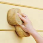
Remove fixtures like picture hooks and light switch covers. Place drop cloths on the floor and any other furnishing in the room. 02 Use a soapy solution to wash walls, rinse and allow time to dry. 03

If any mould is present, use a bleach solution. Using a sponge, leave the solution on the wall for 15 minutes. Rinse and let dry. 04

Assess walls for any damage or surface lumps and bumps. Scrape any peeling or flaking paint and gently sand the surface. 05
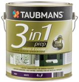
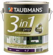
Fill dents or nail holes in the wall. Use an acrylic gap sealant for gaps. Let the fillers and sealers set and sand the areas. Sand rough or shiny spots for improved paint adhesion and finish. 06 Use Taubmans 3 in 1 Prep to spot prime the filled areas. 07 Apply painters masking tape to fittings which can’t be removed and difficult-to-paint areas like skirting boards and fixed shelving.
Taubmans 3 in 1 Prep
• Blocks tannin bleed
• No sanding required

• Superior adhesion
• Fast drying
• Suitable for use with all topcoats
OR
Taubmans Easycoat Prep
• Very low VOC
• Contains Microban®
• Protects against mould and mildew
YOU’LL NEED
Depends on wall size and the amount of flaws it has.
Drop cloths Bucket of soapy water Sponge
Sandpaper 180 or 240 grade
Bleach^ ^Where treatment of mould is required

Scraper
Pre-mixed filler Gap sealant Filling blades Painters masking tape
1 4 2 5 7
TIME
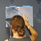
HOW TO CREATE WALL STENCILS
Stand out from the crowd with the breathtaking effect of wall stencils using gloss over the top of matt paint. Design inspiration can come from anywhere and be uniquely you. So if it’s impact you’re looking for, or just a subtle enhancement, then this stunning treatment is for you.
 BLACK FOX – T15 20.7 GLOSS ON MATT
ESSENTIAL PRODUCTS STEPS
01
Prepare the walls using Taubmans 3 in 1 Prep. Check out the previous “How to Prepare a Wall” for a step-by-step guide. 02

Paint the walls first using a matt sheen level of your chosen colour. 03
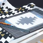
Create your stencil from your favourite image or a standard shape. You could invest in a craft die-cutting machine. For a budget friendlier option, clear A4 or A3 plastic pockets, a metal ruler a cutting knife and board will do. Inspiration on the left image is taken from Aztec/Tribal pattern. 04
Print your design onto thick paper or cards. Overlay the plastic and tape it for secure cutting. Carefully trace with your knife, making sure you have a clean-cut edge. 05

You can cut a minimum 4 - 5 stencils. But we recommend at least double so you can swap them our when they get messy. 06
Carefully measure and mark out the positions and spacing of the stencils on your wall. Use a painters masking tape to secure 4 - 5 stencils in place. 07
Using a small roller, paint over the stencils using a gloss finish. Repeat process for the rest of the wall.
Taubmans 3 in 1 Prep
• Blocks tannin bleed
• No sanding required
• Superior adhesion
• Fast drying
• Suitable for use with all topcoats OR
Taubmans Ultimate Enamel
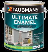
• Smooth finish with easy water clean up
• Inhibits mould and mildew
• Fast drying
• Low odour
YOU’LL NEED 6 7 4 5 2
Pencil Craft die-cutting machine
+
Clear plastic pockets, metal ruler, cutting knife and board Thick paper or cardboard
+ OR
Paint Drop cloths
Painters masking tape Mini paint rollers
Paint tray Step ladder
HOW TO PREPARE A NURSERY
First of all, CONGRATULATIONS! You’re eagerly awaiting the arrival of your little bundle of joy and now it’s time to transform part of your home into a little sanctuary for them. It’s an exciting time, but can be a bit daunting because, well, where do you start? You want this space to be the perfect beginning for your little one and don’t worry Taubmans is here to help!
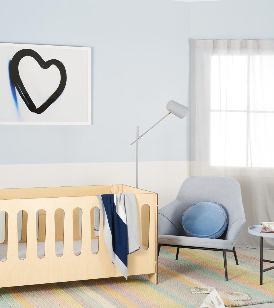
CRADLE WHITE – T15 9.1 QUIET SKY – T15 148.1
01
SELECTING THE PERFECT PALETTE
ESSENTIAL PRODUCTS
Taubmans Endure Interior Walls
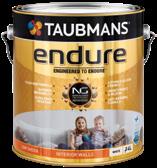
• Engineered with Nanoguard® technology
• Highly washable finish
• Lifetime guarantee* OR
PICKING THE RIGHT SHADE
It’s important to pick a colour that you and your baby will love. Don’t be afraid to use colour but remember to avoid over stimulating colours for newborns, like red. Whites, soft greys gentle stones or calming pastels are the best tones for this space. 02
After selecting the palette, it’s time to narrow down to the exact shade. Simply pick up some colour chips from the Taubmans Colour Wall to get started. Once you have your selection, purchase a sample pot of your colours and test these in your nursery. Live with these colours for a few days to see how they look in different lighting conditions and to see which stands out as your favourite. See our top nursery colours below. You can visit our Taubmans Instagram page for more inspirations and our Paint Visualiser Tool on our website to see how these colours look in a nursery. 03
Taubmans Easycoat Walls
• Very low VOC
• Contains Microban®
• Protects against mould and mildew
TOP NURSERY COLOURS
CHOOSING THE ESSENTIAL PAINT
For newborns, we recommend Taubmans Endure Interior Walls in a matt or low sheen finish. It offers excellent washability, low odour and anti-microbial barrier. It is also asthma and allergy friendly and inhibits mould and mildew. For a budget friendlier option, Taubmans Easycoat is an awesome alternative. It has added protection of Microban® to keep away germs.
PREPARING AND PAINTING THE WALLS
After choosing the colour palette, paint sheen and product, it’s time to get to painting. We’re excited to be involved in this special journey with you. Enjoy the next step in your life and happy painting!
04
NATIONAL ASTHMA COUNCIL AUSTRALIA ® BABY STEPS T15 61.3 CRADLE WHITE T15 9.1 SWEET PEA T15 165.2 ICE CREAM T15 1.3 BALLERINA T15 205.1 LITTLE LILAC T15 129.1 ROSE BUD T15 203.2 KEEPSAKE T15 96.3 BUTTON UP T15 23.1 QUIET SKY T15 157.1 MOVIE STAR T15 84,1 PEACEFUL NIGHT T15 157.1 CLOUDBURST T15 13.2 HONEY BEIGE T15 101.2 SPRING SUNSHINE T15 183.2
STEPS
HOW TO PAINT A DOOR
The selection of paint, colour and technique that your door is painted with can dramatically impact the entry of any space. Here are a few tips that will help you create a lasting first impression for any room or home.
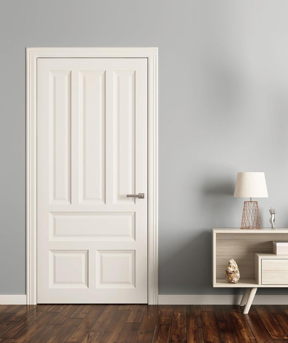
COTTON BALL – T15 1.1
GREY MIST – T08 174-1
ESSENTIAL PRODUCTS STEPS
01 Choose a paint colour but remember to consider the colours you’ve selected for walls, trims and ceilings. 02
For best possible results, we recommend taking the door off the hinges and laying it flat on a raised surface or leaning it against a protected wall. 03
To lay the door flat, use drop cloths on the floor or tape plastic drop cloths to walls if painting against a wall. If you’re unable to remove the door, wedge door in place. 04
Sand down the door. If necessary, lightly sand door edges. 05
If the door is new or previously painted with an oil-based enamel, apply a coat of Taubmans 3 in 1 Prep and let dry. 06
Apply painters masking tape to hinges and door handles. Stir paint thoroughly and pour into a paint tray. 07


Use a brush to paint edges around hinges and door handles. Use a roller for the rest of the door. Start a roller’s width from the edge of the door and roll vertically using light strokes. 08
When applying water based enamels, coat the door and spread paint swiftly without over brushing to avoid visible brush marks. 09
Allow paint to dry before applying second coat. After the second coat dries, re-hinge the door to the frame.
Taubmans 3 in 1 Prep
• Blocks tannin bleed
• No sanding required

• Superior adhesion
• Fast drying
• Suitable for use with all topcoats
Taubmans Ultimate Enamel
• Smooth finish with easy water clean up
• Inhibits mould and mildew
• Fast drying
• Low odour
• TIME: Approx 5-10 mins per coat to apply
• Water based paint approx 2 hrs to dry
• Alkyd based enamel paint approx 4 hrs to dry
• Oil based enamel paint approx 16 hrs to dry
7 9 8 3 4 1
+ =
Roller frame Roller cover to match frame width
Roller Paint tray to match frame width
OR
Paint Drop cloths Sandpaper 180 & 240 grade
Painters masking tape Paint brush
YOU’LL
NEED
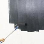
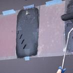
HOW TO PREPARE AN EXTERIOR WALL
The exterior of your home should leave you and your visitors with a lasting first impression. In order to achieve a neat, clean finish and an inviting feeling, exterior walls need to be appropriately prepared for painting. The time it takes to prepare exterior walls for painting will depend on the condition of the walls, the surface you’re painting and the environment you’re painting in.
 MOJO – T172-8
ESSENTIAL PRODUCTS STEPS
01
Remove pot plants, garden hoses and other items near exterior walls. Cover plants and ground near the wall with plastic or canvas drop cloth to avoid damage. 02
Use a soapy solution to wash walls. Rinse and let dry. 03
Check for mould. Use a sponge to apply a bleach solution and leave the solution for 15 minutes. Rinse and let dry. 04 Assess wall for any damage or surface lumps and bumps. Scrape any peeling or peeling paint and gently sand the surface. 05
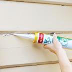
Fill dents or nail holes. Use an acrylic gap sealant for cracks and gaps. (Be sure to use paintable sealants and not silicone.) 06
Let the fillers and sealers set and sand the areas. Sand rough or shiny spots for improved paint adhesion and finish. 07
Use Taubmans 3 in 1 Prep to spot prime the filled areas. 08 Apply painters masking tape to fittings that can’t be removed and difficult-to-paint areas such as trims, windows and doors.
TIPS
Taubmans 3 in 1 Prep
• Blocks tannin bleed
• No sanding required
• Superior adhesion
• Fast drying
To avoid exterior paint blistering or flaking over time, test the existing paint for adhesion before repainting. Cut an ‘X’ through the old paint with a scraper or blade. Apply painters masking tape over the ‘X’ and firmly apply pressure. Remove the tape in a swift motion. If old paint appears on the tape or lifts on the edges of the ‘X’ cut when the tape is removed, it will need to be removed prior to repainting.


For a really effective finish, apply a coat of Taubmans 3 in 1 Prep to the entire wall. This allows for good adhesion and blocks out dark or existing colours, making it easier to paint over and providing a smoother, more professional looking topcoat.
Remember, you’ll need to add a few more materials to the list to complete this step. For large surface areas, you’ll need:
• 230 or 270mm paint roller frame
• Matching roller cover with a 9-12mm nap
• Matching paint tray
• Roller pole
• Suitable for use with all topcoats 5
Sandpaper 180 or 240 grade Pre-mixed filler Gap sealant Filling blades Painters masking tape Drop cloths Bucket of soapy water Sponge Bleach^
treatment of mould is required Scraper YOU’LL NEED
4 3 1 2 8
^Where
@taubmans @taubmans www.taubmans.com.au
@coloursmithanz @coloursmithanz www.coloursmith.com.au
Please note: Colours shown are as close as possible to actual paint colours. Due to limitations of the printing process, photographic and printing images may not represent the true colour images in this magazine.
PPG Industries Australia Pty Limited
14 McNaughton Rd, Clayton VIC 3196 ABN 82 055 500 939
Taubmans ® , Coloursmith ® , Easycoat ® , All Weather ® , Nanoguard ® are registered trademarks of PPG Industries Australia Pty Limited. The PPG Logo is a registered trademark of PPG Industries Ohio, Inc.
For more information about our Lifetime Guarantee, visit www.taubmans.com.au/ privacy-and-legals/disclaimers
Taubmans Endure & Easycoat are approved products of the National Asthma Council Australia’s Sensitive Choice Program. Sensitive Choice ® approved products may benefit people with asthma allergies.
Microban ® and the Microban ® symbol are trademarks of Microban Products Company, Huntersville, NC, USA.
info@taubmans.com.au
Customer care 131 686
Project: Office S&M
Photo: French + Tye
9 322755 078518
RET2528 | TCC103 | 0322
