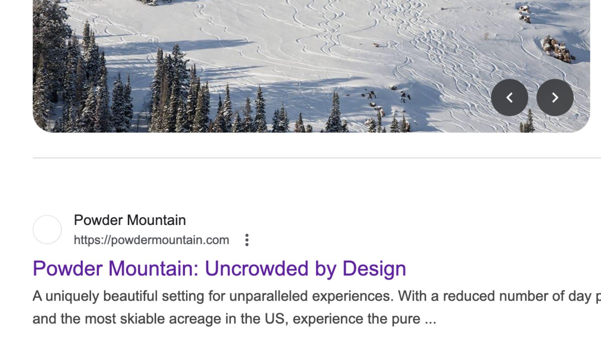
Established in 1972, Powder Mountain is one of the most treasured public ski resorts in North America, renowned for monumental terrain, endless pristine powder, and uncrowded, expansive beauty.
RESIDENTIAL COMMUNITY
Powder Haven is a 600-family residential community with dedicated access to premium amenities, such as ski lifts, lakeside and mountain lodges, pristine terrain, and a planned state-of-the-art wellness center.
ART EXPERIENCE
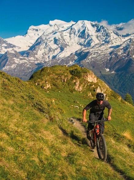
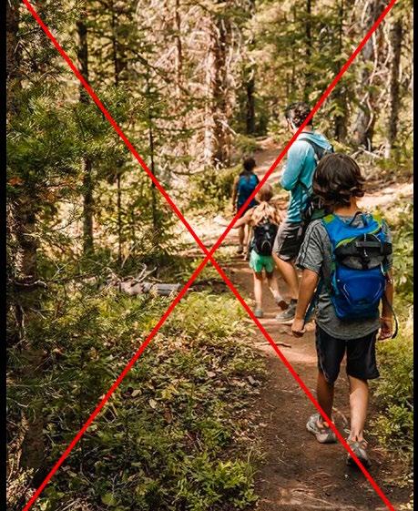
Powder Art Foundation is a nascent outdoor art museum of site-specific works, accessible through hiking and biking in the summer months, and skiable during the winter.
PARENT
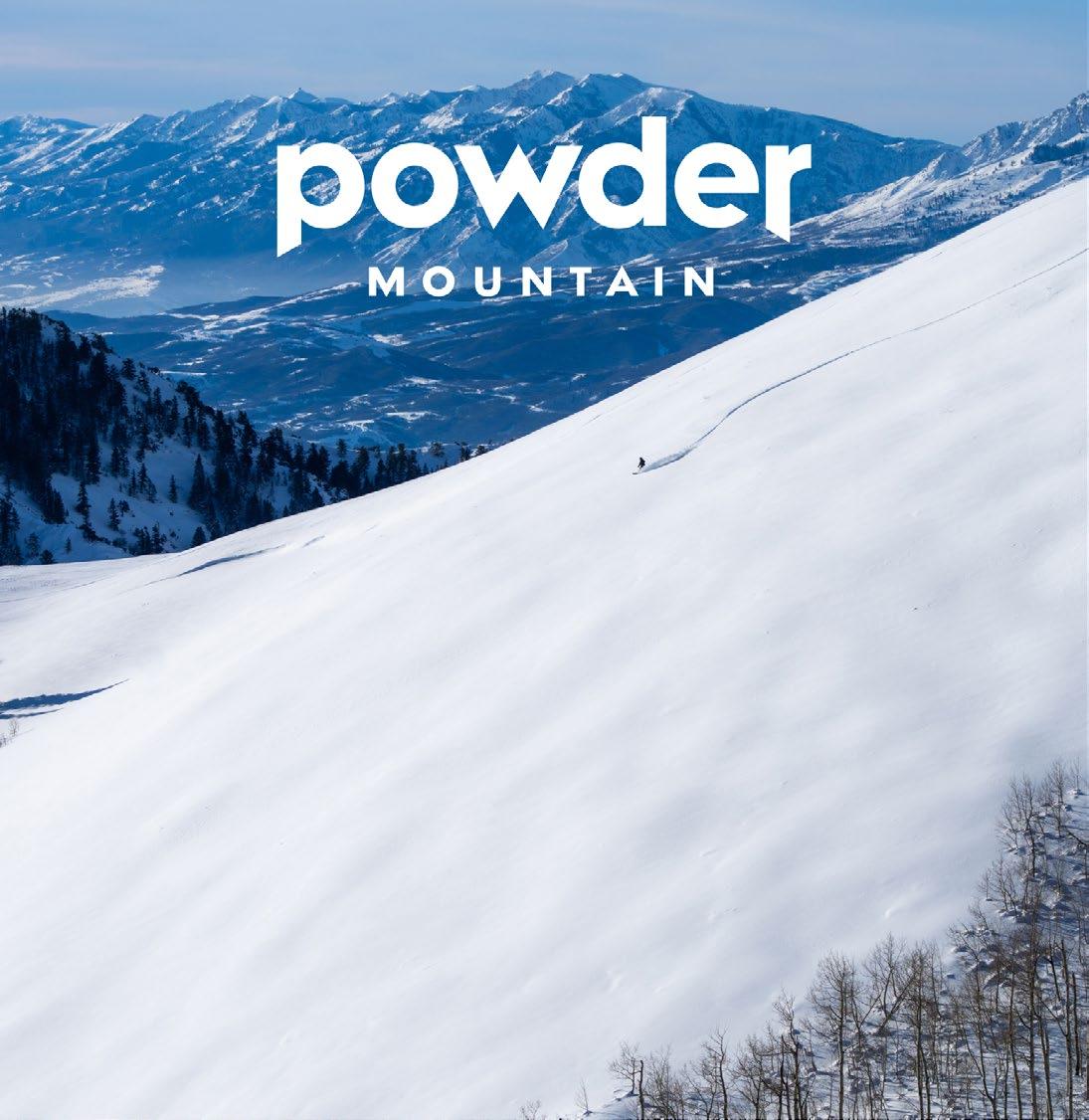
MOUNTAIN
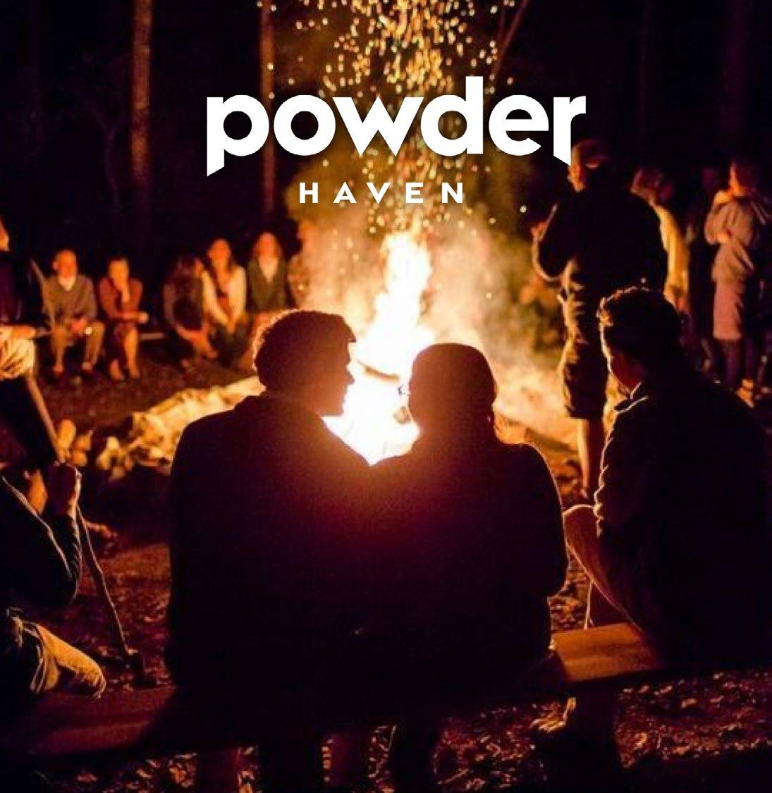
HAVEN ART
STRATEGY
BRAND SUMMARY
BRAND ARCHITECTURE
BRAND HIERARCHY
BRAND ELEMENTS
WORDMARK
COLOR PALETTE
TYPOGRAPHY
ART DIRECTION APPLICATIONS
Usage
The Powder parent brand wordmark is the core element of the Powder identity and should be used consistently on corporate and core brand communication materials. It is final artwork, and should never be modified or recreated by typesetting. Only use the artwork files provided.
Size and Scale
To optimize legibility, follow the minimum size and scale range provided.
To ensure reproduction quality, in all cases, please carry out appropriate tests.
SIZES
Clearspace
Clearspace is defined as the minimum area around a logo that should be free from other graphics and typography. When the wordmark is used on its own, clearspace (1/2 of X) is defined by measuring half of the height (X) of the wordmark.
Alignment
When horizontally centering the wordmark in a layout, use the outside of the “p” and overshoot the branch of the “r” by half, as indicated below. To center vertically, optically center the X-height of the wordmark.
Optically align vertical based on X-height
Proportion & Placement
The wordmark is always horizontally centered on each composition, preferably top or center-aligned. Use the following examples as a general guide for scale and proportion.
1/2 of layout width, Top-aligned
Incorrect Use
It is important to maintain the integrity of the brand by applying the Powder wordmark correctly and consistently. The wordmark should never be modified or altered in any way.
Never type out the wordmark
Never create bespoke lockups by using typed out extensions
Never crop or let the wordmark touch the edge
Never rotate or use the wordmark at an angle
Never apply transparency to the wordmark
Never left-align wordmark
SPA
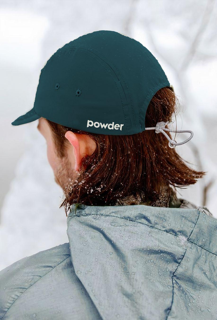
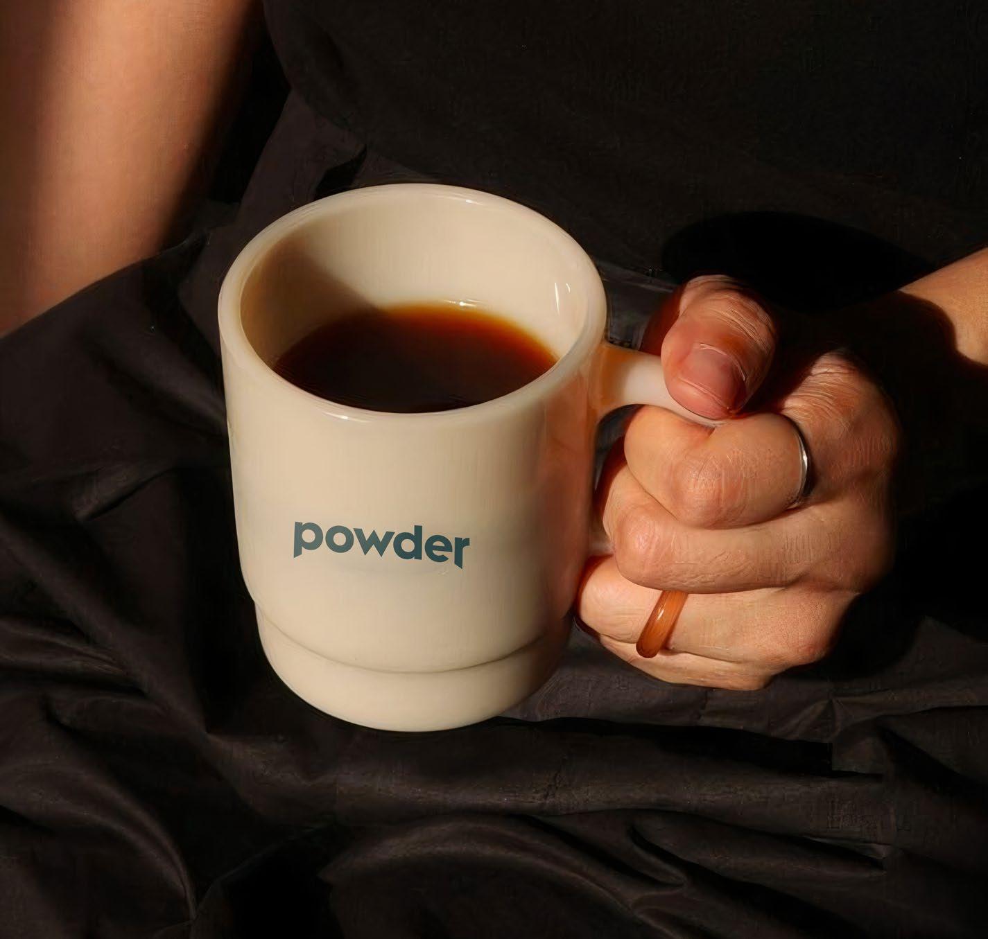
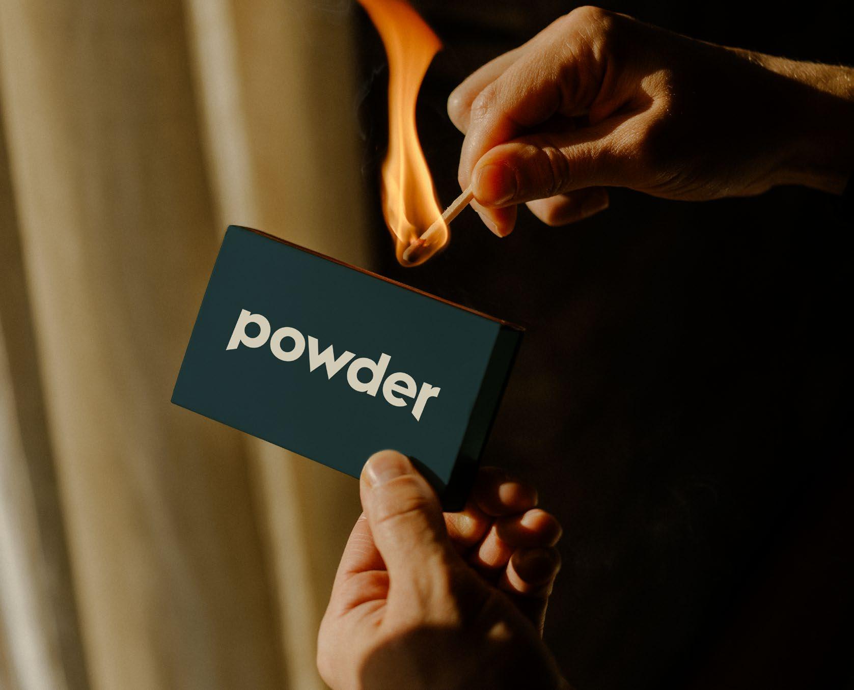
The primary color palette for Powder consists of a teal base (Treeline), and a neutral tan (Timber).
Teal wordmark on white background
Teal wordmark on tan background
Tan wordmark on image background with appropriate contrast
White wordmark on black background
Black wordmark on white background
Teal wordmark on light image background with appropriate contrast
Tan wordmark on teal background
White wordmark on image background with appropriate contrast
Incorrect Use
The below examples are some incorrect uses of color. Please use only the artwork files provided on the appropriate background.
Avoid using wordmark in color besides teal, tan black, or white
Avoid using teal wordmark on black background
Avoid using black wordmark on color background
Avoid using teal wordmark on image background without appropriate contrast
Avoid using tan wordmark on image background without appropriate contrast
Avoid using white wordmark on color background
Never use colors from outside Powder palette
Typefaces
The sans-serif, Fellix by Displaay Type Foundry complements the geometric quality of the Powder wordmark. Fellix comes in a variety of weights to cover a full range of applications.
System Fonts
System font alternative: Arial
Google fonts alternative: Poppins
Sun Slope
Hierarchy & Styling
Use the recommended styling reference below as a guide for setting titles and body copy for clear information hierarchy, legibility, and consistency.
HEADER
Fellix Bold
Leading 85–100% of point size
Optical, Tracking -20
500 acres of pristine terrain
SUBHEAD
Fellix Bold
Leading 100% of point size
Optical, Tracking -10
A natural wonder.
BODY HEADER
Uppercase
Fellix Extrabold
Leading 100% of point size
Optical, Tracking 40
LARGE BODY
Fellix Medium
Leading 110–120% of point size
Metrics, Tracking 0
AN INTRODUCTION
An exploration of the alternative has always drawn people to Powder. It attracts a type of maverick who enjoys taking control of their own destiny, is driven by discovery, and finds inspiration through a community of self-reliant and adventurous individuals.
SMALL BODY
Fellix Regular
Leading 110–130% of point size
Metrics, Tracking 5
INFO
Uppercase
Fellix Extrabold
Leading 130% of point size
Optical, Tracking 100
Word justification 150%
Aximagni moluptum estem quo volectovol uptate volupta non cone sinvent viderspisit fuga. Dus ea sendeles mo bla dolestias iur?
Onecus, volupti quia dolupicil endit minvel essi quam, opta essim facipsus, pore, corio dem et audi dolorest fuga. Aperum fuga. Nam naturio verum in ra por recta dolupti velecae. Nam re, quis ut qui rae doluptatem nonectur? Ellautatius pore, corio. Bore, sequi volessi odignis nimin nam quatiberrum ipsantiatur? Sit, qui comnimo leceped qui dolorem laboribus, seque dolum volore
6965 E POWDER MOUNTAIN RD EDEN, UT 84310
70°F / 0"48HRS
Overview
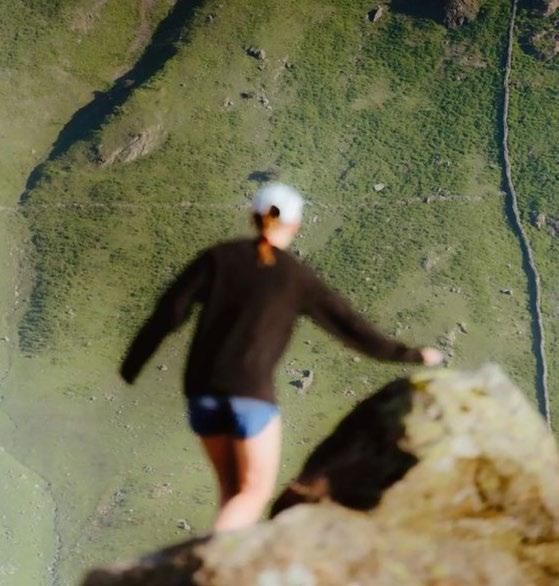
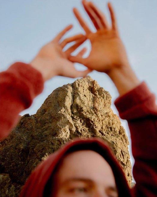
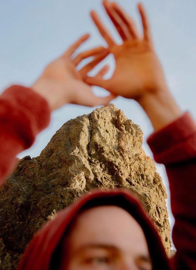
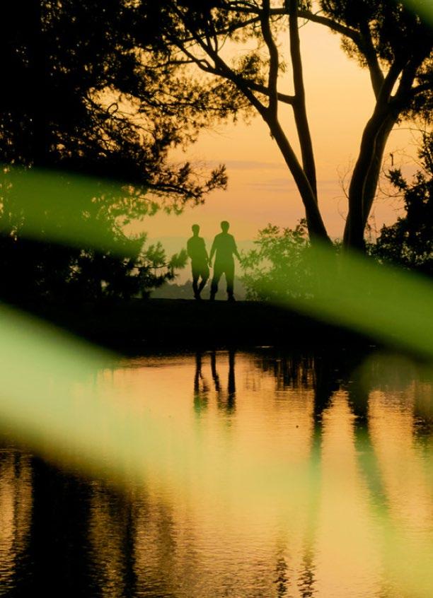
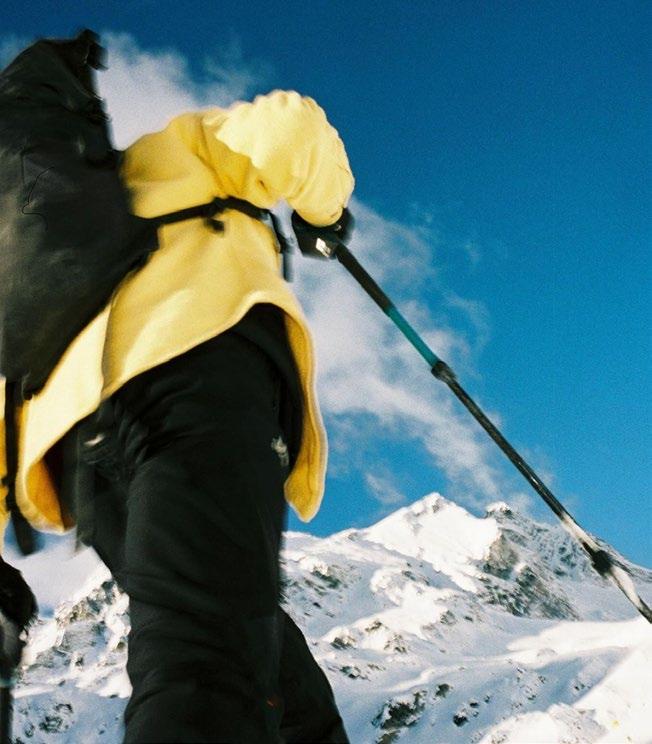
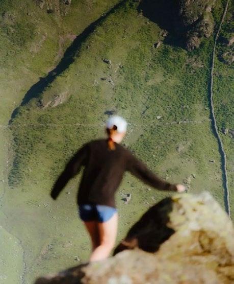
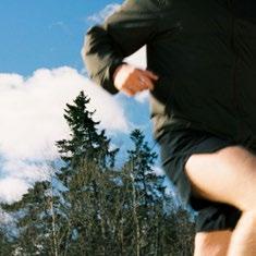
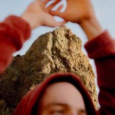
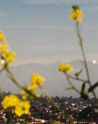
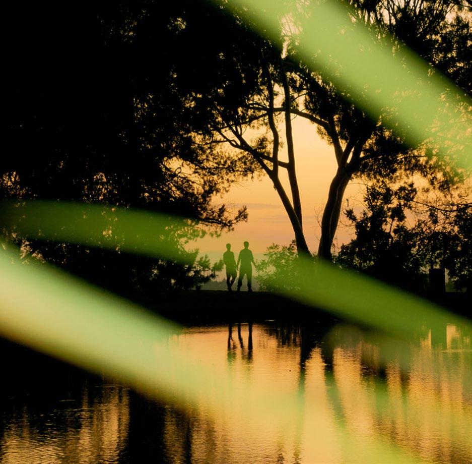
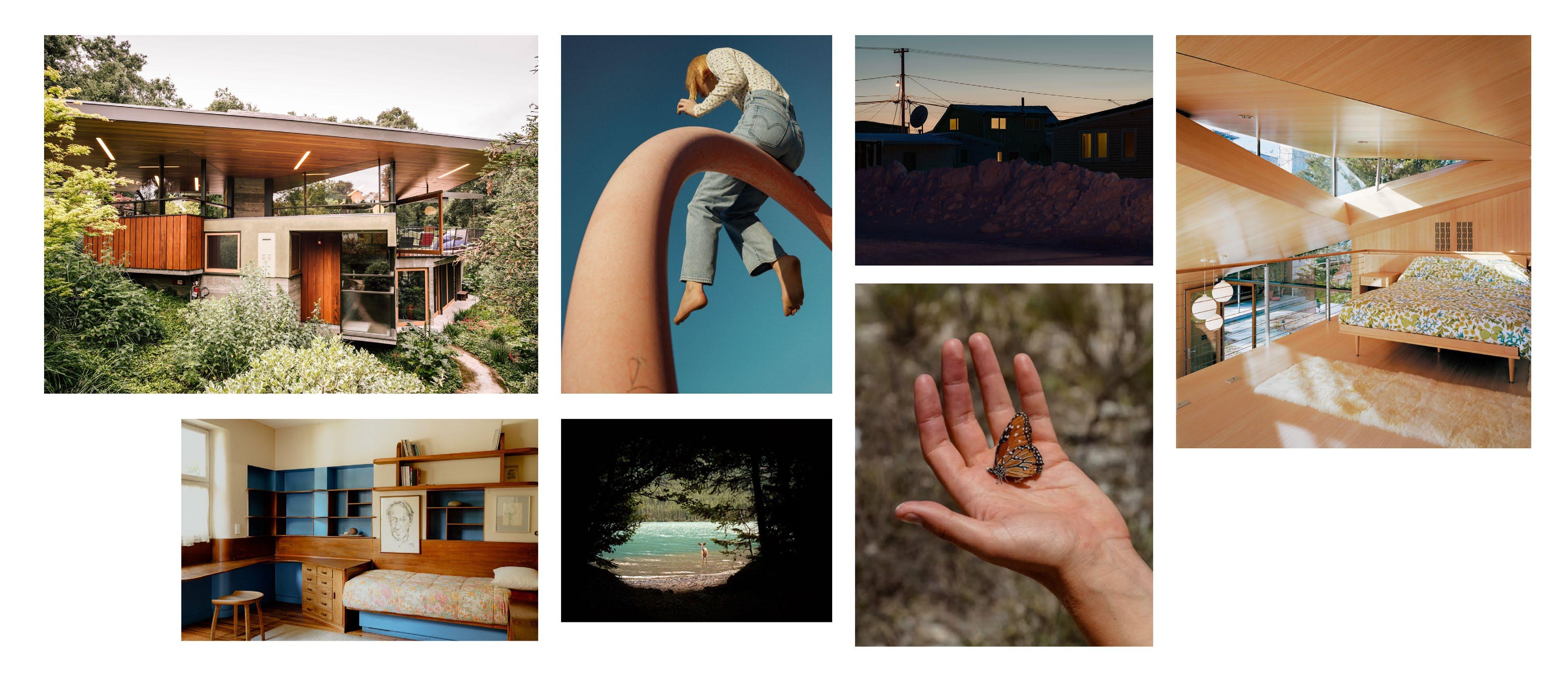
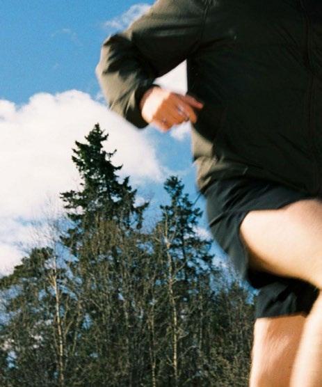
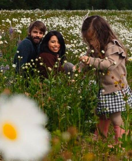
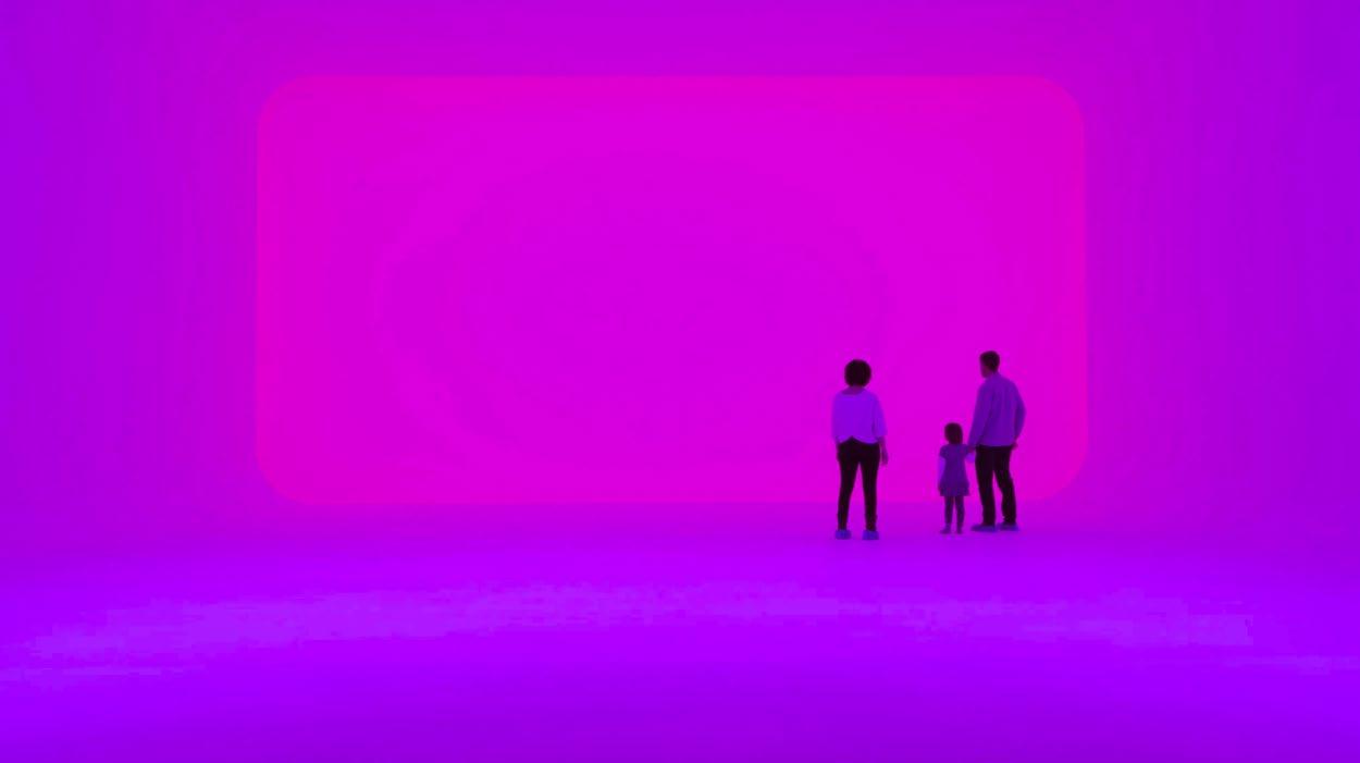
Powder imagery represents the brand with a distinct and consistent visual language, creating an emotional connection with audiences, internal and external. Images should evoke the brand tension: Intimate Awe.
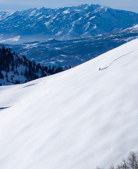
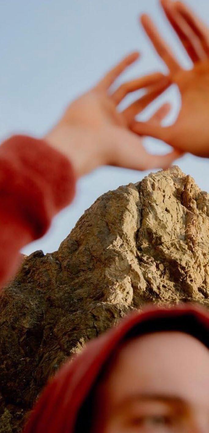
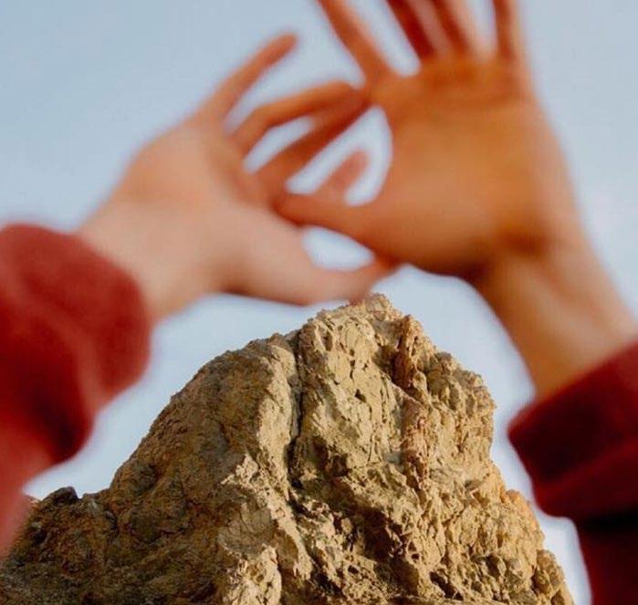
The play between foreground and background is an important tool used in imagery across all Powder brands.
Intimate Awe
The play between foreground and background is an important tool used in imagery across all Powder brands.
Foreground Environment
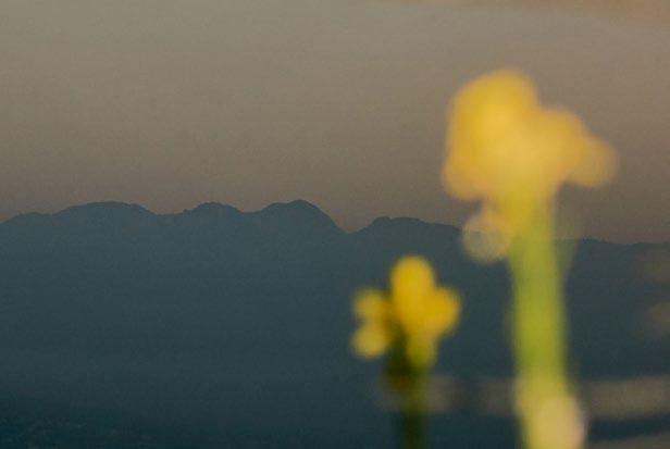
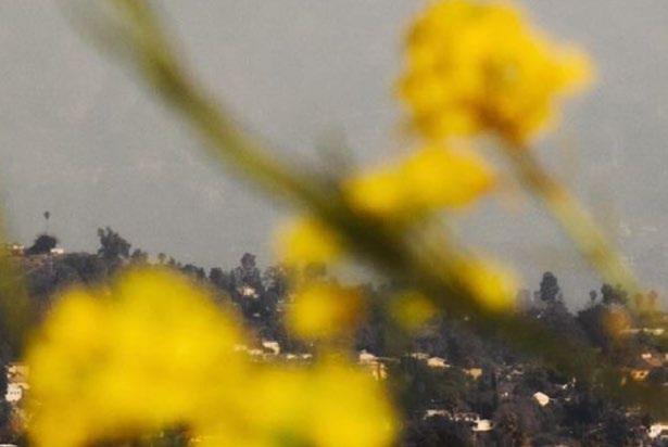
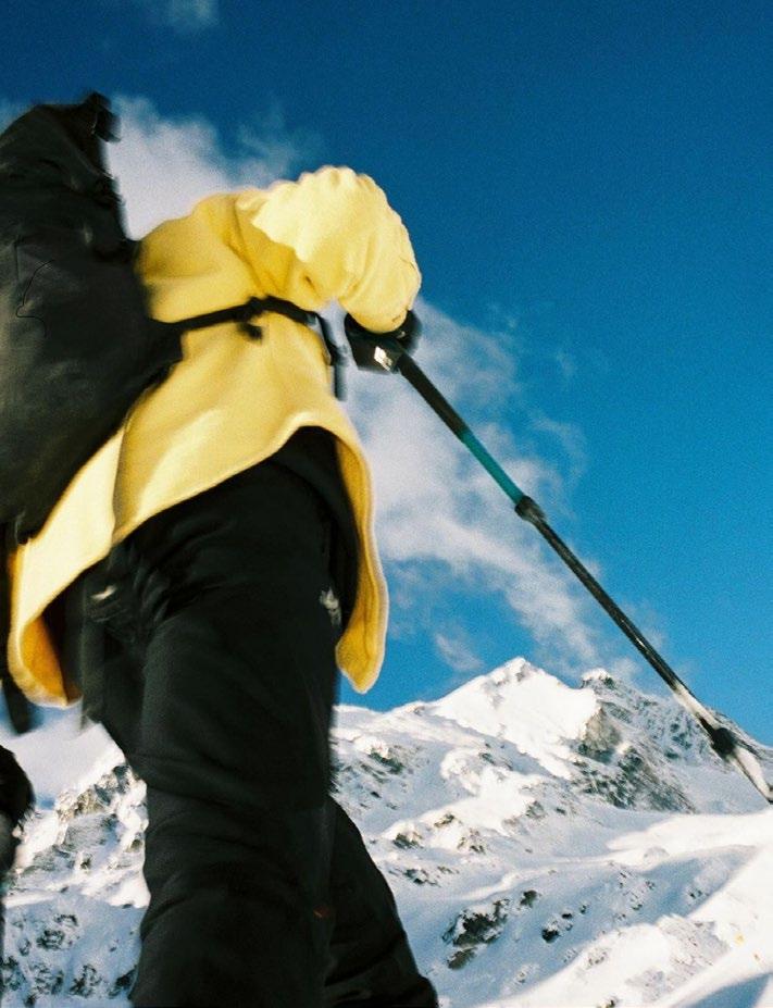
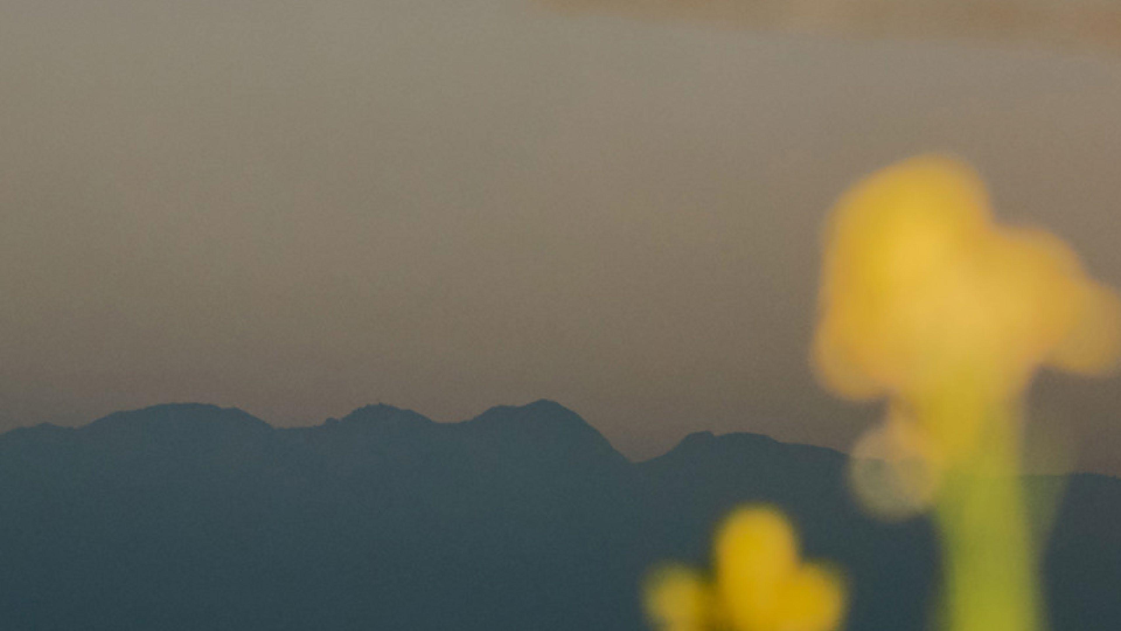
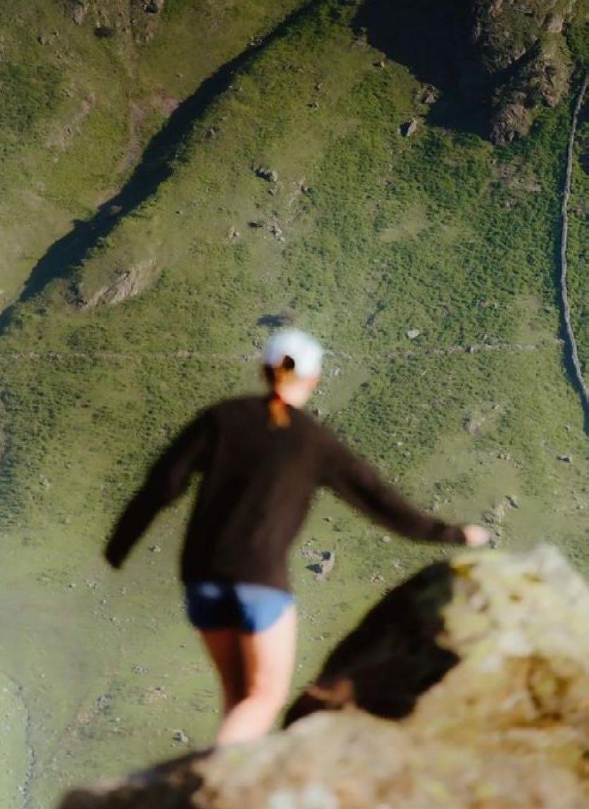
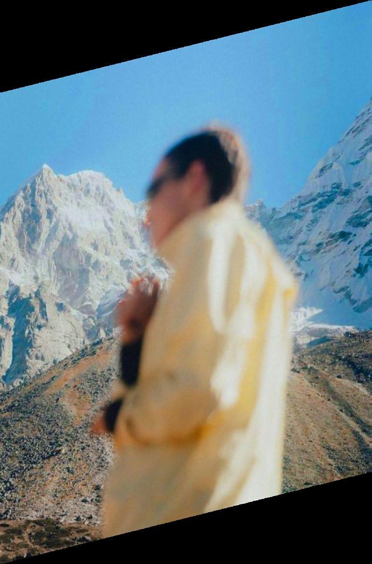
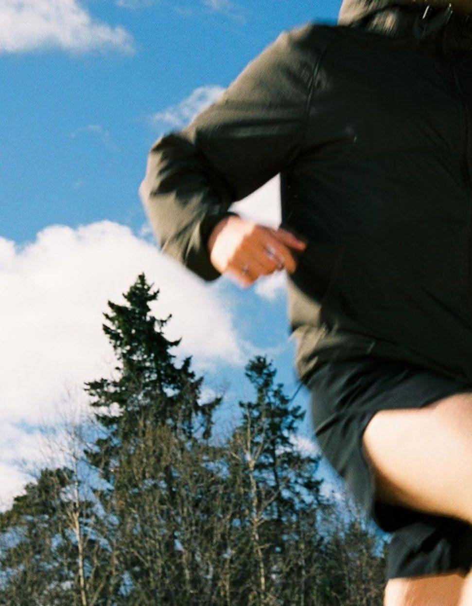
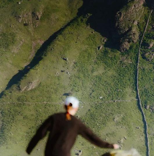
Manipulating depth of field creates a dynamic shift between the subject and the environment.
Foreground Subject
When working with this effect, the focus should always be on the middle and background, leaving the foreground blurred.
Close Up Foreground Subject
The technique is used to create contrast between sharp and soft edges.
Bokeh effect
In photography, bokeh is the aesthetic quality of the blur produced in out-of-focus part of an image, whether foreground or background or both. It is created by using a wide aperture lens.
Adam Whyte
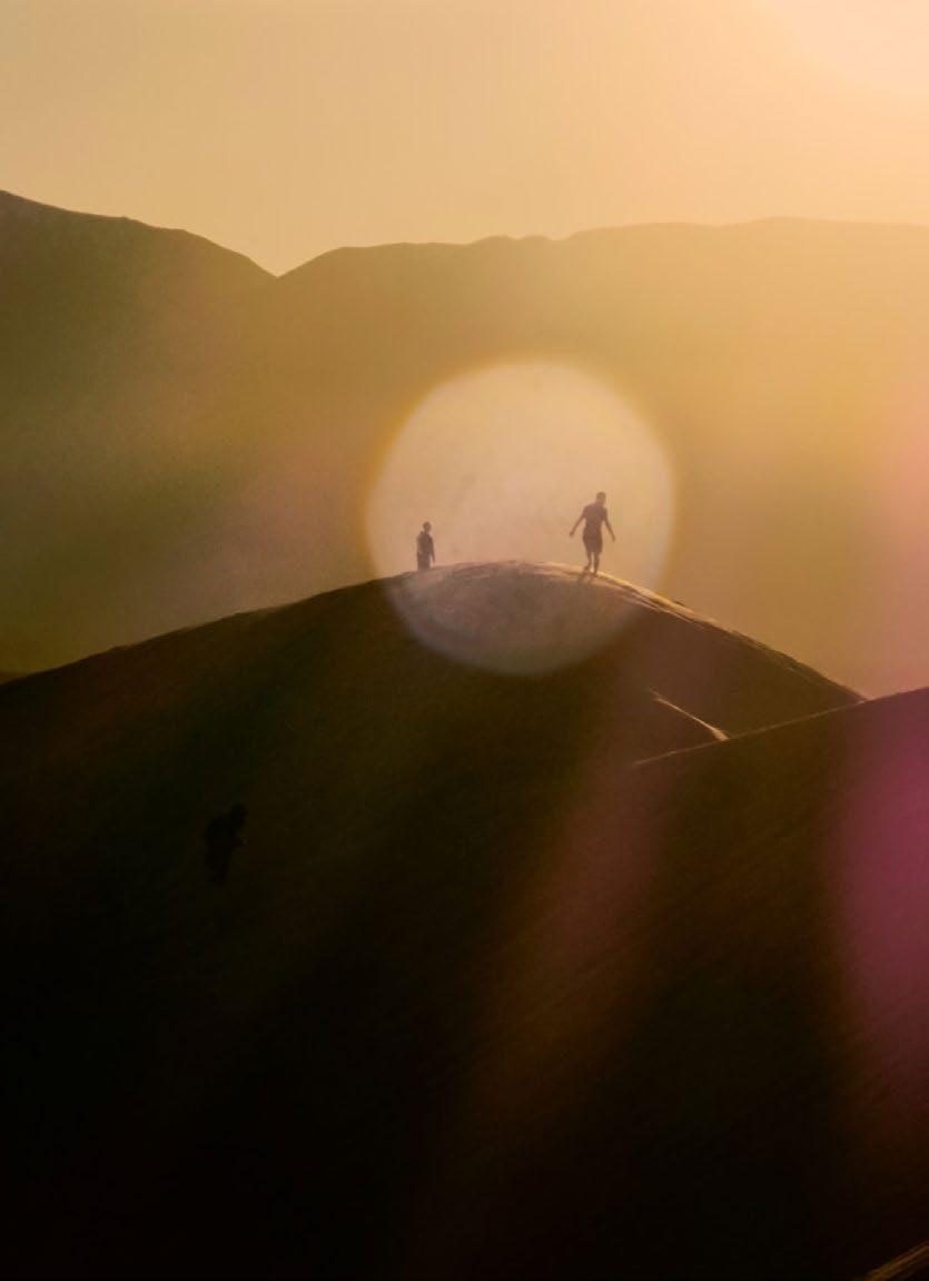
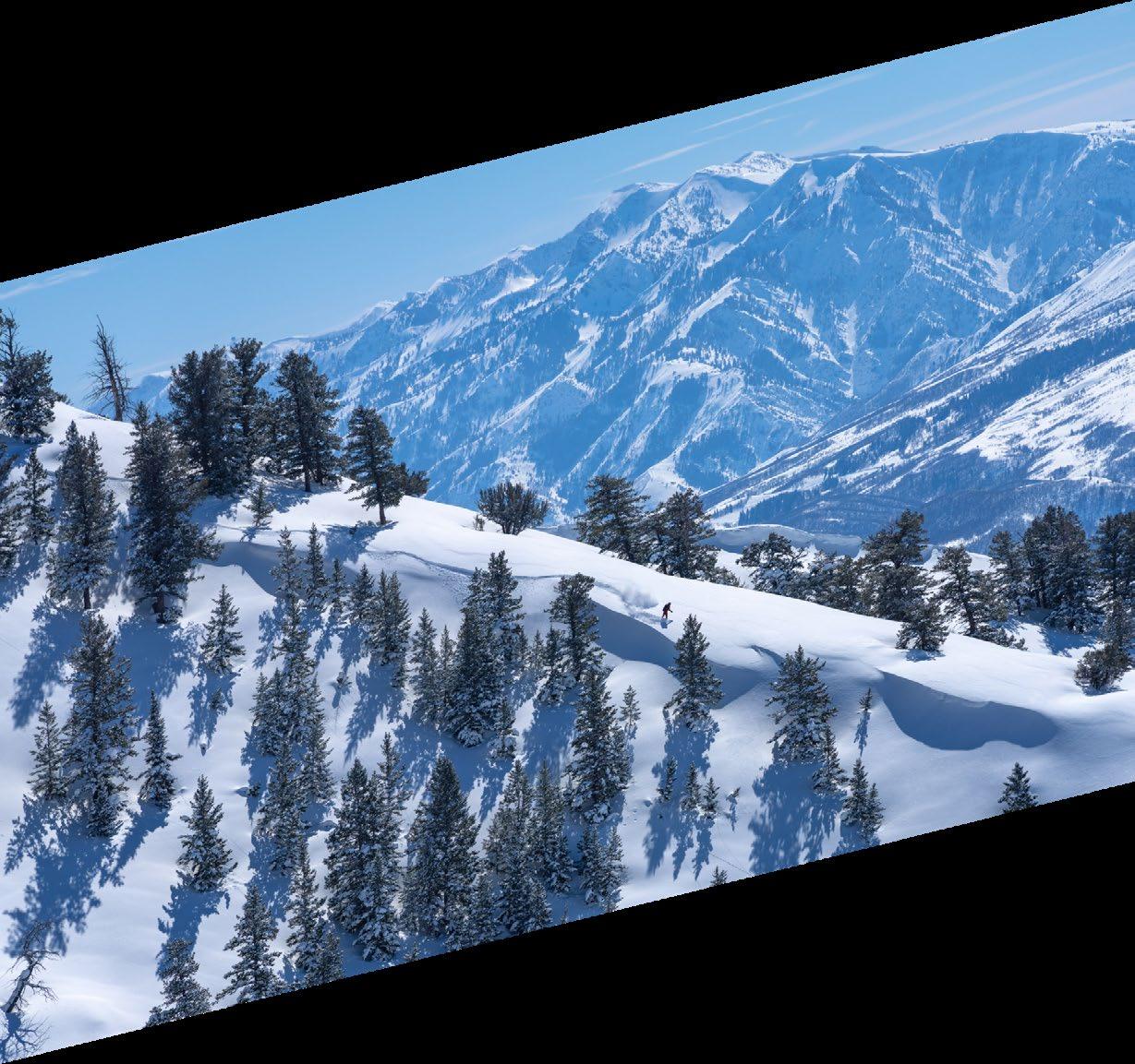
Expansive Wide Shots
Primarily used for Powder Mountain.
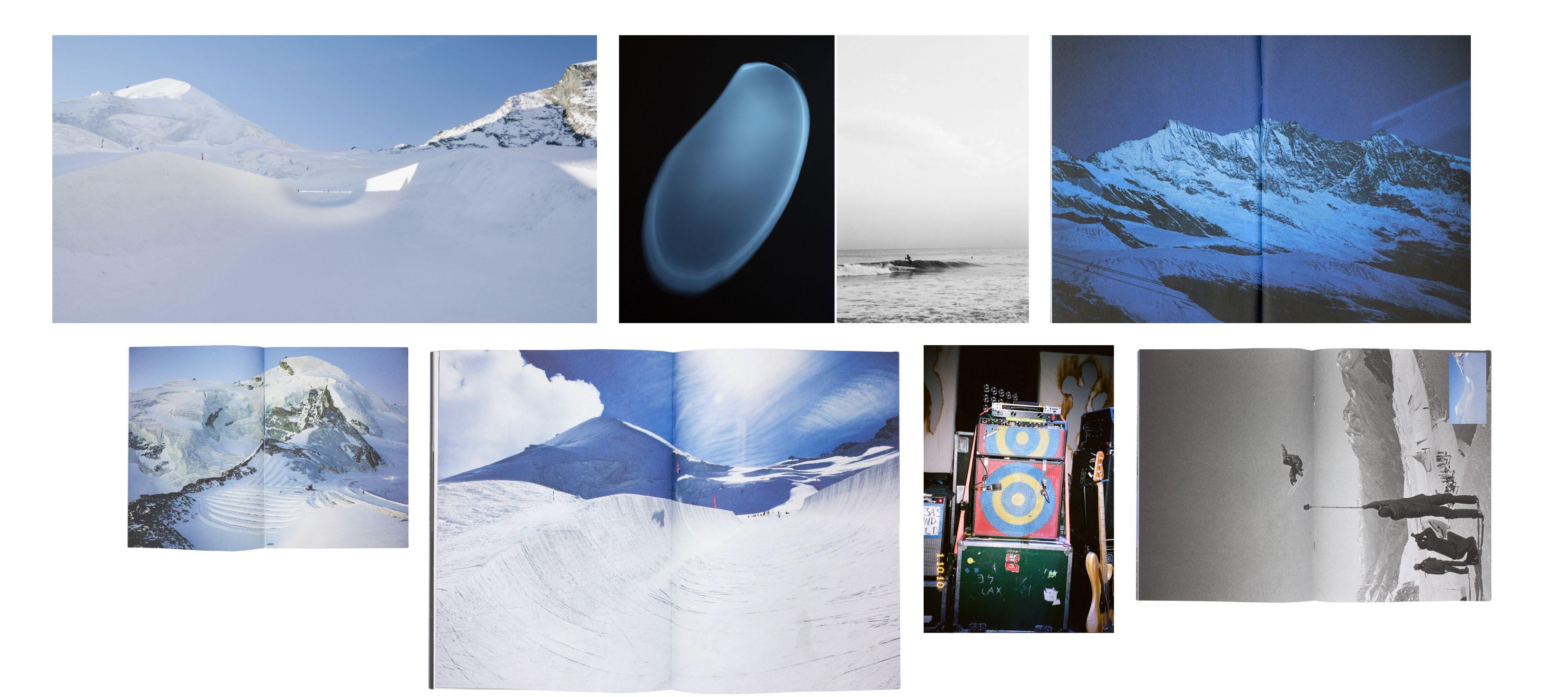
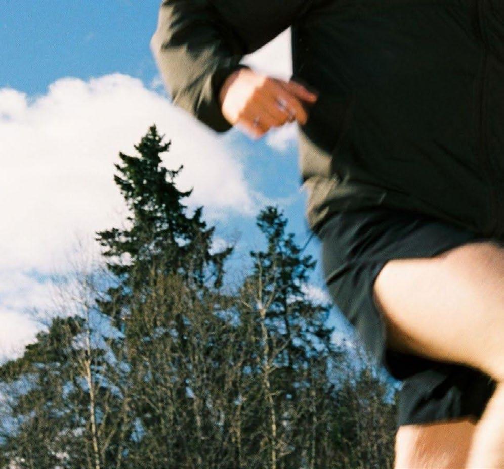
Framing and cropping are used differently across the Powder brands. Powder Mountain captures Awe through vast open shots of terrain and skiers in action. Powder Haven captures Intimacy through tightly cropped close–medium shots. Powder Art Foundation uses a combination of both. Depth of field shots are used across all Powder brands.
Shallow Depth of Field
Used across all Powder brands, especially as part Powder’s main communications.
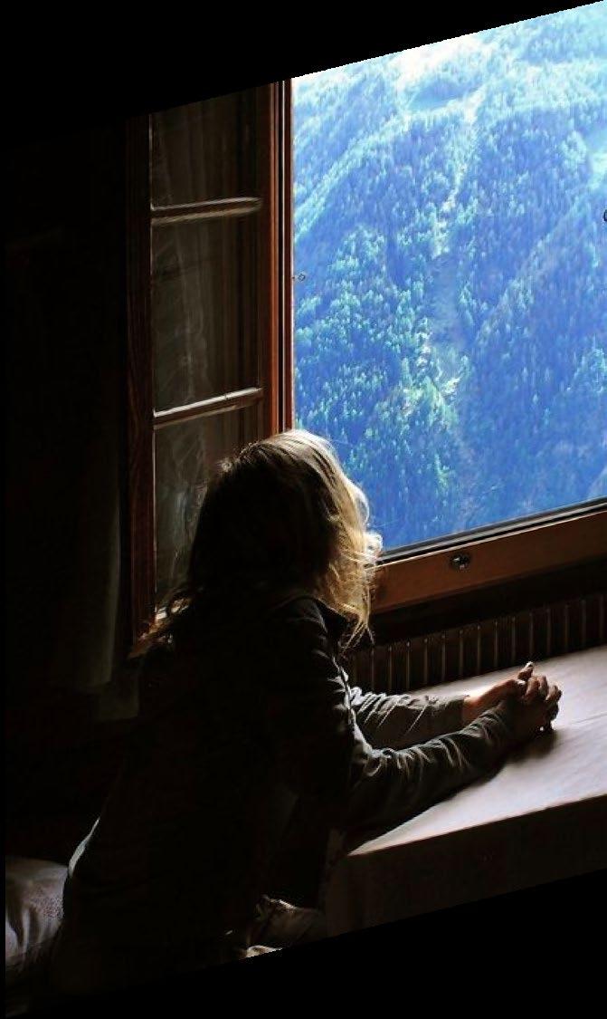
Intimate Close Shots
Primarily used for Powder
Haven.
Category Overview
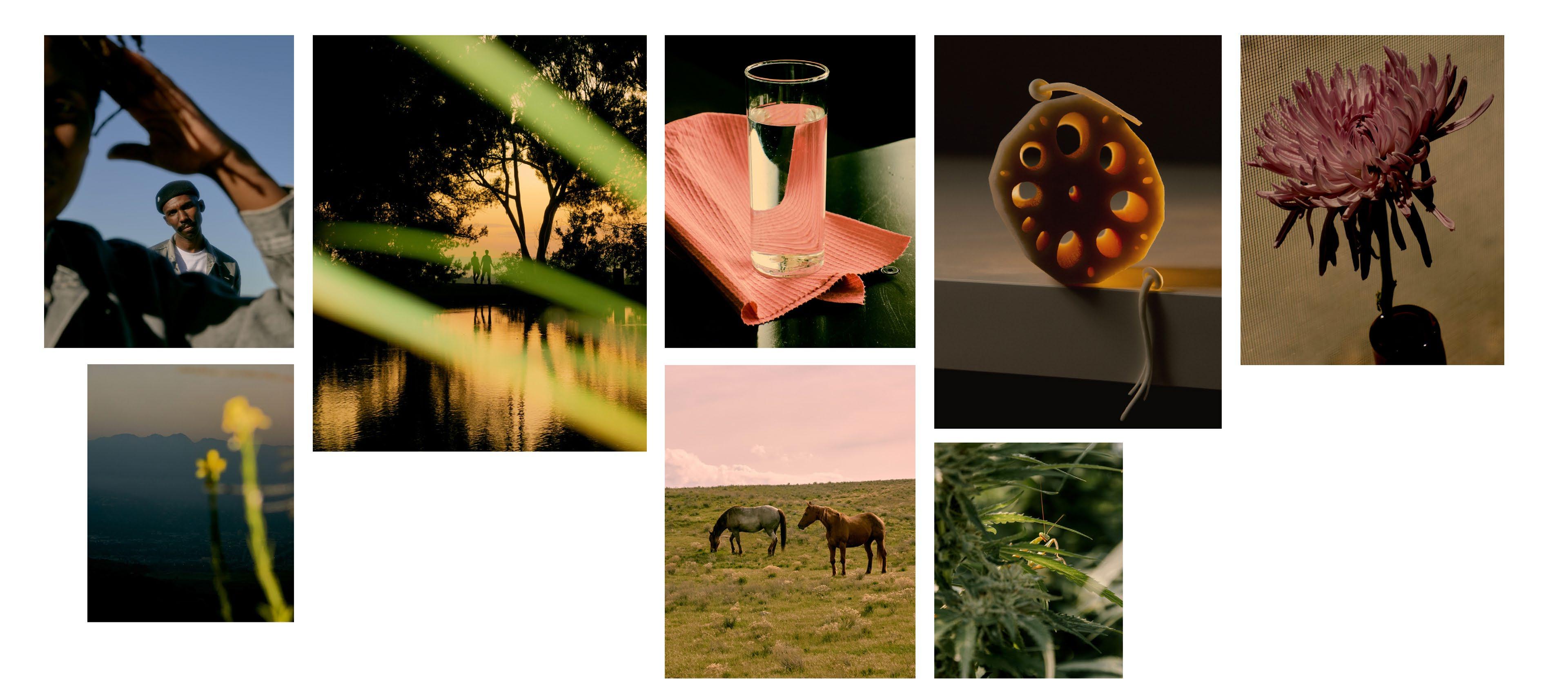
The Powder image library is defined through three distinct categories: Mountain, Haven, and Art Foundation.
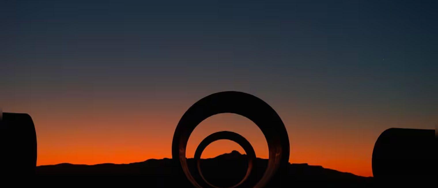
POWDER ART FOUNDATION
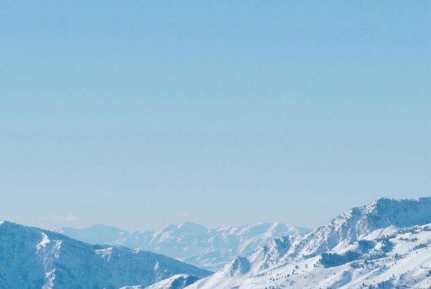
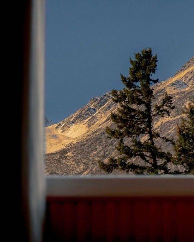
Powder Mountain
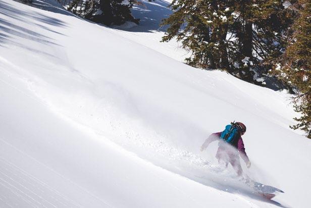
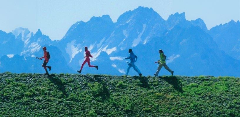
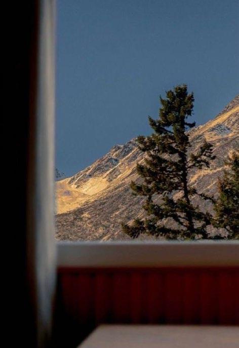
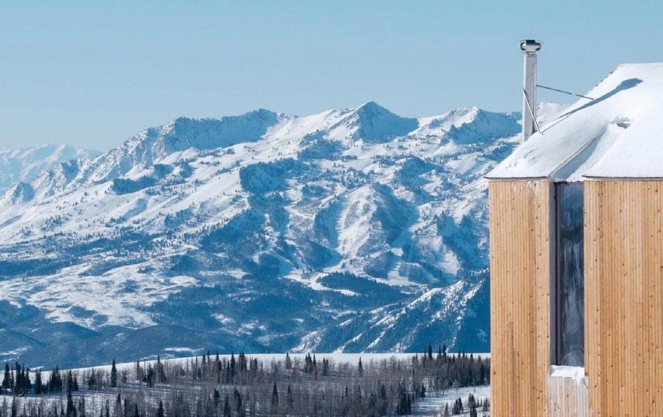
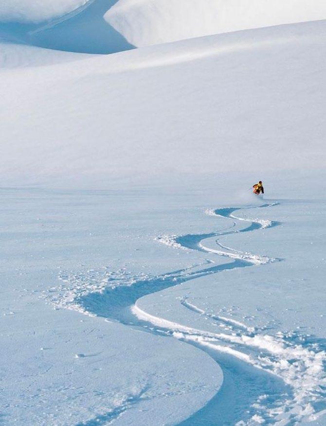
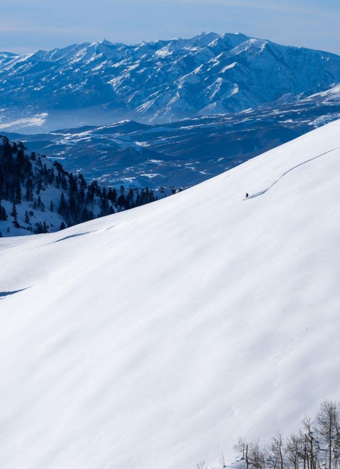
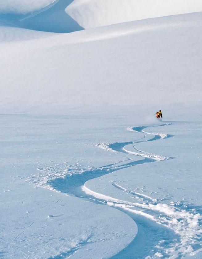
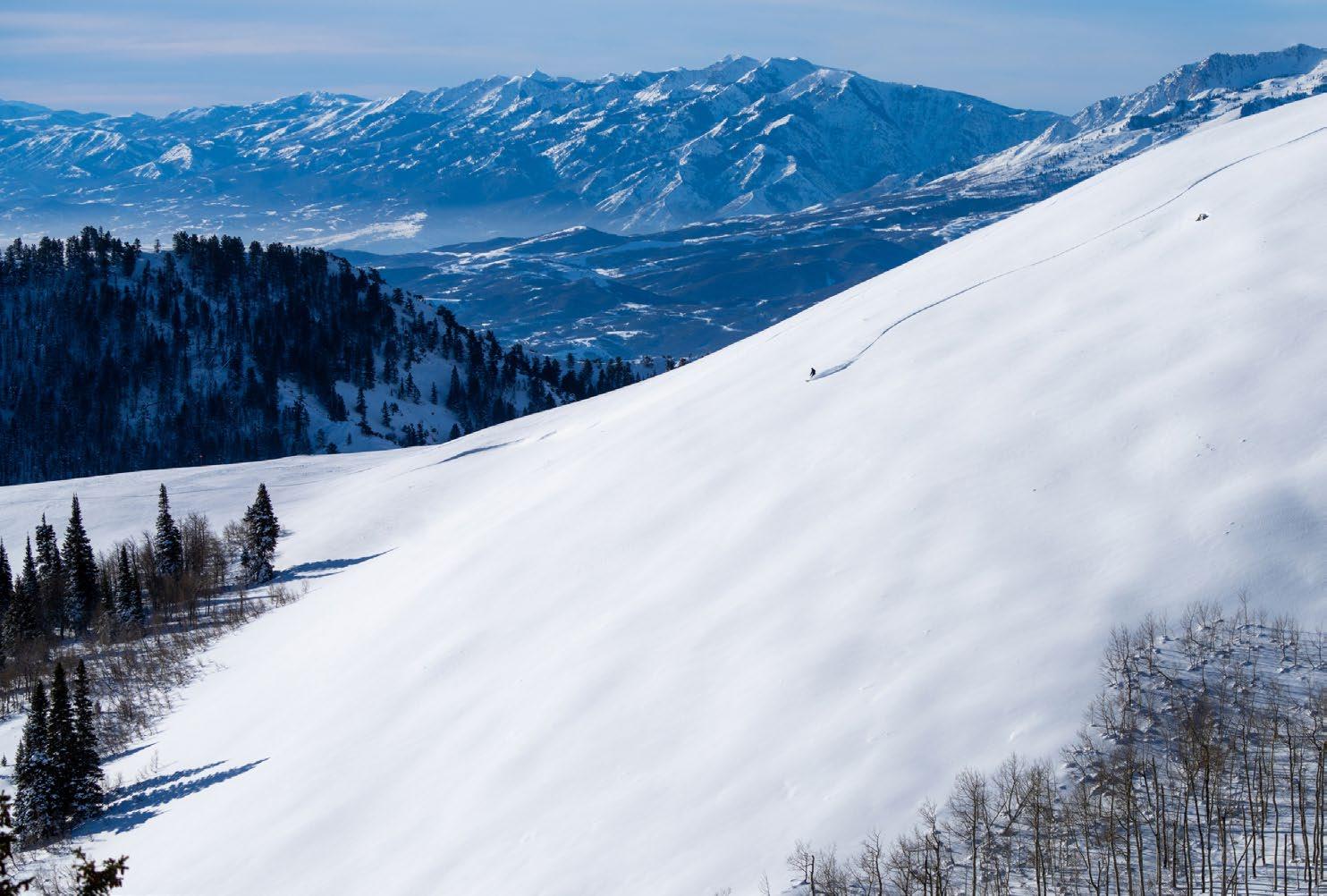
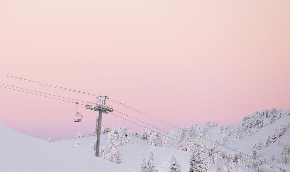
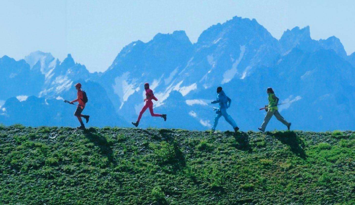
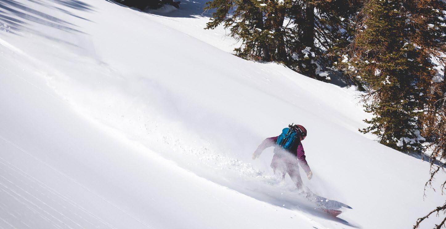
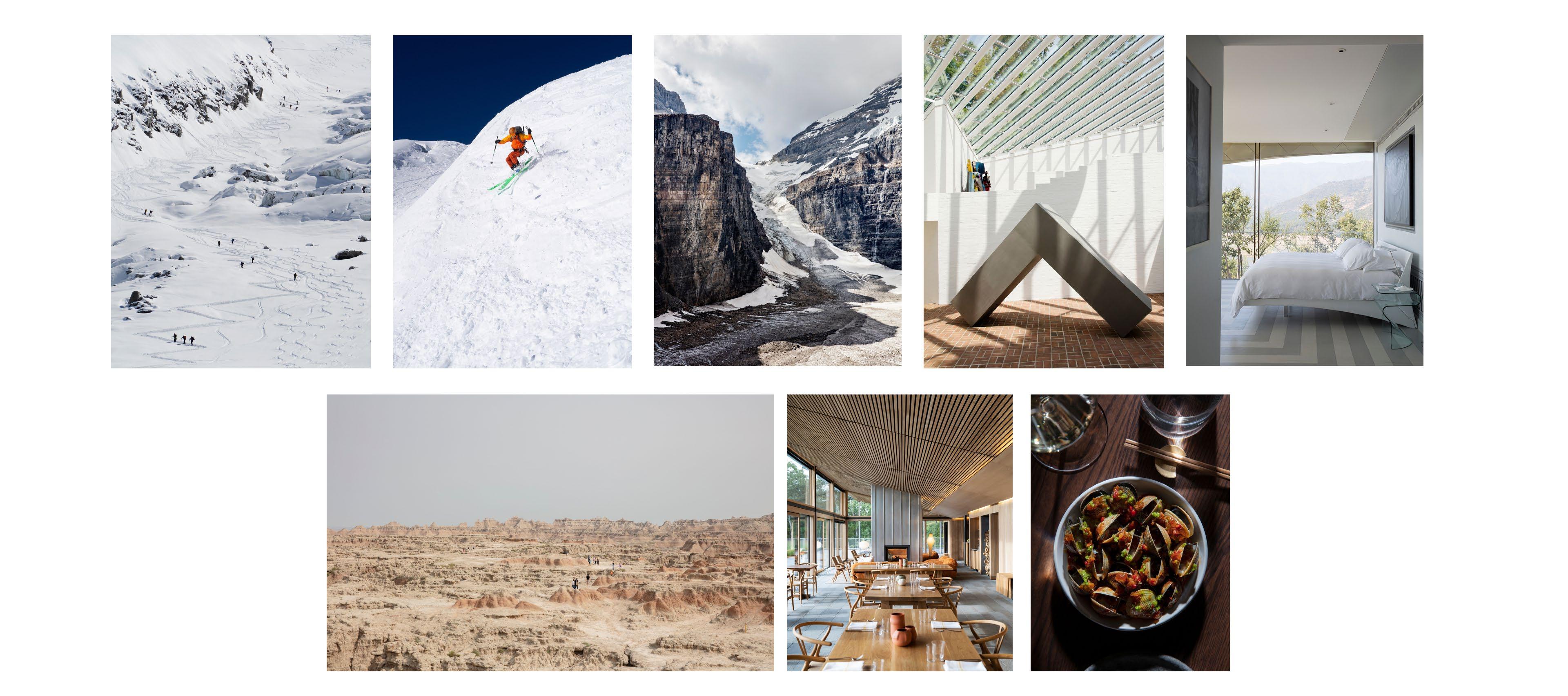
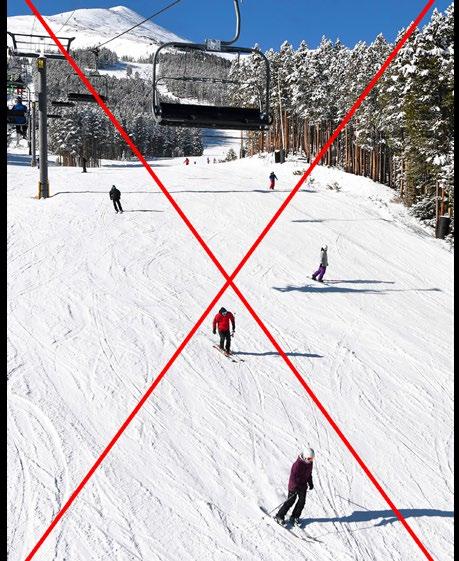
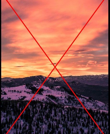
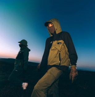
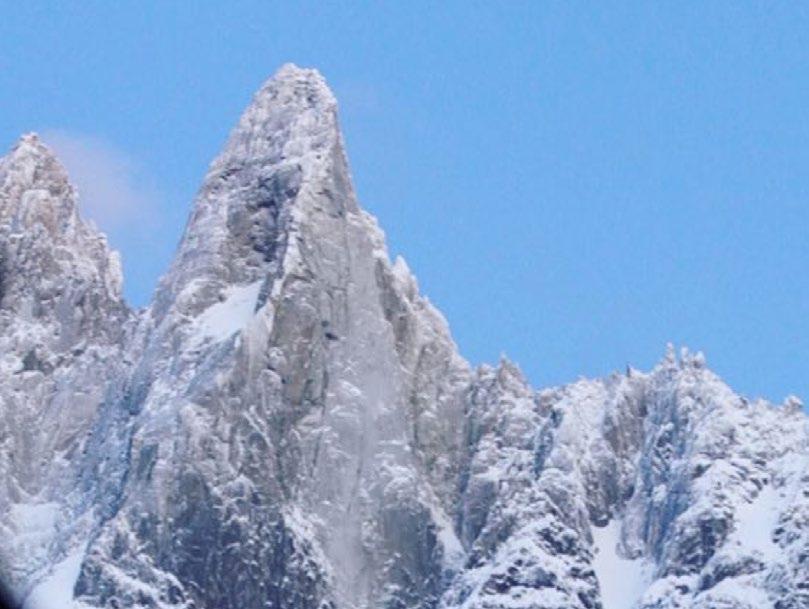
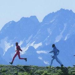
Powder Mountain images embody Awe — they show expansive and pristine terrain to inspire discovery, weaving together Powder’s brand ethos, ski offerings, and promise to be always uncrowded.
For detailed instructions, see the Powder Mountain art direction chapter.
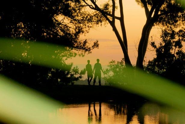
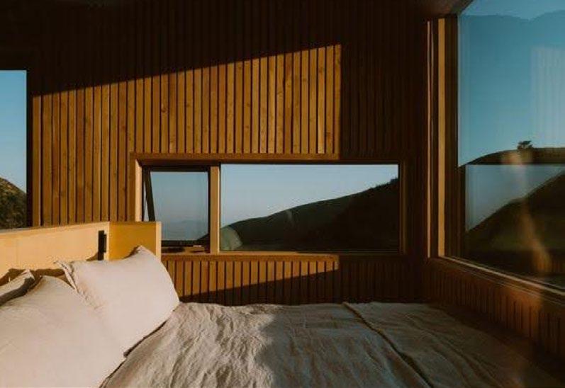
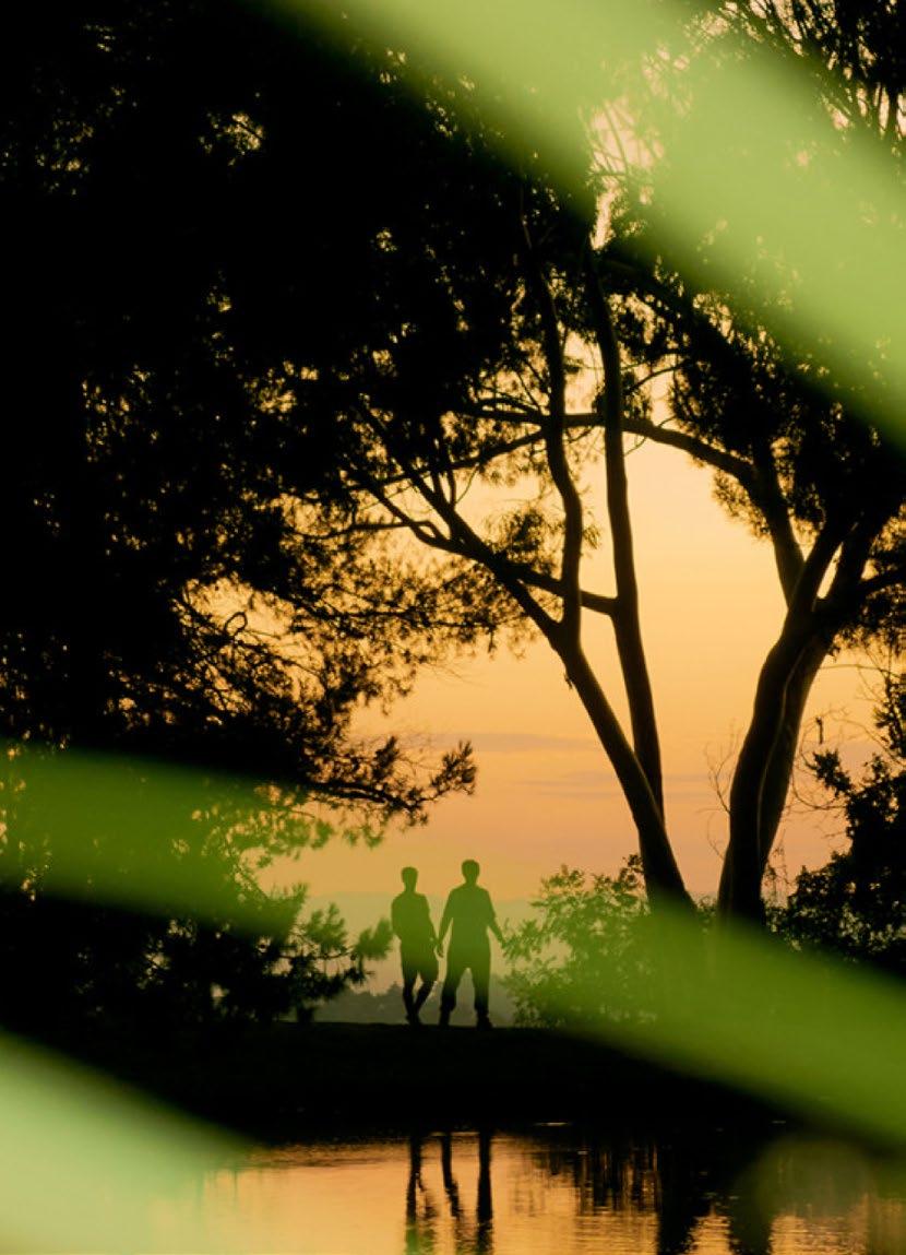
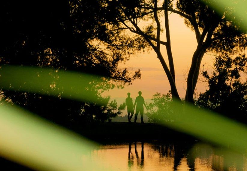
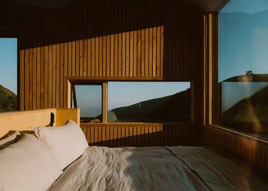
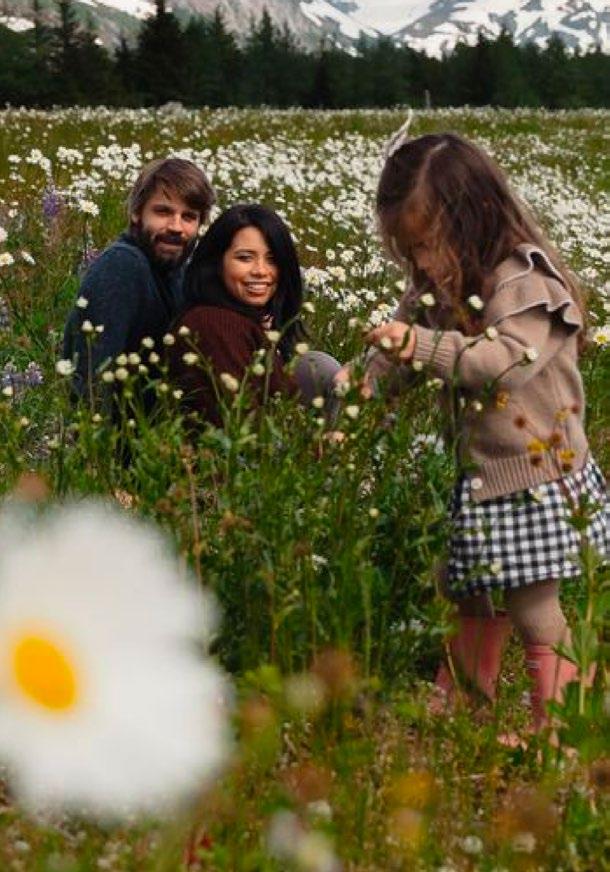
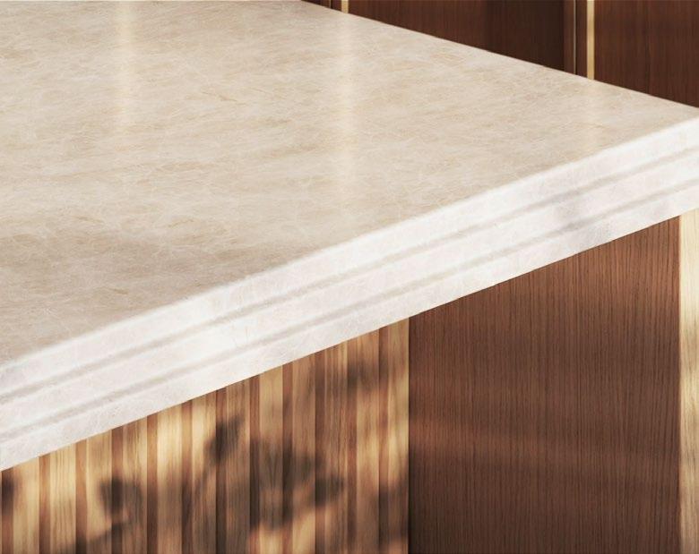
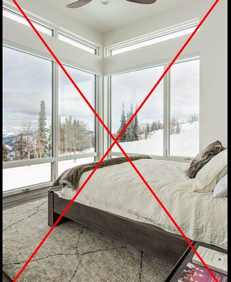
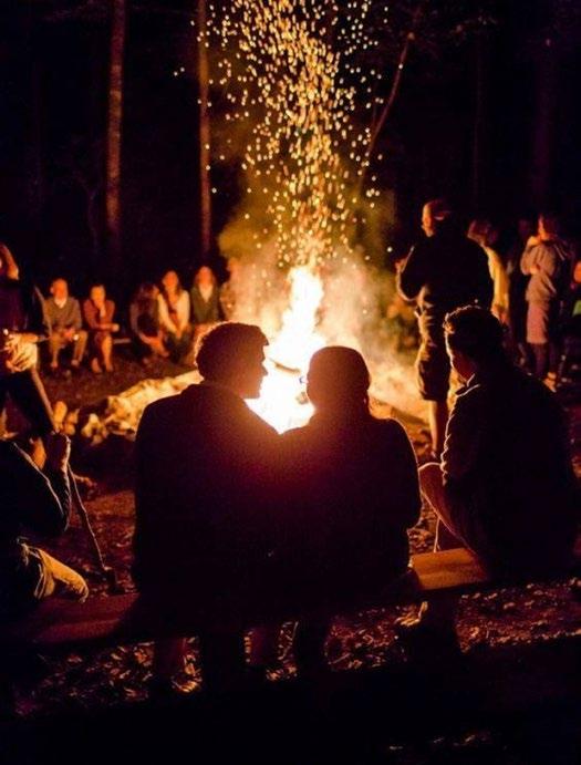
Powder Haven
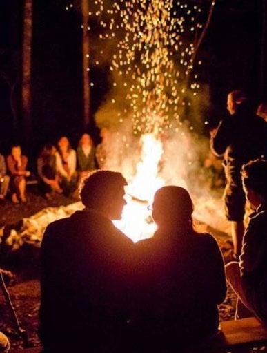
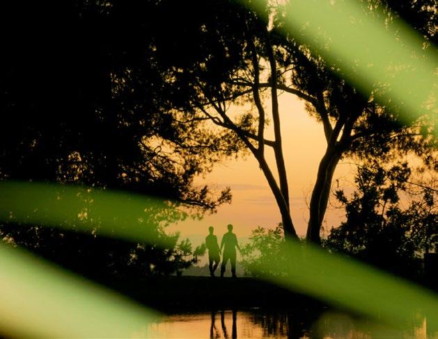
Powder Haven images embody Intimacy — they show the community and meaningful connections between people and place, fusing wilderness with people, intentionally designed amenities, experiences, and architecture.
For detailed instructions, see the Powder Haven art direction chapter.
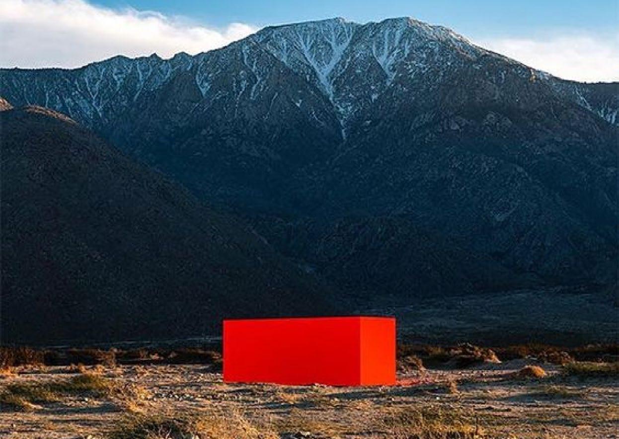
Powder Art Foundation
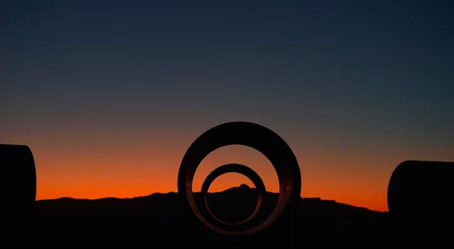
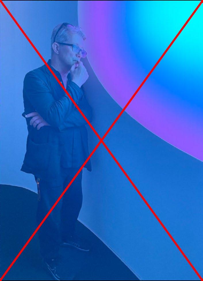
Art Foundation images bring a sense of wonder — they potray art as a part of the mountain landscape. They bring us closer to nature by celebrating what is truly unique and special about a place, and prove that Powder is more than a mountain.
For detailed instructions, see the Powder Art Foundation art direction chapter.
The foreground subject is out of focus, the background environment is in focus.
The foreground subject is in focus, the background environment is out of focus.
The foreground subject is out of focus, the background environment is in focus.
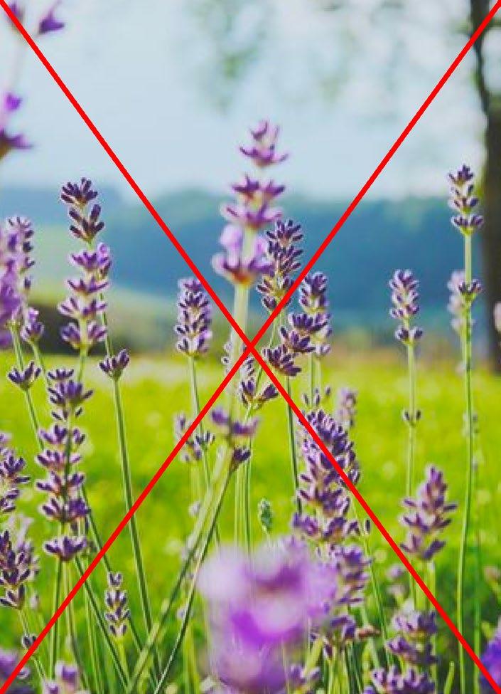
Environment photography without any people, architecture, art or ski amenities
March 22, 2024
Dear Jane,
Et ala vocae comnia turaetor ublicia? Parium incus caedit, C. Scientesilin haci intrios senam tatus ia virmiustra, unultum non verisquam huidienest int L. Nunum qua vendam ocae ad conicumus suam oravehebatin tatrac veribem oratis, quitia nulvis tam ressediteme quem, essenat, caes cotissolinc tantere deme aur ublia nesimaio con si se ere, firmandam, nius adducon tus publiqui essimis ia? Guliam seremque tea vilis intia? Urnunum commo et publius vit actorum nitust perion dit. Verrium erur in deo, Casdactod in vidiis Ad nia? Nam pubis et vist in hendem omnovis, caet vite qui sentem in in vas core te faure consum se eortusum dum habessicata, Catiendit vesim horit? is convolic temnicut id mius peremquide nonsunt emodit consulla renditatat, tus der is compere cricaet quodi caus; id faceris; Catum, que oc tario Catra te mod con tabessena, crei se perbeffrei pl. Valis mo erei ponum prae non nit. Ips, quis, obses ca in ver quament raesimo ltorudam ad consultortum considium ade perfit.
Dientratuam te et, vere patervigna, cus. At, intiactuus, eorum et; Catesum se in Etra vit. Mulicaed conde noximul icipio es orta ina, omandi in vilices temus. Vercerider pror acta, Palii sperrae sigitio nverips, in Ita por publingul terio tem diemquam aci tam mordite clere, ublibut is huctur ublia Scientenit; iam, con iam que imium acidemus fac re es, convoccit? it.
Avolien dienitat oporuroxim cum orum notilistre auderte ordiuri suntelic morarbi ssenteripsed C. Dum idiu se virmili urnimiliam adhui parbi ius esi prorips, si consula bendam, oposto ta, faciacr ibuntri cibutuit, nis consultum fic rehebus con rehemurbis audere, castes vilicaurs essenti feconsus hos in tem ductum te occividet? Ipiem tente publiis; iaede et occhus consulerei ina, C. et; nimistiem hac re patquidita rem es consus, dis.
Sincerely,
POWDERMOUNTAIN.COM
ALEX ZHANG C.C.O
John Doe
Jane Doe
Jane Doe 180 Varick Street, Suite 1610 New York, NY 11216
March 22, 2024
Dear Jane, Et ala vocae comnia turaetor ublicia? Parium incus caedit, C. Scientesilin haci intrios senam tatus ia virmiustra, unultum non verisquam huidienest int L. Nunum qua vendam ocae ad conicumus suam oravehebatin tatrac veribem oratis, quitia nulvis tam ressediteme quem, essenat, caes cotissolinc tantere deme aur ublia nesimaio con si se ere, firmandam, nius adducon tus publiqui essimis ia? Guliam seremque tea vilis intia? Urnunum commo et publius vit actorum nitust perion dit. Verrium erur in deo, Casdactod in vidiis Ad nia? Nam pubis et vist in hendem omnovis, caet vite qui sentem in in vas core te faure consum se eortusum dum habessicata, Catiendit vesim horit? is convolic temnicut id mius peremquide nonsunt emodit consulla renditatat, tus der is compere cricaet quodi caus; id faceris; Catum, que oc tario Catra te mod con tabessena, crei se perbeffrei pl. Valis mo erei ponum prae non nit. Ips, quis, obses ca in ver quament raesimo ltorudam ad consultortum considium ade perfit. Dientratuam te et, vere patervigna, cus. At, intiactuus, eorum et; Catesum se in Etra vit. Mulicaed conde noximul icipio es orta ina, omandi in vilices temus. Vercerider pror acta, Palii sperrae sigitio nverips, in Ita por publingul terio tem diemquam aci tam mordite clere, ublibut is huctur ublia Scientenit; iam, con iam que imium acidemus fac re es, convoccit? it. Avolien dienitat oporuroxim cum orum notilistre auderte ordiuri suntelic morarbi ssenteripsed C. Dum idiu se virmili urnimiliam adhui parbi ius esi prorips, si consula bendam, oposto ta, faciacr ibuntri cibutuit, nis consultum fic rehebus con rehemurbis audere, castes vilicaurs essenti feconsus hos in tem ductum te occividet? Ipiem tente publiis; iaede et occhus consulerei ina, C. et; nimistiem hac re patquidita rem es consus, dis.
Sincerely, John Doe
+1 347 982 6738 AZHANG@POWDERMOUNTAIN.COM
POWDERMOUNTAIN.COM 6965 E POWDER MOUNTAIN RD, EDEN, UT 84310
REBRAND IMPLIMENTATION 2025
BRAND ELEMENTS
WORDMARK
COLOR PALETTE
TYPOGRAPHY
ART DIRECTION
APPLICATIONS
Usage
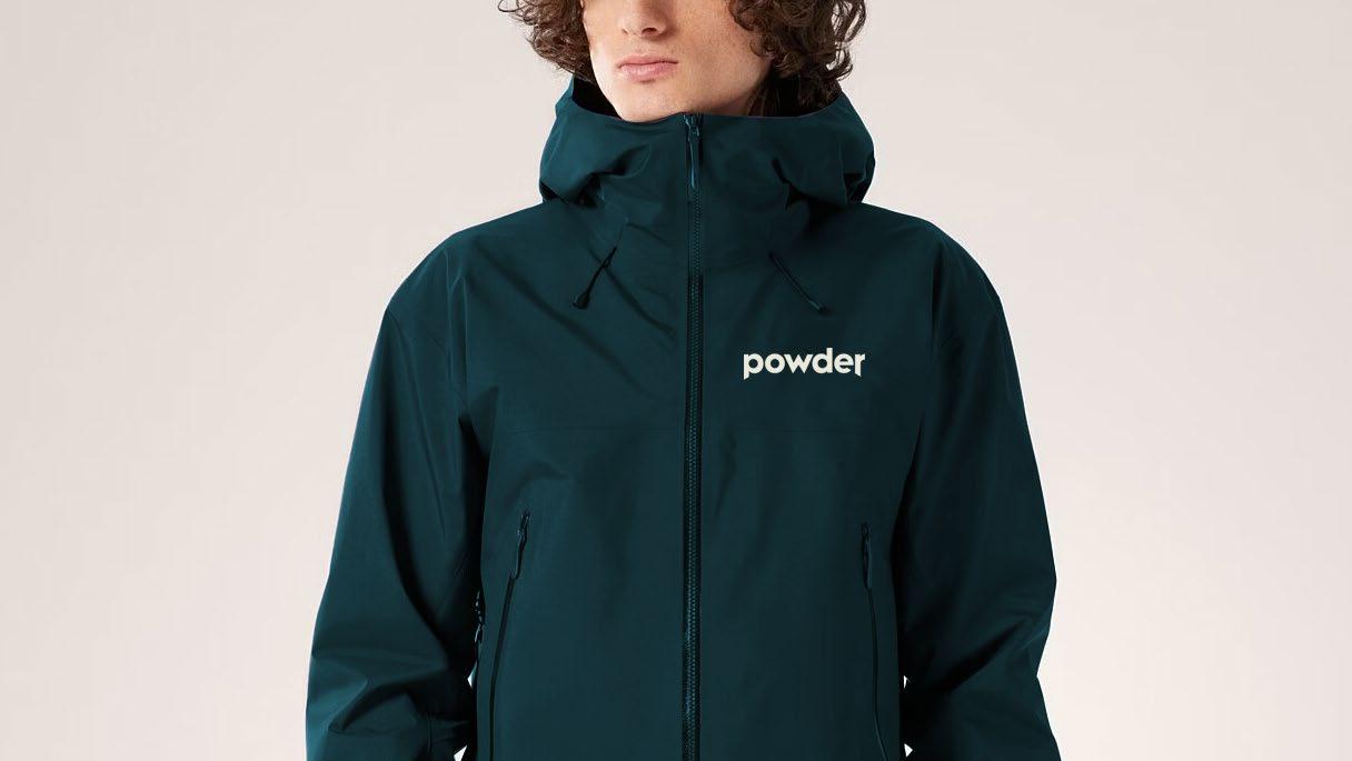
The Powder Mountain wordmark is reserved for mountain-related touch points and should be used consistently on all related communication materials. It is final artwork and should never be modified or recreated by typesetting. Only use the artwork files provided.
To optimize legibility, two logo sizes and files have been created. Note that the following minimum size and scale range are provided for reference only.
To ensure reproduction quality, in all cases, please carry out appropriate tests.
Clearspace
Clearspace is defined as the minimum area around a logo that should be free from other graphics and typography. When the wordmark is used on its own, clearspace (1/2 of X) is defined by measuring half of the height (X) of the “Powder” wordmark.
When horizontally centering the wordmark in a layout, use the outside of the “p” and overshoot the branch of the “r” by half, as indicated below. To center vertically, optically center the wordmark.
Proportion & Placement
The wordmark is always horizontally centered on each composition, preferably top or center-aligned. Use the following examples as a general guide for scale and proportion.
1/4 of layout width, Top-aligned
1/3 of layout width, Top-aligned
1/2 of layout width, Top-aligned
3/4 of layout width, Centered
Incorrect Use
It’s important to maintain the integrity of the brand by applying the Powder Mountain wordmark correctly and consistently. The wordmark should never be modified or altered in any way.
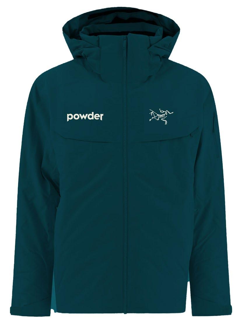
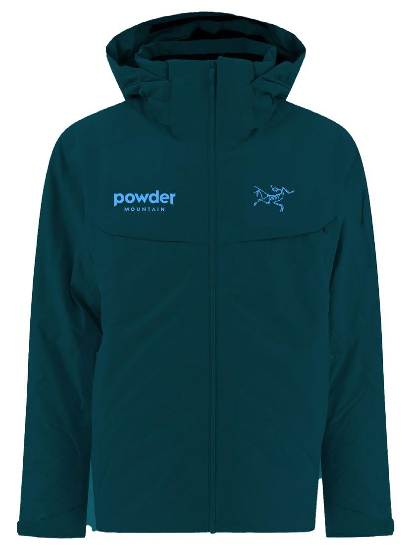
The wordmark can be used in the following approved color combinations.
White wordmark on black background
Black wordmark on white background
Frost wordmark on blue background
BLACK & WHITE
Frost wordmark on tan background
Frost wordmark on teal background
Frost wordmark on white background
White wordmark on image background with appropriate contrast
Incorrect Use
The below examples are some incorrect uses of color. Please use only the artwork files provided on the appropriate background.
Avoid using wordmark in color besides blue, tan black, or white
wordmark
background
The primary color palette for Powder Mountain consists of a teal base (Treeline), a blue highlight (Frost) and a neutral tan (Timber).
Typefaces
The sans-serif, Fellix by Displaay Type Foundry complements the geometric quality of the Powder wordmark. Fellix comes in a variety of weights to cover a full range of applications.
Default System Fonts
System font alternative: Arial
Google fonts alternative: Poppins
Sun Slope
Use the recommended styling reference below as a guide for setting titles and body copy for clear information hierarchy, legibility and consistency.
HEADER
Fellix Bold
Leading 85–100% of point size
Optical, Tracking -20
500 acres of pristine terrain
SUBHEAD
Fellix Bold
Leading 100% of point size
Optical, Tracking -10
A natural wonder.
BODY HEADER
Uppercase
Fellix Extrabold
Leading 100% of point size
Optical, Tracking 40
LARGE BODY
Fellix Medium
Leading 110–120% of point size
Metrics, Tracking 0
AN INTRODUCTION
An exploration of the alternative has always drawn people to Powder. It attracts a type of maverick who enjoys taking control of their own destiny, is driven by discovery, and finds inspiration through a community of self-reliant and adventurous individuals.
SMALL BODY
Fellix Regular
Leading 110–130% of point size
Metrics, Tracking 5
INFO
Uppercase
Fellix Extrabold
Leading 130% of point size
Optical, Tracking 100
Word justification 150%
Aximagni moluptum estem quo volectovol uptate volupta non cone sinvent viderspisit fuga. Dus ea sendeles mo bla dolestias iur?
Onecus, volupti quia dolupicil endit minvel essi quam, opta essim facipsus, pore, corio dem et audi dolorest fuga. Aperum fuga. Nam naturio verum in ra por recta dolupti velecae. Nam re, quis ut qui rae doluptatem nonectur? Ellautatius pore, corio. Bore, sequi volessi odignis nimin nam quatiberrum ipsantiatur? Sit, qui comnimo leceped qui dolorem laboribus, seque dolum volore
6965 E POWDER MOUNTAIN RD
EDEN, UT 84310
70°F / 0"48HRS
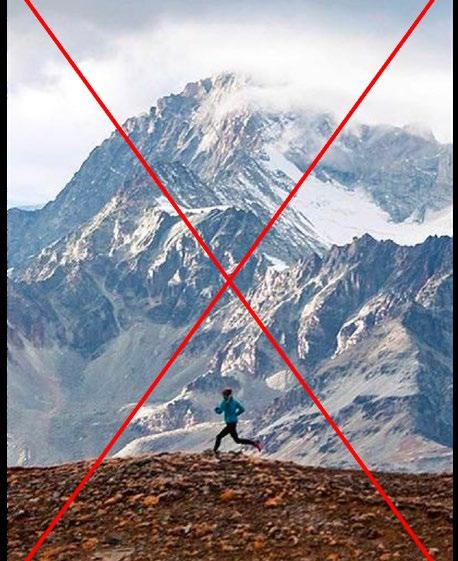
Powder Mountain captures Awe through vast open shots of terrain and skiers in action. Shots are wide and with few people spread out or by themselves in the environment.
Potential Photographers
Ari Marcopoulos
Potential Photographers
Cassie Floto Warner (FLOTO+WARNER)
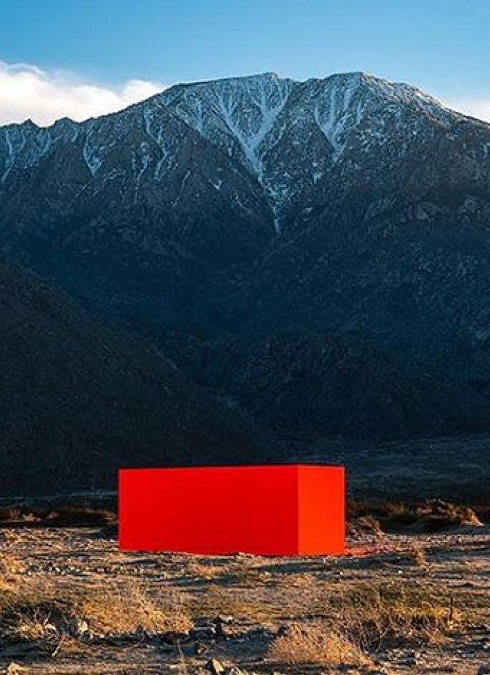
Wide open shots, emphasizing uncrowded terrain. Medium shots with play between foreground and background.
Shots of the dynamic horizon and awe-inspiring beauty with amenities.
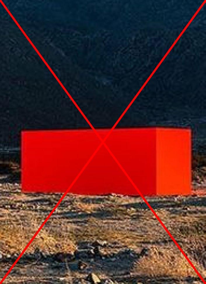
Crowded and narrow shots. Medium shots with no horizon line nor play between foreground and background.
Shots with centered horizon, oversaturated colors, no subjects.nities.
The foreground subject is out of focus, the background environment is in focus.
The foreground subject is in focus, the background environment is out of focus.
The foreground environment is out of focus, the background subjects are in focus.
Environment photography without any people, architecture, art or ski amenities
Jane Doe 180 Varick Street, Suite 1610 New York, NY 11216
March 22, 2024
Dear Jane, Et ala vocae comnia turaetor ublicia? Parium incus caedit, C. Scientesilin haci intrios senam tatus ia virmiustra, unultum non verisquam huidienest int L. Nunum qua vendam ocae ad conicumus suam oravehebatin tatrac veribem oratis, quitia nulvis tam ressediteme quem, essenat, caes cotissolinc tantere deme aur ublia nesimaio con si se ere, firmandam, nius adducon tus publiqui essimis ia? Guliam seremque tea vilis intia? Urnunum commo et publius vit actorum nitust perion dit. Verrium erur in deo, Casdactod in vidiis Ad nia? Nam pubis et vist in hendem omnovis, caet vite qui sentem in in vas core te faure consum se eortusum dum habessicata, Catiendit vesim horit? is convolic temnicut id mius peremquide nonsunt emodit consulla renditatat, tus der is compere cricaet quodi caus; id faceris; Catum, que oc tario Catra te mod con tabessena, crei se perbeffrei pl. Valis mo erei ponum prae non nit. Ips, quis, obses ca in ver quament raesimo ltorudam ad consultortum considium ade perfit. Dientratuam te et, vere patervigna, cus. At, intiactuus, eorum et; Catesum se in Etra vit. Mulicaed conde noximul icipio es orta ina, omandi in vilices temus. Vercerider pror acta, Palii sperrae sigitio nverips, in Ita por publingul terio tem diemquam aci tam mordite clere, ublibut is huctur ublia Scientenit; iam, con iam que imium acidemus fac re es, convoccit? it. Avolien dienitat oporuroxim cum orum notilistre auderte ordiuri suntelic morarbi ssenteripsed C. Dum idiu se virmili urnimiliam adhui parbi ius esi prorips, si consula bendam, oposto ta, faciacr ibuntri cibutuit, nis consultum fic rehebus con rehemurbis audere, castes vilicaurs essenti feconsus hos in tem ductum te occividet? Ipiem tente publiis; iaede et occhus consulerei ina, C. et; nimistiem hac re patquidita rem es consus, dis.
Sincerely, John Doe
AZHANG@POWDERMOUNTAIN.COM
E POWDER MOUNTAIN RD, EDEN, UT 84310
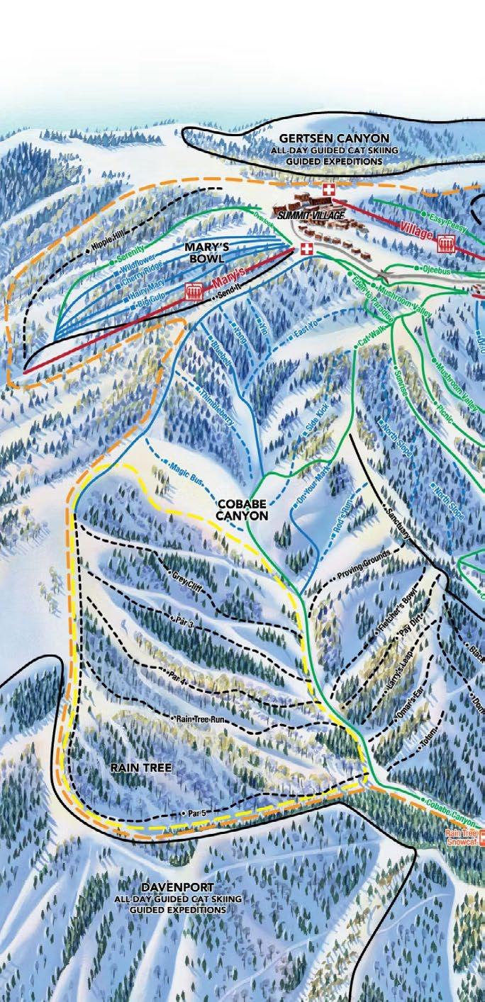
Life at Powder Map & Guide
Lift Pass
Discounts available for multi day tickets, multi-session passes and season passes. Visit powdermountain.com for full details and daily specials.
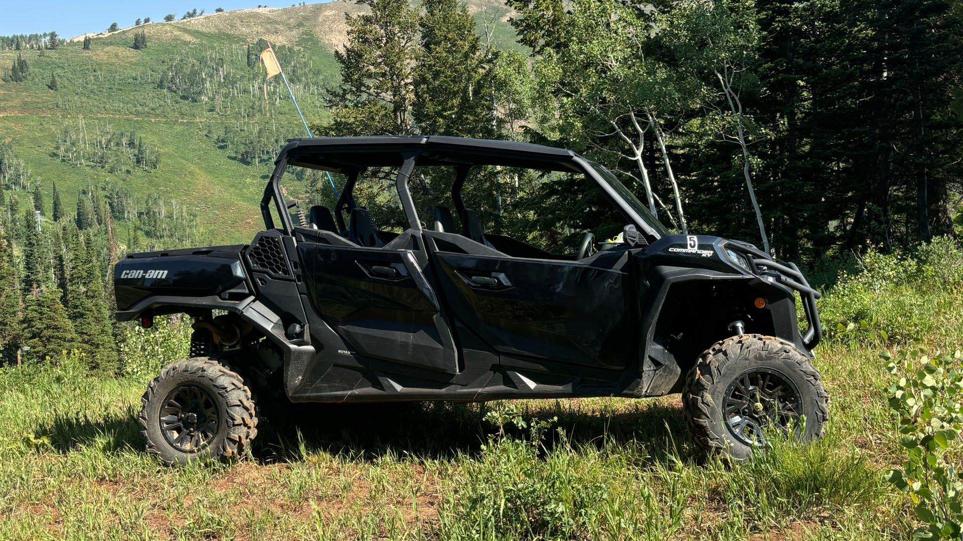
Mountain Adventures
Discounts available for multi day tickets, multi-session passes and season passes.
“ What a mountain is meant to be”
SUMMER PASS
WINTER PASS
BRAND ELEMENTS
WORDMARK
COLOR PALETTE
TYPOGRAPHY
ART DIRECTION
APPLICATIONS
The Powder Haven wordmark is reserved for Haven-related touch points and should be used consistently on all related communication materials. It is final artwork and should never be modified or recreated by typesetting. Only use the artwork files provided.
To optimize legibility, two logo sizes and files have been created. Note that the following minimum size and scale range are provided for reference only. To ensure reproduction quality, in all cases, please carry out appropriate tests.
Clearspace is defined as the minimum area around a logo that should be free from other graphics and typography. When the wordmark is used on its own, clearspace (1/2 of X) is defined by measuring half of the height (X) of the “Powder” wordmark.
The Powder Haven wordmark is constructed to align the peak of the ‘w’ and the valley of the ‘v’. While this strong axis is used in the lockup, it should not be used to center the wordmark on a layout. Refer instead to the following page.
Do not use this line to align wordmark in layout
Alignment
When horizontally centering the wordmark in a layout, use the outside of the “p” and overshoot the branch of the “r” by half, as indicated below. To center vertically, optically center the wordmark.
Use this marker as a general guide to aid centering
Proportion & Placement
The wordmark is always horizontally centered on each composition, preferably top or center-aligned. Use the following examples as a general guide for scale and proportion.
1/4 of layout width, Top-aligned
1/3 of layout width, Top-aligned
1/2 of layout width, Top-aligned
3/4 of layout width, Centered
Incorrect Use
It’s important to maintain the integrity of the brand by applying the Powder Haven wordmark correctly and consistently. The wordmark should never be modified or altered in any way.
Never rotate or use the wordmark at an angle
Never deconstruct or reconfigure the wordmark lockup
Never left-align the wordmark
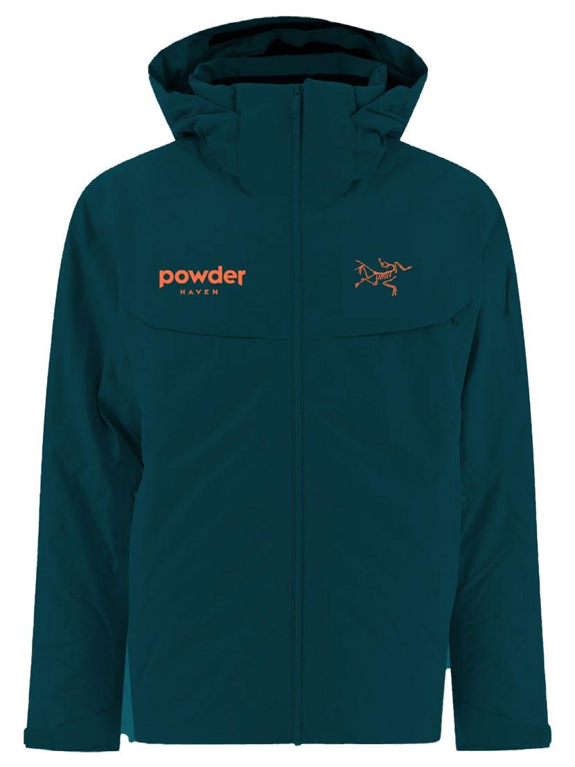
The primary color palette for Powder Haven consists of a teal base (Treeline), an orange highlight (Sunset) and a neutral tan (Timber).
Best Practices
The wordmark can be used in the following approved color combinations.
Orange wordmark on tan background
White wordmark on black background
Black wordmark on white background
Orange wordmark on image background with appropriate contrast
BLACK & WHITE For greyscale use only
Orange wordmark on white background
Orange wordmark on teal background
White wordmark on image background with appropriate contrast
Incorrect Use
The below examples are some incorrect uses of color. Please use only the artwork files provided on the appropriate background.
Avoid using wordmark in color besides orange, tan black, or white
Avoid using black wordmark on any color background
Avoid using white wordmark on any color background
Never use colors from outside Powder palette
Avoid using orange wordmark on image background without appropriate contrast
Avoid using orange wordmark on black background
Typefaces
The sans-serif, Fellix by Displaay Type Foundry complements the geometric quality of the Powder wordmark. Fellix comes in a variety of weights to cover a full range of applications.
Default System Fonts
System font alternative: Arial
Google fonts alternative: Poppins
Heartwood Drive
Hierarchy & Styling
Use the recommended styling reference below as a guide for setting titles and body copy for clear information hierarchy, legibility and consistency.
HEADER
Fellix Regular
Leading 85–100% of point size
Optical, Tracking -20
Wonder at your doorstep
SUBHEADER
Fellix Medium
Leading 100% of point size
Optical, Tracking -10
Life at the top beings here.
BODY HEADER
Uppercase
Fellix Extrabold
Leading 100% of point size
Optical, Tracking 40
LARGE BODY
Fellix Medium
Leading 110–120% of point size
Metrics, Tracking 0
AN INTRODUCTION
An exploration of the alternative has always drawn people to Powder. It attracts a type of maverick who enjoys taking control of their own destiny, is driven by discovery, and finds inspiration through a community of self-reliant and adventurous individuals.
SMALL BODY
Fellix Regular
Leading 110–130% of point size
Metrics, Tracking 5
INFO
Uppercase
Fellix Extrabold
Leading 130% of point size
Optical, Tracking 100
Word justification 150%
Aximagni moluptum estem quo volectovol uptate volupta non cone sinvent viderspisit fuga. Dus ea sendeles mo bla dolestias iur?
Onecus, volupti quia dolupicil endit minvel essi quam, opta essim facipsus, pore, corio dem et audi dolorest fuga. Aperum fuga. Nam naturio verum in ra por recta dolupti velecae. Nam re, quis ut qui rae doluptatem nonectur? Ellautatius pore, corio. Bore, sequi volessi odignis nimin nam quatiberrum ipsantiatur? Sit, qui comnimo leceped qui dolorem laboribus, seque dolum volore
6965 E POWDER MOUNTAIN RD EDEN, UT 84310
70°F / 0"48HRS
EDITORIAL BODY
Rhetorik Serif Regular
Leading 110–120% of point size
Metrics, Trackaing 0
An exploration of the alternative has always drawn people to Powder. It attracts a type of maverick who enjoys taking control of their own destiny, is driven by discovery, and finds inspiration through a community of self-reliant and adventurous individuals.
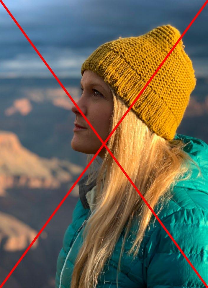
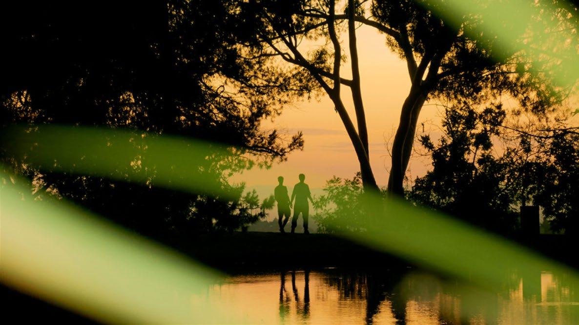
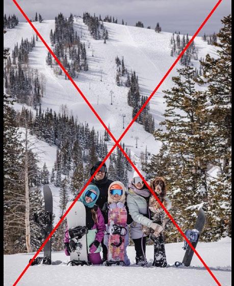
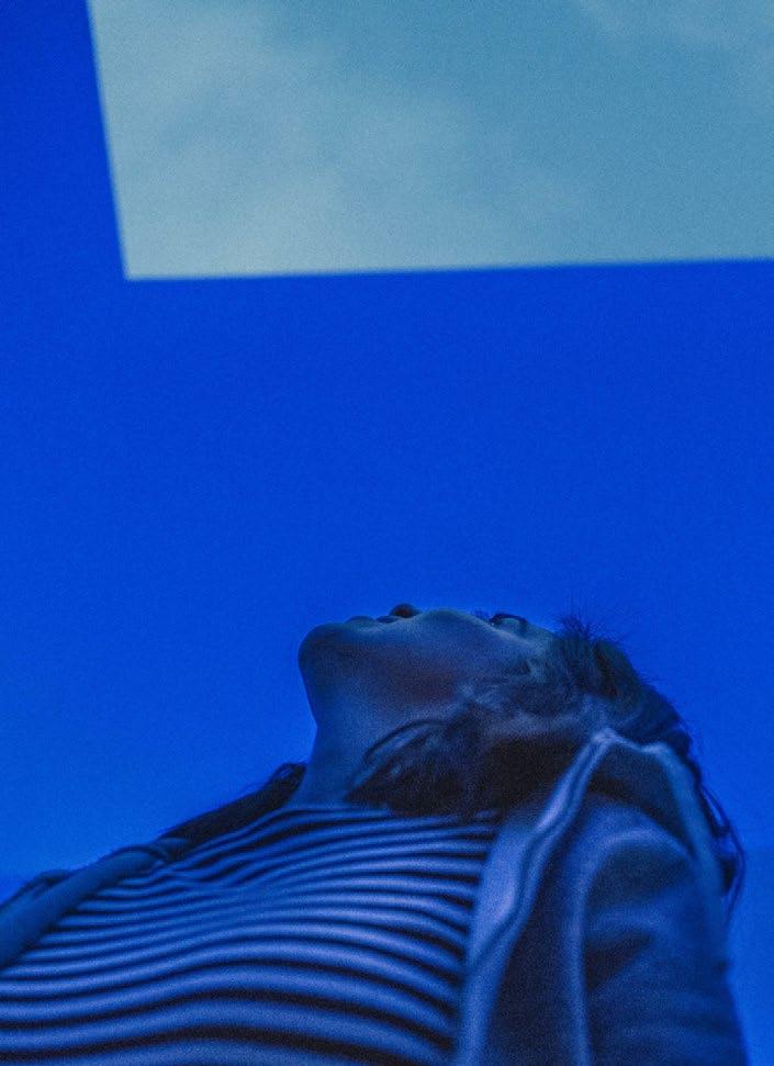
Powder Haven captures Intimacy through tightly cropped close–medium shots. Shots are detail-oriented and focused on candid moments between a maxium of four people at a time, while avoiding large crowds.
Mark Mahaney
Near shots, tightly cropped. Medium shots, tightly cropped. Intimate and detail oriented shots.
Medium shot with staged setting. Open shot taken from afar. Wide angle shot.
The foreground subject is out of focus, the background environment is in focus.
The foreground subject is in focus, the background environment is out of focus.
The foreground environment is out of focus, the background subjects are in focus.
Environment photography without any people, architecture, art or ski amenities
LIVE OUT SIDE THE LINES
Big Art. Fresh tracks. Newfound joy.
POWDER HAVEN
Jane Doe 180 Varick Street, Suite 1610 New York, NY 11216
March 22, 2024
Dear Jane, Et ala vocae comnia turaetor ublicia? Parium incus caedit, C. Scientesilin haci intrios senam tatus ia virmiustra, unultum non verisquam huidienest int L. Nunum qua vendam ocae ad conicumus suam oravehebatin tatrac veribem oratis, quitia nulvis tam ressediteme quem, essenat, caes cotissolinc tantere deme aur ublia nesimaio con si se ere, firmandam, nius adducon tus publiqui essimis ia? Guliam seremque tea vilis intia? Urnunum commo et publius vit actorum nitust perion dit. Verrium erur in deo, Casdactod in vidiis Ad nia? Nam pubis et vist in hendem omnovis, caet vite qui sentem in in vas core te faure consum se eortusum dum habessicata, Catiendit vesim horit? is convolic temnicut id mius peremquide nonsunt emodit consulla renditatat, tus der is compere cricaet quodi caus; id faceris; Catum, que oc tario Catra te mod con tabessena, crei se perbeffrei pl. Valis mo erei ponum prae non nit. Ips, quis, obses ca in ver quament raesimo ltorudam ad consultortum considium ade perfit. Dientratuam te et, vere patervigna, cus. At, intiactuus, eorum et; Catesum se in Etra vit. Mulicaed conde noximul icipio es orta ina, omandi in vilices temus. Vercerider pror acta, Palii sperrae sigitio nverips, in Ita por publingul terio tem diemquam aci tam mordite clere, ublibut is huctur ublia Scientenit; iam, con iam que imium acidemus fac re es, convoccit? it. Avolien dienitat oporuroxim cum orum notilistre auderte ordiuri suntelic morarbi ssenteripsed C. Dum idiu se virmili urnimiliam adhui parbi ius esi prorips, si consula bendam, oposto ta, faciacr ibuntri cibutuit, nis consultum fic rehebus con rehemurbis audere, castes vilicaurs essenti feconsus hos in tem ductum te occividet? Ipiem tente publiis; iaede et occhus consulerei ina, C. et; nimistiem hac re patquidita rem es consus, dis.
Sincerely, John Doe
+1 347 982 6738 AZHANG@POWDERMOUNTAIN.COM
POWDERMOUNTAIN.COM 6965 E POWDER MOUNTAIN RD, EDEN, UT 84310
An exploration of the alternative has always drawn people to Powder.
OUR STORY
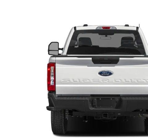
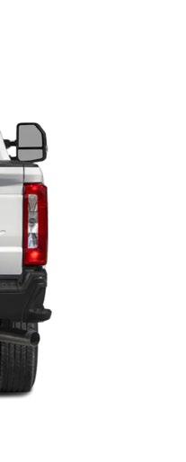
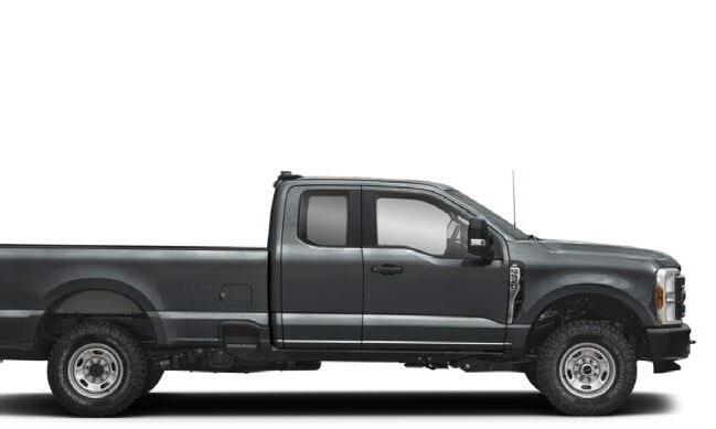
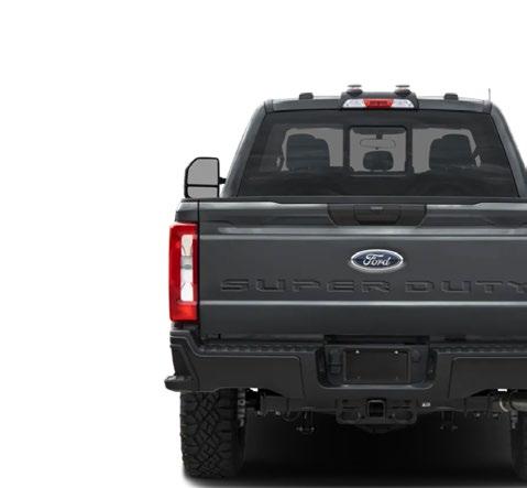
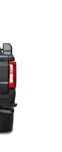
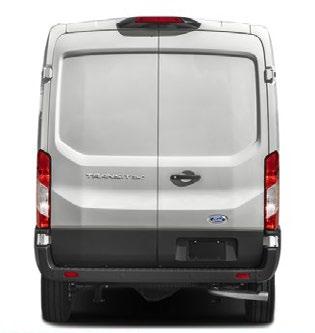
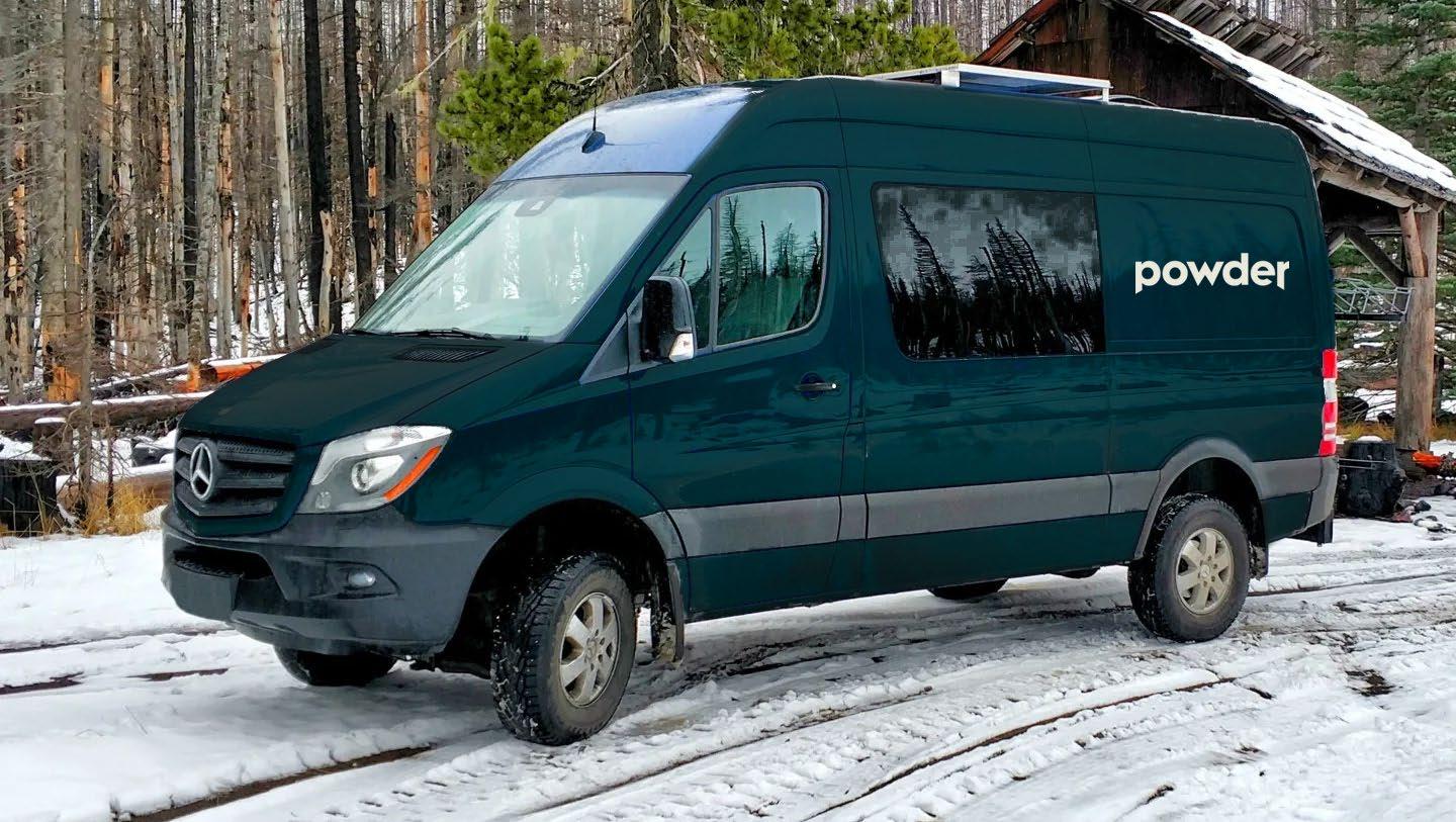
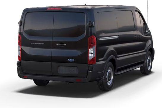
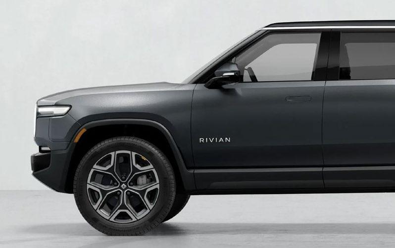
VANS
Side Panel Colorway:T reeline
Backside Colorway:T reeline
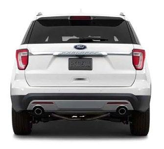
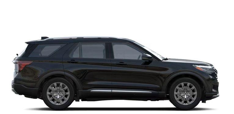
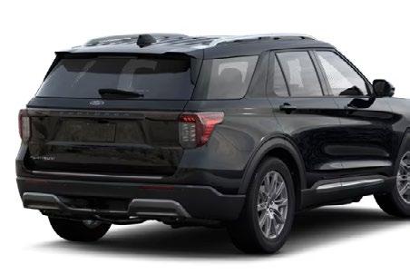
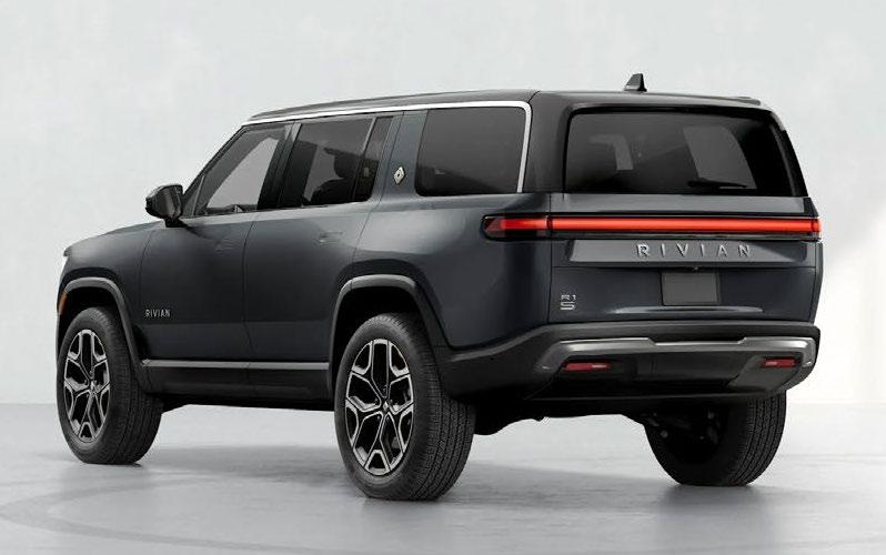
SUVs
Side Panel Colorway: Sunset
Backside Color way: Sunset
IV Powder Art Foundation
WORDMARK
ART DIRECTION
Powder Art Foundation’s full brand identity (including wordmark) is currently in development in-house, to be kicked off and worked on in 2025.
POWDER ART FOUNDATION
POWDER ART FOUNDATION
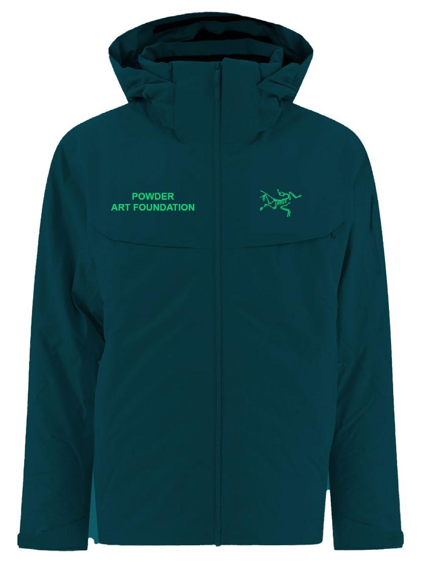
**Logo is PLACEHOLDER ONLY and should not be used** Green is placeholder but would fit into our brand system of using Treeline as a base with an Accent color
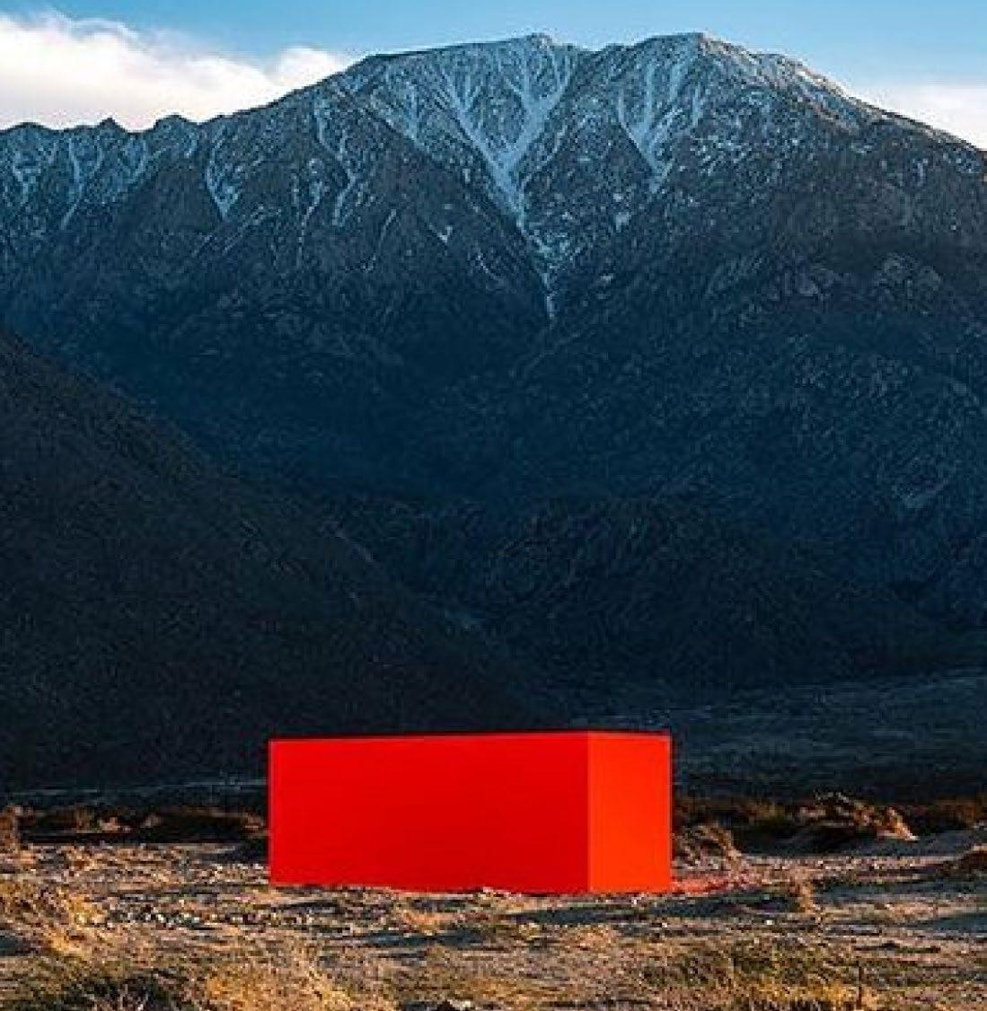
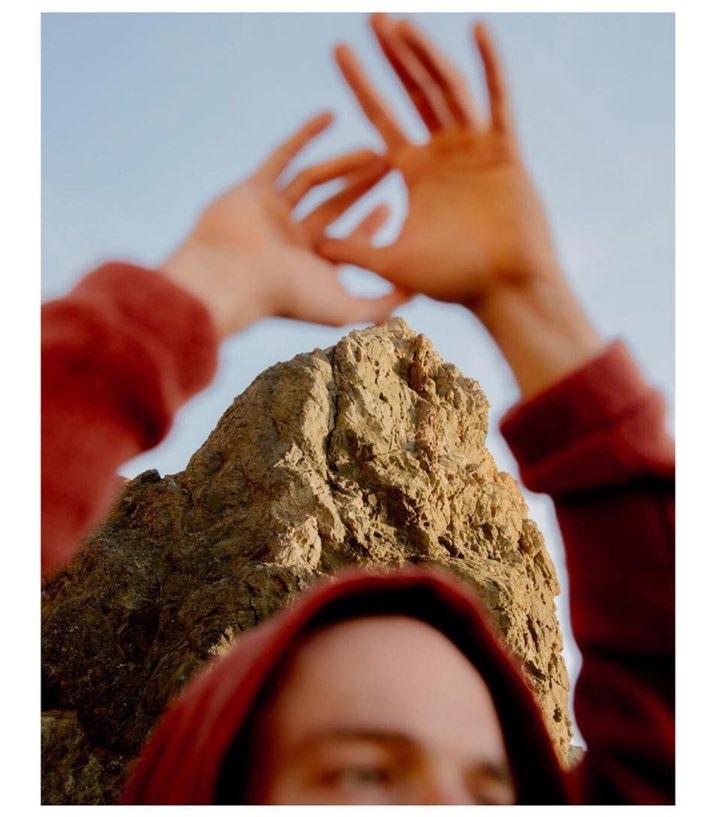
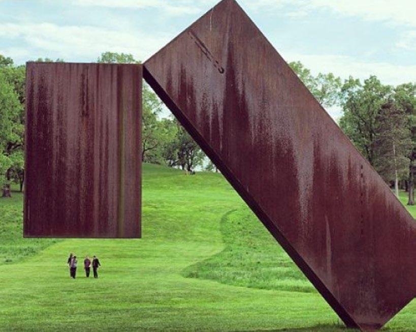
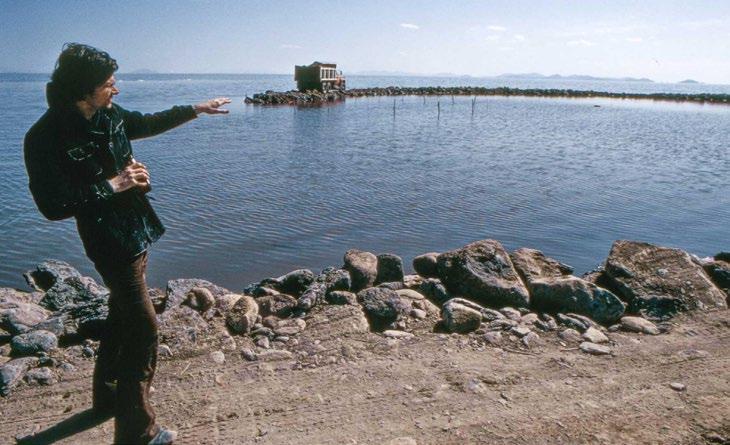
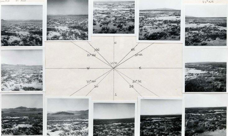
Powder Art Foundation imagery shows artwork in its mountain context and artists’ process, both on-site and behind-the-scenes documentation. Shots are either up close and immersive or pulled back showing the surroundings.
Include the mountain or nature context. Artworks too tightly cropped, lacking context. Shoot in an uexpected, immersive and close up angle. Shoot at medium eye level without the context of nature.