
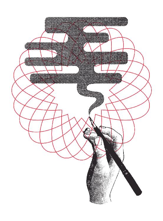
PART III THE OPENING
CHAPTER VII STORIES AND VOIDS 1
Chapter Seven Stories and Voids
“Draw your chair up close to the edge of the precipice and I’ll tell you a story.”
F. SCOTT FITZGERALDGreat design moves. In the first part of the book, the internal movements of the maker were assessed as an opportunity for improvisation by using the affordances of formal structures like the three levers as a framework. The next portion looked at motion through the lens of the work’s cultural context. It explained how the world advances by expanding the adjacent possible and shifting culture, and how the motion that surrounds the work should be incorporated into the designer’s decisions through a responsiveness that sways with the work’s context. The motion continues once the work leaves the hands of its creator and moves to the audience. After publication, there is an opportunity to achieve a resonance that emotionally moves the audience, and if successful, the work continues its movement by being passed around and shared. If we’re interested in having the work resonate and propagate, narrative becomes an essential component to design, because nothing moves as quickly and spreads so far as a good story.
Stories are a given – they permeate all cultures and interpretations of life. Narrative is such a fundamental way of thinking that there are even theories that say that stories are how we construct reality for ourselves. We use them to describe who we are, what we believe, where we are going, and where we came from. We create myths about our own origins, such as the Iroquois story of how the earth came to be on the back of a turtle, or the ancient Greek tale of Prometheus stealing fire from Zeus and giving it to man, or the Egyptian Hapi bringing fertility to the land by flooding the Nile.
The scope of these tales is daunting, but the stories we weave need not be grand. A myth about how Helen of Troy’s face launched a thousand ships is just as much a story as a coworker’s tale about their
CHAPTER VII STORIES AND VOIDS 2
shoelace snapping on their lunch break. A story is simply change over time, and the scale and scope of that change doesn’t matter so long as it has momentum. A story, in fact, doesn’t even need to go anywhere, as long as it feels like it is about to head somewhere good.
My favorite example of a dead-end story is Edward Hopper’s painting Nighthawks. I have a print of it that sits in the drawer of my desk. It’s become an object of habitual storytelling for me, because it feels like it has an inert potential to go somewhere, but it thwarts my efforts to figure out exactly where. All Americans are familiar withNighthawks, whether they know the painting’s title or not: it depicts a few people sitting in a nearly empty 1940s New York diner at night. Few pieces of art have the level of recognition that it enjoys, and even fewer achieve the painting’s cultural resonance as to be able to be spoofed as often as it has since it was made seventy years ago. Why has it risen to such stature in our collective consciousness? What is it about this painting that makes it so sticky?
We’re attracted to the painting because it is not finished. All of the paint has been applied, but there’s a gap that frustrates the viewer from deducing what is happening in the picture. Nighthawks is a detective story, and like most of Hopper’s work, it concerns a void. What is absent matters just as much as what is present, creating a tension between what is said and what is implied. It’s a framework for a story where everything has been established save the plot itself. The painting is lacking; it requires us to contribute something of ourselves in order to fill the void and finish it.
Many have created their own stories about Nighthawks: Joyce Carol Oates wrote monologues for each of the characters; the magazine Der Spiegel commissioned five different dramatizations of the painting; and Tom Waits made a whole album about it. No matter who is finishing the painting for Hopper, viewers project themselves intoNighthawks and read the image depending on how they see themselves. There are a few touchstones that guide our stories, but so many details are up for grabs. The quality of the painting pulls us in and requires us to complete it, and what we say suggests something about us.
I think about how the painting was made shortly after the Pearl Harbor attack. I see four individuals with the wind knocked out of them by catastrophic events. I see eyes glazed by the uncertainty of what the
CHAPTER VII STORIES AND VOIDS 3
future holds. I see a woman whose relationship may collapse and a group of men who may have to go to war. I imagine mouths unable to develop their feelings into words. They all sit in silence, staring off into some void, lumbering into some unknown future. I divine all of this from a painting, and I think to myself how I would kill to have this sort of rapt attention on anything that I’ve ever made.
Hopper’s lure is that the painting lacks a story. He sets the table for us, but we must serve ourselves. The reason Nighthawks has such a compelling hook is because it raises an interesting question with so many clues, but never answers it. Yet the quality of the painting makes us perceive the answer must lie within. Those questions will be answered, even if we have to do it ourselves. Narrative is a device we use to make sense of unfamiliar or unresolved things.
In my first few years teaching graphic design, I instructed a class called Graphic Design Systems. Our tools were color, form, and composition, and we practiced methods of using those building blocks to emotively communicate ideas. All work was to be abstract and nonrepresentational, and students were forced to explore the potential of purely visual communication without the additional complications of meaning that come with typography, photographs, and illustrations. How would one create a composition to describe dissonance? How can color and line be used to make something look joyful? After a few weeks, I began noticing a pattern in how the students discussed the work. On critique days, when we were all faced with a wall of red circles, blue squiggles, and clusters of lines, students would provide feedback through stories.
“This one seems to work really well. It makes me dizzy, because it feels like I’m being sucked down into a vortex, like I’ve fallen into a rabbit hole like Alice.”
“I’m not sure that this composition feels joyful, because it seems that this triangle is too aggressive, almost like it’s angry at the squares.”
“It’s like a middle school dance. Some shapes are dancing, but the music doesn’t look like it’s very good.”
“That circle probably has bad breath.”
CHAPTER VII STORIES AND VOIDS 4
I was surprised by how effective this mode of feedback became to the students. They were having more meaningful conversations about the work by telling stories rather than by describing the formal qualities of the compositions. The students were personifying and manipulating compositional elements in a kind of collaborative storytelling exercise. The students had limited experience in talking about the relationships of form on the page, but they were well-versed in human relationships, so it made sense to discuss the work through that lens. After a critique, the take-aways were always vague in words, but wonderfully specific in consequence. Everyone always knew what was expected after the session, even though the logistics of doing so weren’t captured in the words. Make those shapes get on better. Let the dance be fun, so all the shapes want to move. And somebody get that circle a mint.
Storytelling is one of the most efficient communication methods we’ve devised. Its effectiveness is why so much of the wisdom and insight about what it means to be human is wrapped up in fables and parables. The lessons of a story are easy to deduce, and they foster a sensitivity to specifics and create empathy inside of the listener. All stories, as stated earlier, are changes over time, so if you pay attention to what changes, you’ll find the point of the story. This also implies that if we are looking for ways to use narrative in our work as a design material, all we need to do is ask where the time passes to find the story’s proper place.
Telling a story with design in a magazine or book, for example, is possible by using the passage of time as a reader goes down the page or moves from spread to spread. Slowly decreasing or increasing the line height of a block of text, for instance, tells a story by suggesting urgency or relaxation as the lines expand or contract. Similarly, magazine designers spend incredible amounts of time ordering and pacing their publications spread by spread, creating an experience for the reader as they flip through. After a series of quiet, typographic spreads, a publication might choose to run a splashy design with few words and a large photo to capture the reader’s attention. In advertising, narrative can be created by changing the design of the same billboard over the course of a few months. In interaction design, the passing of time could be implied by the user’s scroll, or maybe the application detects that it has been a week since the user has last opened it, then responds accordingly. Drip email campaigns can also be mechanisms for storytelling. And narrative is,
CHAPTER VII STORIES AND VOIDS 5
of course, obvious in areas like film, music, and comics, because time is already in the material’s nature. There is an opportunity to tell a story whenever time can be assumed and pace can be controlled.
In addition to conveying information and entertaining, narrative is also a device that creates empathy, which allows us to better understand one another and ourselves. I have fond memories, from when I was young, of how my parents would sit at the kitchen table before serving dinner and talk to one another about their day. My sister and I weren’t terribly interested in the office politics at my mother’s job, but my father was always there, listening and nodding. Now that I’m older, I realize that the point of those chats was to give my mother an opportunity to tell a story so that my father could understand why she was a different person that night compared to when she left for work in the morning. She was describing the change in her over time, bridging the void between her and my father that developed throughout the day. There was distance between them, and her story closed the gap.
Even now, I’m still learning about the use of these conversations. I catch myself telling similar stories about my day, and realizing that while they may benefit the other person and help them to understand me, I’m also telling them to better understand those events myself. We can fill the gap between what we know of ourselves and what is actually there by going through the motions again. Stories become our gateway to understanding our own lives as well as the lives of others.
In 2008, Pixar released its feature film Wall•E. The movie concerns a robot living on Earth in the distant future where the planet has been abandoned by humans, because it has been made inhospitable by an exorbitant amount of garbage. It’s Wall•E’s job to collect and compact that trash. Wall•E’s vocabulary is limited (he’s only able to say his own name and a small set of chirps and whistles), yet the narrative masterfully sustains momentum for two hours. Wall•E meets another robot named Eve, discovers life on Earth in a small sprout, and hitches a ride into space to alert the humans that life can be supported on the planet again. And I’ll admit it: in a moment of weakness, a robot made me cry.
You might say, “That’s the point of movies – to entertain us, to make us laugh, cry, feel.” I suppose these are all true, and that does temper my shame a bit. But Wall•E is a testament to the power of storytelling, because despite the limitations of a robot as a lead character, the film
CHAPTER VII STORIES AND VOIDS 6
is able to tap into an emotional core. Wall•E is anthropomorphized like many cartoon characters, but he is not a fish, tiger, or anything else that has ever had any life to it. He is a mute, animated hunk of metal with no life essence that has somehow been given such an emotional depth that he holds us – enraptured – for two hours. The audience is able to achieve a certain sense of empathy with Wall•E through the power and propulsion of excellent storytelling. His successes are our successes, and his pains are our pains, even if he is just a circuit board.
Story has the ability to humanize things that weren’t thought to be alive before, and I have to wonder if the inverse is true. If you take a robot and add a story, it becomes more human. If you took a person and removed their story, would they become something less worthy of sympathy? There’s an old story about David Ogilvy, one of the original mad men that established the dominance of the advertising field in the 50s and 60s, that seems to deal with storytelling as an avenue to create empathy. One morning on his walk to work, Ogilvy saw a beggar with a sign around his neck.
I AM BLIND.
The poor man slouched in a corner and would occasionally hold the cup up to his ear to give it a rattle, because he was unable to tell how much money was in it by looking. Most days, the beggar didn’t hear much. Ogilvy was in good spirits that day. It was late April in New York, when the air is beginning to warm, and there’s a peaceful pause before the city falls into the oppressive heat of summer. He decided to help the beggar, and dropped a contribution into the cup. Ogilvy explained what he did for a living when the beggar thanked him, and he asked for permission to modify the sign around the man’s neck. Upon receiving consent, he took the sign and added a few words.
That night, on his way home, Ogilvy said hello to the beggar, and was pleased to see his cup overflowing. The beggar, frazzled with his success, and uncertain of what Ogilvy did to the sign, asked what words were added.
IT IS SPRING AND I AM BLIND.
CHAPTER VII STORIES AND VOIDS 7
Ogilvy was able to create empathy in the passersby, who would have ignored the blind man, by adding a story.
I love that story, because it speaks to the best of what we can do for one another. It also suggests what we should seek to do with the stories we tell. Roger Ebert described the specifics eloquently by calling the goal “elevation,” saying, “I would consciously look for Elevation, remembering that it seems to come not through messages or happy endings or sad ones, but in moments when characters we believe in … achieve something good. … One human life, closely observed, is everyone’s life. In the particular is the universal. Empathy is the feeling that most makes us human.” Stories with elevation let us empathize.
The tale of the blind man’s sign is also about storytelling. I first heard it from a friend over a cocktail at an airport bar, and he had it told to him by a former coworker around a campfire at a company retreat. Stories spread through a human network, they branch and expand, to produce a hand-off of understanding between a group of people. Each story that’s remembered signifies something noteworthy that has been comprehended, whether it is exceptional or of the everyday. The stories we tell represent bigger things, whether it is a take on the beginning of the world, the bond between my parents, the feelings I project onto one of my favorite paintings, or the connections between people once they are given the language to empathize.
And I think that this gets us to the most important aspect of narrative: the quality of the story is a second-rate concern so long as we empathize with the person it is about and care for the one telling it. A good story speaks to the experience of someone else, but in its telling creates another shared experience for the speaker and listener. The story moves, and with each telling, it keeps a hint of the wisp of the last voice that told it, and retains a bit of the luster of the last shared moment it made.
Footnotes
“Draw your chair up close…”: Fitzgerald, F. Scott, and Edmund Wilson. The Crack-Up. New York: J. Laughlin,1945.
CHAPTER VII STORIES AND VOIDS 8
CHAPTER VIII FRAMEWORKS AND ETTIQUETE 9
Chapter Eight
Frameworks and Etiquette
“The question, O me! so sad, recurring – What good amid these, O me, O life?
Answer.
That you are here – that life exists, and identity;
That the powerful play goes on, and you will contribute a verse.”
WALT WHITMAN
There are two successful outcomes when a design focuses on its audience: resonance and engagement. Stories speak to the first and frameworks to the latter. Frameworks are the structures that allow for contributions to be made to the products of design, and increasingly, it has become the work of the designer to create these frameworks. One of the more central questions that design must now address is how one produces an enticing environment for conversation, community, and creativity.
A framework is the bridge that connects the designer to the audience and goes both ways. It also nicely resolves a thought that crosses my mind frequently while working: “What if the audience is smarter than I am?” If the audience knows more about what they need than the designer does, it seems silly to not have a way to gather their thoughts, opinions, and proposed solutions. Frameworks open up a valve of communication and contribution; if effective, they reap the rewards of an intelligent and experienced audience. A good framework is an enticing means of contribution and an invaluable feedback mechanism. It gives designer and audience shared ownership of the products of design, a true synthesis of requirements.
Largely, the practices that make for good improvisation produce good frameworks, because both are created to help initiate creative work and encourage contributions from others. I’m reminded of the Japanese rengamentioned earlier, where the poets would contribute
CHAPTER VIII FRAMEWORKS AND ETTIQUETE 10
lines and daisy-chain them together to create a whole greater than the sum of its parts. The framework wasn’t the poem, but the structure and methods employed to help produce it. There were rules and limitations to the game, with social etiquette layered on top, and these elements interacted to create the materials for the poets’ interaction. I think all of these patterns apply to contemporary frameworks as well: there is the action that needs to be done, the tension of creating a worthwhile larger work, and the social etiquette necessary to pull it all off. The goal is the same now as it was in the time of the renga – to build something of quality, to have others contribute something of themselves in the process, to have those individuals interact with one another as a community of contributors. All frameworks are implicitly social in that they are an environment where conversation, sharing, and building occur. They’re collaborative.
Earlier I discussed improvisation as it applies to a personal creative process, but more frequently, improv is a social act. The results of the improvisation are built up through dialogue between many individuals, whether it is a group of jazz musicians sharing a stage and trading fours, or a troupe of improv comedians feeding one another material to get laughs. And so all of the tenets that influence improvisation on an individual level also need to be applied collectively for frameworks. Contributions must be accepted, and then appended by someone else, which brings us back to “Yes, and….” Momentum also matters here, so the materials need to trade hands frequently, with tight feedback loops to quickly incorporate each contribution to the whole. There’s a special satisfaction in contributing to something, and it becomes even more rewarding when everyone can see how their part has influenced other aspects of the creation.
Liz Danzico likes to frame up her experiences of contribution by telling a story about a saltbox that hung beside her mother’s stove while she was growing up. Occasionally, her mother would ask her to add a bit of salt to the pot while the meal was on the stove simmering. Salting was a way for her to participate in making dinner; the salt was an agent of change that she could use to contribute to the meal, and the saltbox was the structure that allowed her to contribute. The saltbox, if you will, was the framework.
CHAPTER VIII FRAMEWORKS AND ETTIQUETE 11
I think the process of salting is an apt analogy for a creative offering, because the soup in the pot isn’t Liz’s creation, but she’s the one who imbues it with flavor by adding salt. Salting happens one pinch at a time – it is a gradual process – with success determined by tasting afterwards. We judge what we’ve done by testing the change we’ve created, and that’s how a good framework should feel for the audience when they contribute. The path is self-correcting, because they can observe the influence of their actions and make changes if needed. Maybe the soup needs more salt. The feedback loop is purposefully tight. That’s why you can trust a child to help with dinner without ruining the meal: it’s a small effort with low risk, but big rewards. Salt releases the food’s natural flavors when applied judiciously, and this speaks to the benefits of a successful framework: it’s not the main dish, but a meaningful addition to what the audience already wants to achieve. It enhances what they already intend to do and increases the quality of what they would have been able to achieve on their own. But frameworks have a tendency to disappear when they are intuitive and carefully planned, because our attention is on the wonderful fruits of the process. We typically only notice frameworks, like salt, when something is out of balance. Consider salt in a cookie: we only taste it when there’s too much or not enough, because when the balance is just right, we hardly realize it’s there.
Frameworks have always existed, from game design to the office suggestion box, but their importance has been amplified by the presence of the internet and the opportunities that the web affords. Designers must manage a new kind of conversation around their work, because connectivity has created new opportunities for audiences to contribute. We are no longer only designing logos, brochures, and posters, but now also experiences and interactions that provide the path for audience engagement. If resonance and engagement are our goals, then improvisation is the blueprint for creating these interactions. Improvisation’s ability to manage the contributions of others and lead them to a desirable outcome makes it a prime lens to view and understand these new requirements.
The proximity of the audience to the work should be considered an overlap of interest. The designer and audience are now wed in co-authorship, with each of their contributions part of the dialogue
CHAPTER VIII FRAMEWORKS AND ETTIQUETE 12
that establishes the characteristics of the project and the direction it will take. Kind of Blue, for example, is credited as an album by Miles Davis, but, in truth, it is an album made collaboratively with all the other musicians in the studio. The music did indeed spring from the limitations Davis wrote on those slips of paper, but once providing the framework, he wisely stepped back and relinquished complete control and authorship.
Designers should do the same with the frameworks they produce. They should begin by setting good restrictions that act as suggestions, but then step out of the way to see where the audience takes those purposeful limitations. Stepping out of the way requires a new way of thinking, because the designer can no longer command the whole ecosystem of the work if others are contributing. The control that designers so often desire is undermined through an unpredictable collaboration with the audience.
Again, the solution is for the designer to sway responsively to the shifting context of the work with the contributions of the audience. The key is to understand when to surrender control and let the audience drive, and when to exert authority to focus everyone’s effort to ensure a more meaningful outcome. A gentle touch, more often than not, is all that’s needed to guide things in the right direction. One could say that Davis’ genius withKind of Blue was introducing that gentle touch to jazz, favoring a few simple scales over the elaborate scaffolding of Bebop.
A good set of well-chosen rules makes the contributor feel like they are already halfway done: all that is left to do is to sort out the details and execute their idea. A good example would be the easy hand-holding of a MadLib – name a few words, drop them in, and then read what funny nonsense results. The framework limits what words go where; place an adjective here, a verb there, then a name, and presto: you get a funny story. Bad choices in frameworks, however, have a tendency to feel too limiting; they are frustrating and unclear to the audience and squelch any inkling of interest in participating. Imagine if the MadLib asked for a present participle that modifies a noun as an adjective. The value proposition for contributing becomes an unappealing one.
The contributions of the audience fortify the work, create identification and ownership in them, and solidify the community around the design.
CHAPTER VIII FRAMEWORKS AND ETTIQUETE 13
Frameworks are collaborative and social in nature, so etiquette also becomes a concern for the designer. I have a friend who collects etiquette books, and it’s only recently that I think I’ve come to understand why she does this. The books highlight the important points of our engagements with one another. Manners underscore what we feel is proper. Etiquette is composed of the rules of engagement, and how we interact when we’re together. Designers need to think about setting these rules, because they exist to grease and ease social interactions.
The start of the internet produced a lot of discussion about “netiquette” to establish the social norms that would dictate our interactions in this new and unfamiliar digital space. Those conversations have largely vanished in the past two decades, which is a shame, because while the web has become increasingly social, we haven’t developed many new social protocols to handle the glut of demands created by socializing online. Our initial attempts at netiquette translated our existing manners into the digital space. We were correct, to a large extent, to bring along the behaviors that come from kindness and politeness, but collective socializing online is not a mirror image of doing so in physical space. Most relationships are asynchronous and anonymous. Believing that a simple one-to-one translation of the norms we have in physical space should work in digital space underestimates the influence that our new connectivity has over the way we socialize. The tools we have shape how we use them, and the social web, frameworks, and their design decisions establish how the audience contributes and how they relate to one another as individuals.
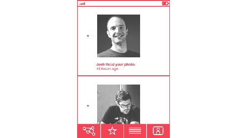
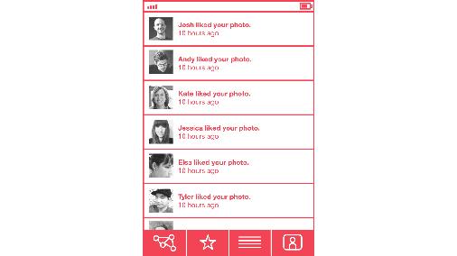
The story about Ogilvy and the blind beggar speaks to the consequences of when the personhood of an individual is amplified or minimized. The human presence changes behavior. Ogilvy created a space for empathy by telling a story, and I think that the decisions of a designer can influence whether or not users empathize with one another when huddled around a framework. Empathy is crucial in these cases, because frameworks are the means to build up things collaboratively. Let me give an example. A few weeks ago, I was using an application on my phone that is essentially a framework for sharing photos with friends. These friends can comment on the photos and favorite them. There is a screen in the application that lets you look at the updates describing who has liked a photo that you have taken, or if new people have shown up and subscribed to your stream of photos. The interface looks, roughly, something like this:
CHAPTER VIII FRAMEWORKS AND ETTIQUETE 14
It’s a nice design, and it provides a concise digest of activity around the photos that I’ve taken, but I think it’s a complete failure in reinforcing the emotions that make the behaviors it presents meaningful. I look at this screen often, but the one thing I should feel – thankfulness for the kindness and recognition of others – never materializes.
Except for the one time it did: I opened the application one day to discover a rendering bug had enlarged the avatars on this screen. That one simple change made me feel a part of this photography framework and the community it sustains. Seeing the faces of the ones who liked my photos made me part of a web of mutual appreciation. The people snapped back into focus as individuals.
CHAPTER VIII FRAMEWORKS AND ETTIQUETE 15
I began to think about the screen’s original design: it had information density, but it wasn’t a suitable representation of personhood. The design was optimized for consumption of information rather than thankfulness for the interactions and relationships it depicts. Appreciation is a significant aspect of positive experiences; if the design choices have been optimized for consumption instead, it turns an opportunity for nourishing collective resonance into a gesture of empty snacking. All of which begs the question: was the rendering mistake actually a mistake if it fixed the most fundamental problem of the original design? The bug was eventually fixed and the screen returned to the original layout, but I want my big faces back.
Footnotes
“…you will contribute a verse.”: From the poem O Me! O Life! Whitman, Walt. Leaves of Grass. New York, NY: HarperCollins, 2000.
CHAPTER VIII FRAMEWORKS AND ETTIQUETE 16
CHAPTER VIIII DELIGHT AND ACCOMMODATION 17
Chapter Nine
Delight and Accommodation
“Who ever said that pleasure wasn’t functional?”
CHARLESEAMES
Design doesn’t need to be delightful for it to work, but that’s like saying food doesn’t need to be tasty to keep us alive. The pedigree of great design isn’t solely based on aesthetics or utility, but also the sensation it creates when it is seen or used. It’s a bit like food: plating a dish adds beauty to the experience, but the testament to the quality of the cooking is in its taste. It’s the same for design, in that the source of a delightful experience comes from the design’s use.
There is a tendency to think that to delight someone with design is to make them happy. Indeed, the work may do that, but more appropriately, the objective is to produce a memorable experience because of its superior fit. The times that design delights us are memorable because we sense the empathy of the work’s creator. We feel understood, almost as if by using the work, we are stepping into a space designed precisely for us.
Outside of design, the most delightful memories are some of my strongest. They’re of the idyllic times where I felt like I fit: the world seemed to be orchestrating itself just for me. I was exactly where I was supposed to be at the right time. Of course, these situations weren’t constructed for me, but the experiences felt like they were tailored. They were specific and personal, empathetic and warm. The experiences shine more in their remembrance, turning into a kind of self-perpetuating myth whose importance grows with each retelling. Why shouldn’t delightfully designed experiences be like these memories? Now, it’s far outside of the capabilities of anyone to maneuver the parts of the universe to recreate the idyllic experiences to which I refer, but with each project, designers are given a chance to align the specifics in a fitting way to create that same sort of feeling. Empathy creates an opportunity for skillful accommodation.
Again, design gets wrapped up with how the work feels while being used. All design is experience design – whether it is visiting a website,
CHAPTER VIIII DELIGHT AND ACCOMMODATION 18
reading a book, referencing a brochure, interacting with a brand, or interpreting a map. All of these interactions and objects of attention produce experiences of use, and those experiences can be made better and more memorable by skillfully catering to the audience in an accommodating way.
Delight, unfortunately, can be painted as a quick fix or a gimmick that offers a snazzy way to spit-shine a poor idea with novelty. The intentions of creating accommodating work go deeper than just a surface treatment, and are meant to build and maintain meaningful, nourishing, and codependent relationships between the designer and audience. The decisions that make a design delightful are an expression of compassion for the audience and care for the work being done. They should attempt to build up long-term benefits rather than temporary gains. The gestures that make a design delightful can be small, but their implications are meaningful: they are part of an attempt to engage an audience in a consequential, human way, and to maximize the opportunity of the situation for everyone.
The correct choices feel much like an embrace. A space of accommodation has been skillfully created by the designer for the audience to occupy, and the audience need only to step into the space for it to be completed. It’s an architected space crafted through empathy based on the designer anticipating the disposition and needs of the audience to achieve a good fit. For instance, there is a certain small satisfaction when our spell check learns to automatically correct our frequent typos, or when the handbasket appears in the grocery store right as we pick up the extra item that makes it too difficult to carry everything with our bare hands. The fit is the result of a successful decision made in response to the desires and natural behaviors of the audience.
There’s room for a delightful approach in most design, even in the most conventional of exchanges. In Griffin, Georgia, for instance, there’s a road sign hung over the state highway a hundred yards in front of a bridge. The sign warns oncoming traffic of the low overpass ahead by saying:
IF YOU HIT THIS SIGN, YOU WILL HIT THAT BRIDGE.
CHAPTER VIIII DELIGHT AND ACCOMMODATION 19
There are many different ways that the sign could have been made, but this particular one is effective because all three parts of the design – the message, tone, and format – are treated in a delightful way. The text gains clarity, immediacy, warmth, and humor through the tone of the writing, and the format is manipulated in a pleasing way because of the position of the sign. Placing the sign over the road rather than next to it gives the warning a more direct relationship with the hazard it warns against. It’s not just a written warning, but also a feedback mechanism for the real threat ahead. The sign provides a great example of how to approach a design problem to create delight, and highlights what makes a design delightful: it empathizes with the audience and their circumstances, surprises in its delivery, and achieves a clarity in what it is trying to say or accomplish. A delightful experience is the overlap of these three things.

Surprise is a crucial component, because it is hard to delight someone if they expect what they are being given. Delight fades when there is entitlement or predictability, and that’s why so many of the delightful experiences in commerce involve a customer being under-promised then over-delivered. They get into an engagement expecting a certain amount, and are delighted when they get more than they bargained for.
The simplest form of delightful surprise is serendipity, when we are presented with an unexpected relevancy. Serendipity in design provides a new viewpoint that makes us look at what we are doing in new ways. It is the opposite of purposefully designing for delight, but like a scientist observing natural occurrences in the lab, understanding the natural patterns of things allows us to reconstruct them in our work. One of my favorite serendipitous occurrences is an error message that came up one day while writing:
CHAPTER VIIII DELIGHT AND ACCOMMODATION 20
Isn’t it pleasing to think that software has pathos, and that writing is just as difficult for it as it is for us? I admit, most error messages create a large amount of grief because they signify lost work, but when this particular one popped up, I had to laugh. “Application cannot edit the Unknown” (capitalized, proper noun), and all I could do is to accept it and say OK. The computer had been personified for a moment, and in its existential crisis, I felt like it understood my writer’s block. It was comforting to have company when lost in my words. This happy circumstance means that one of the best opportunities to delight the audience is when something goes wrong.
We can also be surprised by delight when the mundane is rethought and elevated. At the Ace Hotel in New York, a required exit sign over a door was an eyesore, and a stark contrast from the considered, detailed wall where it was mounted. Rather than accept the wart as it was, the sign was embraced as a chance to create an experience for the hotel’s guests by integrating the exit sign into the space. Now, surrounding the sign are other letters painted on the wall in a similar condensed style:
Every requirement is an opportunity for delight, even the ugly ones. Sometimes the creative treatment of these warts are the most enjoyable parts of a design.

Delightful design also adds clarity by finding the balance between adding details for resonance and taking them away for simplicity. When the two are balanced correctly, we’re left with a design that shows up when it offers something of value, and then gets out of the way when it is not needed. Sometimes, more must be added to give clarity to the work, such as how a map may have added guidance along with street names to make it easier to navigate; but usually value and delight are created by taking things away and reducing friction.
It is a chore in most hotels and airports, for instance, to get connected to the public WiFi. The process is wrought with roadblocks and complications: login screens, user agreements, registration pages.
CHAPTER VIIII DELIGHT AND ACCOMMODATION 21
The web page used to access the WiFi at the Ace Hotel, however, has a simpler approach to that interaction:
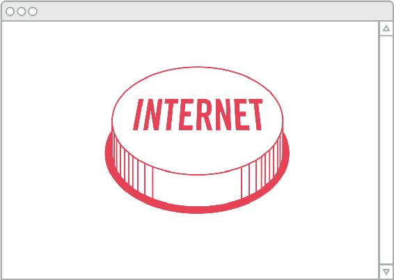
The internet button surprises and delights, because it understands what the user wants to do, and eliminates everything else that doesn’t pertain to that goal. Clarity emerges, and delight shows up with it, because we feel like our intentions are plainly understood.
The most important element of delightful design is empathy. Clarity and surprise are only achievable through empathy with the audience. An intimate understanding of the audience means that our designs can be warmer in their communication and more appropriate. We can be friendly and good-natured with the ones who imbue our work with its value. Projects that seem cold or excessively composed are more indicative of a lack of understanding than a mark of professionalism. One can speak naturally and personally when they know someone well, and a friendly, affectionate, and hospitable tone is essential to cater to audiences, encourage dialogue with platforms, and produce the utility and resonance that great design seeks to achieve.
Delightful design attempts to make the work more pleasurable for everyone involved in it, and in doing so, makes the designer and the audience more aware of one another. This seems to be a foolish thing
CHAPTER VIIII DELIGHT AND ACCOMMODATION 22
to say, but without the empathy that delightfulness requires, it’s quite easy for the designer to be short-sighted and see the design work as a set of logistical problems to overcome or creative challenges to master, rather than an opportunity to produce something that enhances someone else’s life. The warmth and exuberance of communication and the accommodation to the audience necessitated by delightful design also makes it easier for the audience to spot the presence of the designer in the work. The work becomes more humanized in its tone and effect, so it becomes easy to see that there are people behind it.
Footnotes
“Whoever said that pleasure…”: Design Q&A with Charles Eames. Perf. Charles Eames. YouTube. Web.
CHAPTER VIIII DELIGHT AND ACCOMMODATION 23
CHAPTER VIIII DELIGHT AND ACCOMMODATION 24
CHAPTER X GIFTS AND GIVING 25
Chapter Ten
Gifts and Giving
“Not I, not I, but the wind that blows through me!”
D. H. LAWRENCEThere is an old Japanese tale about a poor student who was away from home and living at an inn. One evening, as his stomach grumbled, he smelled the briny scent of fish coming from the inn’s kitchen as the innkeeper made his dinner. He wandered his way outdoors to the kitchen’s window, and sat below the sill with his meager meal of rice, hoping that the scent of the fish might improve his paltry dish. The student did this for many weeks, until one night the innkeeper spotted him and became furious. He grabbed the youngster by the arm and dragged him to stand before the local magistrate, demanding payment from the student for the scent of the fish that he had stolen.
“This is most curious,” said the magistrate, who thought for a moment and then came to a conclusion. “How much money do you have with you?” he asked the student, who then produced three gold coins from his pocket.
The student feared that he would be forced to pay the innkeeper the last of his money, but the magistrate continued. “Please,” he said, “put all the coins in one of your hands.” The student did as he was asked. “Now, pour those coins into your other hand.” The student dumped the coins. With that, the magistrate dismissed the innkeeper and student’s case.
The innkeeper yelped in confusion, “How can this be settled? I’ve not been paid!”
“Yes, you have,” replied the magistrate. “The smell of your fish has been repaid by the sound of his money.”
The Japanese have many tales about this eighteenth century magistrate’s rulings, but the story of the stolen smell is the most often told. The student, despite not paying for the fish, was able to benefit from its scent, enjoying what amounted to an accidental gift from the innkeeper that added flavor to his bowl of rice. I feel similar to the
CHAPTER X GIFTS AND GIVING 26
student when enjoying the creative work that most inspires me. I’m working on my own projects, eating my humble bowl of rice, while reading, watching, and using the best that humankind has to offer. I’m awkwardly stringing together words into sentences, and then I get to have the wind knocked out of me by the first paragraph of Moby Dick. I get to be in that work’s presence, to sit under the window and steal the scent of the things I love, in order to improve what I make.
Stop and look around you. How much of your environment is created? How many things that surround you are designed by someone? From the wheat-pasted posters on the street, to the octagonal stop signs on the road; the overstuffed arms of the sofa where you sit, to the milky consistency of the page on which these words are printed, or maybe even the bezel of the device on which you’re reading this. All of these choices are designed, and they all coalesce into the experience of this moment. Most designers realize that much of our lives are designed, but we don’t often stop to think that the work’s widespread presence turns our design choices into significant contributions to the ambiance of life. The lesson of the innkeeper’s story is that the things we make transcend commerce and ownership – they are an experience to have rather than an object to own or a service to access. There is an aspect to the work’s value that can not be described in dollars and cents.
Typically, the success of a design is defined by the economics of the work. Good design is profitable, because finances help see that design endures. But as stated earlier, design is equal parts art and commerce. The dual nature implies that there are opportunities and values in the practice that transcend commerce to enter into a space of collaboration and value creation that can’t be captured on a ledger. Design seeks to create experiences in addition to being profitable, so the price and profit of the work represent only part of its value. I think the most fitting way to think about the best works of design are as gifts.
Lewis Hyde, in his landmark book The Gift, describes how art simultaneously exists in both the market and gift economies, and that the appropriate way to look at the work of a creative individual is as a gift. Hyde uses the qualities of a gift economy to articulate the attributes and value of the creative perspective and to assess the resonance and worth of the creative work once it is shared with others. There is value in a creative work to bond people and engender cohesion in communities,
CHAPTER X GIFTS AND GIVING 27
and this worth can’t be fully articulated in strictly commercial terms. Instead, Hyde looks for lessons in gift economies to understand the patterns and opportunities of an arrangement where value is exchanged outside of finances.
The gift lives in the work, but also in the work’s creator. We typically describe someone’s talent by saying they have a gift for it, as if their eye for color or perfect pitch were blessings imbued from someone somewhere else. In our best, most creative moments, it feels as if we are hardly doing the work ourselves, achieving a sense of flow where time disappears, improvising becomes easy, and decisions seem instinctual, like some unknown force is guiding our steps. The ancient Greeks believed that their artists were guided by daemons – divine attendants who delivered creativity and insight to the artists waiting for them. The Romans later called their daemons geniuses. Writer Elizabeth Gilbert, in a lecture for the TED conference in 2009, said that the Greeks and Romans thought their artists were not geniuses, but rather had one – genius being something to be in the presence of, that could come and go as it willed, and not something contained in the artist themselves. The genius bestowed the gift of insight to the artist, and it became the artist’s responsibility to use the material provided by the genius.
Regardless of where our talents and tendencies come from, the gift of the individual is an assignment: their talents must be used to sing a song of their own. Their personal gift is made good through their labor, and the gift is passed on to others through the work they produce. We feel an obligation to use our natural resources to build and make, to mold and shape the world around us for the betterment of others.
This is hard work, though, because the obligation to one’s gift forces us down a road where there is no logical end to the amount of effort, time, and attention we put into it. We have a tendency to toil and sweat the details, even beyond the point of clear financial benefit. David Chang, head chef at New York restaurant Momofuku, made a cameo on the television series Treme and framed the gap between efficiency and the extra effort extolled by so many creative individuals in their practice by calling it the “long, hard, stupid way.” In Chang’s case, the long, hard, stupid way was exhibited all over the kitchen, from preparing one’s own stock, to sweating out the details of the
CHAPTER X GIFTS AND GIVING 28
origins of the ingredients, to properly plating dishes before sending them out to the table. Commercial logic would suggest that Chang stop working once it no longer made monetary sense, but the creative practitioner feels the sway of pride in their craft. We are compelled to obsess. Every project is an opportunity to create something of consequence by digging deeper and going further, even if it makes life difficult for the one laboring.
The long, hard, stupid way makes the process of design look like toiling, sweating over a drafting table, and producing piles of rejected ideas and prototypes. It’s going longer, thinking harder, working smarter, and staying up later. This opens up a gap between the amount of these human resources that make financial sense and the exorbitant amount of care and attention that is actually applied to the work because of the obligation to the gift. The fruits of that labor can be sensed by the audience; in fact, we seek it out.
It’s the extra essence that manifests as a well-plated dish when it comes to the table, an articulately phrased sentence as it appears on the page, or a daub of paint that sings of life in a portrait by getting the light in the eyes just right. The long, hard, stupid way is the path of creating special experiences for the individuals who can notice the details, almost as if one were speaking a private language to those attuned to listen. These careful details are what make the scent from the kitchen at the inn worth smelling.
Hyde states that a necessary element of a gift is that it must be bestowed. One can not ask for what they get, otherwise it is not a true gift. Hyde’s definition mirrors the general structure of most design jobs: one person (the client) hires another (the designer) to create something for a third (the audience). It is hard to imagine this situation as anything other than gift-giving when the work is made out of kindness and consideration. Gifts – whether wedding gifts, birthday presents, or the simple exchange of business cards at a meeting – operate in a social layer to initiate a relationship between people or to fortify an already existing connection. Gifts are a form of social currency, and this is fitting for design, because it is a communicative endeavor that always exists in a social context. The work has its movement initiated in its creation, and that movement gains momentum when given to the audience as a gift. The work continues its movement as it becomes distributed and shared; becoming something
CHAPTER X GIFTS AND GIVING 29
that is passed on after the initial hand-off. This fits nicely with another declaration Hyde makes about gifts: that they must move, and the more movement, the greater the value assigned to the creation.
In an episode of the television show The West Wing, there’s a scene about heirlooms where President Bartlet asks his personal aide, Charlie, to go on the hunt for a carving knife to use over the holidays. Bartlet rejects each knife that Charlie brings back, citing the important details that each blade lacks. This happens several times, much to Charlie’s exasperation, until he finally brings the President the best possible knife he can find in Washington. President Bartlet inspects the knife closely while Charlie describes the finer details of what makes this knife the best available: its weight is properly distributed while in the hand, its edge is honed, fine, and sharp. President Bartlet refuses even this blade, but then produces a knife of his own, one that has been in his family for generations and was made by a silversmith named Paul Revere. He gives it to Charlie as his Christmas present.
A family heirloom accrues more value with the greater number of generations it has been passed down. It does not matter that the object itself remains the same, because the space around the object – its social context – is what makes us feel that the item is more valuable. The connection to Paul Revere lent Bartlet’s knife a high financial value, but its social value was a product of its tradition and shared experience. The knife tied its possessor to a long line of others. I look at the obligations of our talents as a similar situation. We are part of a long line of people who have been tasked to shape this world in big and small ways, and the longer that line runs, the more valuable our opportunity becomes.
Bartlet’s knife also shows that we are introduced to the finer details of a good gift and educated to its nature so that we may be able to appreciate it more fully. The context can produce a feeling of gratitude, and whether it is a family heirloom or a piece of design specially crafted for an audience, the space around the object creates an experience that primes the receiver for appreciation and thankfulness. Design gains the ability to nourish when it acts as a gift rather than as something to create yearning. We get to close loops of desire rather than open new ones.
We manipulate the context around the work to create a better experience for the one we’re giving it to, much like how President Bartlet sent
CHAPTER X GIFTS AND GIVING 30
Charlie on a wild goose chase so that he would have to teach himself about what makes a fine knife. Gifts are wrapped for a reason – it frames the exchange, creates a surprise, and lengthens time to ensure an opportunity to have an experience.
A similar thing happens when reading an old-style book with deckled edges. The edges don’t offer any sort of utility in contemporary books, but they were a necessity in much older titles. Readers would slice open pages with a knife, because the text was printed on folded paper on both sides. The binding would seal the pages shut on the right edge, and they would have to be torn, like opening a letter, to unveil the next page of text. The process turned the reading process into a literal page-by-page unveiling of a story. Italo Calvino said in his novel, If On a Winter’s Night a Traveler:
This volume’s pages are uncut: a first obstacle opposing your impatience. Armed with a good paper knife, you prepare to penetrate its secrets. With a determined slash you cut your way between the title page and the beginning of the first chapter.
The cutting of bound pages transforms a simple page turn into a treasure hunt, and while the obstacle doesn’t necessarily scale well for someone who ravenously reads, it does make a simple page flip feel a bit like a child tearing through Christmas gifts at a feverish pace. Ripping apart pages meters the pace of reading, and frames it with a bit of nostalgia and romanticism. If anything, it forces the reader to spend more time with the words. Sometimes slowing down is a gift, because it lets the reader more fully appreciate the skill and capabilities of the writer. The design decisions of the format encouraged savoring for a better reading experience.
The success of a gift is quantified by the experience of its recipient, and harkens back to the primacy of the listener or audience. The qualities that make a great gift are the same characteristics that have been used to mark good design in this book: thoughtfulness in the choices that were made, understanding and responding to the context, and using empathy to accommodate and customize for fit.
Design, like many gifts, gains its primary value through customization to the one it is given to. “It’s the thought that counts,” as the saying about gifts goes, and that thoughtfulness implies an understanding of
CHAPTER X GIFTS AND GIVING 31
the individual receiving the gift. This is why cash is thought to be an underclass of present: it may be the most flexible and valuable from an economic standpoint, but the ability to spend it anywhere means that the gift was never personalized. Good gifts must be tailored to their recipients, so the difference between giving fifty dollars in cash and thoughtfully spending fifty dollars on someone is immense. It suggests that the quality of the gift is not just in its objective qualities like flexibility or cost, but in its subjective characteristics like intent and context. The space around the gift and the environment in which it is given sets up an excellent experience.
And perhaps the line between thoughtfully buying a gift and just giving the money to someone relates to the reason why so many creative individuals feel it necessary to do things the long, hard, stupid way. To merely work within the boundaries of financial concerns and not maximize one’s creative capacity is to give someone the cash. Singing a song of our own while we make our work uses the full capacity of the creative person to create new value and something of consequence. There is a contribution greater than just the commercial concern; there is a human investment of talent, perspective, and perseverance.
These are the elements that resonate with the audience, because the work becomes a link between two individuals. Both sides of the equation are humanized, initiating a relationship between them through publishing the work. A few years ago, my friend Rob Giampietro was designing a business card for a client, and during a presentation of design options, the client chose one, then asked if the design was completed. In a moment of insight, Rob responded that the design of the business card wouldn’t be finished until the client gave it to someone else. The implied exchange was part of the design, and Rob’s task was to create a framework for that gift exchange to occur. The measure of a design is in its capacity to be shared: something travels from one person to another, and in the process, they both gain. Like a gift, design requires movement; the work must be shared, the ideas must move. A business card that stays in its owner’s pocket is no good.
The publication of each design project initiates an exchange of gifts. On the one side, the designer and client offer their work; while on the other, the audience gives their attention, contributes through platforms,
CHAPTER X GIFTS AND GIVING 32
and offers their financial support. We value all these contributions, but the gift of attention is perhaps the most valuable. Attention may seem like an easy gift to give, but it is not; it is the scarcest resource available because its quantities are limited and nonrenewable. We can’t produce more attention, and there are ever more things vying for it each day. Attentive audiences should be rewarded with high-quality work, and there should be a symmetry to the quality of each.
In the 1970s, Robert Irwin explored the qualities of attention as a gift. He called the experiment “being available in response.” He would be available to other people who sought his presence, attention, and time, just like his responsiveness to the rooms where he installed his art. He explained:
I just sort of let it be known that I was available, in a way like I’m saying it to you. I mean, I didn’t put out any ads or anything, but word got around. And you could be, let’s say, up at UCLA, and you’d say, “Well, let’s take advantage of that. We’ll have him come up and talk to the students.” And that’s what I’d do. Or, “We’ll have him come up and do a piece on the patio.” And I would just come up and do that.
“There’s an important distinction to be made here,” [Irwin] continued, “between organizing and proselytizing, on the one hand, and responding to interest, on the other. I was and continue to be available in response. I mean, I don’t stand on a corner and hand out leaflets. I’m not an evangelist. I’m not trying to sell anything. But on the other hand, if you ask me a question, you’re going to get a half- hour answer.”
The experiment started slowly, but within a few months, Irwin was almost continually on the road. The project lasted two years. He’d show up at schools and talk to students, or visit institutions and do an installation. Irwin himself said that he wasn’t attempting to sell anything, implying that his availability existed outside of commerce and so was a gift. While his gift was free in commercial terms, it was terribly expensive in attention, making it a truly significant offering. The writer and media theorist Clay Shirky recently said, “We systematically overestimate the value of access to information and underestimate the value of access to each other.” How inspiring for Irwin to devote so many years to being fully available to those who were interested.
The relationship between quality work and quality attention, however, is a bit of a chicken and egg paradox. Which comes first? Do people
CHAPTER X GIFTS AND GIVING 33
make good work to gain the rapt attention of an audience, or do they not bother with refined work until they know others are listening? Inside of commerce, this is a problem, because it doesn’t make much sense to make a financial investment without a good hunch of reward. Luckily, for the creative individual, it is of no concern. The desire to produce great work will never leave the one making it, because of their sense of obligation to their gift. The song must be sung.
The things that initiate the exchange of high quality attention may start inside of the designer, but the products of the process have a tendency to have authorship and ownership evaporate. Sometimes the things we design lose the signature of the one who creates them, because their application is so widespread that their sway in culture diffuses to such an extent that it enters the air like the scent of the innkeeper’s fish. They become a shared experience molding our interpretation of the world, becoming our points of reference, like the shape of a Coke bottle, the gait of the illuminated man on a street’s crosswalk sign, the design of a paper clip, or the recycling logo. Design can sometimes achieve a state so fused with the culture, so widespread, distributed, and engrained into the background, that it recedes in spite of its up-front positioning. It can become easy to presume that these things have always existed, and forget that they were designed and originated with someone’s decisions.
One of the best examples of this in graphic design is Milton Glaser’s I ♥ NY logo. It’s become something without an author, a shared symbol that permeates across all the spoofs and iterations it has inspired. Glaser’s mark has become a gift to the culture that is shared, referenced, and celebrated. The mark became a vessel for emotion, a platform ready for the contributions of the audience to project their own affiliations onto to better articulate their appreciation for the city. Now, the mark is a shorthand to express affection for anything.
The art critic John Berger said that great art creates a space and gives it a face. In doing so, it’s almost as if the gift names these hidden and formless experiences and enables us to more fully realize them, like the release that happens when we’re searching for a word that is on the tip of our tongue, and someone else provides it for us. Empathy, understanding, and the codependency created by making things for others allows us to describe the overlaps between us by creating this
CHAPTER X GIFTS AND GIVING 34
shorthand language of complex feelings and experiences. All we need to do is point at something and treat it as a symbol for something more.
We are dependent on each other in this way – we finish each other’s sentences, fill one another’s needs, and help each other to become better. A person is not a closed system, they can never be fully self-sufficient. We need each other because we cannot make everything ourselves. Everything was invented, but it was not done alone, so we should revere the times we are able to fill this complementary role for others, and cherish when others do so for us. It’s the words of others that teach us to speak, the expressions of life by other people that teach us how to express ourselves. The great opportunity of design is that we are frequently afforded the privilege to fill another’s needs and desires.
I used to be a bit jaded about my work in an attempt to shield myself from the responsibility of it. I’d say, it is just a logo, only a promotional piece. It’s only a website, just an essay. But, the things that we make are more than just objects. They’re the way we paint pictures of what’s to come. They are the projects that give us license to imagine a better future for ourselves and everyone else. These objects represent the promises that we make to one another and symbolize the connections between us. They come from the friction between the world we live in and the one we want to live in by building on top of our longings and exemplifying our capabilities.
W. H. Auden said a culture is no better than its woods. I’d say it’s also no more than the things that it makes. We understand the lives of faded communities by the vesper trails they leave behind as stories, objects, and votives that represented something more. Everything fades, and in the end, all we have are one another and the things we make to put between us. As art historian George Kubler said, “The moment just past is extinguished forever, save for the things made during it.” All of these creations linger, and they echo across the long line of time and speak to what those people were able to build and what they believed.
And I believe in so much. I believe in the two-way bridges we build that connect us to one another. I believe in the deep interconnectedness of everything, in the benefits of our codependency, and in the opportunity of today when we believe in a tomorrow. I believe in the gift that creative people are given and in the obligation to use it. I believe that we have done well, but I think we can do better. I believe we can do much,
CHAPTER X GIFTS AND GIVING 35
much better. There is more making to be done. There are dreams out there that must be made real.
And if you look closely, and ignore the things that do not matter, what comes into focus is simply this: there is the world we live in and one that we imagine. It is by our movement and invention that we inch closer to the latter. The world shapes us, and we get to shape the world.
CHAPTER X GIFTS AND GIVING 36
Footnotes
“Not I, not I…”: From the poem Song of a Man Who Has Come Through. Lawrence, D. H. The Complete Poems.New York: Penguin, 1971.
Hyde, Lewis. The Gift: Creativity and the Artist in the Modern World. New York: Vintage, 2007.
“Elizabeth Gilbert, in a lecture…”: A New Way to Think About Creativity. Perf. Elizabeth Gilbert. YouTube. TEDTalks. Web.
“the long, hard, stupid way…”: Brion, Raphael. “Treme Watch: David Chang Gets a Cameo.” Eater. Eater National, 13 June 2011. Web. 02 Apr. 2012.
“In an episode of…”: Sorkin, Aaron, and Patrick H. Caddell. “Shibboleth.” The West Wing. NBC. 22 Nov. 2000. Television.
Calvino, Italo, and William Weaver. If on a Winter’s Night a Traveller. London: Vintage, 1998.
“the design of the business card wouldn’t be finished until…”: Giampietro, Rob. “Reflections on Recent Work.”Lined and Unlined. 5 Jan. 2009. Web. 2 Apr. 2012.
“I just sort of let it be known that I was available…”: Weschler, Lawrence, and Robert Irwin. Seeing Is Forgetting the Name of the Thing One Sees: A Life of Contemporary Artist Robert Irwin. Berkeley: University of California,1982.
“We systematically…”: Hochman, David. “Office Party? Let’s Tweet It.” Nytimes.com. The New York Times, 4May 2011. Web. 2 Apr. 2012.
“A culture is no better than its woods.”: Auden, W. H. The Shield of Achilles. New York: Random House, 1955.
“The moment just past is extinguished forever…”: Kubler, George. The Shape of Time: Remarks on the History of Things. New Haven: Yale University Press, 1962.
CHAPTER X GIFTS AND GIVING 37
CHAPTER X GIFTS AND GIVING 38
THE SHAPE OF DESIGN PART III