BRAND PERSONALITY
BLEACHING THE BARRIER BRAND IS...
DARING
EDUCATIONAL HOPEFUL
RESILIENT
CONCIOUS TRANSFORMATIVE
BLEACHING THE BARRIER BRAND IS NOT...
TRANSPARENT
COMPETENT UP-TO-DATE
CARELESS UNRELIABLE DESTRUCTIVE NEGLIGENT
SHORT-SIGHTED IRRESPONSIBLE EXCLUSIVE INCONSIDERATE IGNORANT
Bleaching the Barrier | Brand Guidelines 8
PRIMARY WORDMARK
LOGOMARK
COMPONENTS OF THE BLEACHING THE BARRIER IDENTITY SYSTEM
The Bleaching the Barrier visual identity system consists of:
• The Primary Wordmark
• Logomark
The primary wordmark is available in its preferred versions which are applicable for most uses. Visit pages 10-11 for more detailed information on the use of various versions.
The logomark is a restrictive-use option and may only be used in situations where there is a constraint on space but still allows for the business to be displayed in a flexible manner.
See page 12-13 for more detailed information on using the different variations of the logomark.
Bleaching the Barrier | Brand Guidelines 9
Primary gradient logo [Gradient color scaling from #7652A2 (dark purple)#E1CDE4 (light shade) and # E7DCED (lightest purple). See page 17 for the CMYK, RGB, and HEX values].
THE PRIMARY WORDMARK
The Bleaching the Barrier primary wordmark may be produced using the core color palette and gradient. In instances where color is not an option or where the core color palette may conflict with the application in use, the primary wordmark may be reproduced in black or grayscale. Instances in which the primary wordmark is reproduced using the core color palette, or alternate solid color options, will depend on the limitations and/or requirements of the specific application in which it is being used. See page 17-18 for the core color palette and the CMYK, RGB, and HEX values.
3" (Min. width)
Primary solid logo (one-color version, may be reproduced in black, grayscale, or any solid color from the core color palette. See page 17 for the core color palette).
Small scale logo. (Min width size is 3"in. May be reproduced in any of the color options described to the left)
Bleaching the Barrier | Brand Guidelines 10
THE PRIMARY WORDMARK CLEARSPACE
To maintain the integrity of the Bleaching the Barrier primary wordmark ample space should always be provided. Clearspace is important so that the balance of the logo is not interrupted by outside elements. The diagram below depicts the correct amount of space that should exists around the primary wordmark.
Bleaching the Barrier | Brand Guidelines 11
Gradient logomark [Gradient color starting at #E7DCED (lightest purple) to #7652A2 (dark purple) . See page 17 for the CMYK, RGB, and HEX values].
THE LOGOMARK
The logomark (one-color version, may be reproduced in black, grayscale, or any solid color from the core color palette. See page 17 for the CMYK, RGB, and HEX values).
The Bleaching the Barrier logomark may be used in instances where there is a constraint for space. This logomark allows for a flexible, bold and recognizable option where there is unavailable space for the primary wordmark.
The Bleaching the Barrier logomark may be produced using the core color palette. In instances where color is not an option or where the core color palette may conflict with the application in use, the logomark may be reproduced in black or grayscale. Instances in which the logomark is reproduced using the core color palette, or alternate solid color options, will depend on the limitations and/ or requirements of the specific application in which it is being used. See page 17 for the core color palette and the CMYK, RGB, and HEX values.
Small scale logo. (Min width size is 0.5"in. May be reproduced in any of the color options described above).
Bleaching the Barrier | Brand Guidelines 12
0.5"in (Min. width)
THE LOGOMARK CLEARSPACE
To maintain the integrity of the Bleaching the Barrier logomark, ample space should always be provided. Clearspace is important so that the balance of the logo is not interrupted by outside elements. The diagram to the left depicts the correct amount of space that should exists around the logomark.
Bleaching the Barrier | Brand Guidelines 13
DO NOT OUTLINE ANY PART OF THE IDENTITY.

DO NOT APPLY ANY FILTERS SUCH AS A DROP SHADOW OR EMBOSS.
DO NOT PLACE IDENTITY DESIGN AT AN ANGLE.
DO NOT CREATE ALTERNATE LOCK-UPS . TH E
INCORRECT USAGE
The Bleaching the Barrier identity is the official mark of the organization and should be rendered with utmost consistency and dignity. It should never be tweaked, stretched, or otherwise manipulated.
This page shows some of the mistakes that are to be avoided.
DO NOT ADJUST PLACEMENT, SPACING, AND SCALE OF ANY ELEMENT OF THE IDENTITY DESIGN.
DO NOT STRETCH THE IDENTITY DESIGN IN ANY DIRECTION OTHER THAN IN PROPORTION.
DO NOT APPLY A STROKE TO THE IDENTITY DESIGN.
DO NOT TYPESET ANY PART OF THE IDENTITY DESIGN.
Bleaching the Barrier | Brand Guidelines 14
T HE
T HE THE
T HE
T HE
T HE
RALEWAY (PRIMARY)
T U V W X Y Z
MONTSERRAT (SECONDARY)
A B C D E F G H
I J K L M N O P Q R S T U V W X Y Z A B C D E F G H I J K L M N O P Q R S
TYPOGRAPHY
The Bleaching the Barrier logotype uses the typeface Raleway black. The Raleway typeface should only be used for the brand’s workmark and for the primary headers and sub-headers. Raleyway should only be used in uppercase letters and never combined using a mix of uppercase and lowercase letters.
All secondary typeface elements, such as body copy and captions, will use Montserrat regular as its typeface.
Raleway is designed by Matt McInerney, Pablo Impallari, and Rodrigo Fuenzalida. This typeface can be downloaded at: https://fonts.google.com/specimen/ Raleway
For more information on the rights and licenses, visit: https://fonts.google.com/specimen/Raleway/about
Montserrat is designed by Julieta Ulanovsky, Juan Pablo del Peral, and Jacques Le Bailly. This typeface can be downloaded at: https://fonts.google.com/specimen/ Montserrat
For more information on the rights and licenses, visit: https://fonts.google.com/specimen/Montserrat/about
Bleaching the Barrier | Brand Guidelines 15
TYPE SETTINGS
The Bleaching the Barrier brand typefaces are purposeful and should follow the recorded types of settings.
Header One
Typeface: Raleway
Weight: Black
Size: 40pt
Leading: Auto Tracking: 25
Header Two
Typeface: Montserrat
Weight: Semi-Bold
Size: 30pt
Leading: Auto Tracking: 25
Subheader One
Typeface: Raleway
Weight: Bold
Size: 30pt
Leading: Auto
Tracking: 25
Body Copy
Typeface: Montserrat
Weight: Regular
Size: 12pt
Leading: Auto Tracking: 0
Subheader Two
Typeface: Montserrat
Weight: Medium
Size: 20pt
Leading: Auto Tracking: 25
Captions
Typeface: Montserrat
Weight: Regular Size: 9pt
Leading: Auto
Tracking: 0
Bleaching the Barrier | Brand Guidelines 16
CMYK: 63 | 79 |0 | 0
RGB: 118 | 82 | 162
HEX: # 7652A2
CORE COLOR GRADIENT
CMYK: 7 | 12 |0 | 0
RGB: 233 | 222 | 238
HEX: #E9DEEE
CORE COLOR PALETTE
The core color palette is derived from a variation of a purple that was sampled from real living and glowing coral reef. A very light and subtle purple color that is just shy of white is the second color in the core color palette. This signifies the bleached color of dead coral reefs without losing the elements of the logo if placed on white backgrounds.
The wordmark uses a gradient of shades as it transfers from purple to the light subtle purple. The use of the gradient should be used to enhance design elements but not overpower them. Use the gradient sparingly and with clear reasoning.
NOTE: CMYK, RGB, and HEX codes are provided and should be used in the appropriate context. CMYK should be used for print collateral, RGB and Hex codes should be used online.
Bleaching the Barrier | Brand Guidelines 17
CMYK: 87 | 75 | 0 | 0
RGB: 59 | 85 | 166
HEX: #3B55A6
CMYK: 6 | 0 | 96 | 0
RGB: 246 | 235 | 25
HEX: #F6EB19
NEUTRAL COLOR PALETTE
CMYK: 0 | 71 | 58 | 0
RGB: 242 | 111 | 99
HEX: #F26F63
SECONDARY & NEUTRAL COLOR PALETTE
This extended palette is available for instances where a fuller range of colors that work in conjunction with the core color palette are needed. The secondary color palette may be used where there is a demand for a coordinated spectrum of related colors.
Not all the colors will work together, so this palette should be an indication of the palette, but not an endorsement of all potential combinations that are possible.
The neutral color palette can be used with the core and secondary color palettes as a neutral tone throughout.
NOTE: CMYK, RGB, and HEX codes are provided and should be used in the appropriate context. CMYK should be used for print collateral, RGB and Hex codes should be used online.
CMYK: 75 | 68 | 58 | 90
RGB: 0 | 0 | 0
HEX: #000000
CMYK: 67 | 60 | 58 | 43
RGB: 68 | 69 | 69
HEX: #444545
CMYK: 38 | 31 | 32 | 0
RGB: 163 | 163 | 163
HEX: #A3A3A3
Bleaching the Barrier | Brand Guidelines 18

IMAGE STYLE
3" Wide BTB Logomark
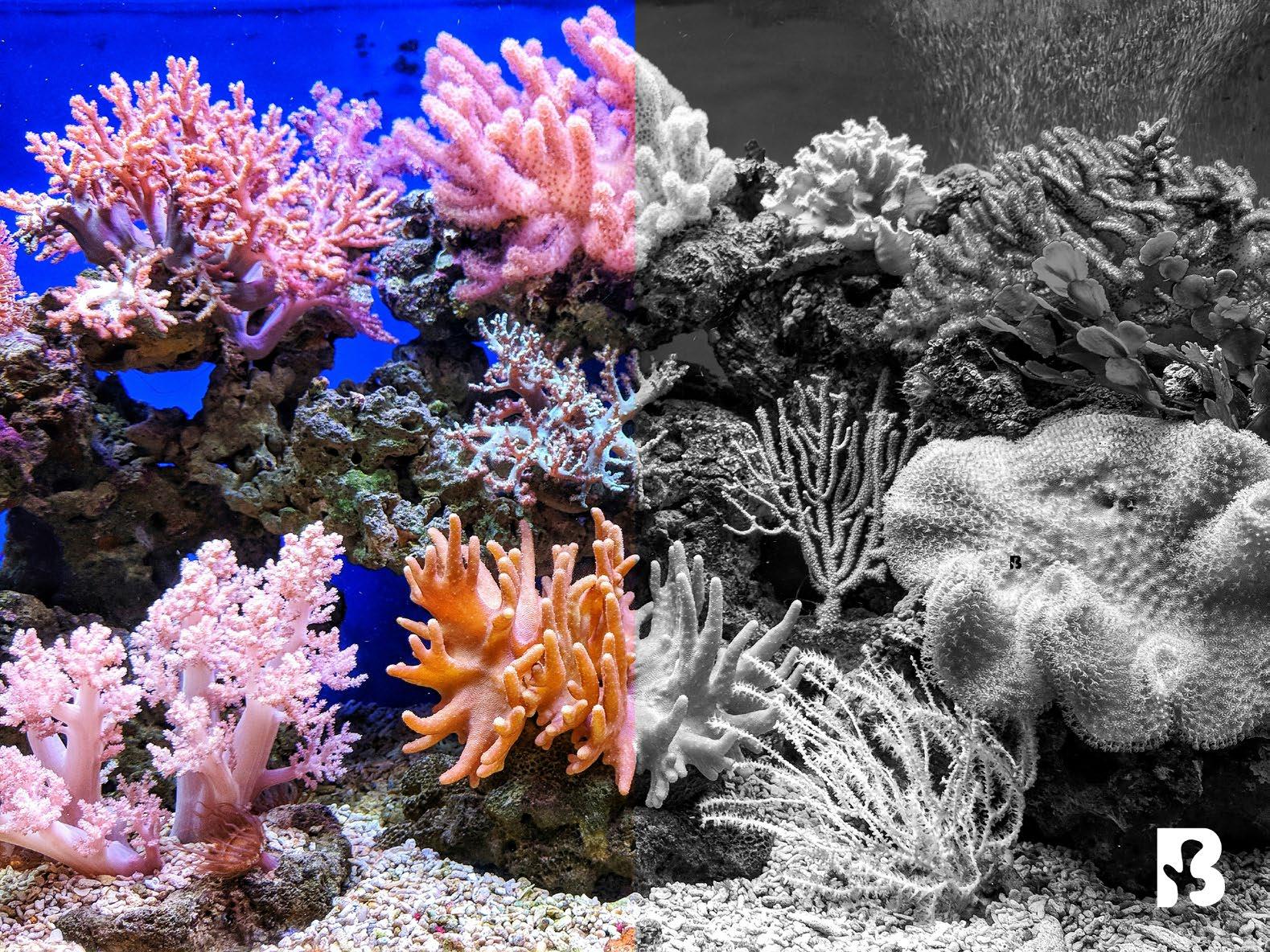
Bleaching the Barrier’s brand has the ability to pull images from other partnering brands and/or campaigns to help coordinate among all parties in conveying the brand and its message. These images should only consist of content relative to the brand’s focus.
The image style should consists of half color half black and white. The curves on the black and white portion should be applied to whiten the whites and darken the dark. This is to extend the portrayal of the bleach corals across more design elements.
The Bleaching the Barrier logomark should be 3in wide. The logomark should be positioned in the right corner of the image and be 2in away vertically and horizontally from the corner.
Bleaching the Barrier | Brand Guidelines 19

IMAGE OVERLAY
If placing text or graphic elements overtop images, the Bleaching the Barrier’s brand follows a color overlay using black, hex code #000000, at a 70% opacity over the images.
This allows for the images to still serve as backgrounds but extend the ability for text or other design elements to still be visible.
Note: Include the Breaching the Barrier logomark in the right corner following the rules from page 19 if no other Breaching the Barrier identification is on the image.
Bleaching the Barrier | Brand Guidelines 20
ADDITIONAL ELEMENTS: PATTERNS
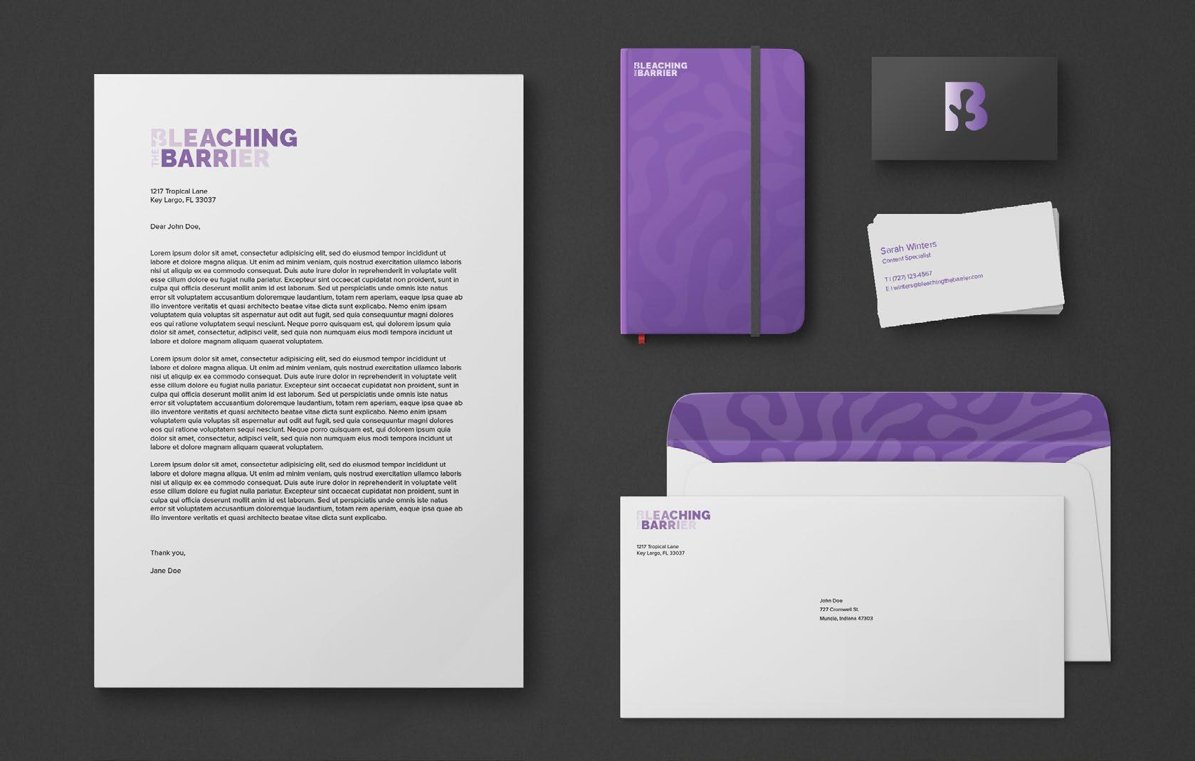
A pattern can be used as an additional element for the Breaking the Barrier brand identity. The pattern consists of organic shapes that imitate that of coral reefs. If can commonly be used as a background pattern for items such as stationery.
Bleaching the Barrier | Brand Guidelines 21
IDENTITY APPLICATION

If placing text or graphic elements overtop images, the Bleaching the Barrier’s brand follows a color overlay using black, hex code #000000, at a 70% opacity over the images.
This allows for the images to still serve as backgrounds but extend the ability for text or other design elements to still be visible.
Note: Include the Breaching the Barrier logomark in the right corner following the rules from page 19 if no other Breaching the Barrier identification is on the image.
Bleaching the Barrier | Brand Guidelines 22
BTB_PrimaryIdentity_Color.pdf
BTB_PrimaryIdentity_Color.png
BTB_PrimaryIdentity_Color.jpg
BTB_PrimaryIdentity_Black.pdf
BTB_PrimaryIdentity_Black.png
BTB_PrimaryIdentity_Black.jpg
BTB_PrimaryIdentity_Grayscale.pdf
BTB_PrimaryIdentity_Grayscale.png
BTB_PrimaryIdentity_Grayscale.jpg
IDENTITY FILES INDEX
Included on pages 23 - 24 are the following versions of the Bleaching the Barrier identity files:
• BTB Primary Identity
• BTB Logomark
Each of the versions is provided in a color/gradient, black, and grayscale option. All the files are provided in the following formats: PDF, PNG, and JPG.
Note on file format usage:
PDF are intended for use with print. They are a scalable vector format which doesn’t lose quality when printed in large or small scales.
PNG is intended for your website. It is a transparent graphic, which means that it’s not attached to any background color or flattened.
JPG is also intended mostly for online use, but they have been saved at the highest quality, providing you flexibility in its use. JPG is a flattened graphic and contains a white background.
Bleaching the Barrier | Brand Guidelines 23
BTB_Logomark_Color.pdf
BTB_Logomark _Color.png
BTB_Logomark _Color.jpg
BTB_Logomark _Black.pdf
BTB_Logomark _Black.png
BTB_Logomark _Black.jpg
BTB_Logomark _Grayscale.pdf
BTB_Logomark _Grayscale.png
BTB_Logomark _Grayscale.jpg
Bleaching the Barrier | Brand Guidelines 24


