Design Portfolio
 Payton Castleberry
Payton Castleberry
Page: 2 Pages: 21-24
RADIATE WINERY OFFSET
Pages: 3-6
Pages: 25-28
NEXT: ROBOTICS PAYTON’S TABLE
Pages: 7-12
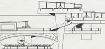
STARK PAVILION
Pages: 13-16
Page: 29-32
STATIONARY PRODUCTS Page: 33-36
ALTIUS Pages: 17-20
ABOUT ME
Page: 37-38
Interior Architecture Design Student
Contact:
Summary :
¥( 816)-588-2432
¥p castleberr y2000@gmail.com
¥O live Branch, MS 38654
Skills:
¥ Rhino/Grasshopper
¥R evit
¥A dobe Suite
¥ Enscape ¥K eyshot
¥M icrosof t Of fice
¥F urniture Design
Education:
Kansas State University
¥ Interior Architecture
¥ Expected Graduation: 05/2024
¥ Degree: Master s of Interior Architecture
¥G PA: 3.1
Kansas State University in Italy
¥S tudy abroad (Januar y - May 2023)
I am a four th-year Interior Architecture student graduating in May 2024. I am seeking an internship opport unity that will allow me to expand my knowledge of design and get professional experience, while also fulfilling my graduation requirements. I am looking forw ard to applying the skills that I have developed in school and experience design in the professional world
Experience:
Grainger Distribution Center (June 2019- August 2022)
-Inventory Control and Quality Assurance Specialist
¥ Counted inventor y to keep accuracy throughout the building
¥C orrected products with error s to maintain customer satisfaction
¥U sed warehouse machiner y to place and relocate products to maximize space
¥U tilized Microsof t programs to analyze data trends and warehouse ef ficiency
K-State Housing and Dining (August 2021- May 2022)
-Residential Assistant
¥P repared programs and activities to help students adapt to college life
¥U sed conflict resolution skills to maintain peace and comfor t for the dorm community
¥W orked with a team to create an inclusive environment for all
¥U sed crisis management skills to quickly solve problems that impact the safety of others
Af filiations:
Acted as a club representative to put events together for the college of architecture
NOMAS (National Organization of Minority Architects Student Chapter)
Serv ed as V ice President helping coordinate events to push inclusivity of diverse designers
Peer Educator Program
Mentored freshman designer s through their firs t year studio experience
Design Port folio:


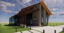
The Winery is located in Sonoma County, California. The concept behind it is “Merge”. It surrounds the idea of combining old architecture and new architecture to create a harmonic space. This idea stemmed from the fact that wine is a timeless thing. There are wines that are produced presently and fresh every day but there are also wines that have been aged for years. I abstracted this notion into the architecture to provide a blended experience for the users. There are wine connoisseurs that prefer the aged wines and there are some that prefer the new. This space is a representation of what happens when you bring them both together.


The name Radiate came from the implementation of the parti used for this project. The idea is that when you pour something in a glass with preexisting liquid in it, the first drop will cause a ripple from the center. This is how I also approached where to use the new architecture vs the old. The old was the existing structure. It was rectilinear and used heavy materials whereas the new architecture ripples or radiates from its origin point in the center of the site. The new architecture uses curvilinear forms and lightweight materials to contrast the old. The parti of this project drove the design.


The design concept for the new NEXT Robotics office, link, is a metaphor for the connection between various spaces in the work environment, creating a space that supports the diversity of all the individuals within the company.


Users will experience compression in the focus spaces and release in the social and collaborative spaces thru the manipulation of the ceiling plane. The work café, which is the most collaborative s ocial space within the office, provides the link uniting the two wings of the space.


The primary goal for NEXT in the design of their new offices is to provide a connection for all the diverse people within the office to each other through strategic placement of the social and collaborative spaces to encourage community. In addition, intentional use of materiality and form help to link the design to the history of the Seaport District of Boston, with the materiality representing the historical component while form is influenced by past and present aspects.


This project was done by me and one of my peers. It was a warm up exercise to get us thinking about design through parti and to practice working in teams. The final product was an eatery that is located right off a body of water. The site was given to us but everything else was a result of our design exploration. For the project we assigned roles. I was the lead designer and my counterpart was the contractor. The design is based on the arc reactor from Iron man. We played with height variation of the platforms to achieve different degrees of privacy. Each level has a different type of space that was necessary for the program. We based the name of it around Stark Industries which is a fictional technology company. From there, we were able to push certain design ideas that correlated with the company values.


This futuristic eatery overlooking the Pacific ocean is Stark Industries’ bold entry into the food business. Seemingly floating structures convey the forward thinking approach that is so integral to the companies mission. Drawing formal inspriation from the Arc Reactor, the beating heart of the organization, drives the spatial arrangement in this pavilion. Circulation between the masses highlights the characteristic energy flow of nuclear fusion.


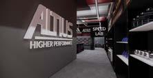
Track and field is a popular sport but there are not many stores that sell all the things you need for it. For this project I saw an opportunity to change that. Track was always something that I was passionate about which allowed me to have a lot of insight on the project. I conducted surveys to see if the target audience would be interested in a store that specialized in track and field. The results suggested that it would be a successful business. The form of items in this space were inspired by the offset of the levels of a medal stand in a track meet. I applied this thought to ceiling planes, in store furniture, and spatial arrangement elements.


My main goal for this project was to provide a special experience for the athletes that came to get equipment from there. Because track is based around individual events, I wanted to provide an experience that allowed the athlete to customize their look and equipment so that they would be unique as they are competing. This kind of an environment can really elevate the performance of an athlete. Thats how I came to call the store Altius. Altius is the latin word for higher. It comes from the Olympic Motto “Citius, Altius, Fortius” which translates to “faster, higher, stronger”. The store is so focused on elevating the confidence and performance of athletes, that I felt that Altius was the perfect name.


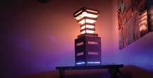
This project was about using biomimicry in lighting. After extensive research, and a few weeks of iterations, I came to produce a lamp that was based around the change of a caterpillar into a butterfly. The metamorphosis inspired the function of the design. The butterfly’s ability to emerge from the “chrysalis” to become something more bright and beautiful was why I designed the Lamp to have two variations of how it can be used. The perfect vertical symmetry of a butterfly drove the symmetry of the design. The light was intended to be a mood light aimed to be used in a residential room. The choice of opened or closed position for the lamp and the color changing options allow the user to customize the experience.


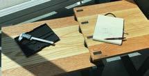
This coffee table was based on the idea of “offset”. The varying heights of the table opened up an opportunity for storage. After doing research on how people utilized coffee tables in their homes, I noticed that remotes, coasters, books, journals, etc. caused clutter on the table. This drove my desire to solve for that. I created nooks in between the supports that attach the upper table top to the bottom one.
This project allowed me to explore a lot in terms of fabrication. I used red oak wood for the entire table. To mimic the look of a steel base and structure, I used a method called “pickling” to finish the legs and connection members. A big emphasis on this table was celebrating the connections. This is done first on the table top where you see the black pieces show through to the surface. The peg connections for the attachment of the leg to the table top is also celebrated by using the color of the table top for the pegs so that they stand out in the pickled legs.


This side table design was used as a metaphor about myself. It was the first piece of furniture that I had ever designed. I decided that it would be used in the mancave in my home. That is what inspired the color. The form however was an abstraction of the logo I had designed for myself. In a profile view of the side of the table, You can make out a backwards “C” then a “P” followed by a correctly oriented “C”. Those are my initials. The dimensions of the table top were selected so that you could place a Lego base plate on them to easily display Lego creations. Legos have always been a part of my life so I wanted to carry them into this project. The underside of the table has a lego brick design on it.


I was often asked why I put such a cool and intricate detail on the bottom where no one could see. There are two answers to that. Primarily, I did not want to disrupt the functionality of the table top so that it could potentially be used by others. The second reason was to convey the metaphor about myself which is as follows: The best parts about people are not always seen at first glance. Sometimes the greatest qualities in a person lie beneath the surface.


For this collection of products, I had a client who needed a set of stationary products that fit the needs of their work style and desk environment. My client had a prominent interest in superheroes. Iron man was their favorite and all the decorations in the room in which their desk existed reflected that. I found inspiration in the arc reactor from the iron man story. It is the part of him that he can’t function without. Similarly, the user cannot function efficiently without the items of this collection. The collection includes a phone stand, multiple pen, pencil and marker holders, and a task/mood lamp. The triangular form is derived from the geometry of the Arc Reactor. The collection can exist as separate items or as joined members depending on the needs of the user.


I am from Lee’s Summit, Missouri. I have had a passion for design since I was kid. My creativity began to flow the moment that a lego brick entered my hand. I love the ability to build whatever comes to mind and doing so without limits.
I love sports. I played football and ran track all through high school. The sports that I played have had a crucial impact on me. They taught me discipline and consistency.


I spend my free time with friends. I find great joy in the connections that I make with others. I have made countless friends from all over the place and those relationships are priceless to me.


Interior Architecture | Payton


