MODERN MASTERS
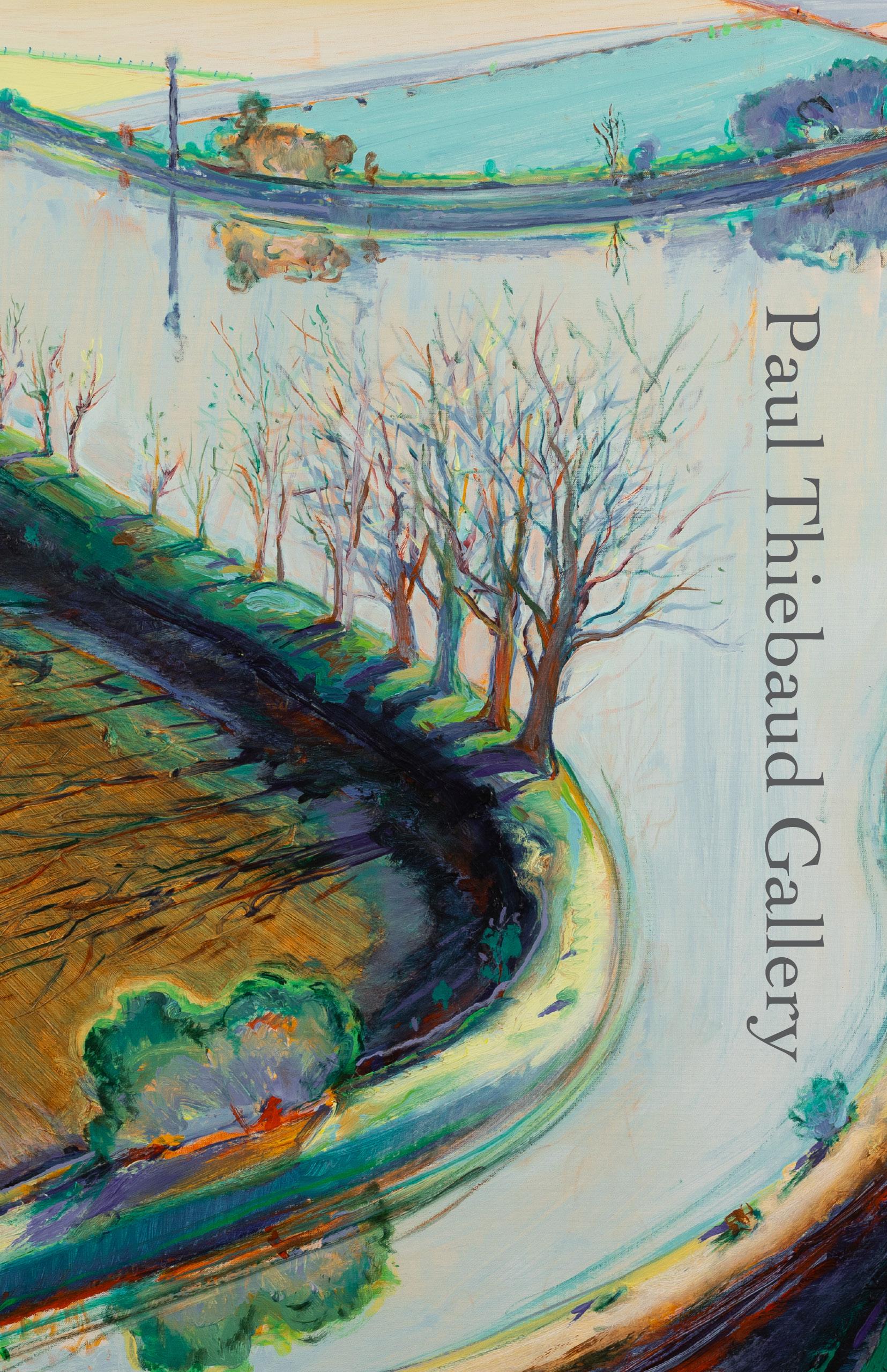
Cover: Wayne Thiebaud, River Bend with Trees (detail), 1997
Rear Cover: Richard Diebenkorn, Berkeley #9 (detail),
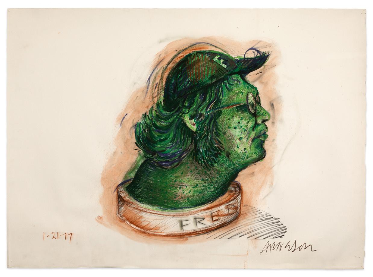
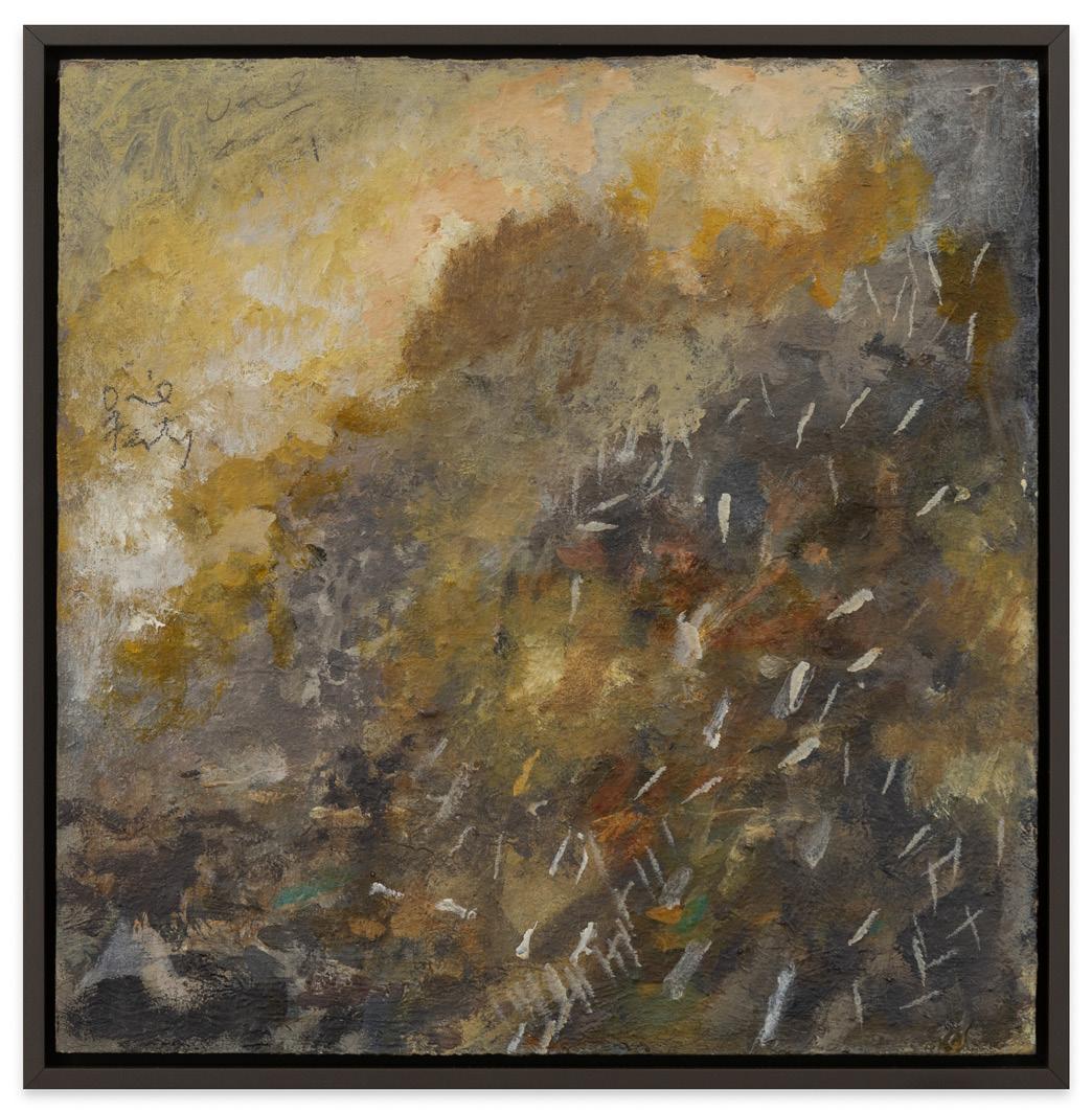
Among the most important of Arneson’s series from the last decade of his life is the Jackson Pollock series. Comprising 97 works, Arneson explored Pollock’s life and image as a way to delve deeply into the heroic and tragic notions of an “artist.” Among the works created were a small group of Pollock portrait drawings, of which Jackson (1982) is one of the finest, with its layered brushwork conveying the deep emotional conflict of this iconic American Artist.
Robert Arneson (1930-1992) is an internationally recognized and celebrated American sculptor. His works have been exhibited around the world and can be found in numerous public collections, including Aichi Prefectural Ceramic Museum, Aichi, Japan; Museum of Modern Art, Shiga, Japan; National Museum of Modern Art, Kyoto, Japan; Museum of Fine Arts, Budapest, Hungary; National Gallery of Australia, Parkes Australia; Stedelijk Museum, Amsterdam, Netherlands; The Guggenheim Museum and Foundation, New York, NY; The Metropolitan Museum of Art, NY; The Museum of Modern Art, NY; Whitney Museum of American Art, NY; San Francisco Museum of Modern Art, CA; Los Angeles County Museum of Art; and the Art Institute of Chicago, IL, among many others.
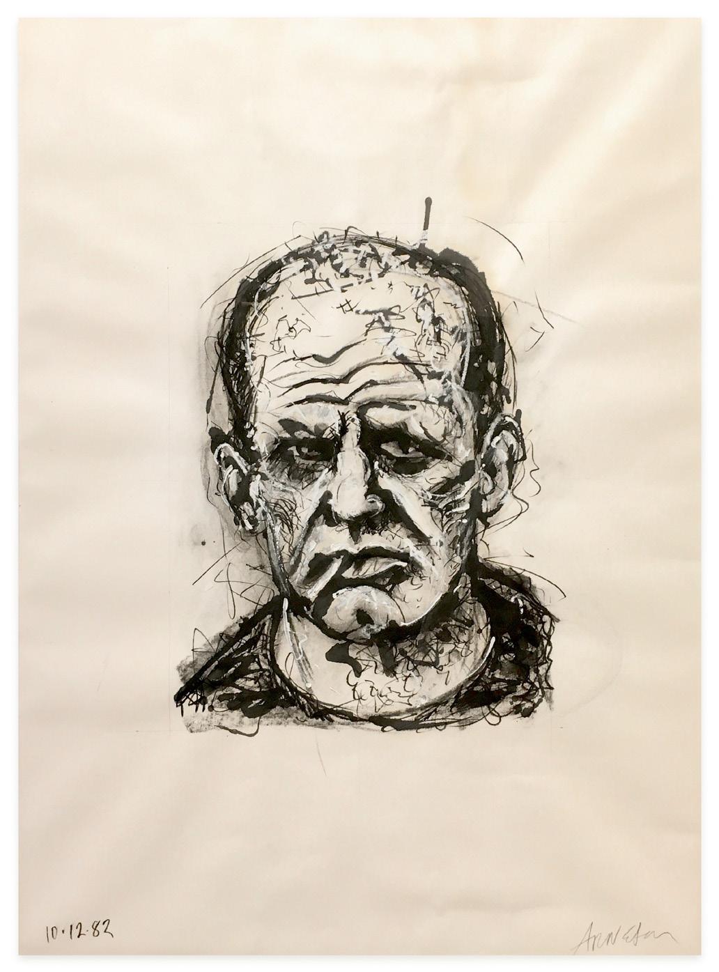
Robert Arneson, Jackson, 1982 oil, acrylic, and alkyd on paper, 27 x 37 inches
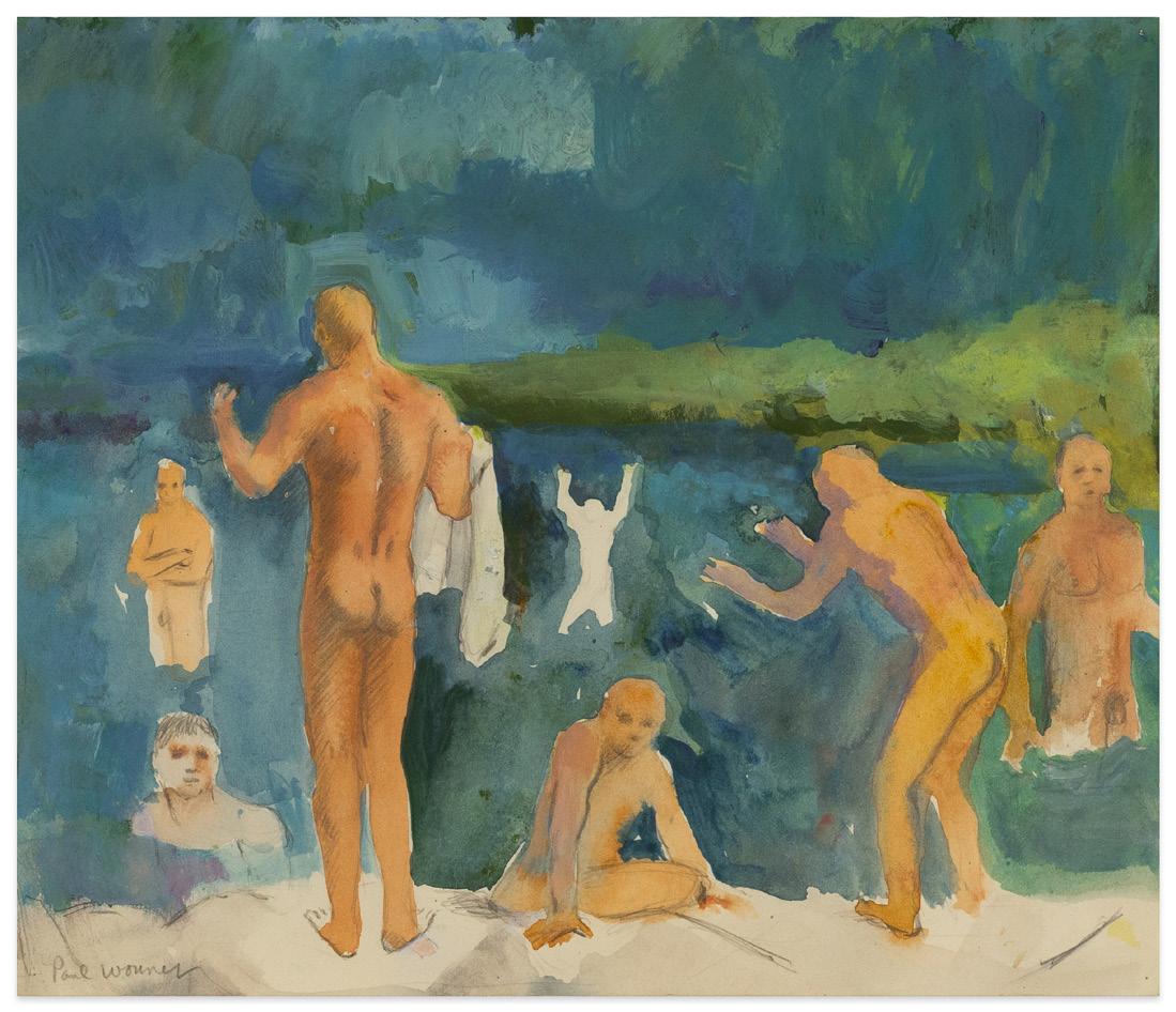
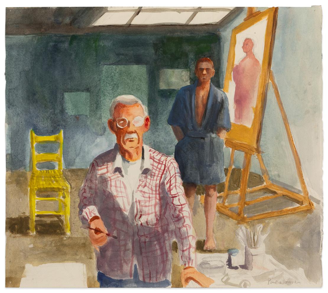
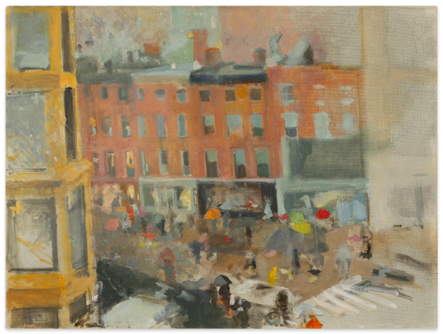
William Theophilus Brown and Paul Wonner
Partners in life as well as in art, William Theophilus Brown and Paul Wonner met in 1952 while attending University of California, Berkeley, for graduate studies and remained not only together until Wonner’s passing in 2008, but were open about their relationship with others from almost the very beginning.
While both artists styles evolved over the decades, early on both found currency in the abstracted realism that emerged from David Park’s studio in 1950 and was later picked up by Elmer Bischoff, Richard Diebenkorn, Bruce McGaw, James Weeks, Walter Snelgrove, Joan Brown, Manuel Neri, and others. William Theophilus Brown and Paul Wonner were both included in the landmark Contemporary Bay Area Figurative Painting exhibition curated by Paul Mills at the Oakland Art Museum in 1957 with all of the aforementioned artists except for Manuel Neri and Joan Brown. With that exhibition behind them, Brown and Wonner’s careers took off and remained steady for the rest of their lives.
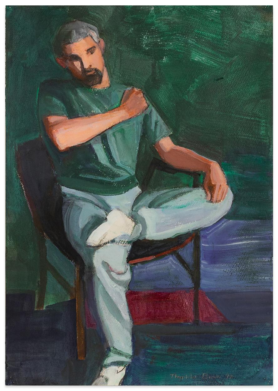
William T. Brown, Jamie Seated (Green Background), 1997 acrylic, oil on canvas, 14 x 9 3/4 inches
Jaime Seated (Green Background) (1997) and Two Artists with Model (2009) are iconic subjects from final decades of Brown’s output. Jaime Yates, a close friend to both Brown and Wonner, sat for Brown numerous times in the late 1990’s, after he was released from the U.S. Navy. From the 1950s onward, regardless of where they were living Brown and Wonner maintained an active life drawing group that their artist friends participated in, which over time included many well-known and famous painters, including Wayne Thiebaud and Richard Diebenkorn. Brown would often draw and paint scenes from these sessions, like Two Artists with Model, 2009, or scenes of himself painting a model in his own studio.
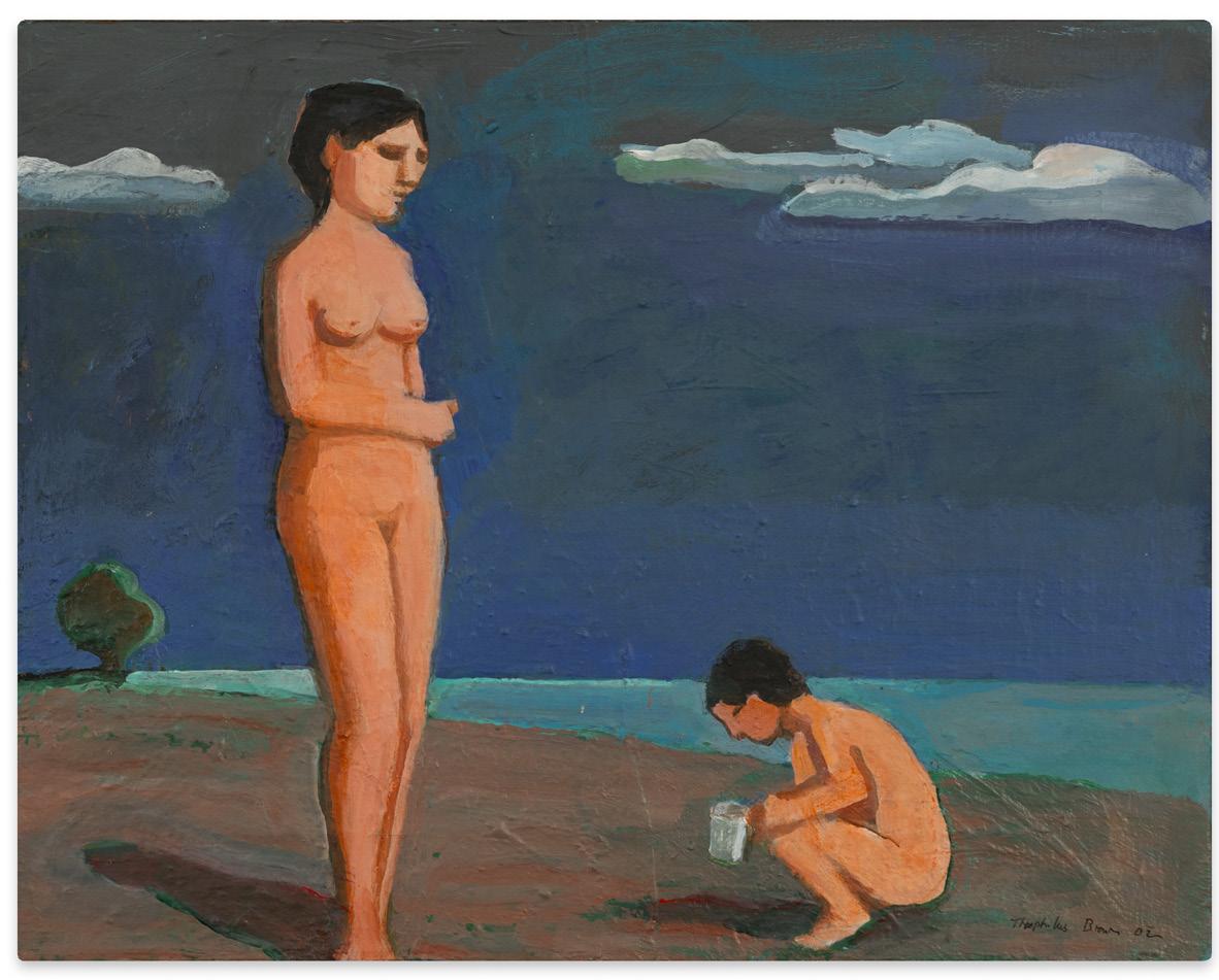
Wonner, too, would paint similar scenes of a model in his studio in the early 2000’s, as seen in Youth and Old Age, 2001. Another favorite subject, Bathers After Cezanne (2002) is an excellent example from a series of works
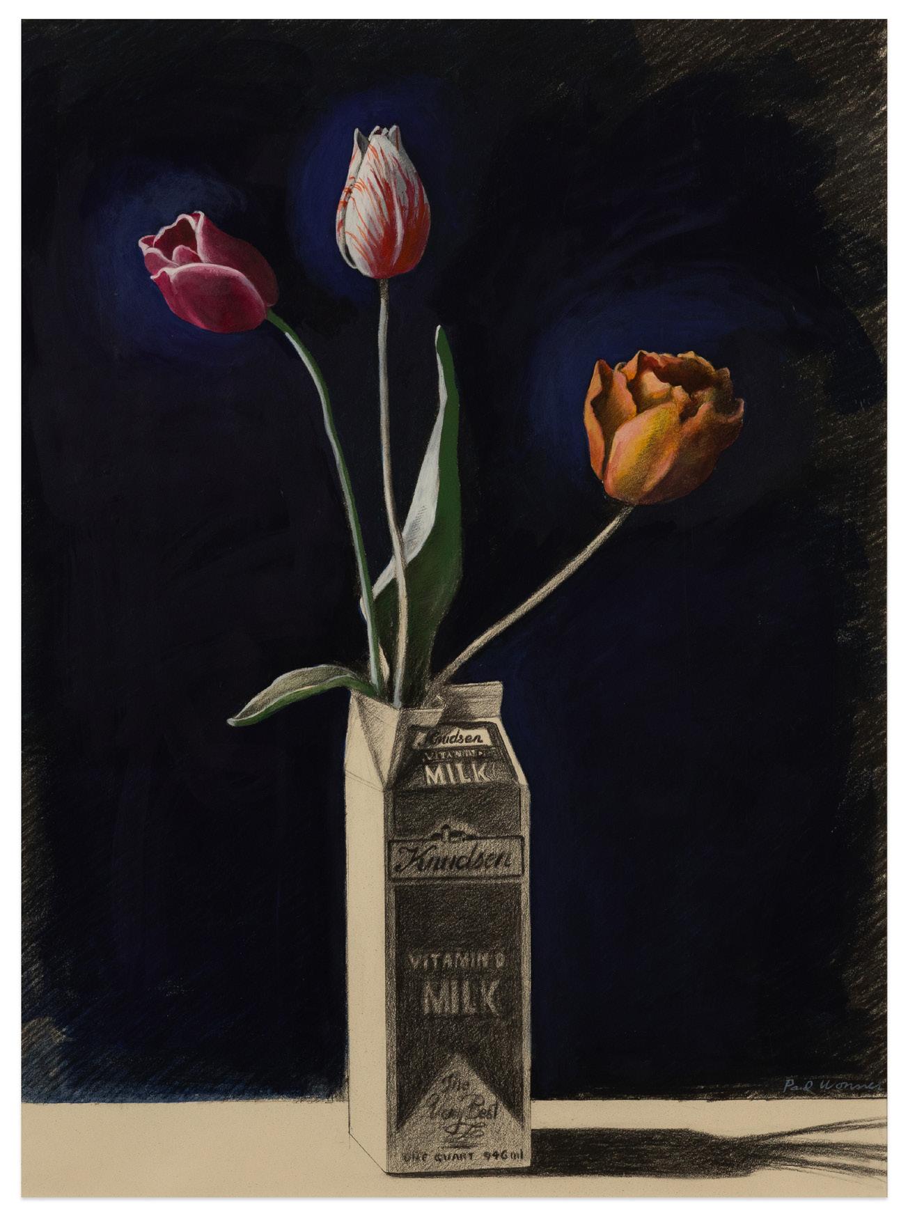
Paul Wonner, Tulips in Milk Carton, n.d.
acrylic and watercolor on paper, 25 x 18 1/2 inches
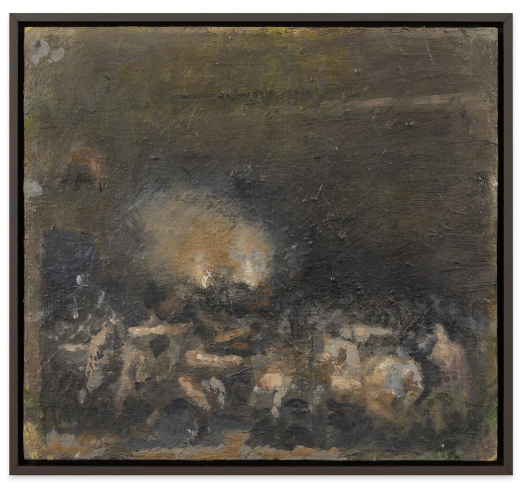
inspired by the late 19th century post-impressionist master. In the late 1970’s, Wonner transitioned his style to a precise realism and began a large series of complex still life paintings inspired by 17th century Dutch still life’s. Carton of Olives (1992), and Tulips in Milk Carton (n.d.), are intimately scaled works from this series, capturing Wonners delicate handling of light, color, and form.
Paul Wonner (1920-2008) grew up in Tucson, AZ, and earned a Bachelors in Art Education from the California Collage of Arts and Crafts, Oakland (now California College of the Arts, San Francisco), and Masters degrees in Art and in Liberal Science from the University of California, Berkeley. William Theophilus Brown (1919-2012) grew up in Moline, IL, and earned a Bachelor of Arts in music from Yale University and a Masters of Arts from the University of California, Berkeley. The works of William Theophilus Brown and Paul Wonner have been exhibited internationally and can be variously found in the collections of The Museum of Modern Art, NY; The Metropolitan Museum of Art, NY; Whitney Museum of American Art, NY; Solomon R. Guggenheim Museum, NY; National Gallery of Art, Washington D.C.; Smithsonian American Art Museum, Washington D.C.; Hirshhorn Museum and Sculpture Garden, Washington D.C.; Museum of Fine Arts, Houston, TX; San Francisco Museum of Modern Art; Oakland Museum of California; Berkeley Art Museum and Pacific Film Archive, UC Berkeley; Crocker Art Museum, Sacramento, CA; San Jose Museum of Art, CA; Iris B. Gerald Cantor Arts Center at Stanford University, and many others.
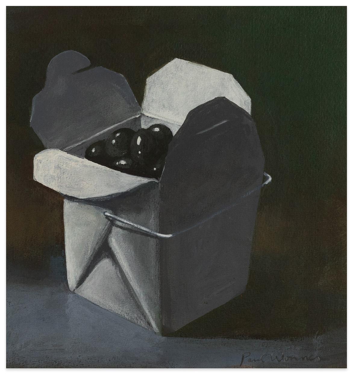
Paul Wonner, Carton of Olives, 1992 acrylic on paper, 8 1/2 x 8 inches
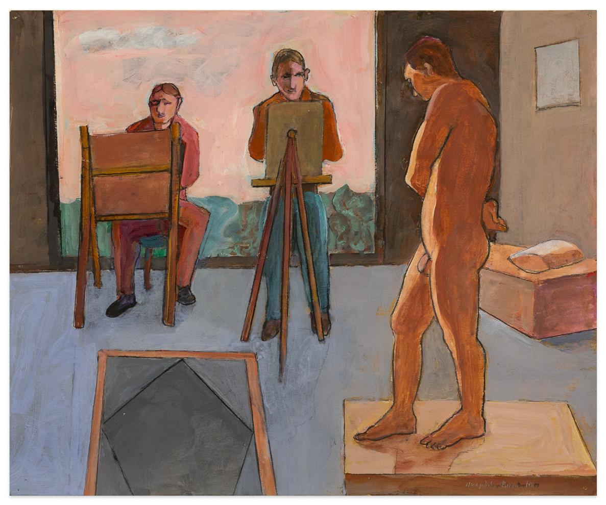
William T. Brown, Two Artists with Model, 2009 acrylic and pencil on paper, 13 7/8 x 16 7/8 inches
William T. Brown, Untitled (Nudes with Tree)(Woman and Child), 2002
acrylic on canvas, 11 x 14 inches
Paul Wonner, Youth and Old Age, 2001
acrylic on paper, 14 1/2 x 16 5/8 inches
Paul Wonner, Bathers after Cezanne, 2002
acrylic and pencil on paper, 12 x 13 3/4 inches

Richard Diebenkorn

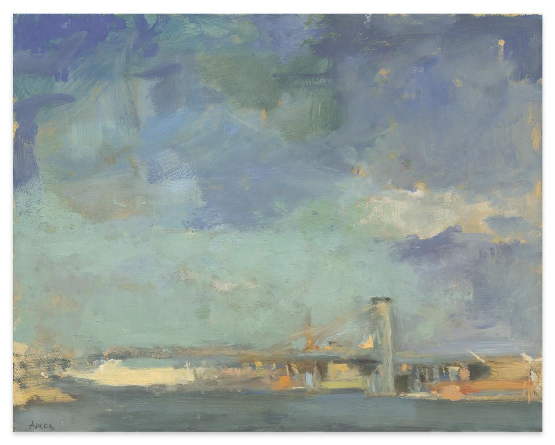
Among the best-known 20th century painters from Northern California, Richard Diebenkorn (1922-1993) rose to prominence in the 1950’s with his first mature forays into abstract painting. The three major series of this period – Albuquerque, Urbana, and Berkeley – reflected both his embrace of the ideas of New York critics and theorists Clement Greenberg and Harold Rosenberg: but also a rejection of the ideological purity and doctrinaire environment it had produced at the California School of Fine Arts (later known as the San Francisco Art Institute) during his time there as a student and teacher between 1947-1949. On arriving at the University of New Mexico in Albuquerque, where he had enrolled in the MFA program, Diebenkorn found a completely different atmosphere to the one he had just left: “things started to come together for me there. It was a very good situation for me, because there was more of this fear of painting…”1
Each time Diebenkorn moved during his career, his work changed dramatically to reflect his environment. Importantly, it was during these years that Diebenkorn solidified his path
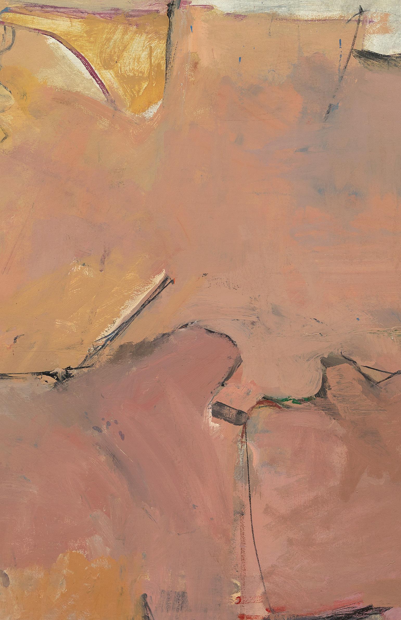
Richard Diebenkorn, Berkeley #9, 1953 oil on canvas mounted on canvas with paper interleaf, 32 5/8 x 38 7/8 inches
through abstraction as one both structurally and chromatically derived from landscape. The Albuquerque paintings display a muted range of desert tones – whites, greys, bleached pinks, and pale yellows – indicative of the rugged terrain of New Mexico. After a brief sojourn to teach at the University of Illinois, at Urbana, for the 1952-1953 academic year, Diebenkorn returned to Berkeley, where he would remain for well over a decade.
At first, the paintings Diebenkorn painted returned to the palette of his Albuquerque series. Berkeley #9 is among those early canvases representing a crucial transition period in the artist’s work. Employing one of his last uses of the dusky, earth-toned palette, the open calligraphic line work in Berkeley #9 (1953) is sparer and has evolved to sit astride reference to arial landscape views and an ambiguous interior space. The Berkeley series abstract paintings would continue to evolve over the next few years, until his shift to what has become known as Bay Area Figuration in 1955.
Diebenkorn would paint in the figurative mode until his move to Santa Monica, CA in 1966, where he began his famous Ocean Park series. Untitled (Ocean Park), (1973) is a quintessential example of his works on paper from this period. Rendered in deep purples and muted greens, Diebenkorn divided the composition using the horizontal, vertical, and diagonal bands inflected with organic touches that are the landmark of his Ocean Park series.
Richard Diebenkorn’s paintings drawings, and prints have been exhibited across the globe and can be found in the collections of The Metropolitan Museum of Art, NY; The Museum of Modern Art, NY; Whitney Museum of American Art, NY; Solomon R. Guggenheim Museum, NY; Smithsonian American Art Museum, Washington, D.C.; The Phillips Collection, Washington, D.C.; San Francisco Museum of Modern Art, CA; Art Institute of Chicago, IL; Fine Arts Museums of San Francisco, CA; Los Angeles County Museum of Art, CA; Museum of Contemporary Art, Los Angeles, CA; and many others.

Richard Diebenkorn, Untitled (Ocean Park), 1973 gouache and pencil on paper, 16 9/16 x 13 5/8 inches
1 Susan Larsen, tape-recorded interview with Richard Diebenkorn, May 1, 2, and 7, 1985, and December 15, 1985, transcript, Archives of American Art, Smithsonian institution, Washington, D. C., pg. 3.
Robert Hudson
Singled out for his first solo exhibition at San Francisco’s Batman Gallery in 1961, while still a student at the California School of the Arts (later known as San Francisco Art Institute), Robert Hudson has built a national reputation over the past 60+ years for his polychromed, welded steel sculptures. Alongside his steel works, paintings, and drawings, Hudson is equally praised for his glazed porcelain sculptures made from cast found objects, his paintings, and drawings.
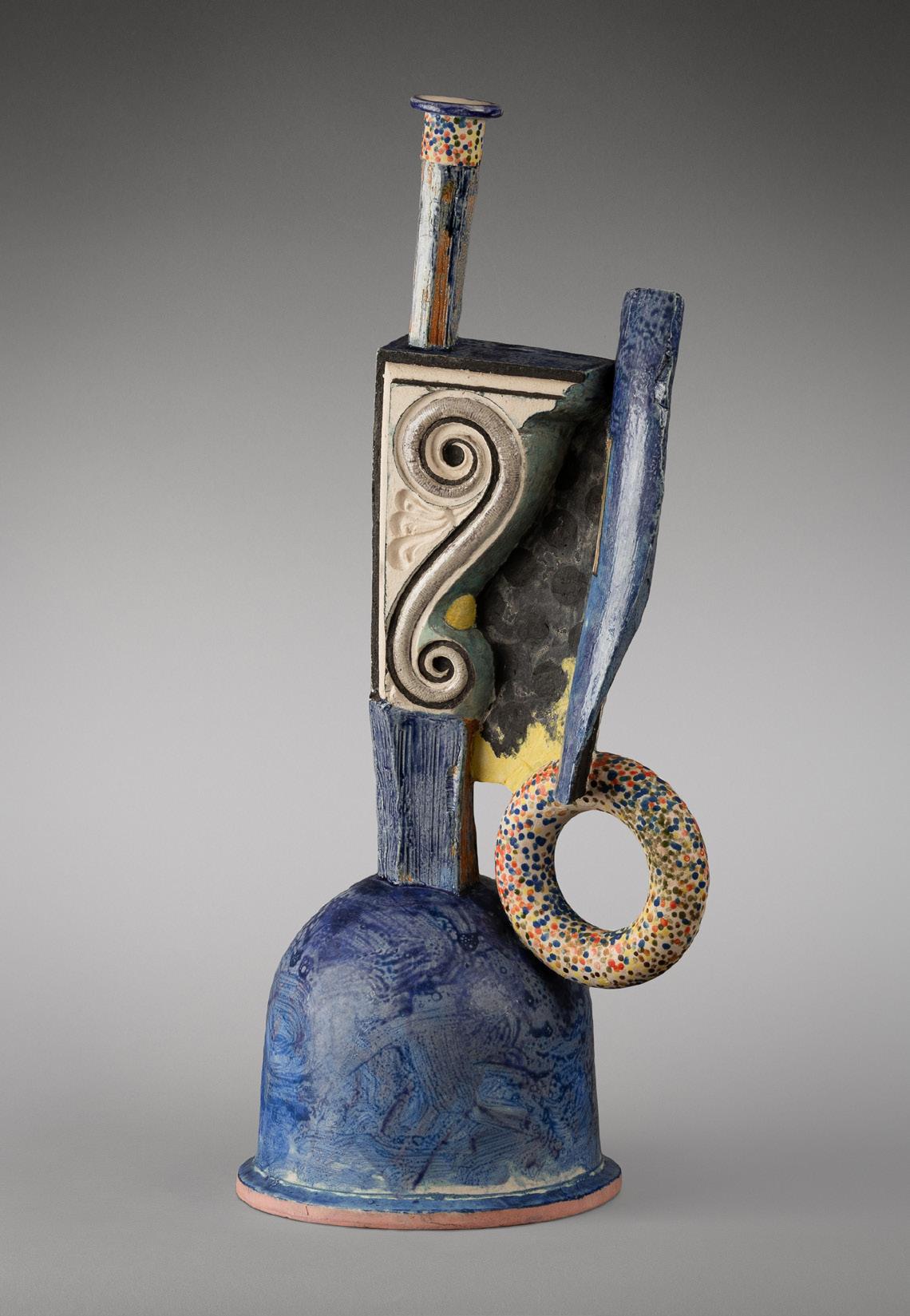
Beginning in the fall of 1971, Hudson joined his friend Richard Shaw at his studio at Stinson Beach, CA, to begin his first forays into using porcelain. Following the mode of working he had established in steel, Hudson began casting found objects such as bottles, sticks, duck decoys, pen knives, drinking tumblers, rocks, fluted jars, balls, crookneck squash, and donut shapes for molds. He then poured porcelain slip into the molds to create the components that were later assembled into the final sculpture. Though they were working in the same studio and from the same molds, Shaw’s and Hudson’s works were distinct from each other in conception and realization. Hudson’s works are much more abstract in execution and feature surface embellishments including illusionistic paintings, creating a dynamic tension between form, void, and illusion. They also focus on combining natural forms with man-made ones to create a unique hybrid form within the history of abstract sculpture, generally, and especially in the history of ceramic sculpture.
While this early intensive period of ceramic work only lasted until 1974, Hudson would return to the medium in the following decades find out what else it had to offer. Bottle with Weed, (2000) is from a period of work created thirty years after the first. While many years separate the first group of works from later pieces, Hudson’s arrangement of forms and choice of glazing is consistent in style, even as his oeuvre has evolved.
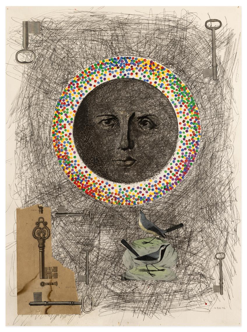
Alongside his assembled sculptures and ceramics, Hudson has been a prolific drawer throughout his career, apply the same ethos to collage and mark making as he did in sculpture. Untitled (Drawing), (2006), is a prime example of Hudson’s drawings from the last twenty years. The central moon shape with a face is surrounded by a halo painted in Hudson’s signature motif of layered multicolored dots of paint. Around these he has created a field of black lines onto which he has collaged found imagery, including a bird. Combining these elements together, Hudson achieves a deft synthesis of forms into a pictorial whole.
Robert Hudson’s works have been exhibited extensively across the United States and can be found in the collections of the Stedelijk Museum, Amsterdam, The Netherlands; The Museum of Modern Art, New York,
Robert Hudson, Untitled, 2006 ink, acrylic, and collage on paper, 30 x 22 1/2 inches
Robert Hudson, Bottle with Weed, 2000 glazed porcelain, 21 x 7 1/2 x 9 1/2 inches
NY; Whitney Museum of American Art, New York, NY; Smithsonian American Art Museum, Washington, D.C.; Hirshhorn Museum And Sculpture Garden, Washington, D.C.; National Gallery of Art, Washington, D.C.; San Francisco Museum of Modern Art, San Francisco, CA; Fine Arts Museums of San Francisco, CA; Art Institute of Chicago, Chicago, IL; and many others.
Robert M. Kulicke
Celebrated as one of the most influential and generationally defining frame designers of the 20th century, Robert M. Kulicke (1924-2007) was also a highly accomplished painter of still life’s – “The Morandi of Manhattan.” The son and brother of design engineers, Kulicke studied art in high school and advertising design at the Philadelphia College of Art. After WWII, he went to Paris and studied in the atelier of Fernand Léger but was turned off by the artist’s emphasis on large-scale, bold compositions. During his stay, he also apprenticed to several framers. It wasn’t until 1957, after his return to New York and establishment of his own frame shop, that Kulicke was inspired to return to painting. The precipitant event was the delivery of 300 paintings by Giorgio Morandi from the World House art gallery. Seeing these works, Kulicke got the confidence to work at small scale.
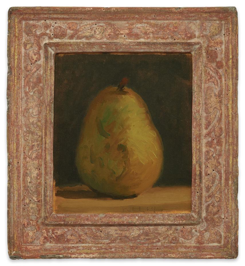
The results are intimate views of flowers, fruits, and the occasional land or seascape. Pear and Apple Against a Black Background (1957) is a signature early work made not long after his encounter with Morandi. Painted in short strokes of thinned oils, Kulicke’s brushwork in the background creates a rhythm of movement highlighting the expressively rendered pear and apple subjects. Two Pears and a Lemon on a Brown Surface Against a Black Background (n.d.) exemplifies the stylistic evolution of Kulicke’s paint handling. Here, Kulicke’s paint strokes merge into definable shapes and forms, while still maintaining their presence. The background, now a solid form, highlights the play of light and shadow across the table, pears and lemon. The same can be said about Pear on a Brown Surface Against a Black Background, from 1964. All three paintings have Kulicke’s signature carved frames with aged detailing. His skills as a framer and as a painter secured his position in the art world as an important artist to be remembered.
Robert Kulicke’s works have been exhibited across the United States and can be found in the public collections of The Metropolitan Museum of Art, NY; The Victoria & Albert Museum, London, United Kingdom; Hirshhorn Museum and Sculpture Garden, Washington, D.C.; Whitney Museum of American Art, NY; Albright-Know Art Gallery, Buffalo, NY; Newark Museum, Newark, NJ; Oklahoma City Museum of Art, OK; Neuberger Museum of Art, SUNY Purchase, Purchase, NY; and in many private collections.
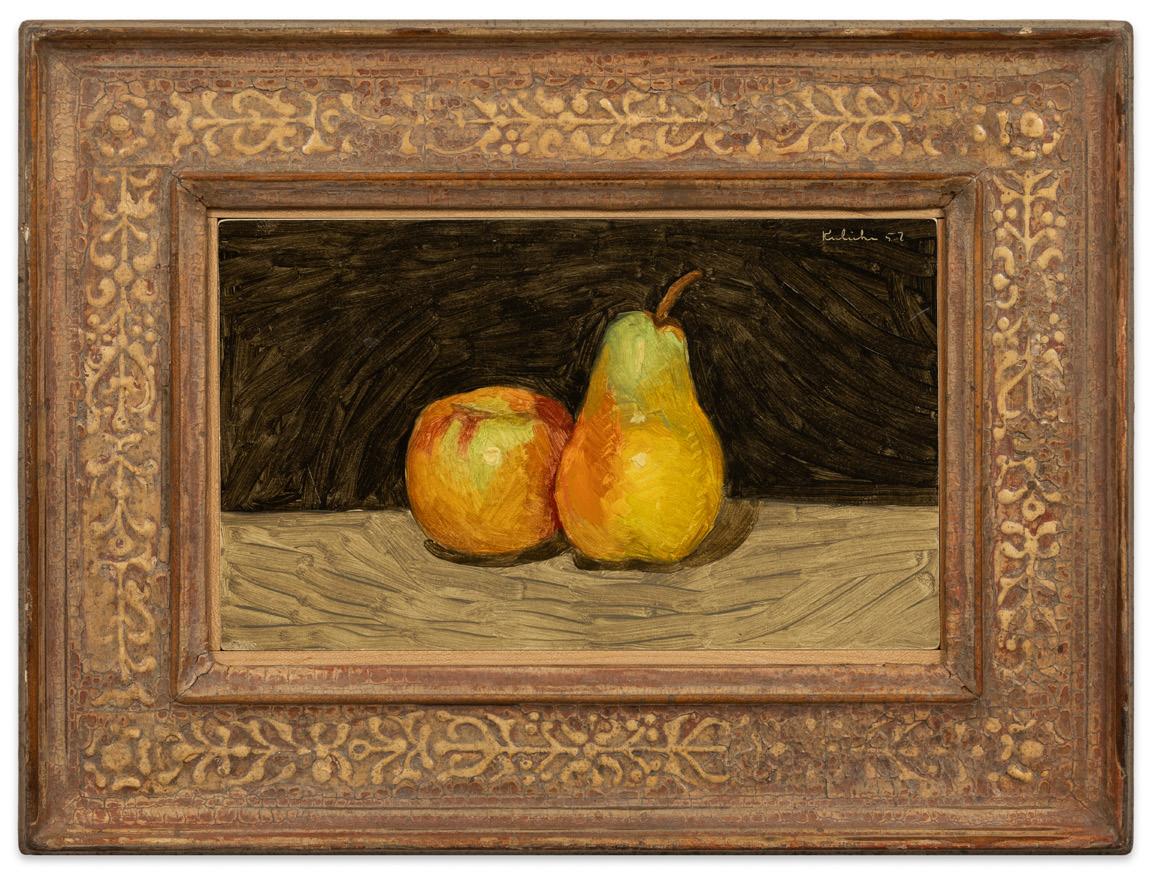
Robert M. Kulicke, Pear and Apple Against a Black Background, 1957 oil on cardboard, frame: 10 1/2 x 14 inches
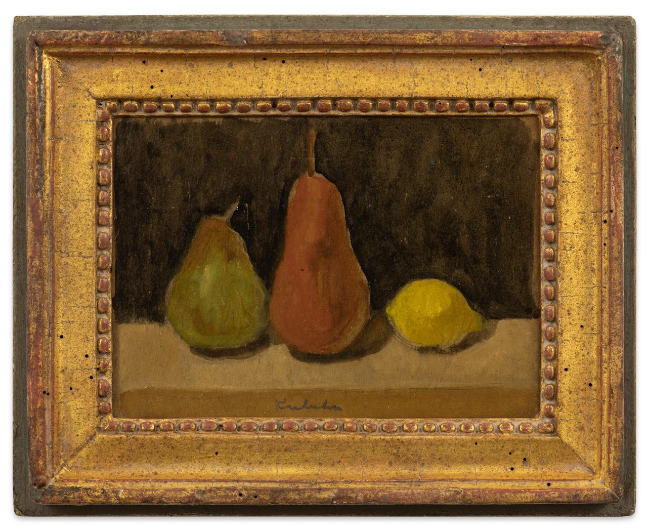
Robert M. Kulicke, Two Pears and a Lemon on a Brown Surface Against a Black Background, n.d. oil on cardboard, frame: 9 3/4 x 12 3/8 inches
Robert M. Kulicke, Pear on Brown Surface Against a Black Background, 1964 oil on silk mounted on paper, frame: 11 1/16 x 9 13/16 inches
Arthur Okamura
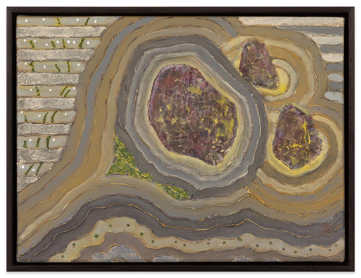
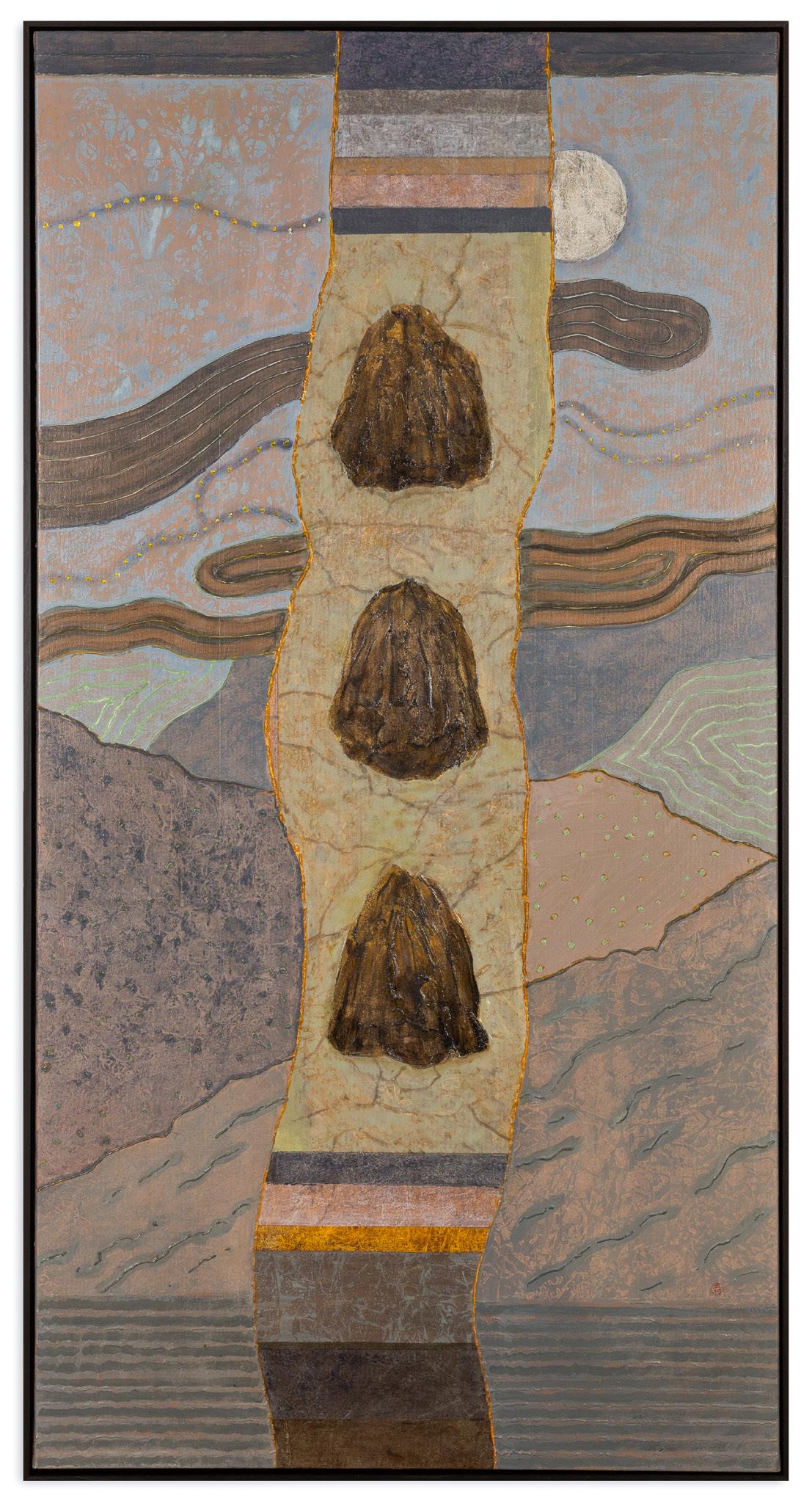
Primarily known as a painter, Arthur Okamura (1932-2009) was an important Japanese American (Nisei) artist from the San Francisco Bay Area who also became known for his drawings, watercolors, printmaking, and illustrations for books of poetry. A longtime lover of gardens and nature, Arthur Okamura began painting rocks in the early 1970s and returned to the subject repeatedly until shortly before his death in 2009.
The compositions of Okamura’s Rock Study Series from approximately 2006-2009 each contain arrangements of three stones surrounded by fields of loose concentric lines that recall the raked patterns in Japanese sand gardens. Okamura’s building up of the paint into articulated ridgelines both conveys a sense of energy emanating from the stones, while also lending a surreal aspect to each work. While Okamura never revealed the possible meanings behind his paintings, rocks in Asian gardens can have various, and simultaneous, meanings – islands, mountains, a source of natural power, and/or the figure of Buddha itself, to name a few. While Okamura’s rock studies borrow their structure from Zen rock gardens, the compositions do not represent any specific real-life garden. In that way, they move into a timeless, eternal realm that allows for deep meditative contemplation.
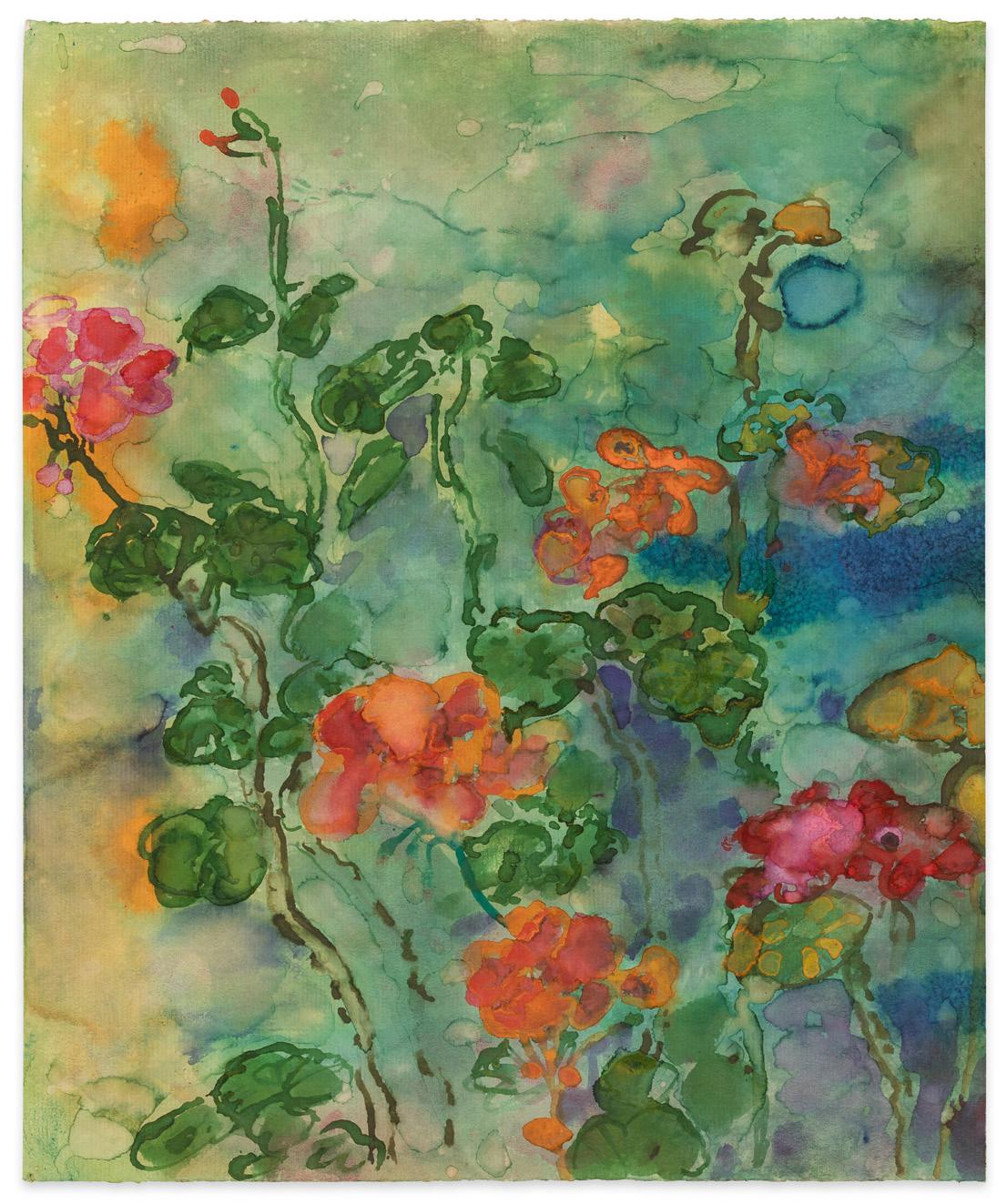
Okamura was also a master watercolor painter, which he began using as early as the 1950s. In the mid-late 1960s he used the medium to create numerous botanical studies, among these being Untitled (Orange and Pink Flowers), c. 1967. Instead of using tight control of the medium to render his subject, Okamura has used the wet-on-wet method with its loose and unpredictable nature. The effect is one of revelation for the transitory nature of light and our perception of the world around us.
Born in Long Beach, CA, in 1932, Arthur Shinji Okamura grew up in the city of Compton, a part of greater Los Angeles. During WWII, Okamura and his family were first moved to the Santa Anita Racetrack Assembly Center and later sent to the Amache Internment Camp near Granada, CO. When the war ended, Okamura’s family moved to Chicago. Between 1950-1954,
Arthur Okamura, Rock Series #6, 2009 acrylic on canvas, 12 x 16 inches
Arthur Okamura, Rock Study #3, 2008
acrylic on canvas, 55 x 27 1/2 inches
14 15/16 inches
Okamura studied painting at the School of the Art Institute of Chicago. He also took classes at the University of Chicago and a summer seminar at Yale University. While still a student, Okamura had his first solo exhibition of paintings at Chicago’s Frank Ryan Gallery in 1953. After moving to San Francisco with his young family in 1956, and later up the coast to Bolinas in 1959, Okamura began studying Zen Buddhism under master Shunryu Suzuki Roshi at the San Francisco Zen Center. Okamura also began teaching in the early 1960s, which eventually led to his tenure at the California College of Arts and Crafts (now California College of the Arts) from 1966-1997. Arthur Okamura died in 2009 at the age of 77.
Arthur Okamura’s paintings, drawings, watercolors, and prints have been exhibited extensively across the United States and can be found in the collections of the Whitney Museum of American Art; SFMOMA; Smithsonian American Art Museum; Hirshhorn Museum and Sculpture Garden; Art Institute of Chicago; Fine Arts Museums of San Francisco; Denver Art Museum; Phoenix Art Museum; Cincinnati Art Museum; Oakland Museum of California; San Jose Museum of Art; Crocker Art Museum; di Rosa Center for Contemporary Art; Bolinas Museum, and the Iris & B. Gerald Cantor Arts Center at Stanford University, among others.
Arthur Okamura, Untitled (Orange and Pink Flowers), c. 1967 watercolor on paper, 18 x
Wayne Thiebaud
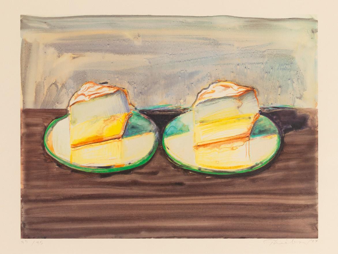
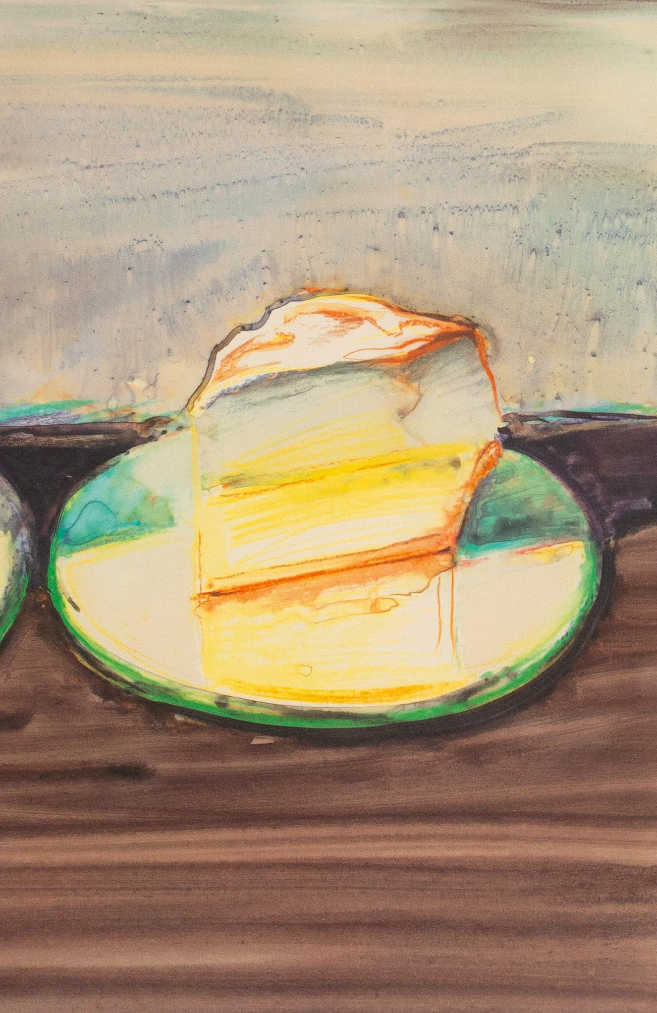
Internationally celebrated for his paintings, drawings, and prints of cakes, candies, people, cityscapes, riverscapes, and clowns, Wayne Thiebaud (1920-2021) was a prolific artist whose works have been collected across the globe. Beginning in 1960-1961, Thiebaud began painting cakes and pies in his mature style, with its tilted foreshortening of pictorial space and bright color palette. The following year, he had his landmark solo exhibition at Allan Stone Gallery in New York, with the result that his work was grouped with the other Pop artists of the period, even though he never considered himself to be one. With the success of the show, Thiebaud’s career took off and continued to soar until his death in 2021. Not long after this initial success, Thiebaud partnered with printmaker Kathan Brown (future founder of Crown Point Press) to create a series of 17 etchings called the Delights. Printed in 1964, among the subjects Thiebaud rendered are Double Deckers and Cake Window.
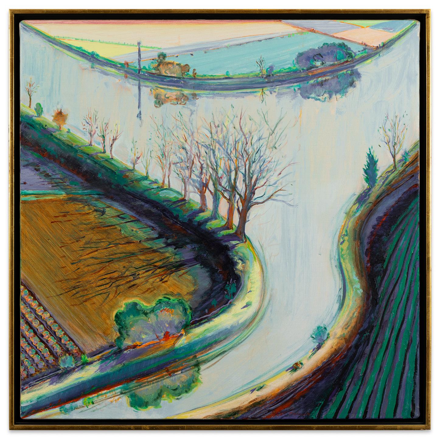
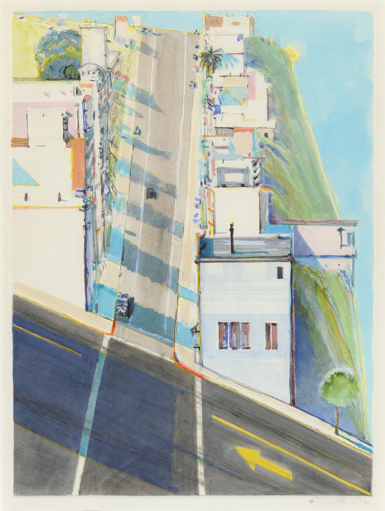
Wayne Thiebaud, River Bend with Trees, 1997 oil on canvas, 30 1/4 x 30 inches
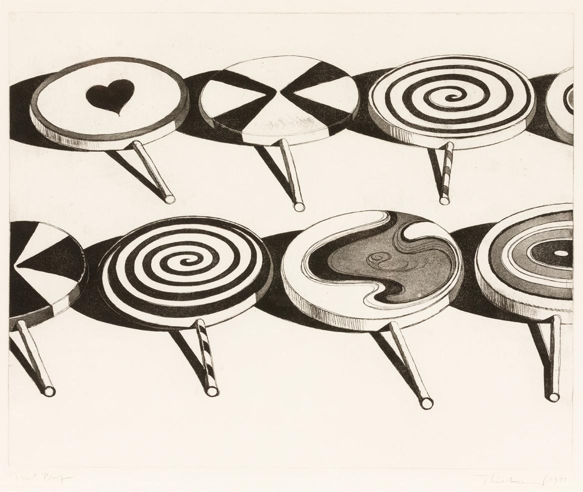
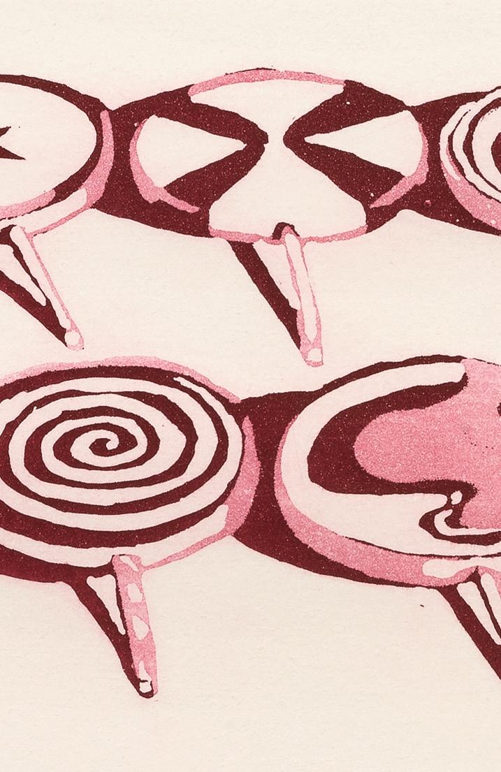
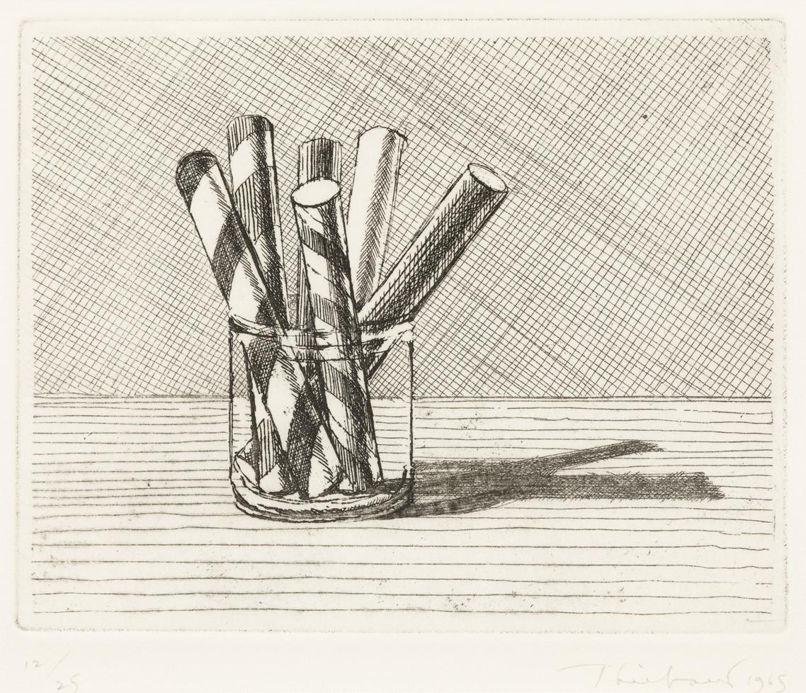
A closely related work from 1965 is Glassed Candy. Each of these works highlight Thiebaud’s superb draftsmanship and mastery of the etching process. Two works of similar subject matter from 1971 – Black and White Suckers and Little Red Suckers – reveal Thiebaud’s continued investigation of vernacular subject matter to see how it responded to nuanced aesthetic choices. Thiebaud also explored other methods of printmaking including lithography and monotypes. Two Meringues from 2004 is a signature example of Thiebaud’s mastery of lithography. Of special note among his lithographs is Paint Cans from 1990. Among the largest prints Thiebaud ever made, Paint Cans was commissioned to celebrate the tenth anniversary of the Chicago International Art Exposition in 1990. Among his monotypes, Ripley Ridge is a unique cityscape masterpiece. After completing the initial printing of Ripley Ridge, Thiebaud went back into the work and added layers of watercolor by hand onto a significant portion of the print.
The standout work among the Thiebaud’s being presented, River Bend with Trees, is a landmark work with a historic past. Painted in 1997, River Bend with Trees was among the paintings included in the exhibition Wayne Thiebaud: Landscapes at San Francisco’s CampbellThiebaud Gallery in November of the same year. This key exhibition marked the formalization of landscapes by Thiebaud. Within the landscape genre, Thiebaud developed a large series of riverscapes inspired by the time he spent in the Sacramento Delta. This region of California sees the confluence of the Sacramento and San Joaquin rivers, producing a large number of low-lying islands that have been developed for agriculture. While not depicting a specific island intersection, Thiebaud’s inclusion of heavy embankments with trees and shrubs surrounding partially planted hills conveys the feeling of floating on the river through this bucolic landscape.
Wayne Thiebaud’s works have been exhibited across the world and can be found in major museum collections including the Tate Gallery, London; the Metropolitan Museum of Art, NY; the Museum of Modern Art, NY; Whitney Museum of American Art, NY; National Gallery of Art, Washington D.C.; Smithsonian American Art Museum, Washington D.C.; San Francisco Museum of Modern Art, CA; Fine Arts Museums of San Francisco, CA; and the Museum of Contemporary Art, Los Angeles, among many others.
Wayne Thiebaud, Ripley Ridge, 1977 watercolor over monotype, image: 24 x 17 1/2 inches
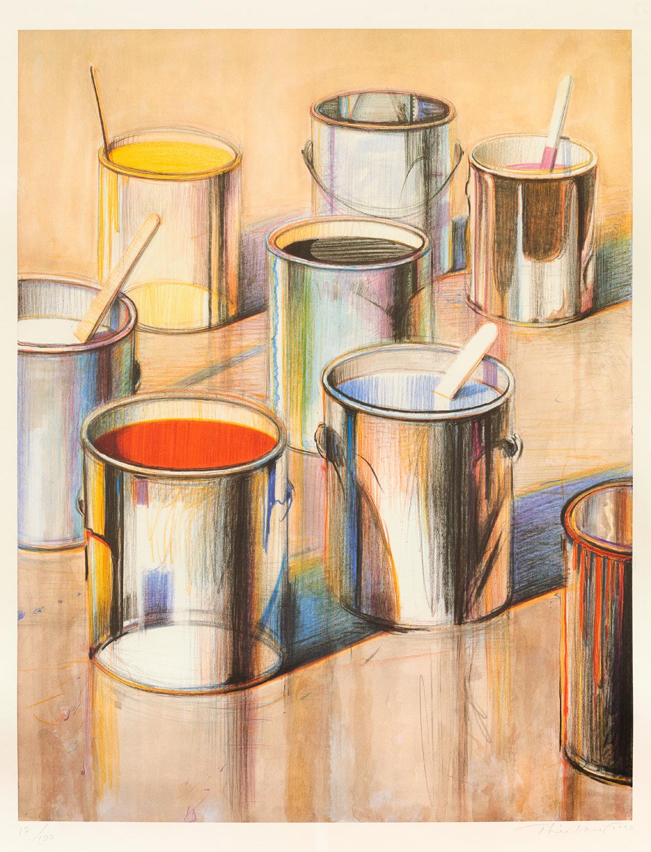
Wayne Thiebaud, Paint Cans, 1990
lithograph, AP 4, image: 29 3/4 x 23 1/8 inches, sheet 38 3/4 x 29 1/8 inches
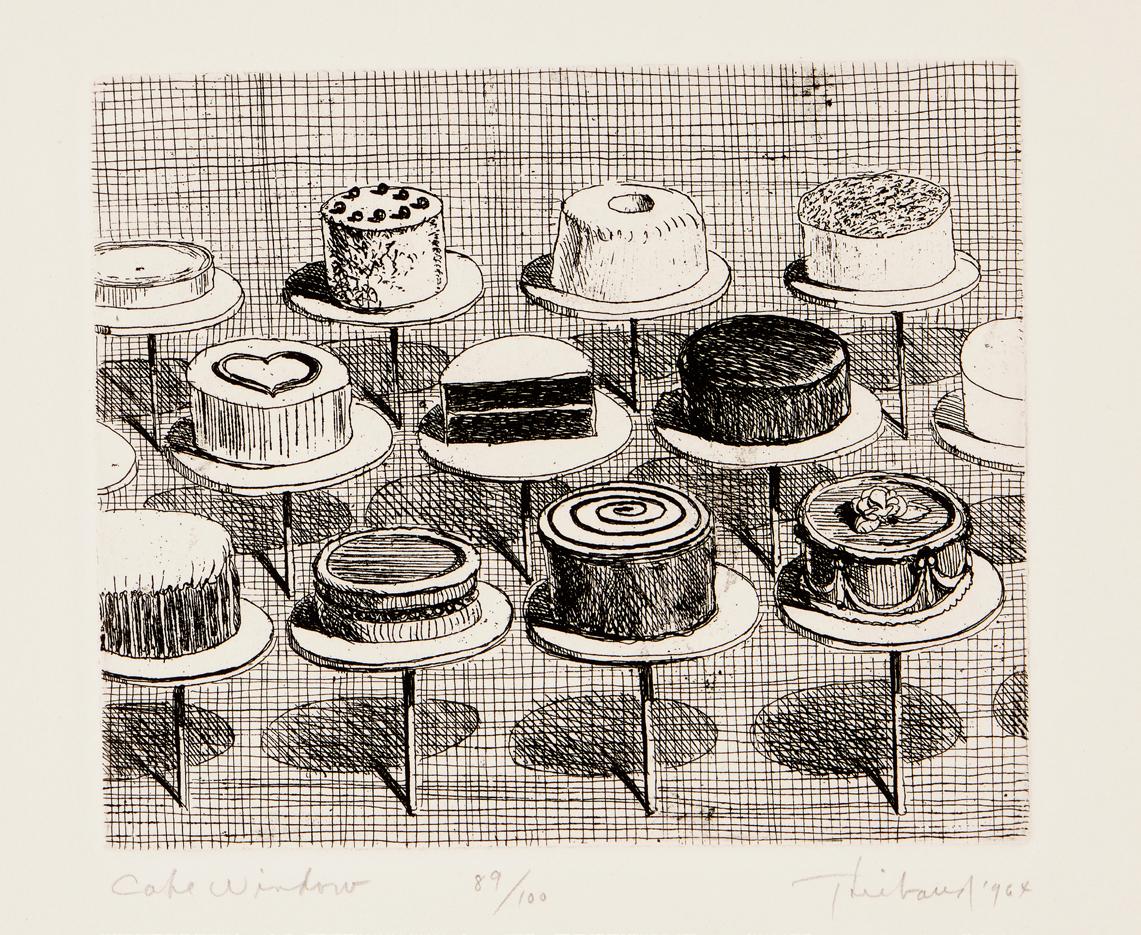
Wayne Thiebaud, Cake Window, from the series, Delights, 1964 etching, edition 89/100, image: 5 x 6 inches, sheet: 12 7/8 x 10 7/8 inches
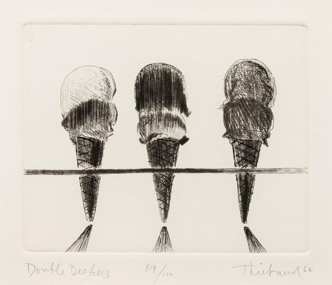
Wayne Thiebaud, Double Deckers, from the series, Delights, 1964 drypoint and etching, edition 89/100, image: 4 x 5 inches, sheet: 12 7/8 x 10 7/8 inches
Wayne Thiebaud, Two Meringues, 2004 lithograph, edition 33/35, image: 13 1/2 x 18 7/8 inches, sheet: 20 3/8 x 23 7/8 inches
Wayne Thiebaud, Black & White Suckers, 1971 aquatint and soft ground etching, TP, image: 17 1/2 x 21 3/4 inches sheet: 22 x 26 1/2 inches
Wayne Thiebaud, Glassed Candy, 1965 drypoint and etching, edition 12/25, image: 5 3/8 x 6 3/4 inches, sheet: 12 x 11 inches
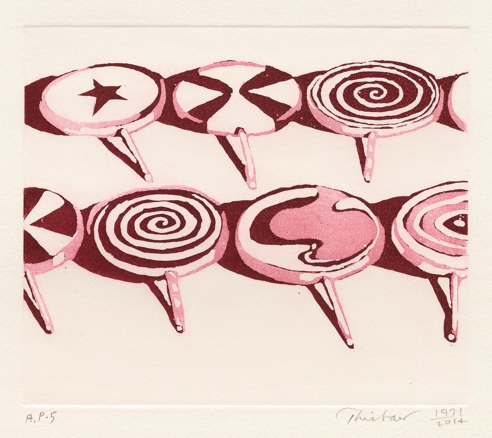
Wayne Thiebaud, Little Red Suckers, 1971/2014 aquatint, AP 5, image: 5 x 6 inches, sheet: 10 x 10 1/2 inches
Peter Voulkos
A venerated master of the medium, Peter Voulkos (1924-2002) broke clay away from the provenance of solely utilitarian objects and led a revolution to have ceramic sculpture accepted as fine art. After a summer session at Black Mountain College in Ashville, NC, in 1953, began to change his approach to making ceramics, however it was not until after he was hired by the Otis College of Art and Design in Los Angeles in 1954 to found their ceramics department that his work rapidly evolved into abstract sculpture. As part of the evolution within his work, Voulkos developed a bulging domed vase form with a tall cylindrical neck coming out of the top that he called a “stack.” The stack form first began to appear around 1960 in works such as USA 41 and Red River, which have the polychromed glazed surfaces that were consistent on his work at this time. Shortly after their creation, Voulkos shifted to making monochromatic bronze sculpture, which would be his primary focus until his Quay Gallery exhibition of black ceramic works in 1968. This show announced the full arrival of the stack form in Voulkos’ works. From then on, Voulkos regularly cast his stack forms in bronze.
Key West S15 (2000) is a prime example of Voulkos’ use of intricate and sophisticated casting methods to make his bronze works. Likely molded from an original clay version of Key West S15, Voulkos used a multi-step system for capturing all of its intricate details. The resulting form and surface is a tour-de-force of the expressive possibilities of bronze. The rugged, craggy texture on the protruding chunks conveys the feeling that you are actually looking at clay and not metal, one of the highest achievements possible in the medium. An edition of 5 with 3 artist proofs, at the time of this printing only four castings have been completed, with this being edition number 1 of 5.
Beyond his clay and bronze sculptures, Voulkos would also occasionally make small functional objects such as the two 1961 Untitled (Cups) shown here. These early cups capture an early moment in the development of Voulkos’ mature style of working. As part of his exploration into sculptural forms Voulkos began pushing out the walls of the vessel forms he was throwing on his pottery wheel, rendering them non-functional in their traditional use and therefore sculpture. These two cups are early examples of this move in his work, where one can both see and feel the form being pushed out from the inside. However, Voulkos did not go all the way in these works, as they still retain their functional capacity.
Peter Voulkos’ works have been exhibited and collected internationally. They can be found in the collections of Yamaguchi Prefectural Museum of Art, Japan; Tokyo Folk Art Museum, Tokyo, Japan; Stedelijk Museum, Amsterdam, Netherlands; Stedelijk Van Abbe Museum, Eindhoven, Netherlands; Nordenfjield Kunstindustrimuseum, Trondheim, Norway; National Museum of Modern Art, Kyoto, Japan, Victoria and Albert Museum, London, UK; National Gallery of Art, Melbourne, Australia; The Museum of Modern Art, NY; Whitney Museum of American Art, NY; The Metropolitan Museum of Art, NY; National Gallery of Art, Washington, D.C.; San Francisco Museum of Modern Art, CA; and many others.
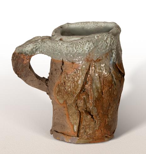

Peter Voulkos, Untitled (Cup), 1961 glazed stoneware, 4 1 /4 x 4 1/2 x 3 1/2 inches
Peter Voulkos, Untitled (Cup), 1961 glazed stoneware, 4 1/4 x 4 1/4 x 3 inches
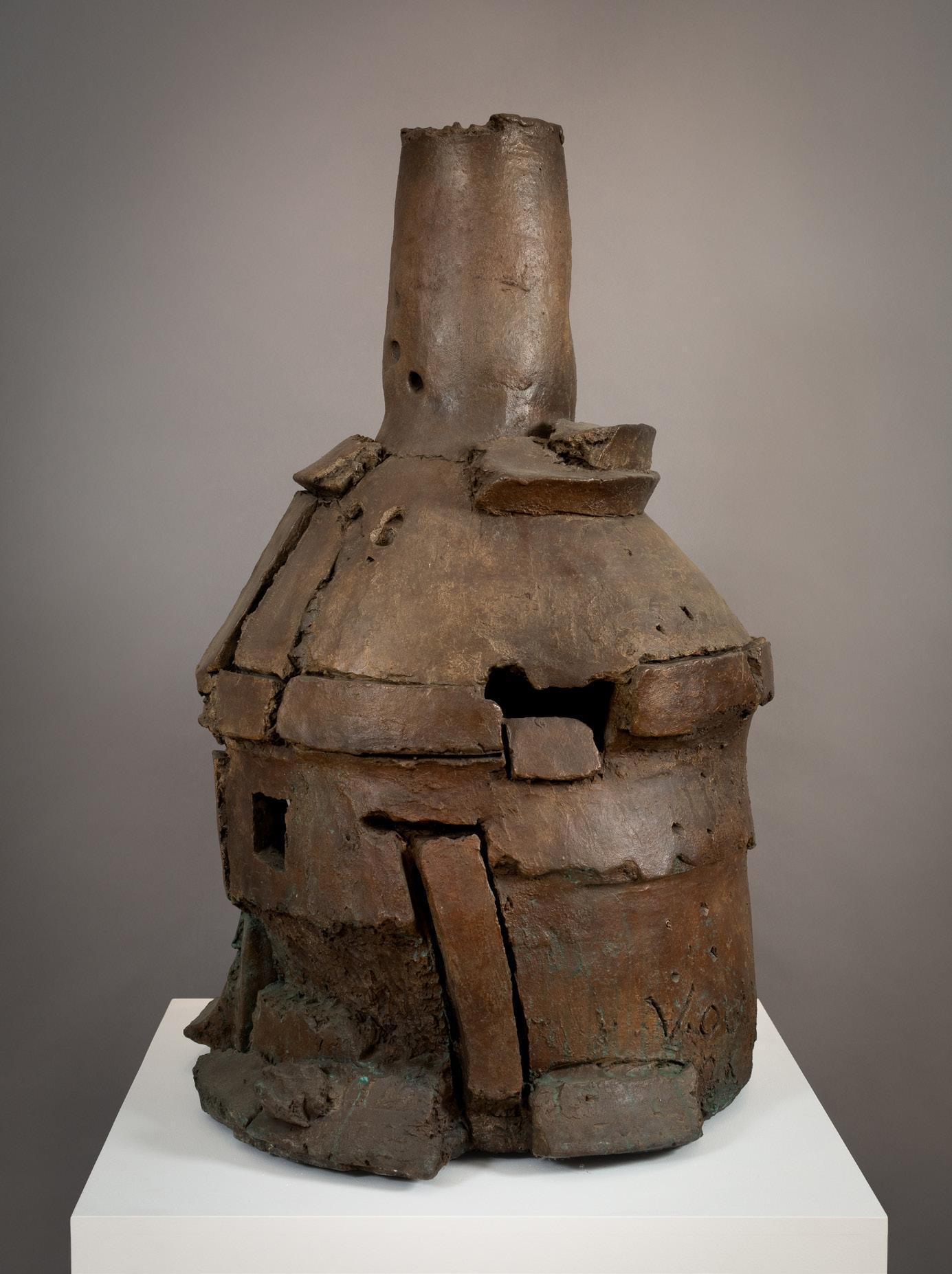
Peter Voulkos, Key West S15, 2000 bronze, edition 1/5, 43 1/2 x 25 1/2 x 26 inches
David Fertig
Known for his love of early 19th century French history, David Fertig’s paintings and works on paper explore the dramatic moments of the Napoleonic Wars and important figures from the period. While many of these paintings are small in scale, the movement and drama of these military engagements comes alive in each panel through Fertig’s expressive surfaces. Influenced by French Romanticism, Post-Impressionism, the Nabis painters, and Abstract Expressionism, David Fertig has culled various stylistic elements from each to invent an original language emphasizing the expressive use of color to convey form. As the artist explained, “I look at everything. I borrow from everyone.” His sources, however, are not only pictorial but also written. Fertig studies who the historical personages were and learns of the details involved in the battles, inventing a pictorial rendition to suit their descriptions. These paintings are not intended as history paintings in the traditional sense of the genre. Rather, they are taken from actual events without placing an emphasis on the narrative element.
David Fertig was born in Philadelphia, PA, and received his BFA in art from Philadelphia College of Art in 1967 and his MFA from the School of the Art Institute of Chicago in 1972. He has taught painting at the Pennsylvania Academy of Fine Arts, Artists for Environment in the Delaware Water Gap, and at University of the Arts in Philadelphia. David Fertig’s paintings, drawings, and prints have been exhibited extensively across the United States, Canada, and in Europe. His works can be found in numerous public, corporate, and private collections, including the State Museum of Pennsylvania, Harrisburg; University of Minnesota, Minneapolis; Woodmere Museum, Bryn Mawr, PA; Evansville Museum of Arts, History and Science, PA; and Millersville State College, PA, among others.
David Fertig, Quatre Bras, 2018 pastel over etching, 6 1/4 x 8 1/16 inches [irregular]
David Fertig, The Arrest of the King of France, 2023 oil on panel, 13 1/4 x 14 1/2 inches
David Fertig, Ciudad Rodrigo, 2023 oil on Masonite, 12 7/8 x 12 3/4 inches
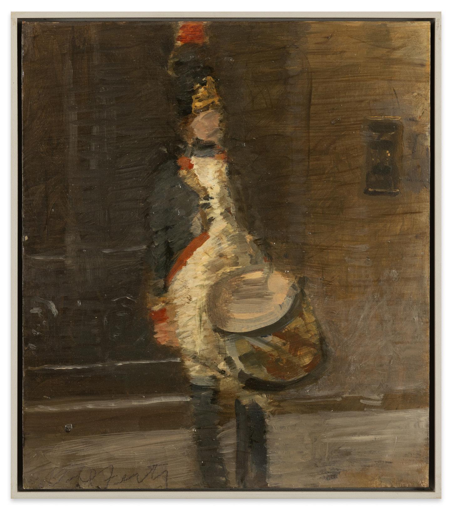
David Fertig, Drummer, Grenadiers, 2008 oil on Masonite, 13 1/2 x 11 3/4 inches
Catherine Maize
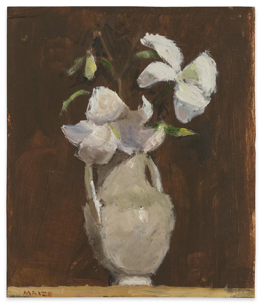
Long interested in depicting intimate moments, Catherine Maize has a national reputation for her small-scale still life paintings of flowers, food, and other objects. On panels that are less than a foot on a side, Maize employs color and delicate brush strokes to convey light, form, and atmosphere that dances between realism and abstraction. As she explains, “to me, the paintings are never about subject matter and that is a strict rule I follow. It is always about the composition, which means light, color, and form.” She also believes that edges and negative space are sacred. The results are paintings that offer respite and reflection from the noisy world we live in.
Catherine Maize studied art at the Art Institute of Chicago, New York Studio School, and went on to earn both her BFA and MFA from Indiana University in Bloomington. Her works can be found in numerous private collections across the United States.
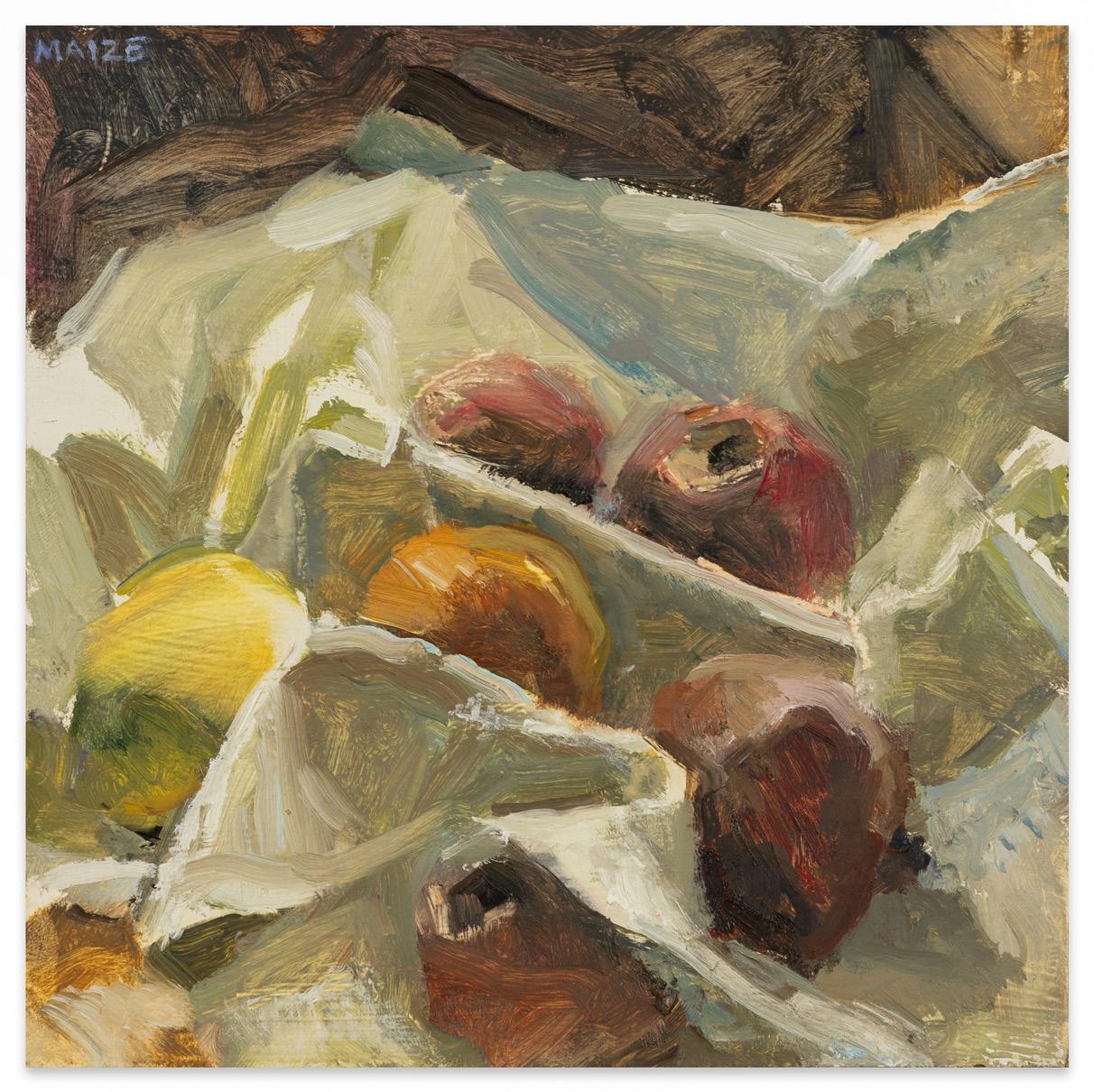
Catherine Maize, Apples in White Cloth, 2015 oil on Masonite, 6 x 6 inches
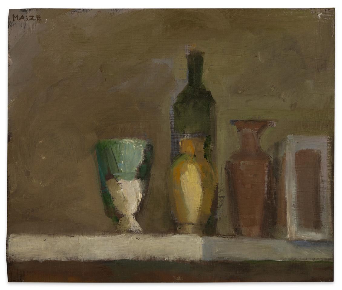
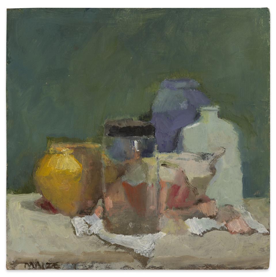
Catherine Maize, Five Vessels and a Box, 2015 oil on Masonite, 5 x 6 inches
Catherine Maize, Lilies, 2022 oil on panel, 7 x 6 inches
Catherine Maize, Still Life with Glass, 2023 oil on panel, 6 x 6 inches
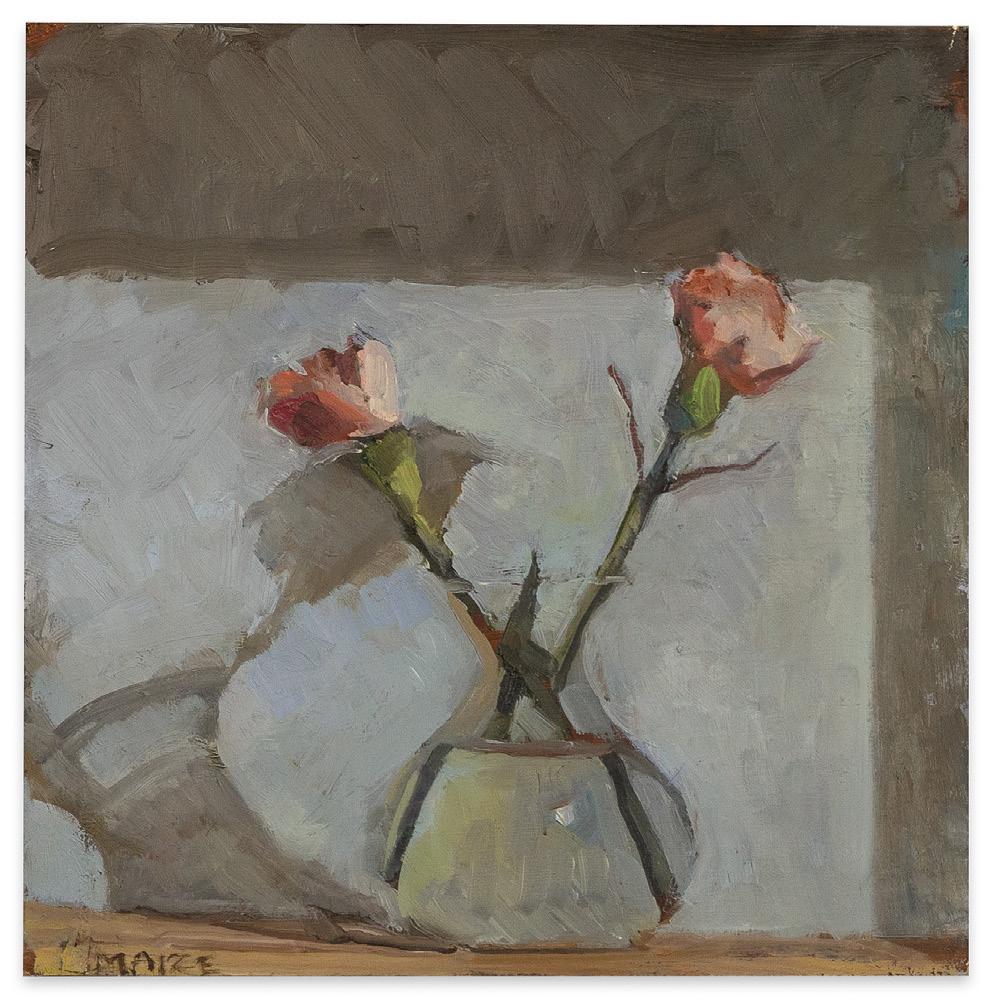
Catherine Maize, Two Carnations, 2022 oil on panel, 6 x 6 inches
Sono Osato
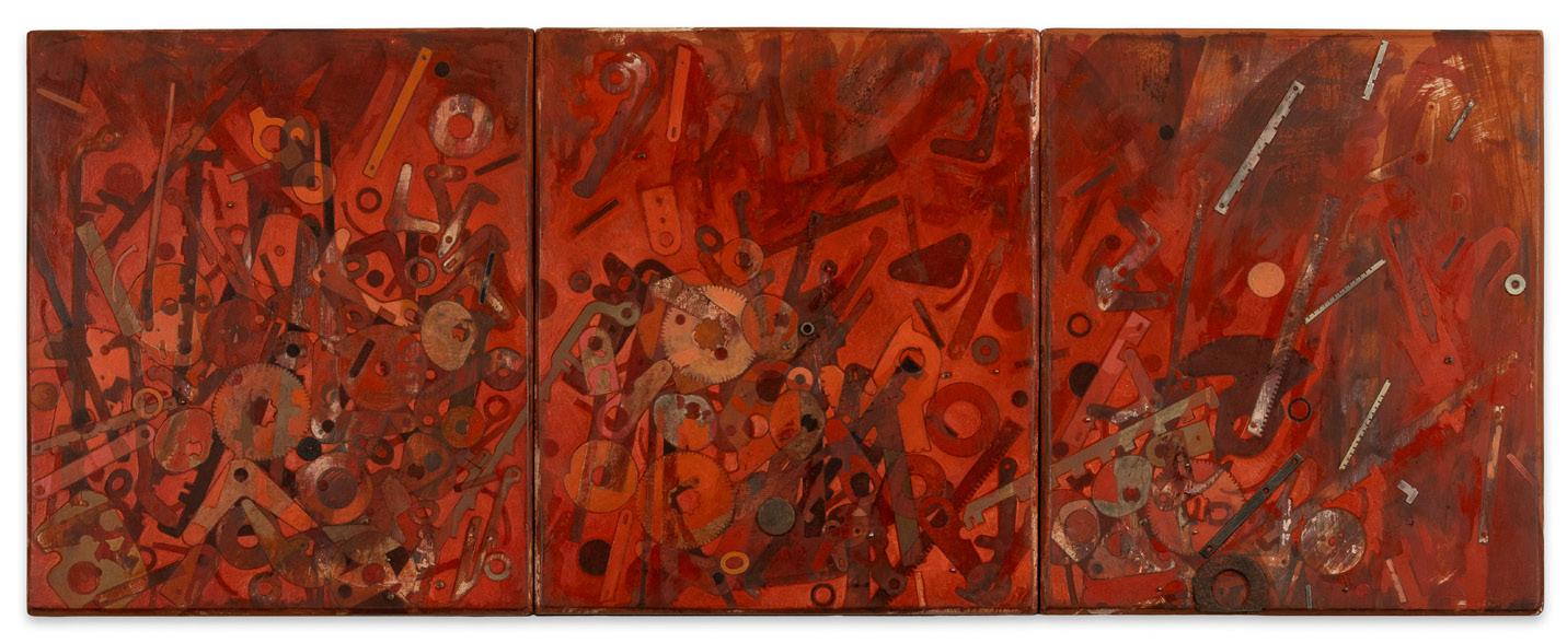
Sono Osato, Umma, 2009 tinted rabbit-skin glue ground, oil & reclaimed objects on panel 14 x 36 in. (triptych); 14 x 12 in. (panel)
Creating work that manifests the undulation of the time through layered forms, Sono Osato’s paintings combine language, technology, and archaeology through the medium of tinted rabbit-skin glue, oil paint, and found objects. Over the course of more than three decades, Osato’s investigations have evolved from thick impasto surfaces inspired by geological strata, to the heavily encrusted surfaces full of animal bones, machine parts engulfed in oil paint, and encaustic of her Silent Language series, to the textured topographies of her Babylon works. From the Babylon series, comes Umma (triptych), (2009), whose surface is a mixture of attached machine parts and found objects over a painted array of layered abstract shapes.
Derived from the silhouettes of mechanical parts Osato has mined from typewriters, adding machines, and other antiquated technologies, these layered forms recall the strata of artifacts found in archeological digs. The name Umma, derives from the ancient Sumerian city of the same name, located in Dhi Qar Province, Iraq, which was first excavated in 1854. As is often her practice, Osato chose to name the painting after this place in part because of its ties to one of the oldest known human civilizations and also one of the oldest known languages.
The most recent evolution of Osato’s works, the Submergence series, has seen the movement of the objects from the surface to within the picture plane and also the enlargement of their forms to greater than life size. Diluvia 4 (2022), with its layering of semi-translucent shapes is one of the newest works from the series. About these works, Osato has written:
In recent years, the impasto has completely disappeared and the layers have liquified. Metaphorically, earth has succumbed to the sea. Instead of an aerial view of the traces of time, I am now looking at the scattered fragments from underneath, through water. Thoroughly submerged, the tracings of old machine parts that I have sifted into a kind of asemic alphabet and read like floating debris are starting to push past being palimpsestual to a paradoxical dissolution where shape and spacial relationships are thrown into the blender, submitting to the deluge, so that one loses their footing entirely and has to look for a suspended period of time before they locate where they are.
Throughout the evolution of my work, I’ve repeatedly returned to trying to feel, envision and interact with a sense of time that is utterly indifferent to me in which it’s possible for the past, present and future to collapse into a single breath, and it’s credible to say that we are all each other in our reckoning with a gestalt far greater than ourselves.
Born in Baden-Baden, Germany, Sono Osato earned her BFA from Arizona State University, Tempe, and her MFA from the California College of Arts and Crafts, Oakland, (now California College of the Arts, San Francisco). Osato’s works have been exhibited extensively in the San Francisco Bay Area, New York, and Austin, TX, where she currently lives and works. She has been the recipient of Pollock-Krasner Foundation grants in 1989, 1999, and 2008. Her works can be found in the collections of the Fine Arts Museums of San Francisco; Oakland Museum of California; di Rosa Center for Contemporary Art, Napa; Stanford Law School, Stanford University; and the Contemporary Arts Center, Cincinnati, OH, as well as many private collections.
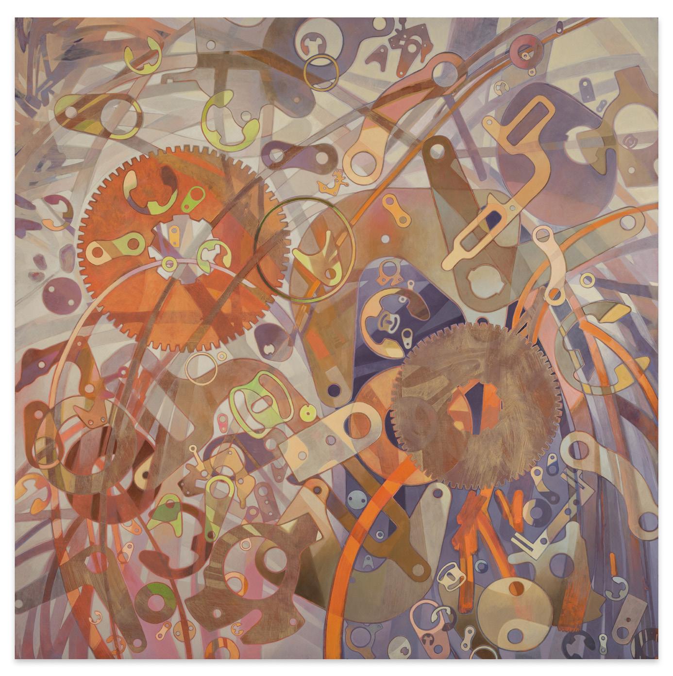
Sono Osato, Diluvia 4, 2023 tinted rabbit-skin glue ground & oil on panel, 48 x 48 inches
John Santoro
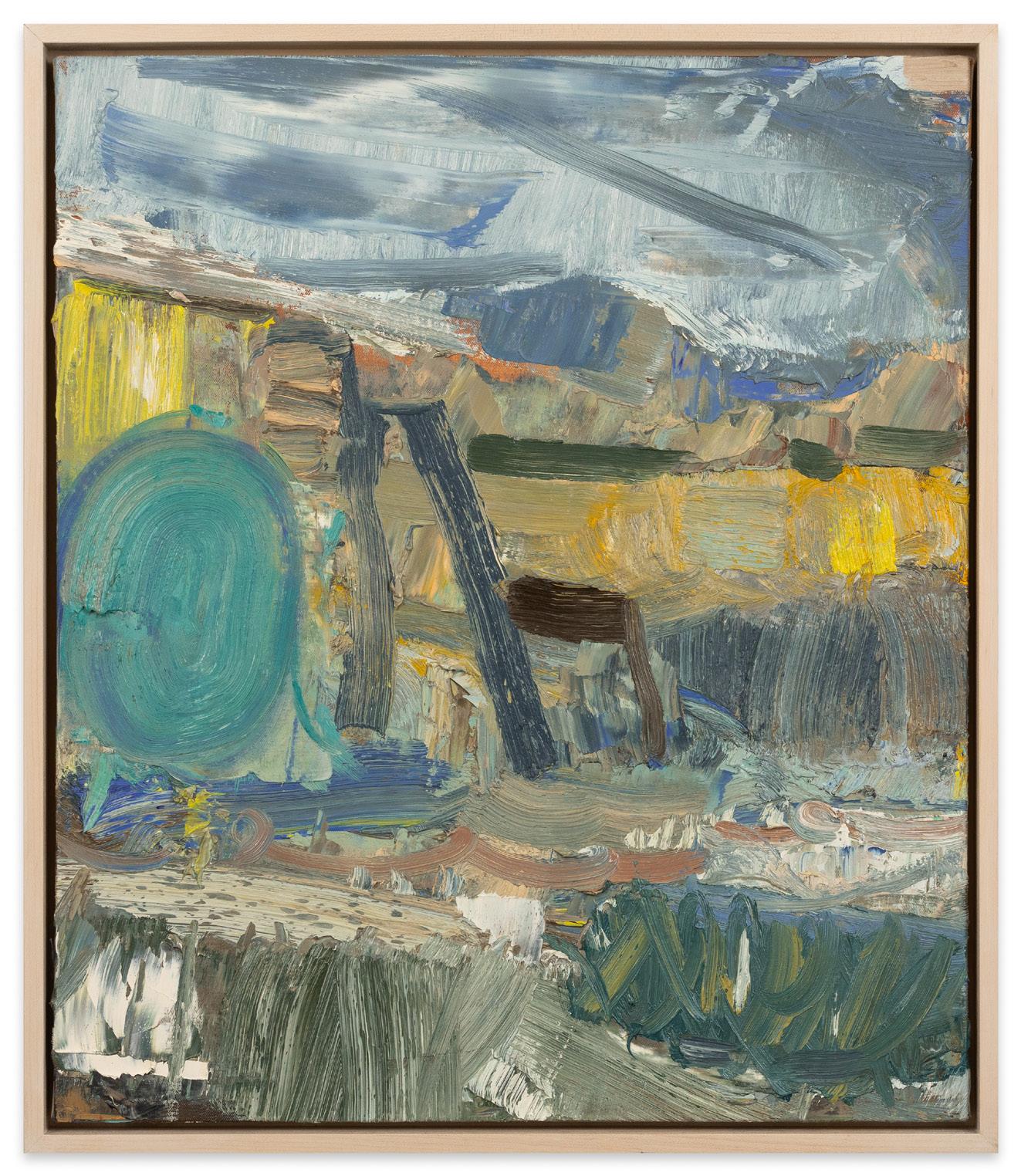
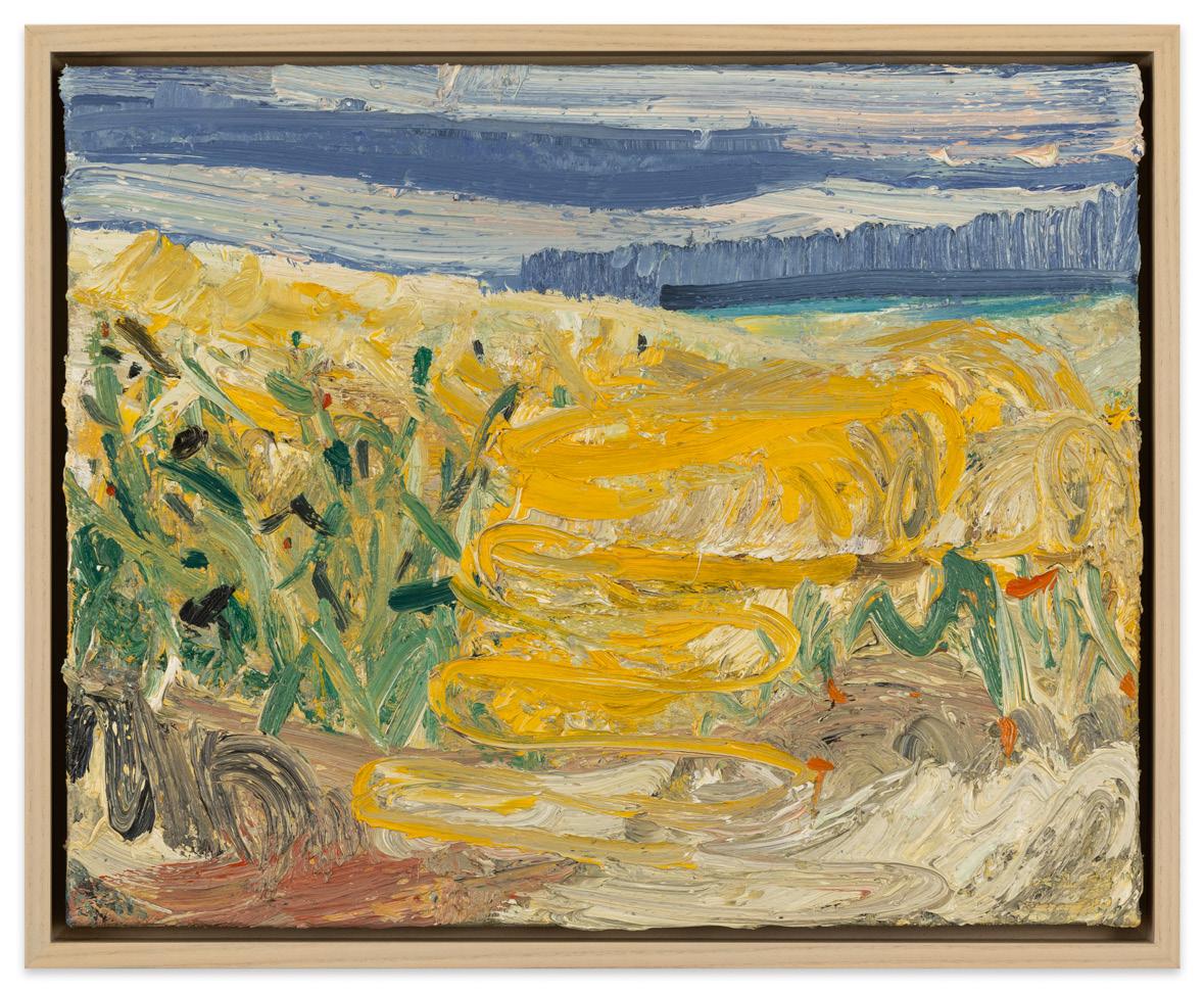
For Chicago based artist John Santoro, landscapes both local and far away provide the foundational inspiration for his paintings. However, instead of depicting the scene in front of him with literal precision, he filters it through the aesthetics of abstract expressionist strokes. The results are squarely on the side of his love for abstraction, with the paint thickly applied to give the canvas a highly textured, juicy surface. While the settings he chooses to paint are often not grand, he endeavors to make them feel so in his works, and succeeds admirably in his efforts.
John Santoro holds a BA from Northern Illinois University and an MFA from the University of Chicago. His works have been exhibited nationally and can be found in numerous private collections.
John Santoro, Backyard: Spring Snow with Garden Hose, 2020 oil on canvas, 28 x 24 inches

John Santoro, Beach Terrain: Wave, 2017 oil on canvas, 16 x 20 inches
John Santoro, Beach Terrain: Yellow, 2017 oil on canvas, 16 x 20 inches
Pam Sheehan
For New York based painter Pam Sheehan, plein air painting is a means of charting an inner landscape by transposing both the subtle and dramatic outer shifts of weather on the terrain. This desire to paint directly from life imparts an immediacy to each of her panel surfaces and transfixes what she sees in time. Rendered in deft strokes and a loosely romantic manner, Sheehan’s works variously recall the dramatic landscapes of J.M.W. Turner and the English formalist painters of the 19th century, yet they defy being confined by either genre. Similar to Robert Kulicke, the artist’s late husband and long-time mentor, Pam Sheehan’s compositions are beautifully set in weathered period frames that accentuate the refined subtleties intrinsic to her work.
Born and raised in New York, Pam Sheehan earned her BFA from Parsons School of Design in 1979 and her MFA from Lehman College, City University of New York, NY in 1996. Along the way, she studied at the Johnson Atelier in Princeton; Pennsylvania Academy of Fine Art, Philadelphia; Frudakis Academy, Philadelphia; Barnstone Studios, Coplay, PA; and the New York Academy of Art, NY. From 1984-2004 she taught at Rockland Community College in Hudson Valley, NY, and from 2004 to the present she has been an instructor at the Art Students League in New York. Her paintings have been exhibited across the United States and can be found in numerous private collections.
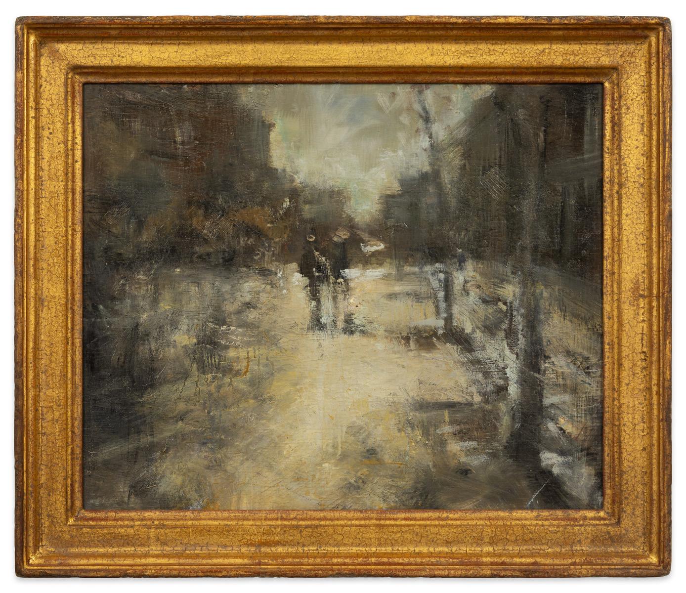
Pam Sheehan, After the Rain Outside the Met, 2012 oil on panel, frame: 15 5/8 x 18 5/16 inches
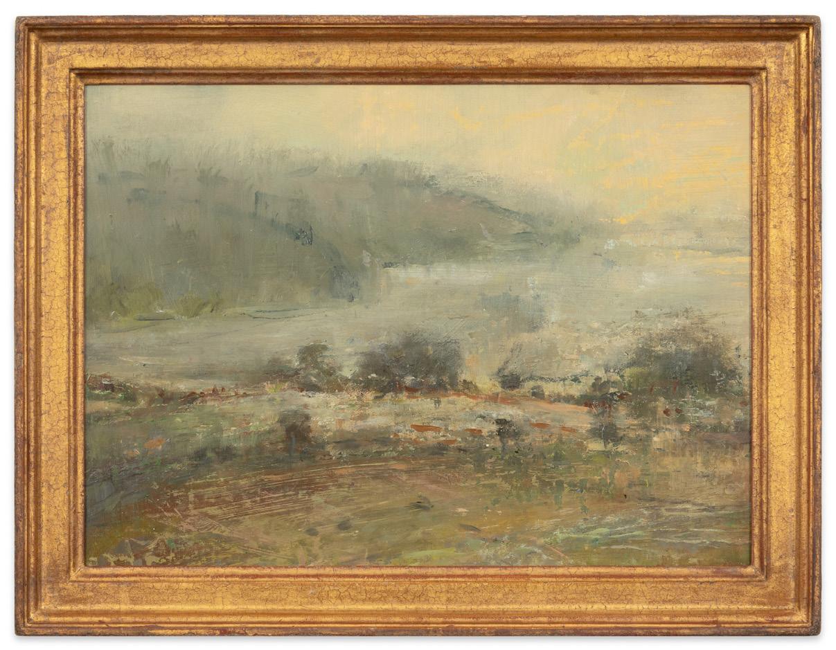
Pam Sheehan, Hudson Valley, 2012 oil on panel, frame: 16 5/8 x 21 5/8 inches
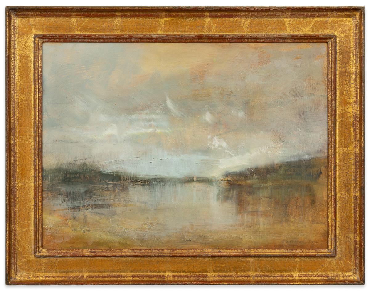
Pam Sheehan, Light on the River, 2014 oil on Masonite, frame: 18 3/16 x 23 7/16 inches
Andrew Wilson
Andrew Wilson’s hand-stitched quilt Muddy Water | Potliqour (2015-2021) is a multi-layered journey into history and meaning. Employing a version of the traditional half square triangle quilt pattern, in this variation the half square triangles were arranged in an intuitive manner. The textile pattern in Muddy Water | Potliquor reproduces the deck plan of the Brookes Slave Ship (the only known depiction of what a slave ship looked like) onto a lightweight cotton cheesecloth using the cyanotype photographic process. The translucent quality of the cloth is highlighted by the use of black batting, which saturates the print and provides a deeper, richer color than the traditional white batting.
Muddy Water | Potliquor references places/spaces that appear to be dangerous and uninviting, and highlights them as generative and restorative. Upon first glance, the quilt has the colors of a swamp, bright blue areas punctuating a maze of the deep greens and browns. Swamps are known to be places of great biodiversity containing plants and animals that have been used by indigenous peoples as healing medicines. While the idea of swamps is off putting to some, they are powerhouses for both healing and ideal places for escaping enslaved folks to hide on their journey toward freedom.
The work also touches on the Blues – a genre of music that situates deep pain and alchemizes it into rich music. The title is a play on Muddy Waters, the iconic African American Blues musician who had a legendarily sonorous voice and among whose most famous songs is My Home is in the Delta. It is a call out, a scream, a holler, a yearning that one can get lost in. Potliquor is the name for the juices left in a pot of greens after cooking. Traditionally, greens are made when someone is ill or for large celebrations. The juices are full of concentrated minerals and spices and are believed to restore one from sicknesses when taken as a curative. It has been used for generations as a Black folk remedy.
All of these threads find themselves stitched together into this textile. For Andrew Wilson, a quilt is a collection of materials whose particular memories, spirit particles, and histories are amplified as they are made into one contiguous object. Through the alchemical process of quilting, they open gateways for trans-dimensional travel. It puts the maker in contact with people, histories, and myths that reach into the past so the present becomes blurred.
Born in Oakland, CA, Andrew Wilson is an emerging African American artist and member of the Cherokee Nation. He earned a BFA from Ohio Wesleyan University in 2013 and a MFA from University of California, Berkeley in Art Practice in 2017. He was the recipient of the Jack K. and Gertrude Murphy Award in 2017 and the Foundation for Contemporary Arts Emergency Grant in 2018. His works have been exhibited across the United States and in Cuba, including at the Museum of the African Diaspora, San Francisco; Yerba Buena Center for the Arts, San Francisco; and the Ross Museum of Art, Delaware, OH. His works can be found in the collections of the University of New Mexico Art Museum, University of Michigan, East Lansing, and Ohio Wesleyan University, among others.
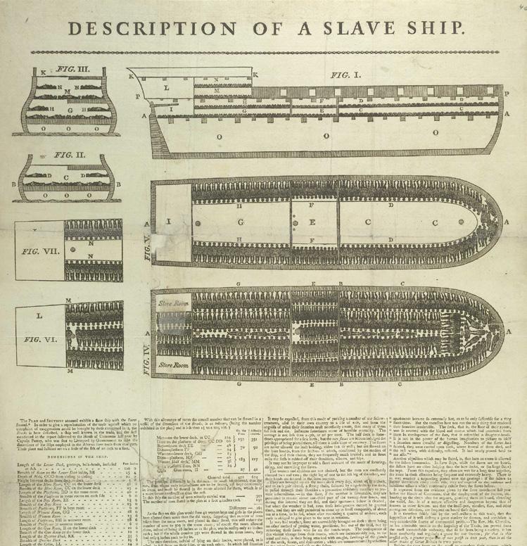
Diagram of the ‘Brookes’ slave ship (detail), 1787 printed by James Phillips, George Yard, Lombard St., London British Library, Asia, Pacific and Africa Collections.

Andrew Wilson, Muddy Water / Potliquor, 2015-2021
cyanotype on cotton, toned, hand quilted, 77 x 51 1/2 inches