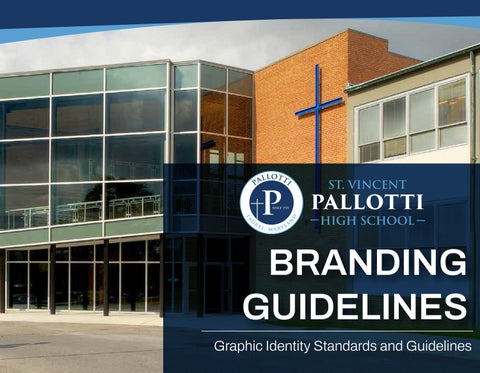
BRANDING GUIDELINES
Graphic Identity Standards and Guidelines


Introduction
St. Vincent Pallotti High School
Standards and Guidelines
IDENTITY
DESIGN IS A POWERFUL FORM OF COMMUNICATION. Visual Communication and other visual materials are collectively the most important assests of representing the “face” of St. Vincent Pallotti High School. As such, an effective visual identity program must strive for clarity through unity, consistency, and visual hierarchy to be easily understood and remain memorable.
The graphic identity of St. Vincent Pallotti High School is summarized in these Branding Guidelines. This document establishes rules (scale, color, and usage) for the consistent implementation of the Pallotti identity. Through recommendations and examples, the Standards and Guidelines serve as a guide for development of future applications, within St. Vincent Pallotti High School, as well as for external or outsourced designers and agencies.
The elements within the system are intentionally limited in order to create a consistent, coherent, and easily managed graphic vocabulary. The identity of these visual elements: LOGO (acronym with its associated rhythmic lines relating to icon, index, and symbol), the SIGNATURES (St. Vincent Pallotti High School), LOCK-UPS (Logos and Signatures combined), legacy color palette, and unified TYPOGRAPHY (fonts and typefaces combinations).
It is important that St. Vincent Pallotti High School keeps up-to-date with modern frameworks, while also representing the prestige of the Catholic faith and legacy of the Saint Vincent Pallotti and the Pallottine Sisters.
St. Vincent Pallotti High School
Why We Have Guidelines
A WELL-MANAGED VISUAL IDENTITY
is an important tool for St. Vincent Pallotti High School to reach its broader strategic goal of strengthening its reputation and prominence among competing Catholic schools. The careful and consistent use of these guidelines will contribute to a powerful and unified expression of the brand and its accompanying goals, establishing a strong identity for Pallotti.
The Visual Communications and Marketing Department’s role is to oversee and facilitate the implementation of the identity system, along with maintaining the clarity of the sytem. The department oversees the design of all outward-facing instituational communications tools and is available to help users within Pallotti and those working on the behalf of Pallotti to use the graphic identity effectively, appropriately, and efficiently. If you have questions, or needs that are not addressed in this document, please contact:
Ian L. Springer Director of Visual Communications and Marketing
Visual Communications and Marketing
St. Vincent Pallotti High School
113 St. Mary’s Place
Laurel, Maryland 20707
Email: ispringer@pallottihs.org
Phone: 301-725-3228 ext. 2329
To access the logo files covered in this document, as well as procedures for ordering business cards and letterhead, and additional guidelines for document preparation, please refer to the folder labeled, “Visual Communications”, in the Shared Drive, in the Faculty/Staff Portal, or visit: www.pallottihs.org/logo
Identity Elements and Scale

LOCK-UP
Elements of the Identity System
Pallotti’s identity system consists of two main elements: a Logo and a Signature
LOGO
The Logo is the core expression of the identity and the symbolic identifier of the school. The logo may be used independently. (See page 6)
SIGNATURE
The signature is the full name of the school. The signature can be used independently, however, the Logo should be used in proximity. (See page 8)
LOCK-UP
A configuration that combines the Logo and Signature in a defined relationship is referred to as a Lock-up. Each Lock-up establishes a unique interaction of Logo and Signature (size, scale, and position of each complementary element). (See page 9).

Pallotti’s Logo can be used independently, or combined (with the Signature) as a Lock-up. When a Lock-up is used, please only use the provided Lock-up files. (See page 10)
The Logo may be used independently as long as:
a) the Signature is represented in proximity (i.e. front or back cover) OR b) the piece is targeted to an audience familiar with the school (i.e. items sold in the school store
The Logo may be placed on imagery (see page 25).
The logo has two scale versions (see page 7).

NOTE
The Logo should be located in a prominent position on all communications.
The Logo should never be recreated or modified. To ensure correct scales and maintain consistency throughout the system, use only the files supplied with these guidelines. The forms have been custom drawn to work at different scales, so it is crucial that new versions of the Logo are not created.
Scale and usage guidelines are detailed in the following pages.
Use only the scales and colors as specified.
LOGO
SMALL SCALE MONOCHROME LOGO


wide

wide
wide
SMALL SCALE
The Small Scale Logo should be used when the Logo width is between 1.25” and .75”. The Small Scale logo should never be used smaller than .75” wide.
wide
+1.25” wide
REGULAR / LARGE SCALE
The Regular/Large Scale Logo should be used when the Logo width is greater than 1.25’.
The Logo file is provided at two scales: Small and Regular/Large.
The Regular/Large Scale Logo is intented for use on applications where the width of the Logo is greater than 1.25”. This Regular/Large Scale Logo can be scaled up infinitely, but should never be used smaller than 1.25” wide.
The Small Scale Logo is intended for use on applications where the width of the Logo is less than or equal to 1.25”. The letterforms and the lines of the logo have been modified for reproduction at this small scale and can be used as small as .75 wide. This Small Scale logo should never be used larger than 1.25” wide or smaller than .75” wide.
ST. VINCENT
PALLOTTI
HIGH SCHOOL
PRIMARY SIGNATURE
ST. VINCENT PALLOTTI HIGH SCHOOL
SECONDARY SIGNATURE 1
ST. VINCENT PALLOTTI HIGH SCHOOL
SECONDARY SIGNATURE 2
Pallotti’s Signature (the full name of the high school) can be used independently or combined (with the Logo) as a Lock-up. When a Lock-up is used, please only use the provided Lock-up files (see pages 9)
The Signature may be used independently as long as the Logo is represented in proximity (on the same surface of the application).
The Signature can be placed on imagery (see page 25)
Three versions of the Signature have been provided: a stacked (primary/preferred) version, and a two-line and single-line versions. The primary signature should be prioritized whenever possible.
Each Signature has three scale versions (see page 22). The Signature should not be scaled below the minimum size found on page 22.
NOTE
The Signature should never be recreated or modified. To ensure correct scales and maintain consistency throughout the system, use only the files supplied with these guidelines. The forms have been custom drawn to work at different scales, so it is crucial that new versions of the Signature are not created.
Scale and usage guidelines are detailed in the following pages.
Use only the scales and colors as specified.
Primary

PRIMARY LOCK-UP
The dynamic “Primary Lock-up” of the Logo and Signature should be considered the ideal configuration for most applications.
The Primary Lock-up has three scale versions (see page 23). Neither the Logo nor the Signature should be scaled below the minimum sizes found on page 23.
NOTE
The Lock-up should be located in a prominent position on all communications.
The Primary Lock-up should never be recreated or modified. To ensure correct scales and maintain consistency throughout the system, use only the files supplied with these guidelines. The forms have been custom drawn to work at different scales, so it is crucial that new versions of the Primary Lock-up are not created.
Scale and usage guidelines are detailed in the following pages.
Use only the scales and colors as specified.

SECONDARY LOCK-UP 1
Each of the three Secondary Lock-ups on the left may be used on any application, per design preference and spatial requirements.
These Secondary Lock-ups have three scale versions (see page 23). Neither the Logo nor the Signature should be scaled below the minimum sizes found on page 24.

SECONDARY LOCK-UP 2

SECONDARY LOCK-UP 3
NOTE
The Secondary Lock-ups should be located in a prominent position on all communications.
The Secondary Lock-ups should never be recreated or modified. To ensure correct scales, and maintain consistency throughout our system, use only the files supplied with these guidelines. The forms have been custom drawn to work at different scales, so it is important that new versions of the Secondary Lock-ups are not created
Scale and usage guidelines are detailed in the following pages.
Use only the scales and colors as specified.
Scaling the Signatures and Lock-ups
SIGNATURE CAP HEIGHT, DEFINED SMALL, REGULAR, AND LARGE SCALE FORMATS


Representative Lock-ups and Signatures have been used above and right to best indicate the scaling system properly. However, the Signature height and scaling rules seen here apply to ALL PALLOTTI LOCK-UPS AND SIGNATURES.
Pallotti’s Signature and Lock-up files have been provided at three scales: Small, Regular, and Large.
The Large Scale Signatures and Lock-ups are intended for use on large-scale applications (16in x 20in or greater).
The Regular Scale Signatures and Lock-ups are intended for use on standard-scale applications (6in x 9in to 14in x 16in).
The Small Scale Signatures and Lock-ups are intended for use on small-scale applications (4in x 6in or smaller).
ST. VINCENT
PALLOTTI
SMALL SCALE
The Small Scale Signature OR Lock-up should be used on document sizes that are 4in x 6in or smaller and when the cap height of the “P” in Pallotti is 1/16 height and should never be smaller than 3/64 height.
The Regular Scale Signature OR Lock-up should be used on document sizes that are 6in x 9in to 14in x 16in and when the cap height of the “P” in Pallotti is 1/16 height. REGULAR SCALE
ST. VINCENT
LARGE SCALE
PALLOTTI
The Large Scale Signature OR Lock-up should be used on document sizes that are 16in x 20in or larger and when the cap height of the “P” in Pallotti is 1/2 height or greater.
HIGH SCHOOL
NOTE
Please only use the provided files (do not recreate them) at the correct scales. The Signatures and Lock-ups have been carefully studied and redrawn for maximum legibility and integrity at each scale.
VINCENTPALLOTTI HIGHSCHOOL
LAUREL , MARYLAND


The Pallotti Seals are the official emblems of the school. They have never functioned as a Logo, but are used as ornamental devices on ceremonial documents (i.e. special event documents, legacy merchandise). The Pallotti seals should only be used in situations specifically identified by the Visual Communications Department or Advancements Department. The seals should not be used in conjunction with the Logo or Signature. It should be considered an alternate expression of the school that is used in place of the current Logo - hence its limited appropriateness for public communications.
NOTE
The seals have all been digitally recreated to be scalable any size or requirement. The seals are meant to be used as more decorative pieces.
Please contact the Visual Communications department for more information about the Pallotti Seals and usage.
Identity Color
COLOR IS THE MOST IMPORTANT SIGNIFIER OF A BRAND. The use of color within documents, marketing, and merchandise all play a crucial role in the recognization of St. Vincent Pallotti High School. The colors choosen for the school color palette have been crafted to both honor the legacy of Pallotti, while also being maleable for a variety of outputs.
The goal of a Color Palette is to maintain consistency within the graphic identity of the school and create a manageable system for visual communication. These colors within the palette should be consistent throughout all of the departments (i.e. Athletics, Admissions, Advancements, Technology, Student Life, Campus Ministry, as well as in the School Store).
The official Color Palette consists of a standard four colors that can be used across RGB (Red, Green, and Blue color deliniation that is primarily used for web-viewing), CMYK (Cyan, Magenta, Yellow, and Key [Black] color deliniation that is primarily used for printed media), and Pantone (a color deliniation that is standard across different mediums, including physical paint).
Color Palette


PMS Black 6 Coated and Uncoated
HEX: #000000
PMS None HEX: #FFFFFF
444 Coated and Uncoated HEX: #787878
The Color Palette of the Pallotti brand utilizes both a monochrome palette and a full range of blue colors. The Lock-ups, Signatures, or Logo may be reproduced in any of these colors (Please see the following pages for color usage rules.)
In print, CMYK is always preferred. When budget is available, PMS can be used as a high-quality replacement.
In contexts where the use of color is not an option (i.e. newspaper ads) the lock-up should be black (90% K) or white (0%).


PMS 648 Coated and Uncoated
HEX: #193964
PMS 298 Coated and Uncoated HEX: #55A0D3
#091729
NOTE
For web and other screen applications, the identity components should be rendered with a RGB/HEX value. Due to the inherent differences in the calibration of different monitors, these may need to be altered slightly. RGB/HEX values seen here should be used as references only.
Printing with CMYK can produce varied results. Please work with your printer to ensure the CMYK values are as close a match to any PMS as possible (proofing and draw downs are recommended).
Using the Color Palette Color Ratio

Black, white, grey, and the four blue hues comprise the color palette of Pallotti’s identity.
The diagram, on the left, shows an approximate ratio of color usage.
NOTE
The color ratio (on the left) applies to Pallotti’s brand as a whole. Individual pieces may be comprised of primarily blue hues; however, if all the brand pieces were evaluated, navy blue, carolina blue, and white would be dominant and used most frequently. It is critical that these three colors ground the identity, allowing for the legacy to show, as well as keep identity consistency. The blue hues command importance, while the monochrome greyscale commands seriousness.
Using the Color Palette Monochrome Palette


The Pallotti Logo, Signatures, or Lock-ups (”Primary Lock-up” seen on the left) may utilize the monochrome colors in the palette in any combination.
In all cases however, maximum legibility must be maintained. For this reason alone, four options have been eliminated on the left.
GREY OR WHITE, ON BLACK BLACK OR WHITE, ON GREY
GREY OR BLACK, ON WHITE
Using the Color Palette Blue Hues Palette


Blue Hues may be used with white or grey. These blue hues can be the base color or the accent color (Logo, Signatures, or Lock-ups: “Primary Lock-up” shown here) color.
In all cases however, maximum legibility must be maintained.
NOTE
Blue Hues may be used with black. These blue hues can be the base color or the accent color.
In all cases however, maximum legibility must be maintained. For this reason, one option has been eliminated.
Blue Hues may be used as both the base color and the accent color.
In all cases however, maximum legibility must be maintained.
Extensive color presentations are possible (only a small/representative amount is shown above). However, some color combinations are not as successful. Please refer to the examples in the applications section of these guidelines before designing Blue Hues color applications.
Blue Hues may be used in conjuction with tints (70%, 80%, etc.) of Blue hues. Tints should only be used as the accent, not the base, color.
In all cases however, maximum legibility must be maintained.
BLUE HUES, WITH WHITE OR GREY BLUE HUES, WITH BLACK
BLUE HUES, WITH BLUE HUES
BLUE HUES, WITH TINTS
the Color Palette


ST. VINCENT
PALLOTTI
HIGH SCHOOL ST. VINCENT
1. Any Pallotti Lock-up (”Primary Lock-up seen on the left and above) may be used in any single monochrome or blue hues from the palette.
HIGH SCHOOL
2. When any Signature (”Primary Signature” seen above) and Logo are used separately - not in a Lock-up - they may each use a unique color from the palette.
3. All Pallotti Lock-ups should always be a single color palette combination.
Expanded Visual Vocabulary
Materials
An expanded visual vocabulary (paper for print applications and store merchandise) have been indicated on the right.
McCoy, Satin
To be used for Publications
Strathmore, Ultimate Paper
To be used for Stationery


To be used (along with white, grey, black, and color) for portfolio, pocket folders,etc.
To be used on various applications
WHITE COATED PAPER
WHITE UNCOATED PAPER
CRAFT PAPER
GREY, BLACK, OR BLUE HUE PAPER
Identity In Use
LOGO

Minimum Size: 3/4” (.75”) wide
To ensure proper detail and legibility, the graphic identity elements should not be used in sizes smaller than those shown above.
For small scale applications the “Small Scale” Logo should never be used smaller than 3/4” (.75”) width. The “Small Scale” Signature should never be used smaller than 3/64” cap height (of the “P” in Pallotti.)
A Lock-up’s minimum size is determined by whichever element (Logo or Signature) reaches its minimum scale first.
NOTE
Minimum Size: 3/64” cap height

SIGNATURE
Please only use the provided files (do not recreate them) at the correct scales. The Logo, Signatures, and Lock-ups have been carefully studied and redrawn for maximum legibility and integrity at each scale.
Preferred Clearspace Logo and Lock-ups

Clearspace around the Logo or Lock-ups is critical in order to separate it from other communication elements such as text, headlines, or imagery. The area around the Logo or Lock-ups should always have a generous clearspace so that these components are not crowded or constrained by external elements. Please observe the area of clearspace to ensure clarity and Logo/Lock-up prominence.
The diagrams here show the minimum amount of clearspace that should surround the Logo or Lock-ups. Maintain at least 1 “X” (whre X = width of the “P” in the Logo) between the Logo or Lock-up and any accompanying element.
CLEARSPACE EXCEPTION
Intepretive graphics (such as banners or totes) with cropping are not bound to the same clearspace rules. However, when design liberties are taken, such instances must be reviewed by the Visual Communications Department at St. Vincent Pallotti High School for approval.
NOTE
Only 2 Lock-ups are shown on the right (for clarity), but this clearspace rule applies equally to the Primary Lock-up and all listed Secondary Lock-ups.


Preferred Clearspace Signatures
= width of the
in the Logo


Clearspace around the Signature is critical in order to separate them from other communication elements such as text, headlines, typography, or imagery.
The diagrams show the minimum amount of space that should surround the Signature. Maintain at least 3 “X” (where X = height of the “P” in Pallotti) between the Signature and any accompanying element.
EXCEPTION
Interpretive graphics (such as banners or merchandise) with cropping are not bound to the same clearspace rules. However, when design liberties are taken, such instances must be reviewed with the Pallotti Visual Communications and Marketing Office for approval.
Identity and Imagery
The Logo, Signatures, or Lock-ups may be positioned on an image. When positioned on imagery these elements can only be white or black.
White Logo, Signatures, or Lock-ups should be used on middle to dark value imagery. Black Logo, Signatures, or Lock-ups should be used on light to middle value imagery.
1. The Logo, Signature, or Lock-ups shoulld be placed in an area of the image that does not compete with, or obscure it.
2. The Logo, Signatures, or Lock-ups can be positioned on a busier area of the image if enough contrast is exists to make each edge of the mark easily legible.
3. Three has been eliminated because the Logo is not legible on the and is with a busier section of the image.
4. Do not place the Logo, Signatures, or Lock-ups in areas where it cannot be seen or matches the color of said element.


ST. VINCENT PALLOTTI HIGH SCHOOL
Integrity of the Logo and Lock-ups
NOTE
The Logo and Lock-ups, elements of the official brand of Pallotti, should be used with the utmost consistency and integrity. Only the supplied Logo and Lock-up files should be used. The Logo should never be tweaked, manipulated, or recreated. Please see below for examples.

Only use the supplied files.
Never add a box or a shape to the Logo or the Lock-ups.

Never set the Logo or Lock-ups in a “non-identity” color.

Do not stretch or manipulate the Logo or Locku-ups.

Do not place imagery within the typography of the Logo.

Do not adjust placement, spacing, scale, weight, or ANY element of the Logo or Lock-ups. Do not create new Lock-ups.


Do not scale the Logo or Lock-ups below the minimum allowable sizes.
Do not typeset any part of the Logo or Lock-ups.

Do not outline the Logo or Lock-ups. Never reinterpret, redraw, or reinvent the Logo or Lock-ups.
PALLOTTI FROM
Do not use the font Trajan Pro paired with the Pallotti Logo to create a new logo.

Never rotate the Logo or Lock-ups.
Integrity of the Signatures and Seals

The Signature and Seal, elements of the official brand of Pallotti, should be used with the utmost consistency and integrity. Only the supplied Signature and Seal files should be used. The Signature should never be tweaked, manipulated, or recreated. Please see below for examples. NOTE
PALLOTTI

Only use the supplied files. Do not create new Signature configurations of any kind.
Do not stretch or manipulate the Signature.

Never set the signature in a “non-identity” color.


Only use the supplied files. Note that this seal should not be used frequently.

Only use the supplied files. Note that this seal should not be used frequently.

Do not outline the Signature.
Do not create alternate Signatures/Lock-ups to form unique marks for Pallotti Departments or programs.
Do not add additional elements to the Signature.


Do not recreate or flip the seal. Do not stretch or manipulate the Seal.
Typography
CONSISTENT typographic style establishes a brand voice for Pallotti. The fonts identified in these guidelines are the only typefaces allowed within Pallotti’s messaging.
Pallotti’s typographic system is comprised of four typfaces: Trajan Pro, Archivo, and the system fonts Times New Roman and Arial.
For information on web design typography, please refer to the “Web Standards” section on page 51 of the brand guidelines.
A B C D E F G H I
J K L M N O P Q R S T U V W X Y Z
TRAJAN PRO (SEMIBOLD)
Pallotti’s Signature was created using the font Trajan Pro. This font should be reserved for the “Pallotti” Signature only.
The single exception is in signage contexts, such as large letters on a stairwell/elevator, or building signage (when there is an affinity with the historical context of the building). However, in these cases it should not challenge or upstage the prominence and special status of the Pallotti Logo; and such instances must be reviewed with the Pallotti Visual Communications and Marketing department for approval.
NOTE
The Pallotti signature uses two weights within the Trajan Pro typeface family: Semibold, which is used on “St. Vincent” and “High School” and Bold, which is used on “Pallotti” respectively.
Proxima Nova, Thin
A B C D E F G H I J K L M N
O P Q R S T U V W X Y Z
Proxima Nova, Light
Proxima Nova, Regular
coeducational, Catholic, secondary, college preparatory school in the Archdiocese of Washington.
Proxima Nova, Medium
Proxima Nova, Semibold
Archivo rounds out the brand voice with its contemporary and clean look; an asthetically pleasing visual counterpoint to Trajan Pro.
Archivo is the supporting typeface of the Pallotti brand and is not used in either the Logo or the Signature. It should be used to support the Logo, Lock-up, and Signatures.
We are located in historic We are located in historic Laurel, Maryland. 0 1 2 3 4 5 6 7 8 9
Archivo should be used in all contexts: collateral applications, signage, and electronic media. The only exception is in cases where systems fonts are necessary. Please see next page.
With an extremely extensive family, Archivo can be employed as both display (headlines, titles, subheadings) and body copy. It can also be used in cases where contrast is needed, or in more functional contexts: in captions, on social media posts, etc.
Proxima Nova, Bold
Celebrating 100 years of excellence, Pallotti was founded in 1921 by the Pallottine Sisters.
Proxima Nova, Extrabold
NOTE
Archivo has 9 weights, with 18 styles (including italics)
Proxima Nova, Black
System Typefaces
Times New Roman and Arial
Times New Roman, Regular
The system font, Times New Roman, should be used for all letters typset in Microsoft Word or Google Docs (printed on pre-printed/offset letterhead).
The system font, Arial, should be used for email correspondence, forms, informational documents and packets, and Powerpoint/Google Slide or Keynote presentations, locations where live system fonts are required in a digital context. Note: Within Gmail, please select the typeface designated, “San Serif”.
NOTE
Times New Roman has 2 weights, with 2 styles (including italics).
Arial has 4 weights with 6 styles (including italics).
Times New Roman, Bold
Arial, Regular
Arial, Bold
St. Vincent Pallotti High School is a coeducational, Catholic, secondary, college preparatory school in the Archdiocese of Washington.
Applications
Stationery
Institutional Letterhead - General
2” .85”
The letter should be positioned 2” from the left and .85” from the top.


Size
8.5in x 11in.
Recommended Color CMYK: C:100% M: 84% Y:35% K:23% C:64% M:24% Y: 2% K: 0%
Typography
Body of the letter typeset in Times New Roman 10 pt size with 14 pt leading.
Recommended Paper Stock Paper: Strathmore writing wove
The files are created in Adobe InDesign to ensure consistency, the original files should be used when making changes or reprinting.
NOTE
Pallotti Departments may request small quantities of general institutional stationery for routine correspondence from Visual Communications and Marketing. If large quantities of stationery items are required for special mailings, please requests at least 3 weeks in advance of the mailing date to allow for printing if sufficient inventory is not available in stock.
First generation stationery files must be used when reprinting or altering all stationery.
Notes above apply to departmental, presidential, and second sheet.
Stationery
Letterhead - Second Sheet
The letter should be positioned 2” from the left and .85” from the top.

2” .85”

Size
8.5in x 11in.
Recommended Color CMYK: C:100% M: 84% Y:35% K:23% C:64% M:24% Y: 2% K: 0%
Typography
Body of the letter typeset in Times New Roman 10 pt size with 14 pt leading.
Recommended Paper Stock Paper: Strathmore writing wove
The files are created in Adobe InDesign to ensure consistency, the original files should be used when making changes or reprinting.
NOTE
For information on stationery, see page 34.
Stationery
Letterhead - Department Specific
2” .85”
The letter should be positioned 2” from the left and .85” from the top.


Size
8.5in x 11in.
Recommended Color CMYK: C:100% M: 84% Y:35% K:23% C:64% M:24% Y: 2% K: 0%
Typography
Body of the letter typeset in Times New Roman
10 pt size with 14 pt leading.
Recommended Paper Stock Paper: Strathmore writing wove
The files are created in Adobe InDesign to ensure consistency, the original files should be used when making changes or reprinting.
NOTE
For information on stationery, see page 34.
Stationery
Letterhead - President/Principal
2” .85”
The letter should be positioned 2” from the left and .85” from the top.


Size
8.5in x 11in.
Recommended Color CMYK: C:100% M: 84% Y:35% K:23% C:64% M:24% Y: 2% K: 0%
Typography
Body of the letter typeset in Times New Roman 10 pt size with 14 pt leading.
Recommended Paper Stock Paper: Strathmore writing wove
The files are created in Adobe InDesign to ensure consistency, the original files should be used when making changes or reprinting.
NOTE
For information on stationery, see page 34.
Stationery
Envelope - General


Size
#10 (9.5in x 4.125in.)
Recommended Color
CMYK: C:100% M: 84% Y:35% K:23%
C:64% M:24% Y: 2% K: 0%
Typography
Mailing address typeset in Times New
Roman
10 pt size with 14 pt leading.
Recommended Paper Stock Paper: Strathmore writing wove
The files are created in Adobe InDesign to ensure consistency, the original files should be used when making changes or reprinting.
NOTE
For information on ordering stationery, see page 34.
Stationery Business Cards


Size 3.5in x 2in.
Recommended Color
CMYK: C:100% M: 84% Y:35% K:23%
C:64% M:24% Y: 2% K: 0%
Recommended Paper Stock Paper: Strathmore, 110#cb
Glossy finish for words, matte for back background.
The files are created in Adobe InDesign to ensure consistency, the original files should be used when making changes or reprinting.
NOTE
For information on ordering stationery, see page 34.
The same color on the front of the business card should continue to the back of the business card (both the navy and carolina blues).
FRONT, COLORWAY
BACK, COLORWAY
Stationery Mailing Label


Size 3.5in x 2in.
Recommended Color
CMYK: C:100% M: 84% Y:35% K:23%
C:64% M:24% Y: 2% K: 0%
Recommended Paper Stock Paper: Strathmore, 110#cb Glossy finish for words, matte for back background.
The files are created in Adobe InDesign to ensure consistency, the original files should be used when making changes or reprinting.
NOTE
For information on ordering stationery, see page 34.
The same color on the front of the business card should continue to the back of the business card (both the navy and carolina blues).
Email Signature
[text of email]
Ia
n L. Sp r inger ‘1 6
Director of Visual Communications and Marketing
Vi sual Communi cati ons and Marketi ng S t . Vi ncent Pal l otti Hi gh S chool 113 St . Mary’s Pl ace | L aurel , MD 20707
(301) 725-3228 ext . 2329

i spri nger@pall ott i hs.org | www. pall ot ti hs.org
Email Signature Formatting
Font Names (ordered by appearance)
Monotype Cursiva
Archivo Medium (Bold)
Archivo Light
Archivo Light (Bold)
Type Sizes
Name: 18 pt
Title, Department and Contact Information: 11 pt
Pallotti Logo
Small Scale Logo File
Make sure to leave 11 pt spacing between the top and bottom of the Pallotti Logo and all information.
NOTE
For a tutorial on how to install fonts and automatically use this signature, please look within the “Visual Communications” folder within the Shared Network drive or within the Faculty/Staff Portal under “Communications and Marketing”. A folder labeled, “Email Signature” will have the tutorial, alongside all files and fonts necessary for installing the email signature.
Email Signatures can be used within Outlook, Gmail,and other email applications.
Presentation


NOTE

Both basic and keynote slide templates are available for Microsoft PowerPoint.
Not all template slides are featured in these guidelines. To download the basic template, you can find the file within the Shared Network Drive under the “Visual Communications” folder or within the Faculty/Staff Portal under “Communications and Marketing”.
For the keynote slides, please contact the Visual Communications department.


Additional Logos


PRIMARY
ATHLETICS LOGOS
The Athletic Panther Head and the Athletic “P” Logo are the official St. Vincent Pallotti logos that represent Athletics.
Either the Athletic Panther Head or the Athletic “P” can be used on athletic merchandise. Both Logos should never be placed on any athletic merchandise or branding materials.
Variations of the Athletic Panther Head may be used in situations where higher contrast is necessary. The variations are monochrome colorways, using the official Navy Blue and Carolina Blue.
VARIATIONS
The Athletic Logos should be located in a prominent position on all merchandise.
The Athletic Logos should never be recreated or modified. To ensure correct scales and maintain consistency throughout the system, use only the files supplied with these guidelines. The forms have been custom drawn to work at different scales, so it is crucial that new versions of the Athletic Logos are not created.
Scale and usage guidelines are detailed in the following pages.
Use only the scales and colors as specified. NOTE
ALL-NAVY BLUE PANTHER HEAD
ALL-CAROLINA BLUE PANTHER HEAD


PRIMARY ATHLETICS LOGO
The Arts Academy Logo is the official St. Vincent Pallotti logo that represents the Arts Academy.
Either the Navy Blue Typography or Carolina Blue Typography variations can be used depending on the visual requirements.
The variation of the Art Academy Logo may be used in situations where higher contrast is necessary. The variation is a monochrome colorway, using the official Carolina Blue.
NOTE
VARIATION

The Arts Academy Logo should be located in a prominent position on all marketing materials.
The Arts Academy Logo should never be recreated or modified. To ensure correct scales and maintain consistency throughout the system, use only the files supplied with these guidelines. The forms have been custom drawn to work at different scales, so it is crucial that new versions of the Arts Academy Logo are not created.
Scale and usage guidelines are detailed in the following pages.
Use only the scales and colors as specified.
CAROLINA BLUE, NAVY SPOT ARTS ACADEMY LOGO
HONORS ADVANCED & PLACEMENT
The following logos and lock-ups are for St. Vincent Pallotti Academic programs. This covers: Pallotti’s Engineering program, ASAP (Accelerated Science at Pallotti, and Honors & Advanced Placement programs. These are the primary logos for the programs and should be used when marketing or advertising academic programs.
Academic program Logos and Lock-ups may be used one merchandise and in-house publications and branding (flyers, pins, etc.). All Logos and Lock-ups have been created to be scaled up or down as necessary. No further alternations to these logos should ever be made.
NOTE
The Academic Logos and Lock-ups should never be recreated or modified. To ensure correct scales and maintain consistency throughout the system, use only the files supplied with these guidelines. The forms have been custom drawn to work at different scales, so it is crucial that new versions of the Academic Logos and Lock-ups are not created.
Use only the scales and colors as specified.
The files provided within the Shared Network Drive can be scaled up or down to any sizes necessary.
For further sizings, please contact the Visual Communications and Marketing department.
ACCELERATED SCIENCE AT PALLOTTI
Panther Paw Logo

PANTHER PAW LOGO 1 (DARK OUTLINE)

PANTHER PAW LOGO 2 (NAVY OUTLINE)

PALLOTTI “P” WITH PANTHER PAW
There are three versions of the official Pallotti Panther Paw Logo. As shown about, there are two different colorways and a Panther Paw and P combination.
Depending on how much contrast is needed, Logo 1 or Logo 2 can be used interchangeably. These logos should not be used in place of any of the official school logos, athletic logos, or Arts Academy logos.
The Panther Paw should be used sparringly and is best used in informal settings, for varsity letters, and for student-driven events.
NOTE
The Panther Paw Logos should never be recreated or modified. To ensure correct scales and maintain consistency throughout the system, use only the files supplied with these guidelines. The forms have been custom drawn to work at different scales, so it is crucial that new versions of the Panther Paw Logos are not created.
Use only the scales and colors as specified.
The files provided within the Shared Network Drive can be scaled up or down to any sizes necessary.
For more sizings, please contact the Visual Communications and Marketing department.
Marketing Materials
Imagery is one of the most powerful ways to properly represent St. Vincent Pallotti High School’s brand. Whether it is used as the main component of a design or as a visual accent within the design, take care to ensure that the image incorporates the brand identity.
Images should convey a sense of leadership, camaraderie, victory, and a compelling student life. Each image should strive to tell a story and maintain a level of professionalism. Photographs should reflect the fundamental experience of a student by showing where learning happenswhether in the classroom or in the field.
When choosing photography, pay special attention to attire, diversity, and any other issues to ensure that the school is portrayed in a positive and professional light.


Web Standards
Social Media Standards


When creating a social media account, pay attention to what graphic or pictures are used for the account profile picture. The profile picture needs to be formatted within a 2048 px x 2048 px document size and centered within a circular shape.
This is to perserve the quality of the image and fit correctly within the social media page banner.
A high quality picture should be used for all social media banners. No image lower than 1000 px x 1000 px and 72dpi resolution.


PROPER FORMATTING
NOTE
A social media profile picture template file can be found within the ‘Visual Communications’ folder within the Shared Network Drive or within the Faculty/Staff Portal under “Communications and Marketing.
When creating a social media account or page, please see page 54.
Do not overscale profile pictures and banners as seen on the right.
Notice in the example above how the logo fits snuggly within the circular profile icon and the banner picture is legible and not pixelated. It is also important to have the correct description and a tage that relates to St. Vincent Pallotti High School.
A B C D E F G H I J K L M N
O P Q R S T U V W X Y Z
LIBRE BASKERVILLE (BOLD)
A B C D E F G H I J K L M N
O P Q R S T U V W X Y Z
FIGTREE - REGULAR
The two primary typefaces that are used for the website are Libre Baskerville and Figtree. These typefaces are used to stand out in comparison to designed advertisements, while also fitting the theme of Pallotti’s brand. There are specific visual guidelines that need to be followed when editing content on the website:
• Text that needs to be a darker color should never be Black; it should always use the “Light Grey” color featured on the right.
• Carolina Blue is an offset of the official Pallotti Carolina Blue that is used for screens. It should mostly be used for buttons, separation lines, and on widgets to accent content on the website.
• Headlines and Titles should either be Navy Blue or Light Grey
• Libre Baskerville is used for main titles and headings, but is used sparringly, while Figtree is used for subheadings and body copy.


RGB 25.56.100
HEX: #193964


RGB 91.91.91
HEX: #5B5B5B


RGB 69.132.191
HEX: #4584BF


RGB
HEX: #FFFFFF
NOTE
RGB colors should only be used on the website. There should be no further alterations to the colors schemes listed above.
Only the typefaces listed on the left should be used.
For specific edits that need to be made on the website, please contact the Visual Communications and Marketing department.
Please be aware that small edits to the website can cascade into much larger edits that need to be alongside them. Changes will be made in the span of 2-3 days. Urgent changes will be prioritizes.
NAVY BLUE
CAROLINA BLUE (TONE) WHITE
LIGHT GREY
MARKETING GUIDELINES
Turnaround time. Please keep in mind we have one in-house designer, so to ensure we have enough time to deliver what you need, we ask you make requests either at the beginning of each semester or 2-3 weeks in advance of when you need the final deliverable. Please allow at least 1-2 weeks for turnaround.
Logo/Branding Compliance. The St. Vincent Pallotti Logo is owned by the school and can only be used with permission. To ensure it is displayed in a consistent manner, refer to all the branding guidelines within this document when ordering t-shirts, creating merchandise, or items that feature the logo.
Media Relations. Please notify the Director of Advancement immediately of any requests for interviews outside of normal score reporting and direct the media to contact Claire Rudinski on her phone extension, 301.725.3228 ext. 2214.
Social Media Accounts. While we encourage coaches and faculty members to establish and actively use social media platforms, it is important for the Visual Communications and Marketing department to have the most updated log-in credentials to ensure continuity from year to year. Please send your social media log-in credentials to Ian L. Springer and be sure to put “The Official page of ...” in the Bio or About section.
AVAILABLE MARKETING TOOLS & SUPPORT
Print Collateral
• Flyer (1 page, good for events)
• Brochure (trifold)
• Schedule Poster
• Business Cards
• Letterhead
Digital Marketing
• Social Media (account set-up, graphics, ads, posts)
• Live Social Media Posting
• Website Content: including news, information updates, page updates
Media Relations.
• Online Event Registration
• Photography & Video
• Signage
• Form creation (specifically for the website)